introduction to topographic and geologic maps and remotely … · 2018-10-13 · introduction to...
TRANSCRIPT

MAPS AND SCALE Many kinds of information can be presented in map form. Topographic and geologic maps are the two kinds most fre-quently used by geologists. This section presents a brief intro-duction to both types of maps.
A point to note at the outset is that, in the United States, topographic and geologic maps commonly carry English, rather than metric, units. Many of these maps were drawn before there was any move toward the adoption of metric units in the United States. The task of redrawing maps to convert to metric units is formidable, particularly with topographic maps. (A metric map series is being prepared by the U.S. Geological Survey, but it will be many years before its completion.)
A basic feature of any map is the map scale, a measure of the size of the area represented by the map. Map scales are reported as ratios—1:250,000, 1:62,500, and so on; or equivalently in words, for example, “one to two hundred fifty thousand.” On a 1:250,000 scale map, a distance of 1 inch on the map represents 250,000 inches (almost 4 miles) in reality; on a 1:62,500 scale map, 1 inch equals about 1 mile of actual distance. The larger the scale factor, the more real distance is represented by a given distance on the map. As a result, the fineness of detail that can be represented on a map is reduced as the scale factor is increased. The choice of scale factor often involves a compromise between minimizing the size of the map (for convenience of use) or the number of maps required to cover the area, and maximizing the amount of detail that can be shown.
TOPOGRAPHIC MAPS Topographic maps primarily represent the form of the earth’s surface. Selected other features, both natural and artificial, may be included for information. Once one becomes accus-tomed to reading them, topographic maps can make excellent navigational aids.
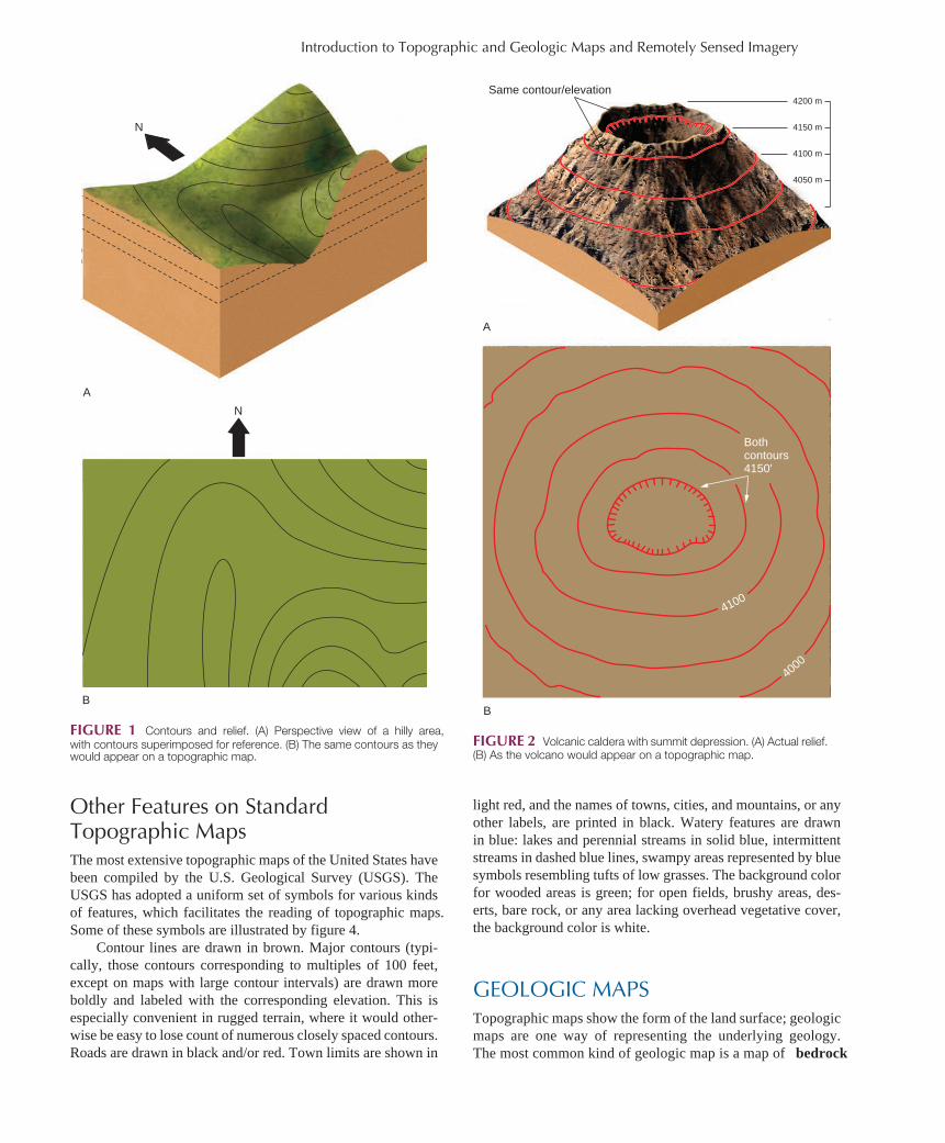
Contour Lines, Contour Intervals The problem of representing three-dimensional features on a two-dimensional map is addressed through the use of contour
lines. A contour line is a line connecting points of equal ele-vation, measured in feet or meters above or below sea level. The contour interval of a map is the difference in elevation between successive contour lines. For instance, if the contour interval is 10 feet, contour lines are drawn at elevations of 1000 feet, 1010 feet, 1020 feet, 1030 feet, and so on (in whatever range of elevations is appropriate to that map). If the contour interval is 20 feet, contours would be drawn at elevations of 1000 feet, 1020 feet, 1040 feet, and so on. The contour interval chosen for a particular map depends on the overall amount of relief in the map area. If the terrain is very flat, as in a midwest-ern floodplain, a 10-foot or even 5-foot contour interval may be appropriate to depict what relief there is. In a rugged moun-tain terrain, like the Rockies, the Cascades, or the Sierras, with several thousand feet of vertical relief, using a 10-foot contour interval would make for a very cluttered map, thick with con-tour lines; a 50-foot or even 100-foot contour interval may be used in such a case.
The relationship between the spacing of contours and the steepness of a slope can be seen in figure 1 . A comparison of the actual relief, as shown in figure 1A , and the resultant arrangement of contour lines on the corresponding topographic map, shown in figure 1B , illustrates that on a given map, the more closely spaced the contours, the steeper the corresponding terrain. In other words, if the map shows many closely spaced contours, this means that there is a great deal of vertical relief over a limited horizontal distance. Note also that contours run across the face of a slope; the upslope and downslope direc-tions are perpendicular to the contours.
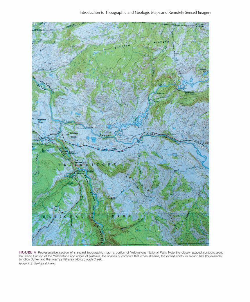
Contours do close, although they may not do so on any one given map. A series of concentric closed contours indicates a hill. If there is a local depression, so that the same contour is encountered twice, once going up in elevation and again within the depression, the repetition of the contour within the depres-sion is marked by a hachured contour, as shown in figure 2 .
Where contour lines cross a stream valley, they point upstream, toward higher elevations ( figure 3 ). Contour lines corresponding to different elevations should not ordinarily cross each other (that would imply that the same point has mul-tiple elevations). The only exception to this would occur in the case of an overhanging cliff, where a range in elevations exists at one spot on the map.
mon26916_appb_521-532.indd 521 8/29/07 3:45:08 PM
Introduction to Topographic and Geologic Maps and Remotely Sensed Imagery
Introduction to Topographic and Geologic Maps and Remotely Sensed Imagery
FIGURE 1 Contours and relief. (A) Perspective view of a hilly area, with contours superimposed for reference. (B) The same contours as they would appear on a topographic map.
Other Features on Standard Topographic Maps The most extensive topographic maps of the United States have been compiled by the U.S. Geological Survey (USGS). The USGS has adopted a uniform set of symbols for various kinds of features, which facilitates the reading of topographic maps. Some of these symbols are illustrated by figure 4 .
Contour lines are drawn in brown. Major contours (typi-cally, those contours corresponding to multiples of 100 feet, except on maps with large contour intervals) are drawn more boldly and labeled with the corresponding elevation. This is especially convenient in rugged terrain, where it would other-wise be easy to lose count of numerous closely spaced contours. Roads are drawn in black and/or red. Town limits are shown in
A
B
N
N
4100
4000
4200 m
4150 m
4100 m
4050 m
Same contour/elevation
A
B
FIGURE 2 Volcanic caldera with summit depression. (A) Actual relief. (B) As the volcano would appear on a topographic map.
light red, and the names of towns, cities, and mountains, or any other labels, are printed in black. Watery features are drawn in blue: lakes and perennial streams in solid blue, intermittent streams in dashed blue lines, swampy areas represented by blue symbols resembling tufts of low grasses. The background color for wooded areas is green; for open fields, brushy areas, des-erts, bare rock, or any area lacking overhead vegetative cover, the background color is white.
GEOLOGIC MAPS Topographic maps show the form of the land surface; geologic maps are one way of representing the underlying geology. The most common kind of geologic map is a map of bedrock
Bothcontours4150'
mon26916_appb_521-532.indd 522 8/29/07 3:45:12 PM

Introduction to Topographic and Geologic Maps and Remotely Sensed Imagery
Additional information, such as the orientation of beds or the location of contacts between map units, may also be recorded. Where obvious, contacts are drawn as solid lines; where only inferred, they are drawn as dashed lines. (If one finds granite at point A and limestone at point B a short dis-tance away, one can infer a contact between the granite and limestone somewhere between A and B, even if the exact spot is covered by soil.)
How easy it is to produce an accurate and complete geo-logic map depends on several factors (aside from the compe-tence of the mapper!). Bedrock exposure is one. Thick soil, water or swamps, and vegetation can all obscure what lies below. In some areas, the geology is well exposed only along stream valleys; in others, the rocks are completely exposed, and mapping is greatly simplified. In glaciated areas, too, one need not only deal with the cover of glacial till (assuming that is not the material of interest) but also be cautious about mistakenly identifying a large, partially buried bit of glacial debris as a small exposure of bedrock. And some areas are simply much more complicated, geologically, than others.
On a geologic map, different units are represented in dif-ferent colors for clarity ( figure 5 ). Units of similar age may be shown in different shades of the same color. The map is accompanied by a key showing all the map units, arranged in chronological order (insofar as their ages are known), with the youngest at the top. Ordinarily, a brief description of each map unit is given; alternatively, standard patterns may be used to indicate the general rock type ( figure 6 ). Each unit is also assigned a symbol. The first part of the symbol consists of one or two letters corresponding to the unit’s age (generally, the geologic era or period; see appendix A). This is usually fol-lowed by one to three lowercase letters corresponding to the rock type or unit’s name (if any). For example, “p –C qm” might be used for an unnamed Precambrian quartz monzonite, “Dl” for the Devonian Littleton Formation, “Qa” for Quaternary alluvium along a stream channel. These symbols are useful for distinguishing units mapped in similar colors, as well as for providing a general indication of the age of each unit directly on the map.
Interpretation of geologic maps likewise varies in diffi-culty, depending on the fundamental complexity of the geology and the extent of exposure (completeness of map). Sometimes, too, how much of the geology can be seen depends not only on cover or lack of it, but on topography. That is, in rugged terrain with considerable vertical relief, one has more of a three-dimensional look at the geology than in flat terrain. For example, in the vicinity of the Grand Canyon, the Paleozoic sedimentary sequence is quite flat-lying. So, for the most part, is the land surface. Outside the canyon, only the Kaibab lime-stone is exposed, forming a nearly level plateau and giving no evidence of what lies below. The cutting of the canyon has exposed many more rock units, down to the Precambrian. This is apparent on a geologic map ( figure 7 ).
The Grand Canyon has a regular, layer-cake geology that has a straightforward interpretation. Where the geology is more com-plex, patterns of repetition of units and orientation of beds must be
Direction of stream flowdownslope
Direction of stream flow
A
B
N
(str
eam
)
(stream)
N
FIGURE 3 Contours crossing stream valleys. (A) Relief with superim-posed contours. (B) On topographic map, the contours point upstream.
geology, which shows the geology as it would appear with soil stripped away. (Other maps may show distribution of dif-ferent soil types, glacial deposits, or other features of surface geology.) From a well-prepared geologic map, aspects of the subsurface structure can often be deduced.
Basics of Geologic Maps Fundamental to making a geologic map is identifying a suit-able set of map units. These may, for example, be individual sedimentary rock formations, distinguishable lava flows, or metamorphic rock units. The main requirement for a map unit is that it be identifiable by the presence or absence of some characteristic(s), and thus distinct from other map units chosen. The mapper then marks which of the map units are found at each place where the rocks are exposed.
mon26916_appb_521-532.indd 523 8/29/07 3:45:16 PM
Introduction to Topographic and Geologic Maps and Remotely Sensed Imagery
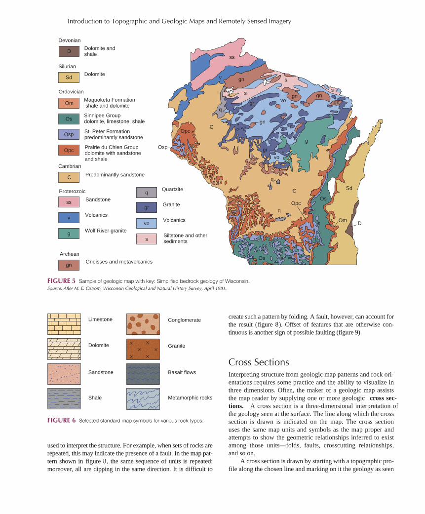
FIGURE 4 Representative section of standard topographic map: a portion of Yellowstone National Park. Note the closely spaced contours along the Grand Canyon of the Yellowstone and edges of plateaus, the shapes of contours that cross streams, the closed contours around hills (for example, Junction Butte), and the swampy flat area (along Slough Creek).Source: U.S. Geological Survey.
mon26916_appb_521-532.indd 524 8/29/07 3:45:19 PM
Introduction to Topographic and Geologic Maps and Remotely Sensed Imagery
FIGURE 5 Sample of geologic map with key: Simplified bedrock geology of Wisconsin. Source: After M. E. Ostrom, Wisconsin Geological and Natural History Survey, April 1981.
Devonian
Silurian
Ordovician
Dolomite andshale
Dolomite
D
Sd
Os
Osp
Opc
ss
v
g
gn
q
gr
vo
s
Om
C
C
C
Maquoketa Formation shale and dolomite
Sinnipee Groupdolomite, limestone, shale
St. Peter Formationpredominantly sandstone
Prairie du Chien Groupdolomite with sandstoneand shale
Cambrian
Predominantly sandstone
Proterozoic
Sandstone
Volcanics
Wolf River granite
Archean
Gneisses and metavolcanics
Quartzite
Granite
Volcanics
Siltstone and othersediments
q
q
ss
v gn
gn
gn gngn
s
s
s
qgr
gr
vo
vo
Os
Os
Ospg
Opc
Opc
Om
Sd
D
Limestone
Dolomite
Sandstone
Shale
Conglomerate
Granite
Basalt flows
Metamorphic rocks
FIGURE 6 Selected standard map symbols for various rock types.
used to interpret the structure. For example, when sets of rocks are repeated, this may indicate the presence of a fault. In the map pat-tern shown in figure 8 , the same sequence of units is repeated; moreover, all are dipping in the same direction. It is difficult to
create such a pattern by folding. A fault, however, can account for the result ( figure 8 ). Offset of features that are otherwise con-tinuous is another sign of possible faulting ( figure 9 ).
Cross Sections Interpreting structure from geologic map patterns and rock ori-entations requires some practice and the ability to visualize in three dimensions. Often, the maker of a geologic map assists the map reader by supplying one or more geologic cross sec-tions. A cross section is a three-dimensional interpretation of the geology seen at the surface. The line along which the cross section is drawn is indicated on the map. The cross section uses the same map units and symbols as the map proper and attempts to show the geometric relationships inferred to exist among those units—folds, faults, crosscutting relationships, and so on.
A cross section is drawn by starting with a topographic pro-file along the chosen line and marking on it the geology as seen
mon26916_appb_521-532.indd 525 8/29/07 3:45:23 PM

Introduction to Topographic and Geologic Maps and Remotely Sensed Imagery
from the surface ( figure 10A ). A structural interpretation that is consistent with all the known data is then devised ( figure 10B ). Depending on the complexity of the geology and the completeness of exposure on which the original geologic map has been based, it may or may not be possible to develop a unique structural interpretation for the observed map pattern. If it is not, several plausible alternatives might be presented. Cross sections can be very valuable in evaluating site suitabil-ity for construction or other purposes.
REMOTE SENSING AND SATELLITE IMAGERY Remote-sensing methods encompass all of those means of examining planetary features that do not involve direct con-tact. Instead, these methods rely on detection, recording, and analysis of wave-transmitted energy—visible light, infrared radiation, and others. Aerial photography, in which stan-dard photographs of relatively large regions of the earth are taken from aircraft, is one example. Radar mapping of sur-face topography, using airplanes or spacecraft, is another. Still another involves analyzing the light reflected from the surface of a body. In the case of many planets, remotely sensed data may be the only kind readily available. In the case of the earth, remote sensing, especially using satellites, is a quick and effi-cient way to scan broad areas, to examine regions having such
rugged topography or hostile climate that they cannot easily be explored on foot or with surface-based vehicles, and to view areas to which ground access is limited for political rea-sons. Probably the best-known and most comprehensive earth satellite imaging system is the one initiated in 1972, known as Landsat.
The Landsat satellites orbit the earth in such a way that images can be made of each part of the earth. Each orbit is slightly offset from the previous one, with the areas viewed on one orbit overlapping the scenes of the previous orbit. Each satellite makes 14 orbits each day; complete coverage of the earth takes 18 days. Therefore, images of any given area should be available every 18 days, although in practice, shifting distributions of clouds obscure the surface some part of the time at any point. Eight Landsat satellites have been launched; two are still functioning. Landsat 9 is scheduled to launch n 2020.
Satellite Images and Applications The sensors in the Landsat satellites do not detect all wave-lengths of energy reflected from the surface ( figure 11 ). They do not take photographs in the conventional sense. They are particularly sensitive to selected green and red wavelengths in the visible light spectrum and to a portion of the infrared (invis-ible heat radiation, with wavelengths somewhat longer than those of red light). These wavelengths were chosen particularly because plants reflect light most strongly in the green and the
FIGURE 7 The presence of the Grand Canyon allows much better knowledge of the area’s subsurface geology. Geologic map shows different rock units in different colors. Note monotony outside canyon.Used with permission Grand Canyon Natural History Association.
mon26916_appb_521-532.indd 526 8/29/07 3:45:24 PM

Introduction to Topographic and Geologic Maps and Remotely Sensed Imagery
FIGURE 8 Faulting can produce repetition of map units. Top surface of top block is the original surface exposure of units; bottom diagram is map result after faulting and erosion to the dashed surface of center diagram.
infrared. Later Landsat satellites (4 and 5) included sensors sensitive to more wavelengths in the visible part of the electro-magnetic spectrum. Different plants, rocks, and soils reflect dif-ferent proportions of radiation of different wavelengths. Even the same feature may produce a somewhat different image under different conditions. Wet soil differs from dry; sediment-laden water looks different from clear; a given variety of plant may reflect a different spectrum of radiation depending on what trace elements it has concentrated from the underlying soil or how vigorously it is growing. Landsat images can be powerful mapping tools.
A common format for Landsat imagery is photographic prints at 1:1,000,000 scale. At that scale, a 23-centimeter (9 inch) print covers 34,225 square kilometers (13,225 square miles). The smallest features that can be distinguished in the image are
Faulting oftilted sediments
New erosionsurface afterfaulting
Map view oferoded surfaceshows repetitionof units C, D, E
AB
CD
E
ED
C
F
FG
A
A
B
BC
C
CD
D
DE
E
EF
F
FG
G
F E D C E D C B
Fault trace
FIGURE 9 Igneous body and surrounding rocks offset by faulting.
about 30 meters (100 feet) in size, which gives some idea of the quality of the resolution. Multiple images can be joined into mosaics covering whole countries or continents.
Images are commonly presented either in black and white or as false-color composites. The latter are produced by pro-jecting the data for individual spectral regions through colored filters and superimposing the results. The false-color images are so named because the resulting pictures, though superfi-cially resembling color photographs, do not present all fea-tures in the colors they would appear to the human eye. The most striking difference is in vegetation, which appears in shades of red, not green. Rock and soil usually show as white, blue, yellow, or brown, depending on composition. Water is blue to bluish black; snow and ice are white. Examples of false-color Landsat images have been used throughout this text. Landsat image data can also be further processed by com-puter to produce images in more “realistic” (expected) col-ors or to enhance particular features by emphasizing certain wavelengths of radiation.
Dozens of applications of Landsat and other space imag-ery exist in the natural sciences—for example, basic geologic mapping, identification of geologic structures, and resource exploration. It is helpful in identifying patterns of land use and in monitoring the progress of crops and the extent of damage to vegetation from fires, insects, or disease. Because satellites scan the same area repeatedly over time, seasonal or long-term changes, the progress and extent of occasional events such as flooding, and changes related to human activi-ties can be observed ( figure 12 ). Satellite imagery also can be used to monitor the development of and changes in surface features such as stream channels and currents. As imaging technology has become more sophisticated, ever-better images have become available. Crews of the International Space Station have provided excellent images.
Offset of similar rockunits indicatespresence of fault.
mon26916_appb_521-532.indd 527 8/29/07 3:45:27 PM

Introduction to Topographic and Geologic Maps and Remotely Sensed Imagery
FIGURE 10 Constructing a cross section. (A) Geology as seen at surface is sketched onto a topographic profile. (B) The pattern is interpreted, and a set of structures consistent with the pattern seen at the surface is sketched in.
A
A' Line of cross section
Jurassicgranite
Paleozoicsediments
Precambrianmetamorphics
Jg
Jg
DI
DI
DI
SI
SI
Ssh
Ssh
Ssh
Ssh
Oss
Oss
pCm
pCm
pCm
(Note: Paleozoicbeds dip to northeastin this part of map.)
A'A
DI
Jg
A
Ssh
Anticlinal structure deducedfrom relative ages and
orientation of beds
Fault indicated byabrupt truncation
of anticline bymetamorphics
Jg
Oss
B
Ssh
SI
(deep geology unknown)
Sense of faulting suggested bythe fact that the metamorphicsare both older and higher grade(more deeply buried prior tofaulting?)
SI
Younger granite stockcrosscuts sediments
(orientation of contactat depth not really known).
1015
18
20
mon26916_appb_521-532.indd 528 8/29/07 3:45:28 PM

Introduction to Topographic and Geologic Maps and Remotely Sensed Imagery
FIGURE 11 Selected wavelengths ofvisible light or infrared radiation dete-cted in three selected MultiSpectral Sca-nner (MSS) or Thematic Mapper (TM) bands are converted to the three primary colors and combined for a false-color composite, based on relative amounts of radiation detected in each band.After U.S. Geological Survey.
Three bands are shown inone image, by assigningeach band a primary color(red, green, blue) andmixing them.
RGB = NRG:
Red means Near-infrared. . .
Green means visible Red. . .
Blue means visible Green.
A wide spectrum ofsolar energy reflects offthe earth, with somewavelengths measuredby Landsat sensors.
Wavelength,µm
MSS4infr
are
dv
isib
leu
v
TM4
TM3
TM2
MSS2
MSS1
1.0
.9
1.1
.8
.7
.6
.5
.4
Sensor, band In a typical image:
Different surfaces reflectdifferently. Vegetationlooks red, water black,bare earth bright,clouds and ice white.
Irrigated fields
Harvested fields
Bare earth
Deep, clear water
Shallow water
2492
22
13713295
226254231
02
12
08097
Coachella ValleyCoachella Valley
Sedimentor bloomSedimentor bloom
Salton SeaSalton Sea
Imperial ValleyImperial Valley
El CentroEl Centro
US-Mexico borderUS-Mexico border
MexicaliMexicali
N
A
B
FIGURE 12 (A) In this image, taken from the International Space Station in 2002, the importance of water from the Salton Sea to agricul-ture is obvious. Note how the U.S./Mexico border stands out as a result of lusher vegetation on the U.S. side. (B) Digital photograph of deforestation in eastern Bolivia, taken from the International Space Station. Agricultural development radiates outward from each of a series of small communities established by resettlement for the purpose of growing soybeans.Images courtesy of Earth Sciences and Image Analysis Laboratory, NASA Johnson Space Center.
mon26916_appb_521-532.indd 529 8/29/07 3:45:30 PM

Introduction to Topographic and Geologic Maps and Remotely Sensed Imagery
FIGURE 14 Years after the 1991 explosive eruptions, lahars can still be triggered by monsoon rains on Mount Pinatubo. Ash from those eruptions is shown in red, lahars in black. Comparison of April (left) and October (right) 1994 images shows evolution of lahars and their deposits, and helps in hazard evaluation.Images courtesy NASA.
In all cases, imagery taken from space is especially use-ful when some ground truth can be obtained. Ground truth is information gathered by direct surface examination (best done at the time of imaging, if vegetation is involved), which can provide critical confirmation of interpretations based on remotely sensed data.
Other Airborne Imaging Techniques A still newer technique, or set of techniques, involves the use of imaging radar. This has been likened to taking a photograph with a flash camera. Just as such a camera generates light that illuminates the pictures it takes, so imaging radar sends pulses
of microwaves that bounce off the surface or scene being imaged. The techniques of processing the returned signal have become increasingly refined since NASA and the Jet Propulsion Laboratory initiated the SEASAT imaging radar system in 1978 ( figure 13 ). Some radar-imaging devices are flown on jets, and some have been carried on the space shuttle. One of the advantages of radar imaging (by comparison with visible-light images, for example) is that microwave radiation is penetrating enough that it is unaffected by cloud cover, heavy rain, or other such conditions that can obscure a visual image. Therefore, it can be used to monitor such phenomena as shifting lahars on Mount Pinatubo during monsoon season ( figure 14 ).
FIGURE 13 Spaceborne radar image of a part of Guangdong prov-ince, China. This is a mineral-rich area, and radar imagery may assist in prospecting for additional deposits.Image courtesy NASA.
mon26916_appb_521-532.indd 530 8/29/07 3:45:37 PM

Introduction to Topographic and Geologic Maps and Remotely Sensed Imagery
Imaging spectroscopy is similar to Landsat imaging in that it relies on detection of a number of different wavelengths of radia-tion in the UV, visible-light, and infrared parts of the spectrum. It has become increasingly sophisticated as instrumentation has been refined. Now scans can involve detection of hundreds of individual specific wavelengths, not just a few broad bands, and certain wavelengths can serve as “fingerprints,” indicating the presence of individual minerals whose crystal structures absorb energy at those precise wavelengths. The instrumentation can also be deployed from low-flying aircraft. The resultant detailed, high-resolution images can be much more useful than other types
FIGURE 15 LIDAR images (A–C) provide more precise topographic data than aerial photographs (D) and can be ana-lyzed so that elevation changes can be mapped (E, F). Dauphin Island, AL, a barrier island.Images courtesy U.S. Geological Survey Coastal and Marine Geology Program.
of images for certain applications, as was shown by the Leadville, Colorado, example of chapter 17.
New ways are still being found to use visible light in remote sensing, too. LIDAR (Light Detection and Ranging) is an aircraft-based laser-altimetry system for examining topography. A major application of LIDAR has been in monitoring coastal change ( figure 15 ). Precise assessment of coastal response to major hurricanes as well as everyday geologic processes can be important to land-use planning in such dynamic regions.
So new tools are continually developed to expand the ways we can explore and understand our planet.
mon26916_appb_521-532.indd 531 8/29/07 3:45:42 PM

Introduction to Topographic and Geologic Maps and Remotely Sensed Imagery
NASA maintains a wonderful image archive of images
bedrock geology contour interval contour lines
Key Terms and Concepts cross section map unit
remote-sensing scale (map)
Brock, J., and Sallenger, A. 2001. Airborne topographic LIDAR map-ping for coastal science and resource management. USGS Open-
File Report 01-46.
Gardner, J. V., Dartnell, P., Gibbons, H., and MacMillan, D. 2000. Exposing the sea floor: High-resolution multibeam mapping along the U.S. Pacific Coast. USGS Fact Sheet 013-00.
Holz, R. K. 1985. The surveillant science: Remote sensing of the envi-
ronment. New York: John Wiley & Sons.
Information about the U.S. Geological Survey Photographic Library and the availability of its products may be found at library.usgs.gov/photo/#/USGS also maintains a media library at www.usgs.gov/products/multimedia-gallery/images
Maps can be ordered from the USGS store at store.usgs.gov/maps
The USGS Spectroscopy Lab works extensively with imaging spectroscopy. Its home page is speclab.cr.usgs.gov and an introduction to aspects of imaging spectroscopy maps is found at speclab.cr.usgs.gov/map.intro.html
A variety of images has been collected as “Earthshots,” and an explanation of the imaging techniques is featured at the same site: earthshots.usgs.gov/earthshots/
from space at the “Earth Observatory” site: earthobservatory.nasa.gov/
NOAA explores the applications of LIDAR to coastal change; an introduction to LIDAR can be found at oceanservice.noaa.gov/facts/lidar.html
Short, N. M., Lowman, P. D., Jr., Freden, S. C., and Firch, W. A., Jr. 1976. Mission to Earth: Landsat views the world. National Aeronautics and Space Administration. Washington, D.C.: U.S. Government Printing Office.
Slaney, V. R. 1981. Landsat images of Canada—A geological ap-praisal. Geological Survey of Canada Special Paper 80–15.
Thompson, M.M. 1987. Maps for America. U.S. Geological Survey. U.S. Government Printing Office, Washington, D.C.
A large collection of Landsat imagery is available through the EROS data center, at eros.usgs.go
The Landsat program, the satellites, and their imagery are described at landsat.usgs.gov
The home page for NASA/JPL imaging radar can be found at uavsar.jpl.nasa.gov/
mon26916_appb_521-532.indd 532 8/29/07 3:45:48 PM
Net Notes
Suggested Readings/References