introduction to statistics for psychology quantitative methods for
TRANSCRIPT
Introduction to Statistics for Psychology
and
Quantitative Methods for Human
Sciences
Jonathan Marchini

Course Information
There is website devoted to the course at
http://www.stats.ox.ac.uk/∼marchini/phs.html
This contains
• Course timetable/information
• Lecture slides (on the website before each lecture)
• Lecture notes (a bit more detailed than the slides)
• Exercise sheets (tutors may or may not use these)
• Formulae booklet and definitions booklet
• Links to past exam papers on the web
PLEASE ENTER THE LECTURE THEATRE QUICKLY!

Lecture 1 : Outline
• Why we need Statistics?
- The scientific process
• Different types of data
- Discrete/Continuous- Quantitative/Qualitative
• Methods of looking at data
- Bar charts, Histograms, Dot plots, Scatter plots, Boxplots
• Calculating summary measures of data
- Location - Mean, Median, Mode- Dispersion - SIQR, MAD, sample variance, sample
standard deviation

The role of Statistics in the Scientific Process
We start with aquestion/hypotheis
Propose a study/experimentthat aims to providedata to help test ourhypothesis
CollectData
Examine the resultsof the statistical test
Study Design(How can we design
most information about our hypothesis)
our study to get the
about a given
objects/events
i.e. take
from the population
population of a sample
STATISTICS
Use statistics to test our hypothesis basedon a model of the data

An Example
Psychologists have long been interested in the relationship between stressand health.
A focused question might involve the study of a specific psychologicalsymptom and its impact on the health of the population.
To assess whether the symptom is a good indicator of stress we needto measure the symptom and stress levels in a sample of individuals fromthe population.
It is not immediately clear how we should go about collecting thissample, i.e. how we should design the study.
We haven’t got very far before we need Statistics!

The general focus of this course
We start with aquestion/hypotheis
Propose a study/experimentthat aims to providedata to help test ourhypothesis
CollectData
Examine the resultsof the statistical test
Study Design(How can we design
most information about our hypothesis)
our study to get the
about a given
objects/events
i.e. take
from the population
population of a sample
STATISTICS
Use statistics to test our hypothesis basedon a model of the data
Datasets consist of measured variables
The datasets that Psychologists and Human Scientists collect will usuallyconsist of one more observations on one or more “variables”.
A variable is a property of an object or event that can take on differentvalues.
Example Suppose we collect a dataset by measuring the hair colour,resting heart rate and score on an IQ test of every student in a class. Thevariables in this dataset would then simply be hair colour, resting heartrate and score on an IQ test, i.e. the variables are the properties that wemeasured/observed.
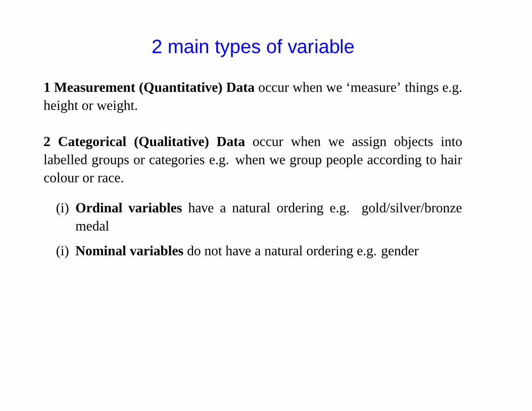
2 main types of variable
1 Measurement (Quantitative) Data occur when we ‘measure’ things e.g.height or weight.
2 Categorical (Qualitative) Data occur when we assign objects intolabelled groups or categories e.g. when we group people according to haircolour or race.
(i) Ordinal variables have a natural ordering e.g. gold/silver/bronzemedal
(i) Nominal variables do not have a natural ordering e.g. gender
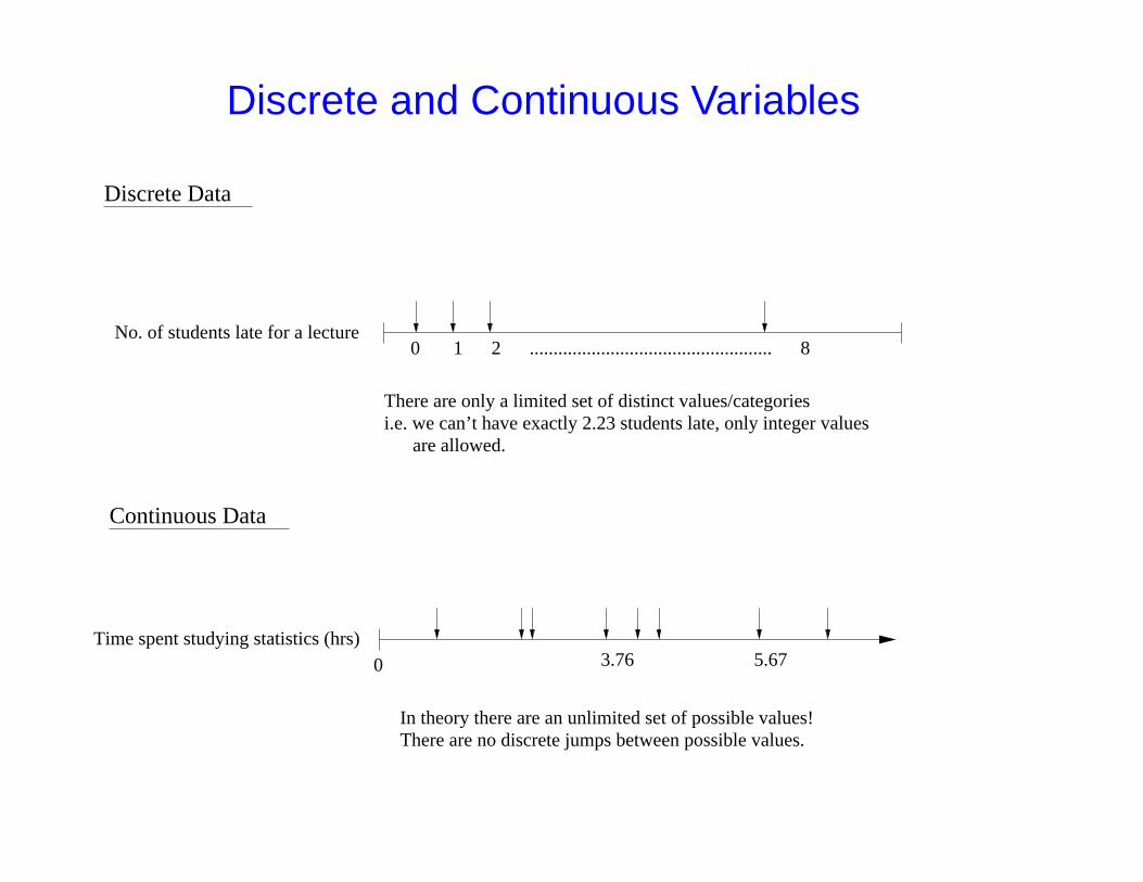
Discrete and Continuous Variables
No. of students late for a lecture
There are only a limited set of distinct values/categoriesi.e. we can’t have exactly 2.23 students late, only integer values are allowed.
0Time spent studying statistics (hrs)
0 1 2 ................................................... 8
3.76 5.67
In theory there are an unlimited set of possible values!There are no discrete jumps between possible values.
Discrete Data
Continuous Data
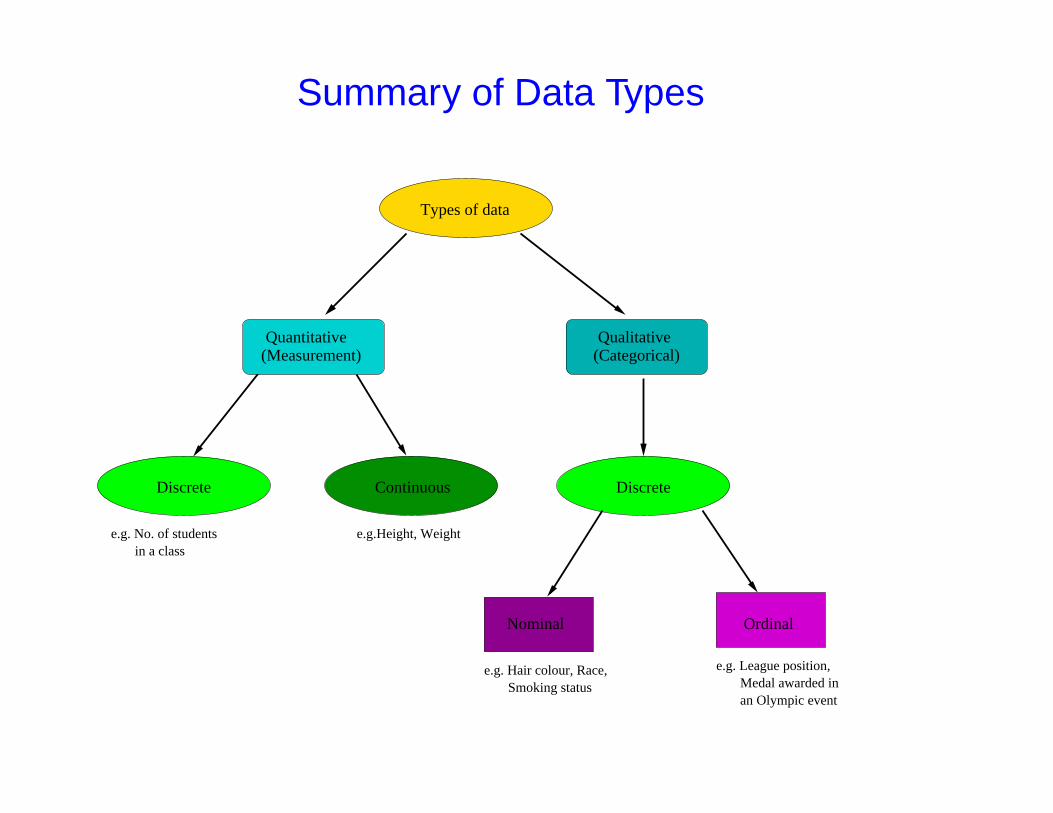
Summary of Data Types
Types of data
(Measurement)Quantitative
(Categorical)Qualitative
Discrete Continuous Discrete
Nominal Ordinal
e.g. No. of students in a class
e.g.Height, Weight
e.g. Hair colour, Race, Smoking status
e.g. League position,
an Olympic event Medal awarded in

Plotting Data
One of the most important stages in a statistical analysis can be simply tolook at your data right at the start.
By doing so you will be able to spot characteristic features, trendsand outlying observations that enable you to carry out an appropriatestatistical analysis.
Also, it is a good idea to look at the results of your analysis using aplot. This can help identify if you did something that wasn’t a good idea!
REMEMBER Data is messy! No two datasets are the same
ALWAYS LOOK AT YOUR DATA

The Baby-Boom dataset
Forty-four babies (a new record) were born in one 24-hour period at theMater Mothers’ Hospital in Brisbane, Queensland, Australia, on December18, 1997. For each of the 44 babies, The Sunday Mail recorded the time ofbirth, the sex of the child, and the birth weight in grams.
Whilst, we did not collect this dataset based on a specific hypothesis,if we wished we could use it to answer several questions of interest.
• Do girls weigh more than boys at birth?
• What is the distribution of the number of births per hour?
• Is birth weight related to the time of birth?
• Is gender related to the time of birth?
• Is there an equal chance of being born a girl or boy?

Time Gender Weight
5 1 383764 1 333478 2 3554115 2 3838177 2 3625245 1 2208247 1 1745262 2 2846271 2 3166428 2 3520455 2 3380492 2 3294494 1 2576549 1 3208635 2 3521
Time Gender Weight
649 1 3746653 1 3523693 2 2902729 2 2635776 2 3920785 2 3690846 1 3430847 1 3480873 1 3116886 1 3428914 2 3783991 2 3345
1017 2 30341062 1 21841087 2 3300
Time Gender Weight
1105 1 23831134 2 34281149 2 41621187 2 36301189 2 34061191 2 34021210 1 35001237 2 37361251 2 33701264 2 21211283 2 31501337 1 38661407 1 35421435 1 3278

Bar Charts
A Bar Chart is a useful method of summarising Categorical Data. Werepresent the counts/frequencies/percentages in each category by a bar.
Fre
quen
cy
Girl Boy
04
812
1620
24

Histograms
‘A Bar Chart is to Categorical Data as a Histogram is to MeasurementData’
Birth Weight (g)
Fre
quen
cy
1500 2000 2500 3000 3500 4000 4500
05
1015
200
510
1520
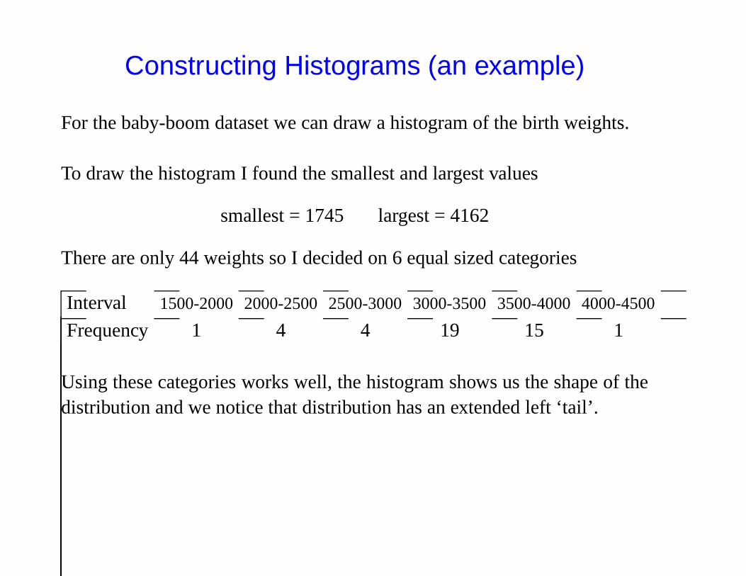
Constructing Histograms (an example)
For the baby-boom dataset we can draw a histogram of the birth weights.
To draw the histogram I found the smallest and largest values
smallest = 1745 largest = 4162
There are only 44 weights so I decided on 6 equal sized categories
Interval 1500-2000 2000-2500 2500-3000 3000-3500 3500-4000 4000-4500
Frequency 1 4 4 19 15 1
Using these categories works well, the histogram shows us the shape of thedistribution and we notice that distribution has an extended left ‘tail’.
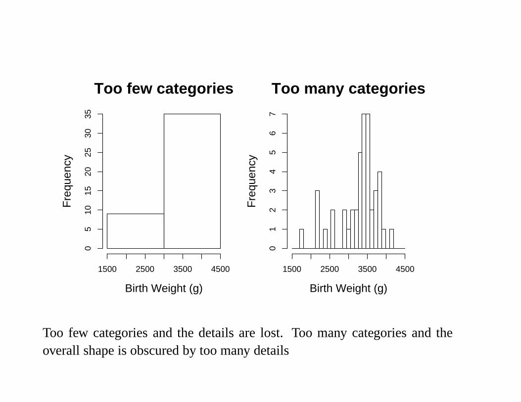
Too few categories
Birth Weight (g)
Fre
quen
cy
1500 2500 3500 4500
05
1015
2025
3035
Too many categories
Birth Weight (g)
Fre
quen
cy
1500 2500 3500 45000
12
34
56
7
Too few categories and the details are lost. Too many categories and theoverall shape is obscured by too many details

Cumulative Frequency Plots and Curves
Interval 1500-2000 2000-2500 2500-3000 3000-3500 3500-4000 4000-4500
Frequency 1 4 4 19 15 1Cumulative 1 5 9 28 43 44Frequency
Cumulative Frequency Plot
Birth Weight (g)
Cum
ulat
ive
Fre
quen
cy
1500 2000 2500 3000 3500 4000 4500
010
2030
4050
2000 2500 3000 3500 4000 4500
010
2030
4050
Cumulative Frequency Curve
Birth Weight (g)
Cum
ulat
ive
Fre
quen
cy

Dot plots
A Dot Plot is a simple and quick way of visualising a dataset. This typeof plot is especially useful if data occur in groups and you wish to quicklyvisualise the differences between the groups.
Birth Weight (g)
Gen
der
1500 2000 2500 3000 3500 4000 4500
Girl
Boy

Scatter Plots
Scatter plots are useful when we wish to visualise the relationship betweentwo measurement variables.
2000 2500 3000 3500 4000
020
040
060
080
010
0012
0014
00
Birth Weight (g)
Tim
e of
birt
h (m
ins
sinc
e 12
pm)

Comparing Histograms
−10 0 10 20 30
−10 0 10 20 30
−10 0 10 20 30

Summary Measures
There are 3 main measures of location
• The Mode
• The Median
• The Mean
There are 5 main measures of dispersion
• The Interquartile Range (IQR) and Semi-Interquartile Range (SIQR)
• The Mean Deviation
• The Mean Absolute Deviation (MAD)
• The Sample Variance (s2) and Population Variance (σ2)
• The Sample Standard Deviation (s) and Population Standard Devia-tion (σ)

The Mode
The Mode of a set of numbers is simply the most common value e.g. themode of the following set of numbers
1, 1, 2, 2, 2, 3, 3, 3, 3, 4, 5, 5, 6, 6, 7, 8, 10, 13 is 3.F
requ
ency
0 2 4 6 8 10 12 14
01
23
4
1 2 3 4 5 6 7 8 9 10 11 12 13 14

Advantage The Mode has the advantage that it is always a score thatactually occurred and can be applied to nominal data.
Disadvantage There may be two or more values that share the largestfrequency. In the case of two modes we would report both and refer to thedistribution as bimodal.
Fre
quen
cy
5 10 15 20 25
05
1015
2025
3035
The Median
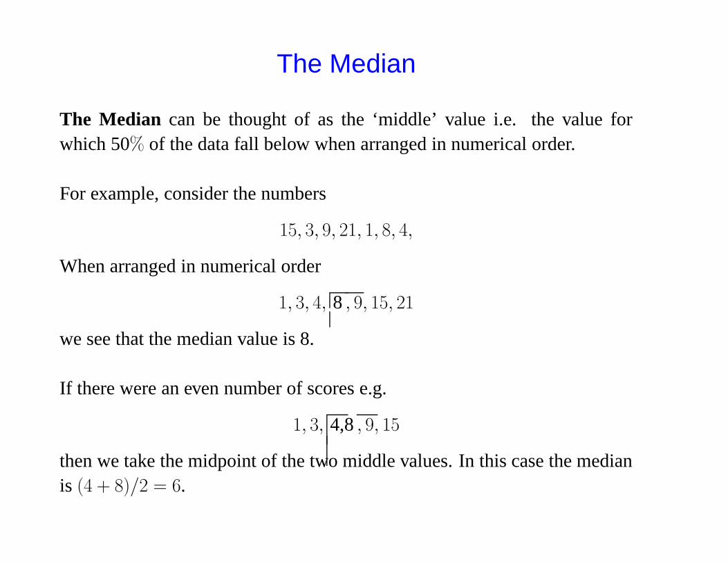
The Median can be thought of as the ‘middle’ value i.e. the value forwhich 50% of the data fall below when arranged in numerical order.
For example, consider the numbers
15, 3, 9, 21, 1, 8, 4,
When arranged in numerical order
1, 3, 4, 8 , 9, 15, 21
we see that the median value is 8.
If there were an even number of scores e.g.
1, 3, 4,8 , 9, 15
then we take the midpoint of the two middle values. In this case the medianis (4 + 8)/2 = 6.

In general, if we have N data points then the median location is defined asfollows:
Median Location = (N+1)2
For example, the median location of 7 numbers is (7 + 1)/2 = 4 and themedian of 8 numbers is (8 + 1)/2 = 4.5 i.e. between observation 4 and 5(when the numbers are arranged in order).
Advantage The median is unaffected by extreme scores (a point itshares with the mode). We say the median is resistant to outliers. Forexample, the median of the numbers
1, 3, 4, 8 , 9, 15, 99999
is still 8. This property is very useful in practice as outlying observationscan and do occur (Data is messy remember!).

The Mean
The Mean of a set of scores is the sum1 of the scores divided by the numberof scores. For example, the mean of
1, 3, 4, 8, 9, 15 is1 + 3 + 4 + 8 + 9 + 15
6= 6.667 (to 3 dp)
In mathematical notation, the mean of a set of n numbers x1, . . . , xn isdenoted by x̄ where
x̄ =
∑ni=1 xi
nor x̄ =
∑
x
n(in the formula book)
See the appendix of the notes for a brief description of the summationnotation (
∑
)
1The total when we add them all up

Advantage The mean is the most widely used measure of location.Historically, this is because statisticians can write down equations for themean and derive nice theoretical properties for the mean, which are muchharder for the mode and median.
Disadvantage The mean is not resistant to outlying observations.For example, the mean of
1, 3, 4, 8, 9, 15, 99999
is 14323.57, whereas the median (from above) is 8.

Sometimes discrete measurement data are presented in the form of afrequency table in which the frequencies of each value are given.
Data (x) 1 2 3 4 5 6Frequency (f) 2 4 6 7 4 1
We calculate the sum of the data as
(2 × 1) + (4 × 2) + (6 × 3) + (7 × 4) + (4 × 5) + (1 × 6) = 82
and the number of observations as
2 + 4 + 6 + 7 + 4 + 1 = 24
The the mean is given by
x̄ =82
24= 3.42 (2 dp)
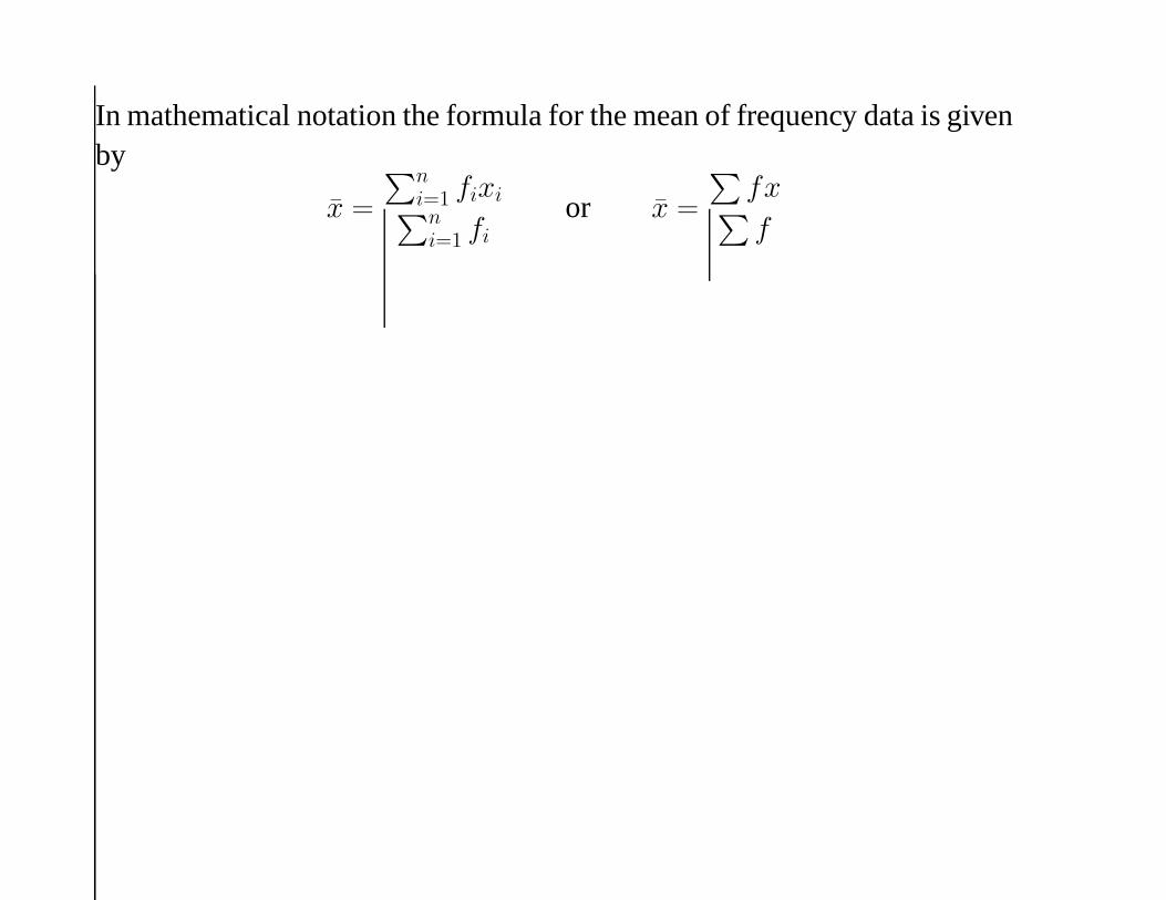
In mathematical notation the formula for the mean of frequency data is givenby
x̄ =
∑ni=1 fixi
∑ni=1 fi
or x̄ =
∑
fx∑
f

The relationship between the mean, median and mode
Symmetric
−10 0 10 20 30
mean = median = mode
Positive Skew
0 5 10 15 20 25 30
meanmedianmode
Negative Skew
0 5 10 15 20 25 30
meanmedianmode

IQR and SIQR
The IQR is the range of the middle 50% of the data.The SIQR is simply half the IQR.
Fre
quen
cy
−5 0 5 10 15 20 25
050
100
150
200
25% 75%
IQR

We calculate the IQR in the following way:
• Calculate the 25% point (1st quartile) of the dataset. The location ofthe 1st quartile is defined to be the
(
N+14
)
th data point.
• Calculate the 75% point (3rd quartile) of the dataset. The location ofthe 3rd quartile is defined to be the
(3(N+1)4
)
th data point.
• Calculate the IQR as
IQR = 3rd quartile - 1st quartile
Example 1 Consider the set of 11 numbers (which have been arranged inorder)
10, 15, 18, 33, 34, 36, 51, 73, 80, 86, 92
The 1st quartile is the (11+1)4 = 3rd data point = 18
The 3rd quartile is the 3(11+1)4 = 9th data point = 80
⇒ IQR = 80 - 18 = 62⇒ SIQR = 62 / 2 = 31.

The Mean Deviation
To measure the spread of a dataset it seems sensible to use the ‘deviation’of each data point from the mean of the distribution. The deviation of eachdata point from the mean is simply the data point minus the mean.
small spread = small deviations large spread = large deviations

Data Deviationsx x − x̄
10 10 - 48 = -3815 15 - 48 = -3318 18 - 48 = - 3033 33 - 48 = -1534 34 - 48 = -1436 36 - 48 = -1251 51 - 48 = 373 73 - 48 = 2580 80 - 48 = 3286 86 - 48 = 3892 92 - 48 = 44
Sum = 528 Sum = 0∑
x = 528∑
(x − x̄) = 0
The mean is x̄ = 52811 = 48
The Mean Deviation of a set of numbersis simply mean of deviations.
In practice, the mean deviation isalways zero.
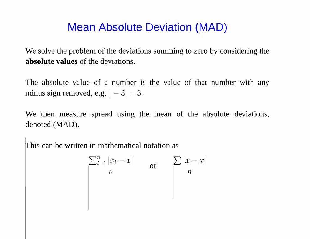
Mean Absolute Deviation (MAD)
We solve the problem of the deviations summing to zero by considering theabsolute values of the deviations.
The absolute value of a number is the value of that number with anyminus sign removed, e.g. | − 3| = 3.
We then measure spread using the mean of the absolute deviations,denoted (MAD).
This can be written in mathematical notation as∑n
i=1 |xi − x̄|n
or
∑
|x − x̄|n

Data Deviations |Deviations|x x − x̄ |x − x̄|10 10 - 48 = -38 3815 15 - 48 = -33 3318 18 - 48 = - 30 3033 33 - 48 = -15 1534 34 - 48 = -14 1436 36 - 48 = -12 1251 51 - 48 = 3 373 73 - 48 = 25 2580 80 - 48 = 32 3286 86 - 48 = 38 3892 92 - 48 = 44 44
Sum = 528 Sum = 0 Sum = 284∑
x = 528∑
(x − x̄) = 0∑ |x − x̄| = 284
MAD =284
11= 25.818 (to 3dp)

The Sample Variance (s2) and Population Variance (σ2)
Another way to ensure the deviations don’t sum to zero is to look at thesquared deviations. Thus another way of measuring the spread is to considerthe mean of the squared deviations, called the Variance
If our dataset consists of the whole population (a rare occurrence) then wecan calculate the population variance σ2 (said ‘sigma squared’) as
σ2 =
∑ni=1(xi − x̄)2
nor σ2 =
∑
(x − x̄)2
n
When we just have a sample from the population (most of the time) we cancalculate the sample variance s2 as
s2 =
∑ni=1(xi − x̄)2
n − 1or s2 =
∑
(x − x̄)2
n − 1
NB We divide by n − 1 when calculating the sample variance as then s2 isa ‘better estimate’ of the population variance σ2 than if we had divided by n.
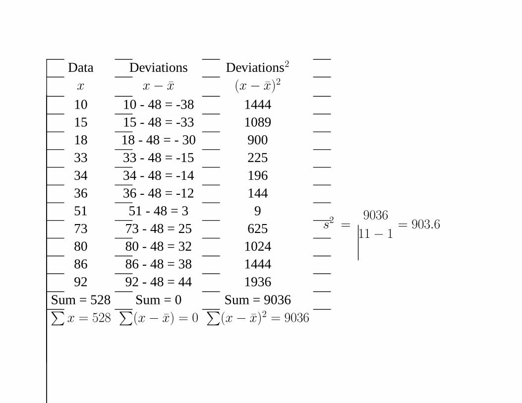
Data Deviations Deviations2
x x − x̄ (x − x̄)2
10 10 - 48 = -38 144415 15 - 48 = -33 108918 18 - 48 = - 30 90033 33 - 48 = -15 22534 34 - 48 = -14 19636 36 - 48 = -12 14451 51 - 48 = 3 973 73 - 48 = 25 62580 80 - 48 = 32 102486 86 - 48 = 38 144492 92 - 48 = 44 1936
Sum = 528 Sum = 0 Sum = 9036∑
x = 528∑
(x − x̄) = 0∑
(x − x̄)2 = 9036
s2 =9036
11 − 1= 903.6

The Sample and Population Standard Deviation (s and σ)
Notice how the sample variance in our example is much higher than theSIQR and the MAD.
SIQR = 31 MAD = 25.818 s2 = 903.6
This happens because we have squared the deviations transforming themto a quite different scale. We can recover the scale of the original data bysimply taking the square root of the sample (population) variance.
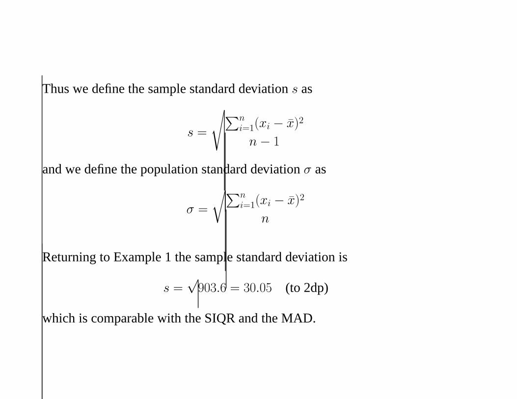
Thus we define the sample standard deviation s as
s =
√
∑ni=1(xi − x̄)2
n − 1
and we define the population standard deviation σ as
σ =
√
∑ni=1(xi − x̄)2
n
Returning to Example 1 the sample standard deviation is
s =√
903.6 = 30.05 (to 2dp)
which is comparable with the SIQR and the MAD.

Box Plots
2000
2500
3000
3500
4000
Median
1st quartile
3rd quartile
Lower Whisker
Upper Whisker
Outliers

A box plot consists of three main parts
1 A box that covers the middle 50% of the data. The edges of the boxare the 1st and 3rd quartiles. A line is drawn in the box at the medianvalue.
2 Whiskers that extend out from the box to indicate how far the dataextend either side of the box. The whiskers should extend no furtherthan 1.5 times the length of the box, i.e. the maximum length of awhisker is 1.5 times the IQR.
3 All points that lie outside the whiskers are plotted individually asoutlying observations.

Plotting box plots of measurements in different groups side by side can beillustrative. For example, box plots of birth weight for each gender side byside and indicates that the distributions have quite different shapes.
Girls Boys
2000
2500
3000
3500
4000