inside tropical rain forests:...
TRANSCRIPT
Chapter 04
Inside Tropical Rain Forests: Biodiversity
PowerPoint Tips (Refer to the Microsoft Help feature for specific questions about PowerPoint.
Copyright The Princeton University Press. Permission required for reproduction or display.
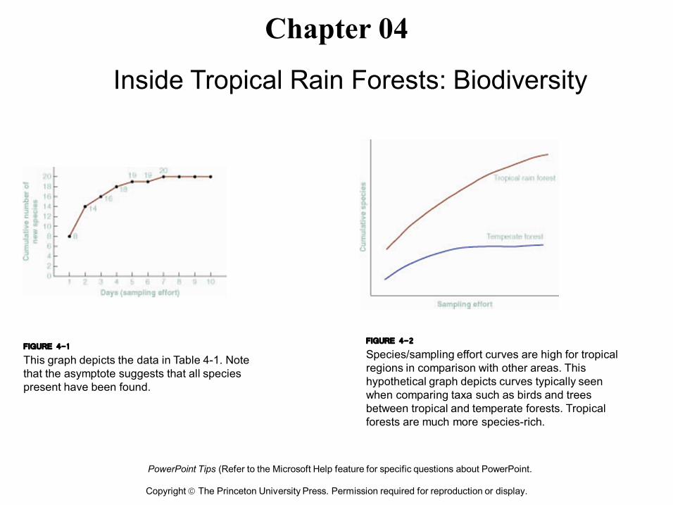
FIGURE 4-1 This graph depicts the data in Table 41. Note that the asymptote suggests that all species present have been found.
FIGURE 4-2 Species/sampling effort curves are high for tropical regions in comparison with other areas. This hypothetical graph depicts curves typically seen when comparing taxa such as birds and trees between tropical and temperate forests. Tropical forests are much more speciesrich.
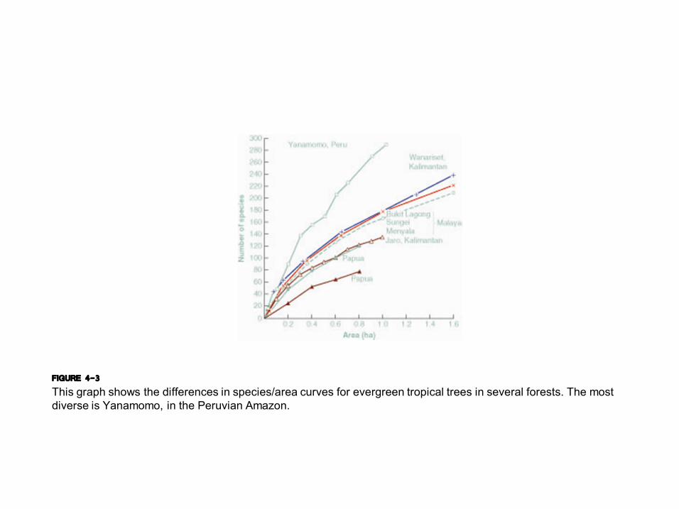
FIGURE 4-3 This graph shows the differences in species/area curves for evergreen tropical trees in several forests. The most diverse is Yanamomo, in the Peruvian Amazon.
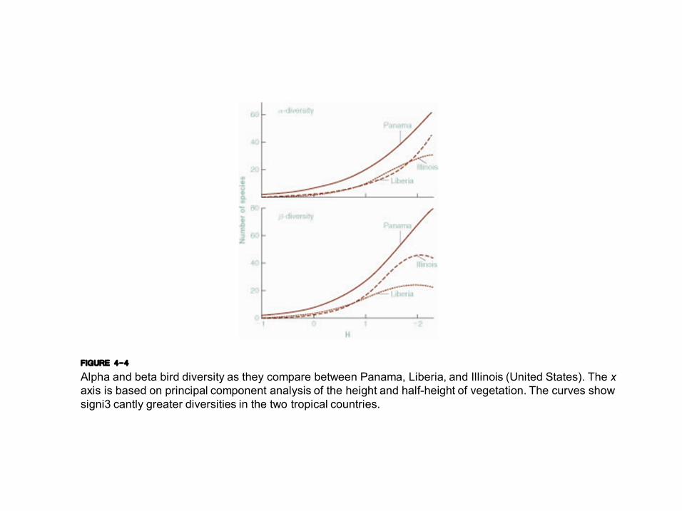
FIGURE 4-4 Alpha and beta bird diversity as they compare between Panama, Liberia, and Illinois (United States). The x axis is based on principal component analysis of the height and halfheight of vegetation. The curves show signi3 cantly greater diversities in the two tropical countries.
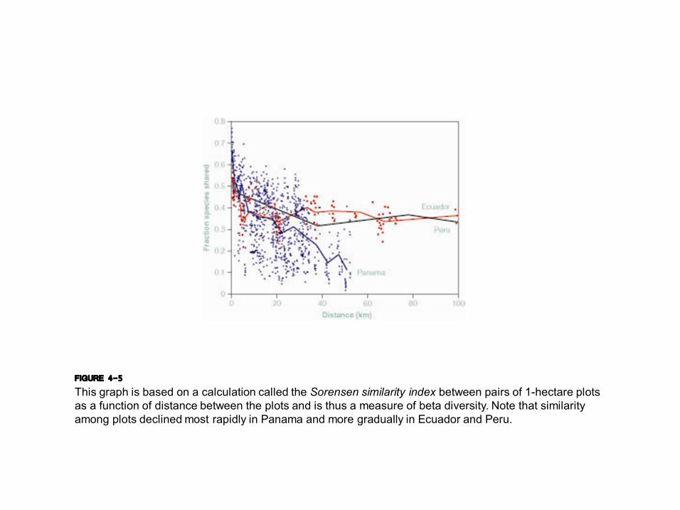
FIGURE 4-5 This graph is based on a calculation called the Sorensen similarity index between pairs of 1hectare plots as a function of distance between the plots and is thus a measure of beta diversity. Note that similarity among plots declined most rapidly in Panama and more gradually in Ecuador and Peru.
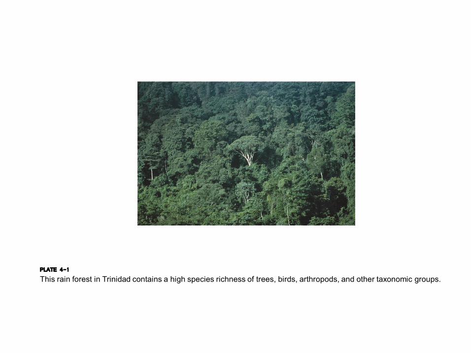
PLATE 4-1 This rain forest in Trinidad contains a high species richness of trees, birds, arthropods, and other taxonomic groups.

PLATE 4-2 Barro Colorado Island in Panama, showing the dock and some of the facilities for researchers.

FIGURE 4-6 The relative abundance of various plant families at Barro Colorado Island.

FIGURE 4-7 The relative abundance of various plant families at Manu 3 oodplain
forest in Amazonian Peru.
FIGURE 4-8 This graph depicts the number of species of various plant life forms at Manu 3 oodplain forest. Note the high relative abundances of lianas (woody vines) and epiphytes.
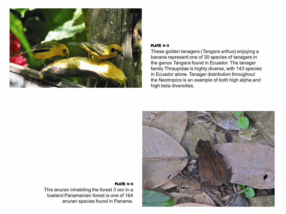
PLATE 4-3 These golden tanagers (Tangara arthus) enjoying a banana represent one of 30 species of tanagers in the genus Tangara found in Ecuador. The tanager family Thraupidae is highly diverse, with 143 species in Ecuador alone. Tanager distribution throughout the Neotropics is an example of both high alpha and high beta diversities.
PLATE 4-4 This anuran inhabiting the forest 3 oor in a lowland Panamanian forest is one of 164
anuran species found in Panama.

PLATE 4-5 The butter3 y Philaethria dido (family Heliconiinae) is found widely in lowland forest in Central and South America.
PLATE 4-6 HARLEQUIN BEETLE (ACROCINUS LONGIMANUS)
PLATE 4-7 TORTOISE BEETLE (SUBFAMILY CASSIDINAE)
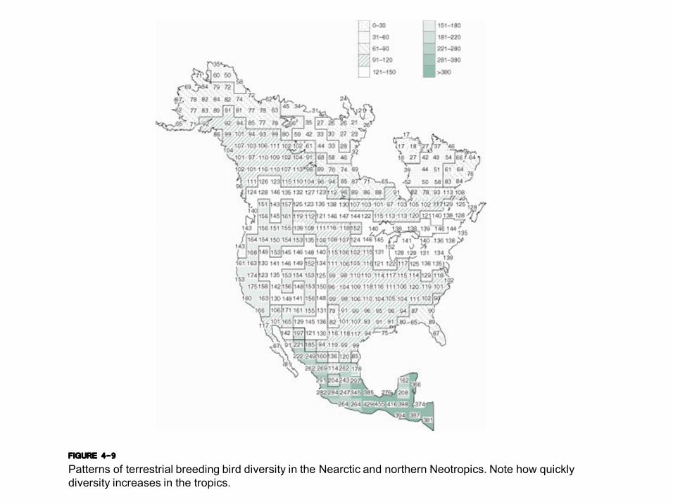
FIGURE 4-9 Patterns of terrestrial breeding bird diversity in the Nearctic and northern Neotropics. Note how quickly diversity increases in the tropics.

FIGURE 4-10 Patterns of terrestrial breeding bird diversity in South America. Note how diversity declines with increasing southern latitude, and note also the consistent high diversity of Amazonian locations. Last, note that the highest diversities in the central Andes Mountains.
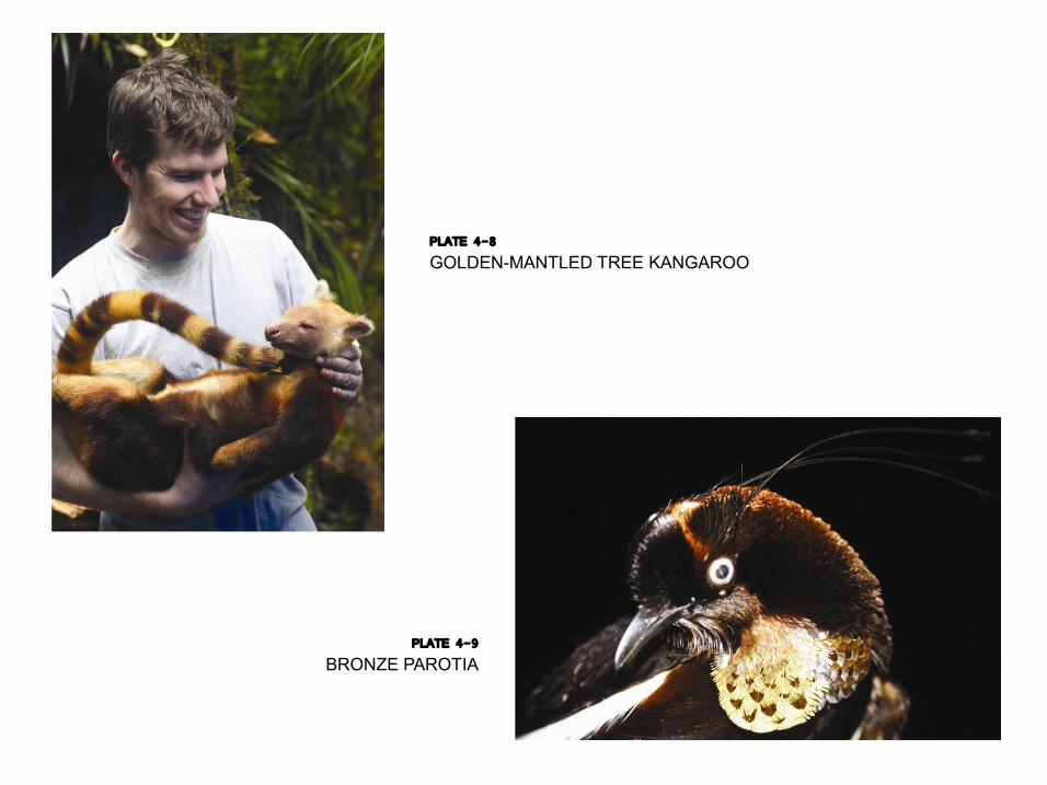
PLATE 4-8 GOLDENMANTLED TREE KANGAROO
PLATE 4-9 BRONZE PAROTIA
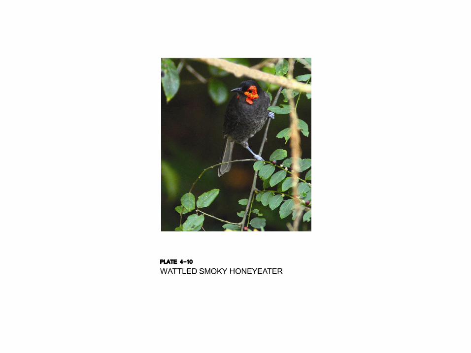
PLATE 4-10 WATTLED SMOKY HONEYEATER
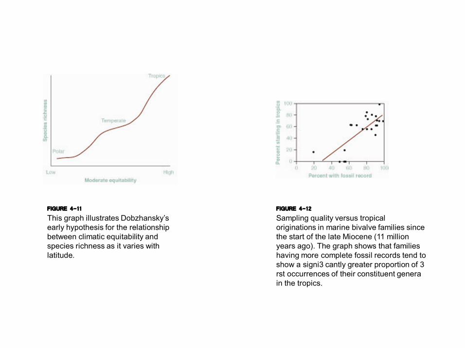
FIGURE 4-11 This graph illustrates Dobzhansky’s early hypothesis for the relationship between climatic equitability and species richness as it varies with latitude.
FIGURE 4-12 Sampling quality versus tropical originations in marine bivalve families since the start of the late Miocene (11 million years ago). The graph shows that families having more complete fossil records tend to show a signi3 cantly greater proportion of 3 rst occurrences of their constituent genera in the tropics.
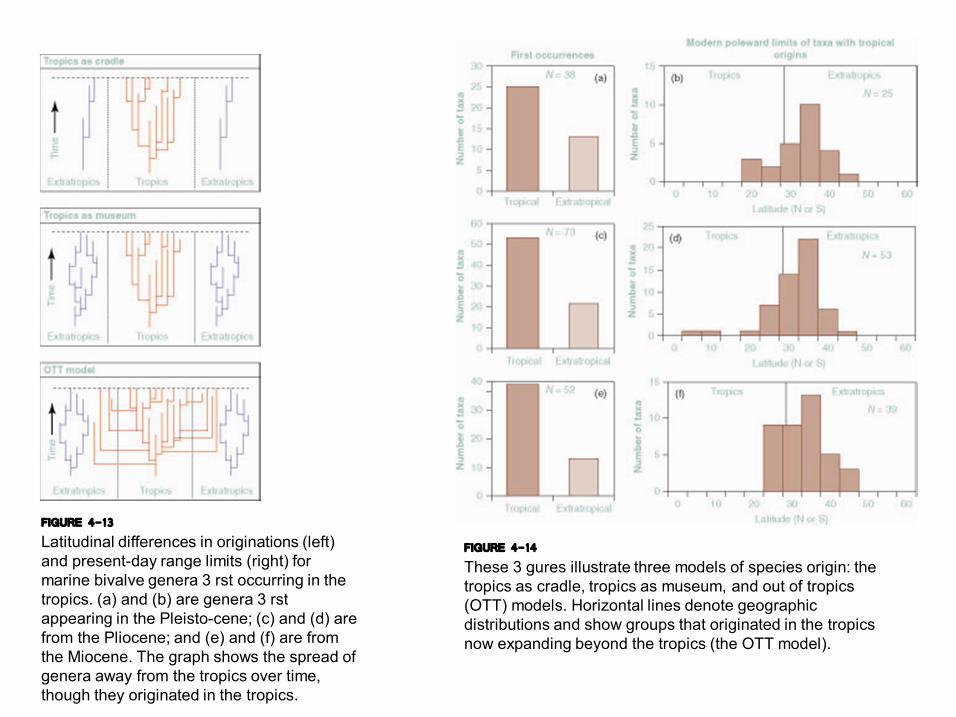
FIGURE 4-13 Latitudinal differences in originations (left) and presentday range limits (right) for marine bivalve genera 3 rst occurring in the tropics. (a) and (b) are genera 3 rst appearing in the Pleistocene; (c) and (d) are from the Pliocene; and (e) and (f) are from the Miocene. The graph shows the spread of genera away from the tropics over time, though they originated in the tropics.
FIGURE 4-14 These 3 gures illustrate three models of species origin: the tropics as cradle, tropics as museum, and out of tropics (OTT) models. Horizontal lines denote geographic distributions and show groups that originated in the tropics now expanding beyond the tropics (the OTT model).
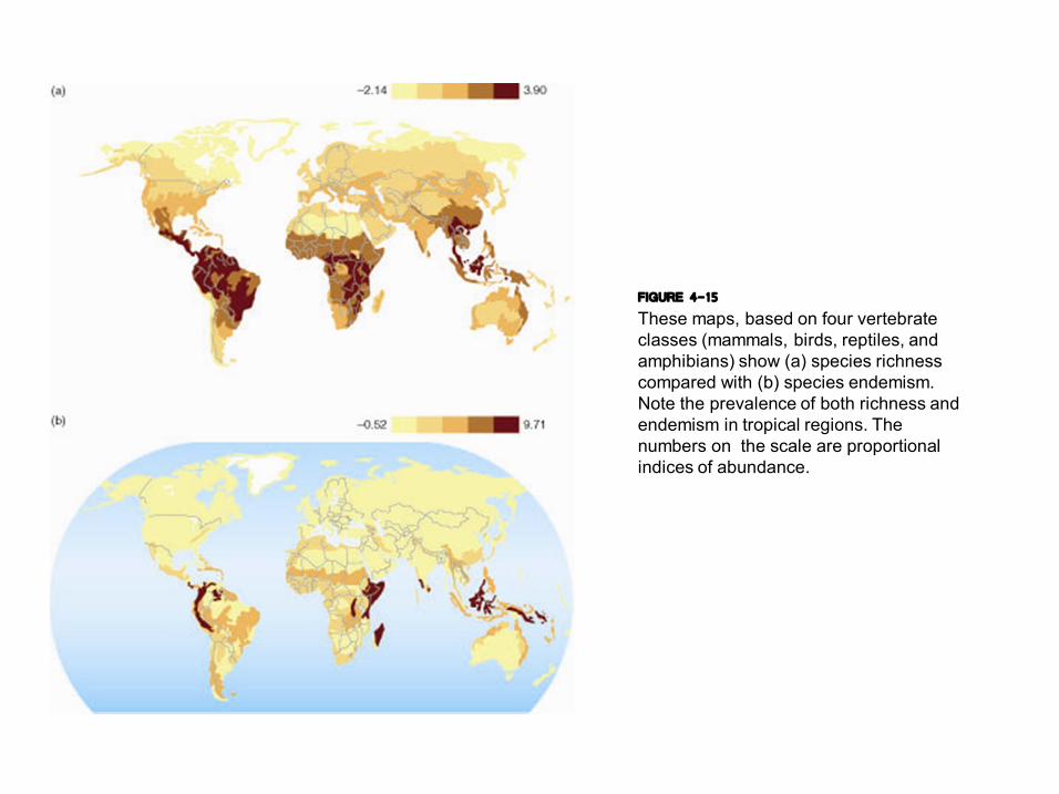
FIGURE 4-15 These maps, based on four vertebrate classes (mammals, birds, reptiles, and amphibians) show (a) species richness compared with (b) species endemism. Note the prevalence of both richness and endemism in tropical regions. The numbers on the scale are proportional indices of abundance.
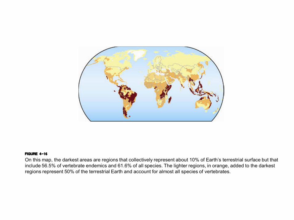
FIGURE 4-16 On this map, the darkest areas are regions that collectively represent about 10% of Earth’s terrestrial surface but that include 56.5% of vertebrate endemics and 61.6% of all species. The lighter regions, in orange, added to the darkest regions represent 50% of the terrestrial Earth and account for almost all species of vertebrates.
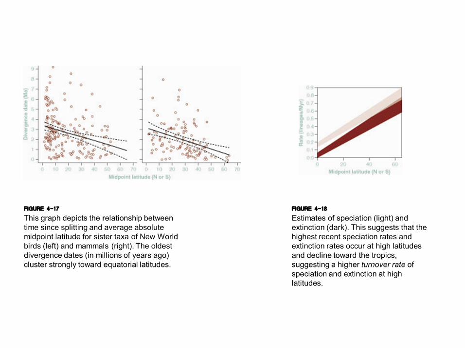
FIGURE 4-17 This graph depicts the relationship between time since splitting and average absolute midpoint latitude for sister taxa of New World birds (left) and mammals (right). The oldest divergence dates (in millions of years ago) cluster strongly toward equatorial latitudes.
FIGURE 4-18 Estimates of speciation (light) and extinction (dark). This suggests that the highest recent speciation rates and extinction rates occur at high latitudes and decline toward the tropics, suggesting a higher turnover rate of speciation and extinction at high latitudes.
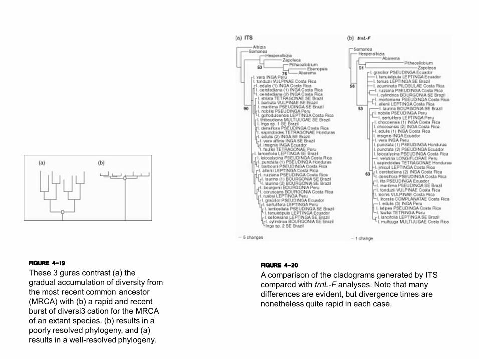
FIGURE 4-19 These 3 gures contrast (a) the gradual accumulation of diversity from the most recent common ancestor (MRCA) with (b) a rapid and recent burst of diversi3 cation for the MRCA of an extant species. (b) results in a poorly resolved phylogeny, and (a) results in a wellresolved phylogeny.
FIGURE 4-20 A comparison of the cladograms generated by ITS compared with trnLF analyses. Note that many differences are evident, but divergence times are nonetheless quite rapid in each case.
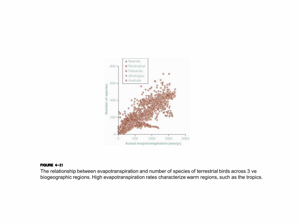
FIGURE 4-21 The relationship between evapotranspiration and number of species of terrestrial birds across 3 ve biogeographic regions. High evapotranspiration rates characterize warm regions, such as the tropics.
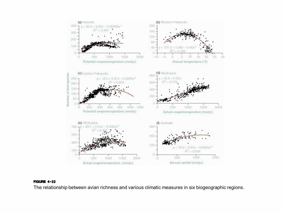
FIGURE 4-22 The relationship between avian richness and various climatic measures in six biogeographic regions.
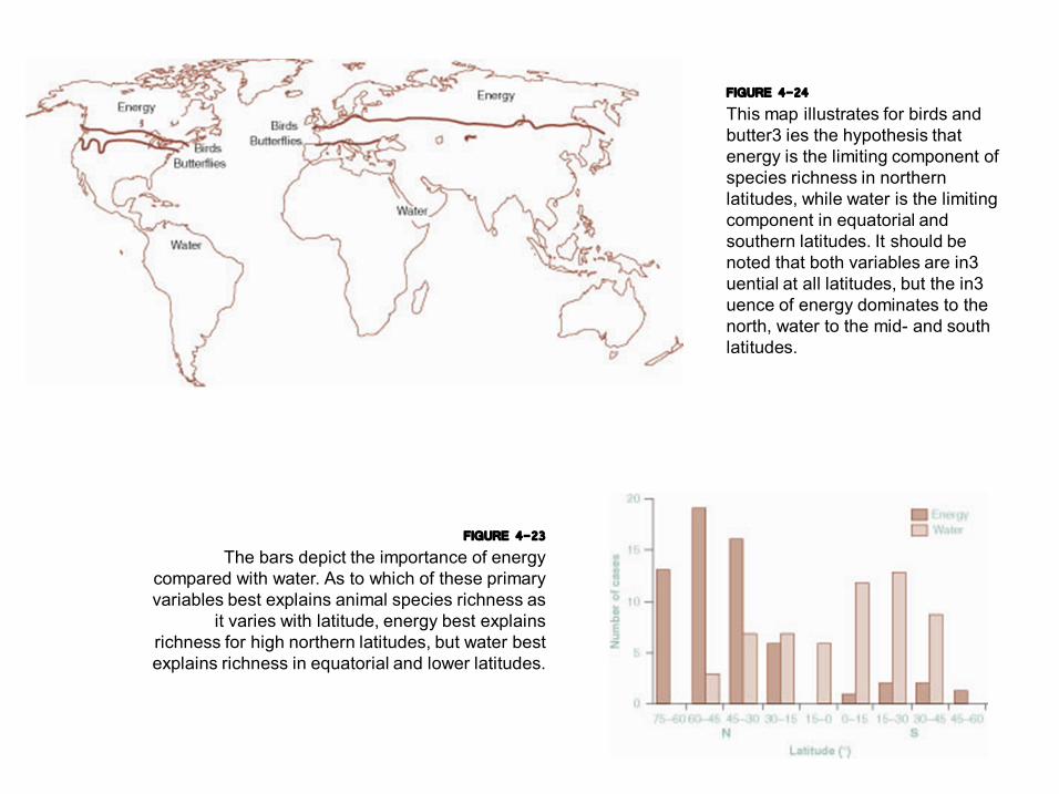
FIGURE 4-23 The bars depict the importance of energy
compared with water. As to which of these primary variables best explains animal species richness as
it varies with latitude, energy best explains richness for high northern latitudes, but water best explains richness in equatorial and lower latitudes.
FIGURE 4-24 This map illustrates for birds and butter3 ies the hypothesis that energy is the limiting component of species richness in northern latitudes, while water is the limiting component in equatorial and southern latitudes. It should be noted that both variables are in3 uential at all latitudes, but the in3 uence of energy dominates to the north, water to the mid and south latitudes.

FIGURE 4-25 (a) The pattern of change in morphospecies of pollen and spores as it ranges from the Miocene through the Paleocene. (b) The change that is evident in the line shows Paleocene pollenbased 3 oras to be clearly different from Miocene pollenbased 3 oras. (c) A cluster analysis showing three distinct pollenbased 3 oras through time. (d) The change in global oxygen for the Cenozoic. Note the rough correlation between the oxygen curve (d) and the morphospecies curve (a).
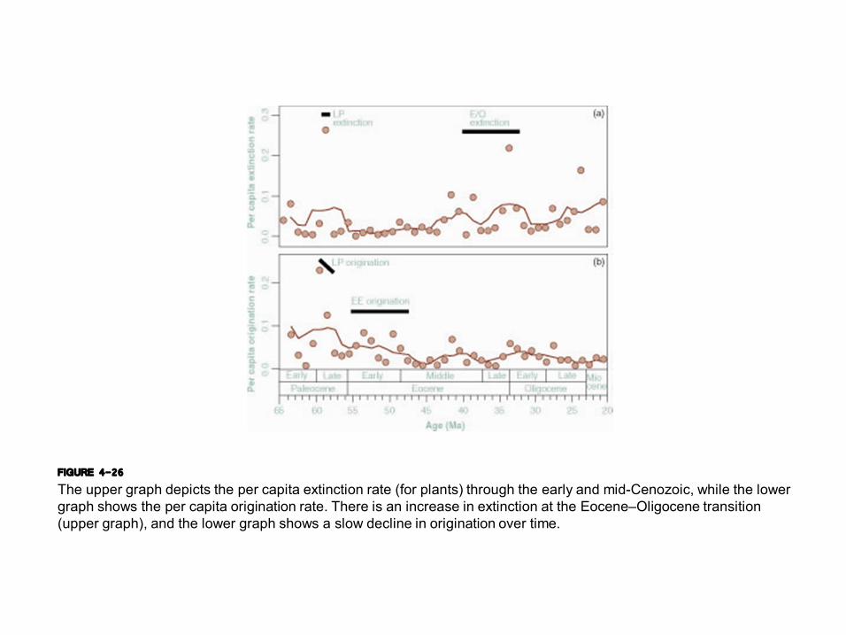
FIGURE 4-26 The upper graph depicts the per capita extinction rate (for plants) through the early and midCenozoic, while the lower graph shows the per capita origination rate. There is an increase in extinction at the Eocene–Oligocene transition (upper graph), and the lower graph shows a slow decline in origination over time.
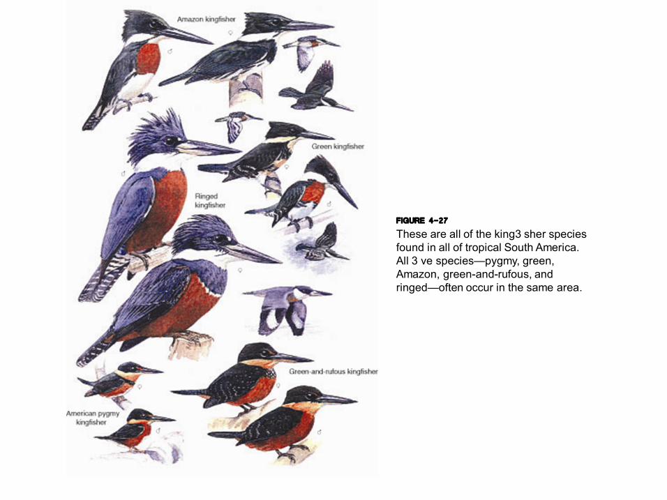
FIGURE 4-27 These are all of the king3 sher species found in all of tropical South America. All 3 ve species—pygmy, green, Amazon, greenandrufous, and ringed—often occur in the same area.
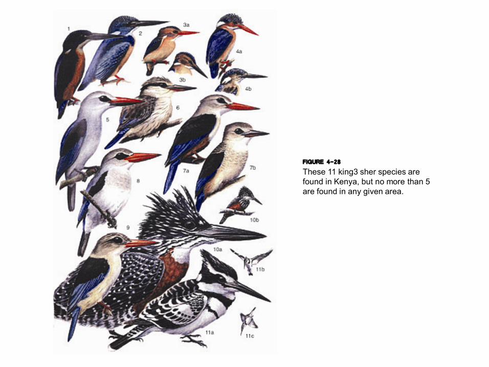
FIGURE 4-28 These 11 king3 sher species are found in Kenya, but no more than 5 are found in any given area.
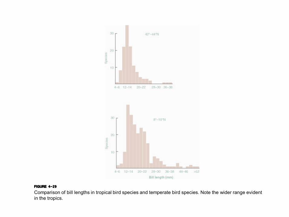
FIGURE 4-29 Comparison of bill lengths in tropical bird species and temperate bird species. Note the wider range evident in the tropics.

PLATE 4-11 Large dried tropical leaves form ideal habitats for many arthropods, which are used as food by various bird species.
PLATE 4-12 Lantern3 y, an example of one of many large tropical
insects that extend the arthropod resource base
more widely in the tropics.
PLATE 4-13 BLACKANDWHITE
OWL

PLATE 4-14 BAT FALCON
PLATE 4-15 BLACKCHEEKED WOODPECKER

FIGURE 4-30 This cladogram shows that the temperate and tropical tree species of comparable phylogenetic distribution support similar numbers of folivorous insect species. The cladogram represents 14 tree species from Moravia (temperate zone) and Papua New Guinea (tropical), with branch lengths proportional to the number of nucleotide substitutions in rbcL sequences.
FIGURE 4-31 Host speci3 city in (a) temperate and (b)
tropical trees. Represented are Lepidoptera larvae, Hymenoptera larvae,
Coleoptera larvae, Coleoptera adults, and orthopteroid adults. Note the
similarity in insect distributions between the tropical and temperate trees.
PLATE 4-17 Riverine sand island in the
Napo River in Ecuador.
PLATE 4-18 This riverine island in Ecuador supports a young stand of rapidly growing Cecropia
trees.
PLATE 4-16 BAMBOO STAND
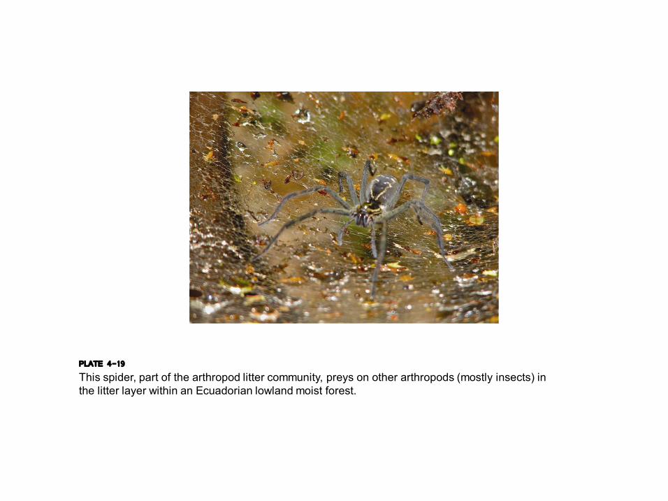
PLATE 4-19 This spider, part of the arthropod litter community, preys on other arthropods (mostly insects) in the litter layer within an Ecuadorian lowland moist forest.
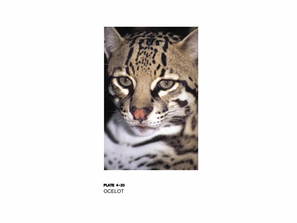
PLATE 4-20 OCELOT
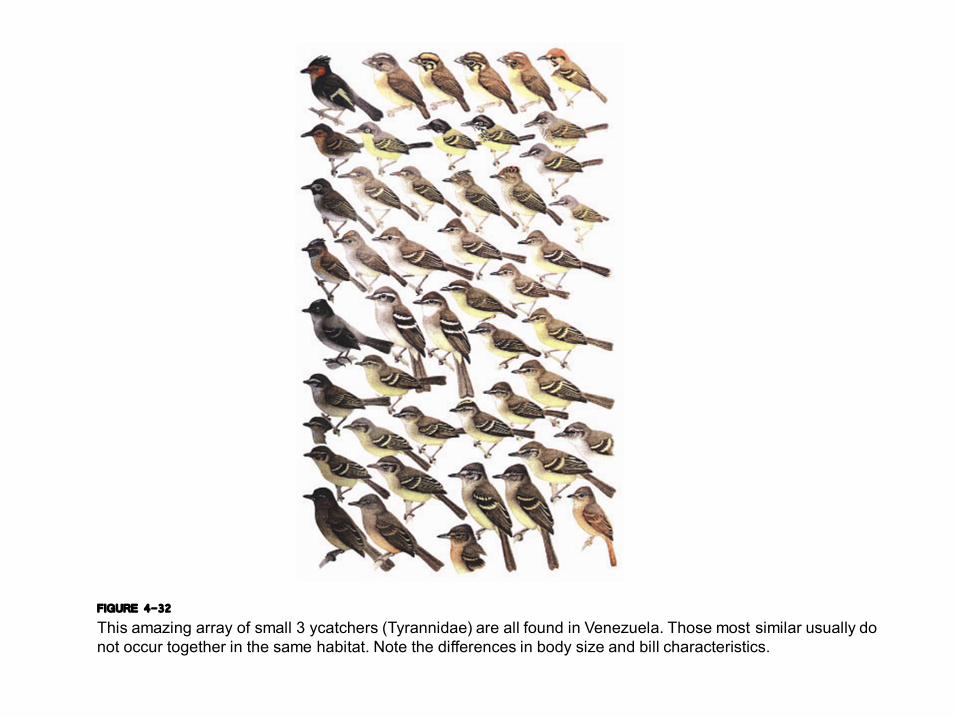
FIGURE 4-32 This amazing array of small 3 ycatchers (Tyrannidae) are all found in Venezuela. Those most similar usually do not occur together in the same habitat. Note the differences in body size and bill characteristics.
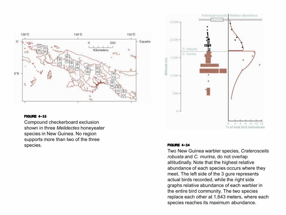
FIGURE 4-33 Compound checkerboard exclusion shown in three Melidectes honeyeater species in New Guinea. No region supports more than two of the three species. FIGURE 4-34
Two New Guinea warbler species, Crateroscelis robusta and C. murina, do not overlap altitudinally. Note that the highest relative abundance of each species occurs where they meet. The left side of the 3 gure represents actual birds recorded, while the right side graphs relative abundance of each warbler in the entire bird community. The two species replace each other at 1,643 meters, where each species reaches its maximum abundance.
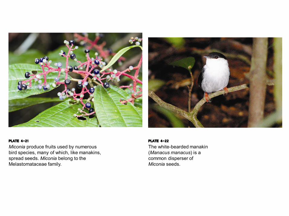
PLATE 4-21 Miconia produce fruits used by numerous bird species, many of which, like manakins, spread seeds. Miconia belong to the Melastomataceae family.
PLATE 4-22 The whitebearded manakin (Manacus manacus) is a common disperser of Miconia seeds.
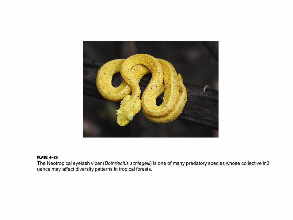
PLATE 4-23 The Neotropical eyelash viper (Bothriechis schlegelii) is one of many predatory species whose collective in3 uence may affect diversity patterns in tropical forests.
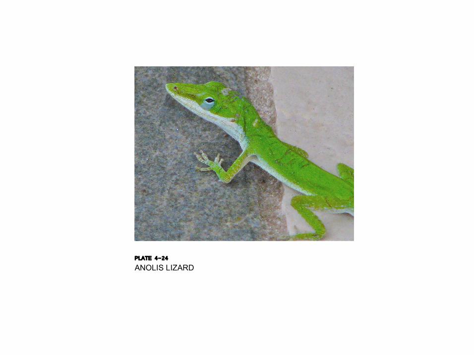
PLATE 4-24 ANOLIS LIZARD
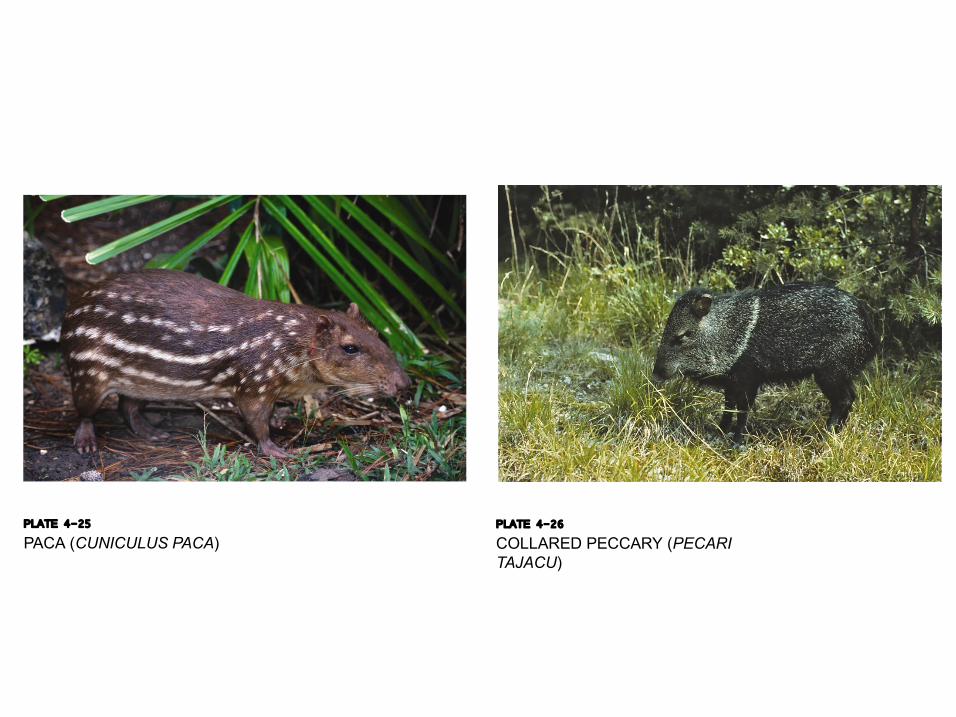
PLATE 4-25 PACA (CUNICULUS PACA)
PLATE 4-26 COLLARED PECCARY (PECARI TAJACU)
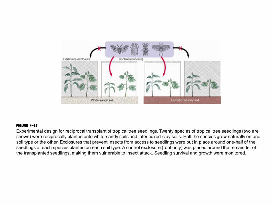
FIGURE 4-35 Experimental design for reciprocal transplant of tropical tree seedlings. Twenty species of tropical tree seedlings (two are shown) were reciprocally planted onto whitesandy soils and lateritic redclay soils. Half the species grew naturally on one soil type or the other. Exclosures that prevent insects from access to seedlings were put in place around onehalf of the seedlings of each species planted on each soil type. A control exclosure (roof only) was placed around the remainder of the transplanted seedlings, making them vulnerable to insect attack. Seedling survival and growth were monitored.
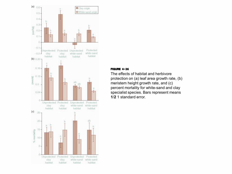
FIGURE 4-36 The effects of habitat and herbivore protection on (a) leaf area growth rate, (b) meristem height growth rate, and (c) percent mortality for whitesand and clay specialist species. Bars represent means 1/2 1 standard error.
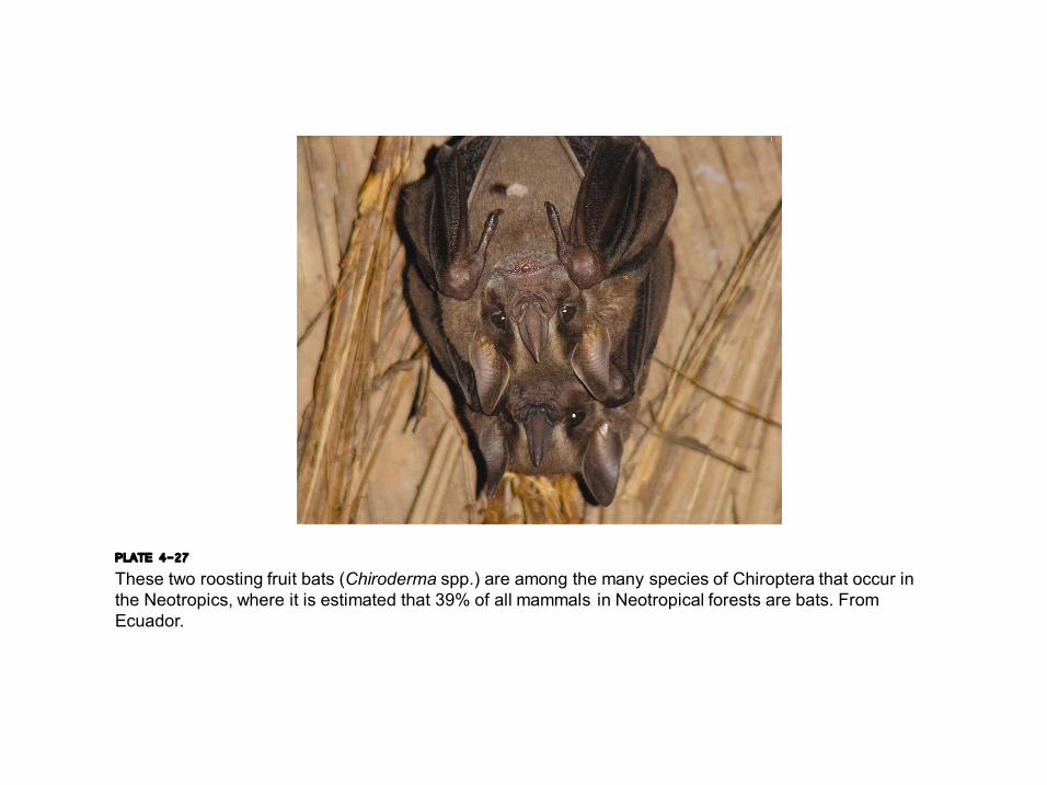
PLATE 4-27 These two roosting fruit bats (Chiroderma spp.) are among the many species of Chiroptera that occur in the Neotropics, where it is estimated that 39% of all mammals in Neotropical forests are bats. From Ecuador.

FIGURE 4-37 This diagram represents simple examples of interaction diversity in subsamples of communities: interaction richness for each subsample is (a) 2, (b) 3, (c) 4, (d) 5, (e) 6, and (f) 10.