inside this issue: a flag for all mankind in the 21st … flag for all mankind in the 21st century...
TRANSCRIPT

Portland Flag Association Publication 1
Portland Flag Association “Free, and Worth Every Penny!” Issue 31 December 2011
A Flag for All Mankind in the 21st Century
There are thousands of flags representing many different groups of people around the world. The United Nations flag and the Olympic flag are the most inclusive. But there is, I believe, a need for a flag that represents each and every one of us, as a member of the human species, and so I have designed a flag with that in mind.
People are divided by race, religion, nationality, and many other factors large or small. Recent developments in science, and concerns for the ecological stability of our planet, have brought some people together and pushed others apart. We need to be reminded of our com-mon humanity and our home.
Flags appear regularly in the news as emblems of our various inter-ests and alliances, and are surely a very important means of commu-nication and representation. This is one reason why I have chosen to express my feelings and my
A Flag for All Mankind 1
Japanese Battle Standards 2
November 2011 Flutterings 4
Remembering John Hood 5
Flags in the News 5
New Wave: Facts About Flags 6
The Flag Quiz 7
The Seal of the State of Jefferson 8
Next Meeting Announcement 8
INSIDE THIS ISSUE:
The human race is a race of cowards, and I am not
only marching in that procession but I am carrying a banner.
—Mark Twain If you wish to compliment the interim editor, or to contribute in the future, contact Ted Kaye at 503-223-4660 or [email protected]. If you wish to complain, call your mother.
understanding of some of this extremely complex set of factors with a flag.
The specific design is representa-tive of earth, air, fire, and water (elements found in many historic, religious, and early scientific contexts), as well as the sun—the ultimate source of power for our world.
The colors express these: earth—black, air—white, fire—red, water—blue, and the sun—yellow. In addition to the extremes of black and white are added the three primary colors.
The particular graphic way in which I have brought these together in the form a flag are simply my own sense of design.
www.portlandflag.org
By David W. Ferriday
Portland Flag Association Publication 2
Japanese Battle Standards: Military Communication of Feudal Japan
A variety of methods were used to communicate across the bat-tlefield in feudal Japan, much like in any other culture. These methods included visual signals like flags and banners and audi-ble signals using drums and horns. Messengers on horseback used ciphers and other methods to prevent their messages from falling into the wrong hands.
By the beginning of the Sengoku Period, battlefield communica-tions had become fairly compli-cated affairs, with larger armies than ever before, and a multitude of flags and banners covered in a myriad of colors and designs. Since the beginnings of what we would today recognize as Japa-nese culture, and probably earlier, various symbols, crests, banners, or markings on armor were used to help identify and distinguish warriors on the battlefield.
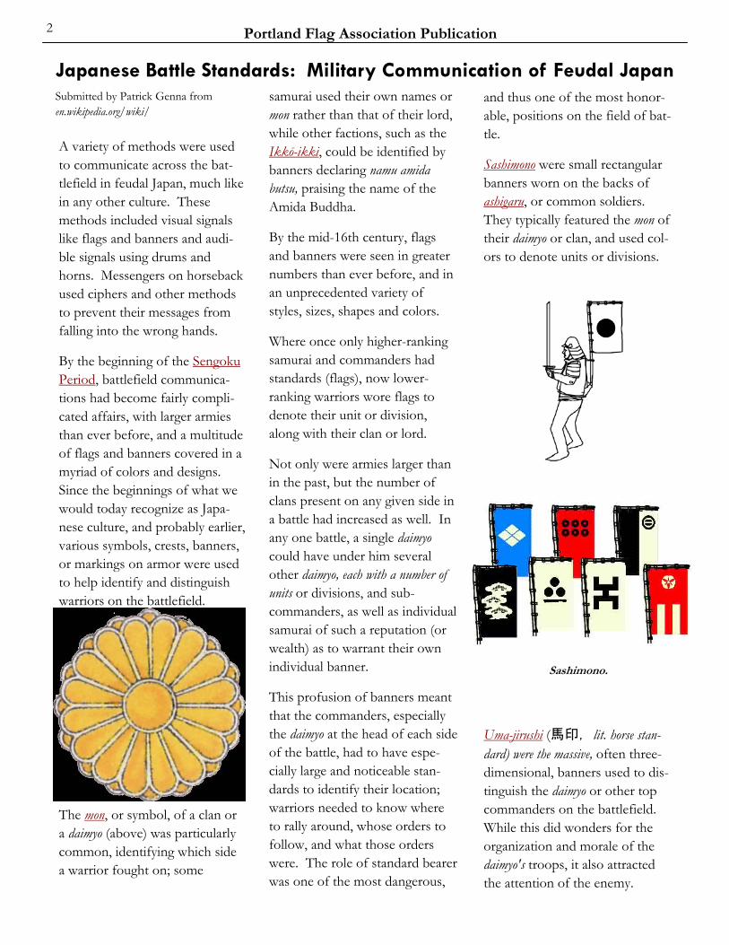
The mon, or symbol, of a clan or a daimyo (above) was particularly common, identifying which side a warrior fought on; some
samurai used their own names or mon rather than that of their lord, while other factions, such as the Ikkō-ikki, could be identified by banners declaring namu amida butsu, praising the name of the Amida Buddha.
By the mid-16th century, flags and banners were seen in greater numbers than ever before, and in an unprecedented variety of styles, sizes, shapes and colors.
Where once only higher-ranking samurai and commanders had standards (flags), now lower-ranking warriors wore flags to denote their unit or division, along with their clan or lord.
Not only were armies larger than in the past, but the number of clans present on any given side in a battle had increased as well. In any one battle, a single daimyo could have under him several other daimyo, each with a number of units or divisions, and sub-commanders, as well as individual samurai of such a reputation (or wealth) as to warrant their own individual banner.
This profusion of banners meant that the commanders, especially the daimyo at the head of each side of the battle, had to have espe-cially large and noticeable stan-dards to identify their location; warriors needed to know where to rally around, whose orders to follow, and what those orders were. The role of standard bearer was one of the most dangerous,
Submitted by Patrick Genna from en.wikipedia.org/wiki/
and thus one of the most honor-able, positions on the field of bat-tle.
Sashimono were small rectangular banners worn on the backs of ashigaru, or common soldiers. They typically featured the mon of their daimyo or clan, and used col-ors to denote units or divisions.
Uma-jirushi (馬印, lit. horse stan-dard) were the massive, often three-dimensional, banners used to dis-tinguish the daimyo or other top commanders on the battlefield. While this did wonders for the organization and morale of the daimyo's troops, it also attracted the attention of the enemy.
Sashimono.

Portland Flag Association Publication 3
The horo (母衣)(below) were large pieces of cloth, not entirely unlike a cape or cloak, which would be worn on the back, sup-ported and shaped by a series of bamboo or wooden sticks. In addition to displaying an identify-ing mon or symbol, and making the samurai appear larger-than-life, it served the purpose of arrow entangler. Ultimately, it marked that warrior as someone important, usually a messenger or scout, and worthy of honorable treatment, even by his enemies.
A daimyo would often signal with his war fan (gunbai or gunpai) as well. While these fans were much larger than the usual paper or silk ones, it seems unlikely that orders could be conveyed to thousands or tens of thousands of warriors in this way.
Saihai were signal batons used by samurai commanders, these were small hand-held staffs with strips of leather, lacquered paper, or a streamer of animal hair on one end.
On the scroll above are depicted uma-jirushi—battle standards set up beside a military commander's horse to show his position—of 170 soldiers. The illustrations are printed in color and also painted by hand. This scroll is important for marking the origin of multi-color woodblock printing (nishiki-e) in Japan. The sixth volume of this work, which was found only recently, is the only scroll still known to exist. It was created 1624-1644; its Japanese title is 御馬印.
Hata-jirushi were one of the older types of standards; they were long streaming banners attached to a crosspiece and held up on a long bamboo or wooden rod.
Nobori (幟, lit. flag, banner ) (right)are perhaps the best-known of feudal Japanese military flags. Introduced somewhat later than the hata-jirushi, a nobori was a stiff-ened piece of cloth, attached to a pole through loops, and includ-ing, of course, a mon or other identifying mark on it, to repre-sent the samurai or daimyo who carried it.
A variety of Uma-Jirushi designs, taken from the 15th century book O Uma Jirushi. For other pages from this book see the collection of Japanese heraldry
at http://commons.wikimedia.org.
Nobori.
Horo.
Portland Flag Association Publication 4
In our November meeting, hosted generously by Mike Hale, we cov-ered a lot of territory (a flag lot?).
Scott Mainwaring passed around a Chinese car-flag attachment he’d recently picked up on eBay, and read excerpts from a new book, Christ to Coke, which has a section on the American flag.
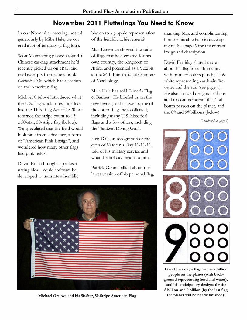
Michael Orelove introduced what the U.S. flag would now look like had the Third flag Act of 1820 not returned the stripe count to 13: a 50-star, 50-stripe flag (below). We speculated that the field would look pink from a distance, a form of “American Pink Ensign”, and wondered how many other flags had pink fields.
David Koski brought up a fasci-nating idea—could software be developed to translate a heraldic
blazon to a graphic representation of the heraldic achievement?
Max Liberman showed the suite of flags that he’d created for his own country, the Kingdom of Æfira, and presented as a Vexibit at the 24th International Congress of Vexillology.
Mike Hale has sold Elmer’s Flag & Banner. He briefed us on the new owner, and showed some of the cotton flags he’s collected, including many U.S. historical flags and a few others, including the “Jantzen Diving Girl”.
Ken Dale, in recognition of the even of Veteran’s Day 11-11-11, told of his military service and what the holiday meant to him.
Patrick Genna talked about the latest version of his personal flag,
thanking Max and complimenting him for his able help in develop-ing it. See page 6 for the correct image and description.
David Ferriday shared more about his flag for all humanity—with primary colors plus black & white representing earth-air-fire-water and the sun (see page 1). He also showed designs he’d cre-ated to commemorate the 7 bil-lionth person on the planet, and the 8th and 9th billions (below).
(Continued on page 5)
November 2011 Flutterings You Need to Know
David Ferriday’s flag for the 7 billion people on the planet (with back-
ground representing land and water), and his anticipatory designs for the
8 billion and 9 billion (by the last flag the planet will be nearly finished). Michael Orelove and his 50-Star, 50-Stripe American Flag

Portland Flag Association Publication 5
Ted Kaye distributed posters, free thanks to Alain Raullet (Breton Flags) and Peter Orenski (American Indian Flags), and showed an un-usual 99% flag observed the day before at the Chap-man Square en-campment of the Occupy Portland protest (lower right). He also passed around an image of the Timbers Army waving dozens of Portland flags at a recent game (right).
(Continued from page 4)
Occupy Portland, the recent protest movement and encamp-ment in downtown Portland, has used flags in interesting ways. Ted Kaye observed a march in late October in which the flags used included USA, Cascadia, Tunisia, and red (IWW) and black (Anarchists).
Part of a national movement, the Portland group created a logo based on the flag of the city of Portland, a wonderfully innova-tive use (what would Doug Lynch have thought?).
This unusual “Gadsden Variant”, drawn on cardboard by an artist named Bobby, turns the well-known rattlesnake into the “99%” image reflecting the movement’s motto “We are the 99%”.
Flags in the News
Remembering John Hood We spent a special time in our November meeting recalling John Hood, a charter member of our Portland Flag Association and the creator and longtime editor of this Vexilloid Tabloid, who died in September.
Mike described John as the best example of charity he’d ever known. In one example, he and Virginia would often bring baked treats to Mike’s staff at Elmer’s. David K. remembered how John could gently bring a wide-ranging PFA discussion back on track. Michael recalled the first meeting of the PFA he had attended—in John’s living room.
Ken talked about how he had written to Dear Abby after 9/11, complaining about the disrespect shown by people allowing the US flag to get ragged and dirty; John
read the letter and recruited Ken to the PFA. Ted told a humorous story about John and Vivian at the NAVA 40 meeting in Reno. John S. recalled how John would call to remind him to attend PFA meetings, and Max showed a book that John had given him: How to Start your own Country.
David F. was the last of us to see John, days before his death, visit-ing just after our September meet-ing to deliver flag gifts to him and Vivian. Patrick reminisced about John’s generosity in giving him rides to PFA meetings. And Scott remembered how nice John could be even when pestering him for an item for the Vexilloid Tabloid, and John’s constant and welcom-ing hospitality. Then, as re-quested by Vivian, we engaged in a fulfilling and useful discussion about what to do with John’s flag collection.
John Niggley related how he had the opportunity to help unfurl a gigantic Timbers banner on the field at Jeld-Wen Park. The Tim-bers, of course, are our [new] ma-jor league soccer team.

Portland Flag Association Publication 6
5”x7”, full color, 144 pages Black Dog Publishing (2011)
ISBN: 978-1-907317-30-9
Many of us like to give flag books as gifts to those who don’t yet fully understand why flags appeal to us. Here’s one that merits a place in the “present drawer”.
New Wave is not the typical flag book—a compilation of flags of the world arranged by country. While it devotes a few pages in the back to national flags and some sub-national sets (Brazil, Canada, Spain, U.S.A.), it is more a book about flags. Sections cover: The History of the Flag, Colours, National Flag Stories, Twentieth Century Flags, Flag Families, Religious Flags, Protest Flags, Flag Etiquette, Flags at Sea, Sports Flags, Popular Culture, Sovereign Flags, and Flag Terms.
A pocket-sized paperback, New Wave uses a bold graphic style with large blocks of color and a very dynamic layout. It would engage both a younger reader and an adult. It has color on every page. While a British book, hardly any aspects of it would jar an American or Canadian reader. And though Max and Patrick found some factual errors in our last meeting, it is well-researched and quite accurate. Interestingly, no author is credited, as if the book were a team effort at its London publishing house.
New Wave is part a com-pilation of flag trivia, part a mini-reference book, and part a series of short articles on several flag-related topics.
The fun section on Fictional Flags probably makes it the only flag book with an illustration of Star Trek’s Mr. Spock. In a shout-out to vexillologists, the flag of FIAV is included among the Interna-tional Flags.
Its own blurb correctly says “Spanning geography, politics, history, culture, design, and art and presented in an accessible and refreshing format, New Wave is an entertaining exploration of the diversity of flags, as well as the rituals and communication as-pects that inform them.”
Black Dog Publishing is offering NAVA members a 40% discount off the regular price of US$15.00 for New Wave: Facts About Flags.
To order at the discounted price of US$9.00 (£4.77 for customers outside the U.S.) plus postage, email [email protected] with your delivery address and quoting ‘NAVA Offer’ as the sub-ject heading. You will then re-ceive the book with an invoice (payment can be made via check or credit card).
Book Review: New Wave – Facts about Flags
Personal Flag: J. Patrick Genna
[With the editor’s apologies for the error in the last issue, here is the correct image for Patrick Genna’s personal flag, along with its formal description.]
The green, white, and red colors indicate Patrick’s Italian immi-grant origin and the red-white-blue his American citizenship.
Also, the blue-white-red (in re-verse) represent his place of birth, St. Louis, a French settlement founded 25 years before the Revolution of 1789.
The royal fleur de lis represents St. Louis, while the Mississippi and Missouri rivers below it are repre-sented by a triple wave of white-blue-white.
The yellow or gold disk repre-sents both the Midwestern (Missouri) sun and a turning circle of life and death centered in Bud-dhism.
Max Liberman produced the artwork for the flag.
Update on Patrick Genna’s Flag
By Ted Kaye

Portland Flag Association Publication 7
What Was that Flag? Answers to the last quiz What’s that Flag? By Max Liberman
The theme of these flags is obvi-ous, but what do they represent?
Answers in the next issue...
Pakistan.
These are all national civil ensigns (flags flown on civilian ships) which differ from the national flag.
Singapore.
Albania.
Luxembourg. Israel.
Malta.

Portland Flag Association Publication 8
January Meeting
The next meeting of the Portland Flag Association will be at 7 p.m., Thursday, January 12, 2012, at Michael Orelove’s house, 2905 S.E. Palmquist Rd #4, Gresham. He lives in a trailer park and the address is for the overall park; the trailer is #4. (503) 703-4495.
See the map at right.
We look forward to seeing those of you who have been otherwise com-mitted, and hear some new war sto-ries, see some different flags, and hear some provocative discussion.
Kathleen and I went to the museum to see the gold pan, which was in the vault. After seeing our Jefferson flag and hearing that I was a member of the Portland Flag Association, the staff put on white gloves and brought out the pan from the vault. I also put on white gloves and held both the pan and the flag for a photo.
The museum has wonderful ex-hibits about the Native American culture of the area and is a nice place to stop and visit if you are driving by on Interstate 5.
[ Note: Ted Kaye’s comprehen-sive article on the Jefferson’s history, flag, and symbols, “The State of Jefferson”, was pub-lished in The Flag Bulletin #150 (vol. 32, no. 1), Jan.–Feb. 1993, pp. 22–30.]
The Seal of the State of Jefferson By Michael Orelove
Kathleen Forrest and I recently drove from Portland to the San Francisco area and passed through the State of Jefferson (parts of southern Oregon and northern California).
We carried a flag of the State of Jefferson on their trip. The flag bears a reproduction of the seal of the State of Jefferson—a gold pan with two large Xs, represent-ing the feeling of being double crossed by the two state govern-ments.
The original Jefferson Citizen’s Committee chose Yreka, Califor-nia, as the interim state capital in November 1941.
The original seal of the State of Jefferson is at the Siskiyou County Museum in Yreka.
The original 1941 seal of the State of Jefferson, a gold pan with two Xs on the bottom and “The Great Seal of State of Jefferson” around the rim,
shown with a contemporary State of Jefferson flag (no flags were created
during the actual secession).