informal economic activity - south carolina state library
TRANSCRIPT

Informal Economic Activity
Rebecca M. Gunnlaugsson
Discussion Paper DP-2008-002
South Carolina Department of Commerce
3/14/2008
2008 Discussion Paper
A County-Level Analysis
of South Carolina’s Pee
Dee Region
Digitized by South Carolina State Library
Informal Economic Activity
A County-Level Analysis of South Carolina
Rebecca M. Gunnlaugsson
Abstract
The informal—black, shadow, or underground—economy, is commonly known for
encompassing illegal activities. More generally, the informal economy covers all economic activity
that occurs ―off the books,‖ thus unrecorded and unreported to governmental taxing authorities.
Research on the informal economy in the U.S. points to its prevalence in low-wage, service-based
local economies. This study investigates the presence of informal economic activity in the Pee Dee
region of South Carolina, comprising the counties of Chesterfield, Darlington, Dillon, Florence,
Marion, and Marlboro. Results provide strong evidence of a sizeable underground economy.
Furthermore, the results point to the same condition existing throughout many regions of the state.
Utilizing the labor market discrepancy method, the size of the informal economy was estimated at
9.6% in the Pee Dee region in 2005, with estimates ranging as high as 16.6% and as low as 3.4% for
the counties within. Furthermore, results point to a steadily increasing informal sector in all counties
from 2000 to 2006.
Key Words: Informal Economy; Underground Economy, Formal and Informal Sectors
JEL Classification Numbers: E26; O17
This document is authorized for internal use only. Do not quote or cite without express permission
of the author and the South Carolina Department of Commerce.
South Carolina Department of Commerce 1201 Main Street, Suite 1600 Columbia, SC 29201 www.sccommerce.com
Digitized by South Carolina State Library

TABLE OF CONTENTS
1. Introduction ............................................................................................................................................... 1
2. Literature Review ....................................................................................................................................... 1
2.1 Ethnographic studies ........................................................................................................................ 1
2.2 Economic Studies .............................................................................................................................. 2
2.2.1 Macroeconomic Approaches ....................................................................................................... 2
2.2.2 Microeconomic Approaches ....................................................................................................... 3
2.2.3 Informal Economy Estimates ..................................................................................................... 4
3. Empirical Methods .................................................................................................................................... 5
4. Results ......................................................................................................................................................... 7
4.1 Pee Dee Region Overview ............................................................................................................... 7
4.2 Availability of Labor ....................................................................................................................... 11
4.3 Informal Economy Estimates ....................................................................................................... 13
4.3.1 Self-Reported Employment Versus Employer-Reported Employment ............................. 14
4.3.3 Wage and Salary Employment Versus Total Private Employment ..................................... 14
4.3.4 Income Tax Filers Versus Population ...................................................................................... 16
4.3.4 Industry Concentration .............................................................................................................. 17
4.3.5 Compilation of Estimates .......................................................................................................... 21
5. Conclusion and Recommendations ...................................................................................................... 22
References ......................................................................................................................................................... 24
Appendix ........................................................................................................................................................... 26
Digitized by South Carolina State Library

2008-001 | Discussion Paper Page | 1
1. Introduction
The informal—black, shadow, or underground—economy, is commonly known for
encompassing illegal activities (including drugs, gambling, or prostitution) and illegal trade in legal
goods (such as tobacco, alcohol, or prescription drugs). More generally, the informal economy
covers all economic activity that occurs ―off the books,‖ thus unrecorded and unreported to
governmental taxing authorities. This type of activity can include babysitting, housecleaning, yard
work, handyman services, agricultural services, construction services, and so on. Much research on
the informal economy in the U.S. points to its prevalence in low-wage, service-based local
economies. Unfortunately, because informal economies are, by definition, unrecorded, they are also
exceptionally hard to quantify for exactly the same reason. This study will examine existing methods
for approximating the size of local informal economic activity and apply those methodologies to
determine the size of the informal economy in South Carolina. Because South Carolina‘s
demography is so diverse—varying greatly in population density, education, and income across
geographic regions—this paper seeks to quantify informality at the local county level. In particular,
the study will focus the majority of local analysis on the Pee Dee region, comprising the counties of
Chesterfield, Darlington, Dillon, Florence, Marion, and Marlboro. Section 2 describes past research
undertaken in quantifying and describing the informal economy. Section 3 presents the methodology
employed in this study to quantify the size of the informal economy at the county level. Section 4
presents the results of the implemented methodology. Finally, Section 5 concludes with possible
policy implications and avenues for further research.
2. Literature Review
Previous studies focusing on informal economic activity have typically fallen into one of the
following two categories: 1.) ethnographic studies which interview and observe the actions and
interactions of a small group of individuals, and 2.) economic studies which apply data to empirical
models to quantify activity.
2.1 Ethnographic studies
Ethnographic studies typically involve the use of specifically designed household surveys which
include extensive interviews with the members of the household. Cohen and Stephens (2005) focus
interviews in Fayette County, Pennsylvania, a community that was largely dependent upon
manufacturing and extractive industries (coal and steel) until the 1970‘s when these industries
declined. The county has persistently high unemployment, poverty, public assistance recipients, and
low post-secondary school attendance. They note the absence of jobs that pay well for both the
unskilled and low-skilled workers who inhabit the region. They find many of the subjects ―co-exist
between two worlds, low wage subsistence in the formal economy and some involvement in
Digitized by South Carolina State Library

2008-001 | Discussion Paper Page | 2
informal economic activity ‗as it comes up.‘‖ (Cohen and Stephens, 2005) These activities included
many ―off the books‖ jobs at local establishments or homes as well as actual illegal activities, such as
growing or selling marijuana. It is also, they determined, the ―near poor,‖ as opposed to the
poorest, that participate most frequently in the informal economy, and they typically do so to
supplement their incomes from formal jobs. They also noted a prevalence of acceptance for jobs
which fell outside the view of the government and, thus, taxation.
Mencken and Maggard (1999) survey a random sample of 521 households in West Virginia in
1996 and find 22% of them participate in the informal economy. They further find that only 8% of
those who engaged in informal jobs earned more than 20% of their household income in that
manner, confirming the Cohen and Stephens (2005) finding that most informal earnings are to
supplement income from jobs in the formal sector. The authors attribute much of the presence of
the informal economy to the restructuing of West Virginia‘s rural regions from an industrial
economy to a service-based one.
2.2 Economic Studies
Economic papers seek to quantify the size of the informal sector through empirical analyses.
Again, the lack of recorded data on the informal sector has presented difficulties in all past studies.
This section outlines several of the methods that have been utilized in the past along with their
findings.
2.2.1 Macroeconomic Approaches
Historically, a majority of studies have employed macroeconomic methods to estimate the size
of the informal sector. The first of such methods is the ―currency demand‖ or ―currency ratio‖
approach developed and modified by Cagan (1958), Tanzi (1983), and Bhattacharyya (1990). This
approach hinges upon the assumption that informal transactions take place in cash. Thus, an
increase in informal economic activity would require an increase in the demand for currency relative
to either tax burden or GDP. This approach is limited by the facts that not all informal transactions
occur in cash, the approach requires no informal economic activity in the base year, and an
increasingly global economy has rendered effective tracking of U.S. currency more difficult.
The second of these techniques is the ―transactions‖ method developed by Feige (1979), which
assumes that the ratio between the number of transactions that take place in an economy and its
GNP. Using Fisher‘s quantity equation to estimate the number of transactions, the percentage of
GNP which is produced by the informal sector can be estimated. Again, this method requires the
informal sector activity to be zero in the base year. Additionally, it assumes a constant ratio between
transactions and GNP, and it requires precise estimates of transactions.
A third macroeconomic procedure is the ―physical input‖ or ―electricity consumption‖ method,
pioneered by Kaufmann and Kaliberda (1996). This method assumes that the best proxy for overall
economic activity is energy use. Thus, growth in the ratio between electricity consumption and GDP
indicates the growth of informal economic activity. Several issues make this method unreliable as
Digitized by South Carolina State Library

2008-001 | Discussion Paper Page | 3
well, including the fact that gains in energy efficiency over time are not captured and not all informal
activities require large amounts of electricity usage.
The final macroeconomic technique is the ―dynamic multiple indicators multiple causes‖
(DYMIMIC) method, first developed by Frey and Weck (1983) but extensively developed since
then. Unlike the previous methods, this one examines the role of more than one factor in both
causing and indicating the presence of informal economic activity. The method treats the growth of
the informal economy as the unobserved variable. Tax burden, regulations, inflation, and real
income are treated as causes. Monetary indicators (cash/money supply ratio), changes in labor force
participation, and formal economy growth are treated as indicators.
These methods are largely criticized for either not being based in economic theory or utilizing
imperfect econometric methods (Thomas 1999). Most importantly, however, is the fact that these
macroeconomic techniques are not applicable to the estimation of small communities. Instead, they
are quite often used to estimate informal sectors at the national level, particularly in developing
nations. Thus, we turn our attention to approaches focused on the microeconomic level.
2.2.2 Microeconomic Approaches
Studies using microeconomic data are relatively few compared with macroeconomic studies.
While all of the aforementioned methods utilize indirect approaches to estimate the informal sector,
the first two of these microeconomic-based methods are direct measures—tax audits and surveys.
The tax audit approach measures the discrepancy between declared income on individuals‘ tax
returns and actual income as determined through audit processes. Feinsten (1999) notes the
problems associated with this method including the difficulties in applying this sample to the general
population, as the sample is typically not randomly selected. Additionally, audits only uncover some
fraction of true noncompliance. Survey methods, used by Mencken and Maggard (1999), directly
collect data from a random sample of households. One disadvantage of such a technique is the
general unwillingness of participants to admit to illegal activities such as involvement in the
underground economy. Another drawback (which is common to tax audits as well) is that they
provide only point estimates, not lending any information to the development of the informal sector
over time. Finally, surveys are time-consuming and costly to implement.
The third of the microeconomic approaches returns to the indirect methods. The ―expenditure‖
method was pioneered by Pissarides and Weber (1989) and further developed by Lyssiotou et. al.
(2004). This approach entails the development of a complete system of demand equations estimated
and from household expenditure data and compared to the household budget constraints, estimated
from income data. The informal economy is then estimated from the discrepancy in the two. This
approach is particularly promising from a local level, the primary obstacle being obtaining data to
produce estimates at a county level. County-level identifiers in the U.S. Consumer Expenditure
Survey are for restricted-use only. Unfortunately, the process of obtaining restricted-use licenses is
extremely long and time-consuming, making this avenue quite possible for a future, more in-depth
study.
Digitized by South Carolina State Library

2008-001 | Discussion Paper Page | 4
The fourth microeconomic approach entails examining ―labor market discrepancies.‖ Using
various labor market statistics, this method utilizes the difference between the number of jobs
reported by employers and the number of people working. Joassart-Marcelli et. al. (2002), examine
the informal economy in Los Angeles using a set of nine different labor market metrics. They find a
significant underground economy that they attribute to factors of globalization, economic
deregulation, and transformation to more flexible forms of production. The data used by this
method is available at the county level. The drawbacks to this method include both the fact that it
does not account for people who are employed in both the informal and formal economies and the
fact that decreases in labor force participation can be due to factors other than just the growth of the
informal sector.
Finally, a ―neighborhood proxies‖ method was developed by the non-profit organization, Social
Compact. This proprietary approach utilizes over 30 sources of data—both public and private—to
formulate a set of eight weighted indicators to develop an estimate of informal activity at a
neighborhood level.
Percentage of households earning less than $30,000 annually
Ratio of household income to expenditures
Percentage of households with no credit or banking histories
Percentage of cash utility payments
Percent of foreign born population
Difference between real home values and model-estimated housing costs
Number of check-cashing providers per acre
Number of check-cashing providers per household
The Social Compact methodology was specifically developed to analyze buying power in urban
areas. It uses a large array of non-traditional data sources that were collected at a neighborhood
level. Unfortunately, the exact methodology is unknown. For a more in-depth study allowing for a
longer time-frame, a similar model could be developed and tailored to rural areas in South Carolina.
2.2.3 Informal Economy Estimates
A summary of the estimates of the size of the informal economy produced by each of the
methods described in sections 2.2.1 and 2.2.2 is provided in Table 1. Two particular trends are
notable. First, the various methods produce a wide range of results. Secondly, the size of the
informal sector is increasing over time.
In addition to these studies whose goal is to estimate the amount of informal economic activity,
other studies examine the factors that lead to larger informal sectors. For instance, Chong and
Gradstein (2007) utilize two macroeconomic methods—electricity consumption and currency
demand—and find that the size of the informal economy is negatively correlated with an economy‘s
wealth and positively correlated with its inequality of income. Using a 1994 survey from a random
sample of Mexican immigrant households in Los Angeles, Marcelli et. al. (1999) obtain estimates of
Digitized by South Carolina State Library

2008-001 | Discussion Paper Page | 5
legal status, years of schooling, age, and gender. They then apply these estimates to a sub-sample of
the 1990 Census Public Use Microdata Sample (PUMS) that includes ―non-Cuban, foreign-born,
Latino labor force participants aged 18-64.‖ They determine the level of informality among this
group in various occupations and use it as a proxy for overall informal economic activity. Their
findings indicate informal work to be highly related to ―lower wages, a higher incidence of poverty,
less education, and a higher likelihood of being employed by others.‖ Workers in occupations with
high levels of informal workers experience lower returns to education than workers in occupations
with low levels of informality.
Table 1: Previous Estimates of the Informal Economy
1 U.S. data summarized in Schneider and Enste (2000) 2 Lyssiotou et. al. (2004) 3 Joassart-Marcelli et. al. (2002) 4 City Drilldown Reports summarized in Social Compact (2007)
3. Empirical Methods
To empirically determine the either the presence or the size of an underground economy
requires employing one or more of the methods described in section 2. The desire to determine
informality at a local level points toward use of the microeconomic methods. In particular, the
expenditure method lends itself well to a county-level analysis. Drawbacks associated with the
lengthy process to obtain restricted-use licenses to access U.S. Consumer Expenditure Surveys
prevent its use in this report. Additionally, analysis of such would provide data for a single year.
U.K.2
Los
Angeles3
Detroit4
Houston4
Santa
Ana4
Miami4
San
Francisco4
Method
1981-
1985
1986-
1990 1993
1998-
2001 2006 2004 2004 2004 2004
Currency
Demand 5.3 6.2
Transactions 21.2 19.4
Electricity
Consumption 7.8 9.9
Surveys 5.6
Tax Audits 8.2 10
Expenditure 10.6
Labor Market
Discrepancies 6.1 10.2 15
Neighborhood
Proxies 9.8 9.7 17 11.6 9.8
Size of Informal Economy (as a % of GDP)
U.S.1
Digitized by South Carolina State Library
2008-001 | Discussion Paper Page | 6
Such a cross-sectional view would prevent analysis of informal economic behavior over time. To do
so, would require repeating the analysis on multiple expenditure surveys spanning several years. This
procedure is an option for a more in-depth study with a longer time frame.
A second promising option is the modification of the neighborhood proxies method to be
applicable to rural areas of South Carolina. Unfortunately, like the previous option, this, too, lends
itself to a long-term study. Implementation of this method will require the following.
o Development of a custom model based on the DYMIMIC strategy. o Identification of data available and required. o Extensive collection of data elements.
In order to provide a basic estimate of the underground economy within a abbreviated period,
this analysis will use the labor market discrepancy method. It will compare five different measures of
labor force size.
1. Working-Age Population: Encompasses individuals ages 15 to 64, as reported by the US
Census Bureau.
2. Labor Force: Estimated by the Bureau of Labor Statistics (BLS) using data from the
Current Population Survey (CPS), the Current Employment Statistics (CES) program, and
the state unemployment insurance (UI) system, this measure comprises people who report
themselves as either being employed or having actively sought work within the past month.
3. Employment: Estimated by the Bureau of Labor Statistics (BLS) using data from the
Current Population Survey (CPS), the Current Employment Statistics (CES) program, and
the state unemployment insurance (UI) system, this measure is a subset of the previous
Labor Force figure and comprises only people who report themselves as employed.
4. Wages and Salary Employment: Comprehensive tabulation, from the BLS Quarterly
Census of Employment and Wages (QCEW), of the workers covered by state
Unemployment Insurance as reported by employers. This measure contains only wage and
salary employment, and does not include self-employment.
5. Total Employment: Produced by the Bureau of Economic Analysis (BEA) as a part of
their Regional Economic Information System (REIS). This data set includes both wage and
salary as well as self-employment data at the 1-digit NAICS level and is estimated using the
QCEW, Census, IRS data.
6. Number of Tax Returns Filed: Reported by the South Carolina Department of Revenue,
this figure indicates the percentage of an area‘s population employed in the formal sector.
In addition to examining the figures at a given point in time, this method will also explore
changes in the measure over time.
Digitized by South Carolina State Library

2008-001 | Discussion Paper Page | 7
4. Results
4.1 Pee Dee Region Overview
The results of this paper focus on a specific region of South Carolina—the Pee Dee region
which comprises the counties of Chesterfield, Darlington, Dillon, Florence, Marion, and Marlboro
as shown in Figure 1.
Figure 1: Map of South Carolina Pee Dee Region
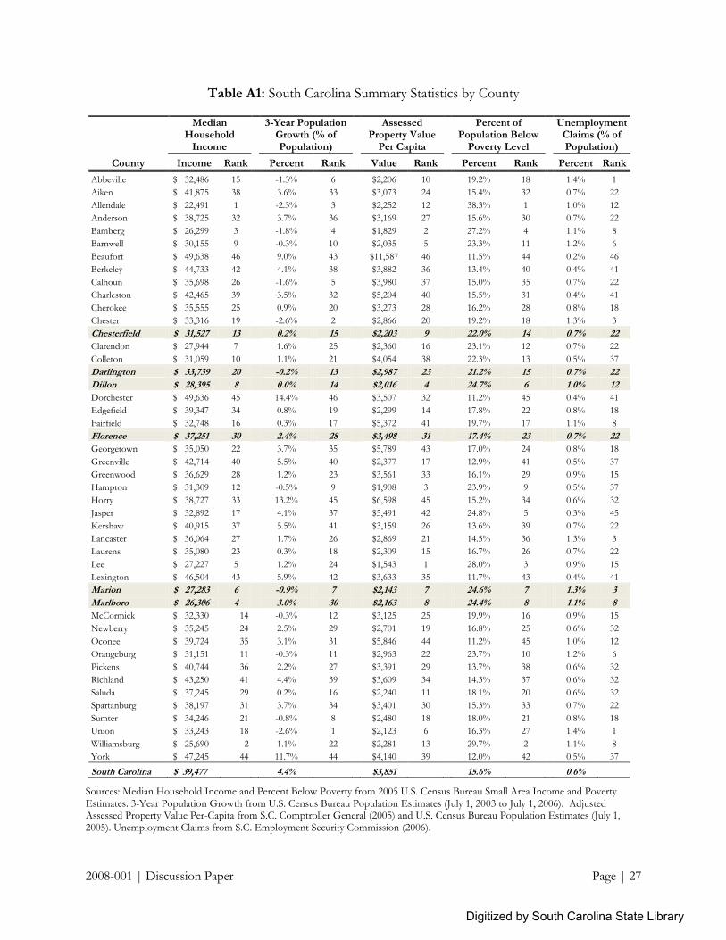
The Pee Dee region can be described as an economically depressed area. The six counties within
the area all have high poverty and unemployment, and low income and property values as displayed
in Table 2. Marion, Marlboro, and Dillon, in particular, are distressed areas, as Marlboro has the
state‘s 4th lowest median household income; Dillon has the 4th lowest assessed property values; and
Marion as the 3rd highest percentage of unemployment insurance claimants. Furthermore, all of the
areas have suffered low or negative population growth between 2003 and 2006. (See Appendix,
Table A1 for a complete listing of summary statistics for all South Carolina counties.)
Digitized by South Carolina State Library

2008-001 | Discussion Paper Page | 8
Table 2: Pee Dee Region Economic Statistics
Median Household
Income
3-Year Population
Growth (% of Population)
Assessed Property
Value Per Capita
Percent of Population
Below Poverty Level
Unemployment
Claims (% of Population)
County Income Rank Percent Rank Value Rank Percent Rank Percent Rank
Chesterfield $ 31,527 13
0.2% 15
$2,203 9
22.0% 14
0.7% 22
Darlington $ 33,739 20
-0.2% 13
$2,987 23
21.2% 15
0.7% 22
Dillon $ 28,395 8
0.0% 14
$2,016 4
24.7% 6
1.0% 12
Florence $ 37,251 30
2.4% 28
$3,498 31
17.4% 23
0.7% 22
Marion $ 27,283 6
-0.9% 7
$2,143 7
24.6% 7
1.3% 3
Marlboro $ 26,306 4
3.0% 30
$2,163 8
24.4% 8
1.1% 8
South Carolina $ 39,477 4.4% $3,851 15.6% 0.6%
Sources: Median Household Income and Percent Below Poverty from 2005 U.S. Census Bureau Small Area Income and Poverty Estimates. 3-Year Population Growth from U.S. Census Bureau Population Estimates (July 1, 2003 to July 1, 2006). Adjusted Assessed Property Value Per-Capita from S.C. Comptroller General (2005) and U.S. Census Bureau Population Estimates (July 1, 2005). Unemployment Claims from S.C. Employment Security Commission (2006).
A closer look at household income in Figure 2 further reveals the poor economic situation of
the region. Between 2000 and 2005, real median household income declined in all counties. While
this trend is felt throughout the United States, it is particularly magnified in South Carolina and the
Pee Dee region. Median household income, reported in inflation-adjusted 2007 US dollars, declined
6.6% statewide. Dillon, Florence, and Darlington experienced slightly less income decline, but
Marlboro experienced the 3rd largest decline in the state of 13.8%. Marion and Chesterfield also
witnessed above average declines. A complete listing of all counties is founding in Table A2.
Figure 2: Growth of Real Median Household Income (in 2007 US dollars), 2000 – 2005
Source: U.S. Census Bureau Small Area Income and Poverty Estimates, 2000 – 2005. Growth rates
shown are for 2000-2005. Estimates shown are for 2005, reported in inflation adjusted 2007 US dollars.
Digitized by South Carolina State Library
United States-6.6% South Carolina
-138_Marlboro
-8.9_Marion
-8. %_ Chesterfield
-5.8%
-5.6%_ Dillon
-5.2%_ Florence
_ Darlington
-15.0% -10.0% -5.0% 0.0%

2008-001 | Discussion Paper Page | 9
Pee Dee counties all have higher unemployment rates than state average of 6.4% for 2006. As
shown in Figure 3, Marion and Marlboro had the first and third highest 2006 annualized
unemployment rate in South Carolina at 12.2% and 11.1%. Most counties have experienced lower
unemployment growth than seen statewide. Between 2000 and 2006, South Carolina‘s
unemployment rate grew 77.8% from 3.6% in 2000 to 6.4% in 2006. Only Chesterfield and Florence
grew at higher rates. Marion, in fact, had the lowest unemployment growth rate in the state. See
Table A3 in the Appendix for unemployment rates for all counties in South Carolina. Additionally,
all of the counties reached unemployment peaks in 2004 or 2005 and have declined since then.
Figure 3: Unemployment, 2001 – 2006
Source: BLS Local Area Unemployment Statistics.
During the same period, the region experienced larger than average growth in per capita gross
retail sales. While South Carolina witnessed a statewide 20.5% increase in real per-capita retail sales
(as seen in Figure 4), Marlboro, Dillon, and Marion counties all experienced even higher growth
rates, with Marlboro County‘s being the second highest in the state. (See Appendix Table A4 for a
complete listing for all South Carolina counties.) Such high level of retail sales growth may be, in
part, explained by the fact that these three counties serve as a ―pass through‖ for visitors on their
way to vacation spots in the Grand Strand area of adjacent Horry County. Additionally, although the
growth rates are particularly high, the absolute levels in real 2007 dollars are well below state average,
with per-capita retail sales for Marion County only totaling $12,979 (11th lowest in the state). In
contrast, Florence‘s per-capita retail sales were the 4th highest in the state at $33,024.
Digitized by South Carolina State Library
-5.9
7.3
8.4
10.6
~.m,--JII
6.9
7.8%South Carolina
65.7%_Marlboro
%_Dillon
_Marion
• Florence
_Darlington
115.6% • Chesterfield
0.0% 50.0% 100.0% 150.0%

2008-001 | Discussion Paper Page | 10
Figure 4: Growth of Gross Retail Sales Per-Capita, 2001 – 2006
Source: S.C. Department of Commerce calculation of South Carolina Department of Revenue data and US Census Estimates of Population., 2001 – 2005. Figures reported in real 2007 U.S. dollars.
In contrast to the dramatic growth in retail sales is the decline in the number of business units
(sales-tax collecting entities) per-capita as shown in Figure 5. While the state averaged a 2.2%
increase in per-capita business units, all six Pee Dee counties witnessed declines. Marlboro County
experienced the second largest decrease in business units per-capita in the state. Furthermore, all
but Florence County had a lower than state average number of businesses per person in absolute
terms. Appendix Table A5 provides a complete listing for all South Carolina counties.
Figure 5: Growth of Business Units Per-Capita, 2001 – 2006
Source: S.C. Department of Commerce calculation of South Carolina Department of Revenue data and US Census Estimates of Population., 2001 - 2005
Digitized by South Carolina State Library
South Carolina
-Marlboro
-Dillon
-Marion
• Florence
- Darlington
- Chesterfield
-20.0% 0.0% 20.0% 40.0% 60.0%
South Carolina10.5%
-Marlboro6.0%
-Dillon
-Florence
-Marion
- Chesterfield
-Darlington
-15.0% -10.0% -5.0% 0.0% 5.0%
2008-001 | Discussion Paper Page | 11
4.2 Availability of Labor
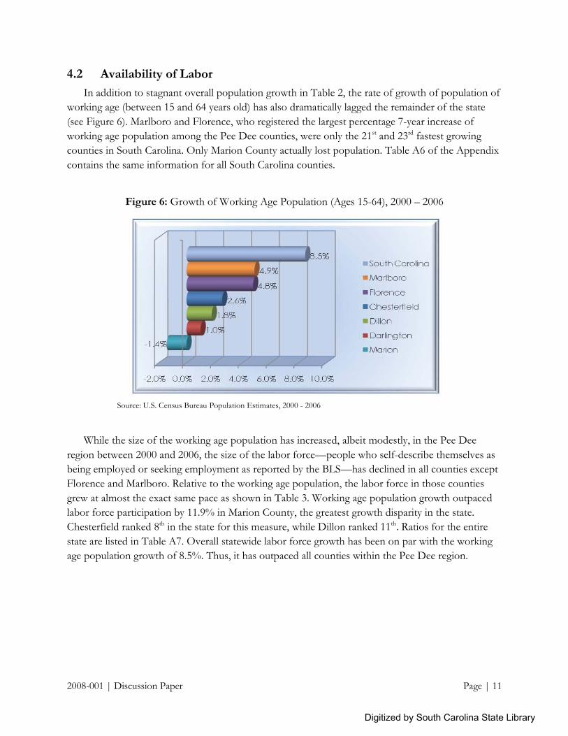
In addition to stagnant overall population growth in Table 2, the rate of growth of population of
working age (between 15 and 64 years old) has also dramatically lagged the remainder of the state
(see Figure 6). Marlboro and Florence, who registered the largest percentage 7-year increase of
working age population among the Pee Dee counties, were only the 21st and 23rd fastest growing
counties in South Carolina. Only Marion County actually lost population. Table A6 of the Appendix
contains the same information for all South Carolina counties.
Figure 6: Growth of Working Age Population (Ages 15-64), 2000 – 2006
Source: U.S. Census Bureau Population Estimates, 2000 - 2006
While the size of the working age population has increased, albeit modestly, in the Pee Dee
region between 2000 and 2006, the size of the labor force—people who self-describe themselves as
being employed or seeking employment as reported by the BLS—has declined in all counties except
Florence and Marlboro. Relative to the working age population, the labor force in those counties
grew at almost the exact same pace as shown in Table 3. Working age population growth outpaced
labor force participation by 11.9% in Marion County, the greatest growth disparity in the state.
Chesterfield ranked 8th in the state for this measure, while Dillon ranked 11th. Ratios for the entire
state are listed in Table A7. Overall statewide labor force growth has been on par with the working
age population growth of 8.5%. Thus, it has outpaced all counties within the Pee Dee region.
Digitized by South Carolina State Library
"" "I"""""'I'_~.5%
.9%1
.8%1
-IJ4'J11".
-2.0% 0.0% 2.0% 4.0% 6.0% 8.0% 10.0%
South Carolina
_Marlboro
_Florence
• Chesterfield
_Dillon
• Darlington
_Marion

2008-001 | Discussion Paper Page | 12
Table 3: Ratio of Labor Force Participants to Population of Working Age (15 to 64), 2000 – 2006
Ratio (LAUS Labor Force / Census Population of Working Age)
Year
County 2000 2001 2002 2003 2004 2005 2006
Growth Rank Average Rank
Chesterfield 0.68 0.66 0.65 0.66 0.64 0.63 0.64
-5.9% 8 0.65 11
Darlington 0.71 0.69 0.69 0.70 0.69 0.69 0.70
-1.4% 24 0.70 20
Dillon 0.69 0.65 0.65 0.66 0.64 0.68 0.66
-4.3% 11 0.66 14
Florence 0.72 0.70 0.70 0.71 0.71 0.71 0.72
0% 25 0.71 26
Marion 0.67 0.63 0.61 0.62 0.62 0.60 0.59
-11.9% 1 0.62 8
Marlboro 0.64 0.64 0.63 0.67 0.66 0.68 0.64
0% 25 0.65 11
South Carolina 0.74 0.72 0.72 0.73 0.73 0.74 0.74 0% 0.73
Source: S.C. Department of Commerce calculation of BLS Local Area Unemployment Statistics and US Census Estimates of Population 15 to 64 years old.
It is important to remember that the labor force comprises all people employed or seeking
employment, thus it includes the unemployed. Since the percentage of unemployed has grown in
every county during the period, it means that the percentage of people actually employed in the
labor force has fallen even more relative to the working age population.
In addition to measuring the growth since 2000, Table 3 also indicates that for every year, every
county in the Pee Dee region has a lower ratio of labor force participants to working age population
than the statewide average, indicating a larger percentage of the population in this region do not
participate in the formal labor force than is typical throughout the state.
Such a gap in growth raises the question of where these new workers found jobs. To further
probe this disparity, we can observe the number of people employed in jobs that pay wages and
salaries relative to the supply of labor. Wage and salary employment, as reported in the QCEW, does
not include the self-employed (which LAUS does). Thus, it provides an inventory of available jobs
filled at legal, established employers. Table 4 reports the ratio of the QCEW wage and salary
employment for all industries to the total population of working age individuals. Most notable is that
all counties, except Florence, had a significantly lower ratio of wage employment to working age
population than the state average of 0.65. Furthermore, all counties have experienced a decrease in
the ratio over the 7-year period, meaning a declining percentage of the population is employed in
traditional salaried positions. Marion County experienced the largest decline of any county in the
state.
Digitized by South Carolina State Library

2008-001 | Discussion Paper Page | 13
Table 4: Ratio of Wage and Salary Employment to Population of Working Age (15 to 64)
Ratio (QCEW Employment / Census Population of Working Age)
Year
County 2000 2001 2002 2003 2004 2005 2006
Growth Rank Average Rank
Chesterfield 0.57 0.53 0.52 0.50 0.48 0.47 0.48
-15.8% 7 0.51 25
Darlington 0.50 0.49 0.49 0.47 0.47 0.47 0.47
-6.0% 28 0.48 23
Dillon 0.49 0.46 0.46 0.46 0.45 0.48 0.47
-4.1% 30 0.47 21
Florence 0.75 0.75 0.75 0.73 0.72 0.68 0.69
-8% 25 0.72 42
Marion 0.52 0.47 0.45 0.44 0.44 0.41 0.40
-23.1% 1 0.45 18
Marlboro 0.41 0.42 0.41 0.41 0.41 0.43 0.41
0% 36 0.41 15
South Carolina 0.68 0.67 0.65 0.64 0.64 0.64 0.64 -6% 0.65
Source: S.C. Department of Commerce calculation of BLS Quarterly Census of Employment and Wages and US Census Estimates of Population 15 to 64 years old.
An important caveat regarding QCEW statistics is that they report the county in which the
individual is employed, whereas both Census and LAUS labor force figures describe the county in
which the individual resides. Thus more urban counties, which may draw a large number of workers
from less-developed surrounding areas, are naturally more likely to have higher ratios of wage and
salary employment to population than more rural areas with fewer employers. For instance,
Richland, Charleston, and Greenville counties have the highest average ratios in the state (see Table
A8 of the Appendix) Florence, which also serves as the most developed area of the Pee Dee as well
as Santee-Lynches (including Kershaw, Lee, Sumter, and Clarendon counties) regions, has the 5th
highest average ratio in the state. The fact that all of the counties within these two regions have
experienced declines in these ratios indicates one of the following: either 1.) more workers are
turning to self-employment or informal economic activity; or 2.) workers are travelling to other
counties to find employment. The remaining neighboring counties (Lancaster, Horry, Williamsburg,
and Georgetown) have also all experienced negative growth in the ratio (Williamsburg‘s has
remained the same); thus, these counties cannot be absorbing the excess wage and salary workers
from the Pee Dee region.
4.3 Informal Economy Estimates
Because no specific measure of the informal economy exists, much evidence regarding its
existence and size is indirect, inferred from discrepancies between the various measures of the labor
market. This section will explore discrepancies that can be used to generate estimates of the
magnitude of the informal economy. At the end, we will summarize the methods studied and
develop an approximation of the Pee Dee region informal economy.
Digitized by South Carolina State Library

2008-001 | Discussion Paper Page | 14
4.3.1 Self-Reported Employment Versus Employer-Reported Employment
First, we will examine the difference in the employment reported by employers versus
employment reported by the employed. Table 5 presents the ratio of QCEW employment (employer
reported) to LAUS employment (employee-reported). A complete listing of all South Carolina
county statistics is founding Table A9. On average statewide, employer-reported jobs account for
95% of the employee-reported jobs. In the Pee Dee region, however, the averages are far less. With
the exception of Florence, Pee Dee region period averages range between 0.71 and 0.85. Except for
Dillon and Marlboro, these ratios have declined since 2000.
Besides the possibility of a shadow economy, several possible explanations exist for the
discrepancies shown. First, as described before, QCEW employment does not include the self-
employed, so workers in these areas may be more likely to be involved in proprietorship activities.
Typically, self-employment facilitates informal economic activity. Second, QCEW figures are based
on the county in which the employer is located while LAUS figures are based on the county in
which the employee lives. Counties like Florence, which are more populous and developed, are
typically net importers of workers from less developed, surrounding counties and, thus, have ratios
in excess of 1. Neither Florence nor any of the other surrounding counties have ratios high enough
to suggest that they are absorbing the excess workers. Finally, LAUS only counts an employed
individual one time, regardless of the number of job activities in which s/he actually participated.
QCEW counts the number of jobs, even if the same worker holds more than one. If multiple
jobholders are factored in, however, the ratios would be even lower. According to BLS (CPS
studies), multiple jobholders accounted for 5.2% of employed people in 2006.
Table 5: Ratio of Employer-Reported QCEW Employment to Self-Reported LAUS Employment, 2000 – 2006
Ratio (QCEW Employment / LAUS Employment)
Year
County 2000 2001 2002 2003 2004 2005 2006
Growth Rank Average Rank
Chesterfield 0.88 0.87 0.87 0.85 0.84 0.83 0.83
-5.7% 16 0.85 33
Darlington 0.75 0.76 0.76 0.73 0.74 0.75 0.72
-4.0% 24 0.74 22
Dillon 0.77 0.79 0.78 0.76 0.78 0.77 0.78
1.3% 38 0.78 25
Florence 1.09 1.13 1.14 1.11 1.11 1.05 1.04
-4.6% 21 1.10 42
Marion 0.85 0.85 0.84 0.82 0.81 0.78 0.76
-10.6% 4 0.82 28
Marlboro 0.69 0.72 0.71 0.71 0.72 0.72 0.72
4.3% 42 0.71 18
South Carolina 0.96 0.97 0.96 0.95 0.94 0.94 0.93 -3.1% 0.95
Source: S.C. Department of Commerce calculation of BLS Local Area Unemployment Statistics and Quarterly Census of Employment and Wages
4.3.3 Wage and Salary Employment Versus Total Private Employment
Informal economic activity is likely to be more highly correlated with those who are self-
employed, as it naturally allows for a lower degree of accountability as well as more flexibility than
Digitized by South Carolina State Library

2008-001 | Discussion Paper Page | 15
positions that receive wages and salaries from an employer. Such a measure provides insight as to
those working ―on the books.‖ Another source of total employment data is the Bureau of Economic
Analysis‘ Regional Economic Information System, which includes self-employment. Table 6
provides the ratio of wage and salary employment reported by the QCEW to the total private non-
farm employment (including self-employment) reported by BEA (all county figures in Table A10).
The BEA utilizes Census, IRS, and other data elements to statistically correct for underreporting and
misreporting.
The variations in ratios between South Carolina and Pee Dee counties are not as pronounced as
they have been for other measures. Statewide, the average ratio was 0.95 as was Florence‘s ratio.
Marlboro surprisingly had a ratio above 1. All counties except Dillon and Marlboro saw decreases in
ratios since 2000, as did South Carolina. In all, this measure indicates that official self-employment is
higher in four of the Pee Dee region than in the rest of the state. We can conclusively say it is also
on the rise in these four counties faster than throughout the state.
Table 6: Ratio of QCEW Employment to BEA REIS Employment, 2001 – 2005
Ratio (QCEW Employment / BEA REIS Employment)
Year
County 2001 2002 2003 2004 2005
Growth Rank Average Rank
Chesterfield 0.93 0.92 0.91 0.90 0.89
-4.3% 20 0.91 19
Darlington 0.90 0.89 0.88 0.88 0.87
-3.3% 25 0.88 15
Dillon 0.91 0.89 0.91 0.88 0.92
1.1% 45 0.90 18
Florence 0.97 0.96 0.96 0.95 0.90
-7.2% 7 0.95 29
Marion 0.88 0.88 0.87 0.86 0.82
-6.8% 12 0.86 10
Marlboro 1.04 1.03 1.02 1.02 1.04
0.0% 43 1.03 41
South Carolina 0.96 0.96 0.95 0.94 0.93
-3.1%
0.95
Source: S.C. Department of Commerce calculation of BLS Quarterly Census of Employment and Wages and BEA Regional Economic Information System.
Another method of measuring self-employment again utilizes the BEA REIS data set. We
develop a location quotient which compares the percentage of wage and salary employment to total
employment that exists in each of the Pee Dee counties with the percentage of wage and salary
employment in the rest of the state as well as the rest of the nation. If a county is under-represented
in its share of wage and salary employment relative to the rest of the state, its location quotient will
be less than one. Table 7 presents the results of such calculation and indicates that the Pee Dee
region is on par with the rest of the state in regards to the share of employees not participating in
self-employment. Only Marion County was significantly below state or national average, indicating a
large sole-proprietorship share. The state, in general, had slightly more wage and salary employment
than the nation. A complete listing for all counties is in Table A11.
Digitized by South Carolina State Library

2008-001 | Discussion Paper Page | 16
Table 7: Wage and Salary Employment Location Quotients, 2001 – 2005
BEA REIS Wage and Salary Employment Location Quotients
Year
County 2001 2002 2003 2004 2005
Average Rank
Chesterfield State LQ 0.98 0.98 0.97 0.97 0.96
0.97 20
National LQ 1.01 1.01 1.00 1.00 0.99 1.00
Darlington State LQ 0.99 0.99 0.99 0.98 0.98
0.99 24
National LQ 1.02 1.02 1.02 1.01 1.01
1.02
Dillon State LQ 1.00 1.00 1.00 1.00 1.00
1.00 30
National LQ 1.03 1.03 1.03 1.03 1.03 1.03
Florence State LQ 1.02 1.02 1.02 1.02 1.01
1.02 37
National LQ 1.05 1.05 1.05 1.05 1.05 1.05
Marion State LQ 0.90 0.89 0.88 0.87 0.85
0.88 4
National LQ 0.93 0.92 0.91 0.90 0.88 0.91
Marlboro State LQ 1.03 1.04 1.04 1.04 1.04
1.04 42
National LQ 1.07 1.07 1.07 1.08 1.08
1.07 South Carolina National LQ 1.03 1.03 1.03 1.03 1.03 1.03
Source: S.C. Department of Commerce calculation of BEA Regional Economic Information System data.
4.3.4 Income Tax Filers Versus Population
According to IRS data, in 2004 132,226,042 returns were filed in the US. Another 15 million
people did not file returns because they did not earn enough money to be required to do so,
according to the Tax Foundation. In an analysis by this group, of these non-filers, 98.9% earned less
than $30,000; 62.8% were over the age of 55; 62.6% were female; 55.5% were married filing jointly;
and 95.3% worked part-time for less than 13 weeks of the year. While the Pee Dee counties are
more likely to have a higher number of non-filers simply due to lower income and higher poverty,
non-filers also serve as a good indicator of people not employed full time in the formal job market.
Table 8 shows the percentage of the population who filed state income tax returns. A complete state
listing is in Table A12. On average, 45% of South Carolina state residents filed returns between 2000
and 2005. (In the US, 45.4% of the population filed returns in 2005.) This figure remained relatively
stable throughout the period. All counties within the Pee Dee region had both lower levels as well as
declining levels of tax filing. They were by no means the lowest in the state. Marion County,
however, did experience the fourth most rapid decline in percent of population filing in the state.
Again, the results of such a comparison must be reviewed in context. Not filing can be
representative of low levels of income, prevalence of part-time work, and workers over 55. Given
that much research has linked the former two of these factors with the presence of informality in the
economy, they can still provide us with some insight into the factors present that indicate informal
economic activity.
Digitized by South Carolina State Library

2008-001 | Discussion Paper Page | 17
Table 8: Percent of Population Filing State Income Tax Returns, 2001 – 2005
Year
County 2000 2001 2002 2003 2004 2005
Growth Rank
Average Rank
Chesterfield 38% 38% 39% 37% 38% 38% -1.8% 32 38% 19
Darlington 41% 40% 40% 39% 39% 39% -3.8% 18 40% 28
Dillon 40% 38% 38% 38% 38% 38% -3.5% 23 38% 22
Florence 43% 43% 43% 42% 42% 41% -4.1% 17 42% 42
Marion 41% 40% 39% 39% 38% 38% -7.5% 4 39% 23
Marlboro 39% 38% 39% 38% 37% 38% -2.7% 28 38% 20
South Carolina 45% 45% 44% 44% 44% 45% -0.4% 45%
Source: S.C. Department of Commerce calculation of South Carolina Department of Revenue data and US Census Estimates of Population.
4.3.4 Industry Concentration
Certain industries are more likely than others to be accommodating to informal economic
activity. It is easier to perform, for instance, handyman services off the books than industrial
machinery manufacturing. Using QCEW and BEA REIS employment data, we can compare the
percentage of workers employed in each industry. Recalling that QCEW data does not include self-
employment and BEA REIS does, comparing the shares of total employment derived from each
data set will provide an indication of which industries are most highly concentrated in self-employed
workers. Figures 7 through 13 provide a comparison of these two sets of data by county. According
to Figure 7, South Carolina, as a whole, has large discrepancies in QCEW wage and salary
employment versus BEA REIS total (including self) employment in six major industry groups.
Other Services (including repair, maintenance, and personal care services)
Arts and Entertainment (including spectator sports, performing arts, amusement, and recreation companies)
Educational Services (including teaching, tutoring, and educational support services)
Professional and Technical Services (including legal, accounting, architectural, engineering, and consulting services)
Real Estate and Rental Leasing
Construction
The largest variations occur in the Other Services and Real Estate and Rental industry groups.
Digitized by South Carolina State Library

2008-001 | Discussion Paper Page | 18
Figure 7: Share of Employment by Industry, South Carolina 2005
Source: S.C. Department of Commerce calculation of BLS Quarterly Census of Employment and Wages and BEA Regional Economic Information System.
The Pee Dee region generally had much larger differences in the share of QCEW employment versus the share of BEA REIS employment for most industries, particularly Other Services and Construction. Many of the Pee Dee counties do not have enough representation of some industry groups (namely, Educational Services, Professional and Technical Services, and Health Care and Social Services) to even be able to calculate employment shares. Chesterfield County exhibits similarities to South Carolina as a whole in its concentration of self-employment in the Other Services and Real Estate and Rental. In addition, Chesterfield had a much larger disparity in Construction, Other Services, Real Estate and Rental, and Administrative and Waste Management Services (including office administrative, employment, business support, waste collection, and disposal services). It also had some difference in Retail Trade.
Figure 8: Share of Employment by Industry, Chesterfield County 2005
Source: S.C. Department of Commerce calculation of BLS Quarterly Census of Employment and Wages and BEA Regional Economic Information System.
Digitized by South Carolina State Library
Other Services
Arts & Entertainment
Educational Services
Professional/Tech Svcs
Real Estate & Rental
Construction
;1 I I I--. 6.99 Yo
3.2~%I
- 2.05%1.66%
j - J64%
J'-1.1f%
5.50%4.37%
1 T-4.49%
T'~.87%
I- 8.66~
'1-84%
o SEA REISShare of Total
Employment
.QCEW ShareofTotalEmployment
0.00% 2.00% 4.00% 6.00% 8.00% 10.00%
o SEA REISShareofTotalEmployment
.QCEW Shareof TotalEmployment
~jjj;;;;;;:;;::::;;:;;;:;=~~::::::J7.34%
1iiiiiiiiiiiiiiiiiiiiiiii.iiiiiiiiiiiiiiii"W?: 12 .~4o/cII 11.72 YoReta iI Trade
Other Services
Real Estate & Rental
11~iiiiiiiiiiiirT.n:~4 39%Admin & Waste Svcs 2.27%
Arts & Entertainment
Professional/Tech Svcs
Construction 5.29%3.19°
0.00% 5.00% 10.00% 15.00%

2008-001 | Discussion Paper Page | 19
Darlington County also had a higher difference in self-employment in Other Services and Real Estate and Rental. Additionally, although a small percentage of the total employment, Darlington has a significant discrepancy in the Information industry (including publishing, software, sound recording, internet publishing, and data processing services).
Figure 9: Share of Employment by Industry, Darlington County 2005
Source: S.C. Department of Commerce calculation of BLS Quarterly Census of Employment and Wages and BEA Regional Economic Information System.
Dillon County likewise had a higher than statewide difference in self-employment in Other Services, Real Estate and Rental, Administrative and Waste Management Services, and Construction.
Figure 10: Share of Employment by Industry, Dillon County 2005
Source: S.C. Department of Commerce calculation of BLS Quarterly Census of Employment and Wages and BEA Regional Economic Information System.
Digitized by South Carolina State Library
8.15%Other Services
Arts & Entertainment o BEA REIS
3.1 % Share ofTotalProfessional/Tech Svcs .73% Employment
.90% _OCEW ShareReal Estate & Rental
of TotalEmployment
Information
7. 5%Construction 6.18%
0.00% 2.00% 4.00% 6.00% 8.00% 10.00%
7.17 0Other Services
Arts & Entertainment o BEA REIS
2.71% Share of TotalAdmin & Waste Svcs Employment
_OCEW ShareReal Estate & Rental
of Total
2.67% EmploymentFinance& Insurance 2.27%
Construction2.90%'
1.14Yo
0.00% 2.00% 4.00% 6.00% 8.00%

2008-001 | Discussion Paper Page | 20
In addition to other trends noted, Florence County exhibited differences in QCEW and BEA REIS shares of total employment in the Transportation and Warehousing industry group.
Figure 11: Share of Employment by Industry, Florence County 2005
Source: S.C. Department of Commerce calculation of BLS Quarterly Census of Employment and Wages and BEA Regional Economic Information System.
Marion County also had a much higher than statewide average difference in QCEW and BEA REIS employment shares in all of the industry groups represented in the county.
Figure 12: Share of Employment by Industry, Marion County 2005
Source: S.C. Department of Commerce calculation of BLS Quarterly Census of Employment and Wages and BEA Regional Economic Information System.
Digitized by South Carolina State Library
Other Services
Arts & Entertainment
Ed ucationa I Services
Admin & Waste Svcs
Professional/Tech Svcs
Real Estate & Rental
Transp & Warehousing
Construction
.... I I I
7.19
T3.34%
01 1.4 %1.19
1~0.70%I0.35%
IT I5M~%
4.59%367%
1 I3.00%
i1.2lf
3.15Q2.91%
i6.62%
5.96% -
o BEA REIS
Share ofTotal
Employment
.QCEW Share
of Total
Employment
0.00% 2.00% 4.00% 6.00% 8.00%
Other Services
Arts & Entertainment
Admin & Waste Svcs
Real Estate & Rental
Finance & Insurance
Construction
......, I I I ,If - 9.0
2.40%I,__1 12 .01%I 0.83¥
-4.49%
j1 ~.70%
- 5.0~%:-O.4°%T
-4.46%1
T T4.09%
',13.91% 1- -Y'91%-
%
o BEA REISShare of Total
Employment
.QCEW ShareofTotalEmployment
0.00% 2.00% 4.00% 6.00% 8.00% 10.00%

2008-001 | Discussion Paper Page | 21
Finally, Marlboro County had the most industry groups with large differences between QCEW and BEA REIS employment shares. In addition to the industry groups represented by most of the other Pee Dee counties, Marlboro also has discrepancies in Transportation and Warehousing, Finance and Insurance, and Retail Trade.
Figure 13: Share of Employment by Industry, Marlboro County 2005
Source: S.C. Department of Commerce calculation of BLS Quarterly Census of Employment and Wages and BEA Regional Economic Information System.
4.3.5 Compilation of Estimates
Three of the methods utilized to compare informal economic activity easily lend themselves to
estimated calculations of an informal economy. These methods and the results they produce are laid
out in Table 9. The estimated size for each county is calculated from the most recent data available.
While no method is perfect, combined they at least provide a general guide for how much economic
activity occurs in the region compared with the rest of the state. The first method—comparing
employer-reported QCEW employment with employee-reported LAUS employment—produces a
negative result for Florence, primarily due to the fact that Florence draws labor from the other Pee
Dee counties. Thus, taken all together, the first method estimates an informal economy of 12.3% in
the Pee Dee region in 2005. Statewide it was 6.7%. The second method—comparing QCEW
employment (wage and salary only) with BEA REIS private employment (including self-
employment)—produces slightly lower results for the counties within the Pee Dee. For 2005, this
method estimated an informal economy of 10.6% within the Pee Dee counties and 6.8% statewide.
Digitized by South Carolina State Library
Other Services 8.01%2.46%
0.78%Arts & Entertainment 0.63%
1.0996Admin & Waste Svcs .46% OBEA REIS
1.78% Share of TotalProfessional/Tech Svcs 0.78%
1.86% EmploymentReal Estate & Rental 0.88%
1.54%_QCEW Share
Finance & Insurance 1.1996 ofTotal23996 Employment
Transp & Warehousing 1.58%
11.61%Retail Trade 0%
1%Construction
0.00% 5.00% 10.00% 15.00%
2008-001 | Discussion Paper Page | 22
Table 9: Estimated Size of the Pee Dee Region Informal Economy
Method 1: Self-Reported Employment Versus Employer-Reported
Employment (reported in Table 5)
Method 2: Wage and Salary Employment Versus Total
Employment (reported in Table 6) Method 3: Income Tax Filers Versus
Population (reported in Table 8)
Employment
Differ-ence
% of Total
Employment
Differ- ence
% of Total
2005
Census Pop.
2005 SC Tax
Returns
% of Pop.
Filing
Difference from US % Filing County
2006 QCEW
2006 LAUS
2005 QCEW
2005 BEA REIS
Chesterfield 14,024 16,855 2,831 16.8%
13,601 15,277 1,676 11.0%
43,191 16,316 37.8% 7.6%
Darlington 20,983 29,039 8,056 27.7%
20,961 24,137 3,176 13.2%
67,369 26,390 39.2% 6.2%
Dillon 9,470 12,095 2,625 21.7%
9,557 10,365 808 7.8%
30,851 11,833 38.4% 7.0%
Florence 60,998 58,543 -2,455 -4.2%
59,516 66,498 6,982 10.5%
130,259 53,997 41.5% 3.9%
Marion 9,037 11,888 2,851 24.0%
9,363 11,420 2,057 18.0%
34,798 13,132 37.7% 7.7%
Marlboro 8,173 11,420 3,247 28.4%
8,071 7,792 -279 -3.6%
27,722 10,474 37.8% 7.6%
Pee Dee Region 122,685 139,840 17,155 12.3% 121,069 135,489 14,420 10.6% 334,190 132,142 39.5% 5.9%
South Carolina 1,855,842 1,988,378 132,536 6.7% 1,819,217 1,952,181 132,964 6.8% 4,246,933 1,906,991 44.9% 0.5%
Source: S.C. Department of Commerce calculation of BLS Quarterly Census of Employment and Wages, BLS Local Area Unemployment Statistics, BEA Regional Economic Information System, US Census Population Estimates, and S.C. Department of Revenue Income Tax data.
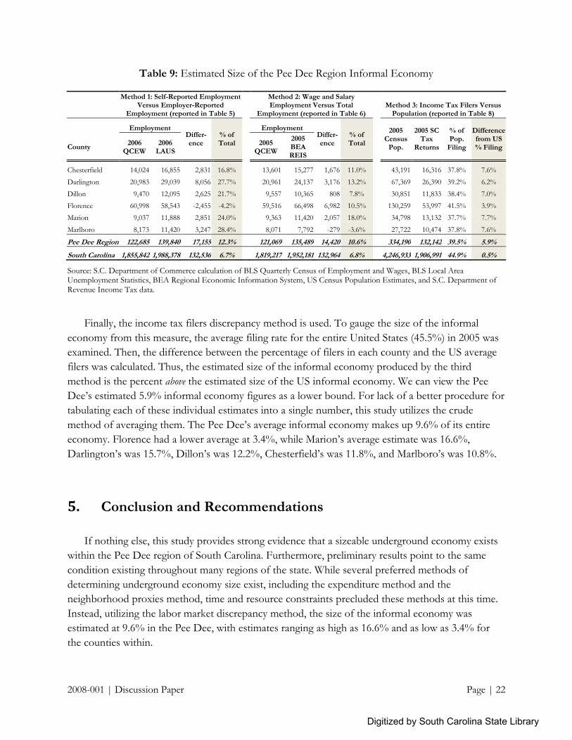
Finally, the income tax filers discrepancy method is used. To gauge the size of the informal
economy from this measure, the average filing rate for the entire United States (45.5%) in 2005 was
examined. Then, the difference between the percentage of filers in each county and the US average
filers was calculated. Thus, the estimated size of the informal economy produced by the third
method is the percent above the estimated size of the US informal economy. We can view the Pee
Dee‘s estimated 5.9% informal economy figures as a lower bound. For lack of a better procedure for
tabulating each of these individual estimates into a single number, this study utilizes the crude
method of averaging them. The Pee Dee‘s average informal economy makes up 9.6% of its entire
economy. Florence had a lower average at 3.4%, while Marion‘s average estimate was 16.6%,
Darlington‘s was 15.7%, Dillon‘s was 12.2%, Chesterfield‘s was 11.8%, and Marlboro‘s was 10.8%.
5. Conclusion and Recommendations
If nothing else, this study provides strong evidence that a sizeable underground economy exists
within the Pee Dee region of South Carolina. Furthermore, preliminary results point to the same
condition existing throughout many regions of the state. While several preferred methods of
determining underground economy size exist, including the expenditure method and the
neighborhood proxies method, time and resource constraints precluded these methods at this time.
Instead, utilizing the labor market discrepancy method, the size of the informal economy was
estimated at 9.6% in the Pee Dee, with estimates ranging as high as 16.6% and as low as 3.4% for
the counties within.
Digitized by South Carolina State Library

2008-001 | Discussion Paper Page | 23
The implications of the existence of such underground activities are many. First, informal
employment occurs outside the legal and tax systems, reducing the revenues receive by national,
state, and local governing bodies, as well as national social insurance programs such as Medicare and
Social Security. Furthermore, these workers are not vested in other insurance programs financed
through legally required employer participation, including Workers Compensation, Unemployment
Insurance, and Disability Insurance. Informal workers also receive no health care, retirement, or
other employer-provided benefits. Informality also promotes a lack of stability and security in
employment. These points, taken together, indicate not only problems for the affected workers, but
also strain on the government-provided social services as well, as sufficient financing is not being
collected from the informal workers, and they would required utilization of these government
services as higher rates.
Many previous studies have linked the prevalence of informal economic activity to economic
restructuring—the transition from manufacturing to service-based economies, increasing
globalization and immigration, economic deregulation, and transformation to more flexible forms of
production. In the rural counties, it may also be correlated with lack of local educational and career
opportunities. Many of the rural workers in informal work live in near-poverty on the margins of the
economy, which benefits the highly skilled. The inability to efficiently train and utilize these labor
resources more effectively translate to lost economic growth from inefficient development and use
of labor. Furthermore, the accumulation of unskilled, informal workers within a region has the
potential to characterize the area as failed and undesirable.
To develop policy recommendations to combat the prevalence of informality, the underlying
causes of it must first be targeted. While increasing systematic regulation of industries in which a
high level of informality occurs may be helpful to reducing some level of underground activity,
providing effective remedies to combat the root causes will reduce the pervasiveness of informal
activity by encouraging economic growth and increasing the opportunities within the formal
economy. This study implores a subsequent, in-depth study into the underlying problems affecting
these communities, the results of which could be used to craft a comprehensive plan for economic
growth. Such a study could utilize Social Compact‘s Neighborhood Proxies Approach as a building
block for determining the type of data necessary and available, as well as key performance indicators
for economic growth. A well-formulated plan for analysis and the use of these results for improving
the economic infrastructure will provide the groundwork improving the formal economic
opportunities and reducing the informal activities.
Digitized by South Carolina State Library

2008-001 | Discussion Paper Page | 24
References
Alderslade, Jamie, John Talmage, and Yusef Freeman. (2006) ―Measuring the Informal Economy –
One Neighborhood at a Time,‖ Brookings Institution Metropolitan Policy Program Discussion
Paper [http://www.brookings.edu/metro/umi.htm].
Bhattacharyya, D. (1990) ―On the Economic Rationale of Estimating the Hidden Economy, United
Kingdom (1960-1884): Estimates and Tests,‖ Economic Journal, 100, 703-17.
Cagan, Phillip. (1958) ―The Demand for Currency Relative to the Total Money Supply,‖ Journal of
Political Economy, 66, 303-29.
Chong, Alberto and Mark Gradstein. (2007) ―Inequality and Informality,‖ Journal of Public Economics,
91, 159-79.
Cohen, Eric D. and Andrea Stephens. (2005) ―Informal Economic Activity in a Deindustrialized
Rural Pennsylvania Community: A Preliminary Profile,‖ Journal of Rural Community Psychology,
E8(2).
Feige, Edgar L. (1979) ―How Big is the Irregular Economy?‖ Challenge, 22(1), 5-13.
Feinstein, Jonathan S. (1999) ―Approaches for Estimating Noncompliance: Examples from Federal
Taxation in the United States,‖ Economic Journal, 109 (June), F360-9.
Frey, Bruno and Hannelore Weck. (1983) ―Bureaucracy and the Shadow Economy: A Macro-
Approach,‖ in Anatomy of Government Deficiencies. Horst Hanusch, ed. Berlin: Springer, 89-109.
Hodge, Scott A. (2005) ―Number of Americans Outside Tax System Continues to Grow,‖ Fiscal
Facts, 27 [http://www.taxfoundation.org/research/show/542.html].
Kaufmann, Daniel and Aleksander Kaliberda. (1996) ―Integrating the Unofficial Economy into the
Dynamics of Post Socialist Economies: A Framework of Analyses and Evidence,‖ World Bank
Policy Research Paper 1691.
Lyssiotou, Panayiota, Panos Pashardes, and Thanasis Stengos. (2004) ―Estimates of the Black
Economy Based on Consumer Demand Approaches‖, Economic Journal, 114, 622-39.
Marcelli, Enrico, Manuel Pastor, and Pascale Joassart. (1999) ―Estimating the Effects of Informal
Economic Activity: Evidence from Los Angeles County,‖ Journal of Economic Issues, 33(3), 579-
607.
Mencken, F. Carson and Sally Ward Maggard. (1999) ―Informal Economic Activity in West Virginia:
A Descriptive and Multivariate Analysis,‖ in Inside West Virginia: Public Policy Perspectives for the 21st
Century. Keith, Bruce and Ronald Althouse, ed. West Virginia: West Virginia University Press.
Digitized by South Carolina State Library

2008-001 | Discussion Paper Page | 25
Joassart-Marcelli, Pascale and Daniel Flaming. (2002) ―Workers Without Rights: The Informal
Economy in Los Angeles,‖ Economic Roundtable Briefing Paper
[http://www.economicrt.org/publications.html]
Pissarides, C. and G. Weber. (1989) ―An Expenditure-Based Estimate of Britain‘s Black Economy,‖
Journal of Public Economics, 39, 17-32.
Schneider, Freidrich and Dominik Enste. (2000) ―Shadow Economies: Size, Causes, and
Consequences,‖ Journal of Economic Literature, 37(March), 77-114.
Social Compact. (2007) ―Making Connections: Community Development That Works,‖
Presentation to 2007 Community Development Policy Summit.
[http://www.clevelandfed.org/CommAffairs/Conf2007/PolicySummit/pdf/TALMAGE.pdf]
Tanzi, Vito. (1983) ―The Underground Economy in the United States: Annual Estimates 1930-
1980,‖ IMF Staff Papers, 30(2), 283-305.
Thomas, James. (1999) ―Quantifying the Black Economy: Measurement Without Theory ‗Yet
Again?‘‖ Economic Journal, 109, 381-9.
Digitized by South Carolina State Library

2008-001 | Discussion Paper Page | 26
Appendix
Digitized by South Carolina State Library
2008-001 | Discussion Paper Page | 27
Table A1: South Carolina Summary Statistics by County
Median Household
Income
3-Year Population Growth (% of Population)
Assessed
Property Value Per Capita
Percent of
Population Below Poverty Level
Unemployment
Claims (% of Population)
County Income Rank Percent Rank Value Rank Percent Rank Percent Rank
Abbeville $ 32,486 15
-1.3% 6
$2,206 10
19.2% 18
1.4% 1
Aiken $ 41,875 38
3.6% 33
$3,073 24
15.4% 32
0.7% 22
Allendale $ 22,491 1
-2.3% 3
$2,252 12
38.3% 1
1.0% 12
Anderson $ 38,725 32
3.7% 36
$3,169 27
15.6% 30
0.7% 22
Bamberg $ 26,299 3
-1.8% 4
$1,829 2
27.2% 4
1.1% 8
Barnwell $ 30,155 9
-0.3% 10
$2,035 5
23.3% 11
1.2% 6
Beaufort $ 49,638 46
9.0% 43
$11,587 46
11.5% 44
0.2% 46
Berkeley $ 44,733 42
4.1% 38
$3,882 36
13.4% 40
0.4% 41
Calhoun $ 35,698 26
-1.6% 5
$3,980 37
15.0% 35
0.7% 22
Charleston $ 42,465 39
3.5% 32
$5,204 40
15.5% 31
0.4% 41
Cherokee $ 35,555 25
0.9% 20
$3,273 28
16.2% 28
0.8% 18
Chester $ 33,316 19
-2.6% 2
$2,866 20
19.2% 18
1.3% 3
Chesterfield $ 31,527 13
0.2% 15
$2,203 9
22.0% 14
0.7% 22
Clarendon $ 27,944 7
1.6% 25
$2,360 16
23.1% 12
0.7% 22
Colleton $ 31,059 10
1.1% 21
$4,054 38
22.3% 13
0.5% 37
Darlington $ 33,739 20
-0.2% 13
$2,987 23
21.2% 15
0.7% 22
Dillon $ 28,395 8
0.0% 14
$2,016 4
24.7% 6
1.0% 12
Dorchester $ 49,636 45
14.4% 46
$3,507 32
11.2% 45
0.4% 41
Edgefield $ 39,347 34
0.8% 19
$2,299 14
17.8% 22
0.8% 18
Fairfield $ 32,748 16
0.3% 17
$5,372 41
19.7% 17
1.1% 8
Florence $ 37,251 30
2.4% 28
$3,498 31
17.4% 23
0.7% 22
Georgetown $ 35,050 22
3.7% 35
$5,789 43
17.0% 24
0.8% 18
Greenville $ 42,714 40
5.5% 40
$2,377 17
12.9% 41
0.5% 37
Greenwood $ 36,629 28
1.2% 23
$3,561 33
16.1% 29
0.9% 15
Hampton $ 31,309 12
-0.5% 9
$1,908 3
23.9% 9
0.5% 37
Horry $ 38,727 33
13.2% 45
$6,598 45
15.2% 34
0.6% 32
Jasper $ 32,892 17
4.1% 37
$5,491 42
24.8% 5
0.3% 45
Kershaw $ 40,915 37
5.5% 41
$3,159 26
13.6% 39
0.7% 22
Lancaster $ 36,064 27
1.7% 26
$2,869 21
14.5% 36
1.3% 3
Laurens $ 35,080 23
0.3% 18
$2,309 15
16.7% 26
0.7% 22
Lee $ 27,227 5
1.2% 24
$1,543 1
28.0% 3
0.9% 15
Lexington $ 46,504 43
5.9% 42
$3,633 35
11.7% 43
0.4% 41
Marion $ 27,283 6
-0.9% 7
$2,143 7
24.6% 7
1.3% 3
Marlboro $ 26,306 4
3.0% 30
$2,163 8
24.4% 8
1.1% 8
McCormick $ 32,330 14
-0.3% 12
$3,125 25
19.9% 16
0.9% 15
Newberry $ 35,245 24
2.5% 29
$2,701 19
16.8% 25
0.6% 32
Oconee $ 39,724 35
3.1% 31
$5,846 44
11.2% 45
1.0% 12
Orangeburg $ 31,151 11
-0.3% 11
$2,963 22
23.7% 10
1.2% 6
Pickens $ 40,744 36
2.2% 27
$3,391 29
13.7% 38
0.6% 32
Richland $ 43,250 41
4.4% 39
$3,609 34
14.3% 37
0.6% 32
Saluda $ 37,245 29
0.2% 16
$2,240 11
18.1% 20
0.6% 32
Spartanburg $ 38,197 31
3.7% 34
$3,401 30
15.3% 33
0.7% 22
Sumter $ 34,246 21
-0.8% 8
$2,480 18
18.0% 21
0.8% 18
Union $ 33,243 18
-2.6% 1
$2,123 6
16.3% 27
1.4% 1
Williamsburg $ 25,690 2
1.1% 22
$2,281 13
29.7% 2
1.1% 8
York $ 47,245 44
11.7% 44
$4,140 39
12.0% 42
0.5% 37
South Carolina $ 39,477 4.4% $3,851 15.6% 0.6%
Sources: Median Household Income and Percent Below Poverty from 2005 U.S. Census Bureau Small Area Income and Poverty Estimates. 3-Year Population Growth from U.S. Census Bureau Population Estimates (July 1, 2003 to July 1, 2006). Adjusted Assessed Property Value Per-Capita from S.C. Comptroller General (2005) and U.S. Census Bureau Population Estimates (July 1, 2005). Unemployment Claims from S.C. Employment Security Commission (2006).
Digitized by South Carolina State Library

2008-001 | Discussion Paper Page | 28
Table A2: Growth of Real Median Household Income (in 2007 US dollars), 2000 – 2005
Year
County 2000 2001 2002 2003 2004 2005 Rank
Growth Rank
Abbeville 40,107 36,676 36,010 34,457 34,424 34,489 15 -14.0% 2
Aiken 46,854 44,590 44,412 44,353 43,962 44,457 38 -5.1% 38
Allendale 26,669 24,702 23,889 23,671 23,629 23,878 1 -10.5% 7
Anderson 45,720 43,647 42,880 43,221 42,442 41,113 32 -10.1% 8
Bamberg 30,197 28,151 28,007 28,014 28,152 27,921 3 -7.5% 25 Barnwell 35,420 33,360 31,818 29,971 29,849 32,014 9 -9.6% 11
Beaufort 55,973 53,233 52,812 52,589 53,319 52,699 46 -5.8% 33
Berkeley 48,535 46,216 46,287 47,393 47,796 47,491 42 -2.2% 43
Calhoun 39,665 37,668 37,166 38,068 38,194 37,899 26 -4.5% 41
Charleston 47,940 45,203 44,324 44,307 43,863 45,083 39 -6.0% 32
Cherokee 41,641 38,986 38,301 38,701 38,828 37,747 25 -9.4% 14
Chester 39,177 37,094 36,553 37,263 37,458 35,370 19 -9.7% 10
Chesterfield 36,368 34,417 34,006 34,387 33,893 33,471 13 -8.0% 23 Clarendon 32,893 30,754 29,846 30,160 30,175 29,667 7 -9.8% 9
Colleton 35,843 33,789 33,330 33,535 33,733 32,974 10 -8.0% 21
Darlington 37,771 35,940 35,471 35,398 35,104 35,819 20 -5.2% 36 Dillon 31,996 30,243 29,450 30,207 29,975 30,146 8 -5.8% 34 Dorchester 51,482 49,268 49,428 50,217 51,725 52,697 45 2.4% 46
Edgefield 41,479 39,850 39,529 38,926 39,525 41,773 34 0.7% 45
Fairfield 36,634 34,562 34,530 34,848 34,500 34,767 16 -5.1% 39
Florence 41,877 39,839 39,197 39,381 39,334 39,548 30 -5.6% 35 Georgetown 43,824 40,642 40,348 41,100 41,358 37,211 22 -15.1% 1
Greenville 51,226 49,167 48,013 47,419 46,582 45,348 40 -11.5% 5 Greenwood 42,707 40,220 39,312 39,059 39,425 38,888 28 -8.9% 17
Hampton 35,033 32,696 31,868 31,872 31,963 33,239 12 -5.1% 37
Horry 43,728 40,887 39,940 40,150 40,455 41,115 33 -6.0% 31
Jasper 35,193 32,676 31,253 32,260 32,618 34,920 17 -0.8% 44
Kershaw 47,048 45,054 44,995 45,444 45,268 43,438 37 -7.7% 24
Lancaster 42,119 39,613 38,838 38,684 39,366 38,288 27 -9.1% 16 Laurens 40,056 38,182 37,250 36,672 36,393 37,243 23 -7.0% 27
Lee 31,967 29,870 28,979 29,372 29,283 28,906 5 -9.6% 12
Lexington 55,172 52,856 52,026 51,614 51,058 49,371 43 -10.5% 6
Marion 31,791 29,631 28,823 29,615 29,189 28,965 6 -8.9% 18 Marlboro 32,385 30,419 29,958 30,389 29,994 27,928 4 -13.8% 3 McCormick 37,913 34,786 34,351 34,305 34,551 34,323 14 -9.5% 13 Newberry 40,152 37,816 37,148 37,423 37,232 37,418 24 -6.8% 30
Oconee 45,445 42,961 42,543 43,098 43,263 42,173 35 -7.2% 26
Orangeburg 36,050 33,751 32,990 33,171 32,862 33,072 11 -8.3% 20
Pickens 45,291 43,155 42,706 42,691 41,928 43,256 36 -4.5% 40
Richland 49,366 46,870 45,626 44,861 43,933 45,917 41 -7.0% 28
Saluda 41,043 37,885 36,102 35,638 38,166 39,541 29 -3.7% 42
Spartanburg 46,497 43,586 42,750 43,014 43,357 40,552 31 -12.8% 4
Sumter 40,079 37,684 36,821 37,032 37,164 36,358 21 -9.3% 15
Union 38,350 36,105 35,499 35,558 35,265 35,293 18 -8.0% 22
Williamsburg 29,836 28,105 27,371 27,913 27,744 27,274 2 -8.6% 19
York 53,882 51,536 51,425 51,495 51,974 50,158 44 -6.9% 29
South Carolina 44,892 43,263 43,153 42,824 43,306 41,911 -6.6%
Source: U.S. Census Bureau Small Area Income and Poverty Estimates, 2000 – 2005. Growth rates shown are for 2000-
2005. Estimates shown are for 2005, reported in inflation adjusted 2007 US dollars.
Digitized by South Carolina State Library

2008-001 | Discussion Paper Page | 29
Table A3: Unemployment Rate, 2001 – 2006
Year 2000-06
County 2000 2001 2002 2003 2004 2005 2006
Growth Rank
Average Rank
Abbeville 3.7 6.5 7.9 8.8 8.2 7.7 8.8
137.8% 3
7.4 20
Aiken 3.7 5 5 5.2 5.7 5.8 6.5
75.7% 18
5.3 37
Allendale 5.1 6.1 7.2 8.5 9.6 10.6 11.5
125.5% 5
8.4 9
Anderson 3 5.3 6.3 7.1 7.1 7.3 6.8
126.7% 4
6.1 31 Bamberg 5 6.6 6.9 7.6 7.3 8.6 9.9
98.0% 15
7.4 19
Barnwell 4.9 6.9 8 9.3 9.5 9 10.2
108.2% 10
8.3 11
Beaufort 3.1 3.9 4.2 4.7 4.9 4.9 5
61.3% 37
4.4 45
Berkeley 3.2 4.4 4.4 5.4 5.5 5.3 5.6
75.0% 30
4.8 41
Calhoun 3.7 5.9 6.4 6.8 6.6 7.3 7
89.2% 19
6.2 29
Charleston 3.2 4.1 4.6 5.3 5.4 5.4 5.1
59.4% 40
4.7 43 Cherokee 4.1 7 8.2 8.6 8.8 7.9 7.8
90.2% 18
7.5 17
Chester 5 7.7 10 10.9 9.8 9.2 10.3
106.0% 13
9.0 6
Chesterfield 4.5 7.4 7.8 9.8 10 9.4 9.7 115.6% 8 8.4 10 Clarendon 5.3 7.5 7.7 8.6 8.9 9.7 9.4
77.4% 27
8.2 12
Colleton 3.7 5 6 7.2 7.2 7.1 6.8
83.8% 21
6.1 30
Darlington 4.8 6.3 7 8.1 8.2 8.7 7.7 60.4% 39 7.3 21 Dillon 6.7 9.2 8 9.3 9.7 9.4 9.5 41.8% 43 8.8 7 Dorchester 3 4.1 4.3 5.1 5.1 5.3 5.2
73.3% 31
4.6 44
Edgefield 3.6 4.8 5 4.9 5.8 7.1 7.7
113.9% 9
5.6 36
Fairfield 4.9 8.4 8.5 10.5 7.9 7.8 8.8
79.6% 25
8.1 13
Florence 4 5.5 6.6 7.7 8.4 8.9 7.3 82.5% 22 6.9 24 Georgetown 5.3 7.4 8.3 9.8 9.5 8.6 7.5
41.5% 44
8.1 14
Greenville 2.6 3.7 4.8 5.5 5.9 5.5 5.4
107.7% 11
4.8 42
Greenwood 4.2 6.8 8.9 9.3 8.7 9 8.1
92.9% 16
7.9 16
Hampton 4.2 6.2 7.4 9.3 9.3 8.3 7.4
76.2% 28
7.4 18
Horry 3.5 4.9 5.2 5.7 5.9 5.7 5.4
54.3% 41
5.2 38
Jasper 3.5 4.3 5.1 5.8 5.5 5.1 5.1
45.7% 42
4.9 40
Kershaw 3.7 5.1 6.1 6.3 6.2 6.5 6.3
70.3% 34
5.7 34 Lancaster 3.6 5.4 6.6 8.9 8.8 8.3 9.1
152.8% 2
7.2 22
Laurens 3.2 6.5 7.6 7.5 7.1 6.7 6.9
115.6% 7
6.5 27
Lee 5.6 7 7.5 8.4 8.7 9.4 9.7
73.2% 32
8.0 15
Lexington 2.6 3.6 3.9 4.5 4.9 4.9 4.7
80.8% 24
4.2 46
Marion 9.2 12.3 11 12.8 13.5 13.6 12.2 32.6% 46 12.1 1 Marlboro 6.7 9.5 10 12.9 12.9 11.3 11.1 65.7% 36 10.6 2 McCormick 6.2 9.6 10.9 12.5 11.1 11.1 11.1
79.0% 26
10.4 4
Newberry 4.1 6.2 7.3 7.4 7.3 6.9 6.6
61.0% 38
6.5 26
Oconee 3.4 5.4 6.7 7.5 7.4 8.6 9
164.7% 1
6.9 25
Orangeburg 5.7 8.6 8.8 9.9 9.4 9.6 9.5
66.7% 35
8.8 8
Pickens 3 5 5.9 6.7 6.7 6.5 6.2
106.7% 12
5.7 35
Richland 3.2 4.2 4.7 5.6 6 5.9 5.8
81.3% 23
5.1 39 Saluda 3.6 5.2 5.8 6.2 7.4 6.6 6.2
72.2% 33
5.9 33
Spartanburg 3.5 5.4 6.7 7.2 7.5 7.4 6.7
91.4% 17
6.3 28
Sumter 4.2 6.5 7.2 7.5 7.8 8.5 7.9
88.1% 20
7.1 23
Union 5 8.9 10.5 11.1 12.1 10.8 10.9
118.0% 6
9.9 5
Williamsburg 7.4 10.2 10.8 12.7 12 11.1 9.9
33.8% 45
10.6 3
York 3.2 4.8 6.5 7.3 7.2 6.6 6.4
100.0% 14
6.0 32
South Carolina 3.6 5.2 5.9 6.7 6.8 6.7 6.4 77.8% 5.9
Source: BLS Local Area Unemployment Statistics.
Digitized by South Carolina State Library

2008-001 | Discussion Paper Page | 30
Table A4: Gross Retail Sales Per-Capita (in 2007 US dollars), 2001 – 2006
Fiscal Year 2001-2005
County 2001-02 2002-03 2003-04 2004-05 2005-06
Growth Rank
Average Rank
Abbeville 7,577 6,957 6,476 7,376 7,364 -2.8% 4 7,732 3
Aiken 15,705 15,730 13,817 17,955 18,342 16.8% 29 16,300 22
Allendale 13,395 14,407 11,872 17,330 18,719 39.7% 42 15,104 18
Anderson 22,968 23,262 19,882 24,479 24,091 4.9% 13 23,151 36
Bamberg 10,970 13,323 11,781 14,833 14,845 35.3% 39 12,885 10 Barnwell 12,536 12,626 10,403 13,295 12,853 2.5% 8 13,199 12
Beaufort 28,223 27,879 23,245 29,165 29,897 5.9% 14 27,995 39
Berkeley 23,137 21,175 18,274 22,011 21,973 -5.0% 2 21,495 33
Calhoun 10,874 11,726 10,464 13,410 15,098 38.8% 41 12,070 8
Charleston 34,310 35,005 28,310 38,451 41,505 21.0% 31 35,664 44
Cherokee 15,237 16,299 14,983 17,640 19,171 25.8% 36 16,985 26
Chester 15,254 17,188 17,396 17,802 18,498 21.3% 32 17,184 28
Chesterfield 18,023 18,605 13,664 17,671 17,635 -2.2% 5 17,183 27 Clarendon 11,526 11,123 9,870 12,193 11,929 3.5% 10 11,360 7
Colleton 15,544 14,934 12,394 15,707 16,684 7.3% 15 15,565 20
Darlington 15,982 15,713 13,533 17,393 17,166 7.4% 16 16,363 23 Dillon 20,376 24,504 18,261 27,461 27,746 36.2% 40 23,218 37 Dorchester 13,646 13,279 11,550 15,939 15,476 13.4% 24 14,075 15
Edgefield 7,273 8,124 23,950 18,752 7,136 -1.9% 6 12,648 9
Fairfield 14,072 13,928 10,716 13,887 16,318 16.0% 27 13,557 14
Florence 32,984 29,070 27,206 35,947 36,762 11.5% 20 33,024 43 Georgetown 19,941 19,747 18,177 23,955 23,217 16.4% 28 20,946 32
Greenville 26,066 24,943 19,499 32,894 36,864 41.4% 44 28,594 40 Greenwood 21,844 22,204 18,507 22,823 22,436 2.7% 9 21,781 34
Hampton 16,206 13,116 10,246 13,546 14,611 -9.8% 1 13,398 13
Horry 35,290 35,711 29,661 39,759 41,590 17.9% 30 36,577 45
Jasper 23,186 28,957 51,447 50,611 43,939 89.5% 46 36,869 46
Kershaw 16,135 16,086 18,948 23,027 21,462 33.0% 38 19,006 30
Lancaster 14,150 13,305 11,452 15,192 15,930 12.6% 22 14,346 17 Laurens 10,565 10,701 9,367 11,550 11,453 8.4% 18 10,843 6
Lee 7,648 8,472 7,446 9,885 10,746 40.5% 43 8,912 4
Lexington 31,074 31,217 28,912 37,480 37,972 22.2% 34 32,868 42
Marion 11,993 11,540 10,051 14,932 15,731 31.2% 37 12,979 11 Marlboro 12,787 15,765 13,886 17,615 19,823 55.0% 45 15,606 21 McCormick 5,318 4,965 4,256 5,450 5,555 4.5% 12 5,188 1 Newberry 17,862 17,663 16,134 21,268 20,490 14.7% 26 18,886 29
Oconee 15,641 16,407 14,097 17,831 17,667 13.0% 23 16,396 24
Orangeburg 18,927 19,087 16,412 21,713 23,019 21.6% 33 19,831 31
Pickens 14,841 14,781 12,820 15,712 16,580 11.7% 21 15,290 19
Richland 29,145 29,534 25,500 31,188 33,086 13.5% 25 29,962 41
Saluda 6,994 6,526 5,305 6,439 6,976 -0.3% 7 6,529 2
Spartanburg 24,742 26,599 23,969 30,546 31,104 25.7% 35 27,128 38
Sumter 16,972 16,602 13,920 17,455 18,310 7.9% 17 16,840 25
Union 11,432 10,210 8,080 10,518 11,085 -3.0% 3 10,397 5
Williamsburg 14,101 14,633 12,346 15,182 14,671 4.0% 11 14,339 16
York 22,608 22,002 19,020 23,300 24,990 10.5% 19 22,631 35
South Carolina 27,600 27,265 23,988 31,408 33,268 20.5% 28,842
Source: S.C. Department of Commerce calculation of South Carolina Department of Revenue data and US Census Estimates of Population., 2001 – 2005. Figures reported in real 2007 U.S. dollars.
Digitized by South Carolina State Library

2008-001 | Discussion Paper Page | 31
Table A5: Business Units Per-Capita, 2001 – 2006
Fiscal Year 2001-05
County 2000-01 2001-02 2002-03 2003-04 2004-05 2005-06
Growth Rank
Average Rank
Abbeville 0.021 0.018 0.017 0.017 0.017 0.018 -1.1% 34 0.018 3
Aiken 0.024 0.022 0.021 0.021 0.021 0.021 -5.0% 12 0.022 18
Allendale 0.023 0.019 0.019 0.018 0.019 0.018 -5.3% 9 0.019 8
Anderson 0.026 0.025 0.024 0.024 0.024 0.023 -4.9% 13 0.024 36
Bamberg 0.023 0.022 0.022 0.021 0.023 0.022 -3.2% 19 0.022 21
Barnwell 0.025 0.023 0.023 0.022 0.024 0.023 -0.9% 35 0.023 30
Beaufort 0.033 0.031 0.031 0.032 0.034 0.034 8.3% 44 0.032 45
Berkeley 0.018 0.017 0.017 0.017 0.018 0.018 7.6% 43 0.018 1
Calhoun 0.021 0.020 0.020 0.019 0.021 0.020 3.1% 40 0.020 12
Charleston 0.031 0.030 0.028 0.023 0.031 0.031 5.1% 42 0.029 43
Cherokee 0.029 0.023 0.022 0.021 0.022 0.022 -5.6% 8 0.023 29
Chester 0.023 0.022 0.021 0.020 0.021 0.021 -2.3% 24 0.021 16
Chesterfield 0.025 0.023 0.022 0.022 0.023 0.022 -3.5% 16 0.023 26
Clarendon 0.024 0.022 0.022 0.022 0.022 0.022 -1.8% 30 0.022 23
Colleton 0.025 0.025 0.023 0.023 0.024 0.023 -5.3% 10 0.024 31
Darlington 0.025 0.022 0.022 0.021 0.022 0.022 -1.8% 29 0.022 22
Dillon 0.032 0.023 0.022 0.022 0.023 0.022 -6.0% 6 0.024 33
Dorchester 0.020 0.019 0.018 0.018 0.018 0.018 -7.3% 4 0.019 7
Edgefield 0.020 0.018 0.018 0.016 0.017 0.018 1.1% 38 0.018 2
Fairfield 0.022 0.019 0.019 0.019 0.019 0.019 0.0% 36 0.019 9
Florence 0.031 0.029 0.028 0.027 0.028 0.027 -5.2% 11 0.028 42
Georgetown 0.031 0.030 0.029 0.028 0.029 0.030 2.0% 39 0.029 44
Greenville 0.025 0.020 0.017 0.015 0.027 0.027 32.3% 46 0.022 19
Greenwood 0.025 0.024 0.024 0.023 0.024 0.024 0.0% 36 0.024 32
Hampton 0.024 0.023 0.022 0.021 0.023 0.024 4.9% 41 0.023 24
Horry 0.046 0.042 0.041 0.041 0.042 0.041 -1.7% 31 0.042 46
Jasper 0.027 0.023 0.023 0.024 0.025 0.026 13.3% 45 0.025 38
Kershaw 0.026 0.024 0.024 0.024 0.024 0.023 -2.9% 20 0.024 35
Lancaster 0.025 0.023 0.022 0.022 0.023 0.023 -2.2% 27 0.023 27
Laurens 0.020 0.019 0.018 0.017 0.018 0.018 -2.2% 28 0.018 4
Lee 0.021 0.020 0.018 0.017 0.017 0.017 -10.8% 1 0.018 4
Lexington 0.029 0.028 0.027 0.026 0.027 0.027 -2.2% 26 0.027 41
Marion 0.024 0.022 0.022 0.021 0.021 0.021 -4.5% 14 0.022 20
Marlboro 0.027 0.022 0.020 0.018 0.020 0.020 -10.5% 2 0.021 15
McCormick 0.023 0.022 0.021 0.020 0.021 0.020 -10.0% 3 0.021 17
Newberry 0.025 0.023 0.022 0.022 0.023 0.022 -2.2% 25 0.023 25
Oconee 0.027 0.025 0.024 0.024 0.025 0.024 -1.6% 32 0.025 39
Orangeburg 0.027 0.026 0.025 0.024 0.026 0.025 -2.4% 23 0.025 40
Pickens 0.020 0.020 0.020 0.019 0.019 0.019 -2.5% 22 0.020 10
Richland 0.026 0.024 0.024 0.023 0.024 0.024 -1.2% 33 0.024 34
Saluda 0.020 0.019 0.019 0.018 0.018 0.018 -3.2% 18 0.019 6
Spartanburg 0.027 0.025 0.024 0.023 0.024 0.023 -6.0% 5 0.024 37
Sumter 0.022 0.021 0.020 0.019 0.020 0.020 -5.8% 7 0.020 11
Union 0.023 0.021 0.020 0.020 0.019 0.020 -4.3% 15 0.020 13
Williamsburg 0.022 0.021 0.020 0.021 0.021 0.020 -2.9% 21 0.021 14
York 0.026 0.023 0.023 0.022 0.023 0.023 -3.4% 17 0.023 28
South Carolina 0.030 0.027 0.026 0.025 0.028 0.028 2.2% 0.027
Source: S.C. Department of Commerce calculation of South Carolina Department of Revenue data and US Census Estimates of Population., 2001 - 2005
Digitized by South Carolina State Library
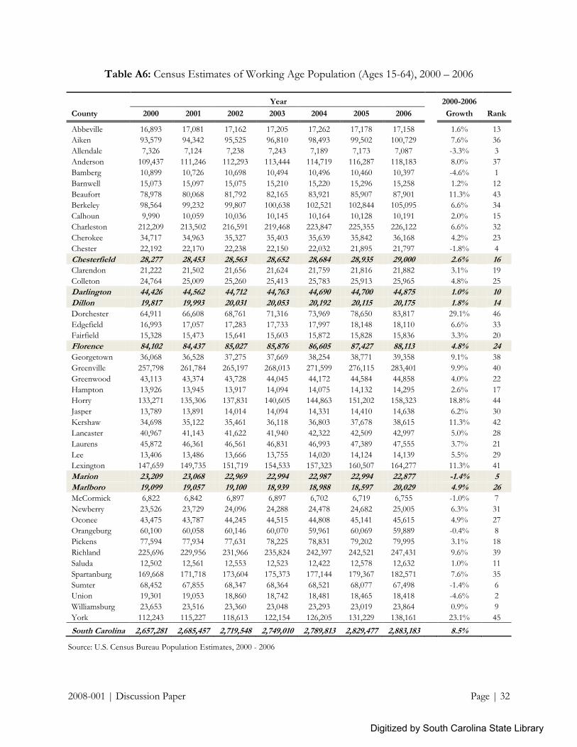
2008-001 | Discussion Paper Page | 32
Table A6: Census Estimates of Working Age Population (Ages 15-64), 2000 – 2006
Year 2000-2006
County 2000 2001 2002 2003 2004 2005 2006
Growth Rank
Abbeville 16,893 17,081 17,162 17,205 17,262 17,178 17,158
1.6% 13
Aiken 93,579 94,342 95,525 96,810 98,493 99,502 100,729
7.6% 36
Allendale 7,326 7,124 7,238 7,243 7,189 7,173 7,087
-3.3% 3
Anderson 109,437 111,246 112,293 113,444 114,719 116,287 118,183
8.0% 37
Bamberg 10,899 10,726 10,698 10,494 10,496 10,460 10,397
-4.6% 1
Barnwell 15,073 15,097 15,075 15,210 15,220 15,296 15,258
1.2% 12
Beaufort 78,978 80,068 81,792 82,165 83,921 85,907 87,901
11.3% 43
Berkeley 98,564 99,232 99,807 100,638 102,521 102,844 105,095
6.6% 34
Calhoun 9,990 10,059 10,036 10,145 10,164 10,128 10,191
2.0% 15
Charleston 212,209 213,502 216,591 219,468 223,847 225,355 226,122
6.6% 32
Cherokee 34,717 34,963 35,327 35,403 35,639 35,842 36,168
4.2% 23
Chester 22,192 22,170 22,238 22,150 22,032 21,895 21,797
-1.8% 4
Chesterfield 28,277 28,453 28,563 28,652 28,684 28,935 29,000 2.6% 16
Clarendon 21,222 21,502 21,656 21,624 21,759 21,816 21,882
3.1% 19
Colleton 24,764 25,009 25,260 25,413 25,783 25,913 25,965
4.8% 25
Darlington 44,426 44,562 44,712 44,763 44,690 44,700 44,875 1.0% 10
Dillon 19,817 19,993 20,031 20,053 20,192 20,115 20,175 1.8% 14
Dorchester 64,911 66,608 68,761 71,316 73,969 78,650 83,817
29.1% 46
Edgefield 16,993 17,057 17,283 17,733 17,997 18,148 18,110
6.6% 33
Fairfield 15,328 15,473 15,641 15,603 15,872 15,828 15,836
3.3% 20
Florence 84,102 84,437 85,027 85,876 86,605 87,427 88,113 4.8% 24
Georgetown 36,068 36,528 37,275 37,669 38,254 38,771 39,358
9.1% 38
Greenville 257,798 261,784 265,197 268,013 271,599 276,115 283,401
9.9% 40
Greenwood 43,113 43,374 43,728 44,045 44,172 44,584 44,858
4.0% 22
Hampton 13,926 13,945 13,917 14,094 14,075 14,132 14,295
2.6% 17
Horry 133,271 135,306 137,831 140,605 144,863 151,202 158,323
18.8% 44
Jasper 13,789 13,891 14,014 14,094 14,331 14,410 14,638
6.2% 30
Kershaw 34,698 35,122 35,461 36,118 36,803 37,678 38,615
11.3% 42
Lancaster 40,967 41,143 41,622 41,940 42,322 42,509 42,997
5.0% 28
Laurens 45,872 46,361 46,561 46,831 46,993 47,389 47,555
3.7% 21
Lee 13,406 13,486 13,666 13,755 14,020 14,124 14,139
5.5% 29
Lexington 147,659 149,735 151,719 154,533 157,323 160,507 164,277
11.3% 41
Marion 23,209 23,068 22,969 22,994 22,987 22,994 22,877 -1.4% 5
Marlboro 19,099 19,057 19,100 18,939 18,988 18,597 20,029 4.9% 26
McCormick 6,822 6,842 6,897 6,897 6,702 6,719 6,755
-1.0% 7
Newberry 23,526 23,729 24,096 24,288 24,478 24,682 25,005
6.3% 31
Oconee 43,475 43,787 44,245 44,515 44,808 45,141 45,615
4.9% 27
Orangeburg 60,100 60,058 60,146 60,070 59,961 60,069 59,889
-0.4% 8
Pickens 77,594 77,934 77,631 78,225 78,831 79,202 79,995
3.1% 18
Richland 225,696 229,956 231,966 235,824 242,397 242,521 247,431
9.6% 39
Saluda 12,502 12,561 12,553 12,523 12,422 12,578 12,632
1.0% 11
Spartanburg 169,668 171,718 173,604 175,373 177,144 179,367 182,571
7.6% 35
Sumter 68,452 67,855 68,347 68,364 68,521 68,077 67,498
-1.4% 6
Union 19,301 19,053 18,860 18,742 18,481 18,465 18,418
-4.6% 2
Williamsburg 23,653 23,516 23,360 23,048 23,293 23,019 23,864
0.9% 9
York 112,243 115,227 118,613 122,154 126,205 131,229 138,161
23.1% 45
South Carolina 2,657,281 2,685,457 2,719,548 2,749,010 2,789,813 2,829,477 2,883,183 8.5%
Source: U.S. Census Bureau Population Estimates, 2000 - 2006
Digitized by South Carolina State Library
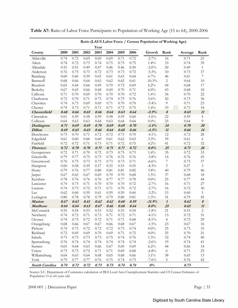
2008-001 | Discussion Paper Page | 33
Table A7: Ratio of Labor Force Participants to Population of Working Age (15 to 64), 2000-2006
Ratio (LAUS Labor Force / Census Population of Working Age)
Year
County 2000 2001 2002 2003 2004 2005 2006
Growth Rank Average Rank
Abbeville 0.74 0.72 0.69 0.69 0.69 0.71 0.72
-2.7% 16 0.71 23
Aiken 0.74 0.72 0.73 0.74 0.75 0.75 0.75
1.4% 33 0.74 39
Allendale 0.51 0.51 0.49 0.47 0.46 0.46 0.50
-2.0% 20 0.49 1
Anderson 0.76 0.75 0.73 0.72 0.73 0.73 0.72
-5.3% 10 0.73 37 Bamberg 0.60 0.60 0.59 0.63 0.61 0.63 0.64
6.7% 46 0.61 7
Barnwell 0.68 0.66 0.64 0.63 0.62 0.62 0.61
-10.3% 2 0.64 10
Beaufort 0.65 0.64 0.66 0.69 0.70 0.72 0.69
6.2% 44 0.68 17
Berkeley 0.67 0.65 0.66 0.68 0.69 0.70 0.71
6.0% 43 0.68 18
Calhoun 0.71 0.70 0.69 0.70 0.70 0.70 0.72
1.4% 36 0.70 22
Charleston 0.72 0.70 0.71 0.73 0.74 0.75 0.76
5.6% 42 0.73 36
Cherokee 0.74 0.73 0.69 0.69 0.71 0.70 0.70
-5.4% 9 0.71 23
Chester 0.74 0.73 0.71 0.71 0.71 0.73 0.75
1.4% 33 0.73 34
Chesterfield 0.68 0.66 0.65 0.66 0.64 0.63 0.64 -5.9% 8 0.65 11 Clarendon 0.61 0.59 0.58 0.59 0.58 0.59 0.60
-1.6% 22 0.59 4
Colleton 0.64 0.63 0.63 0.64 0.63 0.64 0.64
0.0% 25 0.64 9
Darlington 0.71 0.69 0.69 0.70 0.69 0.69 0.70 -1.4% 24 0.70 20 Dillon 0.69 0.65 0.65 0.66 0.64 0.68 0.66 -4.3% 11 0.66 14 Dorchester 0.73 0.70 0.71 0.72 0.72 0.73 0.70
-4.1% 12 0.72 28
Edgefield 0.61 0.60 0.60 0.60 0.61 0.62 0.63
3.3% 39 0.61 6
Fairfield 0.72 0.72 0.71 0.73 0.71 0.72 0.75
4.2% 41 0.72 32
Florence 0.72 0.70 0.70 0.71 0.71 0.71 0.72 0.0% 25 0.71 26 Georgetown 0.72 0.71 0.70 0.72 0.73 0.75 0.73
1.4% 35 0.72 33
Greenville 0.79 0.77 0.75 0.75 0.76 0.76 0.76
-3.8% 14 0.76 43
Greenwood 0.76 0.75 0.73 0.73 0.73 0.73 0.71
-6.6% 7 0.73 37
Hampton 0.60 0.58 0.59 0.57 0.55 0.55 0.55
-8.3% 3 0.57 3
Horry 0.79 0.76 0.77 0.80 0.81 0.81 0.82
3.8% 40 0.79 46
Jasper 0.67 0.65 0.67 0.69 0.70 0.70 0.68
1.5% 37 0.68 18
Kershaw 0.78 0.76 0.76 0.76 0.77 0.77 0.78
0.0% 25 0.77 44 Lancaster 0.74 0.73 0.71 0.70 0.70 0.70 0.72
-2.7% 16 0.71 27
Laurens 0.74 0.73 0.72 0.71 0.71 0.70 0.72
-2.7% 16 0.72 30
Lee 0.62 0.60 0.59 0.61 0.59 0.59 0.60
-3.2% 15 0.60 5
Lexington 0.80 0.78 0.78 0.79 0.79 0.80 0.81
1.3% 31 0.79 45
Marion 0.67 0.63 0.61 0.62 0.62 0.60 0.59 -11.9% 1 0.62 8 Marlboro 0.64 0.64 0.63 0.67 0.66 0.68 0.64 0.0% 25 0.65 11 McCormick 0.55 0.54 0.53 0.53 0.52 0.53 0.54
-1.8% 21 0.53 2
Newberry 0.74 0.72 0.71 0.73 0.71 0.72 0.71
-4.1% 13 0.72 31
Oconee 0.74 0.73 0.72 0.72 0.71 0.71 0.68
-8.1% 4 0.72 29
Orangeburg 0.68 0.66 0.67 0.67 0.66 0.68 0.67
-1.5% 23 0.67 16
Pickens 0.74 0.73 0.72 0.72 0.72 0.73 0.74
0.0% 25 0.73 35
Richland 0.72 0.69 0.69 0.70 0.69 0.71 0.72
0.0% 25 0.70 21
Saluda 0.75 0.73 0.73 0.73 0.75 0.74 0.76
1.3% 32 0.74 40
Spartanburg 0.76 0.74 0.74 0.74 0.74 0.74 0.74
-2.6% 19 0.74 41
Sumter 0.65 0.64 0.63 0.66 0.67 0.69 0.69
6.2% 44 0.66 14
Union 0.73 0.73 0.72 0.71 0.71 0.69 0.68
-6.8% 6 0.71 25
Williamsburg 0.64 0.63 0.64 0.68 0.65 0.68 0.66
3.1% 38 0.65 13
York 0.79 0.77 0.77 0.76 0.75 0.74 0.73
-7.6% 5 0.76 42
South Carolina 0.74 0.72 0.72 0.73 0.73 0.74 0.74 0% 0.73
Source: S.C. Department of Commerce calculation of BLS Local Area Unemployment Statistics and US Census Estimates of Population 15 to 64 years old.
Digitized by South Carolina State Library

2008-001 | Discussion Paper Page | 34
Table A8: Ratio of Wage & Salary Employment to Population of Working Age (15 to 64), 2000-06
Ratio (QCEW Employment / Population of Working Age)
Year
County 2000 2001 2002 2003 2004 2005 2006
Growth Rank Average Rank
Abbeville 0.45 0.43 0.40 0.38 0.39 0.40 0.39
-13.3% 10 0.41 12
Aiken 0.60 0.60 0.59 0.58 0.58 0.56 0.55
-8.3% 22 0.58 38
Allendale 0.54 0.56 0.52 0.48 0.46 0.46 0.59
9.3% 45 0.52 28
Anderson 0.59 0.56 0.55 0.52 0.52 0.51 0.51
-13.6% 9 0.54 30 Bamberg 0.45 0.46 0.46 0.48 0.47 0.48 0.46
2.2% 40 0.47 20
Barnwell 0.58 0.56 0.53 0.49 0.49 0.48 0.46
-20.7% 4 0.51 27
Beaufort 0.68 0.68 0.68 0.69 0.70 0.71 0.70
2.9% 42 0.69 40
Berkeley 0.33 0.33 0.34 0.34 0.34 0.35 0.36
9.1% 44 0.34 3
Calhoun 0.40 0.40 0.40 0.41 0.39 0.41 0.41
2.5% 41 0.40 10
Charleston 0.86 0.85 0.84 0.85 0.86 0.88 0.90
4.7% 43 0.86 45
Cherokee 0.61 0.58 0.55 0.53 0.54 0.54 0.54
-11.5% 14 0.56 35
Chester 0.57 0.55 0.50 0.49 0.48 0.50 0.49
-14.0% 8 0.51 26
Chesterfield 0.57 0.53 0.52 0.50 0.48 0.47 0.48 -15.8% 7 0.51 25 Clarendon 0.39 0.37 0.36 0.35 0.35 0.35 0.35
-10.3% 17 0.36 4
Colleton 0.43 0.42 0.42 0.41 0.41 0.40 0.42
-2.3% 33 0.42 16
Darlington 0.50 0.49 0.49 0.47 0.47 0.47 0.47 -6.0% 28 0.48 23 Dillon 0.49 0.46 0.46 0.46 0.45 0.48 0.47 -4.1% 30 0.47 21 Dorchester 0.40 0.40 0.41 0.40 0.40 0.38 0.36
-10.0% 18 0.39 7
Edgefield 0.37 0.37 0.38 0.37 0.37 0.35 0.34
-8.1% 24 0.36 5
Fairfield 0.49 0.45 0.43 0.37 0.36 0.37 0.38
-22.4% 3 0.41 13
Florence 0.75 0.75 0.75 0.73 0.72 0.68 0.69 -8.0% 25 0.72 42 Georgetown 0.59 0.58 0.57 0.56 0.57 0.59 0.60
1.7% 38 0.58 37
Greenville 0.90 0.86 0.83 0.83 0.82 0.82 0.82
-8.9% 21 0.84 44
Greenwood 0.75 0.74 0.70 0.69 0.69 0.68 0.67
-10.7% 16 0.70 41
Hampton 0.46 0.44 0.42 0.39 0.38 0.38 0.38
-17.4% 6 0.41 13
Horry 0.74 0.71 0.72 0.72 0.73 0.72 0.73
-1.4% 35 0.72 42
Jasper 0.35 0.35 0.37 0.38 0.39 0.43 0.52
48.6% 46 0.40 8
Kershaw 0.52 0.50 0.50 0.50 0.50 0.47 0.46
-11.5% 13 0.49 24 Lancaster 0.47 0.46 0.45 0.42 0.41 0.41 0.41
-12.8% 11 0.43 17
Laurens 0.44 0.43 0.41 0.38 0.38 0.39 0.39
-11.4% 15 0.40 10
Lee 0.30 0.30 0.29 0.29 0.28 0.27 0.27
-10.0% 19 0.29 1
Lexington 0.55 0.54 0.54 0.54 0.55 0.55 0.56
1.8% 39 0.55 32
Marion 0.52 0.47 0.45 0.44 0.44 0.41 0.40 -23.1% 1 0.45 18 Marlboro 0.41 0.42 0.41 0.41 0.41 0.43 0.41 0.0% 36 0.41 15 McCormick 0.33 0.31 0.30 0.28 0.28 0.29 0.29
-12.1% 12 0.30 2
Newberry 0.57 0.55 0.53 0.55 0.55 0.55 0.55
-3.5% 31 0.55 33
Oconee 0.59 0.58 0.56 0.55 0.54 0.52 0.48
-18.6% 5 0.55 31
Orangeburg 0.58 0.56 0.56 0.54 0.54 0.54 0.54
-6.9% 27 0.55 34
Pickens 0.47 0.46 0.45 0.44 0.44 0.44 0.46
-2.1% 34 0.45 19
Richland 0.92 0.90 0.88 0.87 0.85 0.85 0.85
-7.6% 26 0.87 46
Saluda 0.37 0.37 0.38 0.37 0.35 0.35 0.36
-2.7% 32 0.36 5
Spartanburg 0.71 0.68 0.67 0.66 0.65 0.64 0.64
-9.9% 20 0.66 39
Sumter 0.61 0.58 0.56 0.56 0.56 0.57 0.56
-8.2% 23 0.57 36
Union 0.53 0.52 0.50 0.47 0.45 0.44 0.41
-22.6% 2 0.47 22
Williamsburg 0.40 0.41 0.39 0.40 0.40 0.41 0.40
0.0% 36 0.40 9
York 0.54 0.52 0.51 0.51 0.52 0.51 0.51
-5.6% 29 0.52 29
South Carolina 0.68 0.67 0.65 0.64 0.64 0.64 0.64 -6% 0.65
Source: S.C. Department of Commerce calculation of BLS Quarterly Census of Employment and Wages and US Census Estimates of Population 15 to 64 years old.
Digitized by South Carolina State Library

2008-001 | Discussion Paper Page | 35
Table A9: Ratio of Employer-Reported QCEW Employment to Self-Reported LAUS Employment,
2000 – 2006
Ratio (QCEW Employment / LAUS Employment)
Year
County 2000 2001 2002 2003 2004 2005 2006
Growth Rank Average Rank
Abbeville 0.64 0.64 0.63 0.61 0.61 0.62 0.60
-6.3% 12 0.62 10
Aiken 0.84 0.87 0.85 0.83 0.82 0.80 0.79
-6.0% 14 0.83 31
Allendale 1.13 1.16 1.15 1.12 1.12 1.10 1.33
17.7% 45 1.16 44
Anderson 0.79 0.80 0.80 0.77 0.77 0.76 0.75
-5.1% 18 0.78 26 Bamberg 0.80 0.82 0.83 0.83 0.83 0.83 0.80
0.0% 31 0.82 30
Barnwell 0.90 0.91 0.89 0.86 0.87 0.85 0.83
-7.8% 8 0.87 34
Beaufort 1.08 1.10 1.07 1.06 1.05 1.03 1.07
-0.9% 30 1.07 41
Berkeley 0.51 0.54 0.54 0.53 0.53 0.53 0.53
3.9% 41 0.53 3
Calhoun 0.58 0.61 0.61 0.63 0.60 0.64 0.61
5.2% 43 0.61 6
Charleston 1.23 1.26 1.24 1.24 1.23 1.24 1.24
0.8% 36 1.24 45 Cherokee 0.86 0.86 0.86 0.85 0.84 0.84 0.84
-2.3% 26 0.85 32
Chester 0.82 0.81 0.78 0.76 0.76 0.75 0.73
-11.0% 3 0.77 24
Chesterfield 0.88 0.87 0.87 0.85 0.84 0.83 0.83 -5.7% 16 0.85 33 Clarendon 0.66 0.68 0.67 0.65 0.66 0.65 0.66
0.0% 31 0.66 14
Colleton 0.70 0.71 0.71 0.69 0.69 0.68 0.70
0.0% 31 0.70 17
Darlington 0.75 0.76 0.76 0.73 0.74 0.75 0.72
-4.0% 24 0.74 22 Dillon 0.77 0.79 0.78 0.76 0.78 0.77 0.78 1.3% 38 0.78 25 Dorchester 0.57 0.60 0.60 0.59 0.58 0.55 0.54 -5.3% 17 0.58 4 Edgefield 0.63 0.66 0.67 0.64 0.65 0.61 0.58
-7.9% 7 0.63 11
Fairfield 0.72 0.68 0.65 0.57 0.55 0.56 0.56
-22.2% 1 0.61 7
Florence 1.09 1.13 1.14 1.11 1.11 1.05 1.04 -4.6% 21 1.10 42 Georgetown 0.87 0.88 0.88 0.86 0.87 0.86 0.89
2.3% 39 0.87 34
Greenville 1.18 1.17 1.16 1.16 1.14 1.14 1.13
-4.2% 22 1.15 43
Greenwood 1.04 1.05 1.06 1.05 1.03 1.02 1.03
-1.0% 29 1.04 40
Hampton 0.80 0.80 0.78 0.74 0.77 0.75 0.74
-7.5% 9 0.77 23
Horry 0.97 0.99 0.98 0.95 0.96 0.95 0.94
-3.1% 25 0.96 39
Jasper 0.55 0.56 0.59 0.59 0.60 0.64 0.81
47.3% 46 0.62 8
Kershaw 0.69 0.70 0.69 0.70 0.69 0.65 0.63
-8.7% 5 0.68 15 Lancaster 0.67 0.67 0.68 0.65 0.64 0.63 0.62
-7.5% 10 0.65 12
Laurens 0.62 0.62 0.61 0.58 0.58 0.60 0.58
-6.5% 11 0.60 5
Lee 0.52 0.53 0.53 0.52 0.53 0.51 0.49
-5.8% 15 0.52 1
Lexington 0.71 0.72 0.73 0.72 0.73 0.73 0.73
2.8% 40 0.72 19
Marion 0.85 0.85 0.84 0.82 0.81 0.78 0.76 -10.6% 4 0.82 28 Marlboro 0.69 0.72 0.71 0.71 0.72 0.72 0.72 4.3% 42 0.71 18 McCormick 0.64 0.64 0.64 0.61 0.60 0.60 0.61
-4.7% 20 0.62 8
Newberry 0.81 0.81 0.81 0.81 0.83 0.81 0.82
1.2% 37 0.81 27
Oconee 0.82 0.84 0.84 0.83 0.82 0.80 0.78
-4.9% 19 0.82 29
Orangeburg 0.91 0.93 0.92 0.90 0.89 0.88 0.89
-2.2% 27 0.90 36
Pickens 0.66 0.66 0.67 0.67 0.65 0.65 0.66
0.0% 31 0.66 13
Richland 1.33 1.35 1.33 1.32 1.31 1.27 1.25
-6.0% 13 1.31 46 Saluda 0.52 0.53 0.55 0.54 0.51 0.51 0.51
-1.9% 28 0.52 2
Spartanburg 0.96 0.97 0.97 0.96 0.94 0.94 0.92
-4.2% 23 0.95 38
Sumter 0.97 0.98 0.97 0.92 0.91 0.90 0.89
-8.2% 6 0.93 37
Union 0.77 0.77 0.77 0.74 0.72 0.71 0.67
-13.0% 2 0.74 21
Williamsburg 0.68 0.71 0.69 0.68 0.69 0.68 0.68
0.0% 31 0.69 16
York 0.71 0.71 0.71 0.73 0.75 0.74 0.75
5.6% 44 0.73 20
South Carolina 0.96 0.97 0.96 0.95 0.94 0.94 0.93 -3.1% 0.95
Source: S.C. Department of Commerce calculation of BLS LAUS and Quarterly Census of Employment and Wages.
Digitized by South Carolina State Library

2008-001 | Discussion Paper Page | 36
Table A10: Ratio of QCEW Employment to BEA REIS Private Employment, 2001 – 2005
Ratio (QCEW Employment / BEA REIS Employment)
Year
County 2001 2002 2003 2004 2005
Growth Rank Average Rank
Abbeville 0.76 0.76 0.76 0.75 0.75
-1.3% 38
0.76 3
Aiken 0.84 0.83 0.82 0.82 0.80
-4.8% 18
0.82 5
Allendale 1.21 1.21 1.19 1.15 1.14
-5.8% 15
1.18 46
Anderson 0.91 0.91 0.88 0.87 0.86
-5.5% 16
0.89 16 Bamberg 0.94 0.93 0.93 0.92 0.91
-3.2% 27
0.93 25
Barnwell 1.08 1.06 0.99 1.00 0.99
-8.3% 5
1.02 38
Beaufort 0.86 0.86 0.86 0.85 0.84
-2.3% 30
0.85 9
Berkeley 0.76 0.76 0.75 0.73 0.73
-3.9% 22
0.75 2
Calhoun 0.66 0.65 0.64 0.62 0.62
-6.1% 14
0.64 1
Charleston 0.93 0.93 0.93 0.92 0.91
-2.2% 35
0.92 24
Cherokee 0.92 0.93 0.92 0.91 0.90
-2.2% 34
0.92 22
Chester 0.99 0.95 0.94 0.91 0.89
-10.1% 3
0.94 27
Chesterfield 0.93 0.92 0.91 0.90 0.89
-4.3% 20
0.91 19 Clarendon 0.98 0.93 0.90 0.88 0.87
-11.2% 1
0.91 20
Colleton 0.87 0.86 0.83 0.82 0.81
-6.9% 11
0.84 7
Darlington 0.90 0.89 0.88 0.88 0.87
-3.3% 25
0.88 15 Dillon 0.91 0.89 0.91 0.88 0.92
1.1% 45
0.90 18
Dorchester 0.97 0.98 0.99 0.97 0.96
-1.0% 41
0.97 33
Edgefield 1.04 1.09 1.09 1.07 1.08
3.8% 46
1.07 43
Fairfield 0.98 0.96 0.95 0.91 0.91
-7.1% 8
0.94 28
Florence 0.97 0.96 0.96 0.95 0.90
-7.2% 7
0.95 29 Georgetown 0.81 0.77 0.77 0.78 0.78
-3.7% 23
0.78 4
Greenville 0.88 0.89 0.88 0.87 0.86
-2.3% 31
0.88 11
Greenwood 1.02 1.03 1.03 1.03 1.01
-1.0% 42
1.02 38
Hampton 1.01 1.03 0.97 0.96 0.94
-6.9% 10
0.98 34
Horry 0.88 0.89 0.89 0.88 0.87
-1.1% 39
0.88 14
Jasper 0.89 0.89 0.88 0.87 0.87
-2.2% 32
0.88 13
Kershaw 0.88 0.87 0.86 0.84 0.81
-8.0% 6
0.85 8 Lancaster 0.91 0.92 0.88 0.87 0.86
-5.5% 16
0.89 17
Laurens 0.99 1.02 0.94 0.93 0.92
-7.1% 9
0.96 32
Lee 0.94 0.92 0.91 0.91 0.88
-6.4% 13
0.91 21
Lexington 0.84 0.84 0.82 0.81 0.81
-3.6% 24
0.82 6
Marion 0.88 0.88 0.87 0.86 0.82
-6.8% 12
0.86 10 Marlboro 1.04 1.03 1.02 1.02 1.04
0.0% 43
1.03 41
McCormick 1.16 1.11 1.08 1.05 1.03
-11.2% 2
1.09 45
Newberry 1.00 1.03 1.03 0.99 0.98
-2.0% 36
1.01 37
Oconee 0.93 0.92 0.92 0.91 0.90
-3.2% 26
0.92 22
Orangeburg 1.00 0.98 0.99 0.98 0.97
-3.0% 29
0.98 35
Pickens 0.96 0.97 0.95 0.94 0.93
-3.1% 28
0.95 30
Richland 1.09 1.09 1.09 1.08 1.04
-4.6% 19
1.08 44
Saluda 1.05 1.10 1.09 1.05 1.03
-1.9% 37
1.06 42
Spartanburg 0.93 0.94 0.93 0.92 0.92
-1.1% 40
0.93 26
Sumter 0.97 0.96 0.96 0.94 0.93
-4.1% 21
0.95 31
Union 1.06 1.08 1.03 1.01 0.96
-9.4% 4
1.03 40
Williamsburg 0.99 0.99 1.00 0.98 0.99
0.0% 43
0.99 36
York 0.90 0.87 0.86 0.88 0.88
-2.2% 33
0.88 12
South Carolina 0.96 0.96 0.95 0.94 0.93
-3.1%
0.95
Source: S.C. Department of Commerce calculation of BLS Quarterly Census of Employment and Wages and BEA Regional Economic Information System.
Digitized by South Carolina State Library

2008-001 | Discussion Paper Page | 37
Table A11: Wage and Salary Employment Location Quotients, 2001 – 2005
BEA REIS Wage and Salary Employment Location Quotients
Year
County 2001 2002 2003 2004 2005
Average Rank
Abbeville State LQ 0.86 0.85 0.83 0.83 0.82
0.84 3
National LQ 0.89 0.87 0.85 0.85 0.85
0.86
Aiken State LQ 0.94 0.94 0.94 0.93 0.93
0.94 14
National LQ 0.97 0.97 0.97 0.96 0.96
0.97
Allendale State LQ 1.02 1.01 1.00 1.00 1.00
1.01 33
National LQ 1.05 1.04 1.04 1.03 1.03
1.04
Anderson State LQ 0.95 0.95 0.95 0.94 0.94
0.95 17
National LQ 0.99 0.98 0.98 0.97 0.97
0.98
Bamberg State LQ 0.91 0.92 0.92 0.91 0.91
0.91 10
National LQ 0.94 0.94 0.95 0.94 0.94
0.94
Barnwell State LQ 0.98 0.99 0.99 0.98 0.98
0.98 23
National LQ 1.02 1.02 1.02 1.01 1.01
1.02
Beaufort State LQ 1.00 1.00 1.00 1.00 1.00
1.00 29
National LQ 1.03 1.03 1.04 1.04 1.04
1.04
Berkeley State LQ 0.82 0.83 0.82 0.82 0.82
0.82 2
National LQ 0.85 0.86 0.85 0.85 0.85
0.85
Calhoun State LQ 0.71 0.72 0.73 0.71 0.71
0.72 1
National LQ 0.74 0.74 0.75 0.73 0.73
0.74
Charleston State LQ 1.01 1.01 1.02 1.02 1.02
1.02 35
National LQ 1.04 1.04 1.05 1.05 1.05
1.05
Cherokee State LQ 1.03 1.03 1.03 1.03 1.03
1.03 39
National LQ 1.06 1.06 1.06 1.07 1.07
1.06
Chester State LQ 0.99 0.98 0.98 0.97 0.97
0.98 21
National LQ 1.02 1.01 1.01 1.01 1.01
1.01
Chesterfield State LQ 0.98 0.98 0.97 0.97 0.96
0.97 20
National LQ 1.01 1.01 1.00 1.00 0.99 1.00
Clarendon State LQ 0.92 0.92 0.91 0.91 0.90
0.91 9
National LQ 0.95 0.94 0.94 0.94 0.93
0.94
Colleton State LQ 0.89 0.89 0.89 0.88 0.87
0.88 6
National LQ 0.92 0.91 0.91 0.91 0.90
0.91
Darlington State LQ 0.99 0.99 0.99 0.98 0.98
0.99 24
National LQ 1.02 1.02 1.02 1.01 1.01
1.02
Dillon State LQ 1.00 1.00 1.00 1.00 1.00
1.00 30
National LQ 1.03 1.03 1.03 1.03 1.03 1.03
Dorchester State LQ 1.04 1.05 1.05 1.06 1.06
1.05 45
National LQ 1.07 1.08 1.09 1.09 1.10
1.09
Edgefield State LQ 0.99 1.00 1.00 1.01 0.99
1.00 28
National LQ 1.02 1.03 1.03 1.04 1.03
1.03
Fairfield State LQ 0.98 0.97 0.95 0.96 0.96
0.96 19
National LQ 1.01 1.00 0.99 0.99 0.99
1.00
Florence State LQ 1.02 1.02 1.02 1.02 1.01
1.02 37
National LQ 1.05 1.05 1.05 1.05 1.05 1.05
Georgetown State LQ 0.88 0.89 0.88 0.88 0.87
0.88 5
National LQ 0.91 0.92 0.91 0.90 0.90
0.91
Greenville State LQ 1.03 1.03 1.03 1.03 1.03
1.03 40
National LQ 1.07 1.06 1.06 1.06 1.07
1.06
Greenwood State LQ 1.04 1.04 1.04 1.04 1.04
1.04 43
National LQ 1.07 1.07 1.07 1.07 1.08
1.07 Hampton State LQ 0.96 0.95 0.95 0.94 0.94
0.95 18
Digitized by South Carolina State Library

2008-001 | Discussion Paper Page | 38
BEA REIS Wage and Salary Employment Location Quotients
Year
County 2001 2002 2003 2004 2005
Average Rank
National LQ 0.99 0.98 0.98 0.97 0.97
0.98
Horry State LQ 1.02 1.02 1.02 1.03 1.03
1.02 38
National LQ 1.05 1.05 1.06 1.06 1.07
1.06
Jasper State LQ 0.90 0.91 0.91 0.92 0.93
0.91 11
National LQ 0.93 0.94 0.94 0.95 0.96
0.94
Kershaw State LQ 0.92 0.92 0.92 0.92 0.92
0.92 13
National LQ 0.95 0.95 0.95 0.95 0.95
0.95
Lancaster State LQ 0.96 0.95 0.94 0.94 0.93
0.94 15
National LQ 0.99 0.98 0.97 0.97 0.97
0.98
Laurens State LQ 0.99 0.99 0.98 0.98 0.99
0.99 25
National LQ 1.02 1.02 1.02 1.02 1.02
1.02
Lee State LQ 0.90 0.89 0.89 0.88 0.87
0.89 7
National LQ 0.93 0.92 0.92 0.91 0.90
0.92
Lexington State LQ 0.91 0.92 0.92 0.92 0.92
0.92 12
National LQ 0.94 0.95 0.95 0.95 0.95
0.95
Marion State LQ 0.90 0.89 0.88 0.87 0.85
0.88 4
National LQ 0.93 0.92 0.91 0.90 0.88 0.91
Marlboro State LQ 1.03 1.04 1.04 1.04 1.04
1.04 42
National LQ 1.07 1.07 1.07 1.08 1.08
1.07
McCormick State LQ 0.91 0.91 0.89 0.88 0.88
0.89 8
National LQ 0.94 0.93 0.92 0.91 0.91
0.92
Newberry State LQ 1.01 1.01 1.02 1.02 1.02
1.02 36
National LQ 1.04 1.04 1.05 1.06 1.06
1.05
Oconee State LQ 0.99 0.99 0.98 0.98 0.97
0.98 22
National LQ 1.02 1.02 1.02 1.01 1.00
1.01
Orangeburg State LQ 1.01 1.00 1.00 1.00 1.00
1.00 31
National LQ 1.04 1.03 1.03 1.03 1.03
1.03
Pickens State LQ 1.00 0.99 0.99 0.99 0.99
0.99 26
National LQ 1.03 1.02 1.02 1.02 1.02
1.02
Richland State LQ 1.08 1.08 1.08 1.08 1.09
1.08 46
National LQ 1.11 1.11 1.12 1.12 1.12
1.12
Saluda State LQ 0.95 0.94 0.94 0.94 0.95
0.94 16
National LQ 0.98 0.97 0.97 0.97 0.98
0.97
Spartanburg State LQ 1.03 1.04 1.04 1.04 1.03
1.04 41
National LQ 1.07 1.07 1.07 1.07 1.07
1.07
Sumter State LQ 1.04 1.04 1.05 1.05 1.05
1.05 44
National LQ 1.08 1.08 1.08 1.08 1.08
1.08
Union State LQ 1.01 1.02 1.01 1.00 1.01
1.01 34
National LQ 1.04 1.05 1.04 1.04 1.04
1.04
Williamsburg State LQ 1.00 1.00 1.00 1.00 1.01
1.00 32
National LQ 1.04 1.03 1.03 1.04 1.04
1.04
York State LQ 0.99 0.99 1.00 1.00 1.00
1.00 27
National LQ 1.02 1.03 1.03 1.04 1.04
1.03 South Carolina National LQ 1.03 1.03 1.03 1.03 1.03 1.03
Source: S.C. Department of Commerce calculation of BEA Regional Economic Information System data.
Digitized by South Carolina State Library
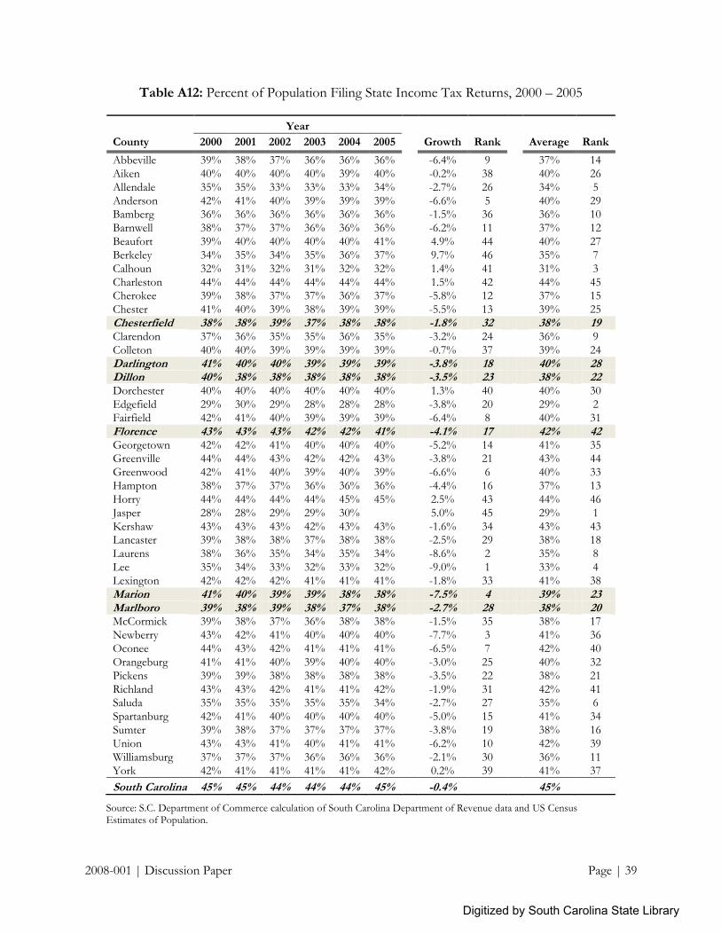
2008-001 | Discussion Paper Page | 39
Table A12: Percent of Population Filing State Income Tax Returns, 2000 – 2005
Year
County 2000 2001 2002 2003 2004 2005
Growth Rank
Average Rank
Abbeville 39% 38% 37% 36% 36% 36% -6.4% 9 37% 14
Aiken 40% 40% 40% 40% 39% 40% -0.2% 38 40% 26
Allendale 35% 35% 33% 33% 33% 34% -2.7% 26 34% 5
Anderson 42% 41% 40% 39% 39% 39% -6.6% 5 40% 29 Bamberg 36% 36% 36% 36% 36% 36% -1.5% 36 36% 10
Barnwell 38% 37% 37% 36% 36% 36% -6.2% 11 37% 12
Beaufort 39% 40% 40% 40% 40% 41% 4.9% 44 40% 27
Berkeley 34% 35% 34% 35% 36% 37% 9.7% 46 35% 7
Calhoun 32% 31% 32% 31% 32% 32% 1.4% 41 31% 3
Charleston 44% 44% 44% 44% 44% 44% 1.5% 42 44% 45 Cherokee 39% 38% 37% 37% 36% 37% -5.8% 12 37% 15
Chester 41% 40% 39% 38% 39% 39% -5.5% 13 39% 25
Chesterfield 38% 38% 39% 37% 38% 38% -1.8% 32 38% 19 Clarendon 37% 36% 35% 35% 36% 35% -3.2% 24 36% 9
Colleton 40% 40% 39% 39% 39% 39% -0.7% 37 39% 24
Darlington 41% 40% 40% 39% 39% 39% -3.8% 18 40% 28 Dillon 40% 38% 38% 38% 38% 38% -3.5% 23 38% 22 Dorchester 40% 40% 40% 40% 40% 40% 1.3% 40 40% 30
Edgefield 29% 30% 29% 28% 28% 28% -3.8% 20 29% 2
Fairfield 42% 41% 40% 39% 39% 39% -6.4% 8 40% 31
Florence 43% 43% 43% 42% 42% 41% -4.1% 17 42% 42 Georgetown 42% 42% 41% 40% 40% 40% -5.2% 14 41% 35 Greenville 44% 44% 43% 42% 42% 43% -3.8% 21 43% 44
Greenwood 42% 41% 40% 39% 40% 39% -6.6% 6 40% 33
Hampton 38% 37% 37% 36% 36% 36% -4.4% 16 37% 13
Horry 44% 44% 44% 44% 45% 45% 2.5% 43 44% 46
Jasper 28% 28% 29% 29% 30%
5.0% 45 29% 1
Kershaw 43% 43% 43% 42% 43% 43% -1.6% 34 43% 43 Lancaster 39% 38% 38% 37% 38% 38% -2.5% 29 38% 18
Laurens 38% 36% 35% 34% 35% 34% -8.6% 2 35% 8
Lee 35% 34% 33% 32% 33% 32% -9.0% 1 33% 4
Lexington 42% 42% 42% 41% 41% 41% -1.8% 33 41% 38
Marion 41% 40% 39% 39% 38% 38% -7.5% 4 39% 23 Marlboro 39% 38% 39% 38% 37% 38% -2.7% 28 38% 20 McCormick 39% 38% 37% 36% 38% 38% -1.5% 35 38% 17
Newberry 43% 42% 41% 40% 40% 40% -7.7% 3 41% 36
Oconee 44% 43% 42% 41% 41% 41% -6.5% 7 42% 40
Orangeburg 41% 41% 40% 39% 40% 40% -3.0% 25 40% 32
Pickens 39% 39% 38% 38% 38% 38% -3.5% 22 38% 21
Richland 43% 43% 42% 41% 41% 42% -1.9% 31 42% 41 Saluda 35% 35% 35% 35% 35% 34% -2.7% 27 35% 6
Spartanburg 42% 41% 40% 40% 40% 40% -5.0% 15 41% 34
Sumter 39% 38% 37% 37% 37% 37% -3.8% 19 38% 16
Union 43% 43% 41% 40% 41% 41% -6.2% 10 42% 39
Williamsburg 37% 37% 37% 36% 36% 36% -2.1% 30 36% 11
York 42% 41% 41% 41% 41% 42% 0.2% 39 41% 37
South Carolina 45% 45% 44% 44% 44% 45% -0.4% 45%
Source: S.C. Department of Commerce calculation of South Carolina Department of Revenue data and US Census Estimates of Population.
Digitized by South Carolina State Library