“improving the quality of life by enhancing mobility” lomax, bruce wang, david schrank, william...
TRANSCRIPT

Tim Lomax, Bruce Wang, David Schrank, William Eisele, Shawn Turner, David Ellis, Yingfeng Li, Nick Koncz, and Lauren Geng
DOT Grant No. DTRT06-G-0044
Improving Mobility Information with Better Data and Estimation Procedures
Final Report
Performing OrganizationUniversity Transportation Center for Mobility™Texas Transportation InstituteThe Texas A&M University SystemCollege Station, TX
Sponsoring AgencyDepartment of TransportationResearch and Innovative Technology AdministrationWashington, DC
“Improving the Quality of Life by Enhancing Mobility”
University Transportation Center for Mobility
UTCM Project # 09-17-09March 2010

Technical Report Documentation Page 1. Project No.
UTCM 09‐17‐09 2. Government Accession No.
3. Recipient's Catalog No.
4. Title and Subtitle
Improving Mobility Information with Better Data and Estimation Procedures
5. Report Date
March 2010
6. Performing Organization Code
Texas Transportation Institute 7. Author(s)
Tim Lomax, Bruce Wang, David Schrank, William Eisele, Shawn Turner, David Ellis, Yingfeng Li, Nick Koncz, and Lauren Geng
8. Performing Organization Report No.
UTCM 09‐17‐09
9. Performing Organization Name and Address
University Transportation Center for Mobility™ Texas Transportation Institute The Texas A&M University System 3135 TAMU College Station, TX 77843‐3135
10. Work Unit No. (TRAIS)
11. Contract or Grant No.
DTRT06‐G‐0044
12. Sponsoring Agency Name and Address
Department of Transportation Research and Innovative Technology Administration 400 7th Street, SW Washington, DC 20590
13. Type of Report and Period Covered
Final Report 01/01/2009 – 12/31/2009 14. Sponsoring Agency Code
15. Supplementary Notes
Supported by a grant from the US Department of Transportation, University Transportation Centers Program 16. Abstract
The Texas Transportation Institute (TTI) continues to be a national leader in providing congestion and mobility information. The information produced by TTI is used to communicate the issues of urban mobility at all levels of government in the U.S. and by both industry and non‐industry professionals when discussing mobility topics. The transportation field continues to evolve with more technological advancements affecting travel on the roadways and the data collected. This project incorporates the speed data from some of these new technologies into the Urban Mobility Report (UMR) to ensure that the report remains the preeminent source on the subject. The 2009 Urban Mobility Report will utilize the current speed estimation methodology, but future reports may be able to incorporate some archived speed information in place of the current estimated speeds. With the fuel price increases of the past few years, an updated analysis of the effects of fuel price fluctuations on travel demand and congestion are being included in the UMR. TTI has developed a methodology for estimating the commodities that are flowing in trucks and the associated traffic delay throughout our nation’s cities. However, at this time, it is unclear how to utilize this information in decision‐making. Some analysis is being performed to determine how to utilize this truck commodity flow information.
17. Key Word
Mobility, Traffic Congestion, Traffic Delay, Traffic Estimation, Traffic Data, Travel Demand, Commodity Flow, Data Collection, Fuel Prices, Research Projects
18. Distribution Statement
Public distribution
19. Security Classif. (of this report)
Unclassified 20. Security Classif. (of this page)
Unclassified 21. No. of Pages
87 22. Price
n/a
Form DOT F 1700.7 (8‐72) Reproduction of completed page authorized

Improving Mobility Information with Better Data and Estimation Procedures
Tim Lomax Research Engineer
Texas Transportation Institute
Bruce Wang Assistant Professor
Texas A&M University
David Schrank Associate Research Scientist Texas Transportation Institute
William Eisele Research Engineer
Texas Transportation Institute
Shawn Turner Senior Research Engineer
Texas Transportation Institute
David Ellis Research Scientist
Texas Transportation Institute
Yingfeng Li Assistant Research Scientist Texas Transportation Institute
Nick Koncz
Assistant Research Scientist Texas Transportation Institute
Lauren Geng Systems Analyst I
Texas Transportation Institute
Final Report Project #09‐17‐09
University Transportation Center for Mobility™
March 2010

2
DISCLAIMER The contents of this report reflect the views of the authors, who are responsible for the facts and the accuracy of the information presented herein. This document is disseminated under the sponsorship of the Department of Transportation, University Transportation Centers Program in the interest of information exchange. The U.S. Government assumes no liability for the contents or use thereof.
ACKNOWLEDGMENTS Support for this research was provided by a grant from the U.S. Department of Transportation, University Transportation Centers Program to the University Transportation Center for Mobility (DTRT06‐G‐0044).

3
TABLE OF CONTENTS LIFT OF FIGURES ............................................................................................................................................ 4 EXECUTIVE SUMMARY .................................................................................................................................. 5 INTRODUCTION ............................................................................................................................................. 7 PRIVATE SECTOR HISTORICAL SPEED DATA .................................................................................................. 8 POLICY IMPLICATIONS OF USING FREIGHT COMMODITY MOBILITY INFORMATION FOR DECISION‐MAKING ....................................................................................................................................................... 21 EFFECTS OF FUEL PRICE ON TRAVEL AND CONGESTION ............................................................................ 32 REFERENCES ................................................................................................................................................ 45 APPENDIX A – 2009 URBAN MOBILITY REPORT .......................................................................................... 47

4
LIST OF FIGURES Figure 1. Different Roadway Segments ...................................................................................................... 10 Figure 2. At‐Grade Intersections ................................................................................................................ 10 Figure 3. Complex Highway Interchange Areas ......................................................................................... 11 Figure 4. Frontage Roads in TMC Network ................................................................................................ 11 Figure 5. Nearby Parallel Roads (Other Than Frontage Roads) on the TMC Network ............................... 11 Figure 6. Overlapping Road Segments on HPMS Network ........................................................................ 12 Figure 7. Roadway Conflation Procedure Developed for Combining HPMS Network Attributes onto the TMC Speed Network ................................................................................................................................... 12 Figure 8. HPMS Regions Used during Data Conflation ............................................................................... 13 Figure 9. Break TMC Segments Based on HPMS Segments ....................................................................... 14 Figure 10. Create Buffers from HPMS Segments ....................................................................................... 14 Figure 11. HPMS Attributes Passed to TMC Segments through HPMS Buffers ......................................... 14 Figure 12. Weekday Traffic Distribution Profile for No to Low Congestion ............................................... 16 Figure 13. Weekday Traffic Distribution Profile for Moderate Congestion ............................................... 17 Figure 14. Weekday Traffic Distribution Profile for Severe Congestion .................................................... 17 Figure 15. Weekend Traffic Distribution Profile ........................................................................................ 18 Figure 16. Weekday Traffic Distribution Profile for Severe Congestion and Similar Speeds in Each Peak Period .......................................................................................................................................................... 18 Figure 17. Freight Box Conceptual Framework Applied to Trucks (Adapted from Reference 8) .............. 23 Figure 18. Public Agency and Trucking Company Perspectives on Delay‐Causing Roadway Congestion (Adapted from Reference 8) ....................................................................................................................... 26 Figure 19: Vehicle Miles Traveled in the United State: 1999 through 2008. ............................................. 32 Figure 20: Vehicle Miles Traveled in the United States: 1936 through 2009 ............................................ 33 Figure 21: Average Annual Gasoline Price in the United States: 1936 through 2009 (in 2009 $) ............ 34 Figure 22: Year‐to‐Year Percent Change in VMT and Gasoline Price (in 2009 $) ....................................... 35 Figure 23: Taxable Gallons of Gasoline Sold (in thousands): August 1997 through December 2009 ....... 36 Figure 24: Taxable Gallons of Gasoline Sold Per Capita: August 1997 through December 2009 .............. 36 Figures 25: Gasoline Price and Gasoline Consumption in February in 2009 Dollars: 1997 through 2009. 38 Figure 26: Gasoline Price and Gasoline Consumption in July in 2009 Dollars: 1997 through 2009. ......... 38 Figure 27: Price Elasticity of Demand for Gasoline: Comparative R‐Squared Values by Month 1997 through 2009. ............................................................................................................................................. 39 Figure 28: Gasoline Price in Texas: 2006 though 2009 .............................................................................. 40 Figure 29: Actual Price of Gasoline in Texas versus Inflation‐Adjusted Price (in cents per gallon) ............ 40 Figure 30: Actual Price of Gasoline in Texas versus Inflation‐Adjusted Price ............................................ 41 Figure 31: Gasoline Consumption Per Capita in Texas Based on the Actual Price of Gasoline vs. the Price Based in Increase in the Consumer Price Index .......................................................................................... 42 Figure 32: Revenues from Alternative Gasoline Price Levels in Texas during the Summer Months of 2006, 2007, 2008, and 2009. ...................................................................................................................... 42

5
EXECUTIVE SUMMARY Introduction The Texas Transportation Institute (TTI) is a national leader in providing congestion and mobility information. TTI’s mobility information is provided mostly through the annual Urban Mobility Report (http://mobility.tamu.edu/ums), but there are also several other national, state, and regional activities that disseminate mobility information. The Urban Mobility Report is recognized internationally as the most comprehensive and authoritative analysis of traffic congestion in the United States. The report has evolved over the years, with several methodology and data changes, but with a consistent focus on providing technical information in an easily understood format. The transportation industry is constantly evolving with much technological advancement affecting the travel on roadways and the traffic data that is collected. There is a need to ensure that TTI’s premier publication, the Urban Mobility Report, keeps pace with current trends and evolves to include the best data sources and most accurate information analytics. The primary objective of this research project was to develop several procedures that could be used to improve and enhance information currently provided in the Urban Mobility Report. These improvements and enhancements fall into the following three specific areas:
1. feasibility of using private sector historical speed data, 2. policy implications of freight mobility commodity data, and 3. analysis of the effects of fuel price fluctuation on travel and congestion.
Task 1: Feasibility of Using Private Sector Historical Speed Data The main objectives of this task were to:
1. Investigate the feasibility of conflating the private sector speed network to the HPMS volume and roadway inventory network, and
2. Develop a methodology to estimate hourly or 15‐minute traffic volumes from annual average daily traffic (AADT) counts.
In this task, TTI researchers established procedures to integrate private sector speed data for nationwide mobility analyses: 1) conflating the private sector TMC network with the HPMS network so that both speeds and traffic volumes are available for each road segment; and 2) estimating average hourly traffic volumes from average daily counts to match hourly average speeds. These two steps will be integrated with other steps of the Urban Mobility Report’s analytical process that have already been developed. The following major steps will be used to calculate the mobility performance measures in forthcoming version of TTI’s Urban Mobility Report:
1. Obtain up‐to‐date HPMS road network that includes traffic volumes by road segment. 2. Conflate (or match) the HPMS network to the private TMC road network that includes average
speeds by hour or 15‐minute intervals. The result of this step is a common road network (using TMC segmentation) that has AADT traffic values and hourly or 15‐minute average speeds.
3. Estimate traffic volumes for each hourly or 15‐minute time interval using the typical traffic distribution profiles.

6
4. Establish free‐flow travel time/speed by using the average speed data during off‐peak time
periods. 5. Calculate mobility performance measures using standard formulas.
Task 2: Policy Implications of Using Freight Commodity Mobility Information for Decision‐Making An understanding of freight mobility is critical to roadway system performance evaluation and subsequent policy development. Specifically, freight transportation decision‐makers depend on information about trip origin/destination patterns, congestion levels, and freight values (monetary and weight) on the transportation system. Because more information is becoming available on freight mobility, it is necessary to determine just what this means for decision‐makers and policy‐makers. This task explored what is happening in the U.S. regarding policy decisions based on freight mobility information, and it provides some examples of existing freight mobility uses. There are extensive policy implications involved with the freight mobility methodology and value data produced by TTI (20). Where to spend construction and operational funding is just one of many concerns. Another is whether to place greater value on freight corridors than corridors that primarily serve passenger vehicles. As discussed in this report, there are not too many existing uses of freight mobility data in the public sector. Most of the freight data deal with truck volumes and weights rather than travel times. There is a need for more freight mobility information to better understand the role the public sector can play in helping to move freight more efficiently on the roadway network. The mobility data are important to the private sector also. While their operations tend to account for the traffic congestion and an unreliable transportation system, the private sector must react to any changes to the roadway network following adjustments made by the public sector to deal with congestion issues. There are still many challenges that exist in trying to fully develop the commodity data, but the benefits of these data could be tremendous. Several existing uses of mobility‐type data were discussed in this report. However, it is apparent that up to this point, there has not been much information developed in this area. The focus of this report was on the estimation of the value of commodity delay. The framework laid out in TTI’s freight mobility work (20) should be valuable to future research in this area. Task 3: Effects of Fuel Price on Travel and Congestion There are two major conclusions that result from this research. First, the effect of gasoline price on consumption can varies significantly based on the time of year. Second, the price of gasoline during the summer months of June, July and August has a greater effect on gasoline consumption than other months. Third, given the funding pressures that transportation agencies face, it seems clear that revenue and cash flow forecasting could be enhanced with a better understanding of the gasoline price/gasoline consumption relationship.

7
INTRODUCTION The Texas Transportation Institute (TTI) is a national leader in providing congestion and mobility information. TTI’s mobility information is provided mostly through the annual Urban Mobility Report (http://mobility.tamu.edu/ums), but there are also several other national, state, and regional activities that disseminate mobility information. The Urban Mobility Report is recognized internationally as the most comprehensive and authoritative analysis of traffic congestion in the United States. The Urban Mobility Report provides key stakeholders in transportation across the government, business and public sectors with an unrivaled source of information on congestion problems and trends for the nation’s roadways. The report has evolved over the years, with several methodology and data changes, but with a consistent focus on providing technical information in an easily understood format. Problem Statement The transportation industry is constantly evolving with much technological advancement affecting the travel on roadways and the traffic data that is collected. There is a need to ensure that TTI’s premier publication, the Urban Mobility Report, keeps pace with current trends and evolves to include the best data sources and most accurate information analytics. Research Objectives The primary objective of this research project was to develop several procedures that could be used to improve and enhance information currently provided in the Urban Mobility Report. These improvements and enhancements fall into the following three specific areas:
1. feasibility of using private sector historical speed data, 2. analysis of the effects of fuel price fluctuation on travel and congestion, and 3. policy implications of freight mobility commodity data.
The other objective of this project was to develop and publish the 2009 Urban Mobility Report (see Appendix A). Overview of this Report This report is structured around four areas and is organized as follows:
Introduction – provides a brief overview of the relevant issues and project objectives.
Private Sector Historical Speed Data – summarizes the feasibility of using private sector historical speed data in national mobility analyses.
Effects of Fuel Price on Travel and Congestion – analyzes the effects of long‐term fuel price trends on vehicle‐miles traveled (as measured by monthly fuel consumption data).
Policy Implications of Freight Commodity Data – examines several policy considerations for using commodity information in freight mobility analyses.
2009 Urban Mobility Report – national analysis of long‐term congestion trends, the most recent congestion comparisons, and a description of many congestion improvement strategies.

8
PRIVATE SECTOR HISTORICAL SPEED DATA Background TTI’s Urban Mobility Report currently includes several travel time and speed‐based performance measures (e.g., travel time index, peak period delay per traveler). Because average travel times and speeds have not been routinely collected on a national basis, TTI has developed an analytical process that estimates travel time‐based performance measures from traffic volume and roadway inventory data available through the Federal Highway Administration’s (FHWA) Highway Performance Monitoring System (HPMS) database. In short, TTI’s analytical process has used the best available data for the past 20 years. Several companies now advertise the availability of nationwide average speed data on major U.S. roadways, primarily for the purposes of traveler information and route navigation. This private sector historical speed could be used to replace the speed estimates currently used to calculate delay in the Urban Mobility Report. In previous research, evaluations were performed to determine how well the private sector data compared to speed data from traditional public agency sources. The results of these comparisons have been positive and encouraging, in that private sector speed data appear consistent and compare favorably with existing data sources. Problem Statement Even if the private sector speed data are used for mobility measures, there is still a need for traffic volume and roadway inventory data from the HPMS database. Traffic volumes are necessary to calculate traveler delay (person or vehicle‐hours of delay), as well as to calculate weighted averages when combining performance measures for all roads in an urban area. Therefore, there is a need to match the HPMS roadway network to the private sector speed network, such that directly measured average speeds, traffic volumes, and roadway inventory data could be available for all roadway links on a national basis. The primary difficulties of combining (or conflating) these two roadway networks are that they:
1. use different linear referencing systems, 2. are segmented differently, and 3. have different levels of coverage.
In addition to the disparate roadway networks, there is also a mismatch in the level of detail between the private sector traffic speeds and HPMS traffic volumes. The traffic speeds are available in average 15‐minute or hourly time intervals, whereas the HPMS traffic volumes are only available as average annual traffic counts. Therefore, there is also a need to estimate traffic volumes at a sub‐daily level, either hourly or in 15‐minute intervals, for all those road segments on which private sector speed data are available. Task Objectives Given the issues stated above, the main objectives of this task were to:
1. investigate the feasibility of conflating the private sector speed network to the HPMS volume and roadway inventory network, and
2. develop a methodology to estimate hourly or 15‐minute traffic volumes from annual average daily traffic (AADT) counts.

9
Methodology This section is divided into the following two parts to document the project work in this task:
1. roadway network conflation and 2. sub‐daily traffic volume estimation.
Roadway Network Conflation There is a need to conflate (or combine) the following two different road networks for mobility performance measures:
1. FHWA’s HPMS database, which contains traffic volume and roadway inventory data; and 2. private sector TMC (Traffic Messaging Channel) network, which contains average historical
speed data. The FHWA HPMS database has existed since 1978 and is the most comprehensive nationwide data system in use that shows the physical condition and usage of the Nation's highway infrastructure. Each state department of transportation (DOT) is responsible for reporting data on public roads within its jurisdiction. For our purposes, the relevant HPMS data includes traffic characteristics (e.g., AADT, peak hour factor, directional distribution) and roadway inventory information (e.g., number of lanes, capacity). To date, HPMS data submittals by each state DOT have been in the format of fixed‐column ASCII‐text files. Recently, however, FHWA has encouraged states to submit their HPMS data in the form of a geographic information system (GIS) file. FHWA’s intent is to eventually require all states to submit HPMS data as a GIS‐compatible file that can be combined at the national level. For this study, FHWA provided a beta version of the HPMS national roadway network in a GIS format. Nearly all commercial traffic information providers use the private sector TMC network for the purposes of traveler information, both real‐time and historical. The TMC network is a de facto, consensus standard that is currently maintained by two major mapping companies, NAVTEQ and TeleAtlas. Like the HPMS network, the TMC network is also defined on a national basis. However, the TMC network is segmented into links and nodes for the sole purposes of consumer traffic information. Therefore, the segmentation of the TMC network typically does not align with the segmentation of the HPMS network (in most cases, the HPMS network segmentation is more disaggregate). Further, the coverage of the roadway networks can differ – the TMC network may include links not in the HPMS network and vice versa. Roadway network conflation is a common function in GIS and several automated tools exist to combine different networks. For example, ESRI® ArcGISTM has the functionality to combine the attributes of multiple feature classes through two options: spatial join and attribute join. The former allows users to join the attributes of a feature (A) to another feature (B) of a different layer based on certain spatial rules, such as A completely enclosing B, A intersecting with B, or A being closest to B. The latter is a table operation that joins two attribute tables based on a common feature identifier. The resulting quality of automated conflation methods can vary widely depending upon several factors, such as the spatial relationship of the two datasets, existence of a common feature identifier, and spatial and attribute data quality of both roadway networks. A quick examination of the TMC and HPMS datasets showed that an attribute join was not possible. Both datasets use very different feature

10
identifying mechanisms as well as the route naming conventions. In addition, the two datasets do not share any other common field that could be used as feature identifiers during a join. Therefore, a spatial join became necessary. The first task that our research team undertook was to determine the cost‐effective spatial join method as well as to determine how much additional quality control/assurance was necessary to clean up suspect matching results. The following are the major challenges for the spatial join approach used in this network conflation task.
1. Different feature representation mechanisms. One of the most basic issues is that, on most roads, the HPMS network represents both directions of traffic with a single line, whereas the TMC network represents each direction of traffic as a unique line. In addition, the HPMS network occasionally represents each traffic direction as a unique line for roads on which each traffic direction is a separate and distinct roadbed (e.g., rural divided interstate highway).
2. Different roadway segmentation (Figure 1). As discussed earlier, the TMC and HPMS networks were created for different purposes and to represent different attributes. The two datasets divide the same roadways using very different mechanisms, resulting in different numbers of segments that are different in length for the same roadway.
Figure 1. Different Roadway Segments
3. At‐grade intersections (Figure 2). Spatial joins are primarily based on predefined spatial criteria
between features that are to be joined. Two unrelated features from different layers could be spatially joined by mistake due to certain spatial relationship that is not ruled out by the predefined criteria. In the case of at‐grade intersections, it is possible that a portion of the intersecting street (right at the junction) is incorrectly assigned to the main perpendicular roadway. The fact that the TMC dataset contains many lower‐level roadways that are not included in the HPMS network further complicates this situation.
Figure 2. At‐Grade Intersections
4. Complex highway interchange areas. One of the most difficult challenges is combining networks
in complex highway interchange areas (Figure 3). In these areas, dense roadways are mixed with ramps, service roads, and occasionally high‐occupancy or toll lanes (represented separately on the TMC network), which makes automatic spatial joins at these areas extremely difficult.
TMC
HPMS
TMC segments
HPMS segments

11
Figure 3. Complex Highway Interchange Areas
5. Frontage roads. Frontage roads are separate roadways that closely parallel the main highways
(Figure 4). It is possible that the mainlane segment in the HPMS network could be matched to the frontage roads in the TMC network.
Figure 4. Frontage Roads in TMC Network
6. Other nearby roads. Nearby roads are another instance in which conflation errors could develop
(Figure 5). In some cases, segments of these roadways can be very close to each other and therefore joined incorrectly.
Figure 5. Nearby Parallel Roads (Other Than Frontage Roads) on the TMC Network
7. Multiple overlapping road segments with different traffic data. Another basic issue that had to
be addressed was the quality and consistency of the HPMS network. Because the HPMS network was a beta version that was a compilation of 50 state DOT submittals, there were some data quality problems with certain states. For example, a common problem in a few states was multiple overlapping road segments with different traffic data (Figure 6). In cases like these, it will be necessary to manually review and correct the matching results based on engineering judgment.
TMC
HPMS
TMC or HPMS
TMC
—: HPMS —: TMC
HPMS

12
Figure 6. Overlapping Road Segments on HPMS Network
After several trial‐and‐error efforts, the research team developed a conflation procedure that spatially joins the attributes of the HPMS segments with those of the TMC segments. The idea was to first create a small buffer for each of the HPMS segments that would inherit the attributes of the HPMS segment and then pass them to the TMC segments it completely encloses. In reality, the procedure involved five major steps grouped into three stages (i.e., data preprocessing, data conflation, and final quality control) (Figure 7). The research team used several existing functions of ArcGIS desktop as well as tools of an ArcGIS extension known as XTools Pro.
Figure 7. Roadway Conflation Procedure Developed for Combining HPMS
Network Attributes onto the TMC Speed Network
Preprocessing. The research team first preprocessed both HPMS and TMC datasets in preparation for the data conflation. The team divided both networks into smaller regions to improve processing speed, avoid memory limit problems, and simplify final quality control. The HPMS data came in nine files, each representing a different region (Figure 8), while the TMC data were included in a single layer representing the nationwide network. The researchers divided the TMC network according to HPMS regions and projected both layers for each region into the same projection system. During this stage, it was also necessary to screen the HPMS data before conflation to delete those duplicate records that included evidently incorrect attribute values (e.g., zeros for the AADT field).

13
Figure 8. HPMS Regions Used during Data Conflation
Data conflation. The data conflation stage included three major steps:
1. Break TMC segments based on HPMS segments. As noted earlier, one of the major changes for a spatial join was that the two datasets had roadway segments of different lengths (Figure 1). To enable a relatively accurate spatial join, it was necessary to break the TMC segments according to the HPMS segments so that correct TMC segments could be spatially identified for each HPMS segment for conflation. As shown in Figure 9, this task was accomplished in several sub‐steps. The start and end points of each HPMS segment were first identified and stored on a point layer (Figure 9a). The duplicates and very‐close neighbors on the point layer were then consolidated to reduce unnecessary/incorrect breaks (Figure 9b). Finally, the TMC segments were broken into smaller segments using the point layer (Figure 9c).

14
Figure 9. Break TMC Segments Based on HPMS Segments
2. Create buffers from the HPMS segments. To enable spatial joins, a small buffer was created
around each HPMS segment (Figure 10). This buffer inherited the attributes from the HPMS segment that would be joined to the TMC segments that fell completely inside the buffer.
Figure 10. Create Buffers from HPMS Segments
3. Spatially join the attributes of HPMS buffers to TMC segments. During this step, the attributes
of the buffers (which they inherited from their parent HPMS segments) were joined with those of the TMC segments that they completely enclosed, as shown in Figure 11.
Figure 11. HPMS Attributes Passed to TMC Segments through HPMS Buffers
: TMC segments : HPMS segments HPMS buffers
: TMC segments : HPMS segments HPMS buffers
a: Generate a layer with the start and end points of HPMS segments
b: Consolidate very close or duplicate points
c: Break TMC segments using point layer
: TMC segments : HPMS segments

15
Readers should notice that, to improve accuracy, the researchers typically used a relatively small buffer radius during the first round of data conflation. Depending on positional consistency of the HPMS network compared with the TMC network, it was necessary to export the TMC segments that were not processed during this round and iterate the conflation method for one or two more rounds with an increased buffer radius. Final quality control. Other than the original data errors, this conflation procedure could result in the following three types of errors due to the data issues discussed earlier:
TMC segments that should have been conflated but left unprocessed due to large positional differences from corresponding HPMS segments;
TMC segments that should not have been assigned with any HPMS attributes but were conflated due to their proximity to other roadways; and
TMC segments that were assigned with attributes from wrong HPMS segments.
As such, it was necessary to conduct a final quality control to improve the accuracy overall as well as for the important areas (e.g., urban areas). The final quality control was done manually by visually checking through the error‐prone roadways. Several techniques were used during the quality control to improve productivity, such as
color coding TMC segments for easy identification of problematic ones, setting selectable layers and identifiable layers wisely, hiding unnecessary attributes to make tables smaller for easy viewing, and using table joins instead of entering values manually for each incorrect segment.
Hourly Traffic Volume Estimation Private sector historical speed data are available in 15‐minute and hourly time intervals; however, the traffic volume data available through HPMS are average annual daily volume totals (AADT). It is necessary to estimate traffic volumes for 15‐minute or hourly time intervals. In summary, a simple average of the hourly traffic speeds was used to identify which of the time‐of‐day volume pattern curves to apply. Congestion levels were the initial sorting factor as determined by the percentage difference between the average peak period speed and the free‐flow speed. The peak time was then determined by the peak with the lower speeds; or if both peaks had approximately the same speed, another curve was used. The traffic volume profiles developed from Texas sites and the national continuous count locations are shown in later sections. These profiles are based on some of the following characteristics:
Low, medium or high congestion levels – The general level of congestion is determined by the amount of speed decline from the off‐peak speeds. Lower congestion levels typically have higher percentages of traffic volume in the peak, while higher congestion levels are usually associated with more volume in hours outside of the peak hour.
Morning or evening peak; or approximately even peak speeds – The speed database has values for each direction of traffic. Most roadways have one peak direction; matching the volume pattern to the speed dataset greatly improves the delay estimate; the higher volume was assigned to the peak period with the lower speed. Roadways with approximately the same congested speed in the morning and evening have a separate volume pattern that was also associated with the relatively high volumes in the midday hours as well.

16
This section describes in more detail the derivation of hourly traffic volume percentages (15‐minute traffic volumes can be similarly derived). Typical time‐of‐day traffic distribution profiles are needed to estimate hourly traffic flows from average daily traffic volumes. Previous analytical efforts1,2 have developed typical traffic profiles at the hourly level (the roadway traffic and inventory databases are used for a variety of traffic and economic studies). These traffic distribution profiles were developed for the following different scenarios (resulting in 16 unique profiles):
Functional class: freeway and non‐freeway; Day type: weekday and weekend; Traffic congestion level: percentage reduction in speed from free‐flow (varies for freeways and
streets); and Directionality: peak traffic in the morning (AM), peak traffic in the evening (PM), approximately
equal traffic in each peak (AM+PM). The 16 traffic distribution profiles shown in Figures 12 through 16 are considered to be very comprehensive, as they were developed based upon 713 urban continuous traffic monitoring locations in 37 states. TTI compared these reported traffic profiles with readily available, recent empirical traffic data in Houston, San Antonio, and Austin to confirm that these reported profiles remain valid.
Figure 12. Weekday Traffic Distribution Profile for No to Low Congestion
1 Roadway Usage Patterns: Urban Case Studies. Prepared for Volpe National Transportation Systems Center and Federal Highway Administration, July 22, 1994. 2 Development of Diurnal Traffic Distribution and Daily, Peak and Off‐peak Vehicle Speed Estimation Procedures for Air Quality Planning. Final Report, Work Order B‐94‐06, Prepared for Federal Highway Administration, April 1996.
0%
2%
4%
6%
8%
10%
12%
0:00 2:00 4:00 6:00 8:00 10:00 12:00 14:00 16:00 18:00 20:00 22:00
Per
cen
t of
Dai
ly V
olu
me
Hour of Day
AM Peak, Freeway Weekday PM Peak, Freeway Weekday
AM Peak, Non-Freeway Weekday PM Peak, Non-Freeway Weekday

17
Figure 13. Weekday Traffic Distribution Profile for Moderate Congestion
Figure 14. Weekday Traffic Distribution Profile for Severe Congestion
0%
2%
4%
6%
8%
10%
12%
0:00 2:00 4:00 6:00 8:00 10:00 12:00 14:00 16:00 18:00 20:00 22:00 Hour of Day
AM Peak, Freeway Weekday PM Peak, Freeway Weekday
AM Peak, Non-Freeway Weekday
Per
cen
t of
Dai
ly V
olu
me
PM Peak, Non-Freeway Weekday
0%
2%
4%
6%
8%
10%
12%
0:00 2:00 4:00 6:00 8:00 10:00 12:00 14:00 16:00 18:00 20:00 22:00
Per
cen
t of
Dai
ly V
olu
me
Hour of Day
AM Peak, Freeway Weekday PM Peak, Freeway Weekday
AM Peak, Non-Freeway Weekday PM Peak, Non-Freeway Weekday

18
Figure 15. Weekend Traffic Distribution Profile
Figure 16. Weekday Traffic Distribution Profile for Severe Congestion and
Similar Speeds in Each Peak Period
0%
2%
4%
6%
8%
10%
12%
0:00 2:00 4:00 6:00 8:00 10:00 12:00 14:00 16:00 18:00 20:00 22:00
Hour of Day
Freeway Non‐Freeway
Percent of D
aily Volume
0%
2%
4%
6%
8%
10%
12%
0:00 2:00 4:00 6:00 8:00 10:00 12:00 14:00 16:00 18:00 20:00 22:00
Per
cen
t of
Dai
ly
Vol
um
e
Hour of Day
Freeway Weekend Non-Freeway Weekend

19
The next step in the traffic flow assignment process is to determine which of the 16 traffic distribution profiles to assign to each TMC path, such that the hourly traffic flows can be calculated from HPMS AADT values. The assignment should be as follows:
Functional class: assign based on HPMS functional road class o Freeway – access‐controlled highways o Non‐freeway – all other major roads and streets
Day type: assign volume profile based on each day
o Weekday (Monday through Friday) o Weekend (Saturday and Sunday)
Traffic congestion level: assign based on the peak period speed reduction percentage calculated
from the private sector speed data. The peak period speed reduction is calculated as follows: 1) Calculate a simple average peak period speed (add up all the speeds and divide the total by the 24 15‐minute periods in the six peak hours) for each TMC path using speed data from 6 a.m. to 9 a.m. (morning peak period) and 4 p.m. to 7 p.m. (evening peak period). 2) Calculate a free‐flow speed during the light traffic hours (e.g., 10 p.m. to 5 a.m.) to be used as the baseline for congestion calculations. 3) Calculate the peak period speed reduction by dividing the average combined peak period speed by the free‐flow speed. Speed Average Peak Period Speed Reduction = Free‐flow Speed (10 p.m. to 5 a.m.) Factor For Freeways (roads with a free‐flow [baseline] speed more than 55 mph):
o speed reduction factor ranging from 90% to 100% (no to low congestion) o speed reduction factor ranging from 75% to 90% (moderate congestion) o speed reduction factor less than 75% (severe congestion)
For Non‐Freeways (roads with a free‐flow [baseline] speed less than 55 mph):
o speed reduction factor ranging from 80% to 100% (no to low congestion) o speed reduction factor ranging from 65% to 80% (moderate congestion) o speed reduction factor less than 65% (severe congestion)
Directionality: Assign this factor based on peak period speed differentials in the private sector
speed dataset. The peak period speed differential is calculated as follows: 1) Calculate the average morning peak period speed (6 a.m. to 9 a.m.) and the average evening peak period speed (4 p.m. to 7 p.m.) 2) Assign the peak period volume curve based on the speed differential. The lowest speed determines the peak direction. Any section where the difference in the morning and evening peak period speeds is 6 mph or less will be assigned to the even volume distribution.

20
Findings and Conclusions This chapter of the report has briefly documented two critical steps in using private sector speed data for nationwide mobility analyses: 1) conflating the private sector TMC network with the HPMS network so that both speeds and traffic volumes are available for each road segment; and 2) estimating average hourly traffic volumes from average daily counts to match hourly average speeds. These two steps will be integrated with other steps of the analytical process that have already been developed. For the sake of completeness, all of the steps in this nationwide mobility analysis are summarized here. The following major steps will be used to calculate the mobility performance measures in forthcoming version of TTI’s Urban Mobility Report:
1. Obtain up‐to‐date HPMS road network that includes traffic volumes by road segment.
2. Conflate (or match) the HPMS network to the private TMC road network that includes average speeds by hour or 15‐minute intervals. The result of this step is a common road network (using TMC segmentation) that has AADT traffic values and hourly or 15‐minute average speeds.
3. Estimate traffic volumes for each hourly or 15‐minute time interval using the typical traffic distribution profiles.
4. Establish free‐flow travel time/speed by using the average speed data during off‐peak time periods.
5. Calculate mobility performance measures using standard formulas.

21
POLICY IMPLICATIONS OF USING FREIGHT COMMODITY MOBILITY INFORMATION FOR DECISION‐MAKING
Overview An understanding of freight mobility is critical to roadway system performance evaluation and subsequent policy development. Specifically, freight transportation decision‐makers depend on information about trip origin/destination patterns, congestion levels, and freight values (monetary and weight) on the transportation system. Much of this information was previously lacking for several reasons. First, data collection resources are limited. It is a daunting task to get such data on the entire transportation network. Second, it takes time for information technologies to mature and identify effective application in freight decision‐making. With the rapidly increasing use of new data collection technologies, more and more freight performance data are becoming available from many sources including both the public sector and private industry. Technologies are more capable than ever of generating travel speed information for passenger cars and commercial vehicles on the roadway system through the use of probe data sources (e.g., GPS devices, cellular phone tracking) and traditional sources (e.g., loop detectors, toll‐tag readers). Because more information is becoming available on freight mobility, it is necessary to determine just what this means for decision‐makers and policy‐makers. This report will discuss what is happening in the U.S. regarding policy decisions based on freight mobility information, and it provides some examples of existing freight mobility uses. Freight Mobility Data in the U.S. At the national level, there have been efforts to measure freight commodity flows such as the 2006 Commodity Flow Survey (CFS) (1). The CFS provides information on the flow of goods in the United States, specifically data on shipments originating from manufacturing, mining, wholesale, auxiliary warehouses, and selected retail establishments in the 50 states and the District of Columbia. The uses for the CFS data tend to be more at the macro‐level such as analyzing trends in goods movement over time or conducting economic analyses at the state or regional level. Typically CFS data are used at the state or national levels, where it is most applicable. The CFS does not provide road section‐specific commodity flow data, especially in regard to congestion and delay. The Freight Analysis Framework (FAF) is another national effort ongoing at the Federal Highway Administration that integrates data from a variety of sources including CFS to estimate commodity flows and freight activity within and between states, regions, and major international gateways (2). FAF includes values for current commodity movements and forecasts of commodity movements out to the year 2035 for 114 geographic regions within the U.S. The Freight Performance Measures (FPM) project is another FHWA effort to measure speed and travel time on freight significant corridors as well as many border crossings using GPS technologies to track truck movement and generate travel times (3). Additionally, the FPM project creates tools that transportation agencies at all levels and the freight industry can use to satisfy a variety of data needs. Another ongoing research effort conducted by the Texas Transportation Institute on freight information architecture sponsored by the National Cooperative Freight Research Program (NCFRP) represents a step toward creating a national standard for compiling and disseminating freight data in the form of a

22
clearinghouse (4). These efforts do not specifically address freight commodity mobility data; they do include many different freight data components. There have been sporadic local efforts in developing and disseminating freight mobility information. Examples include the Seattle Freight Mobility Program, which publishes an informational map of freight corridors and disseminates the information to truckers (5). The information provided to truckers includes restrictions, construction updates on freight improvement projects, on‐line roadside camera pictures and many other items. In the Upper Midwest, the former Upper Midwest Freight Coalition (precursor of the Mississippi Valley Freight Coalition) coordinated by the University of Wisconsin Madison conducted a freight mobility study for the Midwest Region of the U.S. (6). The study examined issues including information sharing and freight bottleneck management through cross‐border collaborations between states in the Midwest. Through the Mobility Measurement in Urban Transportation (MMUT) FHWA pooled fund research projects (7), researchers at the Texas Transportation Institute have developed a “Freight Box Concept” (8). The Freight Box Concept is a framework that visually incorporates the effects of geographic area, commodity type, and time period on freight mobility and reliability (shown in Figure 17). The Freight Box Concept is “scalable” to address any near‐term limitations in data completeness, but provides a method to communicate congestion mobility and reliability as data availability improves. This framework was designed to help transportation professionals better communicate, visualize, understand, compute, and make planning level decisions based upon the factors that affect freight reliability and mobility. As part of this work, researchers demonstrated how delay by commodity information can be used to fully incorporate freight aspects into transportation system monitoring, system evaluation, and project selection. In an extension of the “Freight Box” effort, researchers at TTI have undertaken an effort to develop freight commodity mobility information at the city level using FAF and HPMS data (9). They have developed a methodology to estimate the tons of commodities and their values that are contained inside the trucks moving on regional roadways. Using a methodology that has produced congestion statistics in the TTI Urban Mobility Report, the hours of travel delay associated with each commodity can be estimated as well (10). The research demonstrates how transportation officials and decision‐makers could have a value for the delay and the commodities that are present along the various major roadway corridors in a region. During the transportation programming process, this freight mobility information can be used as one of the performance measures for each corridor where improvements are proposed. Building on these efforts at TTI, the following sections attempt to clarify policy implications of using freight mobility data by answering questions such as:
Who are the (potential) users of freight mobility information?
How will they use it?
What are the applications and ramifications of estimating the value of delay on commodities themselves?

23
Figure 17. Freight Box Conceptual Framework Applied to Trucks
(Adapted from Reference 8)
Who Will Use Freight Mobility Information and How? The primary user of the freight information in the context discussed here is public agency decision‐makers for freight infrastructure investment. The following sections describe some of the uses. Freight Planners With the freight mobility data, freight system planners can rank the benefits derived from congestion relief activities across multiple locations, including terminals and corridors. A simple example can illustrate this process. Given two corridors, each having a certain number of hours of delay for a certain volume of freight traffic, the total number of truck‐hours of delay (or other equivalent measures) can be readily determined by commodity group. With the value of the actual commodities, the economic impact of the delay along the corridors becomes available (in terms of the value of goods affected). Freight system planners can then conduct a cost‐benefit analysis using this value of delayed goods to maximize the use of public funds for congestion relief if the public policy deems it important to keep freight moving through the transportation system. The cost of the commodities could be considered a conservative estimate because there will be secondary costs associated with goods when they are delayed on the transportation system. Another application for incorporating improved commodity information is for capacity analysis. On the surface street system, one traditional method of allocating capacity between conflicting traffic at intersections considers the volume of traffic in each approach with commercial vehicles being converted to passenger car equivalents. This conversion is traditionally done according to the commercial vehicle’s mechanical dynamics compared with passenger cars (e.g., acceleration/deceleration/vehicle size). With detailed freight mobility data, and with the value of delay associated with particular commodity groups, freight vehicles could be converted into passenger car equivalents based on their value of time and potential delay instead of just based on physical characteristics of the vehicles themselves.
Geographic Area
Commodity Types(per SCTG)
1 2 3
Time Periods1
2
5
34
TT1 = Truck Type 1TT2 = Truck Type 2SCTG = Standard Classificationof Transported Goods
TT1
Corridor 1
Each smaller cube within the box contains the TTI and BI by geographic area, commodity type, and time periods for trucking operations
1. AM pre-peak2. AM peak3. Mid-day off peak4. PM peak5. PM post-peak /
night
Corridor 2
Corridor 3
Bottleneck 1
Bottleneck 2
Bottleneck 3
TT2 TT1 TT2 TT1 TT2

24
An example of how commodity flow and the associated value of the commodities affects traffic controls is shown in recent research sponsored by the Southwest Region University Transportation Center (SWUTC) (11). The optimal signal timing considering freight traffic delay cost has a very different setup than the traditional way, which does not consider freight traffic delay cost explicitly. At a simple intersection with two reasonable conflicting traffic streams, a conservative assumption is used that 5 percent of the traffic is commercial and this accounts for 20 percent more delay cost than passenger car delay. In this conservative scenario, the green time would increase by over 30 percent for the major traffic direction due to the delay implication on the freight traffic. As suggested, one may interject the impact of commodity flows along major freight corridors on the allocation of right‐of‐way if the commodity data and their value of delay are known. One of the reasons that traffic control traditionally does not explicitly differentiate traffic is due to the lack of information about the traffic mix and detailed delay cost estimates. Valuing the type of vehicle by value of time has promise in the future to maximize the throughput at intersections and minimize the regional economic costs. Private Freight Stakeholders The value of commodity delay needs to be calibrated with data from the private sector. Although 80 percent of truckers and carriers deem freight delay and traffic congestion as their biggest problem, it is not clear how improved value data of commodities can be utilized by carriers and shippers (12). The private sector usually depends on local information such as time‐of‐day or day‐of‐week traffic delay information for making their routing decisions in shipping. The freight mobility data are generally at an aggregated and possibly even area‐wide level. The private sector may not find as much use for these data as the public agencies in charge of the transportation system development. However, the private sector will want to monitor the results of the delay studies and resulting transportation programming decisions because any changes to the transportation system may result in necessary logistical changes by private sector companies. In a report (8) by TTI for the Southwest Region University Transportation Center, a contrast was drawn between how the public and private sectors differ on their approaches to traffic congestion issues. The Public Agency Perspective Figure 18 illustrates how delay‐causing urban roadway congestion affects both the public sector (public transportation agency) and the private sector (trucking company). The gray highlighted area on the left of the figure relates to the perspective of the public agency. First, the roadway congestion causes personnel from the public agency to ask questions that relate to the congestion itself (e.g., how bad is the congestion?). This is typically answered in terms of travel time and delay. When faced with congestion issues, public agencies also begin to ask questions about what roadway improvements may be needed, and how improvements will be programmed and funded. Potential public agency changes include transportation system improvements. It is important to note that these public agency improvements can alter trucking company operations. The bottom dashed line in Figure 18 represents this influence. It is discussed in the next section. Following the arrows within the public agency perspective of Figure 18 ends with identifying how stakeholders are affected. Within the public sector realm described here, there are primarily two stakeholders—the motoring public and the public agencies themselves. Given these transportation improvements, the motoring public is impacted by reduced congestion and delay on the roadways of

25
interest. The other stakeholders—public agencies—are affected in that they are responsible for continued mobility monitoring of the system, which now includes the additional transportation improvements provided in response to the initial congestion. The Private Sector Perspective Along the right side of Figure 18 is the trucking company perspective on the delay‐causing roadway congestion. As alluded to previously in this section of the report, the trucking industry is concerned with making delivery appointments and minimizing costs. The first question asked from the public‐sector perspective is whether that delivery appointment can still be made. If not, alternative roadways may be of interest. Distribution centers might also be moved if costs would be reduced. The effect of the delay on reliability is also important. There is an interest in knowing if the congestion is a “one‐shot” problem or whether the road is consistently congested at the same time and place. If it is consistently problematic, there may be a long‐term route‐selection change needed. From the trucking company perspective, there are no changes needed if the delivery appointments are still made, or if the current levels of congestion can be planned into the deliveries. Over the long‐term, routes might be changed or distribution centers might be moved if it would result in lower costs (i.e., reduced fuel costs, reductions in other costs due to missed delivery appointments) relative to not changing but living with the congestion. Note that the public agency improvements can alter trucking company operations (bottom dashed line in Figure 18), and the trucking company could experience lower costs by altering trucking operations as a result of the public agency improvements. Also note the top dashed line in Figure 18. It results because if carriers make route changes or distribution center changes, this may affect congestion levels. For example, moving a distribution center might improve congestion in one location that was near the old location of the distribution center, while congestion might get worse near the location of the new distribution center. As shown with the two dashed lines in Figure 18, the result is a “continuous loop” where infrastructure changes by the public agencies can alter trucking company operations, and carrier route changes or distribution center changes may affect congestion levels and, therefore, influence public agency infrastructure improvement planning. Finally, consider how the final stakeholders are affected from the perspective of the trucking company (lower‐right portion of Figure 18). The stakeholders here are the carrier/shipper, store customer, and the store itself. Carriers/shippers might make long‐term route‐selection or distribution center changes if costs are predictably and reliably higher along current routes than expected on an alternate route. However, any additional/unexpected “costs” incurred from congestion would not generally be passed along to the customer in the cost of the merchandise. The store customer can either find the desired merchandise on the store shelf, or not. If not, the customer would likely be informed when the next truck will arrive. From the perspective of the store’s management, it is possible that the store could lose some business if they repeatedly did not have the desired merchandise in stock.

26
Figure 18. Public Agency and Trucking Company Perspectives on Delay‐Causing Roadway Congestion (Adapted from Reference 8)
What is the Cost of Delay on the Commodities Themselves and How can it be Measured? There have been efforts to estimate the impacts of delay on the commodities themselves—not just the vehicle hauling the commodity. Freight transportation policy development, especially that concerning freight congestion relief, depends on adequate measurement of several major benefits: direct, indirect and induced (13). First, the direct benefits of congestion relief on the freight industry includes reduced labor and fuel cost. Second, the indirect benefits might include the increased productivity of shippers and warehousing operations due to the productivity gain of commercial vehicles from improved mobility. This benefit was estimated using an input/output model by correlating the 528 sectors of industry in a six‐county region of Chicago, IL. Third, the induced benefit is due to such things as
Delay‐Causing Roadway Congestion
Questions AskedPublic Agency Perspective:
Potential Changes
How Stakeholders are Affected
Questions Asked
Potential Changes
Trucking Company Perspective:
How Stakeholders are Affected
‐How bad is the congestion?‐Are improvements needed? ‐How will necessary improvements be planned, programmed, and funded?
‐Transportation system Improvements: ‐Added capacity ‐Operations/management‐Traveler information
‐Motoring public: reduced congestion/delay‐Public agencies: Future monitoring of improvements/system.
‐Can we make delivery appt?‐If not, are there roadway alternatives?‐What is the extent of the delay (unreliable one‐time or regularly)?‐Is a long‐term route‐selection change or distribution center move needed?
‐None if delivery appt’s are still made and congestion is planned into the deliveries.‐Perhaps over long term make route‐selection change and/or move distribution center(s) if costs would be reduced.
‐Carrier/Shipper: may make long‐term route‐selection or distribution center change. Any delay “costs” not passed on to customer. ‐Store Customer: either merchandise is on shelf or not. If not, wait for the next truck. ‐Store: Could lose business if shelves empty too often.
Public agency improvements can
alter trucking
company operations.
Carrier route changes or
distribution center changes may affect congestion level.

27
increased purchasing power from improved productivity and additional employment, which generates more demand for new products. The induced benefit is a critical factor for freight planning; however, it is difficult to estimate accurately. The authors estimated in their study that a freight policy in the six‐county area would yield about $11.5 million in direct benefit to the trucking industry, and an indirect benefit of more than $270 million to the region, as well as an additional $300 million of induced benefits. To freight planners, the economic benefit, whether direct, indirect, or induced, is an important criterion for decision‐making. Numerous projects have focused on measuring this economic benefit from improved freight mobility on the roadways and at major freight terminals. Traditionally, input/output models are used for regional impact analyses (13‐16). Standard software packages for economic impact analysis of transportation projects are also available (e.g., StratBENCOST, MicroBENCOST). However, these input/output models can be very resource‐intensive. Therefore, these models’ applicability in major corridors of national importance, where the importance of the corridor traffic goes beyond the local scope, may be questionable due to the size of the area to be studied. It has been a goal of state freight planners to be able to “extract and apply freight specific data in benchmarking freight projects” (17). The Freight Mobility Strategic Investment Board of Washington State deployed intelligent transportation systems technologies with a stated goal of collecting freight specific data. The freight indicators used therein include: daily truck trips along major corridors (I‐5, I‐90, Highway 395, and US 97); average monthly cross‐border truck volume; and road segment rankings in terms of truck tonnage (17). The amount of delay on individual commodities may be available in future freight mobility data, and it could provide the basic input to existing transportation planning models. For example, the current Highway Economic Requirements System‐State Version (HERS‐ST) uses a value of time table with auto and truck hourly costs to measure the economic impact for the purpose of transportation fund allocation (18). The value of time in that model shows $16.50 per hour in 1995 dollars for commercial vehicles. The value of time information in HERS‐ST does not differentiate truck cost based on the commodity being hauled. Having freight mobility information which includes commodity flows and their sector specific delays provides an opportunity to measure more accurately the impact of congestion on carriers and shippers, which the traditional input/output models do not address. With such commodity specific information a much simpler method can be developed to get the indirect benefit from delay reduction projects or programs. This is in contrast to input/output economic models that translate cost savings into new demand for production or consumption. They also represent the many interactions between the various industries. Another consideration is delay cost. For example, one current FHWA figure to account for truck time is about $30 per hour as opposed to the almost $100 per hour used in TTI’s Urban Mobility Report (10). TTI’s truck cost value includes such costs as driver time, truck maintenance, fuel usage, and insurance. Congestion cost is comprised of many different factors beyond just the time lost by the driver; thus, FHWA’s $30 per hour value of time to truckers may be underestimating the direct cost of congestion alone (19). Additionally, these hourly cost values for the truck average value do not account for different commodity flows. Some corridors carry high value products, while others may carry only bulk, lower value products. The overall costs of delay on these two corridors are different, and that difference can only be obtained by determining the commodities (“rolling value”) on each corridor.

28
Traffic Management In the area of traffic operations and control, traffic engineers will be able to better manage the roadways by explicitly considering the cost of delay to traffic that includes both a passenger and commercial mix. As previously mentioned, there is a different value of time for private automobiles and commercial vehicles. Within the commercial traffic, there can be a very different hourly cost for delay time for a given truck depending on the cargo and the particular commodities being hauled. Therefore, different traffic mixes can have very different delay costs. A potential value of delay by commodity type in the TTI freight mobility data will enable traffic management to make better use of the roadway system to minimize the local and regional economic impact by ensuring that freight can move on the roadway system. Additional Policy Questions of Using Commodity Value Information Collecting commodity value data represents a significant investment of time and resources. Several additional questions arise when considering this information. Why are certain commodities on the roadways during congested times? There are two possible reasons why trucks are on the roadway during peak congested times. The first reason is that although a roadway is congested during peak times, the major, congested roads still may represent the shortest path for certain commodities and these commodities have to be delivered during these time periods. Therefore trucks that operate during the normal workday have to utilize all of the roadways, irrespective of congestion level to make their deliveries and pickups. In this case, congestion relief will directly result in shipping time savings for commodities. The second reason is if shippers and carriers do not have information about congestion. Therefore, having freight mobility data available could possibly change their shipping decisions. This reason is probably the least likely of the two reasons for trucks being on the roadways during congestion. A related question is whether these trucks can be shifted to the off‐peak time to free up peak hour capacity. This implies another use of the freight mobility data. Obviously there is a need for shifting traffic from peak hours to the off‐peak hours from the perspective of congestion management. Local municipal ordinances concerning allowable delivery times and shipper’s delivery requirements both have an impact on truck operations. With the freight mobility data, policy implications can be analyzed. For example, a city ordinance banning early morning delivery might add some cost to shippers, but would also have a societal benefit from reduced congestion during the morning peak driving period. Since operating trucks in congestion is an expensive alternative, it is likely that any truck operations that could easily move out of peak congestion times have already been moved. Thus, most of the trucks that are still operating during peak congestion times probably have to be on the roadways and cannot be shifted from the peak periods. Should the commodities in trucks traveling in off‐peak times be included in the economic value placed on the corridor? Many people tend to look at corridors from the perspective of congestion. In this case, if a corridor does not have congestion during a certain time period, it does not get attention. Consider the following questions: Where would the freight traffic go without the current corridor? Would the trucks experience delay and incur additional shipping time elsewhere without the current corridor? A what‐if analysis would be helpful in answering these questions. However, how to include the commodities during the off‐peak hours in corridor value remains a perplexing question. When focusing on traffic congestion, consideration is given to the negative attributes of a roadway. One roadway can move a lot of cars with

29
little congestion but another roadway can move twice as many cars in a day but with heavy congestion. While the second roadway experiences a lot of delay, it also carries twice the volume and thus could have greater economic importance to the region. The same is true with freight traffic. The freight that moves outside of the peak congested times could have the same economic value as the freight moving during congested times; therefore, there is a need to focus on daily truck freight value in the corridor as opposed to just looking at the value of freight during peak times. Methods to Measure the Value of Freight Delay In the TTI freight mobility value‐estimating methodology, the hours of delay associated with each commodity group can be translated into dollar cost if the value of delay information is available (20). Therefore, the value of delay is an important parameter and needs to be estimated. General Framework of the Freight Delay Cost Freight delay has cost to both carriers and shippers (e.g., distributors, retailers and manufacturers), respectively. The cost to carriers is comprised of two components. Direct cost to vehicles (idle time due to congestion, non‐necessary energy consumption during idling, prolonged labor hours, etc.) may be obtained through a direct analysis (20). Loss of productivity of the carrier fleet is another cost experienced due to congestion. Given a fleet size and market demand for shipping, reduced congestion allows carriers to serve more customer demand or be more efficient in serving the demand. The loss of productivity due to congestion (longer time as well as associated uncertainty) may be estimated through simulation using operational data. In addition, there is a logistics cost associated with (1) increased inventory to account for longer travel times and, (2) arrangements for docking operation due to uncertain delivery. This logistics implication is very hard to quantify. A stated preference survey is a likely way to discover information about such logistical costs. In terms of methodology to estimate the incurred cost to the freight community due to congestion, there are several factors that need to be considered including the commodity type and fleet type. The commodity type is linked to logistics and supply chain strategies. On the other hand, fleet type reflects operational implications to carriers. For large carriers, the effect due to delay of one vehicle may be offset by rearrangement of other vehicles. For self‐operators, there is no such advantage. An estimate of delay cost according to commodity group and fleet size is desirable. Delay of one hour at a location has much less negative impact on a shipment that takes several days of shipping time as opposed to one that only takes a few hours of shipping time. Therefore, shipping distance is an important factor to the value of delay. However, at this stage, it is uncertain whether explicit inclusion of shipping distance would introduce more errors in estimates and cause significant additional cost. This needs to be carefully examined in future efforts. Public freight planners may use freight mobility data in the following way to estimate the freight congestion cost:
,ij ij
i j
C c v . Here ijc will be an estimate of per truck cost of a fleet size in truck type i
and commodity group j. ijv is the volume of trucks in truck type i and of commodity group j. This
commodity volume ijv is the volume on a corridor or in an area of interest. C is the total delay cost
therein. The mobility freight value methodology will address how to estimate ijv in the future.
The following provides details on different aggregations (data clusters) of the freight data for analysis.

30
Commodity Groups
Four groups of commodities are recommended for analysis: bulk, low-value, mid-value, and high-value products. The four groups suggested are based on the 42 groups of commodities according to the Standard Classification of Transported Goods (21). The bulk commodity group includes: agricultural products, fertilizer, coal and other minerals, oil products, sand, gravel, logs and rough wood, waste and scrap. Low-value manufactured products include wood products, paper print, paper board, textile products, base metal, and chemical products. Mid-value products include machinery, vehicles, office equipments, and mixed freight. High-value products include electronic equipments, precision instruments, and perishable products such as seafood, fashion items, and express mails. Commodity values also reflect characteristics of supply chain activities such as inventory policy and distribution strategies. The key is to find out the value of delay to each commodity or commodity type. Carrier Groups There are numerous carriers, and they can be stratified in many different ways. It is important to classify them in a way that their operations are consistent within the group. Some examples of stratifications are fleet size (based on the number of tractors), ownership (owner‐operator versus company), general freight versus specialized such as tank trucks, household goods movers, etc. Classification based on fleet size is probably most desirable. Additional Factors There are two types of costs to consider: stakeholders’ perceived cost and the actual cost (e.g., delay time, wasted fuel). Perceived cost deals with stakeholders’ responsive behavior to public policies. The actual cost may be the criterion that public planners want to use in their decision‐making. The two costs have different bases. For example, carriers’ perceived cost might just consider their own productivity and efficiency, and might not consider the logistics implications upstream or downstream of the supply chain. However, the two costs are highly correlated. For example, a high actual cost is likely perceived high as well. The perceived cost is much easier to estimate through a survey. The actual cost is much harder to quantify. Freight cost of congestion also has to do with geographic locations. Take freight bottlenecks as an example. The cost of congestion at a freight terminal is likely different from that at a general highway location such as a freeway interchange. The delay cost at a terminal, or maybe the reliability of time, has a larger logistics impact than at a general intersection or interchange. In a similar light, congestion cost at border crossings may be measured differently. In addition, short‐haul and long‐haul trips may also cause a different impact on logistics operations. Freight commodity mobility data can provide commodity mix and delay information, when coupled with location‐specific information such as hauling distance mix and fleet size mix, will provide policy makers unbiased cost information that other sources cannot provide. Note that estimation of benefits from congestion relief or bottleneck removal often assumes the eliminated congestion does not shift to other locations. In many cases, the congestion relief at one location is accompanied by increased congestion at an additional location on the roadway network. The freight mobility data show the effect of the current roadway network on freight. If the congestion bottlenecks shift across a region, a new assessment will have to be done to re‐quantify the mobility levels.

31
Conclusions There are extensive policy implications involved with the freight mobility methodology and value data produced by TTI (20). Where to spend construction and operational funding is just one of many concerns. Another is whether to place greater value on freight corridors than corridors that primarily serve passenger vehicles. As discussed in this report, there are not too many existing uses of freight mobility data in the public sector. Most of the freight data deal with truck volumes and weights rather than travel times. There is a need for more freight mobility information to better understand the role the public sector can play in helping to move freight more efficiently on the roadway network. The mobility data are important to the private sector also. While their operations tend to account for the traffic congestion and an unreliable transportation system, the private sector must react to any changes to the roadway network following adjustments made by the public sector to deal with congestion issues. There are still many challenges that exist in trying to fully develop the commodity data, but the benefits of these data could be tremendous. Several existing uses of mobility‐type data were discussed in this report. However, it is apparent that up to this point, there has not been much information developed in this area. The focus of this report was on the estimation of the value of commodity delay. The framework laid out in TTI’s freight mobility work (20) should be valuable to future research in this area.

32
EFFECTS OF FUEL PRICE ON TRAVEL AND CONGESTION
“America is experiencing its longest and steepest drop in driving, signaling a permanent shift away from reliance on the car to other modes of transportation, according to a new Brookings Institution report released today. In the coming years, this shift will have far reaching implications for transportation, environmental, energy, and land‐use planning.” Brookings Institution Press Release, December 18, 2008.
Background In July 2008, when the price of gasoline in the United States had reached its peak of over $4.00 per gallon, as reflected in the quote above, many thought the end of the automobile‐dominant transportation era would slowly, but surely, come to an end. As indicated in Figure 19 below, in recent years vehicle miles traveled (VMT) reached its peak in 2006 and actually declined in both 2007 and 2008. However, just looking at a relatively short‐term period might be misleading.
Source: Traffic Volume Trends (http://tonto.eia.doe.gov/dnav/pet/pet_pri_gnd_dcus_stx_a.htm)
Figure 19: Vehicle Miles Traveled in the United State: 1999 through 2008.
If a more long‐term historical new of VMT is taken as shown in Figure 20, it becomes apparent that the decrease in VMT experienced in 2006‐2008 is, in fact, not unique. Indeed, the 2006‐2008 decrease is the fourth such decrease in the last 70+ years.
2,500
2,600
2,700
2,800
2,900
3,000
3,100
1999 2000 2001 2002 2003 2004 2005 2006 2007 2008
Mile
s T
rave
led
(in
Bill
ion
s)

33
Source: Traffic Volume Trends (http://tonto.eia.doe.gov/dnav/pet/pet_pri_gnd_dcus_stx_a.htm)
Figure 20: Vehicle Miles Traveled in the United States: 1936 through 2009
The first decrease in VMT occurred, as might be expected, during the Second World War. During that time, not only were some 16 million American citizens in the armed forces, 75 percent of whom served overseas, but supplies of both gasoline and rubber were rationed as well. The second decrease in VMT occurred in 1974 coincident with a major price increase resulting from a restriction in supply in crude oil. The “oil crisis” began in October 1973, as the Organization of Petroleum Exporting Countries (OPEC) announced a decision to raise the posted price of oil by 70 percent, to $5.11 a barrel. The following day, Arab oil ministers agreed to embargo all oil shipments to the United States, as well as a cut in production by five percent from the September 1974 output. They also announced their intention to continue to cut production over time in five percent increments in response to the U.S. decision to re‐supply the Israeli military during the Yom Kippur War. Furthermore, they vowed to continue the embargo until their economic and political objectives were met. The embargo lasted until late Spring of 1974. Also playing a major role in the decline of VMT was the stock market crash and recession that lasted from January 1973 to December 1974. During that period, the Dow Jones Industrial Average lost 45 percent of its value. In the two years from late 1972 to late 1974, the U.S. economy slowed from 7.2 percent real GDP growth to a ‐2.1 percent contraction, while inflation, as measured by the Consumer Price Index (CPI), jumped from 3.4 percent in 1972 to 12.3 percent in 1974. The third decrease in VMT occurred in the 1979‐1980 period. This period, again, saw dramatic increases in the price of crude oil, this time primarily as a result of declining production in Iran as a result of
0
500
1,000
1,500
2,000
2,500
3,000
3,500
1936
1940
1944
1948
1952
1956
1960
1964
1968
1972
1976
1980
1984
1988
1992
1996
2000
2004
2008M
iles
Tra
vele
d (
in B
illio
ns)

34
political instability, production decreases by Libya and Kuwait and successive 15 percent OPEC price increases. The fourth decrease, which began in 2006, but accelerated in 2008, also coincided with price increases that, in this instance, resulted from a number of factors including supply disruptions in Nigeria, OPEC production cuts, hurricanes that significantly reduced production in the Gulf of Mexico, and general supply uncertainties exacerbated by oil futures market speculation. Also contributing to the decline in VMT was the U.S. recession that started in late 2007 and continues to this day. Figure 21, below, shows these price spikes in a historical context adjusted to constant 2009 dollars.
Figure 21: Average Annual Gasoline Price in the United States: 1936 through 2009 (in 2009 $)
Figure 22 brings these two concepts together by showing the year‐over‐year percent change in both VMT and the real price of gasoline. The three shaded areas show the 1974, 1979‐1980 and 2008 period of high price increases and corresponding declines in VMT. (Note also the significant increase in VMT immediately following the Second World War as troops overseas came home and fuel rationing was lifted.)
$0.00
$0.50
$1.00
$1.50
$2.00
$2.50
$3.00
$3.50
$4.00
1936
1940
1944
1948
1952
1956
1960
1964
1968
1972
1976
1980
1984
1988
1992
1996
2000
2004
2008G
aso
line
Pri
ce

35
Figure 22: Year‐to‐Year Percent Change in VMT and Gasoline Price (in 2009 $)
All of these data, taken together, seem to indicate that there is, in fact, a relationship between gasoline price and vehicle miles traveled. But these data only track gasoline price and VMT at a gross (annual) level. Furthermore, the VMT included in this analysis is an estimate based on limited samples gathered by the states and submitted to the Federal Highway Administration’s Office of Highway Policy Information for inclusion in the monthly Traffic Volume Trends publication (http://tonto.eia.doe.gov/dnav/pet/pet_pri_gnd_dcus_stx_a.htm). Finally, the VMT reflected in the preceeding charts also includes miles attributable to commercial trucks, the overwhelming percentage of whom use diesel fuel rather than gasoline. Taking a Closer Look at Texas In order to take a more detailed look at the gasoline price and VMT relationship, Texas gasoline tax revenue data was obtained from the Texas Comptroller of Public Accouts for each month, from the beginning of the 1998 fiscal year forward (August 1997). Since gasoline used on the public roads of Texas is taxed on a per‐gallon basis and tax revenues are reported on a monthly basis, it is an easy task to convert gasoline tax revenues into gasoline consumption simply by dividing tax revenues by the tax rate. However, if this calculation was the only one performed, the level of consumption would be biased by both population growth and, to a lesser degree, by increased fuel efficiency. Figures 23 and 24 show this clearly. Exhibit 23 would indicate that gasoline use is trending upward – which it is. But Exhibit 24 shows that per capita use of is actually decreasing, primarily a function of population growth and fuel efficiency.
-40.0%
-30.0%
-20.0%
-10.0%
0.0%
10.0%
20.0%
30.0%
40.0%
1937
1941
1945
1949
1953
1957
1961
1965
1969
1973
1977
1981
1985
1989
1993
1997
2001
2005
2009P
erce
nt C
hang
e
VMT Fuel Price in 2009 $

36
Figure 23: Taxable Gallons of Gasoline Sold (in thousands): August 1997 through December 2009
Figure 24: Taxable Gallons of Gasoline Sold Per Capita: August 1997 through December 2009
0
100,000
200,000
300,000
400,000
500,000
600,000
700,000
800,000
900,000
1,000,000
1,100,000
Aug
-97
Feb
-98
Aug
-98
Feb
-99
Aug
-99
Feb
-00
Aug
-00
Feb
-01
Aug
-01
Feb
-02
Aug
-02
Feb
-03
Aug
-03
Feb
-04
Aug
-04
Feb
-05
Aug
-05
Feb
-06
Aug
-06
Feb
-07
Aug
-07
Feb
-08
Aug
-08
Feb
-09
Aug
-09
Tax
able
Gal
lon
s o
f G
aso
line
So
ld (
in '0
00s)
0.0
5.0
10.0
15.0
20.0
25.0
30.0
35.0
40.0
45.0
50.0
Aug
…Ja
n…
Jun
…N
ov…
Apr
…S
ep…
Feb
…Ju
l-00
Dec
…M
a…
Oct
…M
ar…
Aug
…Ja
n…
Jun
…N
ov…
Apr
…S
ep…
Feb
…Ju
l-05
Dec
…M
a…
Oct
…M
ar…
Aug
…Ja
n…
Jun
…N
ov…
Apr
…S
ep…
Gal
lon
s p
er C
apit
a

37
To better compare the amount of gasoline consumed at a specific level of price however, it is also necessary to adjust total gallons of gasoline consumed to a per capita basis and then adjust for changes in fuel efficiency. Gasoline price is adjusted by the rate of inflation as reflected by the CPI. To adjust for population, total consumption, as mentioned above, is divided by total popuatlion to produce a per capita estimate. This is done using population estiamtes developed by the Texas State Data Center (http://txsdc.utsa.edu/). These data are produced on an annual basis and contain estimates of the total Texas population for the months of January and July. Population for months between the estimate dates are derived using interpolation. Estimates for fuel efficiency were developed by the Texas Transportation Institute as a part of the Transportation Revenue Estimator and Needs Determination System (TRENDS) Model (http://trends‐tti.tamu.edu/). The fuel efficiency data used in the TRENDS Model development was, in turn, developed from national estimates of fuel efficiency produced by the Office of Energy Information’s Annual Energy Review (http://www.eia.doe.gov/emeu/aer/pdf/aer.pdf). These national estimates were then adopted to fit the Texas vehicle fleet. The retail price of gasoline in Texas is obtained by the Office of Energy Information’s Weekly Gasoline and Diesel Fuel Prices (http://tonto.eia.doe.gov/dnav/pet/pet_gnd_dcus_stx_a.htm). These historical gasoline prices for Texas were then converted to 2009 dollars by the Consumer Price Index (All Urban Consumers [Current Series]) produced by the U.S. Department of Commerce’s Bureau of Labor Statisitics (http://www.bls.gov/cpi/). Consequently, at the conclusion of this adjustment process, we have gasoline consumption standardized both by population and fuel efficiency (serving as a surrogate for total VMT), while gasoline price is adjusted for inflation as adjusted by the CPI. Next, the inflation‐adjusted price of gasoline for each month was plotted with the fuel efficiency‐adjusted per capita consumption for each month. The gasoline price‐per capita fuel consumption points for like months of each year were then plotted and a least‐squares linear regression analysis was performed with per capita fuel efficiency‐adjusted consumption as the independent (x) variable and inflation‐adjusted gasoline price as the dependent (y) variable. Figures 25 and 26 show examples of the regression analysis performed for each month – in this case February and July. (Equations regression equations for remaining months are included in the Appendix.)

38
Figures 25: Gasoline Price and Gasoline Consumption in February in 2009 Dollars: 1997 through 2009.
Figure 26: Gasoline Price and Gasoline Consumption in July in 2009 Dollars: 1997 through 2009.
y = -0.0102x + 41.776R² = 0.1651
0
5
10
15
20
25
30
35
40
45
50
0 25 50 75 100 125 150 175 200 225 250 275 300 325 350 375 400 425 450
Tax
able
Gal
lon
s o
f G
aso
line
So
ld p
er C
apit
a
Price in Cents per Gallon in 2009 $
y = -0.0260x + 48.8689R² = 0.8160
0
5
10
15
20
25
30
35
40
45
50
0 25 50 75 100 125 150 175 200 225 250 275 300 325 350 375 400 425 450
Tax
able
Gal
lon
s o
f G
aso
line
So
ld p
er C
apit
a
Price in Cents per Gallon in 2009 $

39
Figure 27 shows the result of the 12 linear regression analyses of gasoline price and per capita gasoline consumption. The r‐squared values plotted for each month represent the percentage of variation in the price of gasoline that can be explained by the variation in per capita consumption of gasoline.
Figure 27: Price Elasticity of Demand for Gasoline: Comparative R‐Squared Values
by Month 1997 through 2009.
The results shown indicate less correlation between price and per capita consumption in January and February (r‐squared values of .17), increased correlation March through May, and significant correlation during the summer months (with the price of gasoline explaining between 75 to 82 percent of the variation in the consumption of gasoline). The correlation between gasoline price and per capita consumption then decreases between September and November and increases once again in December. These fluctuations tend to make sense. During the summer months, there is a higher percentage of VMT that is discretionary represented by traditional vacation driving. The length and number of these trips, since they are discretionary, can be influenced to a greater extent by the price of gasoline. The months of January, February, October and November tend to be months with smaller percentages discretionary driving and consequently there is less correlation between gasoline price and VMT. September and December tend to be months where there is a higher percentage of discretionary driving than non‐summer months (due perhaps to the Labor Day and Christmas Holidays) but less than summer months. Given the strengths of the relationship between price and consumption, when gasoline price increases occur can have a significant impact on VMT. As a result, this same timing in gasoline price increases can have a significant effect on tax revenues. Such has been in the case in Texas over the past four years. As
.17 .17
.55 .57 .56
.80 .82
.75
.53
.32.26
.48
0
0.1
0.2
0.3
0.4
0.5
0.6
0.7
0.8
0.9
January
February
March
April
May
June
July
August
Septem
ber
October
Novem
ber
Decem
ber
R‐Squared Value

40
shown in Figure 28 below, the most significant price increases in gasoline have predominately occurred during the time when gasoline price has the most effect on gasoline consumption – and consequently fuel tax revenues.
Figure 28: Gasoline Price in Texas: 2006 though 2009
To see the effect of gasoline price spikes on consumption in the summer months (and consequently, the effects on tax revenues), let us assume for the moment that the price peaks seen above in Figure 28 during the summer months had not occurred (shaded area). In the alternative, let’s assume that the price of gasoline in January 2006 had gradually increased by the rate of increase in the CPI (in this case, from $2.38 per gallon in January 2006 to $2.49 in December 2009). The change in price under this scenario is shown in Figures 29 and 30 below. (The CPI‐adjusted price of gasoline is shown by the dashed line in Exhibit 30.)
Date Actual Price CPI-Adjusted PriceJun-06 282.5 234.2Jul-06 290.6 234.9Aug-06 286.8 235.4Jun-07 297.3 240.5Jul-07 289.7 240.4Aug-07 273.9 240.0Jun-08 396.1 252.6Jul-08 397.8 253.9Aug-08 368.1 252.9Jun-09 253.5 249.0Jul-09 242.2 248.6Aug-09 254.5 249.1
Figure 29: Actual Price of Gasoline in Texas versus Inflation‐Adjusted Price (in cents per gallon)
0.0
50.0
100.0
150.0
200.0
250.0
300.0
350.0
400.0
450.0
Jan-06 Jul-06 Jan-07 Jul-07 Jan-08 Jul-08 Jan-09 Jul-09
Pri
ce in
Cen
ts p
er G
allo
n

41
Figure 30: Actual Price of Gasoline in Texas versus Inflation‐Adjusted Price
To calculate the expected versus actual per capita gasoline consumption for the summer of months of June, July and August, the following equations were employed:
June: y = ‐0.0233x + 47.36 July: y = ‐0.0260x + 48.87 August: y = ‐0.0205x + 47.47 Where: y = gallons of gasoline consumed per capita x = price of gasoline
Based on the actual price and the hypothetical CPI‐adjusted price of gasoline and using the appropriate equation shown above, it is possible to calculate the estimated per capita consumption of gasoline at the two alternative prices (See Figure 31.)
0.0
50.0
100.0
150.0
200.0
250.0
300.0
350.0
400.0
450.0
Jan-06 Jul-06 Jan-07 Jul-07 Jan-08 Jul-08 Jan-09 Jul-09
Pri
ce in
Cen
ts p
er G
allo
n

42
Consumption Based Consumption BasedDate on Actual Price on CPI Price
Jun-06 40.78 41.90Jul-06 41.31 42.76Aug-06 40.30 41.59Jun-07 40.43 41.76Jul-07 41.34 42.62Aug-07 40.62 41.47Jun-08 38.13 41.48Jul-08 38.53 42.27Aug-08 38.27 41.15
Jun-09 41.45 41.56
Jul-09 42.57 42.41
Aug-09 41.11 41.24 Figure 31: Gasoline Consumption Per Capita in Texas Based on the Actual Price of Gasoline vs. the
Price Based in Increase in the Consumer Price Index
When the per capita consumption data are then multiplied first by the estimated population for that corresponding month and then by the gasoline tax rate (20 cents per gallon), the resulting monthly revenue for the two alternative prices are determined.
Fuel Tax Revenue Fuel Tax RevenueBased on Based on Difference in
Date Actual Price on CPI Price RevenueJun-06 $191.1 $196.4 $5.3Jul-06 $194.2 $201.1 $6.8Aug-06 $189.9 $196.0 $6.1Jun-07 $193.2 $199.5 $6.3Jul-07 $197.6 $203.8 $6.1Aug-07 $194.5 $198.5 $4.1Jun-08 $185.5 $201.8 $16.3Jul-08 $187.8 $206.0 $18.2Aug-08 $186.8 $200.9 $14.1Jun-09 $205.7 $206.2 $0.5Jul-09 $211.6 $210.8 -$0.8Aug-09 $204.3 $205.0 $0.7TOTAL $2,342.3 $2,425.9 $83.6
Figure 32: Revenues from Alternative Gasoline Price Levels in Texas during the Summer Months of 2006, 2007, 2008, and 2009.
As shown in Figure 32, the total effect of the gasoline price differential (See Exhibit 11.) for the summer months of 2006 through 2009 is estimated to be $83.6 million – a not insignificant amount, particularly in a time when transportation agencies are facing funding difficulties from a host of other reasons as well.

43
Conclusions There are two major conclusions that result from this research. First, the effect of gasoline price on consumption can varies significantly based on the time of year. Second, the price of gasoline during the summer months of June, July and August has a greater effect on gasoline consumption than other months. Third, given the funding pressures that transportation agencies face, it seems clear that revenue and cash flow forecasting could be enhanced with a better understanding of the gasoline price/gasoline consumption relationship.

44
Regression Equations and Corresponding R‐Squared Values for All Months January: y = ‐.0102x = 41.78 R‐squared value = .1651 February: y = ‐.0153x + 41.58 R‐squared value = .1728 March: y = ‐.0202x + 46.46 R‐squared value = .5478 April: y = ‐.0162x + 45.18 R‐squared value = .5697 May: y = ‐.0155x + 46.95 R‐squared value = .5566 June: y = ‐.0233x + 47.36 R‐squared value = .8064 July: y = ‐.0260x + 48.87 R‐squared value = .8160 August: y = ‐.0205x + 47.47 R‐squared value = .7456 September: y = ‐.0179x + 44.75 R‐squared value = .5284 October: y = ‐.0164x + 45.56 R‐squared value = .3157 November: y = ‐.0199x + 44.48 R‐squared value = .2640 December: y = ‐.0313x + 48.68 R‐squared value = .4841
Where: y = gallons of gasoline consumed per capita x = price of gasoline
45
REFERENCES
1. N. Zmud. 2006. Commodity Flow Survey: Improving Methods to Enhance Data Quality and Usefulness. Transportation Research E‐Circular No. E‐C088. Available TRIS online at http://onlinepubs.trb.org/onlinepubs/circulars/ec088.pdf. (Accessed August 2009)
2. Federal Highway Administration. Freight Analysis Framework. (http://ops.fhwa.dot.gov/freight/freight_analysis/faf/index.htm) (Accessed August 2009)
3. Federal Highway Administration. Freight Performance Measures: Travel Time in Freight‐
Significant Corridors.
(http://ops.fhwa.dot.gov/freight/freight_analysis/perform_meas/fpmtraveltime/index.htm) 4. Quiroga, Cesar, Nicholas Koncz, et al. Specifications for Freight Transportation Data Architecture
(Draft). National Cooperative Freight Research Program. Project NCFRP 12. December 2009. 5. Seattle Freight Mobility Program. (http://www.cityofseattle.net/transportation/freight.htm)
(Accessed August 2009) 6. Adams, T., Gordon, E., Wittwer, J., Gupta, P., Lindquist, M., Vonderembse, K., Kawamura,,and
S. McNeil. Upper Midwest Freight Corridor Study. Work Report. Midwest Regional University Transportation Center. University of Wisconsin Madison. 2005.
7. Mobility Measurement in Urban Transportation. FHWA Pooled Fund Study. Texas Transportation Institute. (http://mobility.tamu.edu/ums/study_information/)
8. Winterich, David, William L. Eisele et al. Developing and Applying Mobility Performance Measures for Freight Transportation in Urban Areas. Southwest Region University Transportation Center. Texas Transportation Institute. Report Number SWUTC‐09‐476660‐00014‐1. November 2009.
9. Federal Highway Administration. “Highway Performance Monitoring System,” 1982 to 2008 Data. January 2010.
10. David L. Schrank and Timothy J. Lomax. 2009 Urban Mobility Report. Texas Transportation Institute Work Report. The Texas A&M University System, College Station, Texas.
11. X. Wang and K. Yin. 2009. Sustainable Intersection Control to Accommodate Urban Freight
Mobility. Texas Transportation Institute. Report Number SWUTC‐08‐476660‐0007‐1. 12. T. F. Golob and Amelia C. Regan. 2000. Freight Industry Attitudes towards Policies to Reduce
Congestion. Transportation Research Part E: Logistics and Transportation Review 36 (1) 55‐77.
13. A. Seetharaman, K. Kawamura, and S. Bhatta. 2003. Economic Benefits of Freight Policy Relating to Trucking Industry, Evaluation of Regional Transportation Plan Freight Policy for a Six‐County Region, Chicago, Illinois. Transportation Research Record 1833. pp. 17‐37.
14. Politano, A. L., and C. J. Roadifer. 1989. Regional Economic Impact Model for Highway Systems (REIMHS). Transportation Research Record 1229, pp. 43–52.
15. Hewitt, J., J. Stephens, K. Smith, and N. Menuez. Infrastructure and Economic Impacts of Changes in Truck Weight Regulations in Montana. In Transportation Research Record: Journal of the Transportation Research Board, No. 1653, TRB, National Research Council, Washington, D.C., 1999, pp. 42–51.
16. Hewings, G, and J. Seo. Economic Impact of the Transportation Sector on the Chicago Economy 1970–2021 and the Potential Impact of Freight Transportation Capacity Limitations on the

46
Chicago, Illinois, and U.S. Economies. Regional Economics Applications Laboratory, University of Illinois, Urbana, 2001.
17. Srour, F. J., and D. Newton. Freight Specific Data Derived from Intelligent Transportation Systems: Potential Uses in Planning Freight Improvement Projects. Transportation Research Record, No. 1957. 2006. pp. 66‐74.
18. Luskin, D. M., E. E. Mallard, and I. C. Victoria‐Jaramillo. 2008. Potential Gains From More Efficient Spending on Texas Highways. Annuals of Regional Science. No. 42, pp. 565‐590.
19. D. Brownstone, C. Kazimi, A. Ghosh, T. F. Golob, and D. vanAmelsfort. 2003. Drivers’ Willingness‐to‐Pay to Reduce Travel Time: Evidence from the San Diego I‐15 Congestion Pricing Project. Transportation Research A, 37, pp. 373‐387.
20. Eisele, W. L., and David L. Schrank. Conceptual Framework and Trucking Application to Estimate the Impact of Congestion on Freight. Presented at the 89th Annual Meeting of the Transportation Research Board. Washington, D.C. January 2010.
21. U.S. Department of Transportation and U.S. Department of Commerce. 2007 Commodity Flow
Survey Standard Classification of Transported Goods. October 2006. (http://www.bts.gov/publications/commodity_flow_survey/survey_materials/pdf/sctg_booklet.
pdf)

Appendix A
47
APPENDIX A – 2009 URBAN MOBILITY REPORT

Appendix A
48

Appendix A
49
2009 URBAN MOBILITY REPORT
David Schrank Associate Research Scientist
and
Tim Lomax
Research Engineer
Texas Transportation Institute The Texas A&M University System
http://mobility.tamu.edu
July 2009

Appendix A
50
DISCLAIMER The contents of this report reflect the views of the authors, who are responsible for the facts and the accuracy of the information presented herein. This document is disseminated under the sponsorship of the U.S. Department of Transportation University Transportation Centers Program in the interest of information exchange. The U.S. Government assumes no liability for the contents or use thereof.
Acknowledgements Michelle Young—Report Preparation Tobey Lindsey—Web Page Creation and Maintenance Richard Cole, Rick Davenport, Bernie Fette and Michelle Hoelscher—Media Relations John Henry—Cover Artwork Dolores Hott and Nancy Pippin—Printing and Distribution Rhonda Brinkmann—Editing
Support for this research was provided in part by a grant from the U.S. Department of Transportation University Transportation Centers Program to the University Transportation Center for Mobility (DTRT06-G-0044).

Appendix A
51
Table of Contents
Page 2009 Urban Mobility Report ....................................................................................................................... 52 The Congestion Trends ............................................................................................................................... 53 Changes to Congestion Methodology – Highlights ................................................................................. 53
One Page of Congestion Problems ............................................................................................................. 55 Won’t Higher Fuel Prices and the Economic Slowdown Help Solve Congestion Problems? ...................... 57 More Detail about Congestion Problems ................................................................................................... 59 Congestion Solutions – An Overview of the Portfolio ................................................................................ 63 Congestion Solutions – The Effects ............................................................................................................. 65 Benefits of Public Transportation Service ............................................................................................... 65
Better Operations ................................................................................................................................... 65
More Capacity ......................................................................................................................................... 66
All Congestion Solutions Are Needed ......................................................................................................... 69 Methodology ............................................................................................................................................... 71 Future Changes ....................................................................................................................................... 71
Combining Performance Measures ........................................................................................................ 71
Concluding Thoughts .................................................................................................................................. 73 National Congestion Tables ........................................................................................................................ 74 References .................................................................................................................................................. 87
Sponsored by: University Transportation Center for Mobility – Texas A&M University American Road & Transportation Builders Association – Transportation Development
Foundation American Public Transportation Association Texas Transportation Institute
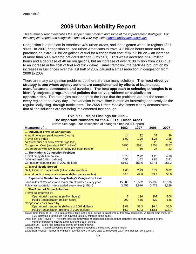
Appendix A
52
2009 Urban Mobility Report
This summary report describes the scope of the problem and some of the improvement strategies. For the complete report and congestion data on your city, see: http://mobility.tamu.edu/ums.
Congestion is a problem in America’s 439 urban areas, and it has gotten worse in regions of all sizes. In 2007, congestion caused urban Americans to travel 4.2 billion hours more and to purchase an extra 2.8 billion gallons of fuel for a congestion cost of $87.2 billion – an increase of more than 50% over the previous decade (Exhibit 1). This was a decrease of 40 million hours and a decrease of 40 million gallons, but an increase of over $100 million from 2006 due to an increase in the cost of fuel and truck delay. Small traffic volume declines brought on by increases in fuel prices over the last half of 2007 caused a small reduction in congestion from 2006 to 2007.
There are many congestion problems but there are also many solutions. The most effective strategy is one where agency actions are complemented by efforts of businesses, manufacturers, commuters and travelers. The best approach to selecting strategies is to identify projects, programs and policies that solve problems or capitalize on opportunities. The strategies must address the issue that the problems are not the same in every region or on every day – the variation in travel time is often as frustrating and costly as the regular “daily slog” through traffic jams. The 2009 Urban Mobility Report clearly demonstrates that all the solutions are not being implemented fast enough.
Exhibit 1. Major Findings for 2009 – The Important Numbers for the 439 U.S. Urban Areas
(Note: See page 2 for description of changes since 2007 Report) Measures of… 1982 1997 2006 2007 … Individual Traveler Congestion
Annual delay per peak traveler (hours) 14 32 37 36Travel Time Index 1.09 1.20 1.25 1.25“Wasted" fuel per peak traveler (gallons) 9 21 25 24Congestion Cost (constant 2007 dollars) $290 $621 $758 $757Urban areas with 40+ hours of delay per peak traveler 1 10 27 23… The Nation’s Congestion Problem
Travel delay (billion hours) 0.79 2.72 4.20 4.16“Wasted” fuel (billion gallons) 0.50 1.82 2.85 2.81Congestion cost (billions of 2007 dollars) $16.7 $53.6 $87.1 $87.2… Travel Needs Served
Daily travel on major roads (billion vehicle-miles) 1.68 2.93 3.79 3.82
Annual public transportation travel (billion person-miles) 38.8 42.6 53.4 55.8… Expansion Needed to Keep Today’s Congestion Level
Lane-miles of freeways and major streets added every year 15,500 16,532 15,032 12,676Public transportation riders added every year (million) 3,456 3,876 3,779 3,129… The Effect of Some Solutions
Travel delay saved by Operational treatments (million hours) 7 116 307 308 Public transportation (million hours) 290 455 622 646Congestion costs saved by Operational treatments (billions of 2007 dollars) $.02 $2.3 $6.4 $6.5 Public transportation (billions of 2007 dollars) $6.3 $9.3 $13.1 $13.7Travel Time Index (TTI) – The ratio of travel time in the peak period to travel time at free-flow conditions. A Travel Time Index of
1.35 indicates a 20-minute free-flow trip takes 27 minutes in the peak. Delay per Peak Traveler – The extra time spent traveling at congested speeds rather than free-flow speeds divided by the
number of persons making a trip during the peak period. Wasted Fuel – Extra fuel consumed during congested travel. Vehicle-miles – Total of all vehicle travel (10 vehicles traveling 9 miles is 90 vehicle-miles). Expansion Needed – Either lane-miles or annual riders to keep pace with travel growth (and maintain congestion).

Appendix A
53
The Congestion Trends (And Why A Few Numbers Are
Different than Previous Reports) Each Urban Mobility Report reviews procedures, processes, and data used to develop the best estimates of the costs and challenges of traffic congestion, improving them when possible. The methodology was revised in 2008/9 to improve the public transportation methodology. In addition, the benefits from operations treatments were estimated throughout the extent of the study database to improve the relevance of the long-term trends. This caused some numbers from previous reports to change. All of the congestion statistics in the 2009 Urban Mobility Report have been revised using the new calculation procedures for all years from 1982 so that true trends can be identified (Exhibit 2). Congestion, by every measure, has increased substantially over the 25 years covered in this report. The most recent two years of the report, however, have seen slower growth or even a decline in congestion. Delay per traveler – the number of hours of extra travel time that commuters spend during rush hours – was 1.3 hours lower in 2007 than 2005. This change would be more hopeful if it was associated with something other than rising fuel prices (which occurred for a short time in 2005 and 2006 before the sustained increase in 2007 and 2008) and a slowing economy. This same kind of slow growth/decline over a few years occurred in the early 1990s when spending and growth in the high-tech and defense sectors of the economy declined dramatically. The decline means congestion is near the levels recorded in 2003, not exactly a year remembered for trouble-free commuting. Changes to Congestion Methodology – Highlights Public transportation – An improved method for transferring riders back into the roadway
network to simulate the effect of eliminating public transportation service resulted in larger delay reduction benefits in the 2009 report. The new methodology was reapplied for all previous years as well. Improvements include using the transit modes in each region to determine the peak travel mileage and alternative routes.
Operations benefits - The 2009 report estimates the benefits from programs that reduce congestion without adding roadway lanes for every year since 1982. Previous reports included these programs only since 2000. There are fewer data for the pre-2000 period, but general trend information and project-specific reports were used to smooth out what had been a disruptive element in the urban area congestion trends.
The base data for this report are from the Federal Highway Administration’s Highway Performance Monitoring System (1). More information on the methodology is included on the website at: http://mobility.tamu.edu/ums/report/methodology.stm

Exhibit 2. National Congestion Measures, 1982 to 2007
Hours Saved
(million hours) Gallons Saved
(million gallons) Dollars Saved
(billions of $2007)
Year
Travel Time Index
Delay per
Traveler (hours)
Total Delay
(billion hours)
Total Fuel Wasted (billion gallons)
Total Cost ($2007 billion)
Operational Treatments
& High-Occupancy
Vehicle Lanes
Public Transp
Operational Treatments
& High-Occupancy
Vehicle Lanes
Public Transp
Operational Treatments
& High-Occupancy
Vehicle Lanes
Public Transp
1982 1.09 13.8 0.79 0.50 16.7 7 290 4 163 0.2 6.3 1983 1.09 14.7 0.87 0.54 18.0 9 296 5 167 0.2 6.4 1984 1.10 15.8 0.95 0.60 19.7 12 306 7 174 0.3 6.6 1985 1.11 12.0 1.10 0.70 22.6 17 324 9 187 0.3 6.9 1986 1.13 20.2 1.27 0.81 25.2 22 306 12 181 0.4 6.3 1987 1.14 21.6 1.41 0.92 27.9 28 315 16 186 0.6 6.5 1988 1.16 24.2 1.62 1.06 32.0 37 384 20 228 0.7 7.9 1989 1.17 25.9 1.78 1.17 35.3 45 411 24 246 0.9 8.5 1990 1.18 26.8 1.88 1.25 37.3 51 409 28 248 1.0 8.4 1991 1.18 26.5 1.93 1.29 38.1 54 404 30 247 1.1 8.3 1992 1.18 27.4 2.05 1.37 40.6 61 397 34 241 1.2 8.1 1993 1.18 28.5 2.17 1.43 42.6 68 391 38 237 1.3 8.0 1994 1.18 28.8 2.26 1.49 44.3 76 407 42 246 1.5 8.3 1995 1.19 30.0 2.42 1.61 47.8 89 427 49 262 1.8 8.8 1996 1.19 31.0 2.58 1.72 51.0 102 442 56 272 2.0 9.1 1997 1.20 31.7 2.73 1.82 53.6 116 455 64 280 2.3 9.3 1998 1.21 31.9 2.83 1.91 55.0 131 482 72 299 2.5 9.7 1999 1.22 33.3 3.04 2.05 58.9 151 511 82 319 2.9 10.3 2000 1.22 33.4 3.18 2.14 63.1 166 538 109 327 3.3 10.9 2001 1.23 34.2 3.33 2.25 65.7 187 559 123 341 3.7 11.3 2002 1.24 35.0 3.52 2.38 69.3 208 566 138 346 4.1 11.4 2003 1.24 35.4 3.73 2.53 73.3 238 558 156 341 4.7 11.2 2004 1.25 36.5 3.97 2.69 79.4 258 591 171 362 5.2 12.1 2005 1.25 37.4 4.18 2.82 85.6 278 595 182 365 5.7 12.4 2006 1.25 36.6 4.20 2.85 87.1 307 622 200 384 6.4 13.1 2007 1.25 36.1 4.16 2.81 87.2 308 646 202 398 6.5 13.7 Note: For more congestion information see Tables 1 to 7 and http://mobility.tamu.edu/ums
54
Appen
dixA

Appendix A
55
0 10 20 30 40
2007
1982
Hours
All Urban Areas
0 10 20 30 40 50
2007
1982
Hours
Areas Over 1 Million Persons
0 10 20 30
2007
1982
Gallons
All Urban Areas
0 10 20 30 40
2007
1982
Gallons
Areas Over 1 Million Persons
One Page of Congestion Problems Travelers and freight shippers must plan around traffic jams for more of their trips, in more hours of the day and in more parts of town than in 1982. In some cases, this includes weekends and rural areas. Until 2007, mobility problems worsened at a relatively consistent rate during the more than two decades studied. Congestion costs are increasing. The congestion “invoice” for the cost of extra time and fuel in 439 urban areas (all values in constant 2007 dollars): In 2007 – $87.2 billion In 2000 – $63.1 billion In 1982 – $16.7 billion Congestion wastes a massive amount of time, fuel and money. In 2007: 2.8 billion gallons of wasted fuel (enough to fill 370,000 18-wheeler fuel delivery trucks –
bumper-to-bumper from Houston to Boston to Los Angeles) 4.2 billion hours of extra time (enough to listen to War and Peace being read 160 million
times through your car stereo) $87.2 billion of delay and fuel cost (The negative effect of uncertain or longer delivery times,
missed meetings, business relocations and other congestion results are not included) Congestion affects the people who typically make trips during the peak period. Yearly delay for the average peak-period traveler was 36 hours in 2007 – almost one week
of vacation – an increase from 14 hours in 1982 (Exhibit 3). That traveler wasted 24 gallons of fuel in 2007 – three weeks worth of fuel for the average
U.S. resident – up from 9 gallons in 1982 (Exhibit 4). The value for the delay and wasted fuel was almost $760 per traveler in 2007 compared to
an inflation-adjusted $290 in 1982. Congestion effects were even larger in areas over one million persons – 46 hours and
31 gallons in 2007.
Exhibit 3. Hours of Travel Delay per Peak-Period Traveler
Exhibit 4. Gallons of Fuel Wasted per Peak-Period Traveler

Appendix A
56

Appendix A
57
Won’t Higher Fuel Prices and the Economic Slowdown Help Solve Congestion Problems?
The 2009 Urban Mobility Report suggests a tentative “yes” to the fuel price question above, if… By “higher” you mean very high – above $4 per gallon for more than a year By “solve” you mean slower growth or modest declines in congestion (don’t expect to drive
at the speed limit on your way to work) The way most people understand congestion, then, the answer is “no, higher fuel prices are not the answer.” The economic solution, likewise, doesn’t hold much hope for those wishing to find the easy answer. Travel may grow slower than in the past, but that will only mean “things get worse slower” – hardly a positive goal statement. The Urban Mobility Report database includes a few similar periods from regional recessions in the past (the northeastern states in the early-to-mid 1980s, Texas in the mid 1980s, California in the early-to-mid 1990s). In every case, when the economy rebounded, so did the congestion problem. An examination of recent fuel price, traffic volume, transit ridership and congestion trends shows (Exhibit 5): There is a cycle to traffic volume and fuel prices – they generally go up in the summer and
down in the winter. There was a small but varying decline in traffic volume in 2008. The largest declines were in
rural areas and on the weekends. The smallest declines were in the urban areas on weekdays – where most of the congestion exists.
Traffic volume began to increase when prices declined in the Fall of 2008. Traffic volume and congestion trends during the economic downturn in the last half of 2008
were consistent with previous recessions – slow or no growth in areas with job losses. Public transportation ridership was up in early and mid-2008 when fuel prices were at their
highest levels (2).
None of these events suggest that price increases which are modest and take a long time or price increases that are rapid but decline after a few months will cause any substantial change in travel behavior or cause a dramatic slowdown in congestion growth trends. Data collected on freeways in 23 urban regions (see Exhibit 5) as part of a 2008 study for the Federal Highway Administration (3) found: Weekday traffic volumes were down between 2% and 4% from June to December 2008
compared to June to December 2007. Traffic congestion for these same time periods was down between 3% and 5%. Weekend traffic volumes were down between 4% and 7% between June and November
2008 and the same period in 2007. Weekend traffic volumes were down only 2% to 3% in December 2008 (with lower fuel
prices). These values show that dramatic fuel price increases and a falling job market will “solve” only part of the congestion problem.

Appendix A
58
The reason why the travel decline was relatively small (in relation to the price increase) may have been due to the fact that people could adopt several coping strategies: Cut back spending in other areas to pay for fuel Reduce their percentage of drive-alone trips Combine trips, for example, stopping at the store on the way home from work Avoid optional trips in “rush hours” (but in many areas this time period was already
congested – one would be hard pressed to find a lot of “joy-riding” in rush hour) Over a relatively short time period, many people are “locked in” to many of their choices and cannot respond rapidly. Consider these factors that made it difficult for people to react to short-term fuel price increases in 2007 and 2008: Cannot sell a large car or SUV for the amount of the loan, because trade-in value was low Cannot ride public transportation for trips that are not served by transit systems Cannot change jobs – many employers were not hiring because the economy was expected
to slow down Cannot move homes because prices had slipped and it was difficult to obtain a mortgage
Exhibit 5. Congestion, Traffic Volume, Transit Ridership and Fuel Cost – 2005 to 2008
Note: Trends are based on 3-month running averages.
0.75
1.00
1.25
1.50
1.75
2.00
May-05 Sep-05 Jan-06 May-06 Sep-06 Jan-07 May-07 Sep-07 Jan-08 May-08 Sep-08
Travel Time IndexFuel Cost Per GallonVolumeTransit Trips
Index May 2005 = 1.0
Fuel Cost Per Gallon

Appendix A
59
More Detail about Congestion Problems Congestion is worse in areas of every size – it is not just a big city problem. The growing time delays hit residents of smaller cities as well (Exhibit 6). Regions of all sizes have problems implementing enough projects, programs and policies to meet the demand of growing population and jobs. Major projects, programs and funding efforts take 10 to 15 years to develop. In 2020, at this rate, congestion problems in cities with 500,000 to 1 million people will resemble today’s traffic headaches for areas over 1 million people.
Exhibit 6. Congestion Growth Trend
Think of what else could be done with the 36 hours of extra time suffered in congestion by the average urban traveler in 2007: Almost 5 vacation days Almost 13 big league baseball games More than 600 average online video clips
0
10
20
30
40
50
60
Small Medium Large Very Large
Hours of Delayper Traveler
Population Area Size
1982 1997 2007
Small = less than 500,000 Large = 1 million to 3 millionMedium = 500,000 to 1 million Very Large = more than 3 million

Appendix A
60
But the problem could be even worse in the regions over 1 million population.
Operational treatments save 278 million hours of delay.
And if there were no public transportation service and travelers used their cars, there would be an additional 616 million hours of delay.
Uncongested31%
Moderate14%
Heavy14%
Severe18%
Extreme23%
Uncongested45%
Moderate13%
Heavy12%
Severe14%
Extreme16%
Travelers and shippers must plan around congestion more often. In all 439 urban areas, the worst congestion levels affected only 1 in 9 trips in 1982, but
almost 1 in 3 trips in 2007 (Exhibits 7 and 8). Free-flowing traffic is seen less than one-third of the time in urban areas over 1 million
population. Delay has grown five times larger overall since 1982 and more than four times higher in
regions with more than 1 million people.
Exhibit 7. Congestion Growth – 1982 to 2007
Urban Areas Over 1 Million Population
2007Total Delay =
4.2 Billion Hours 1982 Total Delay =
0.8 Billion Hours
2007Total Delay =
3.3 Billion Hours 1982
Total Delay = 0.7 Billion Hours
Moderate9%
Heavy6%
Severe6%
Extreme5%
Uncongested74%
Moderate11%
Heavy8%
Severe8%
Extreme6%
Uncongested67%

Appendix A
61
The concept of “rush hour” definitely does not apply in areas with more than 1 million people. Congestion might be encountered three hours in each peak. And very few travelers are “rushing” anywhere.
The Jam Clock (Exhibit 8) depicts the growth of congested periods within the morning and evening “rush hours.”
Exhibit 8. The Jam Clock Shows That It Is Hard To Avoid Congestion in Urban Areas with More than 1 Million Persons
Note: The 2009 Urban Mobility Report examined 6 to 10 a.m. and 3 to 7 p.m.
Red – Almost all regions have congestion Yellow – Some regions have congestion Green Checked– Very few regions have congestion Gray – Time period not analyzed
Evening
Noon
3:00
6:00 p.m.
9:00
Some
Evening
Noon
3:00
6:00 p.m.
9:00
1982 Morning
Midnight
3:00
6:00 a.m.
9:00
Very Few
Almost All
2007 Morning
Midnight
3:00
6:00 a.m.
9:00

Appendix A
62
Congestion levels vary in cities of the same size. Exhibit 9 shows the wide range in congestion problems in each of the four urban size groups. In all four groups, there is a difference of at least 30 hours of delay per traveler between the most and least congested regions. There are many causes for this range – some natural, some man-made. And some of the differences are the result of investment decisions. The public and decision-makers at all levels should consider whether there is a match between transportation funding levels, mobility goals and the projects, programs and policies they support to address congestion problems. Every city is different, but the data suggest the current trends are not acceptable.
Exhibit 9. Congestion and Urban Area Size, 2007
0
10
20
30
40
50
60
70
80
16 Small Areas 31 Medium Areas 29 Large Areas 14 Very Large Areas
Hours of Delay Each Year
Average
AverageAverage
Average
Highest
HighestHighest
Highest
Lowest
LowestLowestLowest

Appendix A
63
Congestion Solutions – An Overview of the Portfolio We recommend a balanced and diversified approach to reduce congestion – one that focuses on more of everything. It is clear that our current investment levels have not kept pace with the problems. Population growth will require more systems, better operations and increased number of travel alternatives. And most urban regions have big problems now – more congestion, poorer pavement and bridge conditions and less public transportation service than they would like. There will be a different mix of solutions in metro regions, cities, neighborhoods, job centers and shopping areas. Some areas might be more amenable to construction solutions, other areas might use more travel options, productivity improvements, diversified land use patterns or redevelopment solutions. In all cases, the solutions need to work together to provide an interconnected network of transportation services. More information on the possible solutions, places they have been implemented, the effects estimated in this report and the methodology used to capture those benefits can be found on the website http://mobility.tamu.edu/solutions. Get as much service as possible from what we have – Many low-cost improvements
have broad public support and can be rapidly deployed. These management programs require innovation, constant attention and adjustment, but they pay dividends in faster, safer and more reliable travel. Rapidly removing crashed vehicles, timing the traffic signals so that more vehicles see green lights, improving road and intersection designs, or adding a short section of roadway are relatively simple actions.
Add capacity in critical corridors – Handling greater freight or person travel on freeways, streets, rail lines, buses or intermodal facilities often requires “more.” Important corridors or growth regions can benefit from more road lanes, new streets and highways, new or expanded public transportation facilities, and larger bus and rail fleets.
Change the usage patterns –There are solutions that involve changes in the way employers and travelers conduct business to avoid traveling in the traditional “rush hours.” Flexible work hours, internet connections or phones allow employees to choose work schedules that meet family needs and the needs of their jobs.
Provide choices – This might involve different routes, travel modes or lanes that involve a toll for high-speed and reliable service – a greater number of options that allow travelers and shippers to customize their travel plans.
Diversify the development patterns – These typically involve denser developments with a mix of jobs, shops and homes, so that more people can walk, bike or take transit to more, and closer, destinations. Sustaining the “quality of life” and gaining economic development without the typical increment of mobility decline in each of these sub-regions appear to be part, but not all, of the solution.
Realistic expectations are also part of the solution. Large urban areas will be congested. Some locations near key activity centers in smaller urban areas will also be congested. But congestion does not have to be an all-day event. Identifying solutions and funding sources that meet a variety of community goals is challenging enough without attempting to eliminate congestion in all locations at all times.

Appendix A
64

Appendix A
65
Congestion Solutions – The Effects The 2009 Urban Mobility Report database includes the effect of several widely implemented congestion solutions. These provide more efficient and reliable operation of roads and public transportation using a combination of information, technology, design changes, operating practices and construction programs. Benefits of Public Transportation Service Regular-route public transportation service on buses and trains provides a significant amount of peak-period travel in the most congested corridors and urban areas in the U.S. If public transportation service had been discontinued and the riders traveled in private vehicles in 2007, the 439 urban areas would have suffered an additional 646 million hours of delay and consumed 398 million more gallons of fuel (Exhibit 10), 40% more than a decade ago. The value of the additional travel delay and fuel that would have been consumed if there were no public transportation service would be an additional $13.7 billion, a 16% increase over current levels in the 439 urban areas.
There were approximately 55 billion passenger-miles of travel on public transportation systems in the 439 urban areas in 2007 (2). The benefits from public transportation vary by the amount of travel and the road congestion levels (Exhibit 10). More information on the effects for each urban area is included in Table 3.
Exhibit 10. Delay Increase in 2007 if Public Transportation Service Were Eliminated – 439 Areas
Population Group and Number of Areas
Average Annual Passenger-Miles of Travel (Million)
Delay Reduction Due to Public Transportation Hours of
Delay (Million) Percent of Base Delay
Dollars Saved ($ Million)
Very Large (14) 41,602 557 18 11,874 Large (29) 6,180 59 6 1,226 Medium (31) 1,718 13 4 259 Small (16) 289 2 3 31 Other (349) 6,033 16 3 339
National Urban Total 55,822 646 16 $13,729 Source: Reference (2) and Review by Texas Transportation Institute Better Operations Five prominent types of operational treatments are estimated to relieve a total of 308 million hours of delay (7% of the total) with a value of $6.5 billion in 2007 (Exhibit 11). If the treatments were deployed on all major freeways and streets, the benefit would expand to about 504 million hours of delay (11% of delay) and more than $10.5 billion would be saved. These are significant benefits, especially since these techniques can be enacted much quicker than significant roadway or public transportation system expansions can occur. The operational treatments, however, do not replace the need for those expansions.

Appendix A
66
Exhibit 11. Operational Improvement Summary for All 439 Urban Areas
Operations Treatment (Number of Regions with Treatment)
Delay Reduction from Current Projects
Delay Reduction if In Place on All
Roads (Million Hours)
Hours Saved (Million)
Dollars Saved ($ Million)
Ramp Metering (25) 39.8 851 98.5Incident Management (272) 143.3 3,060 199.5Signal Coordination (439) 19.6 404 45.8Access Management (439) High-Occupancy Vehicle Lanes (16)
68.7 37.0
1,370 779
159.7Not Known
TOTAL 308 $6,464 504 Note: This analysis uses nationally consistent data and relatively simple estimation procedures. Local or
more detailed evaluations should be used where available. These estimates should be considered preliminary pending more extensive review and revision of information obtained from source databases.(1,4)
More information about the specific treatments and examples of regions and corridors where they have been implemented can be found at the website http://mobility.tamu.edu/resources/
More Capacity Projects that provide more road lanes and more public transportation service are part of the congestion solution package in most growing urban regions. New streets and urban freeways will be needed to serve new developments, public transportation improvements are particularly important in congested corridors and to serve major activity centers, and toll highways and toll lanes are being used more frequently in urban corridors. Capacity expansions are also important additions for freeway-to-freeway interchanges and connections to ports, rail yards, intermodal terminals and other major activity centers for people and freight transportation. Additional roadways reduce the rate of congestion increase. This is clear from comparisons between 1982 and 2007 (Exhibit 12). Urban areas where capacity increases matched the demand increase saw congestion grow much more slowly than regions where capacity lagged behind demand growth. It is also clear, however, that if only 9 areas were able to accomplish that rate, there must be a broader and larger set of solutions applied to the problem. Most of these 9 regions (listed in Table 7) were not in locations of high economic growth, suggesting their challenges were not as great as in regions with booming job markets.

Appendix A
67
Exhibit 12. Road Growth and Mobility Level
Source: Texas Transportation Institute analysis, see Table 7 and http://mobility.tamu.edu/ums/report/methodology.stm
100
150
200
250
300
1982 1986 1990 1994 1998 2002 2006
Demand grew 35% faster than supply
Demand grew 15% to 35% faster
37 Areas
44 Areas
9 Areas
Increase in Congestion(Percent)

Appendix A
68

Appendix A
69
All Congestion Solutions Are Needed
Most large city transportation and planning agencies are pursuing all of these strategies as well as others. The mix of programs, policies and projects may be different in each city and the pace of implementation varies according to overall funding, commitment, location of problems, public support and other factors. Addressing the range of different problems with an overall strategy that chooses transportation and land development solutions with the greatest benefit for the least cost recognizes the diversity of the problems and opportunities in each region. Policy-makers and big city residents have learned to expect congestion for 1 or 2 hours in the morning and in the evening. However, agencies should be able to improve the performance and reliability of the service at other hours. But they have not been able to combine the leadership, technical and financial support to expand the system, improve operations and change travel patterns to keep congestion levels from increasing in times of economic growth. The involvement of business leaders in crafting a set of locally supported solutions would seem to be a very important element in the future. At the strategic end, business leader actions take the form of information development and communication with the public and decision-makers to emphasize the role of transportation in the state and regional economy. On the tactical end, business and community leaders can make the case for small-scale improvements that may not be evident to the operating agencies. And they can support individual workers who wish to choose carpooling, public transportation, flexible work hours, telecommuting or other route or mode options. Addressing the congestion problems can provide substantial benefits and provide improvements in many sectors of society and the economy. A Texas study (5) estimated that solving the congestion problems in the state’s urban regions would generate more than $6.50 in economic benefits for every $1.00 spent. Rebuilding transportation facilities to provide more capacity also addresses the need for roadway repair and infrastructure renewal.

Appendix A
70

Appendix A
71
Methodology The base data for the 2009 Urban Mobility Report come from the U.S. Department of Transportation and the states (1,4). Several analytical processes are used to develop the final measures. These are described in a series of technical reports (6) that are posted on the mobility report website: http://mobility.tamu.edu/ums/report/methodology.stm. The travel and road inventory statistics are analyzed with a set of procedures developed
from computer models and studies of real-world travel time and traffic congestion data. The congestion methodology creates a set of base statistics developed from traffic density values. The density data (daily traffic volume per lane of roadway) are converted to average peak-period speeds using a set of estimation curves based on relatively ideal travel conditions – no crashes, breakdowns or weather problems – for the years 1982 to 2007.
The base estimates, however, do not include the effect of many transportation improvements. The 2009 report addresses this estimation deficiency with methodologies designed to identify the effect of operational treatments and public transportation services. The delay, cost and index measures for all years include these treatments.
The new estimation procedures for public transportation benefits include more detail than previous reports and provide additional information to analyze the effect of public transportation services.
Future Changes There will be other changes in the report methodology over the next few years. There is more information available every year from freeways, streets and public transportation systems that provides more descriptive travel time and volume data. Travel time information is being collected from travelers and shippers on the road network by a variety of public and private data collection sources. Some advanced transit operating systems monitor passenger volume, travel time and schedule information and share those data with freeway monitoring and traffic signal systems. Traffic signals can be retimed immediately by the computers to reduce person congestion (not just vehicle congestion). These data can also be used to more accurately describe congestion problems on public transportation and roadway systems. Combining Performance Measures Table 6 illustrates an approach to understanding several of the key measures. The value for each statistic is rated according to the relationship to the average value for the population group. The terms “higher” and “lower” than average congestion are used to characterize the 2007 values and trends from 1982 to 2007. These descriptions do not indicate any judgment about the extent of mobility problems. Urban areas that have better than average rankings may have congestion that residents consider a significant problem. What Table 6 does, however, is provide the reader with some context for the mobility discussion.

Appendix A
72

Appendix A
73
Concluding Thoughts Congestion has gotten worse in many ways since 1982: Trips take longer. Congestion affects more of the day. Congestion affects weekend travel and rural areas. Congestion affects more personal trips and freight shipments. Trip travel times are unreliable. The 2009 Urban Mobility Report points to an $87.2 billion congestion cost – and that is only the value of wasted time and fuel. Congestion causes the average peak-period traveler to spend an extra 36 hours of travel time and use 24 gallons of fuel consumption, which amounts to a cost of $760 per traveler. The report includes a comprehensive picture of congestion in all 439 U.S. urban areas and provides an indication of how the problem affects travel choices, arrival times, shipment routes, manufacturing processes and location decisions. The recent rise and then fall in fuel prices and the economic slowdown has disrupted the steady climbing trend seen in the last few congestion reports. Before victory is declared on the congestion or imported fuel issues, however, a few points should be considered: The decline in driving after more than a doubling in the price of fuel was the equivalent of
about 1 mile per day for the person traveling the average 12,000 annual miles. Previous recessions in the 1980s and 1990s saw congestion declines that were reversed as
soon as the economy began to grow again. The “recovery” in miles traveled in Fall 2008 when fuel prices dropped before the economy
turned down suggests historical patterns are still in place and congestion will grow again. Anyone who thinks the congestion problem has gone away should check the past. The good news is that there are solutions that work. There are significant benefits from solving congestion problems – whether they are large or small, in big metropolitan regions or smaller urban areas and no matter the cause. There are performance measures that provide accountability to the public and decision-makers and improve operational effectiveness. Mobility reports in coming years will use more comprehensive datasets and improved analysis tools to capture traveler experiences (and frustration). All of the potential congestion-reducing strategies are needed. Getting more productivity out of the existing road and public transportation systems is vital to reducing congestion and improving travel time reliability. Businesses and employees can use a variety of strategies to modify their times and modes of travel to avoid the peak periods or to use less vehicle travel and more electronic “travel.” In many corridors, however, there is a need for additional capacity to move people and freight more rapidly and reliably. Future program decisions should focus on how to use each project, program or strategy to attack the problems, and how much transportation improvement to pursue. The solutions will require more funding – this report clearly describes the shortfall in projects, programs and policies. Focusing on the broad areas of agreement and consensus funding arrangements will provide a base of implementable strategies. Besides the congestion benefits, the construction projects also help rebuild infrastructure elements, a need noted in many analyses over the past decade. The U.S. should begin fixing these problems while crafting an all-encompassing long-term solution.

Appendix A
74
National Congestion Tables Table 1. What Congestion Means to You, 2007
Urban Area Annual Delay per Traveler Travel Time Index Wasted Fuel per Traveler
Hours Rank Value Rank Gallons Rank Very Large Average (14 areas) 51 1.37 35 Los Angeles-Long Beach-Santa Ana CA 70 1 1.49 1 53 1 Washington DC-VA-MD 62 2 1.39 4 42 2 Atlanta GA 57 3 1.35 10 40 3 Houston TX 56 4 1.33 11 40 3 San Francisco-Oakland CA 55 5 1.42 3 40 3 Dallas-Fort Worth-Arlington TX 53 6 1.32 12 36 8 Detroit MI 52 9 1.29 20 34 11 Miami FL 47 11 1.37 5 33 12 New York-Newark NY-NJ-CT 44 14 1.37 5 28 20 Phoenix AZ 44 14 1.30 17 31 14 Seattle WA 43 19 1.29 20 30 15 Boston MA-NH-RI 43 19 1.26 25 29 19 Chicago IL-IN 41 21 1.43 2 28 20 Philadelphia PA-NJ-DE-MD 38 29 1.28 24 24 34 Large Average (29 areas) 35 1.23 24 San Jose CA 53 6 1.36 8 37 7 Orlando FL 53 6 1.30 17 35 9 San Diego CA 52 9 1.37 5 40 3 Tampa-St. Petersburg FL 47 11 1.31 14 30 15 Denver-Aurora CO 45 13 1.31 14 30 15 Riverside-San Bernardino CA 44 14 1.36 8 35 9 Baltimore MD 44 14 1.31 14 32 13 Las Vegas NV 44 14 1.30 17 30 15 Charlotte NC-SC 40 23 1.25 26 27 23 Sacramento CA 39 24 1.32 12 28 20 Austin TX 39 24 1.29 20 27 23 Minneapolis-St. Paul MN 39 24 1.24 28 27 23 Jacksonville FL 39 24 1.23 32 27 23 Indianapolis IN 39 24 1.21 34 27 23 San Antonio TX 38 29 1.23 32 27 23 Portland OR-WA 37 34 1.29 20 26 31 Raleigh-Durham NC 34 36 1.17 43 22 37 Columbus OH 30 40 1.18 39 21 39 Virginia Beach VA 29 41 1.18 39 19 41 Providence RI-MA 29 41 1.17 43 18 42 St. Louis MO-IL 26 47 1.13 52 17 46 Cincinnati OH-KY-IN 25 51 1.18 39 18 42 Memphis TN-MS-AR 25 51 1.12 57 15 52 New Orleans LA 20 61 1.17 43 12 65 Milwaukee WI 18 67 1.13 52 13 60 Pittsburgh PA 15 70 1.09 70 9 71 Kansas City MO-KS 15 70 1.07 80 9 71 Cleveland OH 12 76 1.08 77 8 74 Buffalo NY 11 79 1.07 80 7 77 90 Area Average 41 1.29 28 Remaining Areas 48 Urban Areas Over 250,000 Popn 24 1.16 15 301 Urban Areas Under 250,000 Popn 18 1.10 10 All 439 Urban Areas 36 1.25 24 Very Large Urban Areas—over 3 million population. Large Urban Areas—over 1 million and less than 3 million population.Annual Delay per Traveler – Extra travel time for peak-period travel during the year divided by the number of travelers who begin a trip during the peak period (6 to 9 a.m. and 4 to 7 p.m.). Free-flow speeds (60 mph on freeways and 35 mph on principal arterials) are used as the comparison threshold. Travel Time Index – The ratio of travel time in the peak period to the travel time at free-flow conditions. A value of 1.30 indicates a 20-minute free-flow trip takes 26 minutes in the peak Note: Please do not place too much emphasis on small differences in the rankings. There may be little difference in congestion between
areas ranked (for example) 6th and 12th. The actual measure values should also be examined. Also note: The best congestion comparisons use multi-year trends and are made between similar urban areas.

Appendix A
75
Table 1. What Congestion Means to You, 2007, Continued Urban Area Annual Delay per Traveler Travel Time Index Wasted Fuel per Traveler
Hours Rank Value Rank Gallons Rank Medium Average (31 areas) 23 1.14 15 Tucson AZ 41 21 1.24 28 26 31 Oxnard-Ventura CA 38 29 1.24 28 27 23 Louisville KY-IN 38 29 1.20 35 26 31 Nashville-Davidson TN 37 34 1.15 48 23 35 Albuquerque NM 34 36 1.18 39 22 37 Bridgeport-Stamford CT-NY 33 38 1.25 26 27 23 Birmingham AL 32 39 1.15 48 21 39 Salt Lake City UT 27 45 1.19 37 18 42 Oklahoma City OK 27 45 1.12 57 17 46 Honolulu HI 26 47 1.24 28 18 42 Omaha NE-IA 26 47 1.16 47 17 46 Sarasota-Bradenton FL 25 51 1.19 37 15 52 Colorado Springs CO 23 54 1.13 52 14 56 Allentown-Bethlehem PA-NJ 22 55 1.14 50 14 56 Grand Rapids MI 22 55 1.10 64 13 60 Tulsa OK 22 55 1.10 64 13 60 Hartford CT 21 60 1.12 57 15 52 Fresno CA 20 61 1.13 52 13 60 Richmond VA 20 61 1.09 70 13 60 El Paso TX-NM 19 64 1.12 57 12 65 New Haven CT 19 64 1.11 63 14 56 Albany-Schenectady NY 19 64 1.10 64 12 65 Poughkeepsie-Newburgh NY 17 68 1.09 70 10 68 Dayton OH 14 73 1.09 70 10 68 Toledo OH-MI 14 73 1.08 77 9 71 Indio-Cathedral City-Palm Springs CA 13 75 1.14 50 8 74 Bakersfield CA 12 76 1.09 70 7 77 Springfield MA-CT 11 79 1.06 85 7 77 Rochester NY 10 83 1.06 85 6 83 Akron OH 9 85 1.07 80 6 83 Lancaster-Palmdale CA 6 89 1.10 64 3 89 Small Average (16 areas) 19 1.10 11 Charleston-North Charleston SC 38 29 1.20 35 23 35 Cape Coral FL 29 41 1.17 43 17 46 Pensacola FL-AL 28 44 1.13 52 16 50 Knoxville TN 26 47 1.12 57 16 50 Columbia SC 22 55 1.10 64 14 56 Little Rock AR 22 55 1.09 70 15 52 Salem OR 16 69 1.10 64 10 68 Laredo TX 15 70 1.12 57 8 74 Boulder CO 12 76 1.09 70 7 77 Eugene OR 11 79 1.08 77 7 77 Beaumont TX 11 79 1.05 87 7 77 Anchorage AK 10 83 1.07 80 6 83 Corpus Christi TX 9 85 1.05 87 5 86 Spokane WA 9 85 1.05 87 5 86 Brownsville TX 8 88 1.07 80 5 86 Wichita KS 6 89 1.02 90 3 89 90 Area Average 41 1.29 28 Remaining Areas 48 Urban Areas Over 250,000 Popn 24 1.16 15 301 Urban Areas Under 250,000 Popn 18 1.10 10 All 439 Urban Areas 36 1.25 24
Medium Urban Areas—over 500,000 and less than 1 million population. Small Urban Areas—less than 500,000 population. Annual Delay per Traveler – Extra travel time for peak-period travel during the year divided by the number of travelers who begin a trip during the peak period (6 to 9 a.m. and 4 to 7 p.m.). Free-flow speeds (60 mph on freeways and 35 mph on principal arterials) are used as the comparison threshold. Travel Time Index – The ratio of travel time in the peak period to the travel time at free-flow conditions. A value of 1.30 indicates a 20-minute free-flow trip takes 26 minutes in the peak Note: Please do not place too much emphasis on small differences in the rankings. There may be little difference in congestion between areas
ranked (for example) 6th and 12th. The actual measure values should also be examined. Also note: The best congestion comparisons use multi-year trends and are made between similar urban areas.

Appendix A
76
Table 2. What Congestion Means to Your Town, 2007 Urban Area Totals
Urban Area Travel Delay Excess Fuel Consumed Congestion Cost
(1000 Hours) Rank (1000 Gallons) Rank ($ million) Rank Very Large Average (14 areas) 166,900 115,654 3,549 Los Angeles-Long Beach-Santa Ana CA 485,022 1 366,969 1 10,328 1 New York-Newark NY-NJ-CT 379,328 2 238,934 2 8,180 2 Chicago IL-IN 189,201 3 129,365 3 4,207 3 Atlanta GA 135,335 6 95,936 6 2,981 4 Miami FL 145,608 4 101,727 4 2,955 5 Dallas-Fort Worth-Arlington TX 140,744 5 96,477 5 2,849 6 Washington DC-VA-MD 133,862 7 90,801 8 2,762 7 San Francisco-Oakland CA 129,393 8 94,295 7 2,675 8 Houston TX 123,915 9 88,239 9 2,482 9 Detroit MI 116,981 10 76,425 10 2,472 10 Philadelphia PA-NJ-DE-MD 112,074 11 71,262 11 2,316 11 Boston MA-NH-RI 91,052 12 60,986 13 1,996 12 Phoenix AZ 80,456 14 57,200 14 1,891 13 Seattle WA 73,636 15 50,541 15 1,591 15 Large Average (29 areas) 31,778 22,024 661 San Diego CA 85,392 13 65,734 12 1,786 14 Baltimore MD 56,964 18 41,777 16 1,276 16 Denver-Aurora CO 61,345 16 40,492 17 1,240 17 Tampa-St. Petersburg FL 61,018 17 39,612 18 1,205 18 Minneapolis-St. Paul MN 55,287 19 38,534 20 1,148 19 Riverside-San Bernardino CA 48,135 21 38,537 19 1,083 20 San Jose CA 51,070 20 35,630 21 1,013 21 Orlando FL 41,791 22 27,842 23 850 22 Sacramento CA 39,197 23 28,358 22 806 23 Portland OR-WA 34,418 25 23,969 24 712 24 Las Vegas NV 34,521 24 23,425 25 705 25 St. Louis MO-IL 32,863 26 20,660 27 697 26 San Antonio TX 31,026 27 21,973 26 621 27 Charlotte NC-SC 24,237 29 16,046 31 525 28 Indianapolis IN 23,505 31 16,135 30 522 29 Cincinnati OH-KY-IN 23,832 30 17,307 28 508 30 Virginia Beach VA 24,665 28 16,324 29 501 31 Austin TX 22,777 32 15,578 33 471 32 Jacksonville FL 22,491 33 15,711 32 457 33 Columbus OH 20,428 34 14,519 34 424 35 Raleigh-Durham NC 19,588 37 12,716 37 421 36 Providence RI-MA 19,937 36 12,114 39 386 39 Memphis TN-MS-AR 14,633 43 8,975 44 311 41 Milwaukee WI 14,860 42 10,651 41 307 42 Pittsburgh PA 15,334 41 8,753 45 304 43 Kansas City MO-KS 12,703 47 8,085 49 267 47 New Orleans LA 11,327 50 7,147 51 244 49 Cleveland OH 12,037 49 8,166 48 241 51 Buffalo NY 6,185 66 3,929 67 134 65 90 Area Total 3,592,338 2,473,532 75,761 90 Areas Average 39,915 27,484 842 Remaining Areas 48 Areas Over 250,000 - Total 247,046 161,607 5,387 48 Areas Over 250,000 - Average 5,147 3,367 112 301 Areas Under 250,000 - Total 319,331 179,223 6,074 301 Areas Under 250,000 - Average 1,061 595 20 All 439 Areas Total 4,158,715 2,814,363 87,222 All 439 Areas Average 9,473 6,411 199 Very Large Urban Areas—over 3 million population. Large Urban Areas—over 1 million and less than 3 million population. Travel Delay – Travel time above that needed to complete a trip at free-flow speeds. Excess Fuel Consumed – Increased fuel consumption due to travel in congested conditions rather than free-flow conditions. Congestion Cost – Value of travel time delay (estimated at $15.47 per hour of person travel and $102.12 per hour of truck time) and excess fuel consumption (estimated using state average cost per gallon). Note: Please do not place too much emphasis on small differences in the rankings. There may be little difference in congestion between
areas ranked (for example) 6th and 12th. The actual measure values should also be examined. Also note: The best congestion comparisons use multi-year trends and are made between similar urban areas.

Appendix A
77
Table 2. What Congestion Means to Your Town, 2007 Urban Area Totals, Continued
Urban Area Travel Delay Excess Fuel Consumed Congestion Cost
(1000 Hours) Rank (1000 Gallons) Rank ($ million) Rank Medium Average (31 areas) 9,002 5,879 186 Nashville-Davidson TN 20,215 35 12,487 38 426 34 Louisville KY-IN 19,015 38 13,024 35 409 37 Tucson AZ 17,321 39 10,883 40 393 38 Bridgeport-Stamford CT-NY 16,077 40 12,759 36 350 40 Oxnard-Ventura CA 14,258 45 10,017 42 298 44 Salt Lake City UT 14,557 44 9,468 43 287 45 Birmingham AL 12,605 48 8,395 46 267 46 Oklahoma City OK 12,826 46 8,262 47 257 48 Albuquerque NM 11,095 51 7,070 52 244 49 Hartford CT 10,147 53 7,201 50 203 53 Richmond VA 10,212 52 6,557 54 202 54 Honolulu HI 10,076 54 7,051 53 199 55 Tulsa OK 9,826 56 5,589 57 192 56 Omaha NE-IA 9,298 57 5,864 56 184 57 Sarasota-Bradenton FL 9,030 58 5,418 58 176 58 Allentown-Bethlehem PA-NJ 7,571 59 4,664 60 154 59 Fresno CA 7,032 64 4,436 61 151 61 Grand Rapids MI 7,324 61 4,335 63 148 62 El Paso TX-NM 7,185 62 4,691 59 147 63 Albany-Schenectady NY 6,082 67 3,842 69 131 66 Colorado Springs CO 6,457 65 3,860 68 129 67 Dayton OH 5,800 68 4,000 66 120 69 New Haven CT 5,728 69 4,225 65 117 70 Poughkeepsie-Newburgh NY 4,739 72 2,886 73 95 73 Toledo OH-MI 3,916 77 2,480 74 83 74 Indio-Cathedral City-Palm Springs CA 4,049 74 2,338 77 82 75 Rochester NY 4,038 75 2,441 75 81 76 Springfield MA-CT 3,989 76 2,422 76 77 77 Bakersfield CA 3,359 78 2,091 79 73 78 Akron OH 3,031 79 2,172 78 63 79 Lancaster-Palmdale CA 2,208 80 1,314 80 44 80 Small Average (16 areas) 3,444 2,090 71 Charleston-North Charleston SC 9,944 55 6,090 55 207 52 Cape Coral FL 7,451 60 4,347 62 152 60 Knoxville TN 7,166 63 4,295 64 147 64 Columbia SC 5,478 70 3,516 70 121 68 Pensacola FL-AL 5,469 71 3,122 72 106 71 Little Rock AR 4,652 73 3,298 71 97 72 Salem OR 2,069 81 1,224 81 41 81 Laredo TX 1,806 82 1,005 83 37 82 Spokane WA 1,714 83 1,056 82 36 83 Corpus Christi TX 1,629 84 970 84 32 84 Anchorage AK 1,616 85 903 85 32 85 Eugene OR 1,481 86 903 85 30 86 Beaumont TX 1,425 87 866 87 28 87 Wichita KS 1,404 88 793 88 27 88 Boulder CO 953 89 562 89 18 89 Brownsville TX 841 90 486 90 17 89 90 Area Total 3,592,338 2,473,532 75,761 90 Areas Average 39,915 27,484 842 Remaining Areas 48 Areas Over 250,000 - Total 247,046 161,607 5,387 48 Areas Over 250,000 - Average 5,147 3,367 112 301 Areas Under 250,000 - Total 319,331 179,223 6,074 301 Areas Under 250,000 - Average 1,061 595 20 All 439 Areas Total 4,158,715 2,814,363 87,222 All 439 Areas Average 9,473 6,411 199 Medium Urban Areas—over 500,000 and less than 1 million population. Small Urban Areas—less than 500,000 population. Travel Delay – Travel time above that needed to complete a trip at free-flow speeds. Excess Fuel Consumed – Increased fuel consumption due to travel in congested conditions rather than free-flow conditions. Congestion Cost – Value of travel time delay (estimated at $15.47 per hour of person travel and $102.12 per hour of truck time) and excess fuel consumption (estimated using state average cost per gallon). Note: Please do not place too much emphasis on small differences in the rankings. There may be little difference in congestion between areas
ranked (for example) 6th and 12th. The actual measure values should also be examined. Also note: The best congestion comparisons use multi-year trends and are made between similar urban areas.

Appendix A
78
Table 3. Solutions to Congestion Problems, 2007
Urban Area
Operational Treatment Savings Public Transportation Savings
Treatments Delay
(1000 Hours) Rank Cost
($ Million) Delay
(1000 Hours) Rank Cost
($ Million) Very Large Average (14 areas) 15,413 324.6 39,784 848.2 Los Angeles-Long Beach-Santa Ana CA r,i,s,a,h 60,576 1 1,286.1 32,348 3 588.8 New York-Newark NY-NJ-CT r,i,s,a,h 40,466 2 863.7 319,247 1 6,929.2 San Francisco-Oakland CA r,i,s,a,h 17,675 3 360.8 31,835 4 658.9 Houston TX r,i,s,a,h 15,201 4 300.8 5,902 13 103.0 Miami FL i,s,a,h 13,443 5 269.2 10,026 10 191.1 Dallas-Fort Worth-Arlington TX r,i,s,a,h 11,186 6 221.8 5,486 14 111.1 Washington DC-VA-MD r,i,s,a,h 10,517 7 216.1 26,285 5 521.1 Atlanta GA r,i,s,a,h 9,426 8 215.0 10,474 9 224.8 Chicago IL-IN r,i,s,a 8,038 10 179.5 48,751 2 1,121.1 Philadelphia PA-NJ-DE-MD r,i,s,a 7,856 11 165.1 22,538 7 472.6 Seattle WA r,i,s,a,h 6,802 12 145.6 12,521 8 261.4 Phoenix AZ r,i,s,a,h 5,359 15 121.4 2,566 21 59.8 Boston MA-NH-RI i,s,a 4,929 16 106.7 26,266 6 573.8 Detroit MI r,i,s,a 4,313 19 92.9 2,732 19 57.4 Large Average (29 areas) 2,149 44.6 2,029 42.3 San Diego CA r,i,s,a 8,309 9 170.0 7,832 12 161.7 Riverside-San Bernardino CA r,i,s,a,h 5,505 13 123.5 1,397 30 27.7 Minneapolis-St. Paul MN r,i,s,a,h 5,457 14 109.6 3,900 17 79.4 San Jose CA r,i,s,a 4,396 17 86.4 2,375 22 46.9 Tampa-St. Petersburg FL i,s,a 4,378 18 86.5 1,250 32 24.3 Sacramento CA r,i,s,a,h 3,877 20 80.7 1,865 25 37.0 Baltimore MD i,s,a 3,568 21 79.8 9,474 11 216.0 Denver-Aurora CO r,i,s,a,h 3,554 22 71.3 5,033 15 101.6 Portland OR-WA r,i,s,a,h 2,922 23 61.6 4,771 16 98.0 Orlando FL i,s,a 2,613 24 53.0 1,572 27 31.7 Virginia Beach VA i,s,a,h 1,947 25 39.5 913 38 18.6 Las Vegas NV i,s,a 1,661 26 33.0 1,723 26 35.4 Jacksonville FL i,s,a 1,475 27 30.1 511 43 10.4 San Antonio TX i,s,a 1,386 28 27.8 1,455 29 29.0 St. Louis MO-IL i,s,a 1,323 29 27.9 2,031 23 43.2 Milwaukee WI r,i,s,a 1,296 30 26.7 1,071 35 22.1 Austin TX i,s,a 1,209 31 25.1 1,472 28 30.6 Columbus OH r,i,s,a 1,002 32 21.8 451 45 9.5 Memphis TN-MS-AR i,s,a 965 34 21.2 372 50 7.9 Charlotte NC-SC i,s,a 910 35 19.8 946 37 20.4 Cincinnati OH-KY-IN r,i,s,a 793 37 17.1 1,328 31 28.4 Indianapolis IN i,s,a 697 42 15.5 431 48 9.5 New Orleans LA i,s,a 675 44 14.6 1,075 34 23.4 Cleveland OH i,s,a 505 49 10.3 1,227 33 24.6 Raleigh-Durham NC i,s,a 491 50 10.9 723 39 15.5 Kansas City MO-KS i,s,a 486 51 10.1 240 55 5.0 Pittsburgh PA i,s,a 431 55 8.7 1,957 24 39.1 Providence RI-MA i,s,a 324 57 6.5 989 36 19.1 Buffalo NY i,s,a 160 65 3.6 451 45 9.8 90 Area Total 290,824 6,105.3 630,149 13,390.7 90 Area Average 3,231 68.0 7,002 149.0 Remaining Areas 48 Areas Over 250,000 - Total 8,165 178.9 6,891 150.9 48 Areas Over 250,000 - Average 170 3.7 144 3.1 301 Areas Under 250,000 - Total 9,239 179.6 8,874 187.9 301 Areas Under 250,000 - Average 31 0.6 29 0.6 All 439 Areas Total 308,319 6,463.8 645,914 13,729.5 All 439 Areas Average 702 14.7 1,471 31.3 Very Large Urban Areas—over 3 million population. Large Urban Areas—over 1 million and less than 3 million population.
Operational Treatments – Freeway incident management (i), freeway ramp metering (r), arterial street signal coordination (s), arterial street access management (a) and high-occupancy vehicle lanes (h). Public Transportation – Regular route service from all public transportation providers in an urban area. Delay savings are affected by the amount of treatment or service in each area, as well as the amount of congestion and the urban area population. Note: Please do not place too much emphasis on small differences in the rankings. There may be little difference in congestion between areas
ranked (for example) 6th and 12th. The actual measure values should also be examined.
Also note: The best congestion comparisons use multi-year trends and are made between similar urban areas.

Appendix A
79
Table 3. Solutions to Congestion Problems, 2007, Continued
Urban Area
Operational Treatment Savings Public Transportation Savings Delay Cost Delay Cost
Treatments (1000 Hours) Rank ($ Million) (1000 Hours) Rank ($ Million) Medium Average (31 areas) 354 7.4 414 8.4 Tucson AZ i,s,a 994 33 22.3 571 41 12.9 Nashville-Davidson TN i,s,a 893 36 19.6 407 49 8.6 Omaha NE-IA i,s,a 765 38 15.2 161 67 3.2 Bridgeport-Stamford CT-NY i,s,a 744 39 16.4 248 53 5.4 Albuquerque NM i,s,a 734 40 15.8 237 56 5.2 Birmingham AL i,s,a 723 41 16.6 160 68 3.4 Louisville KY-IN i,s,a 682 43 14.9 501 44 10.9 Sarasota-Bradenton FL i,s,a 564 45 10.9 135 73 2.6 Fresno CA r,i,s,a 529 46 11.3 224 58 4.7 El Paso TX-NM i,s,a 515 47 10.3 546 42 11.1 Salt Lake City UT r,i,s,a 513 48 10.5 2,672 20 52.9 Oxnard-Ventura CA i,s,a 468 52 9.3 257 52 5.3 Hartford CT i,s,a 440 54 8.9 670 40 13.4 Richmond VA i,s,a 274 58 5.4 435 47 8.6 Honolulu HI i,s,a 245 59 4.8 3,045 18 59.2 Allentown-Bethlehem PA-NJ r,i,s,a 204 61 4.3 202 60 4.1 Colorado Springs CO i,s,a 197 62 3.8 222 59 4.4 New Haven CT i,s,a 197 62 4.0 138 71 2.8 Grand Rapids MI s,a 188 64 3.7 245 54 5.0 Albany-Schenectady NY i,s,a 145 66 3.2 271 51 5.8 Indio-Cathedral City-Palm Springs CA i,s,a 145 66 3.0 118 76 2.4 Bakersfield CA i,s,a 144 68 3.0 175 63 3.8 Oklahoma City OK i,s,a 131 69 2.7 95 79 1.9 Rochester NY i,s,a 113 72 2.3 146 69 2.9 Dayton OH s,a 85 74 1.6 169 65 3.6 Poughkeepsie-Newburgh NY s,a 82 75 1.6 199 61 4.0 Tulsa OK i,s,a 78 76 1.6 51 86 1.0 Lancaster-Palmdale CA s,a 64 78 1.3 190 62 3.7 Springfield MA-CT i,s,a 64 78 1.3 119 75 2.3 Akron OH i,s,a 24 86 0.5 73 82 1.5 Toledo OH-MI i,s,a 23 87 0.5 141 70 3.0 Small Average (16 areas) 110 2.3 95 2.0 Cape Coral FL i,s,a 456 53 9.3 137 72 2.8 Knoxville TN i,s,a 373 56 8.0 48 87 1.0 Little Rock AR i,s,a 213 60 4.7 12 90 0.2 Charleston-North Charleston SC i,s,a 122 70 2.7 117 77 2.4 Pensacola FL-AL s,a 114 71 2.2 57 84 1.2 Columbia SC i,s,a 98 73 2.4 170 64 3.9 Spokane WA i,s,a 75 77 1.6 168 66 3.6 Salem OR s,a 54 80 1.0 111 78 2.3 Eugene OR i,s,a 52 81 1.1 230 57 4.7 Anchorage AK s,a 50 82 1.0 120 74 2.4 Laredo TX i,s,a 36 83 0.8 94 80 1.9 Wichita KS i,s,a 32 84 0.6 45 88 0.9 Boulder CO s,a 26 85 0.5 52 85 1.0 Corpus Christi TX s,a 23 87 0.5 65 83 1.3 Brownsville TX s,a 18 89 0.4 75 81 1.5 Beaumont TX s,a 13 90 0.2 15 89 0.3 90 Area Total 290,824 6,105.3 630,149 13,390.7 90 Area Average 3,231 68.0 7,002 149.0 Remaining Areas 48 Areas Over 250,000 - Total 8,165 178.9 6,891 150.9 48 Areas Over 250,000 - Average 170 3.7 144 3.1 301 Areas Under 250,000 - Total 9,239 179.6 8,874 187.9 301 Areas Under 250,000 - Average 31 0.6 29 0.6 All 439 Areas Total 308,319 6463.8 645,914 13,729.5 All 439 Areas Average 702 14.7 1,471 31.3 Medium Urban Areas—over 500,000 and less than 1 million population. Small Urban Areas—less than 500,000 population. Operational Treatments – Freeway incident management (i), freeway ramp metering (r) arterial street signal coordination (s), arterial street access management (a) and high-occupancy vehicle lanes (h). Public Transportation – Regular route service from all public transportation providers in an urban area. Delay savings are affected by the amount of treatment or service in each area, as well as the amount of congestion and the urban area population. Note: Please do not place too much emphasis on small differences in the rankings. There may be little difference in congestion between areas ranked (for
example) 6th and 12th. The actual measure values should also be examined. Also note: The best congestion comparisons use multi-year trends and are made between similar urban areas.

Appendix A
80
Table 4. Congestion Trends – Wasted Hours (Annual Delay per Traveler, 1982 to 2007)
Urban Area
Long-Term Change Annual Hours of Delay per Traveler 1982 to 2007
2007 2006 1997 1982 Hours Rank Very Large Average (14 areas) 51 52 43 21 30 Washington DC-VA-MD 62 59 52 16 46 1 Dallas-Fort Worth-Arlington TX 53 55 34 10 43 2 Atlanta GA 57 59 56 19 38 5 Miami FL 47 48 35 15 32 11 New York-Newark NY-NJ-CT 44 45 32 12 32 11 San Francisco-Oakland CA 55 58 47 23 32 11 Boston MA-NH-RI 43 44 32 12 31 15 Seattle WA 43 45 52 12 31 15 Detroit MI 52 53 48 24 28 21 Houston TX 56 56 39 29 27 22 Chicago IL-IN 41 43 35 15 26 23 Los Angeles-Long Beach-Santa Ana CA 70 72 69 44 26 23 Philadelphia PA-NJ-DE-MD 38 38 28 16 22 36 Phoenix AZ 44 45 35 35 9 70 Large Average (29 areas) 35 36 31 11 24 San Diego CA 52 54 36 12 40 3 Riverside-San Bernardino CA 44 45 26 5 39 4 Orlando FL 53 55 59 18 35 6 Las Vegas NV 44 43 34 10 34 7 Baltimore MD 44 44 32 11 33 9 Minneapolis-St. Paul MN 39 40 38 6 33 9 San Antonio TX 38 40 24 6 32 11 Charlotte NC-SC 40 39 25 10 30 17 San Jose CA 53 55 44 23 30 17 Austin TX 39 39 32 10 29 19 Denver-Aurora CO 45 48 41 16 29 19 Columbus OH 30 32 31 4 26 23 Providence RI-MA 29 26 15 3 26 23 Raleigh-Durham NC 34 32 31 8 26 23 Portland OR-WA 37 38 35 13 24 28 Sacramento CA 39 42 35 15 24 28 Tampa-St. Petersburg FL 47 48 37 24 23 32 Jacksonville FL 39 38 39 17 22 36 Cincinnati OH-KY-IN 25 26 29 5 20 40 Indianapolis IN 39 42 56 19 20 40 Memphis TN-MS-AR 25 28 23 6 19 44 Virginia Beach VA 29 30 31 14 15 56 St. Louis MO-IL 26 30 39 12 14 57 Kansas City MO-KS 15 17 19 3 12 64 Milwaukee WI 18 18 19 7 11 67 Cleveland OH 12 13 18 3 9 70 Buffalo NY 11 12 7 3 8 72 Pittsburgh PA 15 15 18 11 4 82 New Orleans LA 20 20 21 17 3 87 90 Area Average 41 42 36 16 25 Remaining Areas 48 Urban Areas Over 250,000 Popn 24 23 19 7 17 301 Urban Areas Under 250,000 Popn 18 18 16 5 13 All 439 Urban Areas 36 37 32 14 22 Very Large Urban Areas—over 3 million population. Large Urban Areas—over 1 million and less than 3 million population. Annual Delay per Traveler – Extra travel time for peak-period travel during the year divided by the number of travelers who begin a trip during the peak period (6 to 9 a.m. and 4 to 7 p.m.). Free-flow speeds (60 mph on freeways and 35 mph on principal arterials) are used as the comparison threshold. Data for all years include effects of operational treatments. Note: Please do not place too much emphasis on small differences in the rankings. There may be little difference in congestion between
areas ranked (for example) 6th and 12th. The actual measure values should also be examined. Also note: The best congestion comparisons use multi-year trends and are made between similar urban areas.

Appendix A
81
Table 4. Congestion Trends – Wasted Hours (Annual Delay per Traveler, 1982 to 2007), Continued
Urban Area
Long-Term Change Annual Hours of Delay per Traveler 1982 to 2007
2007 2006 1997 1982 Hours Rank Medium Average (31 areas) 23 24 20 8 15 Oxnard-Ventura CA 38 36 21 4 34 7 Birmingham AL 32 33 24 8 24 28 Bridgeport-Stamford CT-NY 33 33 24 9 24 28 Albuquerque NM 34 33 33 11 23 32 Oklahoma City OK 27 24 20 5 22 36 Omaha NE-IA 26 28 19 5 21 39 Louisville KY-IN 38 40 39 18 20 40 Colorado Springs CO 23 26 16 4 19 44 Salt Lake City UT 27 26 28 8 19 44 Hartford CT 21 21 15 4 17 49 Nashville-Davidson TN 37 38 36 20 17 49 Tucson AZ 41 43 29 24 17 49 Albany-Schenectady NY 19 17 9 3 16 52 El Paso TX-NM 19 21 10 3 16 52 Grand Rapids MI 22 23 21 6 16 52 New Haven CT 19 19 15 5 14 57 Richmond VA 20 20 21 6 14 57 Tulsa OK 22 22 18 8 14 57 Allentown-Bethlehem PA-NJ 22 21 25 9 13 61 Honolulu HI 26 24 22 14 12 64 Toledo OH-MI 14 15 14 2 12 64 Sarasota-Bradenton FL 25 27 22 14 11 67 Bakersfield CA 12 13 7 2 10 69 Fresno CA 20 20 18 12 8 72 Akron OH 9 11 13 2 7 74 Poughkeepsie-Newburgh NY 17 18 14 10 7 74 Rochester NY 10 9 8 3 7 74 Dayton OH 14 17 22 10 4 82 Springfield MA-CT 11 12 10 7 4 82 Lancaster-Palmdale CA 6 5 6 12 -6 89 Indio-Cathedral City-Palm Springs CA 13 15 15 20 -7 90 Small Average (16 areas) 19 18 15 6 13 Charleston-North Charleston SC 38 35 27 15 23 32 Pensacola FL-AL 28 28 22 5 23 32 Cape Coral FL 29 28 26 9 20 40 Columbia SC 22 19 12 4 18 47 Little Rock AR 22 19 10 4 18 47 Knoxville TN 26 25 39 10 16 52 Laredo TX 15 12 9 2 13 61 Salem OR 16 17 12 3 13 61 Beaumont TX 11 12 6 4 7 74 Boulder CO 12 14 14 6 6 78 Brownsville TX 8 7 4 2 6 78 Spokane WA 9 8 10 3 6 78 Eugene OR 11 11 9 6 5 81 Corpus Christi TX 9 8 7 5 4 82 Wichita KS 6 5 5 2 4 82 Anchorage AK 10 10 9 10 0 88 90 Area Average 41 42 36 16 25 Remaining Areas 48 Urban Areas Over 250,000 Popn 24 23 19 7 17 301 Urban Areas Under 250,000 Popn 18 18 16 5 13 All 439 Urban Areas 36 37 32 14 22 Medium Urban Areas—over 500,000 and less than 1 million population. Small Urban Areas—less than 500,000 population. Annual Delay per Traveler – Extra travel time for peak-period travel during the year divided by the number of travelers who begin a trip during the peak period (6 to 9 a.m. and 4 to 7 p.m.). Free-flow speeds (60 mph on freeways and 35 mph on principal arterials) are used as the comparison threshold. Data for all years include effects of operational treatments. Note: Please do not place too much emphasis on small differences in the rankings. There may be little difference in congestion between
areas ranked (for example) 6th and 12th. The actual measure values should also be examined. Also note: The best congestion comparisons use multi-year trends and are made between similar urban areas.

Appendix A
82
Table 5. Congestion Trends – Wasted Time (Travel Time Index, 1982 to 2007)
Travel Time Index Point Change in Peak-Period Time Penalty
Urban Area 2007 2006 1997 1982 Points Rank Very Large Average (14 areas) 1.37 1.38 1.30 1.14 23 Chicago IL-IN 1.43 1.45 1.33 1.12 31 2 San Francisco-Oakland CA 1.42 1.44 1.30 1.14 28 4 Washington DC-VA-MD 1.39 1.37 1.32 1.11 28 4 New York-Newark NY-NJ-CT 1.37 1.38 1.26 1.10 27 6 Dallas-Fort Worth-Arlington TX 1.32 1.33 1.17 1.05 27 6 Miami FL 1.37 1.37 1.26 1.11 26 8 Los Angeles-Long Beach-Santa Ana CA 1.49 1.51 1.45 1.24 25 10 Atlanta GA 1.35 1.34 1.27 1.10 25 10 Seattle WA 1.29 1.30 1.31 1.07 22 15 Boston MA-NH-RI 1.26 1.27 1.20 1.08 18 24 Philadelphia PA-NJ-DE-MD 1.28 1.27 1.20 1.11 17 26 Detroit MI 1.29 1.29 1.27 1.13 16 27 Phoenix AZ 1.30 1.29 1.21 1.15 15 29 Houston TX 1.33 1.34 1.23 1.19 14 31 Large Average (29 areas) 1.23 1.24 1.19 1.07 16 Riverside-San Bernardino CA 1.36 1.36 1.18 1.03 33 1 San Diego CA 1.37 1.38 1.23 1.07 30 3 Sacramento CA 1.32 1.33 1.21 1.06 26 8 Baltimore MD 1.31 1.31 1.20 1.07 24 12 Las Vegas NV 1.30 1.30 1.23 1.06 24 12 San Jose CA 1.36 1.37 1.23 1.13 23 14 Denver-Aurora CO 1.31 1.31 1.26 1.09 22 15 Austin TX 1.29 1.29 1.22 1.07 22 15 Portland OR-WA 1.29 1.29 1.24 1.07 22 15 Orlando FL 1.30 1.31 1.30 1.10 20 20 Minneapolis-St. Paul MN 1.24 1.25 1.21 1.04 20 20 San Antonio TX 1.23 1.23 1.13 1.04 19 22 Charlotte NC-SC 1.25 1.24 1.16 1.07 18 24 Jacksonville FL 1.23 1.22 1.18 1.07 16 27 Columbus OH 1.18 1.19 1.16 1.03 15 29 Cincinnati OH-KY-IN 1.18 1.18 1.18 1.04 14 31 Providence RI-MA 1.17 1.15 1.10 1.03 14 31 Indianapolis IN 1.21 1.21 1.25 1.08 13 36 Raleigh-Durham NC 1.17 1.16 1.12 1.04 13 36 Tampa-St. Petersburg FL 1.31 1.30 1.26 1.20 11 42 Virginia Beach VA 1.18 1.18 1.18 1.07 11 42 Milwaukee WI 1.13 1.12 1.12 1.05 8 54 Memphis TN-MS-AR 1.12 1.13 1.12 1.04 8 54 New Orleans LA 1.17 1.17 1.15 1.11 6 67 St. Louis MO-IL 1.13 1.16 1.19 1.07 6 67 Cleveland OH 1.08 1.09 1.13 1.03 5 72 Kansas City MO-KS 1.07 1.08 1.08 1.02 5 72 Buffalo NY 1.07 1.08 1.04 1.03 4 79 Pittsburgh PA 1.09 1.09 1.09 1.06 3 83 90 Area Average 1.29 1.29 1.23 1.10 19 Remaining Areas 48 Urban Areas Over 250,000 Popn 1.16 1.15 1.11 1.05 11 301 Urban Areas Under 250,000 Popn 1.10 1.11 1.09 1.03 7 All 439 Urban Areas 1.25 1.25 1.20 1.09 16 Very Large Urban Areas—over 3 million population. Large Urban Areas—over 1 million and less than 3 million population. Travel Time Index – The ratio of travel time in the peak period to the travel time at free-flow conditions. A value of 1.30 indicates a 20-minute free-flow trip takes 26 minutes in the peak. Free-flow speeds (60 mph on freeways and 35 mph on principal arterials) are used as the comparison threshold. Data for all years include the effects of operational treatments. Note: Please do not place too much emphasis on small differences in the rankings. There may be little difference in congestion between
areas ranked (for example) 6th and 12th. The actual measure values should also be examined. Also note: The best congestion comparisons use multi-year trends and are made between similar urban areas.

Appendix A
83
Table 5. Congestion Trends – Wasted Time (Travel Time Index, 1982 to 2007), Continued
Travel Time Index Point Change in Peak-Period Time Penalty
Urban Area 2007 2006 1997 1982 Points Rank Medium Average (31 areas) 1.14 1.14 1.11 1.05 9 Oxnard-Ventura CA 1.24 1.23 1.12 1.03 21 19 Bridgeport-Stamford CT-NY 1.25 1.25 1.17 1.06 19 22 Tucson AZ 1.24 1.25 1.16 1.10 14 31 Salt Lake City UT 1.19 1.18 1.18 1.05 14 31 Honolulu HI 1.24 1.23 1.19 1.11 13 36 Albuquerque NM 1.18 1.17 1.18 1.05 13 36 Omaha NE-IA 1.16 1.17 1.11 1.04 12 40 Birmingham AL 1.15 1.15 1.10 1.04 11 42 Colorado Springs CO 1.13 1.14 1.09 1.02 11 42 El Paso TX-NM 1.12 1.13 1.07 1.02 10 46 Oklahoma City OK 1.12 1.10 1.08 1.02 10 46 Louisville KY-IN 1.20 1.22 1.19 1.11 9 51 Sarasota-Bradenton FL 1.19 1.20 1.18 1.10 9 51 Hartford CT 1.12 1.12 1.09 1.03 9 51 Allentown-Bethlehem PA-NJ 1.14 1.13 1.16 1.06 8 54 Fresno CA 1.13 1.13 1.11 1.05 8 54 New Haven CT 1.11 1.11 1.09 1.03 8 54 Albany-Schenectady NY 1.10 1.09 1.04 1.02 8 54 Bakersfield CA 1.09 1.09 1.04 1.01 8 54 Tulsa OK 1.10 1.10 1.09 1.03 7 63 Grand Rapids MI 1.10 1.10 1.10 1.03 7 63 Nashville-Davidson TN 1.15 1.16 1.14 1.09 6 67 Indio-Cathedral City-Palm Springs CA 1.14 1.16 1.12 1.08 6 67 Toledo OH-MI 1.08 1.09 1.08 1.02 6 67 Richmond VA 1.09 1.09 1.08 1.04 5 72 Poughkeepsie-Newburgh NY 1.09 1.09 1.07 1.04 5 72 Akron OH 1.07 1.08 1.08 1.02 5 72 Lancaster-Palmdale CA 1.10 1.10 1.06 1.06 4 79 Rochester NY 1.06 1.07 1.06 1.02 4 79 Dayton OH 1.09 1.10 1.12 1.07 2 86 Springfield MA-CT 1.06 1.07 1.05 1.04 2 86 Small Average (16 areas) 1.10 1.09 1.08 1.03 7 Charleston-North Charleston SC 1.20 1.18 1.14 1.08 12 40 Cape Coral FL 1.17 1.15 1.14 1.07 10 46 Pensacola FL-AL 1.13 1.13 1.10 1.03 10 46 Laredo TX 1.12 1.10 1.07 1.02 10 46 Salem OR 1.10 1.10 1.07 1.02 8 54 Columbia SC 1.10 1.08 1.05 1.02 8 54 Knoxville TN 1.12 1.11 1.14 1.05 7 63 Little Rock AR 1.09 1.08 1.04 1.02 7 63 Boulder CO 1.09 1.11 1.10 1.04 5 72 Brownsville TX 1.07 1.07 1.05 1.02 5 72 Eugene OR 1.08 1.08 1.05 1.04 4 79 Beaumont TX 1.05 1.05 1.03 1.02 3 83 Spokane WA 1.05 1.04 1.05 1.02 3 83 Corpus Christi TX 1.05 1.05 1.04 1.03 2 86 Anchorage AK 1.07 1.07 1.06 1.06 1 89 Wichita KS 1.02 1.02 1.02 1.01 1 89 90 Area Average 1.29 1.29 1.23 1.10 19 Remaining Areas 48 Urban Areas Over 250,000 Popn 1.16 1.15 1.11 1.05 11 301 Urban Areas Under 250,000 Popn 1.10 1.11 1.09 1.03 7 All 439 Urban Areas 1.25 1.25 1.20 1.09 16 Medium Urban Areas—over 500,000 and less than 1 million population. Small Urban Areas—less than 500,000 population. Travel Time Index – The ratio of travel time in the peak period to the travel time at free-flow conditions. A value of 1.30 indicates a 20-minute free-flow trip takes 26 minutes in the peak. Free-flow speeds (60 mph on freeways and 35 mph on principal arterials) are used as the comparison threshold. Data for all years include the effects of operational treatments. Note: Please do not place too much emphasis on small differences in the rankings. There may be little difference in congestion between
areas ranked (for example) 6th and 12th. The actual measure values should also be examined. Also note: The best congestion comparisons use multi-year trends and are made between similar urban areas.

Appendix A
84
Table 6. Summary of Congestion Measures and Trends
Congestion Levels in 2007 Congestion Increase
1982 to 2007 Delay per Delay per Total Delay Traveler Travel Time Total Delay Traveler (1000
Urban Area (Hours) Index (1000 Hours) (Hours) Hours) Very Large Average (14 areas) 51 1.37 166,900 30 129,322 New York-Newark NY-NJ-CT - 0 ++ 0 F+ Los Angeles-Long Beach-Santa Ana CA ++ ++ ++ S F+ Chicago IL-IN L- + + S F+ Miami FL - 0 - 0 S Philadelphia PA-NJ-DE-MD -- -- -- S- S- San Francisco-Oakland CA + + - 0 S- Dallas-Fort Worth-Arlington TX 0 - - F+ 0 Atlanta GA + 0 - F+ S Washington DC-VA-MD ++ 0 - F+ S- Boston MA-NH-RI -- -- -- 0 S- Detroit MI 0 -- -- 0 S- Houston TX + - - S S- Phoenix AZ - - -- S- S- Seattle WA -- -- -- 0 S- Large Average (29 areas) 35 1.23 31,778 24 26,944 San Diego CA ++ ++ ++ F+ F+ Minneapolis-St. Paul MN + 0 ++ F+ F+ Baltimore MD ++ ++ ++ F+ F+ Tampa-St. Petersburg FL ++ ++ ++ 0 F+ St. Louis MO-IL -- -- 0 S- S Denver-Aurora CO ++ ++ ++ F F+ Riverside-San Bernardino CA ++ ++ ++ F+ F+ Sacramento CA + ++ + 0 F+ Pittsburgh PA -- -- -- S- S- Portland OR-WA 0 + 0 0 F Cleveland OH -- -- -- S- S- San Jose CA ++ ++ ++ F F+ Cincinnati OH-KY-IN -- - - S S- Virginia Beach VA - - - S- S- Kansas City MO-KS -- -- -- S- S- Milwaukee WI -- -- -- S- S- San Antonio TX + 0 0 F+ F Las Vegas NV ++ + 0 F+ F+ Orlando FL ++ + + F+ F+ Providence RI-MA - - - 0 S- Columbus OH - - - 0 S- Buffalo NY -- -- -- S- S- New Orleans LA -- - -- S- S- Charlotte NC-SC + 0 - F S- Indianapolis IN + 0 - S S- Jacksonville FL + 0 - 0 S- Austin TX + + - F S- Memphis TN-MS-AR -- -- -- S S- Raleigh-Durham NC 0 - -- 0 S-
Interval Values – Very Large and Large 5 hours 5 index points (5 hours x
average popn. for group)
5 hours (5 hours x
average popn. for group)
0 – Average congestion levels or average congestion growth (within 1 interval) (Note: Interval – If the difference in values is less than this, it may not indicate a difference in congestion level). Between 1 and 2 intervals above or below the average More than 2 intervals above or below the average + Higher congestion; F Faster congestion growth; ++ Much higher congestion; F+ Much faster growth - Lower congestion; S Slower congestion growth; -- Much lower congestion; S- Much slower growth

Appendix A
85
Table 6. Summary of Congestion Measures and Trends, Continued
Congestion Levels in 2007 Congestion Increase
1982 to 2007 Delay per Delay per Total Delay Traveler Travel Time Total Delay Traveler (1000
Urban Area (Hours) Index (1000 Hours) (Hours) Hours) Medium Average (31 areas) 23 1.14 9,002 15 7,295 Nashville-Davidson TN ++ 0 ++ F F+ Salt Lake City UT + ++ ++ F F+ Richmond VA - -- + 0 F+ Louisville KY-IN ++ ++ ++ F+ F+ Hartford CT - - + F F+ Bridgeport-Stamford CT-NY ++ ++ ++ F+ F+ Oklahoma City OK + - ++ F+ F+ Tulsa OK 0 - 0 0 F Tucson AZ ++ ++ ++ F F+ Dayton OH -- -- -- S- S- Rochester NY -- -- -- S- S- Birmingham AL ++ 0 ++ F+ F+ Lancaster-Palmdale CA -- - -- S- S- Honolulu HI + ++ + S S El Paso TX-NM - - - 0 S Oxnard-Ventura CA ++ ++ ++ F+ F+ Sarasota-Bradenton FL + ++ 0 S- 0 Springfield MA-CT -- -- -- S- S- Omaha NE-IA + + 0 F+ F Fresno CA - 0 - S- S- Allentown-Bethlehem PA-NJ 0 0 - S S- Akron OH -- -- -- S- S- Grand Rapids MI 0 - - 0 S Albany-Schenectady NY - - - 0 S- Albuquerque NM ++ + + F+ F+ New Haven CT - - -- 0 S- Indio-Cathedral City-Palm Springs CA -- 0 -- S- S- Toledo OH-MI -- -- -- S S- Poughkeepsie-Newburgh NY -- -- -- S- S- Bakersfield CA -- -- -- S- S- Colorado Springs CO 0 0 - F S- Small Average (16 areas) 19 1.10 3,444 13 2,881 Knoxville TN ++ + ++ F F+ Charleston-North Charleston SC ++ ++ ++ F+ F+ Cape Coral FL ++ ++ ++ F+ F+ Columbia SC + 0 ++ F+ F+ Wichita KS -- -- -- S- S- Little Rock AR + 0 + F+ F+ Spokane WA -- -- -- S- S- Pensacola FL-AL ++ + ++ F+ F+ Corpus Christi TX -- -- -- S- S- Anchorage AK -- - -- S- S- Eugene OR -- - -- S- S- Salem OR - 0 - 0 S- Beaumont TX -- -- -- S- S- Laredo TX - + -- 0 S- Brownsville TX -- - -- S- S- Boulder CO -- 0 -- S- S-
Interval Values – Medium and Small 5 hours 5 index points (5 hours x average
popn. for group) 5 hours
(5 hours x average popn.
for group)
0 – Average congestion levels or average congestion growth (within 1 interval) (Note: Interval – If the difference in values is less than this, it may not indicate a difference in congestion level). Between 1 and 2 intervals above or below the average More than 2 intervals above or below the average + Higher congestion; F Faster congestion growth; ++ Much higher congestion; F+ Much faster growth - Lower congestion; S Slower congestion growth; -- Much lower congestion; S- Much slower growth

Appendix A
86
Table 7. Urban Area Demand and Roadway Growth Trends
Less Than 15% Faster (9) 15% to 35% Faster (44) More Than 35% Faster (37) Anchorage AK Allentown-Bethlehem PA-NJ Akron OH Dayton OH Bakersfield CA Albany-Schenectady NY Indio-Cathedral City-Palm Springs CA Beaumont TX Albuquerque NM Lancaster-Palmdale CA Boulder, CO Atlanta GA New Orleans LA Boston MA-NH-RI Austin TX Pittsburgh PA Brownsville TX Baltimore MD Poughkeepsie-Newburgh NY Buffalo NY Birmingham AL St. Louis MO-IL Charleston-North Charleston SC Bridgeport-Stamford CT-NY Wichita KS Charlotte NC-SC Cape Coral, FL Cleveland OH Chicago IL-IN Corpus Christi TX Cincinnati OH-KY-IN Denver-Aurora CO Colorado Springs CO Detroit MI Columbia SC El Paso TX-NM Columbus, OH Eugene OR Dallas-Fort Worth-Arlington TX Fresno CA Hartford CT Grand Rapids MI Jacksonville FL Honolulu HI Laredo TX Houston TX Las Vegas NV Indianapolis IN Little Rock AR Kansas City MO-KS Los Angeles-L Bch-Santa Ana CA Knoxville TN Miami FL Louisville KY-IN Minneapolis-St. Paul MN Memphis TN-MS-AR New Haven CT Milwaukee WI New York-Newark NY-NJ-CT Nashville-Davidson TN Orlando FL Oklahoma City OK Oxnard-Ventura CA Omaha NE-IA Pensacola FL-AL Philadelphia PA-NJ-DE-MD Providence RI-MA Phoenix AZ Raleigh-Durham NC Portland OR-WA Riverside-San Bernardino CA Richmond VA Sacramento CA Rochester NY San Antonio TX Salem OR San Diego CA Salt Lake City UT San Francisco-Oakland CA San Jose CA Sarasota-Bradenton FL Seattle WA Washington DC-VA-MD Spokane WA
Springfield MA-CT Tampa-St. Petersburg FL Toledo OH-MI Tucson AZ Tulsa, OK Virginia Beach VA Note: See Exhibit 12 for comparison of growth in demand, road supply and congestion.
Appendix A
87
References 1 Federal Highway Administration. “Highway Performance Monitoring System,” 1982 to 2007
Data. November 2008. 2 National Transit Database. Federal Transit Administration. 2008. Available:
http://www.ntdprogram.gov/ntdprogram/ 3 Urban Congestion Report: National Executive Summary. Federal Highway Administration.
Unpublished monthly data, 2008.
4 ITS Deployment Statistics Database. U.S. Department of Transportation. 2008. Available: http://www.itsdeployment.its.dot.gov/
5 2030 Committee Texas Transportation Needs Report. Texas 2030 Committee, Austin
Texas. February 2009. Available: http://texas2030committee.tamu.edu/ 6 Urban Mobility Report Methodology. Texas Transportation Institute, College Station, Texas.
2009. Available: http://mobility.tamu.edu/ums/report/methodology.stm

University Transportation Center for Mobility™
Texas Transportation Institute
The Texas A&M University System
College Station, TX 77843-3135
Tel: 979.845.2538 Fax: 979.845.9761
utcm.tamu.edu
TexasTransportationInstitute