impact of ccl’s proposed carbon fee and dividend policy · 2020-01-31 · 1 executive summary...
TRANSCRIPT

Impact of CCL’s proposed carbon fee and dividend policy:
A high-resolution analysis of the financial effect on U.S. households
Kevin Ummel †
Research Scholar, Energy Program
International Institute for Applied Systems Analysis (IIASA)
Prepared for Citizens’ Climate Lobby (CCL)
February, 2016
Working Paper v1.3
I am grateful for comments, advice, and data provided by Kevin Perese, Chad Stone, Robert Corea, Scott Curtin, Art Diem, Eric Wilson, Travis Johnson, James Crandall, Michael Mazerov, Danny Richter, Jerry Hinkle, and Tony Sirna. All remaining errors and omissions are mine. † The analysis and opinions expressed here are those of the author alone and do not reflect the positions of CCL, IIASA, or any other organization. This document is released as working paper subject to revision and improvements.

1 Executive summary
This study simulates a “carbon fee and dividend” policy similar to that proposed by the Citizens’ Climate Lobby (CCL).1 The policy consists of an economy-wide $15 per ton CO2 fee on fossil fuels and imports. Tax rebates are provided for exports to maintain competitiveness of U.S. businesses. The remaining $93 billion is distributed to households on a modified per-capita basis as a taxable “dividend”. Assuming 100% pass through of the carbon fee into consumer prices and no change in employment, wages, or consumer behavior, the net financial effect of the policy for a given household is the difference between higher cost of goods and services and additional disposable income from the dividend. Given these assumptions, the policy confers a net financial benefit on 54% of households nationwide (59% of individuals). The distributional effects are highly progressive. Ninety percent of households living below the Federal Poverty Level are benefited by the policy. The average net benefit in this group is $342 per household, equivalent to nearly 3% of pre-tax income. Overall, the primary distributional effect is to shift purchasing power from the top quintile to the bottom two quintiles of the income distribution (see figure on following page). About two-thirds of younger (age 18-35) and older (age 80 and above) households are benefited, compared to 45% of households age 50 to 65. Over three-quarters of Latino households are benefited, compared to less than one-half of White households. The large household sample used here (5.8 million households) allows results to be generated for each of 30,000+ zip codes, revealing both regional and local spatial patterns (see figure on following page). Impacts across different population subgroups highlight the ways in which “geo-demographic” differences combine with policy design to affect distributional outcomes. It is possible that a different dividend allotment formula with respect to household size and age, for example, could generate net positive benefits for a larger portion of the population. This study introduces a number of methodological advances relevant to both carbon footprinting and carbon tax analysis. These include adjustments for expenditure under-reporting and national variation in prices as well as improvements to input-output modeling of carbon tax price impacts. Overall, these enhancements suggest that rich households may be less exposed to carbon pricing than previously thought.
1 https://citizensclimatelobby.org/carbon-fee-and-dividend/
i
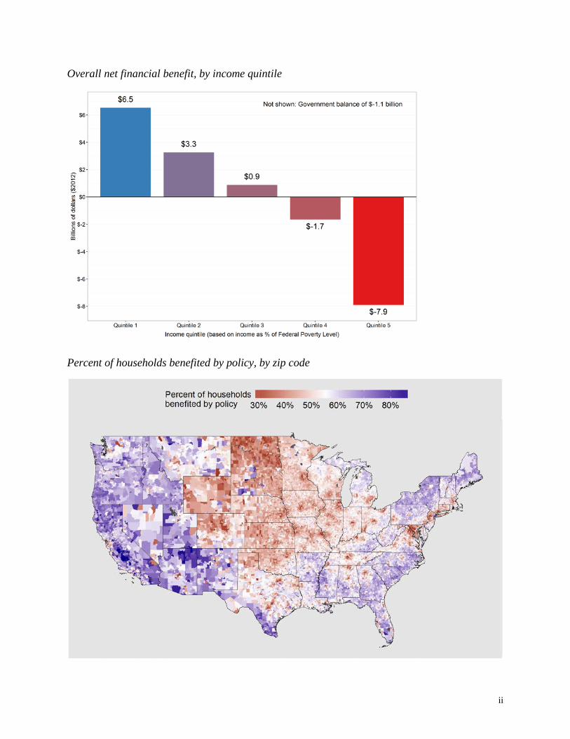
Overall net financial benefit, by income quintile
Percent of households benefited by policy, by zip code
ii

2 Table of contents
1 Executive summary i
2 Table of contents iii
3 List of figures iv
4 Introduction 1
5 Estimation of household carbon footprints 3 5.1 Simulation and adjustment of household expenditures 4 5.2 Input-output modeling of national CIE 6 5.3 Modeling spatial variation in prices 9 5.4 Adjusting CIE for Manhattan and Gucci effects 13 5.5 Calculation of fuel-specific CIE 15
6 Simulation of carbon fee and dividend policy 17 6.1 Sources of gross revenue 17 6.2 Dispersal and taxation of dividend 19 6.3 Impact on government budget 20
7 Results 21 7.1 Costs and benefits across the income distribution 21 7.2 Spatial variation in net benefit 24 7.3 Net benefit across demographic groups 25
8 Conclusion 29
9 References 31
10 Additional graphics 33
iii

3 List of figures
Figure 1 - Gasoline price index (2012) 11 Figure 2 - Fruits and vegetables price index (2012) 12 Figure 3 - Services price index (2012) 12 Figure 4 - Estimated Gucci effect 14 Figure 5 - Carbon intensity of electricity supply (2012) 16 Figure 6 - Residential electricity price (2012) 16 Figure 7 - Assumed relationship between household income and marginal tax rate 20 Figure 8 - Percent of households benefited, by income quintile 22 Figure 9 - Total financial cost and benefit, by income decile 23 Figure 10 - Overall net financial benefit, by income quintile 24 Figure 11 - Percent of households benefited, by zip code 25 Figure 12 - Percent of households benefited, by age group 26 Figure 13 - Percent of households benefited, by household type 27 Figure 14 - Percent of households benefited, by race 28 Figure 15 - Typical per-person carbon footprint, by zip code 33 Figure 16 - Distribution of net financial benefit, by income quintile 34 Figure 17 - Distribution of net financial benefit, by age group 34 Figure 18 - Distribution of net financial benefit, by household type 35 Figure 19 - Distribution of net financial benefit, by race 35
iv

4 Introduction
Governments often seek to discourage harmful behavior by making such activity costlier. Second-hand smoke causes harm to innocent bystanders, prompting federal, state, and local politicians to impose a tax on cigarettes. The tax increases the price of cigarettes – discouraging consumption and improving public health – while providing a source of revenue. Unmitigated burning of coal, oil, and gas causes harm via local air pollution and global climate change. A “carbon fee” – a tax on fossil fuels – is analogous to a cigarette tax, discouraging the use of goods, services, and technologies that rely on fossil fuels and encouraging clean alternatives.2 A carbon fee increases the price of carbon-intensive products. This “price signal” is key to the policy’s efficacy, as it incentivizes conservation and low-carbon choices among households and businesses. But the prospect of American families – especially low-income and elderly – facing higher costs is a central concern of carbon fee skeptics on both ends of the political spectrum. Of course, a carbon fee also generates revenue that can be used to make households and/or businesses better off. Conservative economists have long argued that revenue from “environmental taxes” should be used to reduce other taxes – like income, capital, and corporate taxes – that hinder economic activity (Tullock 1967). Others argue that the revenue should be returned directly to households to help offset higher prices. These differences reflect an inherent tradeoff between efficiency and equity when deciding how to “recycle” carbon fee revenue back into the economy. In general, reduction of capital and corporate taxes maximizes economy-wide efficiency (i.e. GDP growth), while the least-efficient recycling option is to return revenue directly to households. But the consequences for equity are reversed: reducing taxes on business disproportionately benefit the rich, while a rebate to consumers is more likely to benefit low-income households. Reducing taxes on labor generates effects somewhere in-between (Williams et al. 2014a). While conceptually simple, carbon pricing can induce multiple and complex impacts on U.S. households. A reduction in economic efficiency might suppress employment and workers’ wages in some industries more than others (Ho, Morgenstern, and Shih 2008). Improved local air quality or lower long-term climate risk might benefit households in particular places (Jerrett et al. 2005). Revenue returned to households through rebates or lower taxes might benefit certain demographic groups or regions of the country, depending on the policy design (Metcalf 2007). This study simulates a “carbon fee and dividend” policy similar to that proposed by the Citizens’ Climate Lobby (CCL).3 The policy consists of an economy-wide $15 per ton CO2 fee on domestic fossil fuel production and goods imported from abroad. Tax rebates are provided for exports to maintain competitiveness of U.S. businesses. The remaining revenue is distributed to
2 Readers are directed to Metcalf and Weisbach (2009), Marron et al. (2015), and Kennedy et al. (2015) for comprehensive reviews of the implementation and administrative details of such a policy. 3 https://citizensclimatelobby.org/carbon-fee-and-dividend/
1
households on a modified per-capita basis as a taxable “dividend”. Specifically, every adult receives a full dividend “share” and each child (up to two per household) receives a half share. Importantly, this analysis is “static” and does not consider “dynamic” effects that a carbon tax would have on economic growth, employment, wages, trade, or consumption patterns over time.4 Nor does it consider local or global environmental benefits. Instead, I calculate the short-term financial effect on families, assuming that the policy is implemented “overnight” with 100% pass-through of the tax into consumer prices, no change in household behavior, and no change in production processes, technologies, or emissions. Under these assumptions, the net effect of the policy for a given household is the difference between additional costs due to higher prices and additional disposable income due to the dividend. The cost (or tax burden) imposed by the policy is directly related to a household’s “carbon footprint” – the amount of CO2 emitted as a result of consumption. This includes emissions associated with direct consumption of energy (e.g. electricity, natural gas, gasoline, etc.) as well as indirect CO2 that is emitted during the production of other goods and services (e.g. food, electronics, a visit to the doctor, etc.). This basic technique is similar to those employed in prior research, including Metcalf (1999), Hassett, Mathur, and Metcalf (2007), Metcalf (2007), Burtraw, Sweeney, and Walls (2009), Hassett, Mathur, and Metcalf (2011), and Mathur and Morris (2014). This study differs in the high level of socioeconomic, demographic, and spatial detail it provides. Household-level impacts can be assessed across almost any demographic or socioeconomic dimension, down to the level of individual zip codes. I also introduce a number of methodological improvements for estimating a household’s carbon footprint and, therefore, its likely tax burden as a result of higher consumer prices. Section 5 describes how I estimate carbon footprints for each of 5.8 million households in a representative national sample over 2008-2012. This includes novel techniques to adjust for known under-reporting in expenditure surveys and variation in prices paid for goods and services across households as well as improvements to input-output modeling of carbon tax price impacts. Section 6 explains how this information is used to simulate the specific carbon fee and dividend policy outlined above and determine the overall financial gain or loss of each household. Section 7 presents results across the income distribution, space, and population groups. Section 8 concludes with a discussion of caveats, uncertainties, and policy design options.
4 Addressing dynamic effects requires a computable general equilibrium (CGE) model of the economy. Examples include, among others, Rausch and Reilly (2012) and Williams et al. (2014a; 2014b).
2

5 Estimation of household carbon footprints
I use an expenditure-based approach to estimate a household’s carbon footprint. This requires two pieces of information: 1) total expenditure for each kind of good or service; and 2) an estimate of the CO2 emitted per dollar spent on those same goods and services. I refer to the latter as the “carbon intensity of expenditure” – denoted by CIE in subsequent formulae – and it has units of kgCO2 per dollar. A household’s carbon footprint is simply expenditure times CIE summed across i categories of goods and services:
𝐻𝐻𝐻𝐻𝐻𝐻𝐻𝐻𝐻𝐻ℎ𝐻𝐻𝑜𝑜𝑜𝑜 𝐶𝐶𝐶𝐶2 𝑓𝑓𝐻𝐻𝐻𝐻𝑓𝑓𝑓𝑓𝑓𝑓𝑓𝑓𝑓𝑓𝑓𝑓 = ∑ (𝐸𝐸𝑥𝑥𝑓𝑓𝐻𝐻𝑓𝑓𝑜𝑜𝑓𝑓𝑓𝑓𝐻𝐻𝑓𝑓𝐻𝐻𝑖𝑖 ∗ 𝐶𝐶𝐶𝐶𝐸𝐸𝑖𝑖)𝑖𝑖 ( 1 )
Household-level expenditure by category is available from the Bureau of Labor Statistic (BLS) Consumer Expenditure Survey (CEX). This running survey uses interviews and diaries to continually collect expenditure, income, and demographic data for a representative sample of American households. It is the primary source of information on how expenditure patterns vary across types of goods and services, space, and household characteristics. However, household expenditure totals in the CEX are consistently lower than those in the Personal Consumption Expenditures (PCE) component of the Bureau of Economic Analysis (BEA) national accounts (National Research Council 2013).5 The latter provides aggregate household expenditure based on what businesses report to have sold, whereas the CEX provides what households report to have purchased. When expenditure is summed across categories with comparable definitions, CEX totals are typically only 75% of PCE – and reporting rates vary widely across different kinds of goods. Discrepancy between expenditure surveys and national accounts are not uncommon. While there is no theoretical preference for one over the other, there are good practical reasons to prefer PCE as the accurate measure in rich countries (Deaton 2005). This matters greatly for carbon footprinting, because the CIE term in Eq. 1 is calculated using data and techniques that assume national accounts provide the correct measure of expenditure and investment (see Section 5.2). Consequently, addressing the “under-reporting problem” is important for accurate analysis of carbon tax incidence. Estimating CIE introduces a number of methodological challenges as well. The standard approach (and the approach used here) relies on “input-output” tables from BEA that detail monetary flows of commodities to and from industries (Leontief 1953). These tables are used to estimate CIE for individual commodities.6 The advantage of “I-O modeling” is that a single
5 It is also likely that the CEX (like many surveys) underrepresents households at the upper end of the income distribution (Sabelhaus et al. 2013). 6 I believe one of the earliest extensions of I-O modeling to the energy context – from which an extension to emissions can then be made – is Herendeen (1973). Kok, Benders, and Moll (2006) provide an excellent overview of methodological issues in this area.
3
analytical framework is used to measure all of the inputs (and, therefore, CO2 emissions) required to produce a wide range of goods and services. However, a national I-O model can only provide national average CIE for each expenditure category. In reality, we know that CIE actually varies across households, and a primary reason for this is that prices vary across households. Consider a household in Manhattan (New York City) that spends $2.00 for a 2-liter bottle of Coca Cola. A household in Tulsa, Oklahoma spends only $1.33 for the same product. It is reasonable to assume that the real-world carbon footprints of each purchase are not significantly different. But using identical CIE for both transactions suggests that the household in Manhattan is responsible for 50% more pollution. I refer to this complication – stemming from spatial variation in the price of identical products – as the “Manhattan effect”. Further, consider the purchase of shoes. A pair purchased at Walmart might cost $30, while a pair of Gucci luxury brand shoes might cost $600.7 Both transactions are categorized as “Shoes and other footwear” for the purposes of Eq. 1. The Gucci shoes may, in fact, have a higher carbon footprint than those from Walmart – but probably not 20 times higher, which is what a uniform CIE implies. In practice, we expect CIE to vary with household income as wealthier households, on average, buy higher-priced versions of otherwise similar items. I refer to this complication – stemming from differences in price paid across households within a given expenditure category – as the “Gucci effect”.8 Both the Manhattan and Gucci effects suggest that conventional approaches may overestimate the carbon footprints of rich households. On the other hand, it is possible that rich households are disproportionately responsible for underreporting of expenditures in the CEX. These two factors push in opposite directions – with possibly important distributional consequences. The following sections describe how I address the issues raised above, specifically 1) adjustment of household-level expenditures reported in the CEX to match associated PCE totals and 2) calculation and adjustment of national average CIE to account for both the Manhattan and Gucci effects.
5.1 Simulation and adjustment of household expenditures
The CEX sample size is not sufficient to allow an analysis of this kind at both high spatial and demographic resolution. However, it is possible to use CEX data to simulate household expenditure for the much larger American Community Survey (ACS), relying on the large overlap in household and geographic variables between the two surveys. This type of survey integration is sometimes referred to as “micro data fusion” (Pisano and Tedeschi 2014).
7 For the record, I (proudly) have no idea what a pair of luxury-brand shoes actually cost! 8 We can imagine a third effect that we might call the “Hawaii effect” or “Alaska effect”, reflecting the fact that prices are higher in some places due to geographic considerations and transportation costs, independent of the Manhattan and Gucci effects. In theory, a spatial econometric approach could isolate this effect using the data described in Section 5.3, but I leave this for future analysis.
4

The CEX-ACS fusion process was introduced and described in Ummel (2014). The technique relies on boosted quantile regression trees – a machine learning strategy – to estimate expenditure probability distributions conditional on observable household, climatic, and local economic characteristics (e.g. fuel prices). In conjunction with an algorithm to generate random uniform variates that exhibit observed correlation across spending categories (Schumann 2009), it is possible to simulate an expenditure dataset that preserves both micro and macro patterns in the original CEX data. Readers are directed to the original paper for details.9 This study takes the fused CEX-ACS dataset as its starting point. It contains inflation-adjusted expenditures (2012 dollars) for nearly 6 million households across 52 different expenditure categories over the period 2008-2012, along with the complete set of household-level variables inherent to the ACS. The main extension in this paper is to adjust expenditures for the aforementioned discrepancy between CEX and PCE expenditure total (i.e. under-reporting problem). I rely on a comparison of CEX and PCE totals across comparable expenditure categories carried out by BLS and BEA staff.10 It provides the ratio of CEX-to-PCE expenditure (“reporting ratio”) for each category. Expenditures for rent, utilities, vehicle purchase, gasoline, and communication services (e.g. phone service) are all reported quite accurately. Outside of these categories, the aggregate reporting ratio for 2014 was just 53%. To understand why this is problematic, consider the example of expenditures for meals consumed outside the home (i.e. fast food and restaurants). The reporting ratio is about 60%. I-O analysis produces a CIE for restaurants (kgCO2 per dollar of expenditure) based on total PCE expenditure for the category (see Section 5.2). If the CIE is applied to unadjusted CEX expenditure, it will underestimate total emissions from eating out by 40%. To make matters worse, reported restaurant expenditure increases disproportionately with household income. Indeed, this is true of many of the categories with low reporting ratios. Without any adjustment, Eq. 1 will not only underestimate total restaurant emissions, it will disproportionately under-estimate emissions among rich households (assuming the rich report as accurately as the poor). Clearly, it is necessary to adjust CEX expenditure upwards to match PCE totals and create compatibility with CIE derived from I-O tables. However, absent detailed survey data comparing household reported expenditure to actual expenditure (something that is very difficult to do), there is no way of knowing if the likelihood and/or magnitude of under-reporting is related to household demographics (e.g. income). Consequently, I assume that under-reporting is uniform across the population. For each category, CEX expenditure for all households is divided by the category-specific reporting ratio. The net effect is to disproportionately increase expenditure among the rich – but only because the rich
9 http://www.cgdev.org/publication/who-pollutes-household-level-database-americas-greenhouse-gas-footprint-working-paper 10 http://www.bls.gov/cex/cecomparison.htm
5

disproportionately consume those categories where BLS/BEA analysis suggests under-reporting is most significant.11 To check that the adjustment for under-reporting produces plausible total expenditure, I compare aggregate PCE with aggregate (adjusted) expenditure in the household sample. Since the two are not directly comparable as is, I subtract-out the following PCE components from the national accounts data:
• Imputed rental of owner-occupied nonfarm housing • Rental value of farm dwellings • Health care • Health insurance • Pharmaceutical and other medical products • Final (net) consumption expenditures of nonprofit institutions serving households
For 2012, this leaves $7.2 trillion in the remaining PCE categories. I compare this figure with under-reporting-adjusted total expenditures in the household sample, excluding Health insurance, Drugs, Medical services, and Medical supplies, and Cash contributions. The resulting total expenditure is $7.17 trillion. Whether the adjustment procedure generates the correct distribution of expenditures remains an open question, but it does produce overall spending in agreement with the national accounts.
5.2 Input-output modeling of national CIE
The data and techniques used here to estimate national CIE across expenditure categories are similar to those employed by Fullerton (1996), Metcalf (1999), and others.12 My approach is most similar that of Perese (2010), and readers are directed to that paper for technical and mathematical details.13 This section describes where, why, and how I modify the conventional approach, and I assume the reader is familiar with the basics of I-O modeling.14 Estimation of CIE requires the analyst to pass a “tax matrix” into the I-O framework such that, when solved, the system of equations returns a vector of price increases for each commodity. These prices increases reveal the CIE, given the (static) state of economy described in the I-O
11 Cross-country analysis shows that the ratio of total household survey expenditure to total national account expenditure declines with rising income (Deaton 2005). If this observed pattern between countries were to hold within the U.S. – implying that rich households disproportionately under-report expenditures – then my assumption of uniform under-reporting across households will underestimate spending among the rich. 12 Strictly speaking, the analyses cited do not estimate CIE directly but, instead, estimate commodity relative price changes for a given carbon price. Mathematically, these are two sides of the same coin and analogous for our purposes. 13 https://www.cbo.gov/sites/default/files/111th-congress-2009-2010/workingpaper/2010-04-io_model_paper_0.pdf 14 In short, the I-O “framework” or model relies on “Use” and “Make” input tables that describe the monetary flow of commodities to and from industries. They report all inputs and outputs associated with the production of goods and services. The tables are consistent with one another and with the national account totals for consumption and investment across households and government, as well as imports and exports. See UN Statistics Division (1999).
6

tables. Each cell of the tax matrix should contain the revenue to be raised from the use of a given commodity by a given industry. The tax matrix is typically constructed to reflect revenue from energy-related CO2 emissions for the year in question. However, this omits carbon embedded in fuel exports. Fossil fuel inputs (e.g. crude oil) used to produce fuel exports (e.g. fuel oil) are to be taxed at the well/mine mouth or border, but the associated carbon is not reflected in energy-related emissions since it remains embedded in fuel sent abroad. To correct for this, I remove fuel exports from the Make and Use tables. I adjust all intermediate inputs to the respective industries proportionally, reflecting the share of fuel exports in total industry output. This reduces total output of fossil fuel commodities in the I-O framework to account for emissions embedded in fuel exports. In practice, earlier research probably did not suffer too much from this omission, because U.S. fuel exports were relatively small. But fuel exports in the post-2008 period are not negligible. This is most pronounced in the case of petroleum product exports containing almost 500 MtCO2 of embedded carbon in 2012 (coal exports were also significant in CO2 terms). It is also necessary to distribute the revenue in the tax matrix across specific commodity-industry cells. Typically, revenue is allocated across industries in proportion to input value, assuming that ad valorem tax rates are constant for a given fossil fuel commodity. However, in practice input prices can vary considerably across industries. I address this, in part, by integrating EIA data on the amount of CO2 emitted, by fuel, in the “Electricity” and “Other” sectors. This allows me, for a given fossil fuel, to assign one ad valorem tax rate for the power sector and one rate for all other users. In the case of coal, for example, this leads to larger ad valorem rates in the electricity sector compared to industrial users, presumably reflecting the lower input prices of the former. Unlike Perese (2010), I do not explicitly include rebates for carbon sequestered through non-combustive use of fuel (e.g. asphalt, lubricants, etc.). Technically, the CCL proposal would provide such rebates. However, since the size of the tax passed into the I-O model purposefully excludes sequestered CO2, the model captures the aggregate effect of such an adjustment but ignores differential effects across industries. Ideally, future work would include sequestered CO2 in the tax matrix alongside explicit rebates in the I-O framework per Perese (2010). I multiply commodity-specific CIE values from the I-O model across all final uses in the Use table to calculate the total carbon associated with each commodity and end use. This effectively assumes that non-fuel imports have the same carbon-intensity (and, therefore, face the same tax rate) as their domestically-produced counterparts. This is a common assumption in such analyses and could well reflect real-world border tax adjustments under unilateral carbon pricing (Metcalf and Weisbach 2009). In the case of fuel imports and exports, I calculate the associated carbon separately by integrating additional data on physical quantities of fossil fuel produced, imported, and exported in
7

conjunction with CO2 emission factors from the EPA.15 I find that the fuel import and export emissions implied by the I-O model do not consistently replicate the quantities calculated from physical fuel data. This may be due to differences in prices or other issues specific to the treatment of imports and exports in the BEA data. This is an area where additional work in needed. For now, I assume that the fuel import and exports emissions derived from physical fuel quantities are correct. The remaining departure from previous research concerns the level of detail used in the I-O model itself.16 The BEA provides “benchmark” I-O tables every five years that contain detailed data for almost 400 commodities and industries (most recently for 2007). Annual “summary” tables contain analogous data for an aggregated set of about 70 commodities and industries (currently through 2014). Typically, researchers face a tradeoff between detail and timeliness, and all previous research has relied on the comparatively coarse product detail of the summary-level tables. It is possible, however, to use the 2007 benchmark data to “expand” each cell of a summary year table. This results in new Make and Use tables for non-benchmark years that have the product detail of the benchmark tables but retain cell values consistent with the summary-level tables. Since this process can result in discrepancies in commodity and industry total output across the Use and Make tables, I use an iterative proportional fitting procedure (i.e. “matrix raking” or “RAS algorithm”) to adjust cell values and achieve identical margins across the two tables.17 I employ an analogous process to create detail-level versions of the PCE bridge matrices. Using the expanded I-O tables, I compute CIE for each BEA commodity and year 2008-2012. The expanded PCE bridge matrices are used to calculate CIE for more than 200 PCE categories. Finally, CIE is calculated for each of the 51 expenditure categories contained in the fused CEX-ACS dataset, using a cross-walk provided by BLS and BEA that links CEX expenditure line item codes to PCE categories. National CEX expenditure at the line-item level is used to weight the relative contribution of different PCE categories when calculate final CIE for each expenditure category.
15 Both energy-related CO2 emission and physical fuel quantity data come from EIA’s Monthly Energy Review (http://www.eia.gov/totalenergy/data/monthly). Emission factors are from the EPA (http://www.epa.gov/energy/ghg-equivalencies-calculator-calculations-and-references). 16 I utilize the BEA Make and Use tables, in producer prices and after redefinitions, at both the summary and benchmark level of detail along with the commodity-PCE bridge data. For an introduction to the BEA Industry Accounts, see Streitwieser (2009). 17 Every carbon tax analysis using summary-level BEA I-O tables must take analogous steps to, at a minimum, disaggregate the “Coal mining” industry from the aggregated “Mining, except oil and gas” industry. The technique used here is simply a systematic extension of this process to the rest of the matrix.
8

5.3 Modeling spatial variation in prices
As indicated above, variation in consumer prices poses a challenge when computing household carbon footprints from expenditures alone. Previous analyses of CEX data in the context of carbon pricing and/or footprinting have ignored this fact. In order to account for both the Manhattan and Gucci effects, it is necessary to specify how prices for different kinds of goods vary across the country. I rely on a proprietary dataset of consumer prices provided by the Council for Community and Economic Research (C2ER).18 The C2ER data used here provides reported consumer prices for 53 individual goods and services (referred to here as “items”) over 2008-2012 and for nearly 400 urban areas. These data indicate, for example, the retail price of a gallon of regular gasoline or a 2-liter bottle of Coca Cola, etc. The C2ER data generally report consumer prices excluding state and local sales tax. However, prices for gasoline, beer, and wine include federal and state excise taxes paid by producers, and gasoline additionally includes sales tax when applicable. Reported retail prices for gasoline, beer, and wine are first stripped of their sales and excise tax components. Per-gallon excise and applicable sales taxes for gasoline come from the American Petroleum Institute’s motor fuel tax reports.19 Excise taxes for beer and wine come from the Tax Foundation.20 This step removes spatial variation in prices due to differences in state tax policy. The resulting “tax-free” prices reflect the underlying cost of production, transport, and wholesale and retail trade margins for a given location. For each item and year, I spatially interpolate observed prices using zip-code level data as regressors in a universal Kriging model. The zip-code level regressors include a measure of typical per-capita income created by combining information from multiple ACS 5-year (2010-2014) estimate tables, along with population density and typical home value provided by Zillow Real Estate Research.21 Following spatial interpolation of tax-free prices, applicable sales and excise tax for each item is added to arrive at the tax-inclusive retail price in each zip code.22 Combined state and local sales tax rates for each zip code come from Avalara.23 Exclusion of certain items from the sales tax base is determined using guidance on state-specific exclusions of food and drugs from the Federation of Tax Administrators.24
18 https://www.coli.org 19 http://www.api.org/Oil-and-Natural-Gas-Overview/Industry-Economics/Fuel-Taxes 20 http://taxfoundation.org/tax-topics/alcohol-taxes 21 http://www.zillow.com/research/data/ 22 There is no dominant, large-scale spatial pattern underlying sales tax rates. While there is significant intra-state variation due to taxes imposed by local municipalities in addition to the statewide rate, there is effectively zero overall correlation (-0.024) between zip code sales tax rate and typical per-capita income. This suggests that explicit consideration of sales tax leads to place-specific (and somewhat random) adjustments to CIE rather than systematic adjustments along spatial or demographic lines. 23 http://salestax.avalara.com 24 http://www.taxadmin.org/assets/docs/Research/Rates/sales.pdf
9
The prevailing, tax-inclusive price in a given zip code (𝑓𝑓𝑖𝑖) may differ from the effective consumer price – i.e. the average price actually paid by residents (𝑃𝑃𝑖𝑖). This is most pronounced for locales and items where tax rates vary significantly across political borders (e.g. gasoline prices across state borders). I assume that the effective price in a given zip code resembles an average of local prices within some radius of residents’ homes. To capture this effect, I convert the polygon zip code data to a raster grid and, for each cell, item and year, calculate the effective consumer price as the weighted mean price within 40 km (25 miles) of each grid cell. For cell k with j cells at distance 𝑜𝑜𝑗𝑗 and local population25 𝑦𝑦𝑗𝑗, the effective price 𝑃𝑃𝑘𝑘 is the weighted mean of local prices 𝑓𝑓𝑗𝑗 such that
𝑃𝑃𝑘𝑘 =∑ 𝑝𝑝𝑗𝑗𝑤𝑤𝑗𝑗𝑗𝑗
∑ 𝑤𝑤𝑗𝑗𝑗𝑗 where 𝑤𝑤𝑗𝑗 = 𝑦𝑦𝑗𝑗
1+𝑑𝑑𝑗𝑗 ( 2 )
For each item and year, the effective price in zip code 𝑓𝑓 is then simply the population-weighted mean of associated grid cells k:
𝑃𝑃𝑖𝑖 = ∑ 𝑃𝑃𝑘𝑘𝑦𝑦𝑘𝑘𝑘𝑘∑ 𝑦𝑦𝑘𝑘𝑘𝑘
( 3 )
For each item and year, the effective price in zip code 𝑓𝑓 is then divided by the population-weighted mean national price for the item in question (𝑃𝑃�), giving a ratio 𝑅𝑅𝑖𝑖 defined by:
𝑅𝑅𝑖𝑖 = 𝑃𝑃𝑖𝑖𝑃𝑃�
= 𝑃𝑃𝑖𝑖 ∑ 𝑦𝑦𝑖𝑖𝑖𝑖∑ 𝑃𝑃𝑖𝑖𝑦𝑦𝑖𝑖𝑖𝑖
( 4 )
Each of the items are then assigned to a CEX UCC (line-item) code and one of 11 categories: Alcohol, Apparel, Consumer goods, Dairy, Fast food, Fruits and vegetables, Gasoline, Health care, Meat and eggs, Other food, and Services. For each category, a weighted relative price index is calculated (𝑉𝑉𝑖𝑖), where the 𝑓𝑓 associated item weights are equal to total U.S. expenditure for the associated UCC code (𝐸𝐸𝑛𝑛):
𝑉𝑉𝑖𝑖 = ∑ 𝑅𝑅𝑖𝑖𝐸𝐸𝑛𝑛𝑛𝑛∑ 𝐸𝐸𝑛𝑛𝑛𝑛
( 5 )
The variable 𝑉𝑉𝑖𝑖 is computed for each year 2008-2012 and measures relative differences in price levels across zip codes. A value of 𝑉𝑉𝑖𝑖 = 1 indicates parity with national average prices for the category in question. Figures 1-3 show the resulting zip-code level relative price indices for the Gasoline, Fruits and vegetables, and Services categories for the year 2012. In the case of gasoline, the differences largely reflect variation in state excise tax. But for Fruits and vegetables and Services, the patterns reflect other economic forces.
25 Grid-cell population provided by: http://beta.sedac.ciesin.columbia.edu/data/set/gpw-v4-population-density
10

Finally, for the purposes of subsequent analysis that integrates price index data with the fused CEX-ACS dataset, it is necessary to aggregate the zip code level results to the level of PUMA’s. This is accomplished using a linkage between zip codes and PUMA’s provided by the Missouri Census Data Center’s MABLE/Geocorr1226 system and constructing a population-weighted mean index value for each PUMA.
Figure 1 - Gasoline price index (2012)
26 http://mcdc.missouri.edu/websas/geocorr12.html
11

Figure 2 - Fruits and vegetables price index (2012)
Figure 3 - Services price index (2012)
12

5.4 Adjusting CIE for Manhattan and Gucci effects
With the price index data developed above, adjusting CIE for the Manhattan effect is straightforward. For a given expenditure category, the local CIE in PUMA m is simply:
𝐶𝐶𝐶𝐶𝐸𝐸𝑚𝑚 = 𝐶𝐶𝐶𝐶𝐸𝐸�����
𝑉𝑉𝑚𝑚 ( 6 )
where 𝐶𝐶𝐶𝐶𝐸𝐸����� is the national average CIE derived from the I-O analysis in Section 5.2. That is, the local CIE results from adjusting national average CIE up (down) in places with below-average (above-average) prices. However, adjusting for both the Manhattan and Gucci effects is more complicated. The Gucci effect implies that the average price paid for otherwise-similar products (i.e. products within a given expenditure category) varies with household characteristics – particularly income. To estimate the size of this effect, I exploit the fact that households cannot consume infinite amounts of food. Assuming that richer individuals do not eat more calories (just more expensive ones), I estimate annual total calories consumed at the household level (C) by combining information on the number and age of household members with recommended daily calorie intake for different groups.27 Summing local-price-adjusted expenditure E across f food expenditure categories and dividing by C gives a measure of average price per calorie:
𝑌𝑌 = 1𝐶𝐶∑ 𝐸𝐸𝑓𝑓
𝑉𝑉𝑓𝑓𝑓𝑓 ( 7 )
It is possible that Y increases with income because richer households shift to more expensive categories of food (e.g. eating out) without any actual increase in the price paid for calories within a given category. Isolating the Gucci effect requires controlling for the composition of the household food basket. I fit a boosted quantile (median) regression tree model where the response variable is the ratio of Y to its calorie-weighted mean (call the ratio G) over n households in the sample, and the predictors include household income percentile I and a vector of food category expenditure shares 𝑋𝑋𝑓𝑓:
𝐺𝐺 = 𝐹𝐹�𝐶𝐶,𝑋𝑋𝑓𝑓� where 𝐺𝐺 = 𝑌𝑌∑ 𝐶𝐶𝑛𝑛𝑛𝑛∑ 𝑌𝑌𝑛𝑛𝐶𝐶𝑛𝑛𝑛𝑛
( 8 )
A monotonicity constraint is enforced on I and 10-fold cross-validation used to determine the optimal number of regression trees, as determined by minimizing the average root-mean-squared error across the folds.
27 http://www.cnpp.usda.gov/sites/default/files/usda_food_patterns/EstimatedCalorieNeedsPerDayTable.pdf
13

The marginal effect of I on G is given by the black curve in Figure 4. It describes the relationship between household income percentile and typical (median) price-per-calorie relative to the national average controlling for both local price levels and the composition of the food basket. In other words, a measure of the degree to which richer households buy more expensive versions of otherwise-similar calories – the Gucci effect (or, at least, a proxy for it). I assume that this relationship holds across all applicable expenditure categories.28
Figure 4 - Estimated Gucci effect
At this point, a simple adjustment to CIE might consist of including household-level predictions of G (based on I) in the denominator of Eq. 6. However, as mentioned earlier, it is possible that higher-price products and services are, in fact, more carbon-intensive than lower-price alternatives.29 Exactly how much more is unclear and probably not knowable outside of extremely detailed, item-specific expenditure surveys coupled to life-cycle analyses. A practical approach is to assume that variation in G is due entirely to differences in trade margins. That is, Gucci and Walmart shoes are effectively identical at the factory gate, and the difference in consumer price is due to (much) higher transport, wholesale, and retail margins in the case of the former. Under this assumption, for a given expenditure category and household located in PUMA m, the fully-adjusted CIE is a function of the predicted generic Gucci ratio (based on household’s
28 Utility and gasoline expenditure categories are excluded from the Gucci effect adjustment, because premium or luxury version of these goods are generally not available. 29 A relevant exception here is organic food, which may have both a lower carbon footprint and higher price.
14

observed I), the local price index (𝑉𝑉𝑚𝑚), the share of trade margins in total purchaser price (𝑆𝑆𝑡𝑡) and the national average CIE for the production and trade margin components (𝐶𝐶𝐶𝐶𝐸𝐸𝑝𝑝������ and 𝐶𝐶𝐶𝐶𝐸𝐸𝑡𝑡������, respectively).
𝐶𝐶𝐶𝐶𝐸𝐸𝑚𝑚 = (𝑉𝑉𝑚𝑚𝐺𝐺)−1�(1 − 𝑆𝑆𝑡𝑡)𝐶𝐶𝐶𝐶𝐸𝐸𝑝𝑝������ + (𝑆𝑆𝑡𝑡 + 𝐺𝐺 − 1)𝐶𝐶𝐶𝐶𝐸𝐸𝑡𝑡������� ( 9 )
5.5 Calculation of fuel-specific CIE
In the case of electricity, there is no need to rely on CIE from the I-O model. Instead, the EPA eGRID program provides CO2 emission factors for 26 power grid sub-regions in year 2012, reflecting emissions released at power plants during fuel combustion (zero in the case of renewable generators).30 I also include an adjustment for transmission and distribution losses between generators and consumers.31 Combined with a spatial dataset indicating the physical boundaries of grid sub-regions, it is possible to estimate the carbon intensity (kgCO2 per MWh) of individual zip codes. Figure 5 shows the results. A separate dataset from OpenIE, provides residential electricity rates for 2012 for individual zip codes (cents per kWh).32 Figure 6 displays this information. These two data sources allow the calculation of location-specific CIE for residential electricity. In the case of natural gas, heating oil, and LPG, I use state-level residential prices from the EIA to adjust the national average CIE. Since this could lead to erroneous values (primarily because the I-O analysis CIE for these fuels will reflect all uses – not just residential), I include a further, final adjustment to ensure that total residential CO2 emissions from these fuels match totals reported by the EIA.
30 http://www.epa.gov/energy/egrid 31 The eGRID-derived emission factors do not account for inter-regional electricity flows that could impact the true GHG-intensity of electricity consumed. Up to 30% of electricity consumed in some grid sub-regions originates elsewhere (Diem and Quiroz 2012), but there is currently no simple way to account for these flows. 32 http://en.openei.org/datasets/dataset/u-s-electric-utility-companies-and-rates-look-up-by-zipcode-2013
15

Figure 5 - Carbon intensity of electricity supply (2012)
Figure 6 - Residential electricity price (2012)
16

6 Simulation of carbon fee and dividend policy
The simulated policy imposes a $15 per ton CO2 carbon fee on all domestic fossil fuel extraction and imported fuels and goods. I calculate that the average annual carbon tax base – that is, the total amount of CO2 subject to taxation– was 7,810 MtCO2 per year over the period 2008-2012 Assuming a static economy and no response to the tax, this yields gross revenue of $117 billion for simulation purposes. About 20% of gross revenue is used to finance carbon tax rebates for businesses exporting goods abroad or using fossil fuel for non-combustive uses (see Section 6.1). The remaining ~80% is returned to households in the form of a taxable “dividend”. The revenue is disbursed to households, assuming that each adult receives a full dividend “share” and each child (up to two per household) receives a half share. A measure of “net financial benefit” (NFB) is calculated for each household in the sample. Given a pre-tax dividend (D), marginal income tax rate (M; see Section 6.2 below), effective CO2 footprint (Z), and a nominal carbon tax rate of $15 per ton CO2 (T=15), a household’s NFB is given by:
𝑁𝑁𝐹𝐹𝑁𝑁 = (1 −𝑀𝑀)𝐷𝐷 − 𝑍𝑍𝑍𝑍 ( 10 )
In the context of carbon pricing, revenue and CO2 emissions are analogous. The tax burden for a given entity – assuming that the tax is passed entirely on to consumers and there is no macroeconomic response to the policy – is proportional to that entity’s carbon footprint. Since a primary objective of this study is to assess the balance of costs (i.e. emissions or tax burden) and benefits (i.e. dividends) for individual households, it is important to ensure that the “sources and sinks” of these flows are clearly understood.
6.1 Sources of gross revenue
Results from the I-O model show that 12.8% of CO2 emissions (and, therefore 12.8% of gross revenue under carbon pricing) is attributable to local, state, and federal governments. These entities face higher prices when providing public services. In addition, 44% of health care services – ostensibly household consumption in PCE accounting – are, in fact, paid by governments (primarily through Medicare and Medicaid).33 I calculate that the government-financed portion of total health sector CO2 emissions averaged 201 MtCO2 per year over 2008-2012, providing ~2.6% of gross revenue. All told, governments at all levels ultimately finance about 15% of gross revenue. See Table 1 for details. Another 16.3% of gross revenue is derived from implicit taxation of fuel, goods, and services produced for export. This is higher than the result of ~10% reported by Perese (2010) using data from 2006. However, given the significant increase in U.S. fuel exports since that time, the
33 https://kaiserhealthnews.files.wordpress.com/2014/04/highlights.pdf
17
higher figure is reasonable. A policy with full border tax adjustments requires that exporters receive a rebate equal to the carbon tax embedded in their production costs. Consequently, I assume that 16.3% of gross revenue is effectively a new cost (an export rebate) to be paid by the federal government.34 In addition, I estimate that nearly 4% of gross revenue is derived from taxation of carbon sequestered by nonfuel uses of energy (e.g. asphalt, petrochemicals, etc.). This revenue would also need to be rebated. Together, about 20% of gross revenue is directed back to business in the form of tax rebates. The remaining ~65% of revenue must be sourced from households. However, total emissions/costs that can be assigned to households on the basis of actual expenditure only amount to about 54% of gross revenue. Part of the discrepancy is due to health care. Individuals rarely report (or know) the actual value of health care services received. Nor do most report (or know) the value of private health insurance premiums paid by employers. I estimate that private, non-government provision of health care is the source of ~3.3% of gross revenue. I assume this cost is evenly distributed across the non-Medicare and non-Medicaid population. I make a rough estimate of participation in these programs on the basis of head-of-household age and household income relative to the Federal Poverty Level (133% being the general threshold for Medicaid eligibility). This effectively assumes that privately-insured individuals pay 3.3% of gross revenue through higher health insurance premiums, imposing an average cost of $19 per person. Finally, 7.5% of gross revenue is attributable to taxation of fixed private investment – that is, construction of physical structures and purchase of durable equipment by both business and households.35 There is no agreement on how (or even whether, in some cases) revenue derived from fixed capital formation should be allocated to households. I assume this cost is distributed across households in proportion to total expenditure.
34 This is different than the border tax adjustment policy proposed by CCL. CCL proposes to make all exports eligible for a rebate except fossil fuel exports. I chose to simulate the more generic rebate policy since it is unclear how to assign the cost of the fossil fuel exemption across households (if at all). Additionally, CCL proposes the use of a separate government account where revenue from taxation of non-fuel imports is deposited and subsequently used to pay for rebates on non-fuel exports. Based on the I-O model output, I suspect this the account would generate a small positive balance. 35 From BEA NIPA Handbook (https://www.bea.gov/national/pdf/NIPAhandbookch6.pdf): “Private fixed investment (PFI) measures spending by private businesses, nonprofit institutions, and households on fixed assets in the U.S. economy. Fixed assets consist of structures, equipment, and software that are used in the production of goods and services. PFI encompasses the creation of new productive assets, the improvement of existing assets, and the replacement of worn out or obsolete assets.”
18

Table 1 - Sources of gross carbon tax revenue (annual avg. 2008-2012)
MtCO2 Revenue, $B
($15 per tCO2) Percent of
total
Households
Consumption expenditures 4,188 $62.8 53.6%
Private health care 256 $3.8 3.3%
Private fixed investment 582 $8.7 7.5%
Government (all levels)
Consumption and investment 1,003 $15.0 12.8%
Medicare and Medicaid 201 $3.0 2.6%
Rebate-eligible activities
Export of fuel and goods 1,270 $19.0 16.3%
Non-combustive use of fuel 310 $4.8 3.9%
TOTAL 7,810 $117.1 100%
6.2 Dispersal and taxation of dividend
The dividend is treated as fully taxable income at the federal level, and I assume that all households in the fused dataset receive a dividend and pay federal income tax. The policy has no impact on state income taxes. In reality, details of the rebate mechanism(s) could have significant practical and distributional consequences, both for welfare and tax revenue. Dinan (2012) and Stone (2015) provide excellent overviews of the relevant issues and concerns. For the purposes of this study, details of the rebate mechanism itself are ignored. Each household pays a portion of the rebate back to the federal government, reflecting the household’s marginal income tax rate. I estimate the marginal rate of each household using results from the Urban-Brookings Tax Policy Center Microsimulation Model.36 The assumed relationship between household income percentile and marginal tax rate is given in Figure 7. This assumption results in about 18% of the gross dividend returning to the federal government as income tax revenue.
36 http://www.taxpolicycenter.org/numbers/displayatab.cfm?Docid=2503
19

Figure 7 - Assumed relationship between household income and marginal tax rate
6.3 Impact on government budget
The simulation results in a net cost to government of $1.1 billion. Given the allocation of the dividend across households and the assumed marginal tax rate relationship with income, about 18% of the gross dividend is recouped by the federal government as income tax revenue. This generates total income tax revenue of $17 billion, but the tax burden imposed on government through higher prices is $18.1 billion, leaving a $1.1 billion shortfall. It should be noted (again) that this analysis does not consider any dynamics effects of the policy on macroeconomic outcomes. If the policy were to cause the economy to contract, the budget deficit could be greater than presented here.
20

7 Results
When assessing the results presented below, it is important to remember that this analysis is “static” and does not consider “dynamic” effects that a carbon tax would have on economic growth, employment, wages, trade, or consumption patterns over time. Nor does it consider local or global environmental benefits. Instead, I calculate the short-run financial effect on families, assuming that the policy is implemented “overnight” with 100% pass-through of the tax into consumer prices, no change in household behavior, and no change in production processes, technologies, or emissions. Throughout this section, a household that is said to be “benefited” by the policy is one that experiences a positive net financial benefit (NFB) given the assumptions and limitations noted above. The policy’s $15 per ton CO2 carbon fee generates annual revenue of $117 billion for the purposes of the simulation. About 20% of gross revenue is used to finance carbon tax rebates for businesses exporting goods abroad or using fossil fuel for non-combustive uses. The remaining 80% ($93 billion) is returned to households in the form of a taxable “dividend”, assuming that every adult receives a full dividend “share” and each child (up to two per household) receives a half share. This amounts to a pre-tax dividend of, on average, $811 per household ($323 per person).37 Given the assumed marginal tax rate relationship with income (Section 6.2), the average after-tax dividend – that is, the increase in disposable income due to the rebate – amounts to $664 per household ($264 per person).
7.1 Costs and benefits across the income distribution
Overall, 54% of U.S. households experience a positive NFB under the policy. Figure 8 shows the percent of households benefited overall and across income quintiles. Each quintile contains an equal number of people, ranked according to household income as a percentage of the Federal Poverty Level (FPL).38 Among households benefited, the typical (median) gain is $198 per household or about 0.4% of income. Among the 46% of households with a negative NFB, the typical loss is $196 per household. Across all households, the mean NFB is slightly positive ($17), reflecting the fact that the policy, as simulated, results in a small net transfer from government to households (Section 6.3).
37 All “per-person” results include both adults and children equally in the denominator. Also, the ACS sample excludes people living in “group quarters”, which includes correctional facilities, juvenile facilities, nursing homes, and health care facilities. Consequently, per-household and per-person results are slightly over-stated. 38 I use income as a percentage of FPL to rank households, because the latter incorporates an adjustment for household size that better reflects relative economic standing (https://aspe.hhs.gov/poverty-guidelines). Percent of FPL is also often used to determine eligibility for government programs, so distributional effects along this dimension have practical policy relevance.
21

The policy is highly progressive overall. Eighty-seven percent of households in the bottom quintile of the income distribution are benefited, compared to just 15% in the top quintile. On average, net benefit for households in the bottom quintile is $305 per household or about 1.9% of income. Households in the top quintile, on average, experience losses of a similar absolute magnitude ($324) but less relative to income (-0.2%). Households in the middle of the income distribution (Quintile 3) see a small overall benefit (mean value of $39 per household).
Figure 8 - Percent of households benefited, by income quintile
Figure 9 shows overall financial effects across income deciles. The size of the after-tax dividend (additional disposable income) received by each decile does not vary significantly across the income distribution, though it does decline slightly with rising income and higher marginal tax rates. Conversely, the tax burden imposed through higher prices for goods and services increases with income. Overall, the net distributional consequences of the policy are largely (but not exclusively; see Section 7.3) driven by differences in the exposure of households to carbon pricing (i.e. their carbon footprint). Ummel (2014) estimated that per-person CO2 footprints in the top quintile were, on average, 2.9 times larger than those in the bottom quintile. Given the range of methodological improvements introduced in this study (Section 5), that ratio declines to about 2.2, suggesting that the rich are comparatively less exposed to carbon pricing than previously thought.
22

This pattern results in a net transfer of money from upper-income to lower-income households (Figure 10). Overall, households in Quintiles 3 and 4 exhibit comparatively small net gains and losses, respectively. The primary distributional effect is to shift purchasing power from the top quintile to the bottom two quintiles.
Figure 9 - Total financial cost and benefit, by income decile
23

Figure 10 - Overall net financial benefit, by income quintile
7.2 Spatial variation in net benefit
Figure 11 shows the percent of households benefited for each of 30,000+ zip codes. The typical value of ~54% is represented by white shading in the map. Blue (red) areas are those with higher (lower) than typical values.39 I do not provide a formal analysis of the drivers of these spatial patterns. However, it is possible to surmise three factors that explain at least some of the variation. First, areas with comparatively low-carbon electricity tend to fare better (compare with Figure 12 in Section 5.5). Second, households in suburban areas tend to fare worse, reflecting higher incomes/consumption and
39 Readers should consult Ummel (2014) for details regarding derivation of zip-code level results from the fused CEX-ACS dataset. From that paper: “In order to calculate statistics for alternative geographic regions (e.g. zip codes or congressional districts), it is necessary to compute new sample weights that reflect the likelihood of a given household being located in a given region. A sample weight “raking” algorithm is employed to assign and re-weight households for any given geographic region, using region-specific marginal household counts from ACS and 2010 Census summary files. This technique ensures that the subsample of households assigned to a given zip code or congressional district, for example, reflects the actual distribution of households across income, age, race, housing tenure, and household size…More details are provided in the Annex.”
24
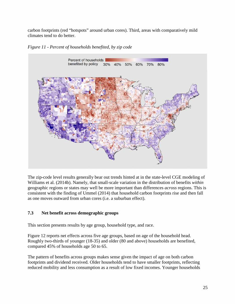
carbon footprints (red “hotspots” around urban cores). Third, areas with comparatively mild climates tend to do better.
Figure 11 - Percent of households benefited, by zip code
The zip-code level results generally bear out trends hinted at in the state-level CGE modeling of Williams et al. (2014b). Namely, that small-scale variation in the distribution of benefits within geographic regions or states may well be more important than differences across regions. This is consistent with the finding of Ummel (2014) that household carbon footprints rise and then fall as one moves outward from urban cores (i.e. a suburban effect).
7.3 Net benefit across demographic groups
This section presents results by age group, household type, and race. Figure 12 reports net effects across five age groups, based on age of the household head. Roughly two-thirds of younger (18-35) and older (80 and above) households are benefited, compared 45% of households age 50 to 65. The pattern of benefits across groups makes sense given the impact of age on both carbon footprints and dividend received. Older households tend to have smaller footprints, reflecting reduced mobility and less consumption as a result of low fixed incomes. Younger households
25
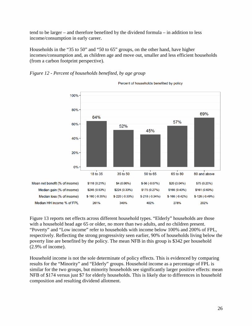
tend to be larger – and therefore benefited by the dividend formula – in addition to less income/consumption in early career. Households in the “35 to 50” and “50 to 65” groups, on the other hand, have higher incomes/consumption and, as children age and move out, smaller and less efficient households (from a carbon footprint perspective).
Figure 12 - Percent of households benefited, by age group
Figure 13 reports net effects across different household types. “Elderly” households are those with a household head age 65 or older, no more than two adults, and no children present. “Poverty” and “Low income” refer to households with income below 100% and 200% of FPL, respectively. Reflecting the strong progressivity seen earlier, 90% of households living below the poverty line are benefited by the policy. The mean NFB in this group is $342 per household (2.9% of income). Household income is not the sole determinate of policy effects. This is evidenced by comparing results for the “Minority” and “Elderly” groups. Household income as a percentage of FPL is similar for the two groups, but minority households see significantly larger positive effects: mean NFB of $174 versus just $7 for elderly households. This is likely due to differences in household composition and resulting dividend allotment.
26
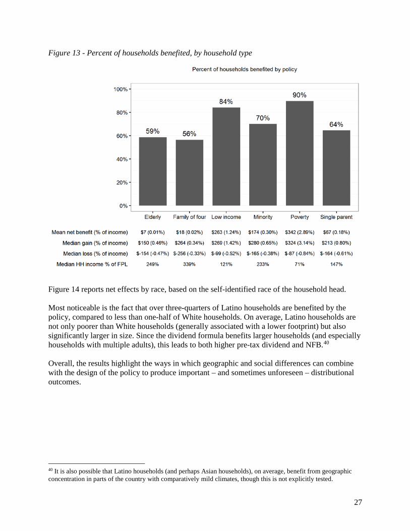
Figure 13 - Percent of households benefited, by household type
Figure 14 reports net effects by race, based on the self-identified race of the household head. Most noticeable is the fact that over three-quarters of Latino households are benefited by the policy, compared to less than one-half of White households. On average, Latino households are not only poorer than White households (generally associated with a lower footprint) but also significantly larger in size. Since the dividend formula benefits larger households (and especially households with multiple adults), this leads to both higher pre-tax dividend and NFB.40 Overall, the results highlight the ways in which geographic and social differences can combine with the design of the policy to produce important – and sometimes unforeseen – distributional outcomes.
40 It is also possible that Latino households (and perhaps Asian households), on average, benefit from geographic concentration in parts of the country with comparatively mild climates, though this is not explicitly tested.
27
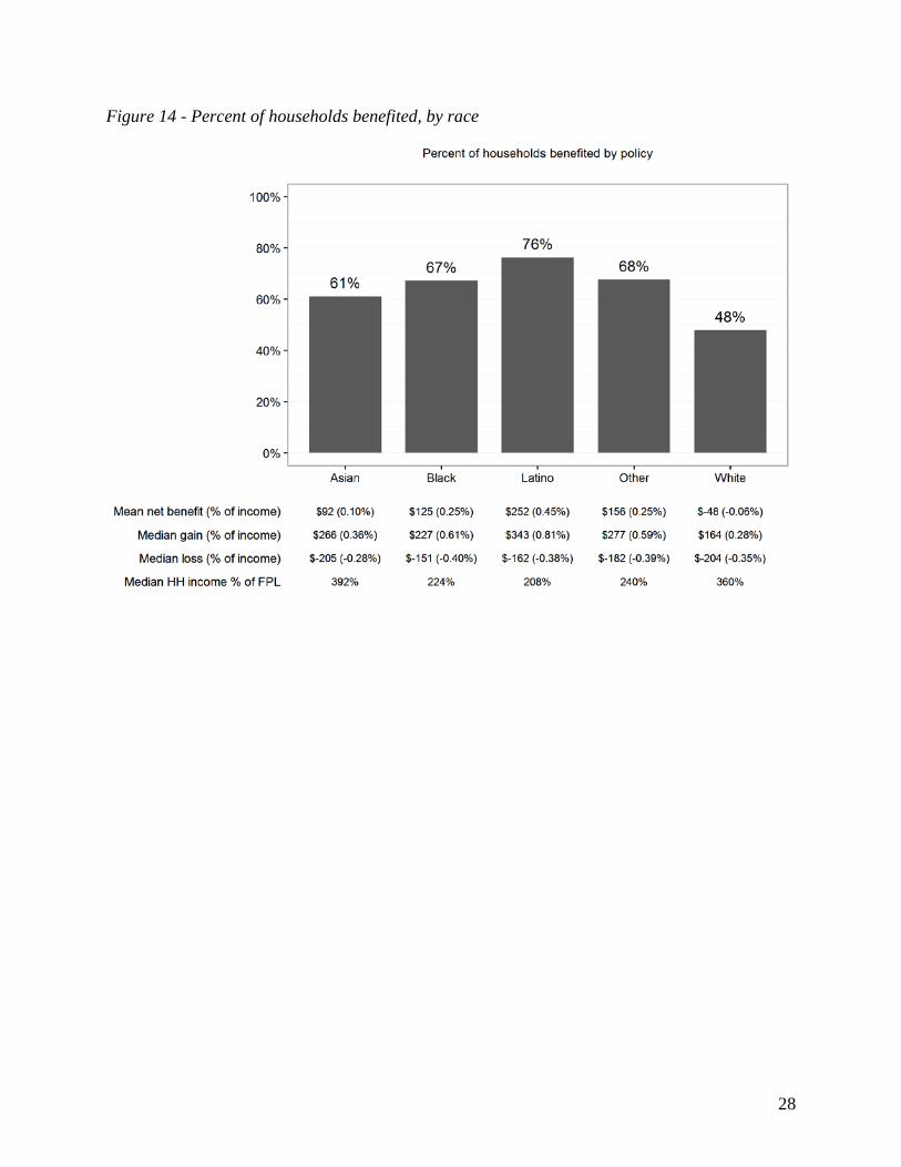
Figure 14 - Percent of households benefited, by race
28
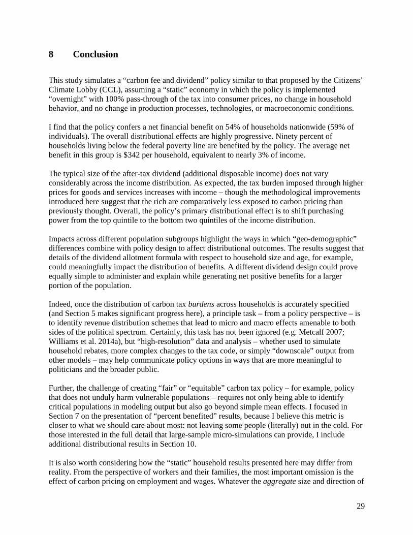
8 Conclusion
This study simulates a “carbon fee and dividend” policy similar to that proposed by the Citizens’ Climate Lobby (CCL), assuming a “static” economy in which the policy is implemented “overnight” with 100% pass-through of the tax into consumer prices, no change in household behavior, and no change in production processes, technologies, or macroeconomic conditions. I find that the policy confers a net financial benefit on 54% of households nationwide (59% of individuals). The overall distributional effects are highly progressive. Ninety percent of households living below the federal poverty line are benefited by the policy. The average net benefit in this group is $342 per household, equivalent to nearly 3% of income. The typical size of the after-tax dividend (additional disposable income) does not vary considerably across the income distribution. As expected, the tax burden imposed through higher prices for goods and services increases with income – though the methodological improvements introduced here suggest that the rich are comparatively less exposed to carbon pricing than previously thought. Overall, the policy’s primary distributional effect is to shift purchasing power from the top quintile to the bottom two quintiles of the income distribution. Impacts across different population subgroups highlight the ways in which “geo-demographic” differences combine with policy design to affect distributional outcomes. The results suggest that details of the dividend allotment formula with respect to household size and age, for example, could meaningfully impact the distribution of benefits. A different dividend design could prove equally simple to administer and explain while generating net positive benefits for a larger portion of the population. Indeed, once the distribution of carbon tax burdens across households is accurately specified (and Section 5 makes significant progress here), a principle task – from a policy perspective – is to identify revenue distribution schemes that lead to micro and macro effects amenable to both sides of the political spectrum. Certainly, this task has not been ignored (e.g. Metcalf 2007; Williams et al. 2014a), but “high-resolution” data and analysis – whether used to simulate household rebates, more complex changes to the tax code, or simply “downscale” output from other models – may help communicate policy options in ways that are more meaningful to politicians and the broader public. Further, the challenge of creating “fair” or “equitable” carbon tax policy – for example, policy that does not unduly harm vulnerable populations – requires not only being able to identify critical populations in modeling output but also go beyond simple mean effects. I focused in Section 7 on the presentation of “percent benefited” results, because I believe this metric is closer to what we should care about most: not leaving some people (literally) out in the cold. For those interested in the full detail that large-sample micro-simulations can provide, I include additional distributional results in Section 10. It is also worth considering how the “static” household results presented here may differ from reality. From the perspective of workers and their families, the most important omission is the effect of carbon pricing on employment and wages. Whatever the aggregate size and direction of
29

this effect, it will not fall uniformly across industries (Ho et al. 2008). Certain types of workers (e.g. coal miners) and their families and communities will be impacted more than others. It is not immediately clear how inclusion of largely place- and industry-specific employment effects would alter distributional outcomes.41 Since it is possible to observe the occupation of each worker in the fused CEX-ACS household sample, however, there is the possibility of gaining some clarity on this question in the future. The static analysis also assumes no change in household consumption patterns in response to higher prices. While this approach approximates the formal welfare loss under carbon pricing (Metcalf 1999), it is effectively a worst-case scenario from a household financial perspective. In practice, some households could reduce their tax burden through changes that impose little or no inconvenience – for example, turning off lights in an unoccupied room. But others face taxation of activities that are not easily avoided or substituted for – for example, long commutes in places with no public transportation. As in the case of employment, the real-world financial effects are likely to vary considerably from one household to another.
41 For example, if those households most exposed to negative employment effects already experience net losses for unrelated reasons, then employment effects could make some households even worse off without significantly changing the overall proportion of households benefited.
30
9 References
Burtraw, Dallas, Richard Sweeney, and Margaret Walls. 2009. “The Incidence of U.S. Climate Policy.” Discussion Paper, Resources for the Future.
Deaton, Angus. 2005. “Measuring Poverty in a Growing World (or Measuring Growth in a Poor World).” Review of Economics and Statistics 87 (1): 1–19.
Dinan, Terry. 2012. “Offsetting a Carbon Tax’s Costs on Low-Income Households.” Working Paper 2012-16, Microeconomic Studies Division, Congressional Budget Office.
Hassett, Kevin A., Aparna Mathur, and Gilbert E. Metcalf. 2007. “The Incidence of a US Carbon Tax: A Lifetime and Regional Analysis.” National Bureau of Economic Research. http://www.nber.org/papers/w13554.
———. 2011. “The Consumer Burden of a Carbon Tax on Gasoline.” Fuel Taxes and the Poor: The Distributional Effects of Gasoline Taxation and Their Implications for Climate Policy, Thomas Sterner, Ed., Resources for the Future Press. http://papers.ssrn.com/sol3/papers.cfm?abstract_id=2212939.
Herendeen, R.A. 1973. “An Energy Input–Output Matrix for the United States, 1963: User’s Guide. Doc. No. 69.” Center for Advanced Computation, University of Illinois at Urbana-Champaign, Urbana.
Ho, Mun S., Richard Morgenstern, and Jhih-Shyang Shih. 2008. “Impact of Carbon Price Policies on U.S. Industry.” Discussion Paper, Resources for the Future.
Jerrett, Michael, Richard T. Burnett, Renjun Ma, C Arden Pope, Daniel Krewski, K Bruce Newbold, George Thurston, et al. 2005. “Spatial Analysis of Air Pollution and Mortality in Los Angeles:” Epidemiology 16 (6): 727–36. doi:10.1097/01.ede.0000181630.15826.7d.
Kok, Rixt, René M.J. Benders, and Henri C. Moll. 2006. “Measuring the Environmental Load of Household Consumption Using Some Methods Based on Input–output Energy Analysis: A Comparison of Methods and a Discussion of Results.” Energy Policy 34 (17): 2744–61. doi:10.1016/j.enpol.2005.04.006.
Leontief, Wasily. 1953. Studies in the Structure of the American Economy; Theoretical and Empirical Explorations in Input-Output Analysis. New York: Oxford University Press.
Mathur, Aparna, and Adele C. Morris. 2014. “Distributional Effects of a Carbon Tax in Broader U.S. Fiscal Reform.” Energy Policy 66 (March): 326–34. doi:10.1016/j.enpol.2013.11.047.
Metcalf, Gilbert. 2007. “A Proposal for a U.S. Carbon Tax Swap.” Discussion Paper, The Hamilton Project.
Metcalf, Gilbert E. 1999. “A Distributional Analysis of Green Tax Reforms.” National Tax Journal, 655–81.
Metcalf, Gilbert E., and David Weisbach. 2009. “Design of a Carbon Tax, The.” Harv. Envtl. L. Rev. 33: 499.
31

National Research Council. 2013. “Measuring What We Spend: Toward a New Consumer Expenditure Survey.” Edited by Don A. Dillman and Carol C. House. Committee on National Statistics, Division of Behavioral and Social Sciences and Education.
Pisano, Elena, and Simone Tedeschi. 2014. “Micro Data Fusion of Italian Expenditures and Incomes Surveys.” Working Paper No. 164, Sapienza University of Rome, Italy. http://www.dipecodir.it/upload/wp/pdf/wp164.pdf.
Rausch, Sebastian, and John Reilly. 2012. “Carbon Tax Revenue and the Budget Deficit: A Win-Win-Win Solution?” MIT Joint Program on the Science and Policy of Global Change. http://18.7.29.232/handle/1721.1/72548.
Sabelhaus, John, David Johnson, Stephen Ash, David Swanson, Thesia Garner, John Greenlees, and Steve Henderson. 2013. “Is the Consumer Expenditure Survey Representative by Income?” National Bureau of Economic Research. http://www.nber.org/papers/w19589.
Schumann, Enrico. 2009. “Generating Correlated Uniform Variates.” COMISEF. http://comisef.wikidot.com/tutorial:correlateduniformvariates/.
Stone, Chad. 2015. “Design and Implementation of Policies to Protect Low-Income Households under a Carbon Tax.” Issue brief, Resources for the Future.
Streitwieser, Mary L. 2009. A Primer on BEA’s Industry Accounts. Bureau of Economic Analysis.
Tullock, Gordon. 1967. “Excess Benefit.” Water Resources Research 3 (2).
Ummel, Kevin. 2014. “Who Pollutes? A Household-Level Database of America’s Greenhouse Gas Footprint.” Working Paper No. 381, Center for Global Development. http://www.cgdev.org/sites/default/files/who_pollutes_greenhouse_gas_footprint_0.pdf.
UN Statistics Division. 1999. “Handbook of Input-Output Table Compilation and Analysis.” Department of Economic and Social Affairs, United Nations. http://unstats.un.org/unsd/publication/SeriesF/SeriesF_74E.pdf.
Williams, Roberton C., Hal G. Gordon, Dallas Burtraw, Jared C. Carbone, and Richard D. Morgenstern. 2014a. “The Initial Incidence of a Carbon Tax across Income Groups.” Resources for the Future Discussion Paper, no. 14-24. http://papers.ssrn.com/sol3/papers.cfm?abstract_id=2537839.
———. 2014b. “The Initial Incidence of a Carbon Tax across US States.” Resources for the Future Discussion Paper, no. 14-25. http://papers.ssrn.com/sol3/papers.cfm?abstract_id=2537847.
32

10 Additional graphics
Figure 15 - Typical per-person carbon footprint, by zip code
33

Figure 16 - Distribution of net financial benefit, by income quintile
Figure 17 - Distribution of net financial benefit, by age group
34
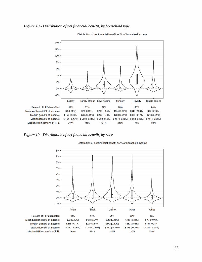
Figure 18 - Distribution of net financial benefit, by household type
Figure 19 - Distribution of net financial benefit, by race
35