ii-12graphs - wavemetrics graphs.pdf · ii-12graphs overview ... graph features ... live graphs and...
TRANSCRIPT
Chapter
II-12II-12Graphs
Overview.......................................................................................................................................................... 212Graph Features ................................................................................................................................................ 212The Graph Menu............................................................................................................................................. 213Typing in Graphs ............................................................................................................................................ 213Graph Names................................................................................................................................................... 213Creating Graphs .............................................................................................................................................. 213Waves and Axes .............................................................................................................................................. 215Types of Axes .................................................................................................................................................. 215Appending Traces .......................................................................................................................................... 216Trace Names .................................................................................................................................................... 216Removing Traces............................................................................................................................................. 216Replacing Traces ............................................................................................................................................. 216Plotting NaNs and INFs................................................................................................................................. 217Scaling Graphs................................................................................................................................................. 217
Autoscaling............................................................................................................................................... 217Manual Scaling......................................................................................................................................... 218Panning ..................................................................................................................................................... 218Fling Mode................................................................................................................................................ 219
Setting the Range of an Axis.......................................................................................................................... 219Manual Axis Ranges................................................................................................................................ 219Automatic Axis Ranges........................................................................................................................... 219
Overall Graph Properties............................................................................................................................... 220Graph Margins ......................................................................................................................................... 220Graph Dimensions................................................................................................................................... 221
Modifying Traces ............................................................................................................................................ 222Selecting Traces to be Modified............................................................................................................. 222Display Modes.......................................................................................................................................... 222Markers ..................................................................................................................................................... 223Text Markers............................................................................................................................................. 224Arrow Markers......................................................................................................................................... 225Line Styles and Sizes ............................................................................................................................... 225Fills ............................................................................................................................................................. 225Bars............................................................................................................................................................. 225Grouping, Stacking and Adding Modes .............................................................................................. 226Trace Color................................................................................................................................................ 228Setting Trace Properties from an Auxiliary (Z) Wave........................................................................ 228Color as f(z)............................................................................................................................................... 228Color as f(z) Example .............................................................................................................................. 229Marker Size as f(z) ................................................................................................................................... 229Marker Number as f(z)............................................................................................................................ 230Pattern Number as f(z)............................................................................................................................ 230Color as f(z) Legend Example................................................................................................................ 230Trace Offsets ............................................................................................................................................. 231

Chapter II-12 — Graphs
II-210
Trace Multipliers...................................................................................................................................... 232Hiding Traces ........................................................................................................................................... 232Complex Display Modes ........................................................................................................................ 232Gaps ........................................................................................................................................................... 233Error Bars .................................................................................................................................................. 233Error Shading ........................................................................................................................................... 234Customize at Point................................................................................................................................... 234
Modifying Axes............................................................................................................................................... 235Axis Tab..................................................................................................................................................... 235Auto/Man Ticks Tab................................................................................................................................ 236Ticks and Grids Tab................................................................................................................................. 237
Exponential Labels ........................................................................................................................... 237Date/Time Tick Labels ..................................................................................................................... 237Tick Dimensions ............................................................................................................................... 237Grid..................................................................................................................................................... 238Zero Line............................................................................................................................................ 239
Tick Options Tab...................................................................................................................................... 239Axis Label Tab.......................................................................................................................................... 239Label Options Tab.................................................................................................................................... 239Axis Range Tab ........................................................................................................................................ 240Manual Ticks ............................................................................................................................................ 240
Computed Manual Ticks ................................................................................................................. 240User Ticks from Waves .................................................................................................................... 241
Log Axes........................................................................................................................................................... 243Date/Time Axes ............................................................................................................................................... 244
Custom Date Formats ............................................................................................................................. 245Date/Time Example ................................................................................................................................. 245Manual Ticks for Date/Time Axes......................................................................................................... 246
“Fake” Axes ..................................................................................................................................................... 246Axis Labels ....................................................................................................................................................... 246
Axis Label Escape Codes ........................................................................................................................ 247Axis Label Special Effects ....................................................................................................................... 247Axis Label Units ....................................................................................................................................... 247
Annotations in Graphs ................................................................................................................................... 248Info Panel and Cursors................................................................................................................................... 248
Using Cursors........................................................................................................................................... 248Free Cursors.............................................................................................................................................. 249Cursor Styles............................................................................................................................................. 249Programming With Cursors................................................................................................................... 249
Identifying a Trace .......................................................................................................................................... 250Subrange Display ............................................................................................................................................ 250
Subrange Display Syntax........................................................................................................................ 250Subrange Display Limitations ............................................................................................................... 251
Printing Graphs............................................................................................................................................... 251Printing Poster-Sized Graphs................................................................................................................. 252Other Printing Methods.......................................................................................................................... 252
Save Graph Copy ............................................................................................................................................ 252Exporting Graphs............................................................................................................................................ 252Creating Graphs with Multiple Axes........................................................................................................... 253Creating Stacked Plots.................................................................................................................................... 253
Staggered Stacked Plot............................................................................................................................ 255Waterfall Plots ................................................................................................................................................. 255
Evenly-Spaced Waterfall Plot Example................................................................................................ 256Unevenly-Spaced Waterfall Plot Example ........................................................................................... 256Fake Waterfall Plots................................................................................................................................. 257
Wind Barb Plots............................................................................................................................................... 258Creating Split Axes ......................................................................................................................................... 259
Chapter II-12 — Graphs
II-211
Live Graphs and Oscilloscope Displays ...................................................................................................... 259Live Mode ................................................................................................................................................. 259Quick Append.......................................................................................................................................... 260
Graph Preferences........................................................................................................................................... 260How to use Graph Preferences .............................................................................................................. 261
Saving and Recreating Graphs...................................................................................................................... 261Graph Style Macros ........................................................................................................................................ 262
Example of Creating a Style Macro....................................................................................................... 262Style Macros and Preferences ................................................................................................................ 263Applying the Style Macro....................................................................................................................... 263Limitations of Style Macros.................................................................................................................... 263Where to Store Style Macros .................................................................................................................. 264
Graph Pop-Up Menus .................................................................................................................................... 264Graph Expansion............................................................................................................................................. 264Graph Shortcuts .............................................................................................................................................. 265

Chapter II-12 — Graphs
II-212
OverviewIgor graphs are simultaneously:• Publication quality presentations of data.• Dynamic windows for exploratory data analysis
This chapter describes how to create and modify graphs, how to adjust graph features to your liking, and how to use graphs for data exploration. It deals mostly with general graph window properties and with waveform and XY plots.These other chapters discuss material related to graphs:
Category Plots on page II-267, Contour Plots on page II-277, Image Plots on page II-2973D Graphics on page II-317, Drawing on page III-59, Annotations on page III-33Exporting Graphics (Macintosh) on page III-89, Exporting Graphics (Windows) on page III-95Graphics Technology on page III-445
A single graph window can contain one or more of the following:
The various kinds of plots can be overlaid in the same plot area or displayed in separate regions of the graph. Igor also provides extensive control over stylistic factors such as font, color, line thickness, dash pattern, etc.
Graph FeaturesIgor graphs are smart. If you expand a graph to fill a large screen, Igor will adjust all aspects of the graph to optimize the presentation for the larger graph size. The font sizes will be scaled to sizes that look good for the large format and the graph margins will be optimized to maximize the data area without fouling up the axis labeling. If you shrink a graph down to a small size, Igor will automatically adjust axis ticking to prevent tick mark labels from running into one another. If Igor’s automatic adjustment of parameters does not give the desired effect, you can override the default behavior by providing explicit parameters.
Igor graphs are dynamic. When you zoom in on a detail in your data, or when your data changes, perhaps due to data transformation operations, Igor will automatically adjust both the tick mark labels and the axis labels. For example, before zooming in, an axis might be labeled in milli-Hertz and later in micro-Hertz. No matter what the axis range you select, Igor always maintains intelligent tick mark and axis labels.
If you change the values in a wave, any and all graphs containing that wave will automatically change to reflect the new values.
You can zoom in on a region of interest (see Manual Scaling), expand or shrink horizontally or vertically, and you can pan through your data with a hand tool (see Panning). You can offset graph traces by simply dragging them around on the screen (see Trace Offsets). You can attach cursors to your traces and view
Waveform plots Wave data versus X values (scaled point number)
XY plots Y wave data versus X wave data
Category plots Numeric wave data versus text wave data
Image plots Display of a matrix of data
Contour plots Contour of a matrix or an XYZ triple
Axes Any number of axes positioned anywhere
Annotations Textboxes, legends and dynamic tags
Cursors To read out XY coordinates
Drawing elements Arrows, lines, boxes, polygons, pictures …
Controls Buttons, pop-up menus, readouts …

Chapter II-12 — Graphs
II-213
data readouts as you glide the cursors through your data (see Info Panel and Cursors). You can edit your data graphically (see Drawing and Editing Waves).
Igor graphs are fast. They are updated almost instantly when you make a change to your data or to the graph. In fact, Igor graphs can be made to update in a nearly continuous fashion to provide a real-time oscil-loscope-like display during data acquisition (see Live Graphs and Oscilloscope Displays)
You can also control virtually every detail of a graph. When you have the graph just the way you like it, you can create a template called a “style macro” to make it easy to create more graphs of the same style in the future (see Graph Style Macros). You can also set preferences from a reference graph so that new graphs will automatically be created with the settings you prefer (see Graph Preferences).
You can print or export graphs directly, or you can combine several graphs in a page layout window prior to printing or exporting. You can export graphs and page layouts in a wide variety of graphics formats.
A graph can exist as a standalone window or as a subwindow of another graph, a page layout, or a control panel (see Embedding and Subwindows on page III-75).
The Graph MenuThe Graph menu contains items that apply only to graph windows. The menu appears in the menu bar only when the active or target window is a graph.
When you choose an item from the Graph menu it affects the top-most graph.
Typing in GraphsIf you type on the keyboard while a graph is the top window, Igor brings the command window to the front and your typing goes into the command line. (The only exception to this is when a graph contains a selected SetVariable control.)
Graph NamesEvery graph that you create has a window name which you can use to manipulate the graph from the command line or from a procedure. When you create a new graph, Igor assigns it a name of the form “Graph0”, “Graph1” and so on. When you close a graph, Igor offers to create a window recreation macro which you can invoke later to recreate the graph. The name of the window recreation macro is the same as the name of the graph.
The graph name is not the same as the graph title which is the text that appears in the graph’s window frame. The name is for use in procedures but the title is for display purposes only. You can change a graph’s name and title using the Window Control dialog which you can access by choosing Win-dows→Control→Window Control.
Creating GraphsYou create a graph by choosing New Graph from the Windows menu.
You can also create a graph by choosing New Category Plot, New Contour Plot or New Image Plot from the New submenu in the Windows menu.
You select the waves to be displayed in the graph from the Y Waves list. The wave is displayed as a trace in the graph. A trace is a visual representation of a wave or an XY pair. By default a trace is drawn as a series of lines joining the points of the wave or XY pair.
Each trace has a name so you can refer to it from a procedure. By default, the trace name is he same as the wave name or Y wave in the case of an XY pair. However, there are exceptions. If you display the same

Chapter II-12 — Graphs
II-214
wave multiple times in a given graph, the traces will have names like wave0, wave0#1, and wave0#2. wave0 is equivalent to wave0#0. Such names are called trace instance names.
You can also programmatically specify a trace’s name using the Display or AppendToGraph operations. This is something an Igor programmer would do, typically to better distinguish multiple traces with the same Y wave.
Often the data values of the waves that you select in the Y Waves list are plotted versus their calculated X values. This is a waveform trace. The calculated X values are derived from the wave’s X scaling; see Wave-form Model of Data on page II-57.
If you want to plot the data values of the Y waves versus the data values of another wave, select the other wave in the X Wave list. This is an XY trace. In this case, X scaling is ignored; see XY Model of Data on page II-58.
If the lengths of the X and Y waves are not equal, then the number of points plotted is determined by the shorter of the waves.
The New Graph dialog has a simple mode and an advanced mode. In the simple mode, you can select mul-tiple Y waves but just one X wave. If you have multiple XY pairs with distinct X waves, click the More Choices button to use the advanced mode. This allows you to select a different X wave for each Y wave.
You can specify a title for the new window. The title is not used except to form the title bar of the window. It is not used to identify windows and does not appear in the graph. If you specify no title, Igor will choose an appropriate title based on the traces in the graph and the graph name. Igor automatically assigns graph names of the form “Graph0”. The name of a window is important because it is used to identify windows in commands. The title is for display purposes only and is not used in commands.
If you have created style macros for the current experiment they will appear in the Style pop-up menu. See Graph Style Macros on page II-262 for details.
Normally, the new graph is created using left and bottom axes. You can select other axes using the pop-up menus under the X and Y wave lists. Picking L=VertCrossing automatically selects B=HorizCrossing and vice versa. These free axes are used when you want to create a Cartesian type plot where the axes cross at (0,0).
You can create additional free axes by choosing New from the pop-up menu. This displays the New Free Axis dialog. Axes created this way are called “free axes” because they can be freely positioned nearly any-where in the graph window. The standard left, bottom, right, and top axes always remain at the edge of the plot area.
You should give the new axis a name that describes its intended use. The name must be unique within the current graph and can’t contain spaces or other nonalphanumeric characters. The Left and Right radio buttons determine the side of the axis on which tick mark labels will be placed. They also define the edge of the graph from which axis positioning is based.
You can create a blank graph window containing no traces or axes by clicking the Do It button without selecting any Y waves to plot. Blank graph windows are mostly used in programming when traces are appended later using AppendToGraph.
The New Graph dialog comes in two versions. The simpler version shown above is suitable for most pur-poses. If, however, you have multiple pairs of XY data or when you will be using more than one pair of axes, you can click the More Choices button to get a more complex version of the dialog.
Using the advanced mode of the New Graph dialog, you can create complex graphs in one step. You select a wave or an XY pair using the Y Waves and X Wave lists, and then click the Add button. This moves your selection to the trace specification list below. You can then add more trace specifications using the Add button. When you click Do It, your graph is created with all of the specified traces.

Chapter II-12 — Graphs
II-215
The advanced version of the dialog includes two-dimensional waves in the Y Waves and X Wave lists. You can edit the range values for waves in the holding pen to specify individual rows or columns of a matrix or to specify other subsets of data. See Subrange Display on page II-250 for details.
Waves and AxesAxes are dependent upon waves for their existence. If you remove from a graph the last wave that uses a particular axis then that axis will also be removed.
In addition, the first wave plotted against a given axis is called the controlling wave for the axis. There is only one thing special about the controlling wave: its units define the units that will be used in creating the axis label and occasionally the tick mark labels. This is normally not a problem since all waves plotted against a given axis will likely have the same units. You can determine which wave controls an axis with the AxisInfo function.
Types of AxesThe four axes named left, right, bottom and top are termed standard axes. They are the only axes that many people will ever need.
Each of the four standard axes is always attached to the corresponding edge of the plot area. The plot area is the central rectangle in a graph window where traces are plotted. Axis and tick mark labels are plotted outside of this rectangle.
You can also add unlimited numbers of additional user-named axes termed free axes. Free axes are so named because you can position them nearly anywhere within the graph window. In particular, vertical free axes can be positioned anywhere in the horizontal dimension while horizontal axes can be positioned anywhere in the vertical dimension.
The Axis pop-up menu entries L=VertCrossing and B=HorizCrossing in the New Graph dialog create free axes that are each preset to cross at the numerical zero location of the other. They are also set to suppress the tick mark and label at zero. For example, create this data:Make yWave; SetScale/I x,-1,1,yWave; yWave= x^3
Now, using the New Graph dialog, select yWave from the Y list and then L=VertCrossing from the Y axis pop-up menu. This generates the following command and the resulting graph:Display/L=VertCrossing/B=HorizCrossing yWave
You could remove the tick mark and label at -0.5 by double-clicking the axis to reach the Modify Axis dialog, choosing the Tick Options tab, and finally typing -0.5 in one of the unused Inhibit Ticks boxes.
The free axis types described above all require that there be at least one trace that uses the free axis. For special purposes Igor programmers can also create a free axis that does not rely on any traces by using the NewFreeAxis operation (page V-568). Such an axis will not use any scaling or units information from any associated waves if they exist. You can specify the properties of a free axis using the SetAxis operation (page V-713) or the ModifyFreeAxis operation (page V-518), and you can remove them using the KillFree-Axis operation (page V-409).
-1.0
-0.5
0.5
1.0
-1.0 -0.5 0.5 1.0

Chapter II-12 — Graphs
II-216
Appending Traces You can append waves to a graph as a waveform or XY plot by choosing Append Traces to Graph from the Graph menu. This presents a dialog identical to the New Graph dialog except that the title and style macro items are not present. Like the New Graph dialog, this dialog provides a way to create new axes and pairs of XY data. The Append to Graph submenu in the Graph menu allows you to append category plots, contour plots and image plots.
Trace NamesThe operations ModifyGraph (traces), RemoveFromGraph, ReorderTraces, ErrorBars and Tag take trace names as parameters.
A trace displays data from a wave but a trace name is not necessarily the same as a wave name. For example:
Make wave0 = sin(x/8)
// Create first instance of wave0. Trace name is wave0 (equivalent to wave0#0).Display wave0
// Create second instance of wave0. Trace name is wave0#1.AppendToGraph wave0
// Create third instance of wave0. Trace name is thirdInstance.AppendToGraph wave0/TN=thirdInstance
This creates a graph with three traces named wave0, wave0#1 and thirdInstance. The trace name wave0 is equivalent to wave0#0.
The addition of a # sign and a number to distinguish traces from the same wave is called "instance nota-tion". For more information on instance notation, see Instance Notation.
For information on programming with trace names, see Programming With Trace Names on page IV-81.
Removing TracesYou can remove traces, as well as image plots and contour plots, from a graph by choosing Remove from Graph from the Graph menu. Select the type of item that you want to remove from the pop-up menu above the list.
A contour plot has traces that you can remove, but they will come back when the contour plot is updated. Rather than removing the contour traces, use the pop-up to select Contours, and remove the contour plot itself, which automatically removes all of the contour-related traces. See Removing Contour Traces from a Graph on page II-287.
If you remove the last item associated with a given axis then that axis will also be removed.
Replacing TracesYou can “replace” a trace in the sense of changing the wave that the trace is displaying in a graph. All the other characteristics of the trace, such as mode, line size, color, and style, remain unchanged. You can use this to update a graph with data from a wave other than the one originally used to create the trace.
To replace a trace, use the Replace Wave item in the Graph menu to display the Replace Wave in Graph dialog:
A special mode allows you to browse through groups of data sets composed of identically-named waves residing in different data folders. For instance, you might take the same type of data during multiple runs on different experimental subjects. If you store the data for each run in a separate data folder, and you give the same names to the waves that result from each run, you can select the Replace All in Data Folder check-

Chapter II-12 — Graphs
II-217
box and then select one of the data folders containing data from a single run. All the waves in the chosen data folder whose names match the names of waves displayed in the graph will replace the same-named waves in the graph.
You can also replace waves one at a time with any other wave. With the Replace All in Data Folder checkbox unchecked, choose a trace from the list below the menu. To replace the Y wave used by the trace, check the Y checkbox; to replace the X wave check the X checkbox. You can replace both if you wish. Select the waves to use as replacements from the menus to the right of the checkboxes. You can select _calculated_ from the X wave menu to remove the X wave of an XY pair, converting it to a waveform display.
The menus allow you to select waves having lengths that don’t match the length of the corresponding X or Y wave. In that case, use the edit boxes to the right to select a sub-range of the wave’s points. You can also use these boxes to select a single row or column from a two-dimensional wave.
The dialog creates command lines using the ReplaceWave operation (page V-681).
Plotting NaNs and INFsThe data value of a wave is normally a finite number but can also be a NaN or an INF. NaN means “Not a Number”, and INF means “infinity”. An expression returns the value NaN when it makes no sense math-ematically. For example, log(-1) returns the value NaN. You can also set a point to NaN, using a table or a wave assignment, to represent a missing value. An expression returns the value INF when it makes sense mathematically but has no finite value. log(0) returns the value -INF.
Igor ignores NaNs and INFs when scaling a graph. If a wave in a graph is set to lines between points mode then Igor draws lines toward an INF. By default, it draws no line to or from a NaN so a NaN acts like a missing value. You can override the default, instructing Igor to draw lines through NaNs using the Gaps checkbox in the Modify Trace Appearance dialog.
The following graph illustrate these points. It was created with these commands:Make wave1= log(abs(x-64))wave1(40)=log(-1)Display wave1
You can override the default, instructing Igor to draw lines through NaNs. See Gaps on page II-233 for details.
Scaling GraphsIgor provides several ways of scaling waves in graphs. All of them allow you to control what sections of your waves are displayed by setting the range of the graph’s axes. Each axis is either autoscaled or manually scaled.
AutoscalingWhen you first create a graph all of its axes are in autoscaling mode. This means that Igor automatically adjusts the extent of the axes of the graph so that all of each wave in the graph is fully in view. If the data in the waves changes, the axes are automatically rescaled so that all waves remain fully in view.
1.5
1.0
0.5
0.0
120100806040200
-INF at X = 64
NaN at X = 40

Chapter II-12 — Graphs
II-218
If you manually scale any axis, that axis changes to manual scaling mode. The methods of manual scaling are described in the next section. Axes in manual scaling mode are never automatically scaled.
If you choose Autoscale Axes from the Graph menu all of the axes in the graph are autoscaled and returned to autoscaling mode. You can set individual axes to autoscaling mode and can control properties of autoscaling mode using the Axis Range tab of the Modify Axis dialog described in Setting the Range of an Axis on page II-219.
Manual ScalingTo manually scale one or more axes of a graph with the mouse, start by selecting the region of the graph that you want to examine. Then select the scaling operation that you want from a pop-up menu that appears when you click inside the region.
Click the mouse and drag it diagonally to frame the region of interest. Igor displays a dashed outline around the region. This outline is called a marquee. A marquee has handles and edges that allow you to refine its size and position.
To refine the size of the marquee move the cursor over one of the handles. The cursor changes to a double arrow which shows you the direction in which the handle moves the edge of the marquee. To move the edge click the mouse and drag.
To refine the position of the marquee move the cursor over one of the edges away from the handles. The cursor changes to a hand. To move the marquee click the mouse and drag.
When you click inside the region of interest Igor presents a pop-up menu from which you can choose the scaling operation.
Choose the operation you want and release the mouse. These operations can be undone and redone; just press Command-Z (Macintosh) or Ctrl+Z (Windows).
The Expand operation scales all axes so that the region inside the marquee fills the graph (zoom in). It sets the scaling mode for all axes to manual.
The Horiz Expand operation scales only the horizontal axes so that the region inside the marquee fills the graph horizontally. It has no effect on the vertical axes. It sets the scaling mode for the horizontal axes to manual.
The Vert Expand operation scales only the vertical axes so that the region inside the marquee fills the graph vertically. It has no effect on the horizontal axes. It sets the scaling mode for the vertical axes to manual.
The Shrink operation scales all axes so that the waves in the graph appear smaller (zoom out). The factor by which the waves shrink is equal to the ratio of the size of the marquee to the size of the entire graph. For example, if the marquee is one half the size of the graph then the waves shrink to one half their former size. The point at the center of the marquee becomes the new center of the graph. The shrink operation sets the scaling mode for all axes to manual.
The Horiz Shrink operation is like the shrink operation but affects the horizontal axes only. It sets the scaling mode for the horizontal axes to manual.
The Vert Shrink operation is like the shrink operation but affects the vertical axes only. It sets the scaling mode for the vertical axes to manual.
Another way to manually scale axes is to use the Axis Range tab of the Modify Axis dialog (see Manual Axis Ranges on page II-219), or the SetAxis operation (page V-713).
PanningAfter zooming in on a region of interest, you may want to view data that is just off screen. To do this, press Option (Macintosh) or Alt (Windows) and move the mouse to the graph interior where the cursor changes to a hand. Now drag the body of the graph. Pressing Shift will constrain movement to the horizontal or vertical directions.
This operation is undoable.
Chapter II-12 — Graphs
II-219
Fling ModeIf, while panning, you release the mouse button while the mouse is still moving, the panning will automat-ically continue. While panning, release the Option or Alt key and change the force or direction of the mouse-click gesture to change the panning speed or direction. Click the mouse button once to stop.
Setting the Range of an AxisYou can set the range and other scaling parameters for individual axes using the Axis Range tab in the Modify Axis dialog. You can display the dialog with this tab selected by choosing Set Axis Range from the Graph menu or by double-clicking a tick mark label of the axis you wish to modify. Information on the other tabs in this dialog is available in Modifying Axes on page II-235.
Start by choosing the axis that you want to adjust from the Axis pop-up menu. You can adjust each axis in turn, or a selection of axes, without leaving this dialog.
Manual Axis RangesWhen a graph is first created, it is in autoscaling mode. In this mode, the axis limits automatically adjust to just include all the data. The controls in the Autoscale Settings section provide autoscaling options.
You can set the axis limits to fixed values by editing the minimum and maximum parameters in the Manual Range Settings section. You can return the minimum or maximum axis range to autoscaling mode by unchecking the corresponding checkbox. These settings are independent, so you can fix one end of the axis and autoscale the other end.
There are a number of other ways to set the minimum and maximum parameters. Clicking the Expand 5% button expands the range by 5 percent. This has the effect of shrinking the traces plotted on the axis by 5%.
Clicking the Swap button exchanges the minimum and maximum parameters. This has the effect of revers-ing the ends of the axis, allowing you to plot waves upside-down or backwards with fixed limits.
An additional way to set the minimum and maximum parameters is to select a wave from the list and use the Quick Set buttons. If you click the X Min/Max quick set button then the minimum and maximum X values of the selected wave are transferred to the parameter boxes. If you click the Y Min/Max quick set button then the minimum and maximum Y values of the selected wave are transferred to the parameter boxes. If you specified the full scale Y values for the wave then you can click the Full Scale quick set button. This transfers the wave’s Y full scale values to the parameter boxes. The full scale Y values can be set using the Change Wave Scaling item in the Data menu.
Automatic Axis RangesWhen the manual minimum and maximum checkboxes are unchecked, the axis is in autoscaling mode. In this mode the axis limits are determined by the data values in the waves displayed using the selected axis. The items in the Autoscale Settings section control the method used to determine the axis range:
The Reverse Axis checkbox swaps the minimum and maximum axis range values, plotting the trace upside-down or backwards.
The top pop-up menu controls adjustments to the minimum and maximum axis range values.
The default mode is “Use data limits”. The axis range is set to the minimum and maximum data values of all waves plotted against the axis.
The “Round to nice values” mode extends the axis range to include the next major tick mark.
The “Nice + inset data” mode extends the axis range to include the next major tick mark and also ensures that traces are inset from both ends of the axis.
The bottom pop-up menu controls the treatment f the value zero.
The default mode is “Zero isn’t special”. The axis range is set to the minimum and maximum data values.

Chapter II-12 — Graphs
II-220
The “Autoscale from zero” mode forces the end of the axis that is closest to zero to be exactly zero.
The “Symmetric about zero” mode forces zero to be in the middle of the axis range.
The “Autoscale from zero if not bipolar” mode behaves like “Autoscale from zero” if the data is unipolar (all positive or all negative) and like “Zero isn’t special” if the data is bipolar.
Autoscaling mode usually sets the axis limits using all the data in waves associated with the traces that use the axis. This can be undesirable if the associated horizontal axis is set to display only a portion of the total X range. Select the Autoscale Only Visible Data checkbox to have Igor use only the data included within the horizontal range for autoscaling. This checkbox is available only if the selected axis is a vertical axis.
Overall Graph PropertiesYou can specify certain overall properties of a graph by choosing Modify Graph from the Graph menu. This brings up the Modify Graph dialog. You can also get to this dialog by double-clicking a blank area outside the plot rectangle.
Normally, X axes are plotted horizontally and Y axes vertically. You can reverse this behavior by checking the “Swap X & Y Axes” checkbox. This is commonly used when the independent variable is depth or height. This method swaps X and Y for all traces in the graph. You can cause individual traces to be plotted verti-cally by selecting the “Swap X & Y Axes” checkbox in the New Graph and Append Traces dialogs as you are creating your graph.
Initially, the graph font is determined by the default font which you can set using the Default Font item in the Misc menu. The graph font size is initially automatically calculated based on the size of the graph. You can over-ride these initial settings using the “Graph font” and “Font size” settings. Igor uses the font and size you specify in annotations and axis labels unless you explicitly set the font or size for an individual annotation or label.
Initially, the graph marker size is automatically calculated based on the size of the graph. You can override this using the “Marker size” setting. You can set it to “auto” (or 0 which is equivalent) or to a number from -1 to 99. Use -1 to make a graph subwindow get is default font size from its parent. Igor uses the marker size you specify unless you explicitly set the marker size for an individual wave in the graph.
The “Use comma as decimal separator” checkbox determines whether dot or comma is used as the decimal separator in tick mark labels.
Graph MarginsThe margin is the distance from an outside edge of the graph to the edge of the plot area of the graph. The plot area, roughly speaking, is the area inside the axes. See Graph Dimensions on page II-221 for a definition. Ini-tially, Igor automatically sets each margin to accommodate axis and tick mark labels and exterior textboxes, if any. You can override the automatic setting of the margin using the Margins settings. You would do this, for example, to force the left margins of two graphs to be identical so that they align properly when stacked vertically in a page layout. The Units pop-up menu determines the units in which you enter the margin values.
You can also set graph margins interactively. If you press Option (Macintosh) or Alt (Windows) and position the cursor over one of the four edges of the plot area rectangle, you will see the cursor change to this shape:
. Use this cursor to drag the margin. You can cause a margin to revert to automatic mode by dragging the margin all the way to the edge of the graph window or beyond. If you drag to within a few pixels of the edge, the margin will be eliminated entirely. If you double click with this cursor showing, Igor displays the Modify Graph dialog with the corresponding margin setting selected.
If you specify a margin for a given axis, the value you specify solely determines where the axis appears. Normally, dragging an axis will adjust its offset relative to the nominal automatic location. If, however, a fixed margin has been specified then dragging the axis will drag the margin.
Chapter II-12 — Graphs
II-221
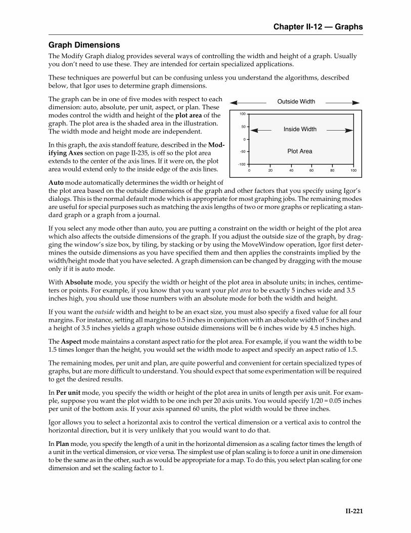
Graph DimensionsThe Modify Graph dialog provides several ways of controlling the width and height of a graph. Usually you don’t need to use these. They are intended for certain specialized applications.
These techniques are powerful but can be confusing unless you understand the algorithms, described below, that Igor uses to determine graph dimensions.
The graph can be in one of five modes with respect to each dimension: auto, absolute, per unit, aspect, or plan. These modes control the width and height of the plot area of the graph. The plot area is the shaded area in the illustration. The width mode and height mode are independent.
In this graph, the axis standoff feature, described in the Mod-ifying Axes section on page II-235, is off so the plot area extends to the center of the axis lines. If it were on, the plot area would extend only to the inside edge of the axis lines.
Auto mode automatically determines the width or height of the plot area based on the outside dimensions of the graph and other factors that you specify using Igor’s dialogs. This is the normal default mode which is appropriate for most graphing jobs. The remaining modes are useful for special purposes such as matching the axis lengths of two or more graphs or replicating a stan-dard graph or a graph from a journal.
If you select any mode other than auto, you are putting a constraint on the width or height of the plot area which also affects the outside dimensions of the graph. If you adjust the outside size of the graph, by drag-ging the window’s size box, by tiling, by stacking or by using the MoveWindow operation, Igor first deter-mines the outside dimensions as you have specified them and then applies the constraints implied by the width/height mode that you have selected. A graph dimension can be changed by dragging with the mouse only if it is auto mode.
With Absolute mode, you specify the width or height of the plot area in absolute units; in inches, centime-ters or points. For example, if you know that you want your plot area to be exactly 5 inches wide and 3.5 inches high, you should use those numbers with an absolute mode for both the width and height.
If you want the outside width and height to be an exact size, you must also specify a fixed value for all four margins. For instance, setting all margins to 0.5 inches in conjunction with an absolute width of 5 inches and a height of 3.5 inches yields a graph whose outside dimensions will be 6 inches wide by 4.5 inches high.
The Aspect mode maintains a constant aspect ratio for the plot area. For example, if you want the width to be 1.5 times longer than the height, you would set the width mode to aspect and specify an aspect ratio of 1.5.
The remaining modes, per unit and plan, are quite powerful and convenient for certain specialized types of graphs, but are more difficult to understand. You should expect that some experimentation will be required to get the desired results.
In Per unit mode, you specify the width or height of the plot area in units of length per axis unit. For exam-ple, suppose you want the plot width to be one inch per 20 axis units. You would specify 1/20 = 0.05 inches per unit of the bottom axis. If your axis spanned 60 units, the plot width would be three inches.
Igor allows you to select a horizontal axis to control the vertical dimension or a vertical axis to control the horizontal direction, but it is very unlikely that you would want to do that.
In Plan mode, you specify the length of a unit in the horizontal dimension as a scaling factor times the length of a unit in the vertical dimension, or vice versa. The simplest use of plan scaling is to force a unit in one dimension to be the same as in the other, such as would be appropriate for a map. To do this, you select plan scaling for one dimension and set the scaling factor to 1.
-100
-50
0
50
100
100806040200
Inside Width
Plot Area
Outside Width
Chapter II-12 — Graphs
II-222
Until you learn how to use the per unit and plan modes, it is easy to create a graph that is ridiculously small or large. Since the size of the graph is tied to the range of the axes, expanding, shrinking or autoscaling the graph makes its size change.
Applying plan or aspect mode to both the X and Y dimensions of a graph is a bad idea. Interactions between the dimensions cause huge or tiny graphs, or other bizarre results. The Modify Graph dialog does not allow both dimensions to be plan or aspect, or a combination of the two. However, the ModifyGraph operation permits it and it is left to you to refrain from doing this.
Sometimes you can end up with a graph whose size makes it difficult to move or resize the window. Use the Graph menu’s Modify Graph dialog to reset the size of the graph to something more manageable.
You can change a graph dimension by dragging with the mouse only if it is in auto mode. If you want to resize a graph but can't, use the Modify Graph dialog to check the width and height modes.
If you want to fully understand how Igor arrives at the final size of a graph when the width or height is constrained, you need to understand the algorithm Igor uses:1. The initial width and height are calculated. When you adjust a window by dragging, the initial
width and height are based on the width and height to which you drag the window.2. If you are exporting graphics, the width and height are as specified in the Export Graphics dialog
or in the SavePICT command.3. If you are printing, the width and height are modified by the effects of the printing mode, as set by
the PrintSettings graphMode keyword.4. The width modes absolute and per unit are applied which may generate a new width.5. The height mode is applied which may generate a new height.6. The width modes aspect and plan are applied which may generate a new width.
Because there are many interactions, it is possible to get a graph so big that you can’t adjust it manually. If this occurs, use the Modify Graph dialog to set the width and height to a manageable size, using absolute mode.
Modifying TracesYou can specify each trace’s appearance in a graph by choosing Modify Trace Appearance from the Graph menu or by double-clicking a trace in the graph. This brings up the following dialog:
For image plots, choose Modify Image Appearance from the Graph menu, rather than Modify Trace Appearance.
For contour plots, you normally should choose Modify Contour Appearance. Use this to control the appear-ance of all of the contour lines in one step. However, if you want to make one contour line stand out, use the Modify Trace Appearance dialog.
Selecting Traces to be ModifiedSelect the trace or traces whose appearance you want to modify from the Trace list. If you got to this dialog by double-clicking a trace in the graph then that trace will automatically be selected. If you select more than one trace, the items in the dialog will show the settings for the first selected trace.
Once you have made your selection, you can change settings for the selected traces. After doing this, you can then select a different trace or set of traces and make more changes. Igor remembers all of the changes you make, allowing you to do everything in one trip to the dialog.
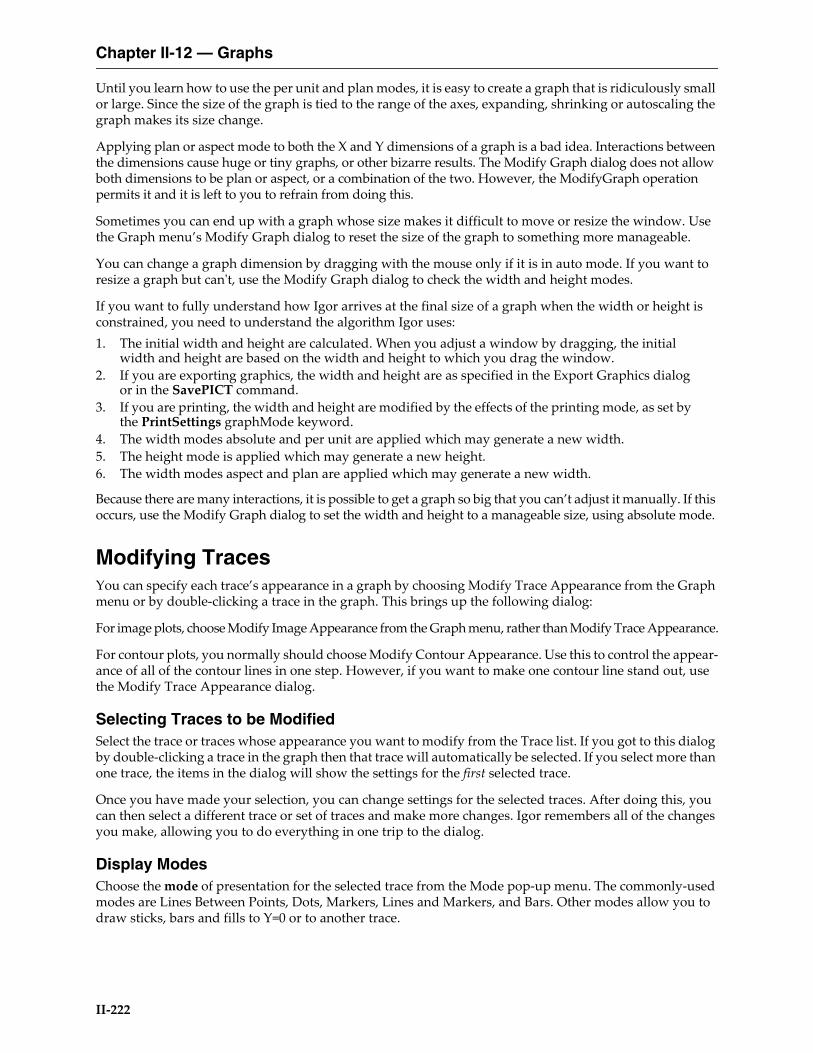
Display ModesChoose the mode of presentation for the selected trace from the Mode pop-up menu. The commonly-used modes are Lines Between Points, Dots, Markers, Lines and Markers, and Bars. Other modes allow you to draw sticks, bars and fills to Y=0 or to another trace.
Chapter II-12 — Graphs
II-223
MarkersIf you choose the Markers or Lines and Markers mode you also can choose the marker, marker size, marker thickness, and whether the marker is opaque or not. The marker size is a fractional number from 0 to 200. 0 means “auto”, which chooses a marker size appropriate to the size of the graph. The marker thickness is in a fractional number from 0 to 50 points. Fractional points may not be evident on screen but can be seen in exported and printed graphics. Setting the marker thickness to 0 makes the markers disappear.
1.0
0.5
0.0
-0.5
-1.0
1086420
1.0
0.5
0.0
-0.5
-1.0
1086420
Sticks to zero modeLines between points mode
1.0
0.5
0.0
-0.5
-1.0
1086420
1.0
0.5
0.0
-0.5
-1.0
1086420
Sticks and markers modeDots mode
1.0
0.5
0.0
-0.5
-1.0
1086420
1.0
0.5
0.0
-0.5
-1.0
1086420
Lines and markers modeMarkers mode
1.0
0.5
0.0
-0.5
-1.0
1086420
Bars mode
1.0
0.5
0.0
-0.5
-1.0
1086420
Cityscape mode
1.0
0.5
0.0
-0.5
-1.0
1086420
Fill to zero mode
1.0
0.5
0.0
-0.5
-1.0
1086420
Fill to next mode
Chapter II-12 — Graphs
II-224
There is an interaction between marker size and marker thickness: Igor will adjust the marker size if this is needed to make the marker symmetrical. The unadjusted width and height of the marker is 2*s+1 points where s is the marker size setting.
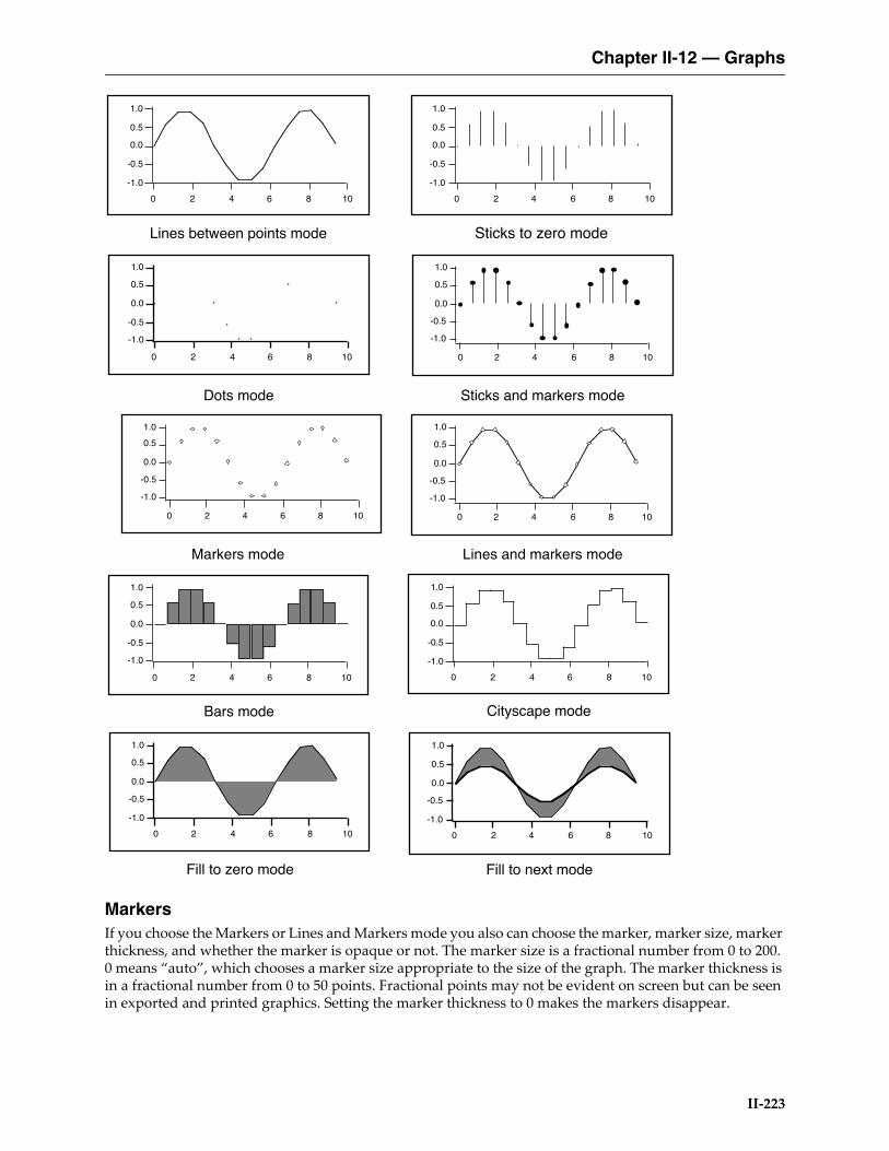
Here is a table of the markers and the corresponding marker codes:
You can also create custom markers. See the SetWindow operation's markerHook keyword.
In the Markers and Lines and Markers modes you can specify a color for marker objects that is different from the fill color for the markers. To use this select the Stroke Color checkbox and select a color from the adjacent pop-up menu.
Text MarkersIn addition to the built-in drawn markers, you can also instruct Igor to use one of the following as text markers:• A single character from a font• The contents of a text wave• The contents of a numeric wave
A single character from a font is mainly of interest if you want to use a special symbol that is available in a font but is not included among Igor’s built-in markers. The specified character is used for all data points.
The remaining options provide a way to display a third value in an XY plot. For example, a plot of earthquake magnitude versus date could also show the location of the earthquake using a text wave to supply text mark-ers. Or, a plot of earthquake location versus date could also show the magnitude using a numeric wave to supply text markers. For each data point in the XY plot, the corresponding point of the text or numeric wave supplies the text for the marker. The marker wave must have the same number of points as the X and Y waves.
To create a text marker, choose the Markers or Lines and Markers display mode. Then click the Markers pop-up menu and choose the Text button. This leads to the Text Markers subdialog in which you can specify the source of the text as well as the font, style, rotation and other properties of the markers.
You can offset and rotate all the text markers by the same amount but you can not set the offset and rotation for individual data points — use tags for that. You may find it necessary to experimentally adjust the X and Y offsets to get character markers exactly centered on the data points. For example, to center the text just above each data point, choose Middle bottom from the Anchor pop-up menu and set the Y offset to 5-10 points. If you need to offset some items differently from others, you will have to use tags (see Tags on page III-44).
Igor determines the font size to use for text markers from the marker size, which you set in the Modify Trace Appearance dialog. The font size used is 3 times the marker size.
You may want to show a text marker and a regular drawn marker. For this, you will need to display the wave twice in the graph. After creating the graph and setting the trace to use a drawn marker, choose Graph→Append Traces to Graph to append a second copy of the wave. Set this copy to use text markers.
0 1 2 3 4 5 6 7
8 9 10 11 12 13 14 15
16 17 18 19 20 21 22 23
24 25 26 27 28 29 30 31
32 33 34 35 36 37 38 39
40 41 42 43 44 45 46 47
48 49 50 51 52 53 54 55
56 57 58 59 60 61 62

Chapter II-12 — Graphs
II-225
Arrow MarkersArrow markers can be used to create vector plots illustrating flow and gradient fields, for example. Arrow markers are fairly special purpose and require quite a bit of advance preparation.
Here is a very simple example:
// Make XY dataMake/O xData = {1, 2, 3}, yData = {1, 2, 3}Display yData vs xData // Make graphModifyGraph mode(yData) = 3 // Marker mode
// Make an arrow data wave to control the length and angle for each point.Make/O/N=(3,2) arrowData // Controls arrow length and angleEdit /W=(439,47,820,240) arrowData
// Put some data in arrowDataarrowData[0][0]= {20,25,30} // Col 0: arrow lengths in pointsarrowData[0][1]= {0.523599,0.785398,1.0472} // Col 1: arrow angle in radians
// Set trace to arrow mode to turn arrows onModifyGraph arrowMarker(yData) = {arrowData, 1, 10, 1, 1}
// Make an RGB color waveMake/O/N=(3,3) arrowColorEdit /W=(440,272,820,439) arrowColor
// Store some colors in the color wavearrowColor[0][0]= {65535,0,0} // RedarrowColor[0][1]= {0,65535,0} // GreenarrowColor[0][2]= {0,0,65535} // Blue
// Turn on color as f(z) modeModifyGraph zColor(yData)={arrowColor,*,*,directRGB,0}
To see a demo of arrow markers choose File→Example Experiments→Graphing Techniques→Arrow Plot.
See the reference for a description of the arrowMarker keyword under the ModifyGraph (traces) operation on page V-522 for further details.
Line Styles and SizesIf you choose the “Lines between points”, “Lines and markers”, or Cityscape mode you can also choose the line style. You can change the dash patterns using the Dashed Lines item in the Line section.
For any mode except the Markers mode you can set the line size. The line size is in points and can be frac-tional. If the line size is zero, the line disappears.
For more information see Dashed Lines on page III-440.
FillsFor traces in the Bars and “Fill to zero” modes, Igor presents a choice of fill type. The fill type can be None, which means the fill is transparent, Erase, which means the fill is white and opaque, Solid, or three patterns of gray. You can also choose a pattern from a palette and can choose the fill types and colors for positive going regions and negative going regions independently.
For more information see Fill Patterns on page III-441 and Gradient Fills on page III-441.
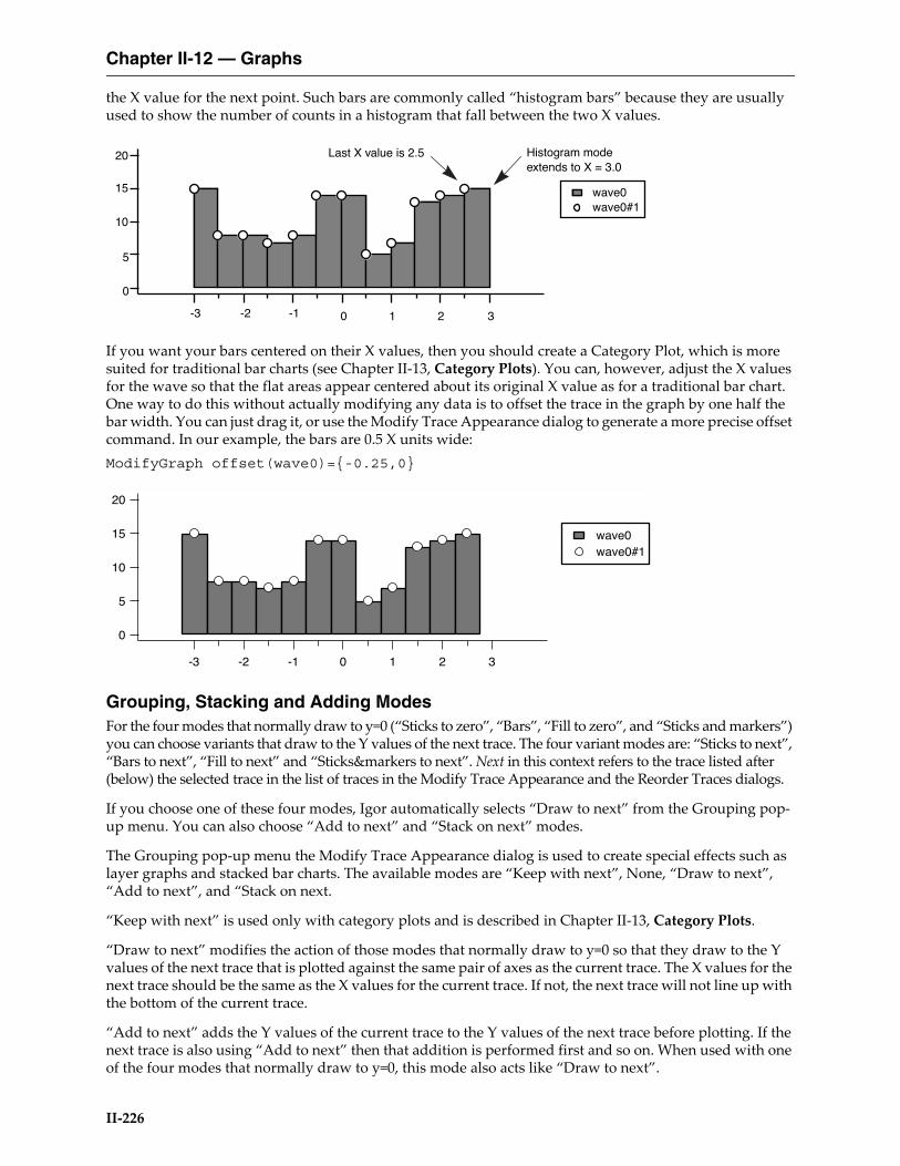
BarsWhen Bars mode is used for a wave plotted on a normal continuous X axis (rather than a category axis, see Chapter II-13, Category Plots), the bars are drawn from the X value for a given point up to but not including
Chapter II-12 — Graphs
II-226
the X value for the next point. Such bars are commonly called “histogram bars” because they are usually used to show the number of counts in a histogram that fall between the two X values.
If you want your bars centered on their X values, then you should create a Category Plot, which is more suited for traditional bar charts (see Chapter II-13, Category Plots). You can, however, adjust the X values for the wave so that the flat areas appear centered about its original X value as for a traditional bar chart. One way to do this without actually modifying any data is to offset the trace in the graph by one half the bar width. You can just drag it, or use the Modify Trace Appearance dialog to generate a more precise offset command. In our example, the bars are 0.5 X units wide:ModifyGraph offset(wave0)={-0.25,0}
Grouping, Stacking and Adding ModesFor the four modes that normally draw to y=0 (“Sticks to zero”, “Bars”, “Fill to zero”, and “Sticks and markers”) you can choose variants that draw to the Y values of the next trace. The four variant modes are: “Sticks to next”, “Bars to next”, “Fill to next” and “Sticks&markers to next”. Next in this context refers to the trace listed after (below) the selected trace in the list of traces in the Modify Trace Appearance and the Reorder Traces dialogs.
If you choose one of these four modes, Igor automatically selects “Draw to next” from the Grouping pop-up menu. You can also choose “Add to next” and “Stack on next” modes.
The Grouping pop-up menu the Modify Trace Appearance dialog is used to create special effects such as layer graphs and stacked bar charts. The available modes are “Keep with next”, None, “Draw to next”, “Add to next”, and “Stack on next.
“Keep with next” is used only with category plots and is described in Chapter II-13, Category Plots.
“Draw to next” modifies the action of those modes that normally draw to y=0 so that they draw to the Y values of the next trace that is plotted against the same pair of axes as the current trace. The X values for the next trace should be the same as the X values for the current trace. If not, the next trace will not line up with the bottom of the current trace.
“Add to next” adds the Y values of the current trace to the Y values of the next trace before plotting. If the next trace is also using “Add to next” then that addition is performed first and so on. When used with one of the four modes that normally draw to y=0, this mode also acts like “Draw to next”.
20
15
10
5
0
-3 -2 -1 0 1 2 3
wave0 wave0#1
Histogram mode extends to X = 3.0
Last X value is 2.5
20
15
10
5
0
-3 -2 -1 0 1 2 3
wave0 wave0#1
Chapter II-12 — Graphs
II-227
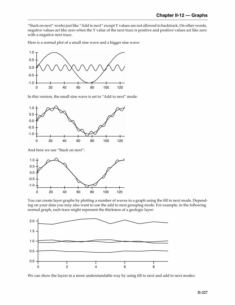
“Stack on next” works just like “Add to next” except Y values are not allowed to backtrack. On other words, negative values act like zero when the Y value of the next trace is positive and positive values act like zero with a negative next trace.
Here is a normal plot of a small sine wave and a bigger sine wave:
In this version, the small sine wave is set to “Add to next” mode:
And here we use “Stack on next”:
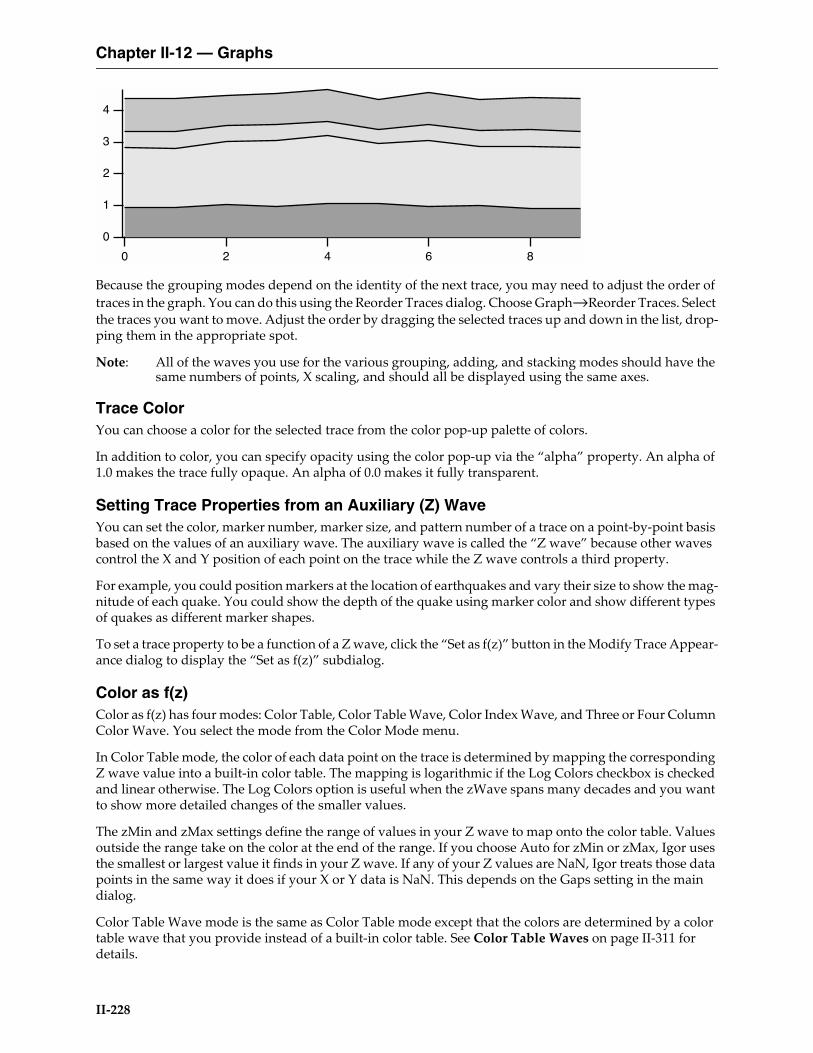
You can create layer graphs by plotting a number of waves in a graph using the fill to next mode. Depend-ing on your data you may also want to use the add to next grouping mode. For example, in the following normal graph, each trace might represent the thickness of a geologic layer:
We can show the layers in a more understandable way by using fill to next and add to next modes:
1.0
0.5
0.0
-0.5
-1.0120100806040200
1.0
0.5
0.0
-0.5
-1.0
120100806040200
1.0
0.5
0.0
-0.5
-1.0
120100806040200
2.0
1.5
1.0
0.5
0.0
86420
Chapter II-12 — Graphs
II-228
Because the grouping modes depend on the identity of the next trace, you may need to adjust the order of traces in the graph. You can do this using the Reorder Traces dialog. Choose Graph→Reorder Traces. Select the traces you want to move. Adjust the order by dragging the selected traces up and down in the list, drop-ping them in the appropriate spot.
Note: All of the waves you use for the various grouping, adding, and stacking modes should have the same numbers of points, X scaling, and should all be displayed using the same axes.
Trace ColorYou can choose a color for the selected trace from the color pop-up palette of colors.
In addition to color, you can specify opacity using the color pop-up via the “alpha” property. An alpha of 1.0 makes the trace fully opaque. An alpha of 0.0 makes it fully transparent.
Setting Trace Properties from an Auxiliary (Z) WaveYou can set the color, marker number, marker size, and pattern number of a trace on a point-by-point basis based on the values of an auxiliary wave. The auxiliary wave is called the “Z wave” because other waves control the X and Y position of each point on the trace while the Z wave controls a third property.
For example, you could position markers at the location of earthquakes and vary their size to show the mag-nitude of each quake. You could show the depth of the quake using marker color and show different types of quakes as different marker shapes.
To set a trace property to be a function of a Z wave, click the “Set as f(z)” button in the Modify Trace Appear-ance dialog to display the “Set as f(z)” subdialog.
Color as f(z)Color as f(z) has four modes: Color Table, Color Table Wave, Color Index Wave, and Three or Four Column Color Wave. You select the mode from the Color Mode menu.
In Color Table mode, the color of each data point on the trace is determined by mapping the corresponding Z wave value into a built-in color table. The mapping is logarithmic if the Log Colors checkbox is checked and linear otherwise. The Log Colors option is useful when the zWave spans many decades and you want to show more detailed changes of the smaller values.
The zMin and zMax settings define the range of values in your Z wave to map onto the color table. Values outside the range take on the color at the end of the range. If you choose Auto for zMin or zMax, Igor uses the smallest or largest value it finds in your Z wave. If any of your Z values are NaN, Igor treats those data points in the same way it does if your X or Y data is NaN. This depends on the Gaps setting in the main dialog.
Color Table Wave mode is the same as Color Table mode except that the colors are determined by a color table wave that you provide instead of a built-in color table. See Color Table Waves on page II-311 for details.
4
3
2
1
0
86420
Chapter II-12 — Graphs
II-229
In Color Index Wave mode, the color of data points on the trace is derived from the Z wave you choose by mapping its values into the X scaling of the selected 3-column color index wave. This is similar to the way ModifyImage cindex maps image values (in place of the Z wave values) to a color in a 3-column color index matrix. See Indexed Color Details on page II-312.
In Three or Four Column Color Wave mode, data points are colored according to Red, Green and Blue values in the first three columns of the selected wave. Each row of the three column wave controls the color of a data point on the trace. This mode gives absolute control over the colors of each data point on a trace. If the wave has a fourth column, it controls opacity. See Direct Color Details on page II-313 for further information.
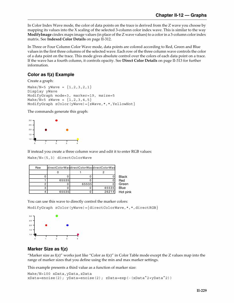
Color as f(z) ExampleCreate a graph:Make/N=5 yWave = {1,2,3,2,1}Display yWaveModifyGraph mode=3, marker=19, msize=5Make/N=5 zWave = {1,2,3,4,5}ModifyGraph zColor(yWave)={zWave,*,*,YellowHot}
The commands generate this graph:
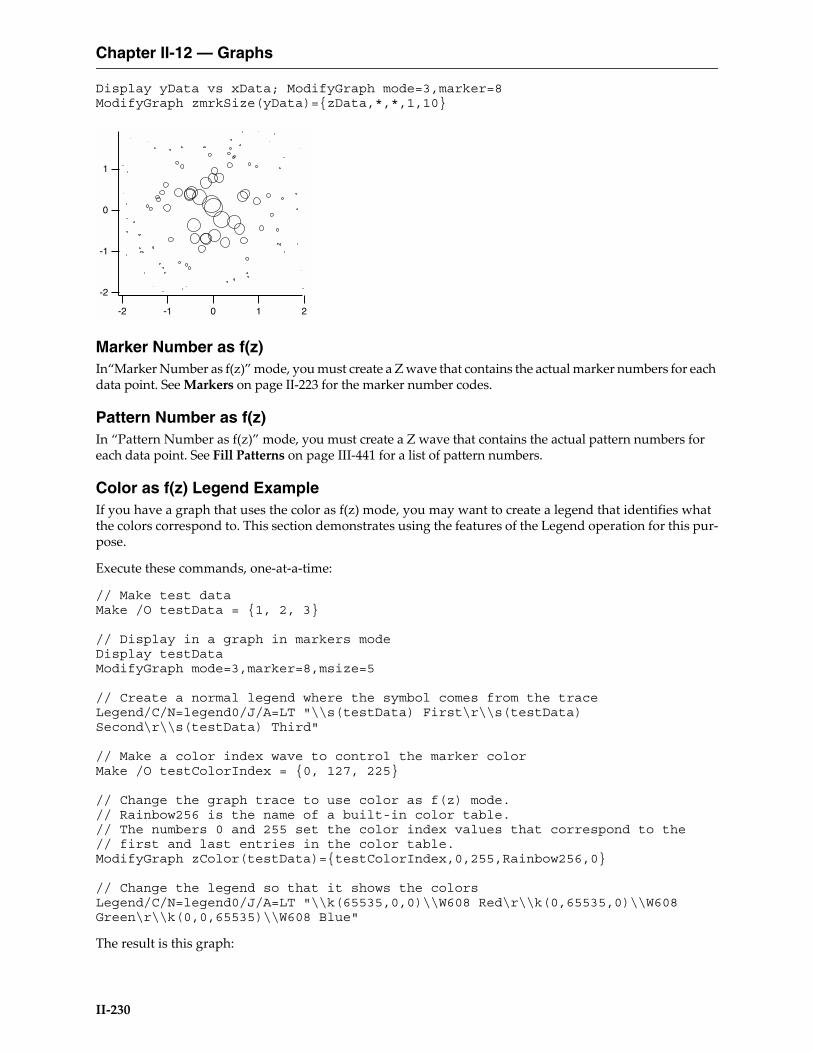
If instead you create a three column wave and edit it to enter RGB values:Make/N=(5,3) directColorWave
You can use this wave to directly control the marker colors:ModifyGraph zColor(yWave)={directColorWave,*,*,directRGB}
Marker Size as f(z)“Marker size as f(z)” works just like “Color as f(z)” in Color Table mode except the Z values map into the range of marker sizes that you define using the min and max marker settings.
This example presents a third value as a function of marker size:Make/N=100 xData,yData,zDataxData=enoise(2); yData=enoise(2); zData=exp(-(xData^2+yData^2))
3.0
2.5
2.0
1.5
1.0
43210
Row directColorWavdirectColorWavdirectColorWav
0 1 2
0 0 0 01 6 5 5 3 5 0 02 0 6 5 5 3 5 03 0 0 6 5 5 3 54 6 5 5 3 5 0 2 6 2 1 4
BlackRedGreenBlueHot pink
3.0
2.5
2.0
1.5
1.0
43210
Chapter II-12 — Graphs
II-230
Display yData vs xData; ModifyGraph mode=3,marker=8ModifyGraph zmrkSize(yData)={zData,*,*,1,10}
Marker Number as f(z)In“Marker Number as f(z)” mode, you must create a Z wave that contains the actual marker numbers for each data point. See Markers on page II-223 for the marker number codes.
Pattern Number as f(z)In “Pattern Number as f(z)” mode, you must create a Z wave that contains the actual pattern numbers for each data point. See Fill Patterns on page III-441 for a list of pattern numbers.
Color as f(z) Legend ExampleIf you have a graph that uses the color as f(z) mode, you may want to create a legend that identifies what the colors correspond to. This section demonstrates using the features of the Legend operation for this pur-pose.
Execute these commands, one-at-a-time:
// Make test dataMake /O testData = {1, 2, 3}
// Display in a graph in markers modeDisplay testDataModifyGraph mode=3,marker=8,msize=5
// Create a normal legend where the symbol comes from the traceLegend/C/N=legend0/J/A=LT "\\s(testData) First\r\\s(testData) Second\r\\s(testData) Third"
// Make a color index wave to control the marker colorMake /O testColorIndex = {0, 127, 225}
// Change the graph trace to use color as f(z) mode.// Rainbow256 is the name of a built-in color table.// The numbers 0 and 255 set the color index values that correspond to the// first and last entries in the color table.ModifyGraph zColor(testData)={testColorIndex,0,255,Rainbow256,0}
// Change the legend so that it shows the colorsLegend/C/N=legend0/J/A=LT "\\k(65535,0,0)\\W608 Red\r\\k(0,65535,0)\\W608 Green\r\\k(0,0,65535)\\W608 Blue"
The result is this graph:
-2
-1
0
1
-2 -1 0 1 2

Chapter II-12 — Graphs
II-231
The last command used the \W escape sequence to specify which marker to use in the legend (08 for the circle marker in this case) and the marker thickness (6 means 1.0 points).
The \k escape sequence specifies the color to use for stroking the marker specified by \W. You would use \K to specify the marker fill color. Colors are specified in RGB format where each component falls in the range 0 to 65535.
This example uses double-backslashes because a single backslash is an escape character in Igor literal strings. Since we want a backslash in the final text, because that is what Igor requires for \k and \W, we need to use a double-backslash in the literal strings.
If you were to enter the legend text in the Add Annotation dialog, you would use just a single backslash and the dialog would generate the requires command, with double-backslashes.
Trace OffsetsYou can offset a trace in a graph in the horizontal or vertical direction without changing the data in the associated wave. This is primarily of use for comparing the shapes of traces or for spreading overlapping traces out for better viewing.
Each trace has an X and a Y offset, both of which are initially zero. If you check the Offset checkbox in the Modify Trace Appearance dialog, you can enter an X and Y offset for the trace.
You can also set the offsets by clicking and dragging in the graph. To do this, click the trace you want to offset. Hold the mouse down for about a second. You will see a readout box appear in the lower left corner of the graph. The readout shows the X and Y offsets as you drag the trace. If it doesn’t take too long to display the given trace, you will be able to view the trace as you drag it around on the screen.
If you press Shift while offsetting a wave, Igor constrains the offset to the horizontal or vertical dimension.
You can disable trace dragging by pressing Caps Lock, which may be useful for trackball users.
Offsetting is undoable, so if you accidently drag a trace where you don’t want it, choose Edit →Undo.
3.0
2.5
2.0
1.5
1.0
2.01.51.00.50.0
Red
Green
Blue
1.0
0.8
0.6
0.4
0.2
0.0
-0.2
-0.4
-0.6
600500400300200x10-9
x offset= 7.39837e-08y offset= -0.487352
Chapter II-12 — Graphs
II-232
It is possible to attach a tag to a trace that will show its current offset values. See Dynamic Escape Codes for Tags on page III-39, for details.
If autoscaling is in effect for the graph, Igor tries to take trace offsets into account. If you want to set a trace’s offset without affecting axis scaling, use the Set Axis Range item in the Graphs menu to disable autoscaling.
When offsetting a trace that uses log axes, the trace offsets by the same distance it does when the axis is not log. The shape of the trace is not changed — it is simply moved. If you were to try to offset a trace by adding a constant to the wave’s data, it would distort the trace.
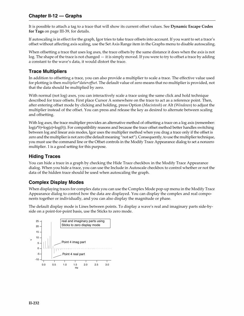
Trace MultipliersIn addition to offsetting a trace, you can also provide a multiplier to scale a trace. The effective value used for plotting is then multiplier*data+offset. The default value of zero means that no multiplier is provided, not that the data should be multiplied by zero.
With normal (not log) axes, you can interactively scale a trace using the same click and hold technique described for trace offsets. First place Cursor A somewhere on the trace to act as a reference point. Then, after entering offset mode by clicking and holding, press Option (Macintosh) or Alt (Windows) to adjust the multiplier instead of the offset. You can press and release the key as desired to alternate between scaling and offsetting.
With log axes, the trace multiplier provides an alternative method of offsetting a trace on a log axis (remember: log(a*b)=log(a)+log(b)). For compatibility reasons and because the trace offset method better handles switching between log and linear axis modes, Igor uses the multiplier method when you drag a trace only if the offset is zero and the multiplier is not zero (the default meaning “not set”). Consequently, to use the multiplier technique, you must use the command line or the Offset controls in the Modify Trace Appearance dialog to set a nonzero multiplier. 1 is a good setting for this purpose.
Hiding TracesYou can hide a trace in a graph by checking the Hide Trace checkbox in the Modify Trace Appearance dialog. When you hide a trace, you can use the Include in Autoscale checkbox to control whether or not the data of the hidden trace should be used when autoscaling the graph.
Complex Display ModesWhen displaying traces for complex data you can use the Complex Mode pop-up menu in the Modify Trace Appearance dialog to control how the data are displayed. You can display the complex and real compo-nents together or individually, and you can also display the magnitude or phase.
The default display mode is Lines between points. To display a wave’s real and imaginary parts side-by-side on a point-for-point basis, use the Sticks to zero mode.
25
20
15
10
5
0
-5
-10
v
3.02.52.01.51.00.50.0Hz
real and imaginary parts using Sticks to zero display mode
Point 4 real part
Point 4 imag part
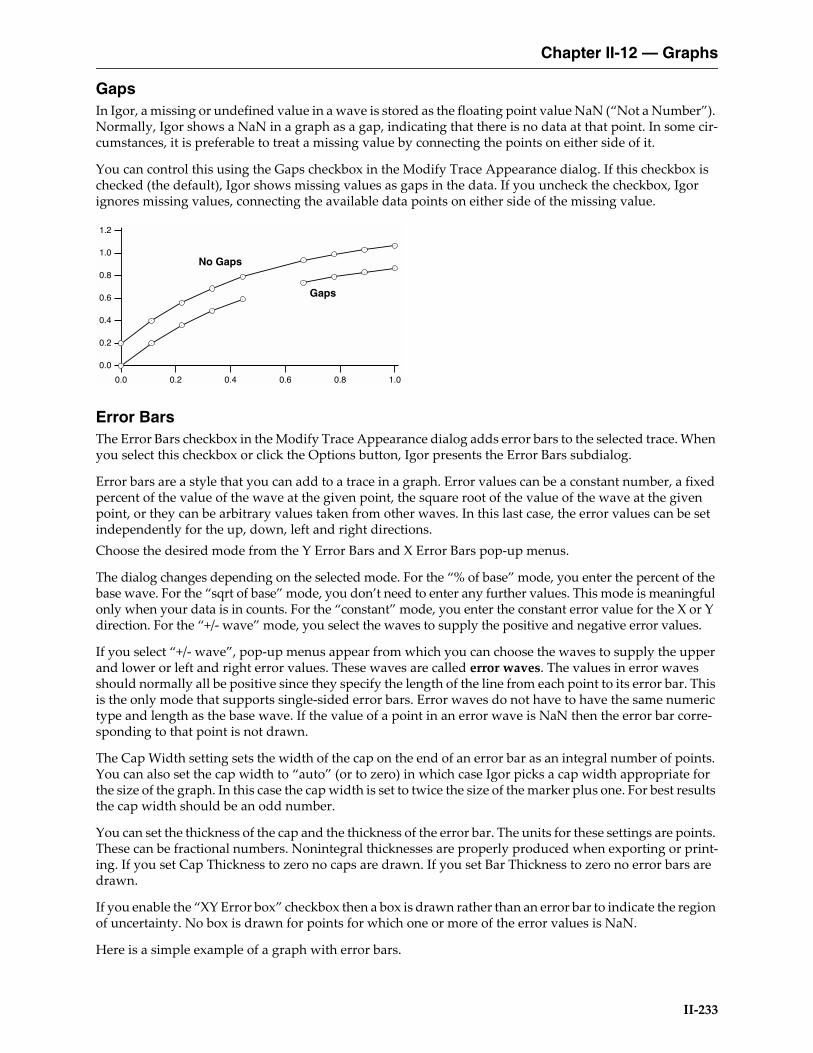
Chapter II-12 — Graphs
II-233
GapsIn Igor, a missing or undefined value in a wave is stored as the floating point value NaN (“Not a Number”). Normally, Igor shows a NaN in a graph as a gap, indicating that there is no data at that point. In some cir-cumstances, it is preferable to treat a missing value by connecting the points on either side of it.
You can control this using the Gaps checkbox in the Modify Trace Appearance dialog. If this checkbox is checked (the default), Igor shows missing values as gaps in the data. If you uncheck the checkbox, Igor ignores missing values, connecting the available data points on either side of the missing value.
Error BarsThe Error Bars checkbox in the Modify Trace Appearance dialog adds error bars to the selected trace. When you select this checkbox or click the Options button, Igor presents the Error Bars subdialog.
Error bars are a style that you can add to a trace in a graph. Error values can be a constant number, a fixed percent of the value of the wave at the given point, the square root of the value of the wave at the given point, or they can be arbitrary values taken from other waves. In this last case, the error values can be set independently for the up, down, left and right directions.Choose the desired mode from the Y Error Bars and X Error Bars pop-up menus.
The dialog changes depending on the selected mode. For the “% of base” mode, you enter the percent of the base wave. For the “sqrt of base” mode, you don’t need to enter any further values. This mode is meaningful only when your data is in counts. For the “constant” mode, you enter the constant error value for the X or Y direction. For the “+/- wave” mode, you select the waves to supply the positive and negative error values.
If you select “+/- wave”, pop-up menus appear from which you can choose the waves to supply the upper and lower or left and right error values. These waves are called error waves. The values in error waves should normally all be positive since they specify the length of the line from each point to its error bar. This is the only mode that supports single-sided error bars. Error waves do not have to have the same numeric type and length as the base wave. If the value of a point in an error wave is NaN then the error bar corre-sponding to that point is not drawn.
The Cap Width setting sets the width of the cap on the end of an error bar as an integral number of points. You can also set the cap width to “auto” (or to zero) in which case Igor picks a cap width appropriate for the size of the graph. In this case the cap width is set to twice the size of the marker plus one. For best results the cap width should be an odd number.
You can set the thickness of the cap and the thickness of the error bar. The units for these settings are points. These can be fractional numbers. Nonintegral thicknesses are properly produced when exporting or print-ing. If you set Cap Thickness to zero no caps are drawn. If you set Bar Thickness to zero no error bars are drawn.
If you enable the “XY Error box” checkbox then a box is drawn rather than an error bar to indicate the region of uncertainty. No box is drawn for points for which one or more of the error values is NaN.
Here is a simple example of a graph with error bars.
1.2
1.0
0.8
0.6
0.4
0.2
0.0
1.00.80.60.40.20.0
Gaps
No Gaps

Chapter II-12 — Graphs
II-234
The top trace used the “+/- Wave” mode with only a +wave. The last value of the error wave was made neg-ative to reverse the direction of the error bar.
Error ShadingIn Igor Pro 7 or later, you can use shading in place of error bars. In the Error Bars subdialog, check the “Use shading instead of bars” checkbox to enable shading.
Shading mode fills between either the +error to -error levels or from +error to data and data to -error depending on the parameters used with the shade keyword.
These commands illustrate multiple and overlapping error shading with transparency:
Make/O/N=200 jack=sin(x/8), sam=cos(x/9) + (100-x)/30Display /W=(64,181,499,520) jack,jack,samModifyGraph lsize(jack)=0,rgb(sam)=(0,0,65535)ErrorBars jack shade={0,0,(0,65535,0,10000),(0,0,0)},const=2ErrorBars jack#1 shade={0,0,(0,65535,0,10000),(0,0,0)},const=1ErrorBars sam shade={0,0,(65535,0,0,10000),(0,0,0)},const=1
On Windows shading does not work with the old GDI graphics technology. See Graphics Technology on page III-445 for details.
These commands illustrate different +error and -error shading as well as the use of pattern:
Make/O jack=sin(x/8)Display /W=(64,181,499,520) jackErrorBars jack shade={0,73,(0,65535,0),(0,0,65535),11,(65535,0,0),(0,65535,0)},const=0.5
See the shade keyword for the ErrorBars operation for details.
Customize at PointYou can customize the appearance of individual points on a trace in a graph displayed in bar, marker, dot and lines to zero modes. To do this interactively, right-click the desired point on a trace and choose Cus-tomize at Point from the contextual menu. The Modify Trace dialog appears with an entry in the trace list shown with the point number in square brackets. When such an entry is selected, only those properties that can be customized are shown in the dialog.
2.5
2.0
1.5
1.0
0.5
0.0
-0.5
1.41.21.00.80.60.40.20.0-0.2

Chapter II-12 — Graphs
II-235
Modifying AxesYou can modify the style of presentation of each axis in a graph by choosing Graph→Modify Axis or by double-clicking an axis. This displays the Modify Axis dialog.
The dialog has tabs for various aspects of axis appearance, plus a few controls outside the tabs. These global controls include the standard Igor dialog controls: Do It, To Cmd Line, To Clip, Help and Cancel buttons, plus a box to display the commands generated by the dialog. At the top are the Axis pop-up menu and the Live Update checkbox.
The Axis pop-up menu shows all axes that are in use in the top graph. Choose the axis that you want to change from the Axis menu, or choose Multiple Selection if you want to affect more than one axis. Below the Multiple Selection item are items that provide shortcuts for selecting certain classes of axes.
You select the appropriate tab for the types of changes you want to make. The dialog provides these tabs:
Axis TabYou can set the axis Mode for the selected axis to linear, log base 10, log base 2, or Date/Time.
The Date/Time mode is special. When drawing an axis, Igor looks at the controlling wave’s units to decide if it should be a date/time axis. Consequently, if you select Date/Time axis, the dialog immediately changes the units of the controlling wave. See Date/Time Axes on page II-244 for details on how date/time axes work.
The Standoff checkbox controls offsetting of axes. When standoff is on, Igor offsets axes so that traces do not cover them:
If a free axis is attached to the same edge of the plot rectangle as a normal axis then the standoff setting for the normal axis is ignored. This is to make it easy to create stacked plots.
Use the Mirror Axis pop-up menu to enable the mirror axis feature. A mirror axis is an axis that is the mirror image of the opposite axis. You can mirror the left axis to the right or the bottom axis to the top. The normal state is Off in which case there is no mirror axis. If you choose On from the pop-up, you get a mirror axis with tick marks but no tick mark labels. If you choose No Ticks, you get a mirror axis with no tick marks. If you choose Labels you get a mirror axis with tick marks and tick mark labels. Mirror axes may not do exactly what you want when using free axes, or when you shorten an axis using Draw Between. An embedded graph may be a better solution if free axes don’t do what you need; see Chapter III-4, Embedding and Subwindows.
Free axes can also have mirror axes. Unlike the free axis itself, the mirror for a given free axis can not be moved — it is always attached to the opposite side of the plot area. This feature can create stacked plots; see Creating Stacked Plots on page II-253.
Axis Tab Auto/Man Ticks Tab Ticks and Grids Tab
Tick Options Tab Axis Label Tab Label Options Tab
Axis Range Tab
30
20
10
0
-6 -4 -2 0 2 4 6
Standoff on
30
20
10
0
-6 -4 -2 0 2 4 6
Standoff off

Chapter II-12 — Graphs
II-236
The “Draw between” items are used to create stacked graphs. You will usually leave these at 0 and 100%, which draws the axis along the entire length or width of the plot area. You could use 50% and 100% to draw the left axis over only the top half of the plot area (mirror axes are on in this example to indicate the plot area):
For additional examples using “Draw between”, see Creating Stacked Plots on page II-253 and Creating Split Axes on page II-259.
The Offset setting provides a way to control the distance between the edge of the graph and the axis. It spec-ifies the distance from the default axis position to the actual axis position. This setting is in units of the size of a zero character in a tick mark label. Because of this, the axis offset adjusts reasonably well when you change the size of a graph window. The default axis offset is zero. You can restore the axis offset to zero by dragging the axis to or beyond the edge of the graph. If you enter a graph margin (see Overall Graph Prop-erties on page II-220), the margin overrides the axis offset.
Normally you will adjust the axis offset by dragging the axis in the graph. If the mouse is over an axis, the cursor changes to a double-ended arrow indicating that you can drag the axis. If the axis is a mirror axis you will not be able to drag it and the cursor will not change to the double-ended arrow.
The Offset setting does not affect a free axis. To adjust the position of a free axis, use the settings in the Free Position section.
The Thickness setting sets the thickness of an axis and associated tick marks in points. The thickness can be fractional and if you set it to zero the axis and ticks disappear.
The free position can be adjusted by dragging the axis interactively. This is the recommended way to adjust the position when using the absolute distance mode but it is not recommended when using the “crossing at” mode. This is because the crossing value as set interactively will not be exact. You should use the Free Position controls to specify an exact crossing value.
The Font section of the Axis tab specifies the font, font size, and typeface used for the tick labels and the axis label. You should leave this setting at “default” unless you want this particular axis to use a font different from the rest of the graph. You can set the default font for all graphs using the Default Font item in the Misc menu. You can set the default font for a particular graph using the Modify Graph item in the Graph menu. The axis label font can be controlled by escape codes within the axis label text. See Axis Labels on page II-246.
Colors of axis components are controlled by items in the Color area.
Auto/Man Ticks TabThe items in the Auto/Man Ticks tab control the placement of tick marks along the axis. You can choose one of three methods for controlling tick mark placement from the pop-up menu at the top of the tab.
Choose Auto Ticks to have Igor compute nice tick mark intervals using some hints from you.
Choose Computed Manual Ticks to take complete control over the origin and interval for placing tick marks. See Computed Manual Ticks on page II-240 for details.
Choose User Ticks from Waves to take complete control over tick mark placement and labelling. See User Ticks from Waves on page II-241 for details.
In Auto Ticks mode, you can specify a suggested number of major ticks for the selected axis by entering that number in the Approximately parameter box. The actual number of ticks on the axis may vary from the sug-
-1.0
-0.5
0.0
0.5
1.0
12080400
Dra
wn
from
0%
to 1
00%
-1.0
0.0
1.0
12080400
Dra
wn
from
50%
to 1
00%

Chapter II-12 — Graphs
II-237
gested number because Igor juggles several factors to get round number tick labels with reasonable spacing in a common numeric sequence (e.g., 1, 2, 5). In most cases, this automatically produces a correct and attractive graph. The Approximately parameter is not available if the selected axis is a log axis.
You can turn minor ticks on or off for the selected axis using the Minor Ticks checkbox.
The Minimum Sep setting controls the display of minor ticks if minor ticks are enabled. If the distance between minor ticks would be less than the specified minimum tick separation, measured in points, then Igor picks a less dense ticking scheme. For log axes Minor Ticks and Tick Separation affect the drawing of subminor ticks.
Ticks and Grids TabThe Ticks and Grids tab provides control over tick marks, tick mark labels, and grid lines.
Exponential LabelsWhen numbers that would be used to label tick marks become very large or very small, Igor switches to exponential notation, displaying small numbers in the tick mark labels and a power of 10 in the axis label. The use of the power of 10 in the axis label is covered under Axis Labels on page II-246. In the case of log axes, the tick marks include the power.
With the Low Trip and High Trip settings, you can control the point at which tick mark labels switch from normal notation to exponential notation. If the absolute value of the larger end of the axis is between the low trip and the high trip, then normal notation is used. Otherwise, exponential is used. However, if the exponent would be zero, normal notation is always used.
There are actually two independent sets of low trip and high trip parameters: one for normal axes and one for log axes. The low trip point can be from 1e-38 to 1 and defaults to 0.1 for normal axes and to 1e-4 for log axes. The high trip point can be from 1 to 1e38 and defaults to 1e4.
Under some circumstances, Igor may not honor your setting of these trip points. If there is no room for normal tick mark labels, Igor will use exponential notation, even if you have requested normal notation.
The Engineering and Scientific radio buttons allow you to specify whether tick mark labels should use engi-neering or scientific notation when exponential notation is used. It does not affect log axes. Engineering notation is just exponential notation where the exponent is always a multiple of three.
With the Exponent Prescale setting, you can force the tick and axis label scaling to values different from what Igor would pick. For example, if you have data whose X scaling ranges from, say, 9pA to 120pA and you display this on a log axis, Igor will label the tick marks with 10pA and 100pA. But if you really want the tick marks labeled 10 and 100 with pA in the axis label, you can set the Exponent Prescale to 12. For details, see Axis Labels on page II-246.
Date/Time Tick LabelsThe Date/Time Tick Labels area of the Ticks and Grids tab is explained under Date/Time Axes on page II-244.
Tick DimensionsYou can control the length and thickness of each type of tick mark and the location of tick marks relative to the axis line using items in the Tick Dimensions area. Igor distinguishes four types of tick marks: major, minor, “fifth”, and subminor:
0.12 3 4 5 6 7 8 9
11.00.80.60.40.20.0
Fifth or Emphasized
Major Minor Subminor
Normal Axis Log Axis
Major
Minor

Chapter II-12 — Graphs
II-238
The tick mark thicknesses normally follow the axis thickness. You can override the thickness of individual tick types by replacing the word “Auto” with your desired thickness specified in fractional points. A value of zero is equivalent to “Auto”.
The tick length is normally calculated based on the font and font size that will be used to label the tick marks. You can enter your own values in fractional points. For example you might enter a value of 6 for the major tick mark, 3 for the minor tick mark and 4.5 for the 5th or emphasized minor tick marks. The submi-nor tick mark only applies to log axes.
Use the Location pop-up menu to specify that tick marks for the selected axis be outside the axis, crossing the axis or inside the axis or you can specify no tick marks for the axis at all.
GridChoose Off from the Grid pop-up menu if you do not want grid lines. Choose On for grid lines on major and minor tick marks. Choose Major Only for grid lines on major tick marks only.
Igor provides five grid styles identified with numbers 1 through 5. Different grid styles have major and minor grid lines that are light, heavy, dotted or solid. If the style is set to zero (the default) and the graph background is white then grid style 2 is used. If the graph background is not white then grid style 5 is used.
Use the Grid Color palette to set the color of the grid lines. They are by default light blue.
The grid line thickness is specified as a fraction of the axis line thickness. Since the axis line thickness is usually one point, and computer monitors usually have a resolution of about a point, it generally is not pos-sible to see the differences in thickness on your screen. You can see the difference in exported and printed graphs.
The examples here show graphs with thicker than normal axis lines and the thickest grid lines:
1.0
0.5
0.0
12 3 4 5 6 7 8 9
10
Grid Style= 0White Background
1.0
0.5
0.0
12 3 4 5 6 7 8 9
10
Grid Style= 0Colored Background
(same as gridStyle=2) (same as gridStyle=5)
1.0
0.5
0.0
12 3 4 5 6 7 8 9
10
Grid Style= 1
1.0
0.5
0.0
12 3 4 5 6 7 8 9
10
Grid Style= 2
1.0
0.5
0.0
12 3 4 5 6 7 8 9
10
Grid Style= 3
1.0
0.5
0.0
12 3 4 5 6 7 8 9
10
Grid Style= 4

Chapter II-12 — Graphs
II-239
Using the settings "Draw from" and "to" you can restrict the length of the grid lines. This is useful if you have used the similar settings on the Axis tab to shorten one of your axes, and you want grid lines to match.
Zero LineYou can control the zero line for the selected axis using the Zero Line checkbox.
The zero line is a line perpendicular to the axis extending across the graph at the point where the value of the axis is zero. The Zero Line checkbox is not available for log axes.
If you turn the zero line on then you will be able to choose the line style from the Style pop-up menu. The thickness of the line can be set in fractional points from 0 to 5. The zero line has the same color as the axis.
Tick Options TabThe Tick Options tab provides fine control over tick marks and tick mark labels.
The Enable/Inhibit Ticks section allows you to limit tick marks to a specific range and to suppress specific tick marks.
The Log Ticks section provides control over minor tick marks and labels on log axes.
The Tick Label Tweaks section provides the following settings:
Axis Label TabSee Axis Labels on page II-246.
Label Options TabThe Label Options tab provides control of the placement and orientation of axis and tick mark labels. You can also hide these labels completely.
Normally, you will adjust the position of the axis label by simply dragging it around on the graph. The “Axis label position” or “Axis label margin” and the “Axis label lateral offset” settings are useful when you want precise numeric control over the position.
Checkbox Result
Thousands separator Tick labels like 10000 are drawn as 10,000.
Zero is '0' Select this to force the zero tick mark to be drawn as 0 where it would ordi-narily be drawn as 0.0 or 0.00.
No trailing zeroes Tick labels that would normally be drawn as 1.50 or 2.00 are drawn as 1.5 or 2.
No leading zero Select if you want tick labels such as 0.5 to be drawn as .5
Tick Unit Prefix is Exponent If tick mark would have prefix and units (μTorr), force to exponential nota-tion (10-6 Torr).
No Units in Tick Labels If tick mark would have units, suppress them.
Units in Every Tick Label If normal axis, force exponent or prefix and units into each label.
1.0
0.5
0.0
12 3 4 5 6 7 8 9
10
Grid Style= 5
Chapter II-12 — Graphs
II-240
The calculations used to position the axis label depend on the setting in the Label Position Mode menu. By default this is set to Compatibility, which will work with older versions of Igor. The other modes may allow you to line up labels on multiple axes more accurately. The choice of positioning mode affects the meaning of the three settings below the menu.
In Compatibility mode, the method Igor uses to position the axis label depends on whether or not a free axis is attached to the given plot rectangle edge. If no free axis is attached then the label position is measured from the corresponding window edge. We call this the axis label margin. Thus if you reposition an axis the axis label will not move. On the other hand, if a free axis is attached to the given plot rectangle edge then the label position is measured from the axis and when you move the axis, the label will move with it.
Because the method used to set the axis label varies depending on circumstances, one or the other of the “Axis label margin” or “Axis label position” settings may be unavailable. If you have selected an axis on the same edge as a free axis, the “Axis label position” setting is made available. If you have selected an axis that does not share an edge with a free axis, the “Axis label margin” setting is made available. If you have selected multiple axes it is possible for both settings to be available.
The axis label position is the distance from the axis to the label and is measured in points.
The axis label margin is the distance from the edge of the graph to the label and is measured in points. The default label margin is zero which butts the axis label up against the edge of the graph.
The margin modes measure relative to an edge of the graph while the axis modes measure relative to the position of the axis. Using an axis mode causes the label to follow a free axis when you move the axis. The margin modes are useful for aligning labels on stacked graphs. The “Axis label margin” setting applies to margin modes while the “Axis label position” setting applies to axis modes.
The absolute modes measure distance in points. Scaled modes have similar numerical values but are scaled to respond to changes in the font size.
The Labels pop-up menu controls which labels are drawn. On gives normal axis labeling. Axis Only leaves the axis label in place but removes the tick mark labels. Off removes the axis labels and tick mark labels.
Axis and Tick label rotations can be set to any value between -360 and 360 degrees.
Axis Range TabSee Scaling Graphs on page II-217.
Manual TicksIf Igor’s automatic selection of ticks does not suit you, and you can’t find any adjustments that make the tick marks just the way you want them, Igor provides two methods for specifying the tick marks yourself. On the Auto/Man Ticks tab of the Modify Axis dialog, you can choose either Computed Manual Ticks or User Ticks from Waves.
Computed Manual TicksUse Computed Manual Ticks to enter a numeric specification of the increment between tick marks and the starting point for calculating where the tick marks fall. This style of manual ticking is available for normal axes and date/time axes. It is not available for normal log axes but is available in LogLin mode.
When you choose Computed Manual Ticks, the corresponding settings in theAuto/Man Ticks tab becomes available.
If you click the “Set to auto values” button, Igor sets all of the items in the Compute Manual Ticks section to the values they would have if you let Igor automatically determine the ticking. This is usually a good starting point.
Using the “Canonic tick” setting, you specify the value of any major tick mark on the axis. Using the “Tick increment” setting, you specify the number of axis units per major tick mark. Both of these numbers are spec-ified as a mantissa and an exponent. The canonic tick is not necessarily the first major tick on the axis. Rather,

Chapter II-12 — Graphs
II-241
it is a major tick on an infinitely long axis of which the axis in the graph is a subset. That is, it can be any major tick whether it shows on the graph or not.
When you use computed manual ticks on a large range logarithmic axis in LogLin mode, the settings in the dialog refer to the exponent of the tick value.
Imagine that you want to show the temperature of an object as it cools off. You want to show time in seconds but you want it to be clear where the integral minutes fall on the axis. You would turn on manual ticking for the bottom axis and set the canonic tick to zero and the tick increment to 60. You could show the half and quarter minute points by specifying three minor ticks per major tick (“Number per major tick” in the Minor Ticks sec-tion) with every second minor tick emphasized (“Emphasize every” setting). This produces the following graph:
Now, imagine that you want to zoom in on t = 60 seconds.
The canonic tick, at t = 0, does not appear on the graph but it still controls major tick locations.
User Ticks from WavesWith Computed Manual Ticks you have complete control over ticking as long as you want equally-spaced ticks. If you want to specify your own ticking on a normal log axis, or you want ticks that are not equally spaced, you need User Ticks from Waves.
The first step in setting up User Ticks from Waves is to create two waves: a 1D numeric wave and a text wave. Numbers entered in the numeric wave specify the positions of the tick marks in axis units. The cor-responding rows of the text wave give the labels for the tick marks.
Perhaps you want to plot data as a function of Tm/T (melting temperature over temperature, but you want the tick labels to be at nice values of temperature. Starting with this data:
100
80
60
40
Tem
p (C
)
120600Time (s)
temp= -1.17 + 101.4 * e(-.0099x)
Sigma = {2.9, 2.58, 0.000505}
70
65
60
55
50
45
40
Tem
p (C
)
60Time (s)
temp= -1.17 + 101.4 * e(-.0099x)
Sigma = {2.9, 2.58, 0.000505}
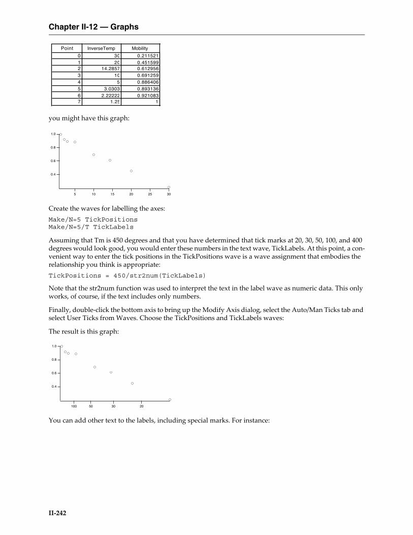
Chapter II-12 — Graphs
II-242
you might have this graph:
Create the waves for labelling the axes:Make/N=5 TickPositionsMake/N=5/T TickLabels
Assuming that Tm is 450 degrees and that you have determined that tick marks at 20, 30, 50, 100, and 400 degrees would look good, you would enter these numbers in the text wave, TickLabels. At this point, a con-venient way to enter the tick positions in the TickPositions wave is a wave assignment that embodies the relationship you think is appropriate:TickPositions = 450/str2num(TickLabels)
Note that the str2num function was used to interpret the text in the label wave as numeric data. This only works, of course, if the text includes only numbers.
Finally, double-click the bottom axis to bring up the Modify Axis dialog, select the Auto/Man Ticks tab and select User Ticks from Waves. Choose the TickPositions and TickLabels waves:
The result is this graph:
You can add other text to the labels, including special marks. For instance:
Point InverseTemp Mobility
0 30 0.2115211 20 0.4515992 14.2857 0.6129563 10 0.6912594 5 0.8864065 3.0303 0.8931366 2.22222 0.9210837 1.25 1
1.0
0.8
0.6
0.4
30252015105
1.0
0.8
0.6
0.4
203050100
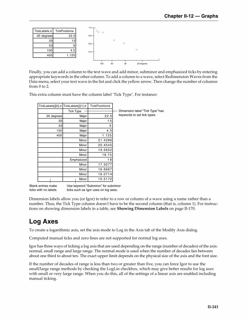
Chapter II-12 — Graphs
II-243
Finally, you can add a column to the text wave and add minor, subminor and emphasized ticks by entering appropriate keywords in the other column. To add a column to a wave, select Redimension Waves from the Data menu, select your text wave in the list and click the yellow arrow. Then change the number of columns from 0 to 2.
This extra column must have the column label ‘Tick Type’. For instance:
Dimension labels allow you (or Igor) to refer to a row or column of a wave using a name rather than a number. Thus, the Tick Type column doesn't have to be the second column (that is, column 1). For instruc-tions on showing dimension labels in a table, see Showing Dimension Labels on page II-170.
Log AxesTo create a logarithmic axis, set the axis mode to Log in the Axis tab of the Modify Axis dialog.
Computed manual ticks and zero lines are not supported for normal log axes.
Igor has three ways of ticking a log axis that are used depending on the range (number of decades) of the axis: normal, small range and large range. The normal mode is used when the number of decades lies between about one third to about ten. The exact upper limit depends on the physical size of the axis and the font size.
If the number of decades of range is less than two or greater than five, you can force Igor to use the small/large range methods by checking the LogLin checkbox, which may give better results for log axes with small or very large range. When you do this, all of the settings of a linear axis are enabled including manual ticking.
TickLabels.d TickPositions
20 degrees 22.5
30 15
50 9
100 4.5
400 1.125
1.0
0.8
0.6
0.4
20 degrees3050100
Blank entries make ticks with no labels.
Dimension label “Tick Type” has keywords to set tick types
Use keyword “Subminor” for subminor ticks such as Igor uses on log axes.
TickLabels[][0].d TickLabels[][1].d TickPositions
Tick Type
20 degrees Major 22 .5
30 Major 1 5
50 Major 9
100 Major 4 .5
400 Major 1 .125
Minor 21.4286
Minor 20.4545
Minor 19.5652
Minor 18.75
Emphasized 1 8
Minor 17.3077
Minor 16.6667
Minor 16.0714
Minor 15.5172

Chapter II-12 — Graphs
II-244
Here is a normal log axis with a range of 0.5 to 30:
If we zoom into a range of 1.5 to 4.5 we get this:
But if we then check the LogLin checkbox, we get better results:
Selecting a log axis makes the Log Ticks box in the Tick Options tab available. The “Max log cycles with minor ticks” setting controls whether minor ticks appear on a log axis. This setting can range from 0 to 20 and defaults to 0. If it is 0 or “auto”, Igor automatically determines if minor ticks are appropriate. Otherwise, if the axis has more decades than this number, then the minor ticks are not dis-played. Minor ticks are also not displayed if there is not enough room for them.
Similarly, you can control when Igor puts labels on the minor ticks of a log axis using the “Max log cycles with minor tick labels” item. This is a number from 0 to 8. 0 disables the minor tick labels. As long as the axis has fewer decades than this setting, minor ticks are labeled.
Date/Time AxesIn addition to numeric axes, Igor supports axes labeled with dates, times or dates and times.
Dates and date/times are represented in Igor as the number of seconds since midnight, January 1, 1904. There is no practical limit to the range of dates that can be represented.
In Igor, a date can not be accurately represented in a single precision wave. Make sure you use double precision waves to store dates and date/times. (A single precision wave can provide dates and date/times calculated from its X scaling, but not from its data values.)
For further discussion of how Igor represents dates, see Date/Time Waves on page II-78.
Times without dates can be thought of in two ways: as time-of-day times and as elapsed times.
Time-of-day times are represented in Igor as the number of seconds since midnight.
Elapsed times are represented as a number of seconds in the range -9999:59:59 to +9999:59:59. For integral numbers of seconds, this range of elapsed times can be precisely represented in a signed 32-bit integer wave. A single-precision floating point wave can precisely represent integral-second elapsed times up to about +/-4600 hours.
Igor displays dates or times on an axis if the appropriate units for the wave controlling the axis is “dat”. This is case-sensitive — “Dat” won’t work. You can set the wave’s units using the Change Wave Scaling item in the Data menu, or the SetScale operation.
To make a horizontal axis a date or time axis for a waveform graph, you must set the X units of the wave controlling the axis to “dat”. For an XY graph you must set the data units of the wave supplying the X coor-dinates for the curve to “dat”. To make the vertical axis a date or time axis in either type of graph, you must set the data units of the wave controlling the axis to “dat”.
If you choose Date/Time as the axis mode in the Axis tab of the Modify Axis dialog, the dialog sets the appropriate wave units to “dat”.
5 6 7 8 91
2 3 4 5 6 7 8 91 0
2 3
2x100 3 4
4.54.03.53.02.52.01.5

Chapter II-12 — Graphs
II-245
For Igor to display an axis as date or time, the following additional restrictions must be met: the axis must span at least 2 seconds and both ends must be within the legal range for a date/time value. If any of these restrictions is not met, Igor displays a single tick mark.
When an axis is in the date/time mode, the Date/Time Tick Labels box in the Ticks and Grids tab of the Modify Axis dialog is available.
From the Time Format pop-up menu, you can choose Normal, Military, or Elapsed. Use Normal or Military for time-of-day times and Elapsed for elapsed times. In normal mode, the minute before midnight is dis-played as 11:59:00 PM and midnight is displayed as 12:00:00 AM. In military mode, they are displayed as 23:59:00 and 00:00:00.
Elapsed mode can display times from -9999:59:59 to +9999:59:59. This mode makes sense if the values dis-played on the axis are actually elapsed times (e.g., 23:59:00). It makes no sense and will display no tick labels if the values are actually date/times (e.g., 7/28/93 23:59:00).
Custom Date FormatsIn the short, long and abbreviated modes, dates are displayed according to system date/time settings. If you choose Other from the Date Format pop-up, a dialog is displayed giving you almost complete control over the format of the tick labels. The dialog allows you to choose from a variety of built-in formats or to create a fully custom format.
Depending on the extent of the axis, the tick mark labels may show date or date and time. You can suppress the display of the date when both the date and time are showing by selecting the Suppress Date checkbox. This checkbox is irrelevant when you choose the elapsed time mode in which dates are never displayed.
Date/Time ExampleThe following example shows how you can create a date/time graph of a waveform whose Y values are tem-perature and whose X values, as set via the SetScale operation, are dates:// Make a wave to contain temperatures for the yearMake /N=365 temperature // single precision data values
// Set its scaling so X values are datesVariable t0, t1t0 = Date2Secs(2000,1,1); t1 = Date2Secs(2001,1,1)SetScale x t0, t1, "dat", temperature // double-precision X scaling
// Enter the temperature data in the wave's Y valuest0 = Date2Secs(2000,1,1); t1 = Date2Secs(2000,3,31) // wintertemperature(t0, t1) = 32 // it's coldt0 = Date2Secs(2000,4,1); t1 = Date2Secs(2000,6,30) // springtemperature(t0, t1) = 65 // it's nicet0 = Date2Secs(2000,7,1); t1 = Date2Secs(2000,9,31) // summertemperature(t0, t1) = 85 // it's hott0 = Date2Secs(2000,10,1); t1 = Date2Secs(2000,12,31) // falltemperature(t0, t1) = 45 // cold again
// Smooth the data outCurveFit sin temperaturetemperature= K0+K1*sin(K2*x+K3)
// Graph the waveDisplay temperatureSetAxis left, 0, 100;Label left "temp"Label bottom "2000"

Chapter II-12 — Graphs
II-246
The SetScale operation sets the temperature wave so that its X values span the year 2000. In this example, the date/time information is in the X values of the wave. X values are always double precision. The wave itself is not declared double precision because we are storing temperature information, not date/time infor-mation in the Y values.
Manual Ticks for Date/Time AxesJust as with regular axes, there are times when Igor’s automatic choices of ticks for date/time axes simply are not what you want. For these cases, you can use computed manual ticks with date/time axes.
To use computed manual ticks, display the Modify Axis dialog by double-clicking the axis, or by choosing Graph→Modify Axis. Select the Auto/Man Ticks tab, and choose Computed Manual Ticks from the menu in that tab.
The first step is to click the Set to Auto Values button. Choose Date, Time, or Date&Time from the pop-up menu below the Canonic Tick setting. This will depend on the range of the data. Choose the units for the Tick Increment setting and enter an increment value.
“Fake” AxesIt is sometimes necessary to create an axis that is not related to the data in a simple way. One method uses free axes that are not associated with a wave (see NewFreeAxis). The Transform Axis package uses this technique to make a mirror axis reflecting a different view of the data. An example would be a mirror axis showing wave number to go with a main axis showing wavelength. For an example, choose File→Example Experi-ments→Graphing Techniques→Transform Axis Demo.
Another technique is to use Igor’s drawing tools to create fake axes. For an example, choose File→Example Experiments→Graphing Techniques→New Polar Graph Demo or File→Example Experiments→Graphing Techniques→Ternary Diagram Demo.
Axis LabelsThe text for an axis label in a graph can come from one of two places. If you specify units for the wave which controls an axis, using the Change Wave Scaling dialog, Igor uses these units to label the axis. You can over-ride this labeling by explicitly entering axis label text using the Axis Label tab of the Modify Axis dialog.
To display the dialog, choose Graph→Label Axis or double-click an axis label. Select the axis that you want to label from the Axis pop-up menu and then enter the text for the axis label in the Axis Label area. Further label formatting options are available in the Label Options Tab.
There are two parts to an axis label: the text for the label and the special effects such as font, font size, super-script or subscript. You specify the text by typing in the Axis Label area. At any point in entering the text, you can choose a special effect from a pop-up menu in the Insert area.
100
80
60
40
20
0
tem
p
1/1/2000 3/1/2000 5/1/2000 7/1/2000 9/1/2000 11/1/20002000
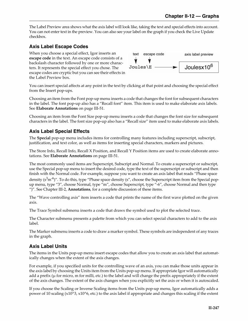
Chapter II-12 — Graphs
II-247
The Label Preview area shows what the axis label will look like, taking the text and special effects into account. You can not enter text in the preview. You can also see your label on the graph if you check the Live Update checkbox.
Axis Label Escape CodesWhen you choose a special effect, Igor inserts an escape code in the text. An escape code consists of a backslash character followed by one or more charac-ters. It represents the special effect you chose. The escape codes are cryptic but you can see their effects in the Label Preview box.
You can insert special affects at any point in the text by clicking at that point and choosing the special effect from the Insert pop-ups.
Choosing an item from the Font pop-up menu inserts a code that changes the font for subsequent characters in the label. The font pop-up also has a “Recall font” item. This item is used to make elaborate axis labels. See Elaborate Annotations on page III-51.
Choosing an item from the Font Size pop-up menu inserts a code that changes the font size for subsequent characters in the label. The font size pop-up also has a “Recall size” item used to make elaborate axis labels.
Axis Label Special EffectsThe Special pop-up menu includes items for controlling many features including superscript, subscript, justification, and text color, as well as items for inserting special characters, markers and pictures.
The Store Info, Recall Info, Recall X Position, and Recall Y Position items are used to create elaborate anno-tations. See Elaborate Annotations on page III-51.
The most commonly used items are Superscript, Subscript and Normal. To create a superscript or subscript, use the Special pop-up menu to insert the desired code, type the text of the superscript or subscript and then finish with the Normal code. For example, suppose you want to create an axis label that reads “Phase space density (s3m-6)”. To do this, type “Phase space density (s”, choose the Superscript item from the Special pop-up menu, type “3”, choose Normal, type “m”, choose Superscript, type “-6”, choose Normal and then type “)”. See Chapter III-2, Annotations, for a complete discussion of these items.
The “Wave controlling axis” item inserts a code that prints the name of the first wave plotted on the given axis.
The Trace Symbol submenu inserts a code that draws the symbol used to plot the selected trace.
The Character submenu presents a palette from which you can select special characters to add to the axis label.
The Marker submenu inserts a code to draw a marker symbol. These symbols are independent of any traces in the graph.
Axis Label UnitsThe items in the Units pop-up menu insert escape codes that allow you to create an axis label that automat-ically changes when the extent of the axis changes.
For example, if you specified units for the controlling wave of an axis, you can make those units appear in the axis label by choosing the Units item from the Units pop-up menu. If appropriate Igor will automatically add a prefix (µ for micro, m for milli, etc.) to the label and will change the prefix appropriately if the extent of the axis changes. The extent of the axis changes when you explicitly set the axis or when it is autoscaled.
If you choose the Scaling or Inverse Scaling items from the Units pop-up menu, Igor automatically adds a power of 10 scaling (x10^3, x10^6, etc.) to the axis label if appropriate and changes this scaling if the extent
Joules\E
axis label previewescape codetext
Joulesx106

Chapter II-12 — Graphs
II-248
of the axis changes. The Trial Exponent buttons determine what power is used only in the label preview so you can see what your label will look like under varying axis scaling conditions. Both of these techniques can be ambiguous — it is never clear if the axis has been multiplied by the scale factor or if the units contain the scale factor.
A less ambiguous method is to use the Exponential Prefix escape code. This is identical to the Scaling code except the “x” is missing. You can then use it in a context where it is clear that it is a multiplier of units. For example, if your axis range is 0 to 3E9 in units of cm/s, typing “Speed, \ucm/s” would create “Speed, 109cm/s”.
It is common to parenthesize scaling information in an axis label. For example the label might say “Joules (x106)”. You can do this by simply putting parentheses around the Scaling or Inverse Scaling escape codes. If the scaling for the axis turns out to be x100 Igor omits it and also omits the parentheses so you get “Joules” instead of “Joules (x100)” or “Joules()”.
If you do not specify scaling but the range of the axis requires it, Igor labels one of the tick marks on the axis to indicate the axis scaling. This is an emergency measure to prevent the graph from being misleading. You can prevent this from happening by inserting the Manual Override escape code, \u#2, into your label. No scaling or units information will be added at the location of the escape code or on the tick marks.
The situation with log axes is a bit different. By their nature, log axes never have to be scaled and units/scal-ing escape codes are not used in axis labels. If the controlling wave for a log axis has units then Igor auto-matically uses the units along with the appropriate prefix for each major tick mark label.
Annotations in GraphsYou can add text annotation to a graph by choosing Graph→Add Annotation. This displays the Add Anno-tation dialog. If text annotation is already on the graph you can modify it by double-clicking it. This brings up the Modify Annotation dialog. See Chapter III-2, Annotations, for details.
Info Panel and CursorsYou can display an information panel (“info panel” for short) for a graph by choosing Graph→Show Info. An info panel displays a precise readout of values for waves in the graph. To remove the info panel from a graph while the graph is the target window choose Graph→Hide Info.
You can use up to five different pairs of cursors (AB through IJ). To control which pairs are available, click the gear icon and select select cursor pairs from the Show Cursor Pairs submenu. By default, cursors beyond B use the cross and letter style.
Cursors provide a convenient way to specify a range of points on a wave which is of particular interest. For example, if you want to do a curve fit to a particular range of points on a wave you can start by putting cursor A on one end of the range and cursor B on the other. Then you can summon the Curve Fitting dialog from the Analysis menu. In this dialog on the Data Options tab there is a range control. If you click the “cur-sors” button then the range of the fit will be set to the range from cursor A to cursor B.
Using CursorsWhen you first show the info panel, the cursors are at home and not associated with any wave. The slide control is disabled and the readout area shows no values.
To activate a cursor, click it and drag it to the desired point on the wave whose values you want to examine. Now the cursor appears on the graph and the cursor’s home icon turns black indicating that the cursor is active. The name of the wave which the cursor is on appears next to the cursor’s name. You can drag the cursor to any point on a trace or image plot.
To move the cursor by one element, use the arrow keys. If the cursor is on a trace, you can use the left and right arrow keys. If it is on an image, you can use the left, right, up, and down arrow keys. If you press Shift plus an arrow key, the cursor moves 10 times as far.
Chapter II-12 — Graphs
II-249
If the cursor is on a trace, you can drag the slide control left or right. If it is on an image, you can drag it in any direction.
If you have both cursors of a pair on the graph and both are active, then the slide control moves both cursors at once. If you want to move only one cursor you can use the mouse to drag that cursor to its new location. Another way to move just one cursor is to deactivate the cursor that you don’t want to move. You do this by clicking in the cursor’s home icon. This makes the home icon change from black to white indicating that the cursor is not active. Then the slide control moves only the active cursor.
You can also move both cursors of a pair at once by dragging. With both cursors on the graph, press the Shift key before clicking and dragging one of the cursors.
When you use the mouse to drag a cursor to a new location, Igor first searches for the trace the cursor is currently attached to. Only if the new location is not near a point on the current trace are all the other traces searched. You can use this preferential treatment of the current trace to make sure the cursor lands on the desired trace when many traces are overlapping in the destination region.
You can attach a cursor to a particular trace by right-clicking the cursor home icon and choosing a trace name from the pop-up menu.
To remove a cursor from the graph, drag it outside the plot area or right-click the cursor home icon and choose Remove Cursor.
Free CursorsBy default, cursors are attached to a particular point on a trace or to a particular element of an image plot. By contrast, you can move a free cursor anywhere within the plot area of the graph. To make a cursor free, right-click the cursor home icon in the info panel and choose Style→Free from the resulting pop-up menu.
Cursor StylesBy default, cursors A and B are displayed in the graph using a circular icon for A and a square icon for B. For all other cursors, the default style is a cross. You can change the style for any cursor by right-clicking the cursor home icon in the info panel and using the resulting pop-up menu.
You can create a cursor style function which you can invoke later to apply a given set of cursor style settings Right-click the cursor home icon in the info panel and, from the resulting pop-up menu, choose Style→Style Function→Save Style Function. Igor creates a cursor style function in the built-in procedure window. You can edit the function to give it a more meaningful name than the default name that Igor uses.
To apply your style function to a cursor, right-click the cursor home icon in the info panel and choose choose Style→Style Function→<Your Style Function>.
Programming With CursorsThese functions and operations are useful for programming with cursors.
The ShowInfo and HideInfo operations show and hide the info panel.
The Cursor operation sets the position of a cursor.
The CsrInfo function returns information about a cursor.
These functions return the current position of a cursor:
These functions return information about the wave to which a cursor is attached, if any:
pcsr qcsr hcsr vcsr xcsr zcsr
CsrWave CsrWaveRef CsrXWave CsrXWaveRef
Chapter II-12 — Graphs
II-250
The CursorStyle keyword marks a user-defined function for inclusion in the Style Function submenu of the cursor pop-up menu.
The section Cursors — Moving Cursor Calls Function on page IV-316 explains how to trigger a user-defined function when a cursor is moved.
Identifying a TraceIgor can display a tool tip that identifies a trace when you hover the mouse over it. To enable this mode, choose Graph→Show Trace Info Tags.
Subrange DisplayIn addition to displaying an entire wave in a graph, you can specify a subrange of the wave to display. This feature is mainly intended to allow the display of columns of a matrix as if they were extracted into indi-vidual 1D waves but can also be used to display other subsets or to skip every nth data point.
To display a subrange of a graph using the New Graph and Append Traces dialogs, you must be in the more complex version of the dialogs which appears when you click the More Choices button. Select your Y wave and optionally an X wave and click the Add button. This adds the trace to the list below. You can then edit the subrange in the list.
Subrange Display SyntaxThe Display operation (page V-140), AppendToGraph operation (page V-31), and ReplaceWave operation (page V-681) support the following subrange syntax for a wave list item:wavename[rdspec][rdspec][rdspec][rdspec]
where rdspec is a range or dimension specification expressed as dimension indices (point numbers for 1D waves). For an n-dimensional wave, enter n specifications and omit the rest.
Only one rdspec can be a range spec. The others must be a single numeric element index or dimension label value.
You can enter [] or [*] to indicate the entire range of the dimension, or [start,stop] for a contiguous subrange, or [start,stop;inc] where start, stop, and inc are dimension indices. Entering * for stop is the same as enteringthe index of the last element in the dimension.
For example:
Make/N=100 w1D = pDisplay w1D[0,*;10] // Display every tenth pointModifyGraph mode=3, marker=19
Make/N=(10,8) w2D = p + 10*qDisplay w2D[0][0,*;2] // Display every other column of row 0ModifyGraph mode=3, marker=19
The subrange syntax rules can be restated as:
1. Only one dimension specifier can contain the range to be displayed.
Legal syntax for range is: [] or [*] for an entire dimension
[start,stop] for a subrange
stop may be *
stop must be >= start
The range is inclusive
Chapter II-12 — Graphs
II-251
For non-XY plots, the X-axis label uses the dimension label (if any) for the active dimension (the one with a range).
When cursors or tags are placed on a subranged trace, the point number used is the virtual point number as if the subrange had been extracted into a 1D wave.
Subrange syntax is also supported for waves used with error bars and with color, marker size and marker number as f(Z). These correspond to the ErrorBars operation (page V-174) with the wave keyword and to the ModifyGraph (traces) operation (page V-522) with the zmrkSize, zmrkNum, and zColor keywords.
Subrange Display LimitationsIn category plots, the category wave (the text wave) may not be subranged. Waves used to specify text using ModifyGraph textMarker mode may not be subranged.
Subranged traces may not be edited using the draw tools (such as: option click on the edit poly icon in the tool palette on a graph).
Waterfall plots may not use subranges.
When multiple subranges of the same wave are used in a graph, they are distinguished only using instance notation and not using the subrange syntax. For example, given display w[][0],w[][1], you must use ModifyGraph mode(w#0)=1,mode(w#1)=2 and not ModifyGraph mode(w[][0])=1,mode(w[][1])=2 as you might expect.
The trace instance and subrange used to plot given trace is included in trace info information. See Identi-fying a Trace on page II-250.
Printing GraphsBefore printing a graph you should set the page size and orientation using the Page Setup dialog. Choose Page Setup from the Files menu. Often graphs are wider than they are tall and look better when printed using the horizontal orientation.
When you invoke the Page Setup dialog you must make sure that the graph that you want to print is the top window. Igor stores one page setup in each experiment for all graphs and stores other page setups for other types of windows. You can set the default graph page setup for new experiments using the Capture Graph Preferences dialog.
To print a graph, choose File→Print while the graph is the active window. You can also choose File→Print Preview to display a preview.
Graphs always print at the same size as the graph window unless they do not fit in which case they are scaled down at the same aspect ratio.
Prior to Igor Pro 7, the Print dialog contained special items added by Igor that allowed several different scaling modes. These are not available in Igor7 due to technical limitations of Qt.
[start,stop;inc] for a subrange with a positive increment
2. Other dimensions must contain a single numeric index or dimension label using % syntax.
Legal syntax for nonrange specifier is:
[index]
[%label]
3. Unspecified higher dimensions are treated as if [0] was specified.
Chapter II-12 — Graphs
II-252
Printing Poster-Sized GraphsUsing the PrintGraphs operation, you can specify a size for a graph that is too big for a single sheet of paper. When you do this, Igor uses multiple sheets of paper to print the graph. Use this to make very large, poster-sized printouts.
To make the multiple sheets into one big poster, you need to trim the edges of the sheets and tape them together. Igor prints tiny alignment marks on the edges so you can line the pages up. You should trim the unneeded borders so that the alignment marks are flush against the edge of the trimmed sheet. Then align the sheets so that the alignment marks butt up against each other. All of the alignment marks should still be visible. Then tape the sheets together.
Other Printing MethodsYou can also print graphs by placing them in page layouts. See Chapter II-17, Page Layouts for details.
You can print graphs directly from macros using the PrintGraphs (see page V-655) operation.
Save Graph CopyYou can save the active graph as an Igor packed experiment file by choosing File→Save Graph Copy. The main uses for saving as a packed experiment are to save an archival copy of data or to prepare to merge data from multiple experiments (see Merging Experiments on page II-19). The resulting experiment file preserves the data folder hierarchy of the waves displayed in the graph starting from the “top” data folder, which is the data folder that encloses all waves displayed in the graph. The top data folder becomes the root data folder of the resulting experiment file. Only the graph, its waves, dashed line settings, and any pictures used in the graph are saved in the packed experiment file, not procedures, variables, strings or any other objects in the experiment.
Save Graph Copy does not work well with graphs containing controls. First, the controls may depend on waves, variables or FIFOs (for chart controls) that Save Graph Copy will not save. Second, controls typically rely on procedures which are not saved by Save Graph Copy.
Save Graph Copy does not know about dependencies. If a graph contains a wave, wave0, that is dependent on another wave, wave1 which is not in the graph, Save Graph Copy will save wave0 but not wave1. When the saved experiment is open, there will be a broken dependency.
The SaveGraphCopy operation on page V-699 provides options that are not available using the Save Graph Copy menu command.
Exporting GraphsYou can export a graph to another application through the clipboard or by creating a file. To export via the clipboard, choose Edit→Export Graphics. To export via a file, choose File→Save Graphics.
The process of exporting graphics from a graph is very similar to exporting graphics from a layout. Because of this, we have put the details in Chapter III-5, Exporting Graphics (Macintosh), and Chapter III-6, Export-ing Graphics (Windows). These chapters describe the various export methods you can use and how to choose a method that will give you the best results.
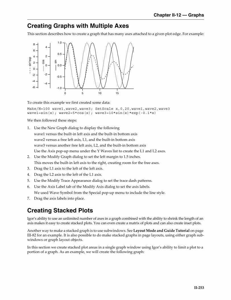
Chapter II-12 — Graphs
II-253
Creating Graphs with Multiple AxesThis section describes how to create a graph that has many axes attached to a given plot edge. For example:
To create this example we first created some data:Make/N=100 wave1,wave2,wave3; SetScale x,0,20,wave1,wave2,wave3wave1=sin(x); wave2=5*cos(x); wave3=10*sin(x)*exp(-0.1*x)
We then followed these steps:
1. Use the New Graph dialog to display the followingwave1 versus the built-in left axis and the built-in bottom axiswave2 versus a free left axis, L1, and the built-in bottom axiswave3 versus another free left axis, L2, and the built-in bottom axisUse the Axis pop-up menu under the Y Waves list to create the L1 and L2 axes.
2. Use the Modify Graph dialog to set the left margin to 1.5 inches.This moves the built-in left axis to the right, creating room for the free axes.
3. Drag the L1 axis to the left of the left axis.4. Drag the L2 axis to the left of the L1 axis.5. Use the Modify Trace Appearance dialog to set the trace dash patterns.6. Use the Axis Label tab of the Modify Axis dialog to set the axis labels.
We used Wave Symbol from the Special pop-up menu to include the line style.7. Drag the axis labels into place.
Creating Stacked PlotsIgor’s ability to use an unlimited number of axes in a graph combined with the ability to shrink the length of an axis makes it easy to create stacked plots. You can even create a matrix of plots and can also create inset plots.
Another way to make a stacked graph is to use subwindows. See Layout Mode and Guide Tutorial on page III-82 for an example. It is also possible to do make stacked graphs in page layouts, using either graph sub-windows or graph layout objects.
In this section we create stacked plot areas in a single graph window using Igor’s ability to limit a plot to a portion of a graph. As an example, we will create the following graph:
-1.0
-0.5
0.0
0.5
1.0
sin
151050
4
2
0
-2
-4
cos
8
6
4
2
0
-2
-4
-6
sin
*exp

Chapter II-12 — Graphs
II-254
First we create some data:Make wave1,wave2,wave3,wave4SetScale/I x 0,10,wave1,wave2,wave3,wave4wave1=sin(2*x); wave2=cos(2*x)wave3=cos(2*x)*exp(-0.2*x)wave4=sin(2*x)*exp(-0.2*x)
We then followed these steps:
1. Use the New Graph dialog to display the followingwave1 versus the built-in left axis and the built-in bottom axiswave2 versus a free left axis, L2, and the built-in bottom axiswave3 versus L2 and a free bottom axis, B2wave4 versus the built-in left axis and B2Use the Axis pop-up menu under the Y Waves list to create the L2 axis.Use the Axis pop-up menu under the X Waves list to create the B2 axis.This creates a graph consisting of a jumble of axes and traces.
2. Choose Graph→Modify Graph and click the Axis tab.The next four steps use the “Draw between” settings in the Axis section of the Axis tab.
3. From the Axis pop-up menu, select left and set the left axis to draw between 0% and 45% of normal.4. From the Axis pop-up menu, select bottom and set the bottom axis to draw between 0% and 45% of
normal.5. From the Axis pop-up menu, select L2 and set the L2 axis to draw between 55% and 100% of normal.
Also, in the Free Position section, choose Distance from Margin from the pop-up menu and set the Dis-tance setting to 0.
6. From the Axis pop-up menu, select B2 and set the B2 axis to draw between 55% and 100% of normal. Also, in the Free Position section, choose Distance from Margin from the pop-up menu and set the Dis-tance setting to 0.
7. Click Do It.
1.0
0.5
0.0
-0.5
-1.0
1086420
1.0
0.5
0.0
-0.5
-1.0
1086420
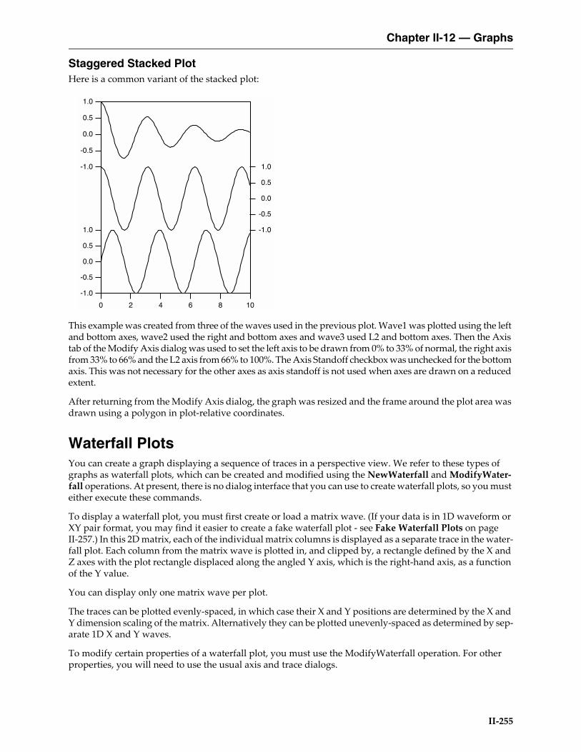
Chapter II-12 — Graphs
II-255
Staggered Stacked PlotHere is a common variant of the stacked plot:
This example was created from three of the waves used in the previous plot. Wave1 was plotted using the left and bottom axes, wave2 used the right and bottom axes and wave3 used L2 and bottom axes. Then the Axis tab of the Modify Axis dialog was used to set the left axis to be drawn from 0% to 33% of normal, the right axis from 33% to 66% and the L2 axis from 66% to 100%. The Axis Standoff checkbox was unchecked for the bottom axis. This was not necessary for the other axes as axis standoff is not used when axes are drawn on a reduced extent.
After returning from the Modify Axis dialog, the graph was resized and the frame around the plot area was drawn using a polygon in plot-relative coordinates.
Waterfall PlotsYou can create a graph displaying a sequence of traces in a perspective view. We refer to these types of graphs as waterfall plots, which can be created and modified using the NewWaterfall and ModifyWater-fall operations. At present, there is no dialog interface that you can use to create waterfall plots, so you must either execute these commands.
To display a waterfall plot, you must first create or load a matrix wave. (If your data is in 1D waveform or XY pair format, you may find it easier to create a fake waterfall plot - see Fake Waterfall Plots on page II-257.) In this 2D matrix, each of the individual matrix columns is displayed as a separate trace in the water-fall plot. Each column from the matrix wave is plotted in, and clipped by, a rectangle defined by the X and Z axes with the plot rectangle displaced along the angled Y axis, which is the right-hand axis, as a function of the Y value.
You can display only one matrix wave per plot.
The traces can be plotted evenly-spaced, in which case their X and Y positions are determined by the X and Y dimension scaling of the matrix. Alternatively they can be plotted unevenly-spaced as determined by sep-arate 1D X and Y waves.
To modify certain properties of a waterfall plot, you must use the ModifyWaterfall operation. For other properties, you will need to use the usual axis and trace dialogs.
1.0
0.5
0.0
-0.5
-1.0
1086420
1.0
0.5
0.0
-0.5
-1.0
-1.0
-0.5
0.0
0.5
1.0
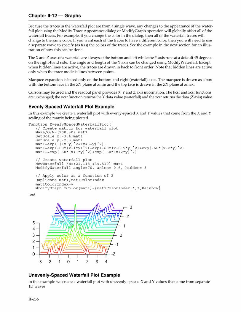
Chapter II-12 — Graphs
II-256
Because the traces in the waterfall plot are from a single wave, any changes to the appearance of the water-fall plot using the Modify Trace Appearance dialog or ModifyGraph operation will globally affect all of the waterfall traces. For example, if you change the color in the dialog, then all of the waterfall traces will change to the same color. If you want each of the traces to have a different color, then you will need to use a separate wave to specify (as f(z)) the colors of the traces. See the example in the next section for an illus-tration of how this can be done.
The X and Z axes of a waterfall are always at the bottom and left while the Y axis runs at a default 45 degrees on the right-hand side. The angle and length of the Y axis can be changed using ModifyWaterfall. Except when hidden lines are active, the traces are drawn in back to front order. Note that hidden lines are active only when the trace mode is lines between points.
Marquee expansion is based only on the bottom and right (waterfall) axes. The marquee is drawn as a box with the bottom face in the ZY plane at zmin and the top face is drawn in the ZY plane at zmax.
Cursors may be used and the readout panel provides X, Y and Z axis information. The hcsr and xcsr functions are unchanged; the vcsr function returns the Y data value (waterfall) and the zcsr returns the data (Z axis) value.
Evenly-Spaced Waterfall Plot ExampleIn this example we create a waterfall plot with evenly-spaced X and Y values that come from the X and Y scaling of the matrix being plotted.Function EvenlySpacedWaterfallPlot()
// Create matrix for waterfall plotMake/O/N=(200,30) mat1SetScale x,-3,4,mat1SetScale y,-2,3,mat1mat1=exp(-((x-y)^2+(x+3+y)^2))mat1=exp(-60*(x-1*y)^2)+exp(-60*(x-0.5*y)^2)+exp(-60*(x-2*y)^2)mat1+=exp(-60*(x+1*y)^2)+exp(-60*(x+2*y)^2)
// Create waterfall plotNewWaterfall /W=(21,118,434,510) mat1ModifyWaterfall angle=70, axlen= 0.6, hidden= 3
// Apply color as a function of ZDuplicate mat1,mat1ColorIndexmat1ColorIndex=yModifyGraph zColor(mat1)={mat1ColorIndex,*,*,Rainbow}
End
Unevenly-Spaced Waterfall Plot ExampleIn this example we create a waterfall plot with unevenly-spaced X and Y values that come from separate 1D waves.
5
4
3
2
1
0
43210-1-2-3
3
2
1
0
-1
-2

Chapter II-12 — Graphs
II-257
Function UnvenlySpacedWaterfallPlot()// Create matrix for waterfall plotMake/O/N=(200,30) mat2SetScale x,-3,4,mat2 // Scaling is needed only to generateSetScale y,-2,3,mat2 // the fake datamat2=exp(-((x-y)^2+(x+3+y)^2))mat2=exp(-60*(x-1*y)^2)+exp(-60*(x-0.5*y)^2)+exp(-60*(x-2*y)^2)mat2+=exp(-60*(x+1*y)^2)+exp(-60*(x+2*y)^2)SetScale x,0,0,mat2 // Scaling no longer needed because we willSetScale y,0,0,mat2 // use X and Y waves in waterfall plot
// Make X and W wavesMake/O/N=200 xWave = 10^(p/200)Make/O/N=30 yWave = 10^(p/30)
// Create waterfall plotNewWaterfall /W=(21,118,434,510) mat2 vs {xWave,yWave}ModifyWaterfall angle=70, axlen= 0.6, hidden= 3
// Apply color as a function of ZDuplicate mat2,mat2ColorIndexmat2ColorIndex=yModifyGraph zColor(mat2)={mat2ColorIndex,*,*,Rainbow}
End
Fake Waterfall PlotsCreating a real waterfall plot requires a 2D wave. If your data is in the form of 1D waveforms or XY pairs, it may be simpler to create a "fake waterfall plot".
In a fake waterfall plot, you plot your waveform or XY data using a regular graph and then create the water-fall effect by offsetting the traces. Since fake waterfall plots use regular Igor traces, you can control their appearance the same as in a regular graph.
The result, with hidden line removal, looks like this:
5
4
3
2
1
0
8642
8
6
4
2

Chapter II-12 — Graphs
II-258
Because of the offsetting in the X and Y directions, the axis tick mark labels can be misleading.
Igor includes a demo experiment showing how to create a fake waterfall plot. Choose File→Example Experiments→Graphing Techniques→Fake Waterfall Plot.
Wind Barb PlotsYou can create a wind barb plot by creating an XY plot and telling Igor to use wind barbs for markers. You turn markers into wind barbs using "ModifyGraph arrowMarker", passing to it a wave that specifies the length, angle and number of barbs for each point.
If you want to color-code the wind barbs, you turn on color as f(z) mode using "ModifyGraph zColor", passing to it a wave that specifies the color for each point.
Here is an example. Execute the commands one section at at time to see how it works.
// Make XY dataMake/O xData = {1, 2, 3}, yData = {1, 2, 3}Display yData vs xData // Make graphModifyGraph mode(yData) = 3 // Marker mode
// Make a barb data wave to control the length, angle// and number of barbs for each point.// To control the number of barbs, column 2 must have a column label of WindBarb.Make/O/N=(3,3) barbData // Controls barb length, angle and number of barbsSetDimLabel 1, 2, WindBarb, barbData // Set column label to WindBarbEdit /W=(439,47,820,240) barbData
// Put some data in barbDatabarbData[0][0]= {20,25,30} // Column 0: Barb lengths in pointsbarbData[0][1]= {0.523599,0.785398,1.0472} // Column 1: Barb angle in radiansbarbData[0][2]= {10,20,30} // Column 2: Wind speed code from 0 to 40
// Set trace to arrow mode to turn barbs onModifyGraph arrowMarker(yData) = {barbData, 1, 10, 1, 1}
// Make an RGB color waveMake/O/N=(3,3) barbColorEdit /W=(440,272,820,439) barbColor
// Store some colors in the color wavebarbColor[0][0]= {65535,0,0} // Red
10
8
6
4
x1
03
600595590585580575570

Chapter II-12 — Graphs
II-259
barbColor[0][1]= {0,65535,0} // GreenbarbColor[0][2]= {0,0,65535} // Blue
// Turn on color as f(z) modeModifyGraph zColor(yData)={barbColor,*,*,directRGB,0}
To see a demo of wind barbs choose File→Example Experiments→Feature Demos2→Barbs and Arrows.
See the arrowMarker keyword under ModifyGraph (traces) on page V-522 for details on the construction of the barb data wave.
The various color as f(z) modes are explained under Setting Trace Properties from an Auxiliary (Z) Wave on page II-228. You can eliminate the barbColor wave by using a color table lookup instead of a color wave.
Creating Split AxesYou can create split axes using the same techniques described above for creating stacked plots. Simply plot your data twice using different axes and then adjust the axes so they are stacked. You can then adjust the range of the axes independently. You can use draw tools to add cut marks.
WaveMetrics supplies a procedure package to automate all aspects of creating split axes except setting the range and adjusting the ticking details of the axes. To use the package, select the Graph→Packages→Split Axes menu item. For an example, choose File→Example Experiments→Graphing Techniques→Split Axes.
Before using the package, you should create the graph in near final form using just the main axes. For best results, especially if you will be using cut marks, you should work with the graph at actual size before adding the split axes. It is recommended that you create a recreation macro just before executing the split axis macros. This is so you can easily revert in case you need to change the pre-split setup.
After creating the split, you can execute the AddSplitAxisMarks procedure to add cut marks between the two axes. You can then use the drawing tools to duplicate the cut marks if you want marks on the traces as well as the axes. Of course, you can also draw your own cut marks. You should use the default Plot Relative coordi-nate system for cut marks so they will remain in the correct location should you resize the graph.
Some programs draw straight lines between data points on either side of the split. While such lines provide the benefit of connecting traces for the viewer, they also are misleading and inaccurate. This package accu-rately plots both sections and does not attempt to provide a bridge between them. If you feel it is necessary, you can use drawing tools to add a connecting bridge.
Live Graphs and Oscilloscope DisplaysThis section will be of interest mainly if you use Igor for data acquisition.
Normally, when the data in a wave is modified, all graphs containing traces derived from that wave are redrawn from scratch. Although fast compared to other programs, this process may noticeably limit the graph update rate.
Live ModeIf you specify one or more traces in a graph as being “live” then Igor takes some shortcuts, resulting in faster than normal updates. Fast update is obtained when certain conditions are observed.
Note: When graphs are redrawn in live mode, autoscaling is not done.
To specify a trace in a graph as being live you must use the live keyword with the ModifyGraph command. There is no dialog support for this setting.ModifyGraph live(traceName)= mode
Mode can be 0 or 1. Zero turns live mode off for the given trace.

Chapter II-12 — Graphs
II-260
WaveMetrics provides a demo experiment that generates and displays synthetic data. You should use this experiment to get a feel for the performance you might expect on your particular computer as a function of the window size, number of points in the live wave, and the live modes. To run the demo, choose File→Example Experiments→Feature Demos→Live Mode.
Although live mode 1 is not restricted to unity thickness solid lines or dots modes, you will get the best per-formance if you do use these settings.
Quick AppendAnother feature that may be of use is the quick append mode. It is intended for applications in which a data acquisition task creates new waves periodically. It permits you to add the new waves to a graph very quickly. To invoke a quick append, use the /Q flag in an AppendToGraph command. There is no dialog support for this setting.
A side effect of quick append is that it marks the wave as not being modified since the last update of graphs and therefore prevents other graphs containing the same wave, if any, from being updated. For a demo, choose File→Example Experiments→Feature Demos→Quick Append.
Graph PreferencesGraph preferences allow you to control what happens when you create a new graph or add new traces to an existing graph. To set preferences, create a graph and set it up to your taste. We call this your prototype graph. Then choose Capture Graph Prefs from the Graph menu.
Preferences are normally in effect only for manual operations, not for automatic operations from Igor pro-cedures. This is discussed in more detail in Chapter III-18, Preferences.
When you initially install Igor, all preferences are set to the factory defaults. The dialog indicates which preferences you have not changed by displaying “default” next to them.
The Window Position and Size preference affects the creation of new graphs only. New graphs will have the same size and position as the prototype graph.
The Page Setup preference is somewhat unusual because all graphs share the same page setup settings, as shown in the Page Setup dialog. The captured page setup is already in use by all other graphs. The utility of this category is that new experiments will use the captured page setup for graphs.
The “XY Plots:Wave Styles” preference category refers to the various wave-specific settings in the graph, such as the line type, markers and line size, set with the Modify Trace Appearance dialog. This category also includes settings for waveform plots. Each captured wave style is associated with the index of the wave it was captured from. The index of the first wave displayed or appended to a graph is 0, the second appended wave has an index of 1, and so on.These indices are the same as are used in style macros. See Graph Style Macros on page II-262.
If preferences are on when a new graph with waves is created or when a wave is appended to an existing graph, the wave style assigned to each is based on its index. The wave with an index of 2 is given the cap-tured style associated with index 2 (the third wave appended to the captured graph).
You might wonder what style is applied to the fifth and sixth waves if only four waves appeared in the graph from which wave style preferences were captured. You have two choices; either the factory default style is used, or the styles repeat with the first wave style and then the second style. You make this choice in the Miscellaneous Settings dialog, with the Repeat Wave Style Prefs in Graphs checkbox. With that box selected, the fifth and sixth waves would get the first and second captured styles; if deselected, they would both get the factory default style, as would any other waves subsequently appended to the graph.
The XY Plots:Axes and Axis Labels preferences category captures all of the axis-related settings for axes in the graph. Only axes used by XY or waveform plots have their settings captured. Axes used solely for a cat-

Chapter II-12 — Graphs
II-261
egory, image, or contour plot are ignored. The settings for each axis are associated with the name of the axis it was captured from.
Even if preferences are on when a new graph with waves is created or when a wave is newly appended to an existing graph, the wave is still displayed using the usual default left and bottom axes unless you explic-itly specify another named axis. The preferred axes are not automatically applied, but they are listed by name in the New Graph, and the various Append to Graph dialogs, in the two Axis pop-up menus so that you may select them.
For example, suppose you capture preferences for an XY plot using axes named MyRightAxis and MyTo-pAxis. These names will appear in the X Axis and Y Axis pop-up menus in the New Graph and Append Traces to Graph dialogs.• If you choose them in the New Graph dialog and click Do It, a graph will be created containing newly-
created axes named MyRightAxis and MyTopAxis and having the axis settings you captured.• If you have a graph which already uses axes named MyRightAxis and MyTopAxis and choose these
axes in the Append Traces to Graph dialog, the traces will be appended to those axes, as usual, but no captured axis settings will be applied to these already-existing axes.
Captured axes may also be specified by name on the command line or in a procedure, provided preferences are on:Function AppendWithCapturedAxis(wav)
Wave wavVariable oldPrefStatePreferences 1; oldPrefState = V_Flag // Turn preferences onAppend/L=MyCapturedAxis wav // Note: MyCapturedAxis must
// be vertical to use /LPreferences oldPrefState // Restore old prefs setting
End
The Category Plots:Axes and Axis Labels and Category Plots:Wave Styles are analogous to the correspond-ing settings for XY plots. Since they are separate preference categories, you have can independent prefer-ences for category plots and for XY plots. Similarly, preferences for image and contour plots are independent of preferences for other types. See Chapter II-13, Category Plots, Chapter II-14, Contour Plots, and Chapter II-15, Image Plots.
How to use Graph PreferencesHere is our recommended strategy for using graph preferences:1. Create a new graph containing a single trace. Use the axes you will normally use.2. Make the graph appear as you prefer using the Modify Graph dialog, Modify Trace Appearance
dialog, the Modify Axis dialog, etc. Move the graph to where you prefer it be positioned.3. Choose the Graph→Capture Graph Prefs menu to display the Capture Graph Preferences dialog.
Check the checkboxes corresponding to the categories you want to capture, and click Capture Prefs.4. Choose Misc→Miscellaneous Settings to display the Miscellaneous Settings dialog. In the Graphs
section, check the Repeat Wave Style Prefs checkbox, and click Save Settings.
Saving and Recreating GraphsIf you click in the close button of a graph window, Igor asks you if you want to save a window recreation macro.
Igor presents the graph’s name as the proposed name for the macro. You can replace the proposed name with any valid macro name.
If you want to make a macro so you can recreate the graph later, click Save. Igor then creates a macro which, when invoked, will recreate the graph with its size, position and presentation intact. Igor saves the recre-ation macro is placed in the procedure window where you can inspect, modify or delete it as you like.

Chapter II-12 — Graphs
II-262
The macro name appears in the Graph Macros submenu of the Windows menu. You can invoke the macro by choosing it from that submenu or by executing the macro from the command line. The window name of the recreated graph will be the same as the name of the macro that recreated it.
If you are sure that you never want to recreate the graph, you can press Option (Macintosh) or Alt (Windows) while you click the close button of the graph window. This closes the graph without presenting the dialog and without saving a recreation macro.
For a general discussion of saving, recreating, closing windows, see Chapter II-4, Windows.
Graph Style MacrosThe purpose of a graph style macro is to allow you to create a number of graphs with the same stylistic properties. Igor can automatically generate a style macro from a prototype graph. You can manually tweak the macro if necessary. Later, you can apply the style macro to a new graph.
For example, you might frequently want to make a graph with a certain sequence of markers and colors and other such properties. You could use preferences to accomplish this. The style macro offers another way and has the advantage that you can have any number of style macros while there is only one set of prefer-ences.
You create a graph style macro by making a prototype graph, setting each of the elements to your taste and then, using the Window Control dialog, instructing Igor to generate a style macro for the window.
You can apply the style macro when you create a graph using the New Graph dialog. You can also apply it to an existing graph by choosing the macro from the Graph Macros submenu of the Windows menu.
Example of Creating a Style MacroAs an example, we will create a style macro that defines the color and line type of five traces.
Since we want our style macro to define a style for five traces, we start by making a graph with five waves:Make wave0=p, wave1=10+p, wave2=20+p, wave3=30+p, wave4=40+pDisplay wave0, wave1, wave2, wave3, wave4
Now, using the Modify Trace Appearance dialog, we set the color and line style for each of the waves to our liking.
Now we're ready to generate the style macro. With the graph the active window, we choose Win-dows→Control→Window Control to display the Window Control dialog in which we check the Create Style Macro checkbox.
When we click Do It, Igor generates a graph style macro and saves it in the procedure window.
The graph style macro for this example is:
Proc Graph0Style() : GraphStylePauseUpdate; Silent 1 // modifying window...

Chapter II-12 — Graphs
II-263
ModifyGraph/Z lStyle[1]=1,lStyle[2]=2,lStyle[3]=3,lStyle[4]=4ModifyGraph/Z rgb[0]=(0,0,0)ModifyGraph/Z rgb[1]=(3,52428,1)ModifyGraph/Z rgb[2]=(1,12815,52428)ModifyGraph/Z rgb[3]=(52428,1,41942)ModifyGraph/Z rgb[4]=(65535,21845,0)
EndMacro
Notice that the graph style macro does not refer to wave0, wave1, wave2, wave3 or wave4. Instead, it refers to traces by index. For example,ModifyGraph rgb[0]=(0,0,0)
sets the color for the trace whose index is 0 to black. A trace’s index is determined by the order in which the traces were displayed or appended to the graph. In the Modify Trace Appearance dialog, the trace whose index is zero appears at the top of the list.
The /Z flag used in the graph style macro tells Igor not to worry if the command tries to modify a trace that is not actually in the graph. For example, if you make a graph with three traces (indices from 0 to 2) and apply this style macro to it, there will be no trace whose index is 3 at the time you run the macro. The command:ModifyGraph rgb[3]=(52428,1,41942)
would generate an error in this case. Adding the /Z flag continues macro execution and ignores the error.
Style Macros and PreferencesWhen Igor generates a graph style macro, it generates commands to modify the target graph according to the prototype graph. It assumes that the objects in the target will be in their factory default states at the time the style macro is applied to the target. Therefore, it generates commands only for the objects in the proto-type which have been modified. If Igor did not make this assumption, it would have to generate commands for every possible setting for every object in the prototype and style macros would be very large.
Because of this, you should create the new graph with preferences off and then apply the style macro.
Applying the Style MacroTo use this macro, you would perform the following steps.1. Turn preferences off by choosing Preferences Off from the Misc menu.2. Create a new graph, using the New Graph dialog and optionally the Append Traces to Graph dialog.3. Choose Graph0Style from the Graph Macros submenu in the Windows menu.4. Turn preferences back on by choosing Preferences On from the Misc menu.
If you use only the New Graph dialog, you can use the shorter method:1. Open the New Graph dialog, select the waves to be displayed in the graph, and choose Graph0Style
from the Style pop-up menu in the dialog. Click Do It.
Igor automatically generates the Preferences Off and Preferences On commands to apply the style to the new graph without being affected by preferences.
Limitations of Style MacrosIgor automatically generates style macro commands to set all of the properties of a graph that you set via the ModifyGraph, Label and SetAxis operations. These are the properties that you set using the Modify Trace Appearance, Modify Graph, and Modify Axis dialogs.

Chapter II-12 — Graphs
II-264
It does not generate commands to recreate annotations or draw elements. Igor’s assumption is that these things will be unique from one graph to the next. If you want to include commands to create annotations and draw elements in a graph, you must add the appropriate commands to the macro.
Where to Store Style MacrosIf you want a style macro to be accessible from a single experiment only, you should leave them in the main procedure window of that experiment. If you want a style macro to be accessible from any experiment then you should store it in an auxiliary procedure file. See Chapter III-13, Procedure Windows for details.
Graph Pop-Up MenusThere are a number of contextual pop-up menus that you can use to quickly set colors and other graph properties. To display a contextual menu on Macintosh, press the Control key and click. On Windows, click using the right mouse button.
Different contextual menus are available for clicks on traces, the interior of a graph (but not on a trace) and axes. If you press the Shift key before a contextual click on a trace or axis, the menu will apply to all traces or axes in the graph.
Sometimes it is difficult to contextual click in the plot area of a graph and not hit a trace. In this case, try clicking outside the plot area, but not on an axis.
Graph ExpansionNormally, graphs are shown actual size but sometimes, when working with very small or very large graphs, it is easier to work with an expanded or contracted screen representation. You can set an expansion or contraction factor for a graph using the Expansion submenu in the Graph menu or using the contextual menu for the graph body, away from traces or axes.
The expansion setting affects only the screen representation. It does not affect printing or exporting.

Chapter II-12 — Graphs
II-265
Graph ShortcutsAction Shortcut (Macintosh) Shortcut (Windows)
To autoscale a graph Press Command-A. Press Ctrl+A.
To modify the appearance or front-to-back drawing order of a trace
Press Control and click the trace to get a contextual menu.
Press Shift-Control to modify all traces.
Double-click the trace to summon a dialog.
Right-click the trace to get a contextual menu.
Press Shift while right-clicking to modify all traces.
Double-click the trace to summon a dialog.
To modify the appearance of an axis, axis labels, grid lines, tick marks
Press Control and click the axis.
Press Shift-Control to modify all axes.
Double-click an axis to summon a dialog.
Right-click the axis.
Press Shift and right-click to modify all axes.
Double-click an axis to summon a dialog.
To modify the appearance of a contour plot
Control-click and choose Modify Contour from the contextual menu or press Shift and double-click the contour plot.
See also Chapter II-14, Contour Plots.
Right-click and choose Modify Contour from the contextual menu or press Shift and double-click the contour plot.
See also Chapter II-14, Contour Plots.
To modify the appearance of an image plot
Control-click and choose Modify Image from the contextual menu.
See also Chapter II-15, Image Plots.
Right-click and choose Modify Image from the contextual menu.
See also Chapter II-15, Image Plots.
To set background colors Press Control and click in the graph body, away from any traces.
Press Ctrl and click in the graph body, away from any traces.
To set the range of an axis Double-click tick mark labels to summon a dialog.
Double-click tick mark labels to summon a dialog.
To pan the graph Press Option and drag the body of the graph.
Press Shift also to constrain the direction of panning.
Press Alt and drag the body of the graph.
Press Shift also to constrain the direction of panning.
To offset a trace Click and hold the trace for about a second, then drag. You can avoid inadvertently triggering this feature by pressing Caps Lock before clicking a trace.
Click and hold the trace for about a second, then drag. You can avoid inadvertently triggering this feature by pressing Caps Lock before clicking a trace.
To adjust the position of an axis or axis label
Drag the axis or label. Drag the axis or label.
To change a graph margin Press Option and click the axis and drag. Drag beyond edge of graph to return to default position.
Press Option and double-click an axis or just double-click outside of the graph body and axes to summon a dialog.
Press Alt and click the axis and drag. Drag beyond edge of graph to return to default position.
Press Alt and double-click an axis or just double-click outside of the graph body and axes to summon a dialog.
To change an axis label Double-click the label to summon a dialog.
Double-click the label to summon a dialog.
Chapter II-12 — Graphs
II-266
To change an annotation Double-click the annotation to summon a dialog.
Double-click the annotation to summon a dialog.
To connect a tag to a different point
Press Option and drag the tag to the new point. Don’t drag the arrow or line; drag the tag body. Drag it off the graph window to remove it.
Press Alt and drag the tag to the new point. Don’t drag the arrow or line; drag the tag body. Drag it off the graph window to remove it.
To attach a cursor to a particular trace
Drag the cursor from the info panel to the trace or click the cursor name in the info panel and choose a trace name from the pop-up menu.
Drag the cursor from the info panel to the trace or click the cursor name in the info panel and choose a trace name from the pop-up menu.
To get information about a particular trace
Press Command-Option-I to turn on Trace Info tags.
Press Ctrl+Alt+I to turn on Trace Info tags.
To show or hide a graph’s tool palette
Press Command-T. Press Ctrl+T.
To move or resize a user-defined control without using the tool palette
Press Command-Option and click the control. With Command-Option still pressed, drag or resize it.
See also Chapter III-14, Controls and Control Panels.
Press Ctrl+Alt and click the control. With Ctrl+Alt still pressed, drag or resize it.
See also Chapter III-14, Controls and Control Panels.
To modify a user-defined control
Press Command-Option and double-click the control. This displays a dialog that you use to modify all aspects of the control. If the control is already selected, you don’t need to press Command-Option.
Press Ctrl+Alt and double-click the control. This displays a dialog that you use to modify all aspects of the control. If the control is already selected, you don’t need to press Ctrl+Alt.
To edit a user-defined control’s action procedure
With the graph in modify mode (tools showing, second icon from the top selected) press Option and double-click the control. This displays the procedure window containing the action procedure or beeps if there is no action procedure.
With the graph in modify mode (tools showing, second icon from the top selected) press Alt and double-click the control. This displays the procedure window containing the action procedure or beeps if there is no action procedure.
To nudge a user-defined control’s position
Select the control and press Arrow keys.
Press Shift to nudge faster.
Select the control and press Arrow keys.
Press Shift to nudge faster.
Action Shortcut (Macintosh) Shortcut (Windows)