identity - whatdotheyknow
TRANSCRIPT
These identity guidelines are designed to help you understandthe Electoral Commission brand positioning and attributes, andhow they are expressed through the corporate identity. By followingthem, you will play an integral part in building and maintaining theElectoral Commission’s reputation as an independent authority.
Identityguidelines
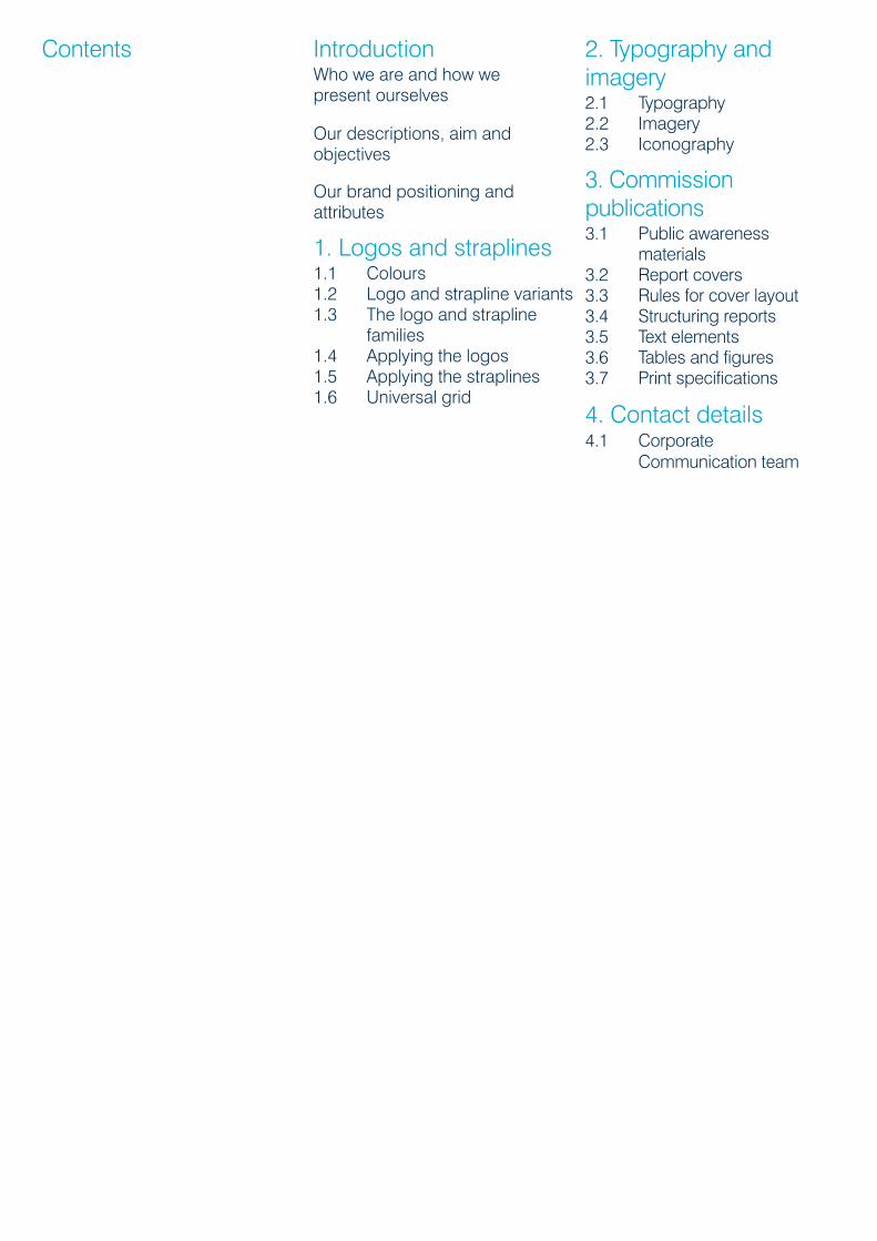
Contents IntroductionWho we are and how wepresent ourselves
Our descriptions, aim andobjectives
Our brand positioning andattributes
1. Logos and straplines1.1 Colours1.2 Logo and strapline variants1.3 The logo and strapline
families1.4 Applying the logos1.5 Applying the straplines1.6 Universal grid
2. Typography andimagery2.1 Typography2.2 Imagery2.3 Iconography
3. Commissionpublications3.1 Public awareness
materials3.2 Report covers3.3 Rules for cover layout3.4 Structuring reports3.5 Text elements3.6 Tables and figures3.7 Print specifications
4. Contact details4.1 Corporate
Communication team
Introduction

Who we are and how wepresent ourselves
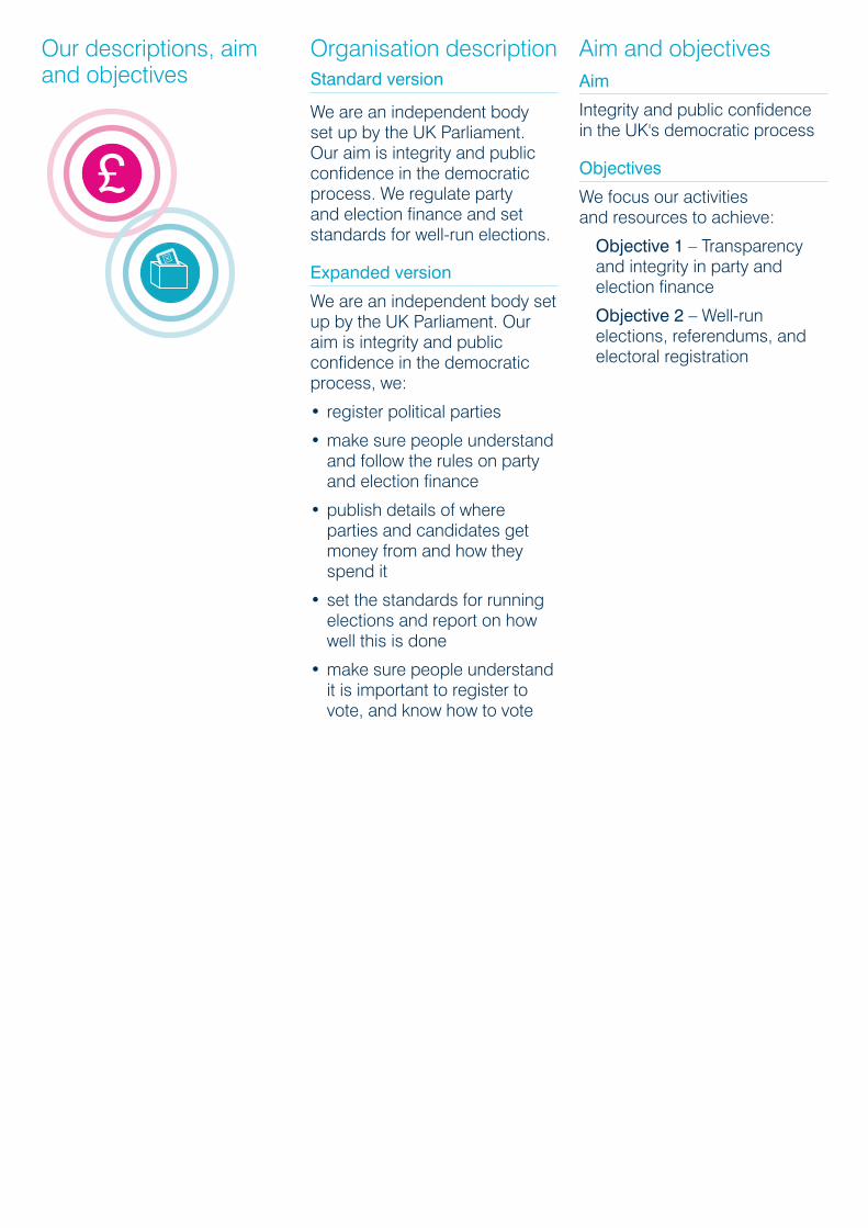
What is the ElectoralCommission?We are an independent body setup by the UK Parliament. Ouraim is integrity and publicconfidence in the democraticprocess. We regulate party andelection finance and setstandards for well-run elections.
Our identityThe way our organisation looksis a direct reflection of what westand for and our ambitions forthe future. In order that ourmessage remains clear andunambiguous, our identity needsto be managed properly.
For this to happen, each ofthe basic elements which createour visual identity must beprotected. These identityguidelines give you theinformation you need tounderstand our identity andhow it should be used. Alwaysrefer to them when working onCommission reports and otherprofessionally typesetpublications publications.
Our descriptions, aimand objectives
Organisation descriptionStandard version
We are an independent bodyset up by the UK Parliament.Our aim is integrity and publicconfidence in the democraticprocess. We regulate partyand election finance and setstandards for well-run elections.
Expanded version
We are an independent body setup by the UK Parliament. Ouraim is integrity and publicconfidence in the democraticprocess, we:
• register political parties
• make sure people understandand follow the rules on partyand election finance
• publish details of whereparties and candidates getmoney from and how theyspend it
• set the standards for runningelections and report on howwell this is done
• make sure people understandit is important to register tovote, and know how to vote
Aim and objectivesAim
Integrity and public confidencein the UK's democratic process
Objectives
We focus our activitiesand resources to achieve:
Objective 1 – Transparencyand integrity in party andelection finance
Objective 2 – Well-runelections, referendums, andelectoral registration

Our brand positioningand attributes
Democracy mattersDemocracy is the basis of oursociety. We protect our politicaland social foundations byprotecting a free and fairelectoral process. We servevoters by encouraging fullparticipation in the process.
Indepedent yet interdependent,we are a vital element inprotecting the way of life ofthe nation.
We are:
• approachable andcommunicative
• proactive, innovative andauthoritative
• impartial and independent
• trustworthy and have integrity
Logos andstraplines
1.0
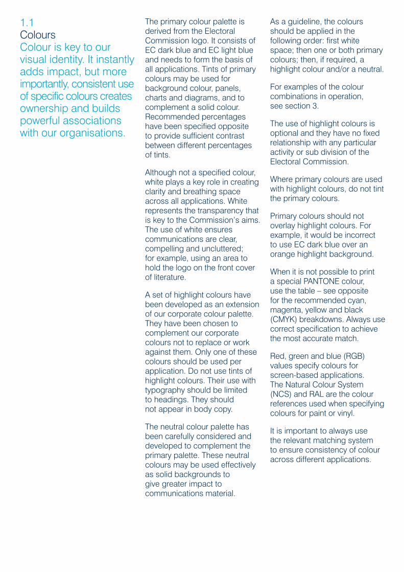
1.1ColoursColour is key to ourvisual identity. It instantlyadds impact, but moreimportantly, consistent useof specific colours createsownership and buildspowerful associationswith our organisations.
The primary colour palette isderived from the ElectoralCommission logo. It consists ofEC dark blue and EC light blueand needs to form the basis ofall applications. Tints of primarycolours may be used forbackground colour, panels,charts and diagrams, and tocomplement a solid colour.Recommended percentageshave been specified oppositeto provide sufficient contrastbetween different percentagesof tints.
Although not a specified colour,white plays a key role in creatingclarity and breathing spaceacross all applications. Whiterepresents the transparency thatis key to the Commission’s aims.The use of white ensurescommunications are clear,compelling and uncluttered;for example, using an area tohold the logo on the front coverof literature.
A set of highlight colours havebeen developed as an extensionof our corporate colour palette.They have been chosen tocomplement our corporatecolours not to replace or workagainst them. Only one of thesecolours should be used perapplication. Do not use tints ofhighlight colours. Their use withtypography should be limitedto headings. They shouldnot appear in body copy.
The neutral colour palette hasbeen carefully considered anddeveloped to complement theprimary palette. These neutralcolours may be used effectivelyas solid backgrounds togive greater impact tocommunications material.
As a guideline, the coloursshould be applied in thefollowing order: first whitespace; then one or both primarycolours; then, if required, ahighlight colour and/or a neutral.
For examples of the colourcombinations in operation,see section 3.
The use of highlight colours isoptional and they have no fixedrelationship with any particularactivity or sub division of theElectoral Commission.
Where primary colours are usedwith highlight colours, do not tintthe primary colours.
Primary colours should notoverlay highlight colours. Forexample, it would be incorrectto use EC dark blue over anorange highlight background.
When it is not possible to printa special PANTONE colour,use the table – see oppositefor the recommended cyan,magenta, yellow and black(CMYK) breakdowns. Always usecorrect specification to achievethe most accurate match.
Red, green and blue (RGB)values specify colours forscreen-based applications.The Natural Colour System(NCS) and RAL are the colourreferences used when specifyingcolours for paint or vinyl.
It is important to always usethe relevant matching systemto ensure consistency of colouracross different applications.
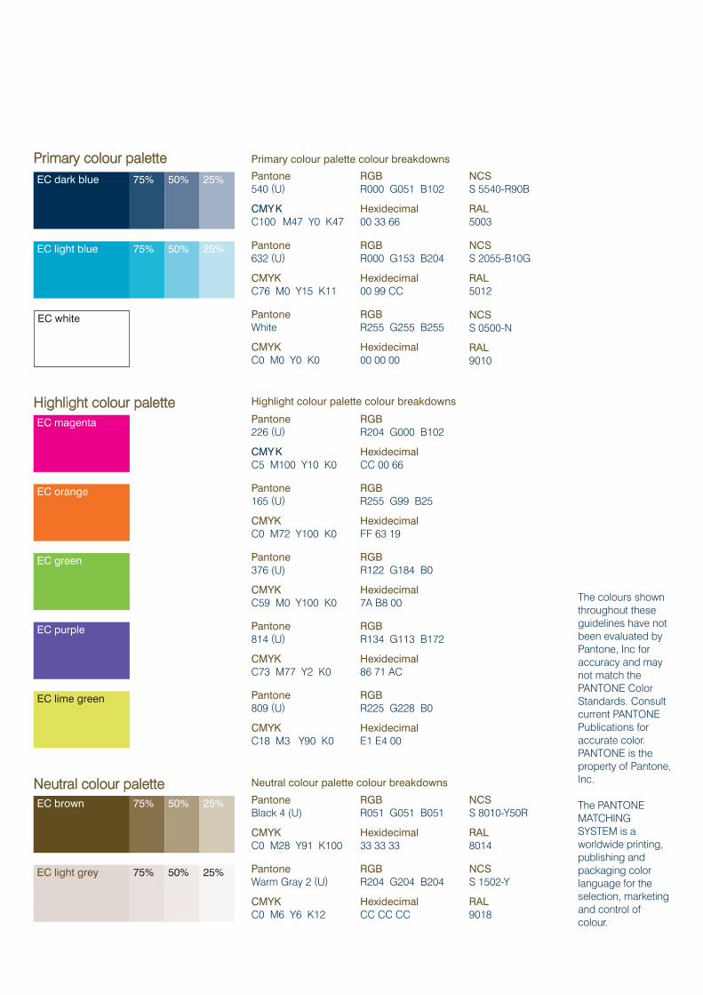
PPrriimmaarryy ccoolloouurr ppaalleettttee Primary colour palette colour breakdowns
EC dark blue 75%
75%
50%
50%
25%
25%EC light blue
Pantone 540 (U)
CMYKC100 M47 Y0 K47
RGBR000 G051 B102
Hexidecimal00 33 66
NCSS 5540-R90B
RAL5003
Pantone632 (U)
CMYKC76 M0 Y15 K11
RGBR000 G153 B204
Hexidecimal00 99 CC
NCSS 2055-B10G
RAL5012
EC white PantoneWhite
CMYKC0 M0 Y0 K0
RGBR255 G255 B255
Hexidecimal00 00 00
NCSS 0500-N
RAL9010
EC magenta Pantone 226 (U)
CMYKC5 M100 Y10 K0
RGBR204 G000 B102
HexidecimalCC 00 66
EC orange Pantone165 (U)
CMYKC0 M72 Y100 K0
RGBR255 G99 B25
HexidecimalFF 63 19
EC green Pantone376 (U)
CMYKC59 M0 Y100 K0
RGBR122 G184 B0
Hexidecimal7A B8 00
EC purple Pantone814 (U)
CMYKC73 M77 Y2 K0
RGBR134 G113 B172
Hexidecimal86 71 AC
EC lime green Pantone809 (U)
CMYKC18 M3 Y90 K0
RGBR225 G228 B0
HexidecimalE1 E4 00
EC brown PantoneBlack 4 (U)
CMYKC0 M28 Y91 K100
RGBR051 G051 B051
Hexidecimal33 33 33
NCSS 8010-Y50R
RAL8014
EC light grey PantoneWarm Gray 2 (U)
CMYKC0 M6 Y6 K12
RGBR204 G204 B204
HexidecimalCC CC CC
NCSS 1502-Y
RAL9018
The colours shownthroughout theseguidelines have notbeen evaluated byPantone, Inc foraccuracy and maynot match thePANTONE ColorStandards. Consultcurrent PANTONEPublications foraccurate color.PANTONE is theproperty of Pantone,Inc.
The PANTONEMATCHINGSYSTEM is aworldwide printing,publishing andpackaging colorlanguage for theselection, marketing and control ofcolour.
75% 50% 25%
75% 50% 25%
NNeeuuttrraall ccoolloouurr ppaalleettttee Neutral colour palette colour breakdowns
HHiigghhlliigghhtt ccoolloouurr ppaalleettttee Highlight colour palette colour breakdowns
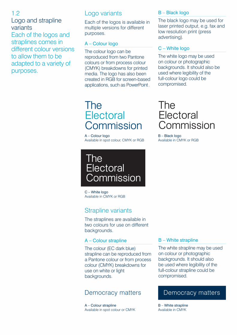
Logo variantsEach of the logos is available inmultiple versions for differentpurposes.
A – Colour logo
The colour logo can bereproduced from two Pantonecolours or from process colour(CMYK) breakdowns for printedmedia. The logo has also beencreated in RGB for screen-basedapplications, such as PowerPoint..
The Boundary Committee for England logo
A: Colour logoAvailable in spot colour, CMYK or RGB
C: Black logoAvailable in CMYK or RGB
B: Colour logo, reversed outAvailable in spot colour, CMYK or RGB
The Welsh Electoral Commission logoThe Electoral Commission logo
D: White logoAvailable in CMYK or RGB
The Boundary Committee for England logo
A: Colour logoAvailable in spot colour, CMYK or RGB
C: Black logoAvailable in CMYK or RGB
B: Colour logo, reversed outAvailable in spot colour, CMYK or RGB
The Welsh Electoral Commission logoThe Electoral Commission logo
D: White logoAvailable in CMYK or RGB
The Boundary Committee for England logo
A: Colour logoAvailable in spot colour, CMYK or RGB
C: Black logoAvailable in CMYK or RGB
B: Colour logo, reversed outAvailable in spot colour, CMYK or RGB
The Welsh Electoral Commission logoThe Electoral Commission logo
D: White logoAvailable in CMYK or RGB
B – Black logo
The black logo may be used forlaser printed output, e.g. fax andlow resolution print (pressadvertising).
C – White logo
The white logo may be used on colour or photographicbackgrounds. It should also beused where legibility of thefull-colour logo could becompromised.
1.2Logo and straplinevariantsEach of the logos andstraplines comes indifferent colour versionsto allow them to beadapted to a variety ofpurposes.
Strapline variantsThe straplines are available intwo colours for use on differentbackgrounds.
A – Colour strapline
The colour (EC dark blue)strapline can be reproduced froma Pantone colour or from processcolour (CMYK) breakdowns foruse on white or lightbackgrounds.
A – Colour logoAvailable in spot colour, CMYK or RGB
B – Black logoAvailable in CMYK or RGB
C – White logoAvailable in CMYK or RGB
A – Colour straplineAvailable in spot colour or CMYK
B – White straplineAvailable in CMYK
B – White strapline
The white strapline may be usedon colour or photographicbackgrounds. It should also be used where legibility of the full-colour strapline could becompromised.
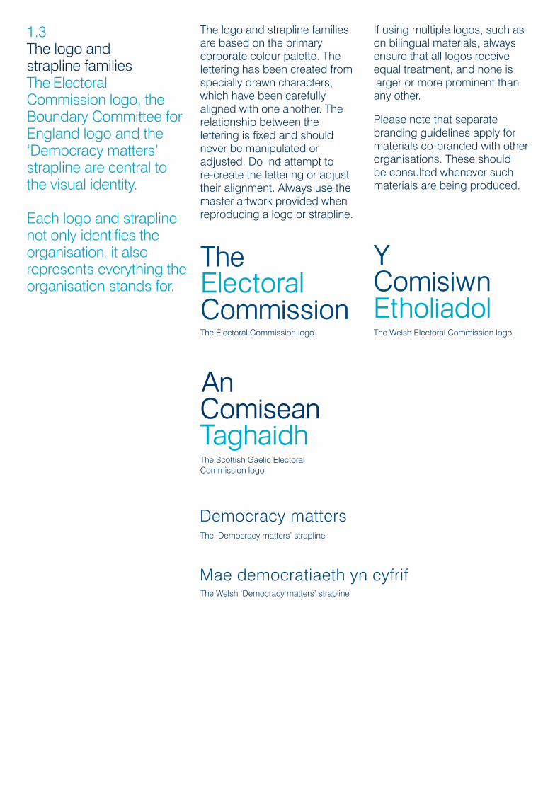
1.3The logo and strapline familiesThe ElectoralCommission logo, theBoundary Committee forEngland logo and the‘Democracy matters’strapline are central tothe visual identity.
Each logo and straplinenot only identifies theorganisation, it alsorepresents everything theorganisation stands for.
The logo and strapline familiesare based on the primarycorporate colour palette. Thelettering has been created fromspecially drawn characters,which have been carefullyaligned with one another. Therelationship between thelettering is fixed and shouldnever be manipulated oradjusted. Do not attempt to re-create the lettering or adjusttheir alignment. Always use themaster artwork provided whenreproducing a logo or strapline.
The Electoral Commission logo The Welsh Electoral Commission logo
The Scottish Gaelic Electoral Commission logo
If using multiple logos, such ason bilingual materials, alwaysensure that all logos receiveequal treatment, and none islarger or more prominent thanany other.
Please note that separatebranding guidelines apply formaterials co-branded with otherorganisations. These shouldbe consulted whenever suchmaterials are being produced.
The ‘Democracy matters’ strapline
The Welsh ‘Democracy matters’ strapline
80% (40mm high) for use on A3 materials
60% (30mm high) for use on A4 materials
30% (15mm high) for minimum use 40% (20mm high) for use on A5 materials
Minimum clear space zonePlease noteThe keyline letter ‘n’ denotesthe minimum clear space; they do not print.
40mm high
Increased clear space zone, for use on second party materials, e.g. advertising campaigns
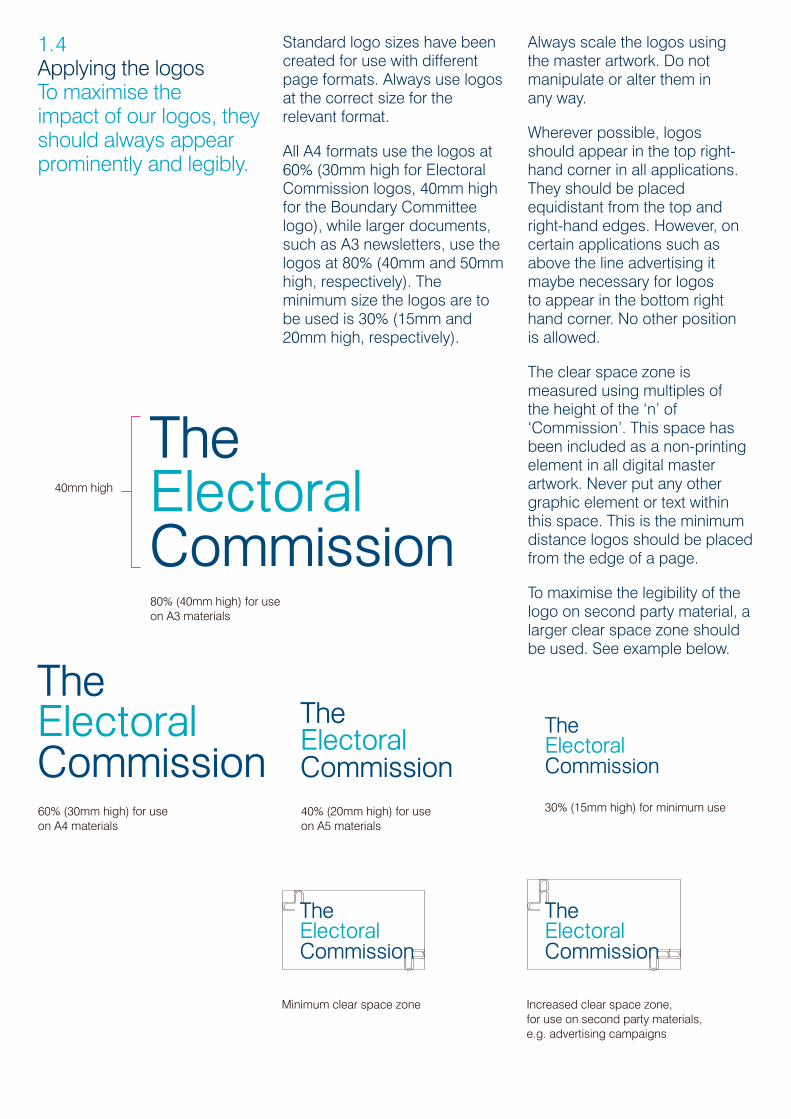
1.4Applying the logosTo maximise the impact of our logos, theyshould always appearprominently and legibly.
Standard logo sizes have been created for use with differentpage formats. Always use logosat the correct size for therelevant format.
All A4 formats use the logos at60% (30mm high for ElectoralCommission logos, 40mm highfor the Boundary Committeelogo), while larger documents,such as A3 newsletters, use thelogos at 80% (40mm and 50mmhigh, respectively). Theminimum size the logos are tobe used is 30% (15mm and20mm high, respectively).
Always scale the logos using the master artwork. Do notmanipulate or alter them in any way.
Wherever possible, logos should appear in the top right-hand corner in all applications.They should be placedequidistant from the top andright-hand edges. However, oncertain applications such asabove the line advertising itmaybe necessary for logos to appear in the bottom righthand corner. No other position is allowed.
The clear space zone ismeasured using multiples of the height of the ‘n’ of‘Commission’. This space hasbeen included as a non-printingelement in all digital masterartwork. Never put any othergraphic element or text withinthis space. This is the minimumdistance logos should be placedfrom the edge of a page.
To maximise the legibility of thelogo on second party material, alarger clear space zone shouldbe used. See example below.

1.5Applying the straplinesTo maximise the impact of the‘Democracy matters’strapline, it shouldalways appearprominently and legibly.
Standard strapline sizes havebeen created for use withdifferent page formats. Alwaysuse straplines at the correct sizefor the relevant format.
All A4 formats use the straplinesat 60%, while larger documents,such as A3 newsletters, use thestraplines at 80%. A5 formatsshould use the strapline at 40%These sizes are such that theEnglish-language strapline shouldappear at the same width as theword ‘Commission’ of the logo,as shown below. Welsh materialsshould also use the strapline atthe same percentages, but the‘same width’ rule will not apply asthe Welsh strapline is wider thanthe English.
Wherever possible, thestraplines should appear in thebottom left-hand corner in allapplications. They should beplaced equidistant from thebottom and left-hand edges.If placed in another corner, theyshould still be equidistant fromthe nearest two edges.
The clear space zone ismeasured using multiples of theheight of the ‘e’ of ‘Democracy’.This space has been includedas a non-printing element in alldigital master artwork. Never putany other graphic element or textwithin this space. This is theminimum distance the logosshould be placed from theedge of a page.
80% for use on A3 materials
The logo and strapline should be presented atthe same percentage – thus the same width
The Welsh logo and strapline should be presented atthe same percentage
60% for use on A4 materials
40% for use on A5 materials
Minimum clear space zone
eeee
10
1010
1027
7
5 5 5 5 5 1027.5 27.5 27.5 27.5 27.5 27.5
Logo positioningDL examples
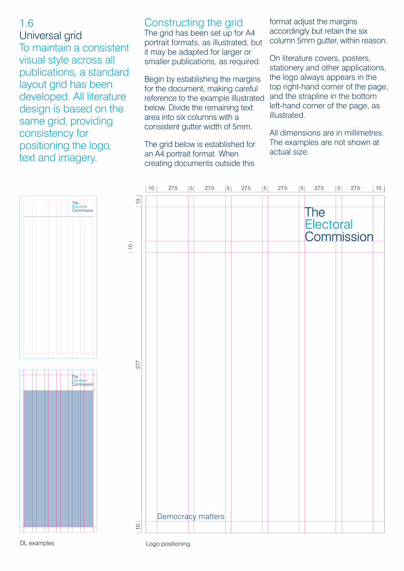
1.6Universal gridTo maintain a consistentvisual style across allpublications, a standardlayout grid has beendeveloped. All literaturedesign is based on thesame grid, providingconsistency forpositioning the logo, text and imagery.
Constructing the gridThe grid has been set up for A4portrait formats, as illustrated, butit may be adapted for larger orsmaller publications, as required.
Begin by establishing the margins for the document, making carefulreference to the example illustratedbelow. Divide the remaining textarea into six columns with aconsistent gutter width of 5mm.
The grid below is established foran A4 portrait format. Whencreating documents outside this
format adjust the marginsaccordingly but retain the sixcolumn 5mm gutter, within reason.
On literature covers, posters,stationery and other applications,the logo always appears in thetop right-hand corner of the page,and the strapline in the bottomleft-hand corner of the page, asillustrated.
All dimensions are in millimetres.The examples are not shown atactual size.
Typography and imagery
2.02.0
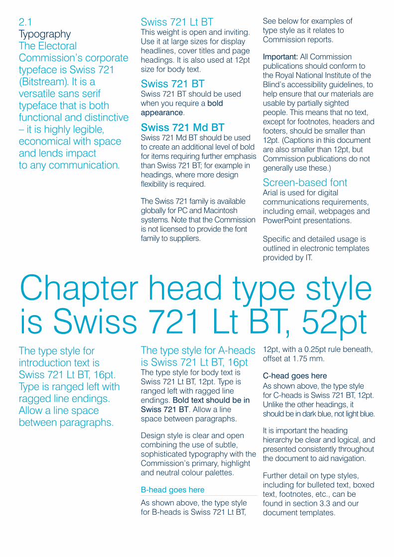
2.1TypographyThe ElectoralCommission’s corporatetypeface is Swiss 721(Bitstream). It is aversatile sans seriftypeface that is bothfunctional and distinctive– it is highly legible,economical with spaceand lends impact to any communication.
Swiss 721 Lt BTThis weight is open and inviting.Use it at large sizes for displayheadlines, cover titles and pageheadings. It is also used at 12ptsize for body text.
Swiss 721 BTSwiss 721 BT should be usedwhen you require a boldappearance.
Swiss 721 Md BTSwiss 721 Md BT should be usedto create an additional level of boldfor items requiring further emphasisthan Swiss 721 BT; for example inheadings, where more designflexibility is required.
The Swiss 721 family is availableglobally for PC and Macintoshsystems. Note that the Commissionis not licensed to provide the fontfamily to suppliers.
See below for examples of type style as it relates toCommission reports.
Important: All Commissionpublications should conform tothe Royal National Institute of theBlind’s accessibility guidelines, tohelp ensure that our materials areusable by partially sightedpeople. This means that no text,except for footnotes, headers andfooters, should be smaller than12pt. (Captions in this documentare also smaller than 12pt, butCommission publications do notgenerally use these.)
Screen-based fontArial is used for digitalcommunications requirements,including email, webpages andPowerPoint presentations.
Specific and detailed usage isoutlined in electronic templatesprovided by IT.
The type style forintroduction text isSwiss 721 Lt BT, 16pt.Type is ranged left withragged line endings.Allow a line spacebetween paragraphs.
The type style for A-headsis Swiss 721 Lt BT, 16ptThe type style for body text isSwiss 721 Lt BT, 12pt. Type isranged left with ragged lineendings. Bold text should be inSwiss 721 BT. Allow a line space between paragraphs.
Design style is clear and opencombining the use of subtle,sophisticated typography with theCommission’s primary, highlightand neutral colour palettes.
B-head goes here
As shown above, the type stylefor B-heads is Swiss 721 Lt BT,
12pt, with a 0.25pt rule beneath,offset at 1.75 mm.
C-head goes hereAs shown above, the type style for C-heads is Swiss 721 BT, 12pt.Unlike the other headings, itshould be in dark blue, not light blue.
It is important the headinghierarchy be clear and logical, andpresented consistently throughoutthe document to aid navigation.
Further detail on type styles,including for bulleted text, boxedtext, footnotes, etc., can befound in section 3.3 and ourdocument templates.
Chapter head type styleis Swiss 721 Lt BT, 52pt
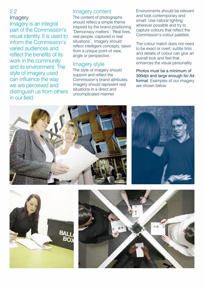
2.2ImageryImagery is an integralpart of the Commission’svisual identity. It is used toinform the Commission’svaried audiences andreflect the benefits of itswork in the communityand its environment. Thestyle of imagery used can influence the way we are perceived anddistinguish us from othersin our field.
Imagery contentThe content of photographsshould reflect a simple themeinspired by the brand positioning‘Democracy matters’: ‘Real lives,real people, captured in realsituations’. Imagery shouldreflect intelligent concepts, takenfrom a unique point of view,angle or perspective.
Imagery styleThe style of imagery shouldsupport and reflect theCommission’s brand attributes.Imagery should represent realsituations in a direct anduncomplicated manner.
Environments should be relevantand look contemporary andsmart. Use natural lightingwherever possible and try tocapture colours that reflect theCommission’s colour palettes.
The colour match does not need to be exact or overt; subtle tintsand details of colour can give anoverall look and feel thatenhances the visual personality.
Photos must be a minimum of300dpi and large enough for A4format. Examples of our imageryare shown below.

2.3IconographySymbols and icons arean important part of ourvisual identity. We usethem throughout ourcommunications tosimplify information orto clarify particularinstructions. Icons canalso be used to explaina process or to highlighta particular heading orparagraph.
When creating these icons it isimportant to remember that theaudience will need to recognisethem instantly.
Consideration must be given topeople with learning difficulties,people with English as a secondlanguage and people with visualimpairment.
A maximum of four levels ofstroke weight are used in eachicon: heavy, medium, light andextra light. As a general rule,icon corners should alwaysappear rounded and the icon’smain lines should be the samethickness as the bounding circle.
Icons are created at a minimumsize of 10mm, where themedium keyline weight is 1pt.When scaling up smaller icons,attention should be given to theproportionate size of keylinesand stroke weights.
Our icons can also be used asan illustration style, for exampleon a poster or cover design.When icons are used at a largesize they do not need to becontained within a circle.
For examples of the icons inuse, see section 3.

3.0
Commissionpublications
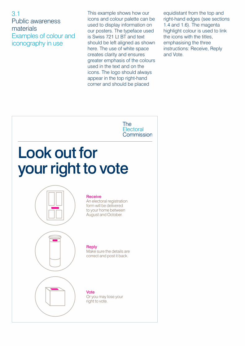
3.1Public awarenessmaterialsExamples of colour andiconography in use
Look out for your right to vote
ReceiveAn electoral registration form will be delivered to your home between August and October.
ReplyMake sure the details are correct and post it back.
VoteOr you may lose your right to vote.
This example shows how ouricons and colour palette can beused to display information onour posters. The typeface usedis Swiss 721 Lt BT and textshould be left aligned as shownhere. The use of white spacecreates clarity and ensuresgreater emphasis of the coloursused in the text and on theicons. The logo should alwaysappear in the top right-handcorner and should be placed
equidistant from the top andright-hand edges (see sections1.4 and 1.6). The magentahighlight colour is used to linkthe icons with the titles,emphasising the threeinstructions: Receive, Reply and Vote.
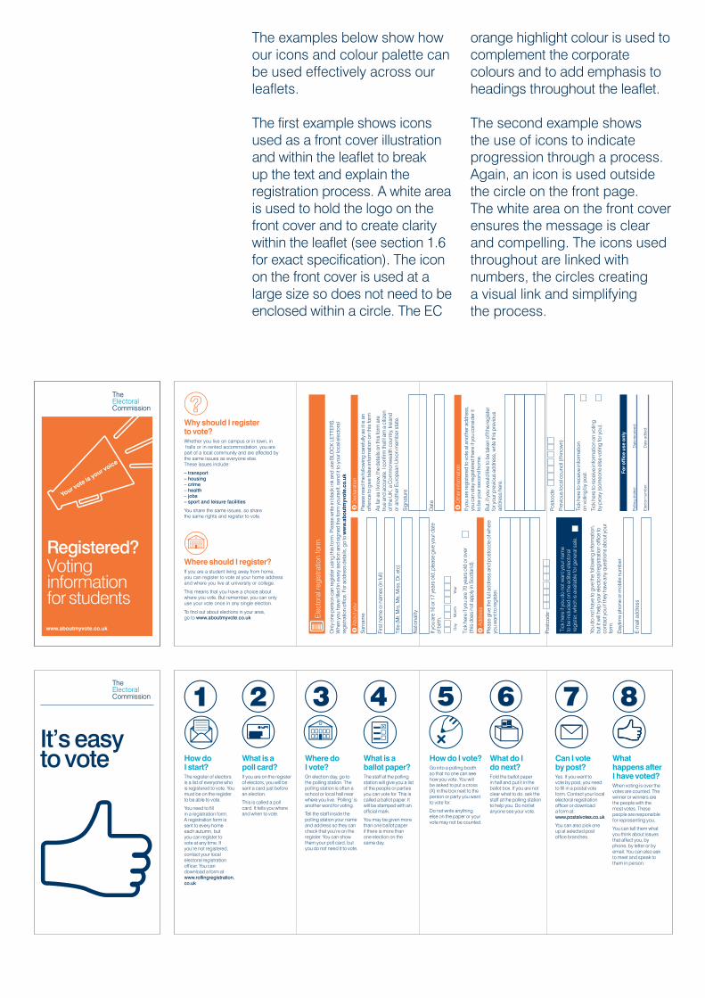
The examples below show howour icons and colour palette canbe used effectively across ourleaflets.
The first example shows iconsused as a front cover illustrationand within the leaflet to breakup the text and explain theregistration process. A white areais used to hold the logo on thefront cover and to create claritywithin the leaflet (see section 1.6for exact specification). The iconon the front cover is used at alarge size so does not need to beenclosed within a circle. The EC
orange highlight colour is used tocomplement the corporatecolours and to add emphasis toheadings throughout the leaflet.
The second example showsthe use of icons to indicateprogression through a process.Again, an icon is used outsidethe circle on the front page.The white area on the front coverensures the message is clearand compelling. The icons usedthroughout are linked withnumbers, the circles creatinga visual link and simplifyingthe process.
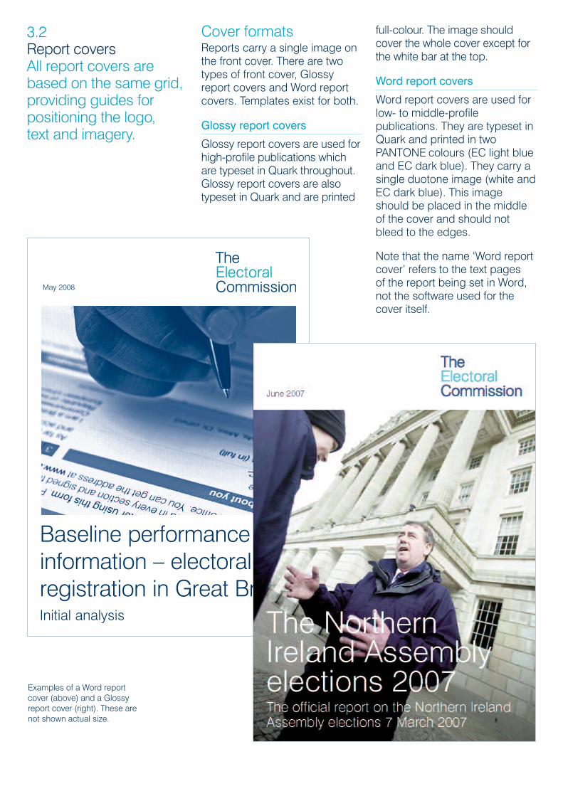
3.2Report covers All report covers arebased on the same grid,providing guides forpositioning the logo, text and imagery.
Cover formatsReports carry a single image onthe front cover. There are twotypes of front cover, Glossyreport covers and Word reportcovers. Templates exist for both.
Glossy report covers
Glossy report covers are used forhigh-profile publications whichare typeset in Quark throughout.Glossy report covers are alsotypeset in Quark and are printed
full-colour. The image shouldcover the whole cover except forthe white bar at the top.
Word report covers
Word report covers are used forlow- to middle-profilepublications. They are typeset inQuark and printed in twoPANTONE colours (EC light blueand EC dark blue). They carry asingle duotone image (white andEC dark blue). This imageshould be placed in the middleof the cover and should notbleed to the edges.
Note that the name ‘Word reportcover’ refers to the text pages of the report being set in Word,not the software used for thecover itself.
Examples of a Word reportcover (above) and a Glossyreport cover (right). These arenot shown actual size.
May 2008
Baseline performanceinformation – electoralregistration in Great BritainInitial analysis
Front covers and spinesGlossy report covers
For Glossy report covers, thetext sizes to use are:
• title in 64pt font
• subtitle in 29pt font
• date of publication in 18pt font
All text should be in either whiteor EC dark blue. If the coverimage allows it, the report titleshould appear at the foot of thepage, rather than at the top.
Word report covers
For Word report covers, the textsizes to use are:
• title in 48pt font
• subtitle in 30pt font
• date of publication in 16pt font
All text should be in EC darkblue.
Rules that apply to both Glossyand Word report covers
For both types of cover, theCommission logo should beplaced in the top right, at aconsistent size (60%, 30mmhigh for A4 reports).
Reports of more than 80pp willneed to be perfect bound andrequire a spine. This must givethe full title of the report (maintitle and subtitle) in 10pt fontsize and in white on a field of EC dark blue.
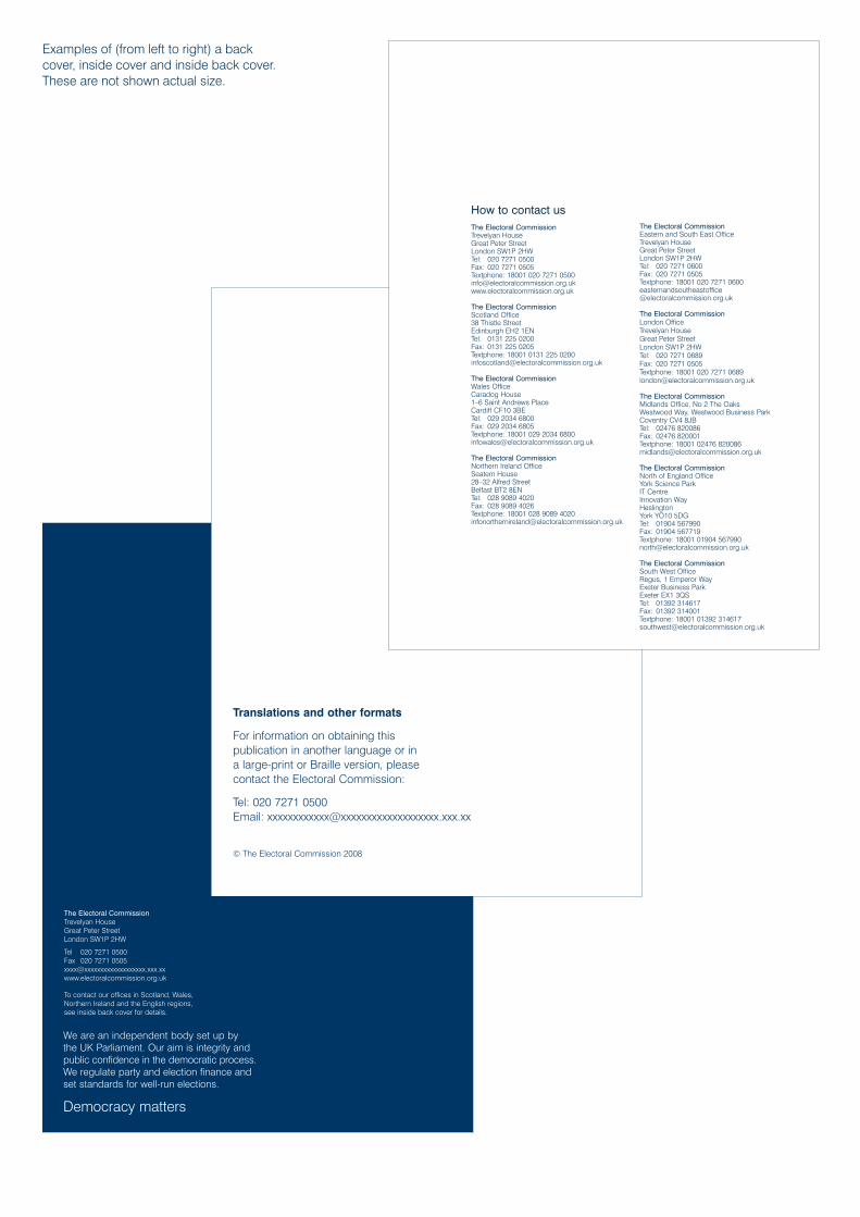
Inside and back coversThe inside and back coversshould be presented in thesame way on both Glossy andWord report covers.
The inside cover must carry allthe following information in ECdark blue in the bottom left:
• Translations and otherformats…text and contactdetails (16pt)
• copyright information
The inside back cover mustcarry contact details of all ouroffices in EC dark blue in thebottom right.
The back cover should be a fieldof EC dark blue and carry thefollowing information in white inthe bottom left:
• We are an independentbody…text
• Democracy matters
• address and contact details ofour Head Office and textdirecting the reader to theinside back cover for contactdetails of our other offices.
Note that back covers should nolonger carry our logo.
Examples of inside and backcovers are shown on thefollowing page.
3.3Rules for cover layoutThe following guidelinesshould be followed whenlaying out a cover,including inside andback covers.
We are an independent body set up by the UK Parliament. Our aim is integrity andpublic confidence in the democratic process.We regulate party and election finance andset standards for well-run elections.
Democracy matters
The Electoral CommissionTrevelyan HouseGreat Peter StreetLondon SW1P 2HW
Tel 020 7271 0500Fax 020 7271 0505xxxx@xxxxxxxxxxxxxxxxxxx.xxx.xxwww.electoralcommission.org.uk
To contact our offices in Scotland, Wales,Northern Ireland and the English regions, see inside back cover for details.
Examples of (from left to right) a backcover, inside cover and inside back cover.These are not shown actual size.
Translations and other formats
For information on obtaining this publication in another language or in a large-print or Braille version, please contact the Electoral Commission:
Tel: 020 7271 0500Email: [email protected]
© The Electoral Commission 2008
How to contact usThe Electoral CommissionTrevelyan HouseGreat Peter StreetLondon SW1P 2HWTel: 020 7271 0500Fax: 020 7271 0505Textphone: 18001 020 7271 0500info@electoralcommission.org.ukwww.electoralcommission.org.uk
The Electoral CommissionScotland Office38 Thistle StreetEdinburgh EH2 1ENTel: 0131 225 0200Fax: 0131 225 0205Textphone: 18001 0131 225 [email protected]
The Electoral CommissionWales OfficeCaradog House1–6 Saint Andrews PlaceCardiff CF10 3BETel: 029 2034 6800Fax: 029 2034 6805Textphone: 18001 029 2034 [email protected]
The Electoral CommissionNorthern Ireland OfficeSeatem House28–32 Alfred StreetBelfast BT2 8ENTel: 028 9089 4020Fax: 028 9089 4026Textphone: 18001 028 9089 [email protected]
The Electoral CommissionEastern and South East OfficeTrevelyan HouseGreat Peter StreetLondon SW1P 2HWTel: 020 7271 0600Fax: 020 7271 0505Textphone: 18001 020 7271 [email protected]
The Electoral CommissionLondon OfficeTrevelyan HouseGreat Peter StreetLondon SW1P 2HWTel: 020 7271 0689Fax: 020 7271 0505Textphone: 18001 020 7271 [email protected]
The Electoral CommissionMidlands Office, No 2 The OaksWestwood Way, Westwood Business ParkCoventry CV4 8JBTel: 02476 820086Fax: 02476 820001Textphone: 18001 02476 [email protected]
The Electoral CommissionNorth of England OfficeYork Science ParkIT CentreInnovation WayHeslingtonYork YO10 5DGTel: 01904 567990Fax: 01904 567719Textphone: 18001 01904 [email protected]
The Electoral CommissionSouth West OfficeRegus, 1 Emperor WayExeter Business ParkExeter EX1 3QSTel: 01392 314617Fax: 01392 314001Textphone: 18001 01392 [email protected]
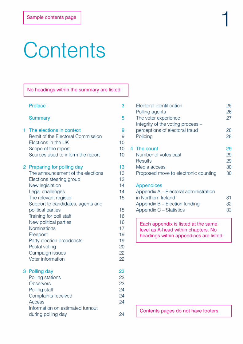
3.4Structuring reports All reports follow astandard stucture, whichdetermines the orderingand format of thedifferent sections.
Contents pageChapter heads are displayedand numbered in theCommission’s light blue; A-heads are displayed in darkblue. No levels of heading belowA-heads are displayed.Information is given in two-column format. Ensure that A-heads are not orphaned fromthe chapter heads betweencolumns.
Where text carries over onto asecond line (or more), align thenumber on the bottom line.Appendix titles are given in fullas A-heads.
List of tables and figures,acknowledgements,preface and summaryThese sections of a publicationare not numbered chapters.They come between thecontents page and the firstchapter and must start on arecto (right-hand page). Allreports have a summary(formerly executive summary),but the other sections areoptional. If the report has apreface, use an image of theperson who wrote the prefacefor the opposite page.
The preface and summary muststart with a pullout paragraph, toappear in 16pt font size and inthe Commission’s light blue.This paragraph should fit intothe first column of the first page.No body text should be placedbelow it. It should not flow intothe second column. If footnotesare cited in the pulloutparagraph, they can appear atthe foot of the column.
ChaptersNew chapters must start on arecto. Chapters must benumbered sequentially (1, 2, 3,
etc.) and this should be reflectedin the contents page.
Chapters must begin with apullout paragraph – this shouldfollow the same rules as with thepullouts for the preface andsummary.
Paragraphs within chaptersshould be numbered (seeNumbering below).
Verso pagesNew chapters must not begin ona verso (left-hand page). Wherethe verso preceding a newchapter is blank, a full-pageimage in a dark blue duotonemust be inserted.
AppendicesThe initial appendix must starton a recto, but subsequentappendices can start on versos.
Appendix A, B, C, etc. mustappear as the main (chapter)heading, in 52pt font size and inthe Commission’s light blue. Ifthere is a subtitle, this mustappear below the chapterheading in 31pt font size, also inlight blue. Headings should thenfollow the usual style (A-head, B-head, C-head).
There is no need for a pulloutparagraph. Paragraphs are notnumbered in appendices.
Footers take the following form –title of report: appendix letter. Ifthere is a subtitle, this is notincluded in the footer. Forexample:
Compulsory voting around theworld: appendix A
Samples of the contentspage, summary and chapterfirst page styles are shownon the following pages.
1Contents
Electoral identification 25Polling agents 26The voter experience 27Integrity of the voting process – perceptions of electoral fraud 28Policing 28
4 The count 29Number of votes cast 29Results 29Media access 30Proposed move to electronic counting 30
Appendices Appendix A – Electoral administration in Northern Ireland 31Appendix B – Election funding 32Appendix C – Statistics 33
Preface 3
Summary 5
1 The elections in context 9Remit of the Electoral Commission 9Elections in the UK 10Scope of the report 10Sources used to inform the report 10
2 Preparing for polling day 13The announcement of the elections 13Elections steering group 13New legislation 14Legal challenges 14The relevant register 15Support to candidates, agents and political parties 15Training for poll staff 16New political parties 16Nominations 17Freepost 19Party election broadcasts 19Postal voting 20Campaign issues 22Voter information 22
3 Polling day 23Polling stations 23Observers 23Polling staff 24Complaints received 24Access 24Information on estimated turnout during polling day 24
Sample contents page
Each appendix is listed at the samelevel as A-head within chapters. Noheadings within appendices are listed.
No headings within the summary are listed
Contents pages do not have footers

Sample first page of summary
Summary
Elections in Northern Ireland have undergone a considerabletransformation in the last few years.Electoral administration wasfundamentally changed by theintroduction of the Electoral FraudAct in 2002, which introducedindividual registration andrequirements for photographicidentification at polling stations.These changes have formed thebedrock for increased confidencein the electoral system, which isseen in a more accurate and robustelectoral register and electionslargely free from allegations offraud. This in turn has enabled theChief Electoral Officer to focus onfurther improving the quality ofelectoral administration.
BackgroundAs in 2003, planning for the 2007 Northern IrelandAssembly elections took place against thebackdrop of some uncertainty in the politicalprocess. Improvements in electoral administrationare reflected in the voters’ experience where ninein 10 (90%) of those interviewed in our post-election public opinion survey said they wereeither very or fairly satisfied with their overallexperience of the elections. These positive viewswere endorsed by the political parties, candidates,representatives of civic society and the media,none of whom raised any significant issues ofconcern with the Commission.
Electoral Administration Act 2006Future elections in Northern Ireland will benefitfrom the introduction of the ElectoralAdministration Act 2006, which was notintroduced in Northern Ireland in time for theMarch elections. The Northern Ireland Officeplans to commence the provisions of the Act forUK Parliamentary general elections before theParliamentary recess in summer 2007, after whichthe provisions will be applied to Northern IrelandAssembly and local government elections. Theprovisions include allowing people to register tovote up to 11 days before polling day and willintroduce changes to political party descriptions.The May 2007 elections in England, Scotland andWales have provided important learning pointson the application of the Act in Northern Ireland.
The Northern Ireland Assembly elections 2007: summary
5
Paragraphs in summaries and prefacesare not numbered
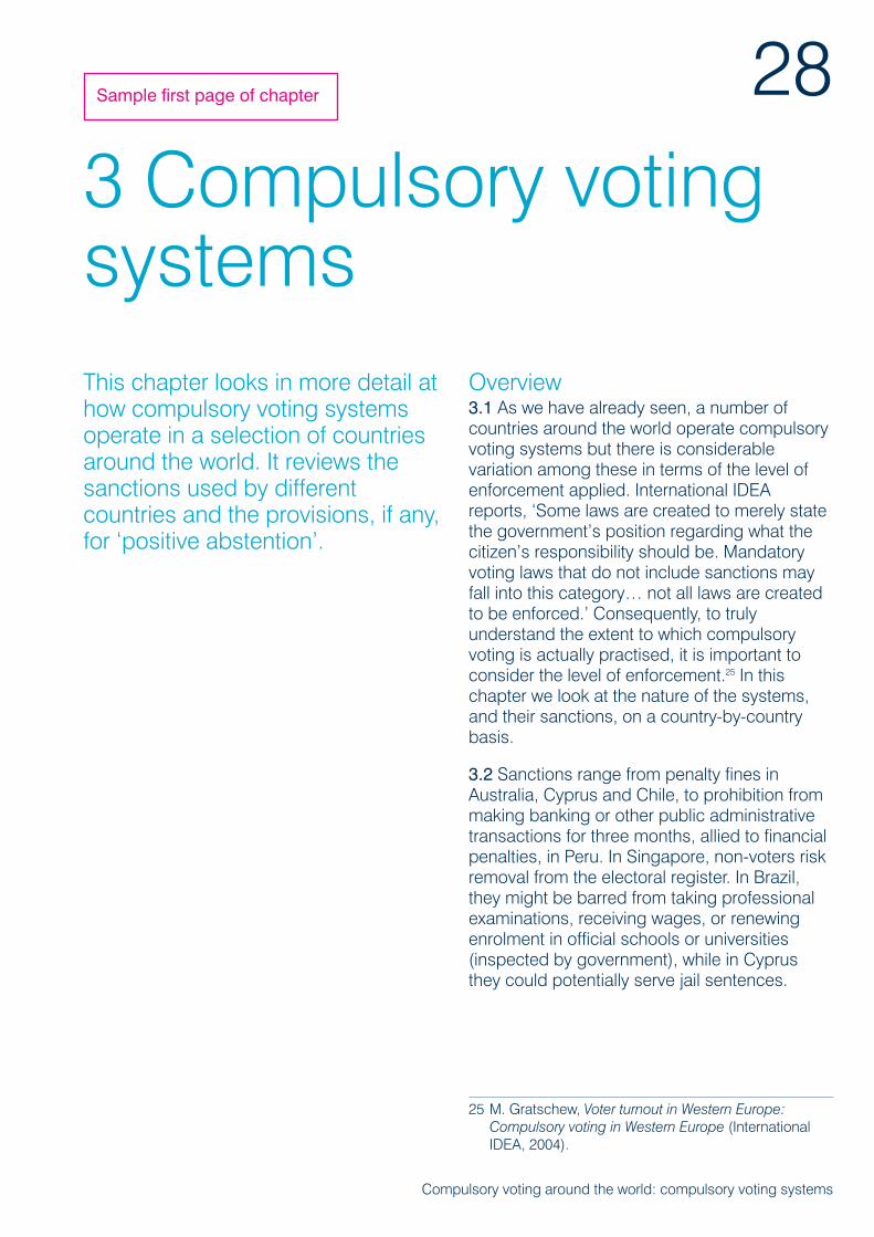
3 Compulsory votingsystemsThis chapter looks in more detail athow compulsory voting systemsoperate in a selection of countriesaround the world. It reviews thesanctions used by differentcountries and the provisions, if any,for ‘positive abstention’.
Overview3.1 As we have already seen, a number ofcountries around the world operate compulsoryvoting systems but there is considerablevariation among these in terms of the level ofenforcement applied. International IDEAreports, ‘Some laws are created to merely statethe government’s position regarding what thecitizen’s responsibility should be. Mandatoryvoting laws that do not include sanctions mayfall into this category… not all laws are createdto be enforced.’ Consequently, to trulyunderstand the extent to which compulsoryvoting is actually practised, it is important toconsider the level of enforcement.25 In thischapter we look at the nature of the systems,and their sanctions, on a country-by-countrybasis.
3.2 Sanctions range from penalty fines inAustralia, Cyprus and Chile, to prohibition frommaking banking or other public administrativetransactions for three months, allied to financialpenalties, in Peru. In Singapore, non-voters riskremoval from the electoral register. In Brazil,they might be barred from taking professionalexaminations, receiving wages, or renewingenrolment in official schools or universities(inspected by government), while in Cyprusthey could potentially serve jail sentences.
Compulsory voting around the world: compulsory voting systems
28
25 M. Gratschew, Voter turnout in Western Europe:Compulsory voting in Western Europe (InternationalIDEA, 2004).
Sample first page of chapter
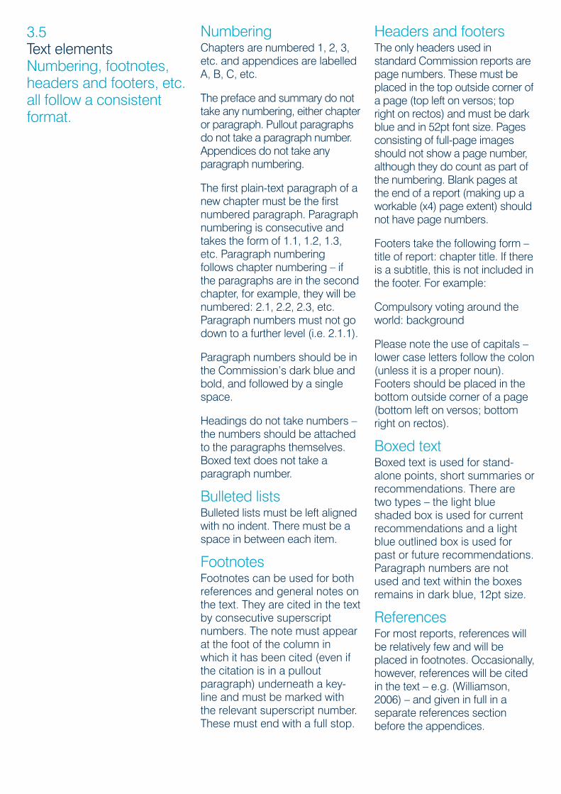
3.5Text elements Numbering, footnotes,headers and footers, etc.all follow a consistentformat.
NumberingChapters are numbered 1, 2, 3,etc. and appendices are labelledA, B, C, etc.
The preface and summary do nottake any numbering, either chapteror paragraph. Pullout paragraphsdo not take a paragraph number.Appendices do not take anyparagraph numbering.
The first plain-text paragraph of anew chapter must be the firstnumbered paragraph. Paragraphnumbering is consecutive andtakes the form of 1.1, 1.2, 1.3,etc. Paragraph numberingfollows chapter numbering – ifthe paragraphs are in the secondchapter, for example, they will benumbered: 2.1, 2.2, 2.3, etc.Paragraph numbers must not godown to a further level (i.e. 2.1.1).
Paragraph numbers should be inthe Commission’s dark blue andbold, and followed by a singlespace.
Headings do not take numbers –the numbers should be attachedto the paragraphs themselves.Boxed text does not take aparagraph number.
Bulleted listsBulleted lists must be left alignedwith no indent. There must be aspace in between each item.
FootnotesFootnotes can be used for bothreferences and general notes onthe text. They are cited in the textby consecutive superscriptnumbers. The note must appearat the foot of the column inwhich it has been cited (even ifthe citation is in a pulloutparagraph) underneath a key-line and must be marked withthe relevant superscript number.These must end with a full stop.
Headers and footersThe only headers used instandard Commission reports arepage numbers. These must beplaced in the top outside corner ofa page (top left on versos; topright on rectos) and must be darkblue and in 52pt font size. Pagesconsisting of full-page imagesshould not show a page number,although they do count as part ofthe numbering. Blank pages atthe end of a report (making up aworkable (x4) page extent) shouldnot have page numbers.
Footers take the following form –title of report: chapter title. If thereis a subtitle, this is not included inthe footer. For example:
Compulsory voting around theworld: background
Please note the use of capitals –lower case letters follow the colon(unless it is a proper noun).Footers should be placed in thebottom outside corner of a page(bottom left on versos; bottomright on rectos).
Boxed textBoxed text is used for stand-alone points, short summaries orrecommendations. There aretwo types – the light blueshaded box is used for currentrecommendations and a lightblue outlined box is used forpast or future recommendations.Paragraph numbers are notused and text within the boxesremains in dark blue, 12pt size.
ReferencesFor most reports, references willbe relatively few and will beplaced in footnotes. Occasionally,however, references will be citedin the text – e.g. (Williamson,2006) – and given in full in aseparate references sectionbefore the appendices.
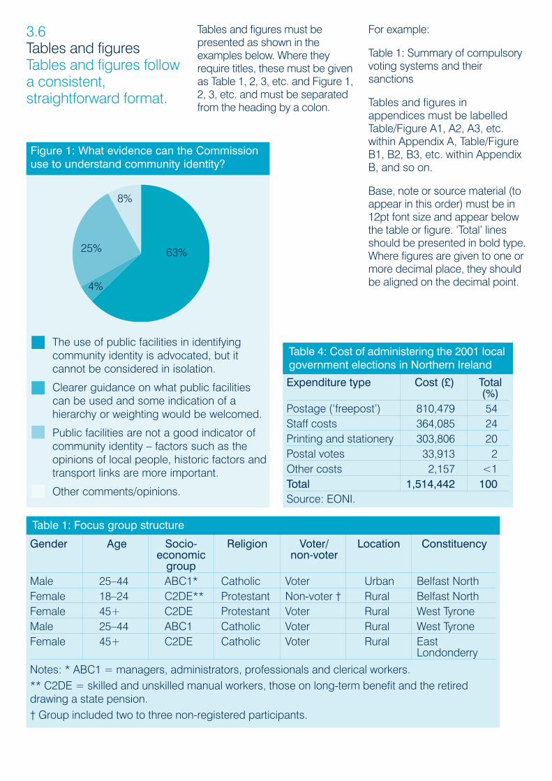
Tables and figures must bepresented as shown in theexamples below. Where theyrequire titles, these must be givenas Table 1, 2, 3, etc. and Figure 1,2, 3, etc. and must be separatedfrom the heading by a colon.
For example:
Table 1: Summary of compulsoryvoting systems and theirsanctions
Tables and figures inappendices must be labelledTable/Figure A1, A2, A3, etc.within Appendix A, Table/FigureB1, B2, B3, etc. within AppendixB, and so on.
Base, note or source material (toappear in this order) must be in12pt font size and appear belowthe table or figure. ‘Total’ linesshould be presented in bold type.Where figures are given to one ormore decimal place, they shouldbe aligned on the decimal point.
3.6Tables and figures Tables and figures followa consistent,straightforward format.
Expenditure type Cost (£) Total (%)
Postage (‘freepost’) 810,479 54Staff costs 364,085 24Printing and stationery 303,806 20Postal votes 33,913 2Other costs 2,157 <1Total 1,514,442 100Source: EONI.
Table 4: Cost of administering the 2001 localgovernment elections in Northern Ireland
Figure 1: What evidence can the Commissionuse to understand community identity?
The use of public facilities in identifyingcommunity identity is advocated, but itcannot be considered in isolation.
Clearer guidance on what public facilitiescan be used and some indication of ahierarchy or weighting would be welcomed.
Public facilities are not a good indicator ofcommunity identity – factors such as theopinions of local people, historic factors andtransport links are more important.
Other comments/opinions.
Gender Age Socio- Religion Voter/ Location Constituencyeconomic non-votergroup
Male 25–44 ABC1* Catholic Voter Urban Belfast NorthFemale 18–24 C2DE** Protestant Non-voter † Rural Belfast NorthFemale 45+ C2DE Protestant Voter Rural West TyroneMale 25–44 ABC1 Catholic Voter Rural West TyroneFemale 45+ C2DE Catholic Voter Rural East
Londonderry
Notes: * ABC1 = managers, administrators, professionals and clerical workers.** C2DE = skilled and unskilled manual workers, those on long-term benefit and the retireddrawing a state pension.† Group included two to three non-registered participants.
Table 1: Focus group structure
63%
4%
25%
8%
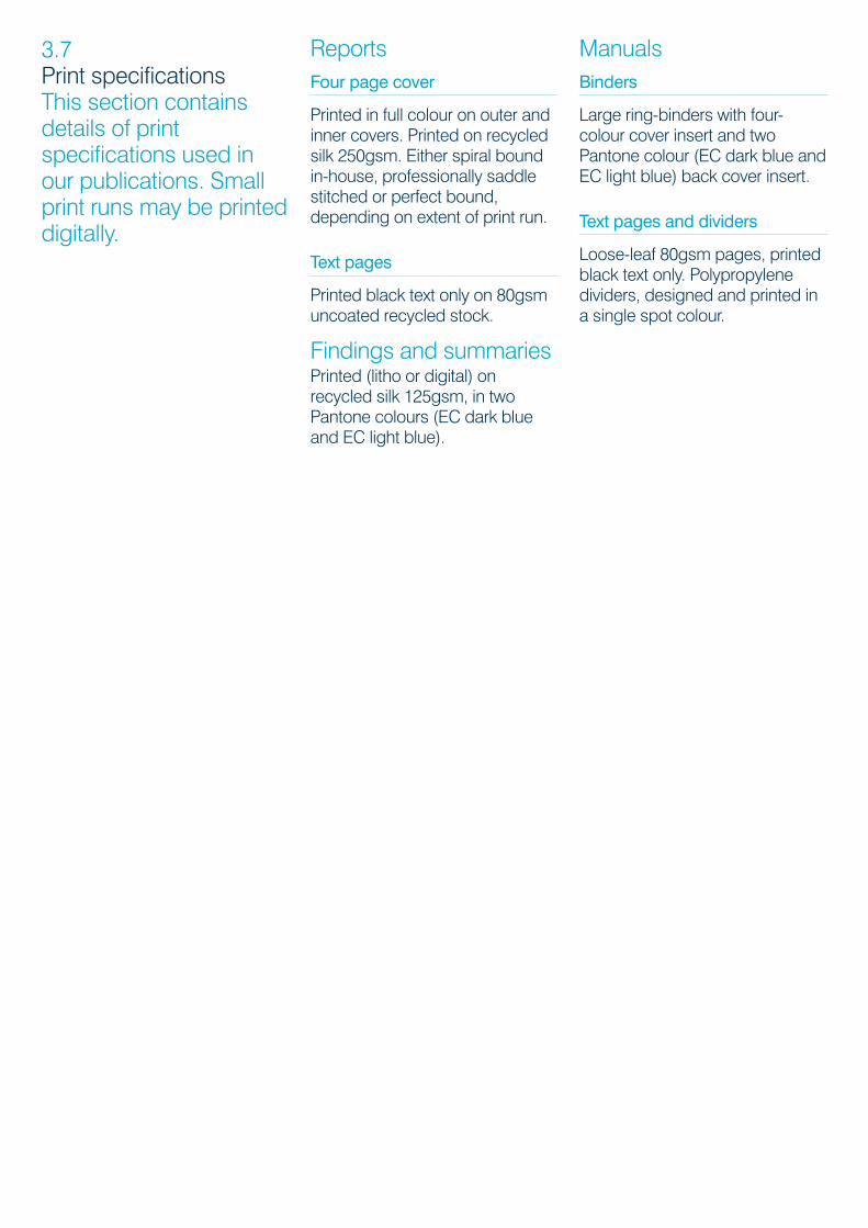
ReportsFour page cover
Printed in full colour on outer andinner covers. Printed on recycledsilk 250gsm. Either spiral boundin-house, professionally saddlestitched or perfect bound,depending on extent of print run.
Text pages
Printed black text only on 80gsmuncoated recycled stock.
Findings and summariesPrinted (litho or digital) onrecycled silk 125gsm, in twoPantone colours (EC dark blueand EC light blue).
ManualsBinders
Large ring-binders with four-colour cover insert and twoPantone colour (EC dark blue andEC light blue) back cover insert.
Text pages and dividers
Loose-leaf 80gsm pages, printedblack text only. Polypropylenedividers, designed and printed ina single spot colour.
3.7Print specifications This section containsdetails of printspecifications used inour publications. Smallprint runs may be printeddigitally.

Contact details
4.0
4.1CorporateCommunication team If you have anyquestions, pleasecontact a member of the CorporateCommunication team.
The Corporate Communicationteam is based at the ElectoralCommission’s Head Office:
The Electoral CommissionTrevelyan HouseGreat Peter StreetLondon SW1P 2HW
www.electoralcommission.org.uk
Corinne LeongCorporate CommunicationManagerTel 020 7271 0532Fax 020 7271 [email protected]
Jessica BishopSenior CorporateCommunication Officer(Publications and Branding)Tel 020 7271 0536Fax 020 7271 [email protected]
Lisa TollidayCorporate CommunicationOfficer (Publications and Branding)Tel 020 7271 0535Fax 020 7271 [email protected]