hurme geometric sanshurmedesign.fi/hurmegeometricsans_no3_specimen.pdf · hurme geometric sans...
TRANSCRIPT
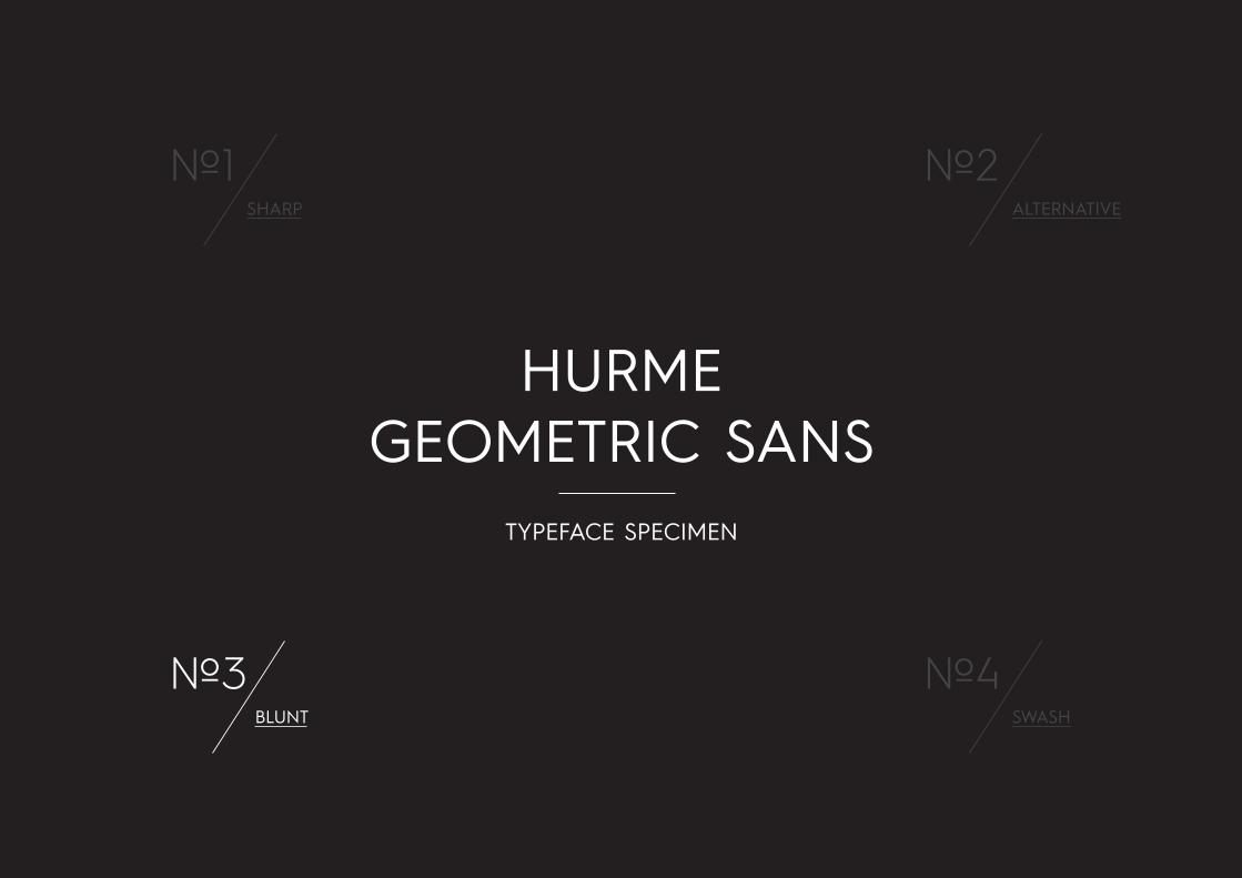
HURME GEOMETRIC SANS
SHARP
No.1ALTERNATIVE
No.2
BLUNT
No.3SWASH
No.4
TYPEFACE SPECIMEN

Black Black ObliqueBoldBold Oblique SemiBold SemiBold ObliqueRegularRegular Oblique LightLight Oblique Thin Thin ObliqueHairline Hairline Oblique
Black Black ObliqueBoldBold Oblique SemiBold SemiBold ObliqueRegularRegular Oblique LightLight Oblique Thin Thin ObliqueHairline Hairline Oblique
Black Black ObliqueBoldBold Oblique SemiBold SemiBold ObliqueRegularRegular Oblique LightLight Oblique Thin Thin ObliqueHairline Hairline Oblique
Black Black ObliqueBoldBold Oblique SemiBold SemiBold ObliqueRegularRegular Oblique LightLight Oblique Thin Thin ObliqueHairline Hairline Oblique
No1 HURMEGEOMETRICSANS No2 HURME
GEOMETRICSANS No3 HURME
GEOMETRICSANS No4 HURME
GEOMETRICSANS
Hurme Geometric Sans Typeface Specimen 04/8/2013 2
Hurme Geometric Sans © 2012 Hurme Design. www.hurmedesign.fi

Bijoux Falls
HALFBREEDsurprisingly poignant.
MEADOW VALLEY
ANTIRAPEE MANAGERI
Forældre forstår man først at påskønne
No need to worry, my accountant handles that
SECRET TUNNELS
Calçado é uma peça
kilogramThe 19" (482.6 mm) standard rack arrangement
A SMOOTH SEA NEVER MADE A SKILLFUL SAILORJe n'aime pas mélanger l'or et l'argent
No3 HURMEGEOMETRICSANS
Hurme Geometric Sans Family overview 04/08/13 3
Hurme Geometric Sans © 2012 Hurme Design.
OverviewHurme Geometric Sans No.3 includes seven weights with true SmallCaps and obliques. Alternate characters and other Opentype features make for a versatile family that can be adjusted for specific needs. See pages 8-12 for complete view of the Opentype features.
Hurme Geometric Sans No.3 is a part of the Hurme Geometric Sans font family. Please see www.hurmedesign.fi for more information.
No.3 - Black Oblique, Caps. SS 03 on.
No.3 - Regular, Caps.
No.3 - Bold. SS 02 on.
No.3 - Black.
No.3 - Light Oblique. SS 02 on.
No.3 - Light, SmallCaps. SS 04 on.
No.3 - Hairline. SS 07 (alternate j) on.
No.3 - Black, Caps. SS 04 and SS 05 on.
No.3 - Thin Oblique. SS 06 on.
No.3 - SemiBold, Caps.
No.3 - Light Oblique, Caps.
No.3 - Light. SS 06 on.
No.3 - Bold.

BLUNTNo3 HURME
GEOMETRICSANS
Hurme Geometric Sans No.1 has sharp corners. All corners found in HGS No.1 have been clipped and straightened in HGS No.3. Here all character shapes follow the caps height and baseline levels. This makes it the most effective of the Hurme Geometric Sans series in smaller sizes.
The Titling Alternate -feature will move all diacritics between baseline and caps height, allowing a very tight leading.
Hurme Geometric Sans Typeface Specimen 04/8/2013 4
Hurme Geometric Sans © 2012 Hurme Design. www.hurmedesign.fi
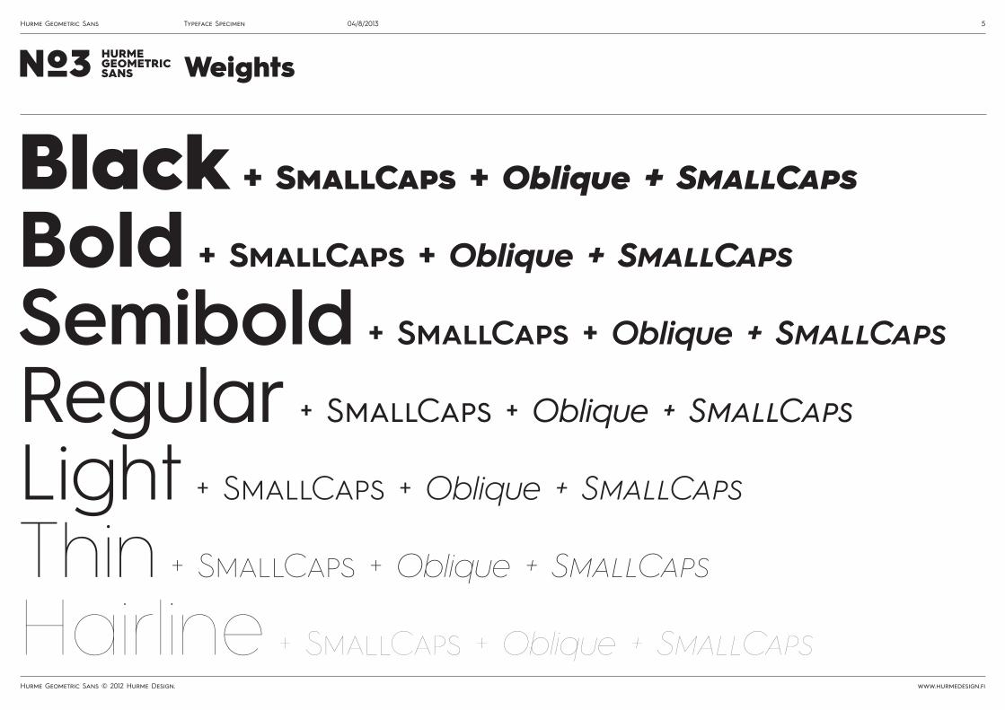
WeightsNo3 HURMEGEOMETRICSANS
Black + SmallCaps + Oblique + SmallCaps
Bold + SmallCaps + Oblique + SmallCaps
Semibold + SmallCaps + Oblique + SmallCaps
Regular + SmallCaps + Oblique + SmallCaps
Light + SmallCaps + Oblique + SmallCaps
Thin + SmallCaps + Oblique + SmallCaps
Hairline + SmallCaps + Oblique + SmallCaps
Hurme Geometric Sans Typeface Specimen 04/8/2013 5
Hurme Geometric Sans © 2012 Hurme Design. www.hurmedesign.fi
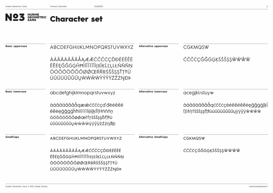
Basic uppercase
SmallCaps
Alternative uppercase
Alternative SmallCaps
Basic lowercase Alternative lowercase
ABCDEFGHIJKLMNOPQRSTUVWXYZ
ÀÁÂÃÄĀĂÅǺĄÆǼĆĈČĊÇĎĐÈÉÊĚËĒĔĖĘĜĞĠĢĤĦÌÍÎ Ĩ Ï Ī ĬİĮIJĴĶĹĽĻĿŁŃŇÑŅÒÓÔÕÖŌŎŐØǾŒŔŘŖŚŜŠȘŞŤŢŦÙÚÛŨÜŪŬŮŰŲẀẂŴẄỲÝŶŸŹŽŻŊÐÞ
abcdefghijklmnopqrstuvwxyz
àáâãäāăåǻąæǽćĉčċçďđèéêěëēĕėęĝğġģĥħìíî ĩïī ĭiIJįIJĵķĺľļŀłńňñņòóôõöōŏőøǿœŕřŗśŝšșşťţŧùúûũüūŭůűųẁẃŵẅỳýŷÿźžżŋðþ
CGKMQSW
ĆĈČĊÇĜĞĠĢĶŚŜŠȘŞẀẂŴẄ
cgkmqsw
ćĉčċçĝğġģķśŝšșşẁẃŵẅ
abcdefghijklmnopqrstuvwxyz
àáâãäāăåǻąæǽćĉčċçďđèéêěëēĕėęĝğġģĥħìí î ĩ ï ī ĭiįijĵķĺľļŀłńňñņòóôõöōŏőøǿœŕřŗśŝšșşßťţŧùúûũüūŭůűųẁẃŵẅỳýŷÿźžżŋðþ
acegjklrstuyw
àáâãäāăåǻąćĉčċçèéêěëēĕėęĝğġģĵķĺľļŀłŕŗřśŝšșşťţŧùúûũüūŭůűųỳýŷÿẁẃŵẅ
Character setNo3 HURMEGEOMETRICSANS
Hurme Geometric Sans Typeface Specimen 04/8/2013 6
Hurme Geometric Sans © 2012 Hurme Design. www.hurmedesign.fi

No3 HURMEGEOMETRICSANS
FiguresProportional Lining Proportional Oldstyle Tabular LIning NumeratorsDenumerators
FractionsPrebuilt Opentype
1234567890123456789012345678901234567890 123456789044444
½⅓⅔¼¾1234567890/1234567890
Titling Caps Titling Caps AlternativesÀÁÂÃÄĀĂÅǺĄǼĆĈČĊÇĎÈÉÊĚËĒĔĖĘĜĞĠĢĤÌÍÎĨÏĪĬİĮĴĶĹĻŃŇÑŅÒÓÔÕÖŌŎŐǾŔŘŖŚŜŠȘŞŤŢÙÚÛŨÜŪŬŮŰŲẀẂŴẄỲÝŶŸŹŽŻŊ
ĆĈČĊÇĜĞĠĢĶŚŜŠȘŞẀẂŴẄ
Standard punctuation All-Caps punctuation&?¿!¡/|\¦()[]•·@©(P)®™ℓ*ªº†‡No.§¶ .,:;…”“’‘‚„"'‹›«»-–—_
:;•·‹›«»/\-–—()[]¡¿@
All-Caps ArrowsArrows ←↑→↓↔←↑→↓↔
Mathematical symbols Currency symbols+−±×÷=≠#¬<>≤≥^°~≈/%‰∆Ωμπ∞∂∏◊∑√∫ $¢€£¥ƒ¤
Ligatures Ligaturesff fi fj fl ffi ffj ffl fj fl ffj ffl
Character set
Hurme Geometric Sans Typeface Specimen 04/8/2013 7
Hurme Geometric Sans © 2012 Hurme Design. www.hurmedesign.fi

Excellent
EXCELLENT
Excellent
excellent
LigaturesSubstitutes a sequence of glyphs with a single glyph, without collisions or awkward gaps between letters. Ligatures are on by default.
Discretionary ligaturesWhen activated from the Opentype menu, this fea-ture provides a quick access to some pre-designed glyphs trough certain character combi-nations. The grey boxes indicate a space character.
off on off off (optional) on
off on
off on
off on
SmallCaps + All to SmallCapsThis feature formats lowercase text as true small caps. Also formatting all text to small cap-itals supported.
AllCaps/Case-sensitive formsSubstitutes punctuation marks and symbols with their appro-priate capital forms automati-cally when All Caps is activat-ed. Note, that the forms are NOT actived by typing in Caps.
OrdinalsSubstitutes default alphabetic glyphs with corresponding pre-designed glyphs.
1a 2o No 1ª 2º No.
H:5 E-E@A (H) H:5 E-E@A (H)
-^ |^ ↑
Opentype featuresNo3 HURMEGEOMETRICSANS
-v |v ↓
TM ™
^\ <^
-> →
\v v>
<- ←
(P) (P)
No. No.
<|> ^|v
v/ <v
(C) ©
(R) ®
<-> ↔
l ℓ
/^ ^>
ff fi fj ffi ffjfj ffj
ff fi fj ffi ffj fj ffj
Hurme Geometric Sans Typeface Specimen 04/8/2013 8
Hurme Geometric Sans © 2012 Hurme Design. www.hurmedesign.fi

CGQSaceglstyCGQScegsKk
Cc
M
Gg
j
l
Ww
Q
r
t
a
Ss
u
y
4
CGKMQSWacegjklrstuwy4
CGQSaceglstyCGQScegsKk
Cc
M
Gg
j
l
Ww
Q
r
t
a
Ss
u
y
4
CGKMQSWacegjklrstuwy4
Stylistic AlternatesSubstitutes default characters with a selected set of alternative characters.
off on
off on off on
CGQSceglsty
CGQSceglsty
Stylistic SetsStylistic Sets
SS 01: Substitutes default characters with a selected set of alternative characters.
SS 02: Substitutes default characters with a selected set of alternative characters.
Opentype Stylistic Sets and Stylistic Alternates replace the default characters with alternative characters and/or character sets. For example, you can choose between vertical and slanted line terminals that match the curve angle.
SS 03: Substitute only K and k
SS 11: Substitute only C and c
SS 04: Substitute only M
SS 12: Substitute only G and g
SS 07: Substitute only j
SS 15: Substitute only l
SS 05: Substitute only W and w
SS 13: Substitute only Q
SS 08: Substitute only r
SS 16: Substitute only t
SS 06: Substitute only a
SS 14: Substitute only S and s
SS 09: Substitute only u
SS 17: Substitute only y
SS 10: Substitute only 4
SS 18: Substitute all alternatives
Gs GsOpentype featuresNo3 HURME
GEOMETRICSANS
Hurme Geometric Sans Typeface Specimen 04/8/2013 9
Hurme Geometric Sans © 2012 Hurme Design. www.hurmedesign.fi

1234567890 /123 H2O x571234567890 /123 H2O x57
Proportional Oldstyle figuresChanges figures from Proportional lining (default) to Oldstyle figures (numbers of varying height). These are suited to use with lowercase text.
NumeratorsSubstitutes numbers with superior figures.
off on off on
off on off on
off on
off on
1234567890 123/ x2=y2+z21234567890 123/ x2=y2+z2
Proportional Lining figuresChanges figures from other styles to the default Proportional Lining figures. Lining figures are of the same height as capitals, so they are best suited to use with all-
DenominatorsSubstitutes numbers with inferior figures.
Tabular Lining figuresAll numbers are switched to their corresponding versions of equal width.
FractionsIn addition to pre-designed fractions, this Opentype feature substitutes figures separated by slash with diagonal fractions. The feature ignores the numeric date format.
2 2/3 1234/1234
1234567890
2 2/3 1234/1234
1234567890
Opentype featuresNo3 HURMEGEOMETRICSANS
Hurme Geometric Sans Typeface Specimen 04/8/2013 10
Hurme Geometric Sans © 2012 Hurme Design. www.hurmedesign.fi

Titling alternatesSubstitutes all capitals with diacritics for alternates designed with diacritics below the caps height. This offers a more flexible way to design the layout in languages that use diacritics.
Titling alternates offDiacritics limit the line spacing.
Titling alternates onVery tight line spacing possible.
off on
ÀÁÂÃÄĀĂÅǺĄǼĆĈČĊÇĎÈÉÊĚËĒĔĖĘĜĞĠĢĤÌÍÎĨÏĪĬİĮĴĶĹĻŃŇÑŅÒÓÔÕÖŌŎŐǾŔŘŖŚŜŠȘŞŤŢÙÚÛŨÜŪŬŮŰŲẀẂŴẄỲÝŶŸŹŽŻ
ÀÁÂÃÄĀĂÅǺĄǼĆĈČĊÇĎÈÉÊĚËĒĔĖĘĜĞĠĢĤÌÍÎĨÏĪĬİĮĴĶĹĻŃŇÑŅÒÓÔÕÖŌŎŐǾŔŘŖŚŜŠ ȘŞŤŢÙÚÛŨÜŪŬŮŰŲẀẂŴẄỲÝŶŸŹŽŻ
Opentype featuresNo3 HURMEGEOMETRICSANS
PÚBLICA L'ÚL
FRÅN ÖVERSKRIFTER
FRAMFÖR ALLT PÅ LÖPSEDELNRÖYHKEÄSTÁTŮ SAMÝCH
ET ÜHINENUD RAHVASTE
DANS L'IDÉAL À RÉPONDRE
FRÅN ÖVERSKRIFTER
FRAMFÖR ALLT PÅ LÖPSEDELNRÖYHKEÄSTÁTŮ SAMÝCH
ET ÜHINENUD RAHVASTEPÚBLICA L'ÚLDANS L'IDÉAL À RÉPONDRE
Hurme Geometric Sans Typeface Specimen 04/8/2013 11
Hurme Geometric Sans © 2012 Hurme Design. www.hurmedesign.fi
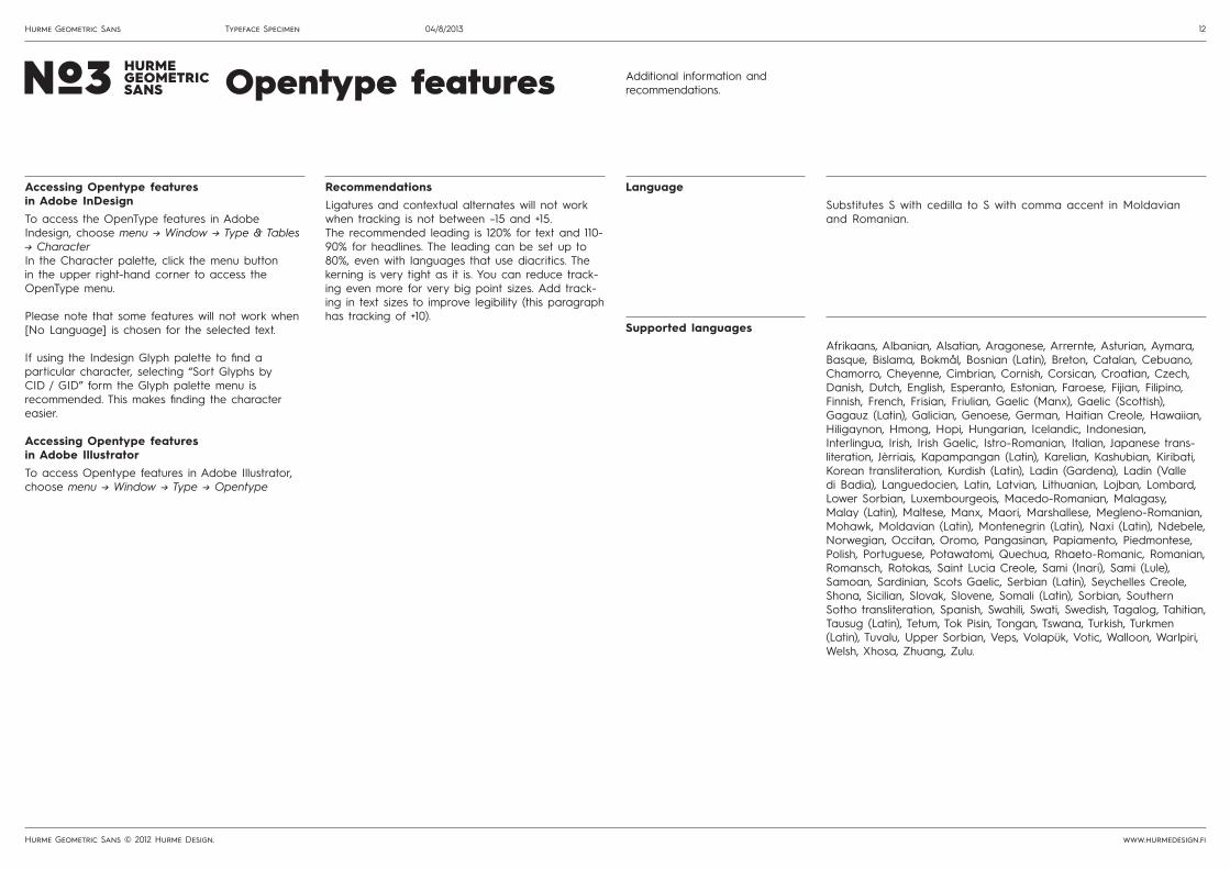
Additional information and recommendations.
Accessing Opentype features in Adobe InDesignTo access the OpenType features in Adobe Indesign, choose menu -> Window -> Type & Tables -> CharacterIn the Character palette, click the menu button in the upper right-hand corner to access the OpenType menu.
Please note that some features will not work when [No Language] is chosen for the selected text.
If using the Indesign Glyph palette to find a particular character, selecting “Sort Glyphs by CID / GID” form the Glyph palette menu is recommended. This makes finding the character easier.
Accessing Opentype features in Adobe IllustratorTo access Opentype features in Adobe Illustrator, choose menu -> Window -> Type -> Opentype
RecommendationsLigatures and contextual alternates will not work when tracking is not between –15 and +15.The recommended leading is 120% for text and 110-90% for headlines. The leading can be set up to 80%, even with languages that use diacritics. The kerning is very tight as it is. You can reduce track-ing even more for very big point sizes. Add track-ing in text sizes to improve legibility (this paragraph has tracking of +10).
Opentype featuresNo3 HURMEGEOMETRICSANS
Language
Supported languages
Substitutes S with cedilla to S with comma accent in Moldavian and Romanian.
Afrikaans, Albanian, Alsatian, Aragonese, Arrernte, Asturian, Aymara, Basque, Bislama, Bokmål, Bosnian (Latin), Breton, Catalan, Cebuano, Chamorro, Cheyenne, Cimbrian, Cornish, Corsican, Croatian, Czech, Danish, Dutch, English, Esperanto, Estonian, Faroese, Fijian, Filipino, Finnish, French, Frisian, Friulian, Gaelic (Manx), Gaelic (Scottish), Gagauz (Latin), Galician, Genoese, German, Haitian Creole, Hawaiian, Hiligaynon, Hmong, Hopi, Hungarian, Icelandic, Indonesian, Interlingua, Irish, Irish Gaelic, Istro-Romanian, Italian, Japanese trans-literation, Jèrriais, Kapampangan (Latin), Karelian, Kashubian, Kiribati, Korean transliteration, Kurdish (Latin), Ladin (Gardena), Ladin (Valle di Badia), Languedocien, Latin, Latvian, Lithuanian, Lojban, Lombard, Lower Sorbian, Luxembourgeois, Macedo-Romanian, Malagasy, Malay (Latin), Maltese, Manx, Maori, Marshallese, Megleno-Romanian, Mohawk, Moldavian (Latin), Montenegrin (Latin), Naxi (Latin), Ndebele, Norwegian, Occitan, Oromo, Pangasinan, Papiamento, Piedmontese, Polish, Portuguese, Potawatomi, Quechua, Rhaeto-Romanic, Romanian, Romansch, Rotokas, Saint Lucia Creole, Sami (Inari), Sami (Lule), Samoan, Sardinian, Scots Gaelic, Serbian (Latin), Seychelles Creole, Shona, Sicilian, Slovak, Slovene, Somali (Latin), Sorbian, Southern Sotho transliteration, Spanish, Swahili, Swati, Swedish, Tagalog, Tahitian, Tausug (Latin), Tetum, Tok Pisin, Tongan, Tswana, Turkish, Turkmen (Latin), Tuvalu, Upper Sorbian, Veps, Volapük, Votic, Walloon, Warlpiri, Welsh, Xhosa, Zhuang, Zulu.
Hurme Geometric Sans Typeface Specimen 04/8/2013 12
Hurme Geometric Sans © 2012 Hurme Design. www.hurmedesign.fi
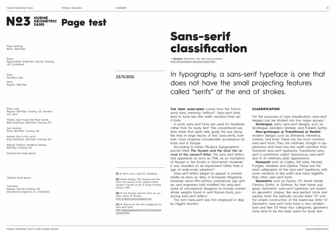
The term sans-serif comes from the French word sans, meaning “without”. Sans-serif fonts tend to have less line width variation than ser-if fonts.
In print, sans-serif fonts are used for headlines rather than for body text.1 The conventional wis-dom holds that serifs help guide the eye along the lines in large blocks of text. Sans-serifs, how-ever, have acquired considerable acceptance for body text in Europe.
According to James Mosley's Typographica journal titled The Nymph and the Grot: the re-vival of the sanserif letter, the sans serif letters had appeared as early as 1748, as an inscription of Nymph in the Grotto in Stourhead.2 However, it was classified as an experiment rather than a sign of wide-scale adoption.3
Sans-serif letters began to appear in printed media as early as 1805, in European Magazine. However, early-19th-century commercial sign writ-ers and engravers had modified the sans-serif styles of neoclassical designers to include uneven stroke weights found in serif Roman fonts, pro-ducing sans-serif letters.2
The term Sans-serif was first employed in 1830 by Figgins foundry.
CLASSIFICATION
For the purposes of type classification, sans-serif designs can be divided into four major groups:4
Grotesque, early sans-serif designs, such as Grotesque, Akzidenz Grotesk, and Franklin Gothic.
Neo-grotesque or Transitional or Realist, modern designs such as Standard, Helvetica, Univers, and Arial. These are the most common sans-serif fonts. They are relatively straight in ap-pearance and have less line width variation than Humanist sans-serif typefaces. Transitional sans-serif is sometimes called "anonymous sans-serif" due to its relatively plain appearance.
Humanist such as Calibri, Gill Sans, Myriad, Frutiger, Verdana and Optima. These are the most calligraphic of the sans-serif typefaces, with some variation in line width and more legibility than other sans-serif fonts.
Geometric such as Futura, ITC Avant Garde, Century Gothic or Gotham. As their name sug-gests, Geometric sans-serif typefaces are based on geometric shapes, like near-perfect circle and square. Note the optically circular letter "O" and the simple construction of the lowercase letter "a". Geometric sans-serif fonts have a very modern look and feel. Of these four categories, geometric fonts tend to be the least useful for body text.
[1] /^ Serifs more used for headlines
[2] James Mosley, The Nymph and the Grot: the revival of the sanserif letter, London: Friends of the St Bride Printing Library, 1999
[3] /^ The Nymph and the Grot, an up-date. James M. Mosley, http://typefoundry.blogspot.com
[4] /^ About.com lists five categories for sans-serif fonts. http://desktoppub.about.com/cs/basic/g/sansserif.htm
— Source: Wikipedia, the free encyclopedia.http://en.wikipedia.org/wiki/Sans-serif
Sans-serifclassification
In typography, a sans-serif typeface is one that does not have the small projecting features called “serifs” at the end of strokes.
23/11/2012
Page testNo3 HURMEGEOMETRICSANS
Page heading:Black. 30pt/30pt.
Deck:Regular. 18pt/22pt.
Body copy:Regular. 8pt/9.5pt. Tracking +25. Numera-tors used.
Nested style trough first three words:Bold SmallCaps. 8pt/9.5pt. Tracking +25.
Sub heading:Black. 8pt/9.5pt. Tracking +25.
Nested style in first word:Bold SmallCaps. 8pt/9.5pt. Tracking +25.
Regular Oblique, SemiBold Oblique. 8pt/9.5pt. Tracking +25.
Proportional lining figures.
Byline:Regular/Bold SmallCaps. 6pt/7pt. Tracking +25. Underlined.
Date:SemiBold. 10pt.
Oldstyle lining figures.
Footnotes:Regular. 6pt/7pt. Tracking +25. Discretionary ligatures on. Underlined.
Hurme Geometric Sans Typeface Specimen 04/8/2013 13
Hurme Geometric Sans © 2012 Hurme Design. www.hurmedesign.fi

ThanksGrafia Ry, Tal Leming, Karsten Luecke, John Hudson, Mark Simonson, Karl Stange, André G. Isaak, Michel Boyer and generally everyone helping others at Typophile.
PhotosAll photos by Kaapo Kamu (www.kaapokamu.com).
Copyright © 2012 Toni Hurme, Hurme Design. All rights reserved.
This PDF document is provided to you for evaluation purposes only. You may reproduce this document on a personal printer, and you may distribute this PDF document to others freely, provided that you do not alter the document and/or remove the copyright and trademark information.
Hurme Design assumes no liability for inadvertent inaccuracies or typographical errors that might be found in this document. The names of individuals and/or businesses used in typographic illustrations are intended to be fictitious. Any similarity to persons, living or dead, and/or actual places, addresses, business names, trademarks or trade names is unintentional and purely coincidental. Product characteristics, content and availability are subject to change without notice.
This type specimen is set in Hurme Geometric Sans.
Hurme DesignThe independent studio and typefoundry of Toni Hurme based in Helsinki, Finland. For more information, inquiries or to give feedback, feel free to contact.
Visit www.hurmedesign.fi, Behance (www.behance.net/hurme) to view more work, or follow on: Twitter (@hurmedesign) and Facebook (Hurme Design).
Hurme DesignTuohustie 21 AFI-00670Helsinki, Finland
Acknowledgements
Hurme Geometric Sans Typeface Specimen 04/8/2013 14
Hurme Geometric Sans © 2012 Hurme Design. www.hurmedesign.fi