how effective is the combination of your main product and ancillary texts?
TRANSCRIPT
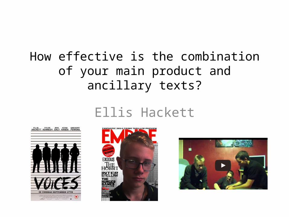
How effective is the combination of your main product and ancillary texts?
Ellis Hackett

To give our audiences instant recognition we used the same actors across all of our products, although they cannot be seen on the poster as we have used silhouettes. We chose one of the
main actors in the trailer to be on our front cover which emphasises how important his role is in the development of the film. This creates a continuity across our products so that
they can be recognised as fitting together.
ACTORS

SETTING
Across our magazine and in our trailer we tried to use backgrounds or settings which properly reflected the genre. The establishing shot in our trailer is of a bleak/grey scene of flats where the majority of the film would take place and so we also used the same colourings and a similar city landscape on our magazine so that it showed how
the magazine had been altered to suit our particularly film.

COLOUROn all of the shots in our trailer we added a filter layer so that the shots were made darker, the colours becoming more dull so that they all blended together in the shot. We used this across all of our products, having the majority of the colours being used as
grey, white and black. This helps to emphasise the crime/thriller aspect of our trailer as it presents our film as altogether being
quite dark and full of mystery, leaving the actors as the only particularly eye catching figures across the products.

FONTSAcross all of our products we used the same font ‘Crimes Times Six’ as it was the font we chose to use for the title of the film. Using the
same font across all three products helps to make our products successful as a marketing campaign as it can be recognised by
everyone who sees it and will create a general image of the film by linking all of the information which is being presented across a variety of products. The only fault that could be found is the use of different
colours for the title, as it may be hard for people to recognise them as belonging to the same product.

SHOTSWe used the same shot in our poster and trailer. We used the last shot of our group from the end of the trailer for our poster. Even
though we used silhouette’s on our poster it can easily be recognised as being the same shot from our trailer as it is the only clip in the
trailer where all of the group are standing together in a line. By using the same shot it helped us to develop an array of skills and because we were able to use the same image for two products it means that
the key points of our film are addressed: there are five friends involved in criminal activity, yet there is something more dangerous
that is about to come.

PRODUCTION AND DISTRIBUTION COMPANIES
In order for us to show continuity we used the logos of our production company and distribution company (Castle Rock and
Warner Bros.) on both our trailer and poster. These symbols already have instant recognition by people, and so by including
them on two of our products we are actively improving the opinion of our work as it is showing our work to be something
worthy of companies with an already good reputation. It is expected for the companies to be marketed across a product they
have put money towards and so this is creating a professional look to our work and making both our poster and our trailer look
as it should.
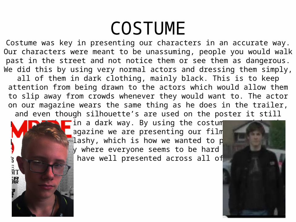
COSTUMECostume was key in presenting our characters in an accurate way. Our characters were meant to
be unassuming, people you would walk past in the street and not notice them or see them as dangerous. We did this by using very normal actors and dressing them simply, all of them in dark
clothing, mainly black. This is to keep attention from being drawn to the actors which would allow them to slip away from crowds whenever they would want to. The actor on our magazine
wears the same thing as he does in the trailer, and even though silhouette’s are used on the poster it still presents them in a dark way. By using the costumes used in the film on the
magazine we are presenting our film as not being particularly flashy, which is how we wanted to present it, and full of mystery where everyone seems to be hard to identify, a theme which we
have well presented across all of our products.
GENREI believe that our products are very effective in demonstrating the main genre and selling points across all of our products. We do this in a range of ways: through the use of mise en scene, altering the lighting; the actors and settings we chose and even the music we
decided to use worked together to be suitable for a crime/thriller film.In these films it is expected that there will be a strange plot twist that no one expects, and audiences are always left wondering over who is causing the problems. We portrayed this effectively in our trailer by giving little away about who the real bad guy is in our film. We also did this in our poster, by using the silhouette’s of our main characters which allows them all to be seen yet it gives nothing away about who the potential traitor could be.We also showed our characters as thieves throughout our trailer when we see them
pooling the resources from a recent theft on a bed, and this is also shown in our poster by using the background which you would expect for a mug-shot background. In this way we have accurately portrayed key aspects of our film across both our trailer and our poster.
On the magazine we have a dull background and a simple boy in dark clothes as our main image. This presents him as having power in the group, and this is mirrored as he is one of the key characters who is seen in the later clips during the trailer. All gangs need a leader,
and we have shown this actor to be the leader of their ‘gang’ by having him as a focus point throughout the two products.

Overall I think our three products work well together. We use the same colours, actors, settings and costumes to present our three products as all being used to market the same product. Our genre is accurately shown across all of our products and this means that there are very minor differences across all of
our products which would mean that all of our products easily work together to create a successful marketing campaign. Together our magazine and poster compliment the trailer,
highlighting key aspects and selling points which we wanted to put across to audiences such as the confusion about the
identity of the villain and their group dynamics which come from being thieves.