how effective is the combination of your main
TRANSCRIPT

HOW EFFECTIVE IS THE COMBINATION OF YOUR MAIN
PRODUCT AND ANCILLARY TEXTS?Sophie Bell

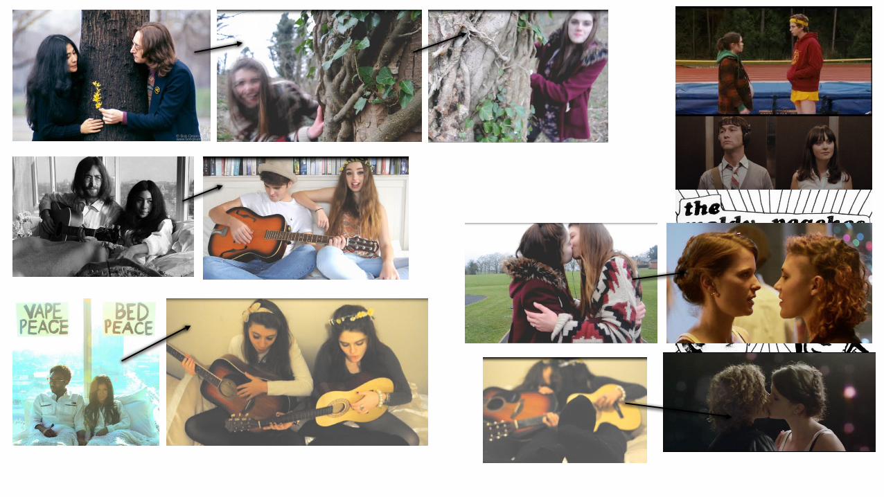
THE MAIN CONCEPT IN MY MUSIC VIDEO The main concept behind my products, and the concept that I used to link all 3 of my products together, is the idea of love/friendship and happiness. This is encompassed by my using young/ teenage actors and models in my products, because this theme is usually associated with a young and carefree culture. In all my products I have shown this by incorporating a relationship between two young people; in my video one of the couples (‘Jade and Alexander) in the song are presented right the way through and are then carried through into my other products. My influence for involving a couple in my products came from John Lennon and Yoko Ono’s influential photo-shoot, which has been recreated in modern music videos such an Jhene Aiko’s ‘bed peace’. I decided to employ this concept into my own work because I think themes of love, peace and happiness can be connoted through use of a strong couple. Another influence for my use of a couple in my products came from films like ‘Juno’ and ‘500 Days of Summer’ which feature a simple and wholesome love between a young couple – these films incorporate music from the folk/indie genre such as ‘The Moldy Peaches’, ‘Kimya Dawson’ ‘Cat Power’ and ‘Regina Spektor’. These movies influenced me because I wanted to also show love between a young couple in a more innocence/ wholesome way as opposed to how young relationships are presented in urban music. I believe this perfectly compliments the messages behind the song I have used which features lyrics such as ‘Home is wherever I’m with you’, ‘in the streets we run Afree’ and ‘not the way I do love you’. It also compliments the genre as a whole. My carrying this theme of a couple through all of my products I think creates a campaign that can be recognised easily, as It is a very simple concept but carries profound messages. Whilst displaying a heterosexual couple (Jade and Alexander) in my video, I also decided to show a homosexual couple as well (myself and Tess). In my video this couple are also performing the song and then the narrative shows one girl proposing to the other – I was influenced to incorporate a homosexual couple from the music video ‘Latch’ by disclosure which follows a straight, lesbian and gay couple. But mainly, because a very small number of music videos display homosexual romance, as the norm is the straight couple. I did this to again compliment by running theme of love and happiness but also equality, which I think has to go along with the former. See the next page for images of all of these influences, compared to my own work:

THE MAIN CONCEPT IN MY POSTER I carried through this theme into my poster my using my main couple from the video (Jade and Alexander) as models on my poster. I think this carries through the themes that I have displayed in my video and allows people to recognise this easily through the simple design of my poster. I was influenced my the posters for the movies that I previously mentioned like Juno, which display the couple together on the poster. The bottom of my poster contains thumbnails to social media sites which my target audience (audience 2.0) would immediately recognise – sound cloud, Facebook and twitter. They would then be able to search my band on these sites and follow them through there, using their smartphones, thus saturating the social media market with my bands campaign. I tried to keep with the conventions of posters from the folk genre which include lots of intricate illustrations. However I could not successfully do this so instead I just added a photograph and then added the small images of butterflies etc. around it in order to try and keep with this convention. I have also tried to use these butterflies etc. as symbolism for the themes of love and happiness which are evident in my music video, they carry through into my products and represent key themes. In the image on my poster the couple are smiling/ laughing sitting on the bed with the guitar in the same position as they are in the video – this allows immediately for my audience to recognise them as part of one campaign. This also encompasses the mood of the entire song and allows the audience to relate the lyrics to the picture. I also decided to incorporate these images of butterflies, flower and a bird in order to draw a similarity to the rural setting In which my video is filmed – the narrative part is outside within nature surrounded by trees, a river and greenery. By using these symbols I am emphasizes the pastoral aspect of my video. A pastoral setting is important because that is the context in which folk music originates from and it is recognised as such today – so to film my video in a city would not have been fitting.

THE MAIN CONCEPT IN MY DIGIPAK Similarly to the poster, I carried on the themes derived from my music video. I made this evident by colour picking from Photoshop exactly the same shade of yellow used In my poster and applying It to the background of my Digipak. I used the same characters and props used in the image in my poster except different poses in order to show a range of emotions from my models. I incorporated these images in the style of polaroid pictures, this is because originally I had the theme of memories running through my video, and this is evident in the fact that the girls performing are also featured in the narrative of my video as a kind of flashback – so I have encompassed this theme of memory or nostalgia through the use of polaroid's. I have incorporated an image of the guitar used so it shows how important the instruments are in the genre of music which my video belongs to. I think by using different photographs of my models I have shown a range of emotions from them and this will mean the audience can relate the Digipak to the video more and they will also be able to relate themselves to the models. It also relates to their part of the video better because in the video they show a range of emotions. This means there is a strong connection between the Digipak and video. I have also decided to use the same butterfly custom brush which I created in Photoshop and used in my poster. I decided to place this in the corners in order to create a more subtle look, and then I enlarged it and placed it over some of the panels in order to create a shadow- like effect. I colour picked the same brown shades as seen in my poster for this in order to create a continuous colour pallet (I chose yellow because that is a colour usually associated with happiness and also sunshine/ thus relating back to my video.) throughout my products which is important for maintain a professional look. This has helped me to link my products together in such a way that they look almost the same, thus improving the link between all my products. If my poster and Digipak were professional I would add a code that my audience 2.0 would be able to scan with their smartphones which take them to the bands official website. It will also have a link which takes them to iTunes where they would be able to buy my bands music. If I were to do this task again I could make the improvement of actually including this on my products, because as it is I only have a link to the band website which would not allow my audience to access my band on all levels. Including the band’s record label logo at the bottom of my Digipak would also encourage my audience to perhaps listen to other bands in that label, which they would be able to search on YouTube and download on ITunes.

CONCLUSION Creating a link between different promotional materials is important because it brings said materials together as a campaign and will make for an all round better marketing campaign and audience reception. I have created products for a indie/folk band, therefore my products would be aimed at a relatively niche audience – in comparison with the mass audience of pop or rock music. The old media ways of marketing (print products – posters and magazine adverts) works well but it becomes expensive to distribute them. This is why I would upload my video to YouTube and saturate the social media market with digital copies of my poster. In order to distribute the print products I would need to create a 360 degree marketing strategy that saturates the market. A band like Edward Sharpe and the magnetic zeroes would be able to do this as their success is international; the record label could make demands for the band to be featured in indie magazines such as ‘INDIE’ ‘NME’ or ‘SPIN’. This, as well as the social media campaigns on twitter Facebook and YouTube will then saturate the market with push marketing and be readily accessible to my digital native audience every time they go on their smart devices. My audience will be able to receive this and then make social interaction with my band by showing excitement or giving feedback for their album. I think all of my products work together very well and believe I was successful in creating a strong link between all of my products. My target audience thought so too – as in my survey when I asked whether this link was successful or not – the majority of them gave me 4/5 out of 5. This means my audience will be able to recognise and enjoy my products as a campaign and therefore it will be more popular, grossing more profit. The Digipak and Adverts purpose is to inform the audience, which I think mine does relatively well by providing information – the music video’s purpose is to entertain and similarly I did this well by creating both a performance and narrative digesis in which my viewer can get lost. I united these products together through the use of two important aspects; characters and themes. I then created a very strong link between my ancillary products by using identical colour palettes, which is a technique common in all professional campaigns. The Digipak is merchandise and the other two products are above the line marketing. The concept of using one key signifier (the couple, ‘Jade and Alexander’) was essential to the success of my products, as I have previously said, if my print products were to be distributed, it allows the audience to associate my products together and also identify with these key signifiers which would then increase popularity. The audiences ability to recognise a link between my ancillary products would essentially encourage them to engage with it and without such a link I don’t think my campaign would be very successful at all. However, my Digipak and poster have a symbiotic relationship because each help to promote the other. But my audience are more likely to see my music video on YouTube first or the poster on music websites because they are audience 2.0. It is not as essential for the print products to link with the music video as there are other songs on the album, thus making this link a bit looser – however, I still felt it important to link these products and this is why I have used the same characters throughout. This link throughout my products is also effective because it links Edward Sharps carefree, ‘hippie’ and peaceful style of music which can be seen throughout my products. All together, I think that there is a clear relationship between my products.
