hoefler text font book
DESCRIPTION
Hoefler Text Font Book that I've designed for my class showcasing the history, anatomy, and uses of the font.TRANSCRIPT

41414141414141414
Hoefler Text
41414141414141414141414141
41414141414141414141414141
Vy Vu
41414141414141414


hoefler text
Vy Vu
2012
R


]

434343434343434343434343242424242424242424242424434343434343434343434343 242424242424242424242424 434343434343434343434343 242424242424242424242424 434343434343434343434343 242424242424242424242424 434343434343434343434343 242424242424242424242424 434343434343434343434343 242424242424242424242424 434343434343434343434343 242424242424242424242424 434343434343434343434343 242424242424242424242424 434343434343434343434343 242424242424242424242424 434343434343434343434343 242424242424242424242424

1
table of contents
introduction
03-45
i ii
iii
vi
w anatomy 46-85
display + examples
86-105
Round Forms
Round-Square Forms
Square Forms
Diagonal-Square Forms
Diagonal Forms
2
Common Letter Pair/
Frequencies Studies
Test Words, Sentences,
Paragraphs
Pangram
z
History
Jonathan Hoefler
Characteristics
Evolution
v vi
vii
viii ix
x
xi
xii
434343434343434343434343242424242424242424242424434343434343434343434343 242424242424242424242424 434343434343434343434343 242424242424242424242424 434343434343434343434343 242424242424242424242424 434343434343434343434343 242424242424242424242424 434343434343434343434343 242424242424242424242424 434343434343434343434343 242424242424242424242424 434343434343434343434343 242424242424242424242424 434343434343434343434343 242424242424242424242424 434343434343434343434343 242424242424242424242424

First typefaces on a Macintosh

w[introduction]
History
i

4
introduction / History
Howaboutnow?
Weights ranging from Regular, Bold,
and Black.
d p
Notice how the leg of the k and the spine of
the s are exaggerated.

5
History / introduction
According to the Vox-ATypl Classification,
Hoefler Text (pronounced Heffler) is a Garalde
(or Old Style) serif typeface designed in 1991
by Jonathan Hoefler, the creator of the foundry
called Hoefler & Frere-Jones in 1989. The
overall family includes twenty-seven styles
that encompasses three weights: regular, bold,
and black. There are also the roman and italic
which features small caps, italic, swash caps,
and the italic swash small caps. Comparing
to other typefaces, what makes the Hoefler
text unique are their special characters such
as the lining figures, ligatures, fractions,
math characters, monetary symbols, and
contextual punctuation.1 These characters are
used to decorate and articulate the written
text. For instance, the ligatures are extended
far out, creating a more obscure look.

6
introduction / History
The reason why Jonathan Hoefler designed the
Hoefler Text typeface family was also the same
reason behind the response of the challenges
and needs he met when he step foot into the
graphic design world.
He simply just wanted more.
He wanted more fonts, more styles, more choices that does not have to resort to on-the-fly variants of regular, italic, bold, and bold italic.
When Hoefler first started out, there were only
a few designers that pursue their career in digital
typography. Luckily, for Hoefler it was easy for
clients to target his work. Since the digital
typography field was small, so was competition
including the equipment used to manufacture
them. Hence without the competition, damages
were being done to typography, for designers
were too focused on “manufacturing their most
important faces first”2 which unfortunately dur-
ing that time, the production processes were at
their weakest. As a consequence, fine typography
greatly suffered because the craftsmanship and
refinement was not considered thoroughly enough.
Engraved capitals is one of his
several added traditions to the
typography world.

7
History / introduction
Hoefler Text was created since the beginning of the
digital age, so there were a sea of undiscovered mediums
to be dabbled with. Thanks to Hoefler ’s revival of the tra-
ditional printings, more openings to new ideas emerged
from the old-style figures and small caps. He brought
back some of his favorite seventeenth century elegant
elements in typography that he did not see in any of the
fonts of his time. The baroque-like typeface drew its in-
spiration from other two typefaces: Jean Janna’s Janson
Text and Nicholas Kis’ Garamond Number 03.3 This de-
tailed oriented font trumps all the simple fonts that came
before it, such as Helvetica and American Typewriter.
Sure, Helvetica has different weights (hairline, ultra-
thin, light, book, medium, normal, extra-black, etc.)
and thicknesses for emphasis and contrast, but it was
not enough to please Hoefler aesthetically. The font
still held the same body/structure, but only with little
modification to the weight. Hoefler designed a font
where there are little flourishes within the uppercase
letters that adds finesse and formality to the structure. RNotice the ball terminals on the
finishing curved stroke and leg
of the uppercase R.

8
introduction / History
x-height
x-height
x-heightx-height
x-heightx-height
x-heightx-height
No matter the point size, the x-height is
still legible, even at a 7 pt size.
top to bottom: 7 pt, 9 pt, 11 pt, 13 pt,
15 pt, 20 pt, 26 pt, 32 pt

9
History / introduction
In addition, the function of legibility and read-
ability of the old digital fonts was sacrificed
when set at certain sizes. The x-height and
counters might be too diminutive to be legible
at a smaller size. But with Hoefler, he made
it possible for the font to be legible at any
proportion and in any way that it is utilized.
The changes that Hoefler wanted, he made
happen with a few additional traditions added
along the way. Hoefler Text continuously
remains to be used by designers, businesses,
and even the average person. It is a type-
face that is set in stone and pre-installed on
every Macintosh computer. When the font
was created, it was one of the three original
fonts that was prosperously used in System
7.5. There were some faulty errors concerning
the TrueType GX fonts, for some fonts were
unable to display its full capabilities, however,
Hoefler ’s typeface pulled through.4 And now,
since everything is moving to the web, Hoefler
& Frere-Jones is expanding their font library
to other browsers and interface systems, like
Windows. One of his company’s striving goals is
to have their library exist on all browsers. This
way all users, not only from the Macintosh,
will have an opportunity to utilize his fonts.5

Photo courtesy of Marc Eckardt
w[introduction]
Jonathan Hoefler
ii

12
introduction / Jonathan Hoefler
Jonathan Hoefler is a American designer specialized in typography. He worked at
the Hoefler & Frere-Jones type foundry located in New York alongside his fellow
type designer, Tobais Frere-Jones. Hoefler ’s inspiration for designing typefaces
came about when he first saw a 1983 Macintosh advertisement in Time Magazine:
“There were all these photographs of screen graphs, like things you do on a Mac, you know pie charts, and shit like that. And one of them is this little tiny thing and these fifteen words that changed my life:‘If you don’t see a typeface you like here, Macintosh lets you design your own.’” 6

“There were all these photographs of screen graphs, like things you do on a Mac, you know pie charts, and shit like that. And one of them is this little tiny thing and these fifteen words that changed my life:‘If you don’t see a typeface you like here, Macintosh lets you design your own.’” 6
Jonathan Hœflertalk at Pivot: AIGA Design Conference

14
introduction / Jonathan Hoefler
This simple quote brought
together his love for being a
computer nerd and design at
that moment. It was the initiative
that started his career as a type
designer. Hoefler found that the
fonts, like Helvetica for example,
on the Macintoshes at that time
were“bewildering.” Observing
that the counters in the number
8 and 6 and the circles in % were
not the same.
8 6 Counters inside the 8 and 6 are elliptical
while the percentage sign’s counter is a
round circle.

15
Johnathan Hoefler / introduction
There were only four types of style at that
time regular, italic, bold, and bold italic.7 To
him, it seemed that the styles were limited,
so he began developing the typeface family
called Hoefler Text. He wanted to create new
kinds of fonts, ones that contain small caps,
italic small caps, swashes, and arabesques
because at that time the world of Macintosh
was stuck with the four simple and mundane
versions of the fonts. Hoefler Text allowed for
complex typography with its ornate styles and
characteristics. The typeface later became a
part of the Macintosh operating system and is
used everywhere. But his journey in design-
ing fonts did not stop there, for he continued
to work with his design team in New York
to create other well-known fonts such as
Gotham, Didot, and Vitesse which would later
be used in magazines and advertisements.
Didot
used for Vogue
magazine
logo, 2001.

16
introduction / Jonathan Hoefler
The Hoefler & Frere-Jones foundry was established in 1989 and continues to deliver the high
performance and high style that they withhold. Jonathan Hoefler ’s dedication to bringing
new typefaces to the world made him
Plenty of his works were used in world renown
publications such as the Rolling Stones,
Harper’s Bazaar, The New York Times Magazine,
Sports Illustrated, and Esquire.8 He began
his education as a graphic designer but felt
that the world needed more fonts to choose
from, so he set out designing his own fonts.
“...one of the forty most influential designers in America by I.D. Magazine.”
He worked under Roger Black, a publication
designer, at the Font Bureau for some time
and was later contacted by Harper’s in 1991
to redesign their identity. Not only were his
works in printed magazines, they exist on
popular internet websites as well, such as
the logo of Wikipedia set in Hoefler Text.

17
Johnathan Hoefler / introduction
WikipediA The Free Encyclopedia
Hoefler Text
used for Wikipedia
logo, 2001 (top)
and Didot for
Harper’s Bazaar,
1991 (bottom)

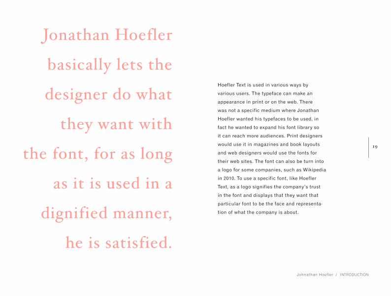
Hoefler Text is used in various ways by various users. The
typeface can make an appearance in print or on the web.
There was not a specific medium where Jonathan Hoefler
wanted his typefaces to be used, in fact he wanted to expand
his font library so it can reach more audiences. Print designers
would use it in magazines and book layouts and web designers
would use the fonts for their web sites. The font can also be
turn into a logo for some companies, such as Wikipedia in 2010.
To use a specific font, like Hoefler Text, as a logo signifies the
company’s trust in the font and displays that they want that
particular font to be the face and representation of what the
company is about.
In 2011, Dickinson College in Pennsylvania unveiled its
new visual identity as a celebration and solidification for
becoming one of the nation’s best colleges and universi-
ties. Claude Skelton Design, who designed this identity, says
that branding logo “captures the spirit of pride, confidence
and energy that runs throughout the college”.9 Hoefler ’s
font had the ability to evoke emotions and feelings from
those who come across his text, it shows that his fonts can
also reach people at a personal and emotional level and
not just at a design standpoint. The font also made ap-
pearances in the Oprah Magazine and the Smithsonian.
18
introduction / Jonathan Hoefler
The redesigned college seal (left)
features a newly rendered liberty
cap, telescope and book. The new
logo (right) set in the Hoefler typeface
exudes an understated confidence.
Hoefler Text is used in various ways by
various users. The typeface can make an
appearance in print or on the web. There
was not a specific medium where Jonathan
Hoefler wanted his typefaces to be used, in
fact he wanted to expand his font library so
it can reach more audiences. Print designers
would use it in magazines and book layouts
and web designers would use the fonts for
their web sites. The font can also be turn into
a logo for some companies, such as Wikipedia
in 2010. To use a specific font, like Hoefler
Text, as a logo signifies the company’s trust
in the font and displays that they want that
particular font to be the face and representa-
tion of what the company is about.
Jonathan Hoefler
basically lets the
designer do what
they want with
the font, for as long
as it is used in a
dignified manner,
he is satisfied.
19
Johnathan Hoefler / introduction

20
introduction / Jonathan Hoefler

21
Johnathan Hoefler / introduction
His works has been exhibited and included in
the permanent collection of the Cooper-Hewitt
National Design Museum located in New York.
Clients would contact the Hoefler & Frere-
Jones Type Foundry to commission a typeface
for their company. The font Gotham was born
when GQ Magazine asked them to create a font
that was
This font was later used in Barack “Obama’s
Change We Can Believe In” campaign
banners and other materials. The foundry
have their fair share of clients that are known
in the advertising and marketing world.
“...a sans-serif made on a geometric structure that would look masculine and new, and fresh, and be versatile.” 10
«

GHGHGHGHGHGHGHGHGHGHGHGHGHGHGHGHGHGHGHGHEFEFEFEFEFEFEFEFEFEFEFEFEFEFEFEFEFEFEFEFGHGHGHGHGHGHGHGHGHGHGHGHGHGHGHGHGHGHGHGHEFEFEFEFEFEFEFEFEFEFEFEFEFEFEFEFEFEFEFEFGHGHGHGHGHGHGHGHGHGHGHGHGHGHGHGHGHGHGHGHEFEFEFEFEFEFEFEFEFEFEFEFEFEFEFEFEFEFEFEFGHGHGHGHGHGHGHGHGHGHGHGHGHGHGHGHGHGHGHGHEFEFEFEFEFEFEFEFEFEFEFEFEFEFEFEFEFEFEFEFGHGHGHGHGHGHGHGHGHGHGHGHGHGHGHGHGHGHGHGHEFEFEFEFEFEFEFEFEFEFEFEFEFEFEFEFEFEFEFEFGHGHGHGHGHGHGHGHGHGHGHGHGHGHGHGHGHGHGHGHEFEFEFEFEFEFEFEFEFEFEFEFEFEFEFEFEFEFEFEFGHGHGHGHGHGHGHGHGHGHGHGHGHGHGHGHGHGHGHGHEFEFEFEFEFEFEFEFEFEFEFEFEFEFEFEFEFEFEFEFGHGHGHGHGHGHGHGHGHGHGHGHGHGHGHGHGHGHGHGHEFEFEFEFEFEFEFEFEFEFEFEFEFEFEFEFEFEFEFEFGHGHGHGHGHGHGHGHGHGHGHGHGHGHGHGHGHGHGHGHEFEFEFEFEFEFEFEFEFEFEFEFEFEFEFEFEFEFEFEFGHGHGHGHGHGHGHGHGHGHGHGHGHGHGHGHGHGHGHGHEFEFEFEFEFEFEFEFEFEFEFEFEFEFEFEFEFEFEFEFGHGHGHGHGHGHGHGHGHGHGHGHGHGHGHGHGHGHGHGHEFEFEFEFEFEFEFEFEFEFEFEFEFEFEFEFEFEFEFEFGHGHGHGHGHGHGHGHGHGHGHGHGHGHGHGHGHGHGHGHEFEFEFEFEFEFEFEFEFEFEFEFEFEFEFEFEFEFEFEFGHGHGHGHGHGHGHGHGHGHGHGHGHGHGHGHGHGHGHGHEFEFEFEFEFEFEFEFEFEFEFEFEFEFEFEFEFEFEFEFGHGHGHGHGHGHGHGHGHGHGHGHGHGHGHGHGHGHGHGHEFEFEFEFEFEFEFEFEFEFEFEFEFEFEFEFEFEFEFEFGHGHGHGHGHGHGHGHGHGHGHGHGHGHGHGHGHGHGHGHEFEFEFEFEFEFEFEFEFEFEFEFEFEFEFEFEFEFEFEFGHGHGHGHGHGHGHGHGHGHGHGHGHGHGHGHGHGHGHGHEFEFEFEFEFEFEFEFEFEFEFEFEFEFEFEFEFEFEFEFGHGHGHGHGHGHGHGHGHGHGHGHGHGHGHGHGHGHGHGHEFEFEFEFEFEFEFEFEFEFEFEFEFEFEFEFEFEFEFEFGHGHGHGHGHGHGHGHGHGHGHGHGHGHGHGHGHGHGHGHEFEFEFEFEFEFEFEFEFEFEFEFEFEFEFEFEFEFEFEF

23
w[introduction]
Characteristics
iii
GHGHGHGHGHGHGHGHGHGHGHGHGHGHGHGHGHGHGHGHEFEFEFEFEFEFEFEFEFEFEFEFEFEFEFEFEFEFEFEFGHGHGHGHGHGHGHGHGHGHGHGHGHGHGHGHGHGHGHGHEFEFEFEFEFEFEFEFEFEFEFEFEFEFEFEFEFEFEFEFGHGHGHGHGHGHGHGHGHGHGHGHGHGHGHGHGHGHGHGHEFEFEFEFEFEFEFEFEFEFEFEFEFEFEFEFEFEFEFEFGHGHGHGHGHGHGHGHGHGHGHGHGHGHGHGHGHGHGHGHEFEFEFEFEFEFEFEFEFEFEFEFEFEFEFEFEFEFEFEFGHGHGHGHGHGHGHGHGHGHGHGHGHGHGHGHGHGHGHGHEFEFEFEFEFEFEFEFEFEFEFEFEFEFEFEFEFEFEFEFGHGHGHGHGHGHGHGHGHGHGHGHGHGHGHGHGHGHGHGHEFEFEFEFEFEFEFEFEFEFEFEFEFEFEFEFEFEFEFEFGHGHGHGHGHGHGHGHGHGHGHGHGHGHGHGHGHGHGHGHEFEFEFEFEFEFEFEFEFEFEFEFEFEFEFEFEFEFEFEFGHGHGHGHGHGHGHGHGHGHGHGHGHGHGHGHGHGHGHGHEFEFEFEFEFEFEFEFEFEFEFEFEFEFEFEFEFEFEFEFGHGHGHGHGHGHGHGHGHGHGHGHGHGHGHGHGHGHGHGHEFEFEFEFEFEFEFEFEFEFEFEFEFEFEFEFEFEFEFEFGHGHGHGHGHGHGHGHGHGHGHGHGHGHGHGHGHGHGHGHEFEFEFEFEFEFEFEFEFEFEFEFEFEFEFEFEFEFEFEFGHGHGHGHGHGHGHGHGHGHGHGHGHGHGHGHGHGHGHGHEFEFEFEFEFEFEFEFEFEFEFEFEFEFEFEFEFEFEFEFGHGHGHGHGHGHGHGHGHGHGHGHGHGHGHGHGHGHGHGHEFEFEFEFEFEFEFEFEFEFEFEFEFEFEFEFEFEFEFEFGHGHGHGHGHGHGHGHGHGHGHGHGHGHGHGHGHGHGHGHEFEFEFEFEFEFEFEFEFEFEFEFEFEFEFEFEFEFEFEFGHGHGHGHGHGHGHGHGHGHGHGHGHGHGHGHGHGHGHGHEFEFEFEFEFEFEFEFEFEFEFEFEFEFEFEFEFEFEFEFGHGHGHGHGHGHGHGHGHGHGHGHGHGHGHGHGHGHGHGHEFEFEFEFEFEFEFEFEFEFEFEFEFEFEFEFEFEFEFEFGHGHGHGHGHGHGHGHGHGHGHGHGHGHGHGHGHGHGHGHEFEFEFEFEFEFEFEFEFEFEFEFEFEFEFEFEFEFEFEFGHGHGHGHGHGHGHGHGHGHGHGHGHGHGHGHGHGHGHGHEFEFEFEFEFEFEFEFEFEFEFEFEFEFEFEFEFEFEFEFGHGHGHGHGHGHGHGHGHGHGHGHGHGHGHGHGHGHGHGHEFEFEFEFEFEFEFEFEFEFEFEFEFEFEFEFEFEFEFEF

24
introduction / Characteristics
Being classified as a Garalde typeface
means that there are distinct characteristics
within parts of the letters that separate them
from the other typefaces like Pre-Venetian,
Venetian, Transitionl, Didone, and Display.
OEM OEM OEMHoefler Text Adobe Garamond Minion Pro
Garalde typefaces have flowing
forms, medium to high contrast
and variable widths (the capital
letters have wide and narrow
oldstyle proportions).11

25
Characteristics / introduction
M MHoefler Text Regular + Hoefler Text Italic + Swash Caps
Hoefler Text is comprised of several ways to
display their italics. It appears that allowing
the designer to have the option to decorate
their text is seen as an important factor, for
there are multiple ways to ‘fine-tune the
flavor’ of its italics.
Swash caps is a typographical
flourish on a glyph, like an exag-
gerated serif that were historically
often used to begin sentences.
M

26
introduction / Characteristics
eA beautifully crafted organic Hoefler
Text ornament.

27
Characteristics / introduction
The combinations of ornaments
create a set of interlocking
arabesques, capable of generating
an infinite number of repeating
patterns. 12
This text paragraph above is enclosed
by the use of two Hoefler Text
ornaments.
OPOPOPOPOOPOPOO
OPOPOPOPOOPOPOPO
OOPOPOOPOOPOP
OOOOPOPOOPOOOO
Along with the decorative swashes comes
the ornaments and arabesques which are
used to embellish the surroundings of the
text. Borders and tiling can be created using
the repeating elements of these ornaments.

28
introduction / Characteristics
The comparison between Hoefler Text and other typefaces, like
Helvetica and Garamond, there are some well-defined differenc-
es and similarities between the fonts. Using the Vox-ATypl, one
is able to characterize how different Hoefler Text is to Helvetica.
Comparing the two fonts is like comparing apples to oranges.
They each grow from different kinds of trees. To start, Helvetica
is categorized underneath the Neo-Grotesque lineal typeface.
The purpose of the Neo-Grotesque typefaces is for their
‘simplicity and perceived alliance with the machine age’13, so
in turn, their type is more clean-cut and highly legible whereas
the Hoefler text is more calligraphic. An obvious observation
amidst the two fonts is the serif and sans-serif characteristic.
Serifs do not exist in the Lineal fonts, but they do in Garaldes.
G G
Hoefler Text contains serifs while
Helvetica’s are nonexistent.

29
Characteristics / introduction
To compare it using a typographer’s eyes, one is
able to identify how the unique structural features
of Hoefler Text and Helvetica. There are certain terms
that help break down the similarities and differences.
Hoefler contains a beak, which is
defined as a single-sided upper serif,
whereas Helvetica’s is nonexistence.

30
introduction / Characteristics
O O The stress ( the axis at which
the letter is drawn) are both up-
right and not oblique. In addition,
the contrast between the strokes
of fonts Helvetica has a lower
contrast than Hoefler Text.
E ESans-serif fonts lack brackets. Notice the curved shapes that join
the horizontal and vertical strokes
in Hoefler Text.

31
Characteristics / introduction
A dramatic feature that Helvetica does
not hold are swashes and ligatures.
F

32
introduction / Characteristics
{Moving on with the comparisons, the typeface
Garamond has more similiar characteristics with
Hoefler Text. For one, they are both contrived
under the same type classification: garalde.
Garalde typefaces demonstrate a greater refinement than the Humanists because the skills of punchcutters improved. There is a greater contrast in the thick and thins of the strokes, sharper in appearance, and more refined. {It is more difficult to differentiate between Hoefler
and Garamond because they are serif fonts. How-
ever, even with the same classification there are
some dissimilarities that make the fonts unique.

33
Characteristics / introduction
1234567 1234567Hoefler Text (left) has text figure
numbers whereas Garamond (right)
carry the lining figures where all the
figures are at the same height and
rests on the baseline.

34
introduction / Characteristics
HHoefler Text

35
Characteristics / introduction
HIf one examines closely, one is able to
spot that both of the typefaces contain
cupped brackets, where the bottom of
the bracket is arched upwards like a foot.
HGaramond


w[introduction]
Evolution
iv

38
introduction / Evolution

39
Evolution / introduction
Technology played an important role in the
development and evolution of typography.
Before computers and digital press, historical
typographers would design type using the wood-
block method of printing. Then as technology
evolved, printing became easier by each century.
From the printing press method to lithography to
hot metal typesetting, different techniques were
utilized in creating fonts, thus various ideas
would emerge for each approach during the
process. There are advantages and disadvan-
tages in the technology that was provided then.
Around 1450, German blacksmith, goldsmith,
printer, and publisher Johannes Gutenberg
invented the glorious invention of printing
press. People began creating fonts, but they
were unable to get the thin clean crisp lines like
Jonathan Hoefler did to his typefaces for the
technique of movable type was done purely by
human hands. The precision and measurements
were not done by computer design programs,
hence it was difficult to attain the neat and
proper lines. Even the curves, which are difficult
to draw by hand, were easily constructed with
the help of the systematic measurement tools.

40
introduction / Evolution
Notice the clean cut straight
edges of the lines on the letter
W and the smooth curves of the
swashes of the O. These are
the special facets that design
programs were able to achieve.
The contrast in the letter W
and O is impeccable. W O

41
Evolution / introduction
Jonathan Hoefler had the advantage over this because creating type became easier
without the hard labor of cutting metal. Everything is computer digitized. More
intricate details in the typefaces were made possible. For instance, even the most
minute feature in the ornaments can be created with excellent finesse because
the programs allowed them to be developed. The impossible was now attainable.
JEven curves created by design programs
for Hoefler Text ornaments

42
introduction / Evolution
Digital type had offered the “potential for fonts to be not merely as good as traditional
ones, but demonstrably better than anything that had gone before.” The emergence of
the Adobe programs led to fresh ideas and possibilities that were waiting to be tested.
The new concepts were introduced to designers such as “old-style figures” and “small
caps.” 14 But it did not stop there for Hoefler because he looked deeper into the past
to bring back older traditions from fine printing that the designers did not utilized.

43
Evolution / introduction
Lorem ipsum dolor sit amet, consectetur adipiscing elit. Sed vulputate aliquet sceler-isque. Nulla ac libero felis, id facilisis enim. Integer at lacus nulla, eu mattis nulla. Donec tincidunt orci ut massa ultri-cies nec elementum eros or-nare. Vestibulum sit amet sapi-en ut turpis lacinia fermentum eu sit amet tellus.
Hoefler Text set in italic small caps swash
44
introduction / Evolution
Apple helped Jonathan Hoefler expand his
typefaces, including Hoefler Text.

45
Evolution / introduction
Hoefler Text was later discovered by the
developers at Apple and they commissioned
him to further expand his fonts. In heed of
society’s use of type, Apple wanted to share
their font creation with the nation, so as a
result “TrueType Gx” was created.15 What this
technology did was made fine typography
readily available for anyone, no matter the
occupation or age. This benefited Hoefler
Text for the advanced features such as
small caps and old-style figures have now
became a standard issue. The old standard
use of regular, italic, and bold were no
longer the only options towards variants.


47
z[anatomy]Round Forms
v

48 Ccanatomy / Round Forms
Hoefler Text’s round forms consists of smooth
curves with barely any straight strokes.
Jonathan Hoefler made use of the descender
line with the exaggerated curve of the swashes.
Stress

49
C A P H E I G H TA S C E N D E R L I N E
X - H E I G H T
B A S E L I N E
D E S C E N D E R L I N E
Hoefler Text Bold Hoefler Text Italic
Hoefler Text Black Hoefler Text Italic Swash
Cc Cc Cc Cc
Round Forms / anatomy

50
anatomy / Round Forms
Gg Gg Gg Gg
GgLoop/Lobe
Ear
51
Round Forms / anatomy
Gg Gg Gg Gg
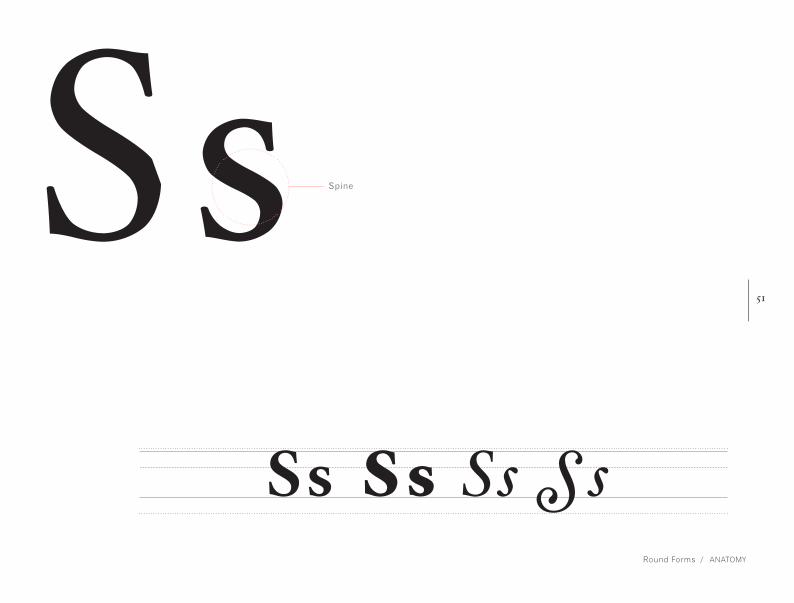
GgSs Ss Ss Ss
Ss Spine
52
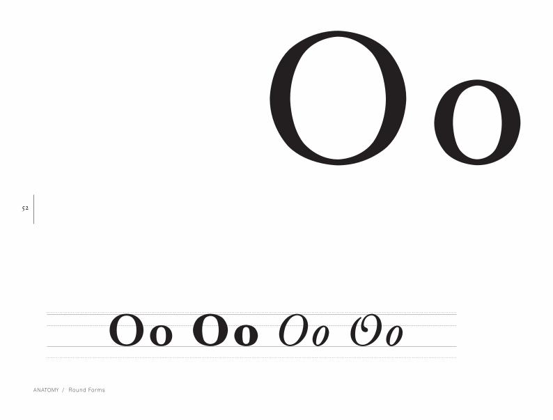
anatomy / Round Forms
OoOo Oo Oo Oo

53
Round Forms / anatomy
Oo Oo Oo Oo Qq Qq Q q
QqTail


55
z[anatomy]
Round-Square Forms
vi

56
anatomy / Round-Square Forms
Bb Bb Bb Bb
BbBowl
Round-Square Forms features
curved and straight strokes.
They intersect with one an-
other to create the letterform.

57
Round-Square Forms / anatomy
BbDd Dd Dd Dd
Dd Ascender

58
anatomy / Round Forms
Uu Uu Uu
UuBracket

59
Round-Square Forms / anatomy
Pp Pp Pp Pp
Pp

60
anatomy / Round-Square Forms
Rr Rr Rr Rr
Rr

61
Round-Square Forms / anatomy
RrJj Jj Jj
JjDescender


63
z[anatomy]Square Forms
vii

64
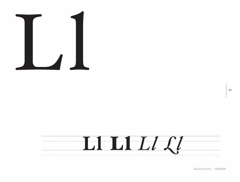
anatomy / Square Forms
The square forms of Hoefler Text
consists of straight lines that
are perpendicular or parallel to
one another. No diagonals are
found within these letterforms. EeEe Ee Ee Ee
Arm

65
Square Forms / anatomy
Ee Ee Ee Ee
FfFf Ff Ff Ff

66
anatomy / Square Forms
Hh Hh Hh Hh
HhCrossbar
67
Square Forms / anatomy
Ll Ll Ll Ll
Ll

68
anatomy / Square Forms
Tt Tt Tt Tt
TtFinial

69
Square Forms / anatomy
TtIi Ii Ii
Ii Tittle


71
z[anatomy]
Diagonal-Square Forms
viii

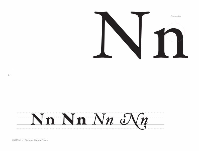
72 ZzDiagonal-Square forms in Hoefler Text contains
diagonal stroke that are connected to one
or two straight vertical or horizontal lines .
anatomy / Diagonal-Square Forms
Stroke

73Zz C A P H E I G H TA S C E N D E R L I N E
X - H E I G H T
B A S E L I N E
D E S C E N D E R L I N E
Zz Zz Zz Zz
Diagonal-Square Forms / anatomy
74
anatomy / Diagonal-Square Forms
NnNn Nn Nn Nn
Shoulder

75
Diagonal-Square Forms / anatomy
NnKk Kk Kk Kk
Kk

76
anatomy / Diagonal-Square Forms
Mm Mm Mm Mm
Mm

77
Diagonal-Square Forms / anatomy
MmYy Yy Yy
YyTerminal


79
z[anatomy]
Diagonal-Square Forms
ix

80
anatomy / Diagonal Forms
AaDiagonal forms only has diagonal strokes
that meet to form a point or apex. There
are no horizontal or vertical strokes.
Apex

81Aa Aa Aa A a
Diagonal Forms / anatomy
C A P H E I G H TA S C E N D E R L I N E
X - H E I G H T
B A S E L I N E
D E S C E N D E R L I N E

82
anatomy / Diagonal Forms
Vv Vv Vv Vv
Vv

83
Diagonal Forms / anatomy
Vv Vv Vv Vv Ww Ww Ww Ww
WwOvershoot

84
anatomy / Diagonal Forms
Xx Xx Xx Xx
Xx
85
Diagonal Forms / anatomy
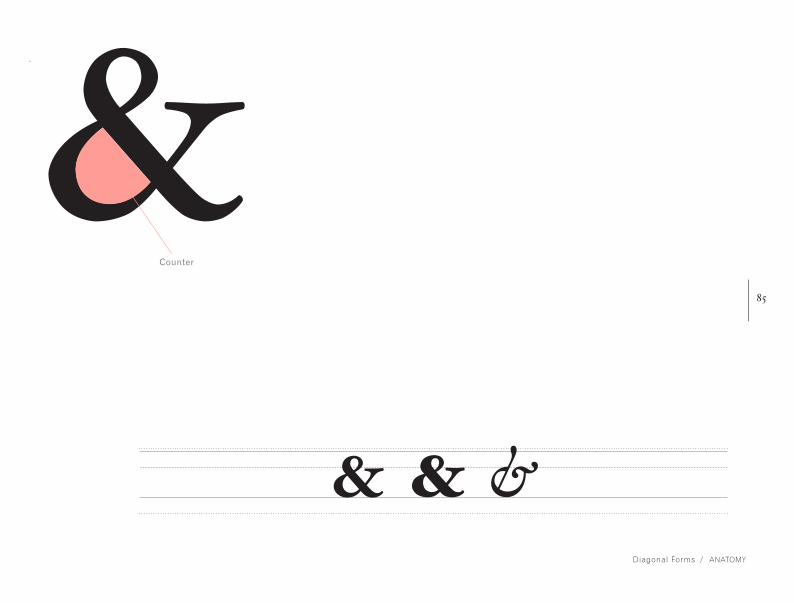
& & &
&Counter

TH HE AN RE ER IN ON AT ND ST ES EN OF TE ED OR TI HI AS TO TH HE AN RE ER IN ON AT ND ST ES EN OF TE ED OR TI HI AS TO TH HE AN RE ER IN ON AT ND ST ES EN OF TE ED OR TI HI AS TO TH HE AN RE ER IN ON AT ND ST ES EN OF TE ED OR TI HI AS TO TH HE AN RE ER IN ON AT ND ST ES EN OF TE ED OR TI HI AS TO TH HE AN RE ER IN ON AT ND ST ES EN OF TE ED OR TI HI AS TO TH HE AN RE ER IN ON AT ND ST ES EN OF TE ED OR TI HI AS TO TH HE AN RE ER IN ON AT ND ST ES EN OF TE ED OR TI HI AS TO TH HE AN RE ER IN ON AT ND ST ES EN OF TE ED OR TI HI AS TO TH HE AN RE ER IN ON AT ND ST ES EN OF TE ED OR TI HI AS TO TH HE AN RE ER IN ON AT ND ST ES EN OF TE ED OR TI HI AS TO TH HE AN RE ER IN ON AT ND ST ES EN OF TE ED OR TI HI AS TO TH HE AN RE ER IN ON AT ND ST ES EN OF TE ED OR TI HI AS TO TH HE AN RE ER IN ON AT ND ST ES EN OF TE ED OR TI HI AS TO TH HE AN RE ER IN ON AT ND ST ES EN OF TE ED OR TI HI AS TO TH HE AN RE ER IN ON AT ND ST ES EN OF TE ED OR TI HI AS TO TH HE AN RE TH HE AN RE ER IN ON AT ND ST ES EN OF TE ED OR TI HI AS TO

87
z[display + examples]
Common Letter Pairs /
Frequencies Studies
x

88
display + examples / Common Letter Pairs / Frequencies Studies
TH TO HE AN
RE ER IN ON
AT ND ST ES

89
Common Letter Pairs / Frequencies Studies / display + examples
According to Herbert S. Zim’s introductory
cryptography text “Codes and Secret Writing,”
these are letter pairings that are commonly
used in the English language.
EN OF TE ED
OR TI HI AS

90
display + examples / Common Letter Pairs / Frequencies Studies
LL EE SS OO
TT FF RR NN
PP CC Most common
doubled letter
pairings

91
Common Letter Pairs / Frequencies Studies / display + examples
ETAON RISHD
LFCMU GYPWB
VKXJQ ZLetter frequencies are used for the study
of crypotgraphy, which are techniques for
secure communication in the presence of
third parties, and frequency analysis.
English letter
frequency
sequence

“I am still an old man. But I am not unarmed.”
– Excerpt from The Old Man and the Sea
93
z[display + examples]
Test Words, Sentences, Paragraphs
xi

94
display + examples / Test Words
The
old man
a n d t h e Sea
top to bottom:
Hoefler Text Swash Italic, 28 pt
Hoefler Text Engraved font, 80 pt
Hoefler Text Italic, 28 pt

95
Test Words, Sentences, Paragraphs / display + examples
Ernest Hemingwayby:
140 pt 48 pt

96
display + examples / Test Words
He was an old man who fished alone in a skiff in the Gulf Stream and he had gone eighty-four days now without taking a fish. In the first forty days a boy had been with him. But after forty days without a fish the boy’s parents had told him that the old man was now definitely and finally salao, which is the worst form of unlucky, and the boy had gone at their orders in another boat which caught three good fish the first week. It made the boy sad to see the old man come in each day with his skiff empty and he always went down to help him carry either the coiled lines or the gaff and harpoon and the sail that was furled around the mast. The sail was patched with flour sacks and, furled, it looked like the flag of permanent defeat.”16 – Excerpt from The Old Man and the Sea
“
Hoefler Text in
paragraph form
12 pt

97
Test Words, Sentences, Paragraphs / display + examples
“Santiago,” the boy said.
“Yes,” the old man said. He was holding
his glass and thinking of many years ago.
“Can I go out to get sardines for you for tomorrow?”
“No. Go and play baseball. I can still
row and Rogelio will throw the net.”
28 pt
36 pt
23 pt
23 pt
Hoefler Text in
sentence form.
12 pt
‡‡‡‡‡‡‡‡‡‡‡‡‡‡‡‡‡‡‡‡‡‡‡‡‡‡‡‡‡‡‡‡‡‡‡‡‡ 4444444444444444444444444444
‡‡‡‡‡‡‡‡‡‡‡‡‡‡‡‡‡‡‡‡‡‡‡‡‡‡‡‡‡‡‡‡‡‡‡‡‡4444444444444444444444444444
‡‡‡‡‡‡‡‡‡‡‡‡‡‡‡‡‡‡‡‡‡‡‡‡‡‡‡‡‡‡‡‡‡‡‡‡‡ 4444444444444444444444444444
‡‡‡‡‡‡‡‡‡‡‡‡‡‡‡‡‡‡‡‡‡‡‡‡‡‡‡‡‡‡‡‡‡‡‡‡‡4444444444444444444444444444
‡‡‡‡‡‡‡‡‡‡‡‡‡‡‡‡‡‡‡‡‡‡‡‡‡‡‡‡‡‡‡‡‡‡‡‡‡ 4444444444444444444444444444
‡‡‡‡‡‡‡‡‡‡‡‡‡‡‡‡‡‡‡‡‡‡‡‡‡‡‡‡‡‡‡‡‡‡‡‡‡4444444444444444444444444444
‡‡‡‡‡‡‡‡‡‡‡‡‡‡‡‡‡‡‡‡‡‡‡‡‡‡‡‡‡‡‡‡‡‡‡‡‡ 4444444444444444444444444444
‡‡‡‡‡‡‡‡‡‡‡‡‡‡‡‡‡‡‡‡‡‡‡‡‡‡‡‡‡‡‡‡‡‡‡‡‡4444444444444444444444444444
‡‡‡‡‡‡‡‡‡‡‡‡‡‡‡‡‡‡‡‡‡‡‡‡‡‡‡‡‡‡‡‡‡‡‡‡‡4444444444444444444444444444
‡‡‡‡‡‡‡‡‡‡‡‡‡‡‡‡‡‡‡‡‡‡‡‡‡‡‡‡‡‡‡‡‡‡‡‡‡4444444444444444444444444444

99
‡‡‡‡‡‡‡‡‡‡‡‡‡‡‡‡‡‡‡‡‡‡‡‡‡‡‡‡‡‡‡‡‡‡‡‡‡ 4444444444444444444444444444
‡‡‡‡‡‡‡‡‡‡‡‡‡‡‡‡‡‡‡‡‡‡‡‡‡‡‡‡‡‡‡‡‡‡‡‡‡4444444444444444444444444444
‡‡‡‡‡‡‡‡‡‡‡‡‡‡‡‡‡‡‡‡‡‡‡‡‡‡‡‡‡‡‡‡‡‡‡‡‡ 4444444444444444444444444444
‡‡‡‡‡‡‡‡‡‡‡‡‡‡‡‡‡‡‡‡‡‡‡‡‡‡‡‡‡‡‡‡‡‡‡‡‡4444444444444444444444444444
‡‡‡‡‡‡‡‡‡‡‡‡‡‡‡‡‡‡‡‡‡‡‡‡‡‡‡‡‡‡‡‡‡‡‡‡‡ 4444444444444444444444444444
‡‡‡‡‡‡‡‡‡‡‡‡‡‡‡‡‡‡‡‡‡‡‡‡‡‡‡‡‡‡‡‡‡‡‡‡‡4444444444444444444444444444
‡‡‡‡‡‡‡‡‡‡‡‡‡‡‡‡‡‡‡‡‡‡‡‡‡‡‡‡‡‡‡‡‡‡‡‡‡ 4444444444444444444444444444
‡‡‡‡‡‡‡‡‡‡‡‡‡‡‡‡‡‡‡‡‡‡‡‡‡‡‡‡‡‡‡‡‡‡‡‡‡4444444444444444444444444444
‡‡‡‡‡‡‡‡‡‡‡‡‡‡‡‡‡‡‡‡‡‡‡‡‡‡‡‡‡‡‡‡‡‡‡‡‡4444444444444444444444444444
‡‡‡‡‡‡‡‡‡‡‡‡‡‡‡‡‡‡‡‡‡‡‡‡‡‡‡‡‡‡‡‡‡‡‡‡‡4444444444444444444444444444
z[display + examples]
Pangram
xii

100
display + examples / Pangram
The quick brown fox jumped over the lazy dog.
The quick brown fox jumped over the lazy dog.
The quick brown fox jumped over the lazy dog.
The quick brown fox jumped over the lazy dog.
The quick brown fox jumped over the lazy dog.
The quick brown fox jumped over the lazy dog.
The quick brown fox jumped over the lazy dog.
Hoefler Text Regular
Hoefler Text Italic
Hoefler Text Bold
Hoefler Text Black
Hoefler Text Black Italic
Hoefler Text Swash Italic
Hoefler Text Swash Caps Italic
18 pt

101
Pangram / display + examples
The quick brown fox jumped over the lazy dog.
The quick brown fox jumped over the lazy dog.
The quick brown fox jumped over the lazy dog.
The quick brown fox jumped over the lazy dog.
The quick brown fox jumped over the lazy dog.
The quick brown fox jumped over the lazy dog.
The quick brown fox jumped over the lazy dog.
El veloz murciélago hindú comía feliz cardillo y kiwi. La cigüeña tocaba el saxofón detrás del palenque de paja.
El veloz murciélago hindú comía feliz cardillo y kiwi. La cigüeña tocaba el saxofón detrás del palenque de paja.
El veloz murciélago hindú comía feliz cardillo y kiwi. La cigüeña tocaba el saxofón detrás del palenque de paja.
El veloz murciélago hindú comía feliz cardillo y kiwi. La cigüeña tocaba el saxofón detrás del palenque de paja.
El veloz murciélago hindú comía feliz cardillo y kiwi. La cigüeña tocaba el saxofón detrás del palenque de paja.
El veloz murciélago hindú comía feliz cardillo y kiwi. La cigüeña tocaba el saxofón detrás del palenque de paja.
El veloz murciélago hindú comía feliz cardillo y kiwi. La cigüeña tocaba el saxofón detrás del palenque de paja.
14 pt
Hoefler Text Regular
Hoefler Text Italic
Hoefler Text Bold
Hoefler Text Black
Hoefler Text Black Italic
Hoefler Text Swash Italic
Hoefler Text Swash Caps Italic

102
display + examples / Pangram
Portez ce vieux whisky au juge blond qui fume
Portez ce vieux whisky au juge blond qui fume
Portez ce vieux whisky au juge blond qui fume
Portez ce vieux whisky au juge blond qui fume
Portez ce vieux whisky au juge blond qui fume
Portez ce vieux whisky au juge blond qui fume
Portez ce vieux whisky au juge blond qui fume
Hoefler Text Regular
Hoefler Text Italic
Hoefler Text Bold
Hoefler Text Black
Hoefler Text Black Italic
Hoefler Text Swash Italic
Hoefler Text Swash Caps Italic
20 pt

103
Pangram / display + examples
Victor jagt zwölf Boxkämpfer quer über den großen Sylter Deich
Victor jagt zwölf Boxkämpfer quer über den großen Sylter Deich
Victor jagt zwölf Boxkämpfer quer über den großen Sylter Deich
Victor jagt zwölf Boxkämpfer quer über den großen Sylter Deich
Victor jagt zwölf Boxkämpfer quer über den großen Sylter Deich
Victor jagt zwölf Boxkämpfer quer über den großen Sylter Deich
Victor jagt zwölf Boxkämpfer quer über den großen Sylter Deich
Hoefler Text Regular
Hoefler Text Italic
Hoefler Text Bold
Hoefler Text Black
Hoefler Text Black Italic
Hoefler Text Swash Italic
Hoefler Text Swash Caps Italic
12 pt

104
display + examples / Pangram
Aa Bb Cc Dd Ee Ff Gg Hg Ii Jj Kk Mm Nn Oo Pp Qq Rr Ss Tt Uu Vv Ww Xx Yy Zz
Upper and Lower
case letters
of the English
alphabet
105
Pangram / display + examples
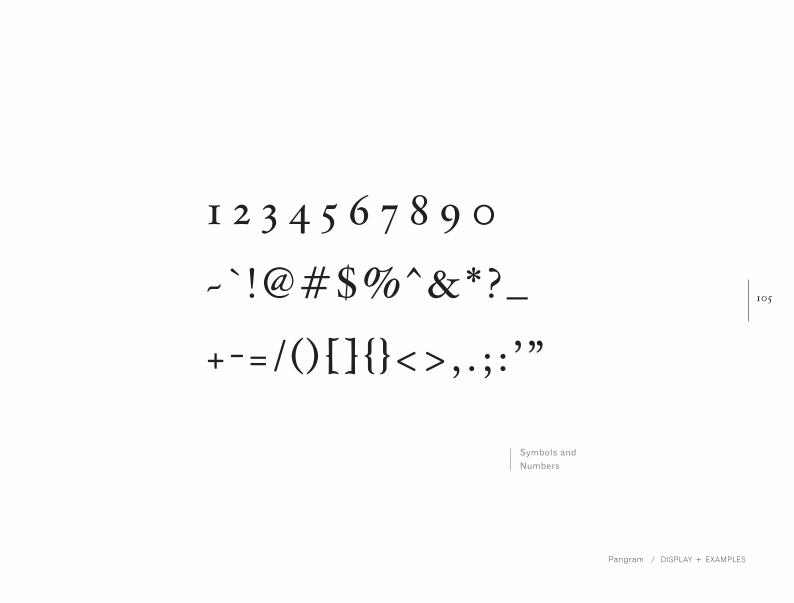
1 2 3 4 5 6 7 8 9 0 ~ ` !@#$%^&*?_ + -= / ( ) [ ] { }<> , . ; : ’ ”
Symbols and
Numbers

106
bibiliography
1. “Hoefler Text,” Hoefler & Frere-Jones (online; 1989-2012), http://www.typography.com/fonts
font_overview.php?productLineID=100010/ (accessed 27 Jan. 2012).
2. “Hoefler Text.”
3. Womack, Mark. “Favorite Fonts: Hoefler Text.” Obsession with Detail (blog), http://obsession
withdetail.net/ (accessed February 7, 2012).
4. Paul Shaw, “The Digital Past: When Typefaces Were Experimental,” AIGA (online; May 19,
2005), http://www.aiga.org/the-digital-past-when-typefaces-were-experimental/ (accessed 21
Feb. 2012).
5. Jonathan Hoefler, “Type at the Crossroads,” Pivot: AIGA Design Conference (Distributed by
AIGA, October 15, 2011 ), http://www.aiga.org/video-pivot-2011-hoefler/ (accessed 21 Feb. 2012).
6. Jonathan Hoefler.
7. Jonathan Hoefler.
8. “Biographies,” Hoefler & Frere-Jones (online; 1989-2012) http://www.typography.com/about/biog
raphies.php/ (accessed 2 Feb. 2012).

107
9. “New Visual Identity Unveiled,” Dickinson College (October 22, 2011 ), http://www.dickinson.edu/news-and-
events/news/2011-12/New-Visual-Identity-Unveiled/ (accessed 21 Feb. 2012).
10. Helvetica. DVD. Directed by Gary Huswit. UK: Veer and Swiss Dots, 2007.
11. Karen Cheng, Designing Type (New Haven: Yale University Press, 2006), 14.
11. Cheng, Designing Type, 15.
12. “Hoefler Text.”
13. “Hoefler Text.”
14. “Hoefler Text.”
15. “Hoefler Text.”
16. Ernest Hemingway. The Old Man and the Sea (New York: Scribner Paperback Fiction, 1995), 9.
photos:
http://typotalks.com/berlin/de/2011/01/26/celebrating-15-years-of-typo-berlin-moments-6/
http://www.vectronicsappleworld.com/macintosh/articlepics/1984ad/macfonts.jpg
http://iowa.barackobama.com

[


