historic look on color theory - johnson & wales university
TRANSCRIPT
Johnson & Wales UniversityScholarsArchive@JWU
Honors Theses - Providence Campus College of Arts & Sciences
9-2018
Historic Look on Color TheorySteele R. StokleyJohnson & Wales University - Providence, [email protected]
Follow this and additional works at: https://scholarsarchive.jwu.edu/student_scholarship
Part of the Arts and Humanities Commons
This Honors Thesis is brought to you for free and open access by the College of Arts & Sciences at ScholarsArchive@JWU. It has been accepted forinclusion in Honors Theses - Providence Campus by an authorized administrator of ScholarsArchive@JWU. For more information, please [email protected].
Repository CitationStokley, Steele R., "Historic Look on Color Theory" (2018). Honors Theses - Providence Campus. 30.https://scholarsarchive.jwu.edu/student_scholarship/30
Historic Look on
Color Theory
By Rose Stokley
Advisors: Kristi Girdharry, Don Kaczmarczyk, & Wendy Wagner
September 2018
Submitted in partial fulfillment of the requirements for the
University Honors Scholar designation at Johnson &
Wales University

Stokley 1
Table of Contents
I. Abstract Page 2
II. Introduction to Color Science Page 3
III. Historical Context Page 7
IV. Color Elucidated Page 24
V. Color Interactions Page 29
VI. Conclusion Page 41
VII. Works Cited Page 43
Stokley 2
I. Abstract
The science of color is called chromatics, colorimetry, or color science. This field of
science includes the perception of color by the human eye, origin of colors, art theory,
therapy, the psychics of electromagnetic radiation, and effects on the brain (Azeemi).
Experts throughout time have desired to decipher the composition of color to explain
how and why humans are able to see colors in order to use them in numerous
disciplines; from scientific to artistic. While color has been studied since ancient times,
the technical workings and the modern understandings of color theory are difficult to
comprehend, and one wishes to make the science more palatable. These studies have
been a global pursuit. However, many important discoveries and scholars were lost over
time, or inaccurately credited. The following paper takes on the historic look on color
science to examine how the understanding of color has evolved over time from ancient
studies until the early 19th century while unearthing uncredited experts that are not
immediately recognized in modern discussion on the subject. Some experts, like Ibn al-
Haytham, have been forgotten throughout time while others have been overly credited
(O’Connor). At first color is defined and how colors interact with each other is
explained. Secondary research and criticism of color science history is used to compare,
and dispute generally accepted, ideas of color theory that were discovered until the 19th
century (Popova). The purpose is to give the reader a comprehensive understanding of
color science, the historical evolution of the field and expose forgotten contributors.
Stokley 3
II. Introduction to Color Science
Since Aristotle in the 4th century BCE, scientists, philosophers, and artists have
documented the study of color to better understand the strange phenomena (Loeb). The
understanding of color science has transformed dramatically between 384 BCE and the
turn of the 20th century. Scientist and artist alike came together in order to decipher the
nature of color. Color science continues to be a popular, but underdeveloped field of
study. Most of the undeveloped research is due to the fact that colors have not been able
to be accurately defined or categorized until modern history (Byrne). Color science is a
vast field of study that has numerous specialties and focuses. Some assets are more
subjective and fall into cultural color symbolism research, and others are more technical
and focus on the scientific measurement of light’s electromagnetic wavelengths and
their additive qualities. Within the purposes of this paper, a look at historical color
theory will be examined in order to gain a holistic view on its advancements. Modern,
western, color science understanding is accredited to Sir Isaac Newton’s work with glass
prisms (Popova).
As stated previously, he general understanding of modern color science is
ascribed to Sir Isaac Newton of the 17th and 18th centuries. His publication of “Optiks”
in 1704 documented his 40-year exploration with glass prisms and light (Caliver).
Optics is the study of a branch of physics that involves light, its nature and behavior.
Written in common language for the masses, “Optiks” this classic on psychical science
presented a comprehensive overview of the 18th knowledge of light. Newton

Stokley 4
scientifically proved color is composed solely of light energy from the sun. This fact is
simply proven by the fact that humans cannot perceive color whatsoever when it is dark,
whist other animals have the capabilities to see objects or use “night vison.” These
findings disputed the previous European tradition that color was a combination of both
darkness and light. Newton is credited with explaining why rainbows appear, ROYGBIV,
the modern understanding of color theory. Color theory is a body of practical knowledge
to color combinations and the visual effects of color mixing (Caliver). The practice
includes the color wheel, color harmonies, and how colors should be used.
While, aspects of his work were revolutionary in order to understand the
relationships and the interactions between colors, most of his work that he is described
the pioneer of, were proven years prior. Newton worked to reinforce the ideas of Al-
Hasan Ibn al-Haytham, an Arab scholar that studied white light using prisms to explain
that color was not a mixture of darkness and lightness in the twelfth century. Prior to
the advancement of a lot of modern science, or even the scientific method Al-Hasan Ibn
al-Haytham was able to formulate how humans see colors. Al-Haytham’s work was
translated into numerous languages and inspired scholars for years (O’Connor). He was
one of Newtons greatest inspirations and provided the scientific evidence for Newton to
expand on his color wheel and light’s three primary colors.
Modern color theory is based on Newton’s color wheel. Traditionally, the color
wheel is still used in art and is based on the idea the three primary colors are red, yellow
and blue. This tool is used to create harmonious color schemes. Harmony is a visual
experience that is pleasing to the eye. The viewer is engaged whilst also experiencing a
Stokley 5
sense of order (Lyn). There is a balance to the visual experience between unity, which
can cause under-stimulation, and complexity, which can cause overstimulation. Color
harmony is a complex notion because how people react to them are both emotional and
psychical. Due to this, responses range greatly due to color symbolism and are open to
various range of factors. Color symbolism is different from color science and are
conditioned and learned (Lyn).
Most of Newton’s discoveries were grounded in science and dismissed the
subjective nature of emotional responses to color symbolism. Connotative color
associations and color symbolism tends to be culture-bound and may also vary across
different contexts and circumstances. These factors include individual differences, such
as age, gender, personal preference, and affective state, as well as cultural, sub-cultural
and socially-based differences which gives rise to conditioning and learned responses
about color (Lyn). Color symbolism is vastly different from color science, color theory or
color psychology and will not be discussed within this paper. Due to the subjective
nature of this field, color symbolism ranges too greatly to be studied accurately across a
global scale.
Color science has a long history and this point of view paved the way for modern
understanding of western color science. Theories studied around this time are still
taught to students and their work has been improved on in order to enhance the visual
experience everyday life. Marketing, electronic technology, design, and art are a few
fields that depend on these studies to utilize colors effectively. However, even though
Newton is accredited with being the founder of modern color science, was he truly the
Stokley 6
first scholar to make these discoveries? Newton’s discoveries and conveying of his
findings were important. However, he is over credited and other scholars are forgotten.
The modern understanding of color theory under credits major scholarly contributors,
including Aristotle, Al-Hasan Ibn al-Haytham, Franciscus Aguilonius, Thomas Young,
and Albert Munsell. (O’Connor).
The following paper will compare various scholars throughout history and give a
synopsis their contributions, and then will overview the modern understanding of color
science, specifically color theory. A knowledge of the contributors to this field and an
understanding of color theory is important for general knowledge, historical purposes
and global perceptions. Gaining a more holistic view on the history of color science is
important in order to gain an appreciation for the complicated science behind the
perception of colors. The idea that Newton originally founded wavelengths, the color
spectrum and additive color mixing downplays the complexity of the history of color
science and the complexity of the field. Multiple scholars and experts from numerous
fields were needed in order to discover and figure out how humans perceive colors. In
addition to, an understanding of color theory is important due to its use in everyday life
and with this knowledge a reader would be able to better understand the composition,
interaction and description of colors. Color theory is useful for creating a website,
designing a room, constructing a wardrobe, and the like. Color is very important since
three quarters of decisions and first impressions are based on colors (Wargo).
Stokley 7
III. Historical Context
As covered previously, color science has been studied since ancient times.
Newton is accredited with most of the scholarly research and advancements (Loeb).
However, other scholars contributed to the vast study. While it is agreed on and has
been proven that people from various cultures describe colors differently depending on
their environment, scholars from around the world have contributed to the science of
the electromagnetic waves that produce any color at all. Below is an extensive
chronological historical overview of color science research from the fourth century BCE
until mid-twentieth century CE.
Aristotle (384 - 322 BCE)
The first documented development of color theory came from ancient Greece in a
text called On Colors. The text was attributed to Aristotle solely, but it is now broadly
accepted to have been written by members of his Peripatetic School and himself. On
Colors proposed that color came down from a deity as heavenly fire rays. Aristotle stated
that all colors are composed from black and white. However, this can be quite confusing
linguistically, black and white are better described as brightness and darkness and
understood as daylight and night darkness. Richard Sorabji theorized that Aristotle may
have seen colors created by close proximity of black and white. For example, in the
image below. Aristotle used the natural world around him to compose his theories. He
wrote that there were two natural or primary colors that were derived from darkness
and light and they related to the normal binary system of the world; day and night,
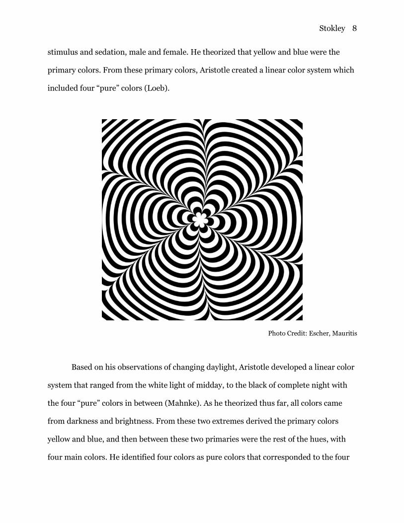
Stokley 8
stimulus and sedation, male and female. He theorized that yellow and blue were the
primary colors. From these primary colors, Aristotle created a linear color system which
included four “pure” colors (Loeb).
Photo Credit: Escher, Mauritis
Based on his observations of changing daylight, Aristotle developed a linear color
system that ranged from the white light of midday, to the black of complete night with
the four “pure” colors in between (Mahnke). As he theorized thus far, all colors came
from darkness and brightness. From these two extremes derived the primary colors
yellow and blue, and then between these two primaries were the rest of the hues, with
four main colors. He identified four colors as pure colors that corresponded to the four
Stokley 9
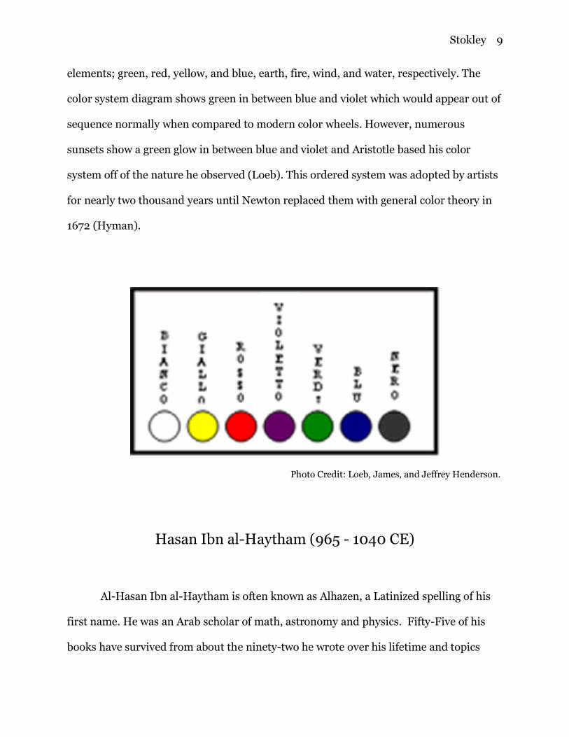
elements; green, red, yellow, and blue, earth, fire, wind, and water, respectively. The
color system diagram shows green in between blue and violet which would appear out of
sequence normally when compared to modern color wheels. However, numerous
sunsets show a green glow in between blue and violet and Aristotle based his color
system off of the nature he observed (Loeb). This ordered system was adopted by artists
for nearly two thousand years until Newton replaced them with general color theory in
1672 (Hyman).
Photo Credit: Loeb, James, and Jeffrey Henderson.
Hasan Ibn al-Haytham (965 - 1040 CE)
Al-Hasan Ibn al-Haytham is often known as Alhazen, a Latinized spelling of his
first name. He was an Arab scholar of math, astronomy and physics. Fifty-Five of his
books have survived from about the ninety-two he wrote over his lifetime and topics
Stokley 10
range from theory of light, vision, astronomy, math and geometry. Ibn al-Haytham was
the first scientist in history to insist everything must be tangibly proven through a
scientific method. Most ancient Greek philosophies of science revolved around reason or
theological means. Ibn al-Haytham stated “If learning the truth is the scientist’s goal…
then he must make himself the enemy of all that he reads. And attack it from every side.
He should also suspect himself as he performs his critical examination of it, so that he
may avoid falling into either prejudice or leniency.” To him it was essential to conduct
experiments and peer review truths of the time rather than blindly accept them
(O’Connor).
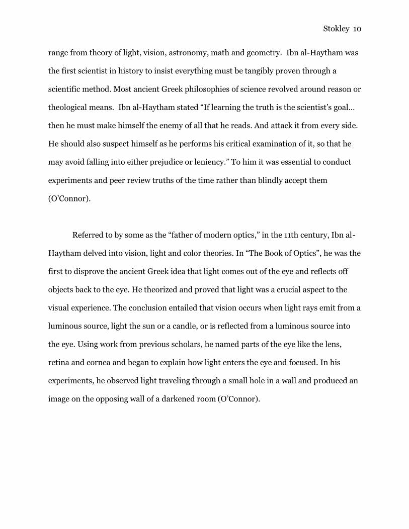
Referred to by some as the “father of modern optics,” in the 11th century, Ibn al-
Haytham delved into vision, light and color theories. In “The Book of Optics”, he was the
first to disprove the ancient Greek idea that light comes out of the eye and reflects off
objects back to the eye. He theorized and proved that light was a crucial aspect to the
visual experience. The conclusion entailed that vision occurs when light rays emit from a
luminous source, light the sun or a candle, or is reflected from a luminous source into
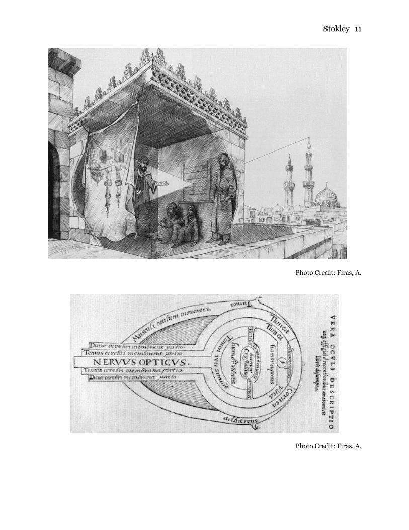
the eye. Using work from previous scholars, he named parts of the eye like the lens,
retina and cornea and began to explain how light enters the eye and focused. In his
experiments, he observed light traveling through a small hole in a wall and produced an
image on the opposing wall of a darkened room (O’Connor).
Stokley 11
Photo Credit: Firas, A.
Photo Credit: Firas, A.
Stokley 12
Idn Al-Haytham studied the way light is affected when traveling through
different mediums like gases, liquid and glass. He filled glass spheres with water to
investigate the origins of a rainbow. He concluded that light was refracted by the water
at various angles to produce certain colors. Rays with the least bent reflections were red,
and those with more bends were purple. A spectrum of colored light was produced
causing a rainbow on the opposing wall. These light reactions also explained why the sky
changed color, the sun's rays hit the atmosphere at various angles causing different
refractions. By the measurement of the different angles by studying the sky, Ibn al-
Haytham calculated the depth of the atmosphere, almost a millennium before it was
proven by spaceflight. Whilst studying the sky, he explained why we cannot see the stars
during the daytime due to visual contrast. He proved the color and brightness of an
object depended on the surrounding colors and levels of brightness (O’Connor).
These visual theories where written in “The book of Optics”. This book was
translated into Latin from Arabic and had a huge impact on European scholars. In 1572
it was printed by Friedrich Risner with the Latin title “Opticae thesaurus: Alhazeni
Arabis libri septem, nuncprimum editi; Eiusdem liber De Crepusculis et nubium
ascensionibus” Translated to “Thesaurus of Optics: seven books of the Arab Alhazen,
first edition: concerning twilight and the advancement of clouds.” Risner is known for
Ibn al-Haytham’s name variant, Alhzen. Previously, it was correctly translated from
Arabic to Alhacen in the west. From these book translations and prints, European
scholars were able to recreate his experiments and understand light in the same way.
Eyeglasses, magnifying glasses, telescopes and cameras were developed from these
recreations. Ibn al-Haytham’s contributions have been overlooked and forgotten since
Stokley 13
European scholars adopted his methods, experiments and theories. Isaac newton was
one of the most famous color theorist to utilize his work and failed to reference him in
his own books including “Optiks.” It was common during these times of expansion and
enlightenment to adopt middle eastern work and discredit the original scholars in order
to give credit to European ones (O’Connor).
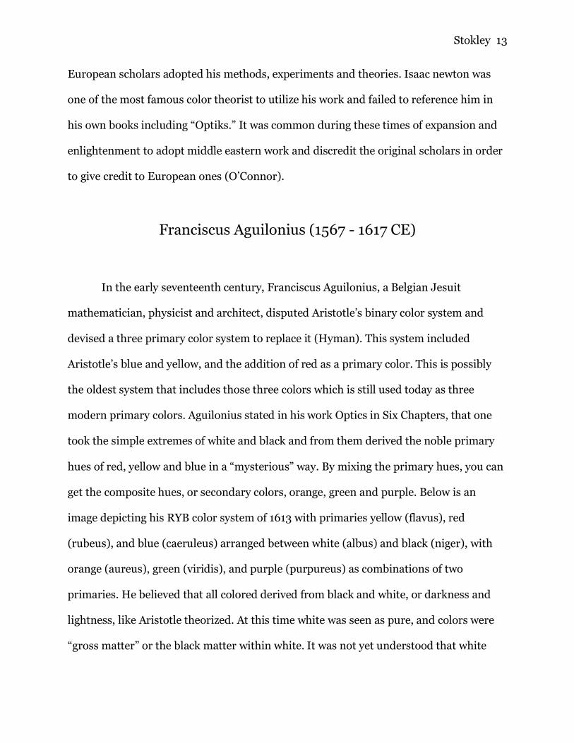
Franciscus Aguilonius (1567 - 1617 CE)
In the early seventeenth century, Franciscus Aguilonius, a Belgian Jesuit
mathematician, physicist and architect, disputed Aristotle’s binary color system and
devised a three primary color system to replace it (Hyman). This system included
Aristotle’s blue and yellow, and the addition of red as a primary color. This is possibly
the oldest system that includes those three colors which is still used today as three
modern primary colors. Aguilonius stated in his work Optics in Six Chapters, that one
took the simple extremes of white and black and from them derived the noble primary
hues of red, yellow and blue in a “mysterious” way. By mixing the primary hues, you can
get the composite hues, or secondary colors, orange, green and purple. Below is an
image depicting his RYB color system of 1613 with primaries yellow (flavus), red
(rubeus), and blue (caeruleus) arranged between white (albus) and black (niger), with
orange (aureus), green (viridis), and purple (purpureus) as combinations of two
primaries. He believed that all colored derived from black and white, or darkness and
lightness, like Aristotle theorized. At this time white was seen as pure, and colors were
“gross matter” or the black matter within white. It was not yet understood that white

Stokley 14
light contained all colors and was not contaminated by “gross” matter. Another false
thought at this time in Europe is that prisms and glass colored light, not that color was
composed of light (Jaeger).
Photo Credit: Gage, John.
Isaac Newton (1642 - 1727 CE)
Later in the seventeenth century, in 1666, Isaac Newton traveled home
from university to individually study optics. He was familiar with the work of Al-Hasan
Ibn al-Haytham and had the Latin translation of numerous books by the scholar. Isaac
newton further worked to prove that color is not composed of black and white nor that
light reveled color but is but of white light alone (Johnson). He wanted a detailed
understanding of color composition and recreated many experiments that al-Haytham
completed. For example, he describes in Opticks, Prop. II Experiment 3. The basic but
Stokley 15
effective method of observing single beams of sunlight, “In a very dark Chamber, at a
round hole, about one third Part of an Inch broad, made in the Shut of a Window, I
placed a Glass Prism.” Newton famously published his book “Optiks” after forty years of
study and experimentation (Piezo).
Isaac Newton was able to bring an understanding of color science to the masses
by his experimentations and explanations of color. He created the first color wheel
which is still used and recognized today. The color wheel was composed after observing
a spectrum of colors ranging from red to violet produced by a glass prism. Newton
stated that colors were produced by various wave lengths, or rays of light. “If the Sun’s
Light consisted of but one sort of Rays, there would be but one Colour in the whole
World…” Sir Isaac Newton, Opticks (Piezo). The phenomenon of white light splitting
into separate hues due to different deviating angles when passed through glass or water
is called the dispersion spectrum Originally newton listed five hues, but later added
orange and violet. Newton selected seven hues to name to coordinate to the seven notes
on a music scale and to keep up the tradition of seven basic colors that Aristotle claimed.
To keep the color and musical scale correlated, Newton did not update his findings after
figuring out his correlation was not correct and was a forced idea. The rainbow is a
continuous spectrum of color, but due to human color vision, distinct bands are seen.
The seven colors in the color wheel are arranged by decreasing wavelength. red is about
650 nanometer (nm) and violet about 400 nm (Popova).
Stokley 16
Photo Credit: Cleland, T. M.
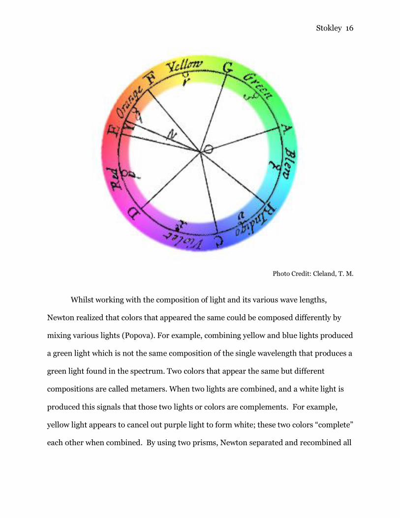
Whilst working with the composition of light and its various wave lengths,
Newton realized that colors that appeared the same could be composed differently by
mixing various lights (Popova). For example, combining yellow and blue lights produced
a green light which is not the same composition of the single wavelength that produces a
green light found in the spectrum. Two colors that appear the same but different
compositions are called metamers. When two lights are combined, and a white light is
produced this signals that those two lights or colors are complements. For example,
yellow light appears to cancel out purple light to form white; these two colors “complete”
each other when combined. By using two prisms, Newton separated and recombined all
Stokley 17
the colors to create the original white light. With this experiment Newton further proved
the notion that light does not revel color or that glass and water colored the light (Piezo).
Photo Credit: Baird, Christopher.
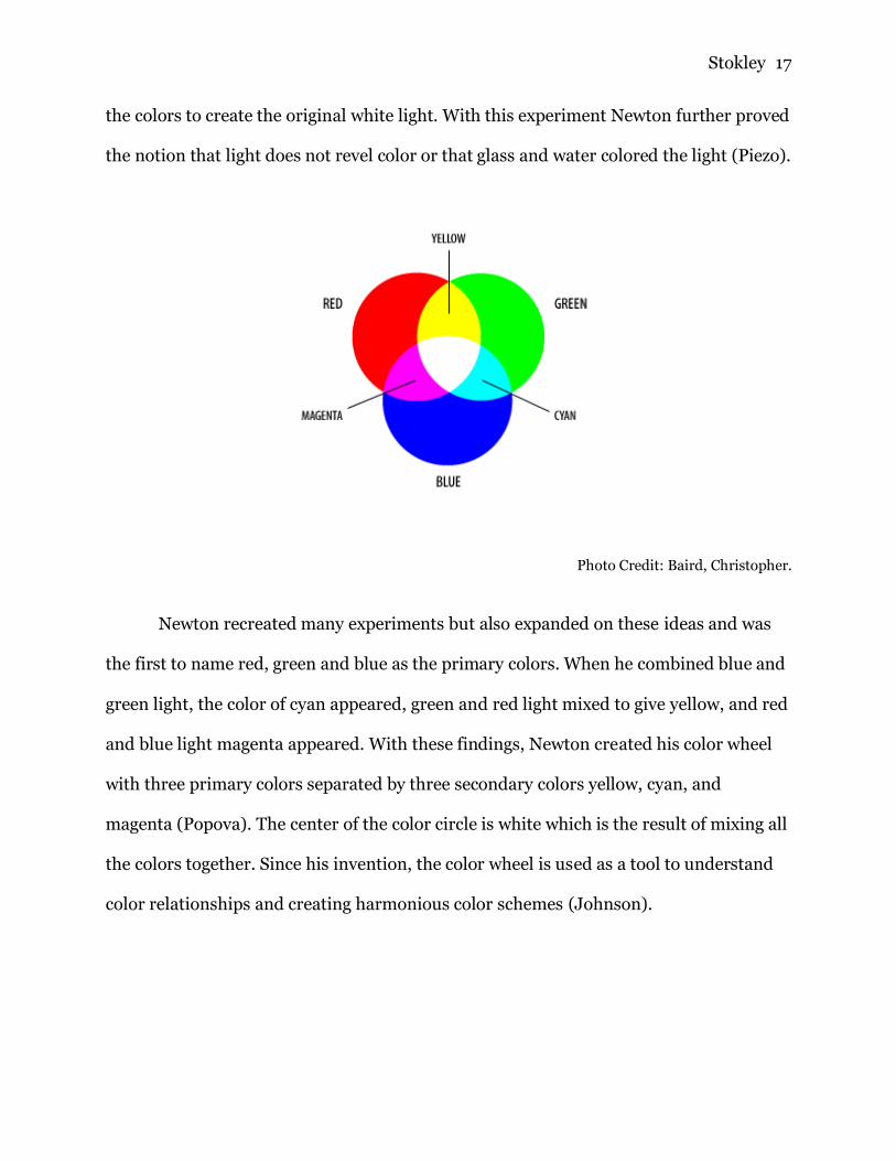
Newton recreated many experiments but also expanded on these ideas and was
the first to name red, green and blue as the primary colors. When he combined blue and
green light, the color of cyan appeared, green and red light mixed to give yellow, and red
and blue light magenta appeared. With these findings, Newton created his color wheel
with three primary colors separated by three secondary colors yellow, cyan, and
magenta (Popova). The center of the color circle is white which is the result of mixing all
the colors together. Since his invention, the color wheel is used as a tool to understand
color relationships and creating harmonious color schemes (Johnson).
Stokley 18
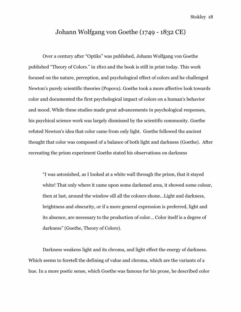
Johann Wolfgang von Goethe (1749 - 1832 CE)
Over a century after “Optiks” was published, Johann Wolfgang von Goethe
published “Theory of Colors.” in 1810 and the book is still in print today. This work
focused on the nature, perception, and psychological effect of colors and he challenged
Newton’s purely scientific theories (Popova). Goethe took a more affective look towards
color and documented the first psychological impact of colors on a human's behavior
and mood. While these studies made great advancements in psychological responses,
his psychical science work was largely dismissed by the scientific community. Goethe
refuted Newton's idea that color came from only light. Goethe followed the ancient
thought that color was composed of a balance of both light and darkness (Goethe). After
recreating the prism experiment Goethe stated his observations on darkness
“I was astonished, as I looked at a white wall through the prism, that it stayed
white! That only where it came upon some darkened area, it showed some colour,
then at last, around the window sill all the colours shone...Light and darkness,
brightness and obscurity, or if a more general expression is preferred, light and
its absence, are necessary to the production of color… Color itself is a degree of
darkness” (Goethe, Theory of Colors).
Darkness weakens light and its chroma, and light effect the energy of darkness.
Which seems to foretell the defining of value and chroma, which are the variants of a
hue. In a more poetic sense, which Goethe was famous for his prose, he described color
Stokley 19
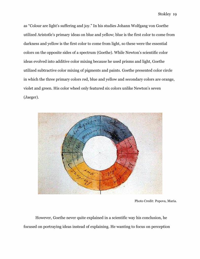
as “Colour are light’s suffering and joy.” In his studies Johann Wolfgang von Goethe
utilized Aristotle’s primary ideas on blue and yellow; blue is the first color to come from
darkness and yellow is the first color to come from light, so these were the essential
colors on the opposite sides of a spectrum (Goethe). While Newton’s scientific color
ideas evolved into additive color mixing because he used prisms and light, Goethe
utilized subtractive color mixing of pigments and paints. Goethe presented color circle
in which the three primary colors red, blue and yellow and secondary colors are orange,
violet and green. His color wheel only featured six colors unlike Newton’s seven
(Jaeger).
Photo Credit: Popova, Maria.
However, Goethe never quite explained in a scientific way his conclusion, he
focused on portraying ideas instead of explaining. He wanting to focus on perception
Stokley 20
without relying on explanation. Goethe was really seeking was not a physiological, but a
psychological theory of colors and he believed scientists were disadvantaged because
they desired to explain but not experience the colors like artist or poets would. He
disagreed that color was simply a scientific study, but a personal experience perceived
differently by person. He wanted to emphasize on the “sensual-moral” effect of color.
Goethe stated, "Newton's error was trusting math over the sensations of his eye"
(Goethe). While these views seem at odds with each other, both are important to
understand color theory. The main difference of these two theories is the behavior of
color in different materials. Newton studied light which has an additive way of mixing,
while Goethe used pigments which uses a subtractive way of mixing (Lyn). Additive and
Subtractive color mixing is explained further in the Color Interactions section of this
paper.
Von Goethe’s research marked the beginning of the modern study of the
psychological impact of color and his theories were heavily adopted by artists (Popova).
He is also noted as the first modern intentional color theorist, which is the study of how
colors are perceived and how they interact with other colors (Goethe). Many physicists
rejected Goethe’s theories by condemning them as too subjective. While Goethe is
famous for his poetry, he personally considered ‘Theory of Colors” his most important
work (Jaeger).

Stokley 21
Thomas Young (1773 - 1829 CE)
Since the turn of the 19th century Thomas Young has been called the founder of
physiological optics (Popova). “Physiological optics is concerned with the perceptual
processes in the eye and its associated neuronal structures in the brain” (Britannica).
Young worked with Newton's three primary colors to create every other hue in the
visible spectrum. Young demonstrated that he could generate any color by mixing
varying proportions of the three primary colors of light. He hypothesized that the
human eye perceives only three primary colors, red, green, and blue in varying ratios
and combined them internally. For example, when someone sees magenta, there is
actually only red and blue lights and no green light mixed together, the human eye
“sees” magenta even though that light does not exist (Popova). Hermann von Helmholtz
used Young’s work to postulate that there were three cones, or three receptors in the
retina. The Young–Helmholtz theory foreshadowed the modern understanding of color
vision that there are three nerve fibers in the eye that are sensitive to different
wavelengths of the visible spectrum. The degree of stimulation of the sensitive nerve
fiber cones creates the perceived color (Britannica).
Albert Munsell (1858 - 1918 CE)
In the late 19th century, Albert Munsell worked on developing a practical theory
of color theory where colors could be defined and categorized scientifically. Munsell was
an artist as well and was the first to combine the scientific and art of color into a single

Stokley 22
theory. His primary goal was to develop an orderly system to accurately identify every
color that exists. One way to create his color space, Munsell invented the photometer
which measured the luminance of an object. The photometer allowed him to define and
measure how color changes. Another invention was the spinning top which enabled
Munsell to mix colors together to measure the relationship between chroma and value.
From these measurements he defined a color in terms of hue, value and chroma
(Johnson).
Through his experiments Munsell created the first formal color notion and
termed five principle hues; red, yellow, green, blue, and purple (Popova). These
findings were artistically founded through subtractive color mixing. In order to help
display his findings, Munsell created the Munsell Color System (Johnson). This was a
three-dimensional color space. As one moves vertically up or down a neutral line the
value of a color increases or decreases. Moving away from the vertical line increases
chroma of a color, or the saturation. While moving around the neutral vertical line
changes hues. This system is important because it is adaptable in the sense other colors
can be added and it will not disrupt other colors dimensions. However, there limitations
because the space is not continuous so discerning two colors that are just barely
different becomes difficult. Munsell was able to build a bridge between the gap in art
and science. Because of its structure, his system allowed scientist to expand and use the
system whilst being simple enough for artist with no scientific background to select or
compare colors. His system created a way to communicate color across many
disciplines (Piezo).
Stokley 23
Photo(s) Credit: Cleland, T. M.
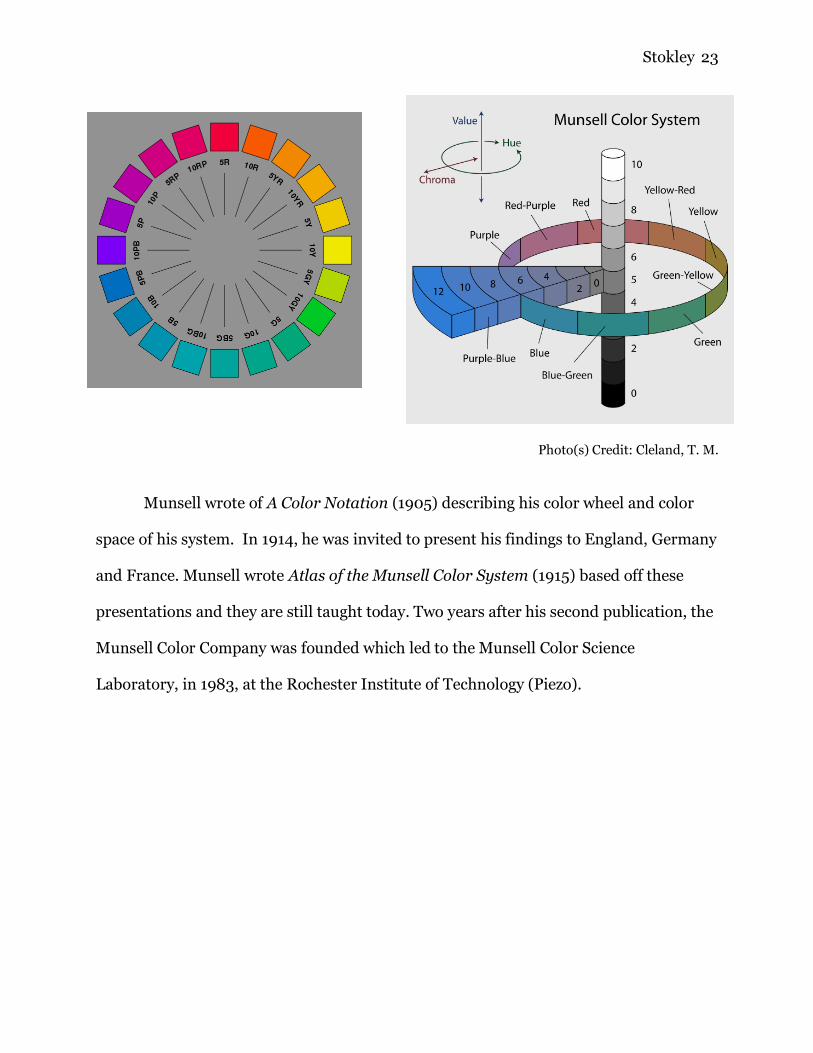
Munsell wrote of A Color Notation (1905) describing his color wheel and color
space of his system. In 1914, he was invited to present his findings to England, Germany
and France. Munsell wrote Atlas of the Munsell Color System (1915) based off these
presentations and they are still taught today. Two years after his second publication, the
Munsell Color Company was founded which led to the Munsell Color Science
Laboratory, in 1983, at the Rochester Institute of Technology (Piezo).
Stokley 24
Colors Elucidated
To better understand the arguments surrounding color science, one should
understand what color is and how they are classified by certain properties. The theories
and topics previously discussed within the last section will be discussed more in depth.
The scientific concept of color can be difficult to grasp but is necessary to have a
somewhat working comprehension of colors in order to differentiate between arguments
and critique the foundations of various rationalizations. Many presume color is a
subjective topic and not a tangible science because of the innumerable varieties of
colors. However, there are many classifications and qualities that can determine a
particular hue by deciphering the wavelength and the scientific behavior of the color.
The Merriam-Webster Dictionary definition of color is “the property possessed by
an object of producing different sensations on the eye as a result of the way the object
reflects or emits light.” The color that humans perceive are due to the three types of
color sensitive cones in the retina of the eye. The three types of cones correspond
roughly to red, green, and blue sensitive detectors. These cones process the various
wavelengths of light that come down from the sun (Byrne). The electromagnetic
radiation of the wavelengths stimulates the cone cells and the cones assist in seeing the
waves as colors. Electromagnetic radiation is a fluctuation of natural electric and
magnetic fields. Color is an energy and the perception of color is a product of the
interaction between energy and matter (Azeemi).

Stokley 25
As color is energy that comes down in waves, the particular length and intensity
of the wave determines the visible color (Byrne). Violet is the shortest wavelength of the
electromagnetic radiation in the visible spectrum of light. Ultraviolet has a shorter
wavelength but is not visible to the human eye. Red has the longest visible wavelength.
And much like ultraviolet is to violet, infrared has a longer wavelength than red, but this
energy cannot be seen by humans. However, the heat generated by infrared radiation
can be felt (Eckstut).
Photo Credit: “Color Theory Part 2: Visible Light Spectrum.”
As light comes down in waves and shines onto an object, due to the length and
intensity of the electromagnetic wavelengths, some colors absorb into the object and
others reflect back. The colors reflected back are the ones perceived through the light
sensitive cones and are visible to the human eye (Byrne). When all the colors are
absorbed into an object the object appears black. And in contrast when all the colors are
reflected back, the object appears white. It is commonly believed that white is an
Stokley 26
absence of all color, this is simply not true and is truly the mixture of all the colors
producing a white light (Caliver).
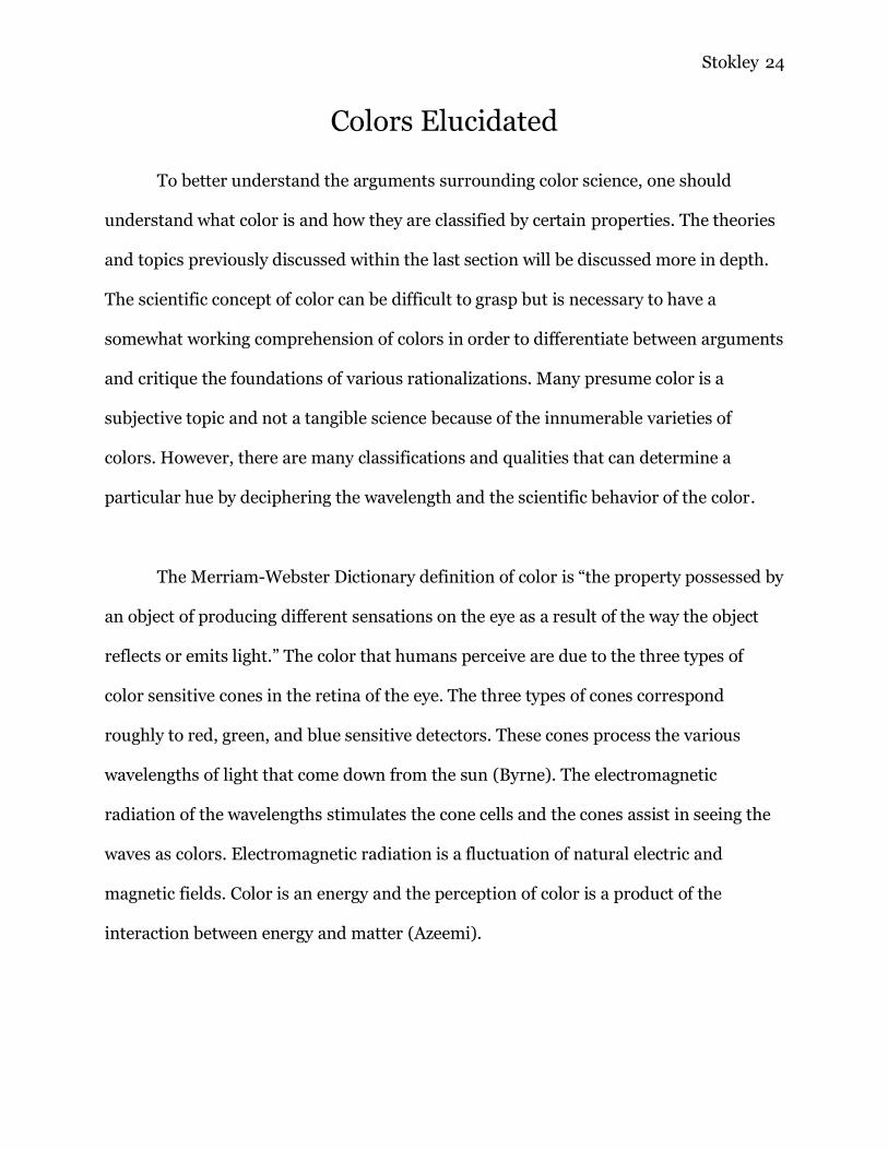
White and black are not colors themselves but instead alter hues by varying
degrees. All hues have tints, shades and tones. A tint is a hue variation of a color mixed
with white. Similarly, a shade is a variation of a color mixed with black. The balance
between hue and black or white ranges from the pure hue of a color to pure white or
pure black. In addition to tints and shades, there are tones. A tone is a hue variation of a
color mixed with gray (Caliver).
Photo Credit: Patkar, Mihir.
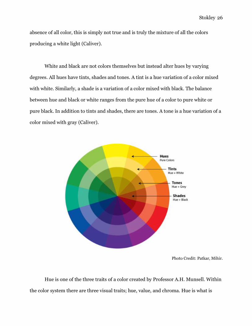
Hue is one of the three traits of a color created by Professor A.H. Munsell. Within
the color system there are three visual traits; hue, value, and chroma. Hue is what is
Stokley 27
commonly called “color.” It is defined as “the quality by which we distinguish one color
from another, as in red from yellow, green, blue, or purple” (Eckstut). Hue is directly
linked to the colors wavelength. A hue may have various degrees of lightness and
darkness. This characteristic is the value of a color and indicates the quantity of light
reflected. This is also called the luminance and refers to the shade or tint of a color.
While value measures the quantity of light reflected, chroma measures the purity of the
color and describes the intensity, or brilliance of a color. Commonly chroma is referred
to as saturation (Caliver).
Photo Credit: Cleland, T. M.
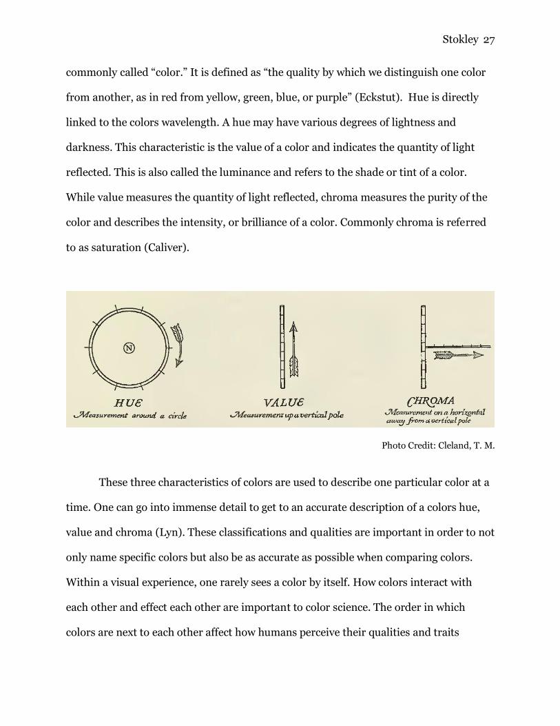
These three characteristics of colors are used to describe one particular color at a
time. One can go into immense detail to get to an accurate description of a colors hue,
value and chroma (Lyn). These classifications and qualities are important in order to not
only name specific colors but also be as accurate as possible when comparing colors.
Within a visual experience, one rarely sees a color by itself. How colors interact with
each other and effect each other are important to color science. The order in which
colors are next to each other affect how humans perceive their qualities and traits
Stokley 28
(Caliver). Within the next section, these qualities are bended and adjusted to created
color schemes, and contrasts in order to create a visionary experience. Like previously
states, colors are solemnly seen alone, but rather they interact with each other. One can
use the following information in order to utilize the power of colors to design a room,
coordinate an outfit, design a website, and the like.
Stokley 29
IV. Color Interactions
Colors are extremely relative and constantly deceive the viewer from their true
nature. Humans never truly perceive colors as they physically are, the color humans
perceive is based on surrounding colors, lighting and other external factors (Azeemi).
The methodology in which colors are mixed changes the physical composition of the
color depending on the nature of the color source, whether additive or subtractive. In
traditional color theory, subtractive color mixing is used and is what most people are
familiar with. Once colors are mixed, every color has a relationship to another color and
their effects on each other are profound (Lyn). The study of color interactions assists in
comprehending how a color will be influenced by its surroundings. There are various
ways that colors interact with each other and they include; contrast of hue, light-dark
contrasts, cool - warm contrasts, complementary contrast, simultaneous contrast,
contrast of saturation, and contrast of extension (Caliver). However, before color
relativity can be touched upon, how colors mix and create hues is important to overview.
There are two methods in which colors mix; additive and subtractive. Additive
color is the behavior of light mixtures. The behavior between ink, paint and pigment
mixtures is called subtractive. Most are familiar with subtractive colors because this is
what is taught in traditional color theory. The confusion between these two behaviors
stems from the absorption of light by objects follows different laws of nature than the
human eye perception of light (Byrne). In subjective color mixing the three primary
colors are red, yellow and blue. In the late 19th century scholars established that

Stokley 30
additive color is described in a different set of primary colors, red, green and blue (RGB)
(Eckstut). These primary colors are anchored in the varying responses by the three
separate color sensitive cones in the retina. Additive color mixing is used in screens like
televisions and computers. Traditional color theory, like the color wheel, is based on
subtractive color mixing (Caliver).
Photo Credit: Baird, Christopher.
When the color wheel is split into two halves, warm and cool colors are separated.
Warm colors are associated with sunset, or daylight and cool colors are associated with
night or overcast days. Warm colors are hues that lay in between red to yellow, and cool
colors are between green to violet. In terms of color theory, warm colors appear active
and usually advance in a painting while cool colors recede. Warm tones stimulate a
viewer's perception and cool colors on the opposite hand relax the scene (Lyn). These
effects are most prominent when the hue is highly saturated. Unsaturated colors lack
chromatic content and are referred to as neutrals, black, white and grey, or near neutrals
like tans, browns, pastels and dark colors. On the color wheel, red yellow and blue are

Stokley 31
the primary colors and this is referred to as the RYB color system, or artistic color model
(Eckstut).
Photo Credit: Patkar, Mihir.
The color wheel is a tool organized specifically to help artist mix colors and also
produce harmonious color schemes. The first color wheel is attributed to Isaac Newton
who arranged seven colors on a rotating disk. When the disc was spun quickly, the
human eye saw white. Since its origins, the color wheel has not changed much but more
so became more detailed. Pictured below is Newtons original color wheel, compared to
the most modern interpterion. The use of a color wheel has since remained the same.
When mixing colors in the RYB color system two primary colors together produce the
secondary colors, orange, green and violet. One step further in color mixing is taking a
Stokley 32
primary color and its adjacent secondary color to produce tertiary colors like red-violet,
or red-orange. When an artist’s complimentary colors are mixed they produce a gray
equivalent in the RYB color system. Complimentary colors and are found across the
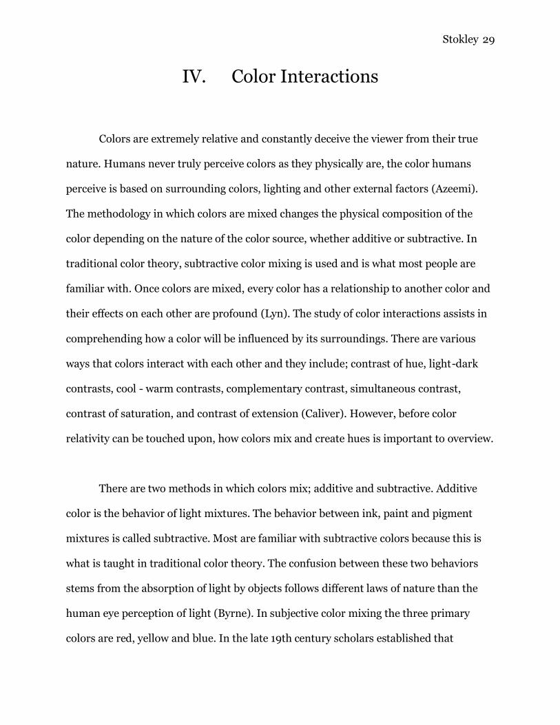
color wheel from each other, for example, blue and orange, purple and yellow (Caliver).
Photo Credit: Cleland, T. M. Photo Credit: Patkar, Mihir.
Colors interact with each other, not only when mixed but when placed next to
each other. When an artist uses specific colors in order to showcase certain colors, they
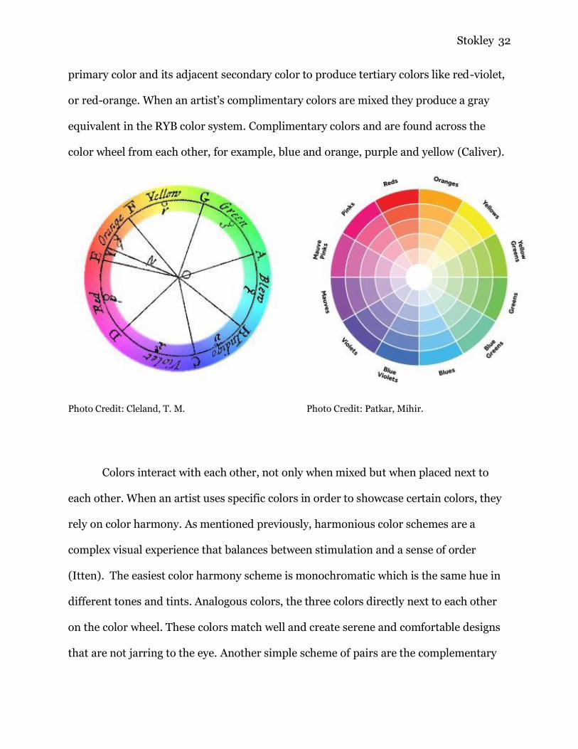
rely on color harmony. As mentioned previously, harmonious color schemes are a
complex visual experience that balances between stimulation and a sense of order
(Itten). The easiest color harmony scheme is monochromatic which is the same hue in
different tones and tints. Analogous colors, the three colors directly next to each other
on the color wheel. These colors match well and create serene and comfortable designs
that are not jarring to the eye. Another simple scheme of pairs are the complementary
Stokley 33
colors, found directly across the color wheel from each other. The high contrast of
complementary colors creates a vibrant look especially when used at full saturation.
Slightly more complex is split complementary colors which uses three colors. The
scheme takes one color and matches it with the two colors adjacent to its
complementary color (Caliver). For example, blue, yellow-orange and red-orange.
Another three-color scheme is called triadic. In a triadic scheme the colors are evenly
spaced around the color wheel and tend to be quite vibrant.
Monochromatic Analogous Complementary
Split Complimentary Triadic
Photo Credit(s): Patkar, Mihir.
Stokley 34
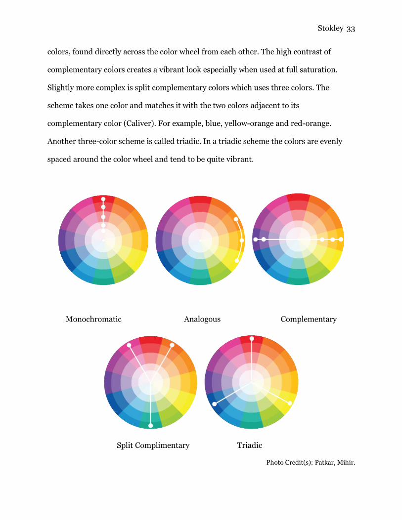
While color harmonies are important in order to create exciting visual
experiences, another aspect of color theory is color relativity. How colors behave in
relation to each other is a complex area of color theory. Color relativity is based on
contrast between neighboring colors. The three traits of a color, hue, value and chroma,
can appear enhanced or reduced depending on the surrounding colors. A hue may seem
darker if surrounded by lighter colors, and a color may seem cooler if surrounded by
warm colors. A color may be able to appear as two different colors (Eckstut). The three
properties of color are all relative and are based on how the cones in the eye perceive
colors. These interpretations, due to surrounding colors, are defined by relative
temperature, relative value, and relative chroma (Lyn).
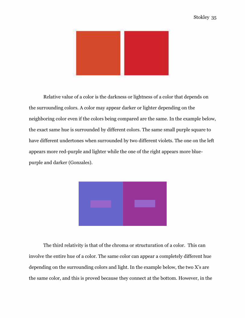
Relative temperature is used in order to compare two colors warmness or
coolness. The same color can appear both warm and cool depending on its shades, tints,
and color mixture. And traditional warm or cool colors can appear different when
comparing them to their surrounding colors (Itten). It's important to remember that
warmth or coolness of a hue is not absolute, but it's strongly related to what colors are
around it. For example, both of the red squares below would be considered warm when
speaking in terms of all colors. However, when comparing one of the red squares to the
other, the red square on the right is cooler than the red square on the left. This is
because the color on the left would be closer to yellow on the color wheel, and the right
color would be closer to blue (Lyn).
Stokley 35
Relative value of a color is the darkness or lightness of a color that depends on
the surrounding colors. A color may appear darker or lighter depending on the
neighboring color even if the colors being compared are the same. In the example below,
the exact same hue is surrounded by different colors. The same small purple square to
have different undertones when surrounded by two different violets. The one on the left
appears more red-purple and lighter while the one of the right appears more blue-
purple and darker (Gonzales).
The third relativity is that of the chroma or structuration of a color. This can
involve the entire hue of a color. The same color can appear a completely different hue
depending on the surrounding colors and light. In the example below, the two X’s are
the same color, and this is proved because they connect at the bottom. However, in the

Stokley 36
purple square it appears green or yellow and in the yellow square it appears purple. The
reason the X looks yellow in the purple box is because the purple box is more purple
than the X, making it look yellow. Same goes for why the X looks purple in the yellow
box (Gonzales).
Photo Credit: Patkar, Mihir.
By using these relativities, strategies were able to be defined and identified in
order to have successful color combinations. In 1922 Johannes Itten devised seven color
contrasts and produced methodologies for coordinating colors to utilize their properties
(Itten). The seven common types of color contrast relativity include; contrast of hue,
light-dark contrasts, cool - warm contrasts, complementary contrast, simultaneous
contrast, contrast of saturation, and contrast of extension.
Photo Credit: Hoffer, Pete.

Stokley 37
Contrast of hue is the juxtaposition between two different hues. The contrast is
greatest at the most intense luminosity or when using the primary colors; red, yellow,
and blue. This contrast simply uses numerous different colors that are located around
the color wheel and sits them next to each other to either enhance or diminish a colors
visual power.
Photo Credit: Hoffer, Pete.
Light-dark contrasts are between light and dark values and include a
monochromatic composition. This contrast refers to the relative lightness and darkness
of a color and the greatest contrast is between black and white. This is also known as the
contrast of value as it does not alter the hue or chroma of a color. Altering the darkness
and lightness of a color can greatly alter an image, as seen above, the foreground seems
much larger than the background compared to the second image with a dark
foreground.
Photo Credit: Hoffer, Pete.
Stokley 38
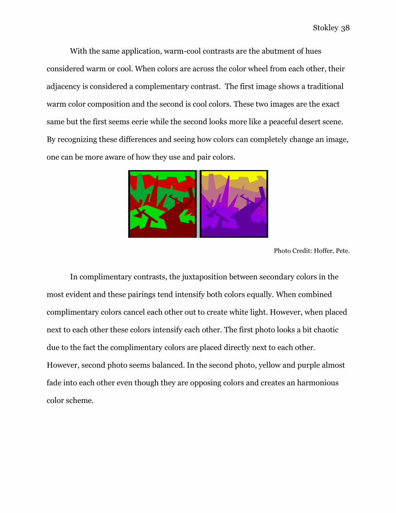
With the same application, warm-cool contrasts are the abutment of hues
considered warm or cool. When colors are across the color wheel from each other, their
adjacency is considered a complementary contrast. The first image shows a traditional
warm color composition and the second is cool colors. These two images are the exact
same but the first seems eerie while the second looks more like a peaceful desert scene.
By recognizing these differences and seeing how colors can completely change an image,
one can be more aware of how they use and pair colors.
Photo Credit: Hoffer, Pete.
In complimentary contrasts, the juxtaposition between secondary colors in the
most evident and these pairings tend intensify both colors equally. When combined
complimentary colors cancel each other out to create white light. However, when placed
next to each other these colors intensify each other. The first photo looks a bit chaotic
due to the fact the complimentary colors are placed directly next to each other.
However, second photo seems balanced. In the second photo, yellow and purple almost
fade into each other even though they are opposing colors and creates an harmonious
color scheme.
Stokley 39
Photo Credit: Hoffer, Pete.
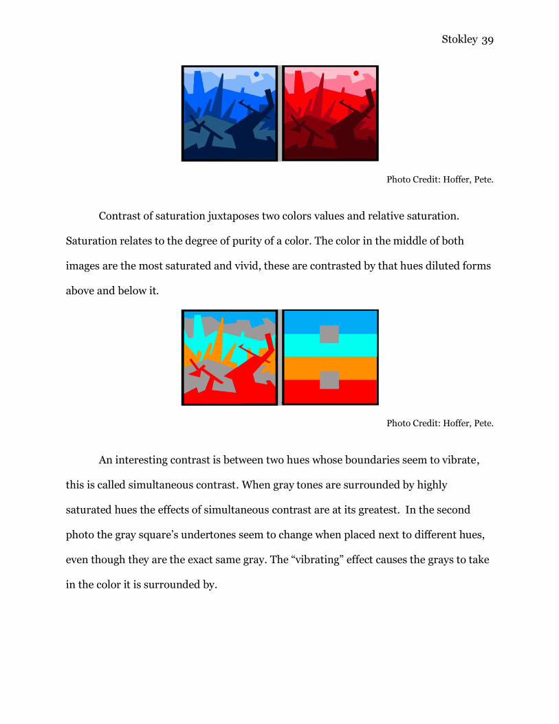
Contrast of saturation juxtaposes two colors values and relative saturation.
Saturation relates to the degree of purity of a color. The color in the middle of both
images are the most saturated and vivid, these are contrasted by that hues diluted forms
above and below it.
Photo Credit: Hoffer, Pete.
An interesting contrast is between two hues whose boundaries seem to vibrate,
this is called simultaneous contrast. When gray tones are surrounded by highly
saturated hues the effects of simultaneous contrast are at its greatest. In the second
photo the gray square’s undertones seem to change when placed next to different hues,
even though they are the exact same gray. The “vibrating” effect causes the grays to take
in the color it is surrounded by.
Stokley 40
Photo Credit: Hoffer, Pete.
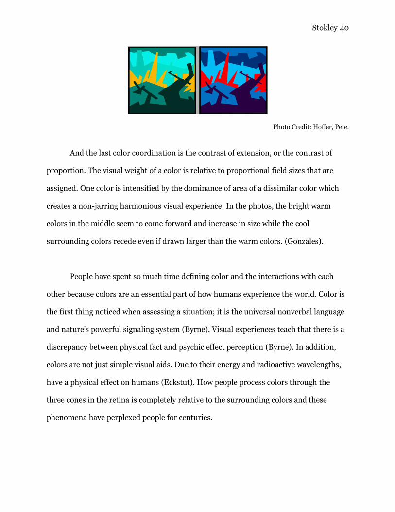
And the last color coordination is the contrast of extension, or the contrast of
proportion. The visual weight of a color is relative to proportional field sizes that are
assigned. One color is intensified by the dominance of area of a dissimilar color which
creates a non-jarring harmonious visual experience. In the photos, the bright warm
colors in the middle seem to come forward and increase in size while the cool
surrounding colors recede even if drawn larger than the warm colors. (Gonzales).
People have spent so much time defining color and the interactions with each
other because colors are an essential part of how humans experience the world. Color is
the first thing noticed when assessing a situation; it is the universal nonverbal language
and nature's powerful signaling system (Byrne). Visual experiences teach that there is a
discrepancy between physical fact and psychic effect perception (Byrne). In addition,
colors are not just simple visual aids. Due to their energy and radioactive wavelengths,
have a physical effect on humans (Eckstut). How people process colors through the
three cones in the retina is completely relative to the surrounding colors and these
phenomena have perplexed people for centuries.
Stokley 41
V. Conclusion
It is easy to see why colors have perplexed scholars for centuries. How humans
perceive colors goes against what anyone would assume. The journey of humans
understand how humans see colors has had an extensive history. An understanding of
the past allows one to predict future trends and more importantly comprehend the
present. Color science is a complex field of psychics which requires experts from
numerous fields to grasp a working understanding of the nature of color. When this field
is credited to only Isaac Newton, the complexity of this field diminishes. It is important
to know of the various scholars to begin comprehending color theory. Color theory is
used in everyday life. People based decisions on colors, moods change due to certain
colors and cultures put certain values to colors. Having a basic understanding of color
theory someone can correlate colors better, understand why their poster is hard to read,
or put together better presentations. Knowing how humans perceives colors also gives
one a better understanding how eyes operates.
While this paper attempts to uncover and credit more scholars within the study
of color, it is nowhere complete. These findings are still quite surface level. Further
research of this field could include scientist from other regions around the world, and
female scientists. Worldly views on color research would be interesting because it is
being researched that humans see colors differently around the world due to our
evolutions in our natural environments and languages. The debate lies within the
argument if humans actually perceive colors differently or if the colors are seen in
Stokley 42
similar ways and there is just different emphasis on linguistics. These studies within
color are expansive and require extensive psychological and psychical research.
The understanding of colors allows experts in numerous fields to hone in on their
qualities and benefits. Colors have the power to evoke emotions, attract new customers,
provide a calming or stimulating event or provide an exciting visual experience.
Through the study of color theory people of all disciplines can advance within their field.
Having a holistic view of how color theory came about gives one a greater appreciation
on the complexity of the field.
VI. Works Cited
Azeemi, Samina T., and Mohsin Mohsin Raza. “A Critical Analysis of Chromotherapy
and Its Scientific Evolution.” Advances in Pediatrics., U.S. National Library of
Medicine, 2 Dec. 2005, www.ncbi.nlm.nih.gov/pmc/articles/PMC1297510/.
Britannica, The Editors of Encyclopaedia. “Thomas Young.” Encyclopædia Britannica,
Encyclopædia Britannica, Inc., 9 June 2018,
www.britannica.com/biography/Thomas-Young.
Byrne, Alex, and David Hilbert. “Color Realism and Color Science.” Behavioral and
Brain Sciences, Cambridge University Press 2002, 2002,
web.mit.edu/abyrne/www/ColorRealism.html.

Stokley 43
Caliver, Robert. “Basic Color Theory.” How Animals See Color, J.L. Morton., 2017,
www.colormatters.com/color-and-design/basic-color-theory.
Eckstut, Joann, and Arielle Eckstut. The Secret Language of Color: Science, Nature,
History, Culture, Beauty of Red, Orange, Yellow, Green, Blue & Violet. Black Dog
& Leventhal, 2013.
Goethe, Johann Wolfgang von, and Charles Lock Eastlake. Goethe's Theory of Colours.
The Echo Library, 2016.
Gonzales, Barbara. “Color Contrasts.” UT Dallas Color Program , The University of
Texas at Dallas,
www.utdallas.edu/~melacy/pages/2D_Design/Itten_ColorContrasts/IttenColor
Contrasts.html.
Itten, Johannes. The Art of Color: The Subjective Experience and Objective Rationale of
Color. Van Nostrand Reinhold, 2004.
Jaeger, W. “Principles of Order in the Color Systems of the 17th Century. .” Advances in
Pediatrics., U.S. National Library of Medicine, Apr. 1984,
www.ncbi.nlm.nih.gov/pubmed/6374264.
Johnson, A. “COLOR THEORY.” Color, MIT Optical Psychics ,
web.mit.edu/22.51/www/Extras/color_theory/color.html.
Loeb, James, and Jeffrey Henderson. “Aristotle, On Colours.” Loeb Classical Library,
Harvard University Press, 26 Mar. 2018, www.loebclassics.com/view/aristotle-
colours/1936/pb_LCL307.5.xml.
Lyn, Sol. “Color Think Tank - What Is Color?” Pantone, JOH & COMPANY, 3 July 2014,
www.pantone.com/what-is-color.
Stokley 44
Mahnke, Frank H., and Rudolf H. Mahnke. Color and Light in Man-made
Environments. N.p.: Academy, 1999. Print.
Piezo, Alegra. “Sir Isaac Newton's Influence on the Color Wheel.” Munsell Color System;
Color Matching from Munsell Color Company, 23 Jan. 2013, munsell.com/color-
blog/sir-isaac-newton-color-wheel/.
Popova, Maria. "19th-Century Insight into the Psychology of Color and Emotion." The
Atlantic. Atlantic Media Company, 17 Aug. 2012. Web.
O'Connor, J, and E. Robertson. “Abu Ali Al-Hasan Ibn Al-Haytham.” Yau Biography,
School of Mathematics and Statistics University of St Andrews, Scotland , Nov.
1999, www-history.mcs.st-andrews.ac.uk/Biographies/Al-Haytham.html.
Wargo, Eric. “How Many Seconds to a First Impression?” Association for Psychological
Science, www.psychologicalscience.org/observer/how-many-seconds-to-a-first-
impression.
Photo Citations
“Color Theory Part 2: Visible Light Spectrum.” Door Hanger Printing - Get Same or Next
Day with NextDayFlyers, 7 Dec. 2010, www.nextdayflyers.com/blog/visible-light-
spectrum/.
Baird, Christopher. “Why Are Red, Yellow, and Blue the Primary Colors in Painting but
Computer Screens Use Red, Green, and Blue?” Science Questions with Surprising
Answers, WTMAU, wtamu.edu/~cbaird/sq/2015/01/22/why-are-red-yellow-
and-blue-the-primary-colors-in-painting-but-computer-screens-use-red-green-
and-blue/.
Stokley 45
Cleland, T. M. “Munsell Color System Practical Description: Hue, Value,
Chroma.” Munsell Color System; Color Matching from Munsell Color Company,
Munsell , 18 Jan. 2017, munsell.com/color-blog/a-grammar-of-color-definition-
hue-value-chroma/.
Escher, Mauritis. “Optical Illusions Art.” Tempopermettendo, SiteOrigin.,
tempopermettendo.info/optical-illusions-art/.
Firas, A. “Ibn Al-Haytham – The First Scientist.” Science of People, Lost Islamic
History, 31 May 2018, lostislamichistory.com/ibn-al-haytham-the-first-
scientist/.
Gage, John. “Colorsystem.” Colorsystem Philipp Otto Runge Kommentar,
www.colorsystem.com/?page_id=629&lang=en.
Loeb, James, and Jeffrey Henderson. “ARISTOTLE, On Colours.” Loeb Classical
Library, 26 Mar. 2018, www.loebclassics.com/view/aristotle-
colours/1936/pb_LCL307.9.xml.
Patkar, Mihir. “Learn The Basics Of Colour Theory To Know What Looks
Good.” Lifehacker Australia, Lifehacker Australia, 3 Oct. 2014,
www.lifehacker.com.au/2014/10/learn-the-basics-of-color-theory-to-know-
what-looks-good/.
Popova, Maria. “Goethe on the Psychology of Color and Emotion.” Brain Pickings, 14
May 2018, www.brainpickings.org/2012/08/17/goethe-theory-of-colours/.