heuristic analysis medicare.gov prescription drug plan finder
TRANSCRIPT
Heuristic Analysis Medicare.gov Prescription Drug Plan Finder
Rebecca Scollan Interaction Design and Information Architecture University of Baltimore Baltimore, MD October 2007
Heuristic Analysis University of Baltimore, MD
Contents 1. Introduction 3 2. Executive Summary 3 3. Methodology 4 4. Site Assessment 6 5. Recommendations 12 Appendix A: Heuristic References 17 Appendix B: Site Assessment Notes 24 References 25
_ _ _ 2

Medicare Prescription Drug Plan Finder October 2007
1. Introduction Medicare.gov offers an interactive application to assist users in their search for a Medicare prescription drug plan based on criteria such as cost, drugs covered and participating pharmacies. A heuristic analysis of the general search was conducted according to current usability standards set forth for seniors. An emphasis was placed on heuristics that decrease demands on two cognitive abilities that decline in age: attention and working memory. The analysis is an informal one: only one reviewer was used and there was limited access to the tool. Regardless, key redesign suggestions resulted from the review. 2. Executive Summary Summary A heuristic analysis was performed with a focus on decreasing the cognitive demands on attention and memory for seniors who use the medicare.gov website. The Prescription Drug Plan Finder met several of the criteria, however some usability challenges were found. Heurist ics Two primary heuristics were used to analyze the Prescription Drug Plan Finder: • Attention: Sites should employ consistent, minimal design to ensure comprehension of
and attention to the most important elements on the screen. • Working Memory: A clear, consistent, shallow structure that provides the user the
ability to maintain confidence in where they are in the process, what information has been used and what will be needed.
Recommendations Six approachable redesign goals are recommended, all of which can be applied quickly and easily: • Make text easier to read and scan • Get rid of clutter • Keep it all in view • Assist recognition rather than recall • Guide the way • Provide friendly, contextual clues
3 _ _ _

Heuristic Analysis University of Baltimore, MD
3. Methodology Heurist ic analys is A heuristic evaluation typically pulls together a team of experts to test a user interface against a set of agreed upon usability standards. Each expert reviews the site alone and rates it according to how it measures up to those standards, or the severity of how it does not. While not considered as effective as user testing, heuristic analysis is noted as quick, informal and a cost effective means for review. For the heuristic analysis of medicare.gov’s Prescription Drug Plan Finder, a review of current research into age and web standards was conducted. From this search, two of the primary cognitive abilities that decline with age were chosen as a focus and both were used to define a heuristic. Key web standards that make sites friendlier to older adults with cognitive disabilities were selected as examples for each of the heuristics. With these in hand the site was reviewed through once for each. Where the Finder met the standards or deviated from them was noted. These notes were considered in the proposed redesign of the tool. Cognit ive abi l i t ies found to decrease with age In order to best serve the primary audience of medicare.gov’s Prescription Drug Plan Finder, it was decided to focus on current usability standards for senior computer users (defined in this analysis as 65 and older). Seniors have a wide range of abilities and experience using technology, yet are frequently at a disadvantage in accessing technology due to impairments in vision, cognition, motor skills and literacy that increase with age (Becker, 2004, p.390). This heuristic analysis focuses on usability standards that apply to cognitive impairments. Czaja writes (2005), “Age-related changes in cognition may have a negative impact on access and use of technology” (p.9). In order to design the best possible interface for older adults, it is important to understand which cognitive processes decline as we age. The following have been found:
• Attentional processes: the ability to concentrate and focus on the task at hand. • Working memory: also known as short-term memory. A common rule of usability
standards is Miller’s Rule – users can process seven tasks, plus or minus two, at a time. • Discourse comprehension: the ability to comprehend spoken or written discourse. • Problem solving and reasoning.
Inference formation and interpret• ation: the ability to draw conclusions based on prior knowledge and observation. Encoding and retrieval in me• mory: the ability to process and call back stored information.
The first two, attention and working memory, are pointed out most frequently as impairments that can hamper access to technology and are the focus of this review. If disabilities in either of these cognitive processes are not considered in the interface of the Drug Plan Finder application, it can greatly affect how a senior user navigates through it, or if they manage to get
_ _ _ 4

Medicare Prescription Drug Plan Finder October 2007
through it at all. Appropriate design that caters to the needs of users with such disabilities can improve efficiency, learnability, and user-satisfaction. (Kurniawan & Zaphiris, 2005, p.130) Usabi l i ty standards for seniors There is a great deal of research into web accessibility and usability standards, most notably the World Wide Web Consortium’s Web Content Accessibility Guidelines, section 508 of the Telecommunications Act, Shneiderman's "Eight Golden Rules of Interface Design" and Nielson’s ten user interface heuristics. Usability researchers and organizations such as the AARP, National Institute on Aging and the National Library of Medicine have also compiled standards to use when designing sites for seniors. This literature was reviewed to find heuristics key to minimizing demands on attention and working memory. ◊ Attention To ease the cognitive demands on attentional processes a design should strive to limit the amount of information on each page by including only necessary information and highlighting what’s most important. Czaja notes (2005) “Declines in attentional capacity may make it difficult for older people to perform concurrent activities or switch their attention between competing displays of information,” (p.9), which includes identifying a necessary button or link on a crowded website. Furthermore, too much information on the screen is a barrier to the user concentrating on the task at hand, especially when dealing with more complex information such as choosing a health plan. Kurniawan and Zaphiris (2005) have found:
[The] cognitive effort required to do sensory processing diminishes the remaining mental resources available for engaging in deeper, interpretive processing of the information. (p.130)
The Drug Plan Finder’s general search returns 76 available plans, which is a large amount of information for any user to process. Avoiding animation, pop-up or multiple browser windows, using visual conventions for navigation, buttons and links and a consistent, minimal page layout also contribute to lessening the demands on the users attention. ◊ Working Memory To reduce demands on working memory it’s key to help users recognize and find information on a page rather than expect them to remember information from either previous pages or even elsewhere on the current page. Senior web users with impairments to working memory have difficulty remembering what pages they visited or what steps they took to arrive at their current page (Kurniawan & Zaphiris, 2005, p.130). Such impairments may also “make it difficult for older people to learn new concepts or skills or recall complex operational procedures” (Czaja, 2005, p.9). Also, tied in to some of the problems associated with attentional processes, seniors with impairments in working memory are less able to pick out important details in an overly crowded or distracting display of information (Becker, 2004, p.390). To help increase performance and satisfaction of a senior user with impairments in working memory a visible site structure with simple, linear navigation, a shallow hierarchy and a minimal, consistent page layout should be characteristics of the interface.
5 _ _ _

Heuristic Analysis University of Baltimore, MD
Heurist ics used for medicare.gov analys is A general goal according to easing cognitive demands on both attention and working memory and associated web usability standards were used in the heuristic analysis. ◊ Attentional processes Sites should employ consistent, minimal design to ensure comprehension of and attention to the most important elements on the screen. Key web standards:
• Consistent, conventional and minimal page layout (including button and information positioning) throughout
• Simple, consistent navigation that incorporates backward/forward navigation • Incorporates text with icons • Use of large buttons • Avoidance of scrolling text • Key information highlighted (bold, increase of text size, position)
Working memory
clear, consistent, shallow structure that provides the user the ability to maintain confidence in
ey web standards:
• Provides clues to ensure users understand what came before and what comes next
rmation form one screen to the next
. Site Assessment
• Only necessary information on the screen • Perceptual organization, such as grouping
◊ Awhere they are in the process, what information has been used and what will be needed. K
• Visible system instructions throughout • User should not have to remember info• Clear, linear navigation scheme with consistent labeling
4
the evaluation of the Drug Plan Finder several elements of thIn e interface were found to help
eets a good deal of criteria regarding working memory, though not lways consistently. The application anticipates some potential errors (figure 1).
decrease the cognitive load on seniors using the site. Several important problems were also found, for which redesign suggestions are offered in Section Five. nterface Strengths I
he Drug Plan Finder mT
a
_ _ _ 6

Medicare Prescription Drug Plan Finder October 2007
Figure 1: Mistakenly hitting “Retrieve my drug list” without entering any information directs the user to
“enter my drugs.” From Medicare.gov.
A list of materials needed to an the application is provided arly on, and an option is offered for users who do not have the necessary materials (figure 2).
swer some of the questions used in
eA glossary, help documentation and an email link are provided at the top right hand corner of each page (figure 3).
7 _ _ _

Heuristic Analysis University of Baltimore, MD
Figure 2: List of necessary documents. From Medicare.gov.
Figure 3: Help re.gov. Buttons es 4 nd 5), criteria that help with both attention and working memory impairments.
offered in the upper right hand corner of each page. From Medica
use descriptive text and there is consistent use of bulleted and bolded text (figura
Figure 4: Bulleted text assists readability. From Medicare.gov.
Figure 5: Button text adequatel scribes the information it links to. From Medicare.gov. It was a and
e questions asked on screen.
y de
lso noted that the user does not always need to remember information to understth
_ _ _ 8

Medicare Prescription Drug Plan Finder October 2007
Areas for Improvement Two challenges found for seniors with cognitive impairments in both working memory and
tention was an inconsistent use of minimal page layout and scrolling text (figures 6 and 7). at
Figure 6: Too much information on the page makes it difficult to decide what to do. From Medicare.gov.
Figure 7: Too much information as well as scrolling text. From Medicare.gov.
9 _ _ _

Heuristic Analysis University of Baltimore, MD
Page and back button labeling is both inconsistent and not descriptive enough, two criteria for working mem
ory (figure 8).
Figure 8: Inconsistent header labeling – “general questions” is not used as a header on the previous page. From Medicare.gov.
Another key problem found in terms of was a lack of contextual clues to form the user where they are in the process of the application. Which page starts and ends the
is
ffered on most of the pages, cluding buttons and links, which can be very distracting to the goal at hand (figure 9 and 10).
working memory
inprocess is not quite clear, nor are steps to take once the final search results are presented. Thcan lead to greater misunderstandings, such as the greater goal of the application, and whether or not the user has completed such goal. Without these clues too much stress is placed on working memory resulting in an unsatisfying experience. In terms of attentional processes, too much information oin
Figure 9: What step to take next? Competing colors, buttons, links and scrolling all vie for the users’ attention. Fro Medicare.gov. m
_ _ _ 10

Medicare Prescription Drug Plan Finder October 2007
Figure 10: Too many questions on the page. From Medicare.gov.
11 _ _ _

Heuristic Analysis University of Baltimore, MD
5. Recommendations The overall redesign goal is to improve the efficiency, learnability, and user-satisfaction of seniors while navigating through the Prescription Drug Plan Finder interface. In order to do this it is important to think in terms of creating what Cooper calls a “considerate” interface. Amongst others, a considerate interface: • Takes an interest in its primary audience – seniors • Is forthcoming by anticipating potential problems its users may have and offering easy
access to helpful information and an easy way out • Anticipates the needs of its senior users • Keeps seniors informed with both important information about the interface and the
product To achieve a considerate interface, there are six key suggestions. Redesign goals Make text easier to read and scan: further break down any paragraphs into small chunks or bullets.
Figure 11: A potential example of eliminating unnecessary information and simplifying text on the Prescription Drug Plan Finder home page. From Medicare.gov.
_ _ _ 12
Medicare Prescription Drug Plan Finder October 2007
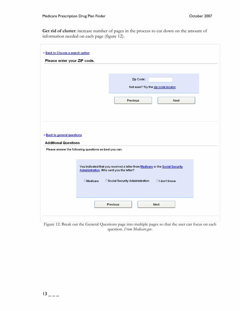
Get rid of clutter: increase number of pages in the process to cut down on the amount of information needed on each page (figure 12).
Figure 12: Break out the General Questions page into multiple pages so that the user can focus on each
question. From Medicare.gov.
13 _ _ _

Heuristic Analysis University of Baltimore, MD
Keep it all in view: eliminate any need for scrolling by decreasing the amount of information on a given page and dividing pages into more than one when necessary (figure 13).
Figure 13: Include information offered below the scroll on the final page as links. From Medicare.gov. Assist recognition rather than recall: use descriptive, consistent page labeling that lets the user know where they are in the process.
Figure 14: Use descriptive language in headings and be sure “back” links match the headings on the previous page. From Medicare.gov.
_ _ _ 14

Medicare Prescription Drug Plan Finder October 2007
Guide the way: make navigation simpler and more accessible.
Figure 15: Provide multiple ways to navigate, such as a “back” link and a “previous” button. From Medicare.gov.
Figure 16: Provide easy tools to move back to key portions of the site. From Medicare.gov. Provide friendly, contextual clues: include a welcome message, a page to signify the “end” of the process, and where to go next.
Figure 17: Simply adding the word “welcome” informs users they are at the start page. From Medicare.gov.
15 _ _ _

Heuristic Analysis University of Baltimore, MD
Figure 18: Use a completion message to alert users they are at the end. From Medicare.gov.
Figure 19: Offer links to any next steps so that users feel empowered to continue on. From Medicare.gov.
_ _ _ 16

Medicare Prescription Drug Plan Finder October 2007
Appendix A Heuristic References Kurniawan and Zaphiris (2005) compiled a new set of web usability standards they consider more robust than unmerged guidelines currently available (p.131). H1. Target Design H1.1. Provide larger targets H1.2. There should be clear confirmation of target capture, which should be visible to older
adults who should not be expected to detect small changes H1.3. Older adult should not be expected to double click H2. Use of Graphics H2.1. Graphics should be relevant and not for decoration. No animation should be present H2.2. Images should have alt tags H2.3. Icons should be simple and meaningful H3. Navigation H3.1. Extra and bolder navigation cues should be provided H3.2. Clear navigation should be provided H3.3. Provide location of the current page H3.4. Avoid pull-down menus H3.5. Do not use a deep hierarchy and group information into meaningful categories H4. Browser Window Features H4.1. Avoid scroll bars H4.2. Provide only one open window e.g., pop-up/ animated advertisements or multiple
overlapping windows should be avoided H5. Content Layout Design H5.1. Language should be simple and clear H5.2. Avoid irrelevant information on the screen H5.3. Important information should be highlighted H5.4. Information should be concentrated mainly in the centre H5.5. Screen layout, navigation and terminology used should be simple, clear and consistent H6. Links H6.1. There should be differentiation between visited and unvisited links H6.2. Links should be clearly named and no link with the same name should go to a different
page H6.3. Links should be in a bulleted list and not tightly clustered H7. User Cognitive Design H7.1. Provide ample time to read information
17 _ _ _
Heuristic Analysis University of Baltimore, MD
H7.2. Reduce the demand on working memory by supporting recognition rather than recall and provide fewer choices to the user
H8. Use of Colour and Background H8.1. Colours should be used conservatively H8.2. Blue and green tones should be avoided H8.3. Background screens should not be pure white or change rapidly in brightness between
screens. Also, a high contrast between the foreground and background should exist, for example, coloured text on coloured backgrounds should be avoided.
H8.4. Content should not all be in colour alone (colour here is denoted by all colours other than black and white)
H9. Text Design H9.1. Avoid moving text H9.2. Text should be left justified and text lines should be short in length H9.3. There should be spacing between the lines H9.4. Main body of the text should be in sentence case and not all capital letters H9.5. Text should have clear large headings H9.6. Use san serif type font i.e., Helvetica, Arial of 12-14 point size. Avoid other fancy font types. H10. Search Engine H10.1. Search engines should cater for spelling errors H11. User Feedback & Support H11.1. Provide a site map H11.2. An online help tutorial should be provided H11.3. Support user control and freedom H11.4. Error messages should be simple and easy to follow Heuristics compiled from AARP’s (NA) review of relevant research on older adults and Web design. They include a list of questions used to focus observations on Web sites. Interaction Design: Designing the way users work with the site 1. Use conventional interaction elements. 1.1 Does the site use standard treatments for links? 1.2 Is link treatment the same from to within the site? 2. Make it obvious what is clickable and what is not. 2.1 In lists of bulleted links, are the bullets clickable? 2.2 Are command and action items presented as buttons? 2.3 Do buttons and links show that they have been clicked? 2.4 Are buttons clearly labeled? 2.5 If there is an image on a button or icon, is it task-relevant? 2.6 Do graphic buttons avoid symbols that will be unfamiliar to older adults who have low
computer and Web expertise?
_ _ _ 18

Medicare Prescription Drug Plan Finder October 2007
2.7 Is there a visible change (other than the cursor changing) when the user "points" to something clickable with his or her mouse?
3. Make clickable items easy to target and hit. 3.1 Are buttons large enough to easily see the image or text on them – at least 180 x 22
pixels? 3.2 Is the area around buttons clickable? 3.3 Is there enough space between targets to prevent hitting multiple or incorrect targets? 3.4 Do buttons and links enlarge when the rest of the text size is increased? 4. Minimize vertical scrolling; eliminate horizontal scrolling. 4.1 Does the site work at the resolution that the user would typically view the site at
without horizontal scrolling? 4.2 Do pop-ups and secondary windows open wide and long enough to contain the content
without the need for scrolling? 4.3 For scrolling lists, for example, a list of all the states. 5. Ensure that the Back button behaves predictably. 5.1 Does the Back button appear on the browser toolbar on every page? 5.2 Does clicking the Back button always go back to the page that the user came from? 6. Let the user stay in control. 6.1 Is there no rolling text that goes by automatically? 6.2 Does the site use static menus (a click leads to another page) rather than “walking
menus” (exposing a sub-menu on hovering)? 6.3 If there are walking menus, do they expand on a click (rather than a hover)? 6.4 Are the sub-menus timed to stay open for 5 seconds or until they’re clicked? 7. Is there clear feedback on actions? 7.1 Are error pages descriptive and did they provide a solution to the user? 7.2 Are confirmation pages clear? 8. Provide feedback in other modes in addition to visual. 8.1 Are captioning and or meaningful alternative text provided for images, video, and
animation? 8.2 Does the site support haptic (vibrating, tactile feedback) pointing devices (such as the
Logitech iFeel mouse)? Information Architecture: Organizing the content 9. Make the structure of the Web site as visible as possible. 9.1 Does the site use a directory list format for listing topics (such as Yahoo! does or
hhs.gov or firstgov.gov)? 9.2 Does the site use cross-references to related topics and redundant links? 9.3 Is the site hierarchy as broad and shallow as possible? 10. Clearly label content categories; assist recognition and retrieval rather than recall.
19 _ _ _

Heuristic Analysis University of Baltimore, MD
10.1 Are labels descriptive enough to make it easy to accurately predict what the content will be under each topic category?
10.2 Do labels and links start with different, distinct, and relevant key words? 10.3 Are labels useful and understandable each on their own? 10.4 Do labels reflect language that older adults are familiar with? 11. Implement the shallowest possible information hierarchy. 11.1 Are important, frequently needed topics and tasks closer to the surface of the Web site? 11.2 Are related topics and links grouped and labeled? 11.3 Do labels and category names correspond to users’ tasks and goals? 11.4 Do paths through the information architecture support users’ tasks and goals? 11.5 Is the path for any given task a reasonable length (2-5 clicks)? 11.6 Is the path clear of distractors and other obstacles to reaching task goals? 11.7 Are there a few, helpful cross-reference links that are related to the current task goal? 11.8 Do redundant links have the same labels? 12. Include a site map and link to it from every page. 12.1 Is there a site map? 12.2 Is the site map linked from every page? 12.3 Does the site map provide a quick overview of the whole site, a rehash of the main
navigation or a list of every single topic on the site? Visual Design: Designing the pages 13. Make pages easy to skim or scan. 13.1 Are pages clean looking and well organized (versus cluttered or busy)? 13.2 Is there a clear visual “starting point” to the page? 13.3 If pages are dense with content, is content grouped or otherwise clustered to show what
is related? 13.4 Is it easy to tell what is content and what is advertising? 13.5 Do task-supporting keywords stand out? 13.6 Are images relevant to, and supportive of, the text content? 13.7 Are there videos or animated sequences? If so, do they support specific goals or tasks? 14. Make elements on the page easy to read. 14.1 Is the default type size 12-point or larger? 14.2 If not, is there an obvious way on the page to increase the type size? 14.3 If not, does changing the type size in the browser enlarge all of the text? 14.4 Is the type size on pull-downs and drop-down menus the same size as the text content?
Does it change when the user increases the type size? 14.5 Are headings noticeably larger than body content (18- or 24-point)? 14.6 Is sans serif type used for body content? 14.7 Are headings set in a typeface that is easy to read? 14.8 Are there visual cues to direct users’ attention to important items that are in the left and
right columns? 15. Visually group related topics.
_ _ _ 20

Medicare Prescription Drug Plan Finder October 2007
15.1 Are pages dense with information, or sparse, or in between? Is the amount appropriate for the audience and type of site?
15.2 Are the most important and frequently used topics, features, and functions, close to the center of the page rather than in the far left or right margins?
15.3 Are task-related topics grouped together? 15.4 Are frequently used topics, actions, and links “above the fold”? 16. Make sure text and background colors contrast. 16.1 Are text and interaction elements a different color from the background (not just a
different hue)? 16.2 Do the colors that are used together make information easy to see and find? 16.3 Are clickable items highlighted differently from other non-clickable highlighted items? 16.4 Are multiple types of highlighting minimized on each page? 17. Use adequate white space. 17.1 Are there visual cues in the layout of the page that help users know there is more
content “below the fold”? 17.2 Is there line space between clickable items? (at least 2 pixels) 17.3 Is body text broken up with appropriate and obvious headings? Information Design: Writing and formatting the content 18. Make it easy to find things on the page quickly. 18.1 Is the amount of text minimized; is only necessary information present? 18.2 If there are introduction paragraphs, are they necessary? 18.3 Are instructions and messages easy to recognize? 18.4 Is there liberal use of headings, bulleted lists, and links to assist skimming? 18.5 Do bulleted lists have the main points and important keywords at the beginning of each
item? 18.6 Do links have meaningful labels? 18.7 Are buttons labeled clearly and unambiguously? 18.8 Do button and link labels start with action words? 19. Focus the writing on audience and purpose. 19.1 Is the content written in active voice, directed to “you”? 19.2 Are sentences short, simple, and straightforward? 19.3 Are paragraphs short? 19.4 Is humor used appropriately, if at all? 19.5 Are headings, labels, and captions descriptive of associated content? 19.6 Are conclusions and implications at the top of a body of text, with supporting content
after? (inverted pyramid) 20. Use the users’ language; minimize jargon and technical terms. 20.1 Does the site use words that most older adults know? 20.2 If there are technical words or jargon, are they appropriate for the level of domain
expertise that the audience has? 20.3 If there are new or technical terms, does the site help users learn what the terms mean?
21 _ _ _

Heuristic Analysis University of Baltimore, MD
20.4 Are concepts and technical information (such as safety and effectiveness information about a prescription drugs) written in plain language?
20.5 Are instructions written in plain language? 20.6 Is the reading level appropriate for the capabilities of the audience and their literacy in
the topic area? Is it easy to draw inferences and to understand the implications of text? Nielson’s (2005) 10 Usability Heuristics Visibility of system status The system should always keep users informed about what is going on, through appropriate feedback within reasonable time. Match between system and the real world The system should speak the users' language, with words, phrases and concepts familiar to the user, rather than system-oriented terms. Follow real-world conventions, making information appear in a natural and logical order. User control and freedom Users often choose system functions by mistake and will need a clearly marked "emergency exit" to leave the unwanted state without having to go through an extended dialogue. Support undo and redo. Consistency and standards Users should not have to wonder whether different words, situations, or actions mean the same thing. Follow platform conventions. Error prevention Even better than good error messages is a careful design which prevents a problem from occurring in the first place. Either eliminate error-prone conditions or check for them and present users with a confirmation option before they commit to the action. Recognition rather than recall Minimize the user's memory load by making objects, actions, and options visible. The user should not have to remember information from one part of the dialogue to another. Instructions for use of the system should be visible or easily retrievable whenever appropriate. Flexibility and efficiency of use Accelerators -- unseen by the novice user -- may often speed up the interaction for the expert user such that the system can cater to both inexperienced and experienced users. Allow users to tailor frequent actions. Aesthetic and minimalist design Dialogues should not contain information which is irrelevant or rarely needed. Every extra unit of information in a dialogue competes with the relevant units of information and diminishes their relative visibility. Help users recognize, diagnose, and recover from errors
_ _ _ 22

Medicare Prescription Drug Plan Finder October 2007
Error messages should be expressed in plain language (no codes), precisely indicate the problem, and constructively suggest a solution. Help and documentation Even though it is better if the system can be used without documentation, it may be necessary to provide help and documentation. Any such information should be easy to search, focused on the user's task, list concrete steps to be carried out, and not be too large.
23 _ _ _

Heuristic Analysis University of Baltimore, MD
Appendix B Site Assessment Notes Working memory provides clues to ensure users understand what came before and what comes next
[0] What the app includes/does not include is positive (but “search” is a vague term) [1-4] inconsistent page labeling [2] I don’t know where I’m going after the review [4] clicking “show” provides unexpected information (and it’s unconventional), where do the plan links go?
visible system instructions throughout
[4] is this the final page? there is no completion message (clicking on a plan brings user to more detailed information and enrollment information)
user should not have to remember information form one screen to the next
Except that the phone number is not offered on each page, there’s no need to remember information from screen to screen in the general area search.
Attentional processes consistent, conventional & minimal page layout
[0] too many options on the page, and it’s more information than the link referred to (what do I choose?), also, the small font is the default rather than large. There’s also so much information on the page that I feel like I might be overlooking something important. [0A] Two choices are good, and it’s laid out simply (but there is a lot of other information on the header and at the bottom of the page that is distracting). [1] This screen could be broken down into more than one – there is too much scrolling. [2] again, too much information to take in – could be broken into three screens [3] simple layout, but too much info in each box [4] What is this primary information this page is giving me? There is a lot to read vertically and horizontally. “select criteria” layout and wording confusing (but it’s important criteria to help sort through all of the plans).
simple, consistent navigation that incorporates backward/forward navigation
[0] There are multiple options to other pages, but no link back to the main menu I came from besides the back button. [0A] “Back to home” is confusing in this context – it goes to prescription drug care home, but the link does not tell me that. [1] link to previous page titles it by a different name [4] where does the user go next?
single mouse clicks use of large buttons [0] buttons use text that accurately describe what they do (but could be larger), also,
links for Spanish, text size in the upper right corner would be more noticeable as buttons [1] “continue” button is too small [4] too many kinds of buttons and links on the page, use of links to other parts of the screen and hide/collapse is confusing
avoidance of pull-down menus
avoidance of scrolling text
[0] must scroll to see some additional items [1] too many questions, user has to scroll [4] too much info to scroll through
_ _ _ 24
Medicare Prescription Drug Plan Finder October 2007
References AARP (NA). Designing Web Sites for Older Adults: Heuristics. Retrieved September, 2007 from http://www.aarp.org/olderwiserwired/owwresources/designing_web_sites_for_ older_adults_heuristics.html Becker, S. A. (2004). A study of web usability for older adults seeking online health
resources. ACM Transactions on Computer-Human Interaction (TOCHI), Volume 11 Issue 4. Retrieved September, 2007, from ACM Digital Library database.
Cooper, A. & Reimann, R., (2003). About Face 2.0: The Essentials of Interaction Design. Indianapolis, Indiana: Wiley Publishing Inc. Czaja, S. J. (2005). The Impact of Aging on Access to Technology. ACM SIGACCESS Accessibility and Computing, Issue 83. Retrieved September, 2007, from ACM Digital Library database. Czaja, S. J., Lee C., (2002) Designing computer systems for older adults. In A. Sears and J. A.. Jacko (Eds), The human-computer interaction handbook: Fundamentals, evolving technologies and emerging applications (p.413-425) Mahwah, NJ: Lawrence Erlbaum Associates, Inc. Kurniawan, S., Zaphiris P. (2005) Designing for individuals with memory and cognitive disabilities: Research-derived web design guidelines for older people. Proceedings of the 7th international ACM SIGACCESS conference on Computers and accessibility Assets '05. Retrieved September, 2007, from ACM Digital Library database. National Institute on Aging & National Library of Medicine (2001). Making Your Website Senior Friendly: A Checklist. Retrieved September, 2007 from http://www.nih.gov/icd/od/ocpl/ resources/wag/documents/checklist.pdf Nielson, J. (2005). 10 Usability Heuristics. Retrieved September, 2007 from http://www.useit.com/papers/heuristic/heuristic_list.html Shneiderman, B., Plaisant, C. (2005). Designing the User Interface: Strategies for effective Human-Computer Interaction. Boston: Pearson Education, Inc.
25 _ _ _