heplotexamples - the comprehensive r archive … can visualize these effects for pairs of variables...
TRANSCRIPT

HE Plot Examples
Michael Friendly
Using heplots version 1.3-5 and candisc version 0.8-0; Date: 2018-04-03
6.0 6.5 7.0 7.5
8.5
9.0
9.5
10.0
tear
glos
s
+
Error
rate
additiverate:additive
Group
●
●
Low
High●
●
Low
High
rate
additiverate:additive
Main effects
−4 −2 0 2 4
−3
−2
−1
01
23
Canonical dimension1 (88.2%)
Can
onic
al d
imen
sion
2 (8
.1%
)
+
Error
epoch
●●
●
●
●
4000BC3300BC
1850BC200BC
AD150
mb
bh
blnh
0 20 40 60 80 100
4050
6070
8090
100
110
SAT
PP
VT
+
Error
ns ns
na
ss
+
Error
n
sns
na
ss
Hi
Lo
Abstract
This vignette provides some worked examples of the analysis of multivariate linearmodels (MLMs) with graphical methods for visualizing results using the heplots packageand the candisc package. The emphasis here is on using these methods in R, and under-standing how they help reveal aspects of these models that might not be apparent fromother graphical displays.
No attempt is made here to describe the theory of MLMs or the statistical detailsbehind HE plots and their reduced-rank canonical cousins. For that, see Fox et al. (2009);Friendly (2007, 2006).
Contents
1 MANOVA Designs 1
1.1 Plastic film data . . . . . . . . . . 11.2 Mock jury decisions . . . . . . . . 51.3 Egyptian skulls . . . . . . . . . . . 11
2 MMRA Designs 17
2.1 Rohwer data . . . . . . . . . . . . 182.2 Hernior data . . . . . . . . . . . . 232.3 SocGrades . . . . . . . . . . . . . . 26
1 MANOVA Designs
1.1 Plastic film data
An experiment was conducted to determine the optimum conditions for extruding plastic film.Three responses, tear resistance, film gloss and film opacity were measured in relation totwo factors, rate of extrusion and amount of an additive, both of these being set to twovalues, High and Low. The design is thus a 2 × 2 MANOVA, with n = 5 per cell. Thisexample illustrates 2D and 3D HE plots, the difference between“effect” scaling and“evidence”(significance) scaling, and visualizing composite linear hypotheses.
We begin with an overall MANOVA for the two-way MANOVAmodel. Because each effecthas 1 df, all of the multivariate statistics are equivalent, but we specify test.statistic="Roy"because Roy’s test has a natural visual interpretation in HE plots.
1
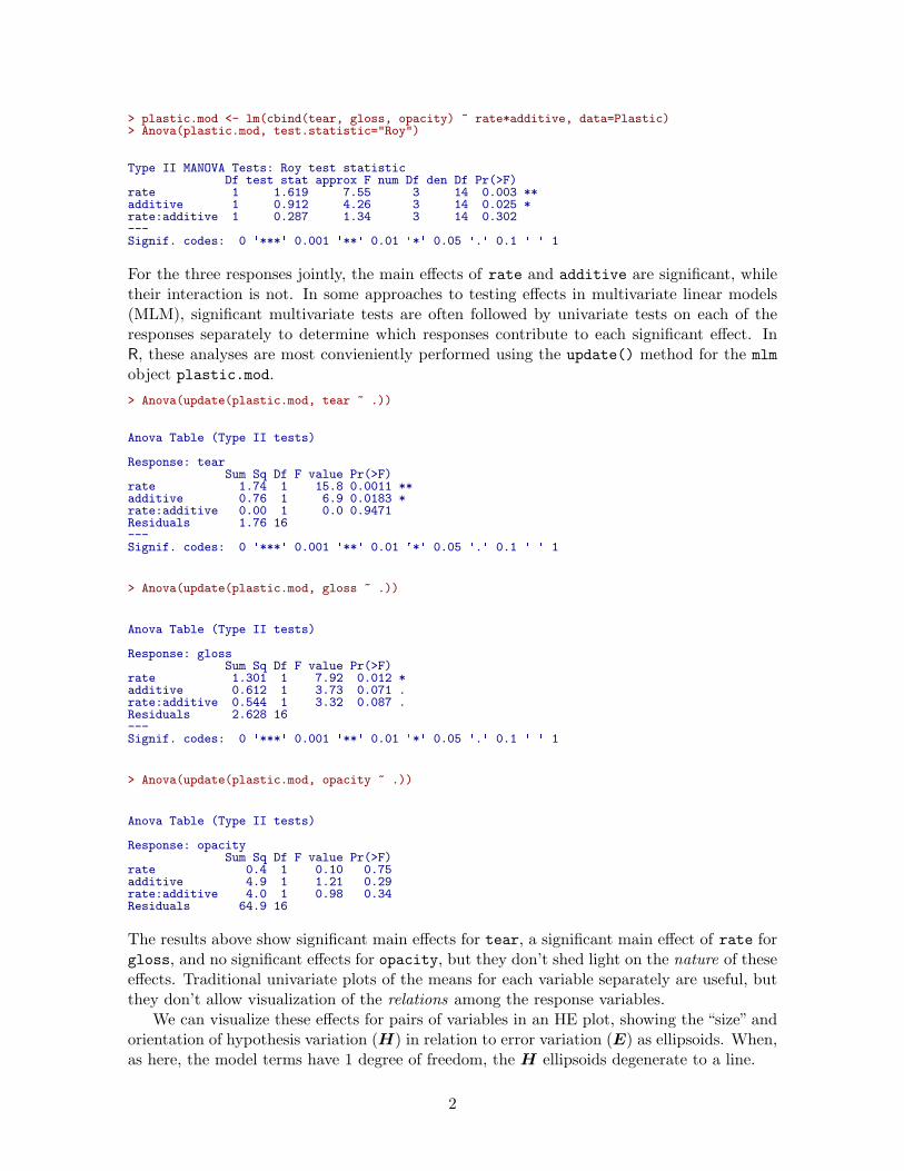
> plastic.mod <- lm(cbind(tear, gloss, opacity) ~ rate*additive, data=Plastic)> Anova(plastic.mod, test.statistic="Roy")
Type II MANOVA Tests: Roy test statisticDf test stat approx F num Df den Df Pr(>F)
rate 1 1.619 7.55 3 14 0.003 **additive 1 0.912 4.26 3 14 0.025 *rate:additive 1 0.287 1.34 3 14 0.302---Signif. codes: 0 ✬***✬ 0.001 ✬**✬ 0.01 ✬*✬ 0.05 ✬.✬ 0.1 ✬ ✬ 1
For the three responses jointly, the main effects of rate and additive are significant, whiletheir interaction is not. In some approaches to testing effects in multivariate linear models(MLM), significant multivariate tests are often followed by univariate tests on each of theresponses separately to determine which responses contribute to each significant effect. InR, these analyses are most convieniently performed using the update() method for the mlm
object plastic.mod.
> Anova(update(plastic.mod, tear ~ .))
Anova Table (Type II tests)
Response: tearSum Sq Df F value Pr(>F)
rate 1.74 1 15.8 0.0011 **additive 0.76 1 6.9 0.0183 *rate:additive 0.00 1 0.0 0.9471Residuals 1.76 16---Signif. codes: 0 ✬***✬ 0.001 ✬**✬ 0.01 ✬*✬ 0.05 ✬.✬ 0.1 ✬ ✬ 1
> Anova(update(plastic.mod, gloss ~ .))
Anova Table (Type II tests)
Response: glossSum Sq Df F value Pr(>F)
rate 1.301 1 7.92 0.012 *additive 0.612 1 3.73 0.071 .rate:additive 0.544 1 3.32 0.087 .Residuals 2.628 16---Signif. codes: 0 ✬***✬ 0.001 ✬**✬ 0.01 ✬*✬ 0.05 ✬.✬ 0.1 ✬ ✬ 1
> Anova(update(plastic.mod, opacity ~ .))
Anova Table (Type II tests)
Response: opacitySum Sq Df F value Pr(>F)
rate 0.4 1 0.10 0.75additive 4.9 1 1.21 0.29rate:additive 4.0 1 0.98 0.34Residuals 64.9 16
The results above show significant main effects for tear, a significant main effect of rate forgloss, and no significant effects for opacity, but they don’t shed light on the nature of theseeffects. Traditional univariate plots of the means for each variable separately are useful, butthey don’t allow visualization of the relations among the response variables.
We can visualize these effects for pairs of variables in an HE plot, showing the “size” andorientation of hypothesis variation (H) in relation to error variation (E) as ellipsoids. When,as here, the model terms have 1 degree of freedom, the H ellipsoids degenerate to a line.
2

> # Compare evidence and effect scaling> colors = c("red", "darkblue", "darkgreen", "brown")> heplot(plastic.mod, size="evidence", col=colors, cex=1.25)> heplot(plastic.mod, size="effect", add=TRUE, lwd=4, term.labels=FALSE, col=colors)
With effect scaling, both the H and E sums of squares and products matrices are bothdivided by the error df, giving multivariate analogs of univariate measures of effect size, e.g.,(y1− y2)/s. With significance scaling, the H ellipse is further divided by λα, the critical valueof Roy’s largest root statistic. This scaling has the property that an H ellipse will protrudesomewhere outside the E ellipse iff the multivariate test is significant at level α. Figure 1shows both scalings, using a thinner line for significance scaling. Note that the (degenerate)ellipse for additive is significant, but does not protrude outside the E ellipse in this view.All that is guarranteed is that it will protrude somewhere in the 3D space of the responses.
By design, means for the levels of interaction terms are not shown in the HE plot, be-cause doing so in general can lead to messy displays. We can add them here for the termrate:additive as follows:> ## add interaction means> intMeans <- termMeans(plastic.mod, ✬rate:additive✬, abbrev.levels=2)> #rownames(intMeans) <- apply(expand.grid(c(✬Lo✬,✬Hi✬), c(✬Lo✬, ✬Hi✬)), 1, paste, collapse=✬:✬)> points(intMeans[,1], intMeans[,2], pch=18, cex=1.2, col="brown")> text(intMeans[,1], intMeans[,2], rownames(intMeans), adj=c(0.5,1), col="brown")> lines(intMeans[c(1,3),1], intMeans[c(1,3),2], col="brown")> lines(intMeans[c(2,4),1], intMeans[c(2,4),2], col="brown")
6.2 6.4 6.6 6.8 7.0 7.2 7.4
8.8
9.0
9.2
9.4
9.6
9.8
tear
glos
s
+
Error
rate
additiverate:additive
●
●
Low
High●
●
Low
HighLw:Lw
Lw:Hg
Hg:Lw
Hg:Hg
Figure 1: HE plot for effects on tear and gloss according to the factors rate, additiveand their interaction, rate:additive. The thicker lines show effect size scaling, the thinnerlines show significance scaling.
The factor means in this plot (Figure 1) have a simple interpretation: The high rate
level yields greater tear resistance but lower gloss than the low level. The high additive
amount produces greater tear resistance and greater gloss.
3
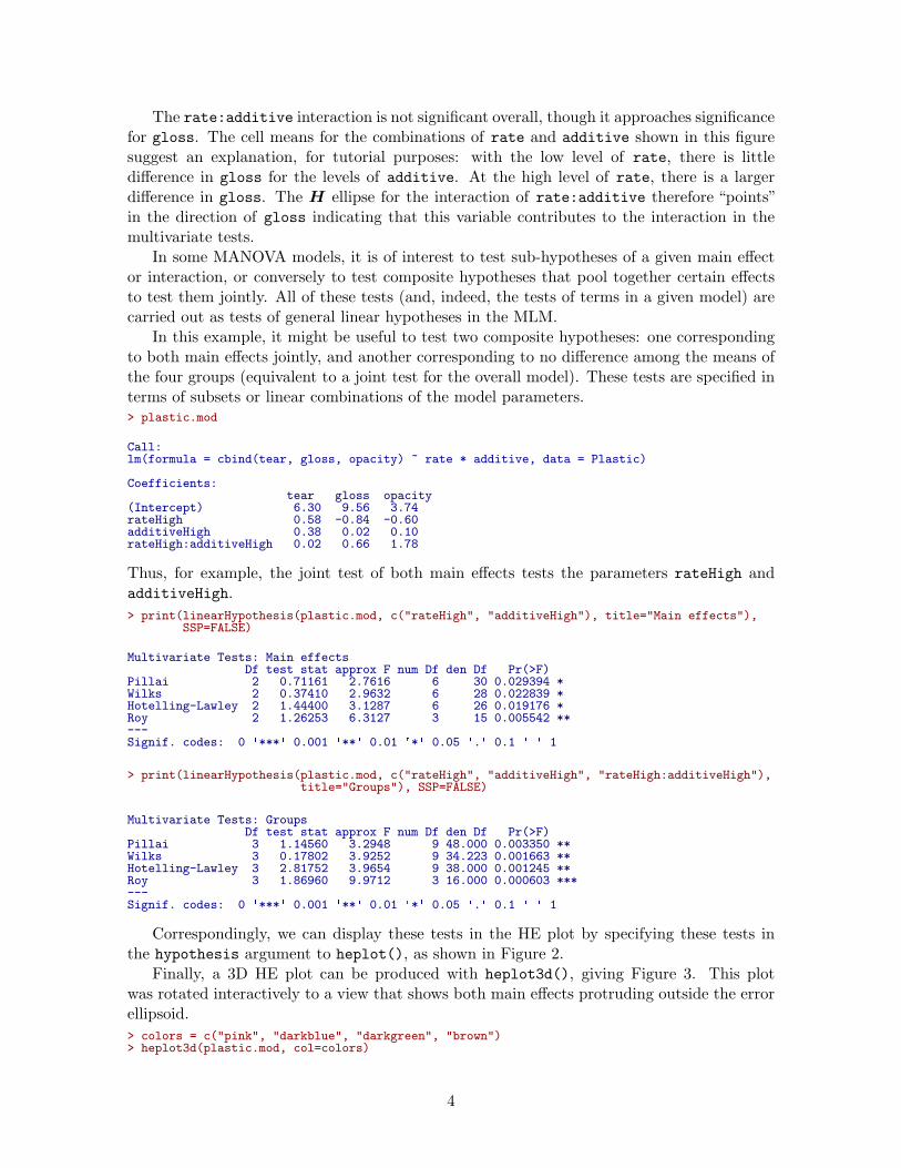
The rate:additive interaction is not significant overall, though it approaches significancefor gloss. The cell means for the combinations of rate and additive shown in this figuresuggest an explanation, for tutorial purposes: with the low level of rate, there is littledifference in gloss for the levels of additive. At the high level of rate, there is a largerdifference in gloss. The H ellipse for the interaction of rate:additive therefore “points”in the direction of gloss indicating that this variable contributes to the interaction in themultivariate tests.
In some MANOVA models, it is of interest to test sub-hypotheses of a given main effector interaction, or conversely to test composite hypotheses that pool together certain effectsto test them jointly. All of these tests (and, indeed, the tests of terms in a given model) arecarried out as tests of general linear hypotheses in the MLM.
In this example, it might be useful to test two composite hypotheses: one correspondingto both main effects jointly, and another corresponding to no difference among the means ofthe four groups (equivalent to a joint test for the overall model). These tests are specified interms of subsets or linear combinations of the model parameters.> plastic.mod
Call:lm(formula = cbind(tear, gloss, opacity) ~ rate * additive, data = Plastic)
Coefficients:tear gloss opacity
(Intercept) 6.30 9.56 3.74rateHigh 0.58 -0.84 -0.60additiveHigh 0.38 0.02 0.10rateHigh:additiveHigh 0.02 0.66 1.78
Thus, for example, the joint test of both main effects tests the parameters rateHigh andadditiveHigh.
> print(linearHypothesis(plastic.mod, c("rateHigh", "additiveHigh"), title="Main effects"),SSP=FALSE)
Multivariate Tests: Main effectsDf test stat approx F num Df den Df Pr(>F)
Pillai 2 0.71161 2.7616 6 30 0.029394 *Wilks 2 0.37410 2.9632 6 28 0.022839 *Hotelling-Lawley 2 1.44400 3.1287 6 26 0.019176 *Roy 2 1.26253 6.3127 3 15 0.005542 **---Signif. codes: 0 ✬***✬ 0.001 ✬**✬ 0.01 ✬*✬ 0.05 ✬.✬ 0.1 ✬ ✬ 1
> print(linearHypothesis(plastic.mod, c("rateHigh", "additiveHigh", "rateHigh:additiveHigh"),title="Groups"), SSP=FALSE)
Multivariate Tests: GroupsDf test stat approx F num Df den Df Pr(>F)
Pillai 3 1.14560 3.2948 9 48.000 0.003350 **Wilks 3 0.17802 3.9252 9 34.223 0.001663 **Hotelling-Lawley 3 2.81752 3.9654 9 38.000 0.001245 **Roy 3 1.86960 9.9712 3 16.000 0.000603 ***---Signif. codes: 0 ✬***✬ 0.001 ✬**✬ 0.01 ✬*✬ 0.05 ✬.✬ 0.1 ✬ ✬ 1
Correspondingly, we can display these tests in the HE plot by specifying these tests inthe hypothesis argument to heplot(), as shown in Figure 2.
Finally, a 3D HE plot can be produced with heplot3d(), giving Figure 3. This plotwas rotated interactively to a view that shows both main effects protruding outside the errorellipsoid.
> colors = c("pink", "darkblue", "darkgreen", "brown")> heplot3d(plastic.mod, col=colors)
4

> heplot(plastic.mod, hypotheses=list("Group" =c("rateHigh", "additiveHigh", "rateHigh:additiveHigh ")),col=c(colors, "purple"),lwd=c(2, 3, 3, 3, 2), cex=1.25)
> heplot(plastic.mod, hypotheses=list("Main effects" =c("rateHigh", "additiveHigh")), add=TRUE,col=c(colors, "darkgreen"), cex=1.25)
6.0 6.5 7.0 7.5
8.5
9.0
9.5
10.0
tear
glos
s
+
Error
rate
additiverate:additive
Group
●
●
Low
High●
●
Low
High
rate
additiverate:additive
Main effects
Figure 2: HE plot for tear and gloss, supplemented with ellipses representing the joint testsof main effects and all group differences
1.2 Effects of physical attractiveness on mock jury decisions
In a social psychology study of influences on jury decisions by Plaster (1989), male partici-pants (prison inmates) were shown a picture of one of three young women. Pilot work hadindicated that one woman was beautiful, another of average physical attractiveness, and thethird unattractive. Participants rated the woman they saw on each of twelve attributes onscales of 1–9. These measures were used to check on the manipulation of “attractiveness” bythe photo.
Then the participants were told that the person in the photo had committed a Crime,and asked to rate the seriousness of the crime and recommend a prison sentence, in Years.The data are contained in the data frame MockJury.1
> str(MockJury)
1The data were made available courtesy of Karl Wuensch, from http://core.ecu.edu/psyc/wuenschk/
StatData/PLASTER.dat
5

Figure 3: 3D HE plot for the plastic film data
✬data.frame✬: 114 obs. of 17 variables:$ Attr : Factor w/ 3 levels "Beautiful","Average",..: 1 1 1 1 1 1 1 1 1 1 ...$ Crime : Factor w/ 2 levels "Burglary","Swindle": 1 1 1 1 1 1 1 1 1 1 ...$ Years : int 10 3 5 1 7 7 3 7 2 3 ...$ Serious : int 8 8 5 3 9 9 4 4 5 2 ...$ exciting : int 6 9 3 3 1 1 5 4 4 6 ...$ calm : int 9 5 4 6 1 5 6 9 8 8 ...$ independent : int 9 9 6 9 5 7 7 2 8 7 ...$ sincere : int 8 3 3 8 1 5 6 9 7 5 ...$ warm : int 5 5 6 8 8 8 7 6 1 7 ...$ phyattr : int 9 9 7 9 8 8 8 5 9 8 ...$ sociable : int 9 9 4 9 9 9 7 2 1 9 ...$ kind : int 9 4 2 9 4 5 5 9 5 7 ...$ intelligent : int 6 9 4 9 7 8 7 9 9 9 ...$ strong : int 9 5 5 9 9 9 5 2 7 5 ...$ sophisticated: int 9 5 4 9 9 9 6 2 7 6 ...$ happy : int 5 5 5 9 8 9 5 2 6 8 ...$ ownPA : int 9 7 5 9 7 9 6 5 3 6 ...
Sample sizes were roughly balanced for the independent variables in the three conditions ofthe attractiveness of the photo, and the combinations of this with Crime:
> table(MockJury$Attr)
Beautiful Average Unattractive39 38 37
> table(MockJury$Attr, MockJury$Crime)
Burglary SwindleBeautiful 21 18Average 18 20Unattractive 20 17
6

The main questions of interest were: (a) Does attractiveness of the “defendent” influencethe sentence or perceived seriousness of the crime? (b) Does attractiveness interact with thenature of the crime?
But first, we try to assess the ratings of the photos in relation to the presumed categoriesof the independent variable Attr. The questions here are (a) do the ratings of the photoson physical attractiveness (phyattr) confirm the original classification? (b) how do otherratings differentiate the photos? To keep things simple, we consider ony a few of the otherratings in a one-way MANOVA.
> (jury.mod1 <- lm( cbind(phyattr, happy, independent, sophisticated) ~ Attr, data=MockJury))
Call:lm(formula = cbind(phyattr, happy, independent, sophisticated) ~
Attr, data = MockJury)
Coefficients:phyattr happy independent sophisticated
(Intercept) 8.282 5.359 6.410 6.077AttrAverage -4.808 0.430 0.537 -1.340AttrUnattractive -5.390 -1.359 -1.410 -1.753
> Anova(jury.mod1, test="Roy")
Type II MANOVA Tests: Roy test statisticDf test stat approx F num Df den Df Pr(>F)
Attr 2 1.77 48.2 4 109 <2e-16 ***---Signif. codes: 0 ✬***✬ 0.001 ✬**✬ 0.01 ✬*✬ 0.05 ✬.✬ 0.1 ✬ ✬ 1
Note that Beautiful is the baseline category of Attr, so the intercept term gives the means forthis level. We see that the means are significantly different on all four variables collectively,by a joint multivariate test. A traditional analysis might follow up with univariate ANOVAsfor each measure separately.
As an aid to interpretation of the MANOVA results We can examine the test of Attr inthis model with an HE plot for pairs of variables, e.g., for phyattr and happy (Figure 4).The means in this plot show that Beautiful is rated higher on physical attractiveness thanthe other two photos, while Unattractive is rated less happy than the other two. Comparingthe sizes of the ellipses, differences among group means on physical attractiveness contributesmore to significance than do ratings on happy.
> heplot(jury.mod1, main="HE plot for manipulation check")
The HE plot for all pairs of variables (Figure 5) shows that the means for happy andindependent are highly correlated, as are the means for phyattr and sophisticated. Inmost of these pairwise plots, the means form a triangle rather than a line, suggesting thatthese attributes are indeed measuring different aspects of the photos.
With 3 groups and 4 variables, the H ellipsoid has only s = min(dfh, p) = 2 dimensions.candisc() carries out a canonical discriminant analysis for the MLM and returns an objectthat can be used to show an HE plot in the space of the canonical dimensions. This is plottedin Figure 6.
> jury.can <- candisc(jury.mod1)> jury.can
7

−5 0 5 10 15
24
68
HE plot for manipulation check
phyattr
happ
y
+
Error Attr
●
●
●
BeautifulAverage
Unattractive
Figure 4: HE plot for ratings of phyattr and happy according to the classification of photoson Attr
Canonical Discriminant Analysis for Attr:
CanRsq Eigenvalue Difference Percent Cumulative1 0.639 1.767 1.6 91.33 91.32 0.144 0.168 1.6 8.67 100.0
Test of H0: The canonical correlations in thecurrent row and all that follow are zero
LR test stat approx F numDF denDF Pr(> F)1 0.309 21.53 8 216 < 2e-16 ***2 0.856 6.09 3 109 0.00072 ***---Signif. codes: 0 ✬***✬ 0.001 ✬**✬ 0.01 ✬*✬ 0.05 ✬.✬ 0.1 ✬ ✬ 1
From this we can see that 91% of the variation among group means is accounted for by thefirst dimension, and this is nearly completely aligned with phyattr. The second dimension,accounting for the remaining 9% is determined nearly entirely by ratings on happy andindependent. This display gives a relatively simple account of the results of the MANOVAand the relations of each of the ratings to discrimination among the photos.
Proceeding to the main questions of interest, we carry out a two-way MANOVA of theresponses Years and Serious in relation to the independent variables Attr and Crime.
> # influence of Attr of photo and nature of crime on Serious and Years> jury.mod2 <- lm( cbind(Serious, Years) ~ Attr * Crime, data=MockJury)> Anova(jury.mod2, test="Roy")
8

> pairs(jury.mod1)
phyattr
1
9
+Error
Attr
●
●●
Beautiful
AverageUnattractive +Error
Attr
●
●●
Beautiful
AverageUnattractive +Error
Attr
●
●●
Beautiful
AverageUnattractive
+
ErrorAttr
●●
●
BeautifulAverage
Unattractive happy
1
9
+
Error Attr
●●
●
BeautifulAverage
Unattractive +
ErrorAttr
●●
●
BeautifulAverage
Unattractive
+
ErrorAttr
●●
●
BeautifulAverage
Unattractive +
ErrorAttr
●●
●
BeautifulAverage
Unattractive independent
1
9
+
ErrorAttr
●●
●
BeautifulAverage
Unattractive
+
Error Attr
●
●●
Beautiful
AverageUnattractive +
ErrorAttr
●
●●
Beautiful
AverageUnattractive +
ErrorAttr
●
●●
Beautiful
AverageUnattractive sophisticated
1
9
Figure 5: HE plots for all pairs of ratings according to the classification of photos on Attr
Type II MANOVA Tests: Roy test statisticDf test stat approx F num Df den Df Pr(>F)
Attr 2 0.0756 4.08 2 108 0.020 *Crime 1 0.0047 0.25 2 107 0.778Attr:Crime 2 0.0501 2.71 2 108 0.071 .---Signif. codes: 0 ✬***✬ 0.001 ✬**✬ 0.01 ✬*✬ 0.05 ✬.✬ 0.1 ✬ ✬ 1
We see that there is a nearly significant interaction between Attr and Crime and a strongeffect of Attr.
The HE plot shows that the nearly significant interaction of Attr:Crime is mainly interms of differences among the groups on the response of Years of sentence, with very littlecontribution of Serious. We explore this interaction in a bit more detail below. The maineffect of Attr is also dominated by differences among groups on Years.
If we assume that Years of sentence is the main outcome of interest, it also makes senseto carry out a step-down test of this variable by itself, controlling for the rating of seriousness(Serious) of the crime. The model jury.mod3 below is equivalent to an ANCOVA for Years.
> # stepdown test (ANCOVA), controlling for Serious> jury.mod3 <- lm( Years ~ Serious + Attr * Crime, data=MockJury)> t(coef(jury.mod3))
(Intercept) Serious AttrAverage AttrUnattractive CrimeSwindle[1,] 0.011612 0.83711 0.39586 0.60285 -0.26302
9

> opar <- par(xpd=TRUE)> heplot(jury.can, prefix="Canonical dimension", main="Canonical HE plot")> par(opar)
−5 0 5
−6
−4
−2
02
46
Canonical HE plot
Canonical dimension1 (91.3%)
Can
onic
al d
imen
sion
2 (8
.7%
)
+Error
Attr
●●
●BeautifulAverage
Unattractive
phyattr
happyindependent
sophisticated
Figure 6: Canonical discriminant HE plot for the MockJury data
AttrAverage:CrimeSwindle AttrUnattractive:CrimeSwindle[1,] -0.53701 2.5123
> Anova(jury.mod3)
Anova Table (Type II tests)
Response: YearsSum Sq Df F value Pr(>F)
Serious 379 1 41.14 3.9e-09 ***Attr 74 2 4.02 0.021 *Crime 4 1 0.43 0.516Attr:Crime 49 2 2.67 0.074 .Residuals 987 107---Signif. codes: 0 ✬***✬ 0.001 ✬**✬ 0.01 ✬*✬ 0.05 ✬.✬ 0.1 ✬ ✬ 1
Thus, even when adjusting for Serious rating, there is still a significant main effect of Attrof the photo, but also a hint of an interaction of Attr with Crime. The coefficient for Seriousindicates that participants awarded 0.84 additional years of sentence for each 1 unit step onthe scale of seriousness of crime.
A particularly useful method for visualizing the fitted effects in such univariate responsemodels is provided by the effects package. By default allEffects() calculates the predicted
10

> heplot(jury.mod2)
2 3 4 5 6 7 8
02
46
810
Serious
Year
s
+
ErrorAttr
Crime
Attr:Crime
●●
●
BeautifulAverage
Unattractive
●●
BurglarySwindle
Figure 7: HE plot for the two-way MANOVA for Years and Serious
values for all high-order terms in a given model, and the plot method produces plots of thesevalues for each term. The statements below produce Figure 8.
> library(effects)> jury.eff <- allEffects(jury.mod3)> plot(jury.eff, ask=FALSE)
The effect plot for Serious shows the expected linear relation between that variable andYears. Of greater interest here is the nature of the possible interaction of Attr and Crime
on Years of sentence, controlling for Serious. The effect plot shows that for the crime ofSwindle, there is a much greater Years of sentence awarded to Unattractive defendents.
1.3 Egyptian skulls from five epochs
This example examines physical measurements of size and shape made on 150 Egyptian skullsfrom five epochs ranging from 4000 BC to 150 AD. The measures are: maximal breadth(mb), basibregmatic height (bh), basialveolar length (bl), and nasal height (nh) of eachskull. See http://www.redwoods.edu/instruct/agarwin/anth_6_measurements.htm forthe definitions of these measures, and Figure 9 for a diagram. The question of interest iswhether and how these measurements change over time. Systematic changes over time is ofinterest because this would indicate interbreeding with immigrant populations.
11

Serious effect plot
Serious
Year
s
0
2
4
6
8
2 4 6 8
Attr*Crime effect plot
Attr
Year
s
3
4
5
6
7
8
Beautiful Average Unattractive
●
●●
= Crime Burglary
Beautiful Average Unattractive
●●
●
= Crime Swindle
Figure 8: Effect plots for Serious and the Attr * Crime in the ANCOVA model jury.mod3.
> data(Skulls)> str(Skulls)
✬data.frame✬: 150 obs. of 5 variables:$ epoch: Ord.factor w/ 5 levels "c4000BC"<"c3300BC"<..: 1 1 1 1 1 1 1 1 1 1 ...$ mb : num 131 125 131 119 136 138 139 125 131 134 ...$ bh : num 138 131 132 132 143 137 130 136 134 134 ...$ bl : num 89 92 99 96 100 89 108 93 102 99 ...$ nh : num 49 48 50 44 54 56 48 48 51 51 ...
> table(Skulls$epoch)
c4000BC c3300BC c1850BC c200BC cAD15030 30 30 30 30
Note that epoch is an ordered factor, so the default contrasts will be orthogonal polynomials.This assumes that epoch values are equally spaced, which they are not. However, examiningthe linear and quadratic trends is useful to a first approximation.
For ease of labeling various outputs, it is useful to trim the epoch values and assign moremeaningful variable labels.
> # make shorter labels for epochs> Skulls$epoch <- factor(Skulls$epoch, labels=sub("c","",levels(Skulls$epoch)))> # assign better variable labels> vlab <- c("maxBreadth", "basibHeight", "basialLength", "nasalHeight")
We start with some simple displays of the means by epoch. From the numbers, the meansdon’t seem to vary much. A pairs plot, Figure 10, joining points by epoch is somewhatmore revealing for the bivariate relations among means.
> means <- aggregate(cbind(mb, bh, bl, nh) ~ epoch, data=Skulls, FUN=mean)[,-1]> rownames(means) <- levels(Skulls$epoch)> means
12

Figure 9: Diagram of the skull measurements. Maximal breadth and basibregmatic heightare the basic measures of “size” of a skull. Basialveolar length and nasal height are importantanthropometric measures of “shape”.
mb bh bl nh4000BC 131.37 133.60 99.167 50.5333300BC 132.37 132.70 99.067 50.2331850BC 134.47 133.80 96.033 50.567200BC 135.50 132.30 94.533 51.967AD150 136.17 130.33 93.500 51.367
> pairs(means, vlab,panel = function(x, y) {
text(x, y, levels(Skulls$epoch))lines(x,y)
})
Perhaps better for visualizing the trends over time is a set of boxplots, joining means overepoch. Using bwplot() from the lattice package package requires reshaping the data fromwide to long format. The following code produces Figure 11.
> library(lattice)> library(reshape2)> sklong <- melt(Skulls, id="epoch")> bwplot(value ~ epoch | variable, data=sklong, scales="free",
ylab="Variable value", xlab="Epoch",strip=strip.custom(factor.levels=paste(vlab, " (", levels(sklong$variable), ")", sep="")),panel = function(x,y, ...) {
panel.bwplot(x, y, ...)panel.linejoin(x,y, col="red", ...)
})
Now, fit the MANOVA model, and test the effect of epoch with Manova(). We see thatthe multivariate means differ substantially.
> # fit manova model> sk.mod <- lm(cbind(mb, bh, bl, nh) ~ epoch, data=Skulls)> Manova(sk.mod)
Type II MANOVA Tests: Pillai test statisticDf test stat approx F num Df den Df Pr(>F)
epoch 4 0.353 3.51 16 580 4.7e-06 ***---Signif. codes: 0 ✬***✬ 0.001 ✬**✬ 0.01 ✬*✬ 0.05 ✬.✬ 0.1 ✬ ✬ 1
Perhaps of greater interest are the more focused tests of trends over time. These are basedon tests of the coefficients in the model sk.mod being jointly equal to zero, for subsets of the(polynomial) contrasts in epoch.
13

maxBreadth
130.5 132.0 133.5
4000BC
3300BC
1850BC
200BC
AD150
4000BC
3300BC
1850BC
200BC
AD150
50.5 51.0 51.5 52.0
132
134
136
4000BC
3300BC
1850BC
200BC
AD150
130.
513
2.0
133.
5
4000BC
3300BC
1850BC
200BC
AD150
basibHeight
4000BC
3300BC
1850BC
200BC
AD150
4000BC
3300BC
1850BC
200BC
AD150
4000BC3300BC
1850BC
200BC
AD150
4000BC3300BC
1850BC
200BC
AD150
basialLength
9495
9697
98994000BC3300BC
1850BC
200BC
AD150
132 134 136
50.5
51.0
51.5
52.0
4000BC
3300BC
1850BC
200BC
AD150
4000BC
3300BC
1850BC
200BC
AD150
94 95 96 97 98 99
4000BC
3300BC
1850BC
200BC
AD150
nasalHeight
Figure 10: Pairs plot of means of Skulls data, by epoch
> coef(sk.mod)
mb bh bl nh(Intercept) 133.97333 132.54667 96.460000 50.93333epoch.L 4.02663 -2.19251 -5.017481 1.07517epoch.Q -0.46325 -1.26504 -0.089087 0.12472epoch.C -0.46380 -0.78003 1.075174 -0.83273epoch^4 0.34263 0.80479 -0.661360 -0.41833
We use linearHypothesis() for a multivariate test of the epoch.L linear effect. Thelinear trend is highly significant. It is not obvious from Figure 10 that maximal breadth andnasal are increasing over time, while the other two measurements have negative slopes.
> coef(sk.mod)["epoch.L",]
mb bh bl nh4.0266 -2.1925 -5.0175 1.0752
> print(linearHypothesis(sk.mod, "epoch.L"), SSP=FALSE) # linear component
14

Epoch
Var
iabl
e va
lue
120
125
130
135
140
145
4000BC 3300BC 1850BC 200BC AD150
●●
●●
●
●
maxBreadth (mb)
120
125
130
135
140
145
4000BC 3300BC 1850BC 200BC AD150
●● ●
●
●
●●
basibHeight (bh)
8090
100
110
4000BC 3300BC 1850BC 200BC AD150
●●
●● ●
●
basialLength (bl)
4550
5560
4000BC 3300BC 1850BC 200BC AD150
●●
●
● ●
nasalHeight (nh)
Figure 11: Boxplots of Skulls data, by epoch, for each variable
Multivariate Tests:Df test stat approx F num Df den Df Pr(>F)
Pillai 1 0.29138 14.597 4 142 5.195e-10 ***Wilks 1 0.70862 14.597 4 142 5.195e-10 ***Hotelling-Lawley 1 0.41119 14.597 4 142 5.195e-10 ***Roy 1 0.41119 14.597 4 142 5.195e-10 ***---Signif. codes: 0 ✬***✬ 0.001 ✬**✬ 0.01 ✬*✬ 0.05 ✬.✬ 0.1 ✬ ✬ 1
linearHypothesis() can also be used to test composite hypotheses. Here we test all non-linear coefficients jointly. The result indicates that, collectively, all non-linear terms are notsignificantly different from zero.
> print(linearHypothesis(sk.mod, c("epoch.Q", "epoch.C", "epoch^4")), SSP=FALSE)
Multivariate Tests:Df test stat approx F num Df den Df Pr(>F)
Pillai 3 0.06819 0.83726 12 432.00 0.6119Wilks 3 0.93296 0.83263 12 375.99 0.6167Hotelling-Lawley 3 0.07063 0.82791 12 422.00 0.6216Roy 3 0.04519 1.62676 4 144.00 0.1707
Again, HE plots can show the patterns of these tests of multivariate hypotheses. Withfour response variables, it is easiest to look at all pairwise HE plots with the pairs.mlm()
15

function. The statement below produces Figure 12. In this plot, we show the hypothesisellipsoids for the overall effect of epoch, as well as those for the tests just shown for the lineartrend component epoch.L as well as the joint test of all non-linear terms.
> pairs(sk.mod, variables = c(1, 4, 2, 3), hypotheses = list(Lin = "epoch.L",NonLin = c("epoch.Q", "epoch.C", "epoch^4")), var.labels = vlab[c(1,4, 2, 3)])
maxBreadth
119
148
+
Error
epochLin
NonLin
●●
●●●
4000BC3300BC1850BC200BCAD150
+
Error
epochLin
NonLin
●●
●●●
4000BC3300BC1850BC200BCAD150
+
Error
epochLin
NonLin●●
●●●
4000BC3300BC1850BC200BCAD150
+
Errorepoch
LinNonLin
●●●
●●4000BC3300BC1850BC
200BCAD150
nasalHeight
120
145
+
Error
epochLin
NonLin
●●●
●● 4000BC3300BC1850BC200BC
AD150
+
Error
epochLinNonLin
●●●
●●4000BC3300BC1850BC
200BCAD150
+
Error
epochLin
NonLin
●●
●
●
●
4000BC3300BC
1850BC200BCAD150 +
Error
epochLin
NonLin
●●●
●
●
4000BC3300BC1850BC
200BCAD150 basibHeight
81
114
+
Error epochLin
NonLin
●●
●
●
●
4000BC3300BC
1850BC200BC
AD150
+
Error
epochLin
NonLin
●●
●●●
4000BC3300BC1850BC200BCAD150 +
Error
epochLin
NonLin
●●
●●
●
4000BC3300BC1850BC200BCAD150 +
Error
epochLin
NonLin
●●
●●
●
4000BC3300BC1850BC200BCAD150 basialLength
44
60
Figure 12: Pairs HE plot of Skulls data, showing multivariate tests of epoch, as well as testsof linear and nonlinear trends.
These plots have an interesting geometric interpretation: the H ellipses for the overalleffect of epoch are representations of the additive decomposition of this effect into H ellipsesfor the linear and nonlinear linear hypothesis tests according to
Hepoch = Hlinear +Hnonlinear
where the linear term has rank 1 (and so plots as a line), while the nonlinear term has rank 3.In each panel, it can be seen that the large direction of theHepoch leading to significance of thiseffect corresponds essentially to the linear contrast. Hnonlinear is the orthogonal complementof Hlinear in the space of Hepoch, but nowhere does it protrude beyond the boundary of theE ellipsoid.
16

These relations can be seen somewhat more easily in 3D, as produced using heplot3d()
by the following statement. The resulting plot is better viewed interactively in R and is notreproduced here. It would be seen there that the ellipsoid for the nonlinear terms is nearlyflat in one direction, corresponding to the panel for (mb, hb) in Figure 12.
> heplot3d(sk.mod, hypotheses=list(Lin="epoch.L", Quad="epoch.Q",NonLin=c("epoch.Q", "epoch.C", "epoch^4")),
col=c("pink", "blue"))
Finally, a simpler view of these effects can be shown in the canonical space correspond-ing to the canonical discriminant analysis for epoch. The computations are performed bycandisc() which returns a class "candisc" object.
> library(candisc)> sk.can <- candisc(sk.mod)> sk.can
Canonical Discriminant Analysis for epoch:
CanRsq Eigenvalue Difference Percent Cumulative1 0.29829 0.42510 0.386 88.227 88.22 0.03754 0.03900 0.386 8.094 96.33 0.01546 0.01570 0.386 3.259 99.64 0.00202 0.00202 0.386 0.419 100.0
Test of H0: The canonical correlations in thecurrent row and all that follow are zero
LR test stat approx F numDF denDF Pr(> F)1 0.664 3.90 16 434 7e-07 ***2 0.946 0.90 9 348 0.533 0.983 0.64 4 288 0.644 0.998 0.29 1 145 0.59---Signif. codes: 0 ✬***✬ 0.001 ✬**✬ 0.01 ✬*✬ 0.05 ✬.✬ 0.1 ✬ ✬ 1
The output above shows that, although Hepoch is of rank 4, two dimensions account for 96%of the between-epoch variation. By the likelihood ratio test, only the canonical correlationfor the first dimension can be considered non-zero.
The canonical HE plot is produced by plotting the sk.can object, giving Figure 13.
> heplot(sk.can, prefix="Canonical dimension")
In this plot, the first canonical dimension (88%) essentially corresponds to the ordered valuesof epoch, from right to left. The variable vectors for maximum breadth (mb), basialiveolarlength (bl) and nasal height (nh) are largely aligned with this dimension, indicating that theydistinguish the groups of skulls according to time. The lengths of these vectors indicates theirrelative contribution to discrimination among the group means. Only the variable vectorfor basibregmatic height (bh) points in the direction of the second canonical dimension,corresponding to higher means in the middle of the range of epochs. We leave it to forensicanthropologists to determine if this has any meaning.
2 Multivariate Multiple Regression Designs
The ideas behind HE plots extend naturally to multivariate multiple regression (MMRA)and multivariate analysis of covariance (MANCOVA). In MMRA, the X matrix containsonly quantitative predictors, while in MANCOVA designs, there is a mixture of factors andquantitative predictors (covariates).
17

−4 −2 0 2 4
−3
−2
−1
01
23
Canonical dimension1 (88.2%)
Can
onic
al d
imen
sion
2 (8
.1%
)
+
Error
epoch
●●
●
●
●
4000BC3300BC
1850BC200BC
AD150
mb
bh
blnh
Figure 13: Canonical discriminant HE plot of the Skulls data
In the MANCOVA case, there is often a subtle difference in emphasis: true MANCOVAanalyses focus on the differences among groups defined by the factors, adjusting for (or con-trolling for) the quantitative covariates. Analyses concerned with homogeneity of regression
focus on quantitative predictors and attempt to test whether the regression relations are thesame for all groups defined by the factors.
2.1 Rohwer data
To illustrate the homogeneity of regression flavor, we use data from a study by Rohwer (givenin Timm, 1975: Ex. 4.3, 4.7, and 4.23) on kindergarten children, designed to determinehow well a set of paired-associate (PA) tasks predicted performance on the Peabody PictureVocabulary test (PPVT), a student achievement test (SAT), and the Raven Progressive matricestest (Raven). The PA tasks varied in how the stimuli were presented, and are called named
(n), still (s), named still (ns), named action (na), and sentence still (ss).Two groups were tested: a group of n = 37 children from a low socioeconomic status
(SES) school, and a group of n = 32 high SES children from an upper-class, white residentialschool. The data are in the data frame Rohwer in the heplots package:
> some(Rohwer,n=6)
18

group SES SAT PPVT Raven n s ns na ss14 1 Lo 30 55 13 2 1 12 20 1717 1 Lo 19 66 13 7 12 21 35 2718 1 Lo 45 54 10 0 6 6 14 1621 1 Lo 32 48 16 0 7 9 14 1837 1 Lo 79 54 14 0 6 6 15 1457 2 Hi 99 94 16 4 6 14 27 19
At one extreme, we might be tempted to fit separate regression models for each of theHigh and Low SES groups. This approach is not recommended because it lacks power anddoes not allow hypotheses about equality of slopes and intercepts to be tested directly.
> rohwer.ses1 <- lm(cbind(SAT, PPVT, Raven) ~ n + s + ns + na + ss, data=Rohwer, subset=SES=="Hi")> Anova(rohwer.ses1)
Type II MANOVA Tests: Pillai test statisticDf test stat approx F num Df den Df Pr(>F)
n 1 0.202 2.02 3 24 0.1376s 1 0.310 3.59 3 24 0.0284 *ns 1 0.358 4.46 3 24 0.0126 *na 1 0.465 6.96 3 24 0.0016 **ss 1 0.089 0.78 3 24 0.5173---Signif. codes: 0 ✬***✬ 0.001 ✬**✬ 0.01 ✬*✬ 0.05 ✬.✬ 0.1 ✬ ✬ 1
> rohwer.ses2 <- lm(cbind(SAT, PPVT, Raven) ~ n + s + ns + na + ss, data=Rohwer, subset=SES=="Lo")> Anova(rohwer.ses2)
Type II MANOVA Tests: Pillai test statisticDf test stat approx F num Df den Df Pr(>F)
n 1 0.0384 0.39 3 29 0.764s 1 0.1118 1.22 3 29 0.321ns 1 0.2252 2.81 3 29 0.057 .na 1 0.2675 3.53 3 29 0.027 *ss 1 0.1390 1.56 3 29 0.220---Signif. codes: 0 ✬***✬ 0.001 ✬**✬ 0.01 ✬*✬ 0.05 ✬.✬ 0.1 ✬ ✬ 1
This allows separate slopes and intercepts for each of the two groups, but it is difficult tocompare the coefficients numerically.
> coef(rohwer.ses1)
SAT PPVT Raven(Intercept) -28.46747 39.697090 13.243836n 3.25713 0.067283 0.059347s 2.99658 0.369984 0.492444ns -5.85906 -0.374380 -0.164022na 5.66622 1.523009 0.118980ss -0.62265 0.410157 -0.121156
> coef(rohwer.ses2)
SAT PPVT Raven(Intercept) 4.151060 33.005769 11.173378n -0.608872 -0.080567 0.210995s -0.050156 -0.721050 0.064567ns -1.732395 -0.298303 0.213584na 0.494565 1.470418 -0.037318ss 2.247721 0.323965 -0.052143
Nevertheless, we can visualize the results with HE plots, and here we make use of the factthat several HE plots can be overlaid using the option add=TRUE as shown in Figure 14.
19

0 20 40 60 80 100
4050
6070
8090
100
110
SAT
PP
VT
+
Error
ns ns
na
ss
+
Error
n
sns
na
ss
Hi
Lo
Figure 14: HE plot for SAT and PPVT, showing the effects for the PA predictors for the Highand Low SES groups separately
> heplot(rohwer.ses1, ylim=c(40,110),col=c("red", "black"), lwd=2, cex=1.2)> heplot(rohwer.ses2, add=TRUE, col=c("blue", "black"), grand.mean=TRUE, error.ellipse=TRUE, lwd=2, cex=1.2)> means <- aggregate(cbind(SAT,PPVT)~SES, data=Rohwer, mean)> text(means[,2], means[,3], labels=means[,1], pos=3, cex=2, col=c("red", "blue"))
We can readily see the difference in means for the two SES groups (High greater on bothvariables) and it also appears that the slopes of the predictor ellipses are shallower for theHigh than the Low group, indicating greater relation with the SAT score.
Alternatively (and optimistically), we can fit a MANCOVA model that allows differentmeans for the two SES groups on the responses, but constrains the slopes for the PA covariatesto be equal.
> # MANCOVA, assuming equal slopes> rohwer.mod <- lm(cbind(SAT, PPVT, Raven) ~ SES + n + s + ns + na + ss,
data=Rohwer)> Anova(rohwer.mod)
Type II MANOVA Tests: Pillai test statisticDf test stat approx F num Df den Df Pr(>F)
SES 1 0.379 12.18 3 60 2.5e-06 ***n 1 0.040 0.84 3 60 0.4773s 1 0.093 2.04 3 60 0.1173ns 1 0.193 4.78 3 60 0.0047 **na 1 0.231 6.02 3 60 0.0012 **ss 1 0.050 1.05 3 60 0.3770---Signif. codes: 0 ✬***✬ 0.001 ✬**✬ 0.01 ✬*✬ 0.05 ✬.✬ 0.1 ✬ ✬ 1
Note that, although the multivariate tests for two of the covariates (ns and na) arehighly significant, univariate multiple regression tests for the separate responses [from sum-
mary(rohwer.mod)] are relatively weak. We can also test the global 5 df hypothesis, B = 0,that all covariates have null effects for all responses as a linear hypothesis (suppressing displayof the error and hypothesis SSP matrices),
20

> (covariates <- rownames(coef(rohwer.mod))[-(1:2)])
[1] "n" "s" "ns" "na" "ss"
> Regr<-linearHypothesis(rohwer.mod, covariates)> print(Regr, digits=5, SSP=FALSE)
Multivariate Tests:Df test stat approx F num Df den Df Pr(>F)
Pillai 5 0.66579 3.5369 15 186.00 2.309e-05 ***Wilks 5 0.44179 3.8118 15 166.03 8.275e-06 ***Hotelling-Lawley 5 1.03094 4.0321 15 176.00 2.787e-06 ***Roy 5 0.75745 9.3924 5 62.00 1.062e-06 ***---Signif. codes: 0 ✬***✬ 0.001 ✬**✬ 0.01 ✬*✬ 0.05 ✬.✬ 0.1 ✬ ✬ 1
Then 2D views of the additive MANCOVA model rohwer.mod and the overall test for allcovariates are produced as follows, giving the plots in Figure 15.
> colors <- c("red", "blue", rep("black",5), "#969696")> heplot(rohwer.mod, col=colors,
hypotheses=list("Regr" = c("n", "s", "ns", "na", "ss")),cex=1.5, lwd=c(2, rep(3,5), 4),main="(SAT, PPVT, Raven) ~ SES + n + s + ns + na + ss")
> heplot(rohwer.mod, col=colors, variables=c(1,3),hypotheses=list("Regr" = c("n", "s", "ns", "na", "ss")),cex=1.5, lwd=c(2, rep(3,5), 4),main="(SAT, PPVT, Raven) ~ SES + n + s + ns + na + ss")
0 20 40 60 80
4050
6070
8090
100
(SAT, PPVT, Raven) ~ SES + n + s + ns + na + ss
SAT
PP
VT
+
Error
SES
n
s
ns
na
ss
Regr
●
●
Hi
Lo
0 20 40 60 80
1012
1416
18
(SAT, PPVT, Raven) ~ SES + n + s + ns + na + ss
SAT
Rav
en +
Error
SES
n
s
ns
nass
Regr
●
●
Hi
Lo
Figure 15: HE plot for SAT and PPVT (left) and for SAT and Raven (right) using the MAN-COVA model
The positive orientation of the Regr ellipses shows that the prediced values for all threeresponses are positively correlated (more so for SAT and PPVT). As well, the High SES groupis higher on all responses than the Low SES group.
Alternatively, all pairwise plots among these responses could be drawn using the pairs
function (figure not shown),
21

> pairs(rohwer.mod, col=colors,hypotheses=list("Regr" = c("n", "s", "ns", "na", "ss")),cex=1.3, lwd=c(2, rep(3,5), 4))
or as a 3D plot, using heplot3d() as shown in Figure 16.
> colors <- c("pink", "blue", rep("black",5), "#969696")> heplot3d(rohwer.mod, col=colors,
hypotheses=list("Regr" = c("n", "s", "ns", "na", "ss")))
Figure 16: 3D HE plot for the MANCOVA model fit to the Rohwer data
The MANCOVA model, rohwer.mod, has relatively simple interpretations (large effectof SES, with ns and na as the major predictors) but the test of relies on the assumption ofhomogeneity of slopes for the predictors. We can test this as follows, adding interactions ofSES with each of the covariates:
> rohwer.mod2 <- lm(cbind(SAT, PPVT, Raven) ~ SES * (n + s + ns + na + ss),data=Rohwer)
> Anova(rohwer.mod2)
Type II MANOVA Tests: Pillai test statisticDf test stat approx F num Df den Df Pr(>F)
SES 1 0.391 11.78 3 55 4.5e-06 ***n 1 0.079 1.57 3 55 0.20638s 1 0.125 2.62 3 55 0.05952 .ns 1 0.254 6.25 3 55 0.00100 ***na 1 0.307 8.11 3 55 0.00015 ***ss 1 0.060 1.17 3 55 0.32813SES:n 1 0.072 1.43 3 55 0.24417SES:s 1 0.099 2.02 3 55 0.12117SES:ns 1 0.118 2.44 3 55 0.07383 .SES:na 1 0.148 3.18 3 55 0.03081 *SES:ss 1 0.057 1.12 3 55 0.35094---Signif. codes: 0 ✬***✬ 0.001 ✬**✬ 0.01 ✬*✬ 0.05 ✬.✬ 0.1 ✬ ✬ 1
It appears from the above that there is only weak evidence of unequal slopes from the separateSES: terms. The evidence for heterogeneity is stronger, however, when these terms are testedcollectively using the linearHypothesis() function:
22
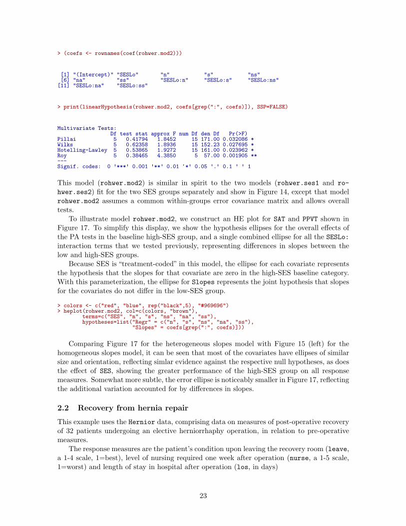
> (coefs <- rownames(coef(rohwer.mod2)))
[1] "(Intercept)" "SESLo" "n" "s" "ns"[6] "na" "ss" "SESLo:n" "SESLo:s" "SESLo:ns"[11] "SESLo:na" "SESLo:ss"
> print(linearHypothesis(rohwer.mod2, coefs[grep(":", coefs)]), SSP=FALSE)
Multivariate Tests:Df test stat approx F num Df den Df Pr(>F)
Pillai 5 0.41794 1.8452 15 171.00 0.032086 *Wilks 5 0.62358 1.8936 15 152.23 0.027695 *Hotelling-Lawley 5 0.53865 1.9272 15 161.00 0.023962 *Roy 5 0.38465 4.3850 5 57.00 0.001905 **---Signif. codes: 0 ✬***✬ 0.001 ✬**✬ 0.01 ✬*✬ 0.05 ✬.✬ 0.1 ✬ ✬ 1
This model (rohwer.mod2) is similar in spirit to the two models (rohwer.ses1 and ro-
hwer.ses2) fit for the two SES groups separately and show in Figure 14, except that modelrohwer.mod2 assumes a common within-groups error covariance matrix and allows overalltests.
To illustrate model rohwer.mod2, we construct an HE plot for SAT and PPVT shown inFigure 17. To simplify this display, we show the hypothesis ellipses for the overall effects ofthe PA tests in the baseline high-SES group, and a single combined ellipse for all the SESLo:interaction terms that we tested previously, representing differences in slopes between thelow and high-SES groups.
Because SES is “treatment-coded” in this model, the ellipse for each covariate representsthe hypothesis that the slopes for that covariate are zero in the high-SES baseline category.With this parameterization, the ellipse for Slopes represents the joint hypothesis that slopesfor the covariates do not differ in the low-SES group.
> colors <- c("red", "blue", rep("black",5), "#969696")> heplot(rohwer.mod2, col=c(colors, "brown"),
terms=c("SES", "n", "s", "ns", "na", "ss"),hypotheses=list("Regr" = c("n", "s", "ns", "na", "ss"),
"Slopes" = coefs[grep(":", coefs)]))
Comparing Figure 17 for the heterogeneous slopes model with Figure 15 (left) for thehomogeneous slopes model, it can be seen that most of the covariates have ellipses of similarsize and orientation, reflecting simlar evidence against the respective null hypotheses, as doesthe effect of SES, showing the greater performance of the high-SES group on all responsemeasures. Somewhat more subtle, the error ellipse is noticeably smaller in Figure 17, reflectingthe additional variation accounted for by differences in slopes.
2.2 Recovery from hernia repair
This example uses the Hernior data, comprising data on measures of post-operative recoveryof 32 patients undergoing an elective herniorrhaphy operation, in relation to pre-operativemeasures.
The response measures are the patient’s condition upon leaving the recovery room (leave,a 1-4 scale, 1=best), level of nursing required one week after operation (nurse, a 1-5 scale,1=worst) and length of stay in hospital after operation (los, in days)
23

−20 0 20 40 60 80 100
4050
6070
8090
100
SAT
PP
VT
+
Error
SES
n
s
ns
na
ss
Regr
Slopes●
●
Hi
Lo
Figure 17: HE plot for SAT and PPVT, fitting the model rohwer.mod2 that allows unequalslopes for the covariates.
The predictor variables are patient age, sex, physical status (pstat, a 1-5 scale, with1=perfect health, 5=very poor health), body build (build, a 1-5 scale, with 1=emaciated,. . . , 5=obsese), and preoperative complications with (cardiac) heart and respiration (resp).
We begin with a model fitting all predictors. Note that the ordinal predictors, pstat,build, cardiac and resp could arguably be treated as factors, rather than linear, regressionterms. We ignore this possibility in this example.
> Hern.mod <- lm(cbind(leave, nurse, los) ~ age + sex + pstat + build + cardiac + resp,data=Hernior)
> Anova(Hern.mod)
Type II MANOVA Tests: Pillai test statisticDf test stat approx F num Df den Df Pr(>F)
age 1 0.143 1.27 3 23 0.307sex 1 0.026 0.21 3 23 0.892pstat 1 0.333 3.84 3 23 0.023 *build 1 0.257 2.65 3 23 0.073 .cardiac 1 0.228 2.26 3 23 0.108resp 1 0.248 2.53 3 23 0.082 .---Signif. codes: 0 ✬***✬ 0.001 ✬**✬ 0.01 ✬*✬ 0.05 ✬.✬ 0.1 ✬ ✬ 1
The results of the multivariate tests above are somewhat disappointing. Only the physicalstatus predictor (pstat) appears to be significant at conventional levels.
The univariate models for each response are implicit in the MLM Hern.mod. These canbe printed using summary(), or we can use summary() to extract certain statistics for eachunivariate response model, as we do here.
> Hern.summary <- summary(Hern.mod)> unlist(lapply(Hern.summary, function(x) x$r.squared))
Response leave Response nurse Response los0.59176 0.24740 0.36531
24

The univariate tests for predictors in each of these models (not shown here) are hard tointerpret, and largely show only significant effects for the leave variable. Yet, the R2 valuesfor the other responses are slightly promising. We proceed to an overall test of B = 0 for allpredictors.
> # test overall regression> Regr <- linearHypothesis(Hern.mod, c("age", "sexm", "pstat", "build", "cardiac", "resp"))> print(Regr, digits=5, SSP=FALSE)
Multivariate Tests:Df test stat approx F num Df den Df Pr(>F)
Pillai 6 1.10198 2.4192 18 75.000 0.0041356 **Wilks 6 0.21734 2.6046 18 65.539 0.0025239 **Hotelling-Lawley 6 2.26797 2.7300 18 65.000 0.0016285 **Roy 6 1.55434 6.4764 6 25.000 0.0003232 ***---Signif. codes: 0 ✬***✬ 0.001 ✬**✬ 0.01 ✬*✬ 0.05 ✬.✬ 0.1 ✬ ✬ 1
> clr <- c("red", "darkgray", "blue", "darkgreen", "magenta", "brown", "black")> vlab <- c("LeaveCondition\n(leave)", "NursingCare\n(nurse)", "LengthOfStay\n(los)")> hyp <- list("Regr" = c("age", "sexm", "pstat", "build", "cardiac", "resp"))> pairs(Hern.mod, hypotheses=hyp, col=clr, var.labels=vlab)
A pairs() plot for the MLM gives the set of plots shown in Figure 18 helps to interpretthe relations among the predictors which lead to the highly significant overall test. Amongthe predictors, age and sex have small and insignificant effects on the outcome measuresjointly. The other predictors all contribute to the overall test of B = 0, though in differentways for the various responses. For example, in the panel for (leave, los) in Figure 18,it can be seen that while only pstat individually is outside the E ellipse, build and resp
contribute to the overall test in an opposite direction.In this multivariate regression example, all of the terms in the model Hern.mod have 1 df,
and so plot as lines in HE plots. An alternative view of these effects can be seen in canonicaldiscriminant space, which, for each predictor shows the scores on the linear combination ofthe responses that contributes most to the multivariate test of that effect, together with theweights for the responses. We use candiscList() to calculate the canonical analyses for allterms in Hern.mod.
> Hern.canL <- candiscList(Hern.mod)
1D canonical discriminant plots for all terms can be obtained interactively with a menu,simply by plotting the Hern.canL object.
> plot(Hern.canL)
Plots for separate terms are produced by the lines below, and shown in Figure 19 and Fig-ure 20.
> plot(Hern.canL, term="pstat")> plot(Hern.canL, term="build")> plot(Hern.canL, term="age")> plot(Hern.canL, term="cardiac")
In these plots, the canonical scores panel shows the linear combinations of the responsevariables which have the largest possible R2. Better outcomes correspond to numericallysmaller canonical scores. The arrows in the structure panel are proportional to the canonicalweights.
These plots provide simple interpretations of the results for the canonical combinationsof the responses. Better physical status, smaller body build, lower age and absence of cardiaccomplications are all positively related to better outcomes.
25

LeaveCondition(leave)
1
3
+
Error
agesex
pstat
build
cardiac
resp
Regr
●
●
f
m +
Error
age
sex
pstat
build
cardiac
resp
Regr
●
●
f
m
+
Error
age
sex
pstat
build
cardiac
resp
Regr
●
● fm NursingCare
(nurse)
3
5
+
Error
age
sex
pstatbuild
cardiacresp
Regr
●
● fm
+
Error
age
sex
pstat
build
cardiac
resp
Regr
●●
fm +
Error
age
sex
pstat
build
cardiac
resp
Regr
●●
fm LengthOfStay
(los)
0
35
Figure 18: HE pairs plot for Hernior data
2.3 Grades in a Sociology Course
The data set SocGrades contains four outcome measures on student performance in an in-troductory sociology course together with six potential predictors. These data were usedby Marascuilo and Levin (1983) for an example of canonical correlation analysis, but arealso suitable as examples of multivariate multiple regression, MANOVA, MANCOVA andstep-down analysis in multivariate linear models.
The outcome measures used here are three test scores during the course, midterm1,midterm2, final, and a course evaluation (eval).2 Predictor variables are student’s so-cial class (class, an ordered factor with levels 1 > 2 > 3) sex, grade point average (gpa),College Board test scores (boards), previous high school unit in sociology? (hssoc: no, yes),and score on a course pretest (pretest).
The basic MLM is fit below as grades.mod.
> data(SocGrades)> grades.mod <- lm(cbind(midterm1, midterm2, final, eval) ~
2It is arguable that the students’ course evaluation should not be considered a response variable here. It
could be used as a predictor in a follow-up, step-down analysis, which would address the separate question of
whether the effects on exam grades remain, when eval is controlled for.
26

●●
1 2 3
−1
01
23
Canonical scores
pstat
Can
1 (1
00%
)Structure
le
ave
nu
rse
lo
s
●●
●
●
1 2 3 4 5
−2
02
4
Canonical scores
build
Can
1 (1
00%
)
Structure
le
ave
nu
rse
lo
s
Figure 19: 1D Canonical discriminant plots for pstat and build. The canonical scores aresuch that better outcomes are associated with smaller scores.
2 40 51 58 65 74 79
−1
01
2
Canonical scores
age
Can
1 (1
00%
)
Structure
le
ave
nu
rse
lo
s
●●●
1 2 3 4
−1
01
23
Canonical scores
cardiac
Can
1 (1
00%
)
Structure
le
ave
nu
rse
lo
s
Figure 20: 1D Canonical discriminant plots for age and cardiac.
class + sex + gpa + boards + hssoc + pretest, data=SocGrades)> Anova(grades.mod, test="Roy")
Type II MANOVA Tests: Roy test statisticDf test stat approx F num Df den Df Pr(>F)
class 2 1.567 11.75 4 30 7.3e-06 ***sex 1 0.553 4.01 4 29 0.0104 *gpa 1 1.208 8.76 4 29 9.2e-05 ***boards 1 0.731 5.30 4 29 0.0025 **hssoc 1 0.035 0.25 4 29 0.9052pretest 1 0.313 2.27 4 29 0.0859 .
27

---Signif. codes: 0 ✬***✬ 0.001 ✬**✬ 0.01 ✬*✬ 0.05 ✬.✬ 0.1 ✬ ✬ 1
In both univariate and multivariate response models, it is often useful to screen for higher-order terms (interactions, non-linear predictors). This can most easily be done using up-
date(), as we do below. First, try the extended model with all pairwise interactions of thepredictors.
> grades.mod2 <- update(grades.mod, . ~ .^2)> Anova(grades.mod2, test="Roy")
Type II MANOVA Tests: Roy test statisticDf test stat approx F num Df den Df Pr(>F)
class 2 2.817 7.04 4 10 0.0058 **sex 1 0.487 1.09 4 9 0.4152gpa 1 1.998 4.49 4 9 0.0286 *boards 1 2.338 5.26 4 9 0.0183 *hssoc 1 0.281 0.63 4 9 0.6522pretest 1 0.510 1.15 4 9 0.3946class:sex 2 2.039 5.10 4 10 0.0168 *class:gpa 2 0.982 2.45 4 10 0.1137class:boards 2 0.522 1.31 4 10 0.3321class:hssoc 2 0.356 0.89 4 10 0.5041class:pretest 2 1.005 2.51 4 10 0.1082sex:gpa 1 0.269 0.60 4 9 0.6694sex:boards 1 0.184 0.41 4 9 0.7944sex:hssoc 1 0.909 2.04 4 9 0.1714sex:pretest 1 0.885 1.99 4 9 0.1795gpa:boards 1 0.447 1.00 4 9 0.4537gpa:hssoc 1 0.596 1.34 4 9 0.3269gpa:pretest 1 0.472 1.06 4 9 0.4291boards:hssoc 1 0.353 0.80 4 9 0.5573boards:pretest 1 0.705 1.59 4 9 0.2593hssoc:pretest 1 1.464 3.29 4 9 0.0635 .---Signif. codes: 0 ✬***✬ 0.001 ✬**✬ 0.01 ✬*✬ 0.05 ✬.✬ 0.1 ✬ ✬ 1
In the results above, only the interaction of class:sex is significant, and the main effects ofhssoc and pretest remain insignificant. A revised model to explore is grades.mod3,
> grades.mod3 <- update(grades.mod, . ~ . + class:sex - hssoc - pretest)> Anova(grades.mod3, test="Roy")
Type II MANOVA Tests: Roy test statisticDf test stat approx F num Df den Df Pr(>F)
class 2 1.588 11.91 4 30 6.5e-06 ***sex 1 0.575 4.17 4 29 0.00864 **gpa 1 1.434 10.40 4 29 2.4e-05 ***boards 1 0.895 6.49 4 29 0.00074 ***class:sex 2 0.450 3.38 4 30 0.02143 *---Signif. codes: 0 ✬***✬ 0.001 ✬**✬ 0.01 ✬*✬ 0.05 ✬.✬ 0.1 ✬ ✬ 1
A pairwise HE plot for all responses (Figure 21) shows that nearly all effects are inthe expected directions: higher gpa, boards, class leads to better performance on mostoutcomes. The interaction of class:sex seems to be confined largely to midterm1.
> pairs(grades.mod3)
These effects are easier to appreciate for the three exam grades jointly in a 3D HE plot.A snapshot is shown in Figure 22.
> heplot3d(grades.mod3, wire=FALSE)
28

midterm1
19
80
+
Error
classsex
gpaboards
class:sex
●
●●
3
21
●
●FM
+
Error
classsex
gpaboards
class:sex
●
●●
3
21
●
●FM
+
Error
classsex
gpa
boardsclass:sex
●
●●
3
21
●
●FM
+
Error
classsex
gpaboards
class:sex
●
●
●
3
2
1
●
●
F
M
midterm2
14
100
+
Error
classsex
gpaboards
class:sex●
●
●
3
2
1
●
●
F
M
+
Error
classsex
gpa
boards
class:sex
●
●
●
3
2
1
●
●
F
M
+
Errorclass
sex
gpa
boardsclass:sex
●
●
●
3
2
1
●
●FM
+
Error
class
sex
gpa
boards
class:sex●
●
●
3
2
1
●
●FM
final
39
166
+
Error
class
sex
gpa
boardsclass:sex●
●
●
3
2
1
●
●FM
+
Error
class
sexgpa
boardsclass:sex
●
●
●
3
2
1
●
●
F
M
+
Error
class
sexgpa
boards
class:sex
●
●
●
3
2
1
●
●
F
M
+
Error
class
sexgpa
boardsclass:sex
●
●
●
3
2
1
●
●
F
M
eval
1
5
Figure 21: HE pairs plot for SocGrades
Interactive rotation of this plot shows that the effect of class is only two dimensional, andof these, one is very small. The major axis of the class ellipsoid is aligned with increasingperformance on all three grades, with the expected ordering of the three social classes.
The representation of these effects in canonical space is particularly useful here. Again,use candiscList() to compute the canonical decompositions for all terms in the model, andextract the canonical R2 from the terms in the result.
> # calculate canonical results for all terms> grades.can <- candiscList(grades.mod3)> # extract canonical R^2s> unlist(lapply(grades.can, function(x) x$canrsq))
class1 class2 sex gpa boards class:sex1 class:sex20.613620 0.024186 0.365269 0.589145 0.472268 0.310461 0.132931
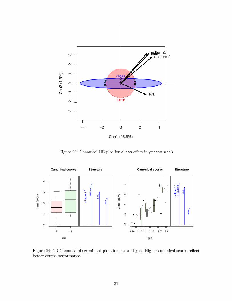
We use heplot() on the "candiscList" object to show the effects of class in canonicalspace, giving Figure 23.
> # plot class effect in canonical space> op <- par(xpd=TRUE)> heplot(grades.can, term="class", scale=4, fill=TRUE, var.col="black", var.lwd=2)> par(op)
29

Figure 22: 3D HE plot for SocGrades, model grades.mod3
It can be seen in Figure 23 that nearly all variation in exam performance due to classis aligned with the first canonical dimension. The three tests and course evaluation all havesimilar weights on this dimension, but the course evaluation differs from the rest along asecond, very small dimension.
1D plots of the canonical scores for other effects in the model are also of interest, andprovide simple interpretations of these effects on the response variables. The statementsbelow produce the plots shown in Figure 24.
> plot(grades.can, term="sex")> plot(grades.can, term="gpa")
It is readily seen that males perform better overall, but the effect of sex is strongest for themidterm2. As well, increasing course performance on tests is strongly associated with gpa.
References
J. Fox, M. Friendly, and G. Monette. Visualizing hypothesis tests in multivariate linear mod-els: The heplots package for R. Computational Statistics, 24(2):233–246, 2009. (Publishedonline: 15 May 2008).
M. Friendly. Data ellipses, HE plots and reduced-rank displays for multivariate linear models:SAS software and examples. Journal of Statistical Software, 17(6):1–42, 2006.
M. Friendly. HE plots for multivariate general linear models. Journal of Computational and
Graphical Statistics, 16(2):421–444, 2007.
30
−4 −2 0 2 4
−3
−2
−1
01
23
Can1 (98.5%)
Can
2 (1
.5%
)
+
Error
class
●●
●3
2 1
midterm1midterm2
final
eval
Figure 23: Canonical HE plot for class effect in grades.mod3
F M
−4
−2
02
4
Canonical scores
sex
Can
1 (1
00%
)
Structure
m
idte
rm1
m
idte
rm2
fin
al
ev
al
2.69 3 3.24 3.47 3.7 3.9
−4
−2
02
4
Canonical scores
gpa
Can
1 (1
00%
)
Structure
m
idte
rm1
mid
term
2
fin
al
ev
al
Figure 24: 1D Canonical discriminant plots for sex and gpa. Higher canonical scores reflectbetter course performance.
31

M. E. Plaster. The Effect of Defendent Physical Attractiveness on Juridic Decisions Using
Felon Inmates as Mock Jurors. Unpublished master’s thesis, East Carolina University,Greenville, NC, 1989.
N. H. Timm. Multivariate Analysis with Applications in Education and Psychology.Wadsworth (Brooks/Cole), Belmont, CA, 1975.
32