heathrow airport’s cost of capital a report on behalf of...
TRANSCRIPT

- 1 -
Heathrow Airport’s
Cost of Capital
A report on behalf of Heathrow
Public Version
February 2013

Europe Economics is registered in England No. 3477100. Registered offices at Chancery House, 53-64 Chancery Lane, London WC2A 1QU.
Whilst every effort has been made to ensure the accuracy of the information/material contained in this report, Europe Economics assumes no
responsibility for and gives no guarantees, undertakings or warranties concerning the accuracy, completeness or up to date nature of the
information/analysis provided in the report and does not accept any liability whatsoever arising from any errors or omissions © Europe Economics.
All rights reserved. Except for the quotation of short passages for the purpose of criticism or review, no part may be used or reproduced without
permission.
Contents
1 Introduction .................................................................................................................................................................... 1
1.1 Estimate of Heathrow’s Cost of Capital ......................................................................................................... 1
1.2 Structure of Report .............................................................................................................................................. 1
2 Methodological Issues .................................................................................................................................................. 3
2.1 The CAPM Framework and other Cross-checks ......................................................................................... 3
2.2 Lack of Direct Market Data ............................................................................................................................... 5
2.3 Choice of the Relevant Capital Market ........................................................................................................... 7
2.4 The Impact of the Financial Crisis ..................................................................................................................... 7
2.5 Time Period ............................................................................................................................................................ 8
2.6 Gearing .................................................................................................................................................................... 9
2.7 Assumed Debt Beta ........................................................................................................................................... 10
2.8 Assumed Tax Rate .............................................................................................................................................. 11
3 Total Market Returns ................................................................................................................................................. 12
3.1 The Relationship between Market Returns and Macroeconomic Conditions ..................................... 12
3.2 The Sustainable Growth Rate (and hence Risk-Free Rate) is Likely to Increase during the Price
Control Period ................................................................................................................................................................. 18
3.3 Why the Sustainable Growth Rate is Likely to Increase ........................................................................... 21
3.4 The Equity Risk Premium .................................................................................................................................. 26
3.5 Conclusion on Total Market Returns ............................................................................................................ 32
3.6 Skewness and Non-Diversifiable Skewness in Total Market Returns .................................................... 33
3.7 Appendix: Technical Details Underpinning the Model .............................................................................. 34
4 Debt Premium ............................................................................................................................................................. 40
4.1 Introduction ......................................................................................................................................................... 40
4.2 Bond Spread Analysis ......................................................................................................................................... 40
4.3 Issuance costs ...................................................................................................................................................... 46
4.4 CEPA’s debt premium estimate ...................................................................................................................... 47
4.5 Conclusion on Heathrow’s debt premium ................................................................................................... 49
5 Developments at Heathrow and in the Airport Sector Since 2007 ............................................................... 50
5.1 Introduction ......................................................................................................................................................... 50
5.2 Macroeconomic context ................................................................................................................................... 50
5.3 Changes in demand ............................................................................................................................................ 50
5.4 Regulatory context ............................................................................................................................................. 52
5.5 The Impact of Capacity Constraints and Regulation on Skewness......................................................... 52
6 Equity Beta .................................................................................................................................................................... 53
6.1 Comparator Data ............................................................................................................................................... 53
6.2 Fundamental Beta Analysis ............................................................................................................................... 59

6.3 Skewness Analysis ............................................................................................................................................... 64
6.4 CEPA’s estimate of Equity Beta ....................................................................................................................... 75
6.5 Overall Conclusion on Equity Beta ................................................................................................................ 78
7 Overall WACC ............................................................................................................................................................ 79
7.1 Overall WACC Estimate .................................................................................................................................. 79
7.2 CEPA’s estimate of the WACC ...................................................................................................................... 81
7.3 Aiming Up ............................................................................................................................................................. 82
7.4 Conclusion ............................................................................................................................................................ 83
Appendix: Approach to Calculating Betas ...................................................................................................................... 84

Introduction
- 1 -
1 Introduction
1.1 Estimate of Heathrow’s Cost of Capital
This report considers what cost of capital would be appropriate for Heathrow in the Q6 airports
price control. It has been commissioned by Heathrow Airport from Europe Economics, with a view
to ensuring that the cost of capital determined for Heathrow is no lower than is justified by market
and economic conditions and outlook.
In the Q5 control, the values for key parameters of the cost of capital determination, as proposed by
the Competition Commission and the CAA, were as shown in columns two and three of Table 1.1.
Column four contains the derivation of this report’s proposed minimum value of the WACC for Q6,
which we would currently expect to revise upwards in later phases.
Table 1.1: Overall WACC
Q5 determination
WACC estimate for Q6
from this report
Low High
Risk free rate (%)
2.5 2.5 2.0
Equity risk premium (%)
2.5 4.5 5.0
Debt Premium including
issuance cost (%) 1.05 1.05 2.6
Equity beta
0.91 1.15 1.3
Cost of equity
(post-tax) (%) 7.3 8.5
Tax rate* (%)
28 21
Cost of equity (pre-tax) (%)
10.2 10.8
Cost of debt (pre-tax) (%)
3.55 4.6
Gearing (%)
60 60
WACC (vanilla) (%)
WACC (pre-tax) (%)
6.2 7.1
The Q6 price control is, at the time of writing, expected to apply for the period April 2014 to March
2019. Even the commencement of this period is some distance away at the time of writing, in highly
volatile market conditions. We anticipate that our proposed values could be amended significantly
(probably upwards) between the time of this report and later submissions.
1.2 Structure of Report
Subsequent sections of this report proceed as follows:

Introduction
- 2 -
In Section 2 we set out a number of the key methodological issues arising in respect of Q6.
Section 3 considers Total Market Returns, including key generic parameters of the CAPM model
such as the risk-free rate and the equity risk premium. The central issue of this section is how
total market returns should be expected to evolve between the time of writing and the mid-point
of the Q6 price control period.
Section 4 considers Heathrow’s cost of debt, in particular noting the rise in debt premia since the
lows of 2005-7 (now commonly acknowledged to reflect market under-pricing of risk).
Section 5 considers developments in the airports sector since the time of the Q5 Competition
Commission advice and CAA determination.
Section 6 estimates equity beta from comparator and Heathrow data.
Section 7 draws together the analysis of previous sections into an estimate for the overall
WACC, and considers the appropriate methodology for aiming up.

Methodological Issues
- 3 -
2 Methodological Issues
These sections sets out the key methodological issues that we consider particularly relevant in the
context of the upcoming price review. These are:
The general framework to be used and additional cross-checks.
Issues related to the lack of direct market data.
The choice of the relevant capital market.
The impact of the financial crisis.
The relevant time period.
The assumed gearing.
2.1 The CAPM Framework and other Cross-checks
The standard way UK regulators assess the cost of capital is through the Weighted Average Cost of
Capital / Capital Asset Pricing Model (WACC-CAPM) approach. The relationship between the
CAPM and the WACC approach is discussed below.
2.1.1 The CAPM
The CAPM framework was developed in the 1960s, building on the portfolio analysis work of
Markowitz (1958), as a way to estimate the value of assets. The key feature of CAPM is that, given
its important assumptions concerning the efficiency of financial markets and that investors care only
about the mean and variance of returns, investment returns can be expressed as:
r = rf + MRP × βA [Eq. 2.1]
where r is the (expected) return on the asset, rf is the return that would be required for a perfectly
risk-free asset, MRP is the “market risk premium”, that is to say the excess return over the risk-free
rate that would be delivered by a notional perfectly diversified portfolio equivalent consisting of all
assets (“the whole market”), and βA is a measure of the correlation between movements in the value
of the asset of interest and in the value of assets as a whole. It is also called “beta” (or sometimes
the “asset beta”).
2.1.2 The vanilla WACC and the capital structure
Utilities typically use a combination of debt and equity. Therefore, in the (vanilla) WACC
framework assets’ returns are decomposed into a cost of equity and a cost of debt, according to the
following formula:
r = (E/V) × re + (D/V) × rd [Eq. 2.2]
where V is the total value of the assets of the company, E is the value of the equity, D is the value of
the debt so V ≡ D + E (D/V is the proportion of the total value of the company accounted for by
debt and is often referred to as the company’s “leverage” or “gearing” — clearly, D/V + E/V = 1), re

Methodological Issues
- 4 -
is the (expected) return on equity and rd is the (expected) return on debt (note that this is not
identical to the coupon rate or yield on debt, since these do not embody probabilities of and losses
on default).
2.1.3 Equivalence between CAPM and WACC
The fundamental relationship between CAPM and WACC stems from the Modigliani-Miller (MM)
insight that the asset beta, and hence the vanilla WACC, will not change due to gearing, unless either
a) the debt tax shield has value or b) the market’s assessment of the systematic risk exposure of the
underlying cash flows has changed with gearing. Using the second Modigliani-Miller Theorem1, the
following equivalence between asset beta and vanilla WACC can be shown:
Table 2.1: Asset beta — vanilla WACC equivalence
Return via asset beta Return via vanilla WACC
MRPrr Af
DE r
ED
Dr
ED
Er
MRPED
D
ED
Err DEf .
)()( MRPrED
DMRPr
ED
Er DfEf
MRPED
DMRP
ED
Err DEf
MRPED
DMRP
ED
Err DEf
The above utilises the decomposition of the corporate debt premium into debt beta and market risk premium components
In Table 2.1 βe is a measure of the correlation between movements in the value of the company’s
equity and in the value of assets as a whole. Similarly, βd is a measure of the correlation between
movements in the value of the company’s debt and in the value of assets as a whole. Since returns
on equity and debt tend to move under different circumstances (e.g. when companies are not in
default debt returns differ little but equity returns may differ considerably, whilst when companies
are in default equity returns differ little (they are close to zero) whilst debt returns differ markedly
(depending on the scale of the default)), equity and debt betas are not typically the same.
2.1.4 Alternatives to CAPM
In some other price reviews, regulators have considered alternatives to CAPM, typically to act as
cross-checks on the main CAPM calculation. Some of the alternatives to CAPM that have been
considered in other contexts would not appear to be relevant for Heathrow at Q6. In particular:
The Fama French model is typically used to take account of small company effects, which would
not be relevant to Heathrow airport. Moreover, the use of the Fama and French approach has
been heavily criticised by the CC in the previous (Q5) review.
The Dividend Growth Model (DGM) can be used to estimate the cost of equity, but the CC has
noted that it is compatible with a very wide range estimate, thus limiting its practical usefulness.
Moreover, the CC was highly sceptical about the value of the DGM in the context of the Bristol
Water judgment, stating that they “regard the DGM evidence as consistent with a wide range of
figures for the cost of WaSCs’ equity”.2
1 The Modigliani-Miller theorem implies the following expression:
ED
D
ED
EDEA .
2 http://www.competition-commission.org.uk/rep_pub/reports/2010/fulltext/558_appendices.pdf

Methodological Issues
- 5 -
In the Q5 price control, the CAA noted the potential value, at least as a cross-check, of the third
moment CAPM model. The third moment CAPM addresses the possibility that investors have
preferences over the distribution of returns that go beyond mean and variance, in particular taking
account of skew. The potential usefulness of the third moment CAPM can be justified on the
following grounds:
The third moment CAPM represents a natural extension of the traditional CAPM framework (as
opposed to being a completely separate methodological approach).
The third moment CAPM has been mentioned by the CC as a potentially relevant cross-check
method for estimating the cost of capital in the airport sector, and it has not been the subject of
heavy criticism (as is the case for the DGM and Fama and French approaches).
Airports’ returns in general, and Heathrow’s returns in particular, are likely to be negatively
skewed (mainly due to the joint effects of capacity and regulatory constraints, a point which is
discussed in more detail below) which makes consideration of the results of the third moment
CAPM model particularly relevant.
Market to Asset Ratios (MARs) for listed companies are typically used as one source of evidence on
whether the regulated WACC is higher or lower than the true market WACC (although one needs
to bear in mind that other factors may also affect MARs). Regulators may also look at MARs
following draft determinations to see whether the overall price control package seems too harsh or
too generous.
2.2 Lack of Direct Market Data
The most significant methodological challenge in the upcoming price control review is the lack of
direct market data for Heathrow Airport Holdings. (In the Q5 review direct market data for
Heathrow was lacking, but market data for the then BAA group was available up until only a few
months before the CAA’s initial estimates were produced). We therefore list below potential
approaches to deal with this issue.
2.2.1 Use of comparators
When direct market data for the entity of interest is lacking it is common practice to infer the asset
beta of the entity of interest (Heathrow airport in this case) based on analysis of relevant
comparators for which market data is available. In the last price control review a number of
international airports, airline companies and UK utilities were used as comparators. We shall
discuss below which potential comparators are most relevant to use on this occasion.
Beta estimates can vary significantly across comparators, and not all comparators are equally
representative of Heathrow’s exposure to systematic risk. A degree of judgment is therefore
needed in deciding to which estimates more weight should be attached. A number of criteria can be
used to assist this process. For example, airports with significant similarities to Heathrow (e.g. in
passenger numbers, status as an international hub, full capacity utilisation etc.) could be considered
to be more representative than UK water companies. Nevertheless, inferring Heathrow’s asset beta
directly from comparators’ estimates alone can be problematic and would be necessarily subject to a
material degree of arbitrariness.

Methodological Issues
- 6 -
2.2.2 Changes since the last period in which direct market data was available
Another potential use of comparators is to assess changes occurring since the last price control
period. This approach does not attempt to assess a precise beta estimate for Heathrow, but rather
indicates the direction of a change (e.g. whether Heathrow’s asset beta has increased or decreased
since the Q5 price control). In the context of the third moment CAPM, a particular consideration
would be whether there is evidence that the skewness of returns to Heathrow has changed since
the time of the last price review.
2.2.3 Fundamental and accounting beta
Alongside the comparator beta analysis, another source of evidence on Heathrow’s asset and equity
betas would be the employment of account and fundamental beta methodologies.
Accounting betas are based on econometric analysis of accounting returns rather than stock market
returns, and hence can be calculated even for non-listed companies. In particular, it would be
possible to regress changes in accounting earnings for Heathrow airport against changes in earnings
for an equity index (such as the FTSE All Share).
However, there are various potential limitations with this approach. One is that firms do not publish
measured earnings on a daily basis, leading to regressions with fewer observations and limited
statistical power compared to those obtainable with daily market data. Another is that earnings are
often smoothed out and subject to accounting judgments, leading to potential mis-measurement of
accounting betas. Finally, accounting information on earnings reflect ex post achieved earnings,
whereas stock prices used in normal beta estimation reflect expectations of future earnings.
A more sophisticated variant of this approach is to calculate what are called “fundamental” betas.
This involves estimating a relationship between various fundamental characteristics of firms and their
betas, and then use the characteristics for Heathrow airport to estimate Heathrow’s beta.
However, it should be noted that a fundamental beta analysis will only imperfectly account for the
effects of systematic skewness, especially insofar as a company has skewness disproportionate to its
variance (as we shall argue Heathrow does).
2.2.4 Disaggregation of Ferrovial’s beta
The largest shareholder in Heathrow airport is Ferrovial, until recently with 33.65 per cent of its
equity. Heathrow is a material component of Ferrovial’s overall business. As at 20103:
the airport business accounted for approximately 23 per cent of Ferrovial’s total revenues, 50
per cent of Ferrovial’s earnings, and 50 per cent of Ferrovial’s total assets;
Heathrow was responsible for 70 per cent of the revenues and 75 per cent of earnings generated
by Ferrovial in its airport business segment, and hence 16 per cent of total revenues and 38 per
cent of earnings.
When a regulated entity is a material part of a broader non-regulated business, regulators
sometimes choose to infer the beta for the regulated entity by disaggregating the beta for the overall
entity. This is, for example, the approach that has been taken by Ofcom to the regulation of BT.
However, such exercises are most normally conducted when the target entity (in this case
Heathrow) constitutes a majority of the total business. A 16 per cent share in revenues / 38 per
3 These figures were sourced from Ferrovial’s annual accounts (January-December 2010)

Methodological Issues
- 7 -
cent in earnings, though significant, is unlikely to be sufficient for such an exercise to constitute the
main data basis for a regulatory decision.
2.3 Choice of the Relevant Capital Market
Past regulatory decisions concerning utilities in the UK have adopted the UK as the relevant capital
market. For instance, beta analyses based on European and world market indices have been used
mainly as cross-checks but have never represented the centrepiece of the analysis. Obviously an
airport has, intrinsic to its business, a straightforwardly international dimension that is of a
completely different order from any international dimension in, say, a water company. Furthermore,
as we understand it, the typical investor relevant to Heathrow operates mainly in developed western
economies.
It might therefore be appropriate to place more weight, at least for some parts of the estimation
exercise, on European and US figures as opposed to UK figures. Alternatively, even if the UK
market continued to be the main source of data, a greater weight might be placed upon international
data than would be the case for UK utilities.
2.4 The Impact of the Financial Crisis
The financial crisis had a significant impact on cost of capital parameters. There have been a number
of key regulatory decisions regarding the cost of capital since 2008, including Ofwat (2009), Ofcom
(2009, 2011), Ofgem (2011) and the Competition Commission’s judgement on the Bristol Water
case (2010). Based on these judgments, the following trends can be noted:
Increase in Equity Risk Premium (ERP) — periods of high market turbulence are associated with
an increased perceived risk of equity investments and, as a result, investors tend to require
higher premiums. ERP regulatory judgements have tended to rise, from typical figures of around
2.50 - 4.50 per cent in 2008 (as per the Q5 Competition Commission recommendation). During
the height of the credit crisis, figures above 5 per cent were used (e.g. 5.25 per cent for
Electricity Distribution in 2009, 5.4 per cent for Water in 2009). Some recent figures have fallen
back to around 5 per cent (e.g. 4.0-5.0 per cent in the Bristol Water judgement, and 5.0 per cent
in Ofcom’s OpenReach judgement of 2011), though in its final proposals for electricity and gas
transmission and gas transmission in 2012, Ofgem proposed an ERP of 5.25 per cent
Decrease in risk-free rate — as the economic conditions deteriorate market expectations about
the economy’s sustainable growth are revised downward and the risk-free rate falls. In fact, risk-
free rate judgements have tended to fall over time, from figures such as the CAA’s Q5 judgement
of 2.50 per cent in 2008, to the 1-2 per cent range of the Competition Commission’s 2010
Bristol Water judgement and the 1.4 per cent figure in the Ofcom OpenReach judgement of
2011. In its final proposals for electricity and gas transmission and gas transmission in 2012,
Ofgem proposed a risk-free rate of 2.0 per cent.
Increase in debt premium — Bond spreads rose sharply during the financial crisis, but have since
come down — though without falling back to their pre-crisis lows. A crucial issue is what view
to take about where bond spreads are likely to settle during the forthcoming price control
period. For instance, it is arguably not appropriate to assume that spreads will end up around the
level seen immediately prior to the financial crisis, since it can be argued that risk was being
under-priced during this period.

Methodological Issues
- 8 -
Other potential impacts — In addition to the impacts illustrated above, which can be viewed —
to a certain extent — as being transitory, an interesting issue is whether the behaviour of
financial markets during the recent global recession has changed the shape of the distribution of
expected investment returns. The recent global recession might demonstrate that perceived
downside risk in some sectors is now greater than previously thought, tending to balance out
returns that were previously perceived as skewed upwards. For example, perhaps in the
regulated sector some investors previously thought that the worst that regulated entities might
do would be to secure their cost of capital, but that there was potential for them to outperform
regulatory assumptions and so gain on the upside; whereas now it is better understood that
there is genuine downside risk. Or alternatively, some stakeholder might argue that for many
assets, there were previously fairly balanced returns but there is now seen to be downside tail
risk, skewing distributions.
Assuming one does proceed with a UK-based WACC analysis, another issue is the relevance of
“crisis” analysis of the cost of capital to the current review. The Q5 determination was undertaken
at the beginnings of the credit crisis. Determinations by regulators since then have had to take
account of the financial crisis and market turbulence. This has had implications for inferring the cost
of capital from historic or contemporaneous data. A key is question is therefore: is the crisis over
or will it be over by the time of the next price control period?
For the purposes of the main estimates reported here we shall assume that by the time the Q6 price
control commences, the acute phase of the crisis will be over. However, this is clearly a question
that is material and should be kept under close review. Alongside our main estimates, we report in
specific sections below the implications for key affected parameters if the crisis were to persist.
However, our overall estimates in this document do not assume a crisis scenario.
2.5 Time Period
The Q6 price control is, at the time of writing, expected to apply for the period April 2014 to March
2019. The precise appropriate weightings, across the price control period, for cost of capital
purposes might reflect a number of complex factors, such as the scheduling of the capital
programme for Q6, that are not available to us at the time of writing. We shall assume, for our
purposes here, that the desired exercise is to estimate what the cost of capital for Heathrow will be
at the mid-point of the price control period — roughly at the turn of the year 2016/17 or, more
strictly, October 2016.
As we write, in the first half of 2012, October 2016 is clearly some distance away, and much could
happen. Very often in finance, the values of contemporaneous forwards-looking variables constitute
the best-estimate of future variables — even, sometimes, quite distant variables. Even when market
data allow us to infer implied estimates for how views about forwards-looking variables will change
in the future, relatively modest differences in the implied future values and the actual current value
are often best explained in terms of factors such as liquidity, uncertainty, and transactions costs.
In current and recent very extreme market conditions, however, (i) it seems much less likely than
usual that current forwards-looking estimates provide a best-estimate of circumstances more than
four years ahead — fundamental analysis of economic conditions and outlook might provide us with
strong reasons to believe that conditions in more than four years’ time will be very different from
those today; and (ii) as we shall see below, implied estimates, drawn from current market data, for
how views about forwards-looking variables will change in the future involve changes far greater in
magnitude than those normally attributed to liquidity, uncertainty or transactions costs.

Methodological Issues
- 9 -
There are thus strong reasons to believe that key elements of the cost of capital in more than four
years’ time could be different from that indicated by market data today.
2.6 Gearing
The gearing assumed for Heathrow in the Q5 price control was 60 per cent. For Q5, Heathrow’s
notional gearing was determined at 60 per cent. In our August 2012 report we took as given the
assumption that Heathrow’s notional gearing would be 60 per cent in Q6, also. We consider what
are the implications of recent trends in gearing for the continued appropriateness of this 60 per cent
assumption. The most widely-quoted analysis of UK non-financial sector indebtedness is that from
the McKinsey Global Institute. In the chart below we provide evidence from the latest available
report at the time of writing (the January 2012 report4).
Figure 2.1: McKinsey Global Institute January 2012
Source: McKinsey Global Institute
We see first that in the period leading up to the Q5 determination non-financial sector indebtedness
rose, relative to GDP, as indeed it had been rising for much of the previous two decades. However,
whilst aggregate UK indebtedness has increased since the time of the Q5 determination in 2008,
driven particularly by increases in bank and government debt, the non-financial corporate sector has
been deleveraging, down from 122 per cent of GDP to 109 per cent.
4 http://www.mckinsey.com/insights/mgi/research/financial_markets/uneven_progress_on_the_path_to_growth

Methodological Issues
- 10 -
If the Q5 determination’s choice of a notional 60 per cent gearing reflected an assumption that the
trends of the previous two decades would be extended, such that 60 per cent gearing was
“forwards-looking”, then the natural assumption might be that the Q5 notional gearing of 60 per
cent was likely to have been too high — the trend of rising gearing did not continue. In that case it
might be natural to consider how much gearing should fall in Q6.
However, we note that the Q5 determination did not aspire fully to reflect then-recent trends of
increased leverage; neither did it anticipate further leverage rises. Notional gearing was raised,
recognising the increase in gearing associated with the January 2006 takeover, but not as far as actual
gearing. We observe that the Q4 notional gearing was 25 per cent so the increase to 60 per cent
already takes account of the gearing impact of the Ferrovial takeover.
This conscious decision to under-shoot those then-recent trends in infrastructure and utilities
leverage can be seen as having been vindicated by subsequent market developments. The question,
then, is not whether Q5 gearing trends have suggested that the Q5-determined gearing was errant
— quite the reverse is true. Rather, the question is whether recent trends imply there is a secure
basis for believing that Q6 gearing will be either materially higher or lower than that in Q5.
At this stage we see no such basis. There is expected to be significant deleveraging in the UK, but
this is expected to occur principally in the household and banking sectors. The non-financial
corporate sector has already deleveraged whilst leverage in the banking sector continued to rise. It
is possible that the non-financial corporate sector will deleverage further yet, in response to wider-
economy deleveraging. However, it is also possible that economic recovery will be associated with
an increased appetite for debt amongst non-financial corporates.
At this stage, we see no compelling reason to deviate from the 60 per cent notional gearing
assumption used in Q5, and would propose that analysis proceeds on that basis pending any basis for
a change.
2.7 Assumed Debt Beta
The debt beta assumed for Heathrow in the Q5 price control was 0.1. The reasons for choosing a
positive debt beta rather than the zero chosen in regulatory determinations up to that point
reflected the special circumstances of that review, as set out on p10 paragraph 3.4 of the “CAA’s price
control reference for Heathrow and Gatwick airports, 2008-2013 — Supporting Paper II” (March 2007)5,
namely:
Large step change in gearing;
Absence of observable equity data after the step change in gearing;
Relatively low equity beta before the change in gearing; and
Relatively high debt beta.
Since BAA/Heathrow Airport Holdings equity beta data has not been available since 2006, we
assume that the issue of there being a large step change in gearing shortly after the delisting of the
regulated entity’s equity does not arise in this review.
It was noted in the Q5 review, and has been noted in subsequent reviews such as Ofwat (2008-9)
and Ofgem (2010-11) that where these special factors do not arise the assumption of a zero debt
5 http://www.caa.co.uk/docs/5/ergdocs/ccref_sp2.pdf

Methodological Issues
- 11 -
beta is usually adequate for calculation purposes, as having a variable debt beta does not have a
material impact on the result. In these reviews debt betas of 0 or 0.1 were used.
In price reviews where use of a debt beta was investigated in more detail, as in Ofcom’s July 2011
WBA determination, its use was in specific response to particular methodological issues associated
with asset beta instability during 2009 under a variable gearing but non-variable debt beta estimation
model. Since we assume an invariant nominal gearing in this case, those gearing instability issues do
not arise here.
In the case of the methodologies discussed here, in addition to the above points, the implications of
a positive debt beta are not unambiguous, in that in some cases (e.g. when using Ferrovial data in our
fundamental beta analysis) the assumed notional Heathrow gearing (60 per cent) is below that of the
model (we “relever down” — in which case a higher debt beta would produce a higher asset beta),
whilst in other cases (e.g. when using comparator data from other airports such as Fraport) the
notional Heathrow gearing is higher (we “relever up”).
The lack of unambiguous directionality to the impact of debt beta undermines the case for using
non-zero estimates of it, given the intrinsic uncertainties in, and lack of a consensus method for, its
estimation. Calculating an elaborate debt beta on this occasion adds computational complexity and
estimation uncertainty without unambiguous significance for the final answer.
Bearing in mind the points above, for the purposes of this present report we assume that the
determined debt beta will be either 0 or 0.1.
2.8 Assumed Tax Rate
The tax rate assumed for Heathrow in the Q5 price control was the statutory tax rate of 28 per
cent. For the purposes of this present report we simply assume that the tax rate in Q6 will again be
the statutory tax rate. As per the most recent Treasury announcements, this will be 21 per cent.

Total Market Returns
- 12 -
3 Total Market Returns
In this section we shall argue the following points:
When the economy does better, total enterprise returns are greater (and vice versa).
This tends to mean that, when the economic outlook is better (i.e. the economy is expected to do
better in the future), required total market returns to capital also tend to be higher (and vice
versa).
Matters can, however, be somewhat complicated by the fact that total enterprise returns are
divided between returns to capital and returns to labour. Evidence suggests that labour may be
obtaining a diminishing share of total returns.
There is a relationship between the risk-free rate of return and the sustainable growth rate of the
economy, both in theory and in statistical evidence.
There is good reason to believe that, although the next few years may see quite low growth for
the UK economy (indeed, perhaps the economies of many developed countries), within the next
few years the medium-term outlook (the outlook beyond the next few years) may improve,
raising sustainable growth rates and associated with a rise in the risk-free rate.
When economic conditions are weak, the equity risk premium tends to be elevated. However,
the elevation in the equity risk premium is not always as great as the fall in the risk-free rate, so
total market returns often fall.
Conversely, when economic conditions improve, although the equity risk premium may fall back,
it should not be expected to fall back as much as the risk-free rate rises, so total market returns
should be expected to rise.
After a major economic and financial crisis, one might expect lasting impacts on risk appetites.
A major economic and financial crisis might also be associated with changes in (a) the degree of
skewness and kurtosis in returns; and (b) how much investors care about skewness and kurtosis
(e.g. the price of skewness).
3.1 The Relationship between Market Returns and Macroeconomic
Conditions
3.1.1 Impact of the economy on total returns to enterprise
When economic growth is higher, firms tend to have greater earnings. Demand is higher, so the
gross value added by businesses increases. Faster economic growth leads to greater total enterprise
returns.
So, if economic growth is expected to be higher in the future, there are expected to be greater
enterprise returns. Total enterprise returns are divided between labour and capital. If the split (the
ratio) can be taken as given (or indeed if returns to labour can be taken as fixed), then a rosier
economic outlook implies that returns to capital will be greater. If investors, responding to a rosier
economic outlook, did not demand higher returns, they would be conceding that labour would take

Total Market Returns
- 13 -
all the benefit from faster growth. Normally, however, capital demands its share of the expected
larger pie.
This is the straightforward case, but it is worth noting that there is no iron rule here. If there is a
change in the capital/labour split of returns, that could in principle reverse the overall effect or
enhance it. For example, poor economic times could coincide with a fall in the share of total returns
taken by labour, so that total returns to capital could rise even as total enterprise returns fell — in
which case our straightforward case effect would be reversed. As an alternative example, rosier
economic times could coincide with labour taking a lower share of total returns — so our
straightforward case effect would be enhanced.
As it happens, evidence suggests that labour has obtained a very stable share of total returns over
the past decade — employee compensation was 54.5 per cent of GDP in 2000 and 54.8 per cent of
GDP in 2010.6 The key change here occurred during the 1980s. In 1970 and 1980 employee
compensation was around 59 per cent of GDP, but by 1990 this had fallen to 55 per cent. Since
1990 the proportion has been very stable.
If a period of elevated returns is relatively brief — for example, if it occurs only for a year or two in
the recovery phase from a recession — then although actual returns to capital may be higher, the
required rate of return will not. Over the lifetime of an investment, there will naturally be some
years in which actual rates of return are below the cost of capital and others in which actual rates of
return are higher. But overall, average expected rates of return will equal the cost of capital.
On the other hand, periods of slower or higher growth could be more sustained than this. In
economics, the “long-term” refers to the period over which there are no fixed costs — when all
investments must be renewed. A period of low or high growth sustained for a longer period than
the lifetime of investments is not merely cyclical in nature; it is structural, and should be expected to
affect not merely year-to-year actual returns but also the required rate of return on investment,
because if low / high growth is sustained and economy-wide, then it affects the opportunity cost of
investment; we can neither invest in something else nor can we simply wait a brief time and invest
under more favourable circumstances. Some of the higher returns effect will appear in the value of
assets, as opposed to the required rate of return on assets (e.g. assets will have lower prices when
outlooks are worse). But if the rate of growth in returns is systematically higher (i.e. returns are not
simply higher but grow at a faster rate each year), then required rates of return will be higher as well
as prices being higher.
Lastly, we observe that economic “shocks” affecting the sustainable growth rate can be both good
and bad in nature. There might be new technologies that raise the sustainable growth rate (e.g. by
stimulating more rapid innovation); there might be periods of sustained bad weather damaging
harvests (e.g. for a couple of decades).
Thus, if (as we shall argue below), within the next few years the long-term (i.e. longer than the
investment life) economic outlook will improve, we should expect total required rates of return to
capital to increase. To reiterate, note carefully: to deliver this result we are not required to argue
that economic conditions will improve over the next few years. Contemporaneous economic
conditions affect required returns only insofar as they provide evidence of expected future economic
conditions. Our case will thus not be that the economy should be expected to improve over the
next few years; rather, it will be that within the next few years the medium-term outlook will
6 Source National Statistics, UK Economic Accounts, Table A3: Gross domestic product: by category of
income

Total Market Returns
- 14 -
improve (in particular, for the average growth rate over the ten to twenty years from the
commencement of the price control period).
3.1.2 Relationship between the sustainable growth rate and the risk-free rate
It is common to think of the risk-free rate of return as an exogenous taste variable — if not actually
constant, then at least fixed by factors outside portfolio decision-making. We think of the risk-free
rate as a measure of impatience, of how much we would rather have things today than tomorrow.
However, though there is much in this, it is not quite the whole story. For the risk-free rate is not
simply the return any one individual would require to hold a risk-free asset. Rather, it is the return
that would be available in such an asset. As such, (a) it reflects collective tastes, rather than those of
any individual — the “taste” of the Market; and (b) it reflects an (albeit notional) equilibrium
condition.
In standard long-term economic growth models, such as the Ramsey-Cass-Koopmans model, a key
equilibrium condition is that (absent population growth) the sustainable growth rate of the economy
equals the risk-free rate.7 Indeed, in corporate finance theory the risk-free rate of return is
sometimes viewed as arising from the sustainable growth rate (i.e. causality runs from the sustainable
growth rate to the risk-free rate).
For our purposes here, we need not fully endorse either of these positions. Instead, we make the
more limited claim that one should expect changes in the risk-free rate to be correlated with
changes in the sustainable growth-rate.
We can make this thought more concrete by considering the likely relationship between the
sustainable growth-rate and our best proxy for the risk-free rate, namely yields on government
bonds. If, for example, yields on medium- to long-term government bonds are very low, we should
interpret that as an indicator that the sustainable growth rate of the economy is expected to be very
low. To see why, consider an investor that is willing to buy a government bond at a very low yield.
That investor is choosing to purchase that government bond in preference to, for example, shares
or bonds in any other business in the real economy. But that must indicate that expected returns
for the real assets of these other real economy businesses are expected to be low or very volatile.
Let us set aside the high volatility case for now, and focus on the case in which returns of these real
economy businesses are low. If returns to all real assets are low, over the medium- to long-term,
then the economy can only be expected to grow slowly over the medium- to long-term. But the
sustainable growth rate is simply the rate at which the economy can grow over the medium- to
long-term. So (setting aside issues of policy mistakes etc. that might eventually be rectified), when
government bond yields are very low, one plausible explanation is that the sustainable growth rate of
the economy is expected to be very low.
Consider the following graph.
7 Ramsey, F.P. (1928), "A mathematical theory of saving", Economic Journal, 38, 152, pp543–559. Cass, D.
(1965), “Optimum Growth in an Aggregative Model of Capital Accumulation”, Review of Economic Studies,
37 (3), pp233–240.

Total Market Returns
- 15 -
Figure 3.1: Comparison of normalised GDP series with quarterly growth (1985Q1 = 100)
Source: Europe Economics calculations
In this graph we compare the average quarterly yield on ten-year index-linked bonds (in blue) with
the actual average growth rate over the subsequent ten years (in red). To make the relationship
easier to see, we have “normalised” both series so that, as they begin in the first quarter of 1985, we
call them both 100. Because they look ahead ten years, the data in this graph ends at the beginning of
2001 (we’ll look ahead below). We can see that movements in the red graph mirror movements in
the blue graph fairly well, though not perfectly. (The correlation between the red and blue graphs is
0.49, which is certainly respectable.) If we believe that the introduction of inflation targeting in the
fourth quarter of 1992 can be treated as a game-changing event, we can compare the right-hand end
of the blue graph with the green graph instead – seeing that the mirroring becomes even better.
(The break-adjusted series has a correlation of 0.83, which is very high.) In Appendix B we confirm
that the series does indeed exhibit a statistically significant structural break in the fourth quarter of
1992.
0
20
40
60
80
100
120
140
160
Average annual quarter-on-quarter growth rate for forthcoming 10 years: 1965Q1 = 100
10-yr index-linked gilt rate 1965Q1 = 100
10-yr index-linked gilt rate 1965Q1 = 100; Series break 1992Q4

Total Market Returns
- 16 -
Figure 3.2: Scatter plot of GDP growth versus gilt rate (raw values)
Source: Europe Economics calculations
We focus on ten-year index-linked gilt yields and growth rates here. Five-year gilt yields can be
significantly affected by policy expectations — e.g. in a recession policy interest rates may be set low,
dragging down the five-year gilt yield. Since our data begins only in 1985, the use of twenty-year
values would make our dataset very short (just five years instead of fifteen). However, we
acknowledge that there is a compromise here. The actual growth rate could, in principle, deviate
materially from the underlying sustainable growth rate even over a ten-year horizon. For example,
one interpretation of our non-break-adjusted series could be that actual growth rates were below
sustainable growth rates during the 1980s but then above sustainable growth rates during the 1990s
(perhaps “catching up” on the “lost growth” of the 1980s). One implication of this reflection is that
it is not obvious, despite the higher correlation, that our break-adjusted series is really the better
series for correlating to ten-year-ahead growth rates.
3.1.3 Predictions of model
These caveats notwithstanding, the upshot of our analysis is that the close relationship that theory
predicts between the risk-free rate and the sustainable growth rate appears to be borne out in
practice. The sustainable growth rate of the economy appears to have been fairly stable from the
mid to late 1980s, risen somewhat in the early 1990s, and fallen fairly rapidly from the second
quarter of 1997 to below its late 1980s trough.
In the following graph, using the correlation between the break-adjusted series for the index-linked
gilt rate and the sustainable growth rate to model the sustainable growth rate, we assume the

Total Market Returns
- 17 -
sustainable growth rate was 2.5 per cent at the start of 1985 and that changes in the risk-free rate
and sustainable growth rates are proportionate to one another.8
8 Our model, explains yields by a constant, the change in regime occurring in 1992Q3, and GDP, as set out in the
following table. A more elaborate version of the model (which confirms the presence of a statistically significant
correlation between yields and GDP) and additional statistical tests are provided in Appendix B to this section.
Estimation Details
Dependent Variable YIELD
Method Least Squares
Sample 1985Q1 2001Q2
Included observations 66
HAC standard errors & covariance (Bartlett kernel, Newey-West fixed bandwidth = 4.0000)
Variable Coefficient Standard Error t-Statistic Prob.
GDP 0.725478 0.095041 7.633279 0.000000
BREAK -0.01073 0.000983 -10.91737 0.000000
C 0.020568 0.002454 8.380193 0.000000
Estimation Statistics
R-squared 0.840297 Mean dependent var 0.034323
Adjusted R-squared 0.835227 S.D. dependent var 0.006840
S.E. of regression 0.002776 Akaike info criterion -8.890969
Sum squared resid 0.000486 Schwarz criterion -8.791439
Log likelihood 296.402 Hannan-Quinn criter. -8.85164
F-statistic 165.7408 Durbin-Watson stat 0.733382
Prob(F-statistic) 0.000000
Technically, this is a model of levels. In the model represented in Figure 3.3, we assume that the sustainable growth
rate in 1985Q1 is equal to the actual 10-year growth rate for the next ten years ahead (2.50 per cent, versus a value
of 2.0 generated by the model in the table). Changes in the level of yields from our model then constitute changes in
the level of yields from this 2.50 per cent startpoint. The effect is that the levels in the model represented in Figure
3.3 are around 0.5 per cent above those generated from the model in the table. For this reason the modelled
sustainable growth rate in Figure 3.3 is described as “Normalised”.

Total Market Returns
- 18 -
Figure 3.3: Modelled sustainable growth rate versus gilts yield
Source: Europe Economics calculations
So, according to our model, the sustainable growth rate peaked at about 4 per cent in the mid-
1990s, and had fallen to about 2 per cent by the end of 2000. The rate continues around 2 per cent
until 2002, when it starts falling again. There is a brief odd blip up in mid-2007, and then the spike in
late 2008 (which surely reflects a sudden rise in sovereign default risk – i.e. the model is breaking
down as the index-linked gilt yield is no longer nearly-risk-free). From the first quarter of 2009 we
also get a downward distortion, as quantitative easing is estimated by the Bank of England to take
perhaps 150 basis points off yields.
So we have some distortions from late 2008 that make it difficult to guess what happened next. In its
Bristol Water judgement, the Competition Commission proposes a range of 1-2 per cent for the
risk-free rate, implying, on our model, a sustainable growth rate of 1.35-2.07 per cent.
3.2 The Sustainable Growth Rate (and hence Risk-Free Rate) is Likely
to Increase during the Price Control Period
The government Office for Budget Responsibility estimates that the economy’s sustainable growth
rate is 0.5 per cent for 2012, and will rise to around 2.2 per cent (which would imply a risk-free rate
of 2.2 per cent) by 2016.9
We consider it plausible — indeed, likely — that the sustainable growth rate could return to these
levels during the next few years, perhaps even exceeding 2.2 per cent by the middle of the price
control period. That is not, of course, to say that we predict average economic growth might be
well above 2 per cent during the next few years or even over the 2010s as a whole — as we say, the
9 See, for example, Table 3.1 p42 Economic and Fiscal Outlook, December 2012, Office for Budget
Responsibility http://cdn.budgetresponsibility.independent.gov.uk/December-2012-Economic-and-fiscal-
outlook23423423.pdf. The OBR considers the long-term figure to be 2.3 per cent.

Total Market Returns
- 19 -
risk-free rate data imply an underlying growth rate averaging perhaps only around 1 per cent.10
Rather, we believe it plausible that, within the next few years, the average growth rate for the next
ten years or so after that point could be in the region of (or perhaps even higher than) the 2.2 per
cent the government proposes. We present this thought in a stylised way in the figure below. It
should be clear that if the actual growth-rate is low enough in 2013-17 or high enough in 2023-27,
then it is possible for the average growth rate of 2013-23 to be markedly below the average growth
rate of 2017-27.
Figure 3.4: Stylised representation of our contention concerning sustainable growth rates
3.2.1 Longer-term gilt rates imply a significant rise in ten-year yields by late 2016
The claim that the risk-free rate should be expected to increase over the next five years (to the mid-
point of the price control) is also supported by the term structure of bonds. The term structure of
yields on index-linked government bonds can be used to infer forward real yields. In particular, it is
possible to lock in the interest paid for borrowing and lending money in the future.
Given current interest rates it is possible to receive one pound at time t by investing the amount
, where t is the number of years from 0 to t and the annualised interest rate at time 0 for
borrowing over the period 0 to t. This can be financed by borrowing the amount over the
period from 0 to t+s.
The total amount of interest that is paid for borrowing one pound over the period t to t+s is
. This implies that at time 0 the forward interest rate for t to t+s equals
.
10 Of course, if there is an “output gap”, then in addition to the underlying trend rate of growth, the economy
might have the capacity to “catch up”, also, growing faster than its trend rate.

Total Market Returns
- 20 -
At 30th November 2012, the real implied ten-year-ahead yield on indexed linked UK gilts was –0.7
per cent.11 But the implied yield for the ten years from November 2017 was 0.37 per cent — a rise
of more than one percentage point in the ten-year yield over the next five years. In the most recent
regulatory determination available at the time of writing — that of Ofcom — the risk-free rate was
determined at 1.4 per cent (despite the very low rates on contemporaneous ten-year gilt yields) for
a charge control applying in the period up to 31 March 2014.12 An implied rise of one percentage
point in yields, during the period February 2017-2027 versus the period November 2012-2022,
could be expected to imply a roughly equivalent rise in the risk-free rate.13
Figure 3.5: Implied Ten-Year Forward Yields at November 2012
Source: Europe Economics calculations based on Bank of England data
Some of this expected rise in yields may already be implicit in Ofcom’s determination of a risk-free
rate notably above contemporaneous ten-year yields. And it is also true that gilt yields are known
to have a term structure that is only imperfectly understood. However, we make the following
observations:
Though a positive slope to the yield curve is normal, on government bonds the standard rise
from around a 10 to a 20 years horizon is of the order of 10-20 basis points. The curve typically
flattens considerably after around eight years. In blue in the following figure we see the yield
curve for UK gilts for July 2003. Between 10 and 30 years there is a 32 basis points difference.
11 Source: Bank of England 12 http://stakeholders.ofcom.org.uk/binaries/consultations/823069/statement/statement.pdf 13 We note that Bank of England interventions via Quantitative Easing had the aim of lowering long term gilt
yields, implying that these interventions had the effect of flattening the curve. This raises the possibility that
the steepness of the curve shown in Figure 3.5 understates the underlying steepness.

Total Market Returns
- 21 -
Figure 3.6: Yield curves for July 2003 and July 2012
Source: yieldcurve.com
By contrast, in red in the figure we present the same curve for July 2012. We note that the rise
in yields across the curve is considerably more and over a longer timescale than can usually be
attributed to pure policy choice effects (e.g. decisions to keep interest rates low in the short
term to smooth out economic fluctuations such as recession). An above-100 basis point rise in
the 6 to 16 year phase (and indeed extended beyond that, even still rising materially to 30 years)
indicates a significant and unusual effect. It is possible that some element of this is a rise in
liquidity premia, but it seems very likely that the overwhelming majority of this effect reflects an
expectation that ten-year yields will be much higher by 2017 than those yields are today.
The common belief that index-linked gilt yields will, in due course, rise applies to longer-term
yields as well as to ten-year yields.
Though the Competition Commission has raised concerns about twenty-year yields in past
judgements, its view was that these were likely to be distorted downwards, not upwards.14
3.3 Why the Sustainable Growth Rate is Likely to Increase
We observe that a figure of 2.2 per cent for the sustainable growth rate would, on our models,
imply a risk-free rate of about 2.2 per cent — slightly above the top of the range recommended by
the Competition Commission in its Bristol Water judgement. Thus, one way of expressing our
claim is that although, recently, the risk-free rate may have lain around the middle of the CC’s
Bristol Water range (as reflected in, for example, the 2011 Ofcom judgement), there is reason to
believe that over the next few years it could rise towards (or even above) the top of that range, as
the sustainable growth rate of the economy rises.
14 See, for example, paragraph 70 in
http://www.competition-commission.org.uk/rep_pub/reports/2010/fulltext/558_appendices.pdf

Total Market Returns
- 22 -
Is it credible that the long-term sustainable growth rate might rise in the way implied by longer-term
gilt yields, perhaps reaching the 2.2 per cent claimed by the government or even, thereafter, rising
higher, perhaps to the 2.5 per cent or so that has been the UK’s longer-term historic average? We
point to six key factors that suggest it might be:
Reduced public spending / taxation relative to GDP
A reduction in the level of government debt relative to GDP
A reduction in corporate sector debt relative to GDP
A reduction in household debt relative to GDP, and an end to the financial crisis
Extension to the retirement age
An increase in the rate of productivity growth in the public sector
We shall now consider each of these cases in turn. We emphasize that in each case what we
propose is that a relevant factor has arisen in recent years that would tend to depress the rate of
overall economic growth for long enough to cover an entire investment cycle — and thus, in the
economist’s sense of “long term” affect the long-term sustainable growth rate — but that can
reasonably be expected (as indicated in both longer-term gilt yields and official economic forecasts)
to be at-least-partially reversed by the middle of the price control period, at least in terms of its
effects upon the growth rate for the ten years ahead from that point.
3.3.1 Reduced public spending relative to GDP
There is extensive academic empirical literature on the relationship between levels of public
spending, tax and GDP growth. Broadly stated, the conclusion of this literature is that at above
about 25 per cent of GDP, increasing public spending further reduces the long-term growth rate of
the economy (especially if such increases take the form of greater government consumption
expenditure, as opposed to investment expenditure or transfers).
We emphasize that it does not, of course, follow that it would be politically desirable only to spend
25 per cent of GDP. After all, the extra spending produces potentially socially desirable outputs,
such as ameliorating poverty, ill-health or poor education, enhancing social inclusion, enabling the
government to project military force around the world allowing the nation to diffuse its values and
fight injustice, and many other such things. Perhaps at some level of GDP spend, the reduction in
growth is of greater social cost than the social benefits of the extra spending (so then there would
be three zones — one in which additional spending enhanced growth, one in which spending
reduced growth but was still desirable because the trade-off was favourable, and a zone in which
further spending increases reduced growth and did not produce social benefits of greater value than
the cost of such growth reduction). In this report we make no comment on these essentially
political questions.
Instead, for our purposes here we focus on the well-established and long-established empirical
results concerning public spending, taxation and growth rates.
Regarding the impact of public spending, two particularly important recent studies are the following:
Afonso, A. & Furceri D. (January 2008), "Government size, composition, volatility, and economic
growth", European Central Bank working paper 849: “a percentage point increase in the share of total
revenue (total expenditure) would decrease output by 0.12 and 0.13 percentage points respectively for
the OECD and for the EU countries”

Total Market Returns
- 23 -
Mo, P.H. (2007), "Government expenditure and economic growth: the supply and demand sides", Fiscal
Studies 28 (4), pp497-522: “a 1 percentage point increase in the share of government consumption in
GDP reduces the equilibrium GDP growth rate by 0.216 percentage points”
The literature on the impacts of taxation gives similar results. The definitive study in that literature
was that of Leibfritz, W., Thornton, J. & Bibbee A., “Taxation and Economic Performance” OECD
Economics Department Working Papers 176 (1997). They find that a 10 percentage point increase
in the tax to GDP ratio reduces the growth rate by 0.5 – 2 percentage points — or equivalently that
each additional percentage point reduces the growth rate by 0.05-0.2 percentage points. (The more
recent Afonso & Furceri paper quoted above finds that a one percentage point increase in the share
of tax in GDP reduces growth by 0.12 percentage points.)
The practitioner rule of thumb here is that each additional percentage point rise in sustained levels
of public spending/tax should be expected to take 0.1-0.15 per cent off the growth rate of the
economy.
Total managed expenditure in the UK reached a trough of 36.3 per cent of GDP in financial year
1999/2000.15 This was the lowest figure recorded since straightforwardly comparable records began
in the early 1960s. It peaked at 47.6 per cent in 2009/10 — a rise of 11.3 percentage points over a
decade.
Had such a level of expenditure been maintained, with taxes raised to match it, the rate of GDP
growth could be expected to be reduced as a consequence. However, the government plans to
reduce spending back to 40.5 per cent by 2015/16 and 39.0 per cent in 2016/7. If, for the ten years
following that point, spending were maintained at around 40 per cent of GDP, the sustainable
growth rate could be expected to be materially higher than during the high-public-spending period of
2008/9-2014/15, which is projected to involve an average level of around 45 per cent of GDP. If we
assume that taxes would have to be set on average no more than three per cent below spending
(e.g. according to the Maastricht sustainability criteria), a five percentage point reduction in long-
term spending relative to GDP would imply around a five percentage point reduction in taxes. At
the Leibfritz et al. figure of 0.05-0.2 percentage points off growth for each percentage extra taxes, a
five percentage point reduction in long-term tax rates implies a 0.25-1 per cent rise in sustainable
growth rates.
To see whether a sustained cut in average long-term spending on this scale is plausible, we note that
public spending was 40.9 per cent of GDP in 2007 and the ten-year average was below 42 per cent
of GDP for every ten-year period commencing each year between 1985/6 and 2001/2. It thus seems
entirely plausible that public spending will be materially lower, relative to GDP, from 2017-on than
has been the case in recent years.
3.3.2 A reduction in the level of government debt relative to GDP
In their August 2011 Bank for International Settlements paper, Cecchetti et al.16 analyse the impact
of various forms of debt upon growth rates. Their conclusions are that, beyond a threshold level,
debt is damaging to growth. That threshold level in respect of government debt is around 85 per
cent of GDP.
15 Source: Public Finances Databank, March 2012 version: http://www.hm-
treasury.gov.uk/d/public_finances_databank.xls 16 Cecchetti, S.G., Mohanty, M.S. & Zampolli, F. (2011), “The real effects of debt”, prepared for the “Achieving
Maximum Long-Run Growth” symposium sponsored by the Federal Reserve Bank of Kansas City, Jackson
Hole, Wyoming, 25–27 August 2011 —
http://www.kc.frb.org/publicat/sympos/2011/2011.Cecchetti.paper.pdf

Total Market Returns
- 24 -
On UK government definitions, UK general government gross debt relative to GDP is projected to
peak at 97.4 per cent of GDP in 2015/16, falling to 94.4 per cent of GDP by 2017/18.17 This
compares with 37.0 per cent in 2001/2. The average from 1990/1 to 1999/2000 was 44.1 per cent.
The previous peak on straightforwardly comparable statistics was 64.2 per cent in 1976/7. On
Cecchetti et al.’s definitions, public sector debt rose from 42 per cent of GDP in 1990 to 54 per
cent in 2000 and 89 per cent in 2010.
Cecchetti et al. find that an additional ten percentage points of GDP of debt, above the threshold,
reduces annual trend growth by around 0.1 percentage points. Although the UK’s debt level will be
above the threshold, the government’s plans to reduce debt relative to GDP could take debt closer
towards the threshold level, mitigating its damaging effect and thereby increasing growth.
3.3.3 A reduction in corporate sector debt relative to GDP
On Cecchetti et al.’s figures, UK corporate sector debt rose from 93 per cent of GDP in 2000 to
126 per cent in 2010. The threshold level for corporate sector debt, above which it reduces trend
growth, is about 90 per cent of GDP. Each additional ten percentage points of debt above this level
reduces trend growth by around 0.05 per cent. So being 30 per cent above the threshold would be
expected to reduce trend growth by around 0.15 per cent.
The UK corporate sector has already materially deleveraged during the recession. It is natural to
expect further deleveraging over the next five years, as, relative to 2005-7, corporate debt spreads
have risen dramatically increasing the relative attractiveness of equity versus debt.
If corporate sector debt were to return to its 2000 level by around the middle of the price control
period, that could therefore be expected to add a further 0.15 percentage points to trend growth.
3.3.4 A reduction in household debt relative to GDP, and an end to the financial
crisis
Cecchetti et al. believe that there should be a similar threshold level for household debt, similar to
that applying for government and corporate sector debt. They state that their best guess as to this
level is around 85 per cent of GDP. However, it should be noted that in their statistical tests,
though 84 per cent was their models’ highest likelihood value for the threshold, the results were far
from statistically significant.
A related possibility, which Cecchetti et al. did not (directly) explore, is that household debt has its
effect upon growth primarily through increasing the likelihood of financial crises. Banking sector
crises have a huge effect in their model: each additional year of crisis takes 0.27 percentage points off
annual growth for the succeeding five years.
UK household debt rose from 75 per cent of GDP in 2000 to 106 per cent in 2010. However,
household debt in the UK has been falling back since its 2007 peak.18 Further falls by 2015/16 could
take it below growth-damaging levels, reducing the risk of further financial crises and reducing the
growth-depressing debt overhang.
17 Source: Public Finances Databank, December 2012 version: http://www.hm-
treasury.gov.uk/d/public_finances_databank.xls 18 Source: Household Indebtedness in the EU, Report prepared by Europe Economics for the European
Parliament’s CRIS committee, April 2010.

Total Market Returns
- 25 -
3.3.5 Extension to the retirement age
In the Cecchetti et al. model, a one standard deviation increase in the dependency ratio (the ratio of
the non-working to working population), or an increase of around 3.5 percentage points in that
ratio, is associated with a 0.6 percentage point reduction in future average annual growth.
Dependency ratios in the UK have been projected to rise significantly. The number of people of
state pensionable age was projected, by the government in 200919, to increase by 32 per cent from
11.8m in 2008 to 15.6m by 2033, whilst the number of working age is projected to rise by just 14
per cent from 38.1m to 43.3m.
Subsequently, the government has announced plans to accelerate rises in the state pension age —
reaching 66 in 2020 instead of between 2024 and 2026 as previously planned.20 It seems plausible
that announcements of further subsequent increases in pension ages will follow by 2015/16, reducing
peak dependency ratios from those currently projected.
3.3.6 An increase in the rate of productivity growth in the public sector
From 1998 to 2007 average annual public sector productivity growth was 0.3 per cent, whilst for the
private sector it was 2.3 per cent.21 It is perhaps natural that in a period in which public spending
rose rapidly, it was difficult to absorb large increases in spending whilst also increasing productivity.
With government consumption constituting around 22 per cent of GDP, if the value of outputs over
inputs grew 1 per cent more rapidly from 2015/16 onwards than in 1998-2007 — plausible given the
tighter spending growth, and the opportunity to catch up on private sector productivity growth as
the spending rises of 1998 to 2007 are finally adapted to — then that could add around 0.2 per cent
to GDP growth.
We observe because of the ways in which GDP is measured, increased productivity growth in the
public sector might not lead to rises in measured GDP growth on anything like this scale. However,
of course, gilt rates reflect the true underlying economic situation, not simply that measured.
3.3.7 Intermediate conclusion on the scope for a rise in the sustainable growth
rate
If all achieved together, the potential impacts we have described could be very large.
0.25-1 per cent for reductions in the long-term trend tax rate
A material impact from the reduction in government debt
0.15 per cent for the reduction in corporate indebtedness
An unclear amount for the reduction in household indebtedness
Some material amount for the reduction in the increase in dependency ratios
Perhaps 0.2 per cent for increased productivity growth in the public sector
All told, these values sum to more than 0.6-1.4 additional percentage points of average growth.
Perhaps it is ambitious to believe that the top end of this range could really be achieved in practice,
19 http://www.ons.gov.uk/ons/rel/npp/national-population-projections/2008-based-projections/statistical-
bulletin-october-2009.pdf 20 http://www.dwp.gov.uk/consultations/2010/spa-66-review.shtml 21 See Basset D., Cawston T., Haldenby A., and Parsons, L. (April 2010), Public sector productivity, Reform

Total Market Returns
- 26 -
and without any offsetting other factors reducing sustainable growth. Nonetheless, we contend that
the factors above do suggest that the government’s own projections could be credible by the middle
of the next price control period. That is to say, by the middle of the next price control period, it is
not totally unreasonable to believe that the sustainable growth rate for the UK economy could have
returned from the recent very low values implied by risk-free rates (perhaps as low as 1 per cent,
perhaps even lower) back towards the 2.2 per cent projected by the government itself or even
perhaps to the 2.5 per cent longer-term value for the UK.
A rise in the sustainable growth rate to 2.2-2.5 per cent would, for the reasons we have set out
above, be expected to be correlated with a rise in the risk-free rate from below 1.5 per cent (in line
with Ofcom’s most recent judgement) to some 2.2-2.5 per cent — broadly in line with risk-free rate
determinations of the early to mid-2000s, but above more recent ranges such as the 1-2 per cent of
the Bristol Water judgement.
Based on (a) an assumed sustainable growth rate of 2.2 per cent by the middle of the period (in line
with the predictions of the OBR for 2016); (b) the Competition Commission’s proposed 1-2 per
cent range in the Bristol Water case; and (c) the above-one percentage point rise in expected ten-
year yields, between the time of writing and 2017, implied by longer-term bond yields the average
risk-free rate during the price control period is therefore in the region of 2.0-2.5 per cent.
A risk-free rate of 2.0-2.5 per cent would be broadly in line with regulatory determinations just
prior to the financial crisis, but below that of the period 2000-2005. Thus, one way of thinking
about this range is that, if we anticipate that by 2017 at least the outlook ahead will be for a world
beyond the crisis, a figure of 2.0-2.5 falls in the range one should naturally expect, given the
precedent of pre-crisis regulatory determinations. Indeed, arguably it should not altogether be ruled
out that by 2017 even the 2.5-3.0 per cent range typical of determinations around 2000-2005 could
be possible — after all, it only took around six years for determinations to fall from the 2.5-3.0
range to below 2.0; it should not be inconceivable that in six years they should rise back again.
However, for now we suggest that, based on our assumed scenario that the acute phase of the crisis
will be over, a figure of 2.0 is the lowest currently plausible. We emphasize that we do not argue
that the current risk-free rate is 2 per cent (though that would be in line with some recent
determinations). Instead, our argument is that the risk-free rate should be expected to rise to 2 per
cent (or perhaps even above) by the period relevant to the price control.
3.4 The Equity Risk Premium
Evidence on the equity risk premium comes from a number of sources:
Historical analysis of risk premiums.
Estimates based on economic data.
Surveys of opinion (e.g. from academics, analysts etc.).
Regulatory precedent.
3.4.1 Historical values
Historical risk premia can be calculated using data on equity market returns and returns on
government debt. The definitive longer-term Dimson, Marsh and Staunton studies on the ERP have
given estimates for the arithmetic risk premium for the UK of 5.2-5.4.

Total Market Returns
- 27 -
Research by Dimson, Marsh and Staunton published in 2002 raised the bar for the both data and
methods used to estimate the ERP.22 The study carried out by Dimson et al. sought to address the
fact that many of the long-run empirical studies on the equity risk premium had been based on the
experience of the US only. Dimson et al. argued that, given how successful the US economy had
been, the US risk premium was unlikely to be representative. Thus, they extended the evidence on
the equity risk premium by examining data on bond and bill returns in 16 countries over a 102 year
period (1900-2002). Their results showed that the equity risk premium has typically been lower
than previous research had suggested.
The 2002 results are updated in the table below.
Table 3.1: ERP estimates and volatility levels 1900-2010
Geometric mean Arithmetic mean Standard error
Belgium 2.6 4.9 2.0
France 3.2 5.6 2.2
Germany 5.4 8.8 2.7
Ireland 2.9 4.9 1.9
Italy 3.7 7.2 2.8
Netherlands 3.5 5.8 2.1
Spain 2.3 4.3 2.0
UK 3.9 5.2 1.6
USA 4.4 6.4 1.9
Europe 3.9 5.2 1.6
World 3.8 5.0 1.5 Source: Dimson et al. (2011)
Long-term historical evidence therefore suggests an equity risk premium of 4-5 per cent for the UK,
depending on the weight given to arithmetic versus geometric averaging.
The standard view is that the cost of capital in the context of five year price cap regulation should be
based on arithmetic mean returns, rather than geometric mean returns. The key reason for this is
that the cost of capital is calculated at the margin, rather than inframarginally. Thus, what is
important is the expected rate of return of the marginal unit of capital. That is what the arithmetic
mean captures, the measure relevant to the opportunity cost of capital.
If there were mean reversion then there would be some case for the use of geometric means,
because doing so captures the underlying process behind the historical returns, as opposed to the
annual observations of return captured by arithmetic mean. However, in our view it is too much to
suggest that there is powerful evidence of mean reversion in stock markets. Indeed, our
understanding is that the considerable bulk of academic evidence suggests that developed economy
markets are weakly efficient over any significant timescale, and thus that, say, annual returns certainly
do not exhibit mean reversion.
We appreciate that it might not be correct simply to use arithmetic means of actual observed
returns, but, rather, arithmetic means of logarithms of the returns. This issue was considered in the
Joint Regulators study by Smither's & Co (2003). Smither’s & Co point out that it is very commonly
assumed that investment returns follow a lognormal distribution. The lognormal distribution
accounts for the truncated nature of the possible equity return distribution — the downside risk is
limited to 100 per cent of investment, whereas upside risk is not. In other words, the distribution of
returns is skewed, and assuming that is lognormal is a way to represent this skewness. As well as
being a common assumption, there is empirical evidence that realised returns follow a lognormal
22 Dimson, Elroy, Marsh, Paul and Staunton, Mike (2002) “Global evidence on the equity risk premium”
London: London Business School.
Total Market Returns
- 28 -
distribution. For example, Andersen et al (2001) find that distributions of realised daily variances of
returns are highly non-normal and skewed to the right, but the logarithms of realised returns are
approximately normal.23
Smither’s & Co (2003) show that the geometric mean of returns corresponds quite closely to the
arithmetic mean of logarithms of returns. They show using the DMS data set that geometric mean
over-estimates the arithmetic mean of log returns by 0.2 percentage points. Therefore, if the
arithmetic mean of log returns is the preferred measure, under certain circumstances the geometric
mean could approximate to it.
However, there is no clear cut answer or agreement on the issue. Again, the clear aim should be to
derive an estimate of the arithmetic mean return. The ambiguity relates to whether the arithmetic
mean of normal returns or lognormal returns should be preferred. As discussed by Smither’s & Co
(2003), unless volatility of returns is constant and returns are unpredictable, assuming that the
arithmetic mean return is stable over time must mean that geometric mean return is not, and vice
versa. The above conditions do not hold together on the DMS sample. However, given the
variability in historical averages, there is no clear cut empirical answer to whether the arithmetic or
geometric mean (as an approximation to the arithmetic mean of logarithms of returns) is the one
that should be assumed stable.
Normal regulatory practice has become to shade down from the DMS arithmetic mean, to reflect
the points raised above, without closely approaching the DMS geometric mean estimates. However,
we would emphasize that justifying any reduction from the arithmetic mean based on lognormality
raises the question of how skewness of returns (driving the lognormal characterisation of the
distribution) is taken into account elsewhere in the determination. Once we begin to model
skewness, we must take into account that investors could care about it. If investors do care about
the skewness of returns, it should be taken into account in more comprehensive way than using it
just as a basis of an argument when it seems convenient.
Thus, although here we adopt as our base estimate of ERP a value that shades down from the DMS
arithmetic mean, we emphasize that our use of such an approach is not conceptually separable from
our later discussions of the significance of skewness. If, for example, our contention that skewness
is material were not to be accepted, the case for a higher ERP than that we propose here would be
correspondingly and automatically strengthened.
3.4.2 Forwards-looking estimates
It is possible to estimate risk premia without resorting to historical data. For example, it is possible
to use formulas relating share prices to expected future dividends to produce forward-looking ERP
estimates. Alternatively, Duff & Phelps (2011) take the historical range of equity risk premia and
select a point within this range, depending upon the economic situation at the time.
Table 3.2 summarises recent forwards-looking estimates of the ERP.
23 Andersen, Bollerslev, Diebold and Ebens (2001): “The distribution of realised stock return volatility”,
Journal of Financial Economics, Vol. 61, No. 1, pp. 43-76
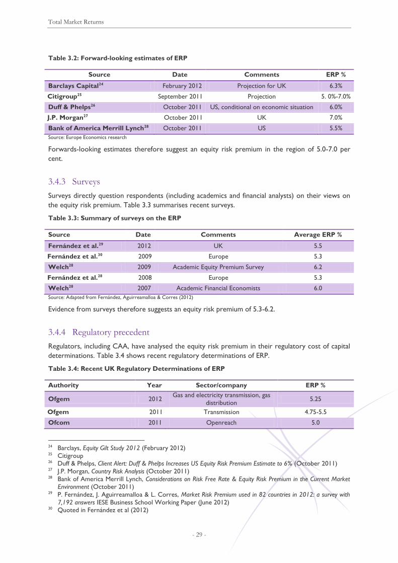
Total Market Returns
- 29 -
Table 3.2: Forward-looking estimates of ERP
Source Date Comments ERP %
Barclays Capital24 February 2012 Projection for UK 6.3%
Citigroup25 September 2011 Projection 5. 0%-7.0%
Duff & Phelps26 October 2011 US, conditional on economic situation 6.0%
J.P. Morgan27 October 2011 UK 7.0%
Bank of America Merrill Lynch28 October 2011 US 5.5%
Source: Europe Economics research
Forwards-looking estimates therefore suggest an equity risk premium in the region of 5.0-7.0 per
cent.
3.4.3 Surveys
Surveys directly question respondents (including academics and financial analysts) on their views on
the equity risk premium. Table 3.3 summarises recent surveys.
Table 3.3: Summary of surveys on the ERP
Source Date Comments Average ERP %
Fernández et al.29 2012 UK 5.5
Fernández et al.30 2009 Europe 5.3
Welch28 2009 Academic Equity Premium Survey 6.2
Fernández et al.28 2008 Europe 5.3
Welch28 2007 Academic Financial Economists 6.0
Source: Adapted from Fernández, Aguirreamalloa & Corres (2012)
Evidence from surveys therefore suggests an equity risk premium of 5.3-6.2.
3.4.4 Regulatory precedent
Regulators, including CAA, have analysed the equity risk premium in their regulatory cost of capital
determinations. Table 3.4 shows recent regulatory determinations of ERP.
Table 3.4: Recent UK Regulatory Determinations of ERP
Authority Year Sector/company ERP %
Ofgem 2012 Gas and electricity transmission, gas
distribution 5.25
Ofgem 2011 Transmission 4.75-5.5
Ofcom 2011 Openreach 5.0
24 Barclays, Equity Gilt Study 2012 (February 2012) 25 Citigroup 26 Duff & Phelps, Client Alert: Duff & Phelps Increases US Equity Risk Premium Estimate to 6% (October 2011) 27 J.P. Morgan, Country Risk Analysis (October 2011) 28 Bank of America Merrill Lynch, Considerations on Risk Free Rate & Equity Risk Premium in the Current Market
Environment (October 2011) 29 P. Fernández, J. Aguirreamalloa & L. Corres, Market Risk Premium used in 82 countries in 2012: a survey with
7,192 answers IESE Business School Working Paper (June 2012) 30 Quoted in Fernández et al (2012)

Total Market Returns
- 30 -
Authority Year Sector/company ERP %
Ofcom 2011 Mobile call termination 5.0
Competition Commission 2010 Bristol Water 4.0 to 5.0
CAA 2010 NATS 5.25
Ofwat 2009 Water 5.4
Ofcom 2009 Openreach (BT’s other activities) 5.0
Ofgem 2009 Electricity distribution 5.25
CEPA for Office of Rail
Regulation 2008 Network Rail
3.0 to 5.0 but may be as
high as 7
NIAUR 2008 SONI 4.5
CAA 2008 Heathrow and Gatwick (BAA) 4.5
Competition Commission 2007 Heathrow and Gatwick (BAA) 2.5 to 4.5
Sources: Respective regulator reports.
Recent regulatory precedent therefore suggests an ERP in the region of 4.75-5.5, up from around 4.5
before the financial crisis began with the most recent proposals by Ofgem at 5.25 per cent.
3.4.5 Effect of economic conditions on the equity risk premium if a poor
medium- to long-term economic outlook persist
There are reasons to expect the ERP to vary depending on economic conditions. When economic
conditions are weak, the equity risk premium (ERP) tends to be elevated. Evidence reported in De
Paoli and Zabczyk (2009) suggests that the size of the ERP depends on whether the economy is in a
period of stagnation or prosperity. In particular, investors seem to require higher premia during
economic slowdowns than during booms. This empirical regularity has been termed “premium
counter-cyclicality”.31
Subsequent results of Bekaert and Harvey (1995), He, Kan, Ng and Zhang (1996) and Li (2001)
confirmed these findings. Cochrane and Piazessi (2005) find that the term premium is counter-
cyclical in the United States while Lustig and Verdelhan (2007) document strong counter-cyclicality
in the exchange rate risk premium. The two most popular asset pricing models attribute this
variation either to counter-cyclical changes in risk aversion (Campbell and Cochrane (1999)) or to
changes in the volatility of the consumption process (Bansal and Yaron (2004)).
Thus, extensive empirical evidence supports the view that risk premia tend to be higher in recession
and stagnation periods. Cochrane and Piazzesi (2005) argue that the ERP increases by almost 20 per
cent in period of crisis.
For this reason, during the financial crisis, a number of regulators have accepted a temporary
elevation in the ERP. For example:
Ofwat, in 2009, adopted an ERP of 5.4, reflecting their consultants’ recommendation of a “crisis”
ERP of 6 and a non-crisis ERP of 5 with a 45 per cent weighting to the crisis value.
31 See B. De Paoli and P. Zabczyk (2009) “Why do risk premia vary over time? A theoretical investigation
under habit formation. Harvey (1989) showed that US equity risk premia are higher at business cycle
troughs than they are at peaks. Subsequent results of Bekaert and Harvey (1995), He, Kan, Ng and Zhang
(1996) and Li (2001) confirmed these findings. Cochrane and Piazessi (2005) find that the term premium is
countercyclical in the United States while Lustig and Verdelhan (2007) document strong countercyclicality
in the exchange rate risk premium. The two most popular asset pricing models attribute this variation
either to countercyclical changes in risk aversion (Campbell and Cochrane (1999)) or to changes in the
volatility of the consumption process (Bansal and Yaron (2004))

Total Market Returns
- 31 -
The CAA adopted an ERP of 5.25 for its 2010 NATS judgement, again reflecting its consultants
recommendation of a “crisis” ERP of 6 and a non-crisis ERP of 5.
Ofcom adopted an ERP of 5 in its 2009 Openreach judgement, reflecting a 50 basis points “uplift”
due to economic turmoil.
Ofgem is proposing 5.25 per cent in latest proposals for gas and electricity transmission and gas
distribution.
However, the elevation in the equity risk premium is not always as great as the fall in the risk-free
rate, so total market returns often fall in tough times. This reflects the point, discussed above, that
total enterprise returns are lower when economic times are worse, so unless returns to labour fall
disproportionately, total returns to capital fall, also. Thus, whilst Smithers & Co Joint Regulators
study of 200332 suggested that total market returns were 6.5-7.5 per cent, by the time of the Bristol
Water judgement the Competition Commission was using a figure of 5 to 7 per cent.
Should a poor medium- to long-term economic outlook persist, rather than the underlying longer-
term outlook improving by the middle of the price control period as we argue above, we would
assume it natural to extend the use of “crisis” levels for the ERP — probably in line with the 6 per
cent crisis figures deployed by Ofwat and the CAA.
It is not, however, so obvious that total market returns would, under these circumstances, fall
further. Although in the UK, labour’s share of total enterprise returns has been stable over the past
two decades, in many other European countries the trend has been downwards. If, by 2017 or so,
the UK were to have adopted a similar trend, as happened in the 1980s (which commenced with a
period of austerity widely seen as analogous to that expected for the early 2010s), then, by 2017 or
so, total market returns to capital might not have fallen even if total enterprise returns fall — in
principle they might even rise.
3.4.6 Effect of economic conditions on the equity risk premium if the medium- to
long-term economic outlook improves by the middle of the price control
period
We have argued above that, by the middle of the price control period, it is reasonable to believe
that official government projections for the sustainable growth-rate of the economy could be
delivered, and hence the risk-free rate rise. When economic conditions improve, although the
equity risk premium may fall back, it should not be expected to fall back as much as the risk-free rate
rises, so total market returns should be expected to rise.
Indeed, it is not even clear that the Equity Risk Premium should be expected to fall back to its pre-
crisis levels. After a major economic and financial crisis, one might expect lasting impacts on risk
appetites. It is also plausible that, even if trend growth might increase back to previous norms, the
outlook could involve greater economic volatility — i.e. although average long-term growth rates
might return to older norms, volatility in growth might not be nearly so low as it was during the so-
called “Great Moderation” of the mid-1990s to mid-2000s.
There are a number of reasons these things might be so:
32 Wright S., Mason R. & Miles D. (2003), A Study into Certain Aspects of the Cost of Capital for Regulated Utilities
in the U.K., Smithers & Co —
http://www.ofcom.org.uk/static/archive/oftel/publications/pricing/2003/capt0203.pdf

Total Market Returns
- 32 -
Policy-makers might be less willing or less able (e.g. because of greater concerns over maintaining
fiscal solvency or concerns about maintaining more buffers on monetary policy) to “smooth”
growth through macroeconomic stabilisation policies. We are not suggesting that all
macroeconomic offsetting of shocks — e.g. cutting interest rates or cutting taxes in response to
growth downturns — might cease; merely that the degree to which this is done might be less
than was the case from the mid-1990s to mid-2000s.
Investors might be more concerned about so-called “black swan” events, technically affecting
kurtosis in the distribution of returns.
The actual or perceived skewness of returns, or the ability to diversify skewness, might have
changed.
3.4.7 Conclusion on the equity risk premium
Based on the evidence above we therefore expect an equity risk premium of at least 5 per cent,
assuming that our approach to the significance of skewness is accepted, and noting that if that were
not the case then a higher ERP, around 6.0 per cent, would be justified. We note that our proposed
ERP is in line with or below the ERP used in most recent determinations and below the most recent
Ofgem proposal for electricity & gas transmission, and gas distribution (5.25 per cent).
3.5 Conclusion on Total Market Returns
Our analysis suggests that total market returns are at least 7.0 per cent. This consists of a risk-free
rate of at least 2.0 per cent and an equity risk premium of at least 5.0 per cent. We note that our
proposed Total Market Return is the same as the upper end of the Q5 determination. The Q5-
determined cost of equity implies an ERP of some 4.25-4.5 whilst the Q5 risk-free rate was the same
for the lower and upper bound estimates. Thus the Q5 Total Market Return was very close to the
same as our proposed Total Market Return here. The Competition Commission has argued that
when the outlook for the economy is stronger the Total Market Return should be higher. Given
that the outlook from 2017-on is likely to be materially stronger than was the outlook from 2008 on
that formed the backdrop to the Q5 determination, our Total Market Return is highly conservative.
The conservative nature of our position on total market returns is evidenced further by statements
of other authorities on cost of capital trends. For example, the Bank of England position is that
although the overall cost of capital (total market return) did fall dramatically during 2009, it is now
already above the levels that prevailed at the time of the Q5 determination, as can be seen in the
following Bank of England chart.33
33 We observe that, even with the early bounce-back, on these Bank of England figures the average total
market return for Q5 could still be below the Q5 determination, as we suggest above and below.

Total Market Returns
- 33 -
Figure 3.7: Bank of England calculations-based chart from MPC Member Ben Broadbent speech
of 12 September 201234
3.6 Skewness and Non-Diversifiable Skewness in Total Market Returns
In the standard CAPM equities’ excess returns are determined by the equity risk premium and
systematic risk, defined as the equity’s beta. In this sense, “risk” is equated with variance and
covariance. However, it is plausible that investors care about other aspects of returns’ distributions,
such as skewness.
If the distribution of returns is not symmetric, then it is said to be positively (negatively) skewed if
the right (left) tail of the distribution is longer than the left (right) tail (see Figure 3.8 below).
Figure 3.8: Skewness
34 http://www.bankofengland.co.uk/publications/Documents/speeches/2012/speech599.pdf

Total Market Returns
- 34 -
It is normally assumed in finance theory that, if investors have preferences skewness, then they
dislike negatively skewed assets as this implies more downside risk. Indeed, investors disliking
negative skewness is more compatible with Arrow-Pratt risk aversion than the standard CAPM
assumption that investors care only about returns’ mean and variance. A consequence of this is that,
if market returns are systematically and negatively skewed (i.e. if the negative skewness cannot be
diversified away) then (under standard finance theory, though not under the standard CAPM)
investors should require a skewness premium for holding assets that are negatively skewed. When
returns are skewed in ways that cannot be diversified away, they are said to be “co-skewed” or to
exhibit “co-skewness”.
3.7 Appendix: Technical Details Underpinning the Model
3.7.1 Break in the yields series
The gilt yield series discussed in section 3.1can be modelled as an ARMA (1,1) process
(autoregressive moving average) with a declining trend, named “T”. (We discuss stationarity issues
later.)
Table 3.5: ARMA (1,1) estimation results
Estimation Details
Method Least Squares
Sample (adjusted) 1985Q2 2001Q2
Included observations 65 after adjustments
Variable Coefficient Std. Error t-Statistic Prob.
C 0.044461 0.003579 12.42281 0.0000
T -0.000292 8.72E-05 -3.351631 0.0014
AR(1) 0.746950 0.092764 8.052165 0.0000
MA(1) 0.336549 0.139958 2.404639 0.0192
Estimation Statistics
R-squared 0.876829 Mean dependent var 0.034311
Adjusted R-squared 0.870772 S.D. dependent var 0.006892
S.E. of regression 0.002478 Akaike info criterion -9.103483
Sum squared resid 0.000374 Schwarz criterion -8.969675
Log likelihood 299.863200 Hannan-Quinn criter. -9.050687
F-statistic 144.749500 Durbin-Watson stat 2.049301
Prob(F-statistic) 0.000000
Inverted AR Roots .75
Inverted MA Roots -.34
Source: Europe Economics calculations

Total Market Returns
- 35 -
Figure 3.9: Fitted and residuals of values for the ARMA (1,1) series process
The graph above indicates there 1992Q3 as a candidate date for a break in the series and indeed a
Chow test confirms this suspicion.
Table 3.6: Chow test on ARMA(1,1)
Test Details
Chow Breakpoint Test 1992Q3
Null Hypothesis No breaks at specified breakpoints
Equation Sample 1985Q2 2001Q2
Test Results
F-statistic 8.680055 Prob. F(4,57) 0.000000
Log likelihood ratio 30.91995 Prob. Chi-Square(4) 0.000000
Wald Statistic 39.88169 Prob. Chi-Square(4) 0.000000
Source: Europe Economics calculations
We have repeated the Chow test after integrating the gilt series (i.e. taking its first difference, an
approach which also resolves potential non-stationarity issues) and modelling it as an ARIMA (1,1).
Table 3.7: ARIMA (1,1) estimation results
Estimation Details
Dependent Variable D(YIELD)
Method Least Squares
Sample (adjusted) 1985Q3 2001Q2
Included observations 64 after adjustments
-.012
-.008
-.004
.000
.004
.008
.01
.02
.03
.04
.05
85 86 87 88 89 90 91 92 93 94 95 96 97 98 99 00 01
Residual Actual Fitted

Total Market Returns
- 36 -
Variable Coefficient Std. Error t-Statistic Prob.
C -0.000189 0.000357 -0.530306 0.597800
AR(1) -0.643664 0.186167 -3.457446 0.001000
MA(1) 0.844661 0.119575 7.063841 0.000000
Estimation Statistics
R-squared 0.076295 Mean dependent var -0.000194
Adjusted R-squared 0.046010 S.D. dependent var 0.002607
S.E. of regression 0.002547 Akaike info criterion -9.062452
Sum squared resid 0.000396 Schwarz criterion -8.961254
Log likelihood 292.998500 Hannan-Quinn criter. -9.022585
F-statistic 2.519216 Durbin-Watson stat 2.038245
Prob(F-statistic) 0.088871
Inverted AR Roots -.64
Inverted MA Roots -.84
Source: Europe Economics calculations
Again, the Chow test confirms the presence of a structural break in the series in at 1992Q3.
Table 3.8: Chow test on ARIMA(1,1)
Test Details
Chow Breakpoint Test 1992Q3
Null Hypothesis No breaks at specified breakpoints
Equation Sample 1985Q3 2001Q2
Test Results
F-statistic 7.81411
Prob. F(3,58) 0.0002
Log likelihood ratio 21.72494
Prob. Chi-Square(3) 0.0001
Wald Statistic 53.73791
Prob. Chi-Square(3) 0.0000
Source: Europe Economics calculations
3.7.2 Model relating yields to GDP growth
Our model explains yields by a constant, the change in regime occurring in 1992Q3, and GDP, as set
out in the following table.
Table 3.9: A simple model relating yields to GDP
Estimation Details
Dependent Variable YIELD
Method Least Squares
Sample 1985Q1 2001Q2
Included observations 66
HAC standard errors & covariance (Bartlett kernel, Newey-West fixed bandwidth = 4.0000)

Total Market Returns
- 37 -
Variable Coefficient Std. Error t-Statistic Prob.
GDP 0.725478 0.095041 7.633279 0.000000
BREAK -0.010731 0.000983 -10.91737 0.000000
C 0.020568 0.002454 8.380193 0.000000
Estimation Statistics
R-squared 0.840297 Mean dependent var 0.034323
Adjusted R-squared 0.835227 S.D. dependent var 0.006840
S.E. of regression 0.002776 Akaike info criterion -8.890969
Sum squared resid 0.000486 Schwarz criterion -8.791439
Log likelihood 296.402 Hannan-Quinn
criter. -8.85164
F-statistic 165.7408 Durbin-Watson stat 0.733382
Prob(F-statistic) 0.000000
Source: Europe Economics calculations
Figure 3.10: Fitted and residuals of values for the simple model
In the model above, the inclusion of a dummy break variable is justified on the ground that the
results of a Chow test on the no-break version of the model indicates that there is a structural
break in the model in 1992Q3.
We have also estimated a more elaborate version of the model by including a first order lagged value
for yields and a moving average component. The results of this model are reported below and
confirm that the correlation between yields and GDP remains statistically significant at the 99 per
cent confidence level.
-.008
-.004
.000
.004
.008
.01
.02
.03
.04
.05
85 86 87 88 89 90 91 92 93 94 95 96 97 98 99 00 01
Residual Actual Fitted
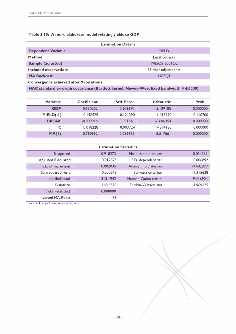
Total Market Returns
- 38 -
Table 3.10: A more elaborate model relating yields to GDP
Estimation Details
Dependent Variable YIELD
Method Least Squares
Sample (adjusted) 1985Q2 2001Q2
Included observations 65 after adjustments
MA Backcast 1985Q1
Convergence achieved after 9 iterations
HAC standard errors & covariance (Bartlett kernel, Newey-West fixed bandwidth = 4.0000)
Variable Coefficient Std. Error t-Statistic Prob.
GDP 0.530202 0.103370 5.129185 0.000000
YIELD(-1) 0.196529 0.121390 1.618990 0.110700
BREAK -0.009016 0.001346 -6.696354 0.000000
C 0.018228 0.003724 4.894180 0.000000
MA(1) 0.780992 0.091691 8.517661 0.000000
Estimation Statistics
R-squared 0.918273 Mean dependent var 0.034311
Adjusted R-squared 0.912825 S.D. dependent var 0.006892
S.E. of regression 0.002035 Akaike info criterion -9.482899
Sum squared resid 0.000248 Schwarz criterion -9.315638
Log likelihood 313.1942 Hannan-Quinn criter. -9.416904
F-statistic 168.5378 Durbin-Watson stat 1.969125
Prob(F-statistic) 0.000000
Inverted MA Roots -.78
Source: Europe Economics calculations

Total Market Returns
- 39 -
Figure 3.11: Fitted and residuals of values for the more elaborate model
A caveat/concern regarding the results above is that if (as appears likely) the yields and GDP series
are non-stationary, the model might be capturing a spurious relationship as opposed to a long-run
equilibrium relationship. In fact Augmented Dickey Fuller (ADF) tests confirm that the yields and
GDP series are I(1) (i.e. they series are non-stationary at the levels, but their first differences are
stationary). Therefore, further analysis is required in order to test whether yields and GDP are
cointegrated, in which case we can conclude that the model describes a long run equilibrium
relationship.
We first notice that the Durbin-Watson (DW) statistics in Table 3.9 is materially different from
zero, which is a first indication that the series might be cointegrated (if the regression were
spurious we would expect a DW value close to zero). Furthermore, we have also performed an
ADF test on the residuals of the regression of Table 3.9 (for a cointegrating relationship we would
expect the residuals to be stationary). The resulting ADF test statistics of the residuals vary between
-3.68 and -3.75 (depending on the version of the test performed, i.e. with/without trend and/or
intercept). These values are larger than the asymptotic critical values (always at the 10 per cent
confidence level, sometimes at 5 per cent) for residual-based unit root tests for cointegration, hence
we can reject the hypothesis that the residuals are non-stationary.35
35 The values are -4.29, -3.74 and -3.45 respectively for 1%, 5% and 10% confidence, see Davidson, R. and J.G
McKinnon (1993), “Estimation and Inference in Econometrics”, Oxford University Press.
-.006
-.004
-.002
.000
.002
.004
.006
.01
.02
.03
.04
.05
85 86 87 88 89 90 91 92 93 94 95 96 97 98 99 00 01
Residual Actual Fitted

Debt Premium
- 40 -
4 Debt Premium
4.1 Introduction
In Q5, the allowed debt premium was 105 basis points, of which 15 bps were issuance costs. To
examine what is the appropriate debt premium for Q6 we take evidence from a number of sources:
Spreads on Heathrow Airport Holdings’ own bonds.
Spreads on comparator airports’ bonds.
Spreads on UK utility companies’ bonds.
Our analysis suggests that Heathrow’s debt premium, including issuance costs, is 2.6 per cent.
4.2 Bond Spread Analysis
4.2.1 Heathrow’s bonds
Spreads on Heathrow Airport Holdings’ corporate bonds over Treasury gilts of the same maturity
(selected by Bloomberg) are shown in Figure 4.1. Spreads have generally decreased since their peak
in 2009 to a generally stable level between two and three per cent. However, some of Heathrow’s
more recent bond issuances have attracted consistently higher spreads.
Figure 4.1: Movements in Heathrow/BAA spreads after the last cut-off date (red dotted line)
Source: Bloomberg and Europe Economics calculations

Debt Premium
- 41 -
Summary statistics for Heathrow’s corporate bond spreads are provided in Table 4.1. This includes
spot spreads at 30/11/2012 and the mean, minimum and maximum spread of each bond over the
course of 2012. (Note that these bonds are ranked in order of maturity). In general Heathrow’s
bonds are ranked A- (on Bloomberg’s composite index of ratings agencies), though its issuances
since 2010 have been rated below this (at BBB and BB), and these bonds have attracted higher yields
and spreads. Using spot data from 30/11/2012 puts Heathrow’s average debt premium at 2.05 per
cent.
Table 4.1: Summary of Heathrow’s corporate bond spreads
Bond Maturity Rating Spread
30/11/2012
Mean
2012
Min
2012
Max
2012
BAA 5.85 11/27/13 27/11/2013 A- 1.24 1.88 1.15 2.52
BAA 5.85 11/27/13 27/11/2013 A- 1.22 1.88 1.15 2.52
BAA 3 06/08/15 08/06/2015 A- 1.18 1.72 1.14 2.57
BAA 12.45 03/31/16 31/03/2016 A- 1.74 2.27 1.68 2.62
BAA 7 1/8 03/01/17 01/03/2017 BB 4.15 5.65 3.96 7.25
BAA 6 1/4 09/10/18 10/09/2018 BBB 2.66 3.66 2.60 4.30
BAA 6 03/20/20 20/03/2020 BBB 2.67 3.62 2.63 4.37
BAA 9.2 03/29/21 29/03/2021 A- 1.80 2.27 1.76 2.69
BAA 5.225 02/15/23 15/02/2023 A- 1.75 2.27 1.68 2.76
BAA 5.225 02/15/23 15/02/2023 A- 1.75 2.27 1.68 2.77
BAA 7 1/8 02/14/24 14/02/2024 BBB 3.05 4.06 3.00 4.76
BAA 6 3/4 12/03/26 03/12/2026 A- 1.76 2.28 1.68 2.80
BAA 7.075 08/04/28 04/08/2028 A- 2.02 2.50 1.96 2.91
BAA 6.45 12/10/31 10/12/2031 A- 2.08 2.52 2.00 2.96
BAA 6.45 12/10/31 10/12/2031 A- 1.72 2.19 1.65 2.66
BAA 5 7/8 05/13/41 13/05/2041 A- 2.05 2.47 1.99 2.86
Average
2.05 2.72 1.98 3.33
Average BBB
2.79 3.78 2.74 4.48
Average A-
1.68 2.21 1.61 2.72
Source: Bloomberg and Europe Economics calculations
We assume that the required rating will be for bonds to be BBB+ or above. For 30/11/2012 spreads
on Heathrow’s A- rated bonds lie in the range 1.18 to 2.08 per cent, with an average spread of 1.68
per cent. For the same date, BBB rated bonds have spreads of 2.66 and 3.05 per cent, giving an
average spread of 2.79. The spread on a notional BBB+ bond would likely lie above the upper bound
of its A- rated bonds but below the lower bound of its BBB rated bonds, and thus in the range of 2.1
to 2.7 per cent.
4.2.2 Airports
Bond spreads were also available for a number of other major airport operators, namely:
Aéroports de Paris
Auckland International Airport

Debt Premium
- 42 -
Sydney Airport
Frankfurt Airport
Flughafen Zürich
Airport comparators’ corporate bond spreads are shown in Figure 4.2. There is a wide range in
comparators’ spreads that persists through time, with spreads ranging from around half to more
than four percentage points. The decline in spreads since 2009 seen in Heathrow’s bonds is
mirrored in some, but by no means all, comparators’ bonds.
Figure 4.2: Airport comparators’ corporate bond spreads 2009-2012
Source: Bloomberg and Europe Economics calculations
Table 4.2 provides summary statistics for the airport comparators’ bonds. As expected, lower rated
bonds (where a rating was available) had higher spreads. At 30/11/2012 spreads ranged from less
than one per cent to more than three per cent.
Table 4.2: Summary of airport comparator corporate bond spreads
Airport Bond Maturity Rating Spread
30/11/2012
Mean
2012
Min
2012
Max
2012
Paris ADPFP 4.100 03/11/13 11/03/2013 A+ 0.184 0.451 0.176 0.692
Paris ADPFP 6.375 01/24/14 24/01/2014 A+ 0.454 1.097 0.416 1.61
Paris ADPFP 2.375 06/11/19 11/06/2019 A+ 0.965 1.175 0.93 1.672
Paris ADPFP 3.886 05/10/20 10/05/2020 - 1.108 1.463 1.093 1.943
Paris ADPFP 4.000 07/08/21 08/07/2021 - 1.113 1.450 1.102 1.857
Paris ADPFP 3.875 02/15/22 15/02/2022 A+ 1.162 1.502 1.121 2.007
Paris ADPFP 3.125 06/11/24 11/06/2024 A+ 1.234 1.379 1.209 1.871

Debt Premium
- 43 -
Airport Bond Maturity Rating Spread
30/11/2012
Mean
2012
Min
2012
Max
2012
Paris ADPFP 3.875 02/15/22 15/02/2022 A+ 1.162 1.502 1.121 2.007
Paris ADPFP 3.125 06/11/24 11/06/2024 A+ 1.234 1.379 1.209 1.871
Auckland AIANZ 7.190 11/07/12 07/11/2012 - 1.859 1.836 1.663 2.1
Auckland AIANZ 7.250 02/28/14 28/02/2014 - 1.155 2.081 1.155 2.932
Auckland AIANZ 7.000 11/27/14 27/11/2014 - 1.26 2.651 1.253 3.314
Auckland AIANZ 7.250 11/07/15 07/11/2015 - 1.455 2.410 1.451 3.695
Auckland AIANZ 8.000 08/10/16 10/08/2016 - 1.592 1.965 1.571 2.222
Auckland AIANZ 8.000 11/15/16 15/11/2016 - 1.335 2.795 1.335 3.432
Auckland AIANZ 5.470 10/17/17 17/10/2017 - 1.521 1.818 1.505 2.153
Fraport FRAGR 5.250 09/10/19 10/09/2019 - 1.809 2.145 1.755 2.438
Sydney SYDAU 8.000 07/06/15 06/07/2015 BBB 2.351 2.798 2.204 3.186
Sydney SYDAU 7.750 07/06/18 06/07/2018 BBB 2.864 3.3157 2.752 3.629
Zurich FHZNSW 4.500 02/18/14 18/02/2014 - 0.445 0.579 0.381 0.972
Zurich FHZNSW 2.250 05/05/17 05/05/2017 - 0.443 0.660 0.388 0.87
Zurich FHZNSW 1.250 07/03/20 03/07/2020 - 0.649 0.695 0.544 0.913
Average 1.24 1.69 1.2 2.15
Average BBB 2.61 3.06 2.48 3.41
Average A+ 0.91 1.21 0.88 1.68
Source: Bloomberg and Europe Economics calculations
At 30/11/2012 the spreads for Sydney’s BBB bonds were 2.35 and 2.86 per cent, while the spreads
for Aéroports de Paris’ A+ bonds were between 0.18 and 1.23 giving a potential range of
approximately 1.5-2.5 for ratings from BBB+ to A. The spread on a notional BBB+ rated bond would
likely be in the upper part of this range, in the region 2.0-2.5.
4.2.3 UK utilities
We also examine evidence on the debt premium of a number of UK utility companies. These are:
British Telecom
Centrica
National Grid
Northumbrian Water
Scottish & Southern Energy
Severn Trent
United Utilities.
Figure 4.3 shows the UK utility companies’ bonds since 2009. BT’s bonds yields are significantly
higher than the other comparators, in the region of two to three per cent since 2010, and have a
lower rating (BBB). As at 30/11/2012 all of the other comparators’ bond yields lay in the range of
0.8 to 1.79 per cent.

Debt Premium
- 44 -
Figure 4.3: Utility comparator corporate bond spreads 2009-2012
Source: Bloomberg and Europe Economics calculations
Table 4.3 shows the utility comparators’ bonds in greater detail.
Table 4.3: UK Utility companies’ corporate bond spreads (2012)
Company Bond Maturity Rating Spread
30/11/2012
Mean
2012
Min
2012
Max
2012
BT BRITEL 7.500 12/07/16 07/12/2016 BBB 1.463 1.46 2.02 1.41
BT BRITEL 6.625 06/23/17 23/06/2017 BBB 1.487 1.49 1.98 1.44
BT BRITEL 8.625 03/26/20 26/03/2020 BBB 1.732 1.73 2.10 1.65
BT BRITEL 5.750 12/07/28 07/12/2028 BBB 1.75 1.75 2.05 1.66
BT BRITEL 6.375 06/23/37 23/06/2037 BBB 1.764 1.76 2.08 1.68
Centrica CNALN 5.125 12/10/14 10/12/2014 A- 0.971 0.97 1.14 0.94
Centrica CNALN 5.500 10/24/16 24/10/2016 A- 1.191 1.19 1.48 1.16
Centrica CNALN 7.000 09/19/18 19/09/2018 A- 1.284 1.28 1.65 1.25
Centrica CNALN 6.375 03/10/22 10/03/2022 A- 1.288 1.29 1.61 1.26
Centrica CNALN 6.400 09/04/26 04/09/2026 A- 1.44 1.44 1.67 1.35
Centrica CNALN 4.375 03/13/29 13/03/2029 A- 1.371 1.37 1.51 1.26
Centrica CNALN 7.000 09/19/33 19/09/2033 A- 1.355 1.36 1.53 1.26
National Grid NGGLN 6.000 06/07/17 07/06/2017 A- 1.007 1.01 1.28 0.96
National Grid NGGLN 6.375 03/03/20 03/03/2020 A- 1.318 1.32 1.44 1.25
National Grid NGGLN 5.875 02/02/24 02/02/2024 A- 1.294 1.29 1.42 1.25
National Grid NGGLN 7.000 12/16/24 16/12/2024 A- 1.37 1.37 1.47 1.32
National Grid NGGLN 8.750 06/27/25 27/06/2025 A- 1.407 1.41 1.47 1.33

Debt Premium
- 45 -
Company Bond Maturity Rating Spread
30/11/2012
Mean
2012
Min
2012
Max
2012
National Grid NGGLN 4.000 06/08/27 08/06/2027 A- 1.405 1.41 1.44 1.34
National Grid NGGLN 6.500 07/27/28 27/07/2028 A- 1.363 1.36 1.44 1.28
National Grid NGGLN 6.200 10/02/28 02/10/2028 A- 1.431 1.43 1.53 1.35
National Grid NGGLN 7.375 01/13/31 13/01/2031 A- 1.316 1.32 1.42 1.25
National Grid NGGLN 5.000 03/01/35 01/03/2035 A- 1.374 1.37 1.54 1.32
National Grid NGGLN 6.000 05/13/38 13/05/2038 A- 1.28 1.28 1.41 1.22
National Grid NGGLN 7.125 02/08/44 08/02/2044 A- 1.232 1.23 1.41 1.16
National Grid NGGLN 5.500 07/24/13 24/07/2013 BBB+ 1.016 1.02 1.27 0.96
National Grid NGGLN 6.125 04/15/14 15/04/2014 BBB+ 1.062 1.06 1.31 1.04
Northumbrian Water NWGLN 6.000 10/11/17 11/10/2017 BBB+ 1.443 1.44 1.65 1.39
Northumbrian Water NWGLN 6.875 02/06/23 06/02/2023 BBB+ 1.444 1.44 1.66 1.42
Northumbrian Water NWGLN 5.625 04/29/33 29/04/2033 BBB+ 1.366 1.37 1.59 1.32
Northumbrian Water NWGLN 5.125 01/23/42 23/01/2042 BBB+ 1.385 1.39 1.54 1.32
Scottish & Southern SSELN 4.625 02/20/37 20/02/2037 - 1.168 1.17 1.47 1.11
Scottish & Southern SSELN 5.750 02/05/14 05/02/2014 A- 0.952 0.95 1.18 0.89
Scottish & Southern SSELN 5.000 10/01/18 01/10/2018 A- 1.355 1.36 1.68 1.30
Scottish & Southern SSELN 4.250 09/14/21 14/09/2021 A- 1.318 1.32 1.58 1.26
Scottish & Southern SSELN 5.875 09/22/22 22/09/2022 A- 1.312 1.31 1.58 1.28
Scottish & Southern SSELN 8.375 11/20/28 20/11/2028 A- 1.428 1.43 1.64 1.31
Scottish & Southern SSELN 5.500 06/07/32 07/06/2032 A- 1.14 1.14 1.43 1.11
Scottish & Southern SSELN 4.625 02/20/37 20/02/2037 A- 1.177 1.18 1.43 1.12
Scottish & Southern SSELN 6.250 08/27/38 27/08/2038 A- 1.264 1.26 1.49 1.18
Severn Trent SVTLN 5.250 12/08/14 08/12/2014 BBB+ 0.831 0.83 1.20 0.83
Severn Trent SVTLN 6.000 01/22/18 22/01/2018 BBB+ 1.263 1.26 1.56 1.23
Severn Trent SVTLN 6.250 06/07/29 07/06/2029 BBB+ 1.458 1.46 1.53 1.33
Severn Trent SVTLN 4.875 01/24/42 24/01/2042 BBB+ 1.378 1.38 1.50 1.30
Severn Trent SVTLN 6.125 02/26/24 26/02/2024 - 1.786 1.79 1.86 1.69
United Utilities UU 6.125 12/29/15 29/12/2015 BBB+ 1.25 1.25 1.46 1.19
United Utilities UU 5.375 05/14/18 14/05/2018 BBB+ 1.414 1.41 1.60 1.40
United Utilities UU 5.750 03/25/22 25/03/2022 BBB+ 1.447 1.45 1.60 1.43
United Utilities UU 5.625 12/20/27 20/12/2027 BBB+ 1.387 1.39 1.55 1.36
United Utilities UU 5.000 02/28/35 28/02/2035 BBB+ 1.321 1.32 1.51 1.31
Average 1.33 1.55 1.27 1.87
Average A- 1.28 1.48 1.22 1.77
Average BBB+ 1.30 1.50 1.26 1.81
Average BBB 1.64 2.05 1.57 2.53
Source: Bloomberg and Europe Economics calculations
The spread on BBB+ rated bonds ranges from 0.83 to 1.46 per cent on 30/11/2012, with an average
of 1.30. The equivalent range for A- rated bonds is 0.95-1.44, while that for BBB rated bonds is 1.46-
1.76 per cent. This suggests a range for these bonds of approximately 1.0 to 1.8 per cent.
Debt Premium
- 46 -
4.2.4 Conclusion on premium on existing debt
Our three sources of data give the following approximate ranges:
Heathrow’s own bonds indicate a debt premium in the region 2.1-2.7 per cent.
Other airports’ bond spreads are in the range of around 2.0-2.5 per cent.
Utility companies’ bond spreads are in the range of 1.0-1.8 per cent.
Noting that the debt premium ranges for Heathrow’s bonds and other airports lie in approximately
the same range, we suggest that Heathrow’s debt premium is in the range 2.1-2.7 per cent.
4.3 Issuance costs
In its November 2007 report on the Heathrow and Gatwick price controls the Competition
Commission gave the then BAA group an allowance of 15 basis points for “ongoing commitment,
agency and arrangement fees paid respectively to lenders, rating agencies and arrangers of finance“,
as part of a total cost of debt of 3.55 per cent.36 The CAA’s concurred with this cost of debt and
allowance in its March 2008 decision.37 Issuance costs in these judgements represent 4.4 per cent of
the cost of debt excluding issuance costs.
Taking a risk-free rate of 2-2.5 and debt premium of 2.5-3, that implies a total cost of debt of 4.5-5.5
before issuance costs. Applying a 4.4 per cent issuance cost would imply issuance costs of 20-24
bps. This was similar to the value determined by Ofwat in 2008/9.
However, issuance costs have been rising in recent years. Heathrow’s latest estimate of its issuance
costs are broken down into facility costs (costs related to mantaining a liquidity facility to deal with
unpredictability in capital requirements), the new issue premium (the difference between the implied
yield of Heathrow’s bonds as trading in the secondary markets, and the yield at which a new bond
would be issued), and issuance fees (those administrative fees charged by banks for managing the
issuance of debt), as follows:
Table 4.4: Breakdown of Heathrow’s actual issuance costs
New issue premium
Issuance costs
Bookrunner fees (e.g. paid to banks and credit rating agencies)
Listing fees, legal fees, prospectus costs, etc.
Overseas market costs
Facility costs
Facility costs: front-end
Facility costs: commitment fees
Total
Source: Heathrow
We understand that Heathrow has provided further detail to the CAA to support these estimates.
In the CAA’s approach, the cost of capital is based on a notional entity — perhaps an efficient new
entrant; perhaps a competitor — rather than on Heathrow’s actual costs. Hence Heathrow’s actual
36 Competition Commission. November 2007. “BAA Ltd - A report on the economic regulation of the
London airports companies (Heathrow Airport Ltd and Gatwick Airport Ltd)” 37 CAA. March 2008. “Economic Regulation of Heathrow and Gatwick Airports 2008-2013”.

Debt Premium
- 47 -
issuance costs are of significance for what evidence they provide as to the likely costs of the notional
entity, rather than because the task is, in principle, to reflect Heathrow’s actual costs.
Heathrow and its owners deploy modern structured finance techniques in establishing and
maintaining their capital structure. It could be suggested that Heathrow’s actual issuance costs are
higher than those appropriate for a notional entity partly because Heathrow deploys such
techniques, which the notional entity is assumed not to. That is the approach implicit in our own
recommendation of 20 bps in our August 2012 report.
There is, however, a tension here, upon which the CAA should reflect. Heathrow does not deploy
structured finance techniques idly. It does so because the use of such techniques reduces its cost of
debt. The debt premium Europe Economics proposed in its August 2012 report was based upon
Heathrow’s actual debt premium (and indeed was at the bottom end of the range). Absent these
structured finance techniques — which do not come for free — Heathrow might expect to have a
higher debt premium. Accepting a reduced debt premium, but not accepting the issuance costs that
reduce it, is potentially inconsistent.
Taking account of the Ofwat determination and Heathrow’s latest estimate implies a range of
bps for issuance costs. We contend that 20 basis points is the lowest number a regulator could
plausibly propose, but would emphasize that in later phases of the price review we would firmly
expect to be arguing for a higher issuance cost than that, especially if structured financing were
assumed by the CAA.
We note that, so long as bonds’ credit ratings are similar, there may be significant variation in
issuers’ gearing that is not reflected in differences in the bonds’ debt premiums. Although high
gearing is one factor that may increase the risk of holding a bond, this and other factors that affect
total risk will determine both the bond’s spread and its credit rating. Two bonds with the same debt
premium and credit rating may therefore be issued by companies with different gearing to the extent
that other factors determining risk offset these differences in gearing. Evidence for this can be seen
in the following table, which shows that companies may have similar spreads for a particular bond
rating, but marked differences in gearing.
Table 4.5: Gearing and spreads for selected bonds
Rating Gearing
Spread for A-
rated bonds
(bps)
Spread for B-
rated bonds
(bps)
United Utilities A- 60% 160
National Grid A- 50% 160
Severn Trent BBB+ 70% 155
Thames Water A-/BBB+ 80% 165 290
Southern Water A-/BBB/B+ 85% 200 370
Yorkshire Water A-/BBB 80% 160 280
BAA A-/BBB 82% 240 435
Source: Data provided by Heathrow Airport Holdings Treasury Department
4.4 CEPA’s debt premium estimate
On p1, the CEPA report proposes a debt premium of 150-200 bps. This number is defended on
p11ff, section 4.1.2 of the CEPA report — though there appears to be a typographical error in the
conclusion on p17, which on the face of it proposes a point estimate for the debt premium of 150
bps. The CEPA report defends no specific figure for issuance costs, but its overall WACC proposals

Debt Premium
- 48 -
imply a debt issuance cost of zero. By contrast, the Europe Economics report proposes a debt
premium of 2.5 per cent supplemented by issuance costs of 20 bps, although we note the Heathrow
estimate the actual costs to be 50-60 bps.
4.4.1 Convergence of evidence
An initial point to emphasize here is a convergence of evidence in respect of Heathrow’s actual debt
premium. Table 4.2, p14 of the CEPA report finds the “Unweighted BAA bond average spread on
gilts” to be 261 bps and the “Weighted BAA bond average spread on gilts” to be 238 bps, which on
the face of it might be taken as implying a range of 2.4-2.6 per cent, very similar to the 2.5 per cent
proposed in the Europe Economics report. Table 4.2 of the CEPA report also illustrates that many
Heathrow/BAA debt issuances of recent years have carried much higher spreads than this, at the
point of issue.
Thus the difference between the Europe Economics and CEPA reports does not arise in respect of
any material dispute about the Heathrow debt premium. Rather, it arises in respect of the weight to
be attached to the Heathrow debt premium, relative to the debt premium on other corporate
bonds of the desired rating, in determining the regulatory debt premium of the notional competitor
or new entrant that is being simulated by a price control.
Specifically, whilst the Europe Economics methodology places most of the weight on the Heathrow
debt premium, it nonetheless places some weight on the debt premium of comparator airports,
which correspond approximately to the range of Heathrow’s debt premium (we observe here that
comparator airports feature in the estimation of CEPA’s equity beta). Europe Economics places
almost no weight upon the bond spreads of utilities.
By contrast, the CEPA report estimate is based heavily on the bond spreads of non-airport bonds
and regulatory determinations outside the airports sector (with the exception of the DAA 2010-14
CAR decision). In particular, it treats the index used by Ofgem in indexing the cost of debt, under
the RIIO framework, as the most “relevant reference point for the overall cost of debt allowance”.
4.4.2 Points of methodological disagreement
Europe Economics would highlight a number of key areas of disagreement with CEPA in how it
produces its debt premium estimate.
First, bonds of different ratings in different sectors need not carry the same premium. There are a
number of reasons for this, but the most pertinent in the current case is that a bond rating provides
an indication of risk of loss on a bond, but the debt premium will include an allowance for the
correlation of that loss with the market as a whole — the debt beta. There is strong theoretical
reason for disputing that the debt beta of all bonds will be the same — some defaults will be more
correlated with the economic cycle than others.
Absent any strong evidence on the debt premia of airports, it might be reasonable to use average
corporate sector debt premium for bonds of the relevant rating as one’s best-guess of the debt
premium. But as we have shown in section 4.2, the debt premia of utilities are lower than those of
airports — not just Heathrow, but other airports, also. CEPA does not attempt to argue that the
higher Heathrow/BAA bond yields arise from any specific inefficiency of Heathrow or other airports.
The best guess for an airport debt premium should therefore be above the average for utilities —
which it is not in the CEPA methodology.

Debt Premium
- 49 -
Second, CEPA treats the Ofgem iBoxx data as a good reference for “the overall cost of debt
allowance”. But Ofgem uses the iBoxx data as part of an indexation methodology, insuring regulated
firms against adverse movements in the cost of debt, which the CAA has not previously done in
respect of Heathrow and which Heathrow has argued against in respect of Q6.
Third, in its derivation of a debt premium from the iBoxx data, CEPA estimates the debt premium
over its risk-free rate estimate, not over gilts. This presumably reflects the notion that gilt rates are
distorted downwards from the risk-free rate by policy measures such as quantitative easing (as the
Bank of England argues). But the distortion created by these policy measures is intended (inter alia)
to temporarily reduce the cost of debt. So at least some of the distortion would be expected to
apply to bonds in general, not simply to gilts, and to unwind in due course. Consequently, the
forwards-looking estimate of the debt premium is better based on gilts (as CEPA does in its earlier
analysis) than on the risk-free rate estimate.
Fourth, we do not believe that a 150 bps range satisfies a common sense-check. It is now widely
acknowledged that debt premia during the mid-2000s were seriously distorted downwards — risk
was under-priced, especially the risk of debt. The notion that the debt premium could have risen
from 105 basis points only to 150 basis points does not seem credible.
4.4.3 Summary of position
Thus, in respect of the debt premium, the CEPA report broadly agrees with the Europe Economics
report regarding the spread of Heathrow bonds over gilts — around 250 basis points. The key
points of dispute regard
how much weight to place upon the debt premium of airports, relative to utilities and other
bonds; and
whether the debt premium is best measured relative to gilts or to the current best-estimate
now-cast of the risk-free rate.
4.5 Conclusion on Heathrow’s debt premium
The evidence presented here suggests that Heathrow’s premium on existing debt is 2.1-2.7 per cent,
while its issuance costs at the very least 20 bps. Taking the mid-point of the 2.1-2.7 per cent range
and including 20 bps issuance costs gives a debt premium point estimate of 2.6 per cent.

Developments at Heathrow and in the Airport Sector Since 2007
- 50 -
5 Developments at Heathrow and in
the Airport Sector Since 2007
5.1 Introduction
This sections sets out the key developments that have affected the airport sector since 2007. These
have been grouped in three separate areas:
General macroeconomic context
Changes in demand
Regulatory context
5.2 Macroeconomic context
At the time of the Q5 decision, the UK economy was entering the beginnings of a credit crisis. Prior
to 2007, the economy was in a boom period and leverage was increasing across the economy and
particularly in the utilities sector. Many of the key building blocks for the WACC were based on the
seminal Smithers & Co (2003) paper38, which in turn considered data from 2002 and earlier —
significantly influenced by developments from the mid-1990s onwards.
The crisis began to take hold in mid-2007 — prior to the CAA’s Q5 judgement – and became
progressively worse through 2008, leading to the deepest recession since the 1920s. The quasi-
nationalisation of Fannie Mae and Freddie Mac in September 2008 was soon followed by the collapse
of Lehman Brothers. Fearing a paralysis of the payment system, governments in Western countries
intervened in the form of the nationalisation and quasi-nationalisation of large parts of the banking
sector, the reduction of interest rates to near-zero, and the running of large government deficits.
Levels of economic activity nonetheless fell.
Inflation has returned as an issue in the macroeconomic debate. In the UK the policy measure of
inflation (CPI) has been consistently above 3 per cent since the start of the financial crisis, reaching 5
per cent in late 2011.
5.3 Changes in demand
The year-on-year contraction in passenger numbers at Heathrow, which started in 2008, continued
to 2010. There are a number of potential contributors to this:
Economic recession
Air Passenger Duty (APD) was increased in November 2010, taxing passenger £12 for short-haul
and £170 for long-haul flights.
38 Smithers & Co (2003), A Study into Certain Aspects of the Cost of Capital for Regulated Utilities in the U.K.,
http://www.ofgem.gov.uk/Networks/Policy/Documents1/2198-jointregscoc.pdf

Developments at Heathrow and in the Airport Sector Since 2007
- 51 -
The volcanic ash disruption of April 2010, which essentially brought air travel across the UK to a
standstill and caused aviation revenue losses.
The year 2010 also saw the first in a series of strikes by BA cabin crew strikes.
Longer-term factors, such as increased awareness of the chance of world and regional pandemics
(e.g. global diseases such as SARS or foot-and-mouth disease in Europe), and since the 11
September 2001 terrorist attack, incidents are typically the periods of uncertainty and heighted
security levels. In particular, it is possible that some of these negative events are now perceived
by potential passengers as occurring more frequently.
That shocks affecting Heathrow negatively have become more frequent and more substantial in
recent can be seen in the following figure.
Figure 5.1: Shocks to Heathrow passengers relative to trend and seasonality
Source: Europe Economics calculations on BAA data
This chart depicts movements in Heathrow passengers after controlling for the effects of seasonal
factors and a time trend. The red lines circumscribe a confidence interval of one standard deviation
from the mean. We use these bounds to define a negative (positive) event as any instance where the
number of passengers is more than one standard deviation below (above) the mean. We note that
there have been two very large negative shocks, with the September 11 2001 terrorist attacks in the
United States and the impact of volcanic ash in 2010.
We analyse these same data in more detail in the following table.
Table 5.1: Table to show shocks to Heathrow passengers
No. of events Average size of event
Positive Negative Positive Negative
All sample 30 29 0.283 -0.381
Pre-2007 28 14 0.285 -0.387
Post-2007 2 15 0.256 -0.375 Source: Europe Economics calculations on BAA data

Developments at Heathrow and in the Airport Sector Since 2007
- 52 -
Here we see that since 2007 negative events have become significantly more frequent than positive
events — before 2007 we observe that negative events accounted for one third of all extreme
(positive and negative) events, whilst after 2007 negative events account for almost the entirety (88
per cent) of extreme events. We also note that the average size of positive and negative events has
decreased (in absolute terms) since 2007, but less for negative events (a decrease of 3 per cent) than
for positive ones (a decrease of 10 per cent).
5.4 Regulatory context
Of significance to UK airports is the Competition Commission investigation into the supply of
airport services by Heathrow/BAA, which commenced in 2007. The Competition Commission
published its final report on BAA’s seven UK airports, requiring, amongst other things, the
divestiture of both Stansted and Gatwick Airports, and the divestiture of either Edinburgh or
Glasgow Airport. The sale of Gatwick was completed on 3 December 2009. In February 2011, the
Supreme Court refused BAA permission to appeal against the Competition Commission’s decision in
the BAA investigation. Since then, the Competition Commission has consulted on whether there
have been any material changes in circumstances and on 19th July 2011 confirmed the requirement
for BAA to sell Stansted Airport and either Edinburgh or Glasgow Airport.39 Accordingly, BAA sold
Edinburgh Airport and has agreed the sale of Stansted Airport.40
The economic regulation of airports where there is judged to be no effective competition has been
reformed as of 2012 through the Civil Aviation Act.41 The reforms aim to improve the quality of
service that passengers receive at designated airports and contribute positively to economic growth.
They replace the existing statutory framework for regulation at designated airports with a more
flexible licence based system. With this current backdrop - and following consultation - the CAA
decided to extend Q5 by one year.
At the pan-European level, the European Airport Charges Directive (2009/12/EC) has come into
force in the UK.42 This Directive establishes a common framework for the regulation and setting of
airport charges across the European Union.
5.5 The Impact of Capacity Constraints and Regulation on Skewness
A capacity-constrained airport subject to price cap regulation would be expected to have skewed
returns, in particular because its upside risk would be limited, creating an asymmetry. Upside risk
would be limited by the interaction of the capacity constraint and the price cap. A capacity-
constrained supplier would normally be able to react to “good” times by raising prices — for a
capacity-constrained supplier “increased demand” means increased willingness to pay.
But a price-capped capacity-constrained supplier cannot raise prices in response to increased
demand. So upside potential is absent.
39 http://www.competition-commission.org.uk/press_rel/2011/july/pdf/39_11_baa_final_mcc.pdf 40 http://www.baa.com/media-centre/press-releases/baa-announces-sale-of-edinburgh-airport,
http://www.baa.com/media-centre/press-releases/heathrow-airport-holdings-announces-sale-of-stansted-
airport 41 http://www.legislation.gov.uk/ukpga/2012/19/enacted 42 http://www.legislation.gov.uk/uksi/2011/2491/made

Equity Beta
- 53 -
6 Equity Beta
In this section we shall argue that Heathrow’s equity beta is currently higher than was determined in
Q5, and that it will remain higher to 2017, with current data suggesting the correct equity beta is
1.3. We argue this as follows:
We show that the equity betas of Heathrow’s most relevant comparators have increased, and
calculate their asset betas from market data. When relevered to reflect Heathrow’s gearing, that
produces an equity beta of 1.3.
Next, we argue from Heathrow-specific data. We do not have equity data to observe for
Heathrow. We do have data that allow us to estimate what is called a “fundamental beta”.
However, fundamental beta data does not fully reflect the impact of skewness, and in particular
our data does not fully reflect changing expectations of skewness. Skewness effects are likely to
be material for Heathrow in Q6. Hence our point estimate derived from Heathrow-specific data
involves both fundamental beta analysis and skewness analysis. This produces an equity beta of
1.36.
The fact that two such profoundly different methods both produce an equity beta so close to 1.3
reinforces the robustness of this estimate.
6.1 Comparator Data
Where comparable data exist, the equity betas of comparators have risen since early 2006 (the end
of the data window used in Q5 for Heathrow’s equity beta).
6.1.1 Selection of Comparators
Given the absence of listed equity for Heathrow, one approach to determining the systematic risk of
Heathrow’s equity is to examine that of suitable comparators’ whose equity is listed. The following
major European airports are listed (and have been cited as comparators in previous determinations):
Charles de Gaulle airport (Paris)
Frankfurt airport
Vienna airport
Zurich airport
Copenhagen airport
To determine which of these airports are the most suitable comparators for Heathrow, we compare
them across the following criteria:
Passenger volumes. Only Charles de Gaulle and Frankfurt have passenger numbers of similar
magnitude to those of Heathrow. The table below shows the comparators’ passenger numbers
for 2012:

Equity Beta
- 54 -
Table 6.1: Airport passenger numbers (2012)
Airport Passengers (million)
Heathrow 69.4
Charles de Gaulle 61.0
Frankfurt 56.4
Vienna 21.1
Zurich 24.3
Copenhagen 22.7
Source: Airports’ websites (August 2012)
Total assets. Only Aéroports de Paris and Fraport have assets comparable in scale to those of
Heathrow. The table below shows the comparators’ total assets. As the figures for Paris and
Frankfurt include minor airports (Orly and Frankfurt-Hahn), we have compared these to the
figures for BAA (SP) Ltd, which operates Heathrow’s other airports.
Table 6.2: Airport total assets (2011)
Airport Total Assets (£ million)
Heathrow & Stansted 12,530
Paris Charles de Gaulle & Orly 7,399
Frankfurt & Frankfurt-Hahn 7,708
Vienna 1,797
Zurich 2,620
Copenhagen 1,006
Source: Bloomberg & BAA (SP) Accounts
Hub status. Heathrow is the primary hub airport of British Airways and was, until recently, the
primary hub of bmi. All possible comparator airports serve as carrier as well. Charles de Gaulle,
is a hub for Air France, Fraport is a hub for Lufthansa, Vienna is a hub for Austrian Airlines,
Zurich is a hub for Swiss International Airlines and Copenhagen is a hub for Scandinavian Airlines.
Capacity constraint.s Like Heathrow, Vienna is constrained in its capacity and plan construction
of new runways and terminals. Fraport was subject to such constraints until October 2011 when
its new runway opened. According to JP Morgan Cazenove estimates, Paris-CDG’s capacity to
expand will be restricted in peak hours, but this can be alleviated by optimising use of its
runways.43 However, Heathrow’s capacity constraints are among the most severe, and JP Morgan
Cazenove notes that Heathrow’s constraints are likely to benefit Frankfurt (and, to a lesser
extent, Paris).
Passenger ratio (European : non-European). As an airport, Heathrow is distinctly international in
its nature, with over half of passenger journeys to and from Heathrow originating or terminating
outside Europe. Table 6.3 compares Heathrow and the other airports in this respect.
43 JP Morgan Cazenove, European Airports, Equity Research, 6th May 2011 p.59-60

Equity Beta
- 55 -
Table 6.3: International nature of airports (2011)
Airport Ratio of passengers – Europe : Outside Europe44
Heathrow 47.9 : 52.1
Aeroports de Paris 61.1 : 38.9
Fraport 65.0 : 35.0
Vienna 88.3 : 11.7
Zurich 78.4 : 21.6
Source: Airports’ reports & websites, complied by Europe Economics
Operational environment. As can be seen, Heathrow has a higher proportion of non-European
passengers than any of the comparators. ADP and Fraport are moderately comparable, whilst
Vienna and Zurich are clearly incomparable, having only a small minority of non-Europe traffic.
Regulation. Like Heathrow, Aéroports de Paris is subject to explicit, multi-year regulation.
Fraport’s and Zurich’s regulation has been less formal. (In future, however, regulation across
European airports will be subject to greater harmonisation as the EU Directive on Airport
Charges is implemented.) 45
6.1.2 Summary
The following chart summarises the above discussion: As can be seen, Aéroports de Paris and
Fraport are, overall, markedly the most appropriate comparators for Heathrow.
Table 6.4: Summary of comparators’ similarity to Heathrow
Heathrow ADP Fraport Vienna Zurich
Copen-
hagen
Passenger
Numbers 69.4 88.1 96.6 21.1 24.3 22.7
Size
(Total Assets) 12,530 7,399 7,708 1,797 2,620 1,006
Hub British
Airways Air France Lufthansa
Austrian
Airlines
Swiss Intl.
Airlines
Scandin-
avian
Capacity
constraints Yes Somewhat
Until
10/2011 Yes No N/A
Passenger
Ratio 47.9 : 52.1 61.1 : 38.9 65.0 : 35.0 88.3 : 11.7 78.4 : 21.6 N/A
Similarity of
Regulation Yes Yes No N/A No N/A
6.1.3 Beta Analysis of Comparators
Figure 6.1, Figure 6.2 and Figure 6.3 shows our best-comparators’ equity betas calculated on
domestic, European and world market indices.
44 Figures for Heathrow, Fraport and Zurich include passenger origins and destinations; figures for Aeroports
de Paris and Vienna include passenger destinations. 45 Citigroup, European Airports and Airport Operators, 8th June 2011

Equity Beta
- 56 -
Figure 6.1: Airport comparator equity betas calculated on domestic market indices (two and five
year rolling windows, 2005-2012)
Source: Europe Economics calculations using Bloomberg data
Figure 6.2: Airport comparator equity betas calculated on a European market index (two and
five year rolling windows, 2005-2012)
Source: Europe Economics calculations using Bloomberg data

Equity Beta
- 57 -
Figure 6.3: Airport comparator equity betas calculated on a world market index (two and five
year rolling windows, 2005-2012)
Source: Europe Economics calculations using Bloomberg data
We see large rises in betas since 2006 on equity betas measured against all indices.
In the table below we give equity betas alongside the companies’ gearing figures (defined as the ratio
of net debt to the sum of net debt and market capitalisation, adjusted to be between 0 per cent and
100 per cent) and the implied asset betas under the assumptions that debt beta is 0 or 0.1.
Table 6.5: Comparator airport betas, 30/11/2012
Two year Five year
Domestic
Index
European
Index
World
Index
Domestic
Index
European
Index
World
Index
Equity beta
Frankfurt Airport 0.779 0.926 0.996 0.841 0.878 0.857
Aéroports de Paris 0.698 0.829 0.846 0.896 0.962 0.958
Gearing
Frankfurt Airport 42.67% 42.67% 42.67% 36.11% 36.11% 36.11%
Aéroports de Paris 29.91% 29.91% 29.91% 29.22% 29.22% 29.22%
Asset beta (debt beta=0)
Frankfurt Airport 0.447 0.531 0.571 0.537 0.561 0.547
Aéroports de Paris 0.489 0.581 0.593 0.634 0.681 0.678
Asset beta (debt beta=0.1)
Frankfurt Airport 0.489 0.574 0.614 0.573 0.597 0.583
Aéroports de Paris 0.519 0.611 0.623 0.663 0.710 0.707
Re-levered beta (60%; debt beta=0)

Equity Beta
- 58 -
Two year Five year
Domestic
Index
European
Index
World
Index
Domestic
Index
European
Index
World
Index
Frankfurt Airport 1.12 1.33 1.43 1.34 1.40 1.37
Aéroports de Paris 1.22 1.45 1.48 1.58 1.70 1.69
Re-levered beta (60%; debt beta=0.1)
Frankfurt Airport 1.073 1.284 1.385 1.283 1.343 1.308
Aéroports de Paris 1.148 1.38 1.408 1.508 1.63 1.618
Source: Europe Economics calculations
Focusing upon the 0.1 debt beta case, the 2 and 5 year domestic equity betas for Fraport, re-levered
at 60 per cent gearing, are 1.1 and 1.3, whilst the 2 and 5 year equity betas for Paris re-levered at 60
per cent gearing, are 1.1 and 1.5. The overall range (1.1-1.5) has a midpoint of 1.3. The central
estimate is for the two most significant comparator airports (at 60 per cent gearing) is therefore 1.3
for equity beta (0.6 for asset beta, assuming 0.1 debt beta).
6.1.4 Evidence from Investor Reports
The table below shows evidence on equity betas for European airports taken from investor reports,
along with the values in this report.
Table 6.6: Asset betas for selected European airports
Publication date Fraport Asset beta ADP Asset beta
UBS (regional) 2007
1.118
UBS (global) 2007
1.127
Citi 2011 0.67 0.67
Citi 2012 0.68 0.77
Credit Suisse 2012 0.65 0.65
Source: Investor reports compiled by Europe Economics
By way of comparison, note that the central estimate of the asset betas for Fraport and ADP in this
report are 0.6. Conversely, with a debt beta of 0.1 and gearing of 60 per cent, an asset beta of 0.65
(the minimum seen in Table 6.6) would be equivalent to an equity beta of 1.475, whilst an asset beta
of 1.127 (the maximum seen in Table 6.6) would be equivalent to an equity beta of 2.668.
We can see that in other investor reports, the asset betas for our key comparators are typically
higher than those we have calculated above — indeed, our figure lies at the bottom end of the range
of these other estimates. This suggests that our relevered equity beta figure of 1.3 can be regarded
as conservative.
6.1.5 Conclusion: Value for Heathrow Equity Beta from Comparator Analysis
The estimate of Heathrow’s equity beta (at 60 per cent gearing) inferred from the two most
appropriate comparator airports is 1.3.

Equity Beta
- 59 -
6.2 Fundamental Beta Analysis
6.2.1 Fundamental betas and the effect of skewness
Whilst being potentially useful approach to gather evidence on the cost of equity of Heathrow based
on Heathrow’s own data, a key limitation of the fundamental beta approach is that is does not allow
capturing the potential effect of skewness of Heathrow’s cost of capital. The reason why is as
follows.
A fundamental beta model correlates beta with movements in accounting/financial variables for a
spread of firms within the market (in the case of our fundamental beta model, drawn from the
FTSE250 — as we shall explain below). Insofar as the market as a whole is skewed, such a model
will to some extent automatically embody the effects of skewness insofar as they are priced into
average returns and variance in returns in a systematic way. However, if a firm has a (non-
diversifiable) skewness that is disproportionate with the (non-diversifiable) variance of its returns, a
fundamental beta model will under-estimate the impact this higher skewness would have upon
required rates of return. We shall see that Heathrow does, indeed, have a skewness that is
disproportionate to that of its peers. It follows that one should expect a fundamental beta analysis
that did not take account of skewness effects to underestimate Heathrow’s beta.
We next explain in more detail the general principles underpinning why skewness may be
particularly relevant for Heathrow, and that Heathrow’s returns are indeed skewed. Once we have
explained these general points we go on in later sections to quantify their significance.
A capacity-constrained airport subject to price cap regulation would be expected to have skewed
returns, in particular because its upside risk would be limited, creating an asymmetry. Upside risk
would be limited by the interaction of the capacity constraint and the price cap. A capacity-
constrained supplier would normally be able to react to “good” times by raising prices — for a
capacity-constrained supplier “increased demand” means increased willingness to pay. But a price-
capped capacity-constrained supplier cannot raise prices in response to increased demand. So
upside potential is absent.
Associated with capacity constraints, Heathrow is becoming more dependent on one large customer
— British Airways — increasing the correlation of its own returns with those of BA. The increasing
dependence of Heathrow on BA can be seen in the following table.
Table 6.7: Market share of BA movements at Heathrow
2007 2008 2009 2010 2011 2012*
TOTAL AIRLINES
BA SHARE OF
MOVEMENTS
Source: Heathrow
(*) 2012 is Jan-Aug. Airlines flying less than 10 movements/year are excluded.
Since the airline sector is typically riskier than the airport sector, higher dependency on a single
airline will tend to increase Heathrow’s risk. Furthermore, with the BA/BMI merger we expect BA’s
percentage of movements to rise to in 2013.

Equity Beta
- 60 -
Heathrow has conducted an analysis of Heathrow’s skewness by regressing passenger numbers and
estimated EBITDA (used as a proxy for returns because of the likely correlation between numbers
and revenues) on the UK market index and found that Heathrow is more negatively skewed than
other airports (see Figure 6.4). The analysis is based on the calculation of Harvey and Siddique’s co-
skewness which provides a measure of the skewness of an asset relative to the market.46 More
technical details on the concept of co-skewness and its implication for an assets’ cost of capital are
provided further below.
Figure 6.4: Heathrow’s Harvey and Siddique Co-skewness based on volume (passenger number)
data
Source: Heathrow
Based on the results of Figure 6.4 we observe that:
Historically, although Heathrow has had the most negative co-skewness compared to other
comparator airports, the absolute degree of co-skewness was relatively modest.
However, the co-skewness of Heathrow’s returns/volumes has become substantially more
negative since 2003.
Heathrow analysis suggests that the issue of co-skewness is of greater relevance to the Q6 price
control than might have been observable at the time of the Q5 control, and moreover the issue
seems to be of particular relevance for the airport sector.
46 The co-skewness measure used by Heathrow is the standardised co-skewness proposed by Harvey and
Siddique (2001), and is different from the gamma proposed by Kraus and Litzenberger (1976) that we have
adopted in our analysis and which is illustrated further below. Differently to the Kraus and Litzenberger
(1976) gamma, the interpretation of standardised skewness is independent of the underlying systematic
market skewness: a negative (positive) standardised co-skewness coefficient means that, if added to a fully
diversified market portfolio, an asset increase (decrease) the skewness of the portfolio, irrespectively of
whether this is positive or negative.

Equity Beta
- 61 -
6.2.2 Use of fundamental betas in the Literature
There is a significant literature on the relationship between systematic risk and accounting and
financial variables. Lawrence et al. (2004) surveyed theoretical literature on the determinants of
equity betas. They note that expressions can be explicitly derived for the following variables:
leverage;
accounting beta;
earnings variability;
growth;
spread;
duration; and
capital adequacy (for banks).
They also note that a firm’s size can be intuitively expected to affect its beta, but do not provide an
explicit expression for this.47
In terms of empirical literature, Beaver et al. (1970) examined the correlation between the equity
betas of 307 firms for the years 1947-1965 and seven accounting risk measures:
dividend payout ratio;
asset growth;
leverage;
asset size;
liquidity (ratio of assets to liabilities);
earnings variability;
accounting beta.
Beaver et al. (1970) found that ranking portfolios of equities according to accounting risk measures
was equivalent to ranking portfolios according to their market beta. They also regressed company
and portfolio betas on payout ratios, asset growth and earnings variability, and found that the
predicted betas provided superior forecasts to the hypothesis that betas were constant.48
More recently, Hong and Sarkar (2007) provided evidence of the relationship between equity betas
and six accounting and market variables of 346 companies in the S&P 500 index for the period 1999-
2003. These variables were:
leverage;
correlation of earnings with the market;
earnings volatility;
ratio of market to book value of equity;
47 Lawrence, E.R., Mishra, S., Prakash, A.J. 2004. “A synthesis of theoretical relationship between systematic
risk and financial and accounting variables.” International Journal of Banking and Finance. Vol.2 No.1. 48 Beaver, W., Kettler, P., Scholes, M. 1970. ‘The association between market determined and accounting
determined risk measures.’ The Accounting Review. Vol.45 No.4.

Equity Beta
- 62 -
earnings growth; and
company tax rate.
Of the coefficients that Hong and Sarkar estimate, all except leverage are statistically significant at
the five per cent level. 49
In a regulatory setting, Oxera (2006) used fundamental beta analysis to estimate individual asset
betas for Heathrow, Gatwick and Stansted Airports.50 Using a panel of data on 74 companies in the
UK utility, transport, retail and property sectors, Oxera analysed the relationship between asset
betas and five variables, namely:
the ratio of capital expenditures to free cash flows;
the ratio of capital expenditures to fixed assets;
earnings margin (before interest and tax);
market value; and
sector specific dummy variables.
6.2.3 Estimation Approach and Results
We now move to quantifying effects. In this section we calculate the uncorrected fundamental beta,
without taking account of skewness. In the next section we shall correct for skewness. Our analysis
uses data on FTSE250 firms for the period 2005 to 2010. The model is based on a number of
accounting variables as this ensures direct applicability of the results to Heathrow Airport. Where
possible, we used the full range of accounting variables found in the literature. The equation
estimated was:
βi,t = α0·SECi + α1·LEVi,t + α2·ACCi,t + α3·VOLi,t + α4·GROi,t + α5·CFCi,t + α6·CFAi,t +
α7·EMAi,t + α8·SIZi,t +εi,t
The variables used in this equation are described in Table 6.8. For the variable ACCi,t, the
correlation between firm and market earnings is used instead of firms’ accounting betas, which are
undesirably unstable due to the small number of available observations.51 Market earnings are
calculated as a market capitalisation-weighted average of firm earnings for FTSE250 companies. The
sector dummies are taken from Bloomberg’s industry sector field, in which Heathrow and all airport
comparators are classified as industrials.
Table 6.8: Description of variables
Variable Description
βi Firm’s equity beta from market data
SECi Sector dummy (Bloomberg sectors)
LEVi Average leverage
ACCi Correlation between firm’s earnings and market earnings
49 Hong, G., Sarkar, S. 2007. ‘Equity systematic risk (beta) and its determinants.’ Contemporary Accounting
Research. Vol.24 No.2. 50 Oxera. 2006. Stand-alone costs of capital of Heathrow, Gatwick and Stansted Airports p.14 51 Firm i’s accounting beta is defined as the estimated coefficient of the term βA in the equation ∆ Earningsi =
α + βA·∆ EarningsM, where EarningsM denotes earnings for the market index.

Equity Beta
- 63 -
Variable Description
VOLi Standard deviation of changes in earnings
GROi Average change in earnings
CFCi Average ratio of capital expenditure to free cash flows
CFAi Average ratio of capital expenditure to fixed assets
EMAi Average earnings margin (ratio of earnings to revenue)
SIZi Average asset size
εi Random error
Our analysis is cross-sectional, using averages of data for 2005-2010 for the independent variables
and equity betas calculated on daily market data for the same period. We regressed the The results
of this estimation are shown below.
Figure 6.5: Fundamental Beta Estimation
Estimation Details
Dependent Variable βi
Method Panel Least Squares
Variable Coefficient Std. Error t-Statistic Prob.
Basic Materials 0.90 0.09 9.92 0.00
Communications 0.64 0.11 6.12 0.00
Consumer, Cyclical 0.87 0.06 13.48 0.00
Consumer, Non-
cyclical 0.57 0.06 9.90 0.00
Diversified 0.29 0.22 1.35 0.18
Energy 1.02 0.14 7.47 0.00
Financial 0.79 0.08 9.70 0.00
Industrial 0.82 0.06 13.34 0.00
Technology 0.75 0.08 9.03 0.00
Utilities 0.12 0.21 0.58 0.56
LEVi 0.45 0.14 3.32 0.00
ACCi 0.07 0.06 1.26 0.21
VOLi 4.69E-03 0.00 4.02 0.00
GROi -1.81E-03 0.00 -0.65 0.52
CFCi 6.43E-03 0.00 1.59 0.11
CFAi -0.03 0.03 -1.00 0.32
EMAi -9.79E-04 0.01 -0.17 0.87
SIZi 2.33E-05 0.00 1.90 0.06
Estimation Statistics
R-squared 0.476515 Mean dependent var 0.964558
Adjusted R-squared 0.408582 S.D. dependent var 0.348618
Source: Europe Economics calculations based on Bloomberg data

Equity Beta
- 64 -
We then multiply these values by the relevant values for Heathrow (then BAA) over the period
2005-2010 (annual averages). At the time of writing, consistent data on Heathrow/BAA’s gearing
was not available prior to 2008, so we have therefore used the 82 per cent gearing figure from the
previous section. We note again that cash-flow data is available on an annual basis, and is used in our
model.
Table 6.9: Application of fundamental beta analysis to Heathrow
Variable Coefficient Value Result
LEVi 0.45 0.82 0.37
ACCi 0.07 -0.41 -0.03
VOLi 4.69E-03 215.61 1.01
GROi -1.81E-03 34.67 -6.27E-02
CFCi 6.43E-03 -2.12 -1.37E-02
CFAi -2.56E-02 0.11 -2.77E-03
EMAi -9.79E-04 0.31 -3.02E-04
SIZi 2.33E-05 11,153.60 0.26
Industrial sector
dummy 0.82 1 0.82
Predicted beta
(sum of last column) 2.36
Source: Europe Economics calculations based on Bloomberg data
The model therefore gives a predicted equity beta of 2.36 at 82 per cent gearing. This can be re-
geared to the notional 60 per cent gearing level. Assuming a debt beta of 0.1 produces an estimated
equity beta of 1.1 at 60 per cent gearing. On the other hand, assuming a debt beta of 0 produces an
estimated equity beta of 1.06. Therefore, focusing upon a debt beta value of 0.1, the uncorrected
fundamental equity beta of Heathrow (at 60 per cent gearing) is 1.1.
6.3 Skewness Analysis
We now move to quantifying the effects of skewness on Heathrow’s cost of capital. In order to do
so, a number of steps are required. These are:
Assessment of whether skewness is systematic (i.e. non diversifiable).
Assessment of whether the potential impact of skewness on the cost of capital is a short-term
feature and immaterial in terms of the long-run cost of equity.
Quantification of the price investors attach to skewness (aggregate market skewness premium).
Assessment of whether airports’ returns tend to be more negatively skewed than market
returns, and whether the co-skewness of airports has increased in recent periods, making
skewness an issue of greater relevance to the Q6 price control than might have been observable
at the time of the Q5 control.
Quantification of the implication of skewness for the cost of equity of Heathrow.
6.3.1 Systematic skewness
Whether or not skewness can be diversified away depends on whether aggregate market returns
(i.e. the returns of a fully diversified portfolio) display systematic skewness. If aggregate market
Equity Beta
- 65 -
returns are not skewed, the effect of holding a negatively (positively) skewed asset upon total
portfolio skewness can be diversified away by holding another asset (or portfolio of assets) with
opposite and offsetting skewness and this can be done without a cost in terms of mean return or
variance or mean-variance trade-off.
If, in contrast, aggregate market returns are systematically skewed, then the effect of holding skewed
assets cannot be fully diversified away by holding other assets without a cost in terms of mean
return or variance or mean-variance trade-off.
The UK equity market is treated as a fully diversified market in all standard regulatory cost of capital
analysis — indeed, the Market Risk Premium is even estimated from the Equity Risk Premium and
betas are calculated with reference to variance and covariance relative to the UK equity market.
The UK equity market as a whole — that fully diversified portfolio — exhibits skewness, as
illustrated in the Figure below.
Figure 6.6: FTSE All Share skewness and quarterly UK GDP growth (1990-2011)
Source: Europe Economics calculations based on Bloomberg data
6.3.2 Assessment of whether Skewness is a short-term feature and immaterial in
the long-run
UK equity market skewness may be positive or negative, depending on the market conditions at the
time. For instance, evidence from the FTSE All Share index suggests that the UK market is
negatively skewed in times of stable economic growth, whereas the market is positively skewed or
un-skewed during recessions and the early part of subsequent economic recoveries. Figure 6.6
shows the skewness of the FTSE All Share index (using a 12 month rolling window) alongside
quarterly UK GDP growth. During the period from 1993 to 2007, with GDP growth consistently
positive, the market is generally negatively skewed, 2003 being the only consistent period of positive
skewness. However, during the course of 1991- 1993 and 2008-2009 as the UK entered and then
exited recessions, returns appear positively skewed.
-2.0
-1.5
-1.0
-0.5
0.0
0.5
1.0
1.5
2.0
-2
-1
0
1
2
90 92 94 96 98 00 02 04 06 08 10
FTSE All Share skewness (12 month window)
UK GDP growth (quarter-on-quarter)
Zero

Equity Beta
- 66 -
The correlation between economic cycles and the sign of market skewness implies that it is possible
to identify periods in which market skewness is zero as times of positive and negative skewness
cancel out. However, even if periods of zero skewness can be easily identified, it would be wrong to
consider this strong evidence of the absence of systematic skewness overall. This is the case for two
main reasons:
First, there is abundant empirical evidence that (at least over a sufficiently long period) aggregate
market skewness is negative.52,53
Second, the time frame of a price control review (i.e. five year) is likely to be short enough for
market returns to display systematic skewness. In fact, as Figure 6.7 below indicates, over the
period Jan-2000-March-2012, the five year rolling skewness of the FTSE ALL Share is consistently
negative and statistically significant (at the 10 per cent level) until the end of 2008. The skewness
ceases to be significant after 2008, i.e. in a period when the skewness is positive (see Figure 6.8).
Figure 6.7: FTSE All Skewness (5 years rolling windows: Jan-2000-March 2012) — statistically
significant values only
Source: Europe Economics calculations based on Bloomberg data
52 See e.g. Albuquerque, R. (2012) “Skewness in Stock Returns: Reconciling the Evidence on Firm Versus
Aggregate Returns”, Review of Financial Studies; Bris, A., Goetzmann, W. N., and Zhu, N., (2007), “Efficiency
and the Bear: Short Sales and Markets Around the World”, Journal of Finance 62, 1029-1079; Chen, J.,
Hong, H., and Stein, J. C., (2001), “Forecasting Crashes: Trading Volume, Past Returns and Conditional
Skewness in Stock Returns”, Journal of Financial Economics 61, 345-381; Kon, S., (1984), “Models of stock
returns — A comparison”, Journal of Finance 39, 147—65; Harvey, C.R. and Siddique, A. (2000)
“Conditional Skewness in Asset Pricing Tests”. Journal of Finance 55 1263—1296 53 We also conducted an analysis of the returns for the FTSE 100 Index since1984 (this index was used
because, for the FTSE 100 Bloomberg data is available for a longer period than for the All Share Index),
shows that, over a period of 27 years (which includes boom periods and recessions in the early 1990s and
late 2000s) market skewness is -0.31 and statistically significant at the 10 per cent level.
-.8
-.6
-.4
-.2
.0
.2
.4
00 01 02 03 04 05 06 07 08 09 10 11 12
FTSE All Share skewness (5 years rolling window, significant observations)

Equity Beta
- 67 -
Figure 6.8: FTSE All Skewness (5 years rolling windows: Jan-2000-March-2012) — all values
Source: Europe Economics calculations based on Bloomberg data
The graphs above suggest that the returns of the UK equity market are, at least in normal times,
systematically and negatively skewed.
We noted that there is abundant empirical evidence that (at least over a sufficiently long period)
aggregate market skewness is negative and therefore not immaterial in the long-run. Moreover,
whilst noticing that it is possible to identify periods in which market skewness is zero (because
correlation between economic cycles and the sign of market skewness implies that times of positive
and negative skewness cancel out), the returns of the UK equity market are, at least in normal times
and when calculated over a 5-year time windows, systematically and negatively skewed.
6.3.3 Quantification of the price investors attach to skewness
In the standard CAPM model, agent utilities depend purely upon the mean and variance of returns.
The implication is that either investors have no preference over skewness (or indeed any higher
moment of the returns distribution, such as kurtosis), or returns are perfectly symmetrical (such
that there is no skewness and the distribution is fully characterised by its mean and variance).
If, instead, one is concerned with assessing whether investors attach a price to skewness and with
quantifying this price, the standard framework to use is the third moment CAPM. The third
moment CAPM is a natural extension of the CAPM model which assumes that investors (besides
having preference over returns’ mean and variance) also have preferences over the symmetry
(skewness) of returns.
The third moment CAPM was first introduced in a seminal paper by Kraus and Litzenberger (1976)
and is considered a widely accepted framework 54 The key idea behind the Third Moment CAPM is
54 Kraus, A. and Litzenberger, R.H. 1976. “Skewness Preference and the Valuation of Risk Assets”. The Journal
of Finance Vol.31 No.4.
-.8
-.6
-.4
-.2
.0
.2
.4
00 01 02 03 04 05 06 07 08 09 10 11 12
FTSE All Share skewness (5 years rolling window)

Equity Beta
- 68 -
that, if market skewness is systematic (i.e. non-diversifiable), then the expected returns on a risk
asset i (in excess of the risk-free rate Rf) can be disaggregated into two different components:
A volatility-risk premium.
A skewness-risk premium.
Mathematically, this corresponds to the following equation:
E(Ri)-Rf = βi*V +γi*S [Eq. 6.1]
where V is the volatility-risk premium, S is the skewness risk premium, βi is the asset beta (which
denotes the co-variance of the asset returns with market returns), and γi is the asset gamma (which
denotes the co-skewness of the asset returns with market returns).55 The co-skewness of an asset
indicates the skewness of the asset’s returns in relation to that of the entire market. More
specifically, under the Third Moment CAPM specification of Kraus and Litzenberger, an asset with a
positive co-skewness has returns that are skewed in the same direction of the market skewness.
Therefore, if the market portfolio is negatively skewed, the inclusion of a positively co-skewed asset
contributes to the negative skewness of the market portfolio and the investor would require a
positive risk premium for that asset. If, in contrast, the market is positively skewed, the inclusion of
a positively co-skewed asset contributes to the positive skewness of the market portfolio and
therefore, the investor is willing to give up some returns for that that asset (see Table below). Table 6.10: Market Skewness and Asset co-skewness
Market (systematic)
skewness
Asset co-
skewness Implication
Positive Positive and
smaller than one
The asset contributes to the positive skewness of the market
but is less positively skewed relative to the market
Positive Positive and larger
than one
The asset contributes to the positive skewness of the market
and is more positively skewed relative to the market
Positive Negative The asset counterbalances the positive skewness of the
market
Negative Positive and smaller
than one
The asset contributes to the negative skewness of the market
but is less negatively skewed relative to the market
Negative Positive and larger
than one
The asset contributes to the negative skewness of the market
and is more negatively skewed relative to the market
Negative Negative The asset counterbalances the negative skewness of the
market
If the effect of holding a negatively (positively) skewed asset upon total portfolio skewness can be
diversified away by holding another asset (or portfolio of assets) with opposite and offsetting
skewness and this can be done without a cost in terms of mean return or variance or mean-variance
trade-off56 then the third moment CAPM would add nothing to the standard CAPM in a perfect
capital market (e.g. one in which there were a full span of returns distributions available). But if the
market itself exhibits overall systematic non-diversifiable skewness, the question arises what price, if
any, agents attach to co-skewness.
56 By mean-variance trade-off, we mean to refer to the trade-off between a zero-variance asset with a mean
return of the risk-free rate and an asset exhibiting whole-market basis variance but delivering the whole-
market return. One could envisage conditions under which it were possible to diversify away all skewness,
but this could only be done at the expense of a shift in the trade-off (e.g. transiting from a preferred low-
risk / low-return asset to an undesired high-risk / high return one). We shall not consider further whether
this case might have implications, or consider it further in any other way.

Equity Beta
- 69 -
Provided that market skewness is systematic (and negative), for an average firm which is
representative of the underlying market risk, both beta and gamma must be equal to one. This
implies that, in a third moment CAPM framework, the equity risk-premium is expressed as the sum
of volatility risk premium and skewness risk premium57, i.e.:
ERP= V + S [Eq. 6.2]
Therefore, for an asset with co-skewness γi, the component of the cost of equity which is
attributable to skewness is γi*S.
In practice, both βi and γi can be estimated through the following empirical model:
Ri - Rf = a1 + a2*(Rm - Rf) + a3*(Rm –E(Rm))2 + ε [Eq. 6.3]
where Rm are the market returns, ε is the error term, and a1, a2, and a3 are the coefficients to be
estimated. The asset-specific risk parameters βi and γi can then be calculated directly from the
coefficients estimated in equation 1.3 through the following formulae:58
βi = a2+ a3 · (m3 / σ2)
γi = a2+ a3 · ((k4 – σ4) / m3)
where σ2, m3 and k4 are, respectively, the sample variance, skewness and kurtosis of the excess
market return.
6.3.4 The skewness premium
We have argued above that the UK equity market displays systematic negative skewness. This being
so, if at least some assets exhibiting negative co-skewness (i.e. roughly, with skew correlated with
market skewness) have systematically higher returns than assets with positive co-skewness (i.e.
roughly, with skew inversely correlated with that of the market), that would suggest that not only is
there skewness of returns that cannot fully be diversified away without consequences for mean or
variance, but agents also care about this and place a price upon it. That would suggest that the third
moment CAPM is a potentially relevant model.
In their original paper Kraus and Litzenberger (1976) estimated a co-skewness risk premium of
approximately 2.6 per cent. Since then various further studies have supported the case for a
positive co-skewness premium. For example, Conine and Tamarkin (1985) applied the Third
Moment CPAM to US utilities and found that the use of a Third Moment CAPM model (as opposed
to a standard CAPM) can add 1.3 per cent to the cost of equity of a typical utility. Harvey and
Siddique (2000) analysed 30 years of data and found a co-skewness risk-premium of approximately
1.9 per cent. Ang, Chen, and Xing (2006) find that the co-skewness premium can be as high as 6 per
cent.
We have carried out an original estimation of the skewness premiums based on daily returns data
covering a period of approximately ten years (i.e. 01/01/2001-31/03/2012). The analysis is based on
returns’ data of the companies composing the FTSE100 in January 2006 as this date (which lies
somewhere in the middle of the time window 01/01/2001-31/03/2012) increases the chance that the
57 Note that the skewness risk-premium V is positive because we are assuming that the systematic skewness
of the market is negative. The “premium” V would be negative if, instead, the market skewness was
positive. 58 We refer to Kraus and Litzenberger (1976) for the mathematical details underpinning these formulas.

Equity Beta
- 70 -
companies considered would belong to the FTSE100 also at the beginning (i.e. Jan-2001) and at the
end (i.e. March-2012) of the period.
The first step of the analysis consists checking for the presence of systematic markets skewness.
The table below shows that the returns of the FTSE100 are not significantly skewed over the entire
time period (the t-statistics is lower than 1.63, i.e. the critical value at the 90 per cent confidence).
This is most likely due to the fact that periods of positive skewness (post 2009) and negative
skewness (pre 2009) trend to cancel out (see Figure 6.9). However the returns of the FTSEE100
display a statistically significant and negative skewness for the period 01/01/2001-09/09/2008. We
have therefore carried out the skewness premium analysis considering only data up to 09/09/2008
(i.e. to the period immediately after the quasi-nationalisations (conservatorships) of the Federal
National Mortgage Association and Federal Home Loan Mortgage Corporation on 6 September
2008 but immediately before the bankruptcy of Lehman Brothers on 15 September 2008).
Table 6.11: Skewness of the FTSE100
Period FTSE100 skewness No. of trading days t-stat
01/01/2001-31/03/2012 0.022 2844 0.49
01/01/2001-09/09/2008 -0.108 1944 1.94 Source: Bloomberg data and EE calculations
Figure 6.9: FTSE100 Skewness (5 years rolling windows: Jan-2001-March-2012)
Source: Europe Economics calculations based on Bloomberg data
For each company composing the FTSE100 we have used the Akaike selection criterion to test
whether the third moment CAPM performs better than a standard CAPM in explaining asset
returns. The analysis shows that for 24 out of the 102 companies considered the third Moment
-.8
-.6
-.4
-.2
.0
.2
.4
01 02 03 04 05 06 07 08 09 10 11 12
FTSE100 skewness (5 years rolling window)

Equity Beta
- 71 -
CAPM is a preferable model.59 As the table below shows, the weighted average beta and the
weighted average gamma across the FTSE100 companies are, as expected, very close to one. 60
Table 6.12: Beta and Gamma estimates of the Assets Composing the FTSE100
Beta Gamma
Minimum 0.29 -2.60
Maximum 1.92 6.18
Median 0.9 1.16
Weighted Average 0.99 0.99 Source: Bloomberg data and EE calculations
Since the FTSE100 market returns are systematically and negatively skewed over the period
considered, and the third moment CAPM is preferred to a standard CAPM model for a material
number of assets, ceteris paribus, we would expect that assets with larger gamma estimates are
associated with higher returns because assets with large positive co-skewness values contribute
significantly to the systematic and negative skewness, as opposed to assets with small or negative
gammas. In order to test this assumption we have regressed the mean returns of each company on
the respective beta and gamma estimates. The output of the regression is reported below and
indicates that, as the theory predicts, both beta and gamma are significantly and positively correlated
with daily asset returns.
Table 6.13: The impact of Beta and Gamma on Company Returns61
Estimation Details
Dependent Variable Average Return
Cross-sections included 102
Variable Coefficient Std. Error t-Statistic Prob.
Beta 0.023506 0.004831 4.865190 0.0001
Gamma 0.014574 0.003016 4.831466 0.0000
Estimation Statistics
R-squared -0.083439 Mean dependent var 0.045183
Adjusted R-squared -0.094273 S.D. dependent var 0.044708
Source: Bloomberg data and Europe Economics calculations
We also notice that coefficient of gamma is approximately 62 per cent of that of beta. This
relationship can be used as an apportionment rule to disaggregate the ERP into volatility premium
and skewness premium as follows:
59 The actual number of equities in the FTSE100 in January 2006 was 102, as two companies had more than
one equity. 60 Each company-specific weight has been calculated as the ratio of the company average market capitalisation
(over the 01/01/2001-31/03/2012 period) over the average FTSE100 market capitalisation. 61 The average daily return of a company composing the FTSE100 is reported in the table as “Mean
dependent variable”, and is equal to 0.045, which corresponds to an annual return of 11.9 per cent.
However the average daily return calculated of the FTSE100 over the same period is index is 0.014, i.e. 3.6
per cent in annual returns. This discrepancy should not be surprising because the mean return is calculated
as a simple arithmetic average of returns (as opposed to the weighted average on which the FTSE index is
based) and therefore high growth companies with a relatively small market capitalisation (and which have
therefore a small impact on the index) are given the same weight as larger companies with lower returns.

Equity Beta
- 72 -
ERP = V + S ERP = V + 0.62 * V
Since in an earlier section, we have argued for an ERP of the order of 5.0 per cent62, the
apportionment rule above implies a volatility premium, V, of 3.1 per cent (i.e. 5.0/(1+0.62)) and a
skewness premium, S, of 1.9 per cent (i.e. 0.62*3.1). We note that the skewness value we find is
identical to that found by Harvey and Siddique (2000).
6.3.5 Skewness in the Airport Sector
The next question for us is whether airports exhibit co-skewed returns. We have estimated the
Third Moment CAPM also for a set relevant airport comparators. The main purpose of this analysis
is:
To determine whether the returns of airports are significantly co-skewed;
To determine whether co-skewness has increased since the Q5 price control;
To this end, we have considered data for two time periods:
The period subsequent the cut-off date used in Q5 (i.e. 01/01/2006) and up to the date where
the market skewness displayed in Figure 6.7 ceases to be significant (i.e. 09/09/2008). Therefore
the entire period considered here is 01/01/2006-09/09/2008, and consists of 398 calendar days.
The period consisting of 398 calendar days preceding the cut-off period used in Q5, i.e. the
period 24/04/2003 - 01/01/2006 (this ensures that the pre-2006 and post-2006 samples are
balanced).
For each airport considered, the third Moment CAPM was estimated on: the domestic market
index, the European market index or the world MSCI index (the former was used for European
airports, whilst the second for non-European airports) and the FTSE All Share index.
As the table below shows, for both periods considered the skewness of the relevant domestic
markets is always negative (the only exception being the French market for the period pre-2006),
therefore, for all airports, the interpretation of gamma coefficients would be identical, i.e. a gamma
larger than one would imply that the airport’s returns are more negatively skewed relative to the
market.
Table 6.14: Market Skewness for Different Market Indexes
Period Market skewness
AT AU CH DE DK FR IT NZ UK EU World
24/04/2003- 01/01/2006 -0.49 -0.44 -0.26 -0.25 -0.20 0.04 -0.56 -0.36 -0.27 -0.25 -0.19
01/01/2006- 09/09/2008 -0.61 -0.28 -0.33 -0.47 -0.53 -0.30 -0.39 -0.01 -0.14 -0.25 -0.27
The beta and gamma estimates for the two periods are reported in the table below.
62 5.2 is the centrepoint of our 5-5.4 range

Equity Beta
- 73 -
Table 6.15: Third Moment CAPM of comparator airports
Pre-2006 (24/04/2003 - 31/12/2005) Post-2006 (01/01/2006-09/09/2008)
Beta Gamma Beta Gamma
Airports Domestic EU/
World UK Domestic
EU/
World UK Domestic
EU/
World UK Domestic
EU/
World UK
Auckland 1.05 0.20 0.20 1.14 1.47 1.10 1.18 0.16 0.03 * 0.94 0.76
BAA 0.65 0.49 0.65 0.57 0.57 0.57 n/a n/a n/a n/a n/a n/a
Florence 0.39 0.37 0.45 0.93 0.86 0.57 0.20 0.18 0.16 0.24 -0.53 -0.69
Fraport 0.48 0.60 0.67 0.81 0.93 1.25 0.96 1.01 0.91 1.44 1.54 2.10
Copenhave
n 0.69 0.43 0.49 -1.54 0.52 0.50 0.25 0.19 0.16 0.69 1.90 3.18
ADP n/a n/a n/a n/a n/a n/a 0.93 0.97 0.92 1.29 1.66 2.80
Sydney 0.89 0.22 0.30 2.07 2.07 1.96 0.83 0.64 0.39 1.15 0.11 0.61
Vienna 0.62 0.34 0.42 1.15 1.53 1.52 0.69 0.66 0.62 0.77 1.45 2.13
Zurich 0.36 0.33 0.44 0.81 0.59 1.32 0.59 0.55 0.51 1.44 2.18 3.25
Average 0.64 0.37 0.45 0.74 1.07 1.10 0.70 0.54 0.46 1.00 1.16 1.77
Notes; (1) All beta coefficients are statistically significant (at the 10 per cent confidence level).
(2) Significant gamma coefficients (at the 10 per cent confidence level) are in bold.
(3) Missing values are indicated by “n/a” and are due to the fact that there was no sufficient data for the given time period.
(*) The gamma estimate for Auckland airport obtained on the domestic index for the post-2006 period has not being reported because it is unreliably high.
Equity Beta
- 74 -
The key results to be noticed are as follows:
There are more instances of significant co-skewness among airports in recent years (i.e. the post-
2006 period) compared to the period preceding the Q5 cut-off date.
Over the period subsequent January-2006 the co-skewness of airports appears to be, on average,
greater than that observed over the period preceding 2006. Moreover the values are, on average,
larger than one, meaning that airports’ returns trend to be more negatively skewed than market
returns.
Over the recent period, Fraport and Paris have the highest co-skewness (obtained on the domestic
indexes). Fraport (together with Zurich) has the highest co-skewness level (i.e.1.44), and Paris has
the second highest (1.29).
6.3.6 Quantification of the Implication of skewness for the cost of equity of
Heathrow
We have seen that airports tend to have negatively skewed returns. What about Heathrow? And is
its skewness more or less than that of a typical airport?
First, the analysis that Heathrow has conducted and that we reported in Figure 6.4 confirms the
results of our own analysis, namely that the issue of co-skewness is of greater relevance to the Q6
price control than might have been observable at the time of the Q5 control, and moreover the issue
seems to be of particular relevance for the airport sector. Second, it also suggests that:
Historically, although Heathrow has had the most negative co-skewness compared to other
comparator airports, the absolute degree of co-skewness was relatively modest.
However, the co-skewness of Heathrow’s returns/volumes has become substantially more negative
since 2003.
Noticing that:
In section 6.3.4 we have assessed the skewness premium (i.e. the premium of an asset skewed at
the market average, i.e. an asset with a gamma equal to one) as 1.9 per cent.
The gamma value for Fraport (obtained on the most recent data and on the domestic index) is
statistically significant and equal to 1.44. Moreover, Heathrow has a higher co-skewness than
Fraport: as Figure 6.4 shows, the difference (in absolute value) between Heathrow’s Harvey and
Siddique (HS) co-skewness and Fraport’s HS co-skewness varies between 0.28 (i.e. 0.28 =0.40-0.12)
and 0.62 (i.e. 0.62 =0.74-0.12). For reasons of conservativeness at this stage we proceed with a
difference of 0.28, which implies a gamma value for Heathrow of some 1.7 (1.44+0.28 = 1.72). This
would imply that, as a consequence of skewness, the required equity returns of Heathrow are 1.3
percentage points higher than those of an asset skewed at the market average (1.3 is calculated as
the skewness premium, 1.9 per cent, times the difference between Heathrow gamma and the
market gamma, i.e. 1.7-1.0=0.7).63,64
63 The calculation is based on equation 6.1. Recalling that the gamma of an asset skewed at the market average
is one, and that we have estimated the market skewness premium to be 1.9 per cent, it follows that the
component of market returns attributable to systematic market skewness is γmarket*S = 1* 0.19. Therefore, it
follows that the component of Heathrow’s returns attributable to the amount of skewness over and above
the market average is ΔγHeathrow * S = (γHeathrow- γmarket) * S = (1.68- 1.0) * 0.19 = 1.3. 64 We observe that our result is similar to that of Conine and Tamarkin (1985).

Equity Beta
- 75 -
6.3.7 Conclusion: Value for Heathrow Equity Beta from Heathrow data
We used Heathrow-specific data to estimate an uncorrected fundamental beta (at 60 per cent gearing
level) of 1.1, which does not account for the effect of skewness. The skewness analysis of
comparator’s airports and Heathrow’s passenger volumes suggests that, as a consequence of
skewness, the required equity returns of Heathrow are 1.3 percentage points higher than those of an
asset skewed at the market average. An increment of 1.3 per cent with a 5 per cent equity risk
premium is equivalent to an increment of 0.26 to the equity beta. Working from the 1.1 fundamental
beta estimate, this implies a corrected equity beta (now taking proper account of skewness) of 1.36.
6.4 CEPA’s estimate of Equity Beta
This section compares CEPA’s estimate of equity beta with our analysis. We first notice that the
methodological approach used by CEPA for estimating the Heathrow’s equity beta shares a number of
similarities with the approach in the Europe Economics report. In particular:
Both analyses rely on the use of airport comparators’ data.
Beta estimates are based on daily data and do not make use of Bayesian or other adjustments.
Frankfurt Airport and Aéroports de Paris are considered the most relevant comparators, and
Heathrow’s equity beta estimates are obtained by re-levering the asset beta of these two airports.
Despite these methodological similarities there are material difference between our re-levered equity
betas and those obtained by CEPA. In the Europe Economics report we produce our estimate based
on 2 and 5 year betas, whilst CEPA considers 1, 3 and 5 years. In passing we question the robustness
of an estimate based on just one year of data in the context of the extreme market volatility of recent
years. For this reason we remain of the view that 2 and 5 year estimates should form the main basis of
estimation.
The estimates thus share one similar period — 5 years. In addition, we believe that CEPA assumes a
debt beta of 0, whilst in our central estimates we use a debt beta of 0.1 — we abstract from this point
in what follows. In what follows we focus upon differences in the 5 year estimate of asset beta, with a
debt beta of 0. We have reviewed a number of possible sources of this difference. These are:
More recent data
Differences in gearing calculation methodology
Difference in “market index” used
Difference in raw beta obtained from calculation (this last is the “unexplained” residual deviation)
A possible explanation for such discrepancies might be due to the fact that CEPA uses more recent
data. We have therefore updated our analysis to account for more recent data (up to 30 September
2012). Nevertheless our updated re-levered equity betas (based on 5 year of data) are 1.376 (based on
Frankfurt Airport) and 1.631 (based on Aéroports de Paris) and therefore remain significantly higher
than CEPA’s estimates, which are 1.165 (based on Frankfurt Airport) and 1.208 (based on Aéroports
de Paris) compared (see the table below).

Equity Beta
- 76 -
Table 6.16: CEPA estimates vs Europe Economics Estimates
Asset beta (5 year)
Re-levered equity beta (5
year) at 60% gearing (debt
beta = 0)
Difference in re-
levered beta
(CEPA vs. EE)
CEPA
estimate EE estimate
CEPA
estimate EE estimate
Frankfurt Airport 0.466 0.550 1.165 1.376 -0.211
Aéroports de Paris 0.483 0.645 1.208 1.613 -0.405
In order to be able to reconcile such discrepancies we were provided with the values of CEPA’s raw
equity beta estimates and further details on the specific aspects of the estimation approach used by
CEPA.
We identified the following methodological differences as being potentially relevant in explaining such
differences:
Our beta estimates for Frankfurt Airport and Aéroports de Paris are based on domestic market
indices, whilst CEPA’s estimates are based on the World market index (FTSE All World).
The gearing definition we used to calculate asset betas is net debt over net debt plus market
capitalisation, whilst CEPA’s gearing definition is net debt over net debt plus total equity (i.e. the
gearing used by CEPA is a book value gearing).
We regard a market value approach to gearing as more standard than a book value approach, when
applied to de-levering raw values to asset betas. The market value of gearing embodies the same
overall market assessment of the value of the assets that drives the beta. The book value approach to
gearing is more standard when applied to re-levering from asset betas to equity betas, and might be
more defensible when estimating a beta from accounting data. We have nonetheless re-estimated betas based on different market indices and on different gearing
definitions. The results are reported in the table below.
Table 6.17: Beta estimates (5 year) based on alternative approaches
Frankfurt Airport Aéroports de Paris
EE’s benchmark estimates
Equity beta (based on domestic market index) 0.844 0.905
Gearing (based on market capitalisation) 34.8% 28.7%
Asset beta (assuming debt beta=0) 0.550 0.645
Re-levered equity beta (at 60% gearing level) 1.376 1.613
Estimates based on world market index
Equity beta (based on world market index) 0.859 0.962
Gearing (based on market capitalisation) 34.8% 28.7%
Asset beta (assuming debt beta=0) 0.560 0.686
Re-levered equity beta (at 60% gearing level) 1.401 1.715
Estimates based world market index and book value
gearing
Equity beta (based on domestic market index) 0.859 0.962
Gearing (based on total equity) 41.7% 41.4%
Asset beta (assuming debt beta=0) 0.501 0.564
Re-levered equity beta (at 60% gearing level) 1.252 1.409

Equity Beta
- 77 -
Frankfurt Airport Aéroports de Paris
CEPA Estimates
Equity beta (based on world market index) 0.800 0.826
Gearing (based on total equity)* 41.8% 41.5%
Asset beta (assuming debt beta=0) 0.466 0.483
Re-levered equity beta (at 60% gearing level) 1.165 1.208 (*) CEPA’s gearing figure have been imputed from equity betas and asset betas
Even after using the world market index to estimate raw betas and a book value definition of gearing
to calculate asset betas, discrepancies in re-levered equity beta remain material. This point is further
illustrated in the following table.
Table 6.18: Reconciliation Table
Raw difference in
calculation
variable
Difference for re-
levered (60%)
equity beta
Proportion of
difference
EE benchmark vs. CEPA
Frankfurt Airport -0.211
Aéroports de Paris -0.406
World index vs. domestic index
(gearing based on market cap.)
Frankfurt Airport 0.015 0.025 -12%
Aéroports de Paris 0.057 0.102 -25%
Gearing based on total equity vs.
gearing based on market cap. (based
on World index)
Frankfurt Airport 7% -0.148 70%
Aéroports de Paris 13% -0.306 75%
CEPA estimates vs. EE estimates
(based on World index and total
equity gearing)
Frankfurt Airport -0.059 -0.087 41%
Aéroports de Paris -0.136 -0.201 50% Source: Europe Economics calculations
From the table above we note that:
A significant portion of the discrepancies is attributable to difference in raw equity beta estimates
— when estimated on the FTSE All World index and on a common gearing basis, our raw beta
estimates remain significantly higher than CEPA’s estimates (for Frankfurt Airport our equity beta
estimate is 0.859 compared to CEPA’s 0.800, and for Aéroports de Paris we obtain 0.962 instead of
0.826.
The use by CEPA of a book-value gearing definition as opposed to the Europe Economics approach
based on market capitalisation explains a large part of the remaining difference between our
estimate and that of CEPA —book-value gearing figures are larger (with a difference of 7
percentage points for Frankfurt Airport and 13 percentage points for Aéroports de Paris) than
gearing figures based on market capitalisation.
The use by CEPA of the world market index, as opposed to a domestic market index, decreases (by
12 per cent for Fraport and 25 per cent for Aéroports de Paris) the discrepancies between our
benchmark estimates and CEPA’s figures — this is the case because raw beta estimates on the

Equity Beta
- 78 -
world market index are greater than those obtained on domestic indices (thus our approach is
conservative).
We have cross-checked our equity beta estimates with those available from Bloomberg and this
confirms the validity of our estimates (the very slight differences between Bloomberg’s estimate and
our estimates are due to the fact that Bloomberg figures are calculated on data up to 25 October
2012, whilst our are based on data up to 30 September 2012).
Table 6.19 Bloomberg equity betas (estimates based on 5 years of daily data using the FTSE All
World index)
Bloomberg estimate EE estimate
Difference
(Bloomberg vs. EE)
Frankfurt Airport 0.858 0.859 -0.001
Aéroports de Paris 0.963 0.962 0.001 Source: Bloomberg and Europe Economics calculations
A last potential source of discrepancy might be due to the precise specification of the regression. We
have estimated betas based on log-returns (as opposed to raw returns), however the way in which
returns are expressed does not have a material impact on the estimates. Further details on the
estimation procedure we have adopted are provided in the appendix.
6.4.1 Conclusion
We have been unable to duplicate CEPA’s numbers and believe that they arise overwhelmingly from a
combination of a difference in gearing methodology and some as-yet-unexplained difference in the
calculation results — a difference that CEPA also has from the Bloomberg numbers — rather than
from some methodological difference. We hope this point of calculation difference can be resolved
soon.
6.5 Overall Conclusion on Equity Beta
First we have estimated an asset beta from direct market data of the most relevant comparators, and
re-levered it to reflect Heathrow’s gearing. This has produced an equity beta of 1.30. Next we have
calculated a fundamental beta using Heathrow-specific financial data and produced an uncorrected
equity beta of 1.1 which, once corrected for the effect of skewness produces an equity beta of 1.36.
The fact that two such profoundly different methods both produce an equity beta in the 1.3s
reinforces the robustness of this estimate, and leads us to conclude that the equity beta of Heathrow
(at 60 per cent gearing) is 1.30.

Overall WACC
- 79 -
7 Overall WACC
7.1 Overall WACC Estimate
Our estimates of the components of Heathrow’s cost of capital, compared with those of the previous
determination, are shown in the table below, with the proposed increase disaggregated by its WACC
component.
Table 7.1: Differences in WACC – Q5 vs. proposed Q6
Q5
determination
WACC
estimate for
Q6 from this
report
Est. effect on
Q6 WACC
Est. % of total
Q6 WACC
rise
Low High
Risk free rate (%) 2.5 2.5 2 -0.58 -66
Equity risk premium (%) 2.5 4.5 5 +0.30 +34
Debt Premium including
issuance cost (%) 1.05 1.05 2.6 +0.93 +107
Equity beta 0.91 1.15 1.3 +0.58 +66
Cost of equity (post-tax) (%) 7.3 8.5
Tax rate* (%) 28 21 -0.36 -41
Cost of equity (pre-tax) (%) 10.2 10.8
Cost of debt (pre-tax) (%) 3.55 4.6
Gearing (%) 60 60 60
WACC (vanilla) (%)
WACC (pre-tax) (%) 6.2 7.1
We see first that our proposed Q6 value for the risk-free rate is below that determined in Q5. Risk-
free rate determinations have fallen in recent years. Indeed, some of the most recent (e.g. Ofcom’s
WBA determination of July 2011) have been below 2 per cent. We argue that the fall in the risk-free
rate is related to the fall in the UK’s underlying sustainable growth rate, and that since we (and the UK
government) believe that the sustainable growth rate will rise by 2017, the risk-free rate should
likewise rise. We emphasize that we do not argue that the current risk-free rate is 2 per cent (though
that would be in line with some recent determinations, such as Ofgem’s final proposals for electricity
and gas transmission and gas distribution from 2012). Instead, our argument is that the risk-free rate
should be expected to rise to 2 per cent (or perhaps even above) by the period relevant to the price
control.
Next, our ERP estimate, at 5 per cent, is above that used in Q5. We offer two observations on this.
First, our proposed ERP is in line with or below the ERP used in most recent determinations and
below the most recent Ofgem proposal for electricity and gas transmission, and gas distribution (5.25
per cent). Second, our combined Total Market Return (the sum of the risk-free rate and ERP) is 7 per
cent, the same as the upper end of the Q5 determination. The Q5-determined cost of equity implies
an ERP of some 4.25-4.5 whilst the Q5 risk-free rate was the same for the lower and upper bound
estimates. Thus the Q5 Total Market Return was very close to the same as our proposed Total
Market Return here. The Competition Commission has argued that when the outlook for the

Overall WACC
- 80 -
economy is stronger the Total Market Return should be higher. Given that the outlook from 2017-on
is likely to be materially stronger than was the outlook from 2008 on that formed the backdrop to the
Q5 determination, our Total Market Return is highly conservative.
In combination, as can be seen in Table 1.1, our proposed Q6 risk-free rate and ERP tend to cut the
WACC from Q5 by 0.28 (0.30 – 0.58). Although the slightly higher ERP raises the WACC via the
cost of equity, the reduction in WACC associated with the lower risk-free rate, converted to a pre-
tax WACC basis, is greater.
The other generic (non-Heathrow-specific) parameter is the tax rate. We assume 21 per cent. That
assumption reduces the WACC, relative to the Q5 determination, by a further 0.36 per cent. In total,
the three generic parameters of WACC imply a drop in the Heathrow cost of capital of 0.64 per cent.
Falls in the determined cost of capital for other UK regulated entities have typically reflected falls in
generic parameters, not falls in company-specific parameters.
The rise proposed for Heathrow in Q6 is driven by the two Heathrow-specific parameters: the debt
premium and the equity beta. We observe that for other regulated entities, determined debt premia
have typically risen since 2007 whilst asset betas have not typically fallen. It is (as a matter of
definition) not possible for all companies to experience a fall in asset betas. But in particular, asset
betas for UK regulator sectors have not fallen across the board since 2007: some have stayed the
same, some may have fallen, some may have risen — each sector has its own specificities, as should be
expected from the intrinsically idiosyncratic nature of betas.
Consider Heathrow’s debt premium. We can see that the rise in the debt premium is much the most
significant driver of the increase in our proposed Q6 WACC versus the Q5 determination. That the
debt premium should be higher in Q6 than that determined in Q5 should be no surprise. Indeed, few,
if any serious, analysts would dispute that Heathrow’s debt premium would be higher than the Q5
determination even at present. The period leading up to the Q5 determination is now widely
recognised as one in which risks, especially risks associated with debt, were under-priced. It is
likewise widely recognised that even if debt premia were distorted upwards in late 2008 and 2009 by
extreme market conditions, the longer-term stable equilibrium position for debt premium, across the
corporate sector, will be markedly higher than in the run-up to Q5. Debt risk was significantly under-
priced. There has now been a correction.
It is possible that by 2017 debt premia will, though still above the Q5 determination levels, be lower
than at present. It is also possible that by 2017 they will be materially higher than at present. We are
not aware of a robust basis, in respect of the debt premium, for deviating from the latest figure as
providing the best forwards-looking estimate for this parameter. The debt premium, excluding
issuance costs, that we propose is 2.4 per cent versus 0.9 per cent in Q5. We propose at least 20
basis points of issuance costs versus the 15 provided for in the Q5 determination — essentially scaling
the Q5 value, percentagewise, relative to the cost of debt.
Finally, we consider the equity beta. We argue that the equity beta is already higher than that
determined in Q5 and that by 2017 it will remain higher. We emphasize that shocks affecting
Heathrow negatively have become more frequent and more substantial in recent years, that
comparators’ equity betas have risen since 2006, that Heathrow will be more capacity-constrained,
implying greater skewness in its returns, and that Heathrow is becoming more dependent on one large
customer in the form of British Airways. The sum of these impacts means that, even in Q5, the equity
beta may be higher than that in the Q5 determination. By 2017 capacity constraints are expected to
rise further, so raising the Q6 beta still more above the Q5 determination level.

Overall WACC
- 81 -
7.2 CEPA’s estimate of the WACC
The following table summarises the key differences between the WACC components in the CEPA
report and those in the Europe Economics report.
Table 7.2: Differences in WACC – BA’s proposed Q6 vs. Heathrow’s proposed Q6
CEPA’s estimate
for Q6
Europe Economics’
current estimate for
Q6
Do EE’s estimates
fall within CEPA’s
range estimates?
Low High
Risk free rate (%) 1.5 2.0 2.0 Yes
Equity risk premium (%) 4.0 5.0 5.0 Yes
Debt Premium including
issuance cost (%) 1.5 2.0 2.7 No
Equity beta 1.0 1.2 1.35 No
Gearing (%) 60 60 60 Yes
Tax rate* (%) 23 23 23 Yes
WACC (pre-tax) (%) 4.66 6.56 7.4 No
(*) CEPA’s paper also provides a WACC figure based also on a tax corporate rate of 22 per cent however, for the sake of comparison, this
table reports only figures based on a tax rate of 23 per cent.
In respect of the risk-free rate and the equity risk premium, the Europe Economics report
recommendation lies within the CEPA report range. We observe that CEPA argues, on p11 of the
CEPA report, that a range of 1.5-2 per cent is, as we understand it intended to be “a reasonable
(arguably conservative) interpretation of the evidence as a whole” regarding the current risk-free rate.
By contrast, Europe Economics suggests that the current risk-free rate may be 1.5 per cent or lower
(though accepting that estimates as high as 2 per cent have featured in recent determinations), but
forecasts that the risk-free rate will rise to 2 per cent or higher by 2017. Thus, arguably, CEPA’s “now-
cast” of the risk-free rate is higher than Europe Economics’ current estimate, but Europe Economics’
“fore-cast” of the risk-free rate lies at the top of CEPA’s “now-cast” range. Although CEPA does not
explicitly discuss its forecast for how the risk-free rate might rise in the future, it appears to us that
our positions are not, at the stage, markedly different.
Regarding the equity risk premium (ERP), although in its main table on p1 the CEPA report suggests
that its ERP range is 4.0-5.0, it seems clear from the discussion on p18ff that CEPA puts a much higher
weight on the upper end of that range. In particular, in the debate about the weight to be given to
geometric versus arithmetic averaging in ERP estimates, CEPA comes down heavily on the arithmetic
side (CEPA report, p18), arguing that “the share for the arithmetic mean would be c. 94%, with just 6%
from the geometric mean. The appropriate unbiased estimate would therefore be 4.91%...As a result
we place greater weight in our analysis on the arithmetic mean.” Consequently, although CEPA makes
some reference to one Barclays study in justifying the lower end of its range, we feel it is clear that
CEPA’s analysis heavily favours the upper part of its range, and thus consider the CEPA and Europe
Economics positions broadly aligned on the ERP.
Both CEPA and Europe Economics assume a notional gearing of 60 per cent. CEPA considers
scenarios for the tax rate of 23 and 22 per cent, whilst Europe Economics considers only a 23 per cent
scenario, but there is no material difference in analysis on this point at this stage.
Thus the key differences between CEPA’s and Europe Economics’ WACC components relate to the
debt premium and the equity beta.

Overall WACC
- 82 -
7.3 Aiming Up
The principle that there is an asymmetry of consequences between those of setting the cost of capital
too low and those of setting it too high is now well-established by regulators and the Competition
Commission. Too high a cost of capital, and consumers today pay a little more than would occur in a
competitive market. Too low a cost of capital, and consumers tomorrow miss out on the benefits of
investment and innovation that does not occur. The latter costs are recognised as significantly
exceeding the former. Consequently, it is now typically accepted that the regulatory cost of capital
should be set above the central estimate of the market cost of capital. The issue of precisely how
much to aim up is debated.
7.3.1 The CC’s approach
In its advice on the Q5 London airports price control, the Competition Commission aims up a number
of estimated parameters in the WACC calculation (such as the equity beta) basically by considering the
95 per cent confidence interval on the ground that if the true mean return is constant, then there is
approximately a 95 per cent chance that the true mean lies between two standard deviations
plus/minus the mean.65
7.3.2 The NATS determination
In the NATS determination, the consultants’ recommendation for the asset beta was explicitly
produced on the basis that, when market data are absent, the degree and nature of uncertainty
regarding asset beta estimation is more serious, and that this justifies “aiming up” to a greater degree.
That suggests that, in the current review, given that Heathrow does not have directly observable
market data available, the appropriate degree of aiming up might — reflecting the NATS precedent —
be expected, likewise, to be greater than would otherwise be the case.
7.3.3 Alternative approaches
The Q5 judgement was made in a period of considerable uncertainty in financial markets. Some
authors have argued that under more normal conditions, aiming up one standard deviation (equivalent
to aiming up at the 66 per cent confidence level) should suffice.
Whether the degree of aiming up in the current price control should reflect the precedent of the CC’s
previous recommendation or a more modest degree of aiming up might depend on the assumptions
used to estimate the central value. The higher the weighting given, in assessing that central value, to
data from current, depressed and volatile market conditions, the greater the uncertainties inherent,
and so the greater the likely appropriate degree of aiming up — perhaps closer to the 95 per cent
level recommended by the Competition Commission. We note that this would also be consistent
with the lack of directly observable market data and the NATS precedent.
Conversely, if the assumptions made are more forwards-looking, anticipating that by the middle of the
price control period market conditions should have stabilised, with generally higher returns, then
something closer to a one standard deviation (66 per cent confidence level) aiming up might be
sufficient.
65 See, for example, Competition Commision (2007), “BAA Ltd — A report on the economic regulation of the
London airports companies (Heathrow Airport Ltd and Gatwick Airport Ltd)”, Appendix paragraph 154,
Overall WACC
- 83 -
7.4 Conclusion
To summarise, our contention is not that the Q5 determination under-states the current Heathrow
WACC. Our contention is that, by 2017, the Heathrow WACC will be higher than that at present,
with a point estimate of 7.1 per cent. The most important drivers of this rise are:
Total Market Returns (the sum of the risk-free rate and equity risk premium) are typically lower
when the economic outlook is worse, because expected returns to investment are then worse,
overall, so the opportunity cost of any particular investment is lower. After 2007 the investment
outlook deteriorated markedly as the UK’s sustainable growth rate fell. But by 2017 the outlook
from then forwards is expected to have improved. So by that point expected investment returns,
across the economy, will be higher, so (other things being equal) the opportunity cost of investing
in Heathrow will be higher. This will have its most material impact on the risk-free rate.
Cost of capital determinations since Q5 have typically involved falls in the cost of capital, relative to
pre-Q5 determinations. But we do not believe that Q5 over-stated Heathrow’s WACC. Instead,
Heathrow’s Q5-determined WACC may be approximately correct, because although risk-free
rates have fallen since Q5, debt premia and equity betas have risen, offsetting what would
otherwise have been a WACC drop.
The most significant driver of our increased WACC estimate for Q6, relative to Q5, is our
proposed increase in the debt premium. It is now widely recognised that debt premia in the period
leading up to Q5 were artificially and unsustainably low, and that increased debt premia in recent
years are not simply a symptom of passing market turbulence but, rather, reflect a genuine re-
assessment and re-pricing of debt risk. It is therefore to be expected that debt premia for Q6 will
be materially higher than those determined in Q5.
The equity beta for Heathrow should be assumed to have risen, because negative shocks at
Heathrow have become more frequent and more substantial in recent years, because equity betas
at the most relevant comparator airports have risen, and because Heathrow faces increasing issues
of capacity constraints, resulting in skewed returns that mandate an equity beta premium, and
capacity constraints (and hence skewness of returns) are likely to become even more significant
over Q6.

Appendix: Approach to Calculating Betas
- 84 -
Appendix: Approach to Calculating
Betas
The general principles we followed for estimating betas are discussed below:
Data frequency ─ In principle daily data are preferred to weekly, monthly, or yearly data, because
they allow estimates on larger samples. In fact the use of daily data is endorsed also by Smithers &
Co (2003)66. We have therefore estimated equity betas on daily data, and we have carried out the
estimations controlling for both heteroskedasticity and serial correlation.
Estimation period ─ Equity betas vary over time. It is important, therefore, to choose an
estimation window that is as recent as possible, because today’s observation is the forward looking
estimate, However, the use of a wider window has the advantage of providing more robust
estimates. Consequently, we rely on estimates based on the last two years and the last five years
of data available. As a robustness check we have also calculated equity betas based on one year of
data, and we have provided one year two years, and five years rolling betas (graphs of rolling betas
are provided further below).
Industry returns ─ Smithers & Co (2003) suggests using the domestic market index (e.g. FTSE All
Share) for estimating the betas of UK utilities. Since our main comparators (i.e. Frankfurt Airport
and Aéroports de Paris) are listed on the German and French stock exchange, we have therefore
used the relevant domestic indexes (CDAX index and CAC All Share index, respectively) for our
benchmark estimates. We have then used the European market index (MSCI Europe Index) and
the world market index (FTSE All World) as a cross-check.
Our estimates are based on log-returns (as opposed to raw returns) — Smithers & Co favour
expressing returns in logarithmic terms, however we found that the way in which returns are
expressed does not have a material impact on the estimates.
When calculating asset betas we have used the average value of daily gearing figures (calculated over
the relevant period, i.e. 1 year, 2, years, or 5 years), where gearing at day t is defined as the ratio
between net debt (at day t) and the sum of net debt (at day t) and market capitalisation (at day t).
66 Wright, S., R. Manson, and D. Miles, (2003): “A Study into Certain Aspects of the Cost of Capital for
Regulated Utilities in the U.K.”