guiding principles of ukrainian tourism brand
TRANSCRIPT
Guiding principlesof Ukrainian tourism brand

Brand-Platform
Systemof VisualIdentity
Introduction
Analytical Part:· Values· Trends· Ukraine as a Whole
Tourism brand:· Positioning; Target Audiences· Ukrainian Character
Marketing Policy:· Product Policy· Communication Policy
3
679
1314
16
20
Introduction
LogoColorFontBrand element "Smile"Brand pictograms constructor «As well as»Brand decorative symbolsCity pictogram makingMaking a photo illustration «As well as»
Principles of Promotional Items DesignCombination of the Logo and the State SymbolsCombination of the Logo and the city logos
Gesture Audio jingleLogo Flash-AnimationLayout Original References Brief SummaryWorking Group
26
2839424547525456
64
9497
99101103104105107

Brand Platform of Ukrainian tourism brand

Brand-platform of Ukrainian tourism brand
Introduction
3
Brandbook of Ukrainian tourism brand is a document for travel industry and hospitality professionals (tourism, hotels and restaurants, entertainment, culture, sports, business centres and event organizers, passenger traffic, etc.). If you develop products for internal and external tourists, plan and implement marketing communications, represents plan to represent Ukraine abroad, invest in travel and hospitality industry or just work in this area — this document will be helpful for you because it answers the questions like: what is Ukraine?, what’s special in it, comparing to other countries?, what’s the best way of positioning for your country, city and/or business? That’s important, for we could work together to enhance the tourism brand of Ukraine, and for it could in turn enhance the attractiveness of your offers.
National Agency for Tourism and ResortsKiev January 2014

Analytical part

Brand-platform of Ukrainian tourism brand
Analytical Part
Purposes and Tasks of Ukrainian Tourism Brand
5
Branding target is sustainable development of image of a very interesting country, worth "exploring", by means of appropriate tourism products (see p. 16) and communications (see p. 21), concerning tourists positive experiences and impressions of while travelling.
Results We Expect• Increasing number of tourists comparing to previous periods. ♦ Increasing investments into the hospitality industry
in general. • Increasing number of international MICE events (congresses,
exhibitions, etc)♦ Increasing number of revisits of the country. • Increasing number of positive publications in international
media, mentioning Ukraine as a tourist destination.

Brand-platform of Ukrainian tourism brand
Analytical Part
Values
6
Branding begins with the values inherent in Ukrainian mentality. Values define "cultural codes". Values is the language, Ukraine will speak to the world. That’s why they create the basis of the concept of Ukrainian tourism brand.
Values, That Mold Ukrainian Temper
WholenessOver the centuries, Ukrainians have managed to preserve their national identity within the actual absence of a national state. Even in his/her negative aspects, a typical Ukrainian remains a whole, meaning not torn between the personal and the collec-tive, subjective and objective, and the contemplation of creation, material and spiritual.
Liberty It’s said that Ukrainians are tolerant. Indeed Ukrainian is just unconcerned, what the other is doing, as long, as it doesn’t touch him/her personally. Such way of behavior has a deeper value in the background: it’s Liberty, limitless, like Ukrainian prairie, and sky, which found its historical manifestation in Cossack’s outlaw democracy, in “The Revolution on the Granite" 1990, “Orange Revolution” etc... Particularly, it concerns the right for freedom for the guests.
StabilityTypically Ukrainian conformity, expressed by saying "Not my business” (literary “My house is on the fringe”), caused by the dramatic experience of isolationism, conformity, provides a special kind of tolerance: tolerance for the sake of stability, prosperity and personal comfort. What’s interesting, on their own territory Ukrainians are open and frank. It manifests in hospitali-ty, friendliness, emotional generosity, the habit to soak up new cultures, knowledge, rules… in the interest towards guests, and giving space to their own “world perspectives”.
Meaning (sense) “The Ukrainian sense” contains practical and sensual dimensions. It’s different form, for example, from Russian understanding. Schools of thought around the world are coming to the conclu-sion that to carry sustainable solutions, feelings are no less important than thought - — we’ve always been in step with that. Ukrainian culture is mainly focused on sensation.
Values, Needing to be Cultivated Trust — this value, so far manifested in Ukrainian people only in extremes: total "nepotism" and lack of control, and total distrust to each other and to the government. The challenge is in learn-ing to trust to yourself and to your neighbor, and to receive trust in response... And here comes a new challenge — responsibility. So emerges dignity that will become a psychological clue for “adulthood” of the country.
According to the results of the open sessions of the “Ukrainian Meaning Platform project”, held by WikiCityNomica in 2011 – 2012 and open sociological studies (http://www.bigyalta.com.ua/story/43061), Ukrainian mentality is molded by the following values: Liberty (freedom), Stability, Sense, Wholeness.

Brand-platform of Ukrainian tourism brand
Analytical Part
Trends
7
The next step is taking into account trends in the global travel industry and hospitality. Trends provide a glimpse into the future of the tourism industry. Since branding — is a long-term strate-gy, brand must be relevant for at least 10 years, so trends should be considered. The trends below were formulated during the "Hospitality Indus-try 2022“ and the Foresight “Global Competitive Edge of Ukrainian Business 2030“ foresights and the foresight for “Club 100”. There are the trends that shape the future of the global tourism industry.
Consumer’s Trends that Define the Future of the World Tourism: 1. The vogue of healthy lifestyle will increase. So do the value of "physical activity“ and "eco- food””.
2. Increasing the value of time, speeding-up of the life pulse, induce fatigue rates, demand for time quality, and need to "take a break“.
3. Increasing consumer’s tendency of deepening impressions,
growing request for "transformational journey“, observed today.
4. Cost reduces of travelling and the increase of its number — "economy travel".
5. “Spirituality related traveling" trend — reflects the request for the "meaning of life".
Geo Economy: 1. The transition to online business creates an antitrendan-ti-trend "the need for off-line sites“.
2. Technological and social blind alleys give an edge to the need for "cross-pollination“: interdisciplinary conferences, interdisci-plinary projects.
3. Growing influence of corporations, globalization accentuates for Ukraine the issue of psychological, economic, political "boundaries", the issue of self-determination, positioning and national dignity.
4. Strengthening of tax control in all countries, offshore limit-ing — provides a chance to make Ukraine a "head-office" (in a variety of "but" — possibly the world's IT hedge-office) through the “development of economic clusters". Tourism will also benefit from that.
Geo Policy: 1. Emerging of new centers of influence, escalation of existing and creation of new local conflicts, increasing the threat of global conflict will require a "neutral area" for negotiations.
2. Collapse or role changing of traditional power institutions will require a practice ground, a laboratory for the development and testing of new ones. Energy and motivation are needed — that’s what we have.
Brand-platform of Ukrainian tourism brand
Analytical Part
8
Geo Culture: 1. Improving the ability of nations to global collaboration despite the rise of radicalism, new requirements to the concept of national identity will stand a challenge for each country, and in terms of "national specialization" would require the test site, laboratory experiments, and the development of "geo-diploma-cy”.
2. Automation of processes, reducing human capacity would pose a problem "superfluous people" that most acutely touches the age group "50 +", which updates and reinforce the trend "growth of self-employment and entrepreneurship" will exacer-bate the issue of finding ideas for business startups — formats, generational tension and enhance social stratification.
3. Enhancing the significance of intangible values, disempower-ment of traditional forms of religion will sharpen “spiritual quest“.
4. The ongoing disintegration of traditional household will provoke a search for new forms of family unions and people‘s cohabitation.
5. Increase of intensity and decrease of depth of communica-tion between people requires new forms of leisure and travel.
Brand-platform of Ukrainian tourism brand
Analytical Part
Ukraine as a wholeConsideration of Ukraine tourist attractiveness usually starts from the fact that it is one of the largest countries in Europe and is located in its very geographic centre. Yes, this is our competi-tive advantage, but not the main one but accessorial. It is as remarkable as the presence of beautiful mountains, sea, old and new towns — not the main reason to come in Ukraine, consider-ing dozens of attractive opportunities offered by other European countries and their nearest neighbours: France, Spain, Italy, Turkey, Germany, UK, Austria, Greece, Georgia, Poland, Croatia, Montenegro etc.
So, we choose not to position our country as the geographical centre of Europe — this doesn’t give good enough reason to invest, for instance, €1.000 per week of dwelling. Let us now look at the political, economic and cultural "centrism ". Ukraine has almost never been a centre in this sense (besides the Kyiv Rus period). Instead, Ukraine has always existed on the margins of non-Ukrainian "slabs" that had their centres — geopolitical, geo-economic, and geo-cultural. But in, geographical sense, we are the island of seismic stability, and "Ukrainian Shield" is one of the oldest geological formations. Probably, the geophysical properties of the "shield" provide stability and safety for our nation in global cataclysms.
What is the uniqueness of Ukraine?
Ukrainian nation has been existing for a long time in the midst of global changes around it. This created a special type of national mindset that is used to be connected simultaneously with different alternatives with different worlds seeing extremes, but not taking them to make the ultimate choice.
In Ukraine rub shoulders and peacefully coexist: the Christian and Islamic worlds, and Catholicism and Orthodoxy, and holy faith and mystic witchery (typical example: Kyiv with its monasteries and witches), we are familiar both with Oriental meditativeness and Western efficiency — we can link those worlds. Not a center, but "jointing edge" of various "slabs". Long use to be "in between" provokes refuse from making choice like " either... or ". Survival is possible only in a state of "as well as". That’s the background of Ukrainian ambivalence, mentioned by the researchers. That’s Ukrainian cultural code selecting "as well as" instead of "either... or". Thus, two seemingly conflicting values: staying whole and possibility of freedom mould the Ukrainian cultural code.
In this peculiar space the logics of "as well as" has a crucial advantage over a stark choice "either... or”.
9

Brand-platform of Ukrainian tourism brand
Analytical Part
Pretty contradictive images are organically bundled in Ukraine: agrarian, but also IT- country, young country — but also an ancient nation, historically and culturally part of Europe — but also open to Asia, the cradle of spirituality — but also a country of working people: farmers and miners.
So the mindset “as well as” provides the country with the role of integrator. How can it be manifested through different contexts?
• Euro-Asian integrator, mediator, facilitator of geo-cultural conflicts;
♦ a HUB (it is a HUB already);• “a Midwife” for new forms and new meanings;♦ in conversion into a new identity — a proving ground, and
then — a laboratory.
10
What does the World Need Ukraine for?The Mission
Brand-platform of Ukrainian tourism brand
Analytical Part
Ukraine has a unique ability to keep dynamic balance without conflicts, the skill of living “in between”… Choosing “as well as” instead of “either… or”. Possible potential mission of Ukraine is Geo Diplomacy.
11

Tourism Brand

13
Positioning target audiences How can Ukraine be positioned within the framework "as well as"?
Travel positioning should give visitors a good reason for coming in Ukraine. It is clear that for different groups of potential tourists those reasons are different. So it makes sense to demon-strate our principles of positioning development on some exam-ples.
Private TourismPotential target groups:
• people on the threshold of making decision; ♦ spiritual seekers;• people in crisis;♦ Slavdom of the World.
Ukraine , with its philosophy of "as well as" is a unique area with a favourable environment for giving birth to something new between the things, that are normally opposed to each other. It’s a space, where you may experience a breakthrough, a leap, a renovation, an insight. The country provides space for new ideas, resolution of internal conflicts, taking complex decisions. Here one comes to bring him/herself to the point of balance and integration, to undergo a spiritual and physical renewal. Here one
has space and time where all alternatives can be equally true, where you can keep the "dynamic pause". In Ukraine it’s logical to extend personal boundaries, to get new experience, knowledge and skills, to acquire new habits and to get rid of the old ones, to contemplate, to invent, to combine, to learn life in a new way, to arrange weddings...
Business tourism.
T-groups: "Companies and sectors on the threshold of changes" (publishing, telecommu-nications, IT, architecture, construction, trans-port, tourism, etc.)
For the groups mentioned above Ukraine is a place for emergence of "ideas on jointing edge", to share experiences, to negotiate, and considering its favourable geographic location, transport and tourist hub, the city for locating central European offices. In Ukraine it is reasonable to organize intersectoral, interdisciplin-ary, interfaith events: conferences, summits, forums and expos, hold multilateral talks, councils, field session. Ukraine can apply to international sport events, multigenre and jazz music festivals. The concept of "as well as" brings forth irony. International Comedy Film Festival could be the trade mark, for example, the one in Odessa.
The nature is shaped by values. Liberty, stability, meaning, integrity (see the chapter "Values") form such traits as deliber-ateness/non fussiness, creativity, irony, laconism, freedom of expression, frankness, that are supposed be displayed in the characteristics of tourist offers in marketing communications (in including visual) and shape the in tourists minds “the realm of Ukraine", that makes the tourists to be unexpected, inventive, modern, educated, ironic, free in their expressions. Branding is meant to point out special attractive "Ukrainian" aspects: freedom, integrity, brightness, irony, dignity, spontaneity, frankness.
Brand-platform of Ukrainian tourism brand
Tourism Brand

14
Ukrainian character
How can Ukraine be positioned within the framework "as well as"?
Travel positioning should give visitors a good reason for coming in Ukraine. It is clear that for different groups of potential tourists those reasons are different. So it makes sense to demon-strate our principles of positioning development on some exam-ples.
Private TourismPotential target groups:
• people on the threshold of making decision; ♦ spiritual seekers;• people in crisis;♦ Slavdom of the World.
Ukraine , with its philosophy of "as well as" is a unique area with a favourable environment for giving birth to something new between the things, that are normally opposed to each other. It’s a space, where you may experience a breakthrough, a leap, a renovation, an insight. The country provides space for new ideas, resolution of internal conflicts, taking complex decisions. Here one comes to bring him/herself to the point of balance and integration, to undergo a spiritual and physical renewal. Here one
has space and time where all alternatives can be equally true, where you can keep the "dynamic pause". In Ukraine it’s logical to extend personal boundaries, to get new experience, knowledge and skills, to acquire new habits and to get rid of the old ones, to contemplate, to invent, to combine, to learn life in a new way, to arrange weddings...
Business tourism.
T-groups: "Companies and sectors on the threshold of changes" (publishing, telecommu-nications, IT, architecture, construction, trans-port, tourism, etc.)
For the groups mentioned above Ukraine is a place for emergence of "ideas on jointing edge", to share experiences, to negotiate, and considering its favourable geographic location, transport and tourist hub, the city for locating central European offices. In Ukraine it is reasonable to organize intersectoral, interdisciplin-ary, interfaith events: conferences, summits, forums and expos, hold multilateral talks, councils, field session. Ukraine can apply to international sport events, multigenre and jazz music festivals. The concept of "as well as" brings forth irony. International Comedy Film Festival could be the trade mark, for example, the one in Odessa.
The nature is shaped by values. Liberty, stability, meaning, integrity (see the chapter "Values") form such traits as deliber-ateness/non fussiness, creativity, irony, laconism, freedom of expression, frankness, that are supposed be displayed in the characteristics of tourist offers in marketing communications (in including visual) and shape the in tourists minds “the realm of Ukraine", that makes the tourists to be unexpected, inventive, modern, educated, ironic, free in their expressions. Branding is meant to point out special attractive "Ukrainian" aspects: freedom, integrity, brightness, irony, dignity, spontaneity, frankness.
Brand-platform of Ukrainian tourism brand
Tourism Brand

Marketing policy

Brand-platform of Ukrainian tourism brand
Marketing policy
While creating tourist products you can use the guide, developed by GIZ:http://euro-capacity.com.ua/?wpdmact=process&did=Ny5ob3RsaW5r
Product policy
16
What do you need to be aware of, generating tourism products, offers within the concept framework "as well as"? Besides, the products listed below(see p. 16-18), you can add value to any existing product by offering in addition to it an "opposite" one. Let’s consider green tourism for example. The impression of "organic life" can be enhanced by attending in addition a fashion show or a business conference in the nearest town. Business conference in Kyiv can be "set off" by a two-day trip to the Kyiv Rus historical park with full immersion into ancient times. The impact of your holiday in four-star hotel in Yalta may be maximized by offering hiking elevation with quests on Ai -Petri...
Productive opposites for making "products" are those, that used to be regarded as conflicting, like "either… or" things: sacred and mundane, rock and classic music, career and children, Europe and Asia, ancient and modern... By using them to enhance an offer, we can more vividly communicate the basic product, offering additional value, increasing thereby the attractiveness of the offer, and creating opportunities for additional profit.
Unproductive combination: listing non-contentious things that just complement each other (sea and mountains, meat and vegetables, bandura and sharovary, etc.).

Brand-platform of Ukrainian tourism brand
Marketing policy
Examples of Products and Communications for Private Tourists:
17
«Ukraine: the Dynamic Pause» tourist networkThe Problem: the time flow gets faster, its pressure increases. “Identity crisises” become a common thing, as well, as the moments, when one must make decision of the greatest impor-tance. The range of options is huge, how to pick the only one?
Resolution: creating a “Ukraine: Dynamic Pause tourist network”. Tourist product: covering Ukraine with the network of "slow routes”: foot, horseback, bicycle, water, the oxen ... with an extensive network of staging posts with the ability to sync with a "fast global time”: WI-FI, all kinds of communication, enter-tainment and spiritual events within the concept of “as well as".
Development: infrastructure development by means of small businesses with minimal state support, covering by the project development of small towns and villages to promote employment of local people, markets for local products. That assumes: design of an interactive map. Many forms and ways: spiritual (monaster-ies) — health (apitherapy), cultural (festivals) — sport (cycling, kayaking, fishing ...), intellectual and psychological, "conversa-tional” and “silent“, etc.
What do we “sell” in such a way to our customers? The space, where all the options are right. An opportunity of a dynamic pause. Time and space for making decisions.
Communication examples: Going over the edge of choice. Between “scary” and “boring”. Between “play” and “stop”. Between “me” and “us”. Between senses and mind. The space of dynamic balance. You’ll come back different.” “Ukraine – is your personal Joker’” or “Pull your Joker!”. “There is a place in the world to come for bringing yourself to balance, to retrieve wholeness, to make a decision. In Ukrainian language sense inherent both sensual and intellectual aspects; they can teach you to “think with your heart”. Adjoin contrasts create highly energized space. The space of the dynamic, “blast” pause. The space for dynamic balance. Here you can disburden from routine and dip into a new “blast” atmosphere. Letting yourself to be rather “as well as”, instead of “either… or”. Discovering a new balance. Finding DIFFERENT solutions. It’s a special world – — perfect for resolving inner conflicts, making decisions, bringing forth innovations, ideas and personal trans-formations. In here it’s weird. It’s unusual. It’s wonderful!” So, it makes sense to promote the product using contrast: pacing ads in places with the highest speed (including speed of life): a business centres of the city, on highways, in airports, on main informational web-sites of the country, in evening news etc.
The Borderland annual international conferences
The Problem: The industry of sectorial conferences degenerate. The place, where possible innovation can emerge is the overlap of different areas.
Resolution: conferences on junctions: “IT for financiers”, “IT for lawyers, “IT for librarians”... “Philosophers for economists”, ”Religions for business”, "Orthodoxy and Protestantism“, "Physics and lyrics“… marketing and theater, geo culture and geo-econo-my etc.
Development: building cross-disciplinary teams for higher complexity tasks.
Communication examples: explaining new disciplines that emerged on junctions of "old" ones through humorous drawings (series of comics for adults, Internet banners, motifakes in social networks, etc.).
The share market of global innovations "After Tomorrow"
The Conflict: less and new discovering are happening nowadays inside separate science disciplines. But on junctions, in overlap-ping areas, numerous researches and inventions show up over the last time.
Resolution: share market of global inventions with sections: alternative technologies, humanitarian technologies, quantum experience, human genome, new materials etc.
Drive to start and maintain communications: interdisciplinary foresights, formation of common vocabulary and new concepts.
The main target of tourism brand development is to mytholo-
gize“the World of Ukraine". Culture shapes the world/myth. Myth creates expectations. Expectations provoke adventures and tourist stories, and the result of that is a sustainable image (brand) within the minds of target audiences.For the country promotion we encourage to use the technique of storytelling (creating a myth using a story), "selling" the “myth” (a special world with its own rules and characters and a special mission, described in an interesting and “juicy” way) to the target audiences. Tourist should strive to come back; he/she has to be happy to tell stories about his/her journey in this amazing country. The “worlds”, described and “inhabited” correctly, do not require extraordinary efforts and excessive investment. “Started” properly, they begin to “live independently”, filling with myth created by its "readers" — tourists.
What’s important to be aware of, using storytelling approach within «as well as» concept?
Ukraine is not just a space of contrast, like Turkey, not the crossroad of the worlds, like Balkans. Ukraine is more likely to be a «neutral area», where due to the intensiveness of experi-ences, love feels sharper, sky looks bluer and flowers look brighter.
Here you have, or supposed to have time just for becoming aware of those experiences. And that is the point to come and to stay in Ukraine. Most successful and world famous stories are the stories of personal development, finding oneself, gaining some unique value and experiencing its implementation.Ukraine is positioning itself as a space where such stories are possible for each guest. A story of a tourist in Ukraine − is the story of his/her personal internal changes, a story of the individ-ual in the midst of Ukrainian diversity of natural and cultural features. It’s a space that emphasizes the personal value of guest, of his/her search, of discovering oneself and the freedom to choose the path of one’s own.
That’s why it’s important to be careful, selecting «as well as» pairs. Not only “me”, not only “you”, but “me” and “you” simultaneous-ly. Subjective and objective at the same time. Not the extremes. Not “either… or”, but “as well as” — at the same time. In your personal experience. Here, in Ukraine.
Productive pairs of opposes for communica-tions: usually contradictive “ether… or” things, like: pause and dynam-ics, innovativeness and traditionalism, flexibility an stiffness, major and minor in music, IT and agriculture simultaneously.
Not really productive combinations: just listing non-conflicting things that are complement (philoso-phy and culture, museums and architecture, success and career, castles and bastions, sun and air). They don’t contain communi-cation interest, because of absence of potential conflict, a paradox.

Brand-platform of Ukrainian tourism brand
Marketing policy
Example of implementation for the group «Slavdom of the World»
18
«Ukraine: the Dynamic Pause» tourist networkThe Problem: the time flow gets faster, its pressure increases. “Identity crisises” become a common thing, as well, as the moments, when one must make decision of the greatest impor-tance. The range of options is huge, how to pick the only one?
Resolution: creating a “Ukraine: Dynamic Pause tourist network”. Tourist product: covering Ukraine with the network of "slow routes”: foot, horseback, bicycle, water, the oxen ... with an extensive network of staging posts with the ability to sync with a "fast global time”: WI-FI, all kinds of communication, enter-tainment and spiritual events within the concept of “as well as".
Development: infrastructure development by means of small businesses with minimal state support, covering by the project development of small towns and villages to promote employment of local people, markets for local products. That assumes: design of an interactive map. Many forms and ways: spiritual (monaster-ies) — health (apitherapy), cultural (festivals) — sport (cycling, kayaking, fishing ...), intellectual and psychological, "conversa-tional” and “silent“, etc.
What do we “sell” in such a way to our customers? The space, where all the options are right. An opportunity of a dynamic pause. Time and space for making decisions.
Communication examples: Going over the edge of choice. Between “scary” and “boring”. Between “play” and “stop”. Between “me” and “us”. Between senses and mind. The space of dynamic balance. You’ll come back different.” “Ukraine – is your personal Joker’” or “Pull your Joker!”. “There is a place in the world to come for bringing yourself to balance, to retrieve wholeness, to make a decision. In Ukrainian language sense inherent both sensual and intellectual aspects; they can teach you to “think with your heart”. Adjoin contrasts create highly energized space. The space of the dynamic, “blast” pause. The space for dynamic balance. Here you can disburden from routine and dip into a new “blast” atmosphere. Letting yourself to be rather “as well as”, instead of “either… or”. Discovering a new balance. Finding DIFFERENT solutions. It’s a special world – — perfect for resolving inner conflicts, making decisions, bringing forth innovations, ideas and personal trans-formations. In here it’s weird. It’s unusual. It’s wonderful!” So, it makes sense to promote the product using contrast: pacing ads in places with the highest speed (including speed of life): a business centres of the city, on highways, in airports, on main informational web-sites of the country, in evening news etc.
The Borderland annual international conferences
The Problem: The industry of sectorial conferences degenerate. The place, where possible innovation can emerge is the overlap of different areas.
Resolution: conferences on junctions: “IT for financiers”, “IT for lawyers, “IT for librarians”... “Philosophers for economists”, ”Religions for business”, "Orthodoxy and Protestantism“, "Physics and lyrics“… marketing and theater, geo culture and geo-econo-my etc.
Development: building cross-disciplinary teams for higher complexity tasks.
Communication examples: explaining new disciplines that emerged on junctions of "old" ones through humorous drawings (series of comics for adults, Internet banners, motifakes in social networks, etc.).
«Week of Kyiev Russ» Annual
The Problem of self identification of former Soviet republics,
that are sovereign states today.
Resolution: an annual fest in “Park of Kyiev Rus”.
Development: recognition of the "parental" rank of Kyiv (“The Mother of cities of Russ "), and consequencely — the status of Ukraine. Getting more awarenws of new subjectivity of each country, unity in diversity.
The share market of global innovations "After Tomorrow"
The Conflict: less and new discovering are happening nowadays inside separate science disciplines. But on junctions, in overlap-ping areas, numerous researches and inventions show up over the last time.
Resolution: share market of global inventions with sections: alternative technologies, humanitarian technologies, quantum experience, human genome, new materials etc.
Drive to start and maintain communications: interdisciplinary foresights, formation of common vocabulary and new concepts.
The main target of tourism brand development is to mytholo-
gize“the World of Ukraine". Culture shapes the world/myth. Myth creates expectations. Expectations provoke adventures and tourist stories, and the result of that is a sustainable image (brand) within the minds of target audiences.For the country promotion we encourage to use the technique of storytelling (creating a myth using a story), "selling" the “myth” (a special world with its own rules and characters and a special mission, described in an interesting and “juicy” way) to the target audiences. Tourist should strive to come back; he/she has to be happy to tell stories about his/her journey in this amazing country. The “worlds”, described and “inhabited” correctly, do not require extraordinary efforts and excessive investment. “Started” properly, they begin to “live independently”, filling with myth created by its "readers" — tourists.
What’s important to be aware of, using storytelling approach within «as well as» concept?
Ukraine is not just a space of contrast, like Turkey, not the crossroad of the worlds, like Balkans. Ukraine is more likely to be a «neutral area», where due to the intensiveness of experi-ences, love feels sharper, sky looks bluer and flowers look brighter.
Here you have, or supposed to have time just for becoming aware of those experiences. And that is the point to come and to stay in Ukraine. Most successful and world famous stories are the stories of personal development, finding oneself, gaining some unique value and experiencing its implementation.Ukraine is positioning itself as a space where such stories are possible for each guest. A story of a tourist in Ukraine − is the story of his/her personal internal changes, a story of the individ-ual in the midst of Ukrainian diversity of natural and cultural features. It’s a space that emphasizes the personal value of guest, of his/her search, of discovering oneself and the freedom to choose the path of one’s own.
That’s why it’s important to be careful, selecting «as well as» pairs. Not only “me”, not only “you”, but “me” and “you” simultaneous-ly. Subjective and objective at the same time. Not the extremes. Not “either… or”, but “as well as” — at the same time. In your personal experience. Here, in Ukraine.
Productive pairs of opposes for communica-tions: usually contradictive “ether… or” things, like: pause and dynam-ics, innovativeness and traditionalism, flexibility an stiffness, major and minor in music, IT and agriculture simultaneously.
Not really productive combinations: just listing non-conflicting things that are complement (philoso-phy and culture, museums and architecture, success and career, castles and bastions, sun and air). They don’t contain communi-cation interest, because of absence of potential conflict, a paradox.

«Ukraine: the Dynamic Pause» tourist networkThe Problem: the time flow gets faster, its pressure increases. “Identity crisises” become a common thing, as well, as the moments, when one must make decision of the greatest impor-tance. The range of options is huge, how to pick the only one?
Resolution: creating a “Ukraine: Dynamic Pause tourist network”. Tourist product: covering Ukraine with the network of "slow routes”: foot, horseback, bicycle, water, the oxen ... with an extensive network of staging posts with the ability to sync with a "fast global time”: WI-FI, all kinds of communication, enter-tainment and spiritual events within the concept of “as well as".
Development: infrastructure development by means of small businesses with minimal state support, covering by the project development of small towns and villages to promote employment of local people, markets for local products. That assumes: design of an interactive map. Many forms and ways: spiritual (monaster-ies) — health (apitherapy), cultural (festivals) — sport (cycling, kayaking, fishing ...), intellectual and psychological, "conversa-tional” and “silent“, etc.
What do we “sell” in such a way to our customers? The space, where all the options are right. An opportunity of a dynamic pause. Time and space for making decisions.
Communication examples: Going over the edge of choice. Between “scary” and “boring”. Between “play” and “stop”. Between “me” and “us”. Between senses and mind. The space of dynamic balance. You’ll come back different.” “Ukraine – is your personal Joker’” or “Pull your Joker!”. “There is a place in the world to come for bringing yourself to balance, to retrieve wholeness, to make a decision. In Ukrainian language sense inherent both sensual and intellectual aspects; they can teach you to “think with your heart”. Adjoin contrasts create highly energized space. The space of the dynamic, “blast” pause. The space for dynamic balance. Here you can disburden from routine and dip into a new “blast” atmosphere. Letting yourself to be rather “as well as”, instead of “either… or”. Discovering a new balance. Finding DIFFERENT solutions. It’s a special world – — perfect for resolving inner conflicts, making decisions, bringing forth innovations, ideas and personal trans-formations. In here it’s weird. It’s unusual. It’s wonderful!” So, it makes sense to promote the product using contrast: pacing ads in places with the highest speed (including speed of life): a business centres of the city, on highways, in airports, on main informational web-sites of the country, in evening news etc.
The Borderland annual international conferences
The Problem: The industry of sectorial conferences degenerate. The place, where possible innovation can emerge is the overlap of different areas.
Resolution: conferences on junctions: “IT for financiers”, “IT for lawyers, “IT for librarians”... “Philosophers for economists”, ”Religions for business”, "Orthodoxy and Protestantism“, "Physics and lyrics“… marketing and theater, geo culture and geo-econo-my etc.
Development: building cross-disciplinary teams for higher complexity tasks.
Communication examples: explaining new disciplines that emerged on junctions of "old" ones through humorous drawings (series of comics for adults, Internet banners, motifakes in social networks, etc.).
The share market of global innovations "After Tomorrow"
The Conflict: less and new discovering are happening nowadays inside separate science disciplines. But on junctions, in overlap-ping areas, numerous researches and inventions show up over the last time.
Resolution: share market of global inventions with sections: alternative technologies, humanitarian technologies, quantum experience, human genome, new materials etc.
Drive to start and maintain communications: interdisciplinary foresights, formation of common vocabulary and new concepts.
Brand-platform of Ukrainian tourism brand
Marketing policy
Products for the target group “Business tourism: companies and fields on the threshold of changes”
19
The main target of tourism brand development is to mytholo-
gize“the World of Ukraine". Culture shapes the world/myth. Myth creates expectations. Expectations provoke adventures and tourist stories, and the result of that is a sustainable image (brand) within the minds of target audiences.For the country promotion we encourage to use the technique of storytelling (creating a myth using a story), "selling" the “myth” (a special world with its own rules and characters and a special mission, described in an interesting and “juicy” way) to the target audiences. Tourist should strive to come back; he/she has to be happy to tell stories about his/her journey in this amazing country. The “worlds”, described and “inhabited” correctly, do not require extraordinary efforts and excessive investment. “Started” properly, they begin to “live independently”, filling with myth created by its "readers" — tourists.
What’s important to be aware of, using storytelling approach within «as well as» concept?
Ukraine is not just a space of contrast, like Turkey, not the crossroad of the worlds, like Balkans. Ukraine is more likely to be a «neutral area», where due to the intensiveness of experi-ences, love feels sharper, sky looks bluer and flowers look brighter.
Here you have, or supposed to have time just for becoming aware of those experiences. And that is the point to come and to stay in Ukraine. Most successful and world famous stories are the stories of personal development, finding oneself, gaining some unique value and experiencing its implementation.Ukraine is positioning itself as a space where such stories are possible for each guest. A story of a tourist in Ukraine − is the story of his/her personal internal changes, a story of the individ-ual in the midst of Ukrainian diversity of natural and cultural features. It’s a space that emphasizes the personal value of guest, of his/her search, of discovering oneself and the freedom to choose the path of one’s own.
That’s why it’s important to be careful, selecting «as well as» pairs. Not only “me”, not only “you”, but “me” and “you” simultaneous-ly. Subjective and objective at the same time. Not the extremes. Not “either… or”, but “as well as” — at the same time. In your personal experience. Here, in Ukraine.
Productive pairs of opposes for communica-tions: usually contradictive “ether… or” things, like: pause and dynam-ics, innovativeness and traditionalism, flexibility an stiffness, major and minor in music, IT and agriculture simultaneously.
Not really productive combinations: just listing non-conflicting things that are complement (philoso-phy and culture, museums and architecture, success and career, castles and bastions, sun and air). They don’t contain communi-cation interest, because of absence of potential conflict, a paradox.
Brand-platform of Ukrainian tourism brand
Marketing policy
20
«Ukraine: the Dynamic Pause» tourist networkThe Problem: the time flow gets faster, its pressure increases. “Identity crisises” become a common thing, as well, as the moments, when one must make decision of the greatest impor-tance. The range of options is huge, how to pick the only one?
Resolution: creating a “Ukraine: Dynamic Pause tourist network”. Tourist product: covering Ukraine with the network of "slow routes”: foot, horseback, bicycle, water, the oxen ... with an extensive network of staging posts with the ability to sync with a "fast global time”: WI-FI, all kinds of communication, enter-tainment and spiritual events within the concept of “as well as".
Development: infrastructure development by means of small businesses with minimal state support, covering by the project development of small towns and villages to promote employment of local people, markets for local products. That assumes: design of an interactive map. Many forms and ways: spiritual (monaster-ies) — health (apitherapy), cultural (festivals) — sport (cycling, kayaking, fishing ...), intellectual and psychological, "conversa-tional” and “silent“, etc.
What do we “sell” in such a way to our customers? The space, where all the options are right. An opportunity of a dynamic pause. Time and space for making decisions.
Communication examples: Going over the edge of choice. Between “scary” and “boring”. Between “play” and “stop”. Between “me” and “us”. Between senses and mind. The space of dynamic balance. You’ll come back different.” “Ukraine – is your personal Joker’” or “Pull your Joker!”. “There is a place in the world to come for bringing yourself to balance, to retrieve wholeness, to make a decision. In Ukrainian language sense inherent both sensual and intellectual aspects; they can teach you to “think with your heart”. Adjoin contrasts create highly energized space. The space of the dynamic, “blast” pause. The space for dynamic balance. Here you can disburden from routine and dip into a new “blast” atmosphere. Letting yourself to be rather “as well as”, instead of “either… or”. Discovering a new balance. Finding DIFFERENT solutions. It’s a special world – — perfect for resolving inner conflicts, making decisions, bringing forth innovations, ideas and personal trans-formations. In here it’s weird. It’s unusual. It’s wonderful!” So, it makes sense to promote the product using contrast: pacing ads in places with the highest speed (including speed of life): a business centres of the city, on highways, in airports, on main informational web-sites of the country, in evening news etc.
The Borderland annual international conferences
The Problem: The industry of sectorial conferences degenerate. The place, where possible innovation can emerge is the overlap of different areas.
Resolution: conferences on junctions: “IT for financiers”, “IT for lawyers, “IT for librarians”... “Philosophers for economists”, ”Religions for business”, "Orthodoxy and Protestantism“, "Physics and lyrics“… marketing and theater, geo culture and geo-econo-my etc.
Development: building cross-disciplinary teams for higher complexity tasks.
Communication examples: explaining new disciplines that emerged on junctions of "old" ones through humorous drawings (series of comics for adults, Internet banners, motifakes in social networks, etc.).
The share market of global innovations "After Tomorrow"
The Conflict: less and new discovering are happening nowadays inside separate science disciplines. But on junctions, in overlap-ping areas, numerous researches and inventions show up over the last time.
Resolution: share market of global inventions with sections: alternative technologies, humanitarian technologies, quantum experience, human genome, new materials etc.
Drive to start and maintain communications: interdisciplinary foresights, formation of common vocabulary and new concepts.
Communication Policy.Mythologizing and Storytelling The main target of tourism brand development is to mytholo-
gize“the World of Ukraine". Culture shapes the world/myth. Myth creates expectations. Expectations provoke adventures and tourist stories, and the result of that is a sustainable image (brand) within the minds of target audiences.For the country promotion we encourage to use the technique of storytelling (creating a myth using a story), "selling" the “myth” (a special world with its own rules and characters and a special mission, described in an interesting and “juicy” way) to the target audiences. Tourist should strive to come back; he/she has to be happy to tell stories about his/her journey in this amazing country. The “worlds”, described and “inhabited” correctly, do not require extraordinary efforts and excessive investment. “Started” properly, they begin to “live independently”, filling with myth created by its "readers" — tourists.
What’s important to be aware of, using storytelling approach within «as well as» concept?
Ukraine is not just a space of contrast, like Turkey, not the crossroad of the worlds, like Balkans. Ukraine is more likely to be a «neutral area», where due to the intensiveness of experi-ences, love feels sharper, sky looks bluer and flowers look brighter.
Here you have, or supposed to have time just for becoming aware of those experiences. And that is the point to come and to stay in Ukraine. Most successful and world famous stories are the stories of personal development, finding oneself, gaining some unique value and experiencing its implementation.Ukraine is positioning itself as a space where such stories are possible for each guest. A story of a tourist in Ukraine − is the story of his/her personal internal changes, a story of the individ-ual in the midst of Ukrainian diversity of natural and cultural features. It’s a space that emphasizes the personal value of guest, of his/her search, of discovering oneself and the freedom to choose the path of one’s own.
That’s why it’s important to be careful, selecting «as well as» pairs. Not only “me”, not only “you”, but “me” and “you” simultaneous-ly. Subjective and objective at the same time. Not the extremes. Not “either… or”, but “as well as” — at the same time. In your personal experience. Here, in Ukraine.
Productive pairs of opposes for communica-tions: usually contradictive “ether… or” things, like: pause and dynam-ics, innovativeness and traditionalism, flexibility an stiffness, major and minor in music, IT and agriculture simultaneously.
Not really productive combinations: just listing non-conflicting things that are complement (philoso-phy and culture, museums and architecture, success and career, castles and bastions, sun and air). They don’t contain communi-cation interest, because of absence of potential conflict, a paradox.

Brand-platform of Ukrainian tourism brand
Marketing policy
21
«Ukraine: the Dynamic Pause» tourist networkThe Problem: the time flow gets faster, its pressure increases. “Identity crisises” become a common thing, as well, as the moments, when one must make decision of the greatest impor-tance. The range of options is huge, how to pick the only one?
Resolution: creating a “Ukraine: Dynamic Pause tourist network”. Tourist product: covering Ukraine with the network of "slow routes”: foot, horseback, bicycle, water, the oxen ... with an extensive network of staging posts with the ability to sync with a "fast global time”: WI-FI, all kinds of communication, enter-tainment and spiritual events within the concept of “as well as".
Development: infrastructure development by means of small businesses with minimal state support, covering by the project development of small towns and villages to promote employment of local people, markets for local products. That assumes: design of an interactive map. Many forms and ways: spiritual (monaster-ies) — health (apitherapy), cultural (festivals) — sport (cycling, kayaking, fishing ...), intellectual and psychological, "conversa-tional” and “silent“, etc.
What do we “sell” in such a way to our customers? The space, where all the options are right. An opportunity of a dynamic pause. Time and space for making decisions.
Communication examples: Going over the edge of choice. Between “scary” and “boring”. Between “play” and “stop”. Between “me” and “us”. Between senses and mind. The space of dynamic balance. You’ll come back different.” “Ukraine – is your personal Joker’” or “Pull your Joker!”. “There is a place in the world to come for bringing yourself to balance, to retrieve wholeness, to make a decision. In Ukrainian language sense inherent both sensual and intellectual aspects; they can teach you to “think with your heart”. Adjoin contrasts create highly energized space. The space of the dynamic, “blast” pause. The space for dynamic balance. Here you can disburden from routine and dip into a new “blast” atmosphere. Letting yourself to be rather “as well as”, instead of “either… or”. Discovering a new balance. Finding DIFFERENT solutions. It’s a special world – — perfect for resolving inner conflicts, making decisions, bringing forth innovations, ideas and personal trans-formations. In here it’s weird. It’s unusual. It’s wonderful!” So, it makes sense to promote the product using contrast: pacing ads in places with the highest speed (including speed of life): a business centres of the city, on highways, in airports, on main informational web-sites of the country, in evening news etc.
The Borderland annual international conferences
The Problem: The industry of sectorial conferences degenerate. The place, where possible innovation can emerge is the overlap of different areas.
Resolution: conferences on junctions: “IT for financiers”, “IT for lawyers, “IT for librarians”... “Philosophers for economists”, ”Religions for business”, "Orthodoxy and Protestantism“, "Physics and lyrics“… marketing and theater, geo culture and geo-econo-my etc.
Development: building cross-disciplinary teams for higher complexity tasks.
Communication examples: explaining new disciplines that emerged on junctions of "old" ones through humorous drawings (series of comics for adults, Internet banners, motifakes in social networks, etc.).
The share market of global innovations "After Tomorrow"
The Conflict: less and new discovering are happening nowadays inside separate science disciplines. But on junctions, in overlap-ping areas, numerous researches and inventions show up over the last time.
Resolution: share market of global inventions with sections: alternative technologies, humanitarian technologies, quantum experience, human genome, new materials etc.
Drive to start and maintain communications: interdisciplinary foresights, formation of common vocabulary and new concepts.
The main target of tourism brand development is to mytholo-
gize“the World of Ukraine". Culture shapes the world/myth. Myth creates expectations. Expectations provoke adventures and tourist stories, and the result of that is a sustainable image (brand) within the minds of target audiences.For the country promotion we encourage to use the technique of storytelling (creating a myth using a story), "selling" the “myth” (a special world with its own rules and characters and a special mission, described in an interesting and “juicy” way) to the target audiences. Tourist should strive to come back; he/she has to be happy to tell stories about his/her journey in this amazing country. The “worlds”, described and “inhabited” correctly, do not require extraordinary efforts and excessive investment. “Started” properly, they begin to “live independently”, filling with myth created by its "readers" — tourists.
What’s important to be aware of, using storytelling approach within «as well as» concept?
Ukraine is not just a space of contrast, like Turkey, not the crossroad of the worlds, like Balkans. Ukraine is more likely to be a «neutral area», where due to the intensiveness of experi-ences, love feels sharper, sky looks bluer and flowers look brighter.
Here you have, or supposed to have time just for becoming aware of those experiences. And that is the point to come and to stay in Ukraine. Most successful and world famous stories are the stories of personal development, finding oneself, gaining some unique value and experiencing its implementation.Ukraine is positioning itself as a space where such stories are possible for each guest. A story of a tourist in Ukraine − is the story of his/her personal internal changes, a story of the individ-ual in the midst of Ukrainian diversity of natural and cultural features. It’s a space that emphasizes the personal value of guest, of his/her search, of discovering oneself and the freedom to choose the path of one’s own.
That’s why it’s important to be careful, selecting «as well as» pairs. Not only “me”, not only “you”, but “me” and “you” simultaneous-ly. Subjective and objective at the same time. Not the extremes. Not “either… or”, but “as well as” — at the same time. In your personal experience. Here, in Ukraine.
Productive pairs of opposes for communica-tions: usually contradictive “ether… or” things, like: pause and dynam-ics, innovativeness and traditionalism, flexibility an stiffness, major and minor in music, IT and agriculture simultaneously.
Not really productive combinations: just listing non-conflicting things that are complement (philoso-phy and culture, museums and architecture, success and career, castles and bastions, sun and air). They don’t contain communi-cation interest, because of absence of potential conflict, a paradox.

Messages for Tourists
Brand-platform of Ukrainian tourism brand
Marketing policy
22
Tourists are not likely to read the concept or to study the brand- book. They’ll have many times heard the jingle on radio, will have seen the big board and city lights, they will be "touched" by the video on cable TV. That will remind them their wish to visit Ukraine. An Internet banner or an ad at the airport will let them know about a tourism product offer. And that all will be set within the "as well as" concept. Residents of other countries will see advertising of Ukrainian tourist products created in "as well as" concept, accompanied by utilities, following the same idea. In minds of private tourists an image of extremely interesting, spacious Ukraine, which has to be explored and “tasted”, will be gradually shaped. Within the business audiences an image of the country to focus on in situations of lack of ideas, situations of change, staying on threshold of making important decisions, will be gradually formed. Families may be interested in Ukraine for restoring the freshness and depth of relationship.
Slogans play an important role in communication. What should the tourist slogans for Ukraine look like?

Brand-platform of Ukrainian tourism brand
Marketing policy
Constructor of slogans, selling particular tourist products:1. Slogan must broadcast the key idea of “as well as”.
2. Slogan must broadcast an attractive offer, a reason for a certain social/client/professional group.
3. The message of slogan must be true (not to provoke inadequate expectations).
Slogan Constructor Image slogan has to speak the language of values, to make the dwellers of other countries “kin” with Ukraine. Examples:
Ukraine: It's all about U
Ukraine: As free as U
Ukraine: As young as U
Ukraine: As tasteful as U
Ukraine: As peaceful as U
Ukraine: As witty as U
Ukraine: As sharp as U
Ukraine: As sheer as U
Ukraine: As artistic as U
Ukraine: As unique as U
Ukraine: As true as U
Ukraine: As smart as U
Ukraine: As lively as U…
23

VideoFor video history creation (commercials countries of video to YouTube) using storytelling approach is also recommended. Requirements for the story: the heroes should represent people from T-groups (see T-groups). The plot should be created within the concept of "as well as" using conflicting topics, opposes with the possibility of positive reframing
The hero in the story always changes (becomes more coherent, wiser, more courageous, liberated ... making an important decision, having gone through adventures, allowing more of "as well as" instead of "either… or "). A story must provide for the reader/viewer a chance for easily identifying with the character.
Brand-platform of Ukrainian tourism brand
Marketing policy
Narrative constructorNarratives may appear as stories of travelling, tolled by friends, as articles, notes or statuses in social networks, series of photos, videos, films, songs and even comics. The main thing that these stories filled with details of the world of "Ukraine" on the background of adventure for our guests in Ukraine and their transformations discoveries - — itself, a country of opportunities ... Tourist is travelling over "unexpected, interesting, amazing Ukraine", gets into various of situations, changes and coming back different — more whole, frank, resolute...
24
Example: a runner by Mihail Hersonskiy http://www.slideshare.net/michaelkhersonsky/mbkh-commercial-presentation-28231060

System of Visual Identity of Ukrainian tourism brand

System of Visual Identityof Ukrainian tourism brand
Introduction
26
The GraphicsGraphic design is a tool meant to provide communication solutions. In our case it’s a system of visual identification, designed as a "constructor" that can "assemble" a visual solutions for any problem. It broadcasts the key idea "As well as" in a technological and convenient way, "involving" people into a playful creative process, adding new ideas and elements. We suggest options both for Ukraine in generals and for particular cities.The purpose of this guide is to communicate clearly the ideas and the rules of use of corporate identity graphics to create together a strong recognizable tourist brand of Ukraine in the international market.

Logo

System of Visual Identityof Ukrainian tourism brand
Logo
Logo
28
Logo it’s an individual meaningful symbol of Ukrainian tourism brand. It consists of two parts — unique graphics lettering and the sign.Two parts of the logo are in a certain proportion and having a fixed position towards one another.
You should always use the approved template logo only. You can’t change anything in the existing logo or try to create it by yourself.
When used correctly, Ukraine tourist brand logo will be seen clearly and comprehensively, having the most impact on consumer (tourist guest) on different types of promotion items.

Logo
System of Visual Identityof Ukrainian tourism brand
Logo.Semantics
29
Letter U, as a symbol by its shape reminds a “bident” (the emblem of Prince
Svyatoslav) — a trident antetype from Kyiv Rus times.
The letter U reminds a magnet by its shape, symbolizing “attraction due to
interaction of polarities”.
Diamond — symbol of polarity 1.Construction, geometric,
argute shape.
Circle — symbol of polarity 2.Organic, smooth,
soft shape.
Ribands (Ukrainian female widgets) — symbol of beauty and femininity.
Recognizable international smile image, as a symbol of togetherness and looking at things
with humor, what’s typical for Ukrainians.

Logo
System of Visual Identityof Ukrainian tourism brand
Logo. Semantics
30
Different by mode graphic symbols: diamond and circle are widely used in traditional Ukrainian ornaments and folk art. They represent the opposites “as well as” by their mode and their color, that “peacefully” coexist within a sign.

Logo
System of Visual Identityof Ukrainian tourism brand
Logo. Position and minimal size
31
Tourist brand logo of Ukraine has vertical and horizontal positions. Vertical version is a basis. In case when logo area is limited, horizontal position may be used.
Combination of the emblem, original graphic lettering and tagline make together a brand block, that we call a logo.
Minimal justifiable logo size
The basic logo is the brand block without a tagline.
18 mm
11 mm15,8 mm
Emblem
Lettering
Tagline
28 mm

object
obje
ctBlank area around logo assures its optimal visual perception and distinctiveness.
Placing other graphic objects into this blank area is not admit table.
Logo. Blank area
32Logo
System of Visual Identityof Ukrainian tourism brand
We take a module — the “N” letter from the logo lettering as the basis of blank space measuring.

Logo
System of Visual Identityof Ukrainian tourism brand
Logo. Color solutions
33
Full color logo
Using any other colors, besides the firm ones, mentioned in this brochure is unacceptable.
Using logo inversion on solid backgroundThe acceptable background colors are only the firm ones that mentioned.
Inversion. Monochrome logoMonochrome contone logo

Logo
System of Visual Identityof Ukrainian tourism brand
Placing the logo on background of any other color besides the firm ones is unacceptable. The cases, when a readymade item is used, may be considered as an exception (ex.: green car, orange wall of a building, etc.)Placing the logo without a white stripe on a background of any color, except white, is unacceptable.
Logo. Using full color logo on chromatic background
34
Full color logo placed on chromatic background with using an additional element — a white riband.
Full color logo placed on white background without additional graphics.
It’s preferable to use the firm blue for the background. As an exception it’s allowed to use 3 other bright colors from the firm palette. For instance, while using a serium of brochures, presentations for different directions, target audiences, etc.

System of Visual Identityof Ukrainian tourism brand
Logo
It’s recommended to place the logo into the center of front pages of printed of electronic editions (1, 4). In cases when the logo is an only communication element, it may be enlarged within the layout sheet to be more emphatic.
At multipage printed or electronic items and ad spaces, where the logo is the main communica-tion element, it should be located in bottom left corner (2, 3, 5, 6).
Logo. Recommended position of basic vertical version
35
Lorem ipsum dolor sit amet, legere putant maiestatis ut mel, tation tincidunt usu no, ei quem complectitur quo. Duis vivendo aliquando ut vix, sit mucius appetere perfecto eu. Id graecis molestie instructior mea, habeo adipiscing vix ei, cu vis quando posidonium. Nusquam constituto et vix. Ea mei mazim tation iisque, autem petentium quo eu. Nihil consetetur neglegentur at has, salutandi temporibus per id, eam quod ullum clita eu.
Ne affert vidisse accusam mea, scripta pertinax
Lorem ipsum dolor sit amet, legere putant maiestatis ut
mel, tation tincidunt usu no, ei quem complectitur quo.
Lorem ipsum dolor sit amet, legere putant maiestatis ut
mel, tation tincidunt usu no, ei quem complectitur quo.
Lorem ipsum dolor sit amet, legere putant maiestatis ut mel, tation tincidunt usu no, ei quem complectitur quo. Duis vivendo aliquando ut vix, sit mucius appetere perfecto eu. Id graecis molestie instructior mea, habeo adipiscing vix ei, cu vis quando posidonium. Nusquam constituto et vix. Ea mei mazim tation iisque, autem petentium quo eu. Nihil consetetur neglegentur at has, salutandi temporibus per id, eam quod ullum clita eu.
Ne affert vidisse accusam mea, scripta pertinax
1 2 3
4 5 6

System of Visual Identityof Ukrainian tourism brand
Logo
Horizontal version of the logo has its location specifics: 1. Logo version on a brand white stripe on cover (1), located on chromatic background or on a picture, always has to be located in left corner, meaning direction “forward”, from left to the right. This also considers multipage printed or electronic items, and those ad areas where the logo is assumed to be the main communication element (2, 3).2. On white surface or a textless cover the logo should be located in the center (4). When the text heading is available we locate it on a right side, along the text margin (5). At multipage printed or electronic items and ad spaces, where the logo is the main communication element it’s located in right bottom corner (5, 6).
Logo. Recommended location of horizontal version
36
Lorem ipsum dolor sit amet, legere putant maiestatis ut mel, tation tincidunt usu no, ei quem complectitur quo. Duis vivendo aliquando ut vix, sit mucius appetere perfecto eu. Id graecis molestie instructior mea, habeo adipiscing vix ei, cu vis quando posidonium. Nusquam constituto et vix. Ea mei mazim tation iisque, autem petentium quo eu. Nihil consetetur neglegentur at has, salutandi temporibus per id, eam quod ullum clita eu.
Ne affert vidisse accusam mea, scripta pertinax
Lorem ipsum dolor sit amet, legere putant maiestatis ut mel, tation tincidunt
Lorem ipsum dolor sit amet, legere putant maiestatis ut mel, tation tincidunt usu no,
Lorem ipsum dolor sit amet, legere putant maiestatis ut mel, tation tincidunt usu no, ei quem complectitur quo. Duis vivendo aliquando ut vix, sit mucius appetere perfecto eu. Id graecis molestie instructior mea, habeo adipiscing vix ei, cu vis quando posidonium. Nusquam constituto et vix. Ea mei mazim tation iisque, autem petentium quo eu. Nihil consetetur neglegentur at has, salutandi temporibus per id, eam quod ullum clita eu.
Ne affert vidisse accusam mea, scripta pertinax signiferumque ne vis. Eius aeterno qui ex. Ei sale tation
1 2 3
4 5 6

System of Visual Identityof Ukrainian tourism brand
Logo
You should not change the location of the emblem and the lettering, except possible cased, described in this brochure.
Do not dislocate proportions between letterings and emblem of the logo.
You should not stretch or modify the logo. The logo should always be sized proportionally
Don’t place logo on parti-colored background, where it will be indistinctive.
Don’t change the logo tagline font.
Don’t change logo colors. You should use brand colors only.
Never use the logo as watermark. Only in full color.
Wrong use of the logo
37

Color

BlueThe color oh sky, confidence and balance. Works as a balance between crimson and bright green.
YellowThe color of Sun, rye, positivity and kindness. Works in contrast with blue, on background of which it can express
it’s “energetic”, positive quality in most significant way.
Bright green The color of nature and harmony. Symbolises polarity №2. Works together with crimson.
Crimson The color of Cossacks, of fertility and sensualism. Indicates polarity №1. It adds expression into the brand palette. Combined with bright green creates an optic flickering effect emphasizing the polarity.
System of Visual Identityof Ukrainian tourism brand
Color
Color. Meaning
39
Dark-brown
The color of soil. Ground and the basis, on which colors look more expressive.

Pantone 298C
CMYK 64 • 17 • 0 • 0
RGB 75 • 171• 224
Pantone 213C
CMYK 0 • 95 • 34 • 0
RGB 238 • 44 • 110
Pantone 584C
CMYK 33 • 0 • 91 • 0
RGB 201 • 209 • 53
Pantone 803C
CMYK 0 • 5 • 100 • 0
RGB 255 • 230 • 0
Pantone 4975C
CMYK 50 • 83 • 73 • 70
RGB 61 • 22 • 23
Basic color of brand background and the key color of the logo. Used for titles, subti-tles and for text high-lighting.
Pictogram color in the constructor “As well as” and та widget elements based on diamond. Used for text high-lighting.
Pictogram color for the constructor “As well as” and widgets based on circle. Used for text highlighting.
Color of third signifi-cance. It is mainly exposed in the emblem of the logo. Eventually may be used as a page background and for graphic frame lines.
Used for logo lettering. Can be also used for the body text.
System of Visual Identityof Ukrainian tourism brand
Color
Color. Meaning
40

Font

Can’t be used as a body text
Font.
42System of Visual Identityof Ukrainian tourism brand
Font
Brand fonts
2. Brand font for subtitles
АБВГДЕЁЖЗИКЛМНОПРСТУФХЦЧШЩЪЫЬЭЮЯ
Kolyada Regular
абвгдеёжзиклмнопрстуфхцчшщъыьэюя
ABCDEFGHIJKLMNOPRSTUVWXYZabcdefghijklmnoprstuvwxyz1234567890 !@#$%^&*()-+=<>?”’«»
1. Brand font for titles
АБВГДЕЁЖЗИКЛМНОПРСТУФХЦЧШЩЪЫЬЭЮЯ
Oksana Cyrillic Heavy
абвгдеёжзиклмнопрстуфхцчшщъыьэюя
ABCDEFGHIJKLMNOPRSTUVWXYZabcdefghijklmnoprstuvwxyz1234567890 !@#$%^&*()-+=<>?”’«»
Used for headings and titles
Can’t be used as a body text
Used for subtitles and text highlighting

Font. Fonts for body text and additional fonts
АБВГДЕЁЖЗИКЛМНОПРСТУФХЦЧШЩЪЫЬЭЮЯ
OfficinaSansC Bold
абвгдеёжзиклмнопрстуфхцчшщъыьэюя
ABCDEFGHIJKLMNOPRSTUVWXYZ
abcdefghijklmnoprstuvwxyz1234567890 !@#$%^&*()-+=<>?”’«»
АБВГДЕЁЖЗИКЛМНОПРСТУФХЦЧШЩЪЫЬЭЮЯ
OfficinaSansC Regular
абвгдеёжзиклмнопрстуфхцчшщъыьэюя
ABCDEFGHIJKLMNOPRSTUVWXYZ
abcdefghijklmnoprstuvwxyz
1234567890 !@#$%^&*()-+=<>?”’«»
43System of Visual Identityof Ukrainian tourism brand
Font
4. For highlighting in text
АБВГДЕЁЖЗИКЛМНОПРСТУФХЦЧШЩЪЫЬЭЮЯ
Tahoma Regular
абвгдеёжзиклмнопрстуфхцчшщъыьэюя
ABCDEFGHIJKLMNOPRSTUVWXYZ
abcdefghijklmnoprstuvwxyz1234567890 !@#$%^&*()-+=<>?”’«»
5. Additional for body text
АБВГДЕЁЖЗИКЛМНОПРСТУФХЦЧШЩЪЫЬЭЮЯ
Tahoma Bold
абвгдеёжзиклмнопрстуфхцчшщъыьэюя
ABCDEFGHIJKLMNOPRSTUVWXYZabcdefghijklmnoprstuvwxyz1234567890 !@#$%^&*()-+=<>?”’«»
6. Additional for highlighting in body text
3. For body text
Used for body text Used for highlighting in body text
For additional bodytext OfficinaSansC Regular.
Additional for highlighting in body text. Standart Тahoma font, available in most PCs, used only for inner purposes (text of the form sheets, etc.), in Internet (e-mails, etc.).
Additional for highlighting in bodytext, OfficinaSansC Bold.

Brand element “Smile”

System of Visual Identityof Ukrainian tourism brand
Brand element "Smile"
Brand element “Smile”
45
"Smile" is an additional self-contained graphic element, created on basis of the logo emblem. “Smile” is not a logo of Ukrainian tourism brand and is used only as a graphics element for the widget constructor “as well as”.

Brand widget constructor “As well as”

System of Visual Identityof Ukrainian tourism brand
Brand widget constructor “As well as”
Basic principles of the constructor “As well as”
47
Element 1Argute crimson diamond figure is a graphical basis for creating images of polarity №1
Element 2Bright green circle figure is graphical basis for creating images of polarity №2
Element 3“Smile” as a symbol of connecting
and balancing the opposites “As well as”

System of Visual Identityof Ukrainian tourism brand
Brand widget constructor “As well as”
Brand widgets of the constructor “As well as”
48
Brand widgets of the constructor “As well as” is based on two polar graphic shapes: diamond and circle with their essential qualities as “sharp angles” and smoothness. The polarity is also reflected in items color: crimson and bright green.

System of Visual Identityof Ukrainian tourism brand
Brand widget constructor “As well as”
A kit of brand “As well as” constructor images may be extended, according to certain tasks and communication style. While you create “As well as” icons, the main thing is following the rules, listed on previous page.
A kit of ready-made“As well as” constructor images
49

System of Visual Identityof Ukrainian tourism brand
Brand widget constructor “As well as”
Images of “As well as” constructor and the logo
50

Widgets

System of Visual Identityof Ukrainian tourism brand
Widgets
Widgets
52
Widgets, as well as the pictograms of “As well as” constructor, are created on basis of diamond and circle shapes and crimson and bright green colors. The graphic images are taken from those that are traditionally used in Ukrainian ornament. They are meant to symbolize traits of the national character in general visual/sensual perception of the style.
Widgets may be used all together, as well as separately, depending on place holders and communication stile.Any scaling of the elements relating to each other is also possible.

Creating pictograms of the cities
System of Visual Identityof Ukrainian tourism brand
Creating pictograms of the cities
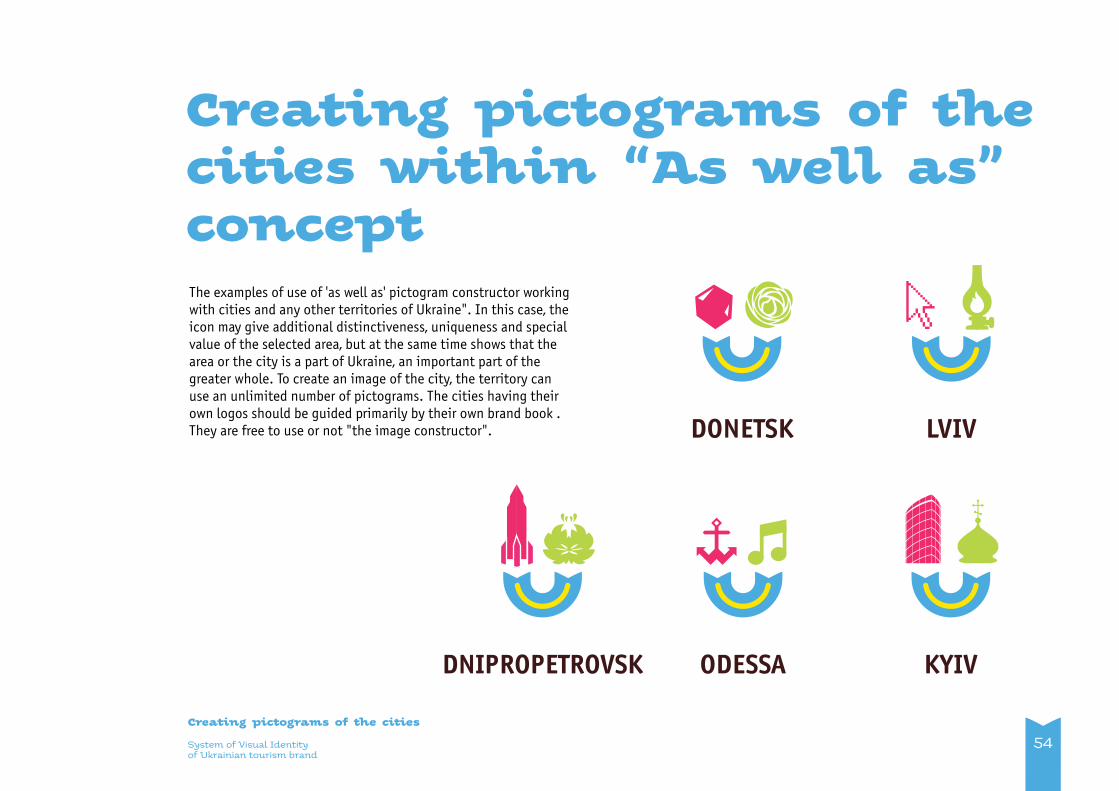
The examples of use of 'as well as' pictogram constructor working with cities and any other territories of Ukraine". In this case, the icon may give additional distinctiveness, uniqueness and special value of the selected area, but at the same time shows that the area or the city is a part of Ukraine, an important part of the greater whole. To create an image of the city, the territory can use an unlimited number of pictograms. The cities having their own logos should be guided primarily by their own brand book . They are free to use or not "the image constructor".
Creating pictograms of the cities within “As well as” concept
54
LVIV
ODESSA KYIVDNIPROPETROVSK
DONETSK

Creating “As well as” photo illustration

System of Visual Identityof Ukrainian tourism brand
Creating “As well as” photo illustration
56
General principle of illustrative photo creation corresponds the brand concept and has to arise out of its general principles in a logical way.Illustration is considered belonging to the “As well as” concept when conflicting opposites are necessarily present in it; the opposites, that are compared, and finally coexist in a peaceful way. If the images are not polar and have no signs of conflict (ex.: drum and guitar, mountains and sea), they are considered to be unproductive combination (see p. 21).
In Version 1, (see p. 48) photo images of real objects, events, life beings are used instead of icons, according to the same construc-tor “As well as” principle. They are united by the "Smile"graphic element.
There must be free space between opposing images and they must not overlap at each other.
Photo illustration. Version 1
Example 1

Photo illustration. Version 1
It’s also effective to use the opposites of popular images, manifesting different tastes, life philosophies, etc., peacefully coexisting in Ukrainian “As well as” environment.
System of Visual Identityof Ukrainian tourism brand
Creating “As well as” photo illustration
57
Example 2

Non-productive are those illustrative photos, where the opposing images don’t inherent any conflict of paradox (see p. 21).
System of Visual Identityof Ukrainian tourism brand
Creating “As well as” photo illustration
Example of non-productive “As well as” photo illustration
58
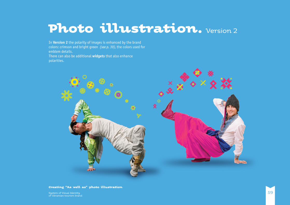
Photo illustration. Version 2
System of Visual Identityof Ukrainian tourism brand
Creating “As well as” photo illustration
59
In Version 2 the polarity of images is enhanced by the brand colors: crimson and bright green (see p. 39), the colors used for emblem details. There can also be additional widgets that also enhance polarities.
3,5 x
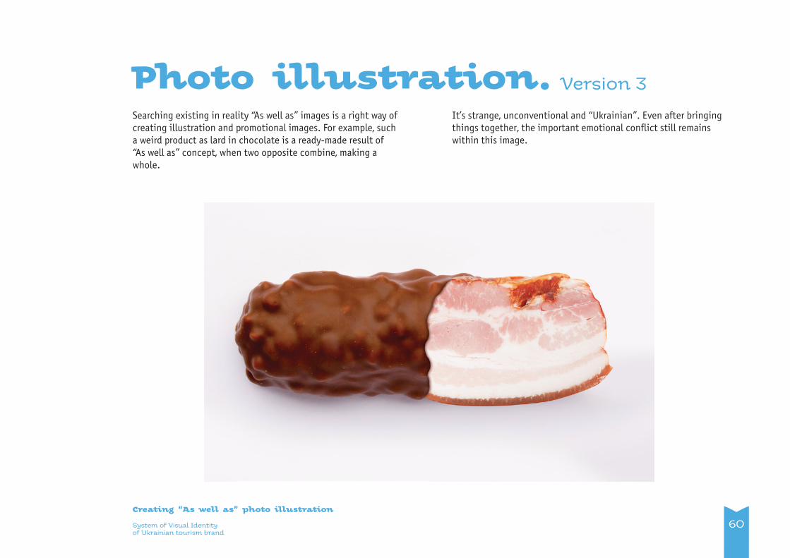
Photo illustration. Version 3
System of Visual Identityof Ukrainian tourism brand
Creating “As well as” photo illustration
60
Searching existing in reality “As well as” images is a right way of creating illustration and promotional images. For example, such a weird product as lard in chocolate is a ready-made result of “As well as” concept, when two opposite combine, making a whole.
It’s strange, unconventional and “Ukrainian”. Even after bringing things together, the important emotional conflict still remains within this image.

System of Visual Identityof Ukrainian tourism brand
Creating “As well as” photo illustration
Photo illustration.
61
In particular cases it’s possible to use readymade genre, land-scape etc. photos, representing Ukraine, without conceptual meaning.
Non-conceptual version

Principles of promotion items design

Examples of style combined with native business correspondence

64System of Visual Identityof Ukrainian tourism brand
Business correspondence
Business cards
Business cards – two-sided For name and position: Kolyada font, 8 pt. For contact information Kolyada font, 7 pt. Contact information may be posted in 1-2 lines. Contact information posted must be brief. Text and logo inset must be 5 mm.
For the design of reverse side of business cards it’s recommended to use different widgets of Ukrainian tourism brand or their combinations.
14, Peremogy Av, 01135, Ukraine, Kyiv+380 44 352-24-05, АТС-104: 35-90, АТС-15: 37-83
[email protected] www.tourism.gov.ua
Helen Shevchenko Head ofState Agency of Ukraine for Tourism and Resorts
5 mm
5 mm
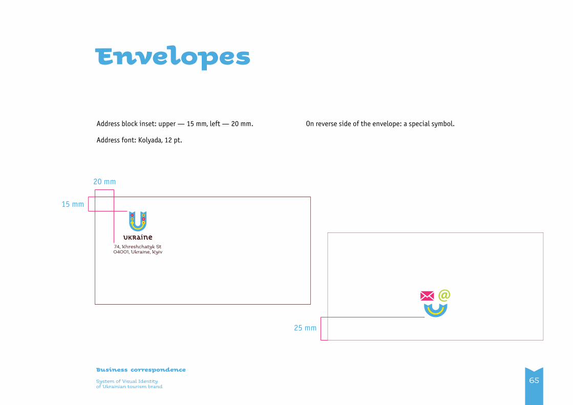
System of Visual Identityof Ukrainian tourism brand
Business correspondence
Envelopes
Address block inset: upper — 15 mm, left — 20 mm.
Address font: Kolyada, 12 pt.
On reverse side of the envelope: a special symbol.
74, Khreshchatyk St04001, Ukraine, Kyiv
65
20 mm
15 mm
25 mm
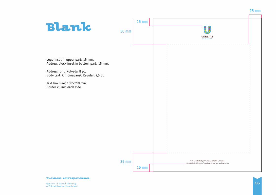
66System of Visual Identityof Ukrainian tourism brand
Business correspondence
Blank
Logo inset in upper part: 15 mm.Address block inset in bottom part: 15 mm.
Address font: Kolyada, 8 pt.Body text: OfficinaSansC Regular, 9,5 pt.
Text box size: 160×210 mm.Border 25 mm each side.
74, Khreshchatyk St., Kyiv, 04001, Ukraine +380 12 345-67-89, [email protected], www.ukraine.ua
74, Khreshchatyk St., Kyiv, 04001, Ukraine +380 12 345-67-89, [email protected], www.ukraine.ua
15 mm
35 mm
15 mm
25 mm
50 mm
15 mm
35 mm
15 mm
25 mm
50 mm
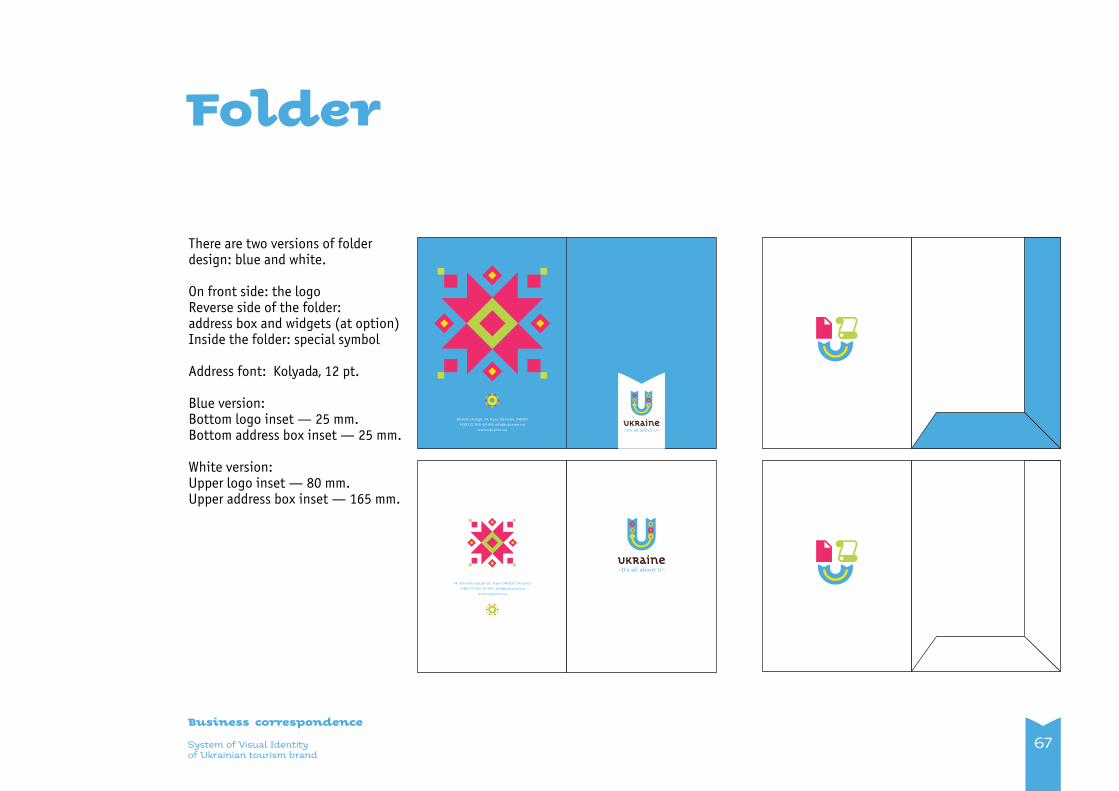
67System of Visual Identityof Ukrainian tourism brand
Business correspondence
Folder
There are two versions of folder design: blue and white.
On front side: the logoReverse side of the folder: address box and widgets (at option)Inside the folder: special symbol
Address font: Kolyada, 12 pt.
Blue version:Bottom logo inset — 25 mm.Bottom address box inset — 25 mm.
White version:Upper logo inset — 80 mm.Upper address box inset — 165 mm.
Khreshchatyk, 74, Kyiv, Ukraine, 04001+380 12 345-67-89, [email protected]
www.ukraine.ua
74, Khreshchatyk St., Kyiv, 04001, Ukraine+380 12 345-67-89, [email protected]
www.ukraine.ua
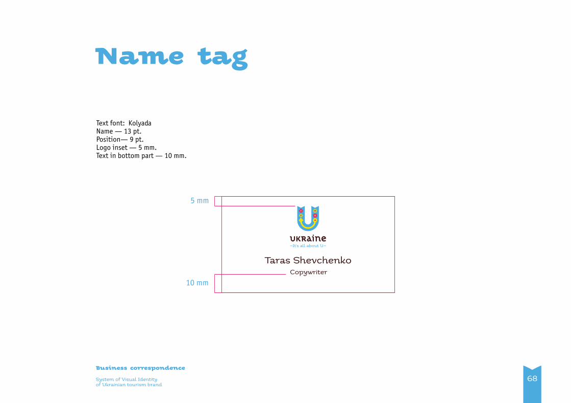
68System of Visual Identityof Ukrainian tourism brand
Business correspondence
Name tag
Text font: Kolyada Name — 13 pt.Position— 9 pt.Logo inset — 5 mm.Text in bottom part — 10 mm.
Taras Shevchenko Copywriter
10 mm
5 mm

Promotional products

System of Visual Identityof Ukrainian tourism brand
Promotional products
Brochure and publication design principles
70
Designing promotional products, for the sustainable and signifi-cant impact on brand consumer, it’s important to follow graphi-cal and meaning principles stated in this brochure.
Specifics of advertising and communicational promo materials allow more wide and free use of all brand visual identity graphic constructor. It is important to hold on the conceptual connec-tion with the idea of the brand concept according to which the (relative) percentage should be the following: 80% of the design was meant for broadcasting the "As well as" idea and only 20% have decorative ornamental purpose.
There are several examples given below on brochure design basis, general principles of which should be used for printed editions design, posters, flyers, informational letters, etc. Depending on specific purposes you can use this example as a template and create new solutions within “As well as” concept on its basis.
Logo position can’t be user-defined, following certain rules are plainly required.
Using the widgets may be user-defined to some extent. You can create “Smile” images with pictograms and illustrations, according to your purposes.

X
Grid. Vertical format
It's recommended to use modular grid while creating promo materials. For example, selected horizontal and vertical planes of the standard A4, which can be proportionally increased or decreased. Standard unit of measurement of the net 1=X.
The work with the grid while creating promo materials, in any format must be carried on according to the following principles:1. Salad highlighted area for text information. Modules m1 and m2 form the required space from the edges to the size of the area. Pictures may extend beyond this area. Text can be placed freely in the plane, but should not go beyond the limits you specify .2. Bright-green area is divided by equal sized lines and columns, forming a grid of cells. When placing graphics and text information you must follow the grid lines (see examples below).
In vertical format the bright-green layout area is divided:8 lines;10 columns.
System of Visual Identityof Ukrainian tourism brand
Promotional products
71
3 X
3,6 X
m2
m1
m2
m1
X = 1

Grid.Horizontal format
In horizontal format the bright-green layout area is divided:12 lines;9 columns.
System of Visual Identityof Ukrainian tourism brand
Promotional products
72
m1
m2 m2
m1
3 X 3 XX
X
5 X
3,5 X
2,5 X
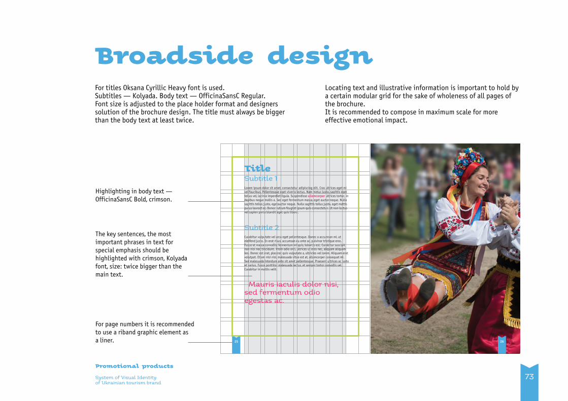
Title Subtitle 1Lorem ipsum dolor sit amet, consectetur adipiscing elit. Cras ultrices eget mi vel faucibus. Pellentesque eget viverra lectus. Nam metus justo, sagittis eget tellus vel, lacinia imperdiet ligula. Suspendisse ullamcorper ultrices tortor, in dapibus neque mollis a. Sed eget fermentum massa, eget auctor neque. Nulla sagittis tellus justo, egetauctor neque. Nulla sagittis tellus justo, eget mattis purus laoreet at. Donec rutrum feugiat ipsum quis consectetur. Ut non lectus vel sapien porta blandit eget quis libero.
Subtitle 2Curabitur vulputate vel arcu eget pellentesque. Donec a accumsan mi, ut eleifend justo. In erat risus, accumsan eu ante ac, pulvinar tristique eros. Fusce et massa convallis, fermentum mi quis, lobortis est. Curabitur suscipit non nisi nec tincidunt. Proin odio orci, ultrices ut eros nec, aliquam aliquam leo. Donec est erat, placerat quis vulputate a, ultricies vel lorem. Aliquam erat volutpat. Etiam nisi nisi, malesuada vitae est at, ullamcorper consequat mi. Sed malesuada interdum ante sit amet pellentesque. Praesent ultrices ac justo et varius. Fusce porttitor malesuada lectus, et semper tortor convallis vel. Curabitur in mattis velit.
Mauris iaculis dolor nisi, sed fermentum odio egestas ac.
Highlighting in body text — OfficinaSansC Bold, crimson.
For page numbers it is recommended to use a riband graphic element as a liner.
The key sentences, the most important phrases in text for special emphasis should be highlighted with crimson, Kolyada font, size: twice bigger than the main text.
25
For titles Oksana Cyrillic Heavy font is used.Subtitles — Kolyada. Body text — OfficinaSansC Regular.Font size is adjusted to the place holder format and designers solution of the brochure design. The title must always be bigger than the body text at least twice.
Broadside design
System of Visual Identityof Ukrainian tourism brand
Promotional products
73
Locating text and illustrative information is important to hold by a certain modular grid for the sake of wholeness of all pages of the brochure. It is recommended to compose in maximum scale for more effective emotional impact.
26

Layout of text in two columns of horizontal and vertical formats
Broadside design
System of Visual Identityof Ukrainian tourism brand
Promotional products
74
interdum ante sit amet pellentesque. Praesent ultrices ac justo et varius. Fusce porttitor malesuada lectus, et semper tortor convallis vel. Curabitur in mattis velit.
Nulla ultricies nisi sed nisl rutrum venenatis. Mauris suscipit aliquam nulla, et interdum purus accumsan eget. Nunc quis vulputate augue. Quisque convallis porttitor risus at commodo. Curabitur eu nisl sed purus lacinia egestas vitae id elit. Sed quis metus elit. Class aptent taciti sociosqu ad litora torquent per conubia nostra, per inceptos himenaeos. Sed nec tortor tortor. Vestibulum ut massa vel metus pulvinar egestas non non libero. Vestibulum malesuada, urna non euismod tempus, dui ipsum ultricies risus, vel tempus mi lacus vel metus. Proin vitae tempor justo. Quisque nisl nunc, mattis non tempus vitae, vulputate eget ante.
Title Subtitle
Mauris iaculis dolor nisi, sed fermentum odio egestas ac.
25
Lorem ipsum dolor sit amet, consectetur adipiscing elit. Cras ultrices eget mi vel faucibus. Pellentesque eget viverra lectus. Nam metus justo, sagittis eget tellus vel, lacinia imperdiet ligula. Suspendisse ullamcorper ultrices tortor, in dapibus neque mollis a. Sed eget fermentum massa, eget auctor neque. Nulla sagittis tellus justo, egetauctor neque. Nulla sagittis tellus justo, eget mattis purus laoreet at. Donec rutrum feugiat ipsum quis consectetur. Ut non lectus vel sapien porta blandit eget quis libero.
Subtitle 2Curabitur vulputate vel arcu eget pellentesque. Donec a accumsan mi, ut eleifend justo. In erat risus, accumsan eu ante ac, pulvinar tristique eros. Fusce et massa convallis, fermentum mi quis, lobortis est. Curabitur suscipit non nisi nec tincidunt. Proin odio orci, ultrices ut eros nec, aliquam aliquam leo. Donec est erat, placerat quis vulputate a, ultricies vel lorem. Aliquam erat volutpat. Etiam nisi nisi, malesuada vitae est at, ullamcorper consequat mi. Sed malesuada
25
nec tincidunt. Proin odio orci, ultrices ut eros nec, aliquam aliquam leo. Donec est erat, placerat quis vulputate a, ultricies vel lorem. Aliquam erat volutpat. Etiam nisi nisi, malesuada vitae est at, ullamcorper consequat mi. Sed malesuada interdum ante sit amet pellentesque. Praesent ultrices ac justo et varius. Fusce porttitor malesuada lectus, et semper tortor convallis vel. Curabitur in mattis velit.
Nulla ultricies nisi sed nisl rutrum venenatis. Mauris suscipit aliquam nulla, et interdum purus accumsan eget. Nunc quis vulputate augue. Quisque convallis porttitor risus at commodo. Curabitur eu nisl sed purus lacinia egestas vitae id elit. Sed quis metus elit. Class aptent taciti sociosqu ad litora torquent per conubia nostra, per inceptos himenaeos. Sed nec tortor tortor. Vestibulum ut massa vel metus pulvinar egestas non non libero. Vestibulum malesuada, urna non euismod tempus, dui
Title Subtitle
Mauris iaculis dolor nisi, sed fermentum odio egestas ac.
Lorem ipsum dolor sit amet, consectetur adipiscing elit. Cras ultrices eget mi vel faucibus. Pellentesque eget viverra lectus. Nam metus justo, sagittis eget tellus vel, lacinia imperdiet ligula. Suspendisse ullamcorper ultrices tortor, in dapibus neque mollis a. Sed eget fermentum massa, eget auctor neque. Nulla sagittis tellus justo, egetauctor neque. Nulla sagittis tellus justo, eget mattis purus laoreet at. Donec rutrum feugiat ipsum quis consectetur. Ut non lectus vel sapien porta blandit eget quis libero.
Subtitle 2Curabitur vulputate vel arcu eget pellentesque. Donec a accumsan mi, ut eleifend justo. In erat risus, accumsan eu ante ac, pulvinar tristique eros. Fusce et massa convallis, fermentum mi quis, lobortis est. Curabitur suscipit non nisi

Using shape fragments of crimson diamond and bright green circle as a text back liner is both decorative and conceptual solution within the “as well as” concept.
The "Smile" brand element is placed at the center of the broadside. Thus the photo images are located on different sides, emphasizing their polarity. The “Smile” symbolically joins them.
Using “As well as” illustration for broadside.
System of Visual Identityof Ukrainian tourism brand
Promotional products
75
25 26
vulputate a, ultricies vel lorem. Aliquam erat volutpat. Etiam nisi nisi, malesuada vitae est at, ullamcorper consequat mi. Sed malesuada interdum ante sit amet pellentesque. Praesent ultrices ac justo et varius. Fusce porttitor malesuada lectus, et semper tortor convallis vel. Curabitur in mattis velit.
Nulla ultricies nisi sed nisl rutrum venenatis. Mauris suscipit aliquam nulla, et interdum purus accumsan eget. Nunc quis vulputate augue. Quisque convallis porttitor risus at commodo. Curabitur eu nisl sed purus lacinia egestas vitae id elit. Sed quis metus elit. Class aptent taciti sociosqu ad litora torquent per conubia nostra, per inceptos himenaeos. Sed nec tortor tortor. Vestibulum ut massa vel metus pulvinar egestas non non libero. Vestibulum malesuada, urna non euismod tempus, dui ipsum ultricies risus, vel tempus mi lacus vel metus. Proin vitae tempor justo. Quisque nisl nunc, mattis non tempus vitae, vulputate eget ante.
Title Subtitle
Mauris iaculis dolor nisi, sed fermentum odio egestas ac.
Lorem ipsum dolor sit amet, consectetur adipiscing elit. Cras ultrices eget mi vel faucibus. Pellentesque eget viverra lectus. Nam metus justo, sagittis eget tellus vel, lacinia imperdiet ligula. Suspendisse ullamcorper ultrices tortor, in dapibus neque mollis a. Sed eget fermentum massa, eget auctor neque. Nulla sagittis tellus justo, egetauctor neque. Nulla sagittis tellus justo, eget mattis purus laoreet at. Donec rutrum feugiat ipsum quis consectetur. Ut non lectus vel sapien porta blandit eget quis libero.
Subtitle 2Curabitur vulputate vel arcu eget pellentesque. Donec a accumsan mi, ut eleifend justo. In erat risus, accumsan eu ante ac, pulvinar tristique eros. Fusce et massa convallis, fermentum mi quis, lobortis est. Curabitur suscipit non nisi nec tincidunt. Proin odio orci, ultrices ut eros nec, aliquam aliquam leo. Donec est erat, placerat quis
Location on the grid

In given example of brochure broadside one should keep in mind the following principles: 1. The"Smile" brand element in this case joins “As well as” opposites of two text boxes, located on crimson diamond and bright green circle liners. The text in those two blocks may tell about some two opposites, united with one umbrella topic.
Unconventional pagination
System of Visual Identityof Ukrainian tourism brand
Promotional products
76
2. Two opposite by meaning illustrative pictures, used as a background, are joined by the “Smile” element. 3. The widgets, located on upper pare on left and right sides, additionally enhance “As well as” opposites. 4. The logo on illustrative photo background is used with white riband frame line.
Curabitur vulputate vel arcu eget pellentesque. Donec a accumsan mi, ut eleifend justo. In erat risus, accumsan eu ante ac, pulvinar tristique eros. Fusce et massa convallis, fermentum mi quis, lobortis est. Curabitur suscipit non nisi nec tincidunt. Proin odio orci, ultrices ut eros nec, aliquam aliquam leo. Donec est erat, placerat quis vulputate a, ultricies vel lorem. Aliquam erat volutpat. Etiam nisi nisi, malesuada vitae est at, ullamcorper consequat mi. Sed malesuada interdum ante sit amet pellentesque. Praesent ultrices ac justo et varius. Fusce porttitor malesuada lectus, et semper tortor convallis vel. Curabitur in mattis velit. Nulla ultricies nisi sed nisl rutrum venenatis. Mauris suscipit aliquam nulla, et interdum purus accumsan eget. Nunc quis vulputate augue.
Title SubtitleLorem ipsum dolor sit amet, consectetur adipiscing elit. Cras ultrices eget mi vel faucibus. Pellentesque eget viverra lectus. Nam metus justo, sagittis eget tellus vel, lacinia imperdiet ligula. Suspendisse ullamcorper ultrices tortor, in dapibus neque mollis a. Sed eget fermentum massa, eget auctor neque. Nulla sagittis tellus justo, egetauctor neque. Nulla sagittis tellus justo, eget mattis purus laoreet at. Donec rutrum feugiat ipsum quis consectetur. Ut non lectus vel sapien porta blandit eget quis libero.
Location on the grid
25
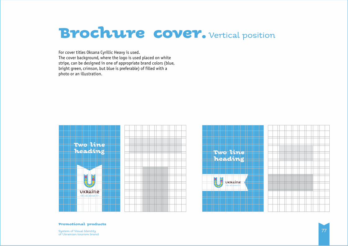
For cover titles Oksana Cyrillic Heavy is used. The cover background, where the logo is used placed on white stripe, can be designed in one of appropriate brand colors (blue, bright green, crimson, but blue is preferable) of filled with a photo or an illustration.
System of Visual Identityof Ukrainian tourism brand
Promotional products
77
Brochure cover. Vertical position
Two lineheading Two line
heading

Brochure cover.Horizontal position
System of Visual Identityof Ukrainian tourism brand
Promotional products
78
Two line heading
Two lineheading
Large add spaces
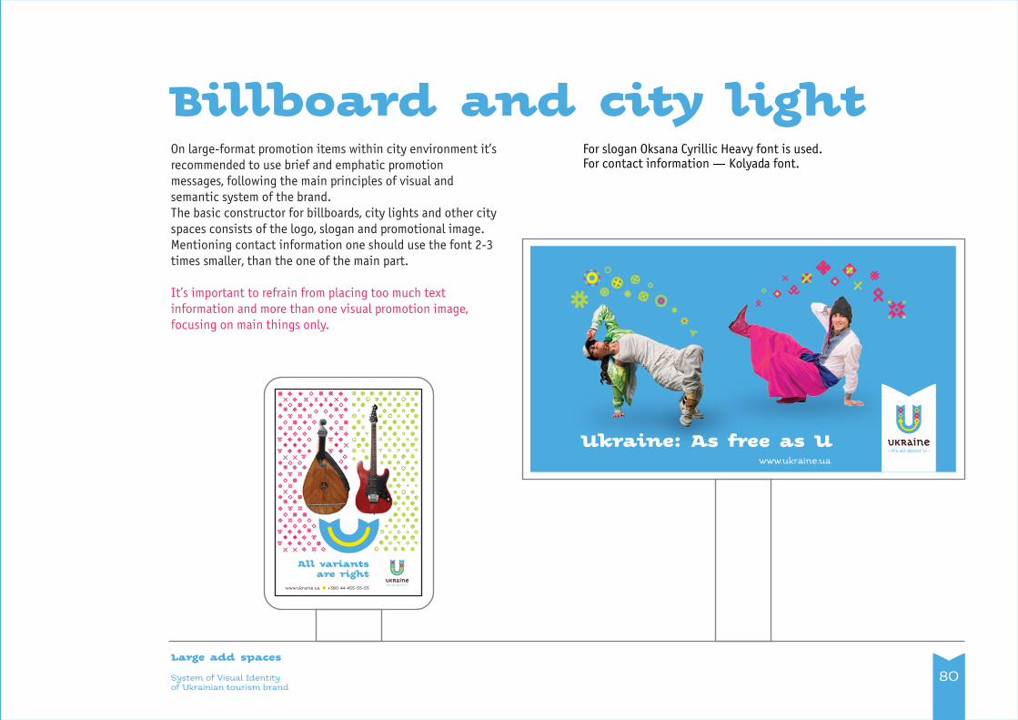
System of Visual Identityof Ukrainian tourism brand
Large add spaces
Billboard and city light
80
On large-format promotion items within city environment it’s recommended to use brief and emphatic promotion messages, following the main principles of visual and semantic system of the brand. The basic constructor for billboards, city lights and other city spaces consists of the logo, slogan and promotional image. Mentioning contact information one should use the font 2-3 times smaller, than the one of the main part.
It’s important to refrain from placing too much text information and more than one visual promotion image, focusing on main things only.
For slogan Oksana Cyrillic Heavy font is used.For contact information — Kolyada font.
www.ukraine.ua +380 44 455-55-55
All variantsare right
Ukraine: As free as Uwww.ukraine.ua

System of Visual Identityof Ukrainian tourism brand
Large add spaces
Сity light poster on the grid
81
www.ukraine.ua +380 44 455-55-55
All variantsare right
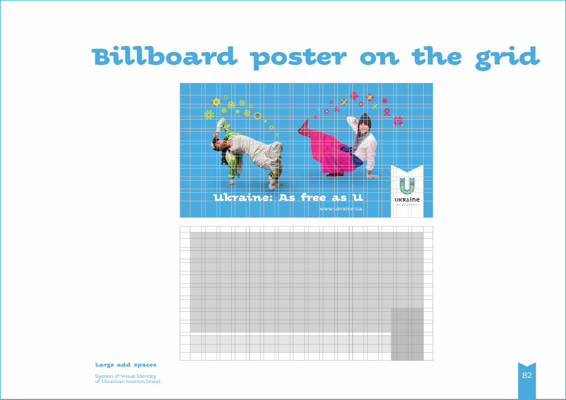
System of Visual Identityof Ukrainian tourism brand
Large add spaces
Billboard poster on the grid
82
Ukraine: As free as Uwww.ukraine.ua

Promotional gifts

84System of Visual Identityof Ukrainian tourism brand
Promotional gifts
Promotional gifts design principlesUsing the system of symbol and pictogram, mentioned above it is easy and convenient to design any promotional gifts.
Designing promotional gifts using the pictogram “As well as” brand constructor is preferable. It’s also important to use city emblems, created according to the same principle. Such design principle was used in examples given below. This principle has also to be applied to all range of swag for further development of the key idea of the brand style.
When it’s needed to decorate promotional gifts with large color areas, it’s possible to use additional widgets and ornaments, created on their basis. Such approach, for example, was used for the product samples below (cap, mug).

The gift set of fridge magnets consists of a single "Smile"and 6-10 magnet icons of "as well as" opposites. With this constructor you can compose different images, eventually changing their mood.
System of Visual Identityof Ukrainian tourism brand
Promotional gifts
Promotional gifts.
85
Design examples
Eco bag Mug
Lapel pin
Cap
Fridge magnet
Vehicle design

87System of Visual Identityof Ukrainian tourism brand
Vehicle design
Vehicle design principles
For branding a wide variety of transport modes like cars and cargo, it is necessary to use the system of additional graphical symbols and patterns created on their basis.
Additionally, Ukrainian tourism brand logo and the slogan must be essential elements of the design.The colorful part of the design must be always positioned on front part of the vehicle.
It’s possible to place the logo on a colorful section as well as on a plain one. Strictly following the principles of use of the Ukrainian tourism brand logo is necessary.
The main leading color used in the array must always be the blue brand color.
Using large planes of crimson is not acceptable.
When using blue for filling large elements of vehicle is impossi-ble it can be replaced with bright green or yellow brand color.

System of Visual Identityof Ukrainian tourism brand
Vehicle design
Vehicle design
88

Exhibition stand design

90System of Visual Identityof Ukrainian tourism brand
Exhibition stand design
Exhibition stand design principles
You have to develop an individual design for branding exhibition stand on different exposures, depending on its construction specifics. But following the main principles, stated in the brochure, using as a constructor the visual identity of Ukrainian tourism brand, is always necessary.
It’s usually recommended to use additional widgets system and to create patterns on its basis.
Pictograms of “As well as” constructor may be used as a kit of images located on exhibition stand planes. They can both fulfill decorative and conceptual functions, briefly broadcasting the meaningful brand messages.
Ukrainian tourism brand logo and the slogan must be essential elements of the design.Following the principles of logo use is necessary.
The main colors used in the array must always be the blue and the white brand colors.
Using crimson, yellow and bright green on array is unacceptable.

Website design, design of social networks pages

92System of Visual Identityof Ukrainian tourism brand
Website design, design of social networks pages
Design principles for the websites and social network pagesWebsiteThe website for Ukrainian tourist brand must be well-considered and user friendly, to provide all the information that’s necessary for tourists. The website must correspond modern requirements, be functional and meaningful. The ultimate website destination is to represent Ukraine in a favorable way as a unique product that must be interesting for the target audience. The brand-platform provides basis for all that; practical constructor for it you can find in this brochure. The design must correspond mentioned above demands.
It’s wrong to understand the website design just as ornate brand styling.
According to the brand-platform, website may be creates on “As well as” idea basis, where the customer has different opposite tourist product options, and each of them is a right one. The contrast in this case can enhance each product offer. “As well as” graphic images (see p. 48) and the brand widgets (see p. 52) can be taken as a basis for creating navigation elements of the website (menu pictograms, buttons, etc.).
The principles of creating illustrative photo can also be applied for illustrating website pages (see p. 56-60).
Ukrainian tourism brand logo and the slogan must be essential elements of the design. Following the principles of logo use is necessary. The main colors used in the array must always be the blue and the white brand colors.
Social networksFor pages in social networks you should mainly use “As well as” graphic image constructor and widgets for brand background and cover. “As well as” illustrations from future advertizing campaigns must be also used on social network pages (ex.: Facebook), updating the brand communication.
For user’s images (avatar, userpic) the full version of the logo (the lettering and the emblem) or a partial one can be used (emblem only), depending. It’s important to follow the free space rule (see p. 32). ). It’s not recommended to place the slogan under the logo, because it will not be readable small avatar icons.

Combining the logo with the state symbols

System of Visual Identityof Ukrainian tourism brand
Combining the logo with the state symbols
Principles of combining the logo with the state symbols of Ukraine
It’s possible to use the logo of Ukrainian tourist brand in combination with national emblem of Ukraine in two versions: vertical and horizontal. Horizontal version is preferable. Vertical version can be used only if using horizontal version is impossible.
While using the vertical block of the logo and the national emblem their width must be equal.
Besides the given examples, it’s also possible to place the logo and the national emblem on bigger distance from one another. In this case there is no need to use a separating line. The form sheet draft on the following page illustrates such approach.
94
9 mm
7 mm
23 mm
28 mm

Form sheetUpper text inset — 15 mm.Address box inset below — 10 mm.
Address font — Kolyada, 8 pt.Body text font — OfficinaSansC Regular, 9 pt. Textbox size — 160×193 mm.
System of Visual Identityof Ukrainian tourism brand
Combining the logo with the state symbols
74, Khreshchatyk St., Kyiv, 04001, Ukraine+380 12 345-67-89, [email protected], www.ukraine.ua
95
10 mm
50 mm
25 mm
15 mm
25 mm
50 mm

Combining the logo with the cities logos

System of Visual Identityof Ukrainian tourism brand
Combining the logo with the cities logos
Principles of combining the logo with the cities logos
It’s possible to use the logo of Ukrainian tourist brand in combination with the cities logos in two versions: vertical and horizontal. Horizontal version is preferable. Vertical version can be used only if using horizontal version is impossible.
While using the vertical block of the logo and the national emblem their width must be equal.
Besides the given examples, it’s also possible to place the logo and the city logo on bigger distance from one another. In this case there is no need to use a separating line.
97
city logo
city logo
9 mm
7 mm
23 mm
28 mm

The gesture

99The gesture of Ukrainian tourism brand
The gesture Gesture is an important communicational element. It’s recommended to integrate the gesture into advertising campaigns — video and photo communications, for the gesture could over time turn into a “meme”, used by tourists, while making picture or video, assuming the message: “I’m in Ukraine”.

Audio jingle

0
101Audio jingleof Ukrainian tourism brand
Audio jingleMusic, jingle — small musical sketch, created within the “As well as” concept, reflecting both traditions and modernity, the pause and dynamics, major and minor — organically and simultaneously.
Jingle is recommended to use in advertizing campaigns with the video and flash animation (see p. 103), as a recognizable Ukrainian tourist brand element.
You can download the jingle using the following link: visitukraine.gov.ua/ua/bb/jingle.zip

Logo flash animation

103Logo flash animationof Ukrainian tourism brand
Logo flash animation
Logo flash animation is recommended to integrate into video advertising campaigns together with audio jungle.It is also possible to use it as well without the audio track on web resources, in presentations, etc.
You can download the flash animation using the following link:www.visitukraine.gov.ua/ua/bb/flash_logo.zip

104Layout originals linksof Ukrainian tourism brand
Layout originals linksLogo. Vertical. Basic version: www.visitukraine.gov.ua/ua/bb/logo_1.zip
Logo. Horizontal: www.visitukraine.gov.ua/ua/bb/logo_2.zip
Fonts: www.visitukraine.gov.ua/ua/bb/fonts.zip
Brand element “Smile”: www.visitukraine.gov.ua/ua/bb/usmishka.zip
“As well as” constructor pictograms: www.visitukraine.gov.ua/ua/bb/iicons.zip
Widgets: www.visitukraine.gov.ua/ua/bb/decor_elements.zip
Business card draft: www.visitukraine.gov.ua/ua/bb/card.zip
Envelope draft: www.visitukraine.gov.ua/ua/bb/envelope.zip
Form sheet draft: www.visitukraine.gov.ua/ua/bb/blank.zip
Folder draft: www.visitukraine.gov.ua/ua/bb/folder.zip
Name tag draft: www.visitukraine.gov.ua/ua/bb/badge.zip
Audio jingle: www.visitukraine.gov.ua/ua/bb/jingle.zip
Flash animated logo: www.visitukraine.gov.ua/ua/bb/flash_logo.zip

105The Background of Ukrainian tourism brand
The Backgroundof Ukrainian Tourism Brand Development
The development of the tourism brand of Ukraine The development of the tourism brand of Ukraine was based on researches made by the group of researchers in 2010 – 2013.
• Brand sessions of Ukrainian cities: Kyiv, Odesa, Kharkiv, Mykolayiv.♦ The Meaning Platform Ukraine social study project.• Foresights (scenery future modeling):
~ Human Capital of Ukraine 2030;~ Hospitality Industry of Ukraine 2022;~ Global Competitive Edge of Ukrainian Business 2030.
The work was proceeding according to the following plan:1. As a first step, we developed the general concept of the tourism brand, based on the values of Ukrainians, global trends in tourist business and studies on tourism potential of Ukraine. The concept was approved by way of wide discussion in expert communities and in social networks.
2. At the basis of the concept three options of graphic identity were developed. They went under the public discussion, by way of which one of the solutions was selected and taken as a principal.
3. The selected graphic solution has gone through six stages of refinement, undergoing open discussion and guidance of the leading Ukrainian experts on each stage.
4. A graphic constructor, developed on the logo basis after expert approval, was meant for involving people into creative process.
5. A competition of all comers has been arranged in social networks to retrieve new ideas for Ukrainian tourist slogans. The best slogans went under evaluation of local and foreign experts, including native speakers.
6. According to the concept, tourist positioning strategy, examples of travel products and jingle music, animation, gesture and other distinctive components of brand were developed.

106The Background of Ukrainian tourism brand
7. Upon approval of the expert community and the presentation at the International Tourism Forum the set of rules of use the tourism brand (brand book) was finalized. It included numerous examples, restrictions and guidelines.
Series of public discussions within the expert communities were hold during September — October. 1. Heads of Tourism Departments of regional administrations.
2. Leaders of tourist business and experts in the sphere of branding.
3. Hotel business executives.
4. Designers, marketologists.
5. Non-political NGO leaders.
6. Business executives in high tech sphere.
7. Tourist business professionals (during International Tourist Forum).
The total amount of people, taking part in expert discussions was about 400.Besides, during these two months there was a discussion of the work on the page of Ukrainian Tourism Brand in a social network Facebook https://www.facebook.com/BrandTourismUkraine. The total coverage consists of more than 12 000 people. The final presentation has been viewed by 4 860 people, about 460 people participated in discussion. Over 400 people left positive feedback on the web site of developers.

107Working Group of the Projectof Ukrainian tourism brand
This brand book was created by order of the State Agency of Ukraine for Tourism and Resorts www.vizitukraine.gov.ua Supported in the frame of Ukrainian German Development Cooperation through Deutsche Gesellschaft für Internationale Zusammenarbeit (GIZ) www.giz.de
CONCEPT, LEGITIMATIONThe team of WikiCityNomica: Polina Bashkina – PR, incidental music, editorship;Anna Valence – humanitarian technologies;Maria Makukha – psychology of communications, translation;Valeriy Pekar – strategic modelling;Yevgen Pestiernikov – foresights, future modelling; Tetyana Zhdanova – branding.www.wikicitynomica.org
Legitimation in tourism circles:Ivan Lyptuga, President of Odesa Tourism Association.
DESIGNKorolivski Mitci design studio:Dmytro Korol, art director Viktoriya Korol, designerDmytro Bulanov, designerwww.mitci.com.ua
MUSIC, JINGLERoman Kolyada, composerStas Firsov, orchestration Yuriy Grom, sound engineerOleg Yasynskiy, voice
PROJECT MANAGERTetyana Zhdanova, Brandhouse, WikiCityNomicawww.brandhouse.com.ua

Thank you!