graphical and tabular descriptive techniques statistics for management and economics chapter 2...
TRANSCRIPT

Graphical and Tabular Descriptive Techniques
Statistics for Management and Economics
Chapter 2
Updated: 04/18/23

Objectives
Types of Data and Information Graphical and Tabular Techniques for
Nominal Data Graphical Techniques for Interval Data Describing the Relationship Between
Two Variables Describing Time-Series Data

Types of data and information
A variable is a characteristic of population or sample of interest
Data, or data points, is the actual values of variables. There are three general types: Interval, Nominal and Ordinal
We also commonly designate them: Quantitative or Categorical

Types of data and information: Interval Data
Real numbers, for example: heights, weights, prices, etc.
Also referred to as quantitative or numerical.
Arithmetic operations can be performed on Interval Data, thus it’s meaningful to talk about 2*Height, or Price + $1, and so on.

Types of data and information: Nominal Data
Nominal data are also called qualitative or categorical.
The values of nominal data are categories, for example: responses to questions about marital status, coded as Single = 1, Married = 2, Divorced = 3, Widowed = 4
Because the numbers are arbitrary arithmetic operations don’t make any sense (e.g. does Widowed ÷ 2 = Married?!)
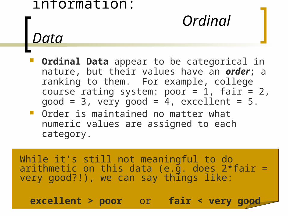
Types of data and information: Ordinal Data
Ordinal Data appear to be categorical in nature, but their values have an order; a ranking to them. For example, college course rating system: poor = 1, fair = 2, good = 3, very good = 4, excellent = 5.
Order is maintained no matter what numeric values are assigned to each category.
While it’s still not meaningful to do arithmetic on this data (e.g. does 2*fair = very good?!), we can say things like:
excellent > poor or fair < very good

Types of data and information Cross-sectional data is data that is
collected at a certain point in time Marketing survey Starting salaries of MBA graduates
Longitudinal data is collected over a period of time. Sometimes also referred to as time-series data. Weekly starting prices of gold Daily bid price on posted e-Bay item

Types of data and information
Prospective data is collected from the current point into the future.
Retrospective or historical data is collected on events that have happened in the past. Compare total return on past years for a
particular IRA

Graphical and Tabular Techniques for Nominal Data
To summarize nominal data, counts (frequencies) are used to describe the number of observations in each category.
These counts are reported in a table called a frequency distribution.
If the percents (or proportions) associated with each count are also reported, this is a relative frequency distribution (i.e., the amount in each group relative to the total).

Graphical and Tabular Techniques for Nominal Data
Bar Chart Often used to display
frequencies The bars represent
each category Height of the bar
represents the frequency
The base of the bar is arbitrary
Pie Chart Shows relative
frequencies A circle, divided into a
number of slices, each of which represent a category
The size of the “slice” is proportional to the size of the percentage for the corresponding category

Graphical and Tabular Techniques for Interval Data
Histogram, stem-and-leaf plot, and the ogive are used when the data are interval (i.e. numeric, non-categorical).
The most important of these graphical methods is the histogram.
The histogram is not only a powerful graphical technique used to summarize interval data, but it is also used to help explain probabilities.

Histogram
A bar-like graph where the bases are intervals and heights are frequencies
Steps to building a histogram:1. Collect data
2. Create a frequency distribution
3. Draw the histogram Interpretation of the histogram:
Symmetry, Skewness, Modality, Bell Shape

Frequency Distribution for Interval Data
Interval data has to be broken down into a series of intervals, or classes
Table 2.6 shows the approximate number of classes in a frequency distribution based on the number of observations (more observations more classes)
Sturges’ formulaNumber of class intervals = 1 + 3.3
log(n) Determine interval widths
(largest obs – smallest obs) / number of classes Summarize data into classes

Interpretation: Symmetry
A histogram is said to be symmetric if, when we draw a vertical line down the center of the histogram, the two sides are identical in shape and size:
Fre
quency
Variable
Fre
quency
VariableFre
quency
Variable

Interpretation: Skewness
A skewed histogram is one with a long tail extending to either the right or the left:
Fre
quency
Variable
Fre
quency
Variable
Positively Skewed Negatively Skewed

Interpretation: Modality
A unimodal histogram is one with a single peak, while a bimodal histogram is one with two peaks:
Fre
quency
Variable
Unimodal
Fre
quency
Variable
Bimodal A modal class is the class withthe largest number of observations

Interpretation: Bell Shape
A special type of symmetric unimodal histogram is one that is bell shaped:
Fre
quency
Variable
Bell Shaped
Many statistical techniques require that the population be bell shaped.
Drawing the histogram helps verify the shape of the population in question.
Let’s See…

Stem-and-leaf plot
A graphical technique often used in preliminary analyses.
Actual values for each observation is used to built the plot (as opposed to summaries as in the histogram).
Each observation is split into a stem and a leaf and plotted.

Creating a Stem-and-Leaf Plot
Observation value: 42.19 There are several ways to split the
stem and leaf: We could split it at the decimal point: Or split it at the “tens” position (first round
to 42)
Stem
Leaf
42 19
4 2

Creating a Stem-and-Leaf Plot
Continue this process for all the observations. Then, line up “stems” in increasing numerical order, with “leaves” to the right (also in increasing numerical order)
Stem Leaf0 00000000001111122222233333455555566666667788889999991 0000011112333333344555556678899992 00001111123446667789993 0013355894 1244455895 335666 34587 0222245567898 3344578899999 0011222223334455599910 00134444669911 124557889
Thus, we still have access to our original data point’s value!
The length of each line represents the frequency of the class defined by the stem.

Ogives Pronounced “Oh-jive” Graph of a cumulative frequency
distribution Steps to an Ogive:
1. Create relative frequency distribution
2. Calculate cumulative frequencies
3. Graph cumulative relative frequencies

Interpretation: OgiveOgive: Starting Accounting Incomes
0.00%
10.00%
20.00%
30.00%
40.00%
50.00%
60.00%
70.00%
80.00%
90.00%
100.00%
$42,500 $45,900 $50,100 $54,300 $58,500 $62,700 $66,900 $71,100 $75,300
Incomes (dollars)
Cu
mu
lati
ve P
erce
nt
Q: 75% of First-Year accountants obtain what salary?
Q: An accounting firm is offering Suzy $55,000 for her first year. Where does she fall among her peers?
A: About $58,600
A: Around the 50 Percentile.

Graphical and Tabular Techniques for Two Variables
Sometimes it is of interest to summarize more than one variable in your dataset or to compare similar variables from two groups.
Different combinations of variables: Nominal/Ordinal, Nominal/Nominal, Ordinal/Ordinal, Time Series Data
Contingency Tables, Scatter Diagrams, Bar Graphs, Line Plot, side-by-side box plot, back-to-back stem plot

Tabular Techniques For Two Nominal Variables
A contingency table (also called a cross-classification table or cross-tabulation table) is used to describe the relationship between two nominal variables.
A contingency table lists the frequency of each combination of the values of the two variables. Relative frequencies are also reported in the table.
The data can then be summarized graphically with a bar cart

Creating a Contingency Table Rows and columns of table
represent categories in each variable
Each combination of the levels of each variable is summarize in the cells of the table.
This reader’s response is captured as part of the total number on the contingency table…
Example 2.8

Interpretation of a Contingency Table
Percentages or proportions calculated to allow comparisons across cells
Identify patterns that appear among the data

Using the Pivot Table in Excel
In order to create a contingency table in Excel to summarize or graph data, you can use the Pivot Table.
Let’s see…

Graphical Comparison Between Two Interval Variables
Sometimes we are interested in how two interval variables are related.
To explore this relationship, we employ a scatter diagram or scatterplot, which plots two variables against one another.
The independent (predictor, explanatory) variable is labeled X and is usually placed on the horizontal axis, while the other, dependent (outcome, response) variable, Y, is mapped to the vertical axis.
Let’s see…

Interpretation: Scatterplot
Positive Linear Relationship Negative Linear Relationship
Weak or Non-Linear Relationship
StrengthThe extent to which the data points fit the pattern in the
plot
PatternDo the data fall in a linear pattern? The
pattern tells us if there is a relationship
or not
DirectionThe direction in
which the data fall – tells important
information about the relationship

Relationship Between One Nominal and One Interval Variable
Bar Chart is an effective way to summarize with one set of bars for each of the levels of the nominal variable
Back-to-back stem plot Side-by-side box plot

Time Series Plot
Observations measured at successive points in time are called time-series data.
Time-series data graphed on a line chart, which plots the value of the variable on the vertical axis against the time periods on the horizontal axis.
Can be used to compare multiple groups over time
Let’s see…

Time Series Plot•Total amounts of U.S. income tax for the years 1987 to 2002
•Identify Patterns in the chart in order to identify what is happening over time.
•From ’87 to ’92, the tax was fairly flat. Starting ’93, there was a rapid increase taxes until 2001. Finally, there was a downturn in 2002
•We could plot several lines here as well to compare groups.