graphical analysis physics 227 lab · 2020-01-08 · graphical analysis physics 227 lab 4...
TRANSCRIPT

Graphical Analysis Physics 227 Lab
1
Introduction to Scientific Analysis of Data Using Spreadsheets. Computer spreadsheets are very powerful tools that are widely used in Business, Science, and Engi-neering to perform calculations and record, present, and analyze data, as well as perform a variety of more sophisticated calculations that can use a number of special functions. One of the virtues of spreadsheets is their relative ease of use compared to programs like Matlab and Mathematica or programming languages like C, or Fortran. In fact, spreadsheets have many of the functions of programming languages as built in functions and can do many of the same things. You can also make your own custom functions that can be called in spreadsheets if you need to, and Microsoft Visual Basic for Excel is a full- edged programming language (albeit with a bit of a learning curve). We will be using Microsoft Excel for this lab. However other spreadsheet programs are very sim-ilar and have much of the same functionality. For example, OpenOffice is a free suite of software programs with Word Processor, Spreadsheet, Presentation (Power Point), Drawing, Math typeset-ting, and Data Base software. The Open Office spreadsheet is called Calc. Don't worry if you have never used Excel before, we will learn how to use the basic features of it in this lab. You should become fairly pro cient in using Excel by the end of the semester since we will use it to analyze and plot the data for almost all of the experiments. Learn how to use Excel yourself. Don't let your partner be the one who always makes the spreadsheet, you should take turns working on it. Part I: Linear Graphs The basic linear equation
𝑦 = 𝑚𝑥 + 𝑏 is the simplest and most widely used relation to t data. Remember that m is the slope and b is the y intercept of the function. x is called the independent variable and y the dependent variable, since y depends on x. The independent variable is the quantity that you directly vary at will in your experiment, like moving a ball from one height to another. The dependent variable is the quantity that is responding to your change, such as the potential energy of a ball that you are moving. When graphing the independent variable is usually put on the horizontal axis, and the dependent variable on the vertical axis. Step 1: Let's take some data from a lab experiment on the photoelectric effect that we will perform later in the semester. This experiment involves shining a light source on a simple circuit which causes a current to ow in the circuit. The student adjusted the wavelength of the light source, and measured how much voltage it took applied against the current to stop the current from owing (this is called the Stop voltage, or Vs) Question 1: Next week everything will go into your lab book, but for today open up a word document and answer the questions in there. Be sure you and your partner's names are at the top as well as the lab number and title. In the experiment described above what is the independent variable and what is the dependent variable?
Graphical Analysis Physics 227 Lab
2
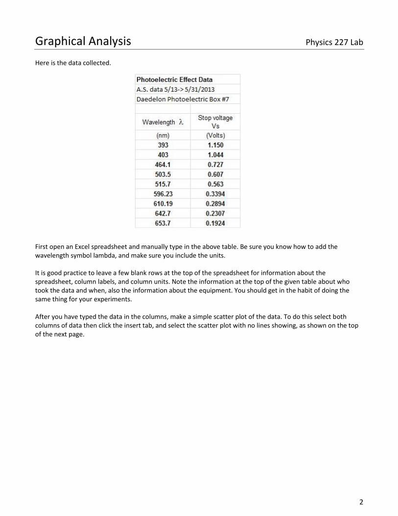
Here is the data collected. First open an Excel spreadsheet and manually type in the above table. Be sure you know how to add the wavelength symbol lambda, and make sure you include the units. It is good practice to leave a few blank rows at the top of the spreadsheet for information about the spreadsheet, column labels, and column units. Note the information at the top of the given table about who took the data and when, also the information about the equipment. You should get in the habit of doing the same thing for your experiments. After you have typed the data in the columns, make a simple scatter plot of the data. To do this select both columns of data then click the insert tab, and select the scatter plot with no lines showing, as shown on the top of the next page.

Graphical Analysis Physics 227 Lab
3
The graph should look similar to the one shown above. There are several problems with this graph. Step 2:

Graphical Analysis Physics 227 Lab
4
Excel's biggest user base is business, so default graph formats are mostly setup for that purpose. As a result you have to do a lot of formatting work to get a graph into a proper scientific or engineering format. For all charts you make for the remainder of this class you should go through the following list. Make sure you know how to do every part of the list (and do them) before moving on to the next part. Most can be adjusted through the green highlighted chart tools section at the top, or by right clicking whatever you want to change and opening its properties. Graph Format
A.) Minimize white space The data should occupy most of the graph window area, rescale your axes to fix this.
B.) Title the chart
In scientific papers this is usually done with a figure caption, but for this lab each graph MUST have a chart title. The title should have information that gives the reader an idea of what is plotted. Find this in the “Layout” tab
C.) Title the Axes All Axes MUST have a title, and MUST include units if applicable. You need to know what data is being shown where. Find this in the “Layout” tab
D.) Delete unnecessary legends, or change legend titles
For this set there is only one series of data, so having the legend that says "series 1" in unnecessary. If there were multiple data sets to distinguish from this would be nice to leave on. To edit these you can either directly delete the legend (click it then hit delete) or right click your graph-> select data-> edit. The first box will be displayed in the legend.
E.) Remove gridlines
Major and Minor tick marks inside, this is just cosmetic and to teach you to format your axes. Right click the number on whichever axis you want to edit then format axis. You’ll find tick marks here, as well as other useful formatting options for later, such as the log scaling.
Basically you are deleting unnecessary marks, white space, and information. Then you are making sure all necessary information is included so that you can tell what the data is by looking at the graph alone. Question 2: Did you do all of the above? If yes then copy and paste your properly formatted graph into a word document for printing NEAR THE END OF LAB. When you are finished your graph should look similar to the one on the following page.

Graphical Analysis Physics 227 Lab
5
Note that the data does not appear to be entirely linear when plotted here. There seems to be an increasing slope at the two shortest wavelengths. Without knowing any theory, one typically plots the dependent variable vs. the independent variable. If the data is not a linear relationship then one looks for other functional forms (transformations of the variables that give a more meaningful relationship). Luckily in known cases the theory has often already been developed. The photoelectric effect (what our above data set is for) is described by the following equation, (which earned Einstein the Nobel Prize in physics in 1921)
ℎ𝑓 = 𝑒 ∗ 𝑉𝑠 + 𝑊, (1) or dividing by e and solving for Vs,
𝑉𝑠 = (ℎ
𝑒) ∗ 𝑓 −
𝑊
𝑒; (2)
Here h is Planck's constant, e is the electron charge, W is the work funciton of the surface, Vs the stopping voltage, and f is the frequency of the light.Don't worry too much about the variable or the theory here yet, we'll revisit this in a later lab. Now look at equation 2, you should notice that this is in a very familiar form, specifically the linear form
𝑦 = 𝑚𝑥 + 𝑏 (3) Question 3: Compare the equation of a line (3) to equation 2 for the PE Effect. What are the following equal to
a) m= b) b=
Equation 2 shows that if we plot the frequency of the light, not the wavelength as the independent variable and Vs as the dependent variable, we should get a straight line whose slope and intercept give us the information you found in Q3. Since the data taken gives us Vs and λ we need some way to get frequency out of lambda. Luckily there's a relation between the wavelength of a light wave, and its frequency through the speed of light which is,
𝑓 =𝑐
𝜆
where c is the speed of light given by c = 2.9979e + 8 m/s.

Graphical Analysis Physics 227 Lab
6
Step 3: Now use a function in excel to add a frequency column to your data. This will allow you to easily convert an entire column of data, rather than calculate it one at a time.
A.) To make a function first type "=" into a cell, this tells excel to look for an equation instead of just text being entered. So select the top of your third column where you'll put your first frequency value, type "=" and then enter the right hand side of equation 3.
B.) Now replace your wavelength by simply selecting the cell that contains the first wavelength value, in my spreadsheet the location for the rst wavelength is A7.
C.) Now for the speed of light practice using an absolute reference. Type the value of c into a separate cell
elsewhere on the page, I used cell D3. Then in your equation, replace c with the cell D3, but surround the D with dollar signs, leaving you with $D$3. This makes it so that when you do step E to analyze the full column this value wont change, while A7 does.
D.) Finally in this equation note that our wavelengths are in nanometers, but the speed of light has meters,
you will need to transform from nanometers to meters. Insert this transform directly into the equation. (In case you’ve forgotten nano is 10-9)
E.) Now after you have entered your formula (make sure you press enter) select the cell and at the bottom
right you'll see a little black box, click this and drag downward for your entire column. When you release this it will drag your equation down and change the cell references for you, except for ones that are absolute referenced (If you drag from cell C7 to C8 it will change A7 to A8 in your formula, but leave $D$3 unchanged).
F.) Your formula and data sheet should now look similar to this (ignore the top right values for now, and note I put my frequency values in column B).

Graphical Analysis Physics 227 Lab
7
Step 4:
A.) As in the picture above, add a linear trendline to your data and display the equation and R2 values on the graph. Just right click your graph, add trendline, then check the two boxes near the bottom.
B.) Be sure to format the trendline label with at least 4 significant figures. Use scientific notation format,
since if you only pick four decimals, and the number has a large power of 10, it is not going to be correctly shown on the trendline equation and R2 value if not expressed in scientific notation Right click your trendline label and click "format trendline label" to adjust this.
Discussion Notice that some information cells have been added to the spreadsheet on the accepted value for h=e, the experimental value (taken from the slope of the trendline equation), and the percent error from the accepted value, 26.8% in this case. There is a problem with this data, as it gives values for h/e that are off by a considerable amount, typically 20-30%, as shown by the comparison with the accepted value on the spreadsheet. When we perform the experiment, we will see the reason for this, having to do with reverse leakage currents, and apply a correction to get better values for h=e and W . Suffice to say the good value for R2 = 0.99699 indicates the data is of high quality and linear to high degree. It indicates that the experimenter likely took good data. Coefficient of Determination: What does the R2 value indicate? In statistics, the coe cient of determination, denoted R2 and pronounced R squared, indicates how well data points t a line or curve. R2 is a statistic that will give some information about the goodness of t of a model. It provides a measure of how well observed outcomes are replicated by the model, as the proportion of total variation of outcomes explained by the model. The coe cient of determination ranges from 0 to 1 in most situations you will encounter. An R2 close to one represents a trendline that is almost identical to the data points, meaning that you can use the trendline to accurately predict additional values. The closer the R2 is to one, the better t to the data, an R2 of exactly 1 indicates that the regression curve perfectly ts the data. However, you need several decimals accuracy of R2 (usually 5 is good) for data that is very accurate, since there is a visual di erence in the quality of t between R2 values of 0.991 and 0.9993 data ts. Also, a t of 0.9 might sound pretty good, but actually the t to the data can be rather poor. Often in life sciences and in data sets with several di erent confounding vari-ables, R2 values might be very low, like 0.5 0.7, yet they are considered to be indicative of a trend. For more information on this subject consult this article and the references therein ( http://en.wikipedia.org/wiki/Coefficient_of_determination )

Graphical Analysis Physics 227 Lab
8
Part II: For the three exercises today you will be provided with two columns of data, an independent variable and a dependant variable. Later in the semester you will replace this data with data you have collected, and use what you do today to greatly speed up analysis in the later labs. Exercise 1: Lab 4 - Inverse Square Law In this exercise you have have measured distance and frequencies.
A.) Before starting make sure to insert the units, here our distance is in cm and our frequencies are in kHz (kilohertz).
B.) Start by making a plot of both sets of the data you have, you will see that the data curves as the function
𝑦 =1
𝑥2
If we take the log of both sides we can turn this into a linear form log 𝑦 = −2 log 𝑥 + log 1
So if we plot this data on a log-log graph instead of a linear one we should see a linear plot. C.) Format both axes on your graphs to log axis so that you see a linear set of data. D.) Add an appropriate trendline to each graph(hint: its not a linear trendline) E.) Be sure to include the trendline equation and R2 value as you always will. F.) Save this and put both graphs in your document, then move on to Exs. 2.
Exercise 2: Lab 6 - Polarization For this lab you will measure Angles and Intensities. You will change our system to a certain angle and measure the intensity for that angle. For lab six you will do a full analysis of this data using excel, but for today all you need to do is make two plots of this data, including a linear transform.
A.) The first plot is just a direct plot of your data, find out what your independent and dependent variables are and make a simple scatter plot of the data.
B.) The second plot is a linearized version of this data. The equation we will use is called Malus' law, given
by
𝐼 = 𝐼𝑜(cos𝟐( 𝜃 + 𝛿 ))
I is the intensity, Io is the initial intensity, θ is the angle, and δ is a constant. We can linearize this by using trig transforms to get a linearzed x as follows,
𝐿𝑖𝑛𝑒𝑎𝑟𝑖𝑧𝑒𝑑 𝑥 = cos(2 ∗ ( 𝜃 + 𝛿 ) ;
Enter this equation into a column in your data sheet, δ is a constant you will need to manipulate for the entire column, treat it the same way you did the speed of light earlier with a value of 1 for now.
A.) Note that excel only takes Radians for the arguments of cosine so you will need to transform your angles. You can either add the transform into the equation or add a column for a radian transform, there is a built in function “=RADIANS()” that you can use to easily do the transform
B.) Plot this Linearized x with your given intensities. You will likely see a circle or ellipse at first. C.) Include both graphs in your document to be printed later
Question 4: Change the value you set for delta. How does the plot behave for different values of delta? (This is to check if you've done everything right, if nothing changes call your instructor over.)

Graphical Analysis Physics 227 Lab
9
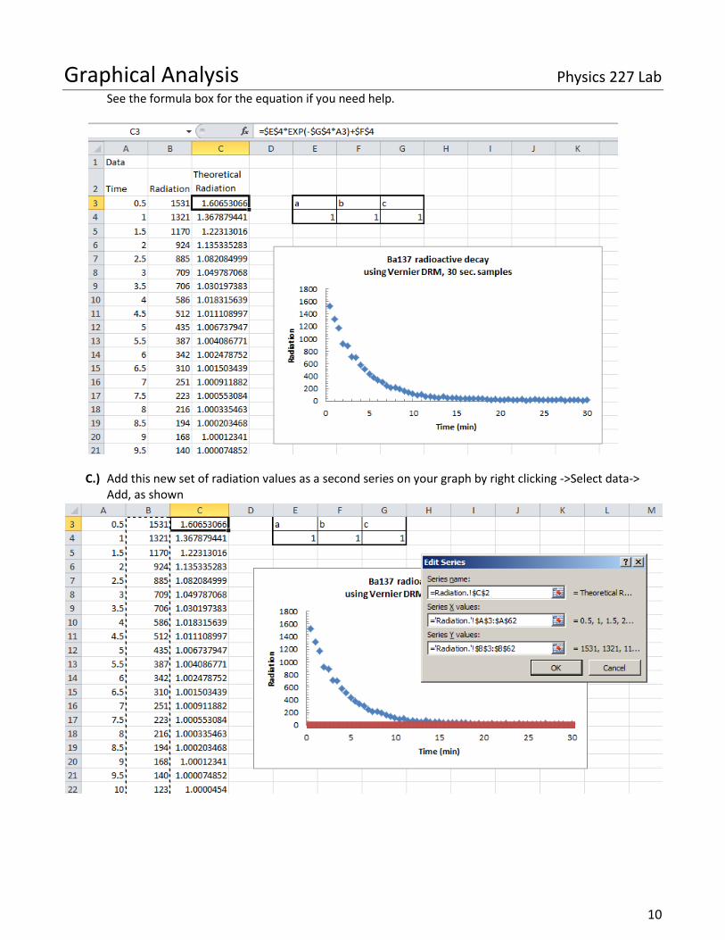
Exercise 3: Lab 12 - Barium-137 Analysis Here you are presented with Radiation (counts) and time (minutes), again be sure to insert the ever important units. The goal of this exercise is to learn the Solver function in excel and how to use it to generate your own trend line for a given data set. This will come in handy when we need to analyze data, but Excel's built in functions are not sufficient to give you a good t. At the end of this you should have one graph with your own trendline on it, -5 points if you have a built in excel trendline on this graph. (Because that means you missed the point) Using Excel solver to fit a curve This section will guide you to generating your own fit line, aka trend line, when excel just can’t quite do it.
A.) The first thing we need to do is make a chart so we can see the data set, start by making a properly formatted graph as shown below, use the data given to you in excel pt 2 sheet.
B.) Now we need a theoretical fit, as you might guess the theoretical equation for above is a negative
exponential, of the form 𝑦 = 𝑒−𝑥
Where y is the radiation, and x is time. We can generalize this by adding some constants, similar to a slope and y intercept for a line we can add the following
𝑦 = 𝑎𝑒−𝑐𝑥 + 𝑏 = 𝑇ℎ𝑒𝑜𝑟𝑒𝑡𝑖𝑐𝑎𝑙 𝑅𝑎𝑑𝑖𝑎𝑡𝑖𝑜𝑛 (1) We’ll add this is a new column to our data set, where a, b and c are fixed values, so hard reference them from separate cells as shown below
Graphical Analysis Physics 227 Lab
10
See the formula box for the equation if you need help.
C.) Add this new set of radiation values as a second series on your graph by right clicking ->Select data->
Add, as shown

Graphical Analysis Physics 227 Lab
11
D.) This is your soon to be fit line, notice though that its currently not very good, this is because I’ve assumed a, b and c are all equal to 1, which isn’t right. The next step is to find those values by using the excel solver
E.) Excel Solver is a minimization tool, it will minimize a single cell by changing some parameters, so first we
need to give it something to minimize. In this case what we need to minimize is the distance between our experimental y values , the B column, and our theoretical y values, the C column. To calculate this distance we’ll use the sum of squares, which can be done with the function
= 𝑆𝑈𝑀𝑋𝑀𝑌2(𝑇ℎ𝑒𝑜𝑟𝑒𝑡𝑖𝑐𝑎𝑙 𝐶𝑂𝐿𝑈𝑀𝑁, 𝐸𝑥𝑝𝑒𝑟𝑖𝑚𝑒𝑛𝑡𝑎𝑙 𝐶𝑂𝐿𝑈𝑀𝑁) Type this into a cell in excel as shown, reference the formula bar.
F.) This value is currently the sum of all the differences squared, so its huge, but now we can minimize it by
running the solver which will change a, b and c. This will bring the red line as close to the blue line as possible. The solver is in the data tab on the far right, ask your instructor to help you find it. Reference the following page to run it.

Graphical Analysis Physics 227 Lab
12
Before and after shown below

Graphical Analysis Physics 227 Lab
13
G.) And there we go, now we have our a, b and c to get a trendline and add it to the graph so there are two final steps.
H.) First remember that the red points are THEORETICAL, we have an equation to get every single point, so this should be shown as a line, to change this right click the red dots, and go to “change series chart type” then select the smooth line in the scatter plot section, as shown here.
I.) Finally since we have our theoretical equation lets add it to the graph using a text box, you might need to go back and look at equation (1) on the first page.
J.) Now you’re finished, you should have a final graph with an equation and trendline as shown below. Congratulations you no longer need to depend on excel to find a theoretical fit!
What you need to turn in This is your first report, next week everything will be printed, cut, and pasted into a blue book but for this week your group will just print and turn in the word document you’ve been making. Write an intro and conclusion to the lab, be sure all questions are answered in order and appear in the appropriate sections, and be sure that all graphs are properly formatted so that I can tell what each one is from the titles. (Make sure the ones from the same section like p2 exs 1 are uniquely labelled.