ggrandomforests: exploring random forest survival · ggrandomforests: exploring random forest...
TRANSCRIPT
ggRandomForests: Exploring Random Forest Survival
John EhrlingerMicrosoft
Abstract
Random forest (Breiman 2001a) (RF) is a non-parametric statistical method requiringno distributional assumptions on covariate relation to the response. RF is a robust, nonlin-ear technique that optimizes predictive accuracy by fitting an ensemble of trees to stabilizemodel estimates. Random survival forests (RSF) (Ishwaran and Kogalur 2007; Ishwaran,Kogalur, Blackstone, and Lauer 2008) are an extension of Breimans RF techniques al-lowing efficient non-parametric analysis of time to event data. The randomForestSRCpackage (Ishwaran and Kogalur 2014) is a unified treatment of Breimans random forestfor survival, regression and classification problems.
Predictive accuracy makes RF an attractive alternative to parametric models, thoughcomplexity and interpretability of the forest hinder wider application of the method.We introduce the ggRandomForests package, tools for visually understand random for-est models grown in R (R Core Team 2014) with the randomForestSRC package. TheggRandomForests package is structured to extract intermediate data objects from ran-domForestSRC objects and generate figures using the ggplot2 (Wickham 2009) graphicspackage.
This document is structured as a tutorial for building random forest for survival withthe randomForestSRC package and using the ggRandomForests package for investigatinghow the forest is constructed. We analyse the Primary Biliary Cirrhosis of the liver datafrom a clinical trial at the Mayo Clinic (Fleming and Harrington 1991). We demonstraterandom forest variable selection using Variable Importance (VIMP) (Breiman 2001a) andMinimal Depth (Ishwaran, Kogalur, Gorodeski, Minn, and Lauer 2010), a property de-rived from the construction of each tree within the forest. We will also demonstrate theuse of variable dependence and partial dependence plots (Friedman 2000) to aid in theinterpretation of RSF results. We then examine variable interactions between covariatesusing conditional variable dependence plots. Our aim is to demonstrate the strength ofusing Random Forest methods for both prediction and information retrieval, specificallyin time to event data settings.
Keywords: random forest, survival, vimp, minimal depth, R, randomForestSRC, ggRandom-Forests, randomForest.
1. Introduction
Random forest (Breiman 2001a) (RF) is a non-parametric statistical method which requiresno distributional assumptions on covariate relation to the response. RF is a robust, non-linear technique that optimizes predictive accuracy by fitting an ensemble of trees to sta-bilize model estimates. Random Survival Forest (RSF) (Ishwaran and Kogalur 2007; Ish-waran et al. 2008) is an extension of Breiman’s RF techniques to survival settings, allow-
arX
iv:1
612.
0897
4v1
[st
at.C
O]
28
Dec
201
6

2 ggRandomForests
ing efficient non-parametric analysis of time to event data. The randomForestSRC package(http://CRAN.R-project.org/package=randomForestSRC) (Ishwaran and Kogalur 2014) isa unified treatment of Breiman’s random forest for survival, regression and classification prob-lems.
Predictive accuracy make RF an attractive alternative to parametric models, though complex-ity and interpretability of the forest hinder wider application of the method. We introducethe ggRandomForests package (http://CRAN.R-project.org/package=ggRandomForests)for visually exploring random forest models. The ggRandomForests package is structured toextract intermediate data objects from randomForestSRC objects and generate figures usingthe ggplot2 graphics package (http://CRAN.R-project.org/package=ggplot2) (Wickham2009).
Many of the figures created by the ggRandomForests package are also available directly fromwithin the randomForestSRC package. However ggRandomForests offers the following ad-vantages:
• Separation of data and figures: ggRandomForests contains functions that operate on ei-ther the rfsrc forest object directly, or on the output from randomForestSRC post pro-cessing functions (i.e., plot.variable, var.select) to generate intermediate ggRandom-Forests data objects. ggRandomForests functions are provide to further process theseobjects and plot results using the ggplot2 graphics package. Alternatively, users can usethese data objects for their own custom plotting or analysis operations.
• Each data object/figure is a single, self contained unit. This allows simple modifica-tion and manipulation of the data or ggplot objects to meet users specific needs andrequirements.
• We chose to use the ggplot2 package for our figures for flexibility in modifying theoutput. Each ggRandomForests plot function returns either a single ggplot object, ora list of ggplot objects, allowing the use of additional ggplot2 functions to modifyand customize the final figures.
This document is structured as a tutorial for using the randomForestSRC package for buildingand post-processing random survival forest models and using the ggRandomForests packagefor understanding how the forest is constructed. In this tutorial, we will build a randomsurvival forest for the primary biliary cirrhosis (PBC) of the liver data set (Fleming andHarrington 1991), available in the randomForestSRC package.
In section 2 we introduce the pbc data set and summarize the proportional hazards analysisof this data from Chapter 4 of (Fleming and Harrington 1991). In section 3, we describehow to grow a random survival forest with the randomForestSRC package. Random forest isnot a parsimonious method, but uses all variables available in the data set to construct theresponse predictor. We demonstrate random forest variable selection techniques (section 4)using Variable Importance (VIMP) (Breiman 2001a) in subsection 4.1 and Minimal Depth(Ishwaran et al. 2010) in subsection 4.2. We then compare both methods with variables usedin the (Fleming and Harrington 1991) model.
Once we have an idea of which variables we are most interested in, we use dependence plots(Friedman 2000) (section 5) to understand how these variables are related to the response.
John Ehrlinger 3
Variable dependence (subsection 5.1) plots give us an idea of the overall trend of a vari-able/response relation, while partial dependence plots (subsection 5.2) show us the risk ad-justed relation by averaging out the effects of other variables. Dependence plots often showstrongly non-linear variable/response relations that are not easily obtained through paramet-ric modeling.
We then graphically examine forest variable interactions with the use of variable and partialdependence conditioning plots (coplots) (Chambers 1992; Cleveland 1993) (section 7) andthe analogouse partial dependence surfaces (section 8) before adding concluding remarks insection 9.
2. Data summary: primary biliary cirrhosis (PBC) data set
The primary biliary cirrhosis of the liver (PBC) study consists of 424 PBC patients referredto Mayo Clinic between 1974 and 1984 who met eligibility criteria for a randomized placebocontrolled trial of the drug D-penicillamine (DPCA). The data is described in (Fleming andHarrington 1991, Chapter 0.2) and a partial likelihood model (Cox proportional hazards)is developed in Chapter 4.4. The pbc data set, included in the randomForestSRC package,contains 418 observations, of which 312 patients participated in the randomized trial (Flemingand Harrington 1991, Appendix D).
R> data("pbc", package = "randomForestSRC")
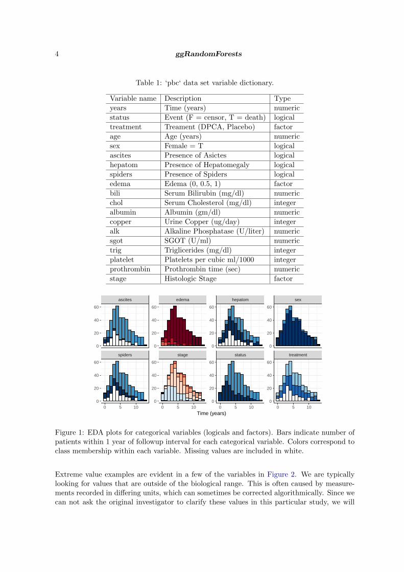
For this analysis, we modify some of the data for better formatting of our results. Since thedata contains about 12 years of follow up, we prefer using years instead of days to describesurvival. We also convert the age variable to years, and the treatment variable to a factorcontaining levels of c("DPCA", "placebo"). The variable names, type and description aregiven in Table 1.
2.1. Exploratory data analysis
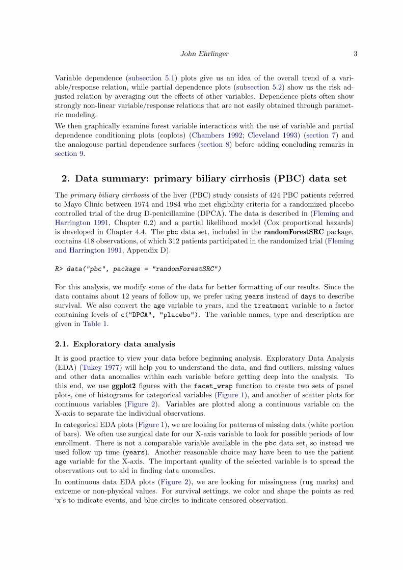
It is good practice to view your data before beginning analysis. Exploratory Data Analysis(EDA) (Tukey 1977) will help you to understand the data, and find outliers, missing valuesand other data anomalies within each variable before getting deep into the analysis. Tothis end, we use ggplot2 figures with the facet_wrap function to create two sets of panelplots, one of histograms for categorical variables (Figure 1), and another of scatter plots forcontinuous variables (Figure 2). Variables are plotted along a continuous variable on theX-axis to separate the individual observations.
In categorical EDA plots (Figure 1), we are looking for patterns of missing data (white portionof bars). We often use surgical date for our X-axis variable to look for possible periods of lowenrollment. There is not a comparable variable available in the pbc data set, so instead weused follow up time (years). Another reasonable choice may have been to use the patientage variable for the X-axis. The important quality of the selected variable is to spread theobservations out to aid in finding data anomalies.
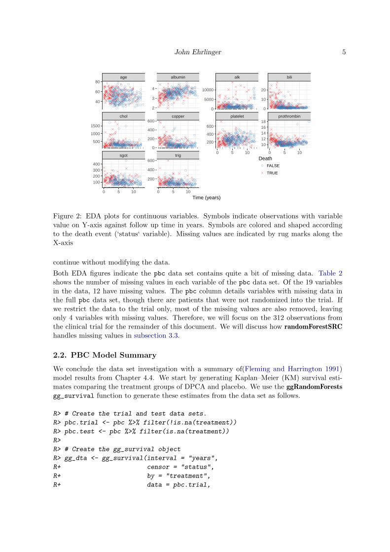
In continuous data EDA plots (Figure 2), we are looking for missingness (rug marks) andextreme or non-physical values. For survival settings, we color and shape the points as red‘x’s to indicate events, and blue circles to indicate censored observation.
4 ggRandomForests
Table 1: ‘pbc‘ data set variable dictionary.
Variable name Description Type
years Time (years) numeric
status Event (F = censor, T = death) logical
treatment Treament (DPCA, Placebo) factor
age Age (years) numeric
sex Female = T logical
ascites Presence of Asictes logical
hepatom Presence of Hepatomegaly logical
spiders Presence of Spiders logical
edema Edema (0, 0.5, 1) factor
bili Serum Bilirubin (mg/dl) numeric
chol Serum Cholesterol (mg/dl) integer
albumin Albumin (gm/dl) numeric
copper Urine Copper (ug/day) integer
alk Alkaline Phosphatase (U/liter) numeric
sgot SGOT (U/ml) numeric
trig Triglicerides (mg/dl) integer
platelet Platelets per cubic ml/1000 integer
prothrombin Prothrombin time (sec) numeric
stage Histologic Stage factor
spiders stage status treatment
ascites edema hepatom sex
0 5 10 0 5 10 0 5 10 0 5 10
0
20
40
60
0
20
40
60
0
20
40
60
0
20
40
60
0
20
40
60
0
20
40
60
0
20
40
60
0
20
40
60
Time (years)
Figure 1: EDA plots for categorical variables (logicals and factors). Bars indicate number ofpatients within 1 year of followup interval for each categorical variable. Colors correspond toclass membership within each variable. Missing values are included in white.
Extreme value examples are evident in a few of the variables in Figure 2. We are typicallylooking for values that are outside of the biological range. This is often caused by measure-ments recorded in differing units, which can sometimes be corrected algorithmically. Since wecan not ask the original investigator to clarify these values in this particular study, we will
John Ehrlinger 5
sgot trig
chol copper platelet prothrombin
age albumin alk bili
0 5 10 0 5 10
0 5 10 0 5 10
0
10
20
1012141618
0
5000
10000
200
400
600
2
3
4
0
200
400
600
200
400
600
40
60
80
500
1000
1500
100
200
300
400
Time (years)
DeathFALSE
TRUE
Figure 2: EDA plots for continuous variables. Symbols indicate observations with variablevalue on Y-axis against follow up time in years. Symbols are colored and shaped accordingto the death event (‘status‘ variable). Missing values are indicated by rug marks along theX-axis
continue without modifying the data.
Both EDA figures indicate the pbc data set contains quite a bit of missing data. Table 2shows the number of missing values in each variable of the pbc data set. Of the 19 variablesin the data, 12 have missing values. The pbc column details variables with missing data inthe full pbc data set, though there are patients that were not randomized into the trial. Ifwe restrict the data to the trial only, most of the missing values are also removed, leavingonly 4 variables with missing values. Therefore, we will focus on the 312 observations fromthe clinical trial for the remainder of this document. We will discuss how randomForestSRChandles missing values in subsection 3.3.
2.2. PBC Model Summary
We conclude the data set investigation with a summary of(Fleming and Harrington 1991)model results from Chapter 4.4. We start by generating Kaplan–Meier (KM) survival esti-mates comparing the treatment groups of DPCA and placebo. We use the ggRandomForestsgg_survival function to generate these estimates from the data set as follows.
R> # Create the trial and test data sets.
R> pbc.trial <- pbc %>% filter(!is.na(treatment))
R> pbc.test <- pbc %>% filter(is.na(treatment))
R>
R> # Create the gg_survival object
R> gg_dta <- gg_survival(interval = "years",
R+ censor = "status",
R+ by = "treatment",
R+ data = pbc.trial,
6 ggRandomForests
Table 2: Missing value counts in ‘pbc‘ data set and pbc clinical trial observations (‘pbc.trial‘).
pbc pbc.trial
treatment 106 0ascites 106 0hepatom 106 0spiders 106 0chol 134 28
copper 108 2alk 106 0sgot 106 0trig 136 30platelet 11 4
prothrombin 2 0stage 6 0
R+ conf.int = 0.95)
The code block reduces the pbc data set to the pbc.trial which only include observationsfrom the clinical trial. The remaining observations are stored in the pbc.test data set forlater use. The ggRandomForests package is designed to use a two step process in figuregeneration. The first step is data generation, where we store a gg_survival data object inthe gg_dta object. The gg_survival function uses the data set, follow up interval, censorindicator and an optional grouping argument (by). By default gg_survival also calculates95% confidence band, which we can control with the conf.int argument.
In the figure generation step, we use the ggRandomForests plot routine plot.gg_survival
as shown in the following code block. The plot.gg_survival function uses the gg_dta
data object to plot the survival estimate curves for each group and corresponding confi-dence interval ribbons. We have used additional ggplot2 commands to modify the axis andlegend labels (labs), the legend location (theme) and control the plot range of the y-axis(coord_cartesian) for this figure.
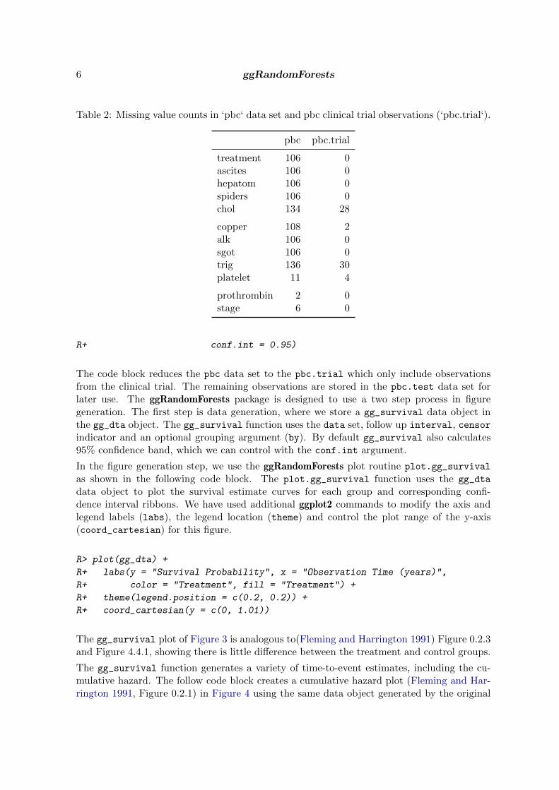
R> plot(gg_dta) +
R+ labs(y = "Survival Probability", x = "Observation Time (years)",
R+ color = "Treatment", fill = "Treatment") +
R+ theme(legend.position = c(0.2, 0.2)) +
R+ coord_cartesian(y = c(0, 1.01))
The gg_survival plot of Figure 3 is analogous to(Fleming and Harrington 1991) Figure 0.2.3and Figure 4.4.1, showing there is little difference between the treatment and control groups.
The gg_survival function generates a variety of time-to-event estimates, including the cu-mulative hazard. The follow code block creates a cumulative hazard plot (Fleming and Har-rington 1991, Figure 0.2.1) in Figure 4 using the same data object generated by the original
John Ehrlinger 7
0.00
0.25
0.50
0.75
1.00
0 3 6 9 12
Observation Time (years)
Sur
viva
l Pro
babi
lity
TreatmentDPCA
placebo
Figure 3: Kaplan–Meier survival estimates comparing the DPCA treatment (red) with placebo(blue) groups for the pbc.trail data set. Median survival with shaded 95% confidence band.
gg_survival function call. The red DPCA line is directly comparable to Figure 0.2.1, we’veadd the cumulative hazard estimates for the placebo population in blue.
R> plot(gg_dta, type = "cum_haz") +
R+ labs(y = "Cumulative Hazard", x = "Observation Time (years)",
R+ color = "Treatment", fill = "Treatment") +
R+ theme(legend.position = c(0.2, 0.8)) +
R+ coord_cartesian(ylim = c(-0.02, 1.22))
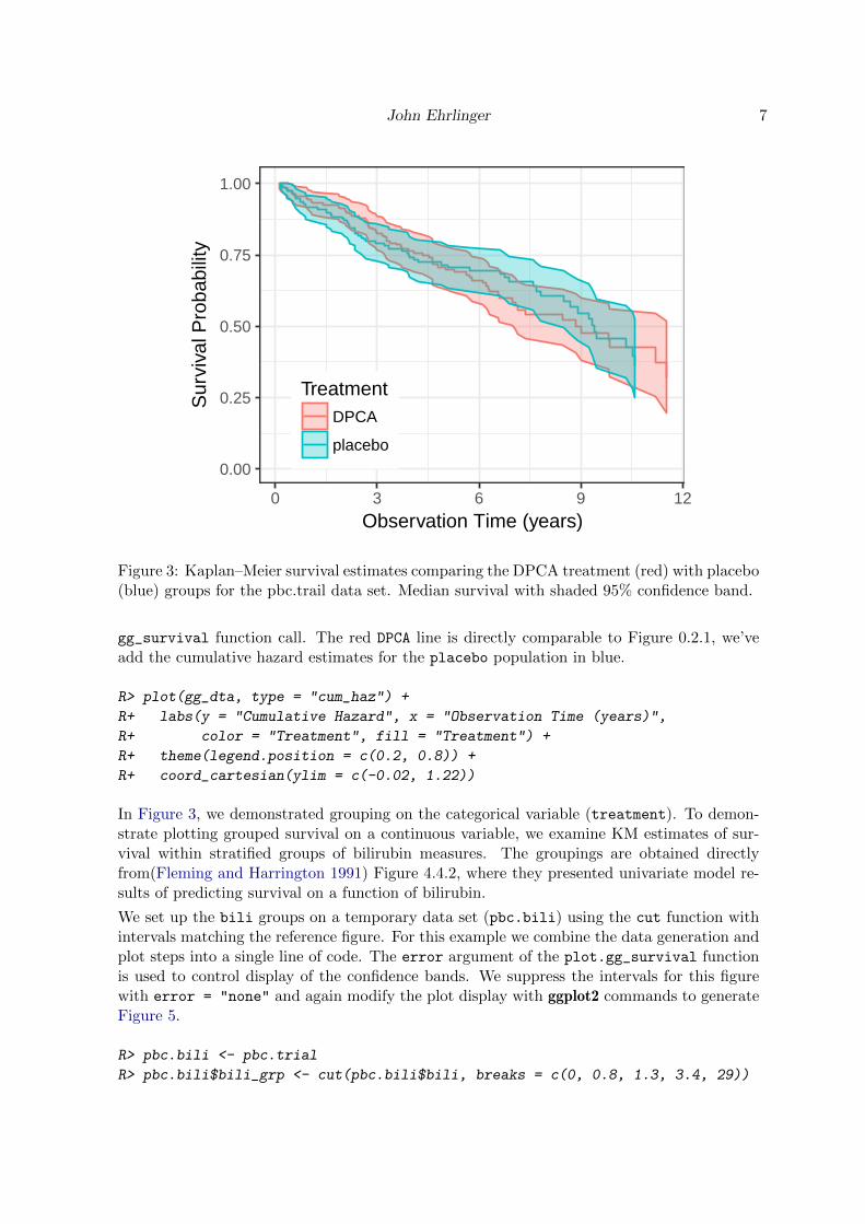
In Figure 3, we demonstrated grouping on the categorical variable (treatment). To demon-strate plotting grouped survival on a continuous variable, we examine KM estimates of sur-vival within stratified groups of bilirubin measures. The groupings are obtained directlyfrom(Fleming and Harrington 1991) Figure 4.4.2, where they presented univariate model re-sults of predicting survival on a function of bilirubin.
We set up the bili groups on a temporary data set (pbc.bili) using the cut function withintervals matching the reference figure. For this example we combine the data generation andplot steps into a single line of code. The error argument of the plot.gg_survival functionis used to control display of the confidence bands. We suppress the intervals for this figurewith error = "none" and again modify the plot display with ggplot2 commands to generateFigure 5.
R> pbc.bili <- pbc.trial
R> pbc.bili$bili_grp <- cut(pbc.bili$bili, breaks = c(0, 0.8, 1.3, 3.4, 29))

8 ggRandomForests
0.0
0.4
0.8
1.2
0 3 6 9 12
Observation Time (years)
Cum
ulat
ive
Haz
ard
TreatmentDPCA
placebo
Figure 4: Kaplan–Meier cumulative hazard estimates comparing the DPCA treatment (red)with placebo (blue) groups for the pbc data set.
R>
R> plot(gg_survival(interval = "years", censor = "status", by = "bili_grp",
R+ data = pbc.bili), error = "none") +
R+ labs(y = "Survival Probability", x = "Observation Time (years)",
R+ color = "Bilirubin")
In Chapter 4,(Fleming and Harrington 1991) use partial likelihood methods to build a linearmodel with log transformations on some variables. We summarize the final, biologicallyreasonable model in Table 3 for later comparison with our random forest results.
3. Random survival forest
Table 3: ‘pbc‘ proportional hazards model summary of 312 randomized cases in ‘pbc.trial‘data set. (Table 4.4.3c [@fleming:1991])
Coef. Std. Err. Z stat.
Age 0.033 0.009 3.84
log(Albumin) -3.055 0.724 -4.22
log(Bilirubin) 0.879 0.099 8.90
Edema 0.785 0.299 2.62
log(Prothrombin Time) 3.016 1.024 2.95

John Ehrlinger 9
0.00
0.25
0.50
0.75
1.00
0 3 6 9 12
Observation Time (years)
Sur
viva
l Pro
babi
lity
Bilirubin(0,0.8]
(0.8,1.3]
(1.3,3.4]
(3.4,29]
Figure 5: Kaplan–Meier survival estimates comparing different groups of Bilirubin measures(bili) for the pbc data set. Groups defined in Chapter 4 of [@fleming:1991].
A Random Forest (Breiman 2001a) is grown by bagging (Breiman 1996a) a collection of clas-sification and regression trees (CART) (Breiman, Friedman, Olshen, and Stone 1984). Themethod uses a set of B bootstrap (Efron and Tibshirani 1994) samples, growing an indepen-dent tree model on each sub-sample of the population. Each tree is grown by recursivelypartitioning the population based on optimization of a split rule over the p-dimensional co-variate space. At each split, a subset of m ≤ p candidate variables are tested for the split ruleoptimization, dividing each node into two daughter nodes. Each daughter node is then splitagain until the process reaches the stopping criteria of either node purity or node membersize, which defines the set of terminal (unsplit) nodes for the tree. In regression trees, nodeimpurity is measured by mean squared error, whereas in classification problems, the Giniindex is used (Friedman 2000).
Random forest sorts each training set observation into one unique terminal node per tree. Treeestimates for each observation are constructed at each terminal node, among the terminal nodemembers. The Random Forest estimate for each observation is then calculated by aggregating,averaging (regression) or votes (classification), the terminal node results across the collectionof B trees.
Random Survival Forest (Ishwaran 2007; Ishwaran et al. 2008) (RSF) are an extension ofRandom Forest to analyze right censored, time to event data. A forest of survival treesis grown using a log-rank splitting rule to select the optimal candidate variables. Survivalestimate for each observation are constructed with a Kaplan–Meier (KM) estimator withineach terminal node, at each event time.
Random Survival Forests adaptively discover nonlinear effects and interactions and are fullynonparametric. Averaging over many trees enables RSF to approximate complex survivalfunctions, including non-proportional hazards, while maintaining low prediction error. (Ish-waran and Kogalur 2010) showed that RSF is uniformly consistent and that survival forestshave a uniform approximating property in finite-sample settings, a property not possessed byindividual survival trees.
10 ggRandomForests
The randomForestSRC rfsrc function call grows the forest, determining the type of forestby the response supplied in the formula argument. In the following code block, we grow arandom forest for survival, by passing a survival (Surv) object to the forest. The forest usesall remaining variables in the pbc.trial data set to generate the RSF survival model.
R> rfsrc_pbc <- rfsrc(Surv(years, status) ~ ., data = pbc.trial,
R+ nsplit = 10, na.action = "na.impute",
R+ tree.err = TRUE,importance = TRUE)
The print.rfsrc function returns information on how the random forest was grown. Here thefamily = "surv" forest has ntree = 1000 trees (the default ntree argument). The forestselected from ceil(
√p = 17) = 5 randomly selected candidate variables for splitting at each
node, stopping when a terminal node contained three or fewer observations. For continuousvariables, we used a random logrank split rule, which randomly selects from nsplit = 10
split point values, instead of optimizing over all possible values.
3.1. Generalization error
One advantage of random forest is a built in generalization error estimate. Each bootstrapsample selects approximately 63.2% of the population on average. The remaining 36.8% ofobservations, the Out-of-Bag (Breiman 1996b) (OOB) sample, can be used as a hold out testset for each tree. An OOB prediction error estimate can be calculated for each observationby predicting the response over the set of trees which were not trained with that particularobservation. Out-of-Bag prediction error estimates have been shown to be nearly identicalto n–fold cross validation estimates (Hastie, Tibshirani, and Friedman 2009). This feature ofrandom forest allows us to obtain both model fit and validation in one pass of the algorithm.
The gg_error function operates on the random forest (rfsrc_pbc) object to extract the errorestimates as a function of the number of trees in the forest. The following code block firstcreates a gg_error data object, then uses the plot.gg_error function to create a ggplot
object for display in a single line of code.
R> plot(gg_error(rfsrc_pbc))
The gg_error plot of Figure 6 demonstrates that it does not take a large number of treesto stabilize the forest prediction error estimate. However, to ensure that each variable hasenough of a chance to be included in the forest prediction process, we do want to create arather large random forest of trees.
3.2. Training Set Prediction
The gg_rfsrc function extracts the OOB prediction estimates from the random forest. Thiscode block executes the data extraction and plotting in one line, since we are not interested inholding the prediction estimates for later reuse. Each of the ggRandomForests plot commandsreturn ggplot objects, which we can also store for modification or reuse later in the analysis(ggRFsrc object). Note that we again use additional ggplot2 commands to modify the displayof the plot object.

John Ehrlinger 11
0.20
0.25
0.30
0 250 500 750 1000
Number of Trees
OO
B E
rror
Rat
e
Figure 6: Random forest OOB prediction error estimates as a function of the number of treesin the forest.
R> ggRFsrc <- plot(gg_rfsrc(rfsrc_pbc), alpha = 0.2) +
R+ scale_color_manual(values = strCol) +
R+ theme(legend.position = "none") +
R+ labs(y = "Survival Probability", x = "Time (years)") +
R+ coord_cartesian(ylim = c(-0.01, 1.01))
R> show(ggRFsrc)
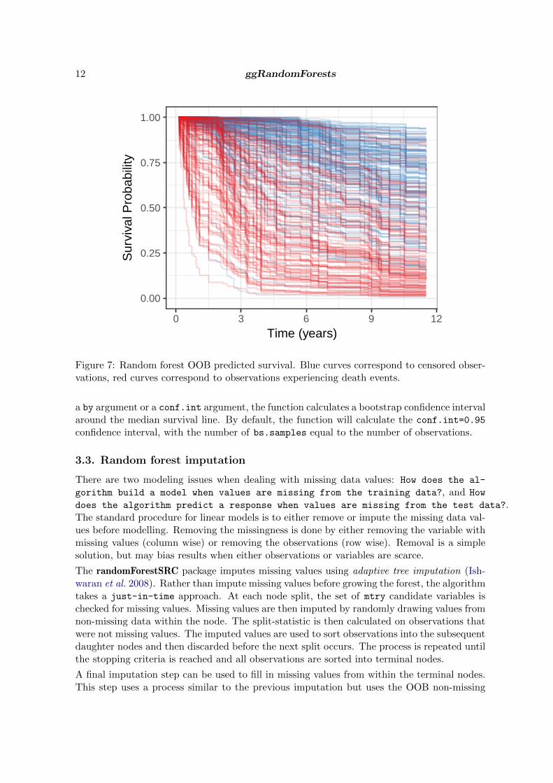
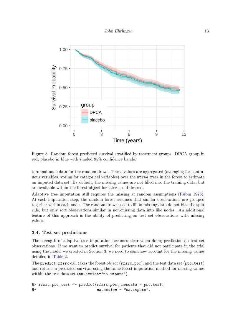
The gg_rfsrc plot of Figure 7 shows the predicted survival from our RSF model. Eachline represents a single patient in the training data set, where censored patients are coloredblue, and patients who have experienced the event (death) are colored in red. We extend allpredicted survival curves to the longest follow up time (12 years), regardless of the actuallength of a patient’s follow up time.
Interpretation of general survival properties from Figure 7 is difficult because of the number ofcurves displayed. To get more interpretable results, it is preferable to plot a summary of thesurvival results. The following code block compares the predicted survival between treatmentgroups, as we did in Figure 3.
R> plot(gg_rfsrc(rfsrc_pbc, by = "treatment")) +
R+ theme(legend.position = c(0.2, 0.2)) +
R+ labs(y = "Survival Probability", x = "Time (years)") +
R+ coord_cartesian(ylim = c(-0.01, 1.01))
The gg_rfsrc plot of Figure 8 shows the median survival with a 95% shaded confidence bandfor the DPCA group in red, and the placebo group in blue. When calling gg_rfsrc with either
12 ggRandomForests
0.00
0.25
0.50
0.75
1.00
0 3 6 9 12
Time (years)
Sur
viva
l Pro
babi
lity
Figure 7: Random forest OOB predicted survival. Blue curves correspond to censored obser-vations, red curves correspond to observations experiencing death events.
a by argument or a conf.int argument, the function calculates a bootstrap confidence intervalaround the median survival line. By default, the function will calculate the conf.int=0.95
confidence interval, with the number of bs.samples equal to the number of observations.
3.3. Random forest imputation
There are two modeling issues when dealing with missing data values: How does the al-
gorithm build a model when values are missing from the training data?, and How
does the algorithm predict a response when values are missing from the test data?.The standard procedure for linear models is to either remove or impute the missing data val-ues before modelling. Removing the missingness is done by either removing the variable withmissing values (column wise) or removing the observations (row wise). Removal is a simplesolution, but may bias results when either observations or variables are scarce.
The randomForestSRC package imputes missing values using adaptive tree imputation (Ish-waran et al. 2008). Rather than impute missing values before growing the forest, the algorithmtakes a just-in-time approach. At each node split, the set of mtry candidate variables ischecked for missing values. Missing values are then imputed by randomly drawing values fromnon-missing data within the node. The split-statistic is then calculated on observations thatwere not missing values. The imputed values are used to sort observations into the subsequentdaughter nodes and then discarded before the next split occurs. The process is repeated untilthe stopping criteria is reached and all observations are sorted into terminal nodes.
A final imputation step can be used to fill in missing values from within the terminal nodes.This step uses a process similar to the previous imputation but uses the OOB non-missing
John Ehrlinger 13
0.00
0.25
0.50
0.75
1.00
0 3 6 9 12
Time (years)
Sur
viva
l Pro
babi
lity
groupDPCA
placebo
Figure 8: Random forest predicted survival stratified by treatment groups. DPCA group inred, placebo in blue with shaded 95% confidence bands.
terminal node data for the random draws. These values are aggregated (averaging for contin-uous variables, voting for categorical variables) over the ntree trees in the forest to estimatean imputed data set. By default, the missing values are not filled into the training data, butare available within the forest object for later use if desired.
Adaptive tree imputation still requires the missing at random assumptions (Rubin 1976).At each imputation step, the random forest assumes that similar observations are groupedtogether within each node. The random draws used to fill in missing data do not bias the splitrule, but only sort observations similar in non-missing data into like nodes. An additionalfeature of this approach is the ability of predicting on test set observations with missingvalues.
3.4. Test set predictions
The strength of adaptive tree imputation becomes clear when doing prediction on test setobservations. If we want to predict survival for patients that did not participate in the trialusing the model we created in Section 3, we need to somehow account for the missing valuesdetailed in Table 2.
The predict.rfsrc call takes the forest object (rfsrc_pbc), and the test data set (pbc_test)and returns a predicted survival using the same forest imputation method for missing valueswithin the test data set (na.action="na.impute").
R> rfsrc_pbc_test <- predict(rfsrc_pbc, newdata = pbc.test,
R+ na.action = "na.impute",

14 ggRandomForests
R+ importance = TRUE)
The forest summary indicates there are 106 test set observations with 36 deaths and thepredicted error rate is 19.1%. We plot the predicted survival just as we did the training setestimates.
R> plot(gg_rfsrc(rfsrc_pbc_test), alpha=.2) +
R+ scale_color_manual(values = strCol) +
R+ theme(legend.position = "none") +
R+ labs(y = "Survival Probability", x = "Time (years)") +
R+ coord_cartesian(ylim = c(-0.01, 1.01))
0.00
0.25
0.50
0.75
1.00
0 3 6 9 12
Time (years)
Sur
viva
l Pro
babi
lity
Figure 9: Random forest survival estimates for patients in the pbc.test data set. Blue curvescorrespond to censored patients, red curves correspond to patients experiencing a death event.
The gg_rfsrc plot of Figure 9 shows the test set predictions, similar to the training setpredictions in Figure 7, though with fewer patients the survival curves do not cover thesame area of the figure. It is important to note that because Figure 7 is constructed withOOB estimates, the survival results are comparable as estimates from unseen observations inFigure 9.
4. Variable selection
Random forest is not a parsimonious method, but uses all variables available in the data setto construct the response predictor. Also, unlike parametric models, random forest does not
John Ehrlinger 15
require the explicit specification of the functional form of covariates to the response. Thereforethere is no explicit p-value/significance test for variable selection with a random forest model.Instead, RF ascertains which variables contribute to the prediction through the split ruleoptimization, optimally choosing variables which separate observations.
The typical goal of a random forest analysis is to build a prediction model, in contrast to ex-tracting information regarding the underlying process (Breiman 2001b). There is not usuallymuch care given in how variables are included into the training data set. Since the goal isprediction, investigators often include the “kitchen sink” if it can help.
In contrast, in survival settings we are typically also interested in how we can possibly improvethe the outcome of interest. To achieve this, for understandable inference, it is important toavoid both duplication and transformations of variables whenever possible when building ourdata sets. Duplication of variables, including multiple measures of a similar covariate, canreduce or mask the importance of the covariate. Transformations can also mask importanceas well as make interpretation of the inference results difficult to impossible.
In this Section, We explore two separate approaches to investigate the RF variable selectionprocess. Variable Importance (subsection 4.1), a property related to variable misspecification,and Minimal Depth (subsection 4.2), a property derived from the construction of the treeswithin the forest.
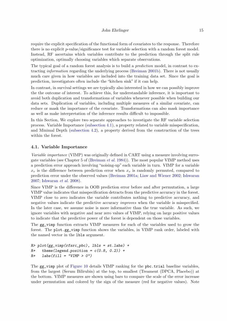
4.1. Variable Importance
Variable importance (VIMP) was originally defined in CART using a measure involving surro-gate variables (see Chapter 5 of (Breiman et al. 1984)). The most popular VIMP method usesa prediction error approach involving “noising-up” each variable in turn. VIMP for a variablexv is the difference between prediction error when xv is randomly permuted, compared toprediction error under the observed values (Breiman 2001a; Liaw and Wiener 2002; Ishwaran2007; Ishwaran et al. 2008).
Since VIMP is the difference in OOB prediction error before and after permutation, a largeVIMP value indicates that misspecification detracts from the predictive accuracy in the forest.VIMP close to zero indicates the variable contributes nothing to predictive accuracy, andnegative values indicate the predictive accuracy improves when the variable is misspecified.In the later case, we assume noise is more informative than the true variable. As such, weignore variables with negative and near zero values of VIMP, relying on large positive valuesto indicate that the predictive power of the forest is dependent on those variables.
The gg_vimp function extracts VIMP measures for each of the variables used to grow theforest. The plot.gg_vimp function shows the variables, in VIMP rank order, labeled withthe named vector in the lbls argument.
R> plot(gg_vimp(rfsrc_pbc), lbls = st.labs) +
R+ theme(legend.position = c(0.8, 0.2)) +
R+ labs(fill = "VIMP > 0")
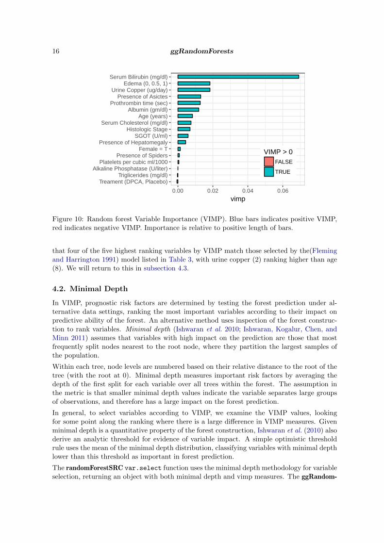
The gg_vimp plot of Figure 10 details VIMP ranking for the pbc.trial baseline variables,from the largest (Serum Bilirubin) at the top, to smallest (Treament (DPCA, Placebo)) atthe bottom. VIMP measures are shown using bars to compare the scale of the error increaseunder permutation and colored by the sign of the measure (red for negative values). Note
16 ggRandomForests
Treament (DPCA, Placebo)Triglicerides (mg/dl)
Alkaline Phosphatase (U/liter)Platelets per cubic ml/1000
Presence of SpidersFemale = T
Presence of HepatomegalySGOT (U/ml)
Histologic StageSerum Cholesterol (mg/dl)
Age (years)Albumin (gm/dl)
Prothrombin time (sec)Presence of Asictes
Urine Copper (ug/day)Edema (0, 0.5, 1)
Serum Bilirubin (mg/dl)
0.00 0.02 0.04 0.06
vimp
VIMP > 0FALSE
TRUE
Figure 10: Random forest Variable Importance (VIMP). Blue bars indicates positive VIMP,red indicates negative VIMP. Importance is relative to positive length of bars.
that four of the five highest ranking variables by VIMP match those selected by the(Flemingand Harrington 1991) model listed in Table 3, with urine copper (2) ranking higher than age(8). We will return to this in subsection 4.3.
4.2. Minimal Depth
In VIMP, prognostic risk factors are determined by testing the forest prediction under al-ternative data settings, ranking the most important variables according to their impact onpredictive ability of the forest. An alternative method uses inspection of the forest construc-tion to rank variables. Minimal depth (Ishwaran et al. 2010; Ishwaran, Kogalur, Chen, andMinn 2011) assumes that variables with high impact on the prediction are those that mostfrequently split nodes nearest to the root node, where they partition the largest samples ofthe population.
Within each tree, node levels are numbered based on their relative distance to the root of thetree (with the root at 0). Minimal depth measures important risk factors by averaging thedepth of the first split for each variable over all trees within the forest. The assumption inthe metric is that smaller minimal depth values indicate the variable separates large groupsof observations, and therefore has a large impact on the forest prediction.
In general, to select variables according to VIMP, we examine the VIMP values, lookingfor some point along the ranking where there is a large difference in VIMP measures. Givenminimal depth is a quantitative property of the forest construction, Ishwaran et al. (2010) alsoderive an analytic threshold for evidence of variable impact. A simple optimistic thresholdrule uses the mean of the minimal depth distribution, classifying variables with minimal depthlower than this threshold as important in forest prediction.
The randomForestSRC var.select function uses the minimal depth methodology for variableselection, returning an object with both minimal depth and vimp measures. The ggRandom-

John Ehrlinger 17
Forests gg_minimal_depth function is analogous to the gg_vimp function. Variables areranked from most important at the top (minimal depth measure), to least at the bottom(maximal minimal depth).
R> varsel_pbc <- var.select(rfsrc_pbc)
minimal depth variable selection ...
-----------------------------------------------------------
family : surv
var. selection : Minimal Depth
conservativeness : medium
x-weighting used? : TRUE
dimension : 17
sample size : 312
ntree : 1000
nsplit : 10
mtry : 5
nodesize : 3
refitted forest : FALSE
model size : 14
depth threshold : 6.7549
PE (true OOB) : 16.502
Top variables:
depth vimp
bili 1.708 0.067
albumin 2.483 0.012
copper 2.904 0.015
prothrombin 2.931 0.014
chol 3.227 0.006
platelet 3.329 0.000
edema 3.333 0.016
sgot 3.677 0.007
age 3.702 0.009
alk 4.039 0.001
trig 4.514 0.000
ascites 5.194 0.013
stage 5.247 0.007
hepatom 6.476 0.003
-----------------------------------------------------------
R> gg_md <- gg_minimal_depth(varsel_pbc, lbls = st.labs)
R> # print(gg_md)

18 ggRandomForests
The gg_minimal_depth summary mostly reproduces the output from the var.select func-tion from the randomForestSRC package. We report the minimal depth threshold (threshold6.755) and the number of variables with depth below that threshold (model size 14). We alsolist a table of the top (14) selected variables, in minimal depth rank order with the associatedVIMP measures. The minimal depth numbers indicate that bili tends to split between thefirst and second node level, and the next three variables (albumin, copper, prothrombin)split between the second and third levels on average.
R> plot(gg_md, lbls = st.labs)
●
●
●
●
●
●
●
●
●
●
●
●
●
●
●
●
●Female = TTreament (DPCA, Placebo)
Presence of SpidersPresence of Hepatomegaly
Presence of AsictesHistologic Stage
Triglicerides (mg/dl)Alkaline Phosphatase (U/liter)
SGOT (U/ml)Age (years)
Platelets per cubic ml/1000Serum Cholesterol (mg/dl)
Edema (0, 0.5, 1)Urine Copper (ug/day)Prothrombin time (sec)
Albumin (gm/dl)Serum Bilirubin (mg/dl)
2.5 5.0 7.5
Minimal Depth of a Variable
Figure 11: Minimal Depth variable selection. Low minimal depth indicates important vari-ables. The dashed line is the threshold of maximum value for variable selection.
The gg_minimal_depth plot of Figure 11 is similar to the gg_vimp plot in Figure 10, rankingvariables from most important at the top (minimal depth measure), to least at the bottom(maximal minimal depth). The vertical dashed line indicates the minimal depth thresholdwhere smaller minimal depth values indicate higher importance and larger values indicatelower importance.
4.3. Variable selection comparison
Since the VIMP and Minimal Depth measures use different criteria, we expect the variableranking to be somewhat different. We use gg_minimal_vimp function to compare rankingsbetween minimal depth and VIMP in Figure 12.
R> plot(gg_minimal_vimp(gg_md), lbls = st.labs) +
R+ theme(legend.position=c(0.8, 0.2))
The points along the red dashed line indicate where the measures are in agreement. Pointsabove the red dashed line are ranked higher by VIMP than by minimal depth, indicating the

John Ehrlinger 19
●
●
●
●
●
●
●
●
●
●
●
●
●
●
●
●
●
Serum Bilirubin (mg/dl)Albumin (gm/dl)
Prothrombin time (sec)Urine Copper (ug/day)
Edema (0, 0.5, 1)Serum Cholesterol (mg/dl)
Platelets per cubic ml/1000Age (years)
SGOT (U/ml)Alkaline Phosphatase (U/liter)
Triglicerides (mg/dl)Histologic Stage
Presence of AsictesPresence of Hepatomegaly
Presence of SpidersTreament (DPCA, Placebo)
Female = T
5 10 15
VIMP Rank
Min
imal
Dep
th (
Ran
k O
rder
)
VIMP●
●
−
+
Figure 12: Comparing Minimal Depth and Vimp rankings. Points on the red dashed lineare ranked equivalently, points above have higher VIMP ranking, those below have higherminimal depth ranking.
variables are more sensitive to misspecification. Those below the line have a higher minimaldepth ranking, indicating they are better at dividing large portions of the population. Thefurther the points are from the line, the more the discrepancy between measures.
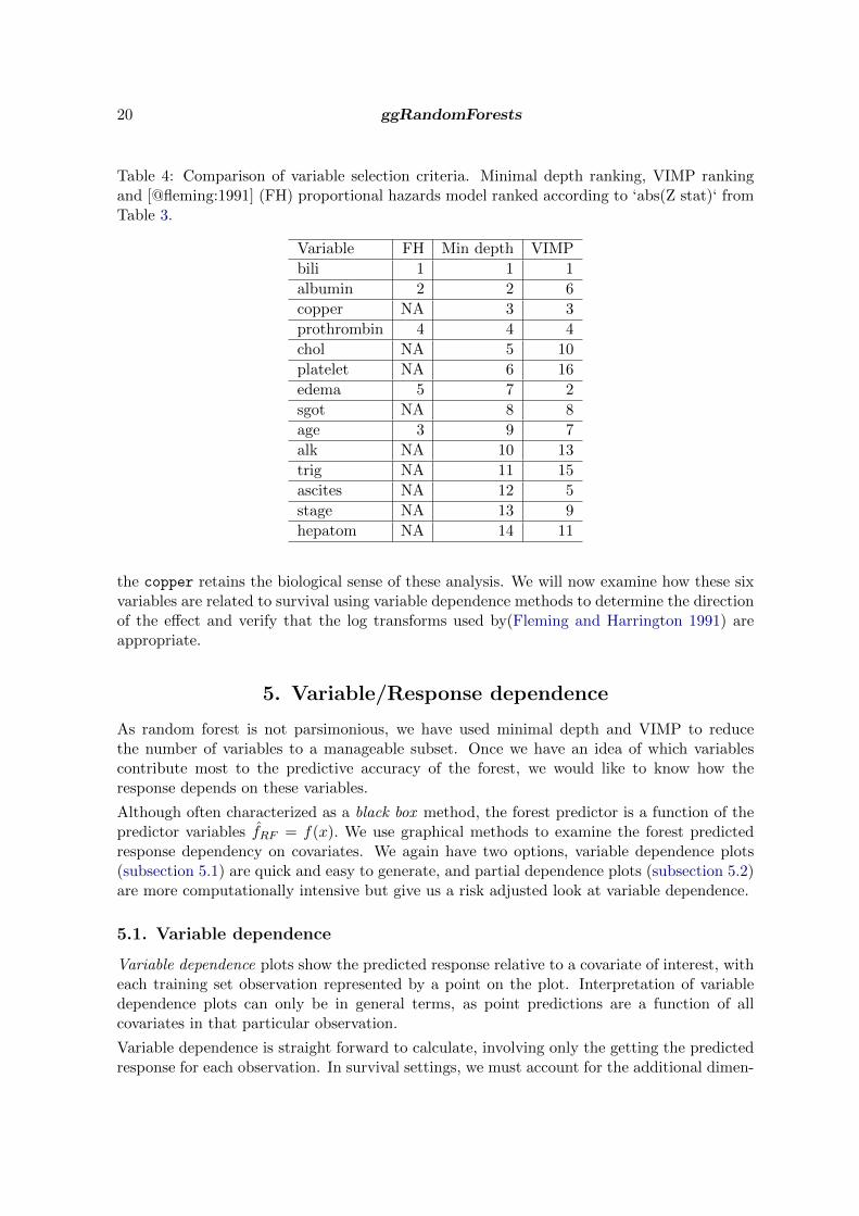
We examine the ranking of the different variable selection methods further in Table 4. Wecan use the Z statistic from Table 3 to rank variables selected in the(Fleming and Harrington1991) model to compare with variables selected by minimal depth and VIMP. The table isconstructed by taking the top ranked minimal depth variables (below the selection threshold)and matching the VIMP ranking and(Fleming and Harrington 1991) model transforms. Wesee all three methods indicate a strong relation of serum bilirubin to survival, and overall, theminimal depth and VIMP rankings agree reasonably well with the(Fleming and Harrington1991) model.
The minimal depth selection process reduced the number of variables of interest from˜17 to14, which is still a rather large subset of interest. An obvious selection set is to examinethe five variables selected by(Fleming and Harrington 1991). Combining the Minimal Depthand(Fleming and Harrington 1991) model, there may be evidence to keep the top 7 variables.Though minimal depth does not indicate the edema variable is very interesting, VIMP rankingdoes agree with the proportional hazards model, indicating we might not want to removethe edema variable. Both minimal depth and VIMP suggest including copper, a measureassociated with liver disease.
Regarding the chol variable, recall missing data summary of Table 2. In in the trial dataset, there were 28 observations missing chol values. The forest imputation randomly sortsobservations with missing values into daughter nodes when using the chol variable, which isalso how randomForestSRC calculates VIMP. We therefore expect low values for VIMP whena variable has a reasonable number of missing values.
Restricting our remaining analysis to the five(Fleming and Harrington 1991) variables, plus
20 ggRandomForests
Table 4: Comparison of variable selection criteria. Minimal depth ranking, VIMP rankingand [@fleming:1991] (FH) proportional hazards model ranked according to ‘abs(Z stat)‘ fromTable 3.
Variable FH Min depth VIMP
bili 1 1 1
albumin 2 2 6
copper NA 3 3
prothrombin 4 4 4
chol NA 5 10
platelet NA 6 16
edema 5 7 2
sgot NA 8 8
age 3 9 7
alk NA 10 13
trig NA 11 15
ascites NA 12 5
stage NA 13 9
hepatom NA 14 11
the copper retains the biological sense of these analysis. We will now examine how these sixvariables are related to survival using variable dependence methods to determine the directionof the effect and verify that the log transforms used by(Fleming and Harrington 1991) areappropriate.
5. Variable/Response dependence
As random forest is not parsimonious, we have used minimal depth and VIMP to reducethe number of variables to a manageable subset. Once we have an idea of which variablescontribute most to the predictive accuracy of the forest, we would like to know how theresponse depends on these variables.
Although often characterized as a black box method, the forest predictor is a function of thepredictor variables f̂RF = f(x). We use graphical methods to examine the forest predictedresponse dependency on covariates. We again have two options, variable dependence plots(subsection 5.1) are quick and easy to generate, and partial dependence plots (subsection 5.2)are more computationally intensive but give us a risk adjusted look at variable dependence.
5.1. Variable dependence
Variable dependence plots show the predicted response relative to a covariate of interest, witheach training set observation represented by a point on the plot. Interpretation of variabledependence plots can only be in general terms, as point predictions are a function of allcovariates in that particular observation.
Variable dependence is straight forward to calculate, involving only the getting the predictedresponse for each observation. In survival settings, we must account for the additional dimen-

John Ehrlinger 21
sion of time. We plot the response at specific time points of interest, for example survival at1 or 3 years.
R> ggRFsrc + geom_vline(aes(xintercept = 1), linetype = "dashed") +
R+ geom_vline(aes(xintercept = 3), linetype = "dashed") +
R+ coord_cartesian(xlim = c(0, 5))
0.00
0.25
0.50
0.75
1.00
0 1 2 3 4 5
Time (years)
Sur
viva
l Pro
babi
lity
Figure 13: Random forest predicted survival (Figure 7) with vertical dashed lines indicatethe 1 and 3 year survival estimates.
The gg_rfsrc of Figure 13 identical to Figure 7 (stored in the ggRFsrc variable) with theaddition of a vertical dashed line at the 1 and 3 year survival time. A variable dependence plotis generated from the predicted response value of each survival curve at the intersecting timeline plotted against covariate value for that observation. This can be visualized as taking aslice of the predicted response at each time line, and spreading the resulting points out alongthe variable of interest.
The gg_variable function extracts the training set variables and the predicted OOB responsefrom rfsrc and predict objects. In the following code block, we store the gg_variable dataobject for later use (gg_v), as all remaining variable dependence plots can be constructedfrom this object.
R> gg_v <- gg_variable(rfsrc_pbc, time = c(1, 3),
R+ time.labels = c("1 Year", "3 Years"))
R>
R> plot(gg_v, xvar = "bili", alpha = 0.4) + #, se=FALSE
R+ labs(y = "Survival", x = st.labs["bili"]) +

22 ggRandomForests
R+ theme(legend.position = "none") +
R+ scale_color_manual(values = strCol, labels = event.labels) +
R+ scale_shape_manual(values = event.marks, labels = event.labels) +
R+ coord_cartesian(ylim = c(-0.01, 1.01))
3 Years
1 Year
0 10 20
0.00
0.25
0.50
0.75
1.00
0.00
0.25
0.50
0.75
1.00
Serum Bilirubin (mg/dl)
Sur
viva
l
Figure 14: Variable dependence of survival at 1 and 3 years on bili variable. Individual casesare marked with blue circles (alive or censored) and red x (dead). Loess smooth curve withshaded 95% confidence band indicates decreasing survival with increasing bilirubin.
The gg_variable plot of Figure 14 shows variable dependence for the Serum Bilirubin (bili)variable. Again censored cases are shown as blue circles, events are indicated by the red x
symbols. Each predicted point is dependent on the full combination of all other covariates,not only on the covariate displayed in the dependence plot. The smooth loess line (Cleveland1981; Cleveland and Devlin 1988) indicates the trend of the prediction over the change in thevariable.
Examination of Figure 14 indicates most of the cases are grouped in the lower end of bili
values. We also see that most of the higher values experienced an event. The “normal”range of Bilirubin is from 0.3 to 1.9 mg/dL, indicating the distribution from our populationis well outside the normal range. These values make biological sense considering Bilirubin is
John Ehrlinger 23
a pigment created in the liver, the organ effected by the PBC disease. The figure also showsthat the risk of death increases as time progresses. The risk at 3 years is much greater thanthat at 1 year for patients with high Bilirubin values compared to those with values closer tothe normal range.
The plot.gg_variable function call operates on the gg_variable object controlled by thelist of variables of interest in the xvar argument. By default, the plot.gg_variable functionreturns a list of ggplot objects, one figure for each variable named in xvar. The remainingarguments are passed to internal ggplot2 functions controlling the display of the figure. These argument is passed to the internal call to geom_smooth for fitting smooth lines to the data.The alpha argument lightens the coloring points in the geom_point call, making it easier tosee point over plotting. We also demonstrate modification of the plot labels using the labs
function and point attributes with the scale_ functions.
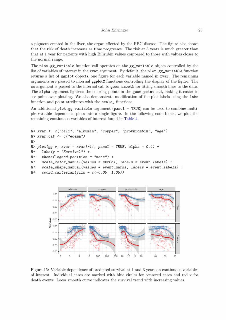
An additional plot.gg_variable argument (panel = TRUE) can be used to combine multi-ple variable dependence plots into a single figure. In the following code block, we plot theremaining continuous variables of interest found in Table 4.
R> xvar <- c("bili", "albumin", "copper", "prothrombin", "age")
R> xvar.cat <- c("edema")
R>
R> plot(gg_v, xvar = xvar[-1], panel = TRUE, alpha = 0.4) +
R+ labs(y = "Survival") +
R+ theme(legend.position = "none") +
R+ scale_color_manual(values = strCol, labels = event.labels) +
R+ scale_shape_manual(values = event.marks, labels = event.labels) +
R+ coord_cartesian(ylim = c(-0.05, 1.05))
albumin copper prothrombin age
1 Year3 Years
2 3 4 0 200 400 600 10 12 14 16 40 60 80
0.00
0.25
0.50
0.75
1.00
0.00
0.25
0.50
0.75
1.00Sur
viva
l
Figure 15: Variable dependence of predicted survival at 1 and 3 years on continuous variablesof interest. Individual cases are marked with blue circles for censored cases and red x fordeath events. Loess smooth curve indicates the survival trend with increasing values.

24 ggRandomForests
The gg_variable plot in Figure 15 displays a panel of the remaining continuous variabledependence plots. The panels are sorted in the order of variables in the xvar argument andinclude a smooth loess line (Cleveland 1981; Cleveland and Devlin 1988) to indicate the trendof the prediction dependence over the covariate values. The se=FALSE argument turns off theloess confidence band, and the span=1 argument controls the degree of smoothing.
The figures indicate that survival increases with albumin level, and decreases with bili,copper, prothrombin and age. Note the extreme value of prothrombin (> 16) influences theloess curve more than other points, which would make it a candidate for further investigation.
We expect survival at 3 years to be lower than at 1 year. However, comparing the two timeplots for each variable does indicate a difference in response relation for bili, copper andprothrombine. The added risk for high levels of these variables at 3 years indicates a non-proportional hazards response. The similarity between the time curves for albumin and age
indicates the effect of these variables is constant over the disease progression.
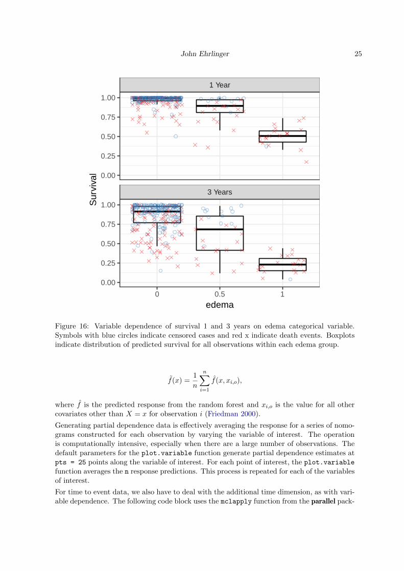
There is not a convenient method to panel scatter plots and boxplots together, so we recom-mend creating panel plots for each variable type separately. We plot the categorical variable(edema) in Figure 16 separately from the continuous variables in Figure 15.
R> plot(gg_v, xvar = xvar.cat, alpha = 0.4) + labs(y = "Survival") +
R+ theme(legend.position = "none") +
R+ scale_color_manual(values = strCol, labels = event.labels) +
R+ scale_shape_manual(values = event.marks, labels = event.labels) +
R+ coord_cartesian(ylim = c(-0.01, 1.02))
The gg_variable plot of Figure 16 for categorical variable dependence displays boxplots toexamine the distribution of predicted values within each level of the variable. The pointsare plotted with a jitter to see the censored and event markers more clearly. The boxes areshown with horizontal bars indicating the median, 75th (top) and 25th (bottom) percentiles.Whiskers extend to 1.5 times the interquartile range. Points plotted beyond the whiskers areconsidered outliers.
When using categorical variables with linear models, we use boolean dummy variables toindicate class membership. In the case of edema, we would probably create two logical vari-ables for edema = 0.5 (complex Edema presence indicator) and edema = 1.0 (Edema withdiuretics) contrasted with the edema = 0 variable (no Edema). Random Forest can use factorvariables directly, separating the populations into homogeneous groups of edema at nodes thatsplit on that variable. Figure 16 indicates similar survival response distribution between 1and 3 year when edema = 1.0. The distribution of predicted survival does seem to spread outmore than for the other values, again indicating a possible non-proportional hazards response.
5.2. Partial dependence
Partial dependence plots are a risk adjusted alternative to variable dependence. Partial plotsare generated by integrating out the effects of variables beside the covariate of interest. Thefigures are constructed by selecting points evenly spaced along the distribution of the variableof interest. For each of these points (X = x), we calculate the average RF prediction over allremaining covariates in the training set by
John Ehrlinger 25
3 Years
1 Year
0 0.5 1
0.00
0.25
0.50
0.75
1.00
0.00
0.25
0.50
0.75
1.00
edema
Sur
viva
l
Figure 16: Variable dependence of survival 1 and 3 years on edema categorical variable.Symbols with blue circles indicate censored cases and red x indicate death events. Boxplotsindicate distribution of predicted survival for all observations within each edema group.
f̃(x) =1
n
n∑i=1
f̂(x, xi,o),
where f̂ is the predicted response from the random forest and xi,o is the value for all othercovariates other than X = x for observation i (Friedman 2000).
Generating partial dependence data is effectively averaging the response for a series of nomo-grams constructed for each observation by varying the variable of interest. The operationis computationally intensive, especially when there are a large number of observations. Thedefault parameters for the plot.variable function generate partial dependence estimates atpts = 25 points along the variable of interest. For each point of interest, the plot.variable
function averages the n response predictions. This process is repeated for each of the variablesof interest.
For time to event data, we also have to deal with the additional time dimension, as with vari-able dependence. The following code block uses the mclapply function from the parallel pack-

26 ggRandomForests
age to run the plot.variable function for three time points (time=1, 3 and 5 years) in par-allel. For RSF models, we calculate a risk adjusted survival estimates (surv.type="surv"),suppressing the internal base graphs (show.plots = FALSE) and store the point estimates inthe partial_pbc list.
R> xvar <- c(xvar, xvar.cat)
R>
R> time_index <- c(which(rfsrc_pbc$time.interest > 1)[1]-1,
R+ which(rfsrc_pbc$time.interest > 3)[1]-1,
R+ which(rfsrc_pbc$time.interest > 5)[1]-1)
R> partial_pbc <- mclapply(rfsrc_pbc$time.interest[time_index],
R+ function(tm){
R+ plot.variable(rfsrc_pbc, surv.type = "surv",
R+ time = tm, xvar.names = xvar,
R+ partial = TRUE ,
R+ show.plots = FALSE)
R+ })
Because partial dependence data is collapsed onto the risk adjusted response, we can showmultiple time curves on a single panel. The following code block converts the plot.variable
output into a list of gg_partial objects, and then combines these data objects, with descrip-tive labels, along each variable of interest using the combine.gg_partial function.
R> gg_dta <- mclapply(partial_pbc, gg_partial)
R> pbc_ggpart <- combine.gg_partial(gg_dta[[1]], gg_dta[[2]],
R+ lbls = c("1 Year", "3 Years"))
We then segregate the continuous and categorical variables, and generate a panel plot of allcontinuous variables in the gg_partial plot of Figure 17. The panels are ordered by minimaldepth ranking. Since all variables are plotted on the same Y-axis scale, those that are stronglyrelated to survival make other variables look flatter. The figures also confirm the strong non-linear contribution of these variables. Non-proportional hazard response is also evident in atleast the bili and copper variables by noting the divergence of curves as time progresses.
Categorical partial dependence is displayed as boxplots, similar to categorical variable depen-dence. Risk adjustment greatly reduces the spread of the response as expected, and may alsomove the mean response compared to the unadjusted results. The categorical gg_partialplot of Figure 18 indicates that, adjusting for other variables, survival decreases with risingedema values. We also note that the risk adjusted distribution does spread out as we movefurther out in time.
R> ggplot(pbc_ggpart[["edema"]], aes(y=yhat, x=edema, col=group))+
R+ geom_boxplot(notch = TRUE,
R+ outlier.shape = NA) + # panel=TRUE,
R+ labs(x = "Edema", y = "Survival (%)", color="Time", shape="Time") +
R+ theme(legend.position = c(0.1, 0.2))

John Ehrlinger 27
●●●●●●●●●●●●●●●
●●●●● ●●
● ● ●
●
●
●
●●●●●●●●●●●●●●●●●●●●●
●
●●●●●●●●●●●●●●●●●●●●●●● ●●
● ●●●●●●●●●●●●●●●●●●●●● ● ● ●
●●●●●●●●●●●●●●●●●●●●●
●
●● ●
albumin age
bili copper prothrombin
2 3 4 40 60 80
0 10 20 0 200 400 600 10 12 14 16
0.5
0.6
0.7
0.8
0.9
0.5
0.6
0.7
0.8
0.9
Sur
viva
l
Time● 1 Year
3 Years
Figure 17: Partial dependence of predicted survival at 1 year (red circle) and 3 years (bluetriangle) as a function continuous variables of interest. Symbols are partial dependence pointestimates with loess smooth line to indicate trends.
Partial dependence is an extrapolation operation. By averaging over a series of nomograms,the algorithm constructs observations for all values of the variable of interest, regardless of therelation with other variables. In contrast, variable dependence only uses observations fromwithin the training set. A simple example would be for a model including BMI, weight andheight. When examining partial dependence of BMI, the algorithm only manipulates BMIvalues, height or weight values. The averaging operation is then confounded in two directions.First, dependence on height and weight is shared with BMI, making it difficult to see the trueresponse dependence. Second, partial dependence is calculated over nomograms that can notphysically occur. For simple variable combinations, like BMI, it is not difficult to recognizethis and modify the independent variable list to avoid these issues. However, care must betaken when interpreting more complex biological variables.
5.3. Temporal partial dependence
In the previous section, we calculated risk adjusted (partial) dependence at two time points(1 and 3 years). The selection of these points can be driven by biological times of interest

28 ggRandomForests
0.5
0.6
0.7
0.8
0.9
0 0.5 1
Edema
Sur
viva
l (%
)
Time1 Year
3 Years
Figure 18: Partial dependence plot of predicted survival at 1 year (red) and 3 years (blue) asa function of edema groups (categorical variable). Boxplots indicate distribution within eachgroup.
(i.e., 1 year and 5 year survival in cancer studies) or by investigating time points of interestfrom a gg_rfsrc prediction plot. We typically restrict generating gg_partial plots to thevariables of interest at two or three time points of interest due to computational constraints.
It is instructive to see a more detailed map of the risk adjusted response to get a feel forinterpreting partial and variable dependence plots. In Figure 17, we can visualize the twocurves as extending into the plane of the page along a time axis. Filling in more partialdependence curves, it is possible to create a partial dependence surface.
For this exercise, we will generate a series of 50 gg_partial plot curves for the bili variable.To fill the surface in, we also increased the number of points along the distribution of bili
to npts=50 to create a grid of 50 × 50 risk adjusted estimates of survival along time in onedimension and the bili variable in the second.
The gg_partial surface of Figure 19 was constructed using the surf3D function from theplot3D package (Soetaert 2014, http://CRAN.R-project.org/package=plot3D).
The figure shows partial dependence of survival (Z-axis) as a function of bili over a five yearfollow up time period. Lines perpendicular to the Bilirubin axis are distributed along thebili variable. Lines parallel to the Bilirubin axis are taken at 50 training set event times,the first event after t = 0 at the back to last event before t = 5 years at the front. Thedistribution of the time lines is also evenly selected using the same procedure as selectingpoints for partial dependence curves.
The 2500 estimated partial dependence points are joined together with a simple straight lineinterpolation to create the surface, colored according to the survival estimates (yellow close
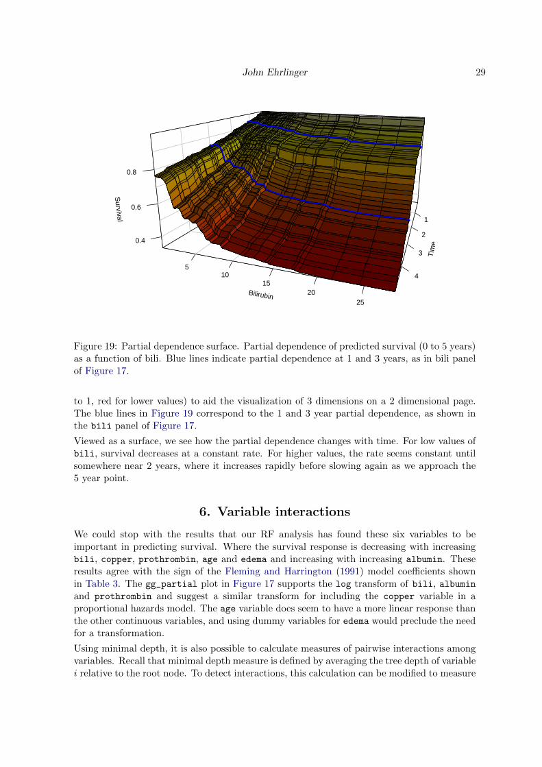
John Ehrlinger 29
Tim
e
1
2
3
4
Bilirubin
510
1520
25
Survival
0.4
0.6
0.8
Figure 19: Partial dependence surface. Partial dependence of predicted survival (0 to 5 years)as a function of bili. Blue lines indicate partial dependence at 1 and 3 years, as in bili panelof Figure 17.
to 1, red for lower values) to aid the visualization of 3 dimensions on a 2 dimensional page.The blue lines in Figure 19 correspond to the 1 and 3 year partial dependence, as shown inthe bili panel of Figure 17.
Viewed as a surface, we see how the partial dependence changes with time. For low values ofbili, survival decreases at a constant rate. For higher values, the rate seems constant untilsomewhere near 2 years, where it increases rapidly before slowing again as we approach the5 year point.
6. Variable interactions
We could stop with the results that our RF analysis has found these six variables to beimportant in predicting survival. Where the survival response is decreasing with increasingbili, copper, prothrombin, age and edema and increasing with increasing albumin. Theseresults agree with the sign of the Fleming and Harrington (1991) model coefficients shownin Table 3. The gg_partial plot in Figure 17 supports the log transform of bili, albuminand prothrombin and suggest a similar transform for including the copper variable in aproportional hazards model. The age variable does seem to have a more linear response thanthe other continuous variables, and using dummy variables for edema would preclude the needfor a transformation.
Using minimal depth, it is also possible to calculate measures of pairwise interactions amongvariables. Recall that minimal depth measure is defined by averaging the tree depth of variablei relative to the root node. To detect interactions, this calculation can be modified to measure

30 ggRandomForests
the minimal depth of a variable j with respect to the maximal subtree for variable i (Ishwaranet al. 2010, 2011).
The randomForestSRC::find.interaction function traverses the forest, calculating all pair-wise minimal depth interactions, and returns a p × p matrix of interaction measures. Thediagonal terms are normalized to the root node, and off diagonal terms are normalized mea-sures of pairwise variable interaction.
R> ggint <- gg_interaction(rfsrc_pbc)
Method: maxsubtree
No. of variables: 17
Variables sorted by minimal depth?: TRUE
bili albumin copper prothrombin chol edema platelet sgot age
bili 0.11 0.26 0.29 0.30 0.29 0.50 0.29 0.31 0.28
albumin 0.33 0.17 0.37 0.39 0.38 0.66 0.37 0.39 0.37
copper 0.36 0.38 0.19 0.40 0.41 0.66 0.41 0.40 0.39
prothrombin 0.40 0.41 0.43 0.20 0.45 0.69 0.46 0.45 0.44
chol 0.42 0.42 0.46 0.48 0.22 0.76 0.47 0.46 0.43
edema 0.45 0.47 0.50 0.51 0.50 0.22 0.49 0.51 0.48
platelet 0.49 0.50 0.53 0.54 0.52 0.80 0.22 0.53 0.51
sgot 0.49 0.47 0.50 0.53 0.52 0.80 0.52 0.25 0.49
age 0.41 0.44 0.47 0.50 0.48 0.79 0.48 0.46 0.25
alk 0.55 0.55 0.57 0.60 0.57 0.83 0.59 0.59 0.55
trig 0.56 0.55 0.57 0.59 0.57 0.84 0.58 0.57 0.55
ascites 0.53 0.54 0.59 0.58 0.58 0.76 0.58 0.60 0.57
stage 0.59 0.60 0.61 0.64 0.61 0.83 0.63 0.62 0.60
hepatom 0.67 0.68 0.70 0.71 0.69 0.86 0.72 0.70 0.69
spiders 0.81 0.82 0.84 0.84 0.84 0.94 0.83 0.82 0.81
treatment 0.87 0.87 0.88 0.87 0.88 0.96 0.89 0.88 0.87
sex 0.84 0.84 0.86 0.86 0.85 0.94 0.86 0.86 0.84
alk trig ascites stage hepatom spiders treatment sex
bili 0.31 0.35 0.65 0.45 0.60 0.62 0.61 0.66
albumin 0.39 0.44 0.78 0.55 0.67 0.70 0.66 0.72
copper 0.42 0.45 0.77 0.57 0.69 0.71 0.69 0.79
prothrombin 0.45 0.48 0.81 0.61 0.72 0.76 0.72 0.79
chol 0.46 0.50 0.86 0.63 0.77 0.76 0.72 0.81
edema 0.50 0.55 0.80 0.64 0.73 0.75 0.75 0.81
platelet 0.53 0.55 0.90 0.70 0.81 0.81 0.77 0.86
sgot 0.51 0.53 0.90 0.67 0.79 0.79 0.76 0.84
age 0.46 0.48 0.88 0.62 0.77 0.76 0.72 0.80
alk 0.27 0.61 0.93 0.74 0.85 0.83 0.81 0.88
trig 0.56 0.30 0.92 0.74 0.85 0.84 0.80 0.90
ascites 0.59 0.62 0.34 0.69 0.77 0.80 0.80 0.83
stage 0.62 0.64 0.91 0.35 0.84 0.83 0.81 0.87
hepatom 0.71 0.71 0.91 0.80 0.43 0.88 0.85 0.89
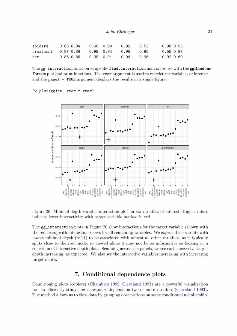
John Ehrlinger 31
spiders 0.83 0.84 0.96 0.90 0.92 0.53 0.90 0.95
treatment 0.87 0.88 0.99 0.94 0.96 0.95 0.55 0.97
sex 0.86 0.86 0.98 0.91 0.94 0.95 0.92 0.60
The gg_interaction function wraps the find.interaction matrix for use with the ggRandom-Forests plot and print functions. The xvar argument is used to restrict the variables of interestand the panel = TRUE argument displays the results in a single figure.
R> plot(ggint, xvar = xvar)
●●
●●
●
● ●
●
● ●●
●
●
●●
●
●
●● ●
●
●
● ●●
● ●●
●
●
●● ●
●
●
●
● ●
●
● ●●
● ●●
●
●
● ● ●
●
●●
● ●
●
●● ●
● ●●
●
●
● ● ●
●
●
●● ●
●
● ●●
● ● ●
●
●
●●
●
●
●●
●
●
●
● ●●
● ●●
●
●
● ●●
●
copper edema prothrombin
age albumin bili
bili
albu
min
prot
hrom
bin
copp
ered
ema
chol
plat
elet
age
sgot
alk
trig
stag
eas
cite
she
pato
msp
ider
str
eatm
ent
sex
bili
albu
min
prot
hrom
bin
copp
ered
ema
chol
plat
elet
age
sgot
alk
trig
stag
eas
cite
she
pato
msp
ider
str
eatm
ent
sex
bili
albu
min
prot
hrom
bin
copp
ered
ema
chol
plat
elet
age
sgot
alk
trig
stag
eas
cite
she
pato
msp
ider
str
eatm
ent
sex
0.25
0.50
0.75
0.25
0.50
0.75
Inte
ract
ive
Min
imal
Dep
th
Figure 20: Minimal depth variable interaction plot for six variables of interest. Higher valuesindicate lower interactivity with target variable marked in red.
The gg_interaction plots in Figure 20 show interactions for the target variable (shown withthe red cross) with interaction scores for all remaining variables. We expect the covariate withlowest minimal depth (bili) to be associated with almost all other variables, as it typicallysplits close to the root node, so viewed alone it may not be as informative as looking at acollection of interactive depth plots. Scanning across the panels, we see each successive targetdepth increasing, as expected. We also see the interactive variables increasing with increasingtarget depth.
7. Conditional dependence plots
Conditioning plots (coplots) (Chambers 1992; Cleveland 1993) are a powerful visualizationtool to efficiently study how a response depends on two or more variables (Cleveland 1993).The method allows us to view data by grouping observations on some conditional membership.

32 ggRandomForests
The simplest example involves a categorical variable, where we plot our data conditional onclass membership, for instance on groups of the edema variable. We can view a coplot asa stratified variable dependence plot, indicating trends in the RF prediction results withinpanels of group membership.
Interactions with categorical data can be generated directly from variable dependence plots.Recall the variable dependence for bilirubin shown in Figure 14. We recreated the gg_variableplot in Figure 21, modified by adding a linear smooth as we intend on segregating the dataalong conditional class membership.
R> # Get variable dependence at 1 year
R> ggvar <- gg_variable(rfsrc_pbc, time = 1)
R>
R> # For labeling coplot membership
R> ggvar$edema <- paste("edema = ", ggvar$edema, sep = "")
R>
R> # Plot with linear smooth (method argument)
R> var_dep <- plot(ggvar, xvar = "bili",
R+ alpha = 0.5) +
R+ # geom_smooth(method = "glm",se = FALSE) +
R+ labs(y = "Survival",
R+ x = st.labs["bili"]) +
R+ theme(legend.position = "none") +
R+ scale_color_manual(values = strCol, labels = event.labels) +
R+ scale_shape_manual(values = event.marks, labels = event.labels) +
R+ coord_cartesian(y = c(-.01,1.01))
R>
R> var_dep
We can view the conditional dependence of survival against bilirubin, conditional on edema
group membership (categorical variable) in Figure 22 by reusing the saved ggplot object(var_dep) and adding a call to the facet_grid function.
R> var_dep + facet_grid(~edema)
Comparing Figure 21 with conditional panels of Figure 22, we see the overall response issimilar to the edema=0 response. The survival for edema=0.5 is slightly lower, though theslope of the smooth indicates a similar relation to bili. The edema=1 panel shows that thesurvival for this (smaller) group of patients is worse, but still follows the trend of decreasingwith increasing bili.
Conditional membership within a continuous variable requires stratification at some level.We can sometimes make these stratification along some feature of the variable, for instancea variable with integer values, or 5 or 10 year age group cohorts. However with our variablesof interest, there are no logical stratification indications. Therefore we arbitrarily stratify ourvariables into 6 groups of roughly equal population size using the quantile_cuts function.We pass the break points located by quantile_cuts to the cut function to create group-ing intervals, which we can then add to the gg_variable object before plotting with the

John Ehrlinger 33
0.00
0.25
0.50
0.75
1.00
0 10 20
Serum Bilirubin (mg/dl)
Sur
viva
l
Figure 21: Variable dependence of survival at 1 year against bili variable. Reproduction oftop panel of Figure 14 with a linear smooth to indicate trend.
edema = 0 edema = 0.5 edema = 1
0 10 20 0 10 20 0 10 20
0.00
0.25
0.50
0.75
1.00
Serum Bilirubin (mg/dl)
Sur
viva
l
Figure 22: Variable dependence coplot of survival at 1 year against bili, conditional on edemagroup membership. Linear smooth indicates trend of variable dependence.
plot.gg_variable function. This time we use the facet_wrap function to generate the pan-els grouping interval, which automatically sorts the six panels into two rows of three panelseach.
The gg_variable coplot of Figure 23 indicates that the effect of bili decreases conditionalon membership within increasing albumin groups. To get a better feel for how the response

34 ggRandomForests
albumin = (3.51,3.74] albumin = (3.74,4] albumin = (4,4.64]
albumin = (1.96,2.97] albumin = (2.97,3.23] albumin = (3.23,3.51]
0 10 20 0 10 20 0 10 20
0.00
0.25
0.50
0.75
1.00
0.00
0.25
0.50
0.75
1.00
Serum Bilirubin (mg/dl)
Sur
viva
l
Figure 23: Variable dependence coplot of survival at 1 year against bili, conditional on albumininterval group membership.
depends on both these variables together, it is instructive to look at the compliment coplot ofalbumin conditional on membership in bili groups. We repeat the previous coplot process,predicted survival as a function of the albumin variable, conditional on membership within 6groups bili intervals. As the code to create the coplot of Figure 24 is nearly identical to thecode for creating Figure 23.
R> # Find intervals with similar number of observations.
R> bili_cts <-quantile_pts(ggvar$bili, groups = 6, intervals = TRUE)
R>
R> # We need to move the minimal value so we include that observation
R> bili_cts[1] <- bili_cts[1] - 1.e-7
R>
R> # Create the conditional groups and add to the gg_variable object
R> bili_grp <- cut(ggvar$bili, breaks = bili_cts)
R> ggvar$bili_grp <- bili_grp
R>
R> # Adjust naming for facets
R> levels(ggvar$bili_grp) <- paste("bilirubin =", levels(bili_grp))
R>
R> # plot.gg_variable
R> plot(ggvar, xvar = "albumin", alpha = 0.5) +
R+ # method = "glm", se = FALSE) +
R+ labs(y = "Survival", x = st.labs["albumin"]) +
R+ theme(legend.position = "none") +
R+ scale_color_manual(values = strCol, labels = event.labels) +
R+ scale_shape_manual(values = event.marks, labels = event.labels) +
R+ facet_wrap(~bili_grp) +
R+ coord_cartesian(ylim = c(-0.01,1.01))
John Ehrlinger 35
bilirubin = (5.1,7.1] bilirubin = (7.1,14] bilirubin = (14,28]
bilirubin = (0.3,1.7] bilirubin = (1.7,3.1] bilirubin = (3.1,5.1]
2 3 4 2 3 4 2 3 4
0.00
0.25
0.50
0.75
1.00
0.00
0.25
0.50
0.75
1.00
Albumin (gm/dl)
Sur
viva
l
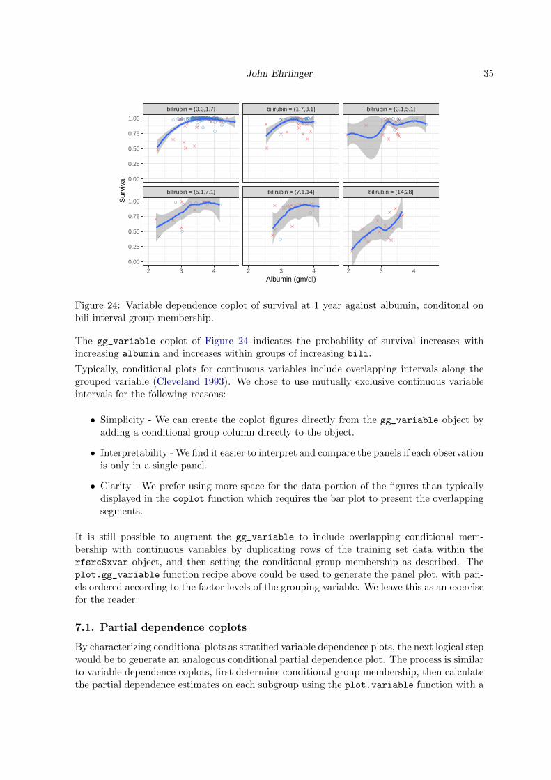
Figure 24: Variable dependence coplot of survival at 1 year against albumin, conditonal onbili interval group membership.
The gg_variable coplot of Figure 24 indicates the probability of survival increases withincreasing albumin and increases within groups of increasing bili.
Typically, conditional plots for continuous variables include overlapping intervals along thegrouped variable (Cleveland 1993). We chose to use mutually exclusive continuous variableintervals for the following reasons:
• Simplicity - We can create the coplot figures directly from the gg_variable object byadding a conditional group column directly to the object.
• Interpretability - We find it easier to interpret and compare the panels if each observationis only in a single panel.
• Clarity - We prefer using more space for the data portion of the figures than typicallydisplayed in the coplot function which requires the bar plot to present the overlappingsegments.
It is still possible to augment the gg_variable to include overlapping conditional mem-bership with continuous variables by duplicating rows of the training set data within therfsrc$xvar object, and then setting the conditional group membership as described. Theplot.gg_variable function recipe above could be used to generate the panel plot, with pan-els ordered according to the factor levels of the grouping variable. We leave this as an exercisefor the reader.
7.1. Partial dependence coplots
By characterizing conditional plots as stratified variable dependence plots, the next logical stepwould be to generate an analogous conditional partial dependence plot. The process is similarto variable dependence coplots, first determine conditional group membership, then calculatethe partial dependence estimates on each subgroup using the plot.variable function with a

36 ggRandomForests
subset argument for each grouped interval. The ggRandomForests gg_partial_coplot func-tion is a wrapper for generating conditional partial dependence data objects. Given a randomforest (rfsrc) object and a groups vector for conditioning the training data set observations,gg_partial_coplot calls the plot.variable function the training set observations condi-tional on groups membership. The function returns a gg_partial_coplot object, a subclassof the gg_partial object, which can be plotted with the plot.gg_partial function.
The following code block will generate the data object for creating partial dependence coplotof 1 year survival as a function of bili conditional on membership within the 6 groups ofalbumin intervals that we examined in the Figure 23.
R> partial_coplot_pbc <- gg_partial_coplot(rfsrc_pbc, xvar = "bili",
R+ groups = ggvar$albumin_grp,
R+ surv_type = "surv",
R+ time = rfsrc_pbc$time.interest[time_index[1]],
R+ show.plots = FALSE)
R>
R> ggplot(partial_coplot_pbc, aes(x=bili, y=yhat, col=group, shape=group)) +
R+ geom_smooth(se = FALSE) +
R+ labs(x = st.labs["bili"], y = "Survival at 1 year (%)",
R+ color = "albumin", shape = "albumin")
0.75
0.80
0.85
0.90
0 10 20
Serum Bilirubin (mg/dl)
Sur
viva
l at 1
yea
r (%
) albuminalbumin = (1.96,2.97]
albumin = (2.97,3.23]
albumin = (3.23,3.51]
albumin = (3.51,3.74]
albumin = (3.74,4]
albumin = (4,4.64]
Figure 25: Partial dependence coplot of survival at 1 year against bili, conditional on albumininterval group membership. Points estimates with loess smooth to indicate trend within eachgroup.
The gg_partial_coplot of Figure 25 shows point estimates of the risk adjusted survival as afunction of bili conditional on group membership defined by albumin intervals. The figureis slightly different than the gg_partial plot of Figure 17 as each set of partial dependenceestimates is calculated over a subset of the training data. We again connect the point estimateswith a Loess curve.
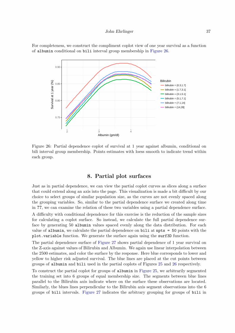
John Ehrlinger 37
For completeness, we construct the compliment coplot view of one year survival as a functionof albumin conditional on bili interval group membership in Figure 26.
0.75
0.80
0.85
0.90
2 3 4
Albumin (gm/dl)
Sur
viva
l at 1
yea
r (%
) Bilirubinbilirubin = (0.3,1.7]
bilirubin = (1.7,3.1]
bilirubin = (3.1,5.1]
bilirubin = (5.1,7.1]
bilirubin = (7.1,14]
bilirubin = (14,28]
Figure 26: Partial dependence coplot of survival at 1 year against albumin, conditional onbili interval group membership. Points estimates with loess smooth to indicate trend withineach group.
8. Partial plot surfaces
Just as in partial dependence, we can view the partial coplot curves as slices along a surfacethat could extend along an axis into the page. This visualization is made a bit difficult by ourchoice to select groups of similar population size, as the curves are not evenly spaced alongthe grouping variables. So, similar to the partial dependence surface we created along timein ??, we can examine the relation of these two variables using a partial dependence surface.
A difficulty with conditional dependence for this exercise is the reduction of the sample sizesfor calculating a coplot surface. So instead, we calculate the full partial dependence sur-face by generating 50 albumin values spaced evenly along the data distribution. For eachvalue of albumin, we calculate the partial dependence on bili at npts = 50 points with theplot.variable function. We generate the surface again using the surf3D function.
The partial dependence surface of Figure 27 shows partial dependence of 1 year survival onthe Z-axis against values of Bilirubin and Albumin. We again use linear interpolation betweenthe 2500 estimates, and color the surface by the response. Here blue corresponds to lower andyellow to higher risk adjusted survival. The blue lines are placed at the cut points betweengroups of albumin and bili used in the partial coplots of Figures 25 and 26 respectively.
To construct the partial coplot for groups of albumin in Figure 25, we arbitrarily segmentedthe training set into 6 groups of equal membership size. The segments between blue linesparallel to the Bilirubin axis indicate where on the surface these observations are located.Similarly, the blues lines perpendicular to the Bilirubin axis segment observations into the 6groups of bili intervals. Figure 27 indicates the arbitrary grouping for groups of bili in
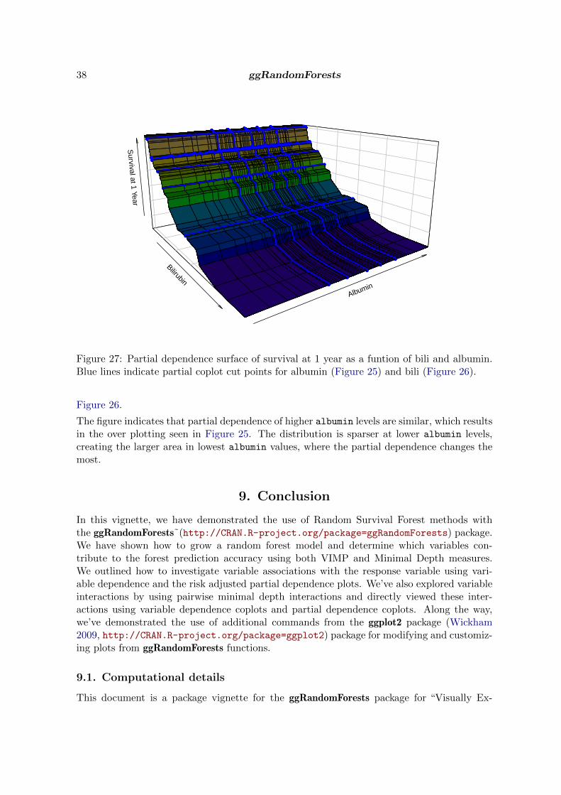
38 ggRandomForests
Bilirubin
Albumin
Survival at 1 Year
Figure 27: Partial dependence surface of survival at 1 year as a funtion of bili and albumin.Blue lines indicate partial coplot cut points for albumin (Figure 25) and bili (Figure 26).
Figure 26.
The figure indicates that partial dependence of higher albumin levels are similar, which resultsin the over plotting seen in Figure 25. The distribution is sparser at lower albumin levels,creating the larger area in lowest albumin values, where the partial dependence changes themost.
9. Conclusion
In this vignette, we have demonstrated the use of Random Survival Forest methods withthe ggRandomForests˜(http://CRAN.R-project.org/package=ggRandomForests) package.We have shown how to grow a random forest model and determine which variables con-tribute to the forest prediction accuracy using both VIMP and Minimal Depth measures.We outlined how to investigate variable associations with the response variable using vari-able dependence and the risk adjusted partial dependence plots. We’ve also explored variableinteractions by using pairwise minimal depth interactions and directly viewed these inter-actions using variable dependence coplots and partial dependence coplots. Along the way,we’ve demonstrated the use of additional commands from the ggplot2 package (Wickham2009, http://CRAN.R-project.org/package=ggplot2) package for modifying and customiz-ing plots from ggRandomForests functions.
9.1. Computational details
This document is a package vignette for the ggRandomForests package for “Visually Ex-

John Ehrlinger 39
ploring Random Forests” (http://CRAN.R-project.org/package=ggRandomForests). TheggRandomForests package is designed for use with the randomForestSRC package (Ishwaranand Kogalur 2014, http://CRAN.R-project.org/package=randomForestSRC) for growingsurvival, regression and classification random forest models and uses the ggplot2 package(Wickham 2009, http://CRAN.R-project.org/package=ggplot2) for plotting diagnosticand variable association results. ggRandomForests is structured to extract data objects fromrandomForestSRC objects and provides functions for printing and plotting these objects.
The vignette is a tutorial for using the ggRandomForests package with the randomForestSRCpackage for building and post-processing random survival forests. In this tutorial, we explorea random forest for survival model constructed for the primary biliary cirrhosis (PBC) of theliver data set (Fleming and Harrington 1991), available in the randomForestSRC package.We grow a random survival forest and demonstrate how ggRandomForests can be used whendetermining how the survival response depends on predictive variables within the model.The tutorial demonstrates the design and usage of many of ggRandomForests functions andfeatures and also how to modify and customize the resulting ggplot graphic objects alongthe way.
The vignette is written in LATEXusing the knitr package (Xie 2015, 2014, 2013, http://CRAN.R-project.org/package=knitr), which facilitates weaving R (R Core Team 2014) code, re-sults and figures into document text.
This vignette is available within the ggRandomForests package on the Comprehensive RArchive Network (CRAN) (R Core Team 2014, http://cran.r-project.org). Once thepackage has been installed, the vignette can be viewed directly from within R with the fol-lowing command:
R> vignette("randomForestSRC-Survival", package = "ggRandomForests")
A development version of the ggRandomForests package is also available on GitHub (https://github.com). We invite comments, feature requests and bug reports for this package athttps://github.com/ehrlinger/ggRandomForests.
9.2. Acknowledgement
This work was supported in part by the National Institutes of Health grant R01-HL103552-01A1.
References
Breiman L (1996a). “Bagging Predictors.” Machine Learning, 26, 123–140.
Breiman L (1996b). “Out–Of–Bag Estimation.” Technical report, Statistics Department,University of California,Berkeley, CA. 94708. URL https://www.stat.berkeley.edu/
~breiman/OOBestimation.pdf.
Breiman L (2001a). “Random Forests.” Machine Learning, 45(1), 5–32.
Breiman L (2001b). “Statistical Modeling: The Two Cultures.” Statistical Science, 16(3),199–231.

40 ggRandomForests
Breiman L, Friedman JH, Olshen R, Stone C (1984). Classification and Regression Trees.Wadsworth and Brooks, Monterey, CA.
Chambers JM (1992). Statistical Models in S. Wadsworth & Brooks/Cole.
Cleveland WS (1981). “LOWESS: A Program for Smoothing Scatterplots by Robust LocallyWeighted Regression.” The American Statistician, 35(1), 54.
Cleveland WS (1993). Visualizing Data. Summit Press.
Cleveland WS, Devlin SJ (1988). “Locally-Weighted Regression: An Approach to RegressionAnalysis by Local Fitting.” Journal of the American Statistical Association, 83(403), 596–610.
Efron B, Tibshirani R (1994). An Introduction to the Bootstrap. Chapman & Hall/CRC.ISBN 0412042312.
Fleming TR, Harrington DP (1991). Counting Processes and Survival Analysis. John Wiley& Sons, New York.
Friedman JH (2000). “Greedy Function Approximation: A Gradient Boosting Machine.”Annals of Statistics, 29, 1189–1232.
Hastie T, Tibshirani R, Friedman JH (2009). The Elements of Statistical Learning: DataMining, Inference, and Prediction. Second edition. Springer-Verlag, New York. ISBN 978-0-387-84857-0.
Ishwaran H (2007). “Variable Importance in Binary Regression Trees and Forests.” ElectronicJournal of Statistics, 1, 519–537.
Ishwaran H, Kogalur UB (2007). “Random Survival Forests for R.” R News, 7, 25–31.
Ishwaran H, Kogalur UB (2010). “Consistency of Random Survival Forests.” Statistics andProbability Letters, 80, 1056–1064.
Ishwaran H, Kogalur UB (2014). “Random Forests for Survival, Regression and Classifi-cation (RF-SRC), R package version 1.6.” URL http://CRAN.R-project.org/package=
randomForestSRC.
Ishwaran H, Kogalur UB, Blackstone EH, Lauer MS (2008). “Random Survival Forests.” TheAnnals of Applied Statistics, 2(3), 841–860.
Ishwaran H, Kogalur UB, Chen X, Minn AJ (2011). “Random Survival Forests for High–Dimensional Data.” Statist. Anal. Data Mining, 4, 115–132.
Ishwaran H, Kogalur UB, Gorodeski EZ, Minn AJ, Lauer MS (2010). “High–DimensionalVariable Selection for Survival Data.” J. Amer. Statist. Assoc., 105, 205–217.
Liaw A, Wiener M (2002). “Classification and Regression by randomForest.” R News, 2(3),18–22.
R Core Team (2014). R: A Language and Environment for Statistical Computing. R Founda-tion for Statistical Computing, Vienna, Austria. URL http://www.R-project.org/.

John Ehrlinger 41
Rubin D (1976). “Inference and Missing Data.” Biometrika, 63, 581–592.
Soetaert K (2014). plot3D: Plotting multi-dimensional data. R package version 1.0-2, URLhttp://CRAN.R-project.org/package=plot3D.
Tukey JW (1977). Exploratory Data Analysis. Pearson.
Wickham H (2009). ggplot2: Elegant Graphics for Data Analysis. Springer-Verlag, NewYork. ISBN 978-0-387-98140-6.
Xie Y (2013). Dynamic Documents with R and knitr. Chapman and Hall/CRC, Boca Raton,Florida. ISBN 978-1482203530, URL http://yihui.name/knitr/.
Xie Y (2014). “knitr: A Comprehensive Tool for Reproducible Research in R.” In V Stodden,F Leisch, RD Peng (eds.), Implementing Reproducible Computational Research. Chapmanand Hall/CRC. ISBN 978-1466561595, URL http://www.crcpress.com/product/isbn/
9781466561595.
Xie Y (2015). knitr: A General-Purpose Package for Dynamic Report Generation in R. Rpackage version 1.9, URL http://yihui.name/knitr/.
Affiliation:
John EhrlingerMicrosoftOne Memorial Drive Cambridge, MA 02142E-mail: [email protected]: https://github.com/ehrlinger/ggRandomForests