general tom measures in yeast - ucla human genetics · web viewgeneral topological overlap measure...
TRANSCRIPT

R SOFTWARE TUTORIAL forGeneral Topological Overlap Measure for Unweighted Networks.
Applications to a Yeast Gene Co-Expression Network
Andy M. Yip
Department of Mathematics
National University of Singapore
2, Science Drive 2
Singapore 117543, Singapore
Email: [email protected]
Steve Horvath
Departments of Human Genetics and Biostatistics
University of California Gonda Research Center
695 Charles E. Young Drive South, Box 708822
Los Angeles, CA 90095-7088, USA
Email: [email protected]
This R software tutorial is supporting material for the following paper Andy M. Yip, Steve Horvath (2006) The Generalized Topological Overlap Matrix For Detecting
Modules in Gene Networks. UCLA Technical Report. http://www.genetics.ucla.edu/labs/horvath/GTOM/
An important use of DNA microarray data is to annotate genes by clustering them on the basis of their gene expression profiles across several microarrays. Because the transcriptional response of cells to changing conditions involves the coordinated co-expression of genes encoding interacting proteins, studying co-expression patterns can provide insights into the underlying cellular processes. It is standardto use the (Pearson) correlation coefficient as a co-expression measure.Here we show how to use the generalized topological overlap matrix (GTOM) for screening for essential genes. Specifically, we compare the following dissimilarity measures for quantifying how dissimilar 2 gene expression profiles are.
1. distCor1 = 1 |ij|2. distCor6 = 1 (ij
6)3. distTom0 = 1 (aij) Ii=j
4. distTom1 = 1 topological overlap of 1-step neighbors5. distTom2 = 1 topological overlap of 2-step neighbors6. distTom3 = 1 topological overlap of 3-step neighbors
whereij = Pearson correlation between genes i and j
aij = Dichotomized ij with a given threshold:
Measure 1: Since the absolute value of the Pearson correlation is widely used to assess how similar 2 expression profiles are, distCor1 (measure 1) is the standard way of assessing dissimililarity of expression profiles.
1

Measure 2: distCor6 is quite similar except that the correlation is raised to a power. Raising the correlation to a power >1 emphasizes high correlations at the expense of low correlations.Measure 3: This measure is based on the adjacency matrix of the unweighted gene co-expression network. Since it is based on the dichotomized correlation matrix, this ignores the continuous nature of the co-expression information.Measure 4: This is the topological overlap matrix measure used by Ravasz et al (2000) and further investigated in Zhang and Horvath (2006).Measures 4-6 represent the generalized topological overlap dissimililarity measures proposed in Yip and Horvath (2006).
Microarray Data Set: Yeast cell cycle dataset that records gene expression levels during different stages of cell cycles in yeasts Spellman-Sherlock-et al 2000. For computational reasons, network analysis was limited to 4000 genes.
Constructing a network from gene-expression dataLargely unexplored in most high-dimensional data analyses are the relationships between gene-expression levels, which exhibit varying degrees of correlation. Genes with expression levels that are highly correlated are biologically interesting, since they may be regulated by a common regulatory mechanisms or participate in similar biological processes. To construct a network from microarray gene-expression data, we begin by calculating the Pearson correlations for all pairs of genes in the network. In principle, one could specify that the connection strength between 2 genes equals the absolute value of the correlation coefficient. Because microarray data can be noisy and the number of samples is o ften small, we and others have found it useful to emphasize strong correlations and punish weak correlations. A natural way of doing this is to define the connection strength between 2 genes by thresholding the absolute value of the correlation coefficient, e.g. below we pick a threshold tau=0.7. This results in an unweighted network where each node represents a gene and an edge between two nodes is present if their absolute correlation coefficient exceeds a threshold tau=0.7. Our methods work for any threshold. A discussion for how this threshold is chosen is beyond the scope of the article. Here, we obtained the threshold tau$by using the scale-free criterionproposed by Zhang and Horvath (2005).As an aside, we mention that one can also raise the absolute value of the Pearson correlation to a power ß >=1 which results in a weighted network (Zhang and Horvath 2005).
By adding up these connection strengths for each gene, we produce a single number (called connectivity, or k) that describes how strongly that gene is connected to all other genes in the network. The next step in network construction is to identify groups of genes with similar patterns of connection strengths by searching for genes with high "topological overlap" (Ravasz et al., 2002; Zhang and Horvath, 2005). A pair of genes is said to have high topological overlap if they are both strongly connected to the same group of genes. The use of topological overlap thus serves as a filter to exclude spurious or isolated connections during network construction. After calculating the topological overlap for all pairs of genes in
2

the network, this information is used in conjunction with a hierarchical clustering algorithm to identify groups, or modules, of densely interconnected genes.More material on weighted network analysis can be found herehttp://www.genetics.ucla.edu/labs/horvath/CoexpressionNetwork/
In an unweighted network, the topological overlap of two nodes reflects their similarity in terms of the commonality of the nodes they connect to, see [Ravasz et al 2002, Yip and Horvath 2006].
Definition of Topological Overlap for an Unweighted NetworkAs cited in our article, the topological overlap matrix comes from the manuscript by Ravasz et al 2002. They report our form of the topological overlapmatrix in the methods supplement of their paper (there is a typo in the main paper!). Topological overlap of two nodes (genes) reflects their relative interconnectivity.
For a network represented by an adjacency matrix is given by
(1)
where, denotes the number of nodes to which both i and j are connected, and is the number
of connections of a node, with and . Since , we find that
.
Thus, . Since , we find that ωij is a number between 0 and 1. There are
2 reasons for adding to the denominator in the topological overlap matrix: 1) in this form, the
denominator can never be 0 and 2) for an unweighted network, one can show that ωij=1 only if the node with fewer links satisfies two conditions: (a) all of its neighbors are also neighbors of the other node, i.e. it is connected to all of the neighbors of the other node and (b) it is linked to the other node. In contrast, ωij=0 if i and j are unlinked and the two nodes don't have common neighbors. Further, the topological overlap matrix is symmetric, i.e, ωij= ωji. and its diagonal elements are set to 0 (i.e. ωii=0). The rationale for considering this similarity measure is that nodes that are part of highly integrated modules are expected to have high topological overlap with their neighbors.
Identifying Gene ModulesAuthors differ on how they define modules. Intuitively speaking, we assume that modules are groups of genes whose expression profiles are highly correlated across the samples. Modules are groups of nodes that have high topological overlap. Module identification is based on the topological overlap matrix Ω=[ωij]
3

defined as (1). To use it in hierarchical clustering, it is turned into a dissimilarity measure by using the standard approach of subtracting it from one (i.e, the topological overlap based dissimilarity measure is
defined by ).
To group genes with coherent expression profiles into modules, we use average linkage hierarchical clustering coupled with the TOM-based dissimilarity. In this article, gene modules correspond to branches of the hierarchical clustering tree (dendrogram). The simplest (not necessarily best) method is to choose a height cutoff to cut branches off the tree. The resulting branches correspond to gene modules, i.e. sets of highly co-expressed genes.
ReferencesTo cite this document please use
Andy M. Yip, Steve Horvath (2006) The Generalized Topological Overlap Matrix For Detecting Modules in Gene Networks. UCLA Technical Report. http://www.genetics.ucla.edu/labs/horvath/GTOM/
The weighted and unweighted gene co-expression network analysis method is described in Bin Zhang and Steve Horvath (2005) "A General Framework for Weighted Gene Co-Expression
Network Analysis", Statistical Applications in Genetics and Molecular Biology: Vol. 4: No. 1, Article 17. http://www.bepress.com/sagmb/vol4/iss1/art17
For a more mathematical description of gene co-expression networks consider S Horvath, J Dong, A Yip (2006) Connectivity, Module-Conformity, and Significance: Understanding
Gene Co-Expression Network Methods. http://www.genetics.ucla.edu/labs/horvath/ModuleConformity/
Ravasz, E., Somera, A. L., Mongru, D. A., Oltvai, Z. N., and Barabási, A. L. (2002). Hierarchical organization of modularity in metabolic networks. Science 297, 1551-1555.
Getting the R software and dataDownloading the R software Go to http://www.R-project.org, download R and install it on your computer. After installing R, you need to install several additional R library packages: For example to install Hmisc, open R, go to menu "Packages\Install package(s) from CRAN", then choose Hmisc. R will automatically install the package. Do the same for some of the other libraries mentioned below. But note that several libraries are already present in the software so there is no need to re-install them.Download the comman delimited text file YEASTCombinedCellCycle4000.csv from our webpagehttp://www.genetics.ucla.edu/labs/horvath/GTOM/Download the R function file: "NetworkFunctions.txt", which contains several R functions needed for Weighted Gene Co-Expression Network Analysis.
4

http://www.genetics.ucla.edu/labs/horvath/GeneralFramework/NetworkFunctions.txt In that file you can also find a short description of the functions. DISCLAIMER: Absolutely no warranty on the code. Please contact SH with suggestions.Unzip all the files into the same directory (e.g. we put it into “C:\Documents and Settings\shorvath\My Documents\ADAG\AndyYip\TutorialGTOMscreening”
# STARTING THE R session:# Open the R software by double clicking the corresponding icon#To interact with the R software copy and paste the commands into the R console.#Text after "#" is a comment and is automatically ignored by R.
# Set the working directory of the R session by using the following command.setwd(“C:/Documents and Settings/shorvath/My Documents/ADAG/AndyYip/TutorialGTOMscreening”)# Note that we use / instead of \ in the path.
# read in the R libraries. library(sna) # this is needed for closeness#library(MASS)#library(class)library(cluster)#library(sma) # different from sna! this is needed for plot.mat belowlibrary(impute) # needed for imputing missing value before principal component analysis#library(splines) # for the spline predictor to estimate the number of clusterslibrary(Hmisc) # probably you won’t need this
#Memory# check the maximum memory that can be allocated memory.size(TRUE)/1024 # increase the available memory memory.limit(size=2048)
# read in the custom network functionssource("C:/Documents and Settings/shorvath/My Documents/RFunctions/NetworkFunctions.txt")
5

# Load the expression datadat0 = read.csv(“YEASTCombinedCellCycle4000.csv”, header=T, row.names=1)# This file contains information on every genedatSummary=dat0[,1:31]# This function contains the expression data: rows are microarray samples, columns are genesdatExpr = t(dat0[,32:75])no.samples = dim(datExpr)[[1]]dim(datExpr)rm(dat0);collect_garbage()
#To choose a power beta for computing the connection strengths, we make use of the # the Scale-free Topology Criterion (Zhang and Horvath 2005). We focus on the scale free # topology model fitting index (denoted as scale.law.R.2) that quantifies how well# a network satisfies a scale-free topology. # The slope of the regression corresponds to the value gamma for the scale free distribution.
# To construct an unweighted network (hard thresholding), # we consider the following vector of potential thresholds.
thresholds1= c(seq(.1,.5, by=.1), seq(.55,.9, by=.05) )
# To choose a cut-off value, we propose to use the Scale-free Topology Criterion (Zhang and # Horvath 2005). Here the focus is on the linear regression model fitting index # (denoted below by scale.law.R.2) that quantify the extent of how well a network # satisfies a scale-free topology.# The function PickHardThreshold can help one to estimate the cut-off value # when using hard thresholding with the step adjacency function.# The first column lists the threshold ("cut"),# the second column lists the corresponding p-value based on the Fisher transform.# The third column reports the resulting scale free topology fitting index R^2.# The fourth column reports the slope of the fitting line. # The fifth column reports the fitting index for the truncated exponential scale free model. # Usually we ignore it.# The remaining columns list the mean, median and maximum connectivity.# To pick a hard threshold (cut) with the scale free topology criterion:# aim for high scale free R^2 (column 3), high connectivity (col 6)
6

# and negative slope (around -1, col 4).
RdichotTable=PickHardThreshold(datExpr, cutvector= thresholds1)[[2]]
Cut p.value scale.law.R.2 slope. truncated.R.2 mean.k. median.k. max.k.
1 0.10 5.13e-01 0.5520 8.060 0.824 2820.000 2850 3350
2 0.20 1.88e-01 0.0617 1.620 0.705 1780.000 1820 2720
3 0.30 4.53e-02 -0.0977 -0.423 0.810 1000.000 1010 2090
4 0.40 6.48e-03 0.2740 -1.440 0.902 486.000 463 1440
5 0.50 4.70e-04 0.5850 -1.900 0.944 199.000 160 898
6 0.55 9.09e-05 0.6910 -1.860 0.962 117.000 83 663
7 0.60 1.32e-05 0.7560 -1.790 0.958 65.500 37 466
8 0.65 1.35e-06 0.8760 -1.620 0.988 34.400 14 314
9 0.70 8.73e-08 0.9060 -1.520 0.993 16.600 4 196
10 0.75 3.03e-09 0.8410 -1.560 0.968 7.250 1 123
11 0.80 4.31e-11 0.8980 -1.360 0.982 2.680 0 64
12 0.85 1.51e-13 0.9470 -1.230 0.961 0.797 0 32
13 0.90 0.00e+00 0.9420 -1.250 0.964 0.146 0 17
# Comment: Note that for a cut-off value (tau)=0.10 the scaling law R^2 equals 0.55, which seems #to be pretty high. However, the slope is positive, i.e. this would predict there are more genes with #high connectivity than there are genes with low connectivity. This is unbiological!# This is the reason why we look at the signed R^2 value: #Signed R^2=-sign(RdichotTable[,4])*RdichotTable[,3]#Let’s plot the scale free topology model fitting index (R^2) versus the cut-off tau. However, the #R^2 values of those cut-offs that lead to a negative slope have been pre-multiplied by -1.
7

cex1=0.7collect_garbage()par(mfrow=c(1,2))plot(RdichotTable[,1], -sign(RdichotTable[,4])*RdichotTable[,3],xlab=”Hard Threshold tau”,ylab=”Scale Free Topology Model Fit,signed R^2”, type=”n”)text(RdichotTable[,1], -sign(RdichotTable[,4])*RdichotTable[,3] , labels=thresholds1,cex=cex1)# this line corresponds to using an R^2 cut-off of habline(h=0.85,col=”red”)plot(RdichotTable[,1], RdichotTable[,6],xlab=”Hard Threshold tau”,ylab=”Mean Connectivity”, type=”n”)text(RdichotTable[,1], RdichotTable[,6] , labels=thresholds1, cex=cex1)
0.2 0.4 0.6 0.8
-0.5
0.0
0.5
1.0
Hard Threshold tau
Sca
le F
ree
Topo
logy
Mod
el F
it,si
gned
R^2
0.1
0.20.3
0.4
0.5
0.550.6
0.650.7
0.750.8
0.85 0.9
0.2 0.4 0.6 0.8
050
010
0015
0020
0025
00
Hard Threshold tau
Mea
n C
onne
ctiv
ity
0.1
0.2
0.3
0.4
0.50.55 0.6 0.65 0.7 0.75 0.8 0.85 0.9
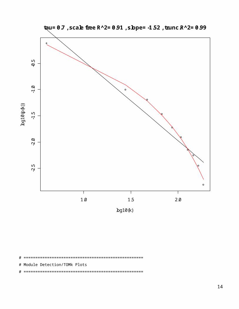
# Based on this analysis, we would choose the cut value (tau) of 0.65 or 0.7 for the correlation matrix #since a) the scale law R^2 crosses 0.85, b) the slope looks OK (negative between -2 and -1). Note that teh slope corresponds to –gamma of the scale free topology distribution.# Later we discuss how robust our findings are with respect to this choice.
# From now on, we fix the cut-off to be:
tau= 0.70
# Calculate Correlation and Adjacency matrices
corhelp=cor(datExpr,use="pairwise.complete.obs")
AdjMat1 = I(abs(corhelp)>tau); diag(AdjMat1)=0
8

# ===================================================
# Check Scale Free Topology
# ===================================================
Degree = apply(AdjMat1,2,sum)# Let’s create a scale free topology plot.# The black curve corresponds to scale free topology and# the red curve corresponds to truncated scale free topology.par(mfrow=c(1,1))ScaleFreePlot1(Degree, AF1=paste(“tau=”,tau),truncated1=TRUE);
9

1.0 1.5 2.0
-2.5
-2.0
-1.5
-1.0
-0.5
log10(k)
log1
0(p(
k))
tau= 0.7 , scale free R^2= 0.91 , slope= -1.52 , trunc.R^2= 0.99
# ===================================================
# Module Detection/TOMk Plots
# ===================================================
10

# Restrict the analysis to the genes with high connectivity
DegCut = 1000
DegreeRank = rank(-Degree)
rest1 = DegreeRank <= DegCut
sum(rest1)
# Comment: this is different from DegCut due to ties in the ranks...
# Remove any isolated nodes, they affect the correlation between different GTOM measures
conn.comp1 = component.dist(AdjMat1[rest1,rest1]) # need the SNA library
conn.comp1$csize
rest1[rest1] = (conn.comp1$membership==1);
summary(Degree[rest1])
AdjMat1rest = AdjMat1[rest1,rest1]
datSummaryrest=datSummary[rest1,]
rm(DegreeRank,AdjMat1); collect_garbage();
# Compute the distance measures
dissCor1 = 1 - abs(corhelp[rest1,rest1])
dissCor6 = 1 - corhelp[rest1,rest1]^6
dissGTOM0 = 1 - AdjMat1rest; diag(dissGTOM0) = 0
# Compute the generalized TOM based dissimilarity
maxk = 3;
for (k in 1:maxk){
assign(paste(“dissGTOM”,k,sep=””), TOMkdist1(AdjMat1rest,k));}
rm(corhelp); collect_garbage();
attach(datSummaryrest)
Biosynthesis1 = rep(“grey”, dim(AdjMat1rest)[[1]])
Biosynthesis1[BiologicalProcess== “protein biosynthesis”] = “darkred”;
11

# This creates a hierarchical clustering using the TOM matrix
hierGTOM0 = hclust(as.dist(dissGTOM0),method="average")
hierGTOM1 = hclust(as.dist(dissGTOM1),method="average")
hierGTOM2 = hclust(as.dist(dissGTOM2),method="average")
par(mfrow=c(1,3))
plot(hierGTOM0, main="Adjacency Matrix: GTOM0", labels=F, xlab=“”, sub=“”)
plot(hierGTOM1, main="Standard TOM Measure: GTOM1", labels=F, xlab=“”, sub=“”)
plot(hierGTOM2, main="New TOM Measure: GTOM2", labels=F, xlab=“”, sub=“”)
# This suggests a height cut-off of h1 for the GTOM1 but one should check the robustness of this choice
12
colorGTOM1=as.character(modulecolor2(hierGTOM1,h1=.95,minsize1=40))
colorGTOM2=as.character(modulecolor2(hierGTOM2,h1=.4))
# This code allows us to test module assignment versus external information on the genestable(Biosynthesis1,colorGTOM1) colorGTOM1Biosynthesis1 black blue brown green red turquoise yellow darkred 0 0 75 0 39 4 0 grey 44 164 79 66 17 429 83table(Biosynthesis1,colorGTOM2) colorGTOM2Biosynthesis1 blue brown green grey turquoise yellow darkred 0 111 0 0 7 0 grey 179 62 60 51 461 69
table(colorGTOM1, essentiality) essentialitycolorGTOM1 0 1 black 35 9 blue 125 39 brown 114 40 green 65 1 red 46 10 turquoise 290 143 yellow 62 21
table(colorGTOM2, essentiality) essentialitycolorGTOM2 0 1 blue 137 42 brown 136 37 green 46 14 grey 38 13 turquoise 313 155 yellow 67 2
13
essentialityColor=ifelse(essentiality==1,”black”, “white”)
par(mfrow=c(5,3),mar=c(2,2,2,2))
plot(hierGTOM0, main="Adjacency Matrix: GTOM0", labels=F, xlab=“”, sub=“”)
plot(hierGTOM1, main="Standard TOM Measure: GTOM1", labels=F, xlab=“”, sub=“”)
plot(hierGTOM2, main="New TOM Measure: GTOM2", labels=F, xlab=“”, sub=“”)
hclustplot1(hierGTOM0,colorGTOM1, title1="")
hclustplot1(hierGTOM1,colorGTOM1, title1="Colored by GTOM1 modules")
hclustplot1(hierGTOM2,colorGTOM1, title1="")
hclustplot1(hierGTOM0,colorGTOM2, title1="")
hclustplot1(hierGTOM1,colorGTOM2, title1="Colored by GTOM2 modules")
hclustplot1(hierGTOM2,colorGTOM2, title1="")
hclustplot1(hierGTOM0,Biosynthesis1, title1="")
hclustplot1(hierGTOM1,Biosynthesis1,title1="Colored by protein biosynthesis status")
hclustplot1(hierGTOM2,Biosynthesis1, title1="")
hclustplot1(hierGTOM0, essentialityColor, title1="")
hclustplot1(hierGTOM1, essentialityColor,title1="Colored by essentiality")
hclustplot1(hierGTOM2, essentialityColor, title1="")
14

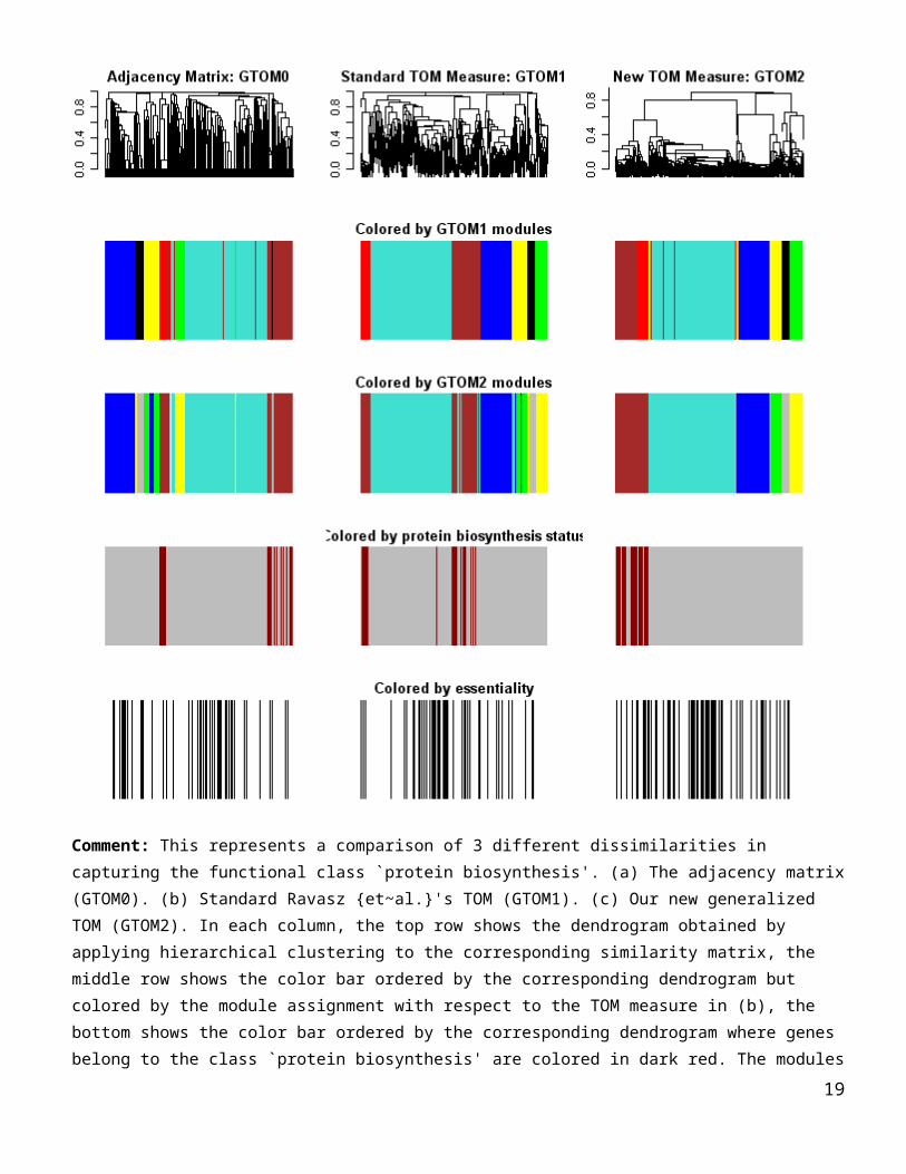
Comment: This represents a comparison of 3 different dissimilarities in capturing the functional class `protein
biosynthesis'. (a) The adjacency matrix (GTOM0). (b) Standard Ravasz {et~al.}'s TOM (GTOM1). (c) Our new
generalized TOM (GTOM2). In each column, the top row shows the dendrogram obtained by applying hierarchical
clustering to the corresponding similarity matrix, the middle row shows the color bar ordered by the corresponding
dendrogram but colored by the module assignment with respect to the TOM measure in (b), the bottom shows the
color bar ordered by the corresponding dendrogram where genes belong to the class `protein biosynthesis' are colored
in dark red. The modules defined by the GTOM1 are the branches of the dendrogram in (b). Almost all protein
biosynthesis genes are rouped together in the brown module by the proposed new TOM measure (GTOM2) whereas
the other two measures tend to distribute the class over two modules.
15

# How related are the distances?datDist = data.frame(dissCor1=c(as.dist(dissCor1)), dissCor6=c(as.dist(dissCor6)), dissGTOM0=c(as.dist(dissGTOM0)), dissGTOM1=c(as.dist(dissGTOM1)), dissGTOM2=c(as.dist(dissGTOM2)), dissGTOM3=c(as.dist(dissGTOM3)))
set.seed(seed=1) # fix the seed so that the results are reproducibledatDist2 = datDist[sample(1:dim(datDist)[[1]],10000),]dim(datDist2)pairs(datDist2, upper.panel=panel.smooth, lower.panel=panel.cor, diag.panel=panel.hist)
Comment: overall the different measures of dissimilarity between expression profiles are correlated, which is re-assuring.
16

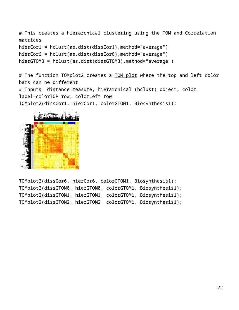
# This creates a hierarchical clustering using the TOM and Correlation matriceshierCor1 = hclust(as.dist(dissCor1),method="average")hierCor6 = hclust(as.dist(dissCor6),method="average")hierGTOM3 = hclust(as.dist(dissGTOM3),method="average")
# The function TOMplot2 creates a TOM plot where the top and left color bars can be different# Inputs: distance measure, hierarchical (hclust) object, color label=colorTOP row, colorLeft rowTOMplot2(dissCor1, hierCor1, colorGTOM1, Biosynthesis1);
TOMplot2(dissCor6, hierCor6, colorGTOM1, Biosynthesis1);TOMplot2(dissGTOM0, hierGTOM0, colorGTOM1, Biosynthesis1);TOMplot2(dissGTOM1, hierGTOM1, colorGTOM1, Biosynthesis1);TOMplot2(dissGTOM2, hierGTOM2, colorGTOM1, Biosynthesis1);
17

TOMplot2(dissGTOM3, hierGTOM3, colorGTOM1, Biosynthesis1);
18
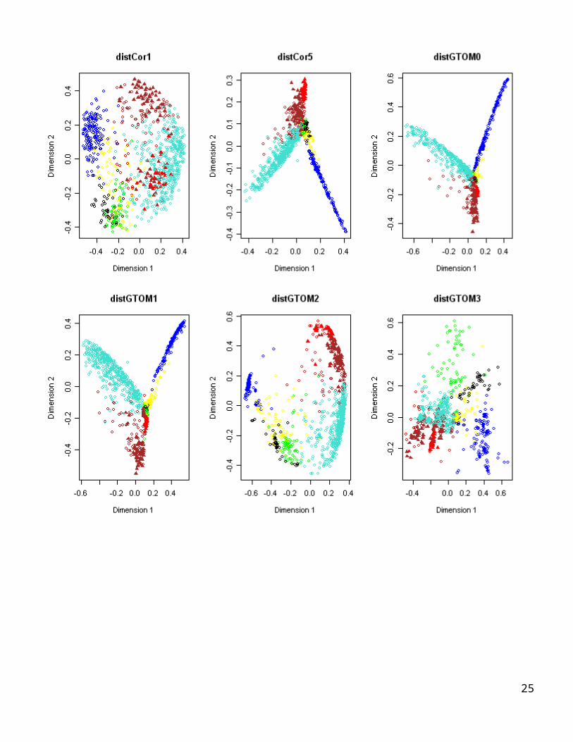
# MDS plots using module color
cmdCor1 = cmdscale(dissCor1,k=3);
cmdCor6 = cmdscale(dissCor6,k=3);
cmdGTOM0 = cmdscale(dissGTOM0,k=3);
cmdGTOM1 = cmdscale(dissGTOM1,k=3);
cmdGTOM2 = cmdscale(dissGTOM2,k=3);
cmdGTOM3 = cmdscale(dissGTOM3,k=3);
par(mfrow=c(2,3))
symbol1 = c(17, 1)[factor(Biosynthesis1)]
plot(cmdCor1,col=as.character(colorGTOM1), pch=symbol1, cex=1.1, xlab=“Dimension 1”, ylab=“Dimension
2”,main=”distCor1”)
plot(cmdCor6,col=as.character(colorGTOM1) , pch=symbol1, cex=1.1, xlab=“Dimension 1”, ylab=“Dimension 2”,
main=”distCor5”)
plot(cmdGTOM0,col=as.character(colorGTOM1) , pch=symbol1, cex=1.1, xlab=“Dimension 1”, ylab=“Dimension 2” ,
main=”distGTOM0”)
plot(cmdGTOM1,col=as.character(colorGTOM1) , pch=symbol1, cex=1.1, xlab=“Dimension 1”, ylab=“Dimension 2” ,
main=”distGTOM1”)
plot(cmdGTOM2,col=as.character(colorGTOM1) , pch=symbol1, cex=1.1, xlab=“Dimension 1”, ylab=“Dimension 2” ,
main=”distGTOM2”)
plot(cmdGTOM3,col=as.character(colorGTOM1) , pch=symbol1, cex=1.1, xlab=“Dimension 1”, ylab=“Dimension 2”,
main=”distGTOM3”)
19

20

The Use of GTOM for Screening for Neighboring Genes
To show a potential use of the GTOM measures, we carry out the following analysis. Recall that for each gene the essentiality is an external gene significance variable based on knock out experiments. essentiality=1 means that the gene is essential for yeast survival, 0 otherwise.We start with an essential gene with high connectivity, i.e. an essential hub gene. Next we create the following lists.List1: rank all genes according to their correlation with that essential gene.List 2: rank all genes according to their TOM1 values with that gene List 3: rank all genes according to their TOM2 value with that gene.The goal is to show that Lists 2 and3 are often more enriched with essential genes than the other lists.We will create the following plots.x-axis rank of genes say 1:20, y-axis proportion of essential genes in the list up to this rank.So, each line starts at point (1,1) because the first gene is essential.At point x=10, the y-value equals the proportion of essential genes that are in the top 10 list of each screening procedure.This results in figures that shows a) that the TOM measures are superior to the correlation measure and b) highlight the differences between TOM1 and TOM2.
GeneSignificance=essentialitytable(colorGTOM1, GeneSignificance) GeneSignificance
colorGTOM1 0 1
black 35 9
blue 125 39
brown 114 40
green 65 1
red 46 10
turquoise 290 143
yellow 62 21
# Find essential hub genes. Goal: find the most highly connected essential genes in the turquoise module# We will now consider essential intramodular hub genes in the following module
whichmodule=”turquoise”
whichcolorvector=colorGTOM1
21
Degreerest=Degree[rest1]Degree2 = Degreerest; # Trick: if a gene is non-essential and not in the right module we assign it negative connectivity Degree2[GeneSignificance==0 | whichcolorvector!= whichmodule] =- Degree2[GeneSignificance==0 | whichcolorvector!= whichmodule]DegreeOrder = order(Degree2,decreasing=T)Degree2[DegreeOrder[1:10]]
#In the following we create 10 plots for the 10 most highly connected essential genes.
par(mfrow=c(2,5))
no.essentialhubs=10
# this is the number of neighbors that will be considered for each of the essential hub genes
no.neighbors=20
for (i in c(1: no.essentialhubs) ) {
# The following gene is the i-th most highly connected essential gene
Hub1 = DegreeOrder[i]
Hub1ListCor1 = c(Hub1,order(dissCor1[Hub1,-Hub1], decreasing=F));
Hub1ListGTOM1 = c(Hub1,order(dissGTOM1[Hub1,-Hub1], decreasing=F));
Hub1ListGTOM2 = c(Hub1,order(dissGTOM2[Hub1,-Hub1], decreasing=F));
# This computes the proportion of essential genes among the most correlated genes.
Hub1PropEssCor1 = cumsum(GeneSignificance[Hub1ListCor1])/(1:length(Hub1ListCor1));
Hub1PropEssGTOM1 = cumsum(GeneSignificance[Hub1ListGTOM1])/(1:length(Hub1ListGTOM1));
Hub1PropEssGTOM2 = cumsum(GeneSignificance[Hub1ListGTOM2])/(1:length(Hub1ListGTOM2));
Hub1PropEss = data.frame(Corr=Hub1PropEssCor1, GTOM1=Hub1PropEssGTOM1, GTOM2=Hub1PropEssGTOM2)
[1:no.neighbors,]
matplot(Hub1PropEss, type="l", lty=1:3, lwd=3, col=2:4, ylab="Proportion Essential", xlab="rank", main=paste(“essential hub
number: “, i) )
legend(10,1, c("correlation","GTOM1","GTOM2"), col=2:4, lty=1:3,lwd=3, pch = "*",ncol = 1, cex=.8)
title("")
}# end of for loop
22

5 10 15 20
0.2
0.4
0.6
0.8
1.0
essential hub number: 1
rank
Prop
ortio
n Es
sent
ial
***
correlationGTOM1GTOM2
5 10 15 20
0.2
0.4
0.6
0.8
1.0
essential hub number: 2
rankPr
opor
tion
Esse
ntia
l
***
correlationGTOM1GTOM2
5 10 15 20
0.4
0.6
0.8
1.0
essential hub number: 3
rank
Prop
ortio
n Es
sent
ial
***
correlationGTOM1GTOM2
5 10 15 20
0.4
0.6
0.8
1.0
essential hub number: 4
rank
Prop
ortio
n Es
sent
ial
***
correlationGTOM1GTOM2
5 10 15 20
0.4
0.6
0.8
1.0
essential hub number: 5
rank
Prop
ortio
n Es
sent
ial
***
correlationGTOM1GTOM2
5 10 15 20
0.2
0.4
0.6
0.8
1.0
essential hub number: 6
rank
Prop
ortio
n Es
sent
ial
***
correlationGTOM1GTOM2
5 10 15 20
0.2
0.4
0.6
0.8
1.0
essential hub number: 7
rank
Prop
ortio
n Es
sent
ial
***
correlationGTOM1GTOM2
5 10 15 200.
50.
60.
70.
80.
91.
0
essential hub number: 8
rank
Prop
ortio
n Es
sent
ial
***
correlationGTOM1GTOM2
5 10 15 20
0.5
0.6
0.7
0.8
0.9
1.0
essential hub number: 9
rank
Prop
ortio
n Es
sent
ial
***
correlationGTOM1GTOM2
5 10 15 20
0.2
0.4
0.6
0.8
1.0
essential hub number: 10
rank
Prop
ortio
n Es
sent
ial
***
correlationGTOM1GTOM2
#Comment:
Note that in many cases the TOM based measures outperform the correlation measure.#But there is a lot of variability and it is more meaningful to summarize the results for multiple genes in a single plot.Toward this end, we will now average these findings.
no.essentialhubs=10no.neighbors=20Hub1PropEssCor1=rep(0,no.neighbors)Hub1PropEssGTOM1=rep(0,no.neighbors)Hub1PropEssGTOM2=rep(0,no.neighbors)for (i in c(1:no.essentialhubs) ) {# The following gene is the i-th most highly connected essential geneHub1 = DegreeOrder[i]Hub1ListCor1 = c(Hub1,order(dissCor1[Hub1,-Hub1], decreasing=F))[1:no.neighbors] ;Hub1ListGTOM1 = c(Hub1,order(dissGTOM1[Hub1,-Hub1], decreasing=F))[1:no.neighbors] ;Hub1ListGTOM2 = c(Hub1,order(dissGTOM2[Hub1,-Hub1], decreasing=F))[1:no.neighbors] ;# This computes the proportion of essential genes among the most correlated genes.Hub1PropEssCor1 = Hub1PropEssCor1+ cumsum(GeneSignificance[Hub1ListCor1])/(1:length(Hub1ListCor1))/no.essentialhubs;Hub1PropEssGTOM1 = Hub1PropEssGTOM1+ cumsum(GeneSignificance[Hub1ListGTOM1])/(1:length(Hub1ListGTOM1))/no.essentialhubs;Hub1PropEssGTOM2 = Hub1PropEssGTOM2+ cumsum(GeneSignificance[Hub1ListGTOM2])/(1:length(Hub1ListGTOM2))/no.essentialhubs;}# end of for loopHub1PropEss = data.frame(Corr=Hub1PropEssCor1, GTOM1=Hub1PropEssGTOM1, GTOM2=Hub1PropEssGTOM2);
23

par(mfrow=c(1,1))matplot(Hub1PropEss, type="l", lty=1:3, lwd=3, col=2:4, ylab="Proportion Essential", xlab="rank", main=paste(“average over“, i, “essential hub genes “,”in the”, whichmodule, “module.”) )legend(5,1, c("correlation","GTOM1","GTOM2"), col=2:4, lty=1:3,lwd=3, pch = "*",ncol = 1, cex=.8)title("")
5 10 15 20
0.5
0.6
0.7
0.8
0.9
1.0
average over 10 essential hub genes in the turquoise module.
rank
Pro
porti
on E
ssen
tial
***
correlationGTOM1GTOM2
# Overall the TOM measures perform better at implicating essential genes when using the essential hubs in the turquoise module as starting set.
CAVEAT: this finding is highly dependent on what nodes one starts with.When considering the 20 most highly connected essential hubs in the whole network (i.e. not necessarily in the turquoise module), we obtain the following result.# Goal: find the most highly connected essential genes in the network# We will now consider essential intramodular hub genes in the following module
Degree2=Degree[rest1]# Trick: if a gene is non-essential and not in the right module we assign it negative connectivity Degree2[GeneSignificance==0] =- Degree2[GeneSignificance==0]DegreeOrder = order(Degree2,decreasing=T)Degree2[DegreeOrder[1:10]]
24
#We will now average the findings.no.essentialhubs=20no.neighbors=20Hub1PropEssCor1=rep(0,no.neighbors)Hub1PropEssGTOM1=rep(0,no.neighbors)Hub1PropEssGTOM2=rep(0,no.neighbors)for (i in c(1:no.essentialhubs) ) {# The following gene is the i-th most highly connected essential geneHub1 = DegreeOrder[i]Hub1ListCor1 = c(Hub1,order(dissCor1[Hub1,-Hub1], decreasing=F))[1:no.neighbors] ;Hub1ListGTOM1 = c(Hub1,order(dissGTOM1[Hub1,-Hub1], decreasing=F))[1:no.neighbors] ;Hub1ListGTOM2 = c(Hub1,order(dissGTOM2[Hub1,-Hub1], decreasing=F))[1:no.neighbors] ;# This computes the proportion of essential genes among the most correlated genes.Hub1PropEssCor1 = Hub1PropEssCor1+ cumsum(GeneSignificance[Hub1ListCor1])/(1:length(Hub1ListCor1))/no.essentialhubs;Hub1PropEssGTOM1 = Hub1PropEssGTOM1+ cumsum(GeneSignificance[Hub1ListGTOM1])/(1:length(Hub1ListGTOM1))/no.essentialhubs;Hub1PropEssGTOM2 = Hub1PropEssGTOM2+ cumsum(GeneSignificance[Hub1ListGTOM2])/(1:length(Hub1ListGTOM2))/no.essentialhubs;}# end of for loopHub1PropEss = data.frame(Corr=Hub1PropEssCor1, GTOM1=Hub1PropEssGTOM1, GTOM2=Hub1PropEssGTOM2);par(mfrow=c(1,1))matplot(Hub1PropEss, type="l", lty=1:3, lwd=3, col=2:4, ylab="Proportion Essential", xlab="rank", main=paste(“average over“, i, “essential hub genes “,”in the network”) )legend(5,1, c("correlation","GTOM1","GTOM2"), col=2:4, lty=1:3,lwd=3, pch = "*",ncol = 1, cex=.8)title("")
25

5 10 15 20
0.5
0.6
0.7
0.8
0.9
1.0
average over 20 essential hub genes in the network
rank
Pro
porti
on E
ssen
tial
***
correlationGTOM1GTOM2
So for this example GTOM1 has similar performance as GTOM2.
There is no doubt that more comprehensive empirical analyses are needed to establish the usefulness and limitations of the GTOM2 measure.
THE END
26