gender convergence in human survival and the postponement
TRANSCRIPT

Faculty of Actuarial
Science and Insurance
Actuarial Research Paper No. 200
Gender Convergence in Human Survival and the Postponement of Death
Les Mayhew & David Smith
July 2012 Cass Business School
106 Bunhill Row London EC1Y 8TZ Tel +44 (0)20 7040 8470
ISBN 978-1-905752-34-8 www.cass.city.ac.uk

“Any opinions expressed in this paper are my/our own and not necessarily those of my/our employer or anyone else I/we have discussed them with. You must not copy this paper or quote it without my/our permission”.

1
Gender convergence in human survival and the
postponement of death
CONTENTS
1. Introduction
2. Gender gap in life expectancy at age 30
- Why is death being postponed?
- Other factors
- Future prospects
- Outline of rest of paper
3 A simplified model of survival and death postponement
- Postponement of death in selected cases
4. Fitting the model
- Calibrating the survival function
5. Initial results
- Further analysis
(a)Trends in survival
(b)Trends in the mode, mean and standard deviation in age of death
(c)Trends in the postponement of death
6. Conclusions
Annex A: Stylised model of survival
Annex B: Smoking prevalence and gender gap in life expectancy
Les Mayhew
David Smith
Faculty of Actuarial Science and Insurance
Cass Business School
106, Bunhill Row
London
EC1Y 8TZ
Corresponding author: [email protected]
July 2012

2
Gender convergence in human survival and the
postponement of death
Abstract
It has been a long accepted demographic maxim that females outlive males. Using data for England and
Wales, we show that life expectancy at age 30 is converging and continuation of this long-term trend
suggests it could reach parity in 2030. Key among the reasons identified for the narrowing of the gap
are differences in smoking prevalence between males and females which have narrowed considerably.
Using data from 30 comparator countries gender differences in smoking prevalence are found to
explain over 75% of the variance in the life expectancy gap, but other factors such as female
emancipation and better health care are also considered. The paper presents a model which considers
differences in male and female longevity in greater detail using novel methods for analysing life tables.
It considers the ages from which death is being postponed to the ages at which people now die; the
relative speed at which these changes are taking place between genders; how the changes observed are
affecting survival prospects at different ages up to 2030. It finds that as life expectancy continues to
rise there is evidence for convergence in the oldest ages to which either gender will live.
Key words: life expectancy gender gap smoking prevalence survival model
convergence
1.0 Introduction
It has been a long accepted demographic maxim that females outlive males. However,
when one examines the historical record for the last century the gap in life expectancy
tends to vary but as part of a long term trend. For years at a time the gap appears to
close, while other times it widens or remains the same.
Sometimes the reasons are obvious and coincide with either wars or epidemics but at
other times life expectancy drifts apart or narrows due to no obvious event. It would
be hard to justify these differences on biological grounds since the gender gap varies
so much and is different in each country and so is more likely to be societal in origin.
Currently we are in a period in which overall life expectancy is increasing rapidly,
with death being postponed to much older ages. Also apparent in a number of
countries is a convergence in gender life expectancy which Trovato (2007) calls the
‘emerging epidemiological feature of post-industrial societies’ (see also Trovato,
1996, 2003 and 2006, Tuljapurkar et al 2000).
Convergence has become a well entrenched trend over recent decades in England and
Wales as male life expectancy catches up with that of females. To this end, we
develop a model which enables us to discern differences in survival by age and gender
and which allow us to project the consequences of this trend in future years in order to
understand the processes in detail and how they affect each gender separately.
The economic and practical ramifications of the postponement of death over a long
period are considerable. The extra years lived into a person’s 80s and beyond will
require assets to be decumulated over more years putting a strain on personal
finances. In addition, both the state and families as well as individuals will experience
increases in health and social care costs and there may not be enough caregivers to
look after all older people in the future. All of these have the possibility of acting as a

3
break on further advances in life expectancy itself and therefore confound the trends
currently underway (Thatcher et al, 2008).
Taking a more positive view, males will be enabled to work for longer in reasonable
health and be expected to live for almost as long as their partners (after taking account
of the typical age difference upon union), whilst cohabitation itself is a factor in
reducing mortality (Cheung, 2000, Karlsson et al, 2009).
In this paper, we address two sets of issues: firstly, how quickly is life expectancy
increasing and why is it converging, including the prospect it will continue to increase
at the same pace. Secondly, we consider whether convergence is benefitting all ages
or just some, and the degree to which these benefits vary by gender. In the next
section, we deal with the first of these questions, by reviewing the trends and
comparing England and Wales with other countries.
As we shall argue, many of these advances that are described are due to the adoption
of healthier lifestyles over a period, but key among these is the huge reduction in the
prevalence of smoking since 1948. To assist with the second set of issues we develop
a model of survival and apply it to the England and Wales population. Section 3
describes the model; Section 4 fits the model to data and Section 5 analyses the
results. A concluding section then follows.
2.0 Gender gap in life expectancy at age 30
Life expectancy is defined as the average number of years an individual is expected to
live based on mortality rates at different ages. An increase in life span may affect
individual age cohorts differently, resulting in a variety of postponement of death
patterns and trends over time.
A distinction can be drawn between pre- and post 30 years of age. Before age 30 there
are currently more gender related differences in male and female mortality than post
30. At birth, more males die before age one than females although with reductions in
infant mortality of 75% since 1970 in England and Wales this difference is less
noticeable than previously.
There is also a marked increase in male mortality between 16 and 30 years but much
less so for females. In 2009 the male ‘accident hump’ had reduced slightly and now
there is no discernible female hump at all. Reasons for the hump include the fact that
men tend to be involved in riskier activities such as dangerous sports, tend to be more
prone to road and other accidents, and are more likely to commit suicide.
By analysing expectation of life at 30, these differences are largely removed. This
allows us to study changes in the patterns of deaths for people in their wealth-
creating and family rearing years. In doing so, we also avoid the complication of
separating out the influences of reductions in childhood mortality and other factors.
We select England and Wales as our exemplar because it is a particularly interesting
case study and, as we shall see, a potential lesson to other countries where
convergence is less evident. Figure 1 shows how life expectancy at 30 has steadily
progressed from 1950 to 2009 for both genders.

4
By 2009 female life expectancy stood at 53.2 years and male life expectancy at 49.4
years, a difference of 3.8 years. This compares with a gap of 5.7 years in 1970 when it
was at a maximum. The trends in life expectancy are very accurately described by a
second order polynomial equation, shown in Figure 1 as dotted lines.
Based on this, male and female life expectancy is forecast to converge at 57.1 years
by 2030. That is not say that the convergence will definitely occur but the trends are
well entrenched. However, it is necessary to investigate the mechanisms that underpin
such a prediction and its robustness.
Figure 1: Trends in life expectancy at age 30 in England and Wales by gender
If England and Wales is compared with France, Japan and Sweden, it turns out that
England and Wales is the only one in which male life expectancy has increased by
more than female life expectancy in the period 1950 to 2009 (8.9 years versus 8.6
years) and in where female life expectancy has increased least.
Table 1 shows that the longest lived males are Swedish (51.4 years) and the longest
lived females are Japanese (57.9 years). Section B of Table 1 shows that the gender
gap in England and Wales was 3.8 years and therefore comparable with Sweden at 3.7
years and much lower than in either France or Japan. As a percentage of male life
expectancy only Sweden had a slightly lower gap than England and Wales at 3.7%
Section C of Table 1 shows that in England and Wales the gap reached a maximum of
5.7 years in 1969 or 8.3% of male life expectancy. This compares with 7.5 years in
France or 16.4% of male life expectancy reached in 1992, which is the biggest
divergence recorded among this group of countries. In Sweden, the peak came in
1983 when the gap was 5.6 years and equivalent to10.9% of male life expectancy.

5
Of the four countries, Japan is the odd country out. Here the gender gap has been
mainly growing in size since 1950 and reached a peak at 6.7 years or 13.3% of male
life expectancy in 2003, the highest of any of the countries shown. Part of the reason
for this is that female life expectancy in Japan has grown faster than elsewhere, but
also that the rate of growth in male life expectancy has lagged behind.
It is instructive to investigate how the gender gap in life expectancy has changed over
the longer term. Although one would expect the gap to be smaller because life
expectancy was much lower in earlier decades, it was also smaller as a percentage of
male life expectancy in the early part of last century as is apparent in section D of
Table 1 (data for Japan are unavailable before 1947).
Life expectancy at 30 (yrs)
England and
Wales France Japan Sweden
A Females 2009 53.2 55.1 57.9 55.1
Males 2009 49.4 48.8 51.4 51.4
B Gender gap (yrs) 3.8 6.3 6.5 3.7
Gap as % of male life expectancy 7.7 12.9 12.6 7.2
improvement relative to (C) (years) -1.9 -1.2 0 -1.9
C Maximum gender gap since 1950 (years) 5.7 7.5 6.7 5.6
as % of male life expectancy 13.3 16.4 13.3 10.9
year in which occurred 1969 1987 2003 1983
D Minimum gender gap since 1900 (years) 2.5 2.6 3.1 0.5
as % of male life expectancy 7.1 7.2 7.8 1.3
year in which occurred 1909 1903 1951
(1) 1922
Table 1: Comparative life expectancy at age thirty in selected countries by gender
(source: HMD).(Note (1): Japanese data unavailable before 1947)
In England and Wales and France a minimum gap was attained in 1909 and 1903
respectively. In Sweden it reached a minimum in 1922, after falling gradually for
most of the previous century, of just 0.5 years or 1.9% of male life expectancy. This
marks the year when the gender gap was at its narrowest in any of the four countries.
The Swedish case lends weight to the argument that there are no fundamental
biological differences between male and female life expectancy, but that the factors
responsible for the gap are primarily societal and gender-centric (Trovato, 1996).
2.1 Why is death being postponed?
In order to understand these trends in more detail we need to ask why death is being
postponed more so in the case of males and why it is happening at different rates in
some countries. In England and Wales, the underlying gender gap that emerged and
which peaked in 1969 was the culmination of a number of effects including the
increased prevalence of smoking over a period, cancer, heart disease etc. among men

6
born around the turn of the century and who especially developed smoking habits
from the 1920s onward.
The following points are noteworthy:
About one in six of all deaths in England and Wales are smoking related. Of
these, about 60% are among men and 40% women. Smoking exacts a large
death toll in the form of chronic obstructive lung disease, and ischemic heart
disease among the over 65s, whilst death from lung cancer is attributable to
smoking in about 85% of cases.
Since 1948, 82% of males smoked some form of tobacco and 65% smoked
cigarettes. Today only 21% smoke cigarettes1. Females took up the smoking
habit later than males peaking at about 40% before declining to 20%. As
smoking among women increased, there were accompanying increases in
female rates of lung cancer and other smoking related diseases (e.g. see
Pampel, 2006, 2003, 2002).
The levels of smoking related mortality depend on tobacco consumption,
quitting rates and lifetime exposure. It is not inconsistent for example for
mortality rates to continue rising whilst smoking prevalence is falling and so
the benefits of smoking cessation tend to percolate gradually at least initially
(Murphy and Di Cesare, 2012).
According to Doll et al (2004), a ceased smoker at age 30 could expect to live
10 years and at 60 three years extra. Crudely speaking, if the remaining 20%
of smokers ceased smoking then this would eventually add another two years
to the life expectancy of the whole population after which time the full
dividend from smoking cessation will be approached.
Coronary heart disease (CHD) mortality, itself smoking related, has been
declining since the 1960s. Unal et al (2004) found that 58% of the coronary
heart disease mortality decrease in England and Wales between 1981 and 2000
was attributable to reductions in major risk factors, principally smoking, blood
pressure and cholesterol. In addition, there are now effective treatments for
heart disease such as coronary artery surgery, angioplasty, statins, and other
medications (Laatikainen et al, 2005).
Trovato (2005), using data from Canada, found that in 1971, 41% of the
difference in male an female life expectancy at birth could be accounted for by
heart disease, 19.7% by accidents, violence and suicide and 9.5% by lung
cancer. Based on data from 2000, he found that the gap had narrowed by two
years in which time the contribution of heart disease had fallen to 27.5% and
accident, violence and suicide to 11.5%.
The relatively small gender gap in life expectancy in Sweden is of particular interest.
While smoking rates among Swedish women have been consistent with those of other
European countries (a fact reflected in comparable lung cancer rates), smoking rates
1 Source: Cancer research UK

7
among men in Sweden have always been lower than those of their European
counterparts. Sweden’s neutrality in both world wars is a factor in the low take up of
smoking among Swedish males; however, a second reason is the traditional
consumption of ‘snus’, a moist powder form of tobacco which is placed under the lip
and not smoked.
Japan is an exception where smoking is still relatively widespread among males;
statistics show Japanese men smoke at one of the highest rates in the world at 36% but
only 12.1% of Japanese women do so. In France, 36% of males also smoke but
prevalence in women is over twice the rate of Japanese females. More generally, we
find that the difference in smoking prevalence between genders is a good indicator of
gaps in life expectancy. Using data from 37 countries (see also Annex B), we
ascertained for example that 75% of the variation in the gap in life expectancy at age
30 could be explained in this way confirming similar results obtained by Trovato
(2005).2
The greatest gender differences in life expectancy and smoking prevalence occur in
Russia and east European countries and the least differences in west European
countries, Australia, Canada and New Zealand. However, this correlation is truer for
more developed countries with long established patterns of tobacco consumption. In
less developed countries, the gender gap is less because life is shorter and death tends
to be from non-smoking related causes. Clearly, there will come a time when smoking
will take a similar toll on human life in rapidly developing regions such as China,
India, Middle Eastern countries and South America, as more people reach the age at
which smoking related diseases make an impact.
2.2 Other factors
Not all of the gender gap can be explained by differences in smoking prevalence
although smoking is often implicated indirectly. Other factors are important and may
be correlated with people who smoke but they are not as well supported by
comprehensive data. A distinction can be drawn between those affecting both genders
and those that are gender specific. Hence, working in hazardous industries affects
males more than females but infectious diseases, cold winters, hot summers,
economic depressions, urban smog and so on are largely gender neutral, especially if
there is a pre-existing health condition.
Since the 1980s the UK has undergone a significant industrial transformation with the
numbers employed in manufacturing and mining falling substantially. Employment in
the coal mining industry, strongly associated with lung disease, has fallen from a peak
of 1.2m in 1920, 0.3m in 1970 to 5,000 today. There are also factors causing female
life expectancy to rise more slowly. An example is increasing female adoption of
unhealthier male behaviours, increases in smoking being a prime example (Pampel,
2005 a and b). Trovato (2005), for example, finds that while increased female labour
force participation is not significantly associated with female smoking, it is inversely
correlated with gender differences in life expectancy.
2 See WHO report on the global tobacco epidemic, 2011: warning about the dangers of tobacco.
http://www.who.int/tobacco/global_report/2011/en/index.html/Human and The Human Mortality
Database, http://www.mortality.org/

8
A more contemporary phenomenon and threat to life expectancy is the rise in obesity.
According to Eurostat (2011), 22% of males in the UK were obese and 23.9% of
women.3 Obese people are more likely to suffer from diabetes which in turn can lead
to other health complications and premature death (Hippisley-Cox et al, 2010).
Among the morbidly obese (BMI levels of 40+), an individual could lose between 5.6
and 10.9 years of future life at age 30 if they remain obese (Mayhew et al, 2009).4
Although obesity in women does not affect life expectancy as much as it does in men,
it has the potential to limit life expectancy gains among women if obesity grows at a
faster rate.
It has been argued that the root causes of disparities in life expectancy are health
inequalities, most of which are largely preventable (Marmot, 20115). Smoking,
obesity, alcohol abuse and other factors are strongly associated with disparities in
wealth and income. For example, Marmot shows that people living in the poorest
neighbourhoods in England will on average die seven years earlier than people living
in the richest neighbourhoods. The causes are complex, but appear to impact more on
men than women due to differences in their health behaviours. Mayhew (2010, 2011),
for example, found a gender gap of up to 14 years among male adults who are
economically inactive, have low educational status, live alone and who smoke as
compared with the longest lived lives.
2.3 Future prospects
In looking forward the question arising is whether the gender gap will continue to
narrow at current rates and for life expectancy to converge by 2030. There do not
appear to be any fundamental biological reasons or barriers why the extra level of life
expectancy required is unattainable. Already Japanese females are living to the age
forecast for England and Wales in 2030 i.e. 57 years and so we know that extra years
are achievable. More fundamentally, Oeppen and Vaupel (2002) find that there has
been an unbroken linear rise in life expectancy of about three months a year for at
least 150 years and so increases post 2030 are also probable.
The main barriers, if any, are societal in origin. Vaupel (2010), summarising reasons
for increases in life expectancy, finds that only about 25% of the variation in adult life
spans is attributable to genetic differences. As long as there is continued access to
health care, etc. life expectancy should continue to improve, he suggests, especially if
coupled with healthier lifestyles, exercise and diet. Karlsson et al (2010), studying the
effects of a reduction in income inequality would have on life expectancy, found that
reducing the UK income inequalities to the levels recorded in Sweden would increase
3 Eurostat, 2011. Overweight and obesity - BMI statistics.
http://epp.eurostat.ec.europa.eu/statistics_explained/index.php/Overweight_and_obesity_-
_BMI_statistics 4 For various reasons there is an increasing preference for using waist to height ratio (WHtR) instead of
BMI for measuring obesity. For example WHtR is easier to measure and provides better visual
representation. A WHtR of 0.5 (i.e. height is twice waist) is considered optimal in males and equivalent
to a BMI value of 25. In females the equivalent is a WHtR of 0.43. It is estimated that a BMI of 30
(borderline obese) equates to a WHtR of 0.53 in women and 0.60 in men. 5 Fair Society, Healthy Lives – the report of the Marmot review (2011)
http://webarchive.nationalarchives.gov.uk/+/www.dh.gov.uk/en/Publichealth/Healthinequalities/DH_0
94770

9
life expectancy by 0.16 years and eliminating inequalities altogether would achieve
0.41 years.
As disparities in life expectancy reduce, death should gradually be concentrating into
fewer years at older age. If true, this means that gender differences in survival will
also gradually disappear subject to the caveats set out above. These processes are
collectively known as the compression of mortality or sometimes as
‘rectangularisation of the survival curve’, about which there is a substantial literature,
e.g. see Robine (2008), Thatcher et al (2008), Bongaarts (2005), Kannisto (2000),
Wilmoth and Horiuchi (1999), and Fries (1980).
There is debate however about whether rectangularisation is actually occurring in the
way envisaged (Canudas-Romo, 2008). In results presented here, we find that patterns
in survival are a more complex mixture of effects depending on age, gender and
period. We tackle this issue by developing a simple stylised model of survival of
which there are three basic types: the divergent, parallel and convergent cases. In the
divergent case, health inequalities widen and life expectancy gains are shared
unequally; in the parallel case gains are shared equally but health inequalities are
unchanged; in the convergent case, based on rectangularisation of the survival curve,
gains are also shared unequally but health inequalities are reduced.
2.4 Outline of rest of paper
Thus far we have used life expectancy as a yardstick for measuring the differences
between genders. However, life expectancy is a broad measure that does not take
account of variations in the mortality experience at various ages. For example, a
population with a constant death rate from birth in which everybody is dead by age
100 would have the same life expectancy as a population that all died on their 50th
birthday. In order to understand what lies behind the finding that male and female life
expectancy is converging we therefore need to go into considerably more detail.
There are three issues to consider:
1. How changes in life expectancy are affecting survival prospects at different
ages over time, for example the relative chances of a male or female reaching
very old ages both in the past and future, and the parts of the survival
distribution that are benefitting most.
2. Changes in the mean and modal age of death to ascertain whether, as well as a
convergence in life expectancy, there is a trend towards greater concentration
of death within a narrower age range and if this is different for males and
females.
3. By comparing different periods, to identify the ages from which death is being
postponed to the ages at which people now die, including the relative speed at
which these changes are taking place and how to interpret the patterns that are
the result.
We start by describing a simple, stylised survival model, which we use to show how
different postponement processes lead to characteristic mortality patterns which can

10
be compared with patterns found in reality and enable us to address these issues. We
use this model to understand the processes by which life expectancy and survival are
interrelated.
To apply the model in practice, we exploit the empirical relationship between life
expectancy and the probability of survival to a given age. We then use this
relationship to establish age specific survival probability in some future year to which
we then fit a Gompertz-Makeham function (e.g. see Olshansky and Carnes 1977 or
Forfar and Smith 1987).
Using life tables for England and Wales, we extend our previously developed
approach (Mayhew and Smith, 2011 and 2012). From this we derive full single year
life tables which we then use to extract the current and future predicted number of
deaths by year and gender. We then compare differences in age of death at ten year
intervals from 1950 to 2030. The results appear as waves which are broadly sinusoidal
in shape. From these waves we derive measures such as amplitude and wave length to
compare differences in the pattern of change between males and females.
The results show substantially different gender patterns and confirm that the
momentum for improvements in life expectancy has switched from younger to older
ages and that men are outperforming women in some sections of the survival
distribution and under performing in others. In the next section we set out a stylised
and simplified version of the model. In Section 4 we fit the model to data from
England and Wales, in Section 5 we set out results and in Section 6 we discuss the
findings and conclusions.
3.0 A simplified model of survival and death postponement
Mathematically the survival curve )(xS denotes the probability of surviving to age x ,
whereas )(xe defines life expectancy at age x . We initially develop our ideas into the
form of a simple, stylized model in order to gain insights into the processes linking
the probability of survival, death and life expectancy. This allows us to derive a basic
relationship between the survivorship and the postponement of death.
Imagine a stationary population in which there are a constant number of births and
deaths and no migration and that is subjected to the same mortality regime each year.
Consider Figure 2(a), which shows the survival curves ABC and AED for
hypothetical populations at two points in time, 1t and
2t .
The )(xS curve may be compared to a life table which is based on an imaginary
population usually of 100,000 people. This means that 1000 deaths represent 1% of
all deaths. Deaths at each age are recorded and subtracted from the remaining lives.
The life table continues until an age is reached by which all 100,000 are dead
corresponding to 2x (point C) or '
2x (point D) depending on the time period.
We define the point 1x in Figure 2(a) as the original onset of mortality, the age at
which death begins, which can range from zero upwards. For simplicity, we assume
there are no deaths before this age. We call the point where BC cuts the age axis 2x

11
or the maximum age to which anyone lives, and so life expectancy is originally given
by .2/)( 21 xx
Figure 2: Simplified model of survivorship and death
age (x)
num
ber
of surv
ivors
(lx
)
age (x)
diffe
ren
ce
in
de
ath
s (
A-B
)
age (x)
nu
mb
er
of d
ea
ths (
dx)
elapsed time (t)
nu
mb
er
of d
ea
ths p
er
an
nu
m
1x
A
O
B E
2x 2'x
C D (a)
(d)
(c)
(b)
P
t1 t
2
1'x
a b
p
q r
s
c
d

12
Both 1x and 2x are somewhat fuzzy quantities in the real world. In developed
countries we could assume the onset of mortality ( 1x ) occurs from around 50 years
onward.
The exact age is imprecise but may be defined by reference to particular percentiles of
deceased, for example, 10%. The same applies to maximum age at death in which it
may be more appropriate to assume that 2x is the age of death of the 90th percentile.
However, our purpose is to use 1x and 2x as conceptually useful devices to anchor
and compare distributions and mortality processes, rather than to determine them
empirically.
Now imagine the age distribution of the population at another point in time, 2t . In
Figure 2(a), we see that 1x has shifted to the right to '
1x , while 2x has advanced to '
2x
(point D). Life expectancy is now .2/)('
2
'
1 xx
In other words, the onset of mortality and maximum age has increased, and as a result
many more people live to older ages. In this example, we see that 1x and 2x have
advanced by slightly different amounts, such that the mortality gradient in 2t is
steeper than in 1t and so more die at each age after '
1x .
Figure 2(b) shows the pattern of deaths in 1t and 2t . The later commencement of
mortality in 2t has caused a shift in the ages of death to the right, but because the
mortality gradient is steeper the deaths are bunched into a shorter age range.
In Figure 2(c), we subtract deaths by age in 2t from 1t in order to show how death has
been effectively postponed between each snapshot. It shows that before point P there
were fewer deaths at 2t than at 1t but more after point P. The effect is to create a
wave or pulse with a fall in death prior to age P and an increase post P.
We define P as the pivot point, the heights (c-d) of the peak and trough as the
amplitude, and the distance (a-b) the peak-to-trough age range. These quantities are
identified by arrows with a diagonal arrow indicating the postponement effect which
the stylised model is trying to capture.
Note also that since we fix at the outset the maximum deaths occurring in any one
year to 100,000, it follows that the total deaths below the horizontal axis defined by
zero, i.e. deaths postponed, must equal the total deaths above. As we shall see later,
using actual life tables the waves are smooth curves and so there is no difficulty in
defining a or b accurately.
Let us assume that at time 1t lives aged below
1x have the mortality rates that are
assumed by '
1x and '
2x whereas lives aged 1x and over at
1t still remain with the old
mortality rate. Figure 2(d) shows the time taken for the population of people with the
improved mortality rates to reach the new steady state. We define this as the transition

13
period in which the population that has become healthier adjusts to its new steady
state. It shows the expected change in the number of deaths between periods which,
for the purposes of the stylised model, is assumed to be an incremental process that
progresses at an even rate year on year. In other words, we assume a process in which
mortality affects future cohorts and not cohorts already aged 1x or over.
Consider the simplest case in which 1
'
1 xx at 1t and
2t .
For 1t x i.e. before these new ‘healthier’ lives reach
1x
Death rate 2 1
2 1
xx
lx x l
x x
in which xl is the number of survivors to age x . This is intuitive as we start with a
stable population and if xl people are born then the same number must die.
For1 2x t x i.e. when the new ‘healthier’ lives reach
1x and die at the new lower rate
but we still have some older lives dying at the original rate
Death rate 2 1
2 1 2 1
x xl lx t t x
x x x x
The first term involves the older lives who die at the original rate. As t increases this
number reduces (as the population with original mortality rates dies out). The second
term involves the newer lives dying at the newer, lower rate. A more general case can
be constructed involving changes to both 1x and
2x but is slightly more complicated.
The main result of this process is that death rates fall initially as the new healthier
cohort ages and then once the whole population is part of this cohort rates climb again
to previous levels. The area pqrs represents the total deaths avoided between 1t and
2t and is equivalent to the area BECD in Figure 2(a).
3.1 Postponement of death in selected cases
Averting deaths may either increase or reduce life disparity between ages of deaths
depending on changes in shape of the survival curve (Zhang and Vaupel, 2009). Our
principal interest lies in changes to the distribution of deaths over the age register, for
example whether they are bunched or spread out.
As well as the specific example in Figure 2, other variants can be constructed
depending on assumed changes to 1x and
2x . Of these, five particular cases can be
conveniently identified which help us to identify and interpret real world patterns.
The first three cases, which were described in detail by Mayhew and Smith (2011),
are known as the divergent, parallel and convergent cases. Cases four and five, termed
regressive cases, are aberrant variants but are nevertheless possible in specific
circumstances.

14
Figure 3 lists each case. An adjacent diagram shows the change in the pattern of
deaths between time periods. Postponed deaths are represented below the line and are
of course exactly balanced by deaths above the line.
1. Divergent case:
2
'
21
'
1 xxandxx
2. Parallel case:
)()( 2
'
21
'
1 xxxx
3. Convergent case:
2
'
21
'
1 xxandxx
4. Regressive case (i)
2
'
21
'
12
'
2,1
'
1 ,0,0 xxxxxxxx
5. Regressive case (ii)
2
'
21
'
12
'
2,1
'
1 ,0,0 xxxxxxxx
Figure 3: Postponement of death in selected cases. The graphs to the right show the
postponement patterns consequent upon the parameter changes to the left
age (x)
diffe
ren
ce
in
de
ath
s (
A-B
)
age (x)
diffe
ren
ce
in
de
ath
s (
A-B
)
age (x)
diffe
ren
ce
in
de
ath
s (
A-B
)
age (x)
diffe
ren
ce
in
de
ath
s (
A-B
)
age (x)
diffe
ren
ce
in
de
ath
s (
A-B
)
age (x)
diffe
ren
ce
in
de
ath
s (
A-B
)
age (x)
diffe
ren
ce
in
de
ath
s (
A-B
)
age (x)
diffe
ren
ce
in
de
ath
s (
A-B
)
age (x)
diffe
ren
ce
in
de
ath
s (
A-B
)
age (x)
diffe
ren
ce
in
de
ath
s (
A-B
)

15
In the divergent case, the age of onset of mortality 1x does not change but the
maximum age of death progresses from 2x to '
2x . Deaths are postponed to older ages
around a unique pivot point and life expectancy benefits by 2/)( 2
'
2 xx years. The
amplitude of the wave above the line is lower than that below the line, but also the
width of the trough is narrower than the peak because death is being postponed from a
narrow to an extended age band.
In the parallel case, the age of onset increases by exactly the same number of years as
the maximum age of death. Everyone benefits similarly as life expectancy increases
by )( 2
'
2 xx . Postponed deaths form a peak below the line and are matched in shape
and amplitude by deaths above the line separated by a gap of )( 1
'
1 xx years, so the
width of the trough and the peak and also the amplitudes are the same.
In the convergent cases, the age of onset of death progresses but the age of maximum
deaths is fixed. The survival curve now becomes more rectangular in shape leading to
greater equality in life span and hence a demonstration of the rectangularisation
hypothesis. Deaths bunch and increase in amplitude above the line and are separated
from deaths below the line by a unique pivot point. In this case, the width of the
trough is wider than the peak but the amplitude of the peak is greater. In this case, life
expectancy increases by 2/)( 1
'
1 xx years as with the divergent case.
The two regressive cases describe situations in which there is either a reduction in the
age of onset of death balanced by an increase in the maximum age of deaths or an
increase in the age of onset of death balanced by a fall in the age of maximum death.
In neither case is there necessarily any change in life expectancy. In such cases, we
would expect to see either a double peak in the number of deaths or a double dip. This
is caused by one part of the age distribution experiencing an improvement in mortality
and in the other part deterioration.
The cases are unusual but not impossible and one could speculate specific scenarios
that might generate such patterns. Examples could include an epidemic affecting
younger age groups or an upsurge in smoking prevalence, a significant increase in
obesity in people of young to middle age leading to earlier death, or simply the result
of a slow process of change over time relating to general increases or decreases in
health inequalities.
4.0 Fitting the model
The identification of patterns of postponement in deaths is split into two parts. In the
next section, we fit the Gompertz-Makeham function to life tables extracted from the
Human Mortality Database (HMD). We fit a mathematical function rather than use
the actual life tables because we wish to extrapolate them so as to identify any future
trends.
We do so by analysing changes in the pattern of deaths at 10 year intervals in both
males and females and interpreting the findings with reference to patterns identified in
the stylised model. By projecting the model we are able to suggest which of the
stylised variants appear to given the best explanation of underlying processes.

16
To create the life tables required to calibrate the model needed to predict survival in
future years and to characterise patterns or trends in postponement, we adopt the two
stage process described in Mayhew and Smith (2012).
In the first stage, using actual data based on the Human Mortality Database (HMD)
for each calendar year from 1950 to 2009, we calculate the expected future lifetime
and the percentiles of people that have survived in 1% steps.
For each calendar year and every percentile, the results are tabulated in a spreadsheet
with life expectancy in the first column and percentile survival ages in subsequent
columns.
We then fit linear regressions for each percentile to the resulting array of points using
an equation of the following form in which x , the age at death, is the dependent
variable:
pppp uex 30
where
px is the age of death of the population surviving to the pth
percentile
p,
p are the regression parameters of the p
th percentile
30e is the expected future life expectancy at age 30
pu is a random error term
Table 2 sets out the fitted regression parameters for both males and females for a
selected range of percentile survivorship. So for example for the male 70th
survival
percentile, the value 70 = 19.8159 and β70 = 1.1274.
If life expectancy at 30 is assumed to be 50 years then the predicted age to which 70
per cent of the male population survives (or 30% die) is 76.2 years [i.e. 19.8159
+1.1274 50]. The equivalent value for females is 23.8491+1.0385 50 or 75.8
years.
Table 2 shows that the goodness of fit statistic, or coefficient of determination R-
squared, is always greater than 0.98 between the 1st and 90
th percentiles suggesting
that a high degree of accuracy is possible throughout the percentile range. Figure 4
shows the results for males based on the 99th
, 95th
, 90th
, 80th
…… 10th
, 5th
, and 1st
survival percentiles including the fitted regression lines.
In 1950, the beginning of the time window, future life expectancy at age 30 was 40.5
years (denoted by hatched line A); in 2009 it was 49.4 years (hatched line B), a
difference of 8.9 years over a 59 year period. If we follow each hatched line from the
bottom of the chart upwards until they cross the 50th
percentile (i.e. median life
expectancy), we surmise that 50% of those turning 30 in 2009 could expect to live to
age 82, as compared with an age of 72 for those turning 30 in 1952.

17
Male
Female
percentile (th) p
p 2R p
p 2R
99 26.7993 0.2623 0.4977 -1.4470 0.8794 0.9174
95 19.1094 0.7318 0.9362 -1.0879 1.1521 0.9833
90 16.4518 0.9367 0.9825 6.9702 1.1335 0.9894
80 17.1963 1.0776 0.9977 17.4051 1.0755 0.9881
70 19.8159 1.1274 0.9992 23.8491 1.0385 0.9930
60 23.1957 1.1213 0.9987 27.8809 1.0268 0.9975
50 27.3860 1.0950 0.9976 31.3071 1.0159 0.9994
40 31.3516 1.0688 0.9973 34.7070 0.9999 0.9993
30 35.8936 1.0296 0.9971 38.5608 0.9733 0.9983
20 41.0291 0.9826 0.9972 42.4869 0.9487 0.9960
10 47.1910 0.9303 0.9965 48.3621 0.8986 0.9907
5 51.7976 0.8912 0.9935 53.2636 0.8518 0.9861
1 59.5101 0.8280 0.9816 61.3460 0.7785 0.9740
Table 2: Fitted regression parameters to data from the HMD (1950-2008)
Figure 4: Male life table survival percentiles as a function of life expectancy at 30
England and Wales
This table of parameters is primarily for use in fitting the survival function (see next
section) but it also has a direct interpretation. The slope parameter p represents the
change in age of death for each one year improvement in life expectancy for a given
percentile of the population. If it is greater than one, it means that this percentile
gains more than one year of life for each added year of life expectancy of the
population. Similarly, when p is less than one, the percentile gains are less than one
year of life for each added year of life expectancy.
30
40
50
60
70
80
90
100
110
40 41 42 43 44 45 46 47 48 49 50 51 52
Life expectancy at age 30
Age to w
hic
h g
iven p
erc
entile
surv
ive
99th percentile
95th percentile
90th percentile
80th percentile
70th percentile
60th percentile
50th percentile
40th percentile
30th percentile
20th percentile
10th percentile
5th percentile
1st percentile
A B

18
Three cases can be recognised: (a) divergent, (b) parallel and (c) convergent. As
Annex A explains, if values of p are initially less than one and increase to above
one as we move down the table, the corresponding stylised survival distribution is the
divergent case. This means that higher percentiles are not benefitting from general
increases in life expectancy as much as lower percentiles. If slope values are equal to
one then the parallel case is indicated in which all ages benefit equally from increases
in life expectancy. If values are initially above one and then fall to below one, the
‘convergent’ case is indicated, in which case the trend points to a maximum age of
attainment to which percentiles converge (i.e. rectangularisation).
From Table 2 we observe that the trends in the value of p do not fall exactly into
any of the three cases. Overall the range of values appears to come closest in
definition to the parallel case since a clear majority of values are close to one;
however, the top and bottom of the distribution indicate contrary trends. Figure 5
plots values of p from 0% to 100% of deaths for males and females (or equivalently
100% to 0 % survival). It has been sub-divided into sections depending on whether
p is less or greater than one and whether p is increasing or decreasing.
If we take males first, p increases in the range from 0% to 32% of deaths
whereupon it reaches a maximum value at point D (age 76 in 2009). From this point
onwards it turns from being a divergent pattern to being gently convergent suggesting
a possible eventual limit to life span. Up to point C, when p equals exactly one,
equating to the 13th
percentile (or people dying age 65 in 2009), males are benefitting
less from general improvements in life expectancy. From point C to F, p is greater
than one and so this percentile range (age 65 to 92 in 2009) is benefitting most from
general increases in life expectancy, for some lives by as much as 12%. Beyond point
F, the 76th
percentile, p falls below one and so males are benefitting less.
In the female case, p increases as far as the 6
th percentile of deaths at point A (age
61 in 2009), whereupon it reaches a maximum value. From this point onward, it turns
from being a strongly divergent pattern into being gently convergent. Up to point A
(age 51 in 2009) when p equals exactly one, females are benefitting less from
general improvements in life expectancy. Between points A and C, p becomes
greater than one and so this percentile range is benefitting most from general
improvements in survival – that is those dying between ages 51 and 88 in 2009.
Beyond point E, p falls to below one, and so, just as for males, the oldest lived
females are benefitting less.
In summary, up to point C males are benefiting less and survival is divergent; from C
to D males are benefitting more and survival is still divergent; from D to F males are
benefitting more and survival is convergent; and from D onwards males are
benefitting less and converging. The pattern for females is somewhat different. Up to
point A females are benefitting less and survival is divergent; from A to C females are
benefitting more and survival is convergent; and from C onwards they are benefitting
less and survival is convergent.

19
Hence convergence, albeit at a gentle rate of change, is occurring for 94% of the
female percentile range as compared with 68% of the percentile range in the case of
males. So we can say that females are converging more than males but the trend is for
males to outlive females at the oldest ages.
Figure 5: Variations in survival parameter p for the males and females that are
dead
4.1 Calibrating the survival function
A life table demands that the results be in the form of the proportion of people
surviving to age x in strict one year intervals rather than surviving to a given
percentile, and so we need a method of converting the results from percentiles into
single year units.
Following the method described in Mayhew and Smith (2011), we make use of the
Gompertz-Makeham equation, which is a well-known and often used highly flexible
function for fitting human survival curves (for historical review see Olshanksy and
Carnes 1977).
This states that the death rate is the sum of an age-dependent component (named after
Gompertz 1825), which increases exponentially with age, and an age-independent
component (named after Makeham, 1860).
Using standard notation, the function for the force of mortality,x, is given as:
x
x A Bc or where lnx
x A Be c
Where A, B, and c are empirically determined parameters which control the shape of
the curve and x is age. The survival function which we seek is then simply defined as:
0.2
0.4
0.6
0.8
1
1.2
1.4
0 10 20 30 40 50 60 70 80 90 100
percentile of population dead
slo
pe p
ara
mete
r
males
females
A
B
EC
D
F

20
x
a
s dsxS exp)(
Based on an age a from which lives are expected to start dying (which in our case is
age 30), and substituting the parameters of the model we obtain the empirical
representation of :)(xS
)()(exp)(ˆ
xa eeBxaAxS
For a population assumed to have 100,000 people alive at aged 30, multiplying the
equation above by 100,000 will give the number of people alive at age x, i.e. we have
simply )(ˆ000,100 xSlx. The parameters A, B and c are estimated using an
iterative heuristic optimisation technique of our own design.
5.0 Initial results
To demonstrate the suitably of the function, we initially apply the formula at two
points in time, 1950 and 2009, using male data. These years mark the start and end
points of our actual data and are a test of the model. Later, we split the data into ten
year intervals from 1950 onwards and project the model to 2030.
Table 3 gives the fitted values of A, B and c for 1950 and 2009 based on the procedure
of the previous section. As B gets smaller there are fewer deaths in middle age and
hence a fall in mortality over the period, whereas as c increases there are more deaths
at older ages.
The main contribution of A is to temper the number of deaths at younger ages after
parameters B and c have been used to fit the majority of the ages. The advantage of a
commencement age of 30 is that the model fits are generally extremely good since we
do not have to contend with childhood and early adult mortality.
Parameters 1950 2009
A -0.0013798 0.0004309
B 0.0001115 0.0000142
c 1.0928285 1.1101324
0.0887693 0.1044793
Table 3: Fitted Gompertz-Makeham parameter for 1950 and 2009
Figure 6(a-d) corresponds with each component of the stylised model described in
Section 2. Data points are based on male life tables for England and Wales in 1950
and 2009 and fitted lines are based on the Gompertz-Makeham formula using the
parameters in Table 3.
Figure 6(a) shows the actual and fitted male survival curves at age 30 based on a radix
of 100,000 lives. It indicates a substantial improvement in survival over the period, in
which life expectancy at age 30 increased from 40.5 to 49.4 years. Although the
advancement in survival bears a resemblance to the stylised model, curves are of

21
course continuous and so there is no direct correspondence with 1x or
2x as previously
explained.
-
20,000
40,000
60,000
80,000
100,000
120,000
30 40 50 60 70 80 90 100 110
age
nu
mb
er
of su
rviv
ors
1950 (actual)
1950 (fitted)
2009 (fitted)
2009 (actual)
0
500
1000
1500
2000
2500
3000
3500
4000
4500
30 40 50 60 70 80 90 100 110
age
nu
mb
er
of d
ea
ths
1950 actual and fitted
2009 actual and fitted
-30
-20
-10
0
10
20
30
40
50
30 40 50 60 70 80 90 100 110
age
diffe
ren
ce
in
nu
mb
er
of d
ea
ths p
er
an
nu
m 2009 minus 1950 (fitted)
2009 minus 1950 (actual)
(a)
(b)
(c)
(d)-
20,000
40,000
60,000
80,000
100,000
120,000
1950 1960 1970 1980 1990 2000 2010
time
an
nu
al d
ea
ths
deaths by year
Figure 6: Initial results showing differences in male survival and death in 1950 and
2009 for England and Wales based on actual data and the fitted survival function

22
Figure 6(b) shows the pattern of deaths in 1950 and 2009 with a shift in modal age of
death clearly visible, occurring at age 75 in 1950 and at age 87 in 2009 (a 12-year
advancement over the period), also as per the stylised model. However, also evident is
a spur of deaths at the very oldest ages in both years, although for reasons of
simplicity this was not one of the features designed into the stylised model at the
outset but one which could be considered in further work.
Figure 6(c) shows the difference in deaths at each age over the life span. It illustrates
the expected pattern with a postponement of death from the early to the later part of
the age register. Clearly, the waves are not square waves as in the stylised model but
more sinusoidal in shape although certainly not symmetrical in amplitude as would be
indicated if survival behaved like the parallel model. For consistency with later
examples, we have annualised the number of deaths between snapshots by dividing
throughout the age range by the number of elapsed years, in this case 59 years.
In this example, the wave crosses the horizontal axis at age 78, which we defined
earlier as the pivot point. Since there is neither a double dip nor a double peak in the
data, the regressive variants shown in Figure 3 ((d) and (e)) are clearly not applicable.
The wave itself is asymmetric with amplitude that is less below the axis than above
and so the parallel case is again ruled out. In the lower register there were an average
of 24 fewer deaths per year at age 68, the bottom of the trough, and 40 more deaths
per year at age 89 at the tip of the wave. The difference from peak to trough is 21
years (89-68).
Figure 6(d) shows the transition in deaths over the period from one assumed steady
state to another with an annual maximum of 100,000. This is represented in the figure
by a sudden jump from mortality rates in 1950 to those in 2009. Since we are working
with life tables rather than actual populations, the effect may be interpreted as a
change in mortality rates rather than a change in actual deaths over the adjustment
period.
5.1 Further analysis
In this section, we wish to break down these patterns into more detail in order to
identify any significant trends over time in the postponement of death, focussing
especially on differences in gender. We do so by dividing the period from 1950 to
2030 into ten year periods, the last two of which, 2020 and 2030, are technically
projections. As previously noted there are three issues to discuss. The first of these is
trends in survival; the second issue are changes in the distribution in age of death
including the mode, mean and standard deviation of age of death; and the third issue
is death postponement.
(a) Trends in survival
Tables 4 and 5 show the fitted parameters for the Gompertz-Makeham formula at ten
years intervals from 1950 to 2030 by gender. Figure 7 shows consequential fitted
and projected male and female survival curves in selected years, 1950, 2010 and
2030. Female survival curves are shown in light relief and male curves in dark relief;
hatched survival curves are projections for 2030.

23
parameters 1950 1960 1970 1980 1990 2000 2010 2020 2030
A -0.0013798 -0.0013798 -0.0013851 -0.0009285 -0.0003608 0.0002141 0.0009000 0.0005566 0.0005487
B 0.0001115 0.0001115 0.0001058 0.0000745 0.0000440 0.0000229 0.0000142 0.0000084 0.0000075
C 1.0928285 1.0926881 1.092691 1.096213 1.1014624 1.107427 1.1095334 1.111649 1.1062989
0.0887693 0.0886408 0.0886435 0.0918615 0.0966387 0.1020393 0.1080000 0.1058445 0.1010201
Table 4: Male parameter values for the Gompertz-Makeham formula
parameters 1950 1960 1970 1980 1990 2000 2010 2020 2030
A 0.0004751 0.000334 0.000333 0.0002456 0.0001985 0.0001861 0.0001779 0.0001552 0.0001496
B 0.0000248 0.0000237 0.0000197 0.0000180 0.0000137 0.0000105 0.0000080 0.0000059 0.0000043
C 1.1082509 1.1080316 1.1092629 1.1086508 1.1107354 1.1124291 1.113858 1.1148711 1.1160122
0.102783 0.1025851 0.1036958 0.1031437 0.1050223 0.106546 0.1078297 0.1087388 0.1097618
Table 5: Female parameter values for the Gompertz-Makeham formula
24
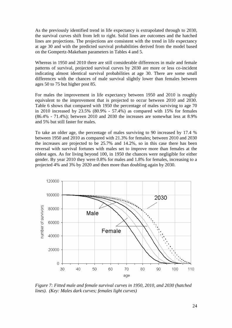
As the previously identified trend in life expectancy is extrapolated through to 2030,
the survival curves shift from left to right. Solid lines are outcomes and the hatched
lines are projections. The projections are consistent with the trend in life expectancy
at age 30 and with the predicted survival probabilities derived from the model based
on the Gompertz-Makeham parameters in Tables 4 and 5.
Whereas in 1950 and 2010 there are still considerable differences in male and female
patterns of survival, projected survival curves by 2030 are more or less co-incident
indicating almost identical survival probabilities at age 30. There are some small
differences with the chances of male survival slightly lower than females between
ages 50 to 75 but higher post 85.
For males the improvement in life expectancy between 1950 and 2010 is roughly
equivalent to the improvement that is projected to occur between 2010 and 2030.
Table 6 shows that compared with 1950 the percentage of males surviving to age 70
in 2010 increased by 23.5% (80.9% - 57.4%) as compared with 15% for females
(86.4% - 71.4%); between 2010 and 2030 the increases are somewhat less at 8.9%
and 5% but still faster for males.
To take an older age, the percentage of males surviving to 90 increased by 17.4 %
between 1950 and 2010 as compared with 21.3% for females; between 2010 and 2030
the increases are projected to be 25.7% and 14.2%, so in this case there has been
reversal with survival fortunes with males set to improve more than females at the
oldest ages. As for living beyond 100, in 1950 the chances were negligible for either
gender. By year 2010 they were 0.8% for males and 1.8% for females, increasing to a
projected 4% and 3% by 2020 and then more than doubling again by 2030.
Figure 7: Fitted male and female survival curves in 1950, 2010, and 2030 (hatched
lines). (Key: Males dark curves; females light curves)

25
1950
2010
2030
Predicted % surviving to age: Male Female Male Female Male Female
70 57.4 71.4 80.9 86.4 89.8 91.4
80 23.8 39.9 56.1 65.5 76.7 77.0
90 2.7 7.9 20.1 29.2 50.2 46.2
95 0.35 1.4 6.8 12.2 32.5 26.4 Life expectancy at
30 40.7 45.2 49.7 53.0 57.1 57.1
Table 6: Predicted survival to given ages and life expectancy at age 30, males and
females
(b) Trends in the mode, mean and standard deviation in age of death
While death can occur at any age, the distribution of ages of death typically show a
tendency to bunch in older age (see for example Figure 6(b)). A feature of the data
over many years has been a sliding to the right of the whole distribution with
corresponding shifts in the modal age of death (Zhang and Vaupel, 2009; Cheung and
Robine, 2007, Kannisto, 2001).
Table 7 (a) and (b) is fully consistent with this picture. It is based on three measures
of central tendency in the age of death and two measures of dispersion: these are the
mode, mean and median and the standard deviation, and inter-quartile range. The
results show that all three are steadily increasing in value over time. The predicted
gains made by males have been higher with, for example, the male modal age of death
advancing by 18 years between 1950 and 2030 compared with 12 years for females.
The mean age of death plus or minus one standard deviation will contain 68.2% of all
deaths post 30 years of age assuming a normal distribution; in practice the distribution
is not exactly normal and so the actual percentage differs slightly and is higher (about
72% of all deaths). The trends in the mean and standard deviation of age of death are
shown in Figure 8. The results indicate mean ages of death of males and females are
converging and just as with life expectancy are expected to reach parity by around
2030.
The standard deviation, however, is showing a slightly contrary trend with males
increasing slightly in value and females decreasing (both trends statistically
significant from zero at p<0.01). This is occurring because there are a higher
percentage of male slow improvers compared with females causing the distribution to
bunch less plus more very old males in later projections. This is also reflected in
changes to the inter-quartile range (IQR), the age range in which 50% of all deaths
occur. As the Table 7 demonstrates this range tends to be slightly lower for females
than for males again indicating a greater bunching in female deaths.

26
(a) Males
year mode mean standard deviation median IQR
1950 75 70.4 11.9 71 17
1960 75 70.5 11.9 71 16
1970 76 71.1 11.9 72 16
1980 77 72.3 11.9 73 16
1990 79 74.0 12.0 75 16
2000 82 76.2 12.2 78 15
2010 85 79.2 12.5 81 16
2020 89 82.6 12.8 84 15
2030 93 87.0 13.5 89 16
(b) Females
year mode mean standard deviation median IQR
1950 80 74.7 12.3 76 16
1960 81 75.4 12.2 77 16
1970 82 76.4 12.2 78 16
1980 83 77.7 12.2 79 15
1990 85 79.1 12.1 81 15
2000 86 80.6 12.0 82 15
2010 88 82.1 11.9 84 15
2020 90 84.3 11.9 86 14
2030 92 86.5 11.9 88 15
Table 7(a) and (b): Modal age of death, mean and standard deviation, median and
inter-quartile range (IQR) for each year by gender
Figure 8: Male and female trends in the mean and standard deviation in the age of
death
50
60
70
80
90
100
110
1940 1960 1980 2000 2020 2040
year
age
males
females

27
(c) Trends in the postponement of death
Figures 9 and 10 show the differences in the average annual number of deaths
between males and females between successive decades. Axes are drawn on a similar
scale to facilitate gender comparisons based on the pattern of evolution in the
resulting waves. Since the population is constrained to 100,000 at age 30, deaths
below the axis equal deaths above.
Visually the results show that the waves are trending higher up the age register and at
the same time are increasing in amplitude both above and below the axis. In later
periods, the waves below the axis trend closer to zero as there are fewer lives to save
and therefore deaths to postpone. These patterns are consistent with an accelerating
shift in deaths to older ages.
The increase in the amplitude of the waves for males is far more striking than for
females and is a reflection of previously identified trends in the data. To better
understand these trends, we defined the following eight indictors:
A. Trough - age at the lowest point in wave
B. Peak - age at the highest part of wave
C. Trough to peak age range - B minus A (years)
D. Pivot age - age at which difference in deaths is zero
E. Pivot to peak - B minus D (years)
F. Trough to pivot - D minus A (years)
G. Amplitude below zero - difference in deaths at trough age
H. Amplitude at peak - difference in deaths at peak age
The results are shown in Tables 8 and 9 and the first six of the indicators are
represented graphically in Figure 11(A-F).
Figure 9: Changes in male deaths by age in ten periods from 1950 to 2030
-200
-150
-100
-50
0
50
100
150
200
30 40 50 60 70 80 90 100 110
age
diffe
ren
ce
s in
ava
rge
de
ath
s p
er
ye
ar
1960-1950 1970-1960
1980-1970 1990-1980
2000-1990 2010-2000
2020-2010 2030-2020

28
Figure 10: Changes in male deaths by age in eight ten-year periods from 1950 to
2030
The trough age is the age at which deaths have fallen most between two points in time
and therefore where the greatest improvement in survival has resulted. The age when
the male trough occurs has increased from age 66 between 1950 and 1960 and is
expected to reach 83 between 2020 and 2030. Based on Figure 11(A) the male trough
will surpass the female trough between 2020 and 2030 again emphasising the rapidity
in male gains.
The peak represents the age at which the difference in deaths compared with a
previous point in time are greatest. Based on Figure 11(B) the male peak will surpass
the female peak, in terms of age when the peak is reached, between 2010 and 2020.
The smaller the age difference between trough and peak, the more death is being
postponed over a shorter age range. The effect observed is as a result of compression,
as the middle percentiles of the survival distribution catch up with the subsequent
percentiles. The net result, shown in Figure 11(C), is that gains in life expectancy are
tending to occur at increasingly older ages with successive waves to the right of the
age register.
The advancement of pivot age is another way of measuring postponement. Pivot age
denotes the age at which deaths turn from being lower than at the same age at a
previous point in time to becoming higher. Results show that male pivot age
increased just two years from 77 to 79 years prior to 2000, but then jumped to 83
years between 2000 and 2010 and is expected to increase again to 92 years between
2020 and 2030. As Figure 11(D) shows, male and female pivot ages will converge
between 2020 and 2030.
The reduction in the years between pivot and peak indicates a compaction of deaths
into a narrower age range between two points in time. Figure 11(E) shows that
initially female deaths are more compacted than for males. The indictor is more
-200
-150
-100
-50
0
50
100
150
200
30 40 50 60 70 80 90 100 110
age
diff
ere
nce in
death
s p
er
year
1960-1950 1970-1960
1980-1970 1990-1980
2000-1990 2010-2000
2020-2010 2030-2020

29
erratic than some of the previous indicators but again it shows that convergence will
occur between 2020 and 2030.
Differences in wave amplitudes are also indicative of the pattern of postponement, for
example if death is being postponed from a wider range of ages below the line to a
narrower range of ages above the line. Tables 8 and 9 rows G and H indicate that this
applies here with the amplitude below the line being consistently less than the
amplitude above.
As suggested by the stylised model (see Figure 3), this pattern would be consistent
with'
1x , the age of onset of mortality, increasing by more than age '
2x , the maximum
age of death and so the net effect can be conceptualised as a combination of the
compression and parallel cases. That is the onset of death is being postponed by more
than the advancement in maximum age with greater compaction of death being the net
outcome.
As well as comparing each gender at different points in time we can also compare
both genders at the same point in time. Figure 12 shows that there were more male
deaths relative to women before the age of 76 in 1950 and before age 85 in 2010. An
interesting implication of this pattern is that between 2020 and 2030 there will be a
double peak of male deaths, albeit not very pronounced (see Figure 3 case 4, stylised
model regressive case (i)). Before age 67, there will be slightly more male than female
deaths; between ages 67 and 97 more female deaths; and post 97 more female deaths.

30
row age 1960-1950
1970-1960
1980-1970
1990-1980
2000-1990
2010-2000
2020-2010
2030-2020
A trough (age) 66 65 63 66 69 74 77 83
B peak (age) 87 86 85 87 89 93 96 101
C peak to trough (years) (B-A) 21 21 22 21 20 19 19 18
D pivot age (P) 77 75 75 77 79 83 87 92
E pivot to peak (years) (B-D) 10 11 10 10 10 10 9 9
F pivot to trough (years) (D-A) 11 10 12 11 10 9 10 9
G -ve amplitude (difference in deaths per year) 2 8 21 30 42 54 62 86
H +ve amplitude (difference in deaths per year) 3 16 48 51 71 98 115 154
Table 8: Values of the eight specified indicators for males
row age 1960-1950
1970-1960
1980-1970
1990-1980
2000-1990
2010-2000
2020-2010
2030-2020
A trough (age) 71 71 74 73 75 77 79 81
B peak (age) 90 90 92 92 94 93 95 99
C peak to trough (years) (B-A) 19 19 18 19 19 16 16 18
D pivot age (P) 80 81 83 82 84 86 88 90
E pivot to peak (years) (B-D) 10 9 9 10 10 7 7 9
F pivot to trough (years) (D-A) 9 10 9 9 9 9 9 9
G -ve amplitude (difference in deaths per year) 9.9 15.9 21.9 20.1 25 26.8 38.8 40.61
H +ve amplitude (difference in deaths per year) 21.3 30.7 43.0 40.0 48.7 51.9 74.9 78.0
Table 9: Values of the eight specified indicators for females

31
(A)
(D)
Figure 11: Convergence indicators males
and females
(B)
(E)
(C)
(F)
50
55
60
65
70
75
80
85
90
95
100
1960-
1950
1970-
1960
1980-
1970
1990-
1980
2000-
1990
2010-
2000
2020-
2010
2030-
2020
period
ag
e
female trough
male trough
60
65
70
75
80
85
90
95
1960-
1950
1970-
1960
1980-
1970
1990-
1980
2000-
1990
2010-
2000
2020-
2010
2030-
2020period
ag
e
female pivot age
male pivot age
75
80
85
90
95
100
105
1960-
1950
1970-
1960
1980-
1970
1990-
1980
2000-
1990
2010-
2000
2020-
2010
2030-
2020
period
ag
e
female peak age
male peak age
0
2
4
6
8
10
12
1960-
1950
1970-
1960
1980-
1970
1990-
1980
2000-
1990
2010-
2000
2020-
2010
2030-
2020
period
ye
ars
female pivot to peak
male pivot to peak
0
5
10
15
20
25
1960-
1950
1970-
1960
1980-
1970
1990-
1980
2000-
1990
2010-
2000
2020-
2010
2030-
2020
period
ye
ars
female peak to trough
male peak to trough
0
2
4
6
8
10
12
14
1960-
1950
1970-
1960
1980-
1970
1990-
1980
2000-
1990
2010-
2000
2020-
2010
2030-
2020
period
ye
ars
female pivot to trough (years)
male pivot to trough (years)

32
Figure 12: Difference in number of deaths by age in 1950, 2010 and 2030.
6.0 Conclusions
This paper has compared trends in male and female life expectancy in England and
Wales. It deliberately focussed on people at age 30 rather than birth in order to
remove biologically related differences in survival in the first years of life and higher
deaths record by males from accident, suicides, etc. in the their early adult years.
The results show a well entrenched trend with male life expectancy improving more
quickly than females in the most recent periods. The gap was at its greatest in 1970 at
5.7 years but fell to 3.7 years in 2009, and based on current trends may converge with
a future life expectancy of 57 years in 2030. It was argued that most of the differences
in life expectancy were due to societal factors and not to fundamental biological
differences.
A stylised survival model was developed to show how improved survival prospects
were being transmitted through the age range with death being postponed from
younger to older ages. Based on data from 1950 to 2009, this yielded the following
findings:
Improvements in survival are occurring at most ages for both genders in line
with general increases in life expectancy at age 30. In terms of the stylised
survival model, visually the pattern of improvement most closely resembled
the parallel case and so rectangularistion is ruled out; however, the pattern is
not clear cut and elements of divergent and convergent behaviour are clearly
present especially in the upper and lower age registers. We found weak
convergence in 94% of the age range in females and 68% in males.
More detailed analysis finds that males that were expected to die between ages
65 to 89 and females aged 50 to 89 had experienced faster than average
improvements in survival than the general population. In contrast to the
-1400
-1200
-1000
-800
-600
-400
-200
0
200
400
600
800
1000
30 40 50 60 70 80 90 100 110
age
diffe
ren
ce
in
de
ath
s
1950
2010
2030

33
beginning of the period, projected survival chances at the oldest ages favoured
males. In 1950 a male had a 0.35% chance of reaching 95 years but by 2030
this could increase to 32.5%. By comparison the female chances were 1.4%
and 26.4% respectively.
As life expectancy has increased, so the modal and mean age of death has also
advanced. However, as is consistent with the parallel stylised model variant,
the proportion of deaths around the modal age and the standard deviation of
age of death have remained broadly similar even though the mean and modal
ages of death have shifted to the right. When these trends are projected
forward to 2030 the mean ages of death merge. Although the standard
deviations of age at death are similar, male standard deviation is increasing
and female decreasing.
A change to pivot age which is an indicator of by how much death has been
postponed between successive decades also shows a continuous pattern of
upward movement. A low pivot age indicates postponement is occurring at
younger ages and a high pivot age at older ages. In the decades 1950-1960,
2000-2010, 2020-2030, male pivot age increases from 77 to 83 and then to 92.
The equivalent results for females were 80 to 86 to 90, suggesting therefore
that male pivot age is set to surpass female pivot age between 2020 and 2030.
The trend towards convergence in males and female life expectancy in England and
Wales was not uniformly reflected in our comparator countries France, Japan and
Sweden. In Japan, we found that the gender difference in life expectancy is diverging,
while in France convergence is proceeding but at a much slower pace. In Sweden, by
contrast convergence is projected to occur earlier than in England and Wales.
In considering why convergence was occurring and why deaths in males were being
postponed at a faster rate than in females, smoking prevalence was identified as a key
factor. Using WHO data from 37 countries, it was found that gender differences in
smoking prevalence explained 75% of the gap in life expectancy in the countries
concerned. These results are therefore similar to Pampel’s findings (e.g. Pampel,
2002) and are key to understanding gender differences in life expectancy.
A more detailed examination of trends in life expectancy from the beginning of the
last century demonstrated a clear pattern in smoking behaviour between genders and
consequent life expectancy. In Sweden, where males historically smoked the least,
there was almost gender parity in life expectancy at age 30 in 1922 following decades
of reduction in the gap. The divergence in life expectancy that followed over the next
50 years can be traced to smoking but was never as great as that seen in other
countries.
In England at Wales, male and female smoking prevalence is just over 20% and
therefore already low versus comparator countries. This compares with male smoking
prevalence of any form of tobacco of 82% in 1948. Other factors that have
contributed to improvements in male life expectancy are de-industrialisation and the
virtual disappearance of hazardous industry such as deep coal mining. There have

34
also been significant improvements in the treatment of heart disease which tended to
affect males more than females (primarily the result of smoking).
For convergence in male-female life expectancy to occur in practice, our projections
show that the gap still needs to reduce by another 3.7 years. These years could come
from several sources and are likely to come from the differential impact of gender
specific factors rather than general improvements. For males, it is clear that there will
be further improvements as lapsed and heavy smokers die out along with former
workers in hazardous industries. A possible hindering factor will be the stubborn and
deep rooted socio-economic differences in life expectancy which, as was seen,
affected males more than females.
On the female side, the emancipation of women may have led to life expectancy
improving at a slower rate. This is believed to be due in part to the adoption of some
male habits such as alcohol consumption above recommended limits and the slower
decline in smoking prevalence, albeit from a lower base. In addition, surveys show
that obesity is more prevalent in women than in men although men are slightly more
prone to being categorised as ‘overweight’ as opposed to ‘obese’. Obesity negatively
impacts on life expectancy, especially with the most obese males and females
potentially losing 10 years or more from their future life span lives at age 30 were
they to remain obese.
The combined effect of these trends to date is that male death patterns are becoming
increasingly similar to female death patterns over a large part of the age range. This is
manifesting in a progressively right shift in the mean and modal age of death at ages
in people’s mid 80s. At the oldest ages male survival may actually be slightly higher
in future, and at younger ages the reverse is true with females having better survival
prospects.
In conclusion, there has been a remarkable improvement in male life expectancy since
1970 relative to women. Although women remain ahead, the gap is reducing quickly
so that if it continues there will be parity by 2030. This trend is almost certainly the
result of changes in male and female lifestyles and not to genetic or biological factors.
We can be fairly sure of this otherwise there would be a much greater similarity
between countries than is actually the case, whereas many of the differences can be
explained in most part simply by differences in smoking prevalence.
This finding concurs with the work of Preston and Wang (2006) who demonstrate that
mortality differences between males and females is consistent with differences in the
prevalence of cigarette smoking by individual cohorts. With recent changes in
smoking patterns, their model suggests that sex differences in mortality will narrow
dramatically in coming decades. Thus, we conclude that the prospects for both
convergence and increases in life expectancy are tied closely with future reductions in
tobacco consumption.
The social consequences of increased longevity and convergence in life expectancy
will continue to be felt throughout society in public services and pensions and so
reforms to both will be both a necessity and inevitable outcome of these trends.
Convergence will make it easier for insurers to set unisex annuity rates and help make
more sense of sex equality legislation when it comes to pension age. For individual
35
citizens the effect can be mitigated however if people are able to remain in good
health, and live and work independently for longer.
As the survival frontier (Kannisto, 1996) extends farther outwards however, public
reforms will need to refocus on a burgeoning numbers of people with social as well as
health care needs and hence a reorientation of spending priorities towards long term
management of conditions of old age. The converging of male and female life
expectancy may be a help rather than a hindrance in this respect, especially if it leads
to fewer women living alone and in isolation for the last few years of their lives.
References
Bongaarts, J. (2005) Long-range trends in adult mortality:
Models and projection methods. Demography, 42(1):23–49.
Canudas-Romo, V. (2008) The modal age at death and the shifting mortality
hypothesis. Demographic Research, 19(30):1179–1204.
Cheung, S. L. K. and Robine, J.-M. (2007) Increase in
common longevity and the compression of mortality: the case of Japan. Population
Studies, 61(1):85–97.
Cheung, Y.B. (2000) Marital Status and Mortality in British Women: A
Longitudinal Study, International Journal of Epidemiology, 29, 93-99.
Doll, R., R. Peto, J. Boreham, I. Sutherland (2004) Mortality in relation to smoking:
50 years' observations on male British doctors. BMJ 2004;328:1519
Fries, J (1980) Aging, natural death and the compression of mortality. New England
Journal of Medicine, 303: 130-35
Hippisley-Cox, J., C. Coupland, A. Sheikh, and P. Brindle (2009) Predicting risk of
type 2 diabetes in England and Wales: prospective derivation and validation of
QDScores. BMJ 2009; 338 doi: 10.1136/bmj.b880
Kannisto, V. (2001) Mode and dispersion of the length of life. Population:
An English Selection, 13(1):159–171.
Kannisto, V. (2000) Measuring the Compression of Mortality. Demographic research
3(6). DOI: 10.4054/DemRes.2000.3.6
Kannisto, V. (1996) The advancing frontier of survival: life tables
for old age. Odense University Press, Odense.
Karlsson M., Mayhew, L. and Rickayzen, B. (2009) Individualised Life Tables:
Investigating Dynamics of Health, Work and Cohabitation in the UK , Journal of
Population Ageing, 1(2-4), p.153-191
Karlsson, M., T. Nilsson, C. Hampus Lyttkens, and G. Leeson (2010) Income
Inequality and Health: Importance of a Cross-Country Perspective.

36
Social Science and Medicine 70 (2010), pp. 875-885.
HMD (2009). Human Mortality Database. University of California, Berkeley
(USA) and Max Planck Institute for Demographic Research (MPIDR). Available at
www.mortality.org (data downloaded on February 4, 2009).
Laatikainen, T., J. Critchley, E. Vartiainen, V. Salomaa1, M. Ketonen, and S.
Capewell (2005) Explaining the Decline in Coronary Heart Disease Mortality in
Finland between 1982 and 1997. American Journal of Epidemiology. 162(8) 162:764–
73
Mayhew L., Smith, D. (2011) Human Survival at Older Ages and the Implications for
Longevity Bond Pricing, North American Actuarial Journal, 15(2), p.248-265.
Mayhew, L. and D. Smith (2011) Evaluating a new method of projecting populations
based on human survival patterns. Forthcoming Population Studies
Mayhew, L., J. Richardson, and B. Rickayzen (2009) A study into the detrimental
effects of obesity on life expectancy in the UK. S. Cass publication, London,
sponsored by The Actuarial Profession.
Mayhew, L. (2009) Increasing Longevity and the economic value of healthy ageing
and working longer. Commissioned report for HMG Cabinet Office Strategy Unit.
http://www.hmg.gov.uk/media/33715/economicsofageing.pdf
Murphy, M. and M. Di Cesare (2012) Use of an age-period-cohort model to reveal the
impact of cigarette smoking on trends in Twentieth-century adult cohort mortality in
England and Wales. Population Studies, iFirst Article, pp-19.
Oeppen, J. and Vaupel, J. (2002) Broken limits to life expectancy. Science, 296:
1029-31.
Pampel, F. (2006) Global Patterns and Determinants of Sex Differences in Smoking.
International Journal of Comparative Sociology 47:466-487.
Pampel, F.(2005a) Diffusion, Cohort Change, and Social Patterns of Smoking. Social
Science Research 34:117-139. 2005.
Pampel, F. (2005b) Forecasting Sex Differences in Mortality in High Income Nations:
The Contribution of Smoking. Demographic Research 13:455-484.
Pampel, F. (2003) Declining Sex Differences in Lung Cancer Mortality in High
Income Nations. Demography 40:45-65.
Pampel, F. (2002) Cigarette Use and the Narrowing Sex Differential in Mortality.
Population and Development Review 28:77-104.
Preston, S. H. and H. D. Wang (2006) Sex mortality differences in the United States:
the role of cohort smoking patterns. Demography 43(4): 631646.

37
Robine, J-M. (2008) The compression of mortality. Paper presented at the Australian
Population Association Conference, Alice Springs, July 2008.
Thatcher, A. R., Cheung, S. L. K., Horiuchi, S., and Robine,
J.-M. (2008) The compression of deaths above the mode. Population Association
of America.
Trovato, F. and N. Lalu. (2007) From Divergence to Convergence: The Sex
Differential in Life Expectancy in Canada, 1971-2000. Canadian Review of Sociology
and Anthropology 44 (1): 1-20.
Trovato, F. and N. Heyen. (2006) A Varied Pattern of Change of the Sex Differential
in Survival in the G7 Countries. Journal of Biosocial Science 38 (3): 301-401.
Trovato, F. (2005) Narrowing Sex Differential in Life Expectancy in Canada and
Austria: Comparative Analysis. Vienna Yearbook of Population Research 2005: 17-
52.
Trovato, F., and N, Heyen. (2003) A Divergent Pattern of the Sex Difference in Life
Expectancy: Sweden and Japan, Early 1970s-Late 1990s. Social Biology 50 (3-4):
238-258.
Trovato, F. and N. Lalu. (1996) Narrowing Sex Differentials in Life Expectancy in
the Industrialized World: Early 1970s to Early 1990s. Social Biology 43 (1-2): 20-37.
Tuljapurkar, S., Li, N. & Boe, C. (2000) A universal pattern of mortality decline in
G-7 countries. Nature, 412, 2 Aug: 490-91.
Unal, B., J. Critchley, S. Capewell (2004) Explaining the decline in coronary heart
disease mortality in England and Wales between 1981 and 2000. Epub, 109(9):1101-
7.
Wilmoth, J. R. and S. Horiuchi, S. (1999) Rectangularization revisited: variability of
age at death within human populations. Demography, 36(4):475–495.
Zhang, Z. and J.Vaupel (2009) The age separating early
deaths from late deaths. Demographic Research, 20(29):721–730.
15

38
Annex A: Stylised model survival including equations and
parameters of interest
Imagine a stationary population in which there is a constant number of births and
deaths, no migration and which is subjected to the same mortality regime each year.
Consider Figures A1 (a) – (c), which show the mortality curves ABC for three such
hypothetical populations at a given point in time.
The vertical axis shows the number of survivors lx and the horizontal axis age x. We
define the point 1x in each case as the onset of mortality, the age at which death
begins, which can range from zero upwards. For simplicity we assume there are no
deaths before this age. We call the point where BC cuts the age axis as 2x or the
maximum age to which anyone lives.
The figures to the right of each variant ar a plot of the percentage of population
surviving to a given age versus life expectancy at age1x . Each variant generates a
distinctive pattern for example the percentile in the convergent model meet at a point
which is the maxim age or2x . We use these hypothetical patterns to search for similar
patterns in the data. Table A1 sets out various demographic parameters of interest
based on each of the cases.

39
Figure A1: Three simplified survival variants: (a) divergent, (b) parallel and (c)
convergent
0
age(x )
num
ber o
f sur
vivo
rs(l x
)
A B
DC
x1
x2 x
2'
O
(a)
0
age (x )
num
ber o
f sur
vivo
rs(l x
)
x1
' x2 x
2'x
1
A B
C D
E
(b)
O
0
age(x)
num
ber o
f sur
vivo
rs (l
x)
A B E
C
x1 x
1' x
2
O
(c)
50
60
70
80
90
100
110
0 10 20 30 40 50
life expectancy at 50
age t
o w
hic
h g
iven %
surv
ive
100
90
80
70
60
50
40
30
20
10
0
50
60
70
80
90
100
110
25 30 35 40 45 50
life expectancy at 50
age t
o w
hic
h g
iven %
surv
ive
100
90
80
70
60
50
40
30
20
10
0
50
60
70
80
90
100
110
25 30 35 40 45 50
life expectancy at 50
age t
o w
hic
h g
iven %
surv
ive
100
90
80
70
60
50
40
30
20
10
0

40
Parameter Divergent variant Parallel variant Convergent variant
1 Population size 1 2
2
xl x x 1 2
2
xl x x 1 2
2
xl x x
2 Life expectancy at
age 1x
1xe
)(2
11
'
2 xx 1 2 1
1
2x x x
1 2 1
1
2x x x
3 Number of deaths
at each year of age
where death is
possible
1
2 1
xl
x x
1
2 1
xl
x x 1
2 1
xl
x x
4 Coefficient of
rectangularisation 2 1
22
x x
x 2 1
22
x x
x 2 1
22
x x
x
5 Proportion of
population
deceased as a
function of 1xe and
age x
1
1
2 x
x xp x
e
1
1
1 12 x
x xp x
e x x
1
1
1 12 x
x xp x
e x x
6 Survival function
as a function of 1xe
1
112 x
x x
e
1
1
1 1
12 x
x x
e x x
1
1
1 1
12 x
x x
e x x
7 Force of Mortality
at age x 1 1
1
2 xe x x
1 1 1 1
1
2 xe x x x x
1 1 1 1
1
2 xe x x x x
8 Inter percentile
range, x 1
2 xe p x )()(2 '
111xpxxex
12 12 xx x e p x
9 Deaths avoided or
person years saved 1
2 22
xlx x 1 2 2xl x x
1
1 12
xlx x
10 Adjustment cycle
(years) 2 1x x
2 1x x
2 1x x
11 Mean age of
Population, x 1 2 1 2
1 23 3
x x x x
x x
1 2 1 2
1 23 3
x x x x
x x 1 2 1 2
1 23 3
x x x x
x x
12 Median age 1 2
1
4x x
1 2
1
4x x
1 2
1
4x x
Table A1: Some parameters of interest

41
Annex B: Smoking prevalence and gender gap in life expectancy
Figure B1 is a cross-sectional plot of differences in male female life expectancy at age
30 against the difference in smoking prevalence between males and females for 37
developed countries covered by the Human Mortality Database (sources: HMD and
World Health Organisation Tobacco Free Initiative, 20116). A regression analysis
showed that differences in smoking prevalence statistically explain 75% of the
variation in the gap in life expectancy at age 30.
Figure B1: Cross-section plot of the difference in life expectancy at age 30 between
males and females versus the prevalence gap in smoking for 37 countries
6 http://www.mortality.org/; http://www.who.int/tobacco/global_report/2011/en/
y = 0.1899x + 3.5448
R2 = 0.7489
0
2
4
6
8
10
12
14
0 5 10 15 20 25 30 35 40 45
prevalence gap (%)
LE
ga
p (
ye
ars
)

FACULTY OF ACTUARIAL SCIENCE AND INSURANCE
Actuarial Research Papers since 2009
Report Number
Date Publication Title Author
188 January 2009 The Market Potential for Privately Financed Long Term Care Products in the UK. ISBN 978-1-905752-19-5
Leslie Mayhew
189 June 2009 Whither Human Survival and Longevity or the Shape of things to Come. ISBN 978-1-905752-21-8
Leslie Mayhew David Smith
190 October 2009 ilc: A Collection of R Functions for Fitting a Class of Lee Carter Mortality Models using Iterative fitting Algorithms* ISBN 978-1-905752-22-5
Zoltan Butt Steven Haberman
191 October 2009 Decomposition of Disease and Disability Life Expectancies in England, 1992-2004. ISBN 978-1-905752-23-2
Domenica Rasulo Leslie Mayhew Ben Rickayzen
192 October 2009 Exploration of a Novel Bootstrap Technique for Estimating the Distribution of Outstanding Claims Reserves in General Insurance. ISBN 978-1-905752-24-9
Robert Cowell
193 January 2010 Surplus Analysis for Variable Annuities with a GMDB Option. ISBN 978-1-905752-25-6
Steven Haberman Gabriella Piscopo
194 January 2010 UK State Pension Reform in a Public Choice Framework. ISBN 978-1-905752-26-3
Philip Booth
195 June 2010 Stochastic processes induced by Dirichlet (B-) splines: modelling multivariate asset price dynamics. ISBN 978-1-905752-28-7
Vladimir Kaishev
196 August 2010 A comparative Study of Parametric Mortality Projection Models. ISBN 978-1-905752-29-4
Zoltan Butt Steven Haberman
197 April 2012 Are the Dimensions of Private Information More Multiple than Expected? Information Asymmetries in the Market of Supplementary Private Health Insurance in England* ISBN 978-1-905752-31-7
Martin Karlsson Florian Klohn Ben Rickayzen
198 May 2012 Re-thinking households – Using administrative data to count and classify households with some applications. ISBN 978-1-905752-32-4
Gillian Harper Les Mayhew
199 May 2012 Evolution of coupled lives’ dependency across generations
and pricing impact. ISBN 978-1-905752-33-1
Elisa Luciano, Jaap Spreeuw
Elena Vigna
200 July 2012 Gender convergence in human survival and the postponement of death. ISBN 978-1-905752-34-8
Les Mayhew David Smith

Statistical Research Papers
Report Number
Date Publication Title Author
Report
1 December 1995. Some Results on the Derivatives of Matrix Functions. ISBN 1
874 770 83 2
P. Sebastiani
2 March 1996 Coherent Criteria for Optimal Experimental Design. ISBN 1 874 770 86 7
A.P. Dawid P. Sebastiani
3 March 1996 Maximum Entropy Sampling and Optimal Bayesian Experimental Design. ISBN 1 874 770 87 5
P. Sebastiani H.P. Wynn
4 May 1996 A Note on D-optimal Designs for a Logistic Regression Model. ISBN 1 874 770 92 1
P. Sebastiani R. Settimi
5 August 1996 First-order Optimal Designs for Non Linear Models. ISBN 1 874 770 95 6
P. Sebastiani R. Settimi
6 September 1996 A Business Process Approach to Maintenance: Measurement, Decision and Control. ISBN 1 874 770 96 4
Martin J. Newby
7 September 1996.
Moments and Generating Functions for the Absorption Distribution and its Negative Binomial Analogue. ISBN 1 874 770 97 2
Martin J. Newby
8 November 1996. Mixture Reduction via Predictive Scores. ISBN 1 874 770 98 0 Robert G. Cowell.
9 March 1997. Robust Parameter Learning in Bayesian Networks with Missing Data. ISBN 1 901615 00 6
P.Sebastiani M. Ramoni
10 March 1997. Guidelines for Corrective Replacement Based on Low Stochastic Structure Assumptions. ISBN 1 901615 01 4.
M.J. Newby F.P.A. Coolen
11 March 1997 Approximations for the Absorption Distribution and its Negative Binomial Analogue. ISBN 1 901615 02 2
Martin J. Newby
12 June 1997 The Use of Exogenous Knowledge to Learn Bayesian Networks from Incomplete Databases. ISBN 1 901615 10 3
M. Ramoni P. Sebastiani
13 June 1997 Learning Bayesian Networks from Incomplete Databases. ISBN 1 901615 11 1
M. Ramoni P.Sebastiani
14 June 1997 Risk Based Optimal Designs. ISBN 1 901615 13 8 P.Sebastiani H.P. Wynn
15 June 1997. Sampling without Replacement in Junction Trees. ISBN 1 901615 14 6
Robert G. Cowell
16 July 1997 Optimal Overhaul Intervals with Imperfect Inspection and Repair. ISBN 1 901615 15 4
Richard A. Dagg Martin J. Newby
17 October 1997 Bayesian Experimental Design and Shannon Information. ISBN 1 901615 17 0
P. Sebastiani. H.P. Wynn
18 November 1997. A Characterisation of Phase Type Distributions. ISBN 1 901615 18 9
Linda C. Wolstenholme

Report Number
Date Publication Title Author
19 December 1997 A Comparison of Models for Probability of Detection (POD) Curves. ISBN 1 901615 21 9
Wolstenholme L.C
20 February 1999. Parameter Learning from Incomplete Data Using Maximum Entropy I: Principles. ISBN 1 901615 37 5
Robert G. Cowell
21 November 1999 Parameter Learning from Incomplete Data Using Maximum Entropy II: Application to Bayesian Networks. ISBN 1 901615 40 5
Robert G. Cowell
22 March 2001 FINEX : Forensic Identification by Network Expert Systems. ISBN 1 901615 60X
Robert G.Cowell
23 March 2001. Wren Learning Bayesian Networks from Data, using Conditional Independence Tests is Equivalant to a Scoring Metric ISBN 1 901615 61 8
Robert G Cowell
24 August 2004 Automatic, Computer Aided Geometric Design of Free-Knot, Regression Splines. ISBN 1-901615-81-2
Vladimir K Kaishev, Dimitrina S.Dimitrova, Steven Haberman Richard J. Verrall
25 December 2004 Identification and Separation of DNA Mixtures Using Peak Area Information. ISBN 1-901615-82-0
R.G.Cowell S.L.Lauritzen J Mortera,
26 November 2005. The Quest for a Donor : Probability Based Methods Offer Help. ISBN 1-90161592-8
P.F.Mostad T. Egeland., R.G. Cowell V. Bosnes Ø. Braaten
27 February 2006 Identification and Separation of DNA Mixtures Using Peak Area Information. (Updated Version of Research Report Number 25). ISBN 1-901615-94-4
R.G.Cowell S.L.Lauritzen J Mortera,
28 October 2006 Geometrically Designed, Variable Knot Regression Splines : Asymptotics and Inference. ISBN 1-905752-02-4
Vladimir K Kaishev Dimitrina S.Dimitrova Steven Haberman Richard J. Verrall
29 October 2006 Geometrically Designed, Variable Knot Regression Splines : Variation Diminishing Optimality of Knots. ISBN 1-905752-03-2
Vladimir K Kaishev Dimitrina S.Dimitrova Steven Haberman Richard J. Verrall
30 November 2008 Scheduling Reentrant Jobs on Parallel Machines with a Remote Server. ISBN 978-1-905752-18-8
Konstantin Chakhlevitch Celia Glass

Report Number
Date Publication Title Author
31 November 2009 Probabilistic Expert Systems for Handling Artifacts in Complex DNA Mixtures. ISBN 978-1-905752-27-0
R.G.Cowell S.L. lauritzen J. Mortera
32 April 2012 Detecting a Family Trio in a DNA Mixture. ISBN 978-1-905752-30-0
Robert G. Cowell
Papers can be downloaded from http://www.cass.city.ac.uk/facact/research/publications.html

Faculty of Actuarial Science and Insurance
Cass Business School
Copyright 2012 © Faculty of Actuarial Science and Insurance, Cass Business School
106 Bunhill Row, London EC1Y 8TZ.
ISBN 978-1-905752-34-8