front cover powerpoint
TRANSCRIPT

Front cover powerpoint

I started making first draft for my front cover by opening photoshop. I then added a skyline by putting 6 artists’ names down so it gives audience and idea what this magazine will include. I have decided that my main colours for this magazine will be purple, black and white so then I coloured the box in purple and typed the letters in black because those two colours look good together.
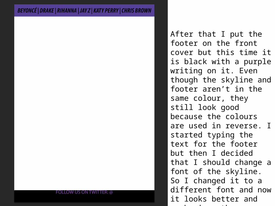
After that I put the footer on the front cover but this time it is black with a purple writing on it. Even though the skyline and footer aren’t in the same colour, they still look good because the colours are used in reverse. I started typing the text for the footer but then I decided that I should change a font of the skyline. So I changed it to a different font and now it looks better and emphasizes the names a bit more which would attract audience’s attention when the cover is finished.

The next thing I did was made a box for the title. I decide that it would be a good idea to make it black as the main colours of this cover are black, white and purple. Then, to make it look more interesting, I drew some purple lines inside the box so it stands out a bit more as well. Afterwards, I chose a name for my magazine which is SSS which stands for ‘sassy, slick, smooth’. It was pretty difficult to choose the font I want to use because it is important that you use an appropriate font as it should go together wit the theme and genre of the magazine. I chose the white colour for the name because it’s one of the main colours and it also stands out on the black background of the box.
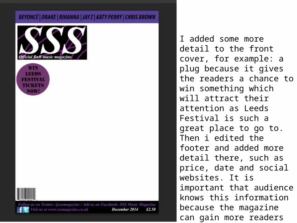
I added some more detail to the front cover, for example: a plug because it gives the readers a chance to win something which will attract their attention as Leeds Festival is such a great place to go to. Then i edited the footer and added more detail there, such as price, date and social websites. It is important that audience knows this information because the magazine can gain more readers by telling their social websites such as Facebook.

The most important step was when I added a photo of my model Sandra. I chose a photo where she is a bit to the side beecause then the title box does not cover her face. I like this photo because she looks quite serious but she smiles at the same time so it shows mixed emotions. The colours of her coat and tights go together with the main colours of the front cover which are black, white and purple.
I also changed the colour of my skyline because then it goes better together with the rest of stuff on the cover.

I decided that I should make Sandra's eyes look a bit more blue so they look more effective.I used the tool showed at the right side of this slide. I made it look almost see-through so then the eyes don't go too blue.

Now I have added two feature stories and the photos of the artists. I chose to colour the box in white because then it kind of jumps out and attracts attention to the texts. Text is written in black and it goes well together with the white background.

As the next step, I moved the photos of Alicia Keys and Iggy Azalea because they look better in that position. Also I have added some self-taken photos at the bottom left corner and they will act like posters in this magazine. Main story was also added but it was showed in a different position to the usual. I highlighted my models name which is Sandra to make it stand out as she is my main artist of this cover.
This is also my final first draft and I think it came out as a successful piece!