for the university of worcester · identity guidelines | 03 we are worcester building a strong...
TRANSCRIPT

identity guidelines | 01
for the University of Worcester
identityguidelines

identity guidelines | 02
we are Worcester
house style guide
Our core essence 4
Our logo 5ScalingColourTypographyRelationshipSeparation Coat of Arms
Colour palette 10
Typeface 12
Photography 15
Designing with our identity 18Powerpoint slide templatesPlasma screen templateA4 poster templatesEmail sign-offs
tone of voiceOur language and our brand 24
Reflecting our values in our language 25
Copy examples 26
Word bank 27
Quick checklist 28
What this guide is for 30
Referring to our University, courses, qualifications and people 31The University, Institutes, schools, departments and services
Campus buildings and facilities 32
Courses and subjects 32
Qualifications 33
Job titles 33
Listing our contact details 34
Referring to other organisations and publications 35
Words or figures? 36
Dates 36
Times 37
Money 37
Measurements 37
Capitalisation, emphasis and punctuation 38Titles and headingsEmphasisAbbreviationsApostrophesBracketsBulletsColons and semicolonsHyphens and dashesQuotation marksQuick spelling checklist
This document has been created as an interactive PDF to use exclusively online for your convenience.
Simply hover your mouse over the desired section and you will be automatically directed to it.
Click on the ‘contents’ button in the top right hand corner of every page in order to return to the front at any point.
Contents

identity guidelines | 03
we are Worcester
Building a strong identity and keeping it consistent is really important. Like a fingerprint, it illustrates our uniqueness, reflecting who we are and what we stand for. We need to make sure it shines through in everything we do, so every time people come into contact with us, they get the same great feeling about the University of Worcester.
The success of our identity depends on all of us owning and standing up for it. We need to understand its goals, values and how to use it day in, day out.
These guidelines have been put together to help you use all the different elements of our identity consistently, wherever they appear.

identity guidelines | 04
Essence Inspired for Life
Rational Supportive learning community, Dynamic developers, Life-changing achievements
n Focused on the workplace and professionalism
n Course accreditation means clear career opportunities
n Quality teaching that really inspires
n Growth in funding and possibilities
n Investment in excellent facilities
n Growth in student applications
n Relevant, high quality internships
n Setting professional standards
n Supporting you in realising your potential
n Full and part-time study choices
Emotional Belonging, Purposeful and Inspiring
n The professionals and leaders of the future
n Amazing achievements
n Ambitious and open-minded
n Develop your career and make a real difference
n Education relevant to everyone
n A safe, welcoming environment
n Unique and friendly
n Treating you as an individual
Our core essence, Inspired for Life, captures the spirit of our University. It’s the heart of who we are, the starting point from which we develop all our communications and the University’s main strapline. Drawn from the emotional and rational benefits of the University, it’s an appealing, imaginative statement that connects with audiences and will do so long into the future.
This diagram shows just what it is that makes the University of Worcester’s attitude, ethos, people and attributes so special.
Our core essence

identity guidelines | 05
Our identity makes a big difference to the way people think about us.
Using words, images and symbols consistently expresses our values and shows we are a confident, professional organisation.
That’s why it’s so important we take great care over the way we use each element of our identity – and these guidelines are here to help us all get it just right.
Let’s start with our logo. Whenever we apply it to anything, it means we take responsibility for that, or are happy to be associated with it.
So how do we use it consistently? Take a look at the guidance on this page and the next few.
x
x
xPlease take care to use our logo accurately.
It’s intended to always be aligned to the top right-hand edge of a page. Where this isn’t possible, it can also be used in the bottom right.
Set a clearance zone around the logo. The clear space should be at least the same as the height of the letter W in Worcester.
This will make sure the logo stands out clearly and doesn’t appear lost or overcrowded.
Our logo
minimum width 30mm

identity guidelines | 06
On light backgrounds, use the CMYK graduated blue logo with dark blue lettering
On dark backgrounds, use the CMYK graduated blue logo with white lettering
Our logoThis is the preferred version of our logo mark: 3D graduated blue.
It’s printed in CMYK. Please use it whenever 4-colour printing is available. In any situation where our logo is to be printed a vector eps or ai file should be used.
A screen version is also available as an RGB jpeg for non-printed applications like the internet and TV.

identity guidelines | 0 7
When 4-colour printing isn’t possible, you can use spot or single colour versions of the logo.
Don’t forget, the guidelines on clearance zones around the logo still apply.
Mono for use on light backgrounds
Single colour printing. Pantone 289 EC
White out for use on dark backgrounds
Single colour printing. Pantone 305 EC
Our logo

identity guidelines | 08
Our logoWe’ve created a set of logos for different departments or services which you can use on materials promoting these particular areas.
Here are a few examples to show you how they work. The Communications Department can supply these, and any others you might need. Please don’t create your own.
As with our main logo, the minimum width of these departmental logos should never fall below 30mm.
Arts, Humanities & Social Sciences
Learning & Information Services
Worcester Business School
Registry Services
Registry Services
minimum width 30mm

identity guidelines | 09
Please be careful with our logo – it’s very important to us and using it incorrectly can damage our identity.
Here are a few things to look out for…
ScalingWhen you’re scaling our logo, don’t stretch or squash its proportions. Always put your cursor in the corner of the image and drag diagonally to resize. You can check by making sure the roundel is still a perfect circle.
ColourNever change the colour of the logo.
TypographyNever reset the text.
RelationshipNever change the relationship between the text and the roundel.
Separation Never separate the roundel from the ‘University of Worcester’ text. The two should always appear together.
Our logo
Typography
Colour
Scaling
Separation
Relationship
Relationship✗ ✗
✗ ✗
✗ ✗
UNIVERSITY OF WORCESTER

identity guidelines | 1 0
Colour paletteThe blues are the baseline corporate colours which add gravitas to the University of Worcester’s publications; they form the basis of the logos and are used only on corporate literature.
These three baseline colours have been carefully chosen to maintain a confident, consistent look across all materials.
They should always be used with white as a supporting colour to provide balance, contrast and a light, fresh feel to the design.
Pantone 289 EC 100 | 80 | 00 | 66
Spot colour 289C
Pantone 7461 EC 91 | 30 | 00 | 00
Spot colour 7461C
Pantone 305 EC 54 | 00 | 00 | 00
Spot colour 305C
Light BlueOur light blue can be used in large areas of flat colour and is often used for titles or highlighted text.
Mid BluePlease never use the mid blue for large areas of flat colour.
Dark BlueThe dark blue is often used on front covers of formal publications like graduation ceremony programmes and is suitable for large areas of flat colour.
Coat of ArmsOur coat of arms is the corporate face of the University of Worcester. We only use it on specific publications like annual reports, graduation ceremony programmes, specific events and information relating to governing bodies.
The Coat of Arms should only be used on official University correspondence from members of the executive board.

identity guidelines | 11
Selecting a pantone swatch.
When selecting accent colours, a good guide is to make your selection from the top area of the Pantone swatch which include a high percentage of black in their colour mix.
Pantone 497 EC c:30 m:72 y:74 k:82
Mid blueRr:0 g:110 b:173
Pantone 484 EC c:08 m:94 y:99 k:34
Light blueR:167 g:219 b:237
Pantone 5767 EC c:32 m:11 y:76 k:37
Greenr:124 g:138 b:68
Pantone 506 EC c:20 m:86 y:38 k:62
Redr:117 g:24 b:25
Pantone 470 EC c:07 m:74 y:99 k:100
Light greyr:212 g:212 b:212
Pantone 137 EC c:0 m:46 y:90 k:80
Mid greyRr:153 g:153 b:153
Blackr:0 g:0 b:0
Body copy colour
80% Black c:00 m:00 y:00 k:80
Headings and page balance
White c:00 m:00 y:00 k:00
Headings and page backgrounds
Pantone 400 EC c:06 m:07 y:11 k:16
To allow for maximum flexibility, we have chosen a range of accent colours to work alongside our blue tones.
We also apply a subtle stone colour as a background to complement the full range of our colour pallet.
The bold yet credible, warm yet sophisticated shades, should be used to highlight and accent materials, for example on covers or headings.
They have a professional, business like feel that underlines our respected, career-focused courses and the reputable, accredited nature of our institutes.
Their rich colour also adds friendliness to our communications, supporting the sense of belonging that’s so key to our core essence.
The idea is that they’re effective individually, yet when used together no one overpowers the others.
Again, they should be used with white for balance and contrast.
Accent colour palette
Web colour palette
Colour palette
Pantone 614 EC c:6 m:2 y:32 k:1
Pantone 615 EC c:8 m:3 y:41 k:3
Pantone 616 EC c:10 m:4 y:49 k:6
Pantone 617 EC c:11 m:5y:7461k:14
Pantone 618 EC c:14 m:9 y:82 k:28
Pantone 619 EC c:17 m:14:93 k:41
Primary
Pantone 5807 EC
c:9 m:3 y:23:3
Pantone 5797 EC
c:15 m:4 y:42 k:9
Pantone 5787 EC
c:18 m:4 y:42 k:9
Pantone 5777 EC
c:26 m:9 y:58 k:19
Pantone 5767 EC
c:35 m:12 y:91 k:56
Pantone 5757 EC
c:7 m:74 y:99 k:100
Pantone 502 EC
c:0 m:26 y:9 k:1
Pantone 501 EC
c:1 m:39 y:11 k:5
Pantone 500 EC
c:6 m:50 y:21 k:14
Pantone 499 EC
c:21 m:74 y:56 k:59
Pantone 498 EC
c:23 m:77 y:77 k:69
Pantone 497 EC
c:30 m:72 y:74 k:82

identity guidelines | 12
Bliss 2 Lightabcdefghijklmnopqrstuvwxyz ABCDEFGHIJKLMNOPQRSTUVWXYZ 0123456789
Bliss 2 Regularabcdefghijklmnopqrstuvwxyz ABCDEFGHIJKLMNOPQRSTUVWXYZ 0123456789
Bliss 2 Boldabcdefghijklmnopqrstuvwxyz ABCDEFGHIJKLMNOPQRSTUVWXYZ 0123456789
Bliss 2 Light Italicabcdefghijklmnopqrstuvwxyz ABCDEFGHIJKLMNOPQRSTUVWXYZ 0123456789
Bliss 2 Regular Italicabcdefghijklmnopqrstuvwxyz ABCDEFGHIJKLMNOPQRSTUVWXYZ 0123456789
Bliss 2 Bold Italicabcdefghijklmnopqrstuvwxyz ABCDEFGHIJKLMNOPQRSTUVWXYZ 0123456789
Bliss 2 Regular
abcdefghijklmnopqrstuvwxyz ABCDEFGHIJKLMNOPQRSTUVWXYZ 0123456789
TypefaceBliss 2 is our primary corporate typeface, so please use it on all body copy.
We’ve carefully chosen this typeface because it expresses the character of our University – it’s modern, friendly and easy to read.
Please use Bliss 2 on all externally facing material, for example leaflets, brochures, prospectuses, signage and posters.
All text should be set ranged left, not justified or centred. Kerning should be set to -5.
Only where Bliss 2 is not available, you can also use Arial Bold Regular in body copy and Arial Bold for headings.

identity guidelines | 13
Clarendon Romanabcdefghijklmnopqrstuvwxyz ABCDEFGHIJKLMNOPQRSTUVWXYZ 0123456789
Arial Boldabcdefghijklmnopqrstuvwxyz ABCDEFGHIJKLMNOPQRSTUVWXYZ 0123456789
Clarendon Bold
abcdefghijklmnopqrstuvwxyz ABCDEFGHIJKLMNOPQRSTUVWXYZ 0123456789
Arial Regular
abcdefghijklmnopqrstuvwxyz ABCDEFGHIJKLMNOPQRSTUVWXYZ 0123456789
TypefaceClarendon is the typeface we’ve chosen for headlines and key messages.
Please use it for large headlines, opening paragraphs and pull-out quotes.
Set large page headlines ranged left, in Clarendon Bold.
Set opening paragraphs ranged left, in Clarendon Roman. If you’re using lettering that’s bigger than 24pt, switch to Clarendon Bold.
Please take care to make sure the copy is always clearly legible and kerning is never set below -10.
For digital work, or if you don’t have access to Clarendon and Bliss 2 , to make sure everyone can read our copy clearly, you can use Arial Regular in body copy and Arial Bold for headings.

identity guidelines | 14
Explore a city that’s full of surprises
TypefaceHere’s an example showing our two corporate typefaces in action.
You’ll also see we’ve given details of size, kerning and leading.
These examples are a good guide to general typography layout with our fonts. Our headings are often limited to a maximum of eight words so that the reader can clearly understand the content of the page. It is also important that body copy paragraphs are limited to a maximum line width of ten to twelve words. This creates a comfortable pace of line return for the reader.
Culture and the artsWhatever your tastes, you’ll find something to keep you entertained in Worcester. If you like a little theatre and live music, there’s plenty happening at the Swan Theatre and Huntingdon Hall. Bit of a film lover? You can catch the latest releases at the city’s two multi-screen cinemas. Prefer the arts? Explore our local galleries.
A buzzing nightlifeAll year round, you’ll find the city’s got a great nightlife, with a wide range of restaurants, bars and clubs. There’s a relaxed, friendly feel that students really enjoy and, if you don’t fancy walking into town, there’s always the Students’ Union on campus, with everything from laid-back bars to live bands.
Fantastic festivals and eventsThe Commandery Museum hosts Worcester’s annual Shakespeare Festival, just one of the many big events on the city’s calendar.
“ I love living and studying here. It has everything for students of all ages, from lovely surroundings to great nightlife.”
Natasha Bird Drama and Performance Studies BA (Hons)
A: Heading Clarendon Bold 34pt on 32pt leading. Kerning set to -10 aligned to the bottom of the text box, which has a 5mm inset space from the bottom edge.
B: Body copy header Bliss 2 Bold 11pt on 12pt leading. Kerning set to -5. Space before set to 2mm. Space after set to 1mm.
C: Body copy Bliss 2 Light 9pt on 12pt leading. Kerning set to -5. Space after set to 2mm.
D: Quotations and intro paragraphs Clarendon Roman 12pt on 12pt leading. Kerning set to -10. Space after set to 2mm.
A
B
C
D

identity guidelines | 15
PhotographyOur photography is about the emotional side of our core essence – it’s friendly, purposeful, inspiring and has a sense of belonging.
We want readers to connect with the people they see in our material and feel Worcester is somewhere they could belong.
So, our photography has a purpose. It’s not about stock shots, it’s about real students enjoying life at Worcester. It’s relevant too – key images reflect what’s said on the page.
It’s inspiring. It shows happy students doing well in their work and social lives.
And it’s about belonging. The students look friendly and at home – someone the reader might like to know. In profile shots, they connect with the reader by looking into the camera.

identity guidelines | 16
Key images focused on page content are supported by lifestyle images.
These images tell a greater story about the experience of living and learning at Worcester. They’re warm, positive and natural, showing our students in attractive places around the campus and the city.
When you’re choosing these images, think of our students’ time with us as a journey that takes them somewhere really positive in life.
To add interest, you can use a single black and white supporting image among other full colour supporting images.

identity guidelines | 17
Photography Don’tsUsing photography in certain ways can have a negative effect on how the University is perceived. Here are some examples we’d like you to avoid.
Please avoid stock photography at all costs. It weakens our emotional essence by not truly representing us as an inspiring, purposeful University where people can really belong.
If you need to flip an image horizontally, please be aware of any labels or wording on clothing which will need to be removed.
Please think carefully about the age range of the students featured and whether the image is relevant to the text it supports.
✗ ✗ ✗Avoid strange angles. Never show students in a negative way. Avoid unnatural poses.
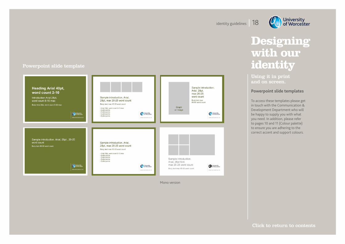
identity guidelines | 18
Designing with our identityUsing it in print and on screen.
Powerpoint slide templates
Powerpoint slide template
To access these templates please get in touch with the Communication & Development Department who will be happy to supply you with what you need. In addition, please refer to pages 10 and 11 (Colour palette) to ensure you are adhering to the correct accent and support colours.
Mono version

identity guidelines | 19
Plasma screen template
Designing with our identityUsing it in print and on screen.
Plasma screen template
To access these templates please get in touch with the Communication & Development Department who will be happy to supply you with what you need. In addition, please refer to pages 10 and 11 (Colour palette) to ensure you are adhering to the correct accent and support colours.
Mono version
Text and image/graph version
Text only version
Preferred version

identity guidelines | 20
Designing with our identityUsing it in print and on screen.
A4 poster templates
➜www.worcester.ac.ukinspired for life
Yelland Lecture TheatreRoom: Details/Directions
www.worcester.ac.ukinspired for life
Clarendon BT Bold 80pt/80, word count 4-8 maxIntro Bliss 2 Bold, 50pt/50, word count 8-25 maxBody Bliss 2 Regular, 35pt/35, word count 15-45 max
www.worcester.ac.ukinspired for life
A3/A4 poster template
To access these templates please get in touch with the Communication & Development Department who will be happy to supply you with what you need. In addition, please refer to pages 10 and 11 (Colour palette) to ensure you are adhering to the correct accent and support colours.

identity guidelines | 21
Designing with our identityUsing it in print and on screen.
Email sign-offs
Standard email sign-off
Jane BrittonCommunication and Development
University of Worcester Henwick Grove, Worcester WR2 6AJtel: 01905 855465 fax: 01905 855132 email: [email protected] further information about opportunities to study at the University of Worcester please visit www.worcester.ac.uk
Jane BrittonCommunication and Development
University of Worcester Henwick Grove, Worcester WR2 6AJtel: 01905 855465 fax: 01905 855132 email: [email protected] further information about opportunities to study at the University of Worcester please visit www.worcester.ac.uk
To access these templates please get in touch with the Communication & Development Department who will be happy to supply you with what you need.

identity guidelines | 022
tone of voicefor the University of Worcester

identity guidelines | 23
Tone of voiceEvery brand has a story to tell. While great designs catch an audience’s eye, when it comes to making claims, showing understanding and really giving people the confidence to choose Worcester, only the right words will do.
Our language is one of the very best ways we have of expressing our brand values. So, when we think about how we write, we should start by reminding ourselves of those values…
BelongingWe treat students as individuals and we’ve created a friendly, uplifting, safe environment where they can feel at home.
PurposefulWe make our courses relevant to our students’ aspirations, both for their careers and for their personal development, so they can go on to make a real difference.
InspiringWe know that open minds need an imaginative, inspiring university experience so they can achieve their ambitions and become the professionals, leaders, entrepreneurs and guardians of tomorrow.
Inspired for lifeThis is our strapline. It’s the heart of who we are and is the starting point from which we develop all our communications for the University. Drawn from the emotional and rational benefits of the University, it’s an appealing, imaginative statement that connects with audiences and will do so long into the future.
Our language and our brand

identity guidelines | 24
Tone of voice
BelongingOur language is warm, friendly, open and inviting. We use ‘you’ and ‘we’ and we give readers plenty of reminders about the supportive community we’re all part of. We write as we speak, so we’re not stuffy and formal, but we’re not overly familiar either.
PurposefulOur language brings out the benefits in everything we do. It’s clear, concise and straight talking, so those benefits stand out and our audience can really see what a difference we make to their lives.
InspiringOur language is inspiring, uplifting and positive. It’s interesting, with imaginative touches and varied pace, so our audience feels excited about being part of Worcester and the opportunities that brings.
So how do our brand values translate into the kind of language we use every day?
Reflecting our values in our language

identity guidelines | 25
Copy examplesHere are a few copy examples, showing how our brand values are brought out in our language.
“ Wherever you see yourself, we’re here to help you get there, with extraordinary courses driven by real industry demands.”
“ Our lively student community’s made up of people from all walks of life, and from all over the world.”
“ The right advice can make a world of difference, so if you’d like to talk to one of our advisors, just call in any time.”
“ At Worcester, our degrees are different. Shaped around your own ambitions, interests and needs, they’ll give you an amazing head start in your chosen career.”
“ Life-changing qualifications that really do open new doors.”

identity guidelines | 26
Word bankTone of voice
We’ve put together this word bank to show you the kind of words we like to use when we’re talking about the University of Worcester. It’s here to give you some ideas and help you get started…
home
quality
confidence
inspiring
journey
innovative
proud
discover
inviting
unique
investing
life-changing
exciting
professional
close-knit
opendriven
safe
careers
imaginative
opportunities
warm
ambitious
welcome
individualrelevant
heartstrong
achieve
prestigious
imagine
practical
accredited
committed
experience
preparedpossibilities
be part of itbecome reach
connect
genuine
dream
real
enthusiastic
supportive
rewarding
growing
share
together
flexibleextraordinary
respected
friendlybeyond
motivated
thriving
get involved
energeticlifelong
dynamic
ready
potential
focused
community
adventure

identity guidelines | 27
Quick checklistTone of voice
Whatever you’re writing for the University of Worcester, check it against these few pointers. If you can answer yes to them all, you’re getting our tone of voice right.
• Does your copy create a sense of belonging? Is it warm, friendly and inviting?
• Does your copy feel purposeful? Is it really bringing out the benefits?
• Does your copy feel inspiring? Is it positive and uplifting?
• Are you using you, we, our and us?
• Have you written as you’d speak, being friendly but not over familiar?
• Will your copy be relevant, interesting and appealing to the reader? We can’t expect them to act on it if we haven’t thought about what they need, want and feel.
identity guidelines | 028
style guidefor the University of Worcester
house

identity guidelines | 29
This guide is intended to be a living document, which evolves to answer the questions you regularly need to ask. So, if there’s anything you think it would be helpful to add, please get in touch with the Communication & Development Department at [email protected] and let us know.
We’ve also created a separate tone of voice guide, which looks at the values of the University and how our writing can and should reflect them. If you’d like a copy, please contact us.
We’ve put together this house style guide for everyone who writes for the University, from copywriters to course leaders, marketing assistants to managers. It’s designed to be a handy reference guide that helps us all be consistent in the way we use things like punctuation, contact details, qualification titles and numbers. These little details really can make a big difference to the integrity of our work, so it’s important we all approach them consistently.
What this guide is for

identity guidelines | 30
The UniversityWe call ourselves University of Worcester (not ‘the’).
In running text, you can say the University of Worcester.
For example:When you arrive at the University of Worcester. Please don’t use ‘The University of Worcester’ unless you’re starting a sentence.
To avoid repetition, you can also refer to us as the University (note the capital U) or Worcester. Please don’t use ‘UoW’ in externally facing work.
When you’re talking about universities in general, please use a lower case u.
For example:Going to university is an exciting step.
Institutes, schools, departments and servicesThese are the official names of the University’s institutes and school:
• Institute of Education• Institute of Health & Society• Institute of Humanities
& Creative Arts• Institute of Science &
the Environment• Institute of Sport &
Exercise Science• Worcester Business SchoolPlease note the use of capitals and ampersands (&) and use these consistently.
Always use the full title of the institute or school in the first instance. If you need to shorten it to avoid repetition, use the Institute, the School or the Business School (note capitals).
When you’re talking about the Students’ Union, please use a capital S and U, and note the position of the apostrophe. You can use the Union or the SU later to avoid repetition.
If you’re referring to a specific University department or service, please capitalise its title. So:
• the Communication & Development Department
• Welfare and Financial Guidance Service
• the Admissions Office
As long as it’s still clear which department or service you’re talking about, you can use the department, the service or the office to avoid repetition (note lower case). When you’re talking more generally, please use lower case.
For example:we offer outstanding services.
Referring to our University, courses, qualifications and people

identity guidelines | 31
The University is multi-sited. The official sites are:
• St John’s Campus • Riverside• City Campus • University Park
Again, please note use of capitals. If you need to add ‘the’ in running text, please use lower case unless you’re beginning a sentence.
For example:at the lively St John’s campus…
When you’re referring to a specific University building, please use initial capitals. So:
•Charles Darwin Building• Sansome Hall
You can use the library, the hall etc. later to avoid repetition. When you’re talking more generally, use lower case.
For example:the University has excellent Halls of Residence.
When you’re talking about a specific course, please use its full name and initial capitals (you can use the course later to avoid repetition).
For example:• Media & Cultural Studies• Forensic & Applied Biology
If you’re talking more generally about a subject area, use lower case. So: Sarah enrolled on the Media & Cultural Studies course. But Sarah has always wanted to study media.
Proper module titles should have initial capitals. They should also feature ‘&’ instead of ‘and’.
For example:• Explorations in Women’s History• Graphic Design: Theory & Practice• Sport & Disability
When you’re talking about parts of a course, please use:
• Year 1, Year 2, Year 3 etc.• Work placement year• Study abroad year
Campus buildings and facilities
Courses and subjects

identity guidelines | 32
Please note use of capitals and punctuation on these qualification titles: Use capitals for formal job titles if they appear alongside someone’s name, but lower case subsequently, or if they’re not directly alongside each other.
For example:Vice Chancellor David Green congratulated the students. The vice chancellor said…
Sharon Hardwick, Course Leader, knows how important it is for students to stay up to date. The role of the course leader is to…
Hugh is a professor of education and has been at the University for…
Our team of professors has a wealth of experience.
Please contact the assistant registrar if you have any queries.
Sue is one of the University’s receptionists.
Qualifications Job titles
A Level A2 LevelAS LevelBachelor’s degreeBA (Hons)BSc (Hons)CertHEDipHEFdAFdScFoundation degreeGCSEGraduate DiplomaHNC or Higher National Certificate
HND or Higher National DiplomaHonours degree MAMasters degreeMScNVQ / GNVQ O LevelPGCE or Postgraduate Certificate in EducationPgCert or Postgraduate CertificatePgDip or Postgraduate DiplomaPhDTop-up degree

identity guidelines | 33
The University’s correct address is:
University of WorcesterHenwick GroveWorcesterWR2 6AJ
Please write it as a block where there is room. If you need to use the address in running text, use commas for clarity. So: University of Worcester, Henwick Grove, Worcester WR2 6AJ.
If they appear in a block alongside the University’s address, phone, fax and email details should be listed like this:
tel: 01905 855000fax: 01905 855144email: [email protected]
In running text you can also say something like: just call us on 01905 855000 or email the admissions team at [email protected]
Please begin web addresses with www.
For example: www.worcester.ac.uk
Guidance about URLs:Don’t split the email addresses and URLs over 2 lines. Don’t put a full point after a URL.
Listing our contact details

identity guidelines | 34
Other organisationsPlease check carefully how the organisation spells and capitalises its name, and stick to this in your copy. Pay special attention to whether the organisation uses ‘the’ before its name and, if so, whether they capitalise it.
Publications, performances and eventsIf you’re referring to a publication, such as a newspaper, book or journal, please put its title in italics. The same applies to plays, TV shows, works of art, events etc.
For example:The Sunday TimesWorcester StandardA Streetcar Named DesireWorcester Festival
Referring to other organisations and publications

identity guidelines | 35
In running text, please use words for the numbers one to ten (in bullets or charts you can use figures if this looks clearer. Please also use figures if you’re talking about measurements or times of day. For example 40km, 5.30pm).
Use figures for 11 and above.
If you need to use two numbers close together and one is ten or under, it’s OK to make them both figures.
For example: there’s room for 8 to 12 students.In numbers over 1,000 please use commas.
For example: 4,530.If you need to begin a sentence with a number, please express it as a word.
For example: Thirty people attended the event.
Days and months should have initial capitals.
For example: Monday, January.Seasons don’t need capitals.
For example: spring, summer.Please write dates in the following format:
For example: Sunday 26 September 2010.Don’t use 21st, 23rd, 27th.
Write the year out in full.
If you’re writing about a particular decade, never use an apostrophe. For example, it’s OK to say the 60s or the 1960s but not ‘the 1960’s’.
Centuries should be expressed like this: 18th Century but 18th-century novels.
Words or figures? Dates

identity guidelines | 36
Express times in figures, making sure you use am or pm for clarity. So:
8am
7.30pm
12 noon
12 midnight
If you know you’re writing for an international audience, it may be more helpful to use the 24-hour clock.
For example:08.00
19.30
Please follow these examples:
25p
£35.50
£40
£9,500
£5 million or £5m
Please follow these examples of abbreviated measurements:
45cm
12m
30km
2.5kg
7lb 4oz
6ft 2in
Times Money Measurements

identity guidelines | 37
Titles and headingsPlease only capitalise the first letter of a title or heading, unless it includes a name which needs initial capitals. For example:
Inspired for life
A reputation built on solid foundations
Building for the future
Exciting opportunities at the University of Worcester
Rewarding careers start at the Institute of Education
EmphasisPlease don’t use speech marks, inverted commas, bold or underlining for emphasis. We’d rather you just let the words speak for themselves, but if you feel it’s essential for clarity, use italics sparingly.
AbbreviationsPlease don’t use a full stop after contractions, unless you’ve reached the end of a sentence.
For example: Dr, Mrs or Mr.Don’t use full stops within or after abbreviations, again unless you’re at the end of a sentence. So: eg ie etc.
ApostrophesApostrophes should be used to show possession.
For example: the man’s coat or the ladies’ coats.They can also be used to show you’ve made a contraction. For example, don’t instead of ‘do not’ or you’ll instead of ‘you will’. This can help your writing feel more friendly and natural.
The important exception to the above is its/it’s. The former is used to show that something belongs to ‘it’ and shouldn’t have an apostrophe.
For example: The dog had lost its ball. The latter is a contraction of ‘it is’ or ‘it has’.
For example: It’s a lovely day. Or it’s been fun.Apostrophes should never be used to indicate a plural. So ‘DVD’s’ is incorrect.
BracketsPlease use round brackets. So, ( ) instead of [ ], { } or < >.
If there is a complete sentence within the brackets, the full stop should also sit within them. If not, it should come after.
For example: (He ran all the way there.) But James just managed to catch the last train (running all the way).
Capitalisation, emphasis and punctuation

identity guidelines | 38
BulletsIf the bulleted points continue the sentence that introduces them, begin each one lower case (unless it’s a proper name or title which you’d usually capitalise, like a module title). This applies to both very short bullets and longer ones.
For example:Subject areas include:• advertising• public relations• marketing
The city is a great place to live, with:• a beautiful riverfront close to the University• tree-lined walkways running past the cathedral• restaurants, cosy pubs and contemporary bars• clubs specialising in all sorts of different music• a range of excellent art galleries
Modules include:• Economic Concepts• Introduction to Web Development• Public Relations Strategy
If the bulleted points are sentences in their own right, begin each one with a capital and end each one with a full stop.
For example: Student life isn’t all study, study, study.• You’ll meet students from all over the
world and make friends for life.• It’s a great chance to explore a completely new place –
you might even stay on after you graduate. • A huge range of sports clubs offer plenty of
ways to keep fit and get competitive.

identity guidelines | 39
Colons and semicolonsYou can use colons to introduce bullets that flow on (see 09.10).
They can also be used between the clauses of a sentence, if the first clause is quite general and the second clause explains it further.
For example: There’s always something going on at the Union; it hosts live bands and sports events every week. In this instance, you can also use a dash instead.
For example: There’s always something going on at the Union – it hosts live bands and sports events every week.Semicolons are used instead of commas to help make long lists clearer, especially if the things you’re listing include commas or ‘and’.
For example: Course modules include: Contemporary Investigations in Sport & Exercise Science; Introduction to Motor Learning & Skill Acquisition; Strength, Power & Speed; and The Sport & Physiology of Exercise.You can also use them to show a link between two complete sentences.
For example: The course opens up lots of great opportunities; students start exciting careers all over the world.
Hyphens and dashesOnly use a hyphen if you’re combining two words to describe a noun that comes immediately after them.
For example: well-known people or He is well known.If a noun doesn’t follow, for example in a list, don’t use a hyphen.
Long dashes can be used instead of commas to pull out part of a longer sentence.
For example: You’ll find lots of great facilities – and a really warm welcome – at our friendly Students’ Union.They can also be used instead of a colon or to give an example.
For example: Halls are a great way to meet new people – perfect if you’re away from home for the first time.The preferred house style for colons is lower case after the colon.
For example: Inspired for life: apply for this year’s student scholarships now.
identity guidelines | 40
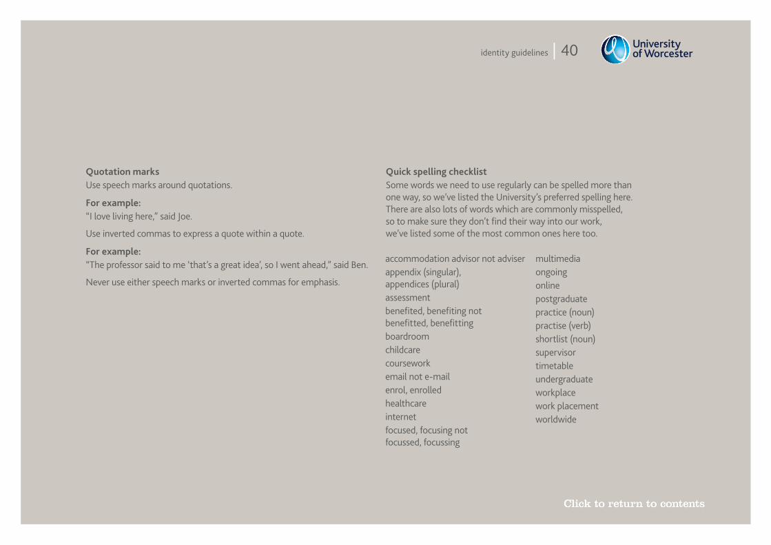
Quotation marksUse speech marks around quotations.
For example: “I love living here,” said Joe.
Use inverted commas to express a quote within a quote.
For example: “The professor said to me ‘that’s a great idea’, so I went ahead,” said Ben.
Never use either speech marks or inverted commas for emphasis.
Quick spelling checklist Some words we need to use regularly can be spelled more than one way, so we’ve listed the University’s preferred spelling here. There are also lots of words which are commonly misspelled, so to make sure they don’t find their way into our work, we’ve listed some of the most common ones here too.
accommodation advisor not adviserappendix (singular), appendices (plural)assessmentbenefited, benefiting not benefitted, benefittingboardroomchildcarecourseworkemail not e-mailenrol, enrolledhealthcareinternetfocused, focusing not focussed, focussing
multimediaongoingonlinepostgraduatepractice (noun)practise (verb)shortlist (noun)supervisor timetableundergraduateworkplacework placementworldwide