flat plan
TRANSCRIPT
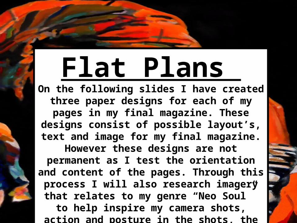
Flat Plans On the following slides I have created
three paper designs for each of my pages in my final magazine. These
designs consist of possible layout’s, text and image for my final magazine.
However these designs are not permanent as I test the orientation and
content of the pages. Through this process I will also research imagery that relates to my genre “Neo Soul” to help
inspire my camera shots, action and posture in the shots, the colours that I could use, and the style of font for my
text.
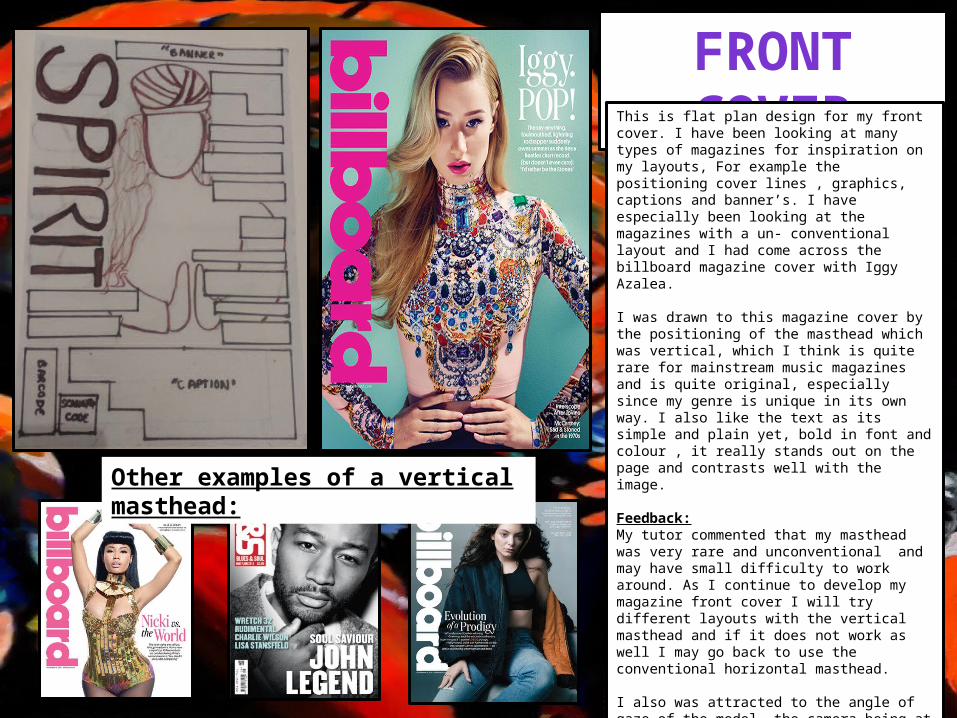
FRONT COVERThis is flat plan design for my front cover. I have been looking at many types of magazines for inspiration on my layouts, For example the positioning cover lines , graphics, captions and banner’s. I have especially been looking at the magazines with a un- conventional layout and I had come across the billboard magazine cover with Iggy Azalea.
I was drawn to this magazine cover by the positioning of the masthead which was vertical, which I think is quite rare for mainstream music magazines and is quite original, especially since my genre is unique in its own way. I also like the text as its simple and plain yet, bold in font and colour , it really stands out on the page and contrasts well with the image.
Feedback:My tutor commented that my masthead was very rare and unconventional and may have small difficulty to work around. As I continue to develop my magazine front cover I will try different layouts with the vertical masthead and if it does not work as well I may go back to use the conventional horizontal masthead.
I also was attracted to the angle of gaze of the model, the camera being at a slightly tilted angle almost as if she is looking down at you, it is almost as if she is in control especially with her stance which is her hands resting at her waist and the neutral yet stern facial expression shows some of the power she may hold.
I have decided to use a mid long shot for my magazine cover model to get the same boldness and abstract look as on the billboard magazine.
Other examples of a vertical masthead:

CONTENTS PAGEThis is flat plan design for my contents page. I have been looking at many types of magazines contents pages for inspiration on the layout and so far I have come across “Q magazine” ,”Billboard magazine" and a previous a level media students final contents page.
I was drawn to these content pages because they each have a layout that is clear and not too over crowded, the text is spaced out and sized carefully, the font is plain and bold which really bounces off the page; enabling the clarity to the reader. I also like the minimal use of colour on the page as the colours are bold but not too overbearing. The colours are only in specific places not all in one section or the page. I like the way how the sections are grouped together which makes the page also clearer and neat to look at, the sections are also minimal also reducing over crowding. The sections are also spaced out well on the page also enhancing the clarity of the pages.
For my flat plan design I followed the same layout as my front cover for the vertical masthead, using a different font and style. For the layout of the text and imagery I combined the three contents pages and applied them to my design.
For my final contents page I would like to use camera shots similar to these displayed on the contents pages, I will create some test shots and select what is appropriate for my contents page. I will test the layout also with the mast head to check what position will be more appropriate horizontal or vertical.

DOUBLE PAGE SPREAD
This is flat plan design for my double page spread for which I have been looking at many types of articles and these are the ones I would like to use for inspiration.
I was drawn to these pages because they each had things I thought could be improved , I decided to combine my improvements to create this flat plan. I think that the layout of each page spread needed improving as it was too conventional and plain, I also think these pages needed more colour as they were dull . I also looked at the layout of the text and applied that to my flat plan, I also decided to position the title horizontal rather than vertical because the title needs to be aligned with the text , to balance the layout and to have more clarity on the page.
I also collected some mid long/close up shots I am interested in using on my double page spread. I especially like these shots because it is simple to input text with these images due to the stance of the model. The camera shots are able to demonstrate what the text possibly could be about to the reader for example the more relaxed stance could mean a more of a relaxed and casual interview .
I will also research more shots I could use for these pages and I will test them with my magazine layout to fit the appropriate shots.