feelgood
DESCRIPTION
Brand guidelines for healthy drinks company.TRANSCRIPT

Our rather beautiful brand guidelines

Why we have brand guidelines…
Consistency Differentiation
Efficiency
We now have a fantastic, unique and OWNABLE proposition that we are proud of and want to shout about. But (and it’s a big but!) it will only work if it is communicated properly.
Spread some feelgoodness!!!!
It should be Simple / Visual / Impactful & most importantly…

So, here they are!
The next few pages contain our golden rules for making sure we communicate all this good stuff
consistently…

Our Name…
We are… THE FEEL GOOD DRINKS COMPANY (when we are talking about our business)
We sell… FEEL GOOD DRINKS (when talking about our lovely brand & drinks)

Pantone ref: 187 c
Our logo… Should have a gap of at least 1cm between it and any other image… we don’t want to get lost in the crowd!
Sometimes you might see our logo represented as a stamp rather than a solid colour – we use this in some of our internal design work
Both of our logos can be found on the server: T:\Useful Stuff\Brand Guidelines\Team Brand Guidelines\Logo\2010
Our lovely logo…
Usage: We would like you to use this logo on all posters and flyers and in brochures

Our handwriting… we use 3 fonts
Blockhead Blackface Blockhead Uplugged Berlins sans
When to use…
Blockhead Blackface should be used for all headings
Blockhead Uplugged should be used in bold as the primary font
Berlin sans should be used in all word documents, for example product brochures
If you need to replicate any of our fonts we can supply details on where to find them

o Red should be used for headings and highlighting key messages
o Black should be used for everything else
o All stock used for printing should be off-white in colour and pre approved by us!
Colours... Red & Black
Pantone ref: 187 c
When we do any work on Windows we use this red… it’s easy to find –2 up 2 in! :

Doodles... All of the doodles found on the packaging are yours to play with, however they must be used in relevant situations.
…should be used in communicating the good stuff in our Still & Sparkling Juice Drinks
… used in communicating the recyclability of the Feel Good Drinks range
… used in conjunction with our URL address and ‘enjoy some feelgoodness @’ tag line
… used in communicating the product attributes of our 400ml Juice Drinks
Say hello @ www.feelgooddrinks.co.uk
…should be used in communicating our Kids Juice Drinks

Lifestyle… We also have beautiful shots of the Feel Good Team in action!
There are 10 to choose from:
o 5 of the team and our gorgeous drinks
o 4 of the team with a piece of fruit
o 1 of the team on the beach in Biarritz!
Lifestyle shots can be used in presentations to liven up a boring slide – think of the shots as Felix replacements!
(just make sure the images are always in a box, red looks great but black is fine too!)

Bringing feelgoodness to life!
A few examples of why and how the new brand guidelines will work…
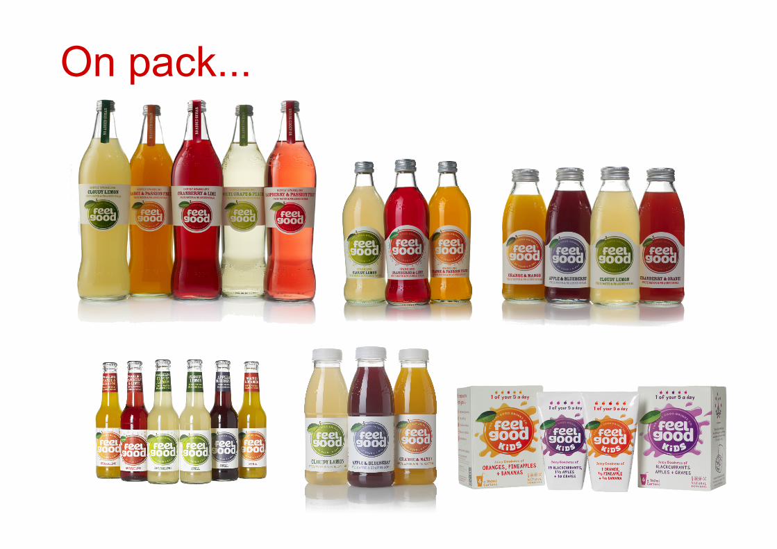
On pack...

On stationery…

In Creative…

On trade posters & flyers…

Thanks!