exploring the use of memory colors for image enhancement
TRANSCRIPT
Exploring the Use of Memory Colors for Image Enhancement
Su Xuea Minghui Tana Ann McNamarab Julie Dorseya Holly Rushmeiera
aYale University bTexas A&M University
ABSTRACT
Memory colors refer to those colors recalled in association with familiar objects. While some previous workintroduces this concept to assist digital image enhancement, their basis, i.e., on-screen memory colors, are notappropriately investigated. In addition, the resulting adjustment methods developed are not evaluated from aperceptual view of point. In this paper, we first perform a context-free perceptual experiment to establish theoverall distributions of screen memory colors for three pervasive objects. Then, we use a context-based experimentto locate the most representative memory colors; at the same time, we investigate the interactions of memorycolors between different objects. Finally, we show a simple yet effective application using representative memorycolors to enhance digital images. A user study is performed to evaluate the performance of our technique.
Keywords: Memory colors, crowd sourcing, color reproduction
1. INTRODUCTION
Memory Colors have been defined as “those colors that are recalled in association with familiar objects”.1
Several early psychophysical studies support that the majority of people associate an ideal color with an arrayof everyday objects (skin, grass, sky, plant, sand, and etc). Naturally these colors vary from person to person,but experiments have repeatedly shown that there are a few standard colors that most people recognize.1–3
Recently, several works have emerged using memory colors as a mechanism for segmentation and correctionin the realm of digital images.4–6 However, the fundamentals for all these techniques, i.e., the memory colorsthey rely on, are ambiguously vague. On one hand, some works7,8 directly use memory colors determined byearly psychophysical experiments,1 which were performed using printed color chips under carefully controlledviewing conditions. However, the appropriateness of applying these colors for digital images under varyingdisplay conditions is not evaluated. On the other hand, some researchers9,10 have experimented with on-screenmemory colors, but enroll only a small number of participants under constant display conditions. Furthermore,none of previous work attended to the interactions of memory colors between different objects. For example,an largely unexplored question is: are the memory colors of concurrent sky and grass different from those whenthey appear separately?
In this paper, we investigate on-screen memory colors, which are suitable for image enhancement; and thenshow their use by a simple but effective color correction task. First, we perform an experiment to establish thescreen memory colors of three pervasive objects in nature: skin, sky and grass. During the experiments the taskof the participants is to select memory colors from color chips displayed on screen, which is analogous to the earlycontext-free psychophysical study1 where printed color chips are used. However, employing online crowd-sourcingtools, i.e., Amazon Mechanical Turk (MTurk), enables us to recruit a much larger group of observers under diversedisplay and viewing conditions. The resulting clusters on the color space form the overall distributions of screenmemory colors.
Second, we perform a context-based experiment to locate representative memory colors. We manipulatethe colors of skin, sky and grass within natural images to various candidate colors sampled from the previousdistributions. Then we conduct a user study to evaluate the ratings of observers based on their color impressionof these manipulated images. This way, the interaction of memory colors between different objects is measured.Also, the average ratings across all manipulated images reveal the preference for memory colors in the imagecontext. The highest rated candidate colors are located as representative memory colors.
Further author information: (Send correspondence to Su Xue)Su Xue: E-mail: [email protected]
Finally, we use a simple image enhancement task to show the effectiveness of representative memory colors.For uncorrected images with memory regions, i.e., regions of memory objects, we find increases in preferencewhen these regions are shifted toward representative memory colors. The exceptions are those images captured(or processed) to deliberately include effects such as color cast for example, to convey a certain mood. In thesecases association of memory colors is less appropriate. The major contributions of our work are as follows:
• A comprehensive crowd sourcing perceptual study demonstrating that distributions for context-free memorycolors in uncontrolled environments are similar to those found in experiments with carefully controlledconditions.
• A subsequent context-aware study that locates representative memory colors. Also, it examines the inter-action of memory colors, and the relative impact of different memory colors on human judgment of imagequality.
• A technique that uses representative memory colors to reduce the three dimensional adjustment of imagecolors to a simple one dimensional adjustment. A validation study reveals the applicable cases for thismethod.
2. PREVIOUS WORK
The notion of memory colors dates back over several decades. Katz11 asserts that human observers frequentlyexaggerate salient aspects of color, particularly if the object is associated with a specific label. Subsequentresearch1–3,9 reveal that the typical color of an object becomes a component of our memory, and influences ourperception of colors of this object. Complementary studies investigate the effects of manipulating color of knownobjects. Even an object of known color is illuminated in a manner that does not match the color identified withit, the perceptions of human observers are still influenced by those colors in their memory.9,10,12,13
Early psychophysical studies on memory colors1–3,9 ask participants to select, from an assemblage of printedcolor chips, the one that they most associate with familiar objects. The recorded judgments are found to formclustered distributions, which implies, that although memory colors of different people are not identical, theyare located in a compact common area. Yendrikhovskij et al.14 ask observers how natural digital color sampleslook in an attempt to locate memory colors for grass, sky and skin, where Gaussian distributions of memorycolor areas are found. Recently, Moreno et al.6 perform a psychophysical study to explore memory colors undervarious lighting conditions. However, all these studies above are performed under strictly controlled displayand viewing conditions. Also, only a moderate number of participants are involved due to practical limitations.In this paper, we use crowd sourcing techniques to perform a more comprehensive investigation into memorycolors across a large range of variations. The interaction between the colors of multiple memory objects are alsoexplored.
A number of recent applications use memory colors as their basis. In image enhancement, several studies findthat a subset of colors are representative of those that both the expert and the naive target when modifying andjudging image quality.7,8 Most notably, the colors of three memory objects, skin, sky and grass, are identified asprincipal ones. Images that are manipulated to place the color ranges of these objects into memory color regionsare viewed more preferentially.15,16 Nachlieli et al.5 focus their effort on automatic skin color correction usingexisting models of skin colors. Rahtu et al.17 use memory colors in automatic color constancy for grass, skyand foliage. Besides, memory colors are used in image segmentation4,18 and illumination quality evaluation.19,20
However, the memory colors these techniques rely on are based on previous psychophysical experiments, whichare not necessarily appropriate for image editing applications. The performance of memory colors in thesetechniques are not evaluated from a perceptual point of view. In this paper, we target to investigate on-screenmemory colors, in particular, representative memory colors, which are suitable for image enhancement. Also,we conduct a user study to evaluate the effectiveness of a proposed simple color correction technique usingrepresentative memory colors.
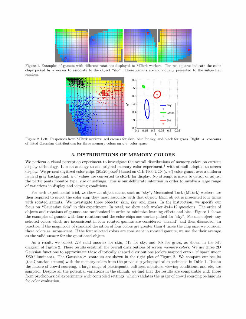
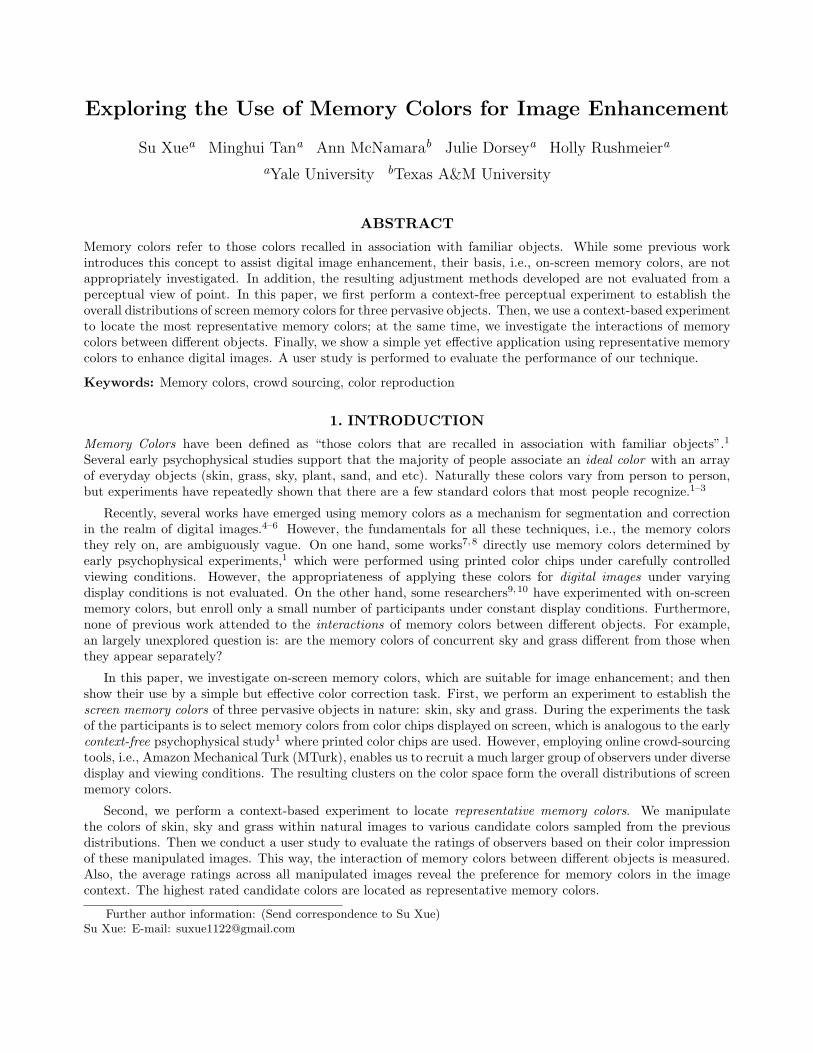
Figure 1. Examples of gamuts with different rotations displayed to MTurk workers. The red squares indicate the colorchips picked by a worker to associate to the object “sky”. These gamuts are individually presented to the subject atrandom.
0.1 0.15 0.2 0.25 0.3 0.350.3
0.35
0.4
0.45
0.5
0.55
0.6
u’
v’
Sky
Grass
Skin
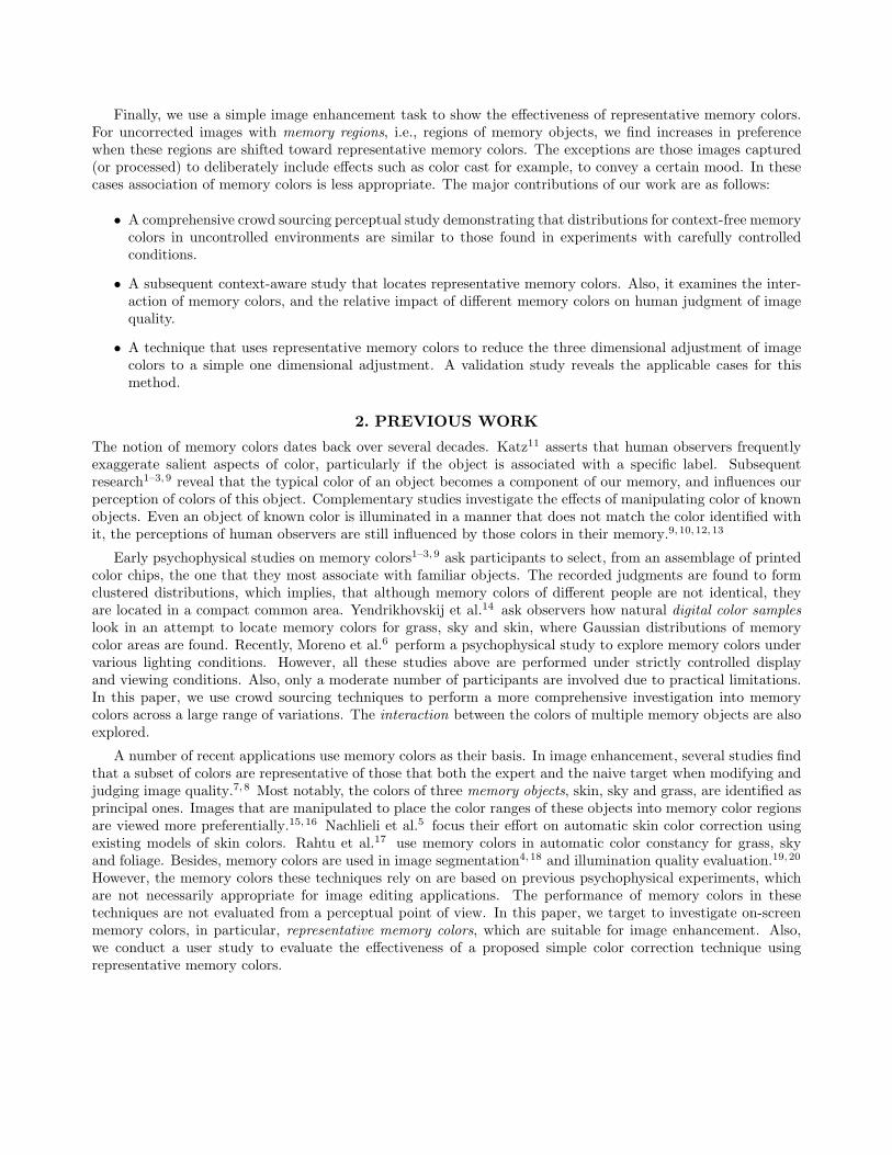
Figure 2. Left: Responses from MTurk workers: red crosses for skin, blue for sky, and black for grass. Right: σ−contoursof fitted Gaussian distributions for three memory colors on u’v’ color space.
3. DISTRIBUTIONS OF MEMORY COLORS
We perform a visual perception experiment to investigate the overall distributions of memory colors on currentdisplay technology. It is an analogy to one original memory color experiment,1 with stimuli adapted to screendisplay. We present digitized color chips (20x20 pixel2) based on CIE 1960 UCS (u’v’) color gamut over a uniformneutral gray background. u’v’ values are converted to sRGB for display. No attempt is made to detect or adjustthe participants monitor type, size or settings. This is our deliberate intention in order to involve a large rangeof variations in display and viewing conditions.
For each experimental trial, we show an object name, such as “sky”, Mechanical Turk (MTurk) workers arethen required to select the color chip they most associate with that object. Each object is presented four timeswith rotated gamuts. We investigate three objects: skin, sky, and grass. In the instruction, we specify ourfocus on “Caucasian skin” in this experiment. In total, we show each worker 3x4=12 questions. The order ofobjects and rotations of gamuts are randomized in order to minimize learning effects and bias. Figure 1 showsthe examples of gamuts with four rotations and the color chips one worker picked for “sky”. For one object, anyselected colors which are inconsistent in four rotated gamuts are considered “invalid” and then discarded. Inpractice, if the magnitude of standard deviation of four colors are greater than 4 times the chip size, we considerthese colors as inconsistent. If the four selected colors are consistent in rotated gamuts, we use the their averageas the valid answer for the questioned object.
As a result, we collect 228 valid answers for skin, 519 for sky, and 568 for grass, as shown in the leftdiagram of Figure 2. These results establish the overall distributions of screen memory colors. We use three 2DGaussian functions to approximate these elliptically shaped distributions (colors mapped onto u’v’ space underD50 illuminant). The Gaussian σ−contours are shown in the right plot of Figure 2. We compare our results(the Gaussian centers) with the memory colors from the previous psychophysical experiment1 in Table 1. Due tothe nature of crowd sourcing, a large range of participants, cultures, monitors, viewing conditions, and etc, aresampled. Despite all the potential variations in the stimuli, we find that the results are comparable with thosefrom psychophysical experiments with controlled settings, which validates the usage of crowd sourcing techniquesfor color evaluation.
(u’, v’) Sky Grass SkinBartleson et al. 0.151, 0.441 0.133, 0.499 0.221, 0.482
MTurk 0.162, 0.419 0.141, 0.558 0.225, 0.509Table 1. Comparison between memory colors found by our experiment (Gaussian centers) and those by previous psy-chophysical experiments. The colors are converted to CIE UCS (u’v’) color space.
0.1 0.15 0.2 0.25 0.3 0.350.3
0.35
0.4
0.45
0.5
0.55
0.6
u’
v’
IIIIIIIVV
Figure 3. Left: Sampling ellipses for three memory objects and the candidate memory colors (5 for each object). Right:Illustration of R, the overall average ratings for different combinations of candidate memory colors.
4. REPRESENTATIVE MEMORY COLORS
Given the overall distributions found in the previous experiment, our subsequent goal is to discover a fewrepresentative memory colors, which serve the best as “standard colors” in image enhancement techniques.21
Theoretically, the fitted Gaussian centers represent the most selected colors, and thus represent a seeminglynatural candidate. However, our previous experiment is performed in a context-free setting, which is suitableto sample a large number of candidate colors, but not necessarily appropriate to determine the best candidatecolors for image enhancement, where image context is an important consideration.
Consequently, we perform a context-based experiment to locate representative memory colors. We take naturalimages that include regions of skin, sky and grass, and generate a set of stimuli by shifting the colors of individualregions toward a few candidate colors. Then, we ask viewers to rate these manipulated images, which containdifferent combinations of candidate colors. The ratings reveal humans’ preferences for the joint distribution ofthree memory colors in the context of natural images. In this manner we locate the representative memory colorsbased on the preferences.
The candidate colors are sampled around the fitted Gaussian centers. This is analogous to a multi-scalesearching scheme: we start with a coarse search, and then conduct a finer search based on the coarse results.Specifically, we sample 5 candidate colors around each Gaussian center. One of the candidate colors is exactlythe Gaussian center, while the other four are sampled along a sampling ellipse (see the right plot of Figure 3).The orientation and the shape of sampling ellipse are identical to those of its overall Gaussian distribution. Eachsampling ellipse is scaled so that three sampling ellipses have an equal area, 0.022π on u’v’ color space. See theleft plot in Figure 3.
When generating the stimuli, we shift the natural image, so that the colors of memory color regions arecentered at 5 candidate colors defined above. For each natural image, we thus create 53 = 125 combinations ofmanipulated colors. Five natural images, labeled as A,B,C,D,E, are used, which serve as various “contexts”in stimuli. We select natural images so that regions pertaining to three memory colors are roughly equal in size,which minimizes any affects due to the region size of the memory color. These regions are manually segmented.A subset of manipulated images is shown in Figure 4. See supplemental materials for all stimuli images.
As before, we use crowd sourcing to elicit the judgments on stimuli, while keeping results as general aspossible. We ask MTurk workers to rate an images based only the quality of the color reproduction, ignoring
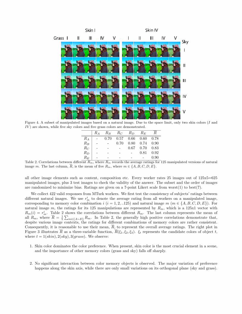
Figure 4. A subset of manipulated images based on a natural image. Due to the space limit, only two skin colors (I andIV ) are shown, while five sky colors and five grass colors are demonstrated.
RA RB RC RD RE R
RA - 0.70 0.57 0.66 0.60 0.78RB - - 0.70 0.80 0.74 0.90RC - - - 0.67 0.70 0.83RD - - - - 0.81 0.92RE - - - - - 0.90
Table 2. Correlations between different Rm, where Rm records the average ratings for 125 manipulated versions of naturalimage m. The last column, R, is the mean of five Rm, where m ∈ A,B,C,D,E.
all other image elements such as content, composition etc. Every worker rates 25 images out of 125x5=625manipulated images, plus 3 test images to check the validity of the answer. The subset and the order of imagesare randomized to minimize bias. Ratings are given on a 7-point Likert scale from worst(1) to best(7).
We collect 422 valid responses from MTurk workers. We first test the consistency of subjects’ ratings betweendifferent natural images. We use rim to denote the average rating from all workers on a manipulated image,corresponding to memory color combination i (i = 1, 2, ..125) and natural image m (m ∈ A,B,C,D,E). Fornatural image m, the ratings for its 125 manipulations are represented by Rm, which is a 125x1 vector withRm(i) = rim. Table 2 shows the correlations between different Rm. The last column represents the mean ofall Rm, where R = 1
5
∑m∈A∼ERm. In Table 2, the generally high positive correlations demonstrate that,
despite various image contexts, the ratings for different combinations of memory colors are rather consistent.Consequently, it is reasonable to use their mean, R, to represent the overall average ratings. The right plot inFigure 3 illustrates R as a three-variable function, R(ξ1, ξ2, ξ3). ξt represents the candidate colors of object t,where t = 1(skin), 2(sky), 3(grass). We observe:
1. Skin color dominates the color preference. When present, skin color is the most crucial element in a scene,and the importance of other memory colors (grass and sky) falls off sharply.
2. No significant interaction between color memory objects is observed. The major variation of preferencehappens along the skin axis, while there are only small variations on its orthogonal plane (sky and grass).
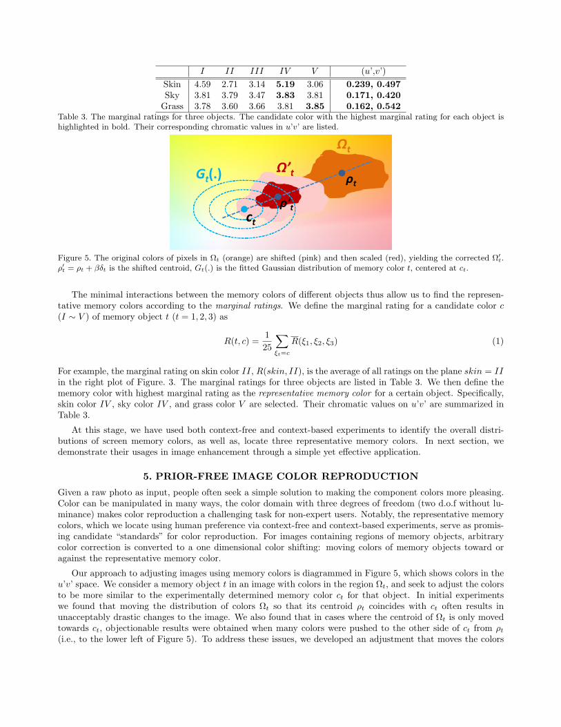
I II III IV V (u’,v’)Skin 4.59 2.71 3.14 5.19 3.06 0.239, 0.497Sky 3.81 3.79 3.47 3.83 3.81 0.171, 0.420
Grass 3.78 3.60 3.66 3.81 3.85 0.162, 0.542Table 3. The marginal ratings for three objects. The candidate color with the highest marginal rating for each object ishighlighted in bold. Their corresponding chromatic values in u’v’ are listed.
Ωt
ρt
ρ't
Ω’tGt(.)
ct
Figure 5. The original colors of pixels in Ωt (orange) are shifted (pink) and then scaled (red), yielding the corrected Ω′t.
ρ′t = ρt + βδt is the shifted centroid, Gt(.) is the fitted Gaussian distribution of memory color t, centered at ct.
The minimal interactions between the memory colors of different objects thus allow us to find the represen-tative memory colors according to the marginal ratings. We define the marginal rating for a candidate color c(I ∼ V ) of memory object t (t = 1, 2, 3) as
R(t, c) =125
∑ξt=c
R(ξ1, ξ2, ξ3) (1)
For example, the marginal rating on skin color II, R(skin, II), is the average of all ratings on the plane skin = IIin the right plot of Figure. 3. The marginal ratings for three objects are listed in Table 3. We then define thememory color with highest marginal rating as the representative memory color for a certain object. Specifically,skin color IV , sky color IV , and grass color V are selected. Their chromatic values on u’v’ are summarized inTable 3.
At this stage, we have used both context-free and context-based experiments to identify the overall distri-butions of screen memory colors, as well as, locate three representative memory colors. In next section, wedemonstrate their usages in image enhancement through a simple yet effective application.
5. PRIOR-FREE IMAGE COLOR REPRODUCTION
Given a raw photo as input, people often seek a simple solution to making the component colors more pleasing.Color can be manipulated in many ways, the color domain with three degrees of freedom (two d.o.f without lu-minance) makes color reproduction a challenging task for non-expert users. Notably, the representative memorycolors, which we locate using human preference via context-free and context-based experiments, serve as promis-ing candidate “standards” for color reproduction. For images containing regions of memory objects, arbitrarycolor correction is converted to a one dimensional color shifting: moving colors of memory objects toward oragainst the representative memory color.
Our approach to adjusting images using memory colors is diagrammed in Figure 5, which shows colors in theu’v’ space. We consider a memory object t in an image with colors in the region Ωt, and seek to adjust the colorsto be more similar to the experimentally determined memory color ct for that object. In initial experimentswe found that moving the distribution of colors Ωt so that its centroid ρt coincides with ct often results inunacceptably drastic changes to the image. We also found that in cases where the centroid of Ωt is only movedtowards ct, objectionable results were obtained when many colors were pushed to the other side of ct from ρt(i.e., to the lower left of Figure 5). To address these issues, we developed an adjustment that moves the colors
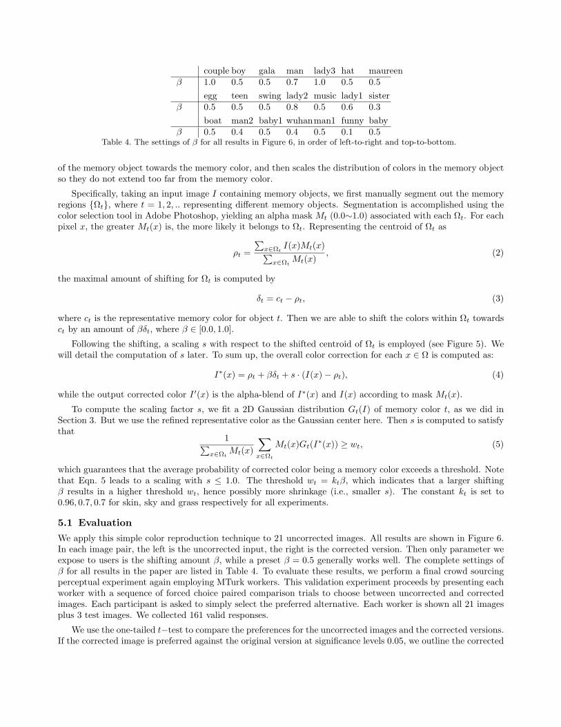
couple boy gala man lady3 hat maureenβ 1.0 0.5 0.5 0.7 1.0 0.5 0.5
egg teen swing lady2 music lady1 sisterβ 0.5 0.5 0.5 0.8 0.5 0.6 0.3
boat man2 baby1 wuhanman1 funny babyβ 0.5 0.4 0.5 0.4 0.5 0.1 0.5
Table 4. The settings of β for all results in Figure 6, in order of left-to-right and top-to-bottom.
of the memory object towards the memory color, and then scales the distribution of colors in the memory objectso they do not extend too far from the memory color.
Specifically, taking an input image I containing memory objects, we first manually segment out the memoryregions Ωt, where t = 1, 2, .. representing different memory objects. Segmentation is accomplished using thecolor selection tool in Adobe Photoshop, yielding an alpha mask Mt (0.0∼1.0) associated with each Ωt. For eachpixel x, the greater Mt(x) is, the more likely it belongs to Ωt. Representing the centroid of Ωt as
ρt =
∑x∈Ωt
I(x)Mt(x)∑x∈Ωt
Mt(x), (2)
the maximal amount of shifting for Ωt is computed by
δt = ct − ρt, (3)
where ct is the representative memory color for object t. Then we are able to shift the colors within Ωt towardsct by an amount of βδt, where β ∈ [0.0, 1.0].
Following the shifting, a scaling s with respect to the shifted centroid of Ωt is employed (see Figure 5). Wewill detail the computation of s later. To sum up, the overall color correction for each x ∈ Ω is computed as:
I∗(x) = ρt + βδt + s · (I(x)− ρt), (4)
while the output corrected color I ′(x) is the alpha-blend of I∗(x) and I(x) according to mask Mt(x).
To compute the scaling factor s, we fit a 2D Gaussian distribution Gt(I) of memory color t, as we did inSection 3. But we use the refined representative color as the Gaussian center here. Then s is computed to satisfythat
1∑x∈Ωt
Mt(x)
∑x∈Ωt
Mt(x)Gt(I∗(x)) ≥ wt, (5)
which guarantees that the average probability of corrected color being a memory color exceeds a threshold. Notethat Eqn. 5 leads to a scaling with s ≤ 1.0. The threshold wt = ktβ, which indicates that a larger shiftingβ results in a higher threshold wt, hence possibly more shrinkage (i.e., smaller s). The constant kt is set to0.96, 0.7, 0.7 for skin, sky and grass respectively for all experiments.
5.1 Evaluation
We apply this simple color reproduction technique to 21 uncorrected images. All results are shown in Figure 6.In each image pair, the left is the uncorrected input, the right is the corrected version. Then only parameter weexpose to users is the shifting amount β, while a preset β = 0.5 generally works well. The complete settings ofβ for all results in the paper are listed in Table 4. To evaluate these results, we perform a final crowd sourcingperceptual experiment again employing MTurk workers. This validation experiment proceeds by presenting eachworker with a sequence of forced choice paired comparison trials to choose between uncorrected and correctedimages. Each participant is asked to simply select the preferred alternative. Each worker is shown all 21 imagesplus 3 test images. We collected 161 valid responses.
We use the one-tailed t−test to compare the preferences for the uncorrected images and the corrected versions.If the corrected image is preferred against the original version at significance levels 0.05, we outline the corrected
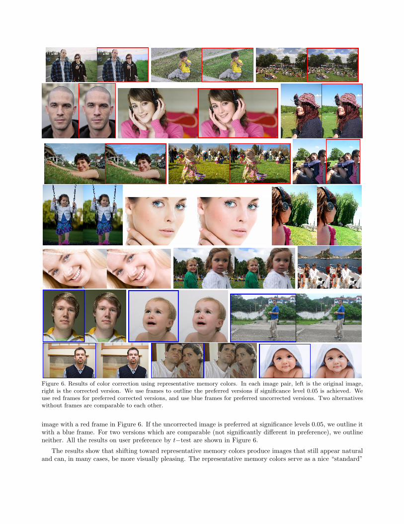
Figure 6. Results of color correction using representative memory colors. In each image pair, left is the original image,right is the corrected version. We use frames to outline the preferred versions if significance level 0.05 is achieved. Weuse red frames for preferred corrected versions, and use blue frames for preferred uncorrected versions. Two alternativeswithout frames are comparable to each other.
image with a red frame in Figure 6. If the uncorrected image is preferred at significance levels 0.05, we outline itwith a blue frame. For two versions which are comparable (not significantly different in preference), we outlineneither. All the results on user preference by t−test are shown in Figure 6.
The results show that shifting toward representative memory colors produce images that still appear naturaland can, in many cases, be more visually pleasing. The representative memory colors serve as a nice “standard”
in the absence of an intended color cast or extra priors. The standard allows us to define a one (rather thanthree) dimensional adjustment for the user. The only parameter is a sliding position β between the original colorand the representative color, which is straightforward even for novice users. Notably, the default setting β = 0.5generally works well for a prior-free automatic image color reproduction.
Not surprisingly, we see both successful and failed example cases in this randomly selected pool of images. Wenotice two primary sources of errors. First, when the original images have intended color cast to convey a certainmood (e.g., first image on the last row in Figure 6), correction with memory colors loses this mood. Second,when there are additional factors that affect our expectations of the colors of memory regions the correction fails.For example, more yellowish skin colors than the memory color are expected with indoor incandescent lighting,and warmer skin colors than the memory color are expected for babies and children than for adults.
6. CONCLUSION
In this paper, a comprehensive investigation in on-screen memory colors and an application using them for imageenhancement are presented. We first acquire distributions of three memory colors on screen using a context-freeexperiment, and then perform a context-based experiment to locate representative memory colors. We thenpropose a simple color reproduction technique guided by the representative memory colors. A user evaluationreveals a dichotomy of suitable and unsuitable cases to apply this technique. We also investigate the presence ofinteractions between memory colors, but find no significant interactions in our study.
While we recognize that color preferences are subjective, memory colors (esp., representative memory colors),are valuable in terms of providing a “neutral standard” for many image enhancement tasks, particularly whenintended color casts or styles are not desired. We chose skin, sky and grass for this study as these regionsoften feature more prominently in natural images, in the future work we would like to include more objects,such as red-brick, soil and sand. Some direct applications are expected, e.g., simple color correction controls foroff-the-shelf digital cameras and smart phones.
REFERENCES[1] Bartleson, C. J., “Memory colors of familiar objects,” J. Opt. Soc. Am. 50, 73–77 (Jan 1960).[2] Hering, E., “Principles of a new theory of the color sense,” In R. C. Teevan & R. C. Birney (Eds.) Color
vision: An enduring problem in psychology: Selected readings , 28–39 (1961).[3] Newhall, S. M., Burnham, R. W., and Clark, J. R., “Comparison of successive with simultaneous color
matching,” J. Opt. Soc. Am. 47, 43–54 (Jan 1957).[4] Fredembach, C., Estrada, F., and Sysstrunk, S., “1 memory colour segmentation and classification using
class-specific eigenregions,” in [Color Imaging Conference ], 315–320, IS&T - The Society for Imaging Scienceand Technology (2008).
[5] Nachlieli, H., Bergman, R., Greig, D., Staelin, C., Oicherman, B., Ruckenstein, G., and Shaked, D., “Skin-sensitive automatic color correction,” HP Lab (2009).
[6] Moreno, A., Fernando, B., Kani, B., Saha, S., and Karaoglu, S., “Color correction: a novel weighted VonKries model based on memory colors,” in [Proceedings of the Third Int’l Conf. on Computational ColorImaging ], 165–175 (2011).
[7] Boust, C., Brettel, H., Vienot, F., Berche, S., and Alquie, G., “Color enhancement of digital images byexperts and preference judgments by observers,” Journal of Imaging Science and Technology 50, 1–11 (Jan-Feb 2006).
[8] Boust, C., Cittadini, F., Chouikha, M. B., Brettel, H., Viznot, F., Berche, S., and Alquiz, G., “Does anexpert use memory colors to adjust images?,” in [Color Imaging Conference ], 347–353, IS&T - The Societyfor Imaging Science and Technology (2004).
[9] Prez-Carpinell, J., De Fez, M. D., Baldov, R., and Soriano, J. C., “Familiar objects and memory color,”Color Research Application 23(6), 416–427 (1998).
[10] Smet, K., Ryckaert, W. R., Pointer, M. R., Deconinck, G., and Hanselaer, P., “Colour appearance rating offamiliar real objects,” Color Research & Application 36(3), 192–200 (2011).
[11] Katz, D., MacLeod, R., and Fox, C., [The world of colour ], K. Paul, Trench, Trubner & Company London(1935).
[12] Siple, P. and Springer, R., “Memory and preference for the colors of objects,” Attention, Perception, &Psychophysics 34, 363–370 (1983).
[13] Amano, K., Uchikawa, K., and Kuriki, I., “Characteristics of color memory for natural scenes,” J. Opt. Soc.Am. A 19, 1501–1514 (Aug 2002).
[14] Yendrikhovskij, S. N., Blommaert, F. J. J., and De Ridder, H., “Color reproduction and the naturalnessconstraint,” Color Research Application 24(1), 52–67 (1999).
[15] Bodrogi, P. and Tarczali, T., “Colour memory for various sky, skin, and plant colours: Effect of the imagecontext,” Color Research Application 26(4), 278–289 (2001).
[16] MacDonald, L., “Using color effectively in computer graphics,” Computer Graphics and Applications,IEEE 19, 20 –35 (Jul/Aug 1999).
[17] Rahtu, E., Nikkanen, J., Kannala, J., Lepisto, L., and Heikkila, J., “Applying visual object categorizationand memory colors for automatic color constancy,” in [Proceedings of the 15th Int’l Conf. on Image Analysisand Processing ], 873–882 (2009).
[18] Fernandez, S. R. and Fairchild, M. D., “Observer preferences and cultural differences in color reproductionof scenic images.,” in [Color Imaging Conference 2002 ], 66–72 (2002).
[19] Smet, K. A. G., Ryckaert, W. R., Pointer, M. R., Deconinck, G., and Hanselaer, P., “Memory coloursand colour quality evaluation of conventional and solid-state lamps,” Optics Express 18(25), 26229–26244(2010).
[20] Smet, K., Ryckaert, W. R., Pointer, M. R., Deconinck, G., and Hanselaer, P., “Optimal colour quality ofLED clusters based on memory colours.,” Optics Express 19(7), 6903–6912 (2011).
[21] Bodrogi, P. and Tarczali, T., “Colour memory for various sky, skin, and plant colours: Effect of the imagecontext,” Color Research & Application 26(4), 278–289 (2001).