exploring ensemble visualization - department of computer
TRANSCRIPT

Exploring Ensemble Visualization
Madhura N. Phadke∗, Lifford Pinto∗, Oluwafemi Alabi†, Jonathan Harter†Russell M. Taylor, II†, Xunlei Wu�, Hannah Petersen‡, Steffen A. Bass‡, and Christopher G. Healey∗
∗North Carolina State University, Raleigh, NC†University of North Carolina at Chapel Hill, Chapel Hill, NC
�Renaissance Computing Institute, Chapel Hill, NC‡Duke University, Durham, NC
ABSTRACT
An ensemble is a collection of related datasets. Each dataset, or member, of an ensemble is normally large, multidimen-sional, and spatio-temporal. Ensembles are used extensively by scientists and mathematicians, for example, by executinga simulation repeatedly with slightly different input parameters and saving the results in an ensemble to see how parame-ter choices affect the simulation. To draw inferences from an ensemble, scientists need to compare data both within andbetween ensemble members. We propose two techniques to support ensemble exploration and comparison: a pairwise se-quential animationmethod that visualizes locally neighboring members simultaneously, and a screen door tinting methodthat visualizes subsets of members using screen space subdivision. We demonstrate the capabilities of both techniques,first using synthetic data, then with simulation data of heavy ion collisions in high-energy physics. Results show that bothtechniques are capable of supporting meaningful comparisons of ensemble data.
Keywords: Ensemble, high-energy physics, perception, heavy ion collision, visualization
1. INTRODUCTION
Advances in computational speed and storage have made it possible to study the development of complex, dynamic sys-tems. For example, researchers in astrophysics are currently investigating the formation of our galaxy based on subtlestructural clues about smaller galaxies that were long ago absorbed into the Milky Way. Simulation models are used totest the validity of competing hypotheses, and to study how different assumptions about the system’s initial state affect itsbehavior. A common approach to investigate a simulation’s parameter sensitivity is to produce an ensemble: a collectionof datasets representing independent runs of the simulation, each with slightly different initial parameters or executionconditions. Visualization has been proposed as one promising approach to analyzing an ensemble. To succeed, visualiza-tion techniques must summarize the data, highlight noteworthy features, and enable rapid and accurate value comparison,pattern detection, and pattern matching.
We are collaborating with a group of colleagues in mathematics, high-energy physics, astrophysics, and meteorologyto study the problem of ensemble visualization. Based on discussions with our colleagues and a study of their existingworkflows, we identified the following needs for ensemble visualization:
1. Attribute value exploration. The ability to identify values and their distributions across both space and time.
2. Shape comprehension. The ability to locate and explore surface contours.
3. Outlier detection. The ability to highlight values that vary from the norm.
4. Member comparison. The ability to compare values, shapes, and outliers across multiple members.
To address these needs, we designed and implemented two prototype ensemble visualization tools. The first approach,pairwise sequential animation, ordersnmembers in an ensemble, then combines subsets of the members and presents themas an animated visualization using hue and texture. The second approach, screen door tinting, uses screen space subdivisionto superimpose similarities and differences betweenm members and a reference member using hue and luminance.
We tested our methods on two sets of ensembles. The first contains simulated volumes with predefined data patterns,allowing us to evaluate each method’s strengths and weaknesses in a known context. The second contained volumes froma simulation of quark–gluon plasma during heavy ion collisions, to test our techniques on real-world data.
Further author information: Christopher G. Healey, Department of Computer Science, North Carolina State University, Raleigh,NC, 27695-8206; E-mail: [email protected], Telephone: 919.513.8112
(a) (b)
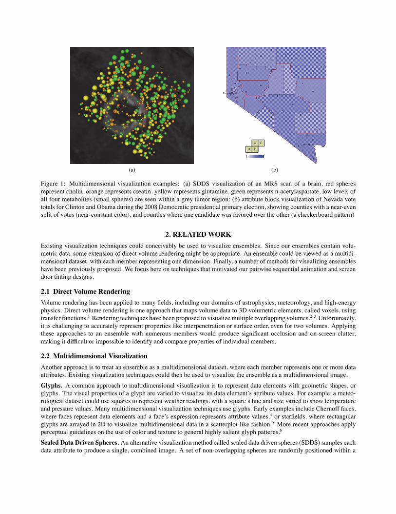
Figure 1: Multidimensional visualization examples: (a) SDDS visualization of an MRS scan of a brain, red spheresrepresent cholin, orange represents creatin, yellow represents glutamine, green represents n-acetylaspartate, low levels ofall four metabolites (small spheres) are seen within a grey tumor region; (b) attribute block visualization of Nevada votetotals for Clinton and Obama during the 2008 Democratic presidential primary election, showing counties with a near-evensplit of votes (near-constant color), and counties where one candidate was favored over the other (a checkerboard pattern)
2. RELATEDWORK
Existing visualization techniques could conceivably be used to visualize ensembles. Since our ensembles contain volu-metric data, some extension of direct volume rendering might be appropriate. An ensemble could be viewed as a multidi-mensional dataset, with each member representing one dimension. Finally, a number of methods for visualizing ensembleshave been previously proposed. We focus here on techniques that motivated our pairwise sequential animation and screendoor tinting designs.
2.1 Direct Volume Rendering
Volume rendering has been applied to many fields, including our domains of astrophysics, meteorology, and high-energyphysics. Direct volume rendering is one approach that maps volume data to 3D volumetric elements, called voxels, usingtransfer functions.1 Rendering techniques have been proposed to visualize multiple overlapping volumes.2, 3 Unfortunately,it is challenging to accurately represent properties like interpenetration or surface order, even for two volumes. Applyingthese approaches to an ensemble with numerous members would produce significant occlusion and on-screen clutter,making it difficult or impossible to identify and compare properties of individual members.
2.2 Multidimensional Visualization
Another approach is to treat an ensemble as a multidimensional dataset, where each member represents one or more dataattributes. Existing visualization techniques could then be used to visualize the ensemble as a multidimensional image.
Glyphs. A common approach to multidimensional visualization is to represent data elements with geometric shapes, orglyphs. The visual properties of a glyph are varied to visualize its data element’s attribute values. For example, a meteo-rological dataset could use squares to represent weather readings, with a square’s hue and size varied to show temperatureand pressure values. Many multidimensional visualization techniques use glyphs. Early examples include Chernoff faces,where faces represent data elements and a face’s expression represents attribute values,4 or starfields, where rectangularglyphs are arrayed in 2D to visualize multidimensional data in a scatterplot-like fashion.5 More recent approaches applyperceptual guidelines on the use of color and texture to general highly salient glyph patterns.6
Scaled Data Driven Spheres. An alternative visualization method called scaled data driven spheres (SDDS) samples eachdata attribute to produce a single, combined image. A set of non-overlapping spheres are randomly positioned within a
volume containing the data elements. For n attributes, 1n spheres are assigned to each attribute. The subset of spheres is
drawn with a unique color, to identify the attribute it represents. The size of a sphere is varied to visualize its underlyingattribute value. Figure 1a shows an example of visualizing the levels of four metabolites captured with an MRS scan: theamounts of cholin, creatin, glutamine, and n-acetylaspartate are shown by the size of the red, orange, yellow, and greenspheres, respectively.7 Low levels of all four metabolites, seen as small spheres, highlight a region containing a tumor.
Attribute Blocks. Attribute blocks use screen-space subdivision to visualize multiple attributes.8 The screen is subdividedinto a regular grid, and cells are assigned to visualize one of the n attributes. For example, for n = 4 attributes, thecells are combined into 2 × 2 blocks. The same cell in each block is used to visualize a specific attribute’s values usingcolor. Attribute blocks were originally designed to show areas of similarity and difference. To do this, each cell usesthe same color scale to represent its attribute values. When all n values are similar, the block is drawn with a constantcolor. If the n values are different, the block shows different colors in each cell, producing a checkerboard-like pattern.Figure 1b shows an example of visualizing vote totals for Hillary Clinton and Barack Obama during the 2008 NevadaDemocratic presidential primary election. Counties with a near-constant color show similar vote totals. Counties withstrong checkerboard patterns show a significant win by one candidate over the other. Small C and O symbols are used toidentify which cells represent Clinton, and which represent Obama.
2.3 Ensemble Visualization
Various techniques and systems have been proposed to visualize ensembles. One common approach is to use side-by-side visualizations, one for each member, often augmented with linking or brushing to allow viewers to highlight datain a common spatial region within each member.9 Statistical summaries like average and standard deviation over all themembers are also used to compress and visualize an ensemble as a single, derived dataset. This capability is providedthrough summary views and trend charts in Ensemble-Vis, an ensemble visualization framework developed jointly bySandia National Laboratory, Lawrence Livermore National Laboratory, and the University of Utah.10
Another approach, used for visualizing weather model ensemble uncertainty, builds isocontour “spaghetti plots” tohighlight similarities and differences across members.11 For n members, n isocontours for a user chosen attribute andvalue are constructed. The isocontours are assigned unique colors, then visualized. If the contours cluster together intoa bundle, the given attribute value follows a similar spatial distribution across the members. If the contours diverge, theattribute value distributions differ.
Although it is tempting to try to select an existing multidimensional or ensemble visualization technique for our data,certain shortcomings of these approaches and specific requirements of our users makes this difficult. For example, glyph-based multidimensional visualizations begin to break down when n increases beyond even a small number. Identifying asufficient number of visual features, and combining them in effective ways, is a significant challenge. SDDS and attributeblocks also suffer as n grows. More attributes means more spheres are needed to capture each attribute’s distribution ofvalues, increasing occlusion and on-screen clutter. Attribute blocks need to increase in size, reducing the total numberof data elements that are displayed, and significantly increasing the difficulty in matching an individual cell to its parentattribute. These issues suggests that the techniques are best applied to ensembles with only a small number of members.
Ensemble visualization systems are specifically designed to handle large number of members. Unfortunately, this isnormally done by compressing the data, for example, by visualizing statistical summaries, or by focusing on only a specificvalue of a specific attribute. Our scientists need to compare individual data elements both within and between members,so approaches that hide this level of detail cannot be used.
Given these challenges, we were faced with two alternatives: to try to modify and extend existing techniques to visualizeour data in ways that support our users’ needs, or to design a completely new ensemble visualization technique. In the end,we decided on a combination these two approaches. Specifically, we used SDDS and attribute blocks as a motivation anda starting point for two new methods to visualize ensembles in ways that support data and member-level comparisons.
3. PAIRWISE SEQUENTIAL ANIMATION
We made two initial decisions to simplify our visualization designs. First, we assume each member encodes a singleattribute value. Although there are ways to support multidimensional members, we have not addressed this problem in ourinitial prototypes. Second, each member’s data elements are represented using glyphs that vary their visual appearance torepresent parent members and attribute values.

(a)
(b)
(c)
(d)Figure 2: Three simulated ensemble members whose volumes represent an apple, a banana, and a pear, combined into asingle ensemble visualization: (a) ensemble visualization; (b) apple volume; (c) banana volume; (d) pear volume
Our first technique builds on SDDS by visualizing a subset of an ensemble’s members as a collection of samples fromeach member. Each sample is visualized with a glyph. One visual property of the glyph (e.g., color or shape) is used toidentify the member it represents. A second visual property (e.g., size or color) is used to visualize the attribute value atthe glyph’s spatial position in the parent member. Based on this initial idea, we divided our design problem into threesteps: (1) visualizing one ensemble member; (2) combining individual visualizations to produce a display containing allthe members; and (3) managing occlusion in the combined visualization.
3.1 Visualizing One Ensemble Member
Since our technique is based on SDDS, visualizing a single ensemble member is simple. Each sample point is representedby a sphere, with the size of the sphere visualizing the sample point’s attribute value. All the spheres are colored a single,unique color to identify the common member they belong to.
A second issue that must be addressed is the number of sample points in the member. Although it is possible tovisualize every sample point, this can lead to occlusion due to over-populated volumes. The problem becomes even moreacute when we visualize multiple members simultaneously. To address this, we implemented a sampling technique thatallows a user to specify a sample size m. A cluster-based algorithm is then used to select m sample points that match thespatial distribution of the attribute values in the member.
3.2 Visualizing Multiple Ensemble Members
Given visualizations for each ensemble member, the simplest way to combine them is to display them simultaneously. Notsurprisingly, this produces poor results, even for a small number of members. Figure 2 shows an example of combiningthree simulated members representing an apple volume, a banana volume, and a pear volume into a single visualizationensemble (Figure 2a). Because the combined result contains numerous overlapping spheres, it is difficult to make out theshape of any of the individual volumes.
(a) (b)v(t)
0
1
t0 1
apple bananapear
(c)v(t)
0
0
1
1t
bananaapple
pear
1/3
(d)
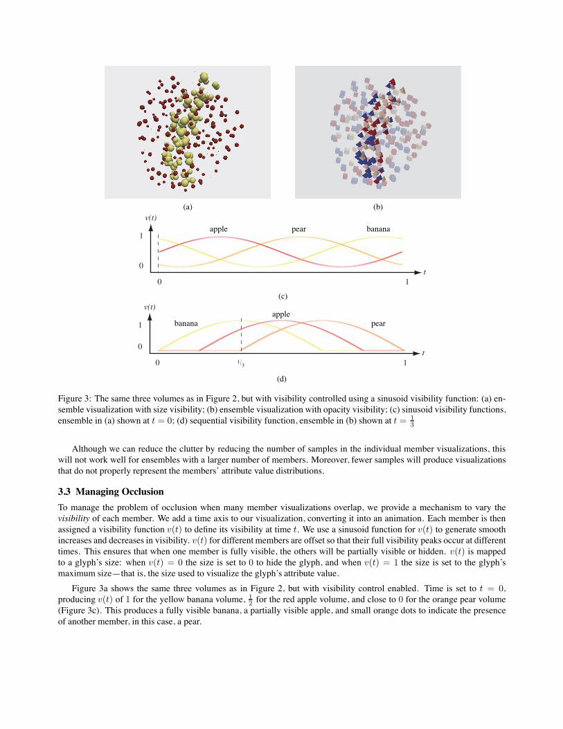
Figure 3: The same three volumes as in Figure 2, but with visibility controlled using a sinusoid visibility function: (a) en-semble visualization with size visibility; (b) ensemble visualization with opacity visibility; (c) sinusoid visibility functions,ensemble in (a) shown at t = 0; (d) sequential visibility function, ensemble in (b) shown at t = 1
3
Although we can reduce the clutter by reducing the number of samples in the individual member visualizations, thiswill not work well for ensembles with a larger number of members. Moreover, fewer samples will produce visualizationsthat do not properly represent the members’ attribute value distributions.
3.3 Managing Occlusion
To manage the problem of occlusion when many member visualizations overlap, we provide a mechanism to vary thevisibility of each member. We add a time axis to our visualization, converting it into an animation. Each member is thenassigned a visibility function v(t) to define its visibility at time t. We use a sinusoid function for v(t) to generate smoothincreases and decreases in visibility. v(t) for different members are offset so that their full visibility peaks occur at differenttimes. This ensures that when one member is fully visible, the others will be partially visible or hidden. v(t) is mappedto a glyph’s size: when v(t) = 0 the size is set to 0 to hide the glyph, and when v(t) = 1 the size is set to the glyph’smaximum size—that is, the size used to visualize the glyph’s attribute value.
Figure 3a shows the same three volumes as in Figure 2, but with visibility control enabled. Time is set to t = 0,producing v(t) of 1 for the yellow banana volume, 1
2 for the red apple volume, and close to 0 for the orange pear volume(Figure 3c). This produces a fully visible banana, a partially visible apple, and small orange dots to indicate the presenceof another member, in this case, a pear.
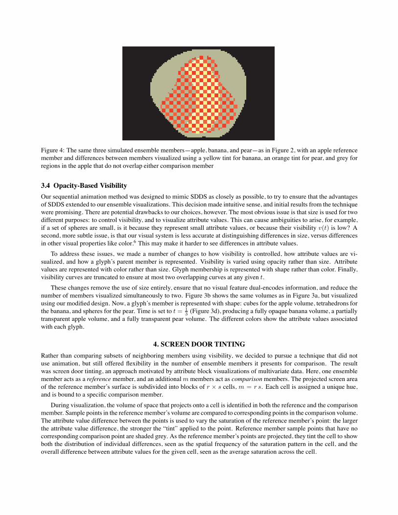
Figure 4: The same three simulated ensemble members—apple, banana, and pear—as in Figure 2, with an apple referencemember and differences between members visualized using a yellow tint for banana, an orange tint for pear, and grey forregions in the apple that do not overlap either comparison member
3.4 Opacity-Based Visibility
Our sequential animation method was designed to mimic SDDS as closely as possible, to try to ensure that the advantagesof SDDS extended to our ensemble visualizations. This decision made intuitive sense, and initial results from the techniquewere promising. There are potential drawbacks to our choices, however. The most obvious issue is that size is used for twodifferent purposes: to control visibility, and to visualize attribute values. This can cause ambiguities to arise, for example,if a set of spheres are small, is it because they represent small attribute values, or because their visibility v(t) is low? Asecond, more subtle issue, is that our visual system is less accurate at distinguishing differences in size, versus differencesin other visual properties like color.6 This may make it harder to see differences in attribute values.
To address these issues, we made a number of changes to how visibility is controlled, how attribute values are vi-sualized, and how a glyph’s parent member is represented. Visibility is varied using opacity rather than size. Attributevalues are represented with color rather than size. Glyph membership is represented with shape rather than color. Finally,visibility curves are truncated to ensure at most two overlapping curves at any given t.
These changes remove the use of size entirely, ensure that no visual feature dual-encodes information, and reduce thenumber of members visualized simultaneously to two. Figure 3b shows the same volumes as in Figure 3a, but visualizedusing our modified design. Now, a glyph’s member is represented with shape: cubes for the apple volume, tetrahedrons forthe banana, and spheres for the pear. Time is set to t = 1
3 (Figure 3d), producing a fully opaque banana volume, a partiallytransparent apple volume, and a fully transparent pear volume. The different colors show the attribute values associatedwith each glyph.
4. SCREEN DOOR TINTING
Rather than comparing subsets of neighboring members using visibility, we decided to pursue a technique that did notuse animation, but still offered flexibility in the number of ensemble members it presents for comparison. The resultwas screen door tinting, an approach motivated by attribute block visualizations of multivariate data. Here, one ensemblemember acts as a reference member, and an additionalm members act as comparisonmembers. The projected screen areaof the reference member’s surface is subdivided into blocks of r × s cells, m = r s. Each cell is assigned a unique hue,and is bound to a specific comparison member.
During visualization, the volume of space that projects onto a cell is identified in both the reference and the comparisonmember. Sample points in the referencemember’s volume are compared to corresponding points in the comparison volume.The attribute value difference between the points is used to vary the saturation of the reference member’s point: the largerthe attribute value difference, the stronger the “tint” applied to the point. Reference member sample points that have nocorresponding comparison point are shaded grey. As the reference member’s points are projected, they tint the cell to showboth the distribution of individual differences, seen as the spatial frequency of the saturation pattern in the cell, and theoverall difference between attribute values for the given cell, seen as the average saturation across the cell.
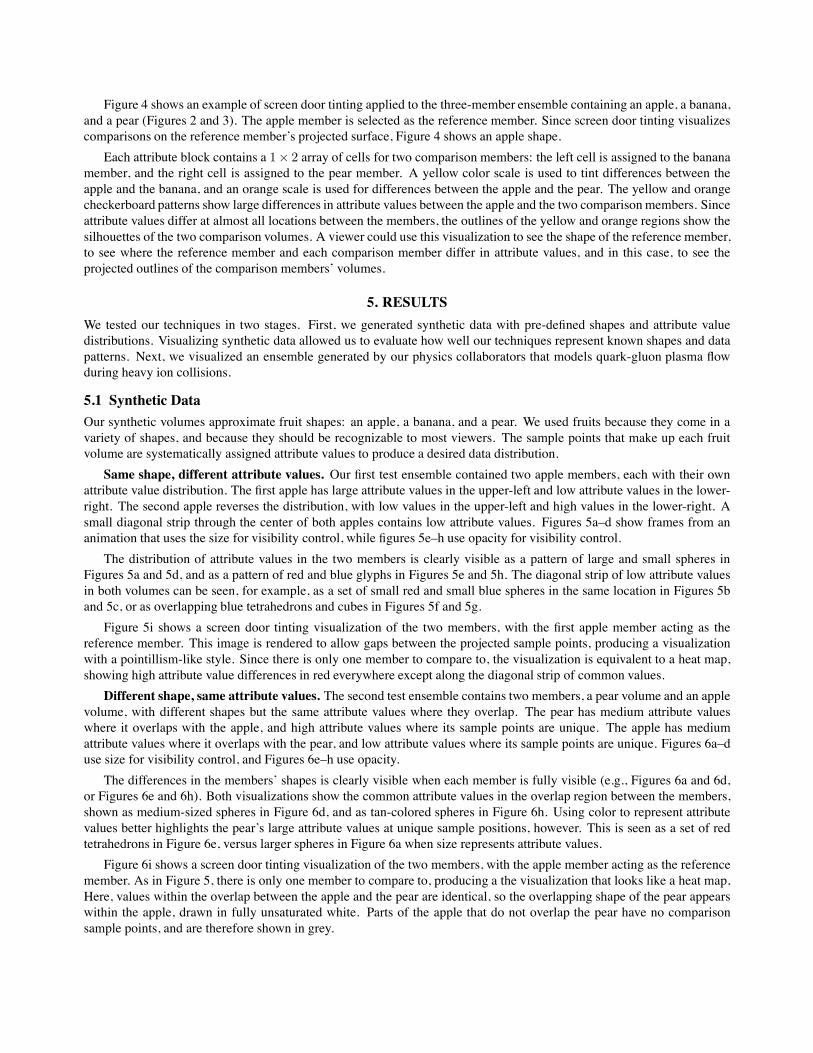
Figure 4 shows an example of screen door tinting applied to the three-member ensemble containing an apple, a banana,and a pear (Figures 2 and 3). The apple member is selected as the reference member. Since screen door tinting visualizescomparisons on the reference member’s projected surface, Figure 4 shows an apple shape.
Each attribute block contains a 1× 2 array of cells for two comparison members: the left cell is assigned to the bananamember, and the right cell is assigned to the pear member. A yellow color scale is used to tint differences between theapple and the banana, and an orange scale is used for differences between the apple and the pear. The yellow and orangecheckerboard patterns show large differences in attribute values between the apple and the two comparisonmembers. Sinceattribute values differ at almost all locations between the members, the outlines of the yellow and orange regions show thesilhouettes of the two comparison volumes. A viewer could use this visualization to see the shape of the reference member,to see where the reference member and each comparison member differ in attribute values, and in this case, to see theprojected outlines of the comparison members’ volumes.
5. RESULTS
We tested our techniques in two stages. First, we generated synthetic data with pre-defined shapes and attribute valuedistributions. Visualizing synthetic data allowed us to evaluate how well our techniques represent known shapes and datapatterns. Next, we visualized an ensemble generated by our physics collaborators that models quark-gluon plasma flowduring heavy ion collisions.
5.1 Synthetic Data
Our synthetic volumes approximate fruit shapes: an apple, a banana, and a pear. We used fruits because they come in avariety of shapes, and because they should be recognizable to most viewers. The sample points that make up each fruitvolume are systematically assigned attribute values to produce a desired data distribution.
Same shape, different attribute values. Our first test ensemble contained two apple members, each with their ownattribute value distribution. The first apple has large attribute values in the upper-left and low attribute values in the lower-right. The second apple reverses the distribution, with low values in the upper-left and high values in the lower-right. Asmall diagonal strip through the center of both apples contains low attribute values. Figures 5a–d show frames from ananimation that uses the size for visibility control, while figures 5e–h use opacity for visibility control.
The distribution of attribute values in the two members is clearly visible as a pattern of large and small spheres inFigures 5a and 5d, and as a pattern of red and blue glyphs in Figures 5e and 5h. The diagonal strip of low attribute valuesin both volumes can be seen, for example, as a set of small red and small blue spheres in the same location in Figures 5band 5c, or as overlapping blue tetrahedrons and cubes in Figures 5f and 5g.
Figure 5i shows a screen door tinting visualization of the two members, with the first apple member acting as thereference member. This image is rendered to allow gaps between the projected sample points, producing a visualizationwith a pointillism-like style. Since there is only one member to compare to, the visualization is equivalent to a heat map,showing high attribute value differences in red everywhere except along the diagonal strip of common values.
Different shape, same attribute values. The second test ensemble contains two members, a pear volume and an applevolume, with different shapes but the same attribute values where they overlap. The pear has medium attribute valueswhere it overlaps with the apple, and high attribute values where its sample points are unique. The apple has mediumattribute values where it overlaps with the pear, and low attribute values where its sample points are unique. Figures 6a–duse size for visibility control, and Figures 6e–h use opacity.
The differences in the members’ shapes is clearly visible when each member is fully visible (e.g., Figures 6a and 6d,or Figures 6e and 6h). Both visualizations show the common attribute values in the overlap region between the members,shown as medium-sized spheres in Figure 6d, and as tan-colored spheres in Figure 6h. Using color to represent attributevalues better highlights the pear’s large attribute values at unique sample positions, however. This is seen as a set of redtetrahedrons in Figure 6e, versus larger spheres in Figure 6a when size represents attribute values.
Figure 6i shows a screen door tinting visualization of the two members, with the apple member acting as the referencemember. As in Figure 5, there is only one member to compare to, producing a the visualization that looks like a heat map,Here, values within the overlap between the apple and the pear are identical, so the overlapping shape of the pear appearswithin the apple, drawn in fully unsaturated white. Parts of the apple that do not overlap the pear have no comparisonsample points, and are therefore shown in grey.

(a) t = 0 (b) t = 0.2 (c) t = 0.8 (d) t = 1
(e) t = 0 (f) t = 0.2 (g) t = 0.8 (h) t = 1
(i)
Figure 5: Two apple member volumes with different attribute value distributions: (a–d) visualized with size controllingvisibility, color identifying a glyph’s parent member, and size representing attribute values; (e–h) visualized with opacitycontrolling visibility, shape identifying a glyph’s parent member, and color representing attribute values; (i) visualizedusing screen door tinting, differences between the two members are seen as red regions, and similarities as white regions
5.2 RHIC Ensemble
We conclude our results with visualizations of an ensemble created by our physics colleagues at Duke University. Thisensemble contains four members, representing four simulation results from a hydrodynamic calculation of the quark-gluonplasma created in gold–gold collisions at the Relativistic Heavy Ion Collider (RHIC) at BrookhavenNational Laboratory.12
Figure 7a–d visualizes the surfaces of the four members, and Figure 7e–h visualizes temperatures in a vertical slice througheach member. These visualizations show that the members have different shapes, and different distributions of temperaturevalues throughout their volumes.
We started by visualizing the ensemble using the pairwise sequential animation technique with visibility controlledby size. The four members were drawn with green, yellow, red, and blue spheres, respectively, with a sphere’s size
(a) t = 0 (b) t = 0.3 (c) t = 0.6 (d) t = 0.9
(e) t = 0 (f) t = 0.3 (g) t = 0.6 (h) t = 0.9
(i)
Figure 6: A pear and an apple member volumes containing common attribute values within their overlap: (a–d) visualizedwith size controlling visibility, color identifying a glyph’s parent member, and size representing attribute values; (e–h)visualized with opacity controlling visibility, shape identifying a glyph’s parent member, and color representing attributevalues; (i) visualized using screen door tinting, similarities between the two members are seen as white regions, areas inthe apple that do not overlap the pear are seen as grey regions
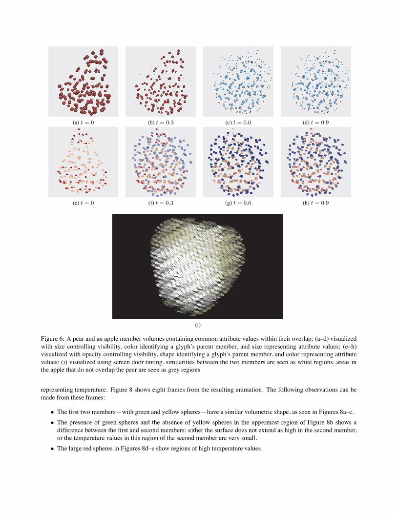
representing temperature. Figure 8 shows eight frames from the resulting animation. The following observations can bemade from these frames:
• The first two members—with green and yellow spheres—have a similar volumetric shape, as seen in Figures 8a–c.• The presence of green spheres and the absence of yellow spheres in the uppermost region of Figure 8b shows adifference between the first and second members: either the surface does not extend as high in the second member,or the temperature values in this region of the second member are very small.
• The large red spheres in Figures 8d–e show regions of high temperature values.

(a) (b) (c) (d)
(e) (f) (g) (h)
Figure 7: RHIC simulation ensemble with four members: (a–d) isosurface visualizations of the members’ surfaces; (e–h)visualization of temperatures in a slice through the center of each member, blue for cold to red for hot
(a) t = 0.125 (b) t = 0.25 (c) t = 0.375 (d) t = 0.5
(e) t = 0.675 (f) t = 0.75 (g) t = 0.825 (h) t = 1
Figure 8: Eight frames from the RHIC ensemble, size controls visibility, color identifies a glyph’s parent member, and sizerepresents temperature values
• The distribution of large red spheres in Figure 8d gives an idea of the temperature distributions in the third member.• The third and fourth members—with red and blue spheres—have a shape that is clearly different from the first twomembers, highlighted by the appearance of small green spheres in Figure 8f where no red or blue spheres exist.
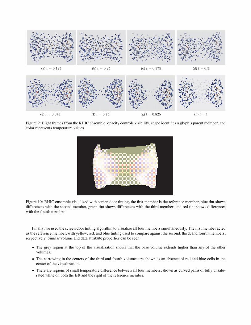
Next, we switched to the pairwise sequential animation that uses opacity for visibility control. The four members aredrawn with tetrahedrons, cubes, spheres, and octahedrons, respectively. Color ranges from blue for low temperatures tored for high temperatures. Figure 9 shows the same eight frames as in Figure 8. The following additional observations canbe made in these frames:
• Red tetrahedrons seen in the left of Figures 9a–b highlight a small region of high temperatures in the first member.• A shape difference between the second and third members—shown with cubes and spheres—is seen in Figure 9e,where semi-transparent cubeswith no corresponding spheres highlight a narrowing in the middle of the third member.
• The narrow middle region in the third member disappears completely in the fourth member, shown in Figure 9g assemi-transparent spheres with no corresponding octahedrons.
(a) t = 0.125 (b) t = 0.25 (c) t = 0.375 (d) t = 0.5
(e) t = 0.675 (f) t = 0.75 (g) t = 0.825 (h) t = 1
Figure 9: Eight frames from the RHIC ensemble, opacity controls visibility, shape identifies a glyph’s parent member, andcolor represents temperature values
Figure 10: RHIC ensemble visualized with screen door tinting, the first member is the reference member, blue tint showsdifferences with the second member, green tint shows differences with the third member, and red tint shows differenceswith the fourth member
Finally, we used the screen door tinting algorithm to visualize all four members simultaneously. The first member actedas the reference member, with yellow, red, and blue tinting used to compare against the second, third, and fourth members,respectively. Similar volume and data attribute properties can be seen:
• The grey region at the top of the visualization shows that the base volume extends higher than any of the othervolumes.
• The narrowing in the centers of the third and fourth volumes are shown as an absence of red and blue cells in thecenter of the visualization.
• There are regions of small temperature difference between all four members, shown as curved paths of fully unsatu-rated white on both the left and the right of the reference member.
6. CONCLUSIONS AND FUTUREWORK
This paper proposes two new methods for visualizing ensembles that contain numerous member datasets: a pairwise se-quential animation technique that combines subsets of members using visibility control, and a screen door tinting techniquethat presents differences between members using screen space subdivision and saturation tinting.
We have investigated the capabilities of these approaches using both synthetic data with known attribute value patterns,and simulated data of quark-gluon plasma flow caused by heavy ion collisions in the Relativistic Heavy Ion Collider. Eachtechnique supports comparing attribute values both within and between ensemble members.
Our techniques are still limited to comparing only a small number of members at any given time. The pairwise sequen-tial animation technique begins to suffer when more than three members are shown. The screen door tinting algorithm canhandle more members, but as the number of members increases, so too does the block size, which reduces the total num-ber of blocks—that is, the number of comparison points—that can be shown. If blocks become too large, the underlyingattribute value distributions become distorted, or lost entirely.
Future work will focus mainly on handling ensembles with larger number of members. We plan to investigate theuse of mathematical or statistical approaches to reduce the number of members in an ensemble, for example, to combinesubsets of highly similar members in ways that preserve only the areas of significant difference between them. We are alsointerested in determining intelligent ways to order the members, for example, to ensure that the subsets being visualizedby the pairwise sequential animation technique present comparisons that are “most interesting” to our domain users.
ACKNOWLEDGMENTS
This work was supported by the U.S. National Science Foundation’s Cyber-Enabled Discovery and Innovation Programgrant number 0941373, and by Sandia National Laboratories contract number 979573.
REFERENCES[1] Bruckner, S. and Groller, M. E., “VolumeShop: An interactive system for direct volume illustration,” in [Proceedings
of the 16th IEEE Visualization Conference (Vis 2005) ], 671–678 (2005).[2] Interrante, V., Fuchs, H., and Pizer, S., “Conveying the 3D shape of smoothly curving transparent surfaces via texture,”
IEEE Transactions on Visualization and Computer Graphics 3(2), 109–116 (1997).[3] Weigle, C. and Taylor, R. M., “Visualizing intersecting surfaces with nested-surface techniques,” in [Proceedings
16th IEEE Visualization Conference (Vis 2005) ], 503–510 (2005).[4] Bruckner, L. A., “On Chernoff faces,” in [Graphical Representation of Multivariate Data ], Wang, P. C. C., ed.,
93–121, Academic Press, New York, New York (1978).[5] Ahlberg, C. and Shneiderman, B., “Visual information seeking: Tight coupling of dynamic query filters with starfield
displays,” in [Proceedings of the Conference on Human Factors in Computing Systems (CHI 94) ], 313–317 (1994).[6] Healey, C. G. and Enns, J. T., “Large datasets at a glance: Combining textures and colors in scientific visualization,”
IEEE Transactions on Visualization and Computer Graphics 5(2), 145–167 (1999).[7] Feng, D., Lee, Y., Kwock, L., and Taylor, R. M., “Evaluation of glyph-based scalar multivariate volume visualization
techniques,” in [Symposium on Applied Perception in Graphics and Visualization (APGV 09) ], 61–68 (2009).[8] Miller, J. R., “Attribute blocks: Visualizing multiple continuously defined attributes,” Computer Graphics & Appli-
cations 27(3), 57–69 (2007).[9] Wilson, A. T. and Potter, K. C., “Toward visual analysis of ensemble data sets,” in [Proceedings of the 2009Workshop
on Ultrascale Visualization (UltraVis ’09)], 48–53 (2009).[10] Potter, K. C., Wilson, A. T., Bremer, P.-T., Williams, D., Doutriaux, C., Pascucci, V., and Johnson, C. R., “Ensemble-
Vis: A framework for statistical visualization of ensemble data,” in [Proceedings of the 2009 IEEE InternationalConference on Data Mining Workshops (ICDMW ’09) ], 233–240 (2009).
[11] Sanyal, J., Zhang, S., Dyer, J., Mercer, A., Amburn, P., and Moorhead, R. J., “Noodles: A tool for visualization ofnumerical weather model ensemble uncertainty,” IEEE Transactions on Visualization and Computer Graphics 16(6),1421–1430 (2010).
[12] Petersen, H., Steinheimer, J., Burau, G., Bleicher, M., and Stocker, H., “A fully integrated transport approach to heavyion reactions with an intermediate hydrodynamic stage,” Physics Review C 78(044901), 1–18 (2008).