exploratory visualization of data with variable qualitythis thesis work is partially supported under...
TRANSCRIPT

Exploratory Visualization of Data with Variable Quality
by
Shiping Huang
A Thesis
Submitted to the Faculty
of the
WORCESTER POLYTECHNIC INSTITUTE
In partial fulfillment of the requirements for the
Degree of Master of Science
in
Computer Science
by
January 2005
APPROVED:
Professor Matthew O. Ward, Thesis Advisor
Professor Murali Mani, Thesis Reader
Professor Michael A. Gennert, Head of Department
Abstract
Data quality, which refers to correctness, uncertainty, completeness and other aspects of
data, has became more and more prevalent and has been addressed across multiple dis-
ciplines. Data quality could be introduced and presented in any of the data manipulation
processes such as data collection, transformation, and visualization.
Data visualization is a process of data mining and analysis using graphical presenta-
tion and interpretation. The correctness and completeness of the visualization discoveries
to a large extent depend on the quality of the original data. Without the integration of
quality information with data presentation, the analysis of data using visualization is in-
complete at best and can lead to inaccurate or incorrect conclusions at worst.
This thesis addresses the issue of data quality visualization. Incorporating data qual-
ity measures into the data displays is challenging in that the display is apt to be cluttered
when faced with multiple dimensions and data records. We investigate both the incor-
poration of data quality information in traditional multivariate data display techniques as
well as develop novel visualization and interaction tools that operate in data quality space.
We validate our results using several data sets that have variable quality associated with
dimensions, records, and data values.

Acknowledgments
I am extremely grateful for the opportunity to have Matthew Ward as my advisor for
the past three years. He is always patient and inspires me in our research talk. I learned a
lot from him not only on our project, but on the method to do general research as well. I
would like to thank Prof. Elke Rundensteiner for her invaluable feedback on our project.
I would like to express my greatest gratitude to her for the strongest support and help she
provided during my study years.
I would like to thank Prof. Murali Mani for being the reader of this thesis and giving
me a lot valuable feedback.
I also would like to thank my team members, Jing Yang, Anilkumar Patro, Wei Peng
and Nishant K. Mehta for our pleasant talk and coorporation in the past years.
I acknowledge and appreciated the love and support of my wife, Hong Zhao, without
whom I would be lost.
This thesis work is partially supported under NSF grant IIS-0119276 and NSA grant.
i
Contents
1 Introduction 1
1.1 Motivation . . . . . . . . . . . . . . . . . . . . . . . . . . . . . . . . . . 1
1.2 Data Quality . . . . . . . . . . . . . . . . . . . . . . . . . . . . . . . . . 4
1.2.1 Missing Data . . . . . . . . . . . . . . . . . . . . . . . . . . . . 4
1.2.2 Uncertainty . . . . . . . . . . . . . . . . . . . . . . . . . . . . . 5
1.2.3 Consistency, Completeness and Other Aspects . . . . . . . . . . 6
1.3 Information Visualization . . . . . . . . . . . . . . . . . . . . . . . . . . 7
1.4 Thesis Approach and Contributions . . . . . . . . . . . . . . . . . . . . 9
1.5 Thesis Organization . . . . . . . . . . . . . . . . . . . . . . . . . . . . . 10
2 Related Work 12
2.1 Missing Data Visualization . . . . . . . . . . . . . . . . . . . . . . . . . 12
2.2 Uncertainty Visualization . . . . . . . . . . . . . . . . . . . . . . . . . . 15
2.3 Data Quality in the Database Community . . . . . . . . . . . . . . . . . 17
2.4 Data Quality in Information Management . . . . . . . . . . . . . . . . . 18
3 Visual Variable Analysis 19
3.1 Visual Encoding . . . . . . . . . . . . . . . . . . . . . . . . . . . . . . . 20
3.2 Algebraic Formalizational Analysis . . . . . . . . . . . . . . . . . . . . 22
3.3 Pre-attentive Processing . . . . . . . . . . . . . . . . . . . . . . . . . . . 25
ii

3.4 Metrics for Visual Displays . . . . . . . . . . . . . . . . . . . . . . . . . 25
4 Data Quality Metrics 27
4.1 Imputing Algorithms . . . . . . . . . . . . . . . . . . . . . . . . . . . . 28
4.1.1 Nearest Neighbor . . . . . . . . . . . . . . . . . . . . . . . . . . 28
4.1.2 Multiple Imputation . . . . . . . . . . . . . . . . . . . . . . . . 29
4.2 Quality Measure Definition . . . . . . . . . . . . . . . . . . . . . . . . . 30
4.3 Data Quality Store . . . . . . . . . . . . . . . . . . . . . . . . . . . . . 32
5 Methodologies 34
5.1 Incorporation of Visualization of Data
with Quality Information in 2D Displays . . . . . . . . . . . . . . . . . . 34
5.1.1 Color Scale Selection . . . . . . . . . . . . . . . . . . . . . . . . 36
5.1.2 Mapping Interpolation . . . . . . . . . . . . . . . . . . . . . . . 38
5.1.3 Parallel Coordinates . . . . . . . . . . . . . . . . . . . . . . . . 38
5.1.4 Glyphs . . . . . . . . . . . . . . . . . . . . . . . . . . . . . . . 44
5.1.5 Scatterplot Matrix . . . . . . . . . . . . . . . . . . . . . . . . . 45
5.2 Incorporation Visualization of Data
with Quality Information in 3D Displays . . . . . . . . . . . . . . . . . . 48
5.2.1 Parallel Coordinates . . . . . . . . . . . . . . . . . . . . . . . . 48
5.2.2 Scatterplot Matrix . . . . . . . . . . . . . . . . . . . . . . . . . 50
5.2.3 Star Glyphs . . . . . . . . . . . . . . . . . . . . . . . . . . . . . 51
5.3 Visualization in Data Quality Space . . . . . . . . . . . . . . . . . . . . 52
5.3.1 Displays in Data Quality Space . . . . . . . . . . . . . . . . . . 52
5.3.2 Operations on Data Quality Displays . . . . . . . . . . . . . . . 53
5.4 User Interactions . . . . . . . . . . . . . . . . . . . . . . . . . . . . . . 54
iii

5.4.1 Linking and Brushing
in Data Space and Quality Space . . . . . . . . . . . . . . . . . . 55
5.4.2 Viewing Transformations . . . . . . . . . . . . . . . . . . . . . . 59
5.5 Animations . . . . . . . . . . . . . . . . . . . . . . . . . . . . . . . . . 60
6 Implementation 61
6.1 System Architecture . . . . . . . . . . . . . . . . . . . . . . . . . . . . . 61
6.2 Implementation . . . . . . . . . . . . . . . . . . . . . . . . . . . . . . . 63
7 Case Studies 64
7.1 Objectives . . . . . . . . . . . . . . . . . . . . . . . . . . . . . . . . . . 64
7.2 Imputation Algorithm Comparative Study . . . . . . . . . . . . . . . . . 65
7.2.1 Methodology . . . . . . . . . . . . . . . . . . . . . . . . . . . . 65
7.2.2 Results . . . . . . . . . . . . . . . . . . . . . . . . . . . . . . . 66
7.3 Quality Visualization Efficiency . . . . . . . . . . . . . . . . . . . . . . 68
7.3.1 Methodology . . . . . . . . . . . . . . . . . . . . . . . . . . . . 69
7.3.2 Results and Findings . . . . . . . . . . . . . . . . . . . . . . . . 71
8 Conclusions 76
8.1 Summary . . . . . . . . . . . . . . . . . . . . . . . . . . . . . . . . . . 76
8.1.1 Data Quality Measures . . . . . . . . . . . . . . . . . . . . . . . 76
8.1.2 Visual Variable Analysis . . . . . . . . . . . . . . . . . . . . . . 77
8.1.3 Data Visualization with Variable Quality . . . . . . . . . . . . . 77
8.1.4 Evaluations . . . . . . . . . . . . . . . . . . . . . . . . . . . . . 77
8.2 Future Directions . . . . . . . . . . . . . . . . . . . . . . . . . . . . . . 78
iv

List of Figures
2.1 Missing Data in XGobi . . . . . . . . . . . . . . . . . . . . . . . . . . . 13
2.2 Manet Display . . . . . . . . . . . . . . . . . . . . . . . . . . . . . . . . 14
2.3 Uncertainty Visualization . . . . . . . . . . . . . . . . . . . . . . . . . . 16
3.1 Retinal Variables . . . . . . . . . . . . . . . . . . . . . . . . . . . . . . 21
3.2 Visual Variables for Data Quality Display . . . . . . . . . . . . . . . . . 24
4.1 Data Quality Definitions and Derivations . . . . . . . . . . . . . . . . . . 31
4.2 Data Quality Computation for Simulated Missing Data . . . . . . . . . . 32
5.1 Definition of Class HLS and Its Interface with RGB Color Scales . . . . . 37
5.2 Mapping Data Quality Measures onto Visual Variables . . . . . . . . . . 39
5.3 Parallel Coordinates with Data Quality Display . . . . . . . . . . . . . . 41
5.4 Quality Band in Parallel Coordinate . . . . . . . . . . . . . . . . . . . . 43
5.5 Glyph with Data Quality Display . . . . . . . . . . . . . . . . . . . . . . 44
5.6 Scatterplot Matrix with Data Quality Incorporated . . . . . . . . . . . . . 46
5.7 An Alternative Scatterplot Matrix with Data Quality Incorporated . . . . 47
5.8 3D Parallel Coordinates with Incorporated Data Quality Information . . . 49
5.9 3D Scatterplot Matrix with Data Quality Information Incorporated . . . . 50
5.10 3D Star Glyph with Data Quality Information Incorporated . . . . . . . . 51
5.11 Visualization in Data Quality Space . . . . . . . . . . . . . . . . . . . . 54
v

5.12 Ordering on Data Quality Display . . . . . . . . . . . . . . . . . . . . . 54
5.13 Brush Data Value Quality - Brushed Data in Data Display . . . . . . . . . 56
5.14 Brush Data Value Quality - Brush in Data Quality Display . . . . . . . . 56
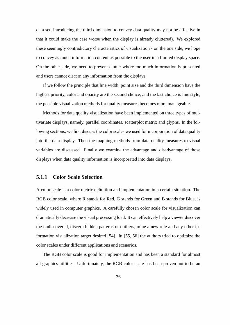
5.15 Brush Dimension Quality Slider - Brushed Data in Data Display . . . . . 58
5.16 Brush Dimension Quality Slider . . . . . . . . . . . . . . . . . . . . . . 58
5.17 Brush Data Record Quality Slider - Brushed Data in Data Display . . . . 59
5.18 Brush Data Record Quality Slider . . . . . . . . . . . . . . . . . . . . . 59
5.19 Brush Data Value Quality Slider - Brushed Data in Data Display . . . . . 60
5.20 Brush Data Value Quality Slider . . . . . . . . . . . . . . . . . . . . . . 60
6.1 Structural Diagram of XmdvTool with Data Quality Visualization . . . . 62
7.1 Complete Iris Dataset . . . . . . . . . . . . . . . . . . . . . . . . . . . . 66
7.2 20% Missing Iris Data, Imputed by Nearest Neighbor . . . . . . . . . . . 66
7.3 Complete Iris Dataset . . . . . . . . . . . . . . . . . . . . . . . . . . . . 67
7.4 20% Missing Iris Data, Imputed by Multiple Imputation . . . . . . . . . . 67
7.5 Complete Cars Dataset . . . . . . . . . . . . . . . . . . . . . . . . . . . 67
7.6 40% Missing Cars Data, Imputed by Nearest Neighbor . . . . . . . . . . 67
7.7 Complete Cars Dataset . . . . . . . . . . . . . . . . . . . . . . . . . . . 68
7.8 40% Missing Cars Data, Imputed by Multiple Imputation . . . . . . . . . 68
7.9 Parallel Coordinates Display with Data Quality Incorporated (Dataset A,
Mapping Method 1) . . . . . . . . . . . . . . . . . . . . . . . . . . . . . 69
7.10 Parallel Coordinates Display with Data Quality Incorporated (Dataset A,
Mapping Method 2) . . . . . . . . . . . . . . . . . . . . . . . . . . . . . 69
7.11 Parallel Coordinates Display with Data Quality Incorporated (Dataset A,
Mapping Method 3) . . . . . . . . . . . . . . . . . . . . . . . . . . . . . 70
vi
7.12 Parallel Coordinates Display with Data Quality Incorporated (Dataset B,
Mapping Method 1) . . . . . . . . . . . . . . . . . . . . . . . . . . . . . 70
7.13 Parallel Coordinates Display with Data Quality Incorporated (Dataset B,
Mapping Method 2) . . . . . . . . . . . . . . . . . . . . . . . . . . . . . 70
7.14 Parallel Coordinates Display with Data Quality Incorporated (Dataset B,
Mapping Method 3) . . . . . . . . . . . . . . . . . . . . . . . . . . . . . 71
7.15 Parallel Coordinates Display with Data Quality Incorporated (Dataset C,
Mapping Method 1) . . . . . . . . . . . . . . . . . . . . . . . . . . . . . 72
7.16 Parallel Coordinates Display with Data Quality Incorporated (Dataset C,
Mapping Method 2) . . . . . . . . . . . . . . . . . . . . . . . . . . . . . 72
7.17 Parallel Coordinates Display with Data Quality Incorporated (Dataset C,
Mapping Method 3) . . . . . . . . . . . . . . . . . . . . . . . . . . . . . 73
7.18 Parallel Coordinates Display with Data Quality Incorporated (Dataset D,
Mapping Method 1) . . . . . . . . . . . . . . . . . . . . . . . . . . . . . 74
7.19 Parallel Coordinates Display with Data Quality Incorporated (Dataset D,
Mapping Method 2) . . . . . . . . . . . . . . . . . . . . . . . . . . . . . 74
7.20 Parallel Coordinates Display with Data Quality Incorporated (Dataset D,
Mapping Method 3) . . . . . . . . . . . . . . . . . . . . . . . . . . . . . 74
vii

List of Tables
5.1 Mapping of Data Quality Measures onto Visual Variables in 2D Parallel
Coordinates . . . . . . . . . . . . . . . . . . . . . . . . . . . . . . . . . 40
5.2 Map Data Value Quality onto Transparent Band in 2D Parallel Coordinates 42
5.3 Map Data Quality Information onto Visual Variables in a 2D Scatterplot
Matrix Display . . . . . . . . . . . . . . . . . . . . . . . . . . . . . . . 45
5.4 An Alternative Method for Mapping Data Quality Information onto Vi-
sual Variables in 2D Scatterplot Matrix Display . . . . . . . . . . . . . . 47
5.5 Key Definitions for Viewing Transformations . . . . . . . . . . . . . . . 60
7.1 Three Mappings of Data Quality Measures onto Visual Variables in Par-
allel Coordinates Display . . . . . . . . . . . . . . . . . . . . . . . . . . 69
7.2 Number of Data Points with Quality Problems Users Found, Standard
Deviation and Average Time Used for Different Dataset and Mapping
Methods . . . . . . . . . . . . . . . . . . . . . . . . . . . . . . . . . . . 75
viii
Chapter 1
Introduction
1.1 Motivation
Data Quality (DQ) problems are increasingly evident, particularly in organizational databases.
A data collector could neglect to collect some of the data; People who are surveyed could
be reluctant to answer a specific question; Errors could be introduced during the post data
processing. It was reported that 50% to 80% of computerized criminal records in the U.S.
were found to be inaccurate, incomplete, or ambiguous [1]. The social and economic
impact of poor-quality data is valued in the billions of dollars [2, 3].
In a broad sense, data quality can correspond to any form of data accuracy, complete-
ness, certainty, and consistency, or any combination of these. To date there has been no
uniform and rigorous definition of data quality. It can include statistical variations or
spread, errors and differences, minimum-maximum range values, noise, or missing data
[4]. All of these could be introduced in any phase during the data acquisition, transfor-
mation and visualization process. The data set acquired may show some or all of these
properties:
• Incompleteness: It is very common that values for some fields of the data set are
1

missing.
• Inaccuracy: Errors can be introduced during data collecting. For example, the
collected data could deviate from actual values because of an inaccurate sensor.
• Inconsistency: the whole data set may be not consistent in terms of numeric values,
or units. For example, a text description may appear in a field where a numeric
value is expected.
In practice, data quality problems often arise from the process of collection and ex-
amination where human activities are involved. Generally, data quality issues are a result
of the instruments and procedures implemented during data acquisition and constraints
placed on the publication of data in certain situations, e.g. un-collected data because of
negligence of collectors, data source confidentiality, statistical sampling that itself is not
a reliable process, flawed experimentation, and estimated or aggregated data.
Data quality has been an important topic in many research communities. The nature
of data quality means different things to different groups. Database researchers and devel-
opers have focused on concurrency control and recovery techniques as well as enforcing
integrity constraints. More recently data quality has emerged as an independent discipline
related to (1) database management, security, real-time processing of data originating
from different sources; (2) tradeoffs between security, integrity and real-time processing
and (3) quality of service [5].
In Total Data Quality Management (TDQM), data quality, or information quality in
this context, is studied in the context of quality management [2]. Here data are treated
as a product and data quality is studied in terms of its definition and modeling in various
aspects [1]. For instance, completeness, consistence, accuracy and other aspects involving
data quality are defined. It is acquired by survey to the data administrator in the processes
to get the measurements for these quality aspects.
2
For years many researchers in the Geographic Information System (GIS) community
have been engaged in investigating the topic of data quality and uncertainty in spatial
databases. Being listed as a key research initiative by both the National Center for Geo-
graphic Information and Analysis (NCGIA) in the late 1980s and the University Consor-
tium for Geographic Information Science (UCGIS) in the mid-1990s indicates the impor-
tance of data quality in this community. To date, the research has spanned a wide variety
of sub-topics ranging from uncertainty modeling and computation to data quality visual-
ization, and using these procedures to help deal with spatial data uncertainty in decision
making [6].
Information visualization is an increasingly important technique for the exploration
and analysis of the large, complex data sets. Visualization takes advantage of the im-
mense power, bandwidth, and pattern recognition capabilities of the human visual system.
However, such power is limited by the visualization itself, that is, the conclusions drawn
from the graphic representation are at best as accurate as the visualization. Therefore, to
maintain the integrity of data visual exploration it is highly important to design a visual-
ization so as to convey precisely the exact information represented by data itself. With
few exceptions, most current practices have ignored data quality issues and presume that
data have been filtered in previous procedures and are completely accurate.
The above mentioned assumption is incorrect, or inaccurate at least. Part of the reason
is that different data records, dimensions, or data values for a specific field may have dif-
ferent degrees of quality. By removing all imperfect data without consideration for their
quality, the conclusion drawn from the rendered visualization of filtered data is inaccurate.
This leads to the demand for visualization tools that incorporate data quality information
into data displays. With existing techniques such as level of detail, linking and brushing
and other user interactions, a user could be made aware of data quality measures when
he(she) explores the data both in data space and quality space.
3
Visualization and communication of potentially large and complex amounts of data
quality information presents a challenge. The data quality could be multidimensional
and complex. It varies from data set to data set and the need for such information will
vary by application. If we assume that data has been processed and checked sufficiently
so that gross errors have been removed, we still face the problem of presenting to users
the appropriate data for their needs. The volume of information required to adequately
describe data quality is thus potentially quite large.
1.2 Data Quality
Data quality is a multi-faceted attribute of the data, whether from measurements and ob-
servations of some phenomenon, or the predictions made from them. It may include
several concepts, including error, accuracy, precision, validity, uncertainty, noise, com-
pleteness, confidence, and reliability. Although there is no consensus or universally rec-
ognized definition for data quality, several aspects of data quality that could be present in
data are discussed below.
1.2.1 Missing Data
Missing data is a ubiquitous problem in data collection. In a typical data set, information
may be missing for some variables for some records. In surveys that ask people to report
their income, for example, a sizable fraction of the respondents typically refuse to answer.
People often overlook or forget to answer some of the questions. Even trained interview-
ers occasionally may neglect to ask some questions. Sometimes respondents say that they
just do not know the answer or do not have the information available to them.
In data analysis, the simplest way to deal with missing data is called complete case
analysis [7], where if a case has any missing data for any of the variables in the analysis,
4
the entire case is excluded from the analysis. The result is a data set that has no missing
data and can be analyzed by any conventional method. Complete case analysis is effective
in occasions where only a small portion of the data are missing, for example, less than
2%.
In many applications, complete case analysis can exclude a large fraction of the origi-
nal samples and thus can generate results that don’t represent all the data collected. Alter-
native algorithms have been developed to compute estimates for such missing data, such
as maximum liklihood, multiple imputation and nearest neighbor methods [8], which of-
fer substantial improvements over complete case analysis.
All these algorithms are developed based upon certain assumptions. For example,
Missing At Random is assumed for these algorithms. It is essential to keep in mind that
these methods, as well as others, cannot be used ubiquitously to treat all missing data
cases with good results. Their performance largely depends on certain easily violated
assumptions for their validity. Not only that, there is often no way to test whether or
not the most crucial assumptions are satisfied. Although some missing data methods are
clearly better than others, none of them can be described as perfect.
The above mentioned facts inspired us to examine and validate the correctness and
effectiveness of missing data algorithms using the power of information visualization.
This is one of the major motivations in this thesis, to visualize the data with derived
quality value by the above mentioned algorithms and to evaluate these algorithms by
visualization as well.
1.2.2 Uncertainty
Uncertainty is another aspect of data quality. It includes statistical variations or spread,
errors and differences, minimum-maximum range values, and noise. NIST classified un-
certainty into these categories [9]:
5

• statistical - either given by the estimated mean and standard deviation, which can
be used to calculate a confidence interval, or an actual distribution of the data;
• error - a difference, or an absolute valued error among estimates of the data, or
between a known correct datum and an estimate; and
• range - an interval in which the data must exist, but which cannot be quantified into
either the statistical or error definition.
The major source of uncertainty of data is from data acquisition. It is clear that all
data sets, whether from instrument measurements or numerical models, have a statistical
variation. With instruments, there is an experimental variability, whether the measure-
ments are taken by a machine or by a scientist. The same is true for data from numerical
models and human observations or inputs.
Another source of data uncertainty is from data transformation. Raw data are some-
times not rendered directly but are subject to further transformations with or without the
knowledge of the person doing the visualization task. These transformations may be as
simple as conversion from one unit of measurement to another, or may involve some algo-
rithms to fuse several data sets into one, or to interpolate or smooth for certain purposes.
All of these transformations alter the data from its original form, and have the potential
of introducing some uncertainty.
1.2.3 Consistency, Completeness and Other Aspects
Data quality is a multi-dimensional concept in nature [10]. What type of metrics of data
quality or an aggregation of these metrics is subjective to the request set by the user.
Completeness is the extent to which data is not missing and is of sufficient breadth and
depth for the task at hand. One can define the concept of schema completeness, which is
the degree to which entities and attributes are not missing from the schema. Other cases
6

of completeness could be, for example, that a column that should contain at least one
occurrence of each of the 50 states, but it only contains 43 states.
Consistency measures test if the data is presented in the same format. It can also be
viewed from a number of perspectives, one being consistency of the same data type values
across tables. Integrity checking [11] is an example of consistency measurement.
1.3 Information Visualization
Information visualization is a visual depiction or external representation of data that ex-
ploits human visual processing to reduce the cognitive loads of task [12]. Endeavors
that require understanding of global or local structure can be handled more easily when
that structure is interpreted by the visual processing centers of the brain, often without
conscious attention, than when that structure has to be cognitively inferred and kept in
working memory. “External representations change the nature of a task: an external
memory aid anchors and structures cognitive behavior by providing information that can
be directly perceived and used without being interpreted and formulated explicitly” [13].
The field of information visualization draws on ideas from several disciplines: com-
puter science, psychology, graphic design, cartography and art. It has gradually emerged
over the past fifteen years as a distinct field with its own research principles and practices.
In short, the principle of information visualization can be recapped as:
Visual encoding: In all visualization, graphical elements are used as a visual syntax
to represent semantic meaning [14]. For instance, color can be used to represent the
temperature of a place in a weather map where red represents hot and white or blue
represents cold, even though the blue color has the highest color temperature. We call
these mappings of information to display elements visual encodings, and the combination
of several encodings in a single display results in a complete visual metaphor.
7

Interactions: Interactivity is the great challenge and opportunity of information visu-
alization. The advent of computers sets the stage for designing interactive visualization
systems of unprecedented power and flexibility. Interactive operations include:
• Navigation: Interactive navigation consists of changing the viewpoint or the posi-
tion of an object in a scene.
• Brush and Linking: Viewers are provided with a powerful utility to focus on a
specific data area by highlighting the user specified area.
• Animation: Viewers have a much easier time retaining their mental model of an
object if changes to its structure or its position are shown as smooth transitions
instead of discrete jumps.
Evaluation: Evaluation plays a central part in information visualization. It not only
provides facts about whether a visualization tool is helpful or not to a viewer, but also
it can be used as clues to fine tune a visualization system by exposing the best choice
from among similar alternatives. Evaluation can be carried out by a quantitive measure
or a carefully designed user study. A visualization tool can be quantitatively evaluated
on whether it is faster or harder than other tools. User testings ranges from informal
usability observations in an iterative design cycle to full formal studies designed to gather
statistically significant results.
XmdvTool is a public domain multivariate data visualization tool developed at WPI[15].
XmdvTool was initially developed to explore data by the integration of four kinds of plots:
scatterplot matrix, parallel coordinates, glyphs and dimensional stacking. Techniques for
linking and brushing were also developed to enrich the user interaction [16]. Recently,
visual hierarchical clustering techniques [17] and InterRing [18] were developed to cope
with large data sets with high dimensionality. We have implemented our data quality vi-
sualizations on the current XmdvTool platform. In the development of visualizations for
8

data quality, we followed the recognized techniques from the information visualization
community, such as multiple resolutions, linking and brushing, and other user interac-
tions.
1.4 Thesis Approach and Contributions
The primary contributions of this thesis include:
• Data quality definition for visualization: We give a quality definition frame work
that includes data record, dimension and value quality. We provide a model for data
quality estimation for data sets so that visualizations can be built that incorporate
them.
• Visual variable analysis: The expressiveness and representation capability and ef-
ficacity of visual variables are analyzed in the context of data quality visualization.
In a modest sense this effort is validated by our current prototypes for data quality
displays.
• Integrating visualization of data with quality information: data quality was incorpo-
rated into several multivariate data displays so as to inform the user of data quality
when he(she) explores the data.
• Visualization in data quality space: Displaying the data quality information in a
separate view has the potential to convey a clearer interpretation of data and its
quality attributes.
• User interactions: Different interactive tools are provided so as to enable users to
explore the data both in data space and quality space.
9

1.5 Thesis Organization
This thesis begins with motivation for the visualization of data with variable quality and
background introduction on data quality and information visualization, followed by a
summary of our research approaches and contributions.
In Chapter 2, related work is discussed. Techniques for the visualization of missing
data, uncertainty and data quality visualization are reviewed.
The next five chapters discuss our approaches and case studies.
In Chapter 3 we investigate the mapping from quality measures to graphic variables.
The options for quality measures and graphics variables, the possible mappings between
them, and applicability for our displays are analyzed in this chapter.
In Chapter 4, we provide the data quality definition in this thesis, where the data qual-
ity is defined in terms of data records, dimensions and data values. Imputation algorithms
for missing data that are used are discussed. Quality measures derived from these algo-
rithms are stated.
Chapter 5 is dedicated to the discussion of our current approaches. Based on the
analysis of visual variables, we incorporate our data quality visualization into the existing
XmdvTool displays. The effectiveness of displays when incorporated with data quality
are discussed. The display in quality space, interaction between data and data quality and
animation are presented.
Chapter 6 discusses the implementation of the above approaches. Modules that are
implemented for data quality visualization and their implementation and relation with
existing system functions in XmdvTool are discussed.
Chapter 7 presents case studies. In this chapter the algorithms to tackle missing data,
the prevalent data type with quality problems, are reviewed. The effectiveness and effi-
ciency of visualization in lieu of checking the correctness of these algorithms are further
10

discussed.
We conclude this thesis in Chapter 8 with discussions and possible future research
directions.
11

Chapter 2
Related Work
As mentioned before, data quality issues have been studied by different research commu-
nities in a variety of aspects including missing data visualization, definition, modeling,
and computation of uncertainty, concurrency control for heterogeneous database fusion,
and analysis, control, and improvement of data quality in the context of global data tran-
sitions. Some of these are elaborated upon below.
2.1 Missing Data Visualization
Missing data has a direct impact on the quality of a data set. When data is collected, the
values for certain fields may be omitted for a variety of reasons, such as negligence of
data collectors and data source confidentiality. Visualization of data sets with missing
values is of interest to several research groups.
XGOBI [19] is a data visualization and analysis tool with the ability to handle miss-
ing data. It employs statistical analysis algorithms such as multiple imputation to esti-
mate values for missing fields, which are then used to represent missing data in displays.
XGOBI allows the user a choice of different ways to view the missing data. The user can
12

plot the missing data with the rest of the data and then, on a graph next to that plot, just
the records missing data or just the records that are not missing data. Figure 2.1 shows a
view of the data with the missing values.
Figure 2.1: Missing data in XGobi. The missing fields were imputed and drawn with amark to differentiate them from regular data records. The data entry whose horizontalfield were missed were drawn with a vertical bar inside the data circles, while the dataitems with vertical dimension value missing were drawn with a horizontal bar inside thedata circles [19].
MANET (Missing Are Now Equally Treated) [20, 21] is another visualization tool
that is specially designed to cope with missing data. MANET allows missing data to be
imputed and displayed in many different ways. The imputed values can be displayed as
13

part of a bar chart, where the missing data are a different color than the rest of the bar.
MANET will also allow the data to be plotted on a 2-dimensional scatterplot. Imputed
values are plotted along the axis that corresponds to the value that is missing. Figure 2.2
shows such a plot.
Figure 2.2: Manet display. Missing data values were imputed and displayed by projectingthem onto the axes. In addition, there are three boxes in the lower left corner for userselection. Users can view data items with only the x value missing, only the y valuemissing, and both values missing. Bright points indicate where overlapping has occurred[20].
Both Xgobi and Manet generate estimated values for the missing fields by the use
of statistical inference algorithms. Then they present graphic displays where the missing
fields are replaced by the estimated values with indicators attached to show that values for
14
those fields are missing. While they present the integrated data displays and make users
informed that the values are missing and estimated values are used for certain fields, users
often have no idea whether the estimated values can be trusted or not.
2.2 Uncertainty Visualization
Data uncertainty is a facet of data quality that has been studied for spatio-temporal databases
in the GIS community. The NCGIA initiative on ”Visualizing the Quality of Spatial Infor-
mation” [6] discussed the components of data quality, representational issues, the devel-
opment and maintenance of data models and databases that support data quality informa-
tion, and evaluation of visualization solutions in the context of user needs and perceptual
and cognitive skills.
After the NCGIA initiative, a flurry of activities have focused on uncertainty defini-
tion, modeling, computation and visualization [22]. Especially for visualization, different
practices in terms of graphic variable mappings have been tested. Use of color, hue, tex-
ture, fog and focus in static rendering of uncertainty and use of animation, flashing alter-
natively of data and uncertainty in dynamic displays have been discussed in [6]. Several
case studies for handling spatial data quality have been reported in [22].
Pang [23, 4] addressed the problem of the visualization of both the data and rele-
vant uncertainty. He surveyed techniques for presenting data together with uncertainty.
These techniques include adding glyphs, adding geometry, modifying geometry, modify-
ing attributes, animation, sonification, and psycho-visual approaches. He presented the
research results in uncertainty visualization for environmental data visualization, surface
interpolation, global illumination with radiosity, flow visualization, and figure animation.
Figure 2.3 is an example of uncertainty visualization applied to ocean currents.
In [24], visualization of spatio-temporal data quality is studied under five dimensions
15

Figure 2.3: Ocean currents are shown with arrow glyphes whose colors are mapped to themagnitude of the uncertainty. The background field indicates angular uncertainty [23].
- quality, three coordinate positions and time. It provides a tool to encapsulate the data
readings and visualization so as to permit the easy transition from statistical analysis al-
gorithms to visual incorporation. In this paper, a quality measure and estimation methods
are presented. The resulting visualization system allows users to map five-dimensional
data to five graphical attributes, where each attribute may be displayed in one of three
modes: continuous, sampled, or constant.
These techniques are predominantly directed toward spatio-temporal data and do not
always extend readily to multivariate data. For example, in most displays for spatio-
temporal data, either 3D or 2D displays could be used where a sequence of displays
convey the temporal variations. When dealing with multivariate data, we face many more
challenges in that often limited resources (space and graphical variables) are available.
16

2.3 Data Quality in the Database Community
Uncertainty, imprecision and tradeoffs between precision and efficiency are topics of re-
cent research in the database community [25, 26, 27, 28, 29, 30, 31]. [25, 26] studied
probabilistic query evaluation in sensor databases where uncertainty is inevitable, and
addressed the issue of measuring the quality of the answer to these queries. They also
provided algorithms for efficiently pulling data from relevant sensors or moving objects
in order to improve the quality of the excuting queries. Similarly, [30, 31] addressed the
problem of querying moving object databases, which capture the inherent uncertainty as-
sociated with the location of moving point objects by modeling, constructing and query-
ing a trajectories database. [27, 28, 29] focus on caching problems to achieve the best
possible performance by dynamically and adaptively setting approximate cached values
and synchronizing with source coorporation.
Uncertainty is another research aspect for temporal and spatio-temporal streaming
data [32, 33, 34, 35]. Both [32] and [33] investigated aggregation computing over con-
tinual data streams, where in [32] the authors take an approach of single-pass techniques
for approximate computation of correlated aggregates over both landmark and sliding
window views of a data stream of tuples, and in [33] the authors maintain aggreations
over data streams using multiple levels of temporal granularity. [34] addressed contin-
uous queries over streams by presenting a continuously adaptive, continuous query im-
plementation based on the query processing framework. [35] proposed an optimization
framework that aims at maximizing the output rate of query evaluation plans for query
optimization for streaming information sources.
17

2.4 Data Quality in Information Management
Data quality research in the information management community focuses on the data
quality improvement through a cycle of data quality definition, evaluation and improve-
ment [2]. First an infrastructure is defined and prototyped, where data quality attributes
on various data granules are defined. Then these values are obtained using user surveys,
where the defined data quality measures are directly acquired from data managers by ask-
ing them questions. Finally quality attributes values are made available to systems and
people that use each data granule and track the impact of providing quality values on
decision-makers and decisions.
Since Wang [2] launched a framework for analysis of data quality, many people have
performed research on data quality, or information quality in this context. [11] addressed
data integrity issues. They merged data integrity theory with management theories about
quality improvement. [10, 36] discussed information quality assessment and improve-
ment. They developed a methodology and illustrated it through application to severalma-
jor organizations.
Researchers from both the database and information management commonly addressed
the data quality from different point of views. People from the database area are more con-
cerned with the analysis side of data quality such as query quality and quality of service,
while information managers are more focused on management of the quality and how to
improve the quality through practical approaches. We believe that data quality visual-
ization, as a tool to incorporate data display and data quality display, will benifit these
research group.
18

Chapter 3
Visual Variable Analysis
The visual communication channel between a data source and a data analyst experiences
a process of information extraction, encoding, rendering and interpretation [37]. First the
relevant information is extracted from the data source. It then is encoded in a display
model, which is then rendered. The last step is the interpretation of the final display.
In each step the data source is refined, limited by the capabilities and efficiency of the
process. The resulting process may exhibit significant information loss. For example, the
quality of information extraction is limited to the efficiency of the extraction algorithm;
rendering is limited to the hardware capabilities; and interpretation is subject to the Gestalt
laws of organization, which are rules that describe what humans should perceive under
certain conditions.
The above mentioned visual communication channel can include a feedback loop for
an interactive visualization. For example, when the user perceives the visual display of
the data, he(she) can perform some operations either on the data or on the display to gain
further insight.
19

3.1 Visual Encoding
The central part of the visual communication channel, encoding, which translates the ex-
tracted information in the data space into a display model in design space, is the task of
visual design. Visual design involves the data variable (dimension) properties analysis, vi-
sual variable (such as color, size and texture) analysis, deciding on the mapping from data
variables to visual variables, and determination of the visual metaphor (2D or 3D display,
trees, networks, or any other metaphors) [38]. In certain situations, the visual metaphor
is already decided, so the mapping from data variables to visual variables constitutes the
predominant task for the visual design.
In [39] it is stated that every data dimension has an abstract measurement associated
with it. These are nominal, ordinal, interval and ratio levels. The interval and ratio levels
are sometimes combined as one quantitative level [40]. The nominal level includes all
categorical information such as a product name, country code, or food type. The order of
the items in this level is arbitrary. The ordinal level groups information into categories in
a certain order so that the items in this level can be judged by relationships such as greater
than or smaller than. In the quantitative level, the item is quantified and is represented
by a numeric value. Quantified items not only could be grouped into categories and be
compared and judged, but also could convey further detailed information such as ”how
long ago A happened before B” and ”to what extent is A bigger than B”.
We notice that the levels of classification for dimensions have different properties and
have different representational capacity or expressiveness. The quantitative level has the
most power of expressiveness, followed in order by ordinal and nominal levels. More
information can be expressed with a level of classification with greater representational
capacity.
Bertin’s [41, 42] retinal variables semiology has been widely referenced. He desig-
20

nates the level of visual variable representation capability into four categories. They are
associative, where any object can be isolated as belonging to the same category, selective,
where each object can be grouped into a category differenced by this variable, ordered,
which allows each element to be grouped into an order of scale, and quantitative, where
each element can be compared to be greater or less than another element. He identified
properties of graphical systems, along with the six retinal variables and two position vari-
ables (for two-dimensional displays) that are perceived by the user. The retinal variables
are size (length and area), shape, texture, color, orientation (or slope), and value. Each
variable can be classified using points, lines and areas. Figure 3.1 shows properties of the
six retinal variables. Moreover, color may be described by hue, saturation and brightness,
and attributes such as transparency and animation may be added. The level of organiza-
tion can be compared with the retinal variables in the classification of points, lines and
areas.
Figure 3.1: Retinal Variables
The critical insight of Cleveland was that not all perceptual channels are created equal:
some have provably more representational power than others because of the constraints of
the human perceptual system [43]. Mackinlay extended Cleveland’s analysis with another
key insight that the efficacy of a perceptual channel depends on the characteristics of the
data [44].
21

The efficacy of a retinal variable depends on the data type: for instance, hue coding is
highly salient for nominal data but much less effective for quantitative data. Size or length
coding is highly effective for quantitative data, but less useful for ordinal or nominal data.
Shape coding is ill-suited for quantitative or ordinal data, but somewhat more appropriate
for nominal data.
Spatial position is the most effective way to encode any kind of data: quantitative,
ordinal, or nominal. The power and flexibility of spatial position makes it the most fun-
damental factor in the choice of a visual metaphor for information visualization.
Another issue in visual variable selection is interaction between them, namely, integral
or separable dimensions. Perceptual dimensions fall on a continuum ranging from almost
completely separable to highly integrated. Separable dimensions are the most desirable
for visualization, since we can treat them as orthogonal and combine them without any
visual or perceptual “cross-talk”. For example, position is highly separable from color. In
contrast, red and green hue perceptions tend to interfere with each other because they are
integrated into a holistic perception of yellow light.
3.2 Algebraic Formalizational Analysis
We seem to be able to target the corresponding visual variable for each data variable
(dimension) by comparing their levels. That’s often not sufficient. Part of the reason is
that data quality is multi-dimensional, where each dimension has a different measure on a
certain aspect. Even though all these dimension values are quantitative, we cannot simply
map quality to a visual variable that has quantitative expressive capability. For example,
additional uncertainty is different from additional weight even though both of them are
quantitative.
An alternative is based on the mathematical concepts of algebra and morphism to
22

assess the potential for communication of a specific message through a visual channel
[45, 46]. Under this concept, both the data variables (dimensions) and visual variables
could be represented by an algebra, which includes a value set and a set of operations
that can be applicable on them. For example, the operation of comparison (order) can be
applicable to a quantitative precision measure. Communication of meaning is achieved
by a correspondence between the behavior of the data and visual variables. This means
that the same operations with the same properties should be available.
Under the assumption that data quality can only be effectively communicated using
visual variables that have a similar behavior (operations) to the quality measure to be
visualized, the task of visual mapping becomes one of searching for the visual variable
that has as many of the same operations as possible as the data variable itself.
Taking into account four types of displays being considered - parallel coordinates,
scatterplot matrix, glyphs and dimensional stacking, we choose six visual variables to
investigate for communicating quality information. They are color, opacity, the third
dimension, line width, point size and line style. Color and opacity are from the same
type of visual variable and are often chosen because of easy implementation without
additional space. The third dimension is chosen because all of our current displays are
two dimensional, and using the third dimension to convey the data quality measure is
a plausible approach. Line width and point size have similar properties but are only
applicable to certain displays. Line style could be regarded as an alternative to texture
and also is only applicable to certain displays.
Those chosen visual variables and the operations that can be applied on them are
shown in Figure 3.2. Noticed that human Gestalt capabilities on addition and subtraction
of color space is limited even though those operations are applicable to them. The third
dimension, line width and point size, are from the same category where operations of
comparison, linear production, addition and subtraction can be applied. Line style can
23

usually only be used to represent nominal data, except when combined with other visual
variables, in that no operation can be applied to it.
Figure 3.2: Visual Variables for Data Quality Display
The data variables in our context are data quality measures. As discussed above, data
quality measures are complicated and can correspond to multiple aspects of the data.
Quality measures on different aspects of data could have different applicable operations.
In this thesis we assume that the data quality measure is quantitative and scalar. Also we
assume that operations of comparison, addition and subtraction could be applied to it.
According to the principle that the visual variable should have as many operations
that can be applicable to it as the corresponding data variable, the best visual variables
will be the third dimension, line width and point size. Although color also has similar
operations to the data quality measure, it is limited to Gestalt interpretation even with the
help of color scales. Taking a further look at the best visual variables, it is not difficult
to conclude that in our situation the third dimension is the best visual variable for data
quality measure in that line width and point size are only applicable to certain displays in
the visualization methods being extended to incorporate data quality.
24

3.3 Pre-attentive Processing
Another fundamental cognitive principle is whether processing of information is done
deliberately or pre-consciously. Some low-level visual information is processed automat-
ically by the human perceptual system without the conscious focus of attention. This type
of processing is called automatic, pre-attentive, or selective. An example of pre-attentive
processing is the visual pop-out effect that occurs when a single yellow object is instantly
distinguishable from a sea of grey objects, or a single large object catches one’s eye.
Exploiting pre-cognitive processing is desirable in a visualization system so that cogni-
tive resources can be freed up for other tasks. Many features can be pre-attentively pro-
cessed, including length, orientation, contrast, curvature, shape, and hue [47]. However,
pre-attentive processing will work for only a single feature in all but a few exceptional
cases. Thus most searches involving a conjunction of more than one feature are not pre-
cognitive. For instance, a red square among red circles and green squares will not pop
out, and can be discovered only by a much slower conscious search process.
3.4 Metrics for Visual Displays
Metrics for visual displays are measures of how effective an information visualization is.
Several efforts have focused on building metrics for visual displays. [48, 49, 50] gave
guidelines for good graphic design practices and provided some basic metrics for 2D and
3D representations. Bertin [42, 41] classified and characterized some 3D information
graphic types. [51] proposed four metrics for evaluating 3D visualizations: number of
data points and data density; number of dimensions and cognitive overhead; occlusion
percentage; and reference context and percentage of identifiable points. Card [38] inves-
tigated the mappings between data and visual presentations and facilitated comparisons of
visualizations by categorizing the visual data types present in the display and presenting
25

this information in morphological tables. Recent work on metrics for visual displays is
presented in [52, 53], where metrics are developed based on a theoretical framework that
incorporates task requirements, characteristics of representational elements, and correct
mappings between task and representation. Information content measures based on math-
ematical communication theory or information theory is used to quantify the information
content of a display.
26

Chapter 4
Data Quality Metrics
As discussed in the previous chapters, data quality has multiple aspects and has a differ-
ent definition and measure depending on the disciplines and applications for which it is
applied. In information visualization, a dominant issue involving data quality is missing
data. We take this problem as an opportunity to examine our data quality visualization
methods and as a start to address data quality visualization.
Data may come with quality information implied in the data set itself. Some are
explicitly defined, such as the missing values. Others are hidden and may need some
statistical analysis to uncover them, e.g., data inconsistency, where data records did not
follow patterns that are intrinsic to the data set. In addition, data quality information
could be associated with data records, data dimensions, or a data value within a data
record. All of this data quality information needs to be identified for effective evaluation
and visualization.
Our focus was incomplete data, where values for some fields are missing. Statistical
analytical methods (e.g., multiple imputation and maximum liklihood algorithms) were
employed to estimate the missing fields, and simultaneously the quality information is
acquired from these algorithms. A future goal for this analysis could be to incorporate
more algorithms from other communities.
In this chapter, we first examine some algorithms for imputing values for missing
27
fields, namely nearest neighbor and multiple imputation approaches. Then we give the
quality measure definition and algorithm used in this thesis.
4.1 Imputing Algorithms
In this section we intend to discuss two imputation algorithms that are implemented as
part of this thesis, namely, nearest neighbor and multiple imputation.
4.1.1 Nearest Neighbor
Nearest Neighbor estimation is a process by which missing values in a dataset are filled
in with estimated values based on similarity between a record with a missing value and
those not missing the corresponding value [7].
To estimate a missing value in a data set, the k data items with the closest profile
(smallest distance) to the data item containing the missing value are determined. The
missing value is then computed as a weighted average of the k values in that group of
neighbors. The k nearest neighbors can be computed only on complete records. Missing
values have to be filled in with an initial approximation. The distance between two data
items is computed using Euclidean distance in a n-dimensional space.
The input to this algorithm is an incomplete dataset; the output is a complete dataset.
K is an integer representing the number of nearest neighbors to be taken into considera-
tion.
The Nearest Neighbor algorithm used in this thesis has these steps.
• Step 1: All missing values in the selected dataset are initially approximated with
the mean of the corresponding dimension from the complete data.
• Step 2: For each data item, the distances to all other data items in a n-dimensional
28
space are computed.
• Step 3: For each data item, select the k data items with the smallest distance to it.
• Step 4: Replace each value that was missing in the data item with the average of the
k values belonging to the k nearest data items for the same dimension.
4.1.2 Multiple Imputation
Multiple Imputation is to repeat the imputation process more than once, producing mul-
tiple ”completed” data sets [7]. Multiple random imputation is used in this thesis, where
for each imputation, a random number is drawn from the residual distribution of each
imputed variable and those random numbers are added to the imputed values. Because of
the random component, the estimates of the parameters of interest will be slightly differ-
ent for each imputed data set. The Expectation Maximization (EM) algorithm is used to
estimate the missing fields for each single imputation in this thesis.
EM Algorithm
The Expectation Maximization (EM) algorithm is a very general method for obtaining
Maximum Liklihood (ML) estimates when some of the data are missing [7, 8]. It is called
EM because it consists of two steps: an expectation step and a maximization step. These
two steps are repeated multiple times in an iterative process that eventually converges to
the ML estimates.
The E step essentially reduces to regression imputation of the missing values. Suppose
our data set contains four variables, X1 through X4, and there are some missing data on
each variable, in no particular pattern. We begin by choosing starting values for the
unknown parameters, that is, the means and the covariance matrix. These starting values
can be obtained by the standard formulas for sample means and covariances, using data
29
items that are complete. Based on the starting values of the parameters, we can compute
coefficients for the regression of any one the Xs on any subset of the other three.
After all the missing data has been imputed, the M step consists of calculating new
values for the means and the covariances matrix, using the imputed data along with the
non-missing data. For means, we just use the usual formulae. For variances and covari-
ances, modified formulas must be used for any terms that involve missing data. Specifi-
cally, terms must be added that correspond to the residual variances and residual covari-
ances, based on the regression equations used in the imputation process. The addition of
the residual terms corrects for the usual underestimation of variances that occurs in more
conventional imputation schemes.
Once we have gotten new estimates for the means and covariance matrix, we start over
with the E step. That is, we use the new estimates to produce new regression imputations
for the missing values. We keep cycling through the E and M steps until the estimates
converge, that is, they hardly change from one iteration to the next.
4.2 Quality Measure Definition
Three types of data quality are defined, namely, quality measures in terms of data dimen-
sions, data records and data values. Often the data set to be conveyed using information
visualization is tabular in nature. We associate a quality measure for each data record
and each dimension. In addition, each data field for a specific dimension and record can
have an associated quality value. These quality values, for data records, dimensions and
data fields, are assumed to be quantitative. How these quality values are acquired is not
our focus. They could be the uncertainty, confidence level, or estimated value from some
statistical analysis algorithm, such as multiple imputation.
In our work, where we have been looking at data sets with missing values, a nearest
30
neighbor or multiple imputation algorithm was used for imputation. Statistical numbers,
fraction of standard deviation and the mean from multiple imputed values, were used to
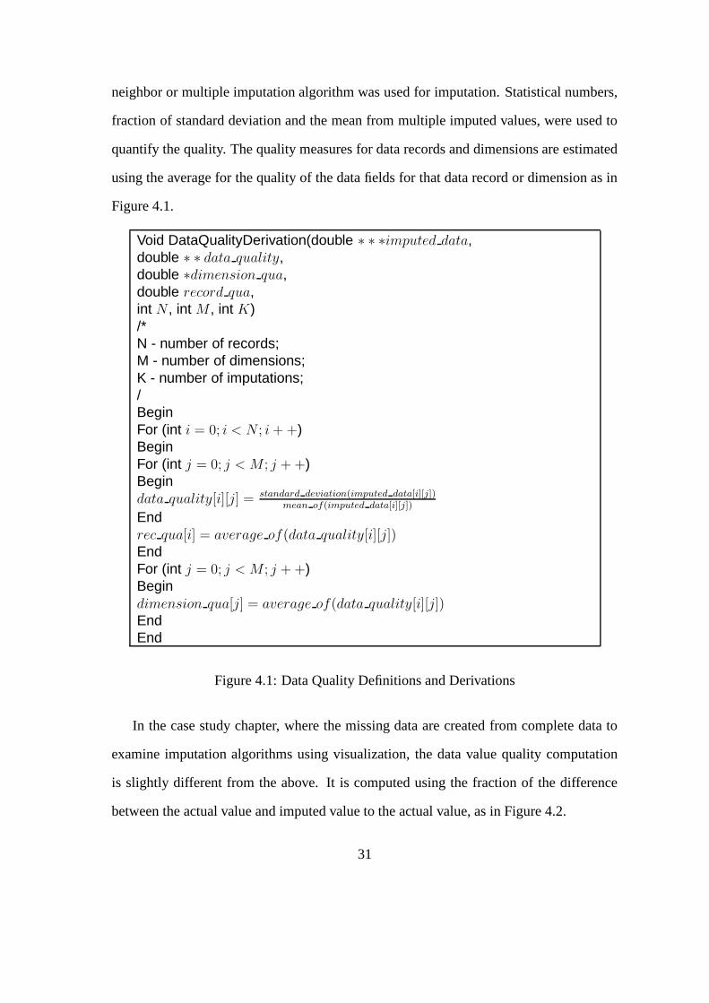
quantify the quality. The quality measures for data records and dimensions are estimated
using the average for the quality of the data fields for that data record or dimension as in
Figure 4.1.
Void DataQualityDerivation(double ∗ ∗ ∗imputed data,double ∗ ∗ data quality,double ∗dimension qua,double record qua,int N , int M , int K)/*N - number of records;M - number of dimensions;K - number of imputations;/BeginFor (int i = 0; i < N ; i + +)BeginFor (int j = 0; j < M ; j + +)Begindata quality[i][j] = standard deviation(imputed data[i][j])
mean of(imputed data[i][j])
Endrec qua[i] = average of(data quality[i][j])EndFor (int j = 0; j < M ; j + +)Begindimension qua[j] = average of(data quality[i][j])EndEnd
Figure 4.1: Data Quality Definitions and Derivations
In the case study chapter, where the missing data are created from complete data to
examine imputation algorithms using visualization, the data value quality computation
is slightly different from the above. It is computed using the fraction of the difference
between the actual value and imputed value to the actual value, as in Figure 4.2.
31

Void ComputeQualityForCreatedMissingData(double ∗ ∗ actual data,double ∗ ∗ ∗imputed data,double ∗ ∗ data quality,double ∗dimension qua,double record qua,int N , int M , int K)/*actual data - original data;imputed data - imputed data from simulated missing data;/BeginFor (int i = 0; i < N ; i + +)BeginFor (int j = 0; j < M ; j + +)Begindata quality[i][j] = abs(actual data[i][j]−mean of(imputed data[i][j]))
actual data[i][j]
Endrec qua[i] = average of(data quality[i][j])EndFor (int j = 0; j < M ; j + +)Begindimension qua[j] = average of(data quality[i][j])EndEnd
Figure 4.2: Data Quality Computation for Simulated Missing Data
4.3 Data Quality Store
Taking into account data value quality, there is a quality measure for each data value.
If the majority of the data values have quality problems, it seems to be reasonable to
allocate a memory slot to the quality measure for each data value. However, the reality
is that usually only a small part of data values have quality problems, while the rest are
perfect in term of data quality.
Since this is a proof of concept study on data quality visualization, temporarily we
do not need to worry about the scalability of these approaches. We can assume that the
dataset is moderate or small in size. Under such an assumption, we can make the similar
32

quality dataset from imputation and derivation methods mentioned earlier. For the sake
of consistency, we format the quality information in a manner similar to the raw data.
33

Chapter 5
Methodologies
High dimensionality can have multiple meanings in our context. One is associated with
the multi-variate data set being visualized. The other applies to the multiple facets of data
quality. Even if we assume that only one aspect of data quality needs to be visualized, we
still are confronted with the high dimensional data set. Existing techniques for visualizing
uncertainty and quality of spatio-temporal data cannot be applied because spatio-temporal
data is low dimensional in nature.
In this section we discuss our current approaches to the visualization of data sets with
quality attributes, namely, incorporating visualization of data with quality information,
visualization in data quality space, and user interactions between data space and data
quality space.
5.1 Incorporation of Visualization of Datawith Quality Information in 2D Displays
Even though the richness of information when data quality is incorporated into data dis-
plays has the potential to enable more informed decision making, the large number of
choices possible for mapping data quality onto graphical attributes makes the incorpora-
tion of data quality into data displays difficult. If we chose six visual variables and three
quality measures as discussed earlier, we have P 63 = 120 choices of mapping quality mea-
34

sures onto visual variables, assuming we set a constraint that different quality measures
cannot be mapped to the same visual variable in the same display. Otherwise we have a
larger number of choices.
Data quality visualization must present data in such a manner that users are made
aware of the locations and degrees of data quality in their data so as to make more in-
formed analysis and decisions. The ways to present the data quality information, in a
separate plot, in the same plot, or both, each could lead to improved interpretation or
increased confusion. We have investigated several distinct classes of mapping methods
from data quality to graphical entities or attributes, including:
• third dimension: transforming 2-D displays to 3-D displays by the introduction of
the third dimension, where the value of the third dimension is used to represent data
quality information.
• animation: data with quality information are displayed in a 3-D space with moving
animation. The moving range and speed are determined by the user.
• opacity: for a 2-D display, the opacity is used to map the corresponding data quality
information for a given data record.
• color: where the data quality is mapped onto the color for a specific data record or
item.
• point size: in displays where geometric points are used to represent data, the size of
point could be used to convey data quality information.
Each of the above mentioned methods have their strengths and weaknesses as to the
applicability to different displays (e.g., mapping data quality onto point size is only ap-
plicable to scatterplot matrix displays, while the method of animation might be best for
parallel coordinates displays) and visualization effectiveness (e.g., for a relatively large
35
data set, introducing the third dimension to convey data quality may not be effective in
that it could make the case worse when the display is already cluttered). We explored
these seemingly contradictory characteristics of visualization - on the one side, we hope
to convey as much information content as possible to the user in a limited display space.
On the other side, we need to prevent clutter where too much information is presented
and users cannot discern any information from the displays.
If we follow the principle that line width, point size and the third dimension have the
highest priority, color and opacity are the second choice, and the last choice is line style,
the possible visualization methods for quality measures becomes more manageable.
Methods for data quality visualization have been implemented on three types of mul-
tivariate displays, namely, parallel coordinates, scatterplot matrix and glyphs. In the fol-
lowing sections, we first discuss the color scales we used for incorporation of data quality
into the data display. Then the mapping methods from data quality measures to visual
variables are discussed. Finally we examine the advantage and disadvantage of those
displays when data quality information is incorporated into data displays.
5.1.1 Color Scale Selection
A color scale is a color metric definition and implementation in a certain situation. The
RGB color scale, where R stands for Red, G stands for Green and B stands for Blue, is
widely used in computer graphics. A carefully chosen color scale for visualization can
dramatically decrease the visual processing load. It can effectively help a viewer discover
the undiscovered, discern hidden patterns or outliers, mine a new rule and any other in-
formation visualization target desired [54]. In [55, 56] the authors tried to optimize the
color scales under different applications and scenarios.
The RGB color scale is good for implementation and has been a standard for almost
all graphics utilities. Unfortunately, the RGB color scale has been proven not to be an
36

intuitive representation for human beings. People have difficulty to interpret what the
color of 26R+30G+16B, or 55B-24G-60B is in situations where there are 256 levels for
each color.
The HLS (H, L and S stand for Hue, Lightness and Saturation, respectively) color
scale had long been used by human beings [57]. It is an intuitive representation of color
and easier to interprete than RGB colors. Artists use HLS color scale to describe col-
ors. To be more intuitive and easier to interprete, we chose the HLS color scale in our
data quality visualization. Each time data quality needs to be mapped onto color, we
interpolate the H and S values based on the quality measures.
Since XmdvTool uses the RGB color scale as the default interface color specification,
we implemented an algorithm to accomplish the transformation between RGB and HLS
color scales. Figure 5.1 shows the definition of class HLS and its interface with RGB
color scales.
class HLScolor {public:double hue, sat, lum;double max of(double, double, double);double min of(double, double, double);double rgb func(double, double, double);public:HLScolor () {hue = 0.0; sat = 0.0; lum = 0.0;}HLScolor (double, double, double);HLScolor (unsigned long );void toRGB(RGBt &);void toUnsignedLong(unsigned long &);void fromRGB (const RGBt &);}
Figure 5.1: Definition of Class HLS and Its Interface with RGB Color Scales
37

5.1.2 Mapping Interpolation
Three types of data quality measures are discussed in this thesis; dimension quality, record
quality and data value quality, all consist of numeric values. When presenting those qual-
ity types with data displays, we use the uniform interpolation equation to map the data
quality measures onto visual variables such as the color, line width, dot size and all other
visual variables used in this thesis.
Figure 5.2 shows the mapping process from data quality measures onto visual vari-
ables. All these values are acquired by interpolating on the range of visual variable values
in terms of data quality measures. Note that V V base and V V range stand for the base
value and range that the current visual variable could be assigned. For instance, if the cur-
rent visual variable is color, its base value is from user initial specification and its range
could be computed by its maximum or minimum values in the defined color spaces.
5.1.3 Parallel Coordinates
In parallel coordinates displays, each poly-line represents a data record and an explicit
axis is used to represent a dimension. An intuitive insight into the parallel coordinates
display is that the most challenging task is to incorporate data value quality into the dis-
play, since the display is easily cluttered. We can use visual variables associated with
poly-lines or axes to convey record quality or dimension quality. For each data value
quality, the information content is overwhelming, since there is a quality measure corre-
sponding to each data value.
The first visual variable set we tested was line width, color and line style as in Table
5.1, where the dimension quality is mapped onto line width, record quality is mapped
onto color, and data value quality is mapped onto line style. Notice that the line style itself
cannot express a quality measure. It only has the representative capability of two category
38

Void MapQualityToVisualVariable(double ∗ ∗ data quality,double ∗dimension qua,double record qua, int N , int M )
Begindouble V V rec[N ];double V V dim[M ];double V V data[N ][M ];double V V range; double V V base; For (int i = 0; i < N ; i + +)
BeginV V rec[i] = record qua[i]−min(record qua)
max(record qua)−min(record qua)∗ V V range + V V base
For (int j = 0; j < M ; j + +)Begin
V V data[i][j] = data quality[i][j]−min(data quality)max(data quality)−min(data quality)
∗ V V range +V V base
EndEnd
For (int j = 0; i < M ; j + +)Begin
V V dim[j] = dimension qua[j]−min(dimension qua)max(dimension qua)−min(dimension qua)
∗ V V range +V V base
EndEnd
Figure 5.2: Mapping Data Quality Measures onto Visual Variables
data. It can convey the extent of quality in combination with other features. In this case,
the length of each dash in the dotted line is used to represent the quality measures for data
values. The dotted line could maximally extend to the midpoint between a data value and
its neighbor.
Without visualization efficiency and expressive capability consideration, this is a rather
reasonable choice for 2D parallel coordinates, where due to the nature of the parallel co-
ordinates display, there are not many visualization resources that could be used for extra
information other than data itself. As we discussed before, color is not the best visual
variable to represent numeric values. A Gestalt study shows that people tend to differenti-
ate the geometric size more easily than color (section 3.2). People usually cannot discern
39

Data quality measures Record quality Dimension quality Value qualityVisual variables Color Line width Line style
Table 5.1: Mapping of Data Quality Measures onto Visual Variables in 2D Parallel Coor-dinates
the distance from dark blue to light blue. However, color is still well used to represent
data quality through this thesis, since, in many situations, we have no other visualization
resources available.
Figure 5.3 is a parallel coordinates display incorporating data quality information by
the mapping method described in Table 5.1. For dimension quality, the thicker the dimen-
sion axes, the worse the quality. We can instantly judge that dimensions 2 and 4 have the
worst quality among other dimensions. Dimension 1, 3, 6, 8 and 9 have better quality and
the rest of dimensions have moderate quality.
The color for each record polyline represents the record quality. the darker the color,
the worse that data record’s quality. In other words, the lighter, the better. We may
not easily find the lightest poly-lines, but the six darker data records are not difficult to
differentiate.
The most challenging and difficult type of quality, the data value quality, is represented
by the length of dotted lines around the data points. The dotted lines that reside on each
side of the data point represent a quality issue for that point. The longer the dotted line,
the lower the quality is for that point. A solid line represents that the data point is of the
highest quality.
By a careful examination, it is not difficult to find that the dimension quality, record
quality and data value quality are associated with each other. Dimension 2 and 4 have
the worst quality among dimensions. The data points located in these two axes also have
longer dotted lines that represent worse data value quality. In the mean time, several data
values on the six darker record poly-lines show signs of worse quality.
40

Figure 5.3: Parallel coordinates with data quality display, where the record quality ismapped onto the color of a ployline, the dimension quality is mapped onto the width ofan axis and the data value quality is mapped onto the length of a dotted line.
We can ascertain the pros and cons for this mapping method by examining the dis-
play. An advantage is that it conveys an amazing information content by a simple mapping
mechanism for data value quality. In a parallel coordinates display with a moderate num-
ber of records and dimensions, we can expect that the dimension quality, record quality
and data value quality can be displayed in an expressive manner and all can be discern-
able.
In information visualization, the efficient use of space is critical and it often deter-
mines the success of a display to a large extent. A number of information visualization
packages focus on efficient space use algorithm design [12] since displays are apt to be
cluttered for an average data set. The mapping method described in Table 5.1 satisfies the
rule that space is used efficiently. It saves space by mapping data value quality onto line
style and conveys the quality measure by the line length.
What are the disadvantages? One is that the mappings do not follow human beings’
41

Data quality measures Record quality Dimension quality Value qualityVisual variables Color Line width Transparent band
Table 5.2: Map Data Value Quality onto Transparent Band in 2D Parallel Coordinates
Gestalt rules well. Aside from the fact that people cannot easily judge good or bad from
light green to dark green, they maybe feel a little bit strange interpreting the line style
and its length as a data value quality measure. In addition, when the data set becomes
large, for instance, over one thousand data records, which is very common for information
visualization, the display could be cluttered. In this case it seems like we have problems
in discerning whether it is a dotted line or a solid line, let alone to discern the length for a
dotted line.
To investigate the expressive capability and effectiviness of visual variables for incor-
porating data quality measures into data displays, an alternative visual variable mapping
method was investigated. As described in Table 5.2, the only difference from the mapping
method in Table 5.1 is that the data value quality is mapped onto a translucent band rather
than a dotted line.
The objective of this mapping method is pretty clear. The critical problem in our data
quality visualization is how to map the data value quality, the dominant information part
among the three types of data quality measure. There is an already assumed data quality
for each data point. The information content is at least doubled for data with quality
measures than pure data without extra information.
Figure 5.4 shows data value quality using an opacity band around the data poly-line
in a parallel coordinates display. Two symmetric points around a data point are defined
in terms of the quality measure for this point, where the offset from the data point corre-
sponds to quality measures. The quality band is formed by painting two band areas along
the upper and lower sides of a data line connecting two data points, where the opacity is
42

gradually changed along the offset to the data line.
Figure 5.4: Quality band in parallel coordinate, where the record quality is mapped ontothe color, the dimension quality is mapped onto the width of an axis and the data valuequality is mapped onto the width of a transparent band.
This mapping method is the same as the semantics described in Table 5.1, except the
transparent band stands for data value quality. The wider the transparent band, the worse
the data value quality at that point. A data line through a point without a band means it
has perfect quality in that dimension.
A geometric entity, a transparent band, and its size are used to convey data value
quality measures. It results in a better display with easy-to-differentiate data value quality
measures. The display efficiency is improved in terms of presenting data quality with
data displays. Unfortunately, this mapping method is only effective when the data set is
limited to a small number of data records. Especially when a large number of imperfect
data are presented, the clutter of the display is a serious problem that cannot be overcome.
The above mentioned results are in agreement with the rule that the efficient use of
display space is critical. The wider the transparent band, the easier it is for viewer to
43

differentiate the data value quality. In the meantime, the number of imperfect data points
that could be displayed discriminatedly at the same time is limited.
5.1.4 Glyphs
The nature of the glyph display is similar to parallel coordinates; thus we apply the same
mapping methods as used for parallel coordinates to incorporate data quality information
into glyph displays.
Figure 5.5 is a glyph display extended with data quality information by the mapping
method described in Table 5.1. In glyph displays, the individuals are emphasized while
the dimensions are displayed with each individual. The quality for each data record is
more easily judged than the other types of data quality measures.
Figure 5.5: Glyph with data quality display, where the record quality is mapped onto thecolor a glyph, the dimension quality is mapped onto the width of a ray axis and the datavalue quality is mapped onto the length of a dotted line.
44

Data quality measures Record quality Dimension quality Value qualityVisual variables Color Line width Point size
Table 5.3: Map Data Quality Information onto Visual Variables in a 2D Scatterplot MatrixDisplay
5.1.5 Scatterplot Matrix
In a scatterplot matrix, the visual emphasis is focused on the relations between two di-
mensions. The data values are plotted as geometrical points along each two dimensions.
Every two dimensions generate a single plot. It results in a symmetrical plot arrangement
where the diagonal plots show the distribution of data within a single dimension. This
provides an opportunity to convey dimension quality in these diagonal plots instead of
the distribution.
After dimension quality have been represented by diagonal plots, the other two types
of quality information need to be mapped. The point size is definitely a good visual
variable for our purpose. But it only can convey one type of quality measure, either the
record quality or data value quality. In such a situation, the data value quality seems to
be better to be conveyed by point size. Again, the remaining quality measure, the record
quality, can be represented by the color. These mapping methods are listed in Table 5.3.
Figure 5.6 is such a display, where the data quality information is incorporated into a
2D scatterplot matrix by the mapping method described in Table 5.3. The advantage of
this display is that the data value quality, which is conveyed by the point size, is apparent
and discernable. We still have some difficulty to associate the quality of the whole data
record; this is due to the nature of the scatterplot matrix, where the visualization cue is
focused on the relation in each single plot.
The dimension quality, which is represented by the line width of the diagonal plot
border, is discernable. The wider line for a diagonal plot box stands for a quality problem
for that dimension. We use consistent semantics to ease the interpretation of the quality
45

information.
The color in this display is used to convey data record quality. Compared with the
display of parallel coordinates, where the same mapping and interpretation semantics are
chosen, it provides a worse visualization in conveying the data record quality. This is
due to the different nature of the two displays, where in the parallel coordinates display,
a connected poly-line has a better representative capability for emphasizing the integrity
than a scatterplot matrix display.
Figure 5.6: Scatterplot Matrix with data quality incorporated, where the record quality ismapped onto color, the data value quality is mapped onto point size and dimension qualityis mapped onto line width around the diagonal plots.
To better use the diagonal plot space in the scatterplot matrix display, an alternative
mapping method was considered. As in Table 5.4, the only difference is that color is
used to convey dimension quality by painting the diagonal box with an appropriate color
setting.
46

Data quality measures Record quality Dimension quality Value qualityVisual variables Color Color Point size
Table 5.4: An Alternative Method for Mapping Data Quality Information onto VisualVariables in 2D Scatterplot Matrix Display
Figure 5.7 is a scatterplot matrix display where the diagonal plots are painted with
a background color. The diagonal plot background color is decided by interpolating the
corresponding dimension quality based on the color for the dimension axes. We keep the
same semantics as to how to interpret the color: the lighter, the better quality; the darker,
the worse quality. Obviously the dimension quality become more apparent and easy to
differentiate, even though we still do not have a precise differentiation between two close
diagonal background colors.
Figure 5.7: Scatterplot matrix with data quality incorporated, where the record quality ismapped onto color, the data value quality is mapped onto point size and dimension qualityis mapped onto the background color.
47

So far it conforms with our principle that the geometrical entities, such as the line
width, transparent band and point size, are reasonable choices to represent quality mea-
sures as to the viewer’s Gestalt understanding and interpretation. The expressive capa-
bility and efficiency of these visual variables to convey data quality in 2D displays is
reasonably good. In the case of the scatterplot matrix, due to the introduction of point
size to represent data field quality, it seems to be better than the other two displays in
terms of display readability and interpretability.
The most attractive geometrical feature, the third dimension, which is good to convey
any information as analyzed in Chapter 3, needed to be investigated. The next section is
dedicated to incorporating data quality information into data displays in 3D space.
5.2 Incorporation Visualization of Datawith Quality Information in 3D Displays
The third dimension is one of the visual variables that may be effective for data quality
visualization, based on the analysis in section 3. The direct implementation in this context
is to visualize the data with quality measures in 3D views, where two dimensions are used
to map the multivariate data and the third dimension is the direct indicator of data quality.
To investigate the visual effectiveness and expressive capability of the third dimen-
sion, we focused on the 3D displays incorporated with data value quality information.
We temporarily ignore the other two types of quality information.
5.2.1 Parallel Coordinates
In parallel coordinates displays, the third dimension is directly used to convey data value
quality measures, which results in a 3D parallel coordinates. Figure 5.8 shows such a
display. To obtain a 3D appearance, cylindrical geometric entities are used to draw data
records instead of the poly-lines in the 2D parallel coordinates display.
48

Figure 5.8: 3D parallel coordinates with incorporated data quality information.
From the 3D parallel coordinates display we find that the third dimension can be
a reasonable representation for conveying data quality measures, especially when these
measures take on a small number of distinct values. It gives a plausible global view in
terms of data with quality measures. For more detailed views, user interactions such as
rotation, linking and brushing techniques could be used to enhance data interpretation and
decision making when faced with data quality problems.
In the meantime, the disadvantage of 3D parallel coordinates display is apparent. The
display is easily cluttered. Viewers still have difficulties in judging the third dimension
values. In addition, a 3D display poses an inconvenience for user interactions, where the
user cannot precisely locate a position in the depth of view just using the mouse. This is
a critical disadvantage for information visualization.
49

5.2.2 Scatterplot Matrix
In a 3D scatterplot matrix, a 3D cylindrical entity is used to represent each data point,
where the start and end position for each cylinder are used to convey two data value
quality measures for that point. Figure 5.9 shows a 3D scatterplot matrix where the data
value quality is mapped onto the third dimension.
Figure 5.9: 3D scatterplot matrix with data quality information incorporated.
From the 3D scatterplot matrix display, we feel that it has similar advantages and
disadvantages as described in the 3D parallel coordinates display. It provides a global
view for data value quality measures. Unfortunately, the display is easily cluttered. It is
not convenient for the viewer to differentiate each matrix plot due to the introduction of
the third dimension. It is not intuitive for the user to interactively specify a data point or
a matrix plot for the same reason.
50

5.2.3 Star Glyphs
In the 2D star glyph display, each glyph represents a singe data record. It is formed by a
number of rays issued from the center that represent dimensions and a polygon around the
center that represent data points. The distance from the center to the polygon edge points
along that ray conveys the data value for the corresponding dimension. The resulting
appearance of a glyph is composed of multiple triangles that share the same center. A 3D
star glyph is achieved by extruding each triangle along the third dimension with a distance
that represents a data value quality for that point. Figure 5.10 shows a 3D glyph display
with the third dimension representing data value quality measures.
Figure 5.10: 3D star glyph with data quality information incorporated.
From this 3D glyph display we find that it is more difficult to control the display. It
tends to be hard to discern since all the glyphs are solid entities.
51

5.3 Visualization in Data Quality Space
Incorporation of data quality into data displays provides rich information and can lead
to more informed analysis. In some situations, rendering the data quality information in
a separate display is required. Part of the reason is that the user could expect a view in
quality space where it could be better displayed only with quality information and lead
to a clear visualization (compared to incorporation of data quality with data displays).
The other reason is that displaying the data quality in a separate display makes it possible
for the user to navigate between data space and quality space and perform an interactive
analysis using existing techniques such as linking and brushing.
Two spaces are discussed here: data space, which is associated with multivariate data
records, and data quality space, which is associated with data quality values, including
record, dimension, and data field quality. The two spaces are not necessarily required
to be independent. In fact, they could have relationships, e.g., the lower values in data
space may directly lead to the high data quality in quality space for a specific variable.
To discover and exploit such associations would be possible by the visualization methods
developed in this thesis.
5.3.1 Displays in Data Quality Space
Two types of plots are used to display data quality in quality space. One is a tabular plot
as in Figure 5.11, where a rectangular area is segmented into n (number of tuples) by m
(number of dimensions) small blocks. Each small block is painted by a color correspond-
ing to its corresponding quality value. Alternatively each block could be partially filled
with a single color, similar to the Table Lens technique [58, 59]. Color is employed here
to convey data value quality because the area required for each quality value is relatively
small.
52

Another type of plot is a histogram slider [60, 61, 62], which shows distributions for
a scalar value. The histogram slider provides the viewer a global picture in terms of the
scalar value displayed. Combined with a dynamic slider, it facilitates rapid exploration of
information by real-time visual display of both the query formulation and results.
In this thesis three histogram sliders were developed to display quality measures for
data records, dimensions and data values respectively (Figure 5.11). Along each slider,
It is divided uniformly into a certain number of bins. Each bin consists of a rectangular
painting with the color that is decided by the quality value of that bin. The height of a bin
stands for the number of data points that fall into this bin’s range.
5.3.2 Operations on Data Quality Displays
Ordering can enhance visualization and possibly make underlying data patterns, associa-
tions and outliers more apparent in certain conditions. We see the potential of ordering in
our data quality display. It not only improves visualization efficiency, but also can provide
a powerful auxiliary operation to help users find interesting data items. The ordering op-
erations are provided for data value quality displays. Figure 5.12 shows an ordered data
quality display of Figure 5.11, where the data located in the upper left area in the quality
display have worse quality and those in the lower right area have better quality.
The primary objective of displays in data quality space is to provide users the ability
to interactively explore data. Users can query an interesting subset of data and get instant
display on specified subsets. The next section discusses the developed functions for user
interactions.
53

Figure 5.11: Visualization in data quality space.
Figure 5.12: Ordering on data quality display.
5.4 User Interactions
User interactions are an important aspect of information visualization. One advantage of
visualization is that it can combine automatic algorithms with the perceptual capabilities
54

and intelligent judgment of human beings. Visualization, especially for exploratory or
confirmatory purposes, is often ineffective without interaction. It is not sufficient to only
display pictures of the data; the user needs to interactively explore the data. The ability
to select and manipulate subsets of the data and change viewing parameters interactively
supports the user in reaching the goal of gaining insights into the characteristics of the
data. User interactions can be as simple as setting display features, changing viewing pa-
rameters, and removing data entries. It can also be more complicated, such as navigating
in multiple views.
Linking and brushing, which is used to target the viewer’s interest in a subset of the
data, is applied to displays in data space and data quality space. To provide the user
with a better view of data with quality information, we developed view changes such as
transformations, rotations and zooming.
5.4.1 Linking and Brushingin Data Space and Quality Space
Linking and brushing are established techniques in multivariate data visualization for
exploring patterns of data with high dimensionality in the same view or multiple views
[15]. It begins with brushing, where an interesting subset of data is selected in one view.
The brushed data subset is then dynamically highlighted in other displays, which is termed
linking.
The techniques of brushing and linking can be applied in both data space and quality
space. Brushed data subsets in data space can be highlighted in quality space; similarly,
the quality data can be brushed and the data falling into the brushed region can be high-
lighted in the data space. Four types of brushes in quality space are introduced. As shown
in Figure 5.11, brushes are applied to the tabular value quality plot, the record quality
histogram slider, the dimension quality histogram slider, and data field quality histogram
55

slider.
Brushing the Data Value Quality
In the tabular data quality display, the brush is defined by a rectangular area that covers
a certain number of contiguous dimensions and data records. The brushed area is indi-
cated by a transparent painting with the current defined brush color. Users can arbitrarily
specify the position and size for this brush. Figure 5.14 shows a brushed area in the data
quality display and corresponding data subset in data display is shown in Figure 5.13.
Figure 5.13: Brush data value quality -brushed data in data display.
Figure 5.14: Brush data value quality -brush in data quality display.
The semantics of brushing deserves discussion in this context. In a tabular data quality
display with data tuples as rows and dimensions as columns, a specific rectangular area
includes a certain number of data tuples and dimensions. As a brush, it could be inter-
preted in three ways and results in three different brush definitions. They are, specified
data tuples with all dimensions, specified data dimensions with all data tuples, and spec-
ified data tuples with specified data dimensions. The third option, specified data tuples
with specified data dimensions, is intuitive and consistent when the specified brush is a
56

rectangular area with continuous extents both for rows and columns. It is possible that the
user selects arbitrary boxes in the tabular quality display. This is equivalent to the brush
where the user operates on the quality histogram slider for all data fields. In this case, the
tabular quality display can be reordered to correspond to the user selections. Figure 5.12
shows an ordered display in quality space.
To enrich the interactive operations between users and quality displays, we leave the
semantics of the brush up to the user’s preference.
Combined with operations on displays in data quality space, the defined brushes can
help a user target his selections.
Brushing the Dimension Quality Slider
A dimension quality slider is defined by a certain number of contiguous bins along the
dimension histogram plot. The slider is transparently painted with the current brush color.
The position and size of a slider are decided by the starting and ending bin’s position along
the dimension histogram plot. Figure 5.16 shows a dimension slider and corresponding
data subset in the data display are shown in Figure 5.15.
Notice that only those dimensions that fall in the dimension slider’s covered area are
drawn. Other dimensions are hidden. The dimension slider has no effect on the data
records.
Brushing the Data Record Quality Slider
Similar to the dimension quality slider, the data record quality slider is applied on the data
record quality histogram plot. Users brush this slider by sliding the start or end or both
positions. Figure 5.18 shows such a slider and the brushed data in data display are shown
in Figure 5.17.
The data record quality slider only works on data records. It does not affect the di-
57
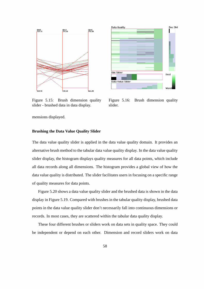
Figure 5.15: Brush dimension qualityslider - brushed data in data display.
Figure 5.16: Brush dimension qualityslider.
mensions displayed.
Brushing the Data Value Quality Slider
The data value quality slider is applied in the data value quality domain. It provides an
alternative brush method to the tabular data value quality display. In the data value quality
slider display, the histogram displays quality measures for all data points, which include
all data records along all dimensions. The histogram provides a global view of how the
data value quality is distributed. The slider facilitates users in focusing on a specific range
of quality measures for data points.
Figure 5.20 shows a data value quality slider and the brushed data is shown in the data
display in Figure 5.19. Compared with brushes in the tabular quality display, brushed data
points in the data value quality slider don’t necessarily fall into continuous dimensions or
records. In most cases, they are scattered within the tabular data quality display.
These four different brushes or sliders work on data sets in quality space. They could
be independent or depend on each other. Dimension and record sliders work on data
58

Figure 5.17: Brush data record qualityslider - brushed data in data display.
Figure 5.18: Brush data record qualityslider.
dimensions and records separately; they are independent. Brushes in the tabular quality
display and data value quality sliders work on the whole data set. They are dependent.
Brush operations can be complicated and other research groups have focused on this
issue. In this thesis we have not intended to address the problems of interacting brushes.
In the meantime, the other brushes or sliders are not updated after a brush or slider oper-
ation has finished.
5.4.2 Viewing Transformations
In 3D visualization, the viewing transformation is a powerful and essential function for
users to navigate and explore the data set. A change in the angle of view can be used
to uncover a particular part of a 3D display. In this thesis, we implemented a camera
utility to facilitate such functions. Users can translate, rotate and zoom views by simple
interactions in the 3D view.
The interactive viewing transformations were implemented by responding to a key
user typed. The detail description is as Table 5.5.
59

Figure 5.19: Brush data value qualityslider - brushed data in data display.
Figure 5.20: Brush data value qualityslider.
Keys typed Operationsz(Z) Transform on z (-z) directiony(Y) Transform on y (-y) directionx(X) Transform on x (-x) directionj(J) Yaw a positive (negative) anglek(K) Roll a positive (negative) anglel(L) Pitcj a positive (negative) angle
Table 5.5: Key Definitions for Viewing Transformations
5.5 Animations
The use of three dimensional representations and animation could potentially enable users
to visualize more relationships within the data set. These representations can provide
more insight than flat, static two dimensional visualizations. In this thesis we imple-
mented a simple animation function. User can move between different views in the 3D
display by controlling rotation orientation and speed.
The animation starting, rotation orientation and speed and stopping were controlled
by operating on mouse.
60

Chapter 6
Implementation
6.1 System Architecture
As shown in Figure 6.1, several modules were developed based on the existing XmdvTool
system for the purpose of data quality visualization:
• Data Quality Imputation. This is an independent module to impute data values for
missing fields and thereafter to derive a complete dataset and corresponding data
quality values. To examine the visualization methodologies for data quality that
we present in this thesis, we create cases of datasets with varying quality from the
dataset with missing values. The nearest neighbor method is used to impute values
for the missing fields. We define data formats and provide a way to have other
imputation methods incorporated in the future.
• Incorporation of Data Quality into Data Display. This module is implemented based
on the existing visualization modules. For 2D displays, the data quality measures
are rendered as selected visual variables. For 3D displays, the data value quality is
mapped onto the third dimension.
• Visualization in Data Quality Space. An independent module that is dedicated to
the visualization for data quality.
61

• Interactions. This is a separate module that provides user interactive functions.
Queries in the form of data quality specification are instantly resolved in the data
display.
• Animation. This module generates 3D consecutive views in a user specified manner
so that users may get a better understanding about the data and potentially discover
relations and features undiscovered by other type of views.
Figure 6.1: Structural Diagram of XmdvTool with Data Quality Visualization
62

6.2 Implementation
This project is implemented as extensions to the XmdvTool system 6.0 alpha version.
We followed the existing system design, style, and methodology to make XmdvTool con-
sistent. All the existing functions and features were left untouched. The data quality
visualization and interactive activities were implemented as new modules to the existing
system.
Similar to previous XmdvTool versions, modules were implemented using C++ as the
developing language. To make the system work across different platforms, the OpenGL
graphics library was used. Its interface was generated using Tcl/Tk. The software will
execute on both Windows and Unix/Linux platforms.
63

Chapter 7
Case Studies
Evaluation is essential for effective information visualization. The discipline of informa-
tion visualization has experienced more then ten years of research and development and
has resulted in a variety of visualization tools with different capabilities. A problem arises
that not only are users overwhelmed by many visualization capabilities, but also develop-
ers, researchers and promoters have difficulties in terms of which visualization technique
to employ.
Evaluation is one of the plausible approaches to solving these problems. Evaluation
may provide metrics, evidence, and examples of why a particular technique is useful or
not. By evaluation, we may discover and quantify how and when a visualization technique
or application works. This can directly or indirectly support and validate results. Another
benefit is that findings from evaluations will likely point us to new directions and new
ideas for interesting and useful research.
7.1 Objectives
The first objective is to examine the visual efficiency and representative capability for the
data quality visualization approaches presented in this thesis. The second objective is to
assess the utility of quality visualization by examining the effectiveness and correctness
64
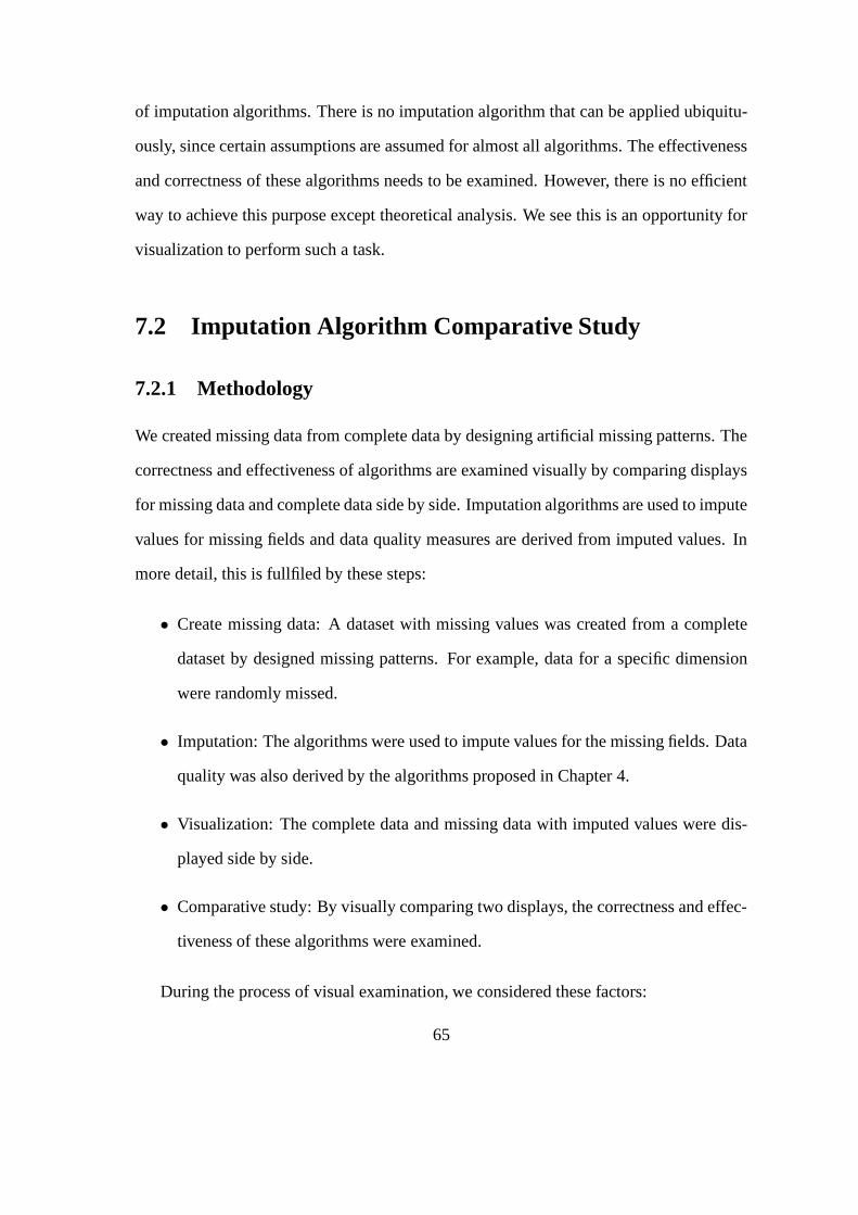
of imputation algorithms. There is no imputation algorithm that can be applied ubiquitu-
ously, since certain assumptions are assumed for almost all algorithms. The effectiveness
and correctness of these algorithms needs to be examined. However, there is no efficient
way to achieve this purpose except theoretical analysis. We see this is an opportunity for
visualization to perform such a task.
7.2 Imputation Algorithm Comparative Study
7.2.1 Methodology
We created missing data from complete data by designing artificial missing patterns. The
correctness and effectiveness of algorithms are examined visually by comparing displays
for missing data and complete data side by side. Imputation algorithms are used to impute
values for missing fields and data quality measures are derived from imputed values. In
more detail, this is fullfiled by these steps:
• Create missing data: A dataset with missing values was created from a complete
dataset by designed missing patterns. For example, data for a specific dimension
were randomly missed.
• Imputation: The algorithms were used to impute values for the missing fields. Data
quality was also derived by the algorithms proposed in Chapter 4.
• Visualization: The complete data and missing data with imputed values were dis-
played side by side.
• Comparative study: By visually comparing two displays, the correctness and effec-
tiveness of these algorithms were examined.
During the process of visual examination, we considered these factors:
65

• Missing patterns: When creating missing data, two designed patterns were applied.
They are random missing, where the data are randomly missed for a specified di-
mension, and, uniform missing, where the data are missing at an uniform frequency.
• Imputation algorithms: Multiple imputation and nearest neighbor algorithms were
used to impute the missing data.
7.2.2 Results
Iris data set with 20% missing, complete data and imputed data are as Figure 7.3, 7.2 and
7.4.
Figure 7.1: Complete Iris Dataset. Figure 7.2: 20% Missing Iris Data, Im-puted by Nearest Neighbor.
By comparing the Figure 7.2 and 7.4, we see that both the nearest neighbor and EM
algorithms have very close performance as to the imputation correctness. Both displays
have data itmes that are significantly different from the actual ones. By a careful investi-
gation we can find that the nearest neighbor algorithm is slightly closer to the actual data
than the EM algorithm, since Figure 7.2 is closer to the Figure 7.3 than Figure 7.4.
The cars data set with 40% missing, complete data and imputed data are shown in
Figure 7.7, 7.6 and 7.8.
66
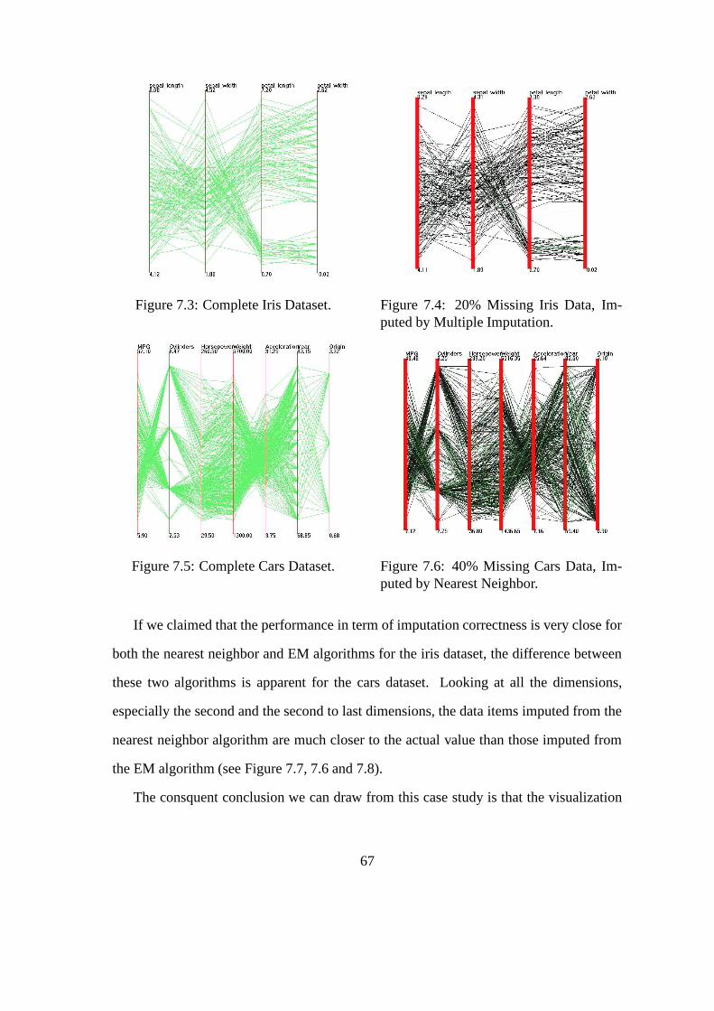
Figure 7.3: Complete Iris Dataset. Figure 7.4: 20% Missing Iris Data, Im-puted by Multiple Imputation.
Figure 7.5: Complete Cars Dataset. Figure 7.6: 40% Missing Cars Data, Im-puted by Nearest Neighbor.
If we claimed that the performance in term of imputation correctness is very close for
both the nearest neighbor and EM algorithms for the iris dataset, the difference between
these two algorithms is apparent for the cars dataset. Looking at all the dimensions,
especially the second and the second to last dimensions, the data items imputed from the
nearest neighbor algorithm are much closer to the actual value than those imputed from
the EM algorithm (see Figure 7.7, 7.6 and 7.8).
The consquent conclusion we can draw from this case study is that the visualization
67

Figure 7.7: Complete Cars Dataset. Figure 7.8: 40% Missing Cars Data, Im-puted by Multiple Imputation.
is a helpful tool to validate and assess the correctness and efficiency for imputation algo-
rithms.
7.3 Quality Visualization Efficiency
Our next assessment was a case study on the expressive capability and efficiency of data
quality mappings when incorporated with the data display. In this case study we only
considered three different data quality mappings in the parallel coordinates display, rather
than consider all data quality mappings in all types of displays such as scatterplot matrix
and glyph displays. Part of the reason is that different displays, even when presenting
data without quality information, have their own advantages and disadvantages. This
thesis didn’t focus on such differences of expressive capability among different displays.
Another reason is that the mapping methods for data quality measures often can’t be
consistent across different displays since some visual attributes can’t be applied to all
displays consistently.
To achieve our purpose of evaluation and to have a comparative study on the expres-
sive capability and efficiency of data quality mappings, we chose the parallel coordinates
68

Data quality measures Record quality Dimension quality Value qualityMapping method 1 Color Line width Transparent bandMapping method 2 Color Line width Dotted lineMapping method 3 N/A N/A 3rd dimension
Table 7.1: Three Mappings of Data Quality Measures onto Visual Variables in ParallelCoordinates Display
display as the display type for the case study. As shown in Table 7.1, there are three dif-
ferent mappings for data quality measures incorporated with the data display. All of these
were discussed in Chapter 5.
7.3.1 Methodology
We chose four data sets, each with a different number of quality problems in terms of
record quality, dimension quality and data value quality. Each of these four datasets with
quality information was visualized by the mapping methods listed in Table 7.1. Figure
7.9, 7.10 and 7.11 show dataset A, Figure 7.12, 7.13 and 7.14 show dataset B, Figure
7.15, 7.16 and 7.17 show dataset C, and Figure 7.18, 7.19 and 7.20 show dataset D under
mapping method 1, 2 and 3.
A user study was performed as follows. We chose graduate students in the WPI com-
puter science department as subjects. Before conducting the user study, we gave a short
explanation of these three different displays. For each display, we asked the same ques-
tions, as follows.
• How many data points you can discern with a quality issue?
• How many dimensions you can discern with a quality problem?
• How many records you can discern with a quality problem?
• Roughly how long did you spend to count these numbers?
69

Figure 7.9: Parallel Coordinates Displaywith Data Quality Incorporated (DatasetA, Mapping Method 1).
Figure 7.10: Parallel Coordinates Displaywith Data Quality Incorporated (DatasetA, Mapping Method 2).
• Do you like this display? any comments?
We summarize our results and findings in the next section.
7.3.2 Results and Findings
We collected the feedback from twelve subjects. Statistics such as the average of number
of data points with quality problem a subject found (# data points(avg)), standard devia-
tion of this number (std dev) and average time used to perform such task (avg time(sec))
are shown in Table 7.2.
In summary, we can conclude from user feedback the following:
• When the dataset is small in terms of the number of data points with data quality
problems (dataset A and B), all three mapping methods work well in conveying
the data point quality measures. Mapping method 3 (3rd dimension) had a worse
performance than the other two mapping methods in terms of the number of data
points the subjects could discerned. As for mapping methods 1 and 2, method
70

Figure 7.11: Parallel Coordinates Displaywith Data Quality Incorporated (DatasetA, Mapping Method 3).
1 (transparent band) was better than method 2 (dotted line) in terms of standard
deviations of the number of data points with quality problem discerned.
• As the dataset size is increased (dataset C and D), the difference between mapping
methods 1 and 2 become apparent. Mapping method 1 (transparent band) takes less
time to count the number of points with quality problems, but the counted number
is less than the actual number. Also it produced a bigger standard variation among
the subjects. On the other hand, mapping method 2 (dotted line), although it took
more time to count the number of points with quality problems, it resulted in a more
precise number compared to the actual number of such data points. It also comes
with a smaller standard deviation for the counted numbers among the users.
• As the dataset size is increased (dataset C and D), mapping method 3 (3rd di-
mension) performs poorly since there is a significant difference between the user
counted and the actual number of data points with quality problem.
71

Figure 7.12: Parallel Coordinates Displaywith Data Quality Incorporated (DatasetB, Mapping Method 1).
Figure 7.13: Parallel Coordinates Displaywith Data Quality Incorporated (DatasetB, Mapping Method 2).
Figure 7.14: Parallel Coordinates Displaywith Data Quality Incorporated (DatasetB, Mapping Method 3).
72

Figure 7.15: Parallel Coordinates Displaywith Data Quality Incorporated (DatasetC, Mapping Method 1).
Figure 7.16: Parallel Coordinates Displaywith Data Quality Incorporated (DatasetC, Mapping Method 2).
Figure 7.17: Parallel Coordinates Displaywith Data Quality Incorporated (DatasetC, Mapping Method 3).
73

Figure 7.18: Parallel Coordinates Displaywith Data Quality Incorporated (DatasetD, Mapping Method 1).
Figure 7.19: Parallel Coordinates Displaywith Data Quality Incorporated (DatasetD, Mapping Method 2).
Figure 7.20: Parallel Coordinates Displaywith Data Quality Incorporated (DatasetD, Mapping Method 3).
74

Datasets and mapping method # data points(avg) std dev avg time(sec)Dataset A, mapping method 1 9 2 5Dataset A, mapping method 2 9 1.5 5Dataset A, mapping method 3 6 2 5Dataset B, mapping method 1 8 1.8 3Dataset B, mapping method 2 4 1 3Dataset B, mapping method 3 5 2 3Dataset C, mapping method 1 33 5.5 12Dataset C, mapping method 2 40 4.2 18Dataset C, mapping method 3 10 6.5 15Dataset D, mapping method 1 30 4.6 20Dataset D, mapping method 2 35 3.8 25Dataset D, mapping method 3 12 8 22
Table 7.2: Number of Data Points with Quality Problems Users Found, Standard Devia-tion and Average Time Used for Different Dataset and Mapping Methods
75

Chapter 8
Conclusions
In this thesis we presented efforts at visualizing data sets with data quality problems.
We analyzed the expressiveness and representation efficiency of visual variables for con-
veying different aspects of data quality information. Incorporating data quality into data
displays, visualization in data quality space, and user interactions were discussed. Our
examples show advantages and disadvantages of our approaches for exploring data sets
both in data space and quality space.
8.1 Summary
More specifically, the results of this thesis are summarized as follows.
8.1.1 Data Quality Measures
We discussed data quality and its multi-dimensional characteristics. We started from
the datasets with missing values, a typical data in information visualization. We then
developed methods for data quality definition and quantification. Nearest neighbor and
EM algorithms were used to impute the data values for missing fields. Thereafter we
derived the data quality measures from the imputation processes.
76

8.1.2 Visual Variable Analysis
A successful visual display largely depends on how the visualization resources are used.
The efficiency and expressive capability are a critical point for a display design. Chal-
lenged with two-fold information needed to be presented, we analyzed the properties of
data, data quality and visual variables. Algebraic mappings were used to investigate the
visual variable choices for our data quality visualization purpose.
8.1.3 Data Visualization with Variable Quality
By the analysis of visual variables, efforts were made to incorporate data quality into
tradition data displays, which included parallel coordinates, scatterplot matrix and glyphs.
The advantages and disadvantages were discussed. The dimensional stacking display was
not included since we see more challenges exist for data quality incorporation in this
display.
Then we moved on to incorporate data quality information into data displays using the
third dimension. Different 3D displays were examined to achieve the best visual effects.
A set of interaction and animation tools were provided to help users acquire a desired
view.
To facilitate navigation, exploration and discovery activities for users, the display in
data quality space was designed and implemented as a separate display. Brushed subsets
of data are displayed in linked displays implemented in data space. The definition and
semantics of brushes were discussed.
8.1.4 Evaluations
Computational techniques and visualization are two different aspects in the process of
analyzing data. Both could potentially contribute to better analysis results. In addition,
77

they could be mutually beneficial - algorithm computations help to improve efficiency for
visualization and vise versa, visualization helps to validate the correctness of algorithms.
We developed such a case study by creating a dataset with missing values, deriving data
quality measures and presenting them in a visual display.
To help evaluate the effectiveness of data quality displays, a case study was performed
to examine the approaches presented in this thesis.
Our approaches had several purposes: to justify our particular design choices in the
context of the problem, to help us distill or further elucidate design principles, and to serve
as a model for subsequent work by relating new visualization techniques to a conceptual
framework as an integral part of the presentation. Our methodology is relevant not only to
the particular problem domain, data quality visualization, but to the field of information
visualization as a whole.
8.2 Future Directions
Efforts to incorporate data quality information into traditional visualization displays is
of growing interest. A variety of work needs to be performed to improve visualization
of data and data quality. One of these is data quality definition and quantification. The
nearest neighbor algorithm as a method to estimate quality measures in this thesis may
be far from sufficient quantification of data quality. A number of techniques for general
or specific modeling of data quality at a variety of granularities are necessary for gaining
insights into the data set.
The challenges of data quality storage is that usually only a very small part of a data set
has quality problems, while the majority of the data are often one hundred percent perfect.
Allocating a chunk of space for all data records for corresponding quality information is
not reasonable since the same quality values for perfect data will be stored. This problem
78

needs to be addressed by designing a meta structure so that only the data with quality
problems are allocated space for quality information.
An immediate need for data quality visualization is formal user evaluations. We have
potentially a large number of mapping possibilities from data quality information to vi-
sual variables. Using evaluation, we may discover and quantify how and when a specific
mapping works. This can directly or indirectly support and validate our approaches. An-
other benefit is that findings from evaluations will likely point us to new directions and
new ideas for interesting and useful research.
Another potential area of work is in data format definition. The XML/DTD structure
could be used to define types of data quality information. This may allow algorithm
incorporation from other domains, e.g, statistical data augmentation algorithms.
Dealing with other aspects of data quality is challenging. For example, uncertainty,
where the quality measure may be non-scalar, is required in some instances. In certain
cases, to indicate the presence of data quality issues is sufficient, while in other contexts
quantitative displays for data quality are necessary. This can obviously affect the number
of options available for effectively communicating quality information.
We also notice that data sets in many domains have attributes analogous to data qual-
ity. Approaches proposed in this thesis could be easily extended into these domains. For
example, some data could be more private than other data. In this sense, data security
visualization could take advantage of the techniques proposed in this thesis.
79

Bibliography
[1] Diane M. Strong, Yang W. Lee, and Richard Y. Wang. Data quality in context.Communications of the ACM, 40(5):103–110, 1997.
[2] Richard Y. Wang, Veda C. Storey, and Christopher P. Firth. A framework for analysisof data quality research. IEEE Transactions on Knowledge and Data Engineering,7(4):623–640, 1995.
[3] G. Shankaranarayan, Mostapha Ziad, and Richard Y. Wang. Managing data qualityin dynamic decision environments: An information product approach. J. DatabaseManag., 14:14–32, 2003.
[4] Alex Pang. Visualizing uncertainty in geo-spatial data. report for a committee of thecomputer science and telecommunications board, 2001.
[5] Mauricio A. Hernndez and Salvatore J. Stolfo. The merge/purge problem for largedatabases. In Proceedings of the 1995 ACM SIGMOD international conference onManagement of data, pages 127–138. ACM Press, 1995.
[6] M. Kate Beard, Barbara P. Buttenfield, and Sarah B. Clapham. Ncgia research ini-tiative 7: Visualization of spatial data quality. Technical Report 91-26, NationalCenter for Geographic Information and Analysis, October 1991, 1991.
[7] Paul D. Allison. Missing Data. Sara Miller McCune, Sage Publications, Inc, 2002.
[8] J. L. Schafer. Analysis of Incomplete Multivariate Data. Chapman & Hall, 1997.
[9] Barry N. Taylor and Chris E. Kuyatt. Guidelines for evaluating and expressing theuncertainty of nist measurement results. Technical Report 1297, National Instituteof Standards and Technology, Geithersburg, MD, January 1993, 1993.
[10] Leo L. Pipino, Yang W. Lee, and Richard Y. Wang. Data quality assessment. Com-mun. ACM, 45(4):211–218, 2002.
[11] Yang W. Lee, Leo Pipino, Diane M. Strong, and Richard Y. Wang. Process-embedded data integrity. J. Database Manag., 15:87–103, 2004.
[12] Tamara Macushla Munzner and Pat Hanrahan. Interactive visualization of largegraphs and networks. PhD thesis, Stanford University, 2000.
80

[13] Jiajie Zhang. The interaction of internal and external representations in a problemsolving task. In Proceedings of the Thirteenth Annual Conference of Cognitive Sci-ence Society, 1991.
[14] B. E. Rogowitz, D. A. Rabenhorst, J.A. Gerth, and E.B. Kalin. Visual cues fordata mining. In Proceedings of the SPIE/SPSE Symposium on Electronic Imaging,volume 2657, pages 275–301, February 1996.
[15] M.O. Ward. Xmdvtool: Integrating multiple methods for visualizing multivariatedata. Proc. of Visualization ’94, p. 326-33, 1994.
[16] A.R. Martin and M.O. Ward. High dimensional brushing for interactive explorationof multivariate data. Proc. of Visualization ’95, p. 271-8, 1995.
[17] Jing Yang, Matthew O. Ward, and Elke A. Rundensteiner. Interactive hierarchicaldisplays: A general framework for visualization and exploration of large multivari-ate data sets. Computers and Graphics Journal, Vol 27, pp 265-283, 2002.
[18] J. Yang, M. O. Ward, and E. A. Rundensteiner. Interring: An interactive tool forvisually navigating and manipulating hierarchical structures. IEEE Symposium onInformation Visualization (InfoVis’02), p. 77-84, 2002.
[19] D. Swayne and A. Buja. Missing data in interactive high-dimensional data visual-ization. Computational Statistics vol.13(1), p. 15-26, 1998.
[20] Unwin, Antony R., Hawkins G., Hofmann H., and Siegl B. Interactive graphicsfor data sets with missing values - manet. Journal of Computaional and GraphicalStatistics, Vol. 4, No. 6, 1996.
[21] M. Theus H. Hofmann. Selection sequences in manet. Computational Statistics,vol.13(1), p. 77-88, 1998.
[22] Gary J. Hunter. New tools for handling spatial data quality: Moving from academicconcepts to practical reality. URISA Journal, vol.11(2), p. 25-34, 1999.
[23] Alex Pang, Craig Wittenbrink, and Suresh Lodha. Approaches to uncertainty visu-alization. The Visual Computer, 13(8):370–390, 1997.
[24] Matthew Ward and Jun Zheng. Visualization of spatio-temporal data quality. InGIS/LIS ’93 Proceedings, Minneapolis: ACSM-ASPRS-URISA-AM/FM, volume 2,pages 727–737, November 1993.
[25] Reynold Cheng, Dmitri V. Kalashnikov, and Sunil Prabhakar. Evaluating proba-bilistic queries over imprecise data. In Proceedings of the 2003 ACM SIGMODinternational conference on on Management of data, pages 551–562. ACM Press,2003.
81

[26] Reynold Cheng and Sunil Prabhakar. Managing uncertainty in sensor database.SIGMOD Rec., 32(4):41–46, 2003.
[27] Chris Olston and Jennifer Widom. Offering a precision-performance tradeoff foraggregation queries over replicated data. In Amr El Abbadi, Michael L. Brodie,Sharma Chakravarthy, Umeshwar Dayal, Nabil Kamel, Gunter Schlageter, and Kyu-Young Whang, editors, VLDB 2000, Proceedings of 26th International Conferenceon Very Large Data Bases, September 10-14, 2000, Cairo, Egypt, pages 144–155.Morgan Kaufmann, 2000.
[28] Chris Olston, Boon Thau Loo, and Jennifer Widom. Adaptive precision setting forcached approximate values. In Proceedings of the 2001 ACM SIGMOD interna-tional conference on Management of data, pages 355–366. ACM Press, 2001.
[29] Chris Olston and Jennifer Widom. Best-effort cache synchronization with sourcecooperation. In Proceedings of the 2002 ACM SIGMOD international conferenceon Management of data, pages 73–84. ACM Press, 2002.
[30] A. Prasad Sistla, Ouri Wolfson, Sam Chamberlain, and Son Dao. Querying the un-certain position of moving objects. Lecture Notes in Computer Science, 1399:310–327, 1998.
[31] G. Trajcevski, O. Wolfson, S. Chamberlain, and F. Zhang. The geometry of uncer-tainty in moving objects databases. In Proceedings of the International Conferenceon Extending Database Technology (EDBT02), pages 233–250, 2002.
[32] Johannes Gehrke, Flip Korn, and Divesh Srivastava. On computing correlated ag-gregates over continual data streams. In Proceedings of the 2001 ACM SIGMODinternational conference on Management of data, pages 13–24. ACM Press, 2001.
[33] Donghui Zhang, Dimitrios Gunopulos, Vassilis J. Tsotras, and Bernhard Seeger.Temporal and spatio-temporal aggregations over data streams using multiple timegranularities. Inf. Syst., 28(1-2):61–84, 2003.
[34] Samuel Madden, Mehul Shah, Joseph M. Hellerstein, and Vijayshankar Raman.Continuously adaptive continuous queries over streams. In Proceedings of the 2002ACM SIGMOD international conference on Management of data, pages 49–60.ACM Press, 2002.
[35] Stratis D. Viglas and Jeffrey F. Naughton. Rate-based query optimization for stream-ing information sources. In Proceedings of the 2002 ACM SIGMOD internationalconference on Management of data, pages 37–48. ACM Press, 2002.
[36] Yang W. Lee, Diane M. Strong, Beverly K. Kahn, and Richard Y. Wang. Aimq:a methodology for information quality assessment. Inf. Manage., 40(2):133–146,2002.
82

[37] Jock Mackinlay. Automating the design of graphical presentations of relationalinformation. ACM Trans. Graph., 5(2):110–141, 1986.
[38] S. K. Card and J. Mackinlay. The structure of the information visualization designspace. In Proceedings of the 1997 IEEE Symposium on Information Visualization(InfoVis ’97), pages 92–99. IEEE Computer Society, 1997.
[39] S. S. Steven. On the theory of scales and measurement. Science, 103:677–680,1946.
[40] Julie Yang-Pelez and Woodie Flowers. Information content measures of visual dis-plays. In Proceedings of the 2000 IEEE Symposium on Information Visualization(InfoVis ’00), pages 99–104. IEEE Computer Society, 2000.
[41] Jacques Bertin. Semiology of Graphics. University of Wisconsin Press, 1983.
[42] Jacques Bertin, Paul Scott, and William J. Berg. Graphics and Graphic Information-Processing. Walter de Gruyter, Inc., 1982.
[43] William S. Cleveland and Robert McGill. Graphical perception: Theory, experi-mentation, and application to the development of graphical methods. Journal of theAmerican Statistical Association, 387:531–554, 1984.
[44] Jock Mackinlay. Automating the design of graphical presentations of relationalinformation. ACM Trans. Graph., 5(2):110–141, 1986.
[45] W. Kuhn and A.U. Frank. A formalization of metaphors and image schemas in userinterfaces. In In Cognitive and Linguistic Aspects of Geographic Space (D.M. Mark& A.U. Frank, eds.), pages 419–434. Kluwer Academic Publishers, 1991.
[46] Werner Kuhn and Brad Blumenthal. Spatialization: spatial metaphors for user in-terfaces. In Conference companion on Human factors in computing systems, pages346–347. ACM Press, 1996.
[47] A. Treisman and S. Gormican. Feature analysis in early vision: Evidence fromsearch asymmetries. Psychological Review, 95:14–48, 1988.
[48] Edward R. Tufte. The Visual Display of Quantitative Information. Graphics Press,1982.
[49] Edward R. Tufte. Envisioning Information. Graphics Press, 1990.
[50] Edward R. Tufte. Visual Explanations. Graphics Press, 1997.
[51] Richard Brath. Concept demonstration metrics of effective information visualiza-tion. IEEE Proc. of Information Visualization, pages 108–111, 1997.
83

[52] Julie Anshun Yang-Pelaez and Woodie C. Flowers. Information content measuresof visual displays. IEEE Proc. of Information Visualization, pages 99–103, 2000.
[53] Julie Anshun Yang-Pelaez. Metrics for the Design of Visual Displays of Information.PhD thesis, Massachusetts Institute of Technology, June 1999.
[54] B. E. Rogowitz and L. A. Treinish. Using perceptual rules in interactive visualiza-tion. In Proceedings of the SPIE Symposium, 2179, Human Vision, Visual Process-ing and Digital Display V, volume 2179, pages 287–295, February 1994.
[55] Haim Levkowitz. Perceptual steps along color scales. International Journal ofImaging Systems and Technology, pages 97–101, July 1996.
[56] H. Levkowitz and G.T. Herman. Towards an optimal color scale. Computer Graph-ics, pages 92–98, March 1987.
[57] Jr. F. S. Hill. Computer Graphics Using OpenGL (second edition). Prentice Hall,2001.
[58] Ramana Rao and Stuart K. Card. The table lens: merging graphical and symbolicrepresentations in an interactive focus + context visualization for tabular informa-tion. In Proceedings of the SIGCHI conference on Human factors in computingsystems, pages 318–322. ACM Press, 1994.
[59] Peter Pirolli and Ramana Rao. Table lens as a tool for making sense of data. InProceedings of the workshop on Advanced visual interfaces, pages 67–80. ACMPress, 1996.
[60] Jean-Daniel Fekete and Catherine Plaisant. Interactive information visualization of amillion items. In Proceedings of the IEEE Symposium on Information Visualization(InfoVis’02), page 117. IEEE Computer Society, 2002.
[61] Qing Li, Xiaofeng Bao, Chen Song, Jinfei Zhang, and Chris North. Dynamic querysliders vs. brushing histograms. In CHI ’03 extended abstracts on Human factors incomputing systems, pages 834–835. ACM Press, 2003.
[62] Qing Li and Chris North. Empirical comparison of dynamic query sliders and brush-ing histograms. In Proceedings of the IEEE Symposium on Information Visualization(InfoVis’03), pages 19–25. IEEE Computer Society, 2003.
84