examples of output from plotting functions of output from plotting functions c dardis november 22,...
TRANSCRIPT
Examples of output from plotting functions
C Dardis
November 22, 2016
Some minimal examples showing the output of plots from the examples.
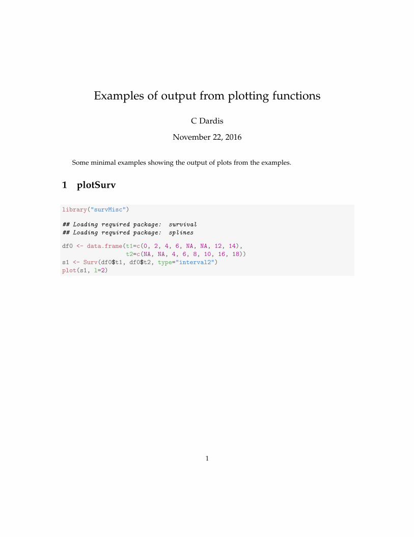
1 plotSurv
library("survMisc")
## Loading required package: survival
## Loading required package: splines
df0 <- data.frame(t1=c(0, 2, 4, 6, NA, NA, 12, 14),
t2=c(NA, NA, 4, 6, 8, 10, 16, 18))
s1 <- Surv(df0$t1, df0$t2, type="interval2")
plot(s1, l=2)
1

2 autoplot.Ten
The ’autoplot’ function is a generic S3 method used by ’ggplot2’.
2.1 Simple examples
2
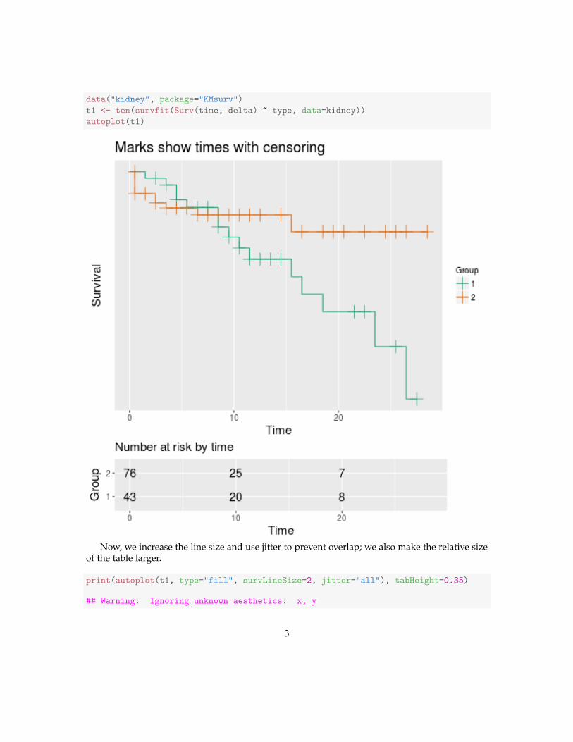
data("kidney", package="KMsurv")
t1 <- ten(survfit(Surv(time, delta) ~ type, data=kidney))
autoplot(t1)
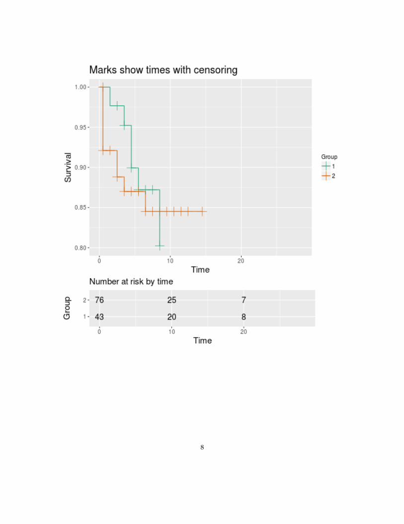
Now, we increase the line size and use jitter to prevent overlap; we also make the relative sizeof the table larger.
print(autoplot(t1, type="fill", survLineSize=2, jitter="all"), tabHeight=0.35)
## Warning: Ignoring unknown aesthetics: x, y
3
## Warning: Ignoring unknown aesthetics: x, y
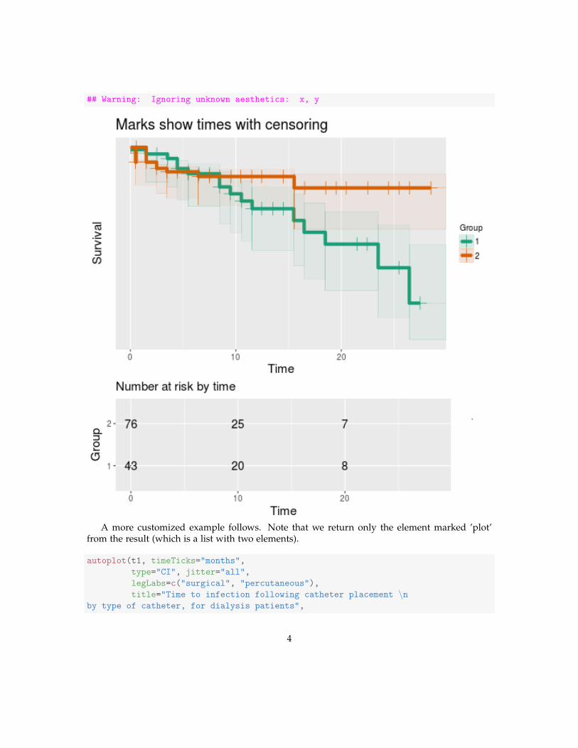
A more customized example follows. Note that we return only the element marked ’plot’from the result (which is a list with two elements).
autoplot(t1, timeTicks="months",
type="CI", jitter="all",
legLabs=c("surgical", "percutaneous"),
title="Time to infection following catheter placement \nby type of catheter, for dialysis patients",
4
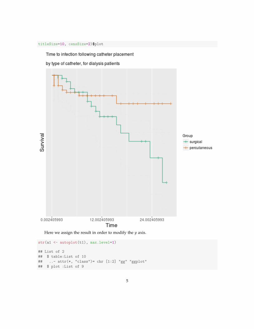
titleSize=10, censSize=2)$plot
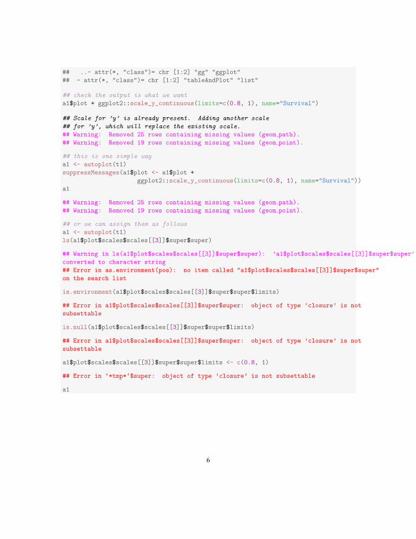
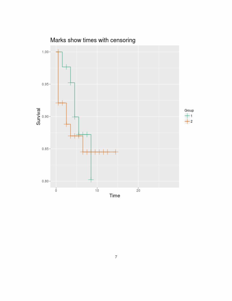
Here we assign the result in order to modify the y axis.
str(a1 <- autoplot(t1), max.level=1)
## List of 2
## $ table:List of 10
## ..- attr(*, "class")= chr [1:2] "gg" "ggplot"
## $ plot :List of 9
5
## ..- attr(*, "class")= chr [1:2] "gg" "ggplot"
## - attr(*, "class")= chr [1:2] "tableAndPlot" "list"
## check the output is what we want
a1$plot + ggplot2::scale_y_continuous(limits=c(0.8, 1), name="Survival")
## Scale for ’y’ is already present. Adding another scale
## for ’y’, which will replace the existing scale.
## Warning: Removed 25 rows containing missing values (geom path).
## Warning: Removed 19 rows containing missing values (geom point).
## this is one simple way
a1 <- autoplot(t1)
suppressMessages(a1$plot <- a1$plot +
ggplot2::scale_y_continuous(limits=c(0.8, 1), name="Survival"))
a1
## Warning: Removed 25 rows containing missing values (geom path).
## Warning: Removed 19 rows containing missing values (geom point).
## or we can assign them as follows
a1 <- autoplot(t1)
ls(a1$plot$scales$scales[[3]]$super$super)
## Warning in ls(a1$plot$scales$scales[[3]]$super$super): ’a1$plot$scales$scales[[3]]$super$super’
converted to character string
## Error in as.environment(pos): no item called "a1$plot$scales$scales[[3]]$super$super"
on the search list
is.environment(a1$plot$scales$scales[[3]]$super$super$limits)
## Error in a1$plot$scales$scales[[3]]$super$super: object of type ’closure’ is not
subsettable
is.null(a1$plot$scales$scales[[3]]$super$super$limits)
## Error in a1$plot$scales$scales[[3]]$super$super: object of type ’closure’ is not
subsettable
a1$plot$scales$scales[[3]]$super$super$limits <- c(0.8, 1)
## Error in ‘*tmp*‘$super: object of type ’closure’ is not subsettable
a1
6
7
8
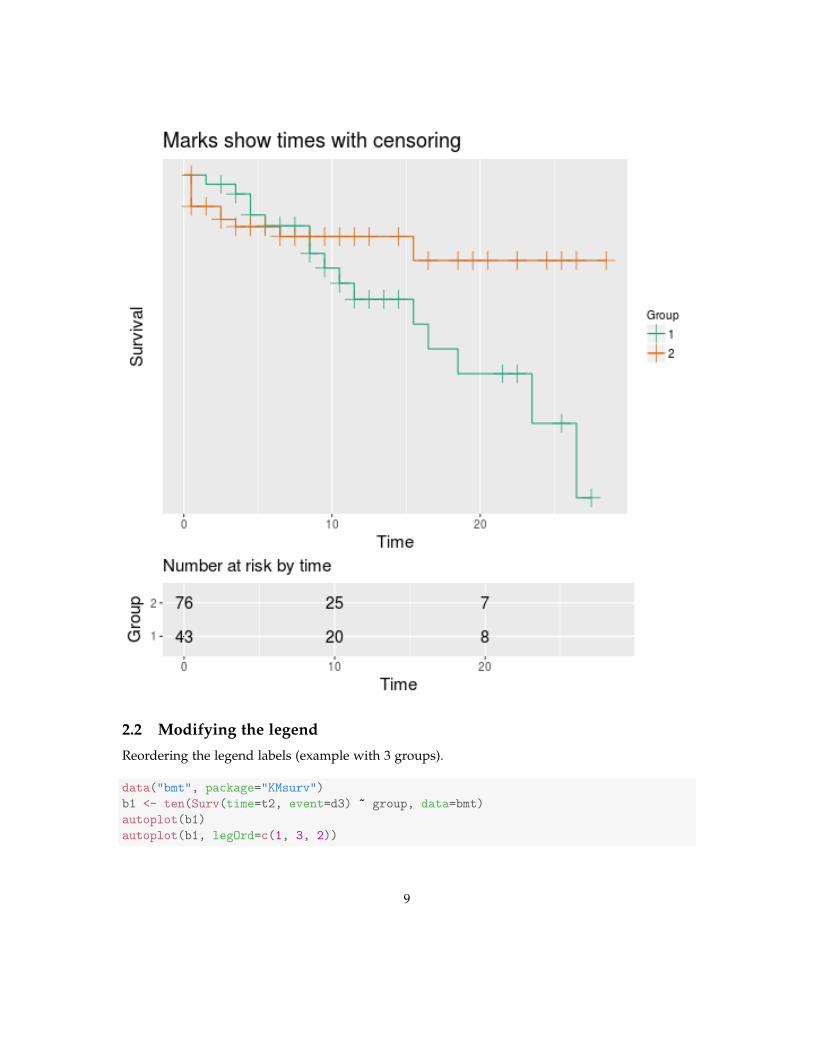
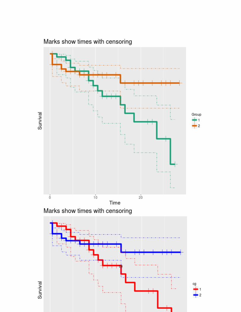
2.2 Modifying the legend
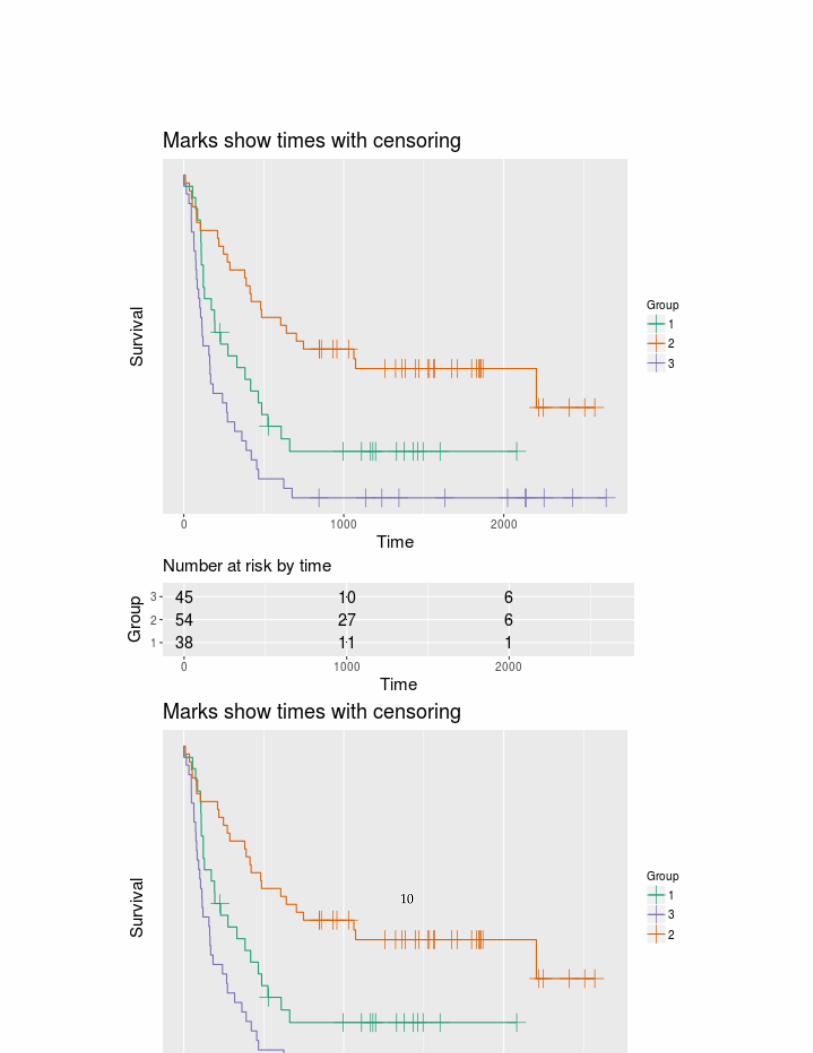
Reordering the legend labels (example with 3 groups).
data("bmt", package="KMsurv")
b1 <- ten(Surv(time=t2, event=d3) ~ group, data=bmt)
autoplot(b1)
autoplot(b1, legOrd=c(1, 3, 2))
9
10
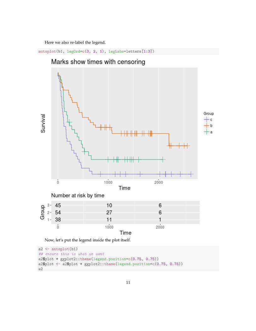
Here we also re-label the legend.
autoplot(b1, legOrd=c(3, 2, 1), legLabs=letters[1:3])
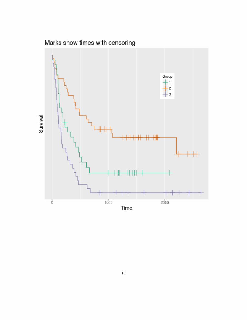
Now, let’s put the legend inside the plot itself.
a2 <- autoplot(b1)
## ensure this is what we want
a2$plot + ggplot2::theme(legend.position=c(0.75, 0.75))
a2$plot <- a2$plot + ggplot2::theme(legend.position=c(0.75, 0.75))
a2
11
12
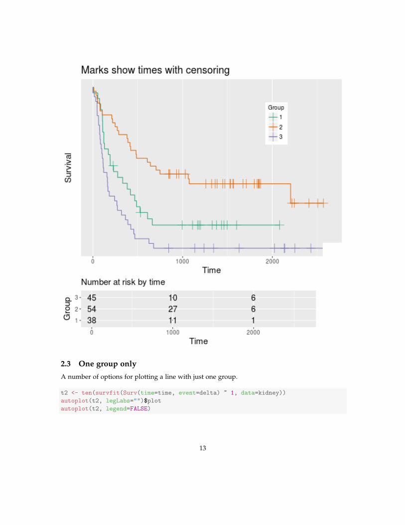
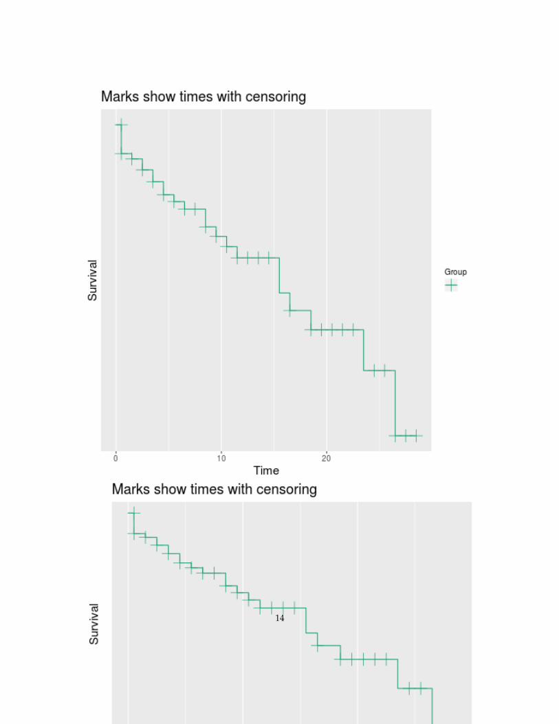
2.3 One group only
A number of options for plotting a line with just one group.
t2 <- ten(survfit(Surv(time=time, event=delta) ~ 1, data=kidney))
autoplot(t2, legLabs="")$plot
autoplot(t2, legend=FALSE)
13
14
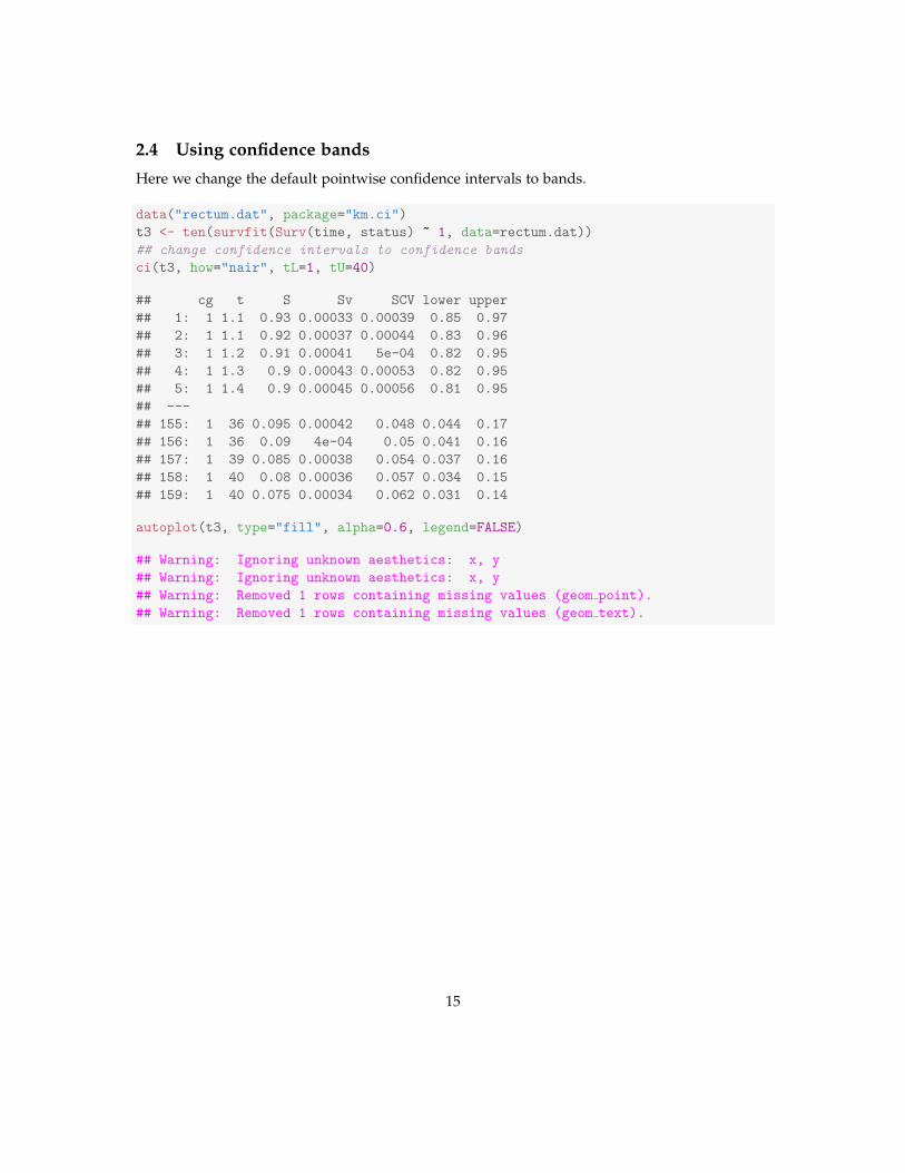
2.4 Using confidence bands
Here we change the default pointwise confidence intervals to bands.
data("rectum.dat", package="km.ci")
t3 <- ten(survfit(Surv(time, status) ~ 1, data=rectum.dat))
## change confidence intervals to confidence bands
ci(t3, how="nair", tL=1, tU=40)
## cg t S Sv SCV lower upper
## 1: 1 1.1 0.93 0.00033 0.00039 0.85 0.97
## 2: 1 1.1 0.92 0.00037 0.00044 0.83 0.96
## 3: 1 1.2 0.91 0.00041 5e-04 0.82 0.95
## 4: 1 1.3 0.9 0.00043 0.00053 0.82 0.95
## 5: 1 1.4 0.9 0.00045 0.00056 0.81 0.95
## ---
## 155: 1 36 0.095 0.00042 0.048 0.044 0.17
## 156: 1 36 0.09 4e-04 0.05 0.041 0.16
## 157: 1 39 0.085 0.00038 0.054 0.037 0.16
## 158: 1 40 0.08 0.00036 0.057 0.034 0.15
## 159: 1 40 0.075 0.00034 0.062 0.031 0.14
autoplot(t3, type="fill", alpha=0.6, legend=FALSE)
## Warning: Ignoring unknown aesthetics: x, y
## Warning: Ignoring unknown aesthetics: x, y
## Warning: Removed 1 rows containing missing values (geom point).
## Warning: Removed 1 rows containing missing values (geom text).
15
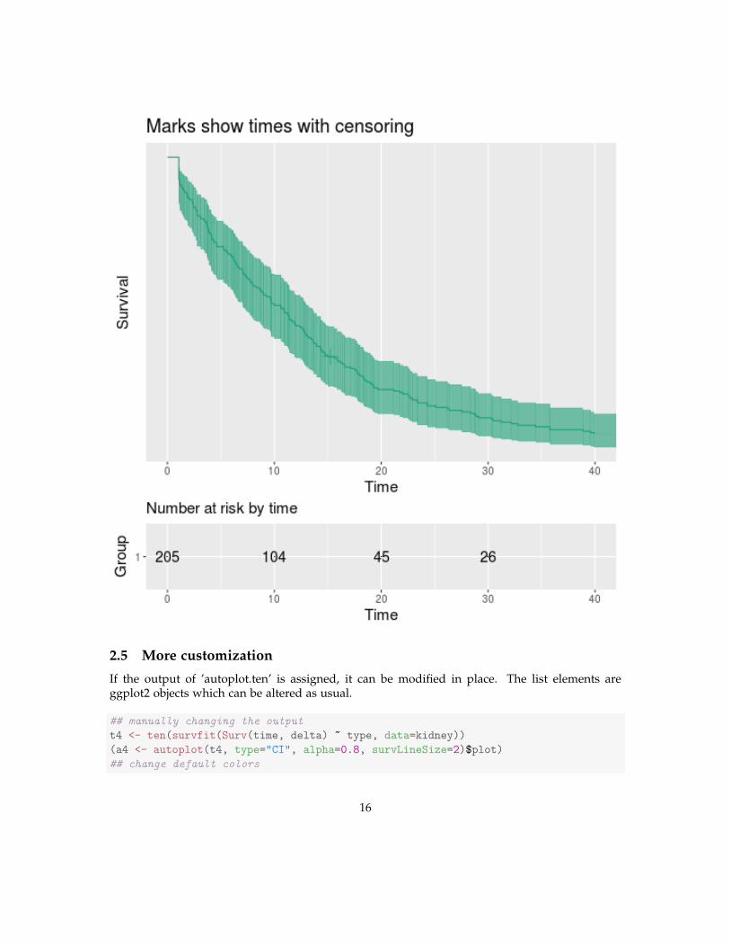
2.5 More customization
If the output of ’autoplot.ten’ is assigned, it can be modified in place. The list elements areggplot2 objects which can be altered as usual.
## manually changing the output
t4 <- ten(survfit(Surv(time, delta) ~ type, data=kidney))
(a4 <- autoplot(t4, type="CI", alpha=0.8, survLineSize=2)$plot)
## change default colors
16

suppressMessages(a4 + list(
ggplot2::scale_color_manual(values=c("red", "blue")),
ggplot2::scale_fill_manual(values=c("red", "blue"))))
## change limits of y-axis
suppressMessages(a4 + ggplot2::scale_y_continuous(limits=c(0, 1)))
17
18
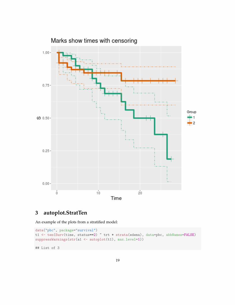
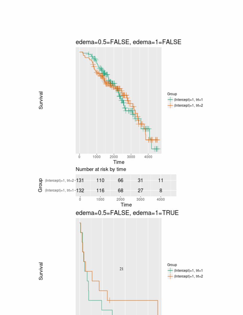
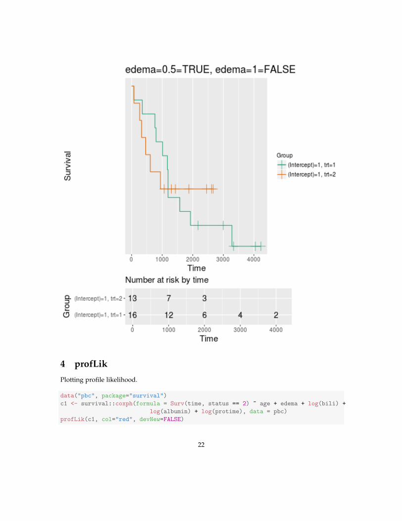
3 autoplot.StratTen
An example of the plots from a stratified model:
data("pbc", package="survival")
t1 <- ten(Surv(time, status==2) ~ trt + strata(edema), data=pbc, abbNames=FALSE)
suppressWarnings(str(a1 <- autoplot(t1), max.level=1))
## List of 3
19
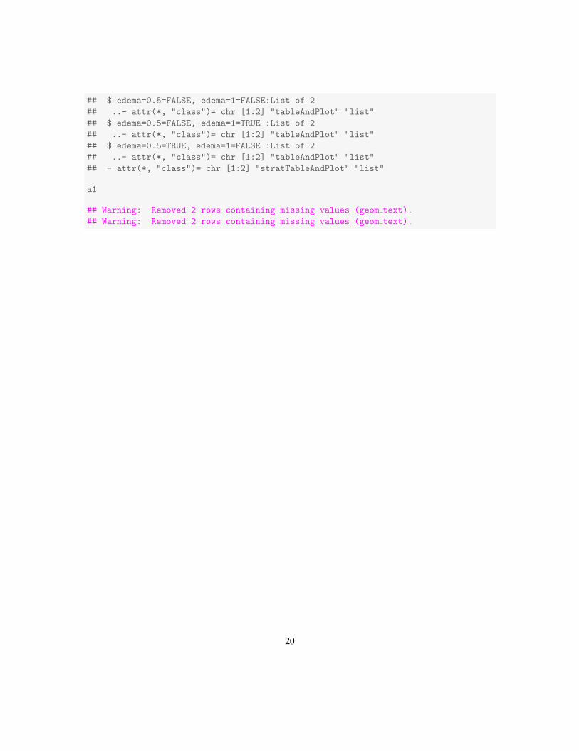
## $ edema=0.5=FALSE, edema=1=FALSE:List of 2
## ..- attr(*, "class")= chr [1:2] "tableAndPlot" "list"
## $ edema=0.5=FALSE, edema=1=TRUE :List of 2
## ..- attr(*, "class")= chr [1:2] "tableAndPlot" "list"
## $ edema=0.5=TRUE, edema=1=FALSE :List of 2
## ..- attr(*, "class")= chr [1:2] "tableAndPlot" "list"
## - attr(*, "class")= chr [1:2] "stratTableAndPlot" "list"
a1
## Warning: Removed 2 rows containing missing values (geom text).
## Warning: Removed 2 rows containing missing values (geom text).
20
21
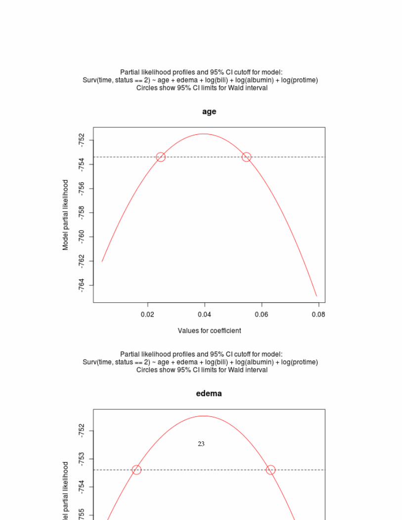
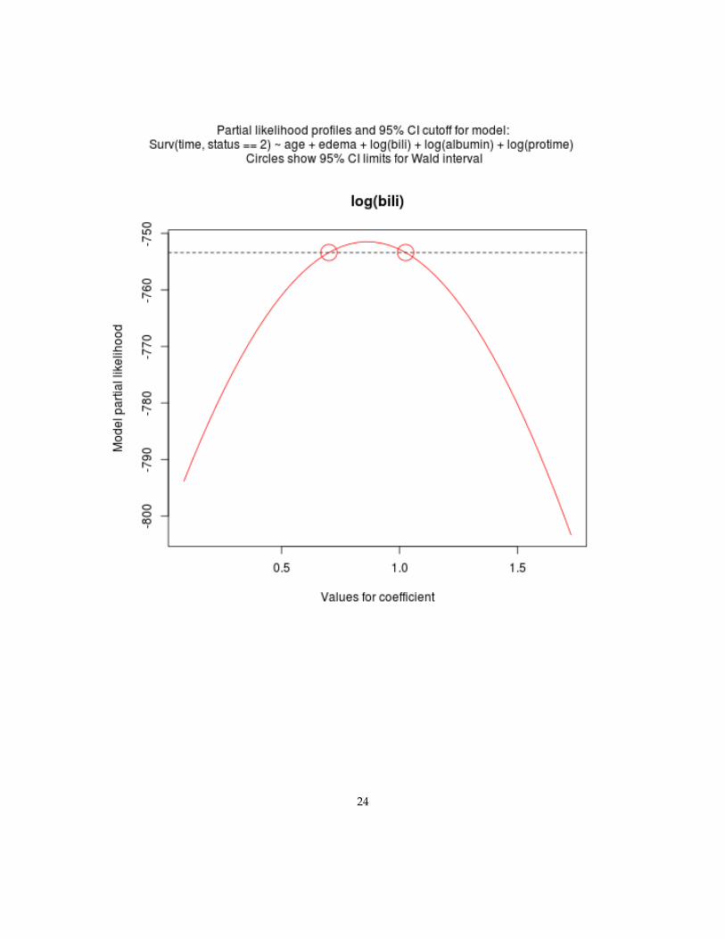
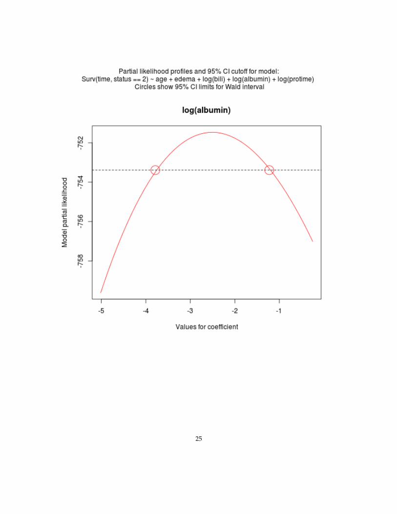
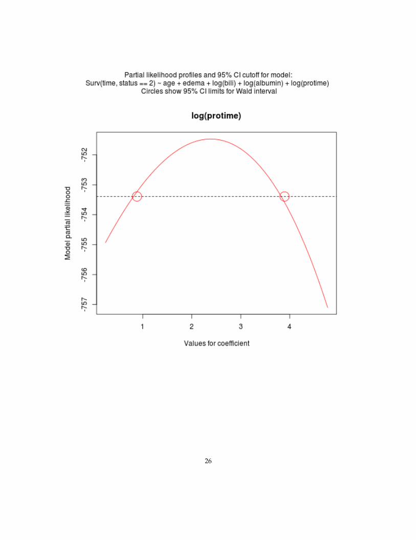
4 profLik
Plotting profile likelihood.
data("pbc", package="survival")
c1 <- survival::coxph(formula = Surv(time, status == 2) ~ age + edema + log(bili) +
log(albumin) + log(protime), data = pbc)
profLik(c1, col="red", devNew=FALSE)
22
23
24
25
26