evaluation question one
TRANSCRIPT

IN WHAT WAYS DOES YOUR MEDIA PRODUCT
USE, DEVELOP OR CHALLENGE FORMS AND CONVENTIONS OF REAL
MEDIA PRODUCTS?

On my magazine I have drawn inspiration from the cover of Spin magazine. Placing a white title on a coloured background in the top left corner is something Spin do to great effect, being the reason I have chosen this for my title location and design. The location of my title will make it easier for potential customers to see when the magazine itself is on shelves, making it the most effective location.
I have chosen, like Spin magazine, to have my two cover models stand on the left and right side of the cover. Placing it on the side is a look that works extremely well for Spin, so I hoped to echo it with my image.
Further drawing inspiration from Spin, I have chosen to have my cover lines on the side of the cover placed atop one of my main images. A line to divide the different cover lines and their subheadings is also something that works to help the reader distinguish between the different cover lines. The choice to do this on my magazine is something that will make my cover more legible and more appealing to the reader.
I have chosen to have a collection of the bands in my magazine in the top right corner of the magazine. This yet again is a convention of Spin magazine, making it of great inspiration for my media product. Doing this helps give the audience and idea of the sort of bands that my magazine covers and – more importantly – what genre of music my magazine covers. This makes the inclusion of this on my cover vital, as new readers will easily be informed of what my magazine is about at a quick glance.
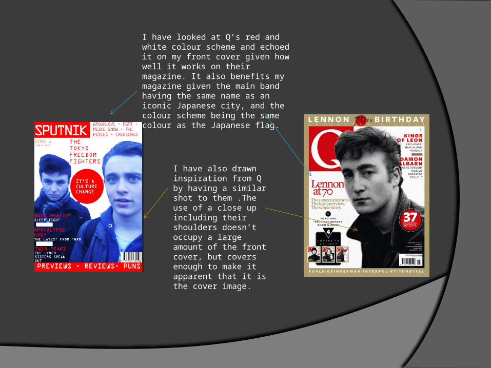
I have looked at Q’s red and white colour scheme and echoed it on my front cover given how well it works on their magazine. It also benefits my magazine given the main band having the same name as an iconic Japanese city, and the colour scheme being the same colour as the Japanese flag.
I have also drawn inspiration from Q by having a similar shot to them .The use of a close up including their shoulders doesn’t occupy a large amount of the front cover, but covers enough to make it apparent that it is the cover image.
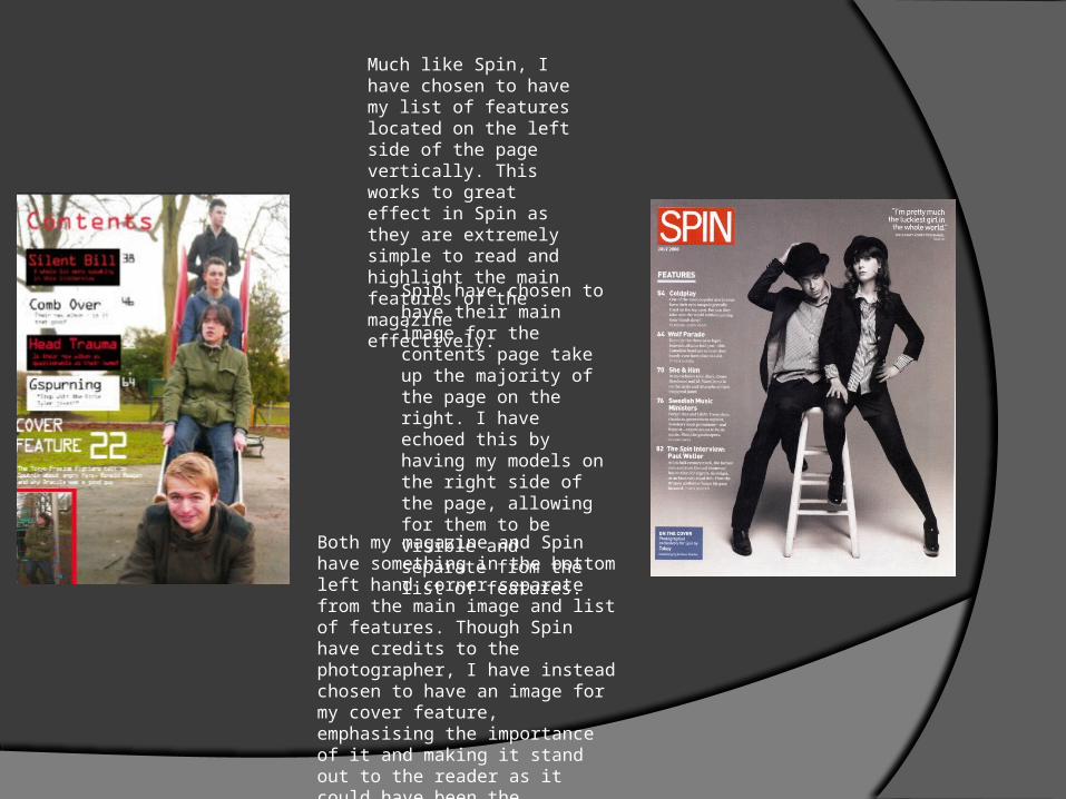
Much like Spin, I have chosen to have my list of features located on the left side of the page vertically. This works to great effect in Spin as they are extremely simple to read and highlight the main features of the magazine effectively.
Spin have chosen to have their main image for the contents page take up the majority of the page on the right. I have echoed this by having my models on the right side of the page, allowing for them to be visible and separate from the list of features.
Both my magazine and Spin have something in the bottom left hand corner separate from the main image and list of features. Though Spin have credits to the photographer, I have instead chosen to have an image for my cover feature, emphasising the importance of it and making it stand out to the reader as it could have been the persuasive feature in them buying the magazine.

Mojo have used a pull quote on their contents page to try and attract people to the magazine and give them an idea of what the magazine article itself contains, as well as proving to the reader that Ringo Starr himself has had an interview with the magazine. This is something I have chosen to echo as it engages and interests the reader, making them desire to read on.
Mojo have chosen to emphasise the cover story by separating it from the rest of the features. This shows the importance of the cover story as it could be the pivotal reason for the reader choosing to purchase the magazine, making it the most important feature of the whole magazine. This motivated me to have the cover story stand out from the rest of the features on the contents page/

Mojo’s double page spread uses a consistent colour scheme of black and white. In turn, I have taken inspiration from this and I have my own colour scheme for my magazine, which suits the overall design of it, involving both the cover and the contents page
The very first letter of the article is much bigger than any other piece of text on the page. This is a common convention of music magazines, and a convention that I have adopted for my own magazine as it gives the reader a clear indicator of where the article starts.