evaluation
TRANSCRIPT
Evaluation
By Jake Worgan

Who would be the audience for your product?

My Stereotypical Reader Tom is 20 years old. He spends his week sat at an office
waiting for the weekend. Tom's interests include festivals, gigs and the latest music. Tom likes to spend time with his friends and is often found at pubs listening to local bands whilst having a few drinks. He likes to have a good time but appreciates he has a job and commitments, therefore he is sensible yet humorous. Tom listens to mostly rock music with bands such as Oasis, Courteeners and the Libertines but will quite happily sit and listen to a recent mixtape from artists such as Kendrick Lamar or a catchy dance tune from Avicii.
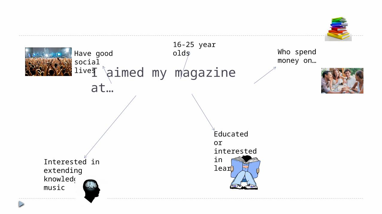
I aimed my magazine at…
16-25 year olds
Educated or interested in learning
Have good social lives
Interested in extending knowledge on music
Who spend money on…

The gap in the market I believe I have found a gap in the market and I am trying to
take advantage of this gap by creating a, hopefully, unique magazine which will be appealing. The reason my target age is 16-25 is because the magazine is not gossip. My magazine is supposed to be intellectual with aspects of humour therefore I felt that this age in which people follow the most recent music seriously would be an ideal age. I did not go below 16 as the maturity of the magazine or the content may not be appealing to youngers as they crave pure entertainment. I did not go above 25 as I thought that this is the age in which people begin to start reliving songs from their childhood as oppose to following new music seriously.
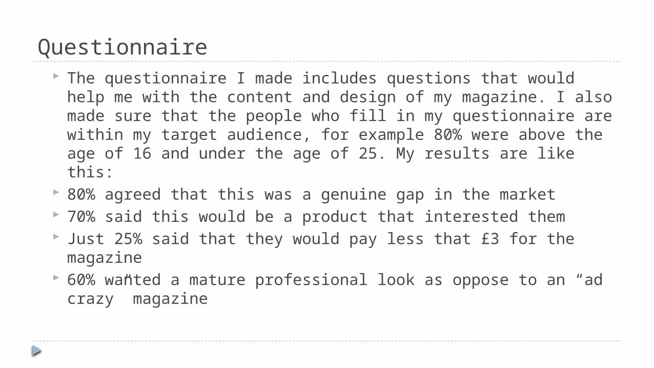
Questionnaire The questionnaire I made includes questions that would help me with
the content and design of my magazine. I also made sure that the people who fill in my questionnaire are within my target audience, for example 80% were above the age of 16 and under the age of 25. My results are like this:
80% agreed that this was a genuine gap in the market 70% said this would be a product that interested them Just 25% said that they would pay less that £3 for the magazine 60% wanted a mature professional look as oppose to an “ad crazy”
magazine
How did you attract/address your audience?
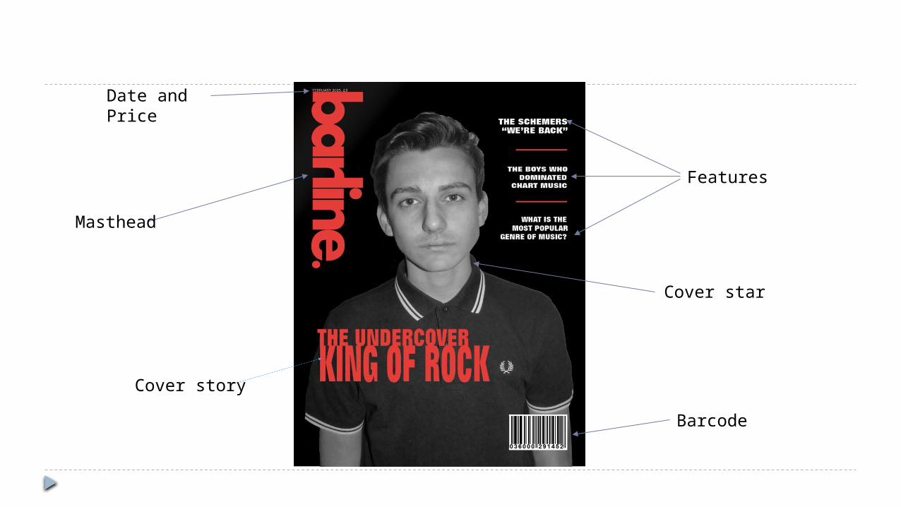
Masthead
Cover star
Date and Price
Barcode
Features
Cover story
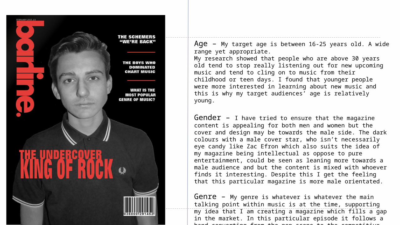
Age – My target age is between 16-25 years old. A wide range yet appropriate. My research showed that people who are above 30 years old tend to stop really listening out for new upcoming music and tend to cling on to music from their childhood or teen days. I found that younger people were more interested in learning about new music and this is why my target audiences’ age is relatively young.
Gender – I have tried to ensure that the magazine content is appealing for both men and women but the cover and design may be towards the male side. The dark colours with a male cover star, who isn’t necessarily eye candy like Zac Efron which also suits the idea of my magazine being intellectual as oppose to pure entertainment, could be seen as leaning more towards a male audience and but the content is mixed with whoever finds it interesting. Despite this I get the feeling that this particular magazine is more male orientated.
Genre – My genre is whatever is whatever the main talking point within music is at the time, supporting my idea that I am creating a magazine which fills a gap in the market. In this particular episode it follows a band converting from the pop scene to the competitive area of underground rock. For this particular magazine I have gone with a dark underground look to support the new look of my fictionary band “The Schemers.”
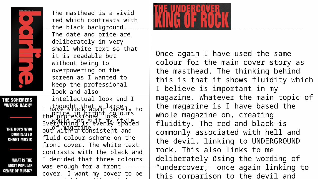
The masthead is a vivid red which contrasts with the black background. The date and price are deliberately in very small white text so that it is readable but without being to overpowering on the screen as I wanted to keep the professional look and also intellectual look and I thought that a large price in bright colours would not suit my style of magazine
Once again I have used the same colour for the main cover story as the masthead. The thinking behind this is that it shows fluidity which I believe is important in my magazine. Whatever the main topic of the magazine is I have based the whole magazine on, creating fluidity. The red and black is commonly associated with hell and the devil, linking to UNDERGROUND rock. This also links to me deliberately using the wording of “undercover,” once again linking to this comparison to the devil and hell (UNDERground.) Similarly the size of the text is almost as large as my masthead, showing just how important and unmissable this particular article is.
I have stuck again purely to the professional look. Everything is evenly spaced out with a consistent and fluid colour scheme on the front cover. The white text contrasts with the black and I decided that three colours was enough for a front cover. I want my cover to be eye catching without being immature and overpowering, looking as though it’s a childish magazine.
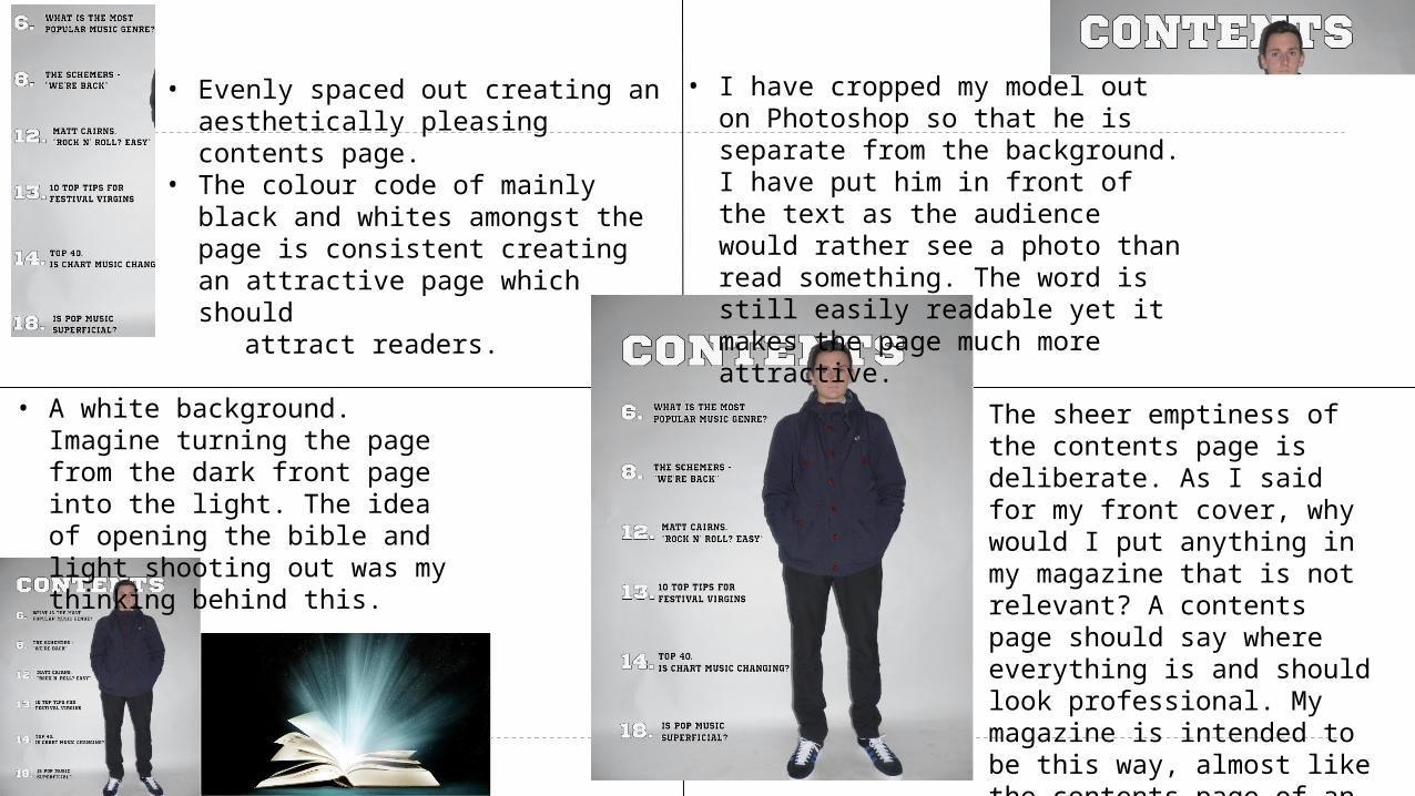
• I have cropped my model out on Photoshop so that he is separate from the background. I have put him in front of the text as the audience would rather see a photo than read something. The word is still easily readable yet it makes the page much more attractive.
• Evenly spaced out creating an aesthetically pleasing contents page.
• The colour code of mainly black and whites amongst the page is consistent creating an attractive page which should
attract readers.
• A white background. Imagine turning the page from the dark front page into the light. The idea of opening the bible and light shooting out was my thinking behind this.
The sheer emptiness of the contents page is deliberate. As I said for my front cover, why would I put anything in my magazine that is not relevant? A contents page should say where everything is and should look professional. My magazine is intended to be this way, almost like the contents page of an intellectual book.
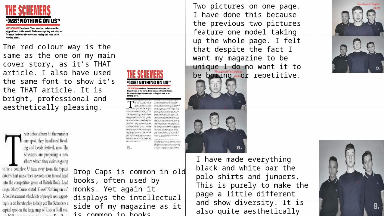
The red colour way is the same as the one on my main cover story, as it’s THAT article. I also have used the same font to show it’s the THAT article. It is bright, professional and aesthetically pleasing.
Two pictures on one page. I have done this because the previous two pictures feature one model taking up the whole page. I felt that despite the fact I want my magazine to be unique I do no want it to be boring, or repetitive.
Drop Caps is common in old books, often used by monks. Yet again it displays the intellectual side of my magazine as it is common in books.
I have made everything black and white bar the polo shirts and jumpers. This is purely to make the page a little different and show diversity. It is also quite aesthetically pleasing.
How does your star represent particular social groups?

Little details My model is an example of intertextuality as the audience
recognise the style of magazine by reading the titles or looking in depth at the clothing and style of my cover star. They gain knowledge subconsciously from simply looking at the front cover.
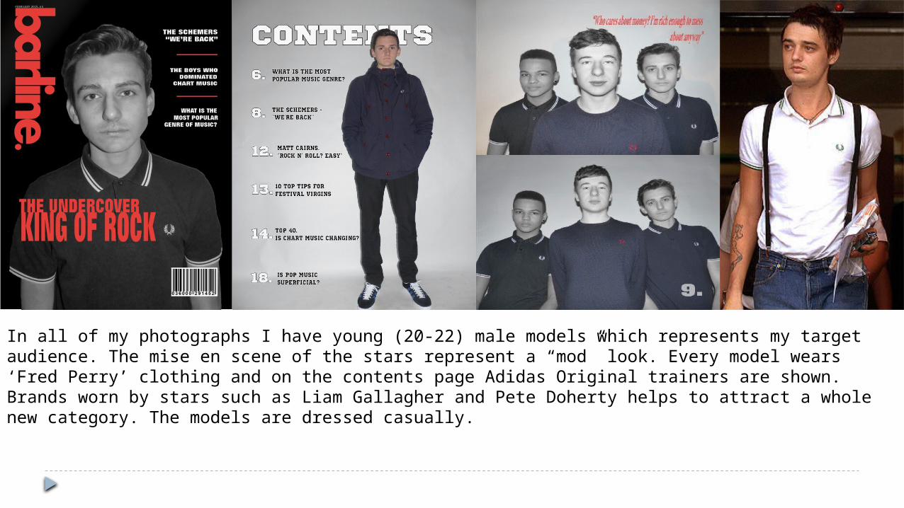
In all of my photographs I have young (20-22) male models which represents my target audience. The mise en scene of the stars represent a “mod” look. Every model wears ‘Fred Perry’ clothing and on the contents page Adidas Original trainers are shown. Brands worn by stars such as Liam Gallagher and Pete Doherty helps to attract a whole new category. The models are dressed casually.
Sexuality and Ethnicity
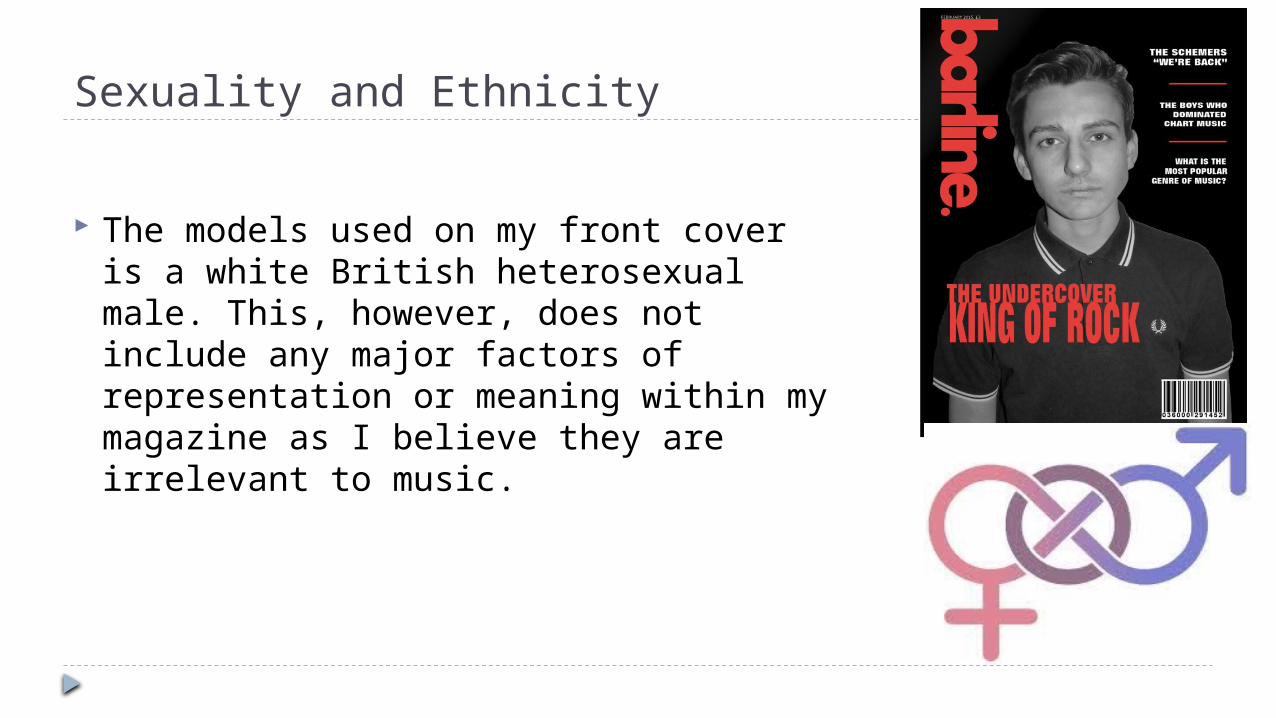
The models used on my front cover is a white British heterosexual male. This, however, does not include any major factors of representation or meaning within my magazine as I believe they are irrelevant to music.

Regional Identity
My magazine is relevant in all regions and therefore I do no think that regional identity is really significant as I cannot pick out a few areas I am aiming my magazine at. All photos are taken indoors so I cannot even analyse the setting or background of images.

Disability
Yet another subculture that has no real representation in my magazine as I believe it has nothing to do with music magazines.

Subcultures: My model is a white British male. This
representation suits the story as Matt and his band are branching into British Rock music which suits

Character association
The link between my “celebrities” and real life celebrities aims to attract a social group to my magazine. Anyone who is familiar with bands such as the Libertines or Courteeners will recognise the logo and make assumptions on the type of music and type of person my cover star represents.
A subtle item of clothing on my cover star hopefully opens a door to a whole new audience to my magazine helping to boost sales.
The look: The laid back and “cool” look which readers will idolise and want to be like. My age group reflects this style as well by being younger and more open with clothing and style.

In what way does your media product use, develop or challenge forms and
conventions of real media products?

The masthead is vertical down the side of the page. It brings diversity to the magazine. Magazines are usually so predictable with multiple magazines having a masthead with the model covering it, this magazine goes against the normal functions and the “ideology” of what a magazine should be like. This level of diversity I found would suit my magazine perfectly as I was trying to find a gap in the market for my magazine.
Iggy Azalea is the main star of this particular issue of “Billboard” magazine and is made large on the page and hardly obstructed by anything by the masthead. This shows her significance.
The small text on the page I found intriguing. Surely you would have large text to attract readers? I created my own philosophical theory about this. If you have smaller text then it shows almost a cockiness that you do not need to go above and beyond to attract your audience. I decided to pass this into my magazine but not to the same extent. I was not a fan of the big paragraph of small text though, I preferred summarising the content of the magazine in one sentence.

Normal magazines, what I wanted to avoid.
All these magazines are popular but represent everything I wanted to avoid. The typical model covering the masthead on the cover is almost a given on every magazine, but not mine. Mine is different, its unique.

My magazine has a masthead vertical down the side. This is unique, like my magazine is. It’s different and shows immediately that this magazine is not your usual music magazine.
My cover star is down the centre of the page with a photo taken in medium close up. This shows how important he is.
The content down the right hand side of my magazine is in small text but with contrasting colours and capital letters it is still easily readable.

I copied the idea of a quote on my double page spread. It gives an immediate taster of what the article is about which is why I thought it would be a good addition to my magazine.
What kind of media institutions might distribute your product?
I did my research and found a company called “Prometheus Global Media.” It refers to itself as a ‘diversified company with leading assets in the media.’ The word “diversified” is what really shone for me and my magazine. My magazine aims to epitomise diverseness and to find a distributor with similar goals. A distributor can help to boost sales so I thought it was important to make sure my magazine is being distributed by an appropriate company and I thought that this distributor would help to boost sales to an audience which will be interested in my magazine and hopefully purchase it again.
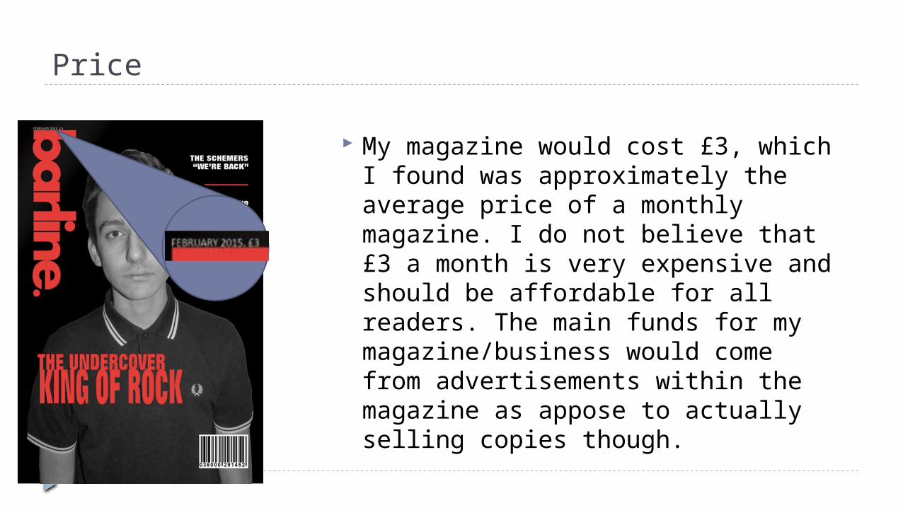
Price
My magazine would cost £3, which I found was approximately the average price of a monthly magazine. I do not believe that £3 a month is very expensive and should be affordable for all readers. The main funds for my magazine/business would come from advertisements within the magazine as appose to actually selling copies though.

Problems in Print Media In modern times, with the rise of the internet and television, printed
media is facing a rapid decline. People tend to prefer to simply research topics that interest them via the internet as oppose to reading aimlessly from a magazine in hope that each page is interesting to them. However, despite the decline in paper copies of magazines being bought, digital copies being sold are soaring high. The magazines cost the same price online on mobile phones or tablets as they do for a paper copy so money is still being cashed into magazine companies. I believe that my magazine is unique, and that is why it will not fail. To recreate a magazine would be pointless, why would you buy a newly established magazine when you could buy a mainstream magazine from a big company? You wouldn’t. There are no mainstream magazine for my genre or bracket of magazine, it is truly unique. Whether digital copies are sold or paper copies are sold my magazine has a promising future as an independent magazine.

The Website
SUBSCRIBE ADVERTISE CAREERS CONTACT
Sneak peak at our next issue…
Title
Relevant images, persuading viewers to click on links.
Online sales. More ways to make money.
NEXT MAGAZINE: PREVIEW Read our interview with The SchemersWe were honoured to be able to get an interview with the stars of the moment, The Schemers. Be sure to pick up the new magazine this February to get a glimpse of their plans for the future.
What is the most popular genre of music?We sent the Barline team out to survey you, the public, to find out what really gets your toes tapping. Will it be a funky house beat or a headbanging rock tune? Found out.
Is pop music superficial?
Sneakpeaks

Merchandise
Apps.
Pens.
T-Shirts
Signature black and red flip flops
Headphones.
All of these are effective ways of not only making money for my company but also, debatably more importantly advertising my magazine and helping to get it universally known.

Merchandise Pens are cheap to make and
cheap to sell. It will be an absolutely tiny percentage of our income but it will also cost a tiny amount to make. The pens suit my audience as it is aimed at people who are trying to study or are interested in education. I believe this could add a snippet of money to the company.
Pens.

Merchandise Headphones is fairly
obvious. For a music magazine to sell headphones suits the target audience instantly, as why would you buy a music magazine if you were not fond of music? They would not be expensive to make and could be sold for an easy profit. I believe this could make my company money.
Headphones.

Merchandise T-Shirts are cheap to
make, can be sold for around £20 each creating a big profit if sold. It also advertises the brand as when people are wearing it out and about people can see it easily and may research it. It is a way to make money and also advertise. A win/win.T-Shirts

Merchandise Flip-flops may not be the most
common form of merchandise but I put deep thought into this. I figured that between the ages 16-25 is the predominant age for summer holidays with friends. A holiday essential is ofcourse, flip flops. Wearing “barline” flip flops can promote the company and are also cheap to make. I did research and found that flip flops can be made at around £2 per pair and can be sold for around £10. £8 profit per pair sold.
Signature black and red flip flops

What have you learnt about technologies from the process of constructing this product?

My front cover: How I made it.
I started by simply creating a black background using the rectangle tool with a black fill. I then created a text box and typed “barline” in. It was easy to rotate the text box and change the colour to my desired red. I had already planned the font, I used ‘Ahorani.’ To get the text closer together I used the text spacing tool and set it to -90.
I used the quick selection tool to remove the background rapidly and to change the my cover star to black and white was easy. I simply clicked the black and white tool which did all the work for me. It took a matter of minutes to edit my photo completely ready for my front cover
The rest of my front cover was simple text boxes which I would just trial and error the positioning until I believed I had found a professional layout.

Contents: How I made it.
I got the original photo on photoshop and cropped Max away from the background. I then pasted the original photo onto my InDesign document and put the Contents text on with a small stroke in position. I then pasted my cropped version of Max onto my InDesign document and placed him exactly on top of where the unedited photo is so that it covers the contents text giving the illusion of the text being sandwiched between the model and the background. I then simple added the numbers by
copying and pasting each text box and changing the numbers. I had to change the number and text for each which wasn’t very hard.
To make sure the white text was easily visible against the white background I had to make sure that I used a stroke with a black outline to solidify the text and make it easily visible. I did this by selecting the stroke option and using a slightly higher weight due to the size of the text.

How I cropped Max
I used photoshop to crop Max out. It was relatively straight forward although I had to use many tools. Firstly, I simply created a text box and typed in “CONTENTS.” I then positioned it so that it was overlapping Max’s head. Thirdly, I opened photoshop and used the quick selection tool to quickly remove the plain white background by highlighting it all and pressing the “Delete” key on the keyboard. I saved this as a separate pdf. file. I then pasted this newly cropped Max and scaled him perfectly on top of the original photo creating the effect that I have peeled Max’s head back, slotted the text behind then glued him back on top. I believe this is subtle yet effective.
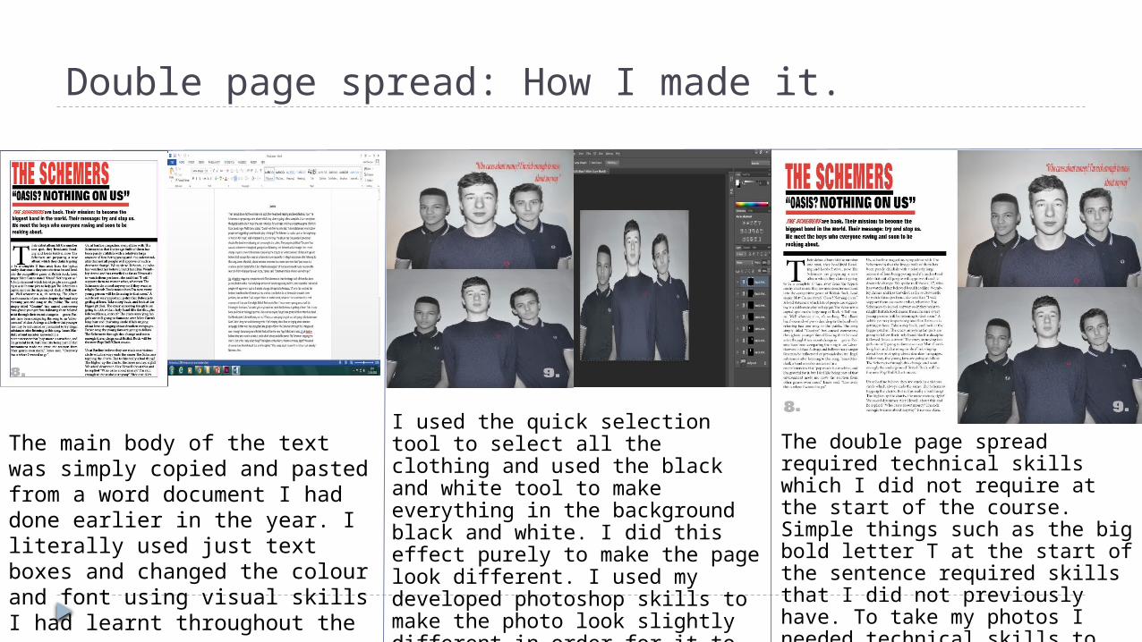
Double page spread: How I made it.
The main body of the text was simply copied and pasted from a word document I had done earlier in the year. I literally used just text boxes and changed the colour and font using visual skills I had learnt throughout the course.
I used the quick selection tool to select all the clothing and used the black and white tool to make everything in the background black and white. I did this effect purely to make the page look different. I used my developed photoshop skills to make the photo look slightly different in order for it to not be seen as boring and simple.
The double page spread required technical skills which I did not require at the start of the course. Simple things such as the big bold letter T at the start of the sentence required skills that I did not previously have. To take my photos I needed technical skills to ensure that the settings were right for the type of photo I wanted. I have learnt a lot.

Looking back at your preliminary task (School Magazine), what do you feel you have learnt in the
process?
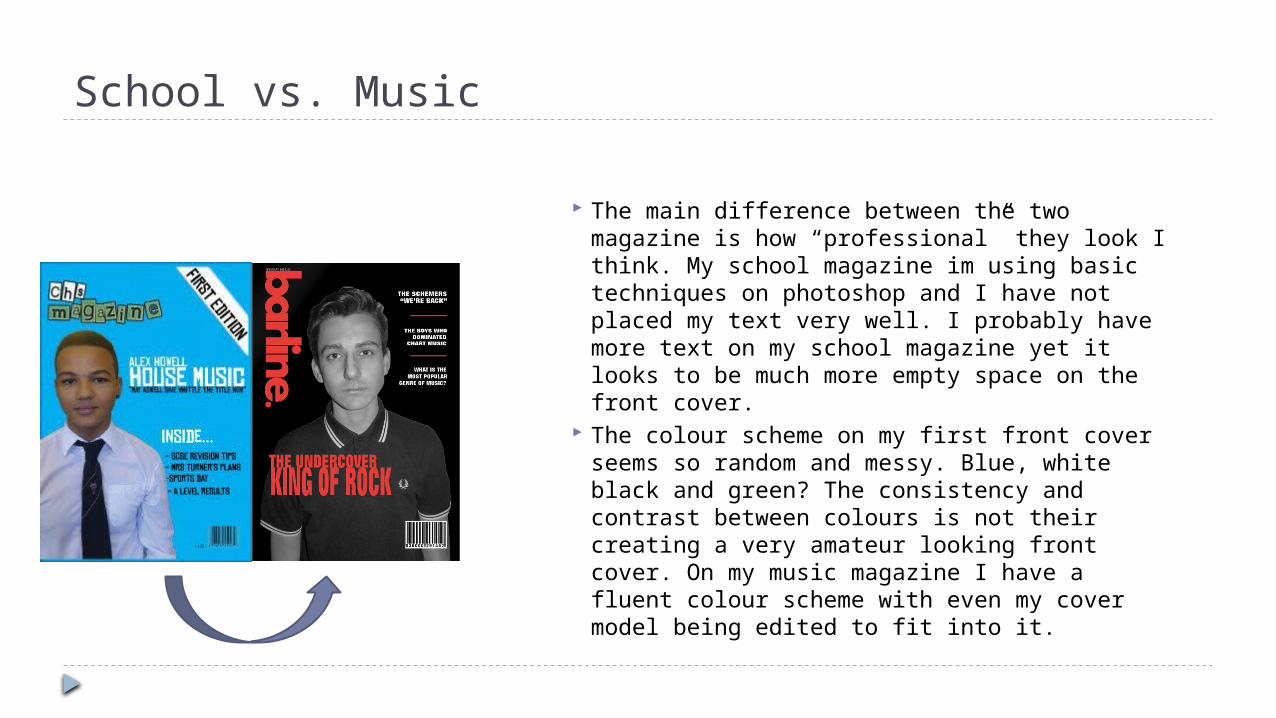
School vs. Music
The main difference between the two magazine is how “professional” they look I think. My school magazine im using basic techniques on photoshop and I have not placed my text very well. I probably have more text on my school magazine yet it looks to be much more empty space on the front cover.
The colour scheme on my first front cover seems so random and messy. Blue, white black and green? The consistency and contrast between colours is not their creating a very amateur looking front cover. On my music magazine I have a fluent colour scheme with even my cover model being edited to fit into it.
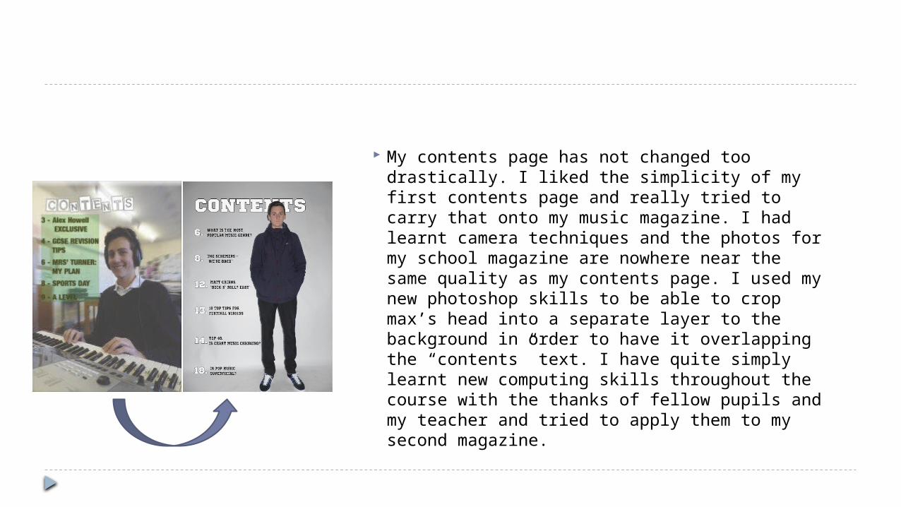
My contents page has not changed too drastically. I liked the simplicity of my first contents page and really tried to carry that onto my music magazine. I had learnt camera techniques and the photos for my school magazine are nowhere near the same quality as my contents page. I used my new photoshop skills to be able to crop max’s head into a separate layer to the background in order to have it overlapping the “contents” text. I have quite simply learnt new computing skills throughout the course with the thanks of fellow pupils and my teacher and tried to apply them to my second magazine.
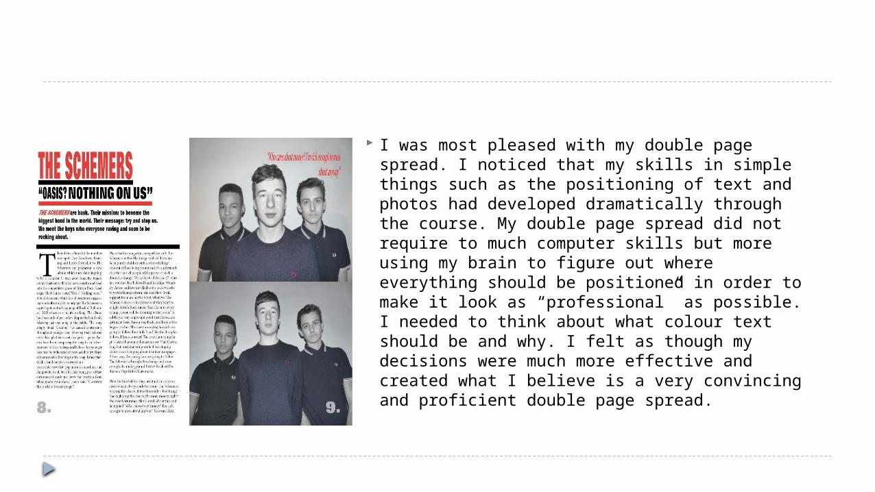
I was most pleased with my double page spread. I noticed that my skills in simple things such as the positioning of text and photos had developed dramatically through the course. My double page spread did not require to much computer skills but more using my brain to figure out where everything should be positioned in order to make it look as “professional” as possible. I needed to think about what colour text should be and why. I felt as though my decisions were much more effective and created what I believe is a very convincing and proficient double page spread.
