emerge magazine devel 3
DESCRIPTION
further development, number 3TRANSCRIPT
www.emergemagazine.co.uk
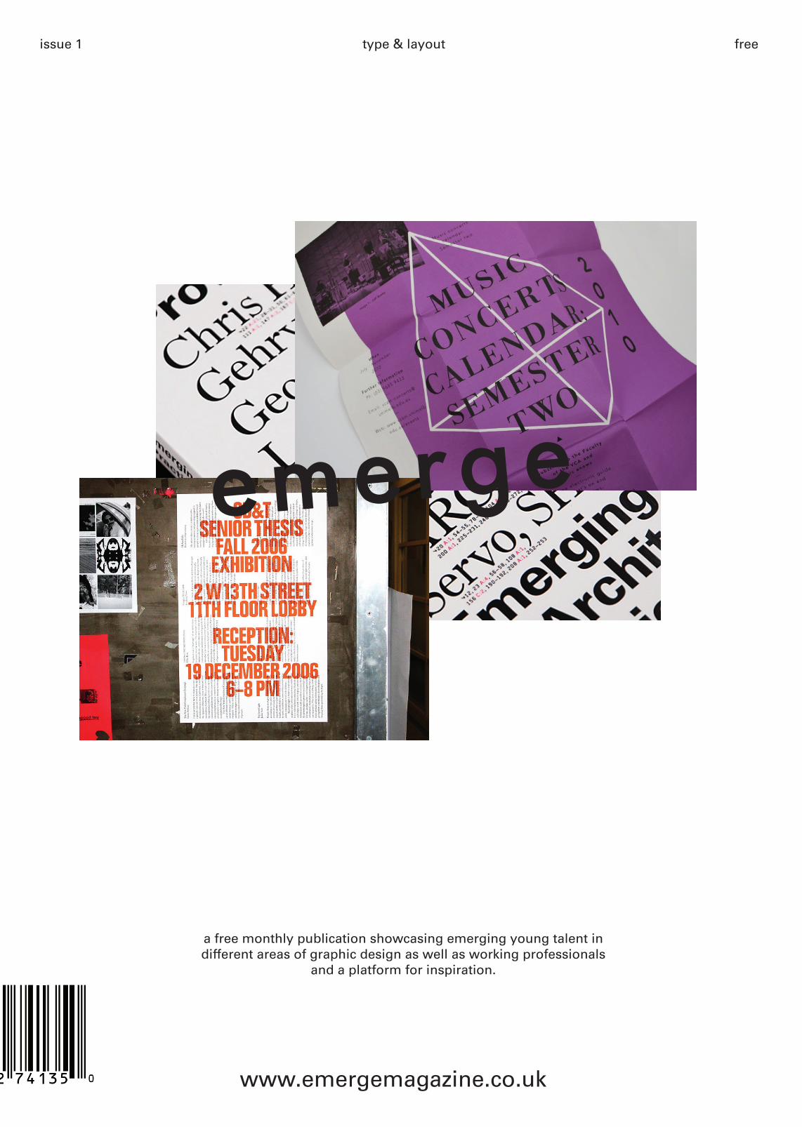
issue 1 free
a free monthly publication showcasing emerging young talent in different areas of graphic design as well as working professionals
and a platform for inspiration.
type & layout
emergeemerge

Welcome to the first issue of Emerge, here at emerge we want to use this publication as a platform to inform, inspire and educate our young readers about emerging
talent, the industry and how to get yourself noticed. Each month we will bring new ideas and issues which arise in contemporary graphic design and each indivud-ual issue will focus on a different theme of design with
relevant features in that area.
Emerge also hosts an online forum on our website for young designers who are doing their degress, post-
grads, diplomas to showcase their work and get feed-back on pieces, whilst also being a place to exchange
ideas and thoughts.
If you’re looking for inspiration closer to home, it’s easy just to cruise Flickr, FFFound or Tumblr until you see
something you like. In our experience, though, some-thing good always seems to happen when you step
away from the screen. If you’re lucky enough to live in a major city such as London you’re spoilt for choice as far as museums and galleries (which, of course, are a
great source of inspiration) are concerned. It seems like the punters agree
In this issue’s profiles we look at the very young and very talented agency Catelogue. Despite only graduat-ing a couple of years ago from Leeds College of Art,
the duo are creating very accomplished work and are a great examples of what happend when you just go for
it.
We’ll also be looking at someone who has beeen around a lot longer, rob giampietro who is a principle at the New York based design studio Project Projects, we invited rob to our regular feature booksheld to talk about the books that has inspired him as a growing
designer and the ones he still turns to for reference as a working professional.
Elsewhere in the magazine we will be showcaseing new emerging talent who have just graduated from dean Pauley from Glasgow and Sueh Li Tan who has
just finished a post-grad in the Netherlands, this show-case shows talent from around Europe and how dif-ferent cultures and experiences have imapacted their
design direction.
issue 01emerge about
emerge p.02 mia porter
www.emergemagazine.co.uk
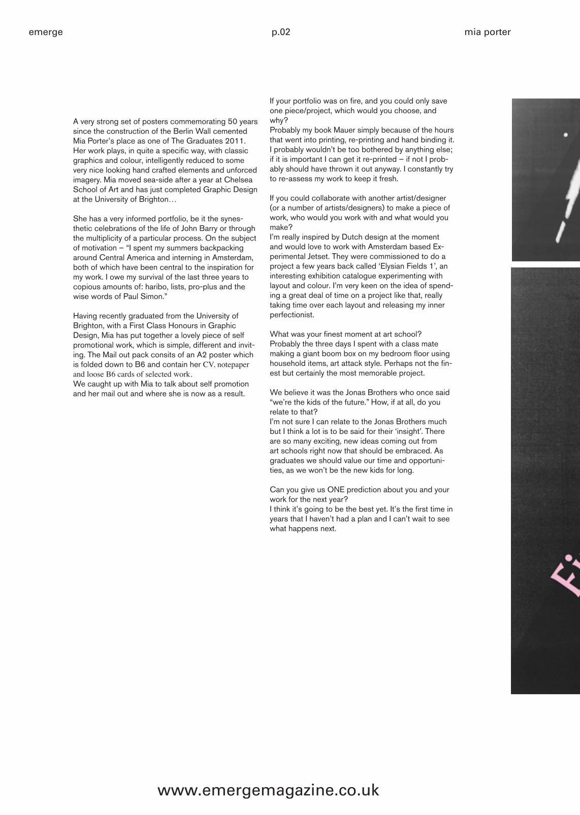
A very strong set of posters commemorating 50 years since the construction of the Berlin Wall cemented Mia Porter’s place as one of The Graduates 2011. Her work plays, in quite a specific way, with classic graphics and colour, intelligently reduced to some very nice looking hand crafted elements and unforced imagery. Mia moved sea-side after a year at Chelsea School of Art and has just completed Graphic Design at the University of Brighton…
She has a very informed portfolio, be it the synes-thetic celebrations of the life of John Barry or through the multiplicity of a particular process. On the subject of motivation – “I spent my summers backpacking around Central America and interning in Amsterdam, both of which have been central to the inspiration for my work. I owe my survival of the last three years to copious amounts of: haribo, lists, pro-plus and the wise words of Paul Simon.”
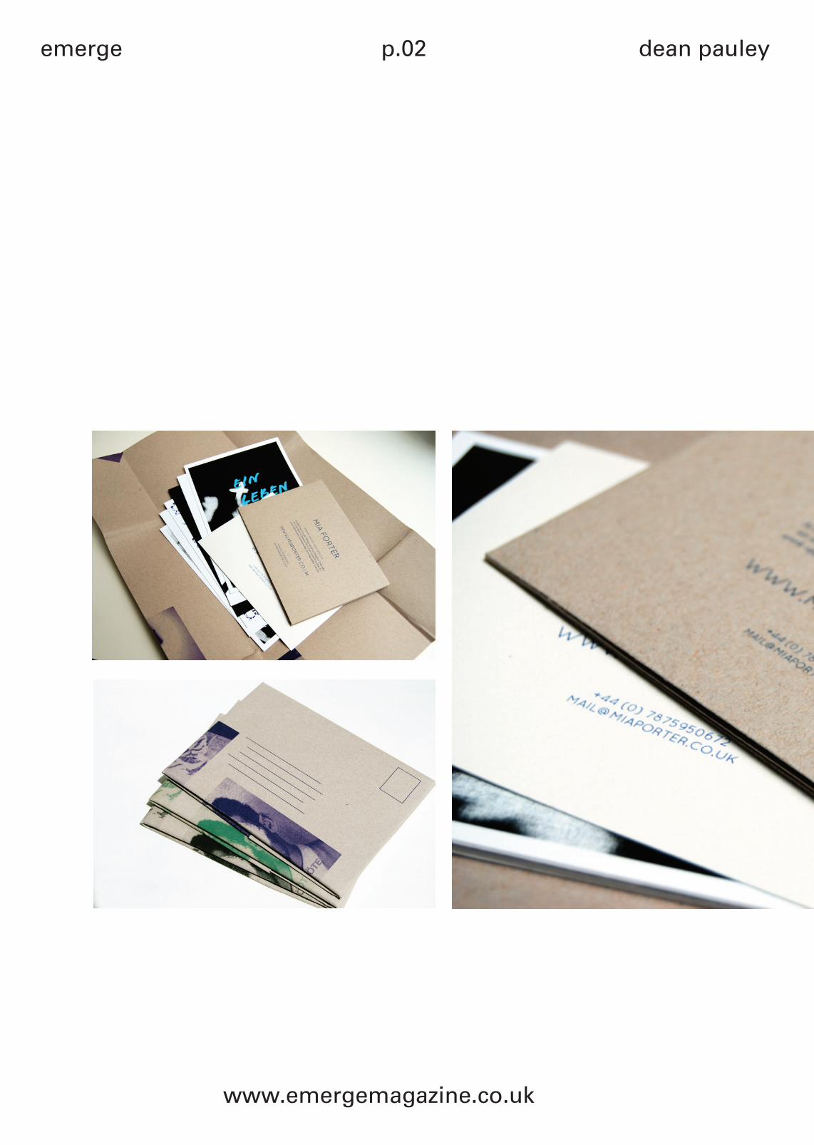
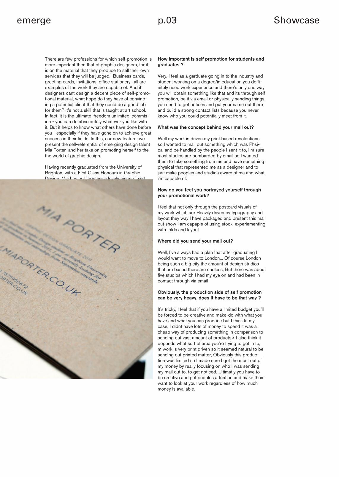
Having recently graduated from the University of Brighton, with a First Class Honours in Graphic Design, Mia has put together a lovely piece of self promotional work, which is simple, different and invit-ing. The Mail out pack consits of an A2 poster which is folded down to B6 and contain her CV, notepaper and loose B6 cards of selected work.We caught up with Mia to talk about self promotion and her mail out and where she is now as a result.
If your portfolio was on fire, and you could only save one piece/project, which would you choose, and why?Probably my book Mauer simply because of the hours that went into printing, re-printing and hand binding it. I probably wouldn’t be too bothered by anything else; if it is important I can get it re-printed – if not I prob-ably should have thrown it out anyway. I constantly try to re-assess my work to keep it fresh.
If you could collaborate with another artist/designer (or a number of artists/designers) to make a piece of work, who would you work with and what would you make?I’m really inspired by Dutch design at the moment and would love to work with Amsterdam based Ex-perimental Jetset. They were commissioned to do a project a few years back called ‘Elysian Fields 1’, an interesting exhibition catalogue experimenting with layout and colour. I’m very keen on the idea of spend-ing a great deal of time on a project like that, really taking time over each layout and releasing my inner perfectionist.
What was your finest moment at art school?Probably the three days I spent with a class mate making a giant boom box on my bedroom floor using household items, art attack style. Perhaps not the fin-est but certainly the most memorable project.
We believe it was the Jonas Brothers who once said “we’re the kids of the future.” How, if at all, do you relate to that?I’m not sure I can relate to the Jonas Brothers much but I think a lot is to be said for their ‘insight’. There are so many exciting, new ideas coming out from art schools right now that should be embraced. As graduates we should value our time and opportuni-ties, as we won’t be the new kids for long.
Can you give us ONE prediction about you and your work for the next year?I think it’s going to be the best yet. It’s the first time in years that I haven’t had a plan and I can’t wait to see what happens next.
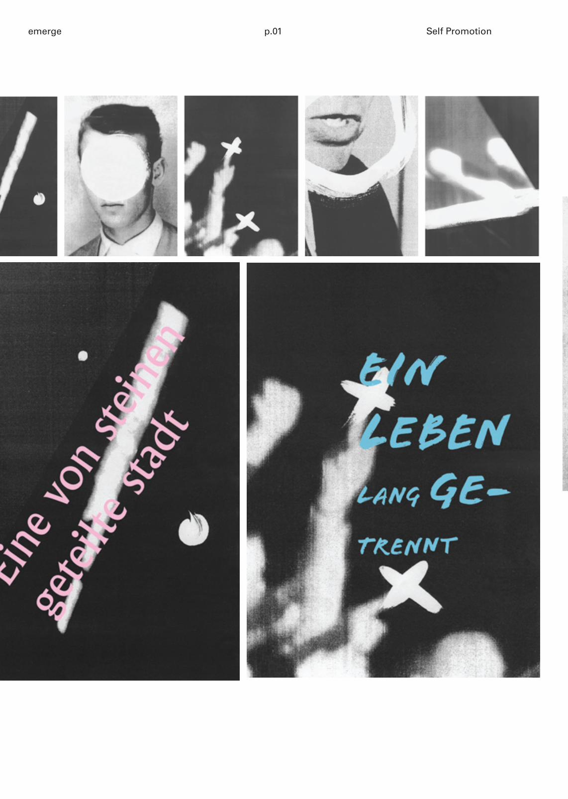
p.01emerge Self Promotion
emerge p.02 dean pauley
www.emergemagazine.co.uk
emerge p.03 Showcase
How important is self promotion for students and graduates ?
Very, I feel as a garduate going in to the industry and student working on a degree/in education you deffi-nitely need work experience and there’s only one way you will obtain something like that and its through self promotion, be it via email or physically sending things you need to get notices and put your name out there and build a strong contact lists because you never know who you could potentially meet from it.
What was the concept behind your mail out?
Well my work is driven my print based resoloutions so I wanted to mail out something which was Phsi-cal and be handled by the people I sent it to, I’m sure most studios are bombarded by email so I wanted them to take something from me and have something physical that represented me as a designer and to just make peoples and studios aware of me and what i’m capable of.
How do you feel you portrayed yourself through your promotional work?
I feel that not only through the postcard visuals of my work which are Heavily driven by typography and layout they way I have packaged and present this mail out show I am capaple of using stock, experiementing with folds and layout
Where did you send your mail out?
Well, I’ve always had a plan that after graduating I would want to move to London... Of course London being such a big city the amount of design studios that are based there are endless, But there was about five studios which I had my eye on and had been in contact through via email
Obviously, the production side of self promotion can be very heavy, does it have to be that way ?
It’s tricky, I feel that if you have a limited budget you’ll be forced to be creative and make-do with what you have and what you can produce but I think In my case, I didnt have lots of money to spend it was a cheap way of producing something in comparison to sending out vast amount of products> I also think it depends what sort of area you’re trying to get in to, m work is very print driven so it seemed natural to be sending out printed matter, Obviously this produc-tion was limited so I made sure I got the most out of my money by really focusing on who I was sending my mail out to, to get noticed. Ultimatly you have to be creative and get peoples attention and make them want to look at your work regardless of how much money is available.
There are few professions for which self-promotion is more important then that of graphic designers, for it is on the material that they produce to sell their own services that they will be judged. Business cards, greeting cards, invitations, office stationery.. all are examples of the work they are capable of. And if designers cant design a decent piece of self-promo-tional material, what hope do they have of convinc-ing a potential client that they could do a good job for them? it’s not a skill that is taught at art school. In fact, it is the ultimate ‘freedom unlimited’ commis-ion - you can do absoloutely whatever you like with it. But it helps to know what others have done before you - especially if they have gone on to achieve great success in their fields. In this, our new feature, we present the self-referential of emerging design talent Mia Porter and her take on promoting herself to the the world of graphic design.
Having recently graduated from the University of Brighton, with a First Class Honours in Graphic Design, Mia has put together a lovely piece of self promotional work, which is simple, different and invit-ing. The Mail out pack consits of an A2 poster which is folded down to B6 and contain her CV, notepaper and loose B6 cards of selected work.We caught up with Mia to talk about self promotion and her mail out and where she is now as a result.
emerge p.04 bookshelf
bookshelfw/ rob giampietro
(project projects)
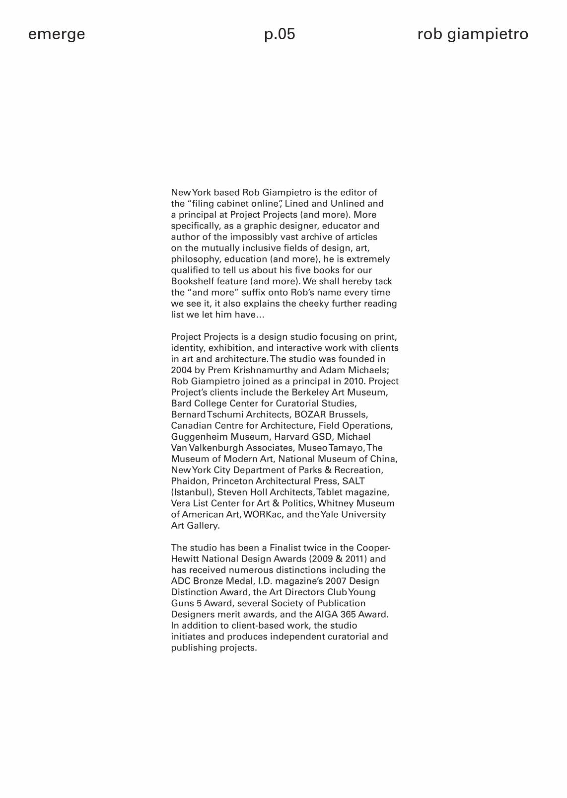
Ever wondered what’s on the bookshelf of some of your favourite creatives? What books they turn to in need of inspiration or refer-ence? Whether they’re a messy Mary or a tidy Tina? Well look no
further, because every issue we invite someone from the creative industries to share with us not only a rundown of their favourite
five books in the whole ruddy world, but also a real-life picture of the shelf on which these esteemed titles live.
emerge p.05 rob giampietro
New York based Rob Giampietro is the editor of the “filing cabinet online”, Lined and Unlined and a principal at Project Projects (and more). More specifically, as a graphic designer, educator and author of the impossibly vast archive of articles on the mutually inclusive fields of design, art, philosophy, education (and more), he is extremely qualified to tell us about his five books for our Bookshelf feature (and more). We shall hereby tack the “and more” suffix onto Rob’s name every time we see it, it also explains the cheeky further reading list we let him have…
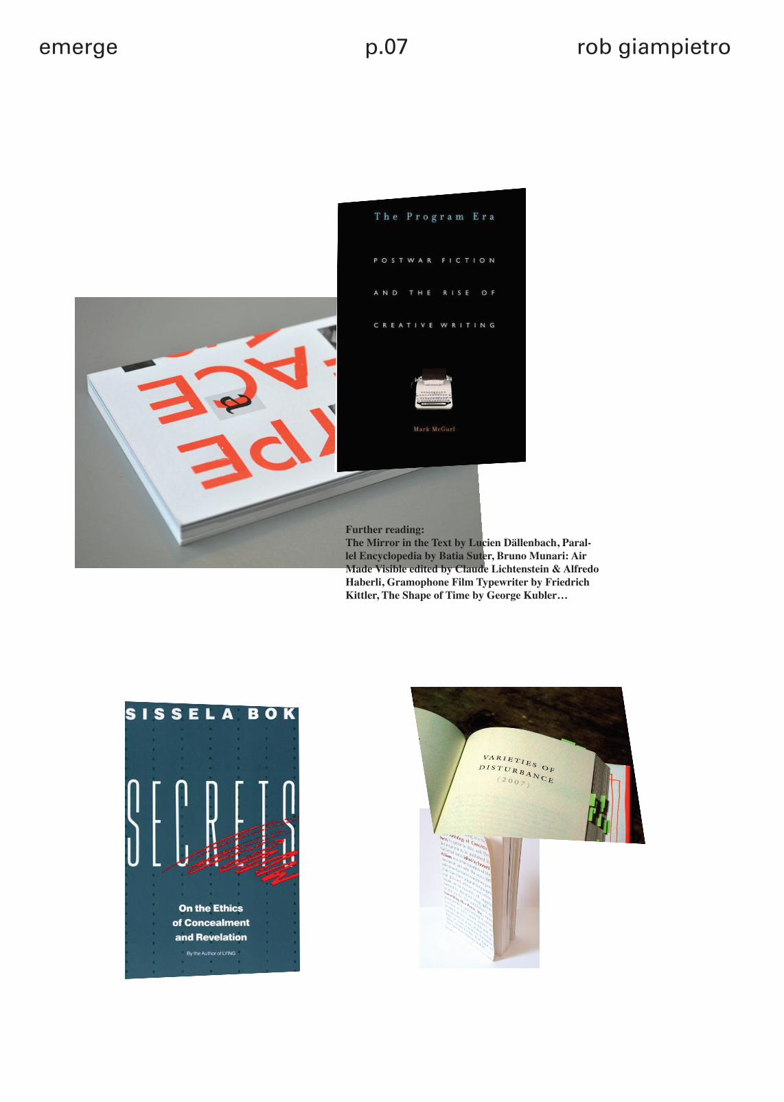
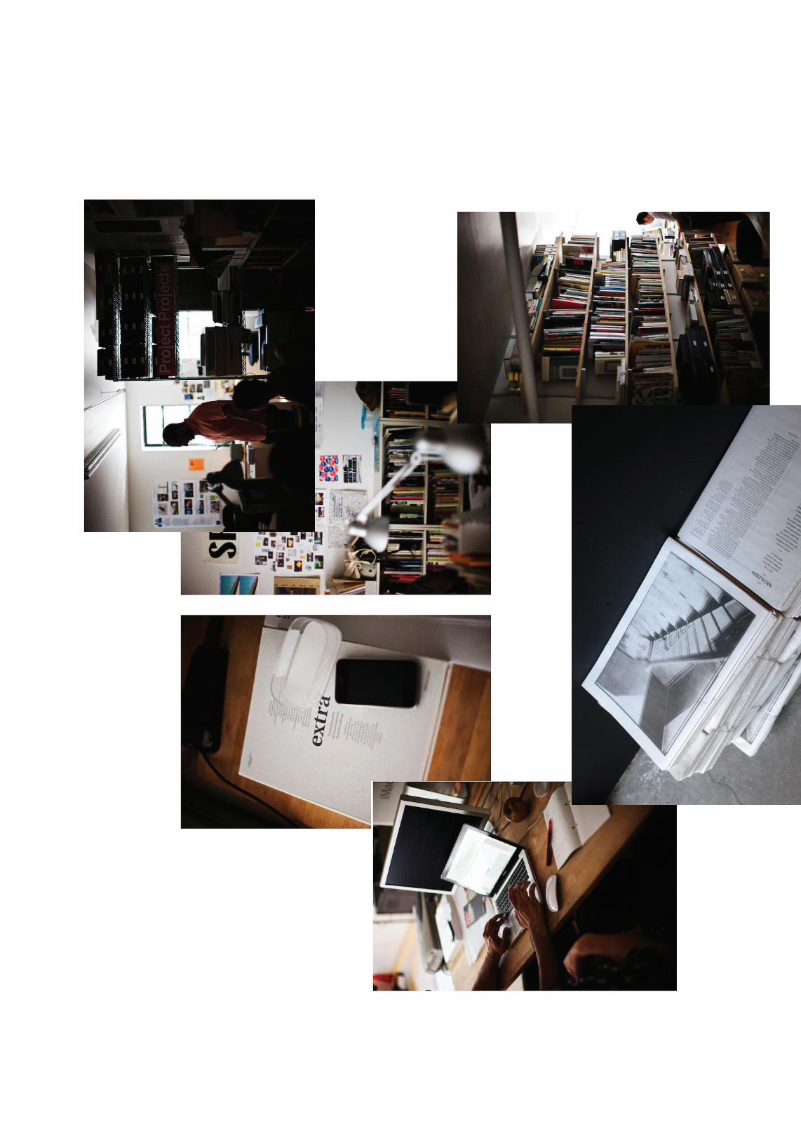
Project Projects is a design studio focusing on print, identity, exhibition, and interactive work with clients in art and architecture. The studio was founded in 2004 by Prem Krishnamurthy and Adam Michaels; Rob Giampietro joined as a principal in 2010. Project Project’s clients include the Berkeley Art Museum, Bard College Center for Curatorial Studies, Bernard Tschumi Architects, BOZAR Brussels, Canadian Centre for Architecture, Field Operations, Guggenheim Museum, Harvard GSD, Michael Van Valkenburgh Associates, Museo Tamayo, The Museum of Modern Art, National Museum of China, New York City Department of Parks & Recreation, Phaidon, Princeton Architectural Press, SALT (Istanbul), Steven Holl Architects, Tablet magazine, Vera List Center for Art & Politics, Whitney Museum of American Art, WORKac, and the Yale University Art Gallery.
The studio has been a Finalist twice in the Cooper-Hewitt National Design Awards (2009 & 2011) and has received numerous distinctions including the ADC Bronze Medal, I.D. magazine’s 2007 Design Distinction Award, the Art Directors Club Young Guns 5 Award, several Society of Publication Designers merit awards, and the AIGA 365 Award. In addition to client-based work, the studio initiates and produces independent curatorial and publishing projects.
emerge p.06 bookshelf
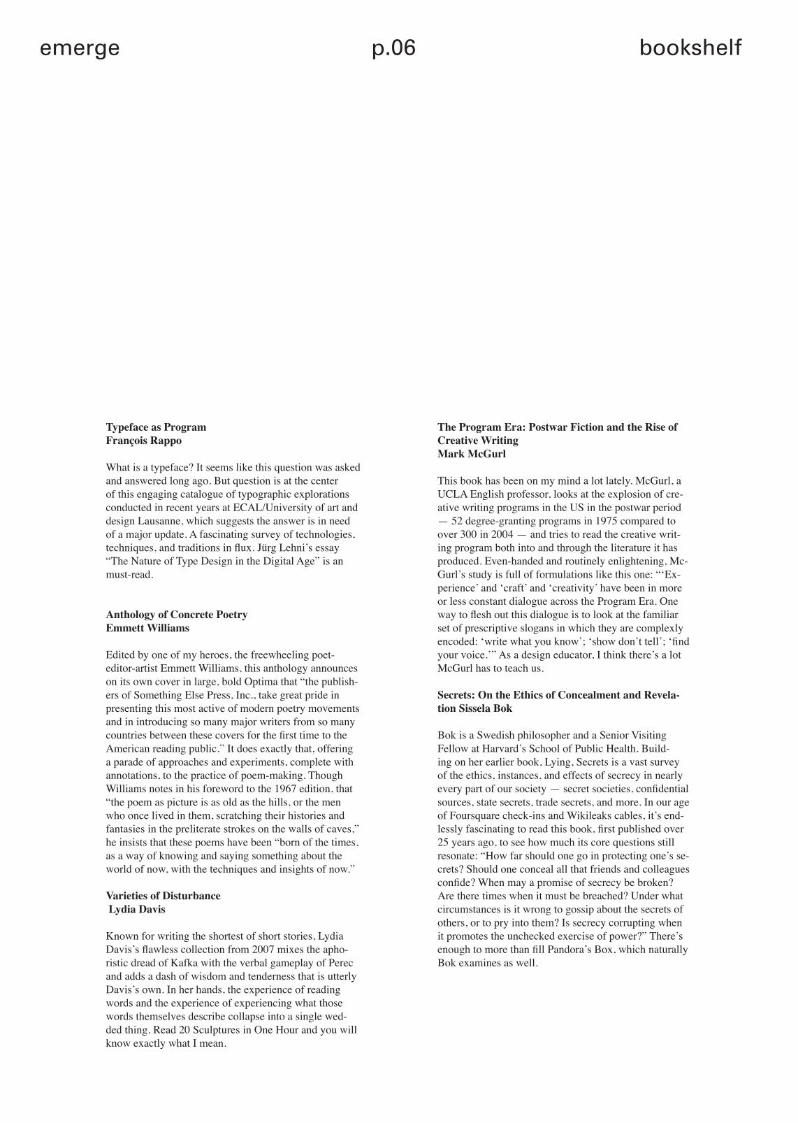
Typeface as ProgramFrançois Rappo
What is a typeface? It seems like this question was asked and answered long ago. But question is at the center of this engaging catalogue of typographic explorations conducted in recent years at ECAL/University of art and design Lausanne, which suggests the answer is in need of a major update. A fascinating survey of technologies, techniques, and traditions in flux. Jürg Lehni’s essay “The Nature of Type Design in the Digital Age” is an must-read.
Anthology of Concrete PoetryEmmett Williams
Edited by one of my heroes, the freewheeling poet-editor-artist Emmett Williams, this anthology announces on its own cover in large, bold Optima that “the publish-ers of Something Else Press, Inc., take great pride in presenting this most active of modern poetry movements and in introducing so many major writers from so many countries between these covers for the first time to the American reading public.” It does exactly that, offering a parade of approaches and experiments, complete with annotations, to the practice of poem-making. Though Williams notes in his foreword to the 1967 edition, that “the poem as picture is as old as the hills, or the men who once lived in them, scratching their histories and fantasies in the preliterate strokes on the walls of caves,” he insists that these poems have been “born of the times, as a way of knowing and saying something about the world of now, with the techniques and insights of now.”
Varieties of Disturbance Lydia Davis
Known for writing the shortest of short stories, Lydia Davis’s flawless collection from 2007 mixes the apho-ristic dread of Kafka with the verbal gameplay of Perec and adds a dash of wisdom and tenderness that is utterly Davis’s own. In her hands, the experience of reading words and the experience of experiencing what those words themselves describe collapse into a single wed-ded thing. Read 20 Sculptures in One Hour and you will know exactly what I mean.
The Program Era: Postwar Fiction and the Rise of Creative Writing Mark McGurl
This book has been on my mind a lot lately. McGurl, a UCLA English professor, looks at the explosion of cre-ative writing programs in the US in the postwar period — 52 degree-granting programs in 1975 compared to over 300 in 2004 — and tries to read the creative writ-ing program both into and through the literature it has produced. Even-handed and routinely enlightening, Mc-Gurl’s study is full of formulations like this one: “‘Ex-perience’ and ‘craft’ and ‘creativity’ have been in more or less constant dialogue across the Program Era. One way to flesh out this dialogue is to look at the familiar set of prescriptive slogans in which they are complexly encoded: ‘write what you know’; ‘show don’t tell’; ‘find your voice.’” As a design educator, I think there’s a lot McGurl has to teach us.
Secrets: On the Ethics of Concealment and Revela-tion Sissela Bok
Bok is a Swedish philosopher and a Senior Visiting Fellow at Harvard’s School of Public Health. Build-ing on her earlier book, Lying, Secrets is a vast survey of the ethics, instances, and effects of secrecy in nearly every part of our society — secret societies, confidential sources, state secrets, trade secrets, and more. In our age of Foursquare check-ins and Wikileaks cables, it’s end-lessly fascinating to read this book, first published over 25 years ago, to see how much its core questions still resonate: “How far should one go in protecting one’s se-crets? Should one conceal all that friends and colleagues confide? When may a promise of secrecy be broken? Are there times when it must be breached? Under what circumstances is it wrong to gossip about the secrets of others, or to pry into them? Is secrecy corrupting when it promotes the unchecked exercise of power?” There’s enough to more than fill Pandora’s Box, which naturally Bok examines as well.
emerge p.07 rob giampietro
Further reading:The Mirror in the Text by Lucien Dällenbach, Paral-lel Encyclopedia by Batia Suter, Bruno Munari: Air Made Visible edited by Claude Lichtenstein & Alfredo Haberli, Gramophone Film Typewriter by Friedrich Kittler, The Shape of Time by George Kubler…

emerge p.010 catelogue
catelogue
emerge p.011 catelogue
New York based Rob Giampietro is the editor of the “filing cabinet online”, Lined and Unlined and a principal at Project Projects (and more). More specifically, as a graphic designer, educator and author of the impossibly vast archive of articles on the mutually inclusive fields of design, art,
philosophy, education (and more), he is extremely qualified to tell us about his five books for our
Bookshelf feature (and more). We shall hereby tack the “and more” suffix onto Rob’s name every time
we see it, it also explains the cheeky further reading list we let him have…
Project Projects is a design studio focusing on print, identity, exhibition, and interactive work with clients
in art and architecture. The studio was founded in 2004 by Prem Krishnamurthy and Adam Michaels;
Rob Giampietro joined as a principal in 2010. Project Project’s clients include the Berkeley Art Museum,
Bard College Center for Curatorial Studies, Bernard Tschumi Architects, BOZAR Brussels,
Canadian Centre for Architecture, Field Operations, Guggenheim Museum, Harvard GSD, Michael
Van Valkenburgh Associates, Museo Tamayo, The Museum of Modern Art, National Museum of China,
New York City Department of Parks & Recreation, Phaidon, Princeton Architectural Press, SALT
(Istanbul), Steven Holl Architects, Tablet magazine, Vera List Center for Art & Politics, Whitney Museum of American Art, WORKac, and the Yale University
Art Gallery.
The studio has been a Finalist twice in the Cooper-Hewitt National Design Awards (2009 & 2011) and has received numerous distinctions including the ADC Bronze Medal, I.D. magazine’s 2007 Design Distinction Award, the Art Directors Club Young Guns 5 Award, several Society of Publication
Designers merit awards, and the AIGA 365 Award. In addition to client-based work, the studio
initiates and produces independent curatorial and publishing projects.
emerge p.12 catelogue
When did you set up Catalogue?Tom: In the final year of our Graphic Design course. We decided that we would like to work together, and initially we had a debate on whether we were going to work full time or part time. When we got the prospectus brief from Leeds College of Art and realised we would have the initial work we needed to start our own studio.
Do you feel the skills that you learned at College have helped you in your professional work?Tom: Ollie and I collaborated on a few projects in our final year and that was encouraged by our tutors who recognised that we had a similar ethos about design and similar ideas, and we worked well together. I suppose this encouraged us to keep working together once we graduated. Ollie: During the course we had screen printing workshops and we were taught how to set work up for print, which was helpful for industry. One of my last tutorials with Fred Bates was really good, and I told him what Tom and I were planning and he was positive and said he could imagine us setting up our own studio, which gave me encouragement.
How did you find setting up your own company?Tom: We did a course in Enterprise and Innovation at College and we have learned as we have gone on from experience.Ollie: We’ve been careful to keep things above board. Having only two of us make things easier to manage as well. Tom: It’s like anything- when you make the transition from being in
education to working for yourself, the direction of the work has to change slightly. The college courses can be more of a personal investigation- you write your own briefs and make the work that you want to be doing. When you step out of that box, into client led work, you can get a big shock when a client turns around and says ‘No, I hate it,’ - you have to learn the hard way how to run your business.
Did you have a role model, or anyone that’s guided you?Tom: Joe Gilmore (artists and tutor at Leeds College of Art) was a big inspiration whilst we were at college because he is a good example of someone who has gone out and started working for themselves, and not compromised his work. He has a lot of integrity which we admire. Ollie: He has never really worked in a big studio environment, which we like. We’d never like to work in a big studio
Did you do any work experience whilst at College?Ollie: Yes, in a small studio, with two guys with a similar set up to ours- they left university and worked in a big publishing company in Harrogate for six to seven years, and decided they would like to work for themselves and teamed up to share work. That’s exactly what Tom and I have done, and I really enjoyed working there. I’ve heard horror stories from friends about larger companies, and they can feel like part of a big machine, and that they are losing their creativity. That’s what I like about the way we work- it’s essentially what we were doing at college. When we get a brief we
can re-write it ourselves and do what we like. We don’t have an overall boss limiting colours and fonts. We haven’t seen a massive transition between college and professional work, which is what a lot of our friends are experiencing.
Do you think that’s because you are good at building contacts and networking?Tom: We do get a lot of work through word of mouth. We’ve been lucky in that respect, we have not had to actively go out looking for work- we’ve been too busy with our current projects which have come from contacts in Leeds.
Do you feel like you are part of a creative community in Leeds?Tom: I would say we are. It seems like more and more people are starting to make things happen, get together more and start new projects and events.Ollie: We have helped other artists and collectives with their projects. We’ve started to work with Joe Gilmore and Nous Vous and we hope to continue working on projects with them.
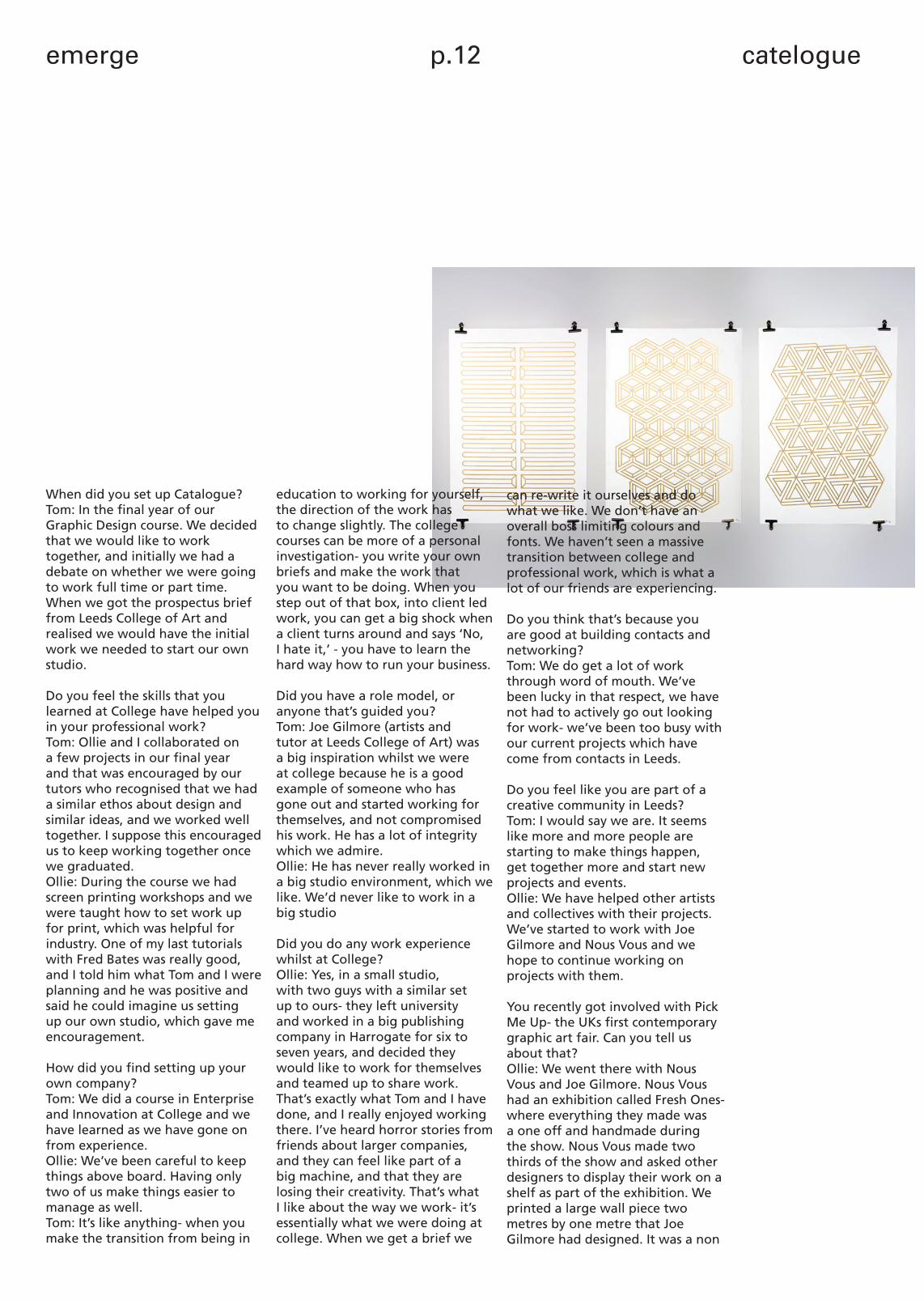
You recently got involved with Pick Me Up- the UKs first contemporary graphic art fair. Can you tell us about that?Ollie: We went there with Nous Vous and Joe Gilmore. Nous Vous had an exhibition called Fresh Ones- where everything they made was a one off and handmade during the show. Nous Vous made two thirds of the show and asked other designers to display their work on a shelf as part of the exhibition. We printed a large wall piece two metres by one metre that Joe Gilmore had designed. It was a non
emerge p.13 catelogue
repetitive pattern made of three tiles. It took about six hours to print, but it was really nice piece.
How is Printshop going?Tom: Better than expected. When we moved into our first office we were daydreaming about buying a screen printing press. When we moved here it seemed a shame not to make use of the space available to us, so we invested in the equipment, to offer the service to clients. We do a lot of printing of t-shirts for bands, design companies and we can screen print all our own stuff. It’s great to be able to design in the office, then go outside and print the work- so many people don’t have that opportunity to do that.
Do you think being in Leeds is important to Catalogue?Ollie: Yes, it’s relatively small place and everyone knows each other, and that works to your advantage.Tom: We don’t feel like we need to go to Networking events as we know a lot of people in Leeds. Networking tends to take place in an informal manner through friends and businesses we know.
Where do you think Catalogue fits into the graphic design market?Tom: We’ve found a niche in the market, as we are one of the only people in Leeds doing clean, organised and modern design. Because we are small, there are only two of us; we can offer that service to smaller companies, with smaller budgets. The other companies that are offering similar designs are in bigger studios and need massive projects to support them.Ollie:We are happy with what
we are doing. We are also a lot more personable than bigger studios- there’s no secretary and communication is easy, you can talk directly to me or Tom.
Have you got a favourite project or client?Tom: We’ve got some work coming up which should be really exciting.Ollie: In the past, I liked the Patrick Oliver books and Vibrations magazine- we like working on books and magazines. We are also really proud of. The Leeds College of Art Prospectus gave the studio got a lot of exposure because the prospectus got plastered all over the design world- it’s been on blogs in many different countries. It’s recently won gold at the Heist awards, which is an incredible achievement, and great recognition for ourselves and the college.
Is that because of how you promoted it?Ollie: We sent it to a few people and it just got passed around and escalated because it’s a nice piece of work. Tom: We think it’s the best prospectus so far for the College, the reason it did so well in Graphic Design world is that it ticks all the boxes, the finishing, the aesthetic- it’s very ‘designed’ and considered. Ollie: The College has helped us a lot with work and I think having the college on our portfolio helps- it boosts our brand and people can trust us to do good work. We like to work for independent companies, the College is a large company, but it’s still independent and not that corporate. It’s nice to work with someone that’s helped us out quite a lot and set us up to be where we are now.
What are your plans for the future?Tom: We’d like to push forward the screen printing- setting up a clothing line independent from Catalogue. Lots of shops in Leeds and London want our t shirts, so we need to capitalise on that.
Would you like to set up your own shop?Tom: Yes, but that would be quite far in the future, but I would never want to stop designing. At the moment it’s great because we can design the t-shirt and print it ourselves in house so we are doing everything we want in one process.
How are you finding running your own company?Tom: We’re really enjoying it- we’ve kept our integrity and we are really happy with the work we produce- we’re not selling out which feels really good.Ollie: Some months can be a little hard, but we can always scrape through. We’ve only been doing this for 9 months, hopefully in a couple of years we’ll still be working for the same type of people, but more frequently.
What advice would you offer to someone that’s still at college?Ollie: Move into an office- don’t try and work from home; being in a professional environment and having to pay rent on a studio helps you to focus. We had a few jobs in the pipeline when we started, so we knew we would have work for the first few months.Tom: Try and keep your integrity and do the work that you want to do. The biggest encouragement for me is that people have chosen to work with us because of our ‘house style’ -people recognise the skill in the work we do and how it can be applied to their projects.
emerge p.14 catelogue
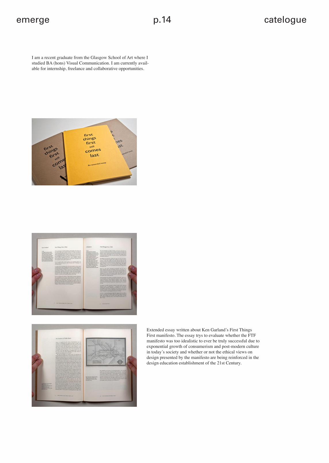
I am a recent graduate from the Glasgow School of Art where I studied BA (hons) Visual Communication. I am currently avail-able for internship, freelance and collaborative opportunities.
Extended essay written about Ken Garland’s First Things First manifesto. The essay trys to evaluate whether the FTF manifesto was too idealistic to ever be truly successful due to exponential growth of consumerism and post-modern culture in today’s society and whether or not the ethical views on design presented by the manifesto are being reinforced in the design education establishment of the 21st Century.
emerge p.15 catelogue
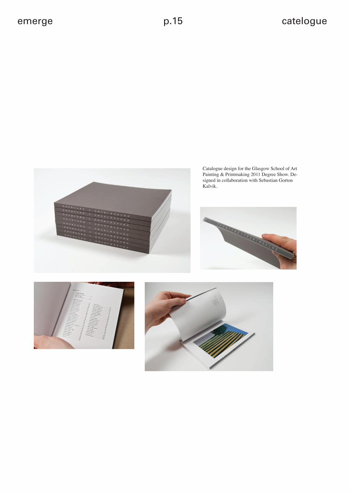
Catalogue design for the Glasgow School of Art Painting & Printmaking 2011 Degree Show. De-signed in collaboration with Sebastian Gorton Kalvik.
emerge
p.16
ww
w.e
mer
gem
agaz
ine.
co.u
kSueh Li Tan
Are interships an unavoidable necessity for design graduates ?
Not necessarily. Interships are just one part of the learning process for young designers.
What’s the best advice you’ve ever recieved?
If you’re not enjoying what you’re doing while working on a certain project, you aren’t on the right teack. w
Tell us about your work with Martin Frostner.
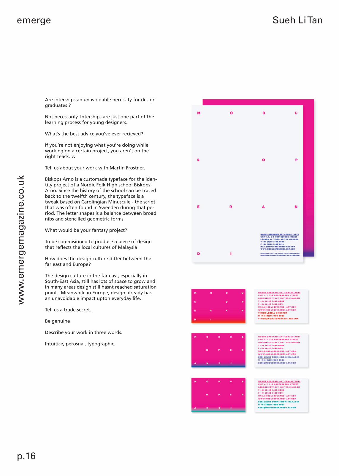
Biskops Arno is a customade typeface for the iden-tity project of a Nordic Folk High school Biskops Arno. Since the history of the school can be traced back to the twelfth century, the typeface is a tweak based on Carolingian Minuscule - the script that was often found in Sweeden during that pe-riod. The letter shapes is a balance between broad nibs and stencilled geometric forms.
What would be your fantasy project?
To be commisioned to produce a piece of design that reflects the local cultures of Malaysia
How does the design culture differ between the far east and Europe?
The design culture in the far east, especially in South-East Asia, still has lots of space to grow and in many areas design still hasnt reached saturation point. Meanwhile in Europe, design already has an unavoidable impact upton everyday life.
Tell us a trade secret.
Be genuine
Describe your work in three words. Intuitice, perosnal, typographic.
p.17
bookshelfw
ww
.emerg
emagazin
e.co.u
k
emerge p.18 credits
emerge talent
Student of the Month does exactly what it says on the tin. We want to showcase the very best in student talent from all over the world, in an exciting monthly feature. If you count technicians amongst your best friends, and if someone other than you can be held responsible for your education, we would love you to submit your work.
Any level of education counts: Foundation, BA, MA, and their international equivalents. We will be selecting submissions on an individual project basis, which means you should be submitting what you believe to be your very best project to date. We are aware, from our own Art School experiences, that projects can vary in scale, format and medium, so here are some submission guidelines…
Text + Links
We need specifics first:– your full name– full course title– place of study– what year you’re currently in.
Next, send through a paragraph (of no more then 150 words) about you, your project, and when the work was made. We’ll be back in touch for more information if you are selected.We also need to know relevant links. If you have an online presence – be it a blog, website, youtube channel, flickr account, tumblr, university portfolio site, etc. – send the information over.
Videos
If you’re submitting a video/moving image piece, please include a link to YouTube or Vimeo. You can also include any relevant stills or process shots, which leads us to….
Images
– a maximum of five images, preferably landscape, at 705 pixels wide. (Portrait images will be subject to some serious cropping.)– all images should be from the same project. If there is only one outcome to your project, you might consider process shots, or a “jazzy angle”.– include them as single attachments within the email, preferably not as zips or pdfs.Lastly, some important things to remember: – you may only submit one project at a time– send in only one project per month– lastly, please refrain from submitting the same project more then once.
When submitting work, please title the email “Student of the Month”, and send [email protected] you are the Student of the Month you will of course have your project featured on the site and receive a subscription to the It’s Nice That magazine.

credits issuesp.19emerge
