edgcm.columbiaedgcm.columbia.edu/documentation/eva_manual_v1.6.pdf version 1.6. ... 2.3 the plot...
TRANSCRIPT

EVA: EdGCM Visualization Application
http://edgcm.columbia.edu
Version 1.6

EVA: EdGCM Visualization Application© 2003-2009 Columbia University
All rights reserved.
* * * * *
* * * * *
EVA was developed under the auspices of the EdGCM Project of Columbia University.
The EdGCM Project acknowledges the support of the National Science Foundation, Division of Atmospheric Science—Paleoclimate Program, and
by the Earth Science programs at NASA.

Contents
1. Introduction to EVA 1
1.1 Installing EVA 1
1.1.1 Mac OS X 2
1.1.2 Windows XP/Vista 2
1.2 Upgrading EVA 2
2. Using the Components of EVA 3
2.1 The Data Browser 3
2.2 The Map Window 4
2.2.1 The Map Window ToolBar for 2-D Arrays 6
2.2.2 The Map Window ToolBar for Vertical Slices 13
2.3 The Plot Window 14
2.4 Math Operations: Differencing Maps and Plots 19
3. Additional Information 25
3.1 Setting Preferences 25
3.2 Troubleshooting 28
EVA Manualiv

EVA Manual1
1. Introduction to EVA
EVA is a free visualization tool created for use specifically with output files produced by EdGCM. Launched from within EdGCM, it allows users to smoothly proceed from post-processing of model output to visualization of data. However, EVA can also be launched as a stand-alone application, making it possible for users to view EdGCM’s climate model output without EdGCM itself running.
EVA provides users with the ability:
• Create map projections (latitude v. longitude) • Create vertical images of the atmosphere (latitude v. pressure) • Produce line plots of time series and zonal averages • Perform basic math operations of data (differencing)
EVA is written using the powerful IDL language for scientific visualization as well as REALBasic, and can run on both Mac OS X and Windows XP/Vista.
System Requirements
For Mac, EVA requires Mac OS X 10.3 (“Panther”) or later; Mac OS X 10.5 (“Leopard”) is recommended. For Windows, EVA requires Windows XP or Vista.
1.1 Installing EVA Separate installation of EVA is normally not required, as it is included in the EdGCM installation package. Should you need to reinstall EVA for any reason, download the appropriate EVA installer from the EdGCM web site and follow the instructions below.

EVA Manual2
1.1.1 Mac OS X
Installing EVA is similar to installing most Mac OS X applications.
1. Download the latest version. 2. Open the disk image. Inside you should find the EVA.app application.
Your browser may have already completed this step for you. 3. Drag EVA.app to your EdGCM > Applications > EVA folder, and replace
the existing copy if necessary.4. The disk image and download file may still be present in your download
folder (probably on your desktop). You should eject the disk image and drag the file to the Trash as it is no longer needed.
To launch EVA you can:
• Go to where you installed it, and double click. • Launch it via EdGCM (see the EdGCM Manual for more information).• Double-click on a netCDF file produced by EdGCM.
1.1.2 Windows XP/Vista
1. Download the latest version. 2. Double click on the zip file to open. Your browser may have already
completed this step for you. 3. Place the EVA folder into your Program Files folder (ex: C:\Program
Files\EVA).4. The EVA download zip file may still be present in your download folder
(probably on your desktop). You can drag this file to the Recycle Bin as it is no longer needed.
After installation, you should have the EVA.exe shortcut in your EdGCM folder and on your desktop. Double-click it to launch the program. If you do not have this shortcut, you can run EVA either by double clicking on EVA.exe in the EVA folder, or launching it through EdGCM.
1.2 Upgrading EVAUpgrading from a previous version of EVA? Just follow the steps listed above for installation. Choose to replace the existing copy of EVA.app when prompted.
Make sure you overwrite the previous version. Multiple copies of EVA on your computer may cause conflicts, errors, and bugs.

EVA Manual3
2. Using the Components of EVA
2.1 The Data Browser The Data Browser opens as soon as EVA is launched, and is the window where users can select the specific files, variables, and regions or time slices that they wish to display and analyze. Once a file is opened in EVA, the Data Browser shows the filename and contents in a hierarchical fashion from left to right: the three panels across the top display the file name, the list of variables selected during EdGCM post-processing, and any available time slices or regions available for each variable.
Figure 1. The Data Browser is the starting point for all map and plot creation.
Note: Variables displayed as maps and vertical slices are usually monthly, seasonal and annual average values, which are selected by default in EdGCM’s Analyze Output window. Zonal average and time series variables are values averaged over the entire world (global), over land only, over the entire ocean, over open ocean only, and over sea ice only.
To begin, select the file that contains the data you want to visualize by clicking on it to highlight it. Then choose a variable of interest, and finally the time/region (see Figure 1). At this point, the bottom panel of the Data Browser will summarize the full and unique information for the data you have selected. Press the Plot

EVA Manual4
button (bottom right corner of the Data Browser) to generate your map or plot.
Note that you may use the control, command or shift keys to make multiple simultaneous selections in the Data Browser. This feature is useful when you wish to generate multiple plots of individual variables all at once, or to create difference (anomaly) maps (described in Section 2.4).
Once an image/map/plot is created, you will probably leave the Data Browser. The following sections on the Map Window and the Plot Window will explain how to work with your graphic.
2.2 The Map Window When you choose to views variables that are either 2-D map arrays (latitude v. longitude; Figure 2) or vertical slices data (latitude v. altitude (pressure); Figure 3), your graphical output will be displayed in the map window. Files with variables suitable for displaying in the map window are created by EdGCM in the widely used netCDF file format, and can be identified by their .nc file extension.
Controls for the map window are primarily contained in the ToolBar, which is a
Figure 2. Example of a 2-D data ar-ray - in this case, a map of surface air temperatures during the month of July.
Figure 3. An example of a vertical slice or profile map, showing the change in temperature with altitude as defined by atmospheric pressure levels in millibars.

EVA Manual5
bit different depending upon the kind of variable (map or vertical slice) shown in the window. Modifications you can make directly in the Map Window, regardless of variable type, involve editing of the title, subtitle, and scale title, any of which can be done just by clicking on the text and typing.
If you want to save the image in your Map Window, you can do so in any of the following ways:
• Choose Save Image from the File menu. • Choose Save Image by clicking on the image to show the contextual menu
(right-click in Windows, or CTRL+click on Macs; see Figure 4).• Select Copy from the Edit or contextual menu (CTRL+C in Windows, or
Cmd+C on Macs) to copy the image to the clipboard.
2-D map arrays contain some additional numerical information about the data in the Map Window (note the bottom row of numbers in the map plot shown in Figure 4). The global average value, northern and southern hemisphere average values, and minimum and maximum values of the data set displayed are the key diagnostics available. You can turn on/off these diagnostics via the contextual
menu (right-click in Windows, or CTRL+click on Macs).
The data used to create map arrays and vertical slices is gridded in its numeric form, with a single value calculated for each grid cell. To see the raw values of these gridded data, make sure that the map window is selected, and then choose Window > Show Data (from the map window menu itself in Windows, or from the menu at the top of the screen on Macs; see Figure 5). In addition, some diagnostic
Figure 4. The contextual menu provides some shortcuts to functions such as saving the image as a new file (.bmp for Windows, .png for Macs).
Figure 5. The Show Data command reveals the numbers associated with each grid cell or x-y data pair in a map or plot.

EVA Manual6
numbers are included at the bottom of the data window (these are the same as those shown at the bottom of the graphical map window in Figure 4). Negative numbers are highlighted in red by default; you can set the color to black if you do not want highlighting. If you wish, you can select the data and copy and paste it into Excel or most other spreadsheet programs.
2.2.1 The Map Window ToolBar for 2-D Arrays
The ToolBar is used to control almost all aspects of the images produced by EVA, and differs somewhat depending on whether 2-D arrays or vertical slices are being displayed; the ToolBar for each data type is discussed further below. Note that if you are working with plots, there is no separate tool bar, just controls within the plot window itself.
The ToolBar for 2-D arrays (maps) (Figure 6) is divided into four main sections: diagnostic variable controls, map controls, colorbar/scale controls, and overlay controls.
Diagnostic Variable Controls
The top section of the diagnostic variable section (Figure 6) lets you choose among three image types: Grid, Contour, and Vector. For each of these image types, you can use the Variable selector menu to see any of the variables and times available for the open file, rather than going back to the data browser to make a new selection.
Grid images show full-color grid cells, with a single value per cell. The size of each cell equals 8x10 degrees by default for all cells except the polar cell, since this is the resolution of global climate model (GISS Model II) used in EdGCM. You can choose to
leave data here in gridded form to emphasize the fact that model output is being displayed, or interpolate
the data to smooth it and make it easier to visually compare the 2-D array with arrays from other sources (e.g., maps of historic temperatures) (see Figure 7).
Figure 6. The Map Window ToolBar.
Figure 7. Gridded (left) and interpolated (right) map data.

EVA Manual7
Contour images show colored contour lines against a (typically) white background; the colors of the contours, and the numerical values associated with each contour, are linked to the colorbar and scale that you choose (Figure 8). Selecting contour images opens an additional ToolBar section that allows you to choose how many contour lines you want to display, whether to show negative contours as dashed lines, the line thickness of the contours, and whether to fill the contours. Note that an image with filled contours is the same as an interpolated grid image.
Vector images will plot two variables against each other. When in vector image mode, a second variable selector menu appears in the toolbar (Figure 9). The upper menu selects the U (north/south) component of the vector, and the lower selects the V (east/west). The data are displayed as colored arrows indicating direction and magnitude (based on the colorbar and scale used); the length of the arrows is not correlated with magnitude in these images.
EVA does not enforce logic for your vector components, so you could potentially plot any variable against either itself or any other variable. To make sure that you are producing valid and logical results, you should limit yourself to variables that are clearly vector components, which will have U or V in their name (e.g., U component of surface air wind). Vector components need to be displayed against their counterparts (same variable name except for the U or V). Also valid are the variables Vertical Sum of East->West Humidity Flux and its partner North->South. If your netCDF file does not include vector data, or it has only one of the components, you will need to return to the Analyze Output window of EdGCM and extract the needed vector component(s).
Figure 8. A contour map and associated ToolBar controls.
Figure 9. A contour map and associ-ated Toolbar controls.
EVA Manual8
Map Controls
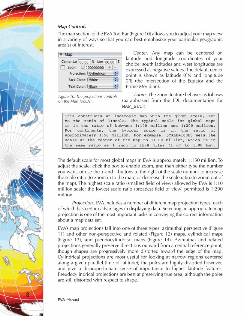
The map section of the EVA ToolBar (Figure 10) allows you to adjust your map view in a variety of ways so that you can best emphasize your particular geographic area(s) of interest.
Center: Any map can be centered on latitude and longitude coordinates of your choice; south latitudes and west longitudes are expressed as negative values. The default center point is shown as latitude 0˚N and longitude 0˚E (the intersection of the Equator and the Prime Meridian).
Zoom: The zoom feature behaves as follows (paraphrased from the IDL documentation for MAP_SET):
This constructs an isotropic map with the given scale, set to the ratio of 1:scale. The typical scale for global maps is in the ratio of between 1:100 million and 1:200 million. For continents, the typical scale is in the ratio of approximately 1:50 million. For example, SCALE=100E6 sets the scale at the center of the map to 1:100 million, which is in the same ratio as 1 inch to 1578 miles (1 cm to 1000 km).
The default scale for most global maps in EVA is approximately 1:150 million. To adjust the scale, click the box to enable zoom, and then either type the number you want, or use the + and – buttons to the right of the scale number to increase the scale ratio (to zoom in to the map) or decrease the scale ratio (to zoom out of the map). The highest scale ratio (smallest field of view) allowed by EVA is 1:10 million scale; the lowest scale ratio (broadest field of view) permitted is 1:200 million.
Projection: EVA includes a number of different map projection types, each of which has certain advantages in displaying data. Selecting an appropriate map projection is one of the most important tasks in conveying the correct information about a map data set.
EVA’s map projections fall into one of three types: azimuthal perspective (Figure 11) and other non-perspective and related (Figure 12) maps, cylindrical maps (Figure 13), and pseudocylindrical maps (Figure 14). Azimuthal and related projections generally preserve directions outward from a central reference point, though shapes are progressively more distorted toward the edge of the map. Cylindrical projections are most useful for looking at narrow regions centered along a given parallel (line of latitude); the poles are highly distorted however, and give a disproportionate sense of importance to higher latitude features. Pseudocylindrical projections are best at preserving true area, although the poles are still distorted with respect to shape.
Figure 10. The projections controls on the Map ToolBar.

EVA Manual9
Figure 11. Azimuthal perspective map projections. The Satellite projection is a special case in which the user is also allowed to chose an altitude (in meters) and tilt angle in addition to recentering the map on a new latitude and longitude (see satellite projection controls at lower right), thus allowing a “bird’s-eye” perspective on a region often less than a hemisphere in size.
Figure 12. Azimuthal non-perspective and related map projections. The azimuthal non-perspective maps (top row) are most often used for polar or regional projections (e.g., the Lambert azimuthal projection is used by the U.S. Geological Survey for its maps of the lower 48 states). The Aitoff and Hammer Aitoff projections (bottom row) are modifi-cations of the non-perspective projections designed for display of the entire globe.

EVA Manual10
Figure 13. Cylindrical map projections. These familiar projections are widely used for illus-trating many different kinds of data and geographic relationships. However, users should take care when analyzing mode output with these projections, so that the extreme stretch-ing of the polar regions does not influence the interpretation of the true extent of climate phenomena and impacts.
Figure 14. Pseudocylindrical map projections. These projections attempt to minimize the severe high-latitude distortions of the cylindrical maps. The Goode’s Homolosine, Moll-weide and Sinusoidal projections all maintain equal area, with varying degrees of distor-tion away from the central meridian(s). The Robinson projection, sometimes referred to as a “compromise” projection, minimizes distortion generally within 45 degrees of the central meridian and equator, though it does not preserve equal area.

EVA Manual11
Global climate model output is often depicted in Mollweide or Robinson projections, since these projections give appropriate visual significance to the scale of tropical regions. Orthographic and stereographic projections are most commonly used for polar views, and the azimuthal equidistant and Lambert azimuthal projections are useful zoomed in for a more regional focus. The satellite projection is the most readily adapted to a variety of regional perspectives.
For more detailed information on the map projection code used by EVA, please consult the IDL documentation (Chapter 15 of the IDL Reference Guide, http://www.ittvis.com/portals/0/pdfs/idl/refguide.pdf - warning, large PDF!). There are also many online sources of information about map projections, their uses and the algorithms used to produce them. Two that may be of interest to EVA users are:
Carlos Furuti’s Cartographical Map Projections (http://www.progonos.com/furuti/MapProj/Normal/TOC/cartTOC.html) – a good general introduction to map projections
A Gallery of Map Projections (http://www.csiss.org/map-projections/index.html) – examples of literally dozens of map projections
Back Color/Text Color: These controls allow you to change the background color and the color of the headers and scale labels in your map window. These modifications are for style only, e.g., for more dramatic visual effect or to better coordinate with other images in a slide series.
Colorbar/Scale Controls
This section of the ToolBar (Figure 15) lets you choose which colorbar to use, the range of the data to use for the scale, the number of ticks (divisions) to show in the scale, and the number of decimal places to display for the scale values.
To bring up a colorbar selector menu, click on the colorbar. EVA comes with a wide variety of colorbars that are useful for displaying (and differentiating between) various kinds of data. For example, a colorbar using shades of blues and yellows to reds (such as the colorbar seen in Figure 15, called “panoply.pa1”) is commonly used for temperature maps. This choice makes sense because people often associate blues with coolness or cold and yellows to reds with warmth or heat. In contrast, a colorbar with many shades of blues, greens and purples (such as the included colorbar called “garden.pa1”) is useful for precipitation maps because it can reveal a great deal of detail, and at the same time will not look confusingly like a temperature map.
If you wish, you can also use custom colorbars (created by third party applications) with EVA. To use a custom colorbar, follow these steps:
Figure 15. Colorbar and scale con-trols in the Maps Toolbar.

EVA Manual12
• For Windows: Insert the colorbar in the folder called C:\Program Files\EVA\colorbars\
• For Mac OS X: Insert the colorbar in the folder called /Users/username/Documents/EVA/colorbars/
• Re-start EVA for the colorbars to register.
Auto Range: By default, EVA will use the minimum and maximum values of your data set to set the endpoints of the scale. You can manually adjust the minimum and maximum value of the scale simply by typing within the min and max fields. To reset the scale to the full range of the data, click on the Auto Range button.
Center on 0: The “Center on 0” button provides a shortcut to scale the data so that 0 is in the center of the colorbar. This feature is especially useful when creating a difference (or anomaly) map, since the white bin in the middle of a difference colorbar (such as (“panoply_diff.pa1”) can then represent little or no difference between data sets.
The algorithm used to perform this operation is as follows:
min = min(data)max = max(data)if abs(max) > abs(min) then range = abs(max)/2.0
else range = abs(min)/2.0min = -1 * rangemax = range
Once you have centered the scale on zero, you can also manually adjust the min and max values as before, but be sure to use the same absolute value (e.g., -5 and +5) so that zero remains at the center of the scale.
Overlay Controls
The overlays section lets you choose the continent overlay and fill, and grid spacing. For both continent and grid you may select color, thickness of line width, and transparency of the grid lines or continent masks. To turn off grid lines completely, set the grid transparency to 100%.
The ability to change the continent mask is especially useful when you want to focus on just part of the earth - for example, blacking out the oceans to focus on climate variables over land areas only.
Figure 16. Overlay controls in the Maps ToolBar.

EVA Manual13
2.2.2 The Map Window ToolBar for Vertical Slices
This ToolBar (Figure 17) is very similar to that for the 2-D map arrays described above, except that fewer features are needed to modify vertical slices plots. Vertical slices are essentially cross-sections of the atmosphere showing how certain diagnostic variables, such as temperature or wind flow, vary with latitude (the x-axis on the plot) and altitude (the y-axis on the plot), where the altitude is measured in millibars of pressure (with 1000 millibars = sea level). Southern latitudes are the negative x-axis values by convention. Altitude is given in pressure coordinates rather than meters above sea level because the GCM would not otherwise be able to accommodate atmospheric circulation around and over land areas with significant topographic relief (e.g., the Rocky Mountains).
Diagnostic Variable Controls
The top section of the ToolBar again refers to the display of diagnostic variables. As with 2-D maps, vertical slices can be plotted as grids or contours, and the contours may be interpolated or not as desired (Figure 18). The vector plot setting has no meaning for vertical slice data that has both direction and magntiude, such as the stream function. Movement for such variables can be thought of as motion into or out of the plane of the vertical slice, and is represented by positive and negative values on the scale rather than with arrows.
Figure 17. The Map Window ToolBar for vertical slice data sets.
Figure 18. Gridded, gridded interpolated, and contour vertical slice plots of the same data set: average July temperatures with altitude across lines of latitude. The black rectangle visible in the lower left corner of the upper plots indicates a lack of model output for the lower atmospheric levels in the vicinity of Antarctica.

EVA Manual14
Vertical Slice Controls
The vertical section of the ToolBar (Figure 17) is simplified from its Maps counterpart for 2-D arrays. The coordinates dropdown menu allows you to choose between gridpoint and scalar coordinates, which adjusts the pressure values on the y-axis of the plot. For the purposes of most EdGCM users, gridpoint coordinates are fine.
Colorbar/Scale Controls
This section of the ToolBar (Figure 17) is identical to the colorbar/scale control for 2-D maps: it lets you choose which colorbar to use, the range of the data to use for the scale, the number of ticks (divisions) to show in the scale, and the number of decimal places to display for the scale values.
2.3 The Plot Window
The Plot Window displays line plots (x-y plots) of output from EdGCM, such as time series (the change in value of a single diagnostic variable over the course of a simulation; Figure 19) and zonal averages (a single variable globally averaged along lines of latitude; Figure 20). Unlike the 2-D map arrays or vertical slices, each post-processed variable is saved to its own file in Microsoft Excel format (.xls). Once these files are open in the Data Browser, you can select either the region(s) (for time series) or region(s) and time slice(s) (for zonal averages) for plotting.
By default, line plots will show time series and zonal average data as several data subsets encompassing different regions (plotted in various colors):
Global average - data from around the entire world Land average - data over land areas only
Ocean average - data over the entire ocean
Open Ocean average - data over ocean regions without ice cover only (time series only)
Ocean Ice average - data over regions of ocean ice only (hidden by default)
Figure 19. An example of a time series plot, showing here the change in annual average temperature caused by a simulated increase in CO2 over the course of a simulation. A time series plot will always show the full range of yearly data in a simulation on the x-axis by default.

EVA Manual15
To save any plot as an image file (.bmp for Windows, .png for Macs), you must choose Save Image from the File menu. There is no contextual menu for saving plots as there is for maps.
Also unlike the map window, the Plot Window does not have an associated toolbar. The plot can be edited either by the controls embedded in the window below the plot area, or by manipulating the plot itself. These methods for editing plots are described further below.
If you would like to see the raw data used to create the line plot, make sure that the Plot Window is selected, and then choose Window > Show Data (from the map window menu itself in Windows, or the menu at the top of the screen on Macs). Note that for there will be a column of data associated with each region-restricted data subset (Figure 21).
Manipulating the Plot
Line plots are created with many default display settings that you can – and should – alter to better display your data set of interest. At the most basic level, you can modify the plot in the following ways to make it more descriptive and easy to read:
• Click on the title and type to change the title. • Click and hold, then drag, the legend to change the location of the legend. • Click and hold, then drag, the x- and y-axis titles to move them.
Figure 20. An example of a zonal average plot, showing here the annual average incoming shortwave radiation distribution from pole to pole. A zonal average plot will show southern latitudes as negative values, and northern latitudes as positive values, on the x-axis.
Figure 21. “Show data” for a line plot yields time series data or zonal averages for each of the geo-graphic data subsets.

EVA Manual16
There are two types of controls that allow you to alter the content and appearance of the plot itself:
Global controls are located directly underneath the plot area, and affect the appearance of the entire plot (Figure 22). They can be used to set the min/max values of the x/y axis, the number of divisions (ticks) per axis, axis titles, and the foreground and background color. The ∧∨ and < > buttons attempt to auto-range the plot around the visible data in the y- and x-axis, respectively. Under “Grid”, the horizontal and vertical boxes allow you to turn on/off grid lines that are synced to the labeled values on the x- and y-axis.
Note: The title for the y-axis by default does not reflect the name of the variable plotted. You must edit the y-axis label by hand, being sure to include appropriate units. If you are unsure of the units, you can always check the variable as listed in EdGCM’s Analyze Output window.
Line controls are located at the bottom of the Plot Window, and are used to alter the appearance of individual lines (Figure 23). Each line can have the following modifications:
• The line can be turned on or off via the Show checkbox. • The color of the line can be customized via the dropdown menu.• The thickness of the line can be changed.• The legend for the line can be modified.
Since most users will initially be interested in plotting global values for either time series or zonal average plots, we suggest hiding all but the global line in the plot, as well as turning on the horizontal grid lines for easier measurement against the y-axis. Note also that by narrowing the plot’s focus to just one line, the plot’s y-axis will automatically adjust to a narrower range of values that makes it easier to see details. See the examples in Figure 24 below.
Figure 22. Global controls in the Plot Window.
Figure 23. Line controls in the Plot Window.

EVA Manual17
Figure 24. a) A time series plot of surface air temperature, as plotted by default in EVA.
Figure 24. b) A time series plot of surface air temperature that has been edited for greater ease in interpretation. Note that only the global data are still plotted, shortening the range of y-axis values considerably so that we can now better see the change in temperature over the run. The line color has been changed to red for better visibility. The y-axis has been labeled, and horizon-tal grid lines have been added. The title of the plot itself has been edited to remove EdGCM’s internal diagnostic variable abbreviation, which can sometimes be a bit cryptic.

EVA Manual18
Note that it is possible to simply plot two data sets (e.g., surface temperature time series from different runs) on the same plot.
1. Open two files containing the same variable in the EVA Data Browser (Figure 25). Select both file names in the left column (CTRL+click in Windows, Shift+click on Macs). Then select “Surface Air Temperature” in the center column, and “Global” in the right column. Once you have done this, you should see both file names listed in the bottom panel of the EVA Data Browser.
2. Then simply click on the “Plot All” button in the lower right corner of the data browser. This new plot (Figure 26) can be edited in the same way as a single line plot.
Figure 25. EVA Data Browser with two time series selected to plot on a single plot.
Figure 26. Single plot with multiple time series.

EVA Manual19
2.4 Math Operations: Differencing Maps and Plots
It is often difficult to make comparisons between data sets by eye, especially for maps. EVA has the ability to allow you to subtract one data set from another for a given variable in order to create something called a difference plot (also called an anomaly plot). This difference plot allows you to see more precisely how one data set or array varies from another.
EVA allows you to perform differences via the following methods:
• Select two variables in the bottom section of the Data Browser, then select the differencing operation you would like performed via the menu at the bottom right of the Data Browser.
• Bring up the contextual menu on a map image (Right+click on Windows, CTRL+click on Mac), and select the differencing operation via the menu.
• Mac OS X only: drag and drop between two map images.
In the examples below, we will use the Data Browser to difference both map arrays and time series plots.
IMPORTANT: Before making your difference map or plot, you must decide which of the data sets (i.e., set of run results) represents your baseline or control simulation, because the control run output is always subtracted FROM the experimental output. Being clear about your control run is very important, especially when you have multiple experiments to compare, because then you can be sure that you are always using the same standard for comparison.
Example 1 - Difference Maps
For this example, we will create a difference map that contrasts the annual average surface air temperature distribution of the Global_Warming_01 experiment with that of our Modern_PredictedSST control run. The following steps assume that you have already averaged the last five years of each run and extracted the surface air temperature variable in EdGCM’s Analyze Output window.
1. Open both the Global_Warming_01.2096-2100ij.nc and the Modern_PredictedSST.2096-2100ij.nc files in the EVA data browser (Figure 27). Select both file names in the left column (CTRL+click in Windows, Shift+click on Macs). Then select “Surface Air Temperature” in the center column, and “Annual” in the right column.
Once you have done this, you should see both file names listed in the bottom panel of the EVA Data Browser (Figure 27). The variable name and time or region should be identical for both files in this case. (By the method described here, it is also possible to compare two variables, such as precipitation and evaporation, within a single given simulation, or to compare two time periods such as January and July for a given variable in a single simulation, by making the appropriate selections.)

EVA Manual20
2. Next, click on the Differencing... dropdown menu (bottom right; Figure 28). EVA allows you to difference your two chosen files any order you like, but for your results to make sense you must subtract your control run FROM the experimental run. In this example, this means subtracting the Modern_PredictedSST run from the Global_Warming_01 run, so you need to select “Data 1 - Data 2” from the dropdown menu.
If the Modern_PredictedSST run had been listed first in the bottom panel, and Global_Warming_01 listed second, then it would have been appropriate to select “Data 2 - Data 1” from the dropdown menu.
3. At this point, EVA will automatically generate a difference map from the two data sets (Figure 29), and create a separate (but temporary) netCDF file of the
Figure 27. The EVA Data Browser, with annual average surface air temperature for two runs selected and ready to difference.
Figure 28. To subtract the Modern_PredictedSST control run from the Global_Warming_01 experiment, select Data 1 - Data 2 from the Differencing menu.

EVA Manual21
differenced data in the Data Browser. If you would like to save the differenced variable for future use, select File > Save Data from the Data Browser menu.
4. The initial difference map created by EVA needs some adjustments so that the map can be analyzed properly. In the colorbar/scale portion of the Map Window ToolBar, click on the colorbar menu, and select a colorbar that has white in the center, such as “panoply_diff.pa1.” Next, click on the button “Center on 0.”
These two steps are very important, because the white color allows you to readily identify areas of little or no difference between the two data sets, and centering the scale assures that white does in fact represent little or no (zero) change.
5. Your may wish to further adjust your difference map with respect to the endpoints and number of divisions shown the scale, to either bring out greater detail or to emphasize a range in data values. If you do, you must make sure that the endpoints of the scale remain symmetrical (e.g., -5 to +5; -12 to +12, etc.), otherwise the colorbar and scale will not remain in sync. Other edits you should consider making to the difference map include changing the scale title, so that it is clear that the colorbar and scale refer to an anomaly.
Once the colorbar and scale for a difference map has been appropriately set, the resulting map may produce a very different impression than the initial map generated by EVA (compare Figure 30 to Figure 29). This part of the process may seem more art than science, but it is vital for accurate representation of the data.
Figure 29. The initial difference map generated by EVA, with default color bar and scale set-tings.

EVA Manual22
Example 2 - Difference Plots
For this example, we will create a difference plot that contrasts the surface air temperature time series of the Global_Warming_01 experiment with that of our Modern_PredictedSST control run. (The following steps assume that you have already run the time series function in EdGCM’s Analyze Output window, and extracted the surface air temperature variable.)
1. Open both the Global_Warming_01_SRFAIRTMP.xls and the Modern_PredictedSST_SRFAIRTMP.xls files in the EVA Data Browser (Figure 31). Select both file names in the left column (CTRL+click in Windows, Shift+click on Macs). Then select “Surface Air Temperature” in the center column, and “Global” in the right column. Once you have done this, you should see both file names listed in the bottom panel of the EVA data browser. The variable name and time or region should be identical for both files.
2. Next, click on the Differencing... dropdown menu (bottom right; Figure 31). As with the difference maps, you must subtract your control run FROM the experimental run. In this example, this means subtracting the Modern_PredictedSST run from the Global_Warming_01 run, so you need to select “Data 1 - Data 2” from the dropdown menu (see e.g. Figure 28). If the Modern_PredictedSST
Figure 30. This figure shows the same difference map from Figure 29 but with modifications to the scale and colorbar to make analysis and interpretation easier. Note that the colorbar now has white in the center, and the scale was both centered on 0 as well as adjusted to a new range of -10 to +10 degrees. The scale title also now reflects the fact that this is a difference (anomaly) map. With these modifications, it is now obvious that the Global_Warming_01 run is at least 0.6˚C warmer than the Modern_PredictedSST control run over all parts of the world.

EVA Manual23
run had been listed first in the bottom panel, and Global_Warming_01 listed second, then it would have been appropriate to select “Data 2 - Data 1” from the dropdown menu.
3. At this point, EVA will automatically generate a difference plot from the two data sets (Figure 32). Unlike difference maps, EVA will not generate any temporary files associated with the difference plot.
Figure 31. The EVA Data Browser, with surface air temperature time series for two runs selected and ready to difference.
Figure 32. The initial difference plot generated by EVA.

EVA Manual24
4. The difference plot needs a few additional edits mainly for correct labeling of the y-axis and legend (Figure 33).
Figure 33. The difference plot with some additional edits for correct labeling and ease of plot reading.

EVA Manual25
3. Additional Information
3.1 Setting Preferences
EVA has a number of preferences that you can specify, depending upon personal usage. You can access preferences under Edit > Preferences in Windows XP/Vista, and under EVA Menu > Preferences on Macs.
Preferences: Application (Figure 34)
1. Turning on “Check for Updates on Launch” allows EVA to make automatic checks for upgrades to the software. This option only works if you have an active internet connection. The alert granularity allows you to select what level of update you wish to access, from major (X) to minor (X.Y.Z.nn).
2. If “Prompt to Save Images and Plots” is not checked, images can be closed without a prompt asking if you wish to save them. This setting can be a time saver if you don’t often save images, but if you forget to save an image you want before closing it, you’ll have to generate it again from scratch.
3. Choose language translation.
Figure 34. Application preferences.

EVA Manual26
Preferences: DataBrowser (Figure 35)
1. Turning on “Alert on File Reopen” helps avoid cases in which you might open a second file of the same name, or try to open the same file twice. If this option is not enabled, trying to open the same file twice can be a problem if EdGCM’s Analyze Output has been used to recreate the file with new variables, and the old file has not been purged (closed) from the EVA Data Browser.
Preferences: ToolBar (Figure 36)
1. Turning on the “Magnetic to Windows” setting makes the EVA map ToolBar attach itself to the associated image. Turning this option off allows you to move the ToolBar and image independently.
Preferences: MapWindow (Figure 37)
1. “Auto Produce Image on File Open” will produce a map of the first variable in the Data Browser list automatically when the file is opened. This can be a time saver, if you often want the first variable plotted, or a time waster, if you don’t.
2. “Auto Produce Image on Math Operations” produces a map automatically when two variables are differenced, which is often handy. However, if you don’t have this option turned on, the difference operation does produce a file (for maps only) that appears in the Data Browser’s first column, and can be selected and plotted manually by clicking on the Plot button.
3. Turning on “Interpolate” will produce contours on maps automatically.
4. “Show Diagnostic Values” shows a few summary statistics below the colorbar/
Figure 35. DataBrowser preferences.
Figure 36. ToolBar preferences.

EVA Manual27
scale on maps. These include global and hemispheric averages, as well as maximum and minimum values for the data set displayed.
Preferences: PlotWindow (Figure 38)1. If “Auto Produce Plot on File Open” is checked, it will produce a line plot of the variables by region when the file is opened.
2. If “Auto Scale When Turning Line On/Off” is checked, the y-axis scale will adjust to a best fit for the data displayed.
3. If “Plot Ocean Ice” is checked, this line will be included on the plot automatically. Since this line often has a very different value from the lines for other regions, it is usually turned off by default so that the y-axis has a more appropriate scale for the remaining lines.
4. If “Show Legend” is checked, a legend will appear in the center of the plot window. The legend can then be dragged to a desirable position on the plot.
Figure 37. MapWindow preferences.
Figure 38. PlotWindow preferences.

EVA Manual28
Preferences: DataWindow (Figure 39)
1. If “Display Data Numbers when Displaying Map” is checked, a spreadsheet is always opened when a map is created. The spreadsheet shows the actual data used to create the map image. If this option is off, the data spreadsheet can be opened manually with the Show Data command (Cmd+D on Mac, CTRL+D on Windows).
3.2 Troubleshooting
EVA sometimes “stalls” and fails to produce a map or plot image inside a window. This typically happens when more than 10 or so files are open in the Data Browser, or many map or plot windows are already open. Quitting EVA and restarting will usually resolve the problem, and you can avoid this issue altogether by closing files and/or map/plot windows when you no longer need them.
In the event that restarting EVA does not resolve your problem, try the following steps:
1) Check to see whether you have the latest EVA release.
The newest release of EVA may already include a fix for your issue!
2) Have you installed EVA properly?
The best way to install EVA is via the EdGCM installer. Manual installation is possible but is riskier.
3) Remove any duplicate copies.
A second copy of EVA might be the source of your issue. Make sure you only have one EVA installed on your computer.
4) Trash your preferences.
The preferences file might have become corrupt. Delete it. It is located in the following places:
Figure 39. DataWindow preferences.

EVA Manual29
On Mac:
/Users/username/Library/Preferences/edu.columbia.edgcm.eva. prefs.plist
On Windows:
C:\Documents and Settings\username\Application Data\edu.columbia.edgcm.eva.prefs.plist
A new preferences file will be generated the next time you start EVA; you will need to reset your preferences at that time.

EVA Manual30
NOTES