ec3320 2016-2017 michael spagat lecture 4 s open to today ...personal.rhul.ac.uk/uhte/014/economics...
TRANSCRIPT

1
EC3320
2016-2017
Michael Spagat
Lecture 4
Let’s open to today with a central economic concept – opportunity cost.
The opportunity cost of a particular course of action is the value of the next best alternative course
of action that could have been chosen.

2
Imagine you are out for a hike. The opportunity cost of going left is the pleasure you would have
received if you had gone right instead. The opportunity cost of going right is the pleasure you
would have received from going left.
Time is a scarce commodity. You cannot simultaneously go right and left. It is important to realize
that your choice is not free even though you do not pay any money.

3

4
Next let’s recall quickly the basic ideas behind linear regression.
(“GPA” stands for “Grade Point Average” which is a measure of how well students perform in
school.)

5
Here are some general observations about the picture on slide 4.
1. The red line is meant to fit the points in the scatterplot as well as possible and is known as the
linear regression line.
2. The positive slope of the red line suggests that higher grades in high school are associated
with higher grades in university.
3. It is not clear that there is a causal relationship between high school GPA and university GPA.
It could be, for example, that higher IQ causes higher GPA in both high school and university.
More generally, there can be a third factor driving GPA at both levels.
Here’s a useful thought experiment for thinking about causality in this case. Imagine your old high
school contacts you and says that they just detected some errors in your records and they are
raising some of your marks. Would this cause you to suddenly perform better at RHUL? Probably
not, which suggests that it is not the high school marks themselves that drive your university
marks.

6
In what sense is a linear regression line the best fit? Consider this simple picture:
Take the distances shown, square them and add these numbers up. You get a measure of how
well the line in the picture fits the data points. If I draw a different line you could then measure the
distances of all the same points to this line, square them and add them up. The linear regression
line is the particular line that minimizes the sum of the squared distances to the data points.
Software like Stata or Excel will find these linear regression lines for you.

7
The picture below gives not only a linear regression line but also the equation of this line.
The interpretation is that 1 more centimetre of height is associated, on average, with an additional
0.28 kilograms of weight.
We can also use this equation to predict that a person who is 160 centimetres high will weigh
around 58.7 kilograms. Of course, this prediction could turn out to be way off.

8
Notice that it is hazardous to make predictions outside of the range for which you have no data.
For example, we can predict that a person who is 100 centimetres tall will weight 41.9 kilograms
but we should be cautious about this prediction since we have no observations for anyone below
125 centimetres tall. It could be that this is a good prediction but it assumes that the straight line
extends beyond the region for which we have decent evidence that it works well.

9
To rebel or not to rebel, that is the question.
This week we have two Berman et al. papers so we need to distinguish between them.
Berman et al. 1 will be “Do Working Men Rebel? Insurgency and Unemployment in Afghanistan,
Iraq, and the Philippines?”
Berman et al. 2 will be “Modest, Secure and Informed: Successful Development in Conflict Zones.”

10
Berman et al. 1 studies the relationship between insurgent activity and unemployment.
Many people assume they understand how this relationship works. For example, here is a quote
from the top U.S. Army Commander in Iraq back in 2006:
“…employment is absolutely critical to what we're doing to take the angry young men off
the street.”
We can characterize this view as the opportunity cost theory of insurgency. The idea is that
people considering joining an insurgency think about what their next best opportunity is. This is
likely to be the wage they would earn in the legal economy if they do not join.
If the unemployment rate is high then the next best opportunity to joining an insurgency could be
unemployment, in which case joining up may look like a pretty good option.

11
This opportunity cost view is sensible and intuitive but a little reflection (or else just reading the
Berman et al. paper….) indicates that there are other mechanisms that can create either positive
or negative correlations between unemployment and violence. The following three mechanisms
go against the simple opportunity cost story.
1. Security measures should reduce violence but may also reduce economic activity, thereby
raising the unemployment rate.
For example, in 2007 Baghdad erected barriers between Sunni and Shiite neighbourhoods, a
measure that probably contributed to reducing sectarian killings. But these barriers also impeded
the free flow of goods and labour around the city, with a negative impact on the economy.
There appears to be a similar phenomenon at work when border crossings between Israel, the
West Bank and Gaza Strip are closed – less violence but higher unemployment.

12
2. A high unemployment rate can help counterinsurgent forces because it becomes easier to
purchase information about the insurgency from unemployed people holding such information.
In other words, some people may be reluctant to provide information to the army but if they are
unemployed and desperately trying to support their families they may do so for money. The army
may be able to use these tips to capture insurgents and reduce violence.
3. Some violence could be aimed at stealing economic resources. When the economy is doing
well there are more resources to steal, possibly provoking violence as have-nots try to steal from
haves. When the economy is doing poorly there may be less such violence since there are not so
many resources available for stealing.
Of course, when the economy does well the unemployment rate also tends to be low.
Together, these two considerations suggest a negative relationship between unemployment and
insurgent violence.

13
All the channels in slides 11-12 push in the direction of a negative relationship between
unemployment and violence, that is, higher unemployment is associated with lower violence and
vice versa in these stories.
Berman et al. 1 also offers a further reason (in addition to the opportunity cost theory) for a
positive relationship between unemployment and violence: violence itself may disrupt the
economy, causing the unemployment rate to increase.
It is important to recognize that several of the above channels can operate simultaneously, making
it extremely difficult to determine causal effects.
If violence causes unemployment and unemployment also causes violence then we have what is
known as a reverse causation problem. I will return to this issue later in the lecture.

14
The basic idea of the Berman et al. 1 paper is to estimate an equation like the following:
rrr uV
where V stands for “violence”, r is “region,” and B are estimated coefficients and is a
random shock that hits at the region level. You can think of the shocks as explaining why the
points in a scatterplot do not fall exactly on a regression line.
The opportunity cost theory suggests that the coefficient estimated for B should be positive –
more unemployed “angry young men” should cause more violence.

15
The authors use data from three different wars: Afghanistan, Iraq and the Philippines. The
following table summarizes the data.
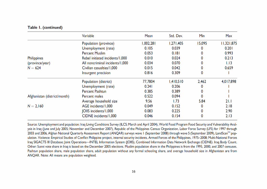
16

17
The actual equations estimated are slightly more complicated than the basic one on slide 15
because they incorporate a time dimension plus various controls.
trttrrtr controlsuV ,,,
where t represents time which is measured in quarters, months or years depending on the
regression and the t are other estimated parameters.
The t coefficients take care of the problem that, for example, violence and unemployment may
both be increasing over time even though there is no causal relationship between the two.
Slide 18 gives the main table from the paper.

18

19
The estimated coefficients on unemployment in table 2 are almost always negative and most of
them are statistically significant.
Recall that the opportunity cost theory predicts a positive relationship between unemployment and
violence so this theory is rejected.
Now let’s think a bit about the meaning of “statistically significant”.

20
Read the footnote to the table and you see that one star corresponds to “p < .1”, two stars to “p <
.05” and three starts to “p < .01”.
This begs the questions: what do the p’s mean?
When p = 0.05 this means that if we assume that the true value of the coefficient is 0 (the “null
hypothesis”) then the probability that our data will lead us to estimate the (negative) coefficient that
we have actually estimated or a smaller one (i.e., a more negative one) is equal to 0.05.
In other words, a low p value indicates that it is unlikely we will observe the negative value we
have estimated or still lower ones if the underlying reality is that there is no relationship between
unemployment and violence.

21
By tradition most published regression tables have the same starring system that Table 2 on slide
19 has.
More stars mean “more significant results” in the sense that we would be very unlikely to see the
reported results if the null hypothesis is true, i.e., if the coefficient is really equal to 0.

22
The next important point to understand is that we should not stop after only assessing the
statistical significance of an estimated coefficient.
We should also ask whether the coefficient has practical significance.
In other words, we should also consider the magnitudes of the coefficients and decide whether
they are big enough to matter. (I think that Berman et al. 1 fails to do this.)

23
Let’s do a magnitude assessment for the very first coefficient in the table which is -1.118. This is
the coefficient on unemployment in Iraq.
Here is a quick comment before proceeding. There is no standard procedure for assessing the
magnitudes of regression coefficients. Doing a good job on this requires having good knowledge
of the situation you are analysing and applying some common sense.
That said, I can still give you set approach that is usually helpful:
Calculate the effect of a 1 standard deviation change in a right-hand-side variable on the left-hand-
side variable where the change in the left-hand-side variable is measured in units of its standard
deviation. This formulation is a bit complicated so let’s look now at an example.

24
Suppose that unemployment in a particular district for a particular quarter increases by six
percentage points, say from 11.7% to 17.7%. This change is almost exactly 1 standard deviation.
(Look at Table 1. Notice that an unemployment rate of, for example, 11.7 is rendered as 0.117.)
The regression coefficient we are analysing suggests that this increase in unemployment should
be associated, on average, with a decrease (remember the coefficient is negative) of roughly
0.067 violent incidents per 1,000 people per quarter (0.06 x 1.118 = 0.067).
Table 1 shows that the standard deviation for violent incidents per 1,000 per quarter is 0.504.
0.067 is about 13% of 0.504. We can conclude that a 1 standard deviation change in
unemployment is associated with a change of only about 13% of 1 standard deviation in the
violence rate. From this point of view the relationship between unemployment and violence seems
fairly weak even though it is statistically significant.

25
What is the point of expressing the changes in unemployment and violence in standard deviation
units?
First, a change of 1 standard deviation in the right-hand-side variable is something that can really
happen, unlike a change of, say, 4 standard deviations. At the same time a 1 standard deviation
change is not trivially small compared to the way this variable tends to move around. In other
words, it is a moderately large change compared to the natural variation in the variable.
Similarly, if the left-hand-side variable changes by 1 standard deviation we can say that this is a
moderately large change compared to the natural variation in the variable.

26
Nevertheless, we must bear in mind that the above technique is just one way to evaluate
regression coefficient magnitudes. Some other methods can also be appropriate in some
circumstances.
For example, Table 1 also says that the mean number of violent incidents per district/quarter is
0.258. 0.067 is around 26% of 0.258 (100 x 0.067/0.258 = 26). So a change of 6 percentage
points in the unemployment rate is associated with a change in violence that of roughly 26% of the
mean level of violence, on average. Perhaps this formulation makes the effect size seem a little
larger than it did under the other formulation.
In summary, I would say that the relationship between unemployment and violence in Iraq is not
tiny but it is not big either.

27
Let’s now move on to Berman et al. 2 paper.
We have some familiarity with one of the Iraq data sources Berman et al. 2 use – the SIGACTS
database. They use it to measure the intensity of insurgent attacks by district and time, measured
now in half-year periods.
They have another key military database as well, called the “Commanders Emergency Response
Program (CERP)”. These were small bits of funding available at the “brigade level or below”.
(Brigades normally have something like 3,000 to 5,000 soldiers). The idea is that commanders at
these relatively low levels have pots of money they can use to win friends, influence people and
generally to stabilize the local situations they are involved in.

28
The question is – Do these strategic expenditures of funds actually help to reduce violence?
It is not too hard to imagine how one could use these datasets to address the question. In
particular, we can ask whether there seems to be a negative association between insurgent
attacks and CERP money spent.
However, if we want to make causal claims, e.g., that spending money causes violence to go
down, then we have to think carefully. In particular, there are various channels of potential
causation that can mess up our analysis.

29
Here are two plausible scenarios:
1. Insurgent attacks break out in an area and commanders quickly rush in with CERP money
(and other things such as troops) to try to stabilize an area. By this description violence
causes CERP spending. Therefore, we will observe a positive correlation between the two
and may erroneously conclude that CERP spending causes violence.
2. Commanders do not like to spend money in unstable environments so they only spend CERP
money in places that are already pretty stable. In this case lack of violence causes CERP
spending and we will observe a negative correlation between violence and spending. If this
scenario is important then we may conclude erroneously that CERP spending causes
violence to go down

30
There can also be more complicated, mixed scenarios.
Variant on scenario 1. Violence attracts CERP money which, in turn, reduces violence. In this
case CERP expenditure causes lower violence but this causal effect is underestimated because
the CERP money only flows into environments that are violent in the first place. In fact, under this
variant we may estimate either a negative or a positive correlation between CERP spending and
violence, depending on how strong these two countervailing effects are.
Variant on scenario 2. CERP spending causes lower violence but we overestimate the extent to
which this is true because CERP spending is only funnelled into low-violence environments in the
first place.

31
Berman et al. 2 are not hugely concerned about the first issue on slide 30 because this problem
only makes it hard for them to find that CERP spending reduces violence.
They do find a statistically significant effect of CERP spending in reducing violence and are happy
to argue that maybe they have underestimated the true effect to the extent that point 1 has bite.
In other words, they are much more interested in demonstrating a statistically significant effect
than they are in pinpointing its exact magnitude and the first issue on slide 30 does not throw a
finding of statistical significance into question.

32
Point 2 is more of a challenge for Berman et al. 2 because it suggests that their findings may be
overestimates. Critics could argue that if they could eliminate the source of upward bias
highlighted in point 2 then their coefficient estimate may no longer be statistically significant. In
fact, almost all of the authors’ effort in the paper is directed at overcoming this critique.
The strategy of Berman et al. 2 is to look at changes in spending and insurgent attacks rather than
levels of spending and insurgent attacks. So, although there may be many areas where spending
is high and violence is low, the authors do not use this positive correlation to support a theory that
CERP spending is causing the violence to be low. Rather, Berman et al. 2 try to make their case
by showing that increases in CERP spending are associated with decreases in insurgent attacks.
In technical terms they have a first-differences design. This is a sensible approach to address the
causation issue however, as one student pointed out on the blog, it still leaves an issue on another
level. If military commanders increase CERP spending to areas where violence is decreasing, i.e.,
they create positive first-differences in CERP spending where there are negative first differences
in violence, then we can erroneously conclude that increases in CERP spending cause decreases
in insurgent attacks.

33
Let’s pause for a moment to gather some intuition.
Suppose I try to argue that having more books in a household will improve the school performance
of the children living in these households. There is surely a positive correlation between school
performance and books in the household but this does not mean that books cause high marks.
For example, households with lots of books will tend to be richer than households with few books
and money will come with lots of advantages for children. So the positive correlation between
books and marks is not very impressive on its own.
But suppose we conduct the following experiment. Choose a bunch of household and record the
school performance of all their children. Then pick some of these households at random, give
them a bunch of books and record everyone’s marks again. Do the marks of the children who got
the books improve relative to the marks of the others? If so then it is reasonable to say that
increases in books lead to improvements in marks. Berman et al. 2 are applying a very similar
idea to Iraq.

34
Here is the equation they work with:
tittitititititititi vvmmggvv ,2,1,31,,21,,11,,
i’s are districts
t’s are half-year time periods
v’s are insurgent attacks
g’s are various measures of aid spending
m’s are measures of troop strength
t is a year dummy
ti , is a random shock

35
So far I have written only about CERP aid because this is what Berman et. al. 2 are most
interested in.
However, they also consider a variety of other aid programmes including things called the
“Community Action Program (CAP)” and the “Community Stabilization Program (CSP)”. These
were both administered by USAID, the main US aid agency.

36
I also did not mention the troop strength data above because I wanted to focus attention on the
main data for the paper – SIGACTS and CERP.
Troop strength enters as a control.
Why control for troop strength?
It could be that a commander increases both troop strength and CERP spending in a particular
district at a particular point in time – insurgent attacks may decrease but maybe to the extent there
is cause and effect here it is more the troop increase causing the decrease in violence rather than
the expenditure of funds driving down the violence. By controlling for troops you can see whether
there might be a spending effect above and beyond the troop effect.

37
Here is the main table of the paper:

38
Think back to last lecture.
Standard errors are in parentheses below the coefficients. If the absolute value of the coefficient
is more than two times as large as the standard error then you should expect a p value below 0.05
and you will see two stars in the table. If the absolute value of the coefficient is more than around
2.5 times the standard error then p will be below 0.01 and you will see three stars in the table.
The main take home point from the table is meant to be that small-scale CERP expenditures seem
to have the biggest impact on reducing insurgent attacks. That is, by far the biggest and most
significant coefficient is the -0.069 coefficient on CERP projects below $50,000. All the other aid
coefficients are either insignificant or small and of borderline significance.
But the above paragraph only looks at statistical significance. What about practical significance?

39
This turns out to be harder than you might expect and I had to correspond with the authors of the
paper to sort it out. The table is not as clear as it could be to facilitate easy interpretation.
This experience leads me to think that many people have read the paper without really coming to
grips with whether or not the estimated CERP coefficient is big enough to have practical
significance. So, apparently, many people are falling into the trap of looking at statistical but not
practical significance.
40
Let’s have a look for ourselves.
The starting point is always to look at the right-hand-side variables and figure out what kinds of
movements in these variables are reasonable or typical. The far-right column in this table is a
good place to start because it gives means for all the variables. But the mean of CERP spending
is $1.32, a ridiculously low number, so I emailed the authors.
It turns out that this variable is spending per capita. They added that median population of a
district is 165,000. So average (in some sense) spending was a bit over $218,000 for an average
district-half year. This isstill a fairly small amount of money but not completely miniscule (like
$1.32 would be).

41
The authors also say that a typical small CERP project spends about $25,000. Let’s suppose that
spending in some district-period goes up by two of these projects. That would be a fairly big
change compared to an average around $218,000 - an increase of around $50,000 is more than
20% of $218,000. Multiply this by -0.069 and we get that violent incidents are reduced by 0.021.
Is 0.021 incidents a little or a lot?
This number is, perhaps, bigger than it might seem to you at first glance since its units are
incidents per capita per district-half year. So let’s compare it to the mean number of incidents per
district-half year per 1,000 which is 0.587. 0.021 is just 3.6% of 0.587 so the reduction really is
small, just as it seemed to be at first glance.
Again, we wind up with a statistically significant effect that does not have enormous practical
significance.