Page 1
Team A - StrengthsReviewer 1• Nice and professional layout of report• Report includes many screen shots• Short and precise problem descriptions with suggestions for improvement
Reviewer 2• Good summary. Starts with summary• Very good structure of Observations and Recommendations. Problem areas are clearly marked.
Recommendations follow findings.• Report contains screen dumps.• Explanations of the choice of evaluation methods are given.• Authors mention that they prefer to work closely with developers.• Problems are described in the order of developers questions posed to the test team. Additionally, the
team marked the severity of problems.
Reviewer 3• Good user tasks• Good user demographics• They give comments about performance, etc., from interviewing users
Reviewer 4• Overall, this report was manageable for me as a reader. This report was the optimum length for me; I
wouldn’t want to read a report that’s much bigger than this.• I liked the three-part approach to describing problems; problem statement, description, recommendation
because it presented the information in a compact, easy to digest format.
Reviewer 5• Comprehensive report (useful information)• Distinction within results (from general to specific problems)• Much information about approach: respondent criteria, procedure, etc.
Reviewer 6• Good supporting material (scenario, tasks, participant profiles, and so on)• Explanation of why different methodologies were used to gather different types of information• Organized by areas of interest to management
Reviewer 7• Executive summary• Information about each user in table form• Good presentation using problem/solution• Good tasks designed to get at requested issues about product
Team A - WeaknessesReviewer 1• One false problem, listed as "severe"• No positive findings reported• No specific test and interview of participating power users
Page 2
Reviewer 2• Intro describes report structure, purpose, and methodology of the test. Even gives user profile and tech
specs. These issues fit better in the appendixes at the end of the report.
Reviewer 3• No timing information provided• Experienced users only used basic functions• No formal presentation of differences between the two groups [novice and experienced users]• They did not give any kind of indication of how severe a problem was
Reviewer 4• Time spent running 6 users at two hours each came to 43 hours in the addendum. If I were a customer
paying these consultants by the hour, I’d definitely have questions about why I’m being billed for 43 hourswhen the methodology puts the hours at 12.
• Fifty-six (56) hours were spent on analyzing data and writing, and thirty-seven (37) hours were spent onpreparation. Authors state that this is about “40% more than usual,”. I’d like to know why. They alsostated that there is considerable variation is the amount of time that they spend on evaluations.
Reviewer 5• In the recommendations some references are made towards another email-program (Outlook) without
clear description of it (or clear arguments why it is better)• Few test participants• Extensive report
Reviewer 6• Did not identify a lot of problems given the time spent
Reviewer 7• Assumed executives needed no overview/context• In reporting findings, "several users" is vague. Doesn't give number or indicate novice or advanced
Page 3
Team B - StrengthsReviewer 1• Excellent observations on "usability in the large"• Extensive interviews of power users. Open to "outside the box" practices• Terse problem descriptions
Reviewer 2• The contents start the report, yet it is very brief. The reader can see what to expect from the report, yet it
does not appear as if you are going to read a whole book, which is actually nice.• Good summary presented up front.• Debriefing section has its own short contents.• Main problems were presented first.• The findings followed the order of developers' questions, which is also the order of regular use of Hotmail.• Good description of methods.• A lot more quantitative data than usual - task completion times, activity, different tables and charts.
Reviewer 3(not evaluated)
Reviewer 4• I liked the “Debriefing Top Findings Section” a great deal and would have liked to have seen the issues in
this section discussed in greater detail.
Reviewer 5• Combination of expert review and usability test• Much useful information: even more interesting topics are considered than those of Hotmail only• Well-structured content of report
Reviewer 6• Complete supporting material (scenario, tasks, participant profiles, raw data, and so on)• Organized by areas of interest to management• Advice on how to deal with what could be an intimidatingly large report
Reviewer 7• 2 types of evaluation• Good report set-up and structure to glean key findings• Good inclusion of specific comments from users.• Good idea to show incorrect paths users took to attempt tasks
Team B - WeaknessesReviewer 1• Overwhelming number of problem descriptions• Many problem descriptions are based on personal opinions rather than observed user behavior• Some problems are formulated in an unnecessarily critical language
Reviewer 2• Findings in the debriefing sections are not followed by recommendations; at the same time,
recommendations could be seen in the findings.
Page 4
Reviewer 3(not evaluated)
Reviewer 4• There is a lot of information in this report, but it’s unfocused and its purpose is unclear.• Task times were presented without summary statistics or suggestions for use. This report has a lot of
spelling errors.• There were no pictures in this report, which made it very hard to orient myself.• The opening caveat, “Findings and recommendations are mixed together and are listed in no particular
order within the 32 categories below” left me with a feeling of despair. The never-ending bulleted listsweren’t nearly as reader friendly as the three-point approach of Group A.
• The “Study Observation and Expert Review Findings” section was difficult to use. I had a hard timefiguring out which items resulted from usability testing and which were from the expert review. The hintabout “+” signs didn’t help.
• The “Study Observation and Expert Review Findings” section had so many detailed points in it, I felt like Iwas looking at a log file. Expert Review comments were interspersed with the user comments, so I wasnever quite sure what I was looking at. Is it summary data or low-level data. Is it user feedback or expertfeedback?
• The report contains no raw data (e.g., log files, subjective satisfaction questionnaire data.)
Reviewer 4• Layout of report could be improved (not attractive)• An indication of severity/frequency of a problem is in general not mentioned• I would prefer a distinction within the results between findings of the experts and problems of the
participants.
Reviewer 6• Screen shots to illustrate points would be nice
Reviewer 7• Need more information about types of users and qualifications earlier in report to understand results• Didn't know which results came from expert evaluation and which from usability testing• Interchanging use of terms for users and participants, unclear if both were utest subjects (or expert
reviewers)• Study design and description of users should be early in report (or referenced). #31 begins this
discussion
Page 5
Team C – StrengthsReviewer 1• Nice and professional layout of report• Problems classified with respect to severity and frequency• Problem descriptions illustrated with screen shots
Reviewer 2• Different methods are used for evaluation.• Recommendations are called "possible solutions" which is nice and non-offensive.• Report is very brief, yet informative.• Problems are presented as sentences, so they describe the problem, not just call out the topic.• Severity and frequency are marked.• Screen shots are presented.
Reviewer 3• They reported severity and frequency of the usability problems
Reviewer 4• I liked how the Problems section presented problems. The problem was stated and described, a severity
was assigned, and a graphic was included.• I liked the test team’s pragmatic approach to limiting the number of users to five (5) because they weren’t
learning anything new.
Reviewer 5• Combination of expert review and usability test• Clear layout• An indication of severity/frequency has been mentioned of every problem
Reviewer 6• Relatively few hours• Found most serious problems found by three or more teams• Good integration of text with screen shots
Reviewer 7• Good to begin with positive results• Like arrangement with problem/severity, then solution• Use of screen captures
Team C - WeaknessesReviewer 1• Few problems reported• No specific test and interview of participating power users• No executive summary
Reviewer 2• Only main problems are described.
Reviewer 3• User demographics could be improved• No idea of tasks that users were doing
Page 6
• They did not separate out where a problem was found in all cases - inspection, walkthrough or user test• I did not get a good understanding from reading the report what the inspection and walkthrough were
used to accomplish
Reviewer 4• I wish the General Observations called out the observations using headings to identify what “general
observations” were being presented.• I like short reports, but this one left me wanting more. No task scenarios were included and no user
descriptions were included.• The report only provides high-level summary data to its readers.
Reviewer 5• Results are not presented in congruence with the Hotmail questions• Little information about approach: methods, procedure, etc. (non-replicable in this way)• I would prefer a distinction within the results between findings of the experts and problems of the
participants.• Few test participants
Reviewer 6• Little supporting material (scenario, tasks, participant profiles, raw data, and so on)• Did not address many of the client’s areas of interest
Reviewer 7• No detailed description of user profile, scenarios, post task questionnaires• Frequency "low" not clear. Need to list number of participants for each finding• Report ended unexpectedly; felt incomplete
Page 7
Team D – StrengthsReviewer 1• Large number of test users• Short report• Uses quantified QUIS ratings
Reviewer 2• Interesting approach combines quantitative measurements with open-ended questions.• The report is brief, so the user is not afraid to start reading.• Use of QUIS rating scale was very interesting for me.
Reviewer 3• We go a good idea of the preferences of users
Reviewer 4(not evaluated)
Reviewer 5• Use of standardized tool• Many respondents• Use of percentages (with the huge amount of respondents it is permitted)
Reviewer 6(not comparable to the other reports)
Reviewer 7(none)
Team D - WeaknessesReviewer 1• Introspection method - users report their own problems without a neutral observer• Many critical remarks about customer from author (Microsoft)• Critical remarks are not always supported by actual findings
Reviewer 2• The report is mostly text paragraphs, which makes it harder to glance through and to find main thoughts.• Authors' opinion appears very strongly in the report, which makes the reader wonder if such a strong
opinion could have affected the findings.
Reviewer 3• No idea what kind of tasks users carried out.• Very little demographic info• Really no indication of what kind of problems users had.
Reviewer 4• Fifty (50) users were recruited for this evaluation which is an excessive number of users to involve in a
usability test. This number might be perceived as less excessive if inferential statistics were run, but noinferential statistics were presented. Since most of the usability activities I’m involved in have small n’s, Iwas interested in seeing how this investigator used his large n. I didn’t really see any benefit to the largen.
Page 8
• One of the hallmarks of competent usability testing is a lack of bias on the part of the investigator. Themost striking feature of this report was the apparently overwhelming degree of bias on the part of theinvestigator. After reading the report in its entirety and deciding the investigator was biased againstMicrosoft, I had a difficult time figuring out which results were valid and which supported some sort ofanti-Microsoft agenda.
• This paper includes none of the features I expect out of a usability report: pictures of the interface,suggestions for improvement, a list of scenarios, user descriptions, log files, identification of lower andhigher severity problems.
Reviewer 5• Subjective data only (no performance measures)• No answer on all Hotmail questions (little information is given in the report)• I would appreciate more methodological and procedural background information (e.g. about QUIS)
Reviewer 6(not comparable to the other reports)
Reviewer 7• Not a standard report; not written to "client"• Hard to read in full paragraph structure: e.g., "methods" section should be broken out into list or table;
problem throughout in this doc design• Do not have sample questionnaire from which results were reported

Page 9
Team E – Strengths
Reviewer 1• Many positive findings reported• Many quotations from test participants• Thorough study
Reviewer 2• Most important findings are presented first and the rest of the findings follow the order of work with
Hotmail and the order of developers' questions.• Findings are sentences.• Recommendations are brief, are given right after the findings.• Found the Save problem that was missed by some of the labs.• It is nice that the background of the study is given at the end of the report.
Reviewer 3• Good user demographics• Includes tasks and questions asked of subjects• Includes hardware specifications
Reviewer 4• I usually like problems separated into low and high severity groups, but this team’s approach of ordering
problems chronologically worked well because it gave me a sense of context.• This team presented problems in a problem, description, user quote, recommendation formation. I liked
this a great deal because even though there was no log file with this report, I got a feel for individual userdata from the sections containing user quotes pertaining to the problem.
• This team indicated how they were connected to the internet.
Reviewer 5• The lay-out of the report makes it very comprehensive (headings, bold text, structure etc.)• Combination heuristic evaluation and usability test• Procedural information is given
Reviewer 6• Good supporting material• Quotations from participants are good• Formatting conventions (italics for quotations, bold for links) aid reading
Reviewer 7• Readers' guide gives good overview• Like comments included• Like questions included in the end• Like user profiles in end
Team E - Weaknesses
Reviewer 1• Most serious problem (Password hint) not reported• Unprofessional layout of report• Overwhelming number of problem descriptions• No executive summary
Page 10
Reviewer 2• The table of contents is two pages long and the Introduction contains a reader's guide. This should scare
the developers off completely.
Reviewer 3• No notion of the severity of problems• Although I liked the sections of the report (by area of investigation) , it was difficult to call out the problems
in each area.
Reviewer 4• This team did not include pictures in their discussion of problems, although there was a screen shot
towards the end of the report.• This test team provided mostly summary data with no individual responses to questions and no user log
files included. The inclusion of user quotes in the individual problem discussions gave me a little low-leveldata, but I’d prefer to see a log file too.
• I would liked to have known their actual Internet connection speed.
Reviewer 5• I would appreciate more methodological background information• A rather long report• Layout: maybe the text column could be wider? (easier to read, and fewer pages)
Reviewer 6(none)
Reviewer 7• Takes too long to make the points; too much verbiage• Need to know the number of participants
Page 11
Team F – Strengths
Reviewer 1• Good executive summary• Thorough study• Clear and attractive layout• Only 50 hours used to run test and write report
Reviewer 2• Summary is presented up front.• Findings are presented in the order of regular use of Hotmail.• Findings are sentences.• Good discussion about the appropriateness of methods.
Reviewer 3• Problems listed by area. Good points listed as well.
Reviewer 4• Presented results in a problem, description, recommendation format which made their findings easy to
read.
Reviewer 5• Extensive report that is carefully written• Procedural information is given (test booklet, interview questions)• Well structured report (finding, explanation, recommendation)
Reviewer 6• Good value – identified many issues in a little time• Recommendations for more appropriate means of gathering information desired by management
Reviewer 7• Sends readers to scenario and user profile up front (in background section)• Good summary of findings/recommendations but need better doc design/white space.• Scenarios were very interesting. Felt real and natural
Team F – Weaknesses
Reviewer 1• Some of the reported problems were encountered by one test participant only• Problems not classified with respect to severity• No tests with experienced Hotmail users
Reviewer 2• No TOC.• Perhaps, "Background" is not a good word for the section that it was used as a title for.• Main problems are not marked as such in the Findings section.• Seriousness of problems is not marked explicitly. Scope is marked by generic phrases: "majority of
users," "some users," etc.
Page 12
Reviewer 3(no comments)
Reviewer 4• Problems weren’t categorized by severity and they didn’t have screen shots integrated with them. Two
screen shots were included in Appendix 6.• This report only presented readers with high level data. No lower-level data like log files, questionnaire
data.• This test took fifty (50) hours to plan, conduct, and write up. The author said, “This is very hard to
estimate” in response to the request to provide day-to-day timesheets. I would have liked to have seen agreater degree of confidence on the part of the author because the time for this report is on the low end ofthe times that teams reported. Only Team H took less time (forty-five, 45, hours) and their report is halfthe length of Team F’s.
Reviewer 5• No contents in the report• Few test respondents• No respondent criteria are given (e.g. no distinction between email experience of respondents)
Reviewer 6• First person writing style could make some clients less likely to take recommendations seriously
Reviewer 7• Summary assumes knowledgeable reader. Who is intended audience?• Would like to know which participants experienced problems, matched to user profiles• Profiles are too vague. Need more information about users• Text too dense, headings too small/lightface• Intro scenario poses possible bias in use of "exciting" and "convenient" with reference to the product• Questionnaire poses leading questions; e.g., how did you like the advertisements?
Page 13
Team G – StrengthsReviewer 1• Short report• Uses SUS questionnaire• Extensive answers to customer questions
Reviewer 2• Introduction is informative and well structured.• Methods contain good reference and are well described.• Conclusions and recommendations are well structured.• Clear statement of results.• A very objective evaluation.• Summary is at the end of the findings section.• Several methods were used for the evaluation.• Some extracts from logging are presented.
Reviewer 3• Good demographics• Ratings on SUS• Good specification of method – used think aloud. Interviews.• Specified test equipment• Procedure spelled out well
Reviewer 4• I liked that individual results were presented for some questionnaire data.• Told me what modem they used
Reviewer 5• Much information about approach: methods, procedure, respondents, etc.• Subjective and objective measurements• Use of standardized tool
Reviewer 6• Description of research design inspires confidence in findings• Included data from a standard assessment instrument (SUS)• Addressed client’s questions
Reviewer 7• Good introduction• Good user profile information• Structure of findings logical, clear• Gives number of participants who experienced each issue.
Team G – WeaknessesReviewer 1• Report reminds of a scientific work - literature references, footnotes, no executive summary• Problems not classified with respect to severity• Precise usability problem descriptions are hard to locate
Page 14
Reviewer 2• Test design could be presented at the end.• No explicit brief recommendations; developers would have to read several paragraphs to understand.
Reviewer 3• Performance measures [are given but they] are not valid for think-aloud studies.• The number of users able to do a task the first time was specified but it was still difficult to get an idea of
the severity.• Results were presented via section – navigation.• Tasks that users were asked to do were not given.
Reviewer 4• I found the tabular results of the “quick and dirty” questionnaire difficult to interpret. To tell the truth, I don’t
know what’s going on in those tables.• Results were divided between the “Results” section and the “Conclusions and Recommendations”
section. I prefer to have the problems and recommendations integrated in one section so I can keep trackof them.
• The report presented mostly summary data.
Reviewer 5• Few people with Hotmail experience had participated in the test• Few specific design recommendations• The time (planned) for each test session was too short
Reviewer 6(none)
Reviewer 7• Lacks executive summary• Recommendations a bit brief. Should be more closely connected to each finding.• Should specify level of experience for each participant (novice, advanced, etc)
Page 15
Team H – StrengthsReviewer 1• Short report• Problem severity classified on a three-point scale• Only 45 hours used to run test and write report
Reviewer 2(not evaluated)
Reviewer 3• Gave number of users experiencing problem.• Gave serious or minor classification.• Listed tasks that users were asked to do
Reviewer 4• I liked the “Short description of individual tests” section a lot. This is the first time I’ve seen anything like
this.• Team H included two screen shots in their report when they were presenting problems. Problems were
presented in the following format: problem, description, frequency of problem, severity of problem.Recommendations for redesign are usually included. This format was easy for me to use.
Reviewer 5• User criteria are mentioned• Positive findings are explicitly mentioned as well as problems• Some procedural information is given
Reviewer 6• Summary of each participant’s test (useful for keeping individual incidents in context)
Reviewer 7• Good to include participant profiles up front• Good summary of each user's issues• Good overview of organization of findings• Good to include number of participants for positive/negative feedback• Good to include actual user forms (appendix A)
Team H – WeaknessesReviewer 1• No tests with experienced Hotmail users• Few problems reported• Classifies "Password Hint" problem as "minor"
Reviewer 2(not evaluated)
Reviewer 3• No users had experience with Hotmail• Reported 18 problems – but classified them as wording, design and technical problems.• Did not give machine specifications.
Page 16
Reviewer 4• I appreciate that individual responses for the background questionnaire were included, but I would have
liked to have seen summary data for these questionnaires.• For the most part, this report only presented summary data.
Reviewer 5• No answer to all Hotmail questions (more information should be given in the report)• Very few test participants• Subjective data is lacking (what do the users think?)
Reviewer 6• Did not find a lot of problems
Reviewer 7• Summary needs some orientation or overview; assumes only knowledgeable audience• Participant profiles need introduction/background section to set the context• No conclusion; report ends abruptly
Page 17
Team J – StrengthsReviewer 1• Professional layout• Severity of problems is given• Good executive summary
Team J – WeaknessesReviewer 1• No tests with experienced Hotmail users• Few problems reported• Timing information is of little value for a think-aloud test• Purpose of questionnaires unclear. With only six test participants the results from questionnaires are not
usable.• The test is called a ”discount test”. However, it is not clear to me that this is indeed a discount test. Video
summaries and extensive questionnaires hardly belong in a discount test.
Page 18
General Comments about the Reports
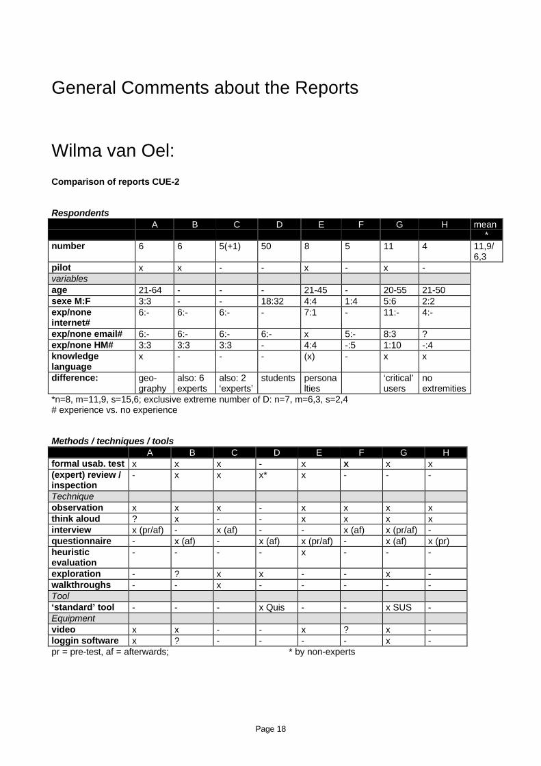
Wilma van Oel:
Comparison of reports CUE-2
RespondentsA B C D E F G H mean
*number 6 6 5(+1) 50 8 5 11 4 11,9/
6,3pilot x x - - x - x -variablesage 21-64 - - - 21-45 - 20-55 21-50sexe M:F 3:3 - - 18:32 4:4 1:4 5:6 2:2exp/noneinternet#
6:- 6:- 6:- - 7:1 - 11:- 4:-
exp/none email# 6:- 6:- 6:- 6:- x 5:- 8:3 ?exp/none HM# 3:3 3:3 3:3 - 4:4 -:5 1:10 -:4knowledgelanguage
x - - - (x) - x x
difference: geo-graphy
also: 6experts
also: 2‘experts’
students personalties
‘critical’users
noextremities
*n=8, m=11,9, s=15,6; exclusive extreme number of D: n=7, m=6,3, s=2,4# experience vs. no experience
Methods / techniques / toolsA B C D E F G H
formal usab. test x x x - x x x x(expert) review /inspection
- x x x* x - - -
Techniqueobservation x x x - x x x xthink aloud ? x - - x x x xinterview x (pr/af) - x (af) - - x (af) x (pr/af) -questionnaire - x (af) - x (af) x (pr/af) - x (af) x (pr)heuristicevaluation
- - - - x - - -
exploration - ? x x - - x -walkthroughs - - x - - - - -Tool‘standard’ tool - - - x Quis - - x SUS -Equipmentvideo x x - - x ? x -loggin software x ? - - - - x -pr = pre-test, af = afterwards; * by non-experts
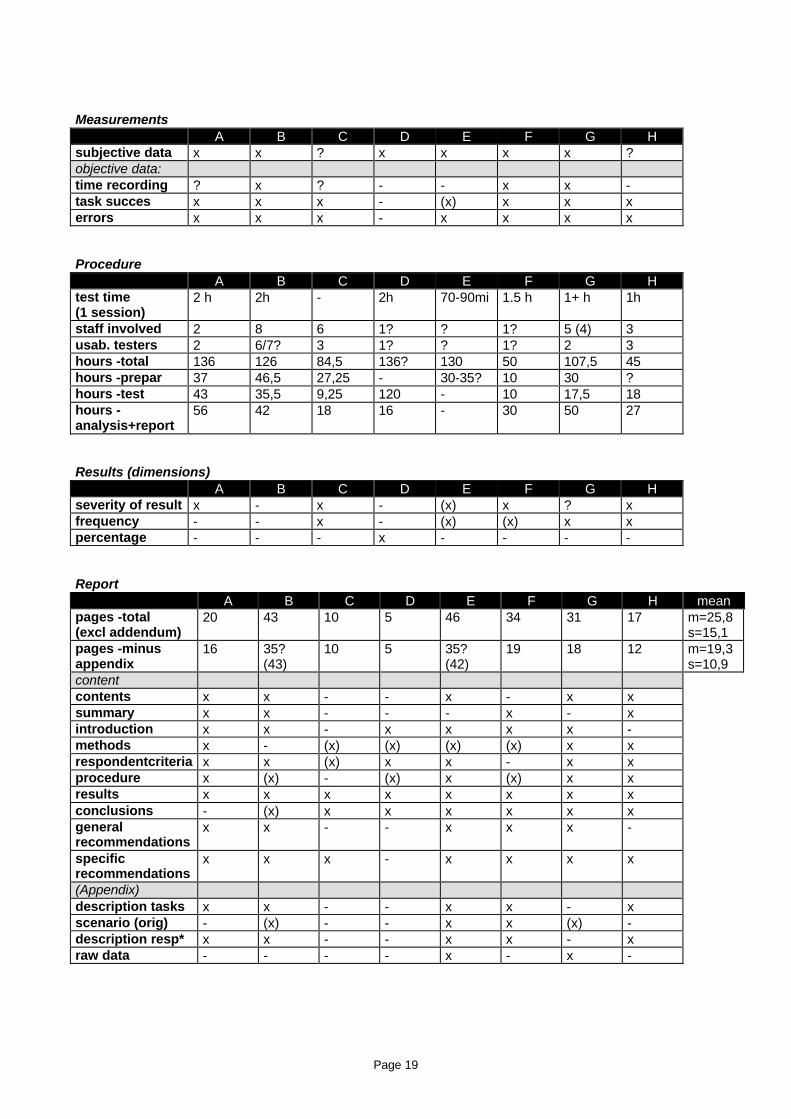
Page 19
MeasurementsA B C D E F G H
subjective data x x ? x x x x ?objective data:time recording ? x ? - - x x -task succes x x x - (x) x x xerrors x x x - x x x x
ProcedureA B C D E F G H
test time(1 session)
2 h 2h - 2h 70-90mi 1.5 h 1+ h 1h
staff involved 2 8 6 1? ? 1? 5 (4) 3usab. testers 2 6/7? 3 1? ? 1? 2 3hours -total 136 126 84,5 136? 130 50 107,5 45hours -prepar 37 46,5 27,25 - 30-35? 10 30 ?hours -test 43 35,5 9,25 120 - 10 17,5 18hours -analysis+report
56 42 18 16 - 30 50 27
Results (dimensions)A B C D E F G H
severity of result x - x - (x) x ? xfrequency - - x - (x) (x) x xpercentage - - - x - - - -
ReportA B C D E F G H mean
pages -total(excl addendum)
20 43 10 5 46 34 31 17 m=25,8s=15,1
pages -minusappendix
16 35?(43)
10 5 35?(42)
19 18 12 m=19,3s=10,9
contentcontents x x - - x - x xsummary x x - - - x - xintroduction x x - x x x x -methods x - (x) (x) (x) (x) x xrespondentcriteria x x (x) x x - x xprocedure x (x) - (x) x (x) x xresults x x x x x x x xconclusions - (x) x x x x x xgeneralrecommendations
x x - - x x x -
specificrecommendations
x x x - x x x x
(Appendix)description tasks x x - - x x - xscenario (orig) - (x) - - x x (x) -description resp* x x - - x x - xraw data - - - - x - x -
Page 20
Barbara Karyukina:I am not quite sure what is the purpose of this exercise. But because Rolf asked us to do it, here it goes.
My comparison is very different than the one done by Wilma, because I first wrote mine and then comparedthem (I did not want them to be the same).
I hope I don't offend anybody with my pluses and minuses. All of it represents my own opinion, which I wouldvery much like to discuss with everybody when we meet. I also did not have too much time, so sorry if Imissed something important in your reports.
Overall• There was a significant similarity in chosen methods. It was nice that many teams used several methods
in their evaluations, because it clearly was not possible to cover all the questions that we were asked withjust one method. At the same time, some interesting evaluation methods were used.
• Teams found a lot of similar problems.
• There were significant differences in findings as well, which may be explained by the difference in usersample:• Language differences experienced vs. novice, UNIX vs. windows users, etc.
Additionally:• It appears that some areas are less hostile ☺ towards Microsoft than others;
• Some groups of users tend to pay more attention to the disclosure and rules;
• Some groups of users seem to trust more in security of the web than others.
• Reports of many teams showed significant similarities in structure. I think this proves that this structureworks, because different labs developed it independently from each other.
• Many teams mentioned positive findings, which I thought, was very good. Some teams put them in aseparate section; I think there can be different opinions about this.
• Several reports had rather extensive tables of content (TOCs). Some of the reports did not have them atall. My perception is that a long TOC can bring users to the conclusion that they are dealing with a verylong report and stop them from even trying to read it.
• My evaluation of different reports may be biased by my perception of a good usability report structure.Perhaps, it is better to present it here. I believe that a report should start with a brief Summary that woulddescribe main findings and recommendations. This summary is useful for gaining developers' attention inthe situation when they know for sure that they don't have enough time to read your report. The Summaryshould be followed by the actual report. The report starts with a very brief introduction of the purpose andmethods of the test, followed by the Findings and Recommendations sections and Appendixes. I prefer towrite each finding as a complete sentence so that they actually describe the problem, not just call out thetopic. A recommendation follows each of the findings. As a rule, I put all methodology in the appendixes -this stuff is very important, however is never interesting to the developers, so they should not spend extratime paging through these sections. I also put any raw data, analysis, user comments, and screen shotsthere. As a result of this project, I think I am going to start using a very brief TOC in my reports.
• It seems that many teams thought about how to order findings better. A majority of teams presented themin the order of developers' questions posed to the test teams, which at the same time appeared to be theregular order of using the application. This seems to me as a good way to organize the findings.It is usually recommended to arrange the findings in the order of severity of problems. But in our situation,the developer's questions were so numerous that it made sense to follow their order. Additionally, someteams decided to put the most important findings up front - in the very beginning of the finding section;other teams marked the most severe problems.
Many reports were very long. Actually, too long to hope that developers in real life would find time to gothrough any of them. However, the length was adequate for our situation. This happened because the
Page 21
developers asked us so many questions all at once. If something like that happens in real work, I try to splitthe report into several sections, perhaps by the method of evaluation used.
Jean Scholtz:Of the 7 teams completing this, 6 did standard usability tests. One also did some inspections. The 7th teamhad students explore the hotmail facility and answer some open ended questions about it and rate theusability using QUIS.
I critiqued these tests from the viewpoint of a manager of a design team trying to determine what changeshad to be made to my product. From that standpoint, I found the exploratory team test less than useful.Although the ratings are nice to know about, this gave me very little insight into problems and potentialsolutions.
From a methodology standpoint, I noted several issues. Several teams used two types of subjects – thosefamiliar with Hotmail and those who were not. If two such groups are used, it seems reasonable to report theresults according to those groups – what confused the novice users? What confused the experiencedusers? Only one group reported that.
Several groups used think aloud protocols. Think aloud protocols are very useful for determining why usersare confused. However, one team reported some performance data for tasks. Performance data and think-aloud protocols are not compatible.
The team that used inspection evaluations as well as user studies did not make it clear how the usabilityproblems were identified.
Usability reports should contain:
1. The tasks users were asked to do2. The demographics of the users3. The equipment used in the test –computer, monitor resolution, speed of connection to internet.4. The procedure for conducting the test Did the observers sit in the room?
How much help did the observers give?How was the analysis done – from watching the video, from notes only?
5. For each task, how many were successful in doing it?6. The problems discovered – in some order, either by task or by area, or by type of problem
This should include the number of users experiencing the problemSome indication of the severity
7. Qualitative information – user comments about the task8. Time – if NOT doing think-aloud
Most teams left out at least one of these sections. After reading all the reports, I really felt that seeing theproblems listed in a more cryptic fashion was better – the narrative reports about sections of the applicationor tasks that described both good and problematic features really have to be studied to discern the exactproblem. I think it’s better to specifically call problems out – and good points as well.
I counted 53 problems that were found by all Teams.Team A – 22Team C – 13Team D – 0Team E - 14Team F - 20Team G – 7Team H - 18
9 problems were found by 3 or more teams. Only 1 problem was found by 6 teams.
Page 22
I would have to say that I think this points to the need for a common reporting format – that specifies whatusability testers should report. As a consumer of the test reports, it would be impossible for me to comparemost of these reports to decide which I should use – I would think that I would want to make sure that thedemographics of the users and the tasks were representative of “my users”.
As this was a “free” test, I can understand not wanting to spend a huge amount of time on it. However, as thetasks and demographics were already specified and collected, adding them to the report should not haveadded much time.
Joe Seeley:
About the studyThe issues the sample client wanted usability experts to address were too broad for a study like CUE-2. Withsuch a large application and so many issues to address, it becomes less likely that teams will cover thesame parts of the application. Also, teams have to balance addressing the client’s desires against the factthat the client is not paying for time. A smaller application or a small subset of a larger application would bemore appropriate given the volunteer nature of the evaluations and the study’s goal of comparing usabilityevaluations.
About the analysisThe identification of problems seems too fine-grained for easy comparison of reports. In at least a few cases,separate rows describe what are probably manifestations of a single problem. For example, problems 265,266, 241, 67, and 41 are all related to the appearance of buttons. Making all buttons look like conventionalGUI buttons could address all of these problems. Similarly, 313, 65, 289, 69, 374, and 64 are all related tothe clearing of data from a form when there is an error. A second pass through the data that aggregatesrelated problems would probably give a clearer picture of which problems were found by many teams, whichteams missed common problems, and which teams found unique problems.
Rolf Molich’s reply to Joe Seeley:Joe,
Thank you very much for your feedback.
I have studied the points you bring up carefully, and I agree that you have a point.
• 265 is indeed the same as 266. To me the important distinction is: Can you correct the one problemwithout also correcting the other problem?
• 241 is different. Most developers would not consider the help system when correcting the buttons in the(main) system. It needs to be explicitly mentioned in the problem description.
• 67 concerns the behavior of the button - not its appearance. You can easily correct 265=266 withoutcorrecting 67 or 241.
• I'm uncertain about 41. The underlying cause is very different from 265, but correcting 265 might solvethis problem.
• 313 relates to the fact that you have to enter your login twice during registration. It has nothing to do withclearing of data.
• I think that 65 and 289 are different problems. In 65 notice that the password disappears and this causesproblems. In 289 users do not notice that the password disappears and this also causes problems.
• 64 is not related to any of the above. Again, it has nothing to do with clearing of data.- 69 concerns theclearing of the "Country" field. 65 concerns the clearing of the "Password" field. 374 concerns the clearingof the user profile.
Page 23
What I looked for in all of the problem descriptions was a generalization of the problem, followed by somespecific examples. But I found few of those, except perhaps for Team B. What I found was specific exampleswhich the testers may have expected their readers to generalize. It is my experience that readers do notgeneralize. So when the testers did not generalize, I chose to count each specific example separately,because I think that developers will correct only the specific problems that are mentioned.
I welcome your comments on these observations.
Scott Butler:• I’d like to know more about the nature of the test teams: who’s academic, who’s a private consultant,
who’s an internal consulting service? I’d like to know how the motivations and backgrounds of thedifferent groups affected the amount of time they spent on this report and the type of report theygenerated.
• I was surprised at the number of teams who neglected to mention how they connected to the internet(e.g., T1 or modem and if a modem, what speed). This was especially surprising since most of the reportsmentioned that users complained about the slow speed of the Hotmail site. Development teams I’mfamiliar with would disregard this feedback if you didn’t state what you’re modem speed was. They’d saysomething like, “Without telling us how fast your modem was, we don’t know if the problem is with the 1.5megs of bitmaps we have on our homepage or if your modem is too slow.” Only two teams indicated whatspeed their modem was.
• I find that a lot of development teams like to have access to data at a variety of levels fromsummarizations and descriptions to raw data, log files, and questionnaire feedback. Most of the reportsonly presented the summary-level data. I also notice that not many teams mentioned highlight tapes inthe addendums. I’m starting to think about “data robustness” and how these reports aren’t very robustbecause they tend to report only one kind of data: summary data.
• I found that problems that were presented in the following fashion -- problem, description, severity,graphic, suggestion -- were easier to use than other presentation styles.
Kent Norman:
Rolf Molich to Kent NormanFive people from the CUE-2 team have contributed comments on the major strengths and weaknesses ofeight of the usability reports in CUE-2.
Several of the comments on your report are causing me some concern because unlike any other commentsthey address your professional integrity.
I enclose the comments in an Excel 97 spreadsheet. ... . I would appreciate a statement from you regardingthese comments. ... . It would be useful to have a reaction directly from you to the questions that mightarise since I understand that you will not be able to participate in CHI99.
Kent Norman’s reply to Rolf MolichThanks for the question about my contribution and the issue of bias.
Here is what you should discuss: To what extent are all usability studies biasedeither for or against the client(s)? The only way to preclude bias is torun a double blind study in which neither the user NOR the researcherknows the identity of the client and the experimental condition being applied.
Page 24
In this study EVERYONE knew. Consequently, a confounding biasis introduced. How can you separate effects due the interface fromthe brand name?
I have made my bias known. I think that is in fact professionally honest.I would question others who claim that they are "objective" but arenot necessarily in touch with their own attitudes and motives.
References:Roesenthal, R. (1967). Covert communication in the psycholoigcal experiment,Psychological Bulletin, 67, 356-367.Jones, R, & Cooper, J. (1971). Mediation of experimenter effects. Journal of Personalityand Social Psychology, 20, 70-74.etc.
Again, I am sorry that I will not be able to attend the Workshop.


