
WSF Working Paper Series
4Is#4/2017
August 2017
Women in Top Incomes –Evidence from Sweden 1974-2013
Anne Boschini, Kristin Gunnarsson, Jesper Roine
FundingERA-Net Plus Funding
Grant Agreement Number 618106
WSF Working Paper SeriesNORFACE Welfare State Futures
Scientific Coordination OfficeZiegelstr. 13c, 10117 Berlin
+49 (0)30 2093 1456info.wsf.sowi (a) hu-berlin.de
welfarestatefutures.org/publications
Women in Top Incomes –
Evidence from Sweden 1974-2013
Anne Boschini
Kristin Gunnarsson*a
Jesper Roine
August 22, 2017
Abstract
Using a large, register-based panel data set we study gender differences in top incomes in
Sweden over the period 1974-2013. We find that, while women are still a minority of the top
decile group, and make up a smaller share the higher up in the distribution we move, their
presence has steadily increased in all top groups over the past four decades. Top income
women are wealthier and rely more on capital incomes, but the difference, relative to men,
has decreased since the 1970s. Over this period capital incomes have in general become more
important in the top, but the share of working-rich women has gone up, while the opposite is
true for men. Realized capital gains are more important for top income women but turn out to
be of a more transitory nature than for men. Mobility is generally higher for top income
women compared to top income men but the trend since the 1990s is toward increased gender
equality in this respect too. Finally, we find important differences between top income
women and men in terms of marital status and family composition. Overall, our results
suggest that many of the findings in the top income literature have a clear gender component
and that understanding gender equality in the top of the distribution requires studying not
only earnings and labour market outcomes but also incomes from other sources.
Keywords: Income inequality, income distribution, gender inequality, top incomes, capital
incomes, realized capital gains
JEL: D13; D31; H20; J16; J31
SOFI, Stockholm University, [email protected]
* Department of Economics, Uppsala University, [email protected] SITE, Stockholm School of Economics, [email protected] a Kristin Gunnarsson thanks the NORFACE ERA-NET (New Opportunities for Research Funding Agency
Cooperation in Europe Network) Welfare State Futures Programme for generous support through Grant
Number 462-14-010.

2
1. Introduction
In recent years the importance of top incomes has become apparent in the study of economic
inequality. Following the seminal work by Piketty (2001, 2003) and Piketty and Saez (2003) a
large number of studies have shown the centrality of developments in the top of the income
distribution, both for the recent increase in inequality observed in many countries, as well as
for its long-run evolution.1 This literature has studied many aspects of top incomes in great
detail. It has, for example, shown the importance of distinguishing between different sources
of income, in particular to consider incomes from capital, and also to study the diverse
developments across different groups within the top of the income distribution.
However, as recently noted by Roine and Waldenström (2015) and, in particular, by Atkinson,
Casarico, and Voitchovsky (2016) one dimension that has not received attention in the top
income literature is that of gender. In view of the enormous interest in the rise of top income
shares in many countries it seems natural to ask: What is the share of women across different
top income groups? How has this changed over time? Are there differences in the
composition of income between men and women in the top of the distribution? Are top
income women different from men along other observable characteristics such as age,
education, marital status, and wealth?
In this paper, we study these questions for the case of Sweden over the past four decades.
Using a large micro panel data set with yearly observations of individual incomes for a
nationally representative sample (3.35 per cent of the Swedish population) starting in 1974 we
are able to analyse how the share of women, and the composition of their incomes, in the top
of the income distribution has changed over time. Using the longitudinal information, we can
also study gender differences in mobility in the top as well as how top income men and
women differ with respect to age, education, wealth, family status, etc. The start of our period
corresponds to when female labour force participation really took off in Sweden and (as we
will discuss in more detail below) when a number of reforms aimed at equalizing
opportunities for men and women were put in place. Our overarching question is how the
process of gradually increased gender equality since the early 1970s has played out in the top
of the income distribution.
In relation to previous work our study bridges two literatures; that on top incomes and the vast
literature on gender inequality and its many facets (see e.g. Bertrand, 2011; Ponthieux and
Meurs, 2015; Blau and Kahn, 2017; and Azmat and Petrongolo, 2014, for excellent
overviews). A substantial part of the gender inequality literature has also, like we do in this
paper, focused on gender differences in the top of the income distribution. However, most of
this work focuses on labour market outcomes by studying, for example, gender differences in
executive compensation (Bertrand, Goldin and Katz, 2010; Smith, Smith and Verner, 2013;
Keloharju, Knupfer and Tåg, 2016) and the so-called “glass-ceiling” (Albrecht, Björklund and
Vroman, 2003; Arulamplam, Booth and Bryan, 2006; Albrecht, Skogman Thoursie, and
1 The collected volumes by Atkinson and Piketty (2007, 2010) contain much of this work and Leigh (2007),
Atkinson, Piketty and Saez (2011), Alvaredo, Atkinson, Piketty and Saez (2013), and Roine and Waldenström
(2015) provide overviews of this literature. Data is available from the top income database at
http://www.wid.world.

3
Vroman, 2015; Fortin, Bell and Böhm, 2017). Recent work by Kleven and Landais (2017)
document the evolution of gender inequality in labour market outcomes for 58 countries since
the late 1960s also focusing on earnings, labour supply and wage rates.
The one exception is the recent work by Atkinson, Casarico, and Voitchovsky (2016). They
report women’s share of different top groups in eight countries with independent taxation for
men and women and also study the composition of these incomes.2 The main difference to our
study is that we use a detailed panel data set that allows us to study other covariates as well as
family status for women in the top groups. We are also able to follow individuals over time
and look at gender differences in top income mobility, which turns out to be important.3
Our ability to look at the share of women in top shares measured over longer periods makes
our study closely related to recent work by Guvenen, Kaplan and Song (2014). They study the
gender structure of top earnings in the U.S. starting in the early 1980s and find increases in
women’s share in the top. Much of this is attributable to a larger share of women staying on in
the top, emphasizing the importance of studying mobility in and out of top groups. As we will
show, differences in mobility also play a major role when studying gender differences in top
incomes in Sweden. An important aspect of this turns out to be the treatment of realized
capital gains, also found to be of great importance for Swedish top income shares in general
(see Roine and Waldenström, 2012).
The individual panel data allows us to address a number of questions regarding who the top
income women are in terms of individual and family characteristics. Having access to
individual wealth data we can also relate to questions regarding potential gender differences
in wealth as a source of income, a potentially important determinant studied already by
Atkinson and Harrison (1978) and more recently by Edlund and Kopczuk (2009).
Finally, in relation to much (but not all) of the work on gender differences it is also important
to note that we in this paper study actual (pre-tax) incomes, not hypothetical gender
differences in case men and women worked equal hours. The latter approach, typically taken
when studying the glass-ceiling, is obviously right for some questions, but we would argue
that studying the sum of all incomes to an individual, and the gender differences in this, is the
more relevant for assessing overall inequality among adults.
Our study obtains five main findings. First, the share of women in the top decile has been a
steadily increased since the 1970s. In the distribution of total income (including capital gains)
the share of women in the top 10 group more than doubled from about 12 per cent in 1974 to
about 28 per cent in 2013. Within the top decile, the share of women is smaller the higher up
we move in the distribution, but the growth rate of the women’s share has been higher in the
very top. While the share of women in the lower half of the top decile (P90-95) has
approximately doubled, from around 15 per cent in the 1970s to about 30 per cent in 2013, it
has almost tripled in the top percentile group (P99-100) from around 8 per cent in 1974 to 23
2 Recent work by Piketty, Saez and Zucman (2016) on the US makes great progress in dealing with gender
inequality in countries where married couples file taxes jointly, making it difficult to observe individual incomes.
They use information on individual labour earnings, available on W2 forms after 1999 and from IRS tabulations
of how wage income is split among couples in the top 5%, available for some years prior to that, to individualize
incomes. Similar work is being done for France by Garbinti, Goupille-Lebret, and Piketty (2017). 3 We will relate our findings directly to theirs in Section 5 on international comparisons.

4
per cent in 2013. However, this picture changes when looking at the distribution of total
income excluding realized capital gains. Now the share of women instead only grows from 8
per cent to about 16 per cent over the period (corresponding to about the same growth rate as
in the P90-95 group), indicating that realized capital gains seem to have an important gender
dimension.
A second finding is that, in terms of income composition, women in the top rely more on
capital incomes than men. Over time this gender difference has decreased at the same time as
the overall importance of capital incomes have increased. In the 1970s, capital played a much
more important role for women top earners compared to men. Since then the role of capital
has increased for both groups but more so for men. When defining top earners based on their
dominant source of income, the number of working-rich women per working-rich man has
increased, while the number of capital-rich women per capital-rich man has decreased.
Third, we find that women are more likely to exit the top group from one year to the next.
This is mainly related to a very different impact of realized capital gains between men and
women. Roine and Waldenström (2012) show the importance of realized capital gains for top
income earners in Sweden and, also, that this importance persists even if the top is ranked
excluding capital gains as well as when the top is defined based on incomes over multiple
years. The interpretation is that realized capital gains to a large extent top-up incomes for
individuals with already high incomes. We find that there is a strong gender component to
this. While realized capital gains top-up already high incomes for men (and hence for most
individuals in the top one group) women in the top without capital gains are not much
affected by adding them. Most of the realized capital gains earned by top income women go
to women who do not qualify in the top group without them. Also, the share of women in the
top of long run incomes is considerably lower than that in repeated cross sections when
capital gains are included (but not when excluding capital gains).
Fourth, we find that top income women on average have more (taxable) wealth than top
income men, which, of course, is in line with top income women having higher shares of
capital income. The difference in magnitude has changed substantially over time, though.
Starting in the late 1970s the ratio of women’s to men’s wealth grew, reaching levels of
women in the top one group having around 4 times as much in average wealth as men in that
group in the late 1980s. In the early 1990s this drops sharply, to a level where women have
around 1.5-2 times as much as men in taxable wealth. This pattern is consistent with tax-
planning being important in the 1980s prior to the 1991 tax reform, but the ratio is also driven
by a gradually changing composition of women in the top group.4
Fifth, we find that women in the top are not very different to men in terms of individual
characteristics such as age and education. Family situations are, however, markedly different.
Only about half of women in the top 1 group are married while the other half is roughly split
between non-married, divorced and widows respectively. These shares have been relatively
4 This tax incentive was not primarily related to the wealth tax since this was assessed on a family bases both before and after
the tax reform in 1991, but rather to the possibility of shifting wealth so as to shift capital income tax since this was
individually assessed (and taxed progressively) after 1986, but with some exceptions put in place already in the early 1980s
limiting the de facto joint taxation of capital income (strictly, so called “B-inkomster” in Swedish tax legislation); see e.g.
Prop 1985/86:130, p. 44-45. After the 1991 tax reform all capital income is tax at a flat rate.

5
stable over time (though the prevalence of married has increased and that of widows has
decreased). For men in the top 1 group the share of married clearly dominates but it has gone
down since 1970s (mainly because the share of non-married and divorced have increased).
We also find a stark difference in terms of couple composition for top income men and
women. About three out of four top 1 men have a wife outside the top 10 (and mostly in the
P0-60 group). For women, the opposite is true; about three in four top 1 women have a
husband in the top 10 (and one in four has a husband who is also in the top 1).
The rest of the paper is organized as follows. Section 2 presents our data and some descriptive
statistics. Section 3 gives an overview of the basic trends for the share of women in and
within the top 10 group of the income distribution as well as for gender differences in the
composition of income, the gender differences in the role of realized capital gains and the
differences top income mobility. In Section 4 we try to further understand who the women in
the top groups are and to what extent they are different from men both in terms of individual
characteristics and covariates as well as in terms of family status. Given the large number of
alternative specification most of the analysis in Sections 3 and 4 is done for the top 1 group
only, with results for the other top decile groups placed in the Appendix.5 In Section 5 we put
our main findings in international perspective and, finally, Section 6 contains some
concluding remarks.
2. Background, our data and descriptive statistics
Sweden is well known for its gender equality, topping several international rankings together
with the other Nordic countries.6 The reasons for Sweden’s relative gender equality are, of
course, many and have long historic roots (see Lundqvist, 2010) but some of the most
important steps were taken in the early 1970s, that is around the start of the period we study.
First, a change in tax legislation in 1971 made it compulsory also for married couples to file
individual tax returns. A few years later in 1974, legislation was passed that entitled mothers
and fathers to share parental allowances upon childbirth. In the early 1970s school reforms
were also made (for both primary and secondary school) and the childcare system was
extended emphasizing the promotion of equal opportunity.
These policy reforms were instrumental for the observed increase in female labour force
participation in the 1970s. The group that responded most to the policy changes was married
women, who’s labour force participation increased from 47.2% in 1965 to 82% in 1985.
Women’s overall labour force participation – independent of marital status – went from
53.8% to 79.2% over the same period, so that women in 1985 had only a few percentage
points lower labour force participation than men (see Gustafsson, 1992). Though most of the
rapid expansion was in the form of part time work, the share of women in full time
employment has also increased steadily since the early 1970s (see e.g. SOU 2005:73 for
5 More precisely, Appendix D contains details within the top 1 in the form of separate results for P99-99.9 and the top 0.1
group. Appendix E contains results for the P90-P99 group (often divided into P90-95 and P95-99). 6 For example, Sweden ranks first in the 2009 Social Institutions and Gender Index from the OECD, and fourth in the 2016
Global Gender Gap presented at the World Economic Forum.

6
details). As a share of all income earners in the tax population, women today constitute about
50 per cent
2.1. Data
Our data comes from the longitudinal individual register database (LINDA), containing yearly
observations for the period 1968 to 2013. The panel consists of a random sample of 3.35 per
cent of the Swedish population, thus ranging from around 180,000 individuals in 1968 to
around 300,000 in 2013. The construction of the sample ensures that each year is a
representative cross section of the population that income year.7 The main income variables
used in our analysis are taken from the same tax registers that form the bases for previous
Swedish top income studies (e.g., Roine and Waldenström, 2008, 2010) covering the full
population previously and, as shown in Roine and Waldenström (2012), estimated top income
shares are essentially equal when using LINDA as when using total tax statistics.
Even though individual data is available starting in 1968 we choose to start our analysis in
1974. There are several reasons for this. First, as mentioned above, before 1971 it is not
possible to separate incomes for men and women since filing taxes on individual bases was
optional for married couples. The system had formerly been household based and a gradual
move toward individual taxation started in the 1960s, but it was not until 1971 that individual
taxation became compulsory. Second, a number of reforms in the early 1970s changed the
income concept and in particular what was included in the tax base. The most important of
these was implemented in 1974 when incomes from items such as unemployment and sick-
leave insurance became part of taxable income. For our purposes starting in 1974 means we
get an income concept that is comparable over time (see Roine and Waldenström, 2010, for
details on these reforms and their impact on the income concept). In addition, 1974 marks an
important year in terms of women’s labour market participation. This year a new parental
allowance system was implemented in Sweden encouraging women with young children to
keep their connection to the labour market.
The main variables of interest in our analysis are total (individual) income, before taxes and
transfers, and all its components. Up until 1990, total income consisted of six income sources:
labour income, capital income, entrepreneurial income, farm income, real estate income and
capital gains. In 1990-1991 a major tax reform was conducted and resulted in a number of
changes in the Swedish tax system and one of them was a change to three income sources
instead of six; earned income (mainly wages), capital income, and business income.8 While
realized capital gains count as capital income (and are taxed at the same flat rate as capital
income) after 1991, it is possible to separate them throughout the period. We follow the same
methods for this as previously used in Roine and Waldenström (2012) and in Bengtsson et al.
(2016).9
7 See Edin and Fredriksson (2000) for a detailed description of the LINDA database and its construction. 8 For a more comprehensive description of the income concepts over time in Sweden, see Roine and Waldenström (2010). 9 The working paper version of Bengtsson et al. (2016), Bengtsson, et al. (2012) contains a detailed appendix of all the
changes of income concepts and their relation to different income definitions.

7
The wealth data used refers to taxable wealth at an individual level. This has a number of
well-known problems in its relation to the levels of true net wealth (see Roine and
Waldenström, 2009, for more details on this). Even though the basic ambition has been the
same over time, that is, to tax total net wealth (the value of all assets less total debt) there has
been some variation in which items have been included and also, more importantly, in how
these have been valued at different points in time. In addition, the threshold above which one
has to file a wealth tax return has changed over time. By focusing on ratios between men and
women in the top of the distribution with respect to the importance of wealth we can,
however, minimize the impact of such problems.
Another potential problem that applies specifically to the relative importance of wealth
between men and women is that some wealth is assessed jointly for couples, and also that, at
least before the 1991 tax reform, there were tax incentives to shift ownership of wealth within
couples. This certainly affects the interpretation of the origins of an asset but at the same time
the tax value at the individual level reflects the legal claims to the asset. It has never been
possible to transfer an asset for tax purposes only while keeping ownership of the asset. In this
respect, the taxable wealth at the individual level does reflect the individual rights to the
assets.
Following the top income literature, we study different top groups within the top decile. We
will mainly focus on three groups: income earners in the top P90-95, P95-99 and P99-100.
Ideally, and following the top income literature, we would like to study smaller fractions
within the top one group but as we rely on a sample and since the women representation in
top groups shrink as we move toward the top, estimates become more sensitive to outliers as
we move towards smaller fractions. In our main results, we therefore focus on the top1 group
but we do report some key findings for smaller groups in Appendix C. In particular we report
the income composition and income levels in SEK for the P99-99.9 and P99.9-100 groups
separately highlighting the fact that as we move toward the very top, capital incomes
dominate total income. In some parts of the analysis we also limit ourselves to studying the
top 1 group and place results for the P90-95 and P95-99 group in the Appendix.
2.2. Descriptive statistics and top income shares
As in many other countries top income shares in Sweden have gone up over the past decades.
This increase has been relatively large, in percentage terms, but starting from an
internationally very low level. Globally Sweden remains among the most equal countries.
Over the period we study here, 1974-2013, the top decile income share fell from around 27
per cent in 1974, down to a low 22 per cent in 1981, and has since gradually increased to
around 30 per cent in 2013. The corresponding figures for the top percentile group are 5.7 per
cent in 1974, 4.1 per cent in 1981 and 8.7 per cent in 2013. These shares are including
realized capital gains, which, as we will see, have become gradually more important since the
1980s. The overall trend, with decreasing top shares until around 1980 followed by a gradual
increase since, is however present also without the inclusion of capital gains.

8
To get a sense of the income levels we deal with when talking about the top 10, top 5, or the
top 1 group we can illustrate the thresholds for being part of these respective groups and how
they have evolved over time. As can be seen in Figure 1 incomes were more compressed in
the 1970s and 1980s and the inclusion of realized capital gains makes more of a difference
over time. (Appendix A1 contains exact figures on thresholds, average income, and income
shares for top groups in 2013.)
Figure 1. Income thresholds for P90, P95 and P99, with and without realized capital gains
income in 2013 prices.
3. Top income gender gaps in Sweden 1974-2013
We now turn to answering our first set of questions: How has the share of women in the top
changed over time? What are their sources of income at different levels, are they different to
those of men, and how have they evolved since the early 1970s? Are women more or less
likely to stay in the top when compared to men, and how has this changed over time?
3.1. Share of women in and within the top10
We begin by presenting the trend in the share of women in the top of the income distribution
in Sweden over time. We focus on our three main top income groups, P90-95, P95-99, and

9
P99-100 and report the share of women when calculating the top income groups in two ways;
when including realized capital gains (RCGs) in total incomes and when excluding RCGs.10
Figure 2 shows the trends in share of women in the respective percentile groups, with the left
hand panel showing the development when ranking individuals according to total income
including RCGs and the right hand panel when ranking excluding RCGs.
Figure 2. Share women in top groups 1974-2013 when including realized capital gains (left
hand panel) and excluding realized capital gains (right hand panel).
Overall, Figure 2 shows a steady and significant increase of the share of women in all top
groups. From constituting 12 per cent in 1974, women in 2013 are above 25 per cent of those
in P90-100. The order of magnitude of the increase is roughly a doubling of the share of
women in all groups since 1974. Figure 2 also clearly shows that the share of women is
consistently smaller the higher up in the distribution one moves. However, comparing the left
and right hand-panels, there is a clear difference in the share of women depending on how
realized capital gains (RCGs) are treated. When including RCGs (the left hand panel in Figure
2) the percentage share of women in the top 1 has almost tripled from around 7 per cent to
roughly 24 per cent, while the share of women when excluding RCGs (the right hand panel)
10 Whether to include RCGs, or not, is an open question. RCGs clearly form part of total income, but their nature
of (potentially) being accumulated over several years and occurring infrequently has led many to exclude RCGs
from distributional studies. In the top income literature, the standard has been to report income shares both
including and excluding RCGs whenever possible. Another possibility - used already in Piketty and Saez (2003)
and in many other studies since - is to rank individuals excluding RCGs and then adding RCGs to their other
incomes. This avoids including individuals in the top group who are there only based on their RCGs, while
acknowledging that RCGs form part of total income. In terms of women representation there is, of course, no
difference in their share whether RCGs are included or not, if the ranking of individuals is done before adding
them.
10
has grown from 7 to 18 per cent. Also in P90-95 and in P95-99 the share of women is higher
in these top groups when including RCGs. Thus, this indicates that women, to a larger extent
than men, appear in the top only as a function of realized capital gains.
3.2. Gender differences in income composition
Total income in Sweden can basically be divided into three sources: earnings, capital income
and business income.11 Previous studies of top incomes have shown that capital income in
general becomes more important closer to the top (and typically significant only in the top 1
group) and also that capital income has grown in overall importance over the past decades. A
particular feature in Sweden, already noted in the previous section and previously studied in
Roine and Waldenström (2012), is that the treatment of realized capital gains (RCGs) matters
for the development of top shares. They show that, on average, the top 1 income share over
the past decades is some 30 per cent higher when including RCGs in a repeated cross section
analysis. Averaging incomes over several years, they conclude that a substantial part of this
remains even when taking into account the potentially transitory nature of RCGs. Top income
individuals, hence, seem to top up already high incomes, rather than becoming top income
individuals only as a function of RCGs. As we show below, this result turns out to have a
clear gender dimension.
To study the income composition between men and women, taking the role of RCGs into
account, we study three alternatives: 1) excluding realized capital gains altogether; 2)
including realized capital gains; and 3) including realized capital gains but ranking individuals
excluding capital gains. The first alternative makes a decomposition that is comparable to
other studies where RCGs are not included, the second are in relation to standard repeated
cross sections including RCGs, and, finally the third alternative keeps the ranking of
individuals when excluding RCGs but then adds RCG incomes. The third alternative is our
preferred measure – and the one we will focus on in the following sections – since it
recognizes that including RCGs when ranking individuals can create a very different (and
possibly misleading) picture of the top, but at the same time it includes RCGs as part of
income.12
11 Before the tax reform in 1991 there were six income categories but these can be translated so as to correspond
to the three categories used after 1991 (see Section 2.1 above). Comparing to many other countries the concept
of business income is much less important in Sweden since most businesses, including self-employed
individuals, pay themselves wages (which thereby become earnings in the tax statistics). The main categories are
therefore earnings and capital income, with the latter being divided into capital income (mainly dividends and
interest) and realized capital gains (RCGs). 12 Creating top groups excluding RCGs and then adding back RCGs is done in e.g. Piketty and Saez (2003) and
many other studies in the top income literature but in some countries RCGs are not included as income and in
other countries RCGs cannot be separated from other capital income. It is therefore important to study all
alternatives and select the appropriate series when making comparisons.

11
Figure 3. Income composition for P90-99 (top) and P99-100 (bottom), excluding realized
capital gains, by women (left) and men (right) separately.
Figure 3 shows the income composition across genders excluding RCGs altogether. We see
that for both men and women in the P90-99 group, labour income totally dominates,
constituting more than 90 per cent of income, while capital income is not very important. For
what little capital income this group has there is, however, a gender difference in that capital
incomes are more important for women but have decreased in importance over time. For men,
the trend is the opposite with capital income growing in importance. In the top 1 group the
time trends are the same but much clearer as capital incomes are more important overall; for
top 1 women capital income constitutes on average about 15 per cent of income throughout
the period, while for men it has increased over time from only a few per cent in the 1970s,
then increasing gradually over time with a marked increase in the past decade becoming
almost as important as for women. Business income accounts for only a few percentage points
of total income and has been decreasing in importance for the top 1 group.13
In the top 1 group the time trends are similar but with capital incomes being more important
overall; for top 1 women capital income constitutes on average about 15 percent of income
throughout the period, while for men it has increased over time from only a few percent in the
1970s, then increasing gradually over time with a marked increase in the past decade
becoming almost as important as for women.
13 As noted before, business income is in Swedish tax law a relatively narrow concept and it should not be taken
to indicate the importance of self-employment income (or small business income). Most self-employed pay
themselves a wage (as most social benefits are tied to wages) and also have possibilities to pay out dividends
(i.e., capital income in this context) with certain tax advantages.

12
When including RCGs before ranking individuals, capital incomes as a whole increase for all
groups. As can be seen in Figure 4 capital incomes are still generally more important for
women, and have also become more important over time for both men and women. Total
capital incomes now make up close to 20 per cent of all income for women in the P90-99
group and about 60 per cent for the top one group. The corresponding figures for men in these
groups are generally lower, with the exception of capital incomes (not including RCGs) which
have become more important for men since around 2005.
Figure 4. Income composition for P90-99 (top) and P99-100 (bottom) ranked including
realized capital gains, by women (left) and men (right) separately.
Much of this is of course due to new individuals appearing in the top only as a function of
making a one-off realization of a capital gain (possibly built up over a long period of time and
hence not to be counted as an income only in that year according to the classical definition of
income). To avoid including such individuals, but at the same time taking the importance of
RCGs into account, we rank individuals based on their incomes without RCGs, but then add
RCGs back to these individuals. The results of this are shown in Figure 5.

13
Figure 5. Income composition for top P90-99 (top) and P99-100 (bottom) ranked excluding
realized capital gains and then adding RCGs, by women (left) and men (right) separately.
The income compositions can now be described as being a mix of the two previous figures.
Clearly RCGs have been important additions to total income for individuals who are in the top
groups even without RCGs at least since the 1990s. In recent years, however, there seems to
have been a shift toward “standard” capital incomes becoming more important in relation to
RCGs.14
3.3. Gender differences in the role of realized capital gains
As shown in the previous section, the most striking difference in income composition between
top income men and women lies in the importance of realized capital gains, in particular for
the top 1 group. This difference has two parts to it; first, when including RCGs before ranking
individuals, women become more numerous in the top 1 group – up to 23 per cent from about
17 per cent when ranking excluding RCGs – suggesting that it is relatively more common for
women to appear in the top group only when including realized capital gains, and second, that
RCGs make up a somewhat larger share of income for those women who are in the top even
when excluding RCGs (as shown in Figure 5 above).
To understand the gender differences in the role of RCGs further we study the impact of the
different ways of treating them when calculating income shares averaged over different time
periods. The logic is straightforward: if the income share of the top group when including
14 In Appendix B, Figure B1, we show the levels of labour, capital and RCG income in Swedish Krona, for men
and women respectively to provide a sense of the magnitudes.

14
RCGs before ranking is similar to that when ranking without RCGs but then adding them
back, this suggests that RCGs are mainly “topping-up” income for those who are in the top
even without RCGs. If there is a clear difference in income shares depending on whether
RCGs are included before ranking or not, this suggests that more of RCG income goes to
individuals who are not in the top without them. When doing this, but averaging incomes over
several years we can also see these patterns in “long run” income shares. Figure 6 shows this
for top1 women and men respectively, first for yearly income (top panels), and then for the
top1 group defined as those with the highest incomes over 5 years moving average windows.
Figure 6. Income shares for top 1 women and men with different treatment of RCGs, yearly
incomes (top) and 5 year average incomes (bottom).
Figure 6 shows an interesting difference between women and men in that for top income men
RCGs for the most part top up already high incomes. The income share for men, when first
excluding RCGs when ranking and then adding them, is very similar to that of the top group
when including RCGs before ranking. For women on the other hand, the income share
increases significantly when adding RCGs before ranking, suggesting that much of women’s
RCGs go to women who would not be in the top group without them. This is true both for
yearly and 5 years average incomes.

15
Figure 7. Share of women in top 1, excluding and including RCGs when ranking, for 1, 3 and
5 years average incomes.
Figure 7 shows that the share of women when excluding RCGs does not change much when
averaging over several years (top panel). Comparing to the share of women when including
RCGs we see a clear drop from 1 to 3 years, where about two to three percentage points of the
women are only in the top in yearly data when including RCGs. Interestingly the share of
women when including RCGs before ranking is higher even for the 5 years average than it is
when excluding RCGs suggesting that some RCGs are substantial. The share of women in the
top of the 5 years average income group when including RCGs is just below 20 per cent,
while it is about 17 per cent in the yearly income top group when excluding RCGs.
3.4. Gender differences in top income mobility
The analysis above shows that women to a larger extent than men appear in the top of the
distribution only as a function of making realized capital gains, but what about mobility in
general? Are women more likely to fall out of the top group? And if so, where in the
distribution do they go? How has this changed over time? Figure 8 shows yearly transition
probabilities for top 1 women and men respectively (top 1 ranked excluding RCGs).15 From
15 If we were to look at the transition probabilities including realized capital gains before ranking the drop in the
likelihood of remaining in the top 1 would decrease much more dramatically over time, especially for women.
This, of course, reflects the fact that many women (and more women than men) appear in the top only when
including realized capital gains. Parallel to the increasing importance of realized capital gains since the late
1980s, the likelihood of a women staying in the top 1 (including RCGs) falls from around 0.7 to between 0.3-0.4,
that is much lower than the slight fall shown in Figure 8. For men the likelihood of leaving the top 1 group is

16
one year to the next most people who are in the top also stay in the top group. For those who
fall out, most move to the group immediately below (P95-99). Comparing women and men,
women are more likely to move out of the top group than men. Looking at the pattern over
time, women have always been a little more likely to drop out of the top group, but while the
trend for men is relatively flat since the 1990s women have a slight upward trend making
them more likely to stay in the top group today as compared to in the 1990s. Also, the
likelihood that an individual moves from the top 1 group to below P95 has for most of the
period been larger for women than for men.
Figure 8. Transition probabilities, year to year, out of the top 1 group of the distribution
excluding RCGs, for women and men, 1974-2013.
The relatively high likelihood that an individual remains in the top group from one year to the
next should of course not be mistaken for low mobility over longer periods. To get a sense of
mobility over longer periods we calculate where individuals have moved over a five years
period. That is, around year t, we look at where those in t-2 are in t+3, t-1 are in t+4, t are in
t+5, t+1 are in t+6, and where those in t+2 are in t+7. This gives an average mobility over five
years for a five years window around every year. The results are shown in Figure 9.
also larger when including RCGs but the difference is not a large as for women, in line with our results in the
previous section that RCGs to a larger extent go to men who are in the top group even without capital gains.

17
Figure 9. Transition probabilities, from year t to year t+5 averaged for five years around
each year (up until 2008, five years before 2013) out of the top1 group of the distribution
excluding RCGs, for women and men 1974-2013.
As can be seen the patterns and time trends are similar to the results for the year-to-year
transition probabilities: women are a little less likely than men to stay in the top1. Since the
1970s there has been a slight decline in the probability of remaining in the top 1 group over a
five-year period for both men and women. This decline in probability is almost perfectly
mirrored by an increase in the likelihood of appearing in the P95-99 group, suggesting that
most movement is still within the top. The likelihood that women leave the top completely is,
however, clearly larger for women than for men.
Guvenen, Kaplan and Song (2014) look at gender differences in mobility in the same way but
for earnings. Comparing to their results our gender mobility differences are similar in the
sense that women are consistently more likely to move out of the top group. However, the
differences are smaller in our data and have been much more constant over time. Also, if
anything the trend in our data is slightly towards higher mobility over time, while the US
earnings mobility seems to have decreased both for men and women.
4. Who are the women in the top 1 group?
So far, we have looked at differences between men and women as groups. We now turn to
questions about who these top income women really are in terms of observable characteristics
and how they have changed over time. Are top women typically young or old, more or less
educated, married or single, etc.? How do top women compare to top income men in these

18
respects? The study, and in particular the interpretation, of these characteristics of top income
earners should be done carefully since many things change simultaneously over time. In
particular, since the share of women grows over time, what we observe is potentially a mix of
changing characteristics of the average top income women and changes caused by the
addition of women with different characteristics than women who previously made up the top
group.16 In addition there are of course overall societal changes such as the population
becoming older, more educated, more often divorced, and of the income composition
changing, in particular, in the direction of capital incomes becoming more important in
general. Keeping this in mind, we will focus on who the top women are in terms of their
observable characteristics especially relative to men, and how this has changed since the
1970s.
4.1 Education, age and marital status of top income women
Looking first at basic descriptives and how these vary between men and women in the top, we
see relatively small gender differences in overall trends. For education the trends for both men
and women show what one could expect: the share of top income earners with post secondary
degrees have increased while those with lower education have decreased and in general
women top income women have higher levels of education (as is the case for women in the
overall population). This is especially true below the very top (in the P90-99 groups) where
the share of tertiary education has increased substantially, while the educational composition
in the top 1 group has not changed as much - see Appendix C for more details. This is of
course not saying that education is unimportant in the top, only that this does not explain the
changes in the gender patterns we observe.
When it comes to age, women and men in the top are most likely in mid or late stages of work
life, with a tendency over time toward a higher probability of being in later stages of their
careers, in particular for women. Looking first at the age distribution when excluding RCGs
(the top panels of Figure 10) the probability of women being 50-64 has gone up while fewer
top women are young and also fewer are above 65. For men instead the share of top income
pensioners has increased slightly while the share of young top income men has fallen slightly.
The overall pattern is most likely a consequence of a changed gender composition with more
high earning women, in the later stages of their careers entering the top group.
When including RCGs the age patterns change slightly. The share of women aged 50-64 still
increases over time but now the share of women above 65 also grows. For men the age
patterns are similar to those when excluding RCGs but the share of men over 65 is slightly
larger. Taken together this suggests that RCGs are relatively more important when individuals
are above 65 but also that this effect is especially pronounced for women.
16 To illustrate using a trivial example: if 10 per cent of the top group in period t consists of women who are all
50 years old, a change between t and t+1 where the share of women grows to 15 per cent and the average age
falls to 45, is compatible with both 10 per cent of the top group still being 50 years old women plus a 5 per cent
addition of younger women, as well as all top women now being 45 years old, and any number of combinations
in between. The same is of course true for the interpretation of the mirror image of what happens to the
composition of men in the top as more women enter the top group.

19
Figure 10. Age composition of women and men in the top 1 group when excluding RCGs (top)
and including RCGs (bottom), 1974-2013.
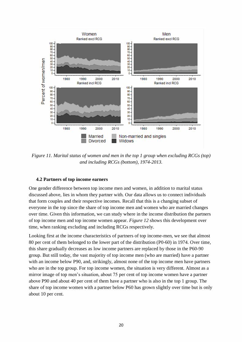
Looking at the marital status for women and men in the top 1 group in Figure 11, we observe
relatively large differences between genders in the top group and, again, some differences in
time trends for women when including and excluding RCGs.17 Over the whole period roughly
half of top women are married with a slightly increasing trend over time (at least when
ranking excluding RCGs). For men, on the other hand, about 75 per cent are married today,
but this is a decrease from around 90 per cent in the 1970s. An interesting detail, which
explains some of the differences in women’s age composition when ranking with or without
RCGs, noted above in Figure 10, is that the share of widows falls over time when excluding
RCGs. This suggests that much of the increase in the share of women above 65, when
including RCGs, is driven by widows. To confirm this effect we separate out the women who
only appear in the top 1 group when RCGs are included and indeed, about 25 per cent of them
are widows and almost half of them are over the age of 65.18
17 Swedish register data allow us to differentiate between married individuals, widows/widowers, divorced and
the rest being either singles or co-habiting. This implies for instance that cohabiting couples (that are not
married) with children are either classified as non-married or divorced if they have been married previously. 18 Most individuals are in the top 1 group both when including and when excluding RCGs but some are there
only when including RCGs. When looking at the subset of women who are only in the top 1 when including
RCGs a majority of them are above 65 and a quarter of them are widows.
20
Figure 11. Marital status of women and men in the top 1 group when excluding RCGs (top)
and including RCGs (bottom), 1974-2013.
4.2 Partners of top income earners
One gender difference between top income men and women, in addition to marital status
discussed above, lies in whom they partner with. Our data allows us to connect individuals
that form couples and their respective incomes. Recall that this is a changing subset of
everyone in the top since the share of top income men and women who are married changes
over time. Given this information, we can study where in the income distribution the partners
of top income men and top income women appear. Figure 12 shows this development over
time, when ranking excluding and including RCGs respectively.
Looking first at the income characteristics of partners of top income-men, we see that almost
80 per cent of them belonged to the lower part of the distribution (P0-60) in 1974. Over time,
this share gradually decreases as low income partners are replaced by those in the P60-90
group. But still today, the vast majority of top income men (who are married) have a partner
with an income below P90, and, strikingly, almost none of the top income men have partners
who are in the top group. For top income women, the situation is very different. Almost as a
mirror image of top men’s situation, about 75 per cent of top income women have a partner
above P90 and about 40 per cent of them have a partner who is also in the top 1 group. The
share of top income women with a partner below P60 has grown slightly over time but is only
about 10 per cent.

21
Figure 12. Income group of top women’s partners (left) and of top men’s partners (right),
1974-2013.
4.3 The distribution of working-rich and capital-rich women in the top
Even though the income composition of the top group, studied in Section 3.2 above,
obviously gives some information about sources of income, it is also useful to try to explicitly
look at the composition from an individual level. The same income composition for the group
can be the result of either very similar individual profiles or of some earning predominantly
capital income and others mainly labour income. To explore this, we define two types of top
income-individuals, capital-rich and working-rich, based on which of these income sources
dominates. More precisely, we define an individual in the top 1 group with more than 2/3 of
total income from capital as “capital-rich”. Similarly, an individual with more than 2/3 of total
income from labour is labelled as “working-rich”. Anything in between is labelled “mixed”.19
Figure 13 shows the proportions of different types since 1974, separating women and men in
the top 1 group, when ranking excluding RCGs.
19 These cut-offs are the same as those used in Roine and Waldenström (2012). Of course any categorization of
this sort is arbitrary but we have tried other thresholds to and none of our conclusions are qualitatively different
when using different thresholds.

22
Figure 13. Share of working-rich, capital-rich and mixed top income earners, women (left)
and men (right) 1974-2013.
Most individuals in the top 1 group clearly have more than 2/3 of their income from labour.
This share is today about 80 per cent for both men and women. However, over time there is a
clear gender difference in the development. The share of top men with primarily labour
related income has decreased steadily since the 1970s, while this share for women has been
more stable. Also, the share of women with primarily capital income has been relatively high
and about as large as the group of “mixed” income women over the whole period, but men
with capital as the main source of income has always been smaller than the corresponding
male mixed income group but both have grown in importance over time.
These shares are the combined result of several developments over time. Women are
throughout the period consistently a smaller, but growing, share of the top group. At the same
time, capital incomes have become an increasingly important source of income for everyone
in the top. A way to highlight the difference between men and women is to “normalize” the
development by looking at the ratio of working-rich women to working-rich men, and the
corresponding ratio for capital-rich individuals. Figure 14 shows the results of these ratios.
The trends may at first seem contradictory; capital-richness among women has decreased in
importance while labour related incomes have become more important, over a period when
capital overall is becoming more important and we also know that capital is, on average more
important for top income women than for top income men.

23
Figure 14. The ratio of capital-rich women to capital-rich men and the ratio of working-rich
women to working-rich men, 1974-2013.
The key to understanding these trends is to note that the developments are relative to men in
the top group. In the 1970s, when capital income was less important than today, there were
around 0.7 capital-rich women per capital-rich man in the top. (In one year in the early 1980s
there were even more capital-rich women than men in the top 1 group). Over time, capital has
become more important in the top group but, relatively speaking, more of this increase has
gone to top income-men. Hence, the ratio of capital-rich women to men falls. For the relative
development of working-rich, the opposite is true. Over a period when the share of working-
rich has fallen for both men and women in the top, this decrease has been relatively smaller
for women, and consequently the ratio of working-rich women to working-rich men has
increased.
With the risk of stating the obvious, a back-of-the-envelope example gives a clear picture of
the development: out of 100 top income individuals about 8 were women in the mid-1970s,
and out of these almost two had capital as their main source of income. Among the 92 men
that made up the rest of the top group, only some three, maybe four, had capital as their main
source of income. Today the group of women has increased to about 16 out of the 100, and
out of these the share with capital as their main source of income remains about the same as in
the 1970s. That is, a little more than three top women have capital as their main source of
income. The number of men in the group is now down to 84 but out of these the share with
capital has approximately quadrupled since the 1970s to about 17 men. Even if it is true that
capital remains more important for top income women relative to men it is also clear that the
bulk of the increasing capital incomes have gone to top income men.

24
4.4 Gender differences in wealth holdings among top income earners
Capital income obviously, by definition, derives from ownership of capital. As our data
contains data on individual wealth holdings, based on wealth tax statistics, we can also study
wealth holdings for top income individuals and the distribution of these between men and
women in the top group.20
These data are in general far from ideal, both in terms of coverage and in terms of asset
valuations (see Roine and Waldenström, 2009). However, if one looks at the ratio of wealth
between women and men, the data become less problematic. As long as the wealth tax data is
a proxy for underlying wealth and the problems with coverage and valuation are not
systematically different between men and women, the wealth ratio captures changes in the
relative importance of wealth between women and men over time. Figure 15 shows the ratio
of average wealth held by women in the top 1 group over the average wealth held by top
income this ratio over time.21
Figure 15. Ratio of average wealth held by top income women to average wealth of top
income men, 1974-2007 (last year when data are available).
20 Married couples and cohabiting partners with (own) children were taxed jointly in the wealth tax regime that
existed up until 2007. But wealth holdings are still registered to individual people and these registered owners
are either men or women. These data form the bases for dividing wealth by gender. 21 It should be noted that a large part of top income individuals report zero net wealth (typically because they
have wealth below the tax threshold). The average we calculate includes these individuals since we sum all
wealth held by top income women and men respectively and divide by the total number of top income women
and men. Again, this means that the averages can change due to changes for the representative individual as well
as due to changes in the composition.

25
This figure shows an interesting pattern with top income women holding on average more
wealth than top income men, consistent with top women having higher average capital
income, but it also shows a clear build-up of wealth of top income women compared to men
in the 1980s followed by a decrease in the 1990s. This pattern is consistent with high income
individuals shifting assets so as to minimize taxes. Before the 1991 tax reform capital incomes
were taxed progressively so being able to shift within the family would be beneficial if one’s
partner had a lower income. Even though wealth was jointly assed for couples up until the
abolishment of wealth tax in 2007, capital income became individually taxed in 1986 (with
some parts being individually taxed already in the early 1980s) creating incentives to shift
wealth to a lower income partner before the 1991 tax reform. Given what we know about top
income individuals and their partner’s income, from section 4.2 above, top income men were
much more likely to have a partner with low income than were top income women, possibly
creating a higher wealth ratio between women and men in the 1980s.22
5. International comparison
As already mentioned in the introduction, what we know about women in the top of the total
income distribution and how it has developed over time a cross countries is relatively limited.
The main reason is that top income studies typically rely on tax data and in many countries
the tax unit is the household, making it difficult to distinguish total incomes for men and
women (while labour market outcomes, wages and earnings are typically available for men
and women separately).
However, for some countries, especially in more recent time-periods, this is not the case, and
for these it is possible to study gender dimensions in the top of the distribution for different
periods depending on data availability. The paper by Atkinson, Casarico, and Voitchovsky
(2016) does precisely this. Figure 16 below puts our basic result about the evolution of the
share of women in the top 10 group in Sweden next to their results for eight other countries
(Australia, Canada, Denmark, Italy, New Zealand, Norway, Spain and the UK). In most cases
their results are based on distributions when excluding capital gains (see Atkinson, Casarico,
and Voitchovsky (2016) for details) but for Sweden we include the share of women both with
and without RCGs.
22 In general, the period after 1980 is characterized by rapid growth of asset values based (both financial and real
assets), see Roine and Waldenström (2012) for details.

26
Figure 16. International comparison of the share of women in the top P90-100 (left) and in
P99-100 (right) the distribution of total income, 1974-2014.
A first observation, also made by Atkinson, Casarico, and Voitchovsky (2016), is that the
developments are strikingly similar despite the countries being relatively diverse in terms of
their overall gender equality.23 The left-hand panel in Figure 16 indicates that while Sweden
and Norway are consistently high up in gender equality rankings, countries such as Italy and
Spain are typically far behind (especially when it comes to economic opportunity).24 But there
doesn’t seem to be much difference in the number of top income women. If anything, the
share of women in the top 10 group has increased at a slower pace in Sweden and Norway
and that the representation of women in the top today is lower than in other, overall less
gender equal, countries.
These patterns become even more striking when looking at the share of women in the top 1
group of the total income distribution. The right-hand panel in Figure 16 shows this
development over time. The three Nordic countries (Denmark, Norway and Sweden) are now
even more clearly the countries with the lowest share of women in the top group when
excluding income from realized capital gains (RCGs) in the ranking of individuals. As
discussed in some length in previous sections, including RCGs increases the share of women
substantially in Sweden. However, we know from our analysis of mobility that these women
that enter the top group are different individuals from one year to the next (more so than for
23 These trends and levels are also in line with what Piketty, Saez and Zucman (2016) find in terms of the share
of women in the top 10 and top 1 groups of the earnings distribution in the US. 24 In the 2016 World Economic Forum Report, Norway and Sweden hold places 3 and 4 respectively, while
Spain, Australia, and Italy are at places 29, 46 and 50, out of 144 countries, with the other countries in between.
When it comes to economic participation and opportunity specifically Spain and Italy are found in the lower half
of the ranking.
27
men). Nevertheless, this difference in the share of women in the top depending on the
treatment of realized capital gains show the importance of treating them separately in the
analysis.
There are many possible reasons for why the Scandinavian countries have the smallest share
of women in the top of the distribution. The most obvious is the existence of a glass-ceiling in
wages (Albrecht, Björklund and Vroman, 2003, and Albrecht, Skogman Thoursie and
Vroman, 2015), which is well-known to be more pronounced in Scandinavian countries than
elsewhere (e.g. Arulampalam, Booth and Bryan, 2006). Different ways in which aspects of
the Scandinavian welfare models might lead to this have been suggested: generous parental
leave rules may lead to women falling behind in career development due to long periods of
absence; expectations about long parental leave may lead to statistical discrimination of
women in the labour market; a relative lack of a market for household services and high levels
of wage compression make it more difficult, and relatively more expensive, to get help,
causing women to cut back on career ambitions or choosing more flexibility over higher pay,
etc.
Our results in this paper are different and complementary to the glass-ceiling discussion. We
look at the presence of women in the top of the total distribution of total income (not the
separate distributions of wages for men and women). The women in the top group are, by
definition, on par with the men in terms of income at each point in the distribution so, in this
sense, there can be no gender difference. However, our findings about income composition
and other ways in which top income men and women differ, give important new insights. One
thing, which is in line with the glass-ceiling result, is that women in the top group have lower
labour income than men. They need to have higher capital incomes to qualify for the top (see
e.g. Figure 6 above). Another point, which is in line with the suggestion that a lack of a
developed household service market hurts top income women, is that most top income women
have partners who also have high incomes (and therefore are likely to have full-time careers).
Top income men, on the other hand, more often have a partner with lower incomes, creating
an asymmetry between men and women in the importance of being able to hire household and
additional childcare help.
6. Conclusions
In this paper, we have studied the presence and characteristics of women in the top of the
income distribution in Sweden since the early 1970s. Though still far from equal to the share
of men, women have roughly doubled their presence in top groups over this period. The main
driving force has been the increasing number of women that have taken high wage positions
previously more exclusively held by men. In the P90-99 group, where labour income makes
up most of total income, women have gradually increased their presence from being 15 per
cent in 1974 to being just above 30 per cent today.
Top income women, however, remain different from top income men in a number of ways.
This is especially marked when looking at the top 1 group. In this group – which has received
a lot of attention due to their increasing overall income share since the 1980s – women have

28
also increased their presence since the 1970s, mainly due to more women earning high wages.
But in terms of income composition they still rely more on capital incomes than top income
men, even though the proportions have converged significantly over time. In the 1970s about
30 per cent of total income for top 1 women was made up of capital income and this remains
true today. Relative to men, however, the trend is that capital is becoming less important for
women because the importance of capital incomes for men has grown over time. When
studying the share of top income men and women who rely primarily on either labour income
or on capital income, it turns out that the relative share of capital-rich women has gone down
and the relative share of working-rich women has increased. This pattern is present in all parts
of the top decile. In general, top income women also have more wealth than top income men
but this difference has also gone down over time.
Another way in which capital income makes top income men and women different is the role
of realized capital gains (RCGs). The share of women in the top 1 group in the 1970s was
around 6-7 per cent regardless of how RCGs are treated. But if one includes RCGs when
ranking individuals their share has grown to some 23-24 per cent today, while the share when
excluding RCGs is only around 18 per cent. Most of this is explained by women, to a larger
extent than men, making one-off realizations of assets that temporarily put them in the top
group causing the share of women being larger when including RCGs before ranking.
Looking at mobility in general, top income women are more likely than men to move out of
the top also when excluding RCGs, but the difference to men has decreased somewhat since
the 1970s (while mobility for men and women has increased slightly).
Top income men and women are not markedly different in age or education, but in terms of
family formation differences are large. Almost all men in the top 1 group were married in the
1970s, and still today this is true for about 75 per cent of top 1 men. Looking at the income of
their partners, most of them were in the P0-60 group in the 1970s and even though this share
has gone down, it remains true that most partners of top income men are not themselves in the
top decile group. Top income women, on the other hand, look very different in these respects.
The share of married top women was about 50 per cent in the 1970s and this has increased
over time to about 60 per cent today, the share of widows has decreased over time from about
20 to 10 per cent, and the share of divorced has increased slightly. In terms of who the top
income women are married to, this is almost a mirror image of men’s situation; about 3 in 4
out of the married top 1 women are married to men who are in the top decile group and about
40 per cent have a partner also in the top 1. Almost none of the married top 1 women have a
partner with low income (in the P0-60 group).
Comparing to the development in other countries it is notable how relatively similar it has
been in terms of the increased share of women in the top over the past decades. But, in
addition, it is also interesting to note that Sweden, despite being known as one of the most
gender equal countries, is, together with Norway and Denmark, below many other countries
in terms of the share of women in the top. This suggests that in the top of the distribution
Sweden may not be as exceptional in terms of gender equality as it is in general.
Overall, our results regarding differences in the role of capital but also the results showing
very different family compositions for top income men and women suggests both that many

29
of the findings in the top income literature have a clear gender component and that
understanding gender equality in the top of the distribution requires studying not only
earnings and labour market outcomes, but also other aspects of top income men and women.
30
References
Acemoglu, Daron, and David H. Autor. 2011. “Skills, Task and Technologies: Implications
for Employment and Earnings.” Handbook of Labor Economics, 4: 1043–1171.
Albrecht, J., Björklund, A., Vroman, S., 2003. “Is There a Glass Ceiling in Sweden?”. Journal
of Labour Economics 21: 145-177.
Albrecht J., Skogman Thoursie P., Vroman S., 2015. "Parental Leave and the Glass Ceiling in
Sweden". Research in Labour Economics 41: 89-114.
Arulampalam, V., Booth, A., Bryan, M., 2006." Is There a Glass Ceiling over Europe?
Exploring the Gender Wage Gap Across the Wage Distribution". Industrial and Labour
Relations Review 60(2): 163-186.
Atkinson, A. B., Casarico, A, Voitchovsky, S., 2016. “Top Incomes and the Gender Divide”,
Melbourne Institute Working Paper 27/16.
Atkinson, A. B., Harrison, A., 1978. Distribution of Personal Wealth in Britain, Cambridge:
Cambridge University Press.
Atkinson, A. B., Piketty, T. (Eds.), 2007. Top Incomes over the Twentieth Century: A
Contrast between European and English-Speaking Countries. Oxford: Oxford University
Press.
Atkinson, A. B., Piketty, T. (Eds.), 2010. “Top Incomes: A Global Perspective, vol 2. Oxford:
Oxford University Press.
Atkinson, A. B., Piketty, T., Saez, E., 2011. “Top Incomes in the Long Run of History”.
Journal of Economic Literature 49: 3-71.
Autor, David H. 2014. “Skills, Education, and the Rise of Earnings Inequality Among the
"Other 99 Percent".” Science, 344(6186): 843–851.
Azmat, G., Petrongolo, B., 2014. “Gender and the Labour Market: What Have We Learned
from Field and Lab Experiments?”. Labour Economics 30, 32-40.
Bengtsson, N., Holmlund, B., Waldenström, D., 2012. “Lifetime versus Annual Tax
Progressivity: Sweden, 1968-2009”. IZA Discussion Paper 6641.
Bengtsson, N., Holmlund, B., Waldenström, D., 2016. “Lifetime versus Annual Tax
Progressivity: Sweden, 1968-2009”. Scandinavian Journal of Economics 118(3): 1-27.
Bertrand M., 2011. “New Perspectives on Gender”. In: Card D., Ashenfelter O (Eds),
Handbook of Labour Economics 4b: 1543-1590, Elsevier.
Bertrand, M., Goldin, C., Katz, L. F., 2010. ”Dynamics of the Gender Gap for Young
Professionals in the Financial and Corporate Sectors”. American Economic Journal: Applied
Economics 2(3): 228-255.
Blau, F. D., Kahn L. M., 2017. “The Gender Wage Gap: Extent, Trends, and Explanations”,
forthcoming Journal of Economic Literature.

31
Domeij, D., and L. Ljungqvist, 2016. “Public Sector Employment and the Skill Premium:
Sweden versus United States 1970-2002, (forthcoming in Scandinavian Journal of
Economics).
Edlund, L., Kopczuk, W., 2009. “Women, Wealth and Mobility”. American Economic Review
99(1): 146–178.
Edin, P.-A., Fredriksson, P., 2000. “LINDA - Longitudinal INdividual DAta for Sweden”.
Uppsala University, Department of Economics Working Paper 2000:19.
Fortin, N., Bell, B, Böhm, M., 2017. "Top earnings inequality and the gender pay gap:
Canada, Sweden, and the United Kingdom". Labour Economics 47: 107-123
Garbinti, B., Goupille-Lebret, J., Piketty, T., 2017. “Income Inequality in France, 1900-2014:
Evidence from Distributional National Accounts (DINA)”. WID World Working Paper
Series No. 2017/4
Gustafsson, S., 1992. “Separate Taxation and Married Women’s Labour Supply. A
Comparison of West Germany and Sweden”. Journal of Population Economics 5: 61-85.
Guvenen, F., Kaplan, G., Son, J., 2014. “The Glass Ceiling and The Paper Floor: Gender
Differences among Top Earners 1981-2012”. NBER Working Paper 20560.
Keloharju, M., Knupfer, S., Tag, J., 2016. ”Equal Opportunity? Gender Gaps in CEO
Appointments and Executive Pay”. Harvard Business School Research Paper 16-092.
Kleven, H., Landais, G., 2017. “Gender Inequality and Economic Development: Fertility,
Education, and Norms”. Economica (forthcoming).
Leigh, A., (2009). “Top Incomes”. In: Salverda, W., Nolan, B., Smeeding, T. (Eds.), The
Oxford Handbook of Economic Inequality. Oxford: Oxford University Press.
Lundqvist, Å., 2011. Family Policy Paradoxes: Gender Equality and Labour Market
Regulation in Sweden, 1930-2010. Bristol: Policy.
Piketty, T., 2001. Les hauts revenus en France au 20ème siècle. Paris: Grasset.
Piketty, T., 2003. “Income Inequality in France, 1901–1998". Journal of Political Economy
111(5): 1004–1042.
Piketty, T., Saez, E., 2003. “Income Inequality in the United States, 1913–1998”. Quarterly
Journal of Economics 118(1): 1–39.
Piketty, T., Saez, E., Zucman, G., 2016. “Distributional National Accounts: Methods and
Estimates for the United States”. NBER Working Paper No. 22945.
Ponthieux, S., Meurs, D., 2014. “Gender Inequality”, Chapter 13, in Handbook of income
inequality.
Roine, J., Waldenström, D., 2008. “The Evolution of Top Incomes in an Egalitarian Society:
Sweden 1903–2004”. Journal of Public Economics 92: 366–387.

32
Roine, J., Waldenström, D., 2010. “Top Incomes in Sweden over the Twentieth Century”. In:
Atkinson, A. B., Piketty, T. (Eds.), Top Incomes: A Global Perspective, vol. 2. Oxford:
Oxford University Press.
Roine, J., Waldenström, D., 2012. “On the Role of Capital Gains in Swedish Income
Inequality”. Review of Income and Wealth 58(3): 569–587.
Roine, J., Waldenström, D., 2015. “Long-Run Trends in the Distribution of Income and
Wealth”. in Atkinson, A. B., Bourguignon, F. (Eds.), Handbook of Income Distribution,
Volume II, Elsevier Science, North Holland, 469-593.
Smith, N., Smith, V., Verner, M., 2013. ”Why are So Few Females Promoted into CEO and
Vice President Positions? Danish Empirical Evidence, 1997–2007”. ILR Review 66(2): 380-
408.
SOU 2005:73, 2005. ”Reformerad föräldraförsäkring - Kärlek, omvårdnad, trygghet”, chapter
6, Stockholm.
33
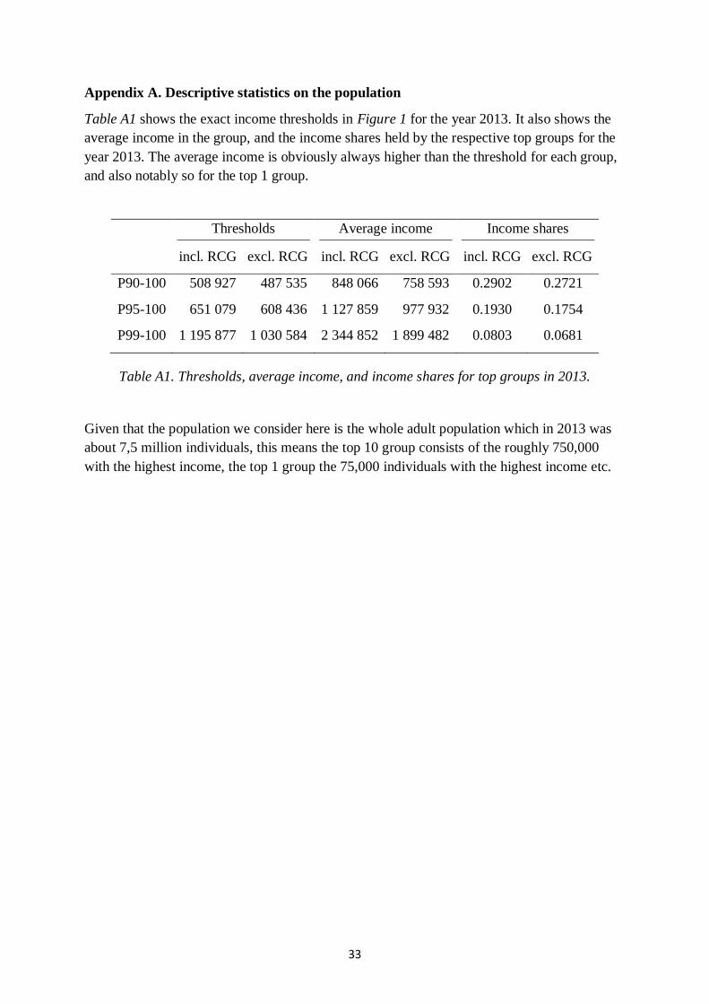
Appendix A. Descriptive statistics on the population
Table A1 shows the exact income thresholds in Figure 1 for the year 2013. It also shows the
average income in the group, and the income shares held by the respective top groups for the
year 2013. The average income is obviously always higher than the threshold for each group,
and also notably so for the top 1 group.
Thresholds
incl. RCG excl. RCG
Average income
incl. RCG excl. RCG
Income shares
incl. RCG excl. RCG
P90-100 508 927 487 535 848 066 758 593 0.2902 0.2721
P95-100 651 079 608 436 1 127 859 977 932 0.1930 0.1754
P99-100 1 195 877 1 030 584 2 344 852 1 899 482 0.0803 0.0681
Table A1. Thresholds, average income, and income shares for top groups in 2013.
Given that the population we consider here is the whole adult population which in 2013 was
about 7,5 million individuals, this means the top 10 group consists of the roughly 750,000
with the highest income, the top 1 group the 75,000 individuals with the highest income etc.
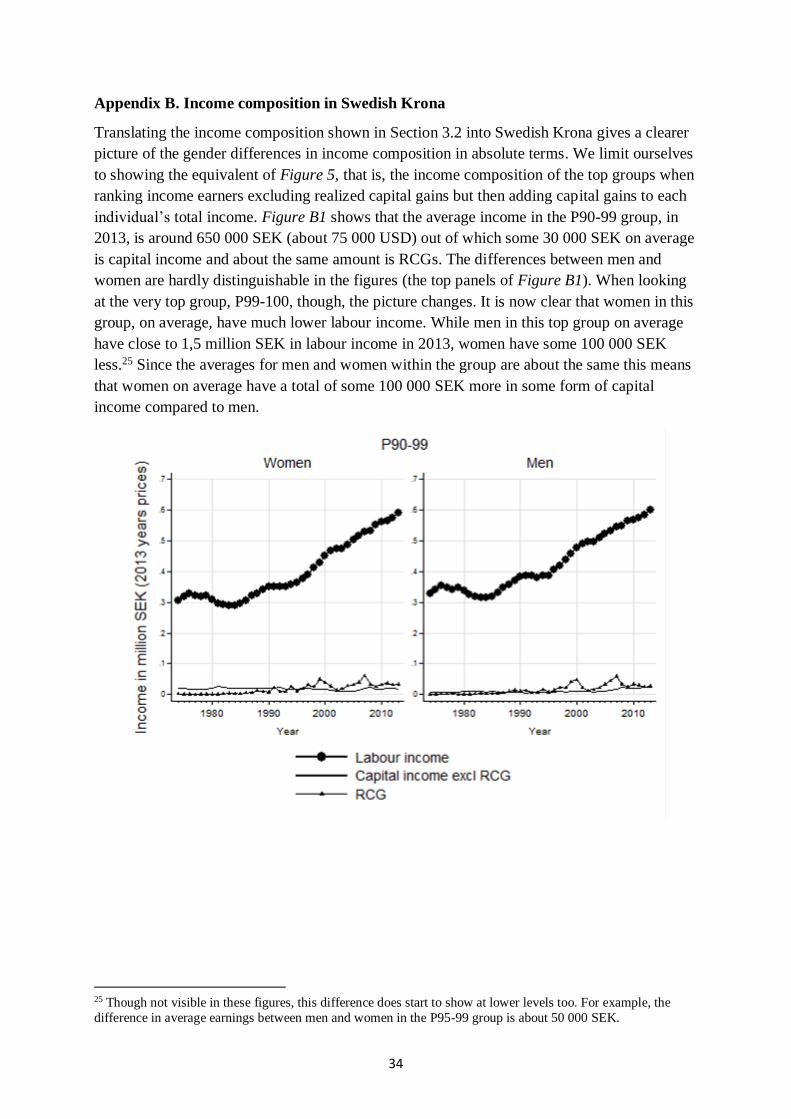
34
Appendix B. Income composition in Swedish Krona
Translating the income composition shown in Section 3.2 into Swedish Krona gives a clearer
picture of the gender differences in income composition in absolute terms. We limit ourselves
to showing the equivalent of Figure 5, that is, the income composition of the top groups when
ranking income earners excluding realized capital gains but then adding capital gains to each
individual’s total income. Figure B1 shows that the average income in the P90-99 group, in
2013, is around 650 000 SEK (about 75 000 USD) out of which some 30 000 SEK on average
is capital income and about the same amount is RCGs. The differences between men and
women are hardly distinguishable in the figures (the top panels of Figure B1). When looking
at the very top group, P99-100, though, the picture changes. It is now clear that women in this
group, on average, have much lower labour income. While men in this top group on average
have close to 1,5 million SEK in labour income in 2013, women have some 100 000 SEK
less.25 Since the averages for men and women within the group are about the same this means
that women on average have a total of some 100 000 SEK more in some form of capital
income compared to men.
25 Though not visible in these figures, this difference does start to show at lower levels too. For example, the
difference in average earnings between men and women in the P95-99 group is about 50 000 SEK.
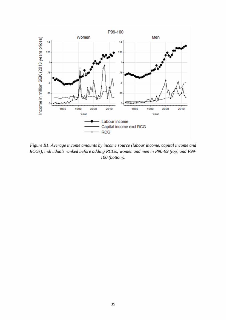
35
Figure B1. Average income amounts by income source (labour income, capital income and
RCGs), individuals ranked before adding RCGs; women and men in P90-99 (top) and P99-
100 (bottom).

36
Appendix C. Development in education levels of top income men and women
Education as a determinant of who ends up in the top income groups, and, in particular, as an
important driver of increased top income inequality in recent decades has been studied
extensively (see e.g., Acemoglu and Autor 2011, and Autor, 2014). In the case of Sweden,
however, the presence of a clear skill premium has been questioned (see Domeij and
Ljungqvist, 2015, and references there in). In this paper our main interest lies in the extent to
which changes in educational patterns between men and women can explain the changes we
see in the share of women in the top of the distribution.
Looking first at the top 1 group we see very small changes since 1991 (the first year when we
have comparable data for education). Women in this group are on average slightly more
educated than men but the differences are small and there are are essentially no differences in
trends. Hence, whatever changes we see in the top 1 group these are not driven by any major
changes in the educational composition.
Figure C1. Share of women and men in the top 1 group according to their highest level of
education when excluding RCGs (top) and including RCGs (bottom), 1990-2013.
Looking at the groups below the top one group, patterns are similar but with larger gender
differences and with larger changes over time. For both men and women, about 80 percent of
the P90-95 group have upper secondary (completed high-school) or first stage tertiary
(equivalent of bachelor education) throughout the period 1991-2013. For both men and
women the proportions between the two has changed in the direction of more people having a
first stage tertiary degree rather than high school. The difference between men and women is
that the proportions today are such that about 65 per cent of women have first stage tertiary
education and about 20 per cent have high school, while for men the proportions are 40 per

37
cent each. Women in this group on average have higher education than men. The patterns in
the P95-99 group are the same but with higher shares of the group having more education.
Figure C2. Share of women and men in the P90-95 group according to their highest level of
education when excluding RCGs (top) and including RCGs (bottom), 1991-2013.
Figure C3. Share of women and men in the P95-99 group according to their highest level of
education when excluding RCGs (top) and including RCGs (bottom), 1991-2013.

38
Appendix D. Developments within the top 1 group
The top income literature has shown that many interesting results are to be found within the
very top groups. As a consequence, it is common to report results for the top 0.1, or even the
top 0.01 groups, in the income distribution. Even though our data set is large (3.35 per cent of
the population) going beyond the top 1 group is not unproblematic, especially when we wish
to study women within this group separately. Given that women make up around 10 per cent
of the top 0.1 group they will constitute very small share of the total (tax) population. Based
on having a 3.35 per cent sample this translates into observing some 25 individuals
representing the roughly 750 women in the top 0.1 group. Going back in time we are looking
at even fewer individuals in total and most likely a smaller share of women. This means that
we cannot really study this group in a satisfactory way based on our sample.
Nevertheless, given what we know about how very different the extreme top can be we want
to illustrate what happens, in particular to the income composition, when we exclude the very
top group. In the following we will present figures, analogous to those in the various sections
of the paper, for the P99-99.9 and P99.9-100 groups separately. The aim is to illustrate how
much of what happens in the top 1 group is mainly driven by the very top P99.9-100 group.
To begin with we decompose the share of women within the top 1 group - see Figure D1. As
expected the share of women is lower as we move up the distribution (but the share has
increased in this group too).
Figure D1. Share of women in P99-99.9, P99.9-100 and P99-100 when including realized
capital gains (left hand panel) and excluding realized capital gains (right hand panel)

39
Figure D2. Income composition ranked excluding realized capital gains and then add RCG
for top P99-99.9 and P99.9-100 for women and men.
Figures D2 and D3 presents the income composition of the top 1 group divided into P99-99.9
and P99.9-100 respectively. The overall trends in income composition in the P99-99.9 group
closely mirrors that in the P99-100 group - compare Figure D2 with Figure 5. The top0.1 per
cent group - see Figure D3 - also shows similarities with the top 1 group trends, but differs in
a few respects. The share of labour income is lower for both men and women in the P99.9-
100, but is still surprisingly high for men. Secondly, capital incomes have grown in relative
importance more for men than for women in this group. This might be explained by
remuneration in the extreme top nowadays taking the form of capital incomes rather than
wages. In the top of the wage distribution, the tax on earnings is double that on capital in
Sweden, which creates strong incentives for firms to redistribute remuneration from labour to
capital income. Noticeable in Figure D3 is also that RCGs are very volatile for women as the
number of women is small.

40
Figure D3. Income composition ranked including realized capital gains before ranking and
then add RCG for top P99-99.9 and P99.9-100 for women and men.
Figures D4 and D5 shows, like in Appendix B, the above differences in income composition
in absolute values. It is now presented in average values in millions of Swedish Krona. The
average income in the P99-99.9 group, in 2013, is around 1,45 million SEK (about 170 000
USD) out of which some 200 000 SEK is average capital income excluding RCG and about
130 000 SEK is RCGs for women. There is hardly any difference between women and men’s
average income values in this group. Although when looking at the very top group, P99.9-
100, the picture changes. Average total income for women was about 5,8 million SEK 2013
out of which 2,4 million was labour income, 3,1 million capital income excluding RCG and
300 000 SEK was RCG. This can be compared to men’s average total income of about 6,9
million SEK out of which labour income was about 3,1 million SEK, average capital income
excluding RCG about 3,2 million and RCG about 600 000 SEK. Not only is there a difference
of more than a 1 million SEK in average total income but the importance of the different
income sources becomes clear. Average capital income is higher than labour income for
women, whereas the income sources are almost of equal size for men. It can also be noted that
the volatility in women’s RCG is high and by evaluating a single year the result will be highly
affected by the choice of year. The high volatility can mainly be explained by the few number
of women in the top and that large realizations of capital are more common among women
than men. As been mentioned before, women tend to move in and out of the top more
frequently than men.

41
Figure D4. Average income amounts by income source (labour income, capital income and
RCGs), individuals ranked before adding RCGs; women and men in P99-99.9.
Figure D5. Average income amounts by income source (labour income, capital income and
RCGs), individuals ranked before adding RCGs; women and men in P99.9-100.

42
Gender differences in the role of realized capital gains
Figure D6. Share of women in income group P99-99.9, excluding and including RCGs when
ranking, for 1, 3 and 5 years average incomes.

43
Figure D7. Share of women in income group P99.9-100, excluding and including RCGs when
ranking, for 1, 3 and 5 years average incomes.
The distribution of working-rich and capital-rich women in the very top
Figure D8 and D9 shows the same analysis as in section 4.3 in the paper on working-rich and
capital-rich women, but now for the top groups P99-99.9 and P99.9-100. The share of
working-rich women has been rather stable but slightly decreasing over the time period, in
1974 the share of working-rich women was about 85 per cent and in 2013 about 80 per cent.
For men, the share of working-rich has clearly dropped. In 1974 the share of working-rich
men was about 97 per cent but had dropped to about 80 per cent in 2013. As noted in the
paper, the overall trend seem to be a larger share of capital-rich individuals, but the change
has been relatively larger for men than for women.
In the very top, in the P99.9-100 group, the trend of an increasing share of capital-rich and a
decreasing share of working-rich is even stronger for men. For women the results looks very
different. The share of capital-rich women was the exclusively largest group up until its peak
at about 80 per cent in 1990. During the 1990s the share dropped dramatically to about 10
percent but then increased again to about around 50 per cent in 2013. Again, note that the
scarce number of women makes the results very volatile. The result is although clear, capital
has been an important income source for women to be in the top over the years.

44
Figure D8. Share of working-rich, capital-rich and mixed top income earners in income
group P99-99.9, women (left) and men (right) 1974-2013.
Figure D9. Share of working-rich, capital-rich and mixed top income earners in income
group P99.9-100, women (left) and men (right) 1974-2013.

45
The ratio between the working-rich women and the working-rich men, and the corresponding
ratio for capital-rich women and men for the groups P99-99.9 and P99.9-100 are shown in
Figure D10 and D11. As discussed in the paper, capital-richness among women has decreased
in importance while labour related incomes have become more important over a period in
time when capital incomes have grown in overall importance. When splitting up the top1
group we can see that the converging trend in the ratio of capital-rich women to capital-rich
men is especially clear in the P99-99.9 group. Capital-rich women was at some points about 1
per capital-rich man in the beginning of the period, when capital income was less important
than today. Over time as capital became a more important source of income the ratio has
fallen and was in 2013 about 0.1 per capital-rich man. For the top0.1 group the falling trend is
not as steep, except for the peak in the middle of the 1980s (when the ratio was close to 1). In
the 1970s there was about 0.5 capital-rich women per capital-rich man, and by the end of the
period it was between 0.05-0.1. Hence, the largest change occurs in the P99-99.9 group.
Figure D10. The ratio of capital-rich women to capital-rich men and the ratio of working-
rich women to working-rich men in P99-99.9, 1974-2013.

46
Figure D11. The ratio of capital-rich women to capital-rich men and the ratio of working-
rich women to working-rich men P99.9-100, 1974-2013.
Age shares
The age structure in the P99-99.9 group looks similar to the top1 presented in the paper, as
shown in Figure D12. Women and men are most likely to be in the age range 35-49 but also
between 50- 64. However, the trend over time differs between the genders. The share of
women in ages 50-64 has increased since the 1970s whereas the share of women above 65
years has decreased, at least when ranking excluding RCG. If including RCG before ranking
the share of women above 65 years increases whereas women between 35-49 years has
decreased. For men, no such difference can be seen when comparing rankings including or
excluding RCG.
In the group P99.9-100 the results look different, mainly for women, but also for men. In
Figure D13 we see that the share of women in the age range 50-64 has increased over the
time period and was the most common age group in 2013; about 60 per cent of the women in
the group was in this age range. About 10 per cent were between 35-49 years and 30 per cent
was 65 or above. For men the trend is the opposite, about 50 per cent was between 50-64
years in the 1970s but has then fallen to about 40 per cent. The share of men in the age range
35-49 increased slightly and was just below 40 per cent in 2013.

47
Figure D12. Age composition of women and men in the P99-99.9 group when excluding
RCGs (top) and including RCGs (bottom), 1974-2013.
Figure D13. Age composition of women and men in the P99.9-100 group when excluding
RCGs (top) and including RCGs (bottom), 1974-2013.

48
Marital status
Figure D14 and D15 show marital status for women and men in the P99-99.9 and P99.9-100
group. As in Figure 12 in the paper, women in the P99-99.9 are more likely to be married by
the end of the period than in the beginning, about 60 per cent of the women were married in
2013 compared to about 45 per cent in the beginning. There is a large drop in the share of
widows, it has decreased from about 20 to less than 10 per cent. Non-married and singles
have slightly decreased over the period whereas the share of divorced women has increased
from about 10 per cent to 15 per cent. Men on the other hand show the opposite trend, from a
share of about 90 per cent being married in the beginning of the period to about 80 per cent in
2013. The category of non-married and singles has increased and so has the share of divorced
men.
In the P99.9-100 group the trend is even more distinct for women. About 50 per cent of the
women were widows in the 1970s but that share had decreased to about 10 per cent in 2013.
The share of married women on the other hand increased from about 30 per cent in the 1970s
to about 50 per cent in 2013. Also, the share of divorced increased from about 5-10 per cent to
about 30 per cent in 2013. Men on the other hand show a very similar picture to the P99-99.9
group.
Figure D14. Marital status of women and men in the P99-99.9 group when excluding RCGs
(top) and including RCGs (bottom), 1974-2013.

49
Figure D15. Marital status of women and men in the P99.9-100 group when excluding RCGs
(top) and including RCGs (bottom), 1974-2013.
Gender differences in wealth holdings
Differences in average wealth holdings for women and men was presented in Figure 16 in the
paper for the top1 group. Figures D16 and D17 shows the ratio of average wealth holdings
between women and men for the groups P99-99.9 and P99.9-100. When splitting up the top1
group, we can see that the large increase in women’s average wealth holdings compared to
men in the 1980s and then later the steep drop in 1990, seems to be driven by the top0.1
group. The average wealth held by women in the P99.9-100 group was about 8 times as large
as wealth held by men in the same income group in 1983 and in 1988. After the middle of the
1990s the relative wealth held by women was around 2 times more than men. The same
pattern cannot be seen in the P99-99.9 group. Wealth held by women in this group peaked in
the 1980s when being at around 4.5 times higher than men. In 2013 average wealth held by
women had decreased to be about 1.8 times higher than men’s average wealth holdings.

50
Figure D16. Ratio of average wealth held by top P99-99.9 women to average wealth of top
P99-99.9 income men, 1974-2007 (last year when data are available).
Figure D17. Ratio of average wealth held by top P99.9-100 women to average wealth of top
P99.9-100 income men, 1974-2007 (last year when data are available).

51
Appendix E. Developments in P90-95 and P95-99
Looking at the other end of the top 10 of the income distribution, in the groups P90-95 and
P95-99, we will see that the differences between men and women is not as clear as in the top1
group. Below we present the same graphs as in the paper but for the P90-95 and P95-99
groups.
Starting with the analysis if the income composition we can see in Figure E1 that labour
income is undoubtedly the major source of income. Labour income makes out about 90 per
cent of the total income for both genders but the remaining 10 per cent is divided differently.
Capital income has made out about 5 per cent of women’s total income and 5 per cent has
been business income over the majority of the time period. For men, business income was the
larger source of income and made out about 8 per cent whereas capital income was about 2
per cent in the 1970s. The increasing importance of capital income over time can be seen from
that capital income by the end of the period was about 6 per cent whereas business income
had decreased to about 4 per cent. There are no larger differences except that labour income
makes out an even larger share of the total incomes in the P90-95 group than for the P95-99
group.
Figure E1. Income composition for top income groups excluding realized capital gain, women
and men in P90-95 (top) and P95-99 (bottom).
As previously in the paper we are interested in how the income composition looks like when
we exclude RCG when ranking and then add RCG and then compare with ranking including
RCG. Figure E2 and E3 shows the result from that analysis. In the top1 group there was a
clear difference between including and excluding RCG. The difference seems to be smaller

52
the further down in the distribution we go. In the P95-99 group there is still a clear difference
in income composition between the different treatments of RCG, for women. In P90-95 on the
other hand the difference is almost non-existing.
Figure E2. Income composition ranked excluding realized capital gains and then add RCG
for top P90-95 and P95-99 for women and men.
Figure E3. Income composition ranked including realized capital gains and then add RCG for
P90-95 and P95-99 for women and men.

53
6.1. Gender differences in the role of realized capital gains
Another way to look at the different importance in including and excluding RCG when
ranking is to average income over more than just one year, as discussed in section 6 in the
paper. For the top1 group we saw an interesting difference between women and men in that
men top up already high incomes with RCGs whereas women tend to move in and out of the
top more frequently. This trend can be seen in the P95-P99 group as well as can be seen in
Figure E4. Although the differences between women’s income shares when ranked including
RCG and when ranked excluding RCG and then add RCG, is not as large as in the top1 group.
That goes for both one year and 5 years average income shares. For men there is hardly any
difference between the income shares when doing the different treatments of RCGs, not for
one year incomes shares nor for 5 year income shares. In Figure E5 we see that the difference
is even smaller, also for women, in the income group P90-95. There is still a small difference
when looking at the 5 year income shares for women, indicating that, even at the lower end of
the top10 group there are women in the top only because of temporarily RCG incomes,
women that would not have been there if it was not for those incomes.
Figure E4. Income shares for income groups P90-95 for women and men with different
treatment of RCGs, yearly incomes (top) and 5 years average incomes (bottom).

54
Figure E5. Income shares for income groups P95-99 for women and men with different
treatment of RCGs, yearly incomes (top) and 5 years average incomes (bottom).
In Figure 7 in the paper we could see a distinct difference in the share of women in top1 when
averaging incomes and ranking over 1, 3 and 5 years. We could also see a clear difference
when comparing the share of women when ranked including and excluding RCG for those
year averages. Looking at the income group P90-95 in Figure E6 we see that there is almost
no difference between the share of women when averaging incomes over 1, 3 and 5 years,
indicating that the share of women do not change when taking a longer perspective than just
one year. As the share of women tend to be the same even when looking at 5 years averages,
we can see that women tend to stay longer in this group and not just temporarily for just one
year.
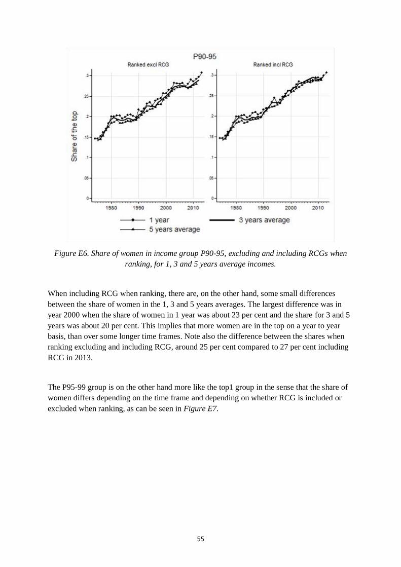
55
Figure E6. Share of women in income group P90-95, excluding and including RCGs when
ranking, for 1, 3 and 5 years average incomes.
When including RCG when ranking, there are, on the other hand, some small differences
between the share of women in the 1, 3 and 5 years averages. The largest difference was in
year 2000 when the share of women in 1 year was about 23 per cent and the share for 3 and 5
years was about 20 per cent. This implies that more women are in the top on a year to year
basis, than over some longer time frames. Note also the difference between the shares when
ranking excluding and including RCG, around 25 per cent compared to 27 per cent including
RCG in 2013.
The P95-99 group is on the other hand more like the top1 group in the sense that the share of
women differs depending on the time frame and depending on whether RCG is included or
excluded when ranking, as can be seen in Figure E7.

56
Figure E7. Share of women in income group P95-99, excluding and including RCGs when
ranking, for 1, 3 and 5 years average incomes.
This indicates that at the lower end of the top10 group women tend to stay more permanently
in that group, whereas it in the upper end of the distribution seems to be more common with
temporarily visits.
Mobility
Figure E8 shows transition probabilities from year to year for income group P90-95. From
one year to the next the majority of individuals, both women and men, stay in the same
income group the following year. However, there is a sharp fall in the share of both women
and men, who stayed in the same income group between 1980 and 1990. It fell from about 0.6
to about 0.5. In the 1990s it started to increase again and in 2013 it was back to a share of
about 0.6. It seems like most of the individuals that fell out of the P90-95 group between the
1980s and 1990s ended up somewhere in the P0-90 part of the distribution. About 10 percent
of the individuals who are in the P90-95 group one year end up in the income group P95-99
the following year. That share is consistent over the time period. It does not seem to be any
major differences between women and men in transition probabilities in this income group.

57
Figure E8. Transition probabilities, year to year, out of the P90-95 group of the distribution
excluding RCGs when ranking, for men and women, 1974-2013.
Figure E9 shows the same yearly transition probabilities but for the income group P95-99.
For this group we can see that the probability to stay in the same percentile group the
following year is higher than for the P90-95 group. About 70 percent of the women and men
showed up in the same income group the following year. However, there are some differences
between the genders to be noted. In the beginning of the period, about 78 percent of the men
showed up in the same income group the following year, but this fell over the period. Women
have been slightly more likely to end up in the income group P90-95 the following year than
men, and slightly more likely to end up in the 0-P90 group. Men have been marginally likely
to end up in the P99-100 group.

58
Figure E9. Transition probabilities, year to year, out of the P95-99 group of the distribution
excluding RCGs when ranking, for men and women, 1974-2013.
The distribution of working-rich and capital-rich women
The share of working-rich in the P90-95 group was almost 100 per cent in the beginning of
the period for men and just slightly below 100 per cent for women as shown in Figure E10.
The share of labour-related income has decreased just slightly from the middle of the 1990s
for both genders. Capital-rich are few but has increased slightly from the middle of the 1990s,
from an almost non-existing level to a share of about 5 per cent.
In Figure E11 we see that the share of working-rich in the P95-99 group is similar to the P90-
95 group, almost 100 per cent for men but about 95 per cent for women in the 1970s. The
share of working-rich decreased for men and was about 94 per cent in 2013. For women the
share stayed rather stable and was about 94 per cent in 2013. The share of capital-rich men
was about 8 per cent in 2013 and about 6 per cent for women.

59
Figure E10. Share of working-rich, capital-rich and mixed top income earners in the P90-95
group, women (left) and men (right), 1974-2013.
Figure E11. Share of working-rich, capital-rich and mixed top income earners in the P95-99
group for women (left) and men (right), 1974-2013.

60
As in the paper we also look at the ratio of working-rich women and working-rich men and
the ratio of capital-rich women and men to see the relative change of these two groups for
women and men. As mentioned above the share of capital-rich individuals is small which
makes the ratio between women and men very volatile. Small changes in the number of
capital-rich individuals will have large effects on the ratio as can be seen in Figure E12. Even
though the volatility is high, the trend is downward sloping, meaning that there are less
capital-rich women per capital-rich men by the end of the period than in the beginning. It was
about 0.6 capital-rich woman per capital-rich man in 2013. The relative change in working-
rich women to working-rich men is going in the other direction. In the 1970s it was around
0.2 working-rich woman per working-rich man and in 2013 it was about 0.45. These are the
same trends as could be seen in Figure 15 for the top1 group, even though the relative sizes
was different in that figure.
Figure E12. The ratio of capital-rich women to capital-rich men and the ratio of working-rich
women to working-rich men, for the P90-95 group, 1974-2013.
Interestingly the trend looks different for the P95-99 group as can be seen in Figure E13.
There is still a downward sloping ratio between the capital-rich women and capital-rich men,
but no as steep as in the p90-95 group. In the 1970s the ratio was about 0.7 capital-rich
woman per capital-rich man, and around 0.55 in 2013, which is a considerable less decrease.
But again, the trend is very volatile. The working-rich ratio on the other hand shows similar
upward slope as the P90-95 group. In the 1970s there was 0.1 working-rich woman per
working-rich man, in 2013 the ratio was 0.35.
The overall trend is clear, along with an increasing share of women in the P90-95 and P95-99
groups where the proportion of working-rich are larger than capital-rich, the ratio to working-

61
rich men is increasing. Since capital income is an increasing source of income, in particular to
men in the top in general, capital-rich women to men is decreasing.
Figure E13. The ratio of capital-rich women to capital-rich men and the ratio of working-rich
women to working-rich men, for the P95-99 group, 1974-2013.
Age shares and marital status
As shown in Figure 11 both women and men in the top1 are most likely to be in their mid or
late stages of work life. The pattern is similar in the P90-95 and the P95-99 groups as can be
seen in Figure E14 and E15. There is neither any clear difference between the age shares
when excluding or including RCG when ranking. The only difference worth mentioning is in
the P95-99 group when comparing the age shares excluding and including RCG. The share of
individuals above 65 has increased from about 10 per cent for women and from about 5 per
cent for men in the 1970s, to about 20 per cent in 2013 for both genders. This pattern cannot
be seen when excluding RCG before ranking.
Interestingly the share of individuals in the ages between 20-34 has decreased for both men
and women and in both the P90-95 and the P95-99 group. The fall is steeper in the P90-95,
where the share has dropped from about 20 per cent in the 1970s to 10 per cent in 2013 for
women, and from about 28 per cent to 10 per cent for men.
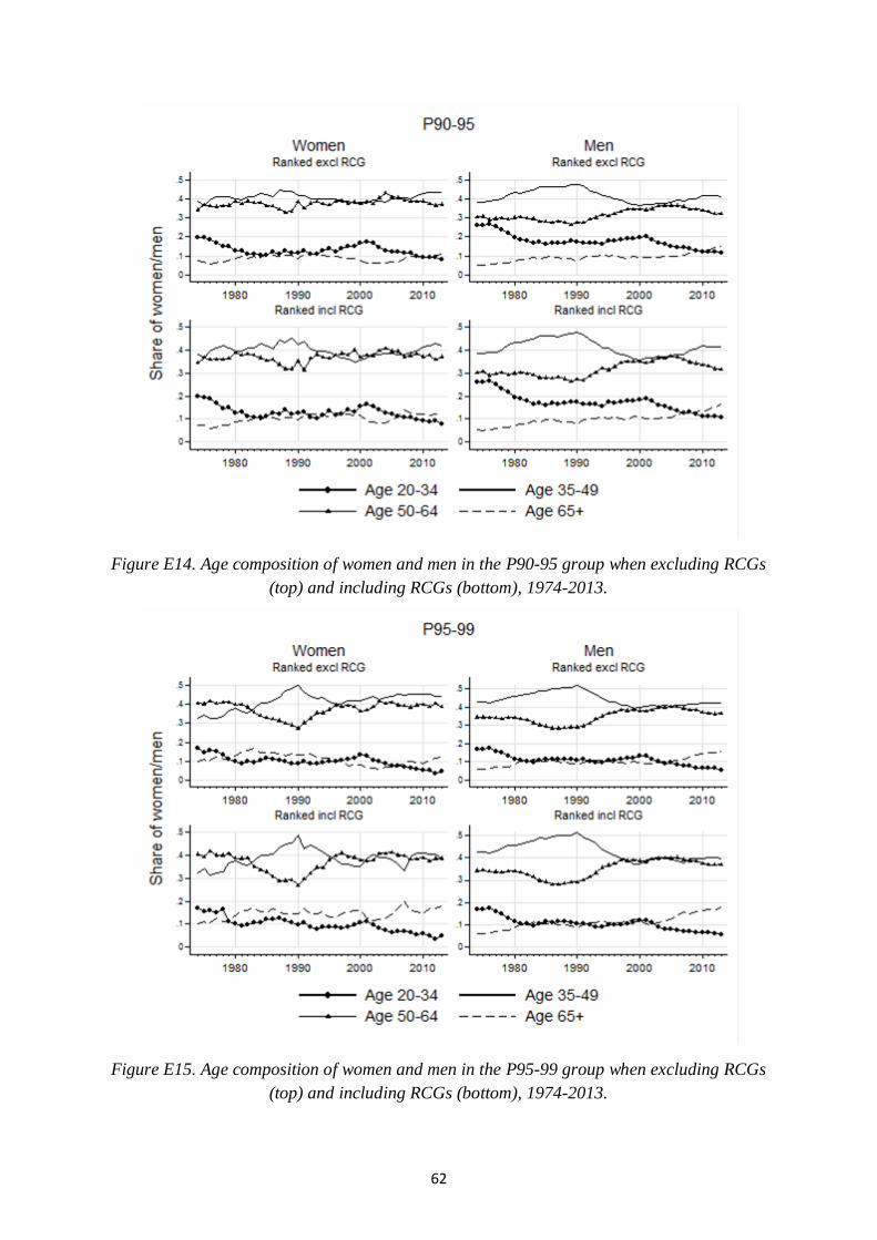
62
Figure E14. Age composition of women and men in the P90-95 group when excluding RCGs
(top) and including RCGs (bottom), 1974-2013.
Figure E15. Age composition of women and men in the P95-99 group when excluding RCGs
(top) and including RCGs (bottom), 1974-2013.
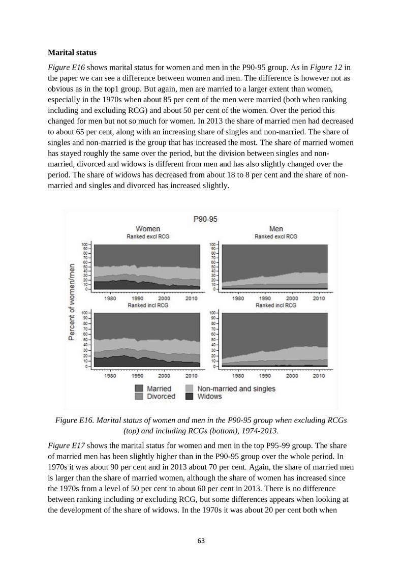
63
Marital status
Figure E16 shows marital status for women and men in the P90-95 group. As in Figure 12 in
the paper we can see a difference between women and men. The difference is however not as
obvious as in the top1 group. But again, men are married to a larger extent than women,
especially in the 1970s when about 85 per cent of the men were married (both when ranking
including and excluding RCG) and about 50 per cent of the women. Over the period this
changed for men but not so much for women. In 2013 the share of married men had decreased
to about 65 per cent, along with an increasing share of singles and non-married. The share of
singles and non-married is the group that has increased the most. The share of married women
has stayed roughly the same over the period, but the division between singles and non-
married, divorced and widows is different from men and has also slightly changed over the
period. The share of widows has decreased from about 18 to 8 per cent and the share of non-
married and singles and divorced has increased slightly.
Figure E16. Marital status of women and men in the P90-95 group when excluding RCGs
(top) and including RCGs (bottom), 1974-2013.
Figure E17 shows the marital status for women and men in the top P95-99 group. The share
of married men has been slightly higher than in the P90-95 group over the whole period. In
1970s it was about 90 per cent and in 2013 about 70 per cent. Again, the share of married men
is larger than the share of married women, although the share of women has increased since
the 1970s from a level of 50 per cent to about 60 per cent in 2013. There is no difference
between ranking including or excluding RCG, but some differences appears when looking at
the development of the share of widows. In the 1970s it was about 20 per cent both when
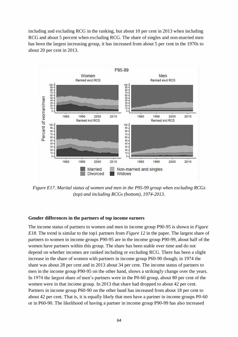
64
including and excluding RCG in the ranking, but about 10 per cent in 2013 when including
RCG and about 5 percent when excluding RCG. The share of singles and non-married men
has been the largest increasing group, it has increased from about 5 per cent in the 1970s to
about 20 per cent in 2013.
Figure E17. Marital status of women and men in the P95-99 group when excluding RCGs
(top) and including RCGs (bottom), 1974-2013.
Gender differences in the partners of top income earners
The income status of partners to women and men in income group P90-95 is shown in Figure
E18. The trend is similar to the top1 partners from Figure 12 in the paper. The largest share of
partners to women in income groups P90-95 are in the income group P90-99, about half of the
women have partners within this group. The share has been stable over time and do not
depend on whether incomes are ranked including or excluding RCG. There has been a slight
increase in the share of women with partners in income group P60-90 though; in 1974 the
share was about 28 per cent and in 2013 about 34 per cent. The income status of partners to
men in the income group P90-95 on the other hand, shows a strikingly change over the years.
In 1974 the largest share of men’s partners were in the P0-60 group, about 80 per cent of the
women were in that income group. In 2013 that share had dropped to about 42 per cent.
Partners in income group P60-90 on the other hand has increased from about 18 per cent to
about 42 per cent. That is, it is equally likely that men have a partner in income groups P0-60
or in P60-90. The likelihood of having a partner in income group P90-99 has also increased

65
over the period whereas the likelihood of having a partner in the top P99-100 group is
unchanged and almost non-existent.
Figure E18. Income group of partners to women in P90-95 (left) and of partners to men
partners to men in P90-95 (right), 1974-2013.
Figure E19 shows the income groups for partners to women and men in the P95-99 group.
The patterns are similar to the ones in Figure E18. About half of the partners to women in the
P95-99 group are in income group P90-99 and that share is stable over the period. Partners in
income groups P60-90 have increased slightly whereas partners in income group P99-100 has
slightly decreased. Including or excluding RCG when ranking does not seem to affect the
picture. For partners to men in the P95-99 group we again see a dramatic fall in the share of
partners in the income group P0-60 and an increase in partners in the P60-90 group. The share
of partners in income group P90-99 has also increased, more than doubled over the time
period and made out about 22 per cent by the end of the period.

66
Figure E19. Income group of partners to women in P95-99 (left) and of partners to men
partners to men in P95-99 (right), 1974-2013.


