Download - Designing Effective Interfaces

Designing Effective Interfaces
(without hamburgers)
Scott Munn Associate Director, Development @ VSA Partners

Designing Effective Interfaces
Why is this important for developers?
• You are the last step along the way
• You might know better than your designers what is most useful
• Shh . . developers make selfish UI decisions
• Benefit themselves and their time
• ….but at the expense of users
What makes an effective interface?

• Best UIs are intuitive
• Best UIs disappear so you can focus on what matters
• Best UIs are relative
• Your users do not share your passions
• Your users do not share your use cases
• Be patient, fickle, and open to change
What makes an effective interface?

Case Study Good UI design: Pencil

UI: Pencil
• Designed for a single purpose; usage is self-evident
• Well-designed extensions
!
• Niches
• Colored pencil
• Calligraphy

Why are pencils effective?
• Simple
• Focused
• Easy to Navigate
• Clear

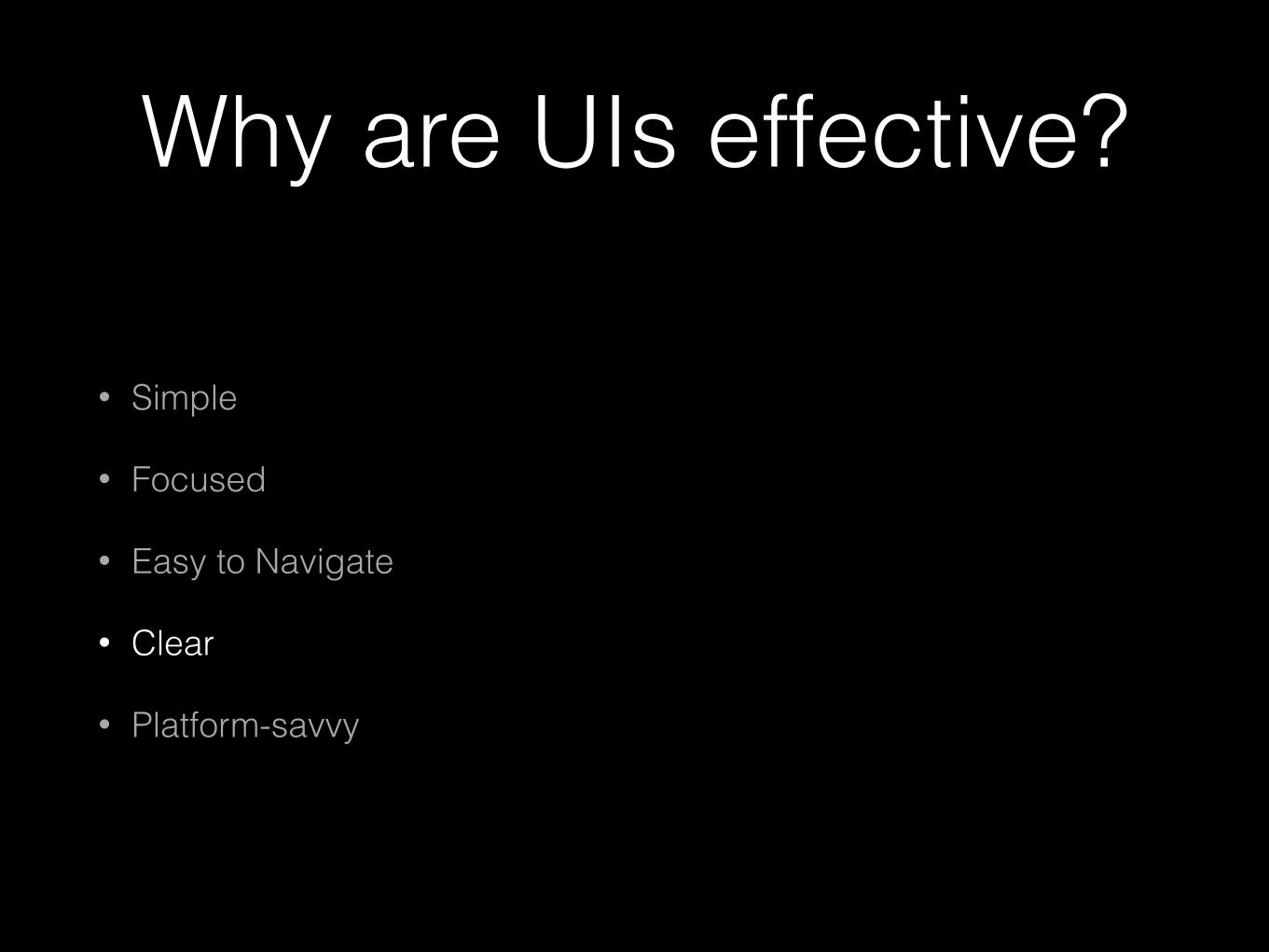
Why are UIs effective?
• Simple
• Focused
• Easy to Navigate
• Clear
• Platform-savvy

Why are UIs effective?
• Simple
• Focused
• Easy to Navigate
• Clear
• Platform-savvy

Intuitive Apps are Simple

• 80/20 rule
• Most of the time, most people will use very little of what you make
• Therefore
• Simplify
• More features are distractions
• Efficiency is availability; everything should be in plain sight*
Intuitive Apps are Simple

Intuitive Apps are Simple
Threes!2048

Why are UIs effective?
• Simple
• Focused
• Easy to Navigate
• Clear
• Platform-savvy

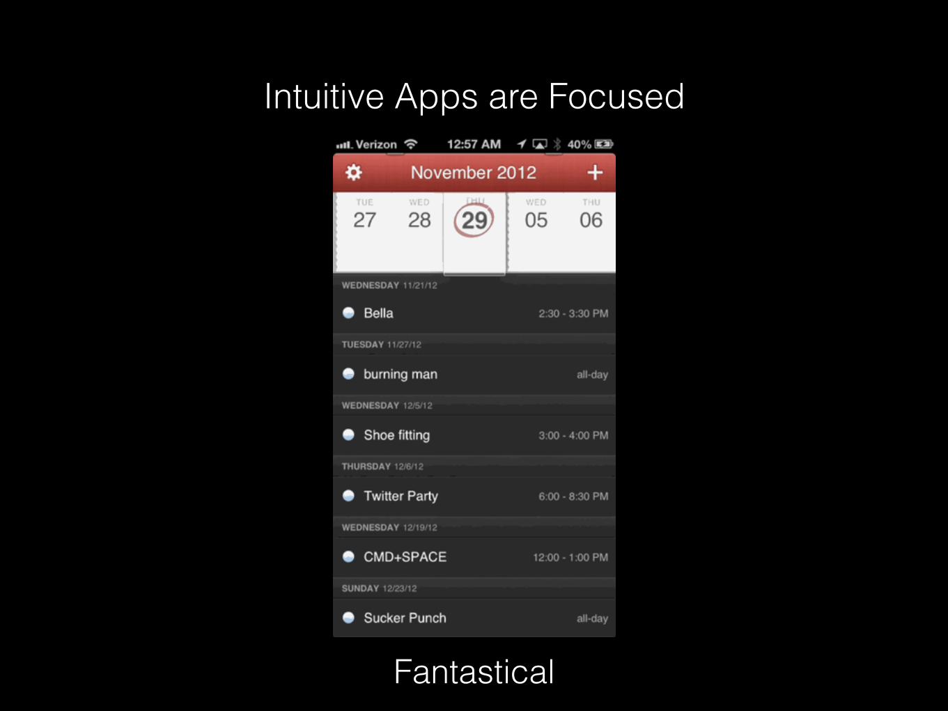
Intuitive Apps are Focused

• Designed exactly for their purpose
• Uncomplicated; therefore, intuitive
• Aspects of design serve intuitive goal
• Niches are available, but not forced on all
Intuitive Apps are Focused
Intuitive Apps are Focused
Fantastical

Why are UIs effective?
• Simple
• Focused
• Easy to Navigate
• Clear
• Platform-savvy

Intuitive Apps are Easy to Navigate

• Low number of options
• A pencil has only 2 ends
• Predictable
• Pencils aren’t unnecessarily changed
• Change is good…sometimes
• E.g. Facebook
Intuitive Apps are Easy to Navigate


Intuitive Apps are Easy to Navigate
• Provide hints
• Hover and animations are hints that interactions are available and successful
• Make selection obvious
• Active states used to show position
• Reminder: color-blind users can’t see colored active states

Intuitive Apps are Easy to Navigate
Cut the Rope
Why are UIs effective?
• Simple
• Focused
• Easy to Navigate
• Clear
• Platform-savvy

Intuitive Apps are Clear

Language
!
• Downplay excessive vocabularies No big words
• Avoid jargon
• “Airplane Mode” vs “Turn off cellular antennas”
• Be succinct
• Avoid truncatio….
• Make text legible
• Check color rules - WCAG 2.0 contrast calculator
Intuitive Apps are Clear

Icons
• Some icons are consistent
• Bad icons
• Need a label
• Aren’t commonplace anymore (floppy disk)
• “Icons can be learned”
• Reminder: it is easier for a user to quit your app than to attempt to learn your interface
Intuitive Apps are Clear

RIP Share Icons

!
Animation• Animation is an easy and delightful way to give feedback
• Example: iPhone passcode shakes when an incorrect code is entered
• Animation provides context
• Animation is increasingly expected by users
Intuitive Apps are Clear

!
AnimationIntuitive Apps are Clear
Sky Guide
Why are UIs effective?
• Simple
• Focused
• Easy to Navigate
• Clear
• Platform-savvy
Intuitive Apps are Platform-Savvy

• User’s expectations are based on other apps, not yours
• Platform consistency is intuitive
• Top apps look tailor made for the OS
• HTML5 cross-platform apps (Phonegap) failed
• Apple and Google aren’t helping
Intuitive Apps are Platform-Savvy

• Gestures and intuitive actions
• Use actions that make sense
• Use actions that are consistent
• Example: swipe to delete mimics crossing an item off a list
Intuitive Apps are Platform-Savvy

Intuitive Apps are Platform-Savvy
Blek
Why are UIs effective?
• Simple
• Focused
• Easy to Navigate
• Clear
• Platform-savvy

“What makes an unintuitive interface?”
Case StudyHamburger Nav design pattern

Hamburger Nav• Origin: Facebook app
• Names
• Side menu
• Navigation drawer
• Hamburger
• Off-canvas nav
• Definition
• Menu icon paired with a list menu
• Content slides to show menu
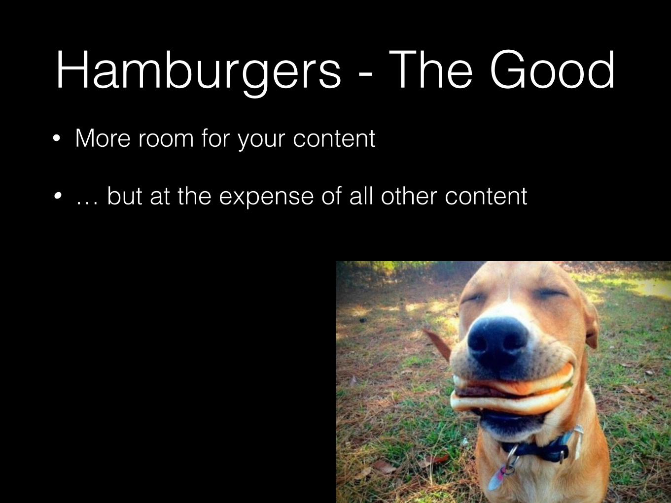
Hamburgers - The Good• More room for your content
• … but at the expense of all other content
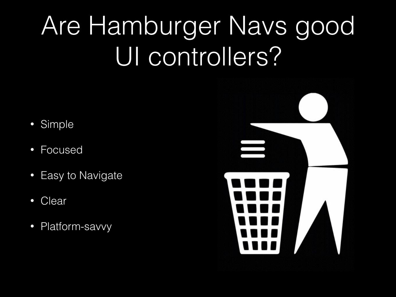
Are Hamburger Navs good UI controllers?
• Simple
• Focused
• Easy to Navigate
• Clear
• Platform-savvy

Hamburger Navs might not be Simple
• Inconsistent interaction: sometimes click, sometimes drag
• Remember? Users increasingly expect animation and interaction. When something they expect doesn’t work, it doesn’t feel intuitive.
• Conflict with back button
• Some solve by placing on right, which conflicts with CTAs
• Tedious - Let’s play “Count the Taps”
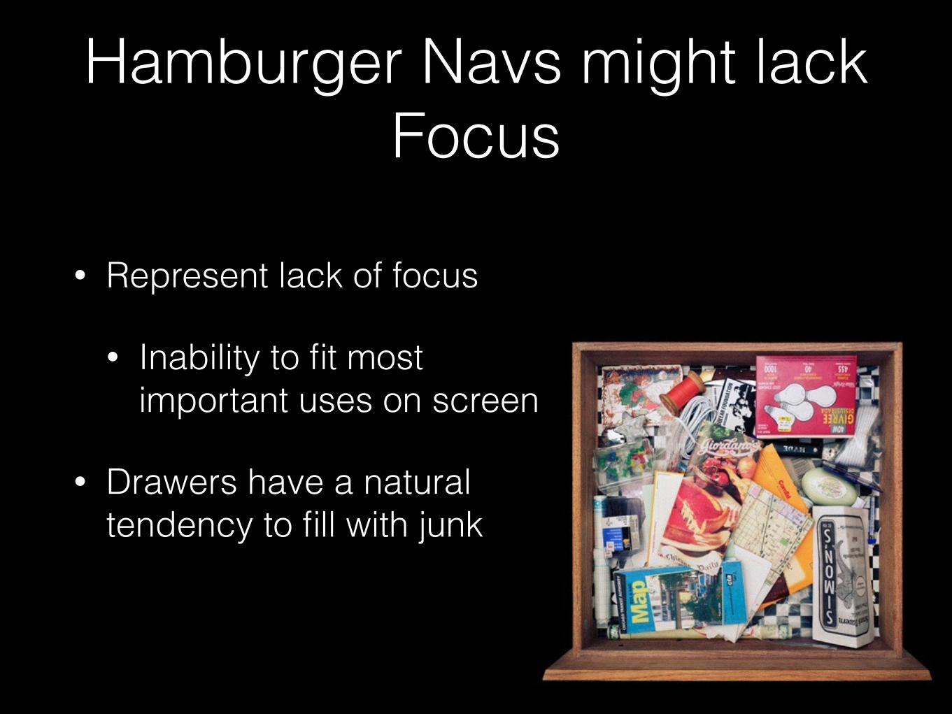
Hamburger Navs might lack Focus
• Represent lack of focus
• Inability to fit most important uses on screen
• Drawers have a natural tendency to fill with junk

Hamburger Navs might not be Easy to Navigate
• Unnecessarily flattens Information Architecture
5760 pixels of navigation*

Hamburger Navs are not Clear
• Split-second navigation ability: FAIL
• At any time, can I tell….
• Where am I? (nope)
• Where else can I go? (still nope)

Hamburger Navs might not be Platform-Savvy
• Tend to be a “catch-all” for any device/screen size
• Do not use unique features of platform
• Exception: Amazon Fire Phone?
• Being abandoned by major companies that used them: e.g. Facebook
• Reduced interaction
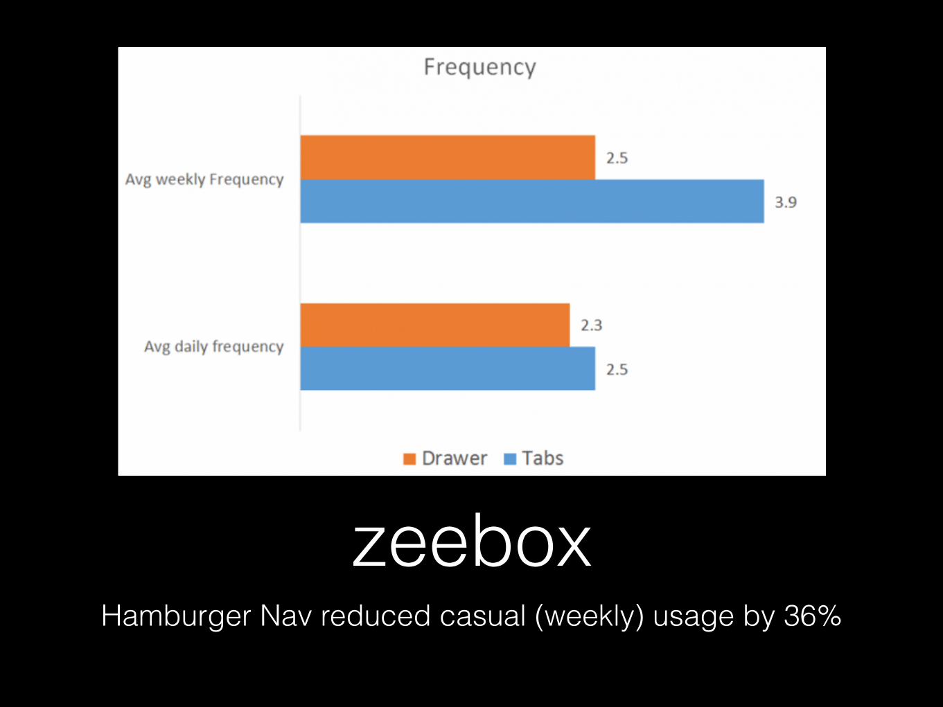
zeeboxHamburger Nav reduced casual (weekly) usage by 36%

Are Hamburger Navs good UI controllers?
• Simple*
• Focused
• Easy to Navigate*
• Clear
• Platform-savvy

In Summary
• Simple
• Focused
• Easy to Navigate
• Clear
• Platform-savvy

Thank you
• ScottMunn.com
• twitter.com/scottmunn
• linkedin.com/in/scottdanielmunn


