
1
BRAND GUIDELINES Including PART 2 for TPAs
—November 2oo8—

2
OUR HISTORY
The year was 1976, and the New York that people once knew was about to change.
The State was in a deep economic slump and looked to tourism to help turn around the economy. With $400,000 from the Governor, industry leaders took an incredibly bold step and spent the entire tourism budget on market research. With consumer feedback in hand and $4 million, an advertising campaign was launched in 1977.
The great minds of Madison Avenue produced a brilliant little campaign called I LOVE NEW YORK.
A full-blown orchestra was assembled to record the song created by the “King of the Jingle” Steve Karmen, while acclaimed graphic designer, Milton Glaser crafted the famous logo.
It all started with the very first TV commercial highlighting the grandeur of New York State with lakes, mountains and countryside and folks proclaiming “I live in [North Carolina, Cape Cod, Brooklyn]...but I Love New York!” The campaign was magical and captivated hearts instantly.
The next commercial highlighted New York City and featured Broadway packages. From there, I LOVE NEW YORK blossomed into a star-studded extravaganza with A-list celebrities and Broadway stars declaring their love for New York at every turn.
Something soon happened though. I LOVE NEW YORK became deeply connected with New York City, even though the brand started with the state. This association strengthened further in September 2001 when the world joined New Yorkers in expressing their love for this special place.

3
OUR HEART
There’s something really special about being a New Yorker—whether you’re from the City or across the State. It’s the reason we stand up a little straighter when we say “I’m from New York!” We are tenacious and passionate. It’s that little something you hear in our voice. And see in our gait. It’s loyalty that defies logic. And, energy that defies reason. All of this is part of our DNA. We don’t sign on for this. It just happens.
There’s something wonderfully different about this place. Somehow it’s bigger, even in the small towns. It’s a feeling. It’s palpable. But it’s hard to explain. New York is an experience that resonates, just like a New Yorker.
Breathtaking, unique and captivating at the same time. It always leaves you wanting more and adding that next place to your mental list of new places to visit.
You see, I LOVE NEW YORK isn’t just an advertising slogan, a logo or a song. It lives. It breathes. It speaks to you. Because it’s me. It’s you. It’s the kid next door. It’s where you get away. To find yourself. It’s the City. It’s the whole State. It’s that amazing truth that no matter where you’re from when you come here, you’re a New Yorker.
It’s why there’s always another reason to love New York.
4
THE IMPORTANCE OF BRANDING
a brand is a beautiful thing.
Enormously powerful. Enormously fragile.
Building a brand takes vision. It takes passion and sweat. And perhaps most importantly, it takes discipline. The discipline to never waiver from your brand’s DNA and what your message to the world will be. We created these guidelines so the tenets of the brand are not just in the hearts and minds of a few, but in the hundreds of you who will touch this brand and share it with the world.
It is impossible to overemphasize the importance of brand consistency. Endless studies prove consistency increases awareness and helps cement an emotional connection to a brand. The more single-minded we are, the more powerful the I LOVE NEW YORK brand will be. It’s that simple.

5
PART 1OUR STORY
I LOVE NEW YORK was relaunched in May 2008.
The new vision is broken down on these pages to provide an in-depth view of the revamped brand strategy.
Meet the next generation of I LOVE NEW YORK.

6
OUR MISSION
To make I LOVE NEW YORK speak to the entire state. To show that the passion and energy present in the
city is pervasive throughout every exquisite acre that
is New York State.
There is only one state big enough to house New York City. One state that is filled with New Yorkers. That is why our rivers race a little faster. It is why our mountains soar a little higher.
Our goal is to share all the hidden treasures New York State holds. To unearth the truth that around every corner across this beautiful, big state there is yet Another reason,
7
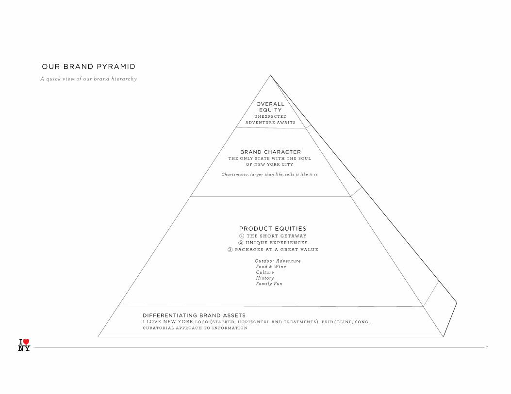
OVERALL EQUITY
unexpected
adventure awaits
DIFFERENTIATING BRAND ASSETSI LOVE NEW YORK logo (stacked, horizontal and treatments) , bridgeline, song,
curatorial approach to information
BRAND CHARACTERthe only state with the soul
of new york city
Charismatic , larger than l i fe , te l ls i t l ike i t is
PRODUCT EQUITIESk the short getaway
l unique experiences
m packages at a great value
Outdoor Adventure Food & W ine Culture History Family Fun
OUR BRAND PYRAMID
A quick v iew of our brand hierarchy
8
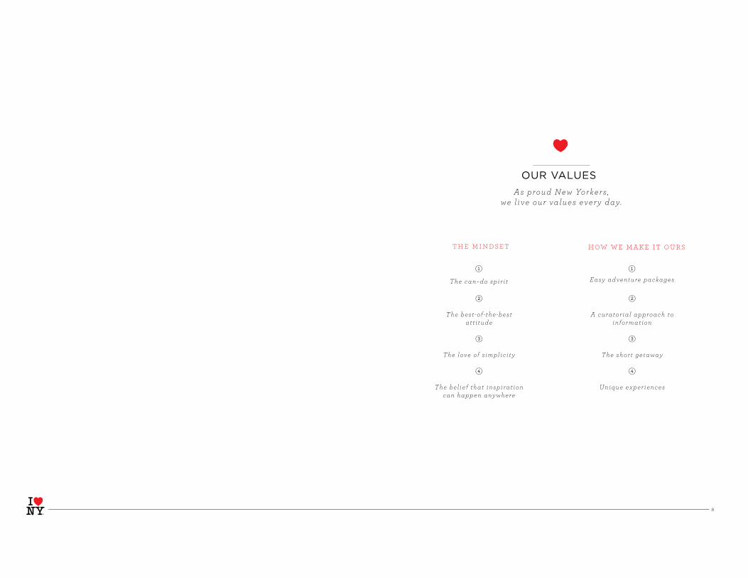
OUR VALUES
As proud New Yorkers , we l ive our values every day.
the mindset how we make it ours
k k
l
The best -of - the-best att i tude
m
The love of s implici ty
n
The bel ief that inspirat ion can happen anywhere
l
A curator ial approach to information
m
The short getaway
n
Unique experiences
The can–do spir i t Easy adventure packages

9
OUR TARGET
Through research , we uncovered eight di f ferent segments of t ravelers . These are people who share
s imi lar att i tudes when t ravel ing .
Focusing on these segments does not mean we are excluding others . I t s imply means we are more able to ef f ic ient ly spend our advert is ing dol lars on people most l ike ly to v is i t New York State .
we’ve identified four priority
segments of travelers
ECLECTIC ADVENTURERS
GUIDED GROUPIES
FAMILY WEEKENDERS
TRAVEL FANATICS
R & R Long Trip Travelers (11%)
R & R Weekenders (11%)
Yuppie Buddies (13%)
Luxury Seekers (13%)Guided Groupies (14%)
Travel Fanat ics (11%)
Family Weekenders (13%)
Eclect ic Adventurers (11%)
f ig 1 .
*

1 0
WHO
ECLECTIC ADVENTURERS
FAMILY WEEKENDERS
TRAVEL FANATICS
WHAT
Off the beaten path . Want to discover hidden gems, expand their minds and experience nature ,
history and culture .
Family First. Travelers looking for easy-to-get-to, family friendly and affordable
destinations.
Live to travel . Travel inf luencers who are open to al l k inds of experiences , wi l l spend to have them and wi l l te l l
everyone about i t .
WHY
Good product match, open to NYS, highconcentrat ion in NYC, NJ, PA .
Good product match, very open to NYS, promotion-sensit ive, high repeat
visi t .
Travel a lot , spend a lot , open to NYS product , inf luential group.
GUIDED GROUPIESOn the beaten path. Older group who like culture,
history, some outdoors and the comfort that comes with planning ahead or a guided tour.
Good product match, famil iar with NYS, open to NYS, more free t ime means
they ’ l l t ravel mid-week and shoulder season.

1 1
OUR MANIFESTO
It’s universal. That burst of adrenaline you feel coming
over the Brooklyn Bridge as the skyline comes into view.
As you cross the river, every inch of you is aware you
are heading into the greatest city in the world. Head
north and the next day you’re hiking to the sky-high
birthplace of the Hudson, Lake Tear of the Clouds near
the summit of Mount Marcy. I LOVE NEW YORK.
I LOVE NEW YORK. It’s fashionistas cherry picking on
Fifth Avenue, families apple picking in the Hudson
Valley. A white-knuckled taxi ride down the FDR or
speed boating around the Thousand Islands. New York is
the heart-wrenching beauty of a horse-drawn carriage
and the heart-stopping thrill of the thoroughbreds
in Saratoga. It is the multicultural Mecca that is
Manhattan and the cultural haven that is Chautauqua
Institution. The smell of a hot cup of joe from the Mud
Truck or the bouquet of an award-winning vintage
from the Finger Lakes. But there’s another reason
I LOVE NEW YORK.
New York is a constant state of discovery. You have to see what’s just around the corner, over the hill, through the bend in the river and on the other side of the mountain. There’s so much more to New York than you think, there’s always another reason,
Riding the elevator to the 102nd floor of the Empire State Building and rappelling down the sheer rock face of “the Gunks.” The lights of Times Square washing over you and the spray of Niagara Falls as you drift on the Maid of the Mist . From the gothic caverns of Wall Street to the majestic beaches of Long Island. The pulsating crowds at Yankee Stadium or the legendary boys of summer in Cooperstown.

1 2
OUR CAMPAIGN CONCEPT
There is only one state big enough to hold New York City. New York State. It is quite simply the only state with the heart and the soul and the passion of New York City embedded into every inch of it. It’s what makes our waterfalls, our mountains, our magnificent towns and villages a whole lot different than everyone else’s. This campaign celebrates that truth and always gives you another reason to love New York.

1 3
OUR TONE OF VOICE
We are smart. Clever. Warm. We always speak with a bit of an edge.
We like to surprise you with our language. We love a good juxtaposition that makes you think differently about our beautiful state.
Like your favorite New Yorker, we enjoy our fair share of witty banter, yet we know exactly when to speak from the heart.
1 4
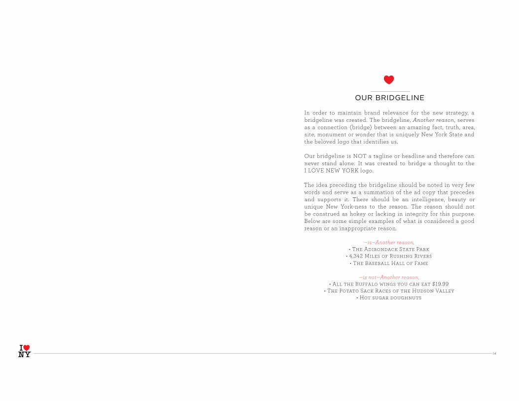
OUR BRIDGELINE
In order to maintain brand relevance for the new strategy, a bridgeline was created. The bridgeline, Another reason, serves as a connection (bridge) between an amazing fact, truth, area, site, monument or wonder that is uniquely New York State and the beloved logo that identifies us.
Our bridgeline is NOT a tagline or headline and therefore can never stand alone. It was created to bridge a thought to the I LOVE NEW YORK logo.
The idea preceding the bridgeline should be noted in very few words and serve as a summation of the ad copy that precedes and supports it. There should be an intelligence, beauty or unique New York-ness to the reason. The reason should not be construed as hokey or lacking in integrity for this purpose. Below are some simple examples of what is considered a good reason or an inappropriate reason.
—is—Another reason,
—is not—Another reason,

1 5
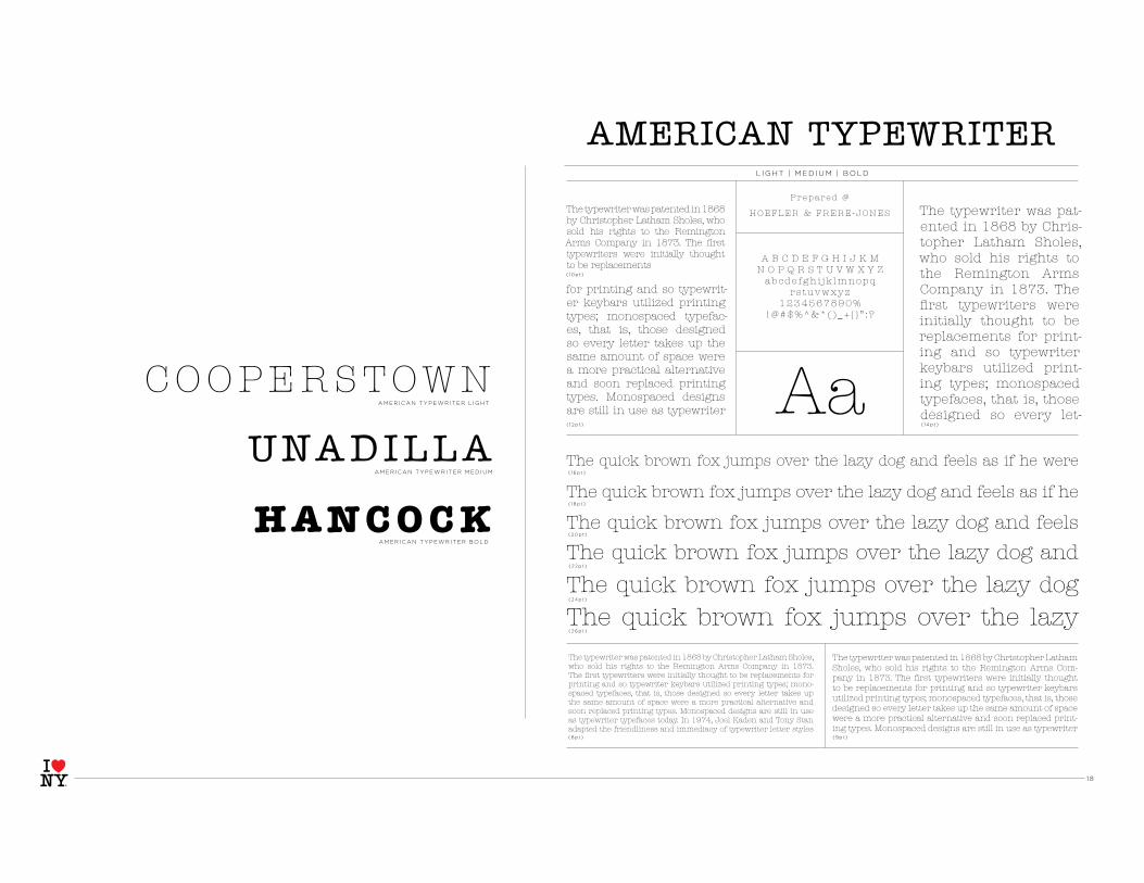
Three typefaces have been chosen for the I LOVE NEW YORK statewide campaign: Archer, Gotham, and American Typewriter. Used in conjunction, they carry across the smart, warm, and historical tone that is New York State. On the following three pages you can see their wide range and read about their history.
OUR TYPEFACES

1 6
HA IRL INE | TH IN | EXTRA L IGHT | L IGHT | BOOK | MED IUM | SEM IBOLD | BOLD
ARCHER HA IRL INE
( 16p t )
( 10p t )
( 1 2 p t ) ( 14p t )
( 18p t )
(2 0p t )
(2 2 p t )
(24p t )
(2 6p t )
(8p t ) (9pt )
ARCHER TH IN
ARCHER EXTRAL IGHT
ARCHER L IGHT
ARCHER BOOK
ARCHER MEDIUM
ARCHER SEMIBOLD
ARCHER BOLD
Archer, the colorful slab serif.
Sweet but not saccharine, earnest but not grave, Archer is designed to hit just the right notes of forthrightness, credibility, and charm.
Slab serifs have been evolving for two hundred years, yet the cat-egory continues to be dominated by two basic styles: Antiques and Geometrics. Antiques arise out of the same nineteenth-century tradi-tion that produced the Modern and Scotch styles: at heart, they’re text faces, and they feature all of the qualities needed to thrive at small
The Geometric is a twentieth-century riposte to the Antique. Informed by the same kind of rationalist thinking that inspired the great sans serifs of the Bau-haus, Geometrics abandon traditional forms in favor of mathematical strategies. A Geometric’s O is circular rather than elliptical, and its forms shed their residual contrast between thicks and thins. Geometrics usually apply this same rational-ism to the woollier parts of the alphabet, replacing the alphabet’s beaks and tails and ball terminals with a program of matching serifs. While these faces can some-times be bracingly modern, they’re often monotonous, and many Geometrics suf-fer from an astringent sting that makes them difficult to use and unwelcome to
Antique. Informed by the same kind of rationalist thinking that inspired the great sans serifs of the Bauhaus, Geometrics abandon traditional forms in favor of mathematical strategies. A Geometric’s O is circular rather than elliptical, and its forms shed their residual contrast between thicks and thins. Geometrics usually apply this same rationalism to the woollier parts of the alphabet, replacing the alphabet’s beaks and tails and ball terminals with a program of matching serifs. While these faces can sometimes be bracingly modern, they’re often monotonous, and
The quick brown fox jumps over the lazy dog and feels as if he were in the seventh
The quick brown fox jumps over the lazy dog and feels as if he were in the
The quick brown fox jumps over the lazy dog and feels as if he were
The quick brown fox jumps over the lazy dog and feels as if he
The quick brown fox jumps over the lazy dog and feels as The quick brown fox jumps over the lazy dog and
(Antiques customarily have the traditional ‘two-storey’ forms of a and g, and a capi-tal R that ends in a flourish.) Our Ziggurat typeface is an example of the Antique style in full flower, captur-ing the best of what the style has to offer: it’s warm, com-forting, and persuasive. But this coziness comes at the expense of modernity, and in the wrong context even the best Antique can feel
P r e p a r e d @
H O E F L E R & F R E R E - J O N E S
A B C D E F G H I J K M N O P Q R S T U V W X Y Z
a b c d e f g h i j k l m n o p qr s t u v w x y z
1 2 3 4 5 6 7 8 9 0 %! @ # $ % ^ & * ( ) _ + { } ” : ?
Aa
FREMONT
L O N G E D DY
AC IDAL IA
A R C H E R
R O S C O E
M O N T I C E L LO
N A R R OW S B U R G
H A N K I N S
CALL ICOON

1 7
L IGHT | BOOK | MED IUM | BOLD
GOTHAM L IGHT
( 16p t )
( 10p t )
( 1 2 p t )( 14p t )
( 18p t )
(2 0p t )
(2 2 p t )
(24p t )
(2 6p t )
(8p t ) (9pt )
GOTHAM BOOK
GOTHAM MEDIUM
GOTHAM BOLD
Gotham. What letters look like.Every designer has admired the no-nonsense lettering of the American vernacular, those letters of paint, plaster, neon, glass and steel that figure so prominently
Long before the emergence of a profession called “graphic design,” there was signage. Up until the mid-twentieth century, the job of providing architectural lettering often fell to engineers or draftsmen, most of whom worked outside of the typographic tradition.
Like most American cities, New York is host to a number of mun-dane buildings whose facades exhibit a distinctively American form of sans serif. This kind of lettering occurs in many media: the same office buildings whose numbers are rendered in this style, in steel or cast bronze, often use this form of lettering for their engraved cornerstones as well. Cast iron plaques regularly feature this kind of lettering, as do countless painted signs and lithographed posters, many dating back as far as the Work Projects Administration of the 1930s. And judging by how often it appears in signs for car parks
as the Work Projects Administration of the 1930s. And judg-ing by how often it appears in signs for car parks and liquor stores, this might well be the natural form once followed by neon-lit aluminum channel letters. Although there is nothing to suggest that the makers of these different kinds of signs ever consciously followed the same models, the consistency with which this style of letter appears in the American urban landscape suggests that these forms were once considered
The quick brown fox jumps over the lazy dog and feels as if he were in
The quick brown fox jumps over the lazy dog and feels as if he
The quick brown fox jumps over the lazy dog and feels
The quick brown fox jumps over the lazy dog and
The quick brown fox jumps over the lazy dog The quick brown fox jumps over the lazy
Gotham. What letters look like. Every designer has ad-mired the no-nonsense lettering of the American vernacular, those letters of paint, plaster, neon, glass and steel that fig-ure so prominently in the urban landscape. Long before the emer-gence of a profession called “graphic design,” there was signage. Up until the mid-twentieth
Prepa red @
HOEFLER & FRERE-JONES
A B C D E F G H I J K M N O P Q R S T U V W X Y Z
abcde fgh i j k l m no pqrs tuvwxyz
1 234 567890%! @ # $%^ &* ( ) _+ {} ” : ?
AaWILL IAM SBURG
ALBANY
ASTORIA
GOTHAM
HUDSON
1 8
L IGHT | MED IUM | BOLD
AMERICAN TYPEWRITER L IGHT
AMERICAN TYPEWRITER MEDIUM
AMERICAN TYPEWRITER BOLD
( 16p t )
( 10p t )
( 1 2 p t ) ( 14p t )
( 18p t )
(2 0p t )
(2 2 p t )
(24p t )
(2 6p t )
(8p t ) (9pt )
The typewriter was patented in 1868 by Christopher Latham Sholes, who sold his rights to the Remington Arms Company in 1873. The first typewriters were initially thought to be replacements
for printing and so typewrit-er keybars utilized printing types; monospaced typefac-es, that is, those designed so every letter takes up the same amount of space were a more practical alternative and soon replaced printing types. Monospaced designs are still in use as typewriter
The typewriter was patented in 1868 by Christopher Latham Sholes, who sold his rights to the Remington Arms Company in 1873. The first typewriters were initially thought to be replacements for printing and so typewriter keybars utilized printing types; mono-spaced typefaces, that is, those designed so every letter takes up the same amount of space were a more practical alternative and soon replaced printing types. Monospaced designs are still in use as typewriter typefaces today. In 1974, Joel Kaden and Tony Stan adapted the friendliness and immediacy of typewriter letter styles
The typewriter was patented in 1868 by Christopher Latham Sholes, who sold his rights to the Remington Arms Com-pany in 1873. The first typewriters were initially thought to be replacements for printing and so typewriter keybars utilized printing types; monospaced typefaces, that is, those designed so every letter takes up the same amount of space were a more practical alternative and soon replaced print-ing types. Monospaced designs are still in use as typewriter
The quick brown fox jumps over the lazy dog and feels as if he were
The quick brown fox jumps over the lazy dog and feels as if he
The quick brown fox jumps over the lazy dog and feels
The quick brown fox jumps over the lazy dog and
The quick brown fox jumps over the lazy dog
The quick brown fox jumps over the lazy
The typewriter was pat-ented in 1868 by Chris-topher Latham Sholes, who sold his rights to the Remington Arms Company in 1873. The first typewriters were initially thought to be replacements for print-ing and so typewriter keybars utilized print-ing types; monospaced typefaces, that is, those designed so every let-
Prepared @
HOEFLER & FRERE -JONES
A B C D E F G H I J K M N O P Q R S T U V W X Y Z
abcde fgh i j k lmnopqrs tuvwxyz
1234567890%!@#$%^&*( ) _+ { } ” : ?
AaUNADILLA
H A N C O C K
COOPERSTOWN
AMERICAN TYPEWRITER
1 9
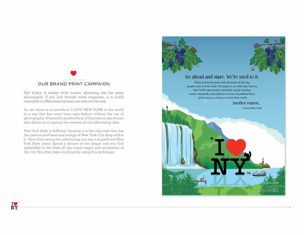
OUR BRAND PRINT CAMPAIGN
The world is awash with tourism advertising that has pretty photography. If you look through travel magazines, it is nearly impossible to differentiate between one state and the next.
So, we chose to re-introduce I LOVE NEW YORK to the world in a way that has never been seen before—without the use of photography. A beautiful modern form of illustration was chosen that allows us to capture the essence of our advertising idea.
New York State is different, because it is the only state that has the passion and heart and energy of New York City deep within it. Upon first seeing the advertising you see a magnificent New York State scene. Spend a minute or two longer and you find embedded in the State all the iconic magic and excitement of the city. No other state could justify using this technique.
™ I LOVE NEW YORK is a trademark/service mark
of the NYS Dept. of Economic Development (NYSDED).
©2008 NYSDED. All rights reserved.

20
Create your free personal Travel Guide to hiking, mountain biking and other outdoor adventures at iloveny.com
In other states, the parks don’t have much competition for tourists’ attention. But if the millions of acres of parkland in New York want to compete with all the lights of Broadway, they’ve got to work day and night to be just as spectacular.
Workaholic Parklands. Another reason,
™ I LOVE NEW YORK logo is a trademark/service mark of the NYS Dept. of Economic Development (NYSDED).©2008 NYSDED. All rights reserved.
For family adventure, county fairs, and a million other reasons to New York, visit iloveny.com
When the county fair opens in most places, it’s a big deal. But in New York it’s a lot harder to stand out from the crowd. So if the hundreds of fairs across the state want to turn heads, they’d better be every bit as glitzy and exciting as the city.
Fashionista Carnivals. Another reason,
™ I LOVE NEW YORK logo is a trademark/service mark of the NYS Dept. of Economic Development (NYSDED).©2008 NYSDED. All rights reserved.
You think you’ve got problems? Try being one of the hundreds of vineyards in New York State. To succeed here, the wine has to be just as good as what the city offers. It’s taken hard work and sleepless nights. Did I grow the best grapes? Did I check every vat? Did I leave the stove on?
Neurotic Vineyards. Another reason,
For scenic vineyards, farm-fresh cuisine and a million other reasons to New York, visit iloveny.com
™ I LOVE NEW YORK logo is a trademark/service mark of the NYS Dept. of Economic Development (NYSDED).©2008 NYSDED. All rights reserved.
ENDLESS STUDIES PROVE CONSISTENCY increases awareness and helps cement an emotional connection to a brand.
Create your free personal Travel Guide at iloveny.com
The historic mansions of New York State will totally get in your face. With arts thriving in the city, they know that no one’s going to hold their place on the cultural subway. They have to be just as artistically vibrant. They have to elbow their way
through shouting, “Hey everybody, get a load of my Corinthian columns!”
Overbearing Mansions. Another reason,
™ I LOVE NEW YORK logo is a trademark/service mark of the NYS Dept. of Economic Development (NYSDED).©2008 NYSDED. All rights reserved.
Create your free personal Travel Guide at iloveny.com
The mountains of New York State play to win.After all, to pull sports fans away from the city they’ve got to be aggressive,B-E-aggressive. That’s why every slope is charged with enough winteraction to get even the benchwarmers juiced.
Assertive Vistas. Another reason,
™ I LOVE NEW YORK logo is a trademark/service mark of the NYS Dept. of Economic Development (NYSDED).©2008 NYSDED. All rights reserved.

2 1
For family adventure, county fairs, and a million other reasons to New York, visit iloveny.com
When the county fair opens in most places, it’s a big deal. But in New York it’s a lot harder to stand out from the crowd. So if the hundreds of fairs across the state want to turn heads, they’d better be every bit as glitzy and exciting as the city.
Fashionista Carnivals. Another reason,
BRAND CONSISTENCY IN PRINT ADS
Top of the “A” in Another reason lines up with top of the “I” in the logo
Bridgeline is mandatory. Another reason has capital “A” and
lower case “r” and there is a comma after Another reason
before logo.
Top copy is always left or right justified
First sentence is always bigger than the rest of the copy
Tagline and bridgelineare slightly staggered
Archer Light is the font
Heart symbol from logo is used in copy instead of spelling out love
Bottom copy is always left or right justified
Legal is always included to denote registered trademark/service mark or
trademark/service mark.
™ I LOVE NEW YORK logo is a trademark/service mark of the NYS Dept. of Economic Development (NYSDED).©2008 NYSDED. All rights reserved.

22
OUR RETAIL ADVERTISING
SEASONAL CAMPAIGNS PROMOTING OVERNIGHT TRAVEL with incentives and packaging create a reason for consumers to consider and choose New York State as their getaway destination.
Creative elements from our new brand “toolbox” are used to carry brand consistency across all media.
™ NYSDED.
™ NYSDED.
™ I LOVE NEW YORK logo is a trademark/service mark of the NYS Dept. of Economic Development (NYSDED).©2008 NYSDED. All rights reserved. * At participating properties.

23
™ NYSDED.
™ NYSDED.
™ NYSDED.
™ NYSDED.
IT’S IMPOSSIBLE TO OVEREMPHASIZE the importance of consistency.

24
BRAND CONSISTENCY IN RETAIL ADS
Headline: It should speak to the offer with a New York tone of voice
Bridgeline is mandatory. Another reason has capital “A” and lower case “r” and there is a comma after Another reason before logo.
Subhead: A straightforward clarification of the offer
Call to action: Drives you to the website to find out more about the offer
Top of the “A” in Another reason lines up with top of the
“I” in the logo
Legal is always included to denote registered trademark/service mark or
trademark/service mark.
™ I LOVE NEW YORK logo is a trademark/service mark of the NYS Dept. of Economic Development (NYSDED).©2008 NYSDED. All rights reserved. * At participating properties.

25
OUR PHOTOGRAPHY
We have a simple rule for photography selection–
Think simple.
Always choose photography that has a point of view. Sometimes more is not better. More is just more. If there is one perfect shot and three mediocre, go with the one perfect shot. Be conscious of composition. Be conscious of whether the picture evokes any emotion. For example, a simple shot of a pond can often be more emotional than a badly composed picture that has a family skating.
Be aware that people are looking at many places before they make their choice of destination. What does the picture say that will make people choose New York State? Try to choose perspectives that are bold and speak directly to the consumer so they can imagine themselves there. Make sure it speaks to the beauty, grandeur and magic of New York State.
Guidelines:
print to maintain integrity of the photos
public/places you can visit
feasible and/or appropriate to identify location
Hudson River Gorge, North Creek

26
Simple lyrics and a catchy melody.
I LOVE NEW YORK was written and composed for the 1977 launch by the “Jingle Man” himself, Steve Karmen. In 1980, Governor Carey signed a proclamation making it the state song. Like any great jingle, I LOVE NEW YORK is permanently imprinted in people’s minds. But like a favorite song, it is also imprinted in people’s hearts. Four amazing little notes.That’s all you need to hear to instantly know it’s New York. And, there isn’t another like it!
OUR SONG“I LOVE NEW YORK”
“I LOVE NEW YORK”
There isn’t another like it.No matter where you go.And nobody can compare it.It’s win and place and show.New York is special.New York is diff’rent’ cause there’s no place else on earth quite like New York and that’s why
I LOVE NEW YORK.(repeat 3 times)
I LOVE NEW YORK is owned by Elsmere Music, Inc. but the State has exclusive rights for its use in advertising.
27
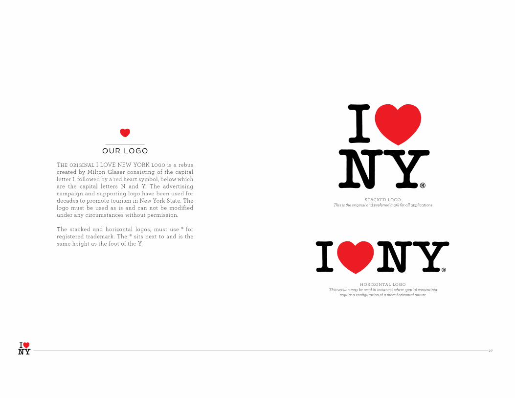
The original I LOVE NEW YORK logo is a rebus created by Milton Glaser consisting of the capital letter I, followed by a red heart symbol, below which are the capital letters N and Y. The advertising campaign and supporting logo have been used for decades to promote tourism in New York State. The logo must be used as is and can not be modified under any circumstances without permission.
The stacked and horizontal logos, must use ® for registered trademark. The ® sits next to and is the same height as the foot of the Y.
STACKED LOGO
This is the original and preferred mark for all applications
HORIZONTAL LOGO
This version may be used in instances where spatial constraintsrequire a configuration of a more horizontal nature
OUR LOGO

28
OUR TREATMENT LOGOSadventurewine & food cultural history
culture
history
family
heritage
scenic drives
fine art
military history
shopping
water
New logos with thematic treatments were created for the 2008 relaunch to breathe new life into the iconic logo and showcase that New York is more than just New York City. The icon remains prominent and in its original, classic form but the added elements force you to stop and rethink what I LOVE NEW YORK really means. And, more importantly, what it means to you. The beauty of I LOVE NEW YORK is that it is loved by all. Our challenge as brand stewards is to turn that love into reasons to choose New York for a getaway. Treatment logos are currently being used for the State campaign only. Used in the Getaway Guide, personal Travel Guide and brand ads, they carry the new brand strategy across by linking thematic curatorial content to the many reasons to choose New York. I LOVE NEW YORK is about making the New York experience your own. The new logos remind you to do that. Whether your idea of a getaway is relaxing, engaging or experiential, they remind you there is always another reason to love New York.
spas & retreats sports

29
spring & summer
fall
winter
OUR SEASONAL LOGOS
Seasonal logos were created for Brand
advertising and seasonal promotions
Seasonal logos use trademark (™) symbol not registered trademark (® ) symbol.
Seasonal logos are used in stacked (preferred) and horizontal format with black/red color application only. The ™ sits next to and is the same height as the foot of the Y.
STACKED LOGO
This is the preferred mark for all applications
HORIZONTAL LOGO
This version may be used in instances where spatial contraints require a configuration
of a more horizontal nature

30
To ensure the legibility of the logo, it must be surrounded with a minimum amount of clearspace. This isolates the logo from competing elements such as photography, text or background patterns that may detract attention and lessen the overall impact. Using the logo in a consistent manner across all applications helps to both establish and reinforce immediate recognition of the I LOVE NEW YORK brand. The provided artwork must be used at all times.
STACKED LOGO
The clearspace minimum is equivalent to the vertical height of the heart icon (shown here as x), regardless of the size at which
the logo is reproduced.
HORIZONTAL LOGO
The clearspace minimum is equivalent to the vertical height of the heart icon (shown here as x), regardless of the size at which
the logo is reproduced.
x
x
x
x
x
x
x
x
x
x
LOGO CLEARSPACE

3 13 1
There are three color versions of the I LOVE NEW YORK logo. There are no absolutes regarding the selection of the specific color application, but context, contrast with regard to background color and surrounding imagery and production parameters all should be considered.
An entirely black or white logo has been provided for those instances where the logo must print in a single color.
When it’s necessary to apply the logo to media other than paper or on-screen (e.g. fabric, wood, metal, glass or leather), the logo may be silkscreened, blind embossed, etched, engraved, etc.
LOGO COLOR APPLICATION
ONE–COLOR PRINTING
The entire logo prints 100% black with no screens. Alternatively, the logo may print reversed (knocked out) of any background color to white. No other colors allowed.
TWO–COLOR PRINTING
Letters print 100% black; heart prints 100% PMS 485. Additionally, the entire logo may be reversed out of any background color to white. Letters may also be reversed out and heart may print 100% PMS 485. No other colors allowed.
FOUR–COLOR PRINTING
Letters print 100% black or reverse out of four-color to white. Heart prints 100% magenta plus 100% yellow. Additionally, the entire logo may be printed in 100% black, or the entire logo may be reversed out of any background color to white . No other colors allowed.

32
To ensure a consistent and appropriate brand identity,
a general set of guidelines for logo usage is outlined as
follows.
1. No elements of the logo artwork may be recreated, deleted, cropped, or reconfigured. All logo artwork is provided as Adobe Illustrator, based EPS.
2. A minimum clearspace must be maintained on the perimeter surrounding logo artwork as outlined on Logo Clearspace page. Must use the artwork provided.
3. Logo artwork must be uniformly scaled. Non-uniform scaling distorts the proportions of artwork and the relationship between the icons and letterforms.
4. Logo artwork should always appear upright.
5. EPS files are vector artwork and are infinitely scalable, thus eliminating the need to ensure proper resolution for the purpose of reproduction.
6. Logo artwork should appear against a solid background to ensure maximum and proper contrast.
7. Logo artwork may only be reproduced directly from a digital file. It should never be reproduced from previously printed materials.
8. Do not put a white box around the logo when placed on a dark background and do not reproduce the logo in colors other than those specified in these guidelines.
LOGO USAGE GUIDELINES

33
1. Don’t change the logo’s orientation.
2 . Don’t bevel or emboss the logo.
3 . Don’t place the logo on a busy photograph or pattern.
4 . Don’t change the logo colors.
5 . Don’t crop the logo in any way.
6. Don’t add “glow” effects to the logo.
7. Don’t present the logo on “vibrating” colored backgrounds.
8. Don’t present the logo in “outline only” fashion.
9. Don’t place the logo on similarly-colored backgrounds.
10. Don’t outline the logo in any color.
11. Don’t add “drop shadow” effects to the logo.
12. Don’t put a white box around the logo when placed on a dark or busy background.
13 . Don’t reconfigure or change the size or placement of any logo elements.
14 . Don’t stretch or squeeze the logo to distort proportions.
15 . Don’t recreate elements or replace with something else.
LOGO USAGE DON’TS
bevel/embossorientation busy photo/pattern color
glowcrop vibrating color outline
outlinebackground color drop shadow white box
stretch/squeezereconfi gure recreate replace

34
LEGAL REQUIREMENTS
In order to protect the trademark legally, it is very important that we display ownership on all marketing materials. The stacked and horizontal logos use ® to denote Registered Trademark.
The thematic and seasonal logos use ™ to denote Trademark.
For all marketing materials bearing the I LOVE NEW YORK logo,
including but not limited to print ads, websites and print collateral,
the legal language below must be displayed in an inconspicuous
location.
For standard stacked or horizontal logo:
® I LOVE NEW YORK logo is a registered trademark/service mark of the NYS Dept. of Economic Development, used with permission.
For thematic or seasonal logos:
™ I LOVE NEW YORK logo is a trademark/service mark of the NYS Dept. of Economic Development, used with permission.
For online advertising or smaller ads where using the full legal line
will compromise the creative integrity, the following abbreviated
version may be used: ® NYSDED or ™ NYSDED
STATE MATERIALS ONLY:
For standard stacked or horizontal logo:
® I LOVE NEW YORK logo is a registered trademark/service mark of the NYS Dept. of Economic Development (NYSDED).
For thematic or seasonal logos:
™ I LOVE NEW YORK logo is a trademark/service mark of the NYS Dept. of Economic Development (NYSDED).
Include the following copyright line after trademark line:
© [current year] NYSDED. All rights reserved.
35
PART 2OUR VISION
Our goal is to make everything the consumer sees in connection with New York State consistently smart, beautiful and motivating; to speak with the same voice, thereby transforming New York into the ultimate destination for people from every corner of the globe.
This document was created to be a resource with some simple rules that we all commit to follow in order to streamline and simplify the process of creating one I LOVE NEW YORK voice. When we follow these guidelines, we will present a more single-minded, unified image of our state and maximize the investment in the brand.
The following pages present the Guidelines for use of the branding tools we have to keep our message consistent and focused. Please consult these pages regularly and incorporate into all work going forward.

36
THE IMPORTANCE OF ALIGNMENT
I LOVE NEW YORK is a beautiful thing.
Enormously powerful. Enormously fragile.
Over time, I LOVE NEW YORK has become more and more fragile due to brand dilution and a need for a firm structure with a focused message. The relaunch was the first step toward a new, refocused brand. Now we need your help.
As stated, it is impossible to over emphasize the importance of consistency. Brand alignment across the state will allow I LOVE NEW YORK to once again be Enormously Powerful!

37
The I LOVE NEW YORK logo is the most recognized of all our branding tools. Now that we have relaunched the brand, it is more important than ever that we are aware of all impressions to be sure they align with our new brand strategy.
All I LOVE NEW YORK logos (variations and treatments) are trademarks and the property of the State. Whether in conjunction with a Matching Funds project or otherwise, use of the I LOVE NEW YORK logos in any form, anywhere must be approved by the I LOVE NEW YORK office. Although this has always been the policy, there have been some misconceptions and confusion over the years. Therefore, please be aware there are no blanket policies for logo use whatsoever.
All inquiries and requests about and for the I LOVE NEW YORK logo should be directed to the Matching Funds Director or Brand Manager at the New York State Department of Economic Development.
LOGO USE & PERMISSIONS

38
spring & summer
fall
winter
SEASONAL LOGOS & RULES
Seasonal logos may be used by TPAs for seasonal advertising or other approved projects. Seasonal logos are not meant to be used on Travel Guide covers but may be appropriate for some tourism collateral in the right context.
Do not attempt to recreate a seasonal logo. The scalable art provided for these treatments must be used.
Seasonal logos can appear as stacked (preferred) or horizontal as shown, but must appear with the black/red color application. No other color application (including b/w) is allowed.
39
THE BRIDGELINE
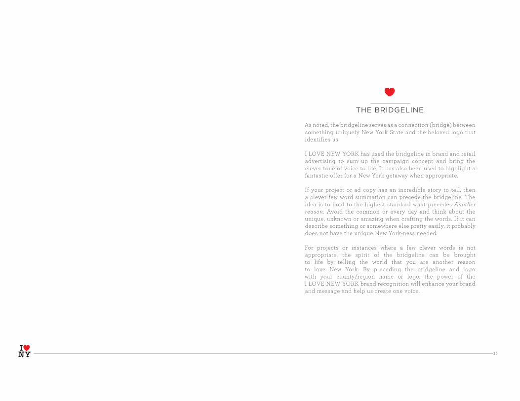
As noted, the bridgeline serves as a connection (bridge) between something uniquely New York State and the beloved logo that identifies us.
I LOVE NEW YORK has used the bridgeline in brand and retail advertising to sum up the campaign concept and bring the clever tone of voice to life. It has also been used to highlight a fantastic offer for a New York getaway when appropriate.
If your project or ad copy has an incredible story to tell, then a clever few word summation can precede the bridgeline. The idea is to hold to the highest standard what precedes Another reason. Avoid the common or every day and think about the unique, unknown or amazing when crafting the words. If it can describe something or somewhere else pretty easily, it probably does not have the unique New York-ness needed.
For projects or instances where a few clever words is not appropriate, the spirit of the bridgeline can be brought to life by telling the world that you are another reason to love New York. By preceding the bridgeline and logo with your county/region name or logo, the power of the I LOVE NEW YORK brand recognition will enhance your brand and message and help us create one voice.

4 0
ADVERTISINGMinimum Sizing of Logos
Using the logo in a consistent manner across all applications helps to both establish and reinforce immediate recognition of the I LOVE NEW YORK brand. The following rules for logo size applies to logo use in all advertising: All full page, 1/2 page and 1/4 page ads must use the logo no smaller than 1” wide. There are three standard web banner sizes: 300 x 250 pixels, 160 x 600 and 728 x 90. All three sizes should use a logo that is no smaller than 60 pixels wide. Use these rules in conjunction with those of logo clearspace to ensure maximum visual impact.
Standard web banner
Scaled down from standard letter size

41
TRAVEL GUIDE COVERS
To increase brand awareness and begin to develop unified and consistent brand messaging, the following simple rules have been crafted for design of Travel Guide covers.
Use only the supplied I LOVE NEW YORK logo with Another reason lock-up.
I LOVE NEW YORK logo must be placed in the upper right corner of the cover with your logo or name placed to the left of it. The county/region logo or name can be placed immediately to the left of the logo or in the upper left corner of the cover.
Logo must be the following size:Stacked version: .09” x 1”Horizontal version: 1” x .5”
No graphic elements can appear above, beside or between the county/region logo or name and the I LOVE NEW YORK logo.
Please see cover examples for visual reference.

4 2
county travel guide
Chautauqua-Allegheny Region
tourchautauqua.com
THE MORE SINGLE-MINDED WE ARE, the more powerful the I LOVE NEW YORK brand will be.

4 3
BRAND CONSISTENCY IN TRAVEL GUIDE COVERS
The county or region logo or name appears immediately to the left of the I LOVE NEW YORK logo or in the upper left corner of the cover.
county travel guide
Chautauqua-Allegheny Region
tourchautauqua.com
Can use stacked or horizontal
Another reason logo lock-up in black/red
combination orin reverse white/red
combination.
To maximize visual impact of destination and bridgeline, apply an optional banner
behind masthead
Logo must be the following size:
Stacked: .09” x 1”
Horizontal: 1” x .5”
No graphic elements can appear above, beside or between the county logo or name and the
I LOVE NEW YORK logo.

4 4
TOURISM COLLATERAL
Print and electronic tourism collateral can include a variety of different pieces. As a general rule, the logo with Another reason lock-up should be used for all tourism collateral.
Brochure Inserts Calendars of Events Regional Tour Planning Directory Special-Interest Themed Brochures Direct Mail Projects Accommodations, Camping or Restaurant Guides Meeting Planners Guides
Please refer to THE BRIDGELINE page for specific execution guidance. If there is a situation where the bridgeline logo does not seem to work, give us a call. We do not want to force fit any brand elements, it should always feel natural.
For Shells or Folders used for trade press or public relations, the same general rules apply but the supplied logo with “The Beat” URL lock-up should be used to promote the industry media portal.
HUDSON VALLEY REGION
BIRD GUIDEBIRD GUIDE
2009
Westchester CountyNew York’s Golden Apple
CALENDAR
THE WAY TO DO BUSINESS...A GREAT PLACE TO PLAY...
New York’s Quadricentennial Year. Celebration events listed inside.
THE
BEAT
4 5
TOURISM WEBSITES
The I LOVE NEW YORK logo must appear on the county/region homepage as a hyperlink to iloveny.com. Preferred placement is upper right, top of page.
To ensure brand recognition, the supplied logo with URL lock-up must be used. The logo must be 60 pixels wide for stacked or 100 pixels wide for horizontal.

4 6
WEBSITE SAMPLES

47
RADIO, TELEVISION & AUDIO/VISUAL
RADIO/AUDIO The bridgeline and I LOVE NEW YORK must be included in all radio spot scripts and audio-only productions.
For radio spots, the voice-over must read the bridgeline “Another reason” then “I LOVE NEW YORK” before the call-to-action at the end. Follow general bridgeline rules (refer to THE BRIDGELINE page) for guidance about copy to precede bridgeline.
For audio-only productions, the voice-over must read “Another reason, I LOVE NEW YORK” at the end of the production or segments. Please consult with I LOVE NEW YORK directly for guidance. The location within the audio will vary based on purpose of audio production, message and length.
TELEVISION/VIDEO The I LOVE NEW YORK logo must appear in all television spots and consumer videos. Use only the supplied logo file with Another reason lock-up.
For television spots, it must appear at the end of the spot and follow the general bridgeline rules (refer to THE BRIDGELINE page). The logo must be a minimum size of 230 x 100 pixels for the bridgeline to be readable on screen. It may not appear outside television safe area.
For videos, it must appear at the end of the production or segments and follow the general bridgeline rules. Please consult with I LOVE NEW YORK directly for guidance. The placement of bridgeline and logo will vary based on purpose of video, message and length. The logo must be a minimum size of 480 x 295 pixels.

4 8
DISPLAYS AND SIGNAGE
The I LOVE NEW YORK logo with URL lock-up must appear on all newly produced displays and signage created for shows, sales meetings or information centers. Use of other I LOVE NEW YORK branding elements such as illustrations and photography or the logo with Another reason lock-up may be appropriate in some cases depending on the nature of the project. Please consult with I LOVE NEW YORK directly for guidance.

49
BRAND CREATIVE FOR TRAVEL GUIDES
To further the statewide brand message, we have customized the four I LOVE NEW YORK brand ads to a 1/2 page, horizontal size (for 8.5” x 11”) for placement in all County and Regional Travel Guides. The full page size is also available.
The brand ads capture all the elements of the relaunch strategy by telling our story through the art of juxtaposition in a New York voice. The illustrations masterfully capture I LOVE NEW YORK’s three targeted themes: outdoor recreation (WATERFALL), agriculture/culinary (VINEYARD) and local culture/history (MANSION). CARNIVAL and shopping are paired together to reach the family market and address the one activity everybody enjoys when they get away.
You may choose which creative best aligns with your county or region from the four. Full and 1/2 pages will be a standard size, non-bleed and supplied as hi-res art files. Due to licensing requirements, they cannot appear anywhere else without permission.
Create your free personal Travel Guide to hiking, mountain biking and other outdoor adventures at iloveny.com
In other states, the parks don’t have much competition for tourists’ attention. But if the millions of acres of parkland in New York want to compete with all the lights of Broadway, they’ve got to work day and night to be just as spectacular.
Workaholic Parklands. Another reason,
™ I LOVE NEW YORK is a trademark/service mark of the NYS Dept. of Economic Development (NYSDED).©2008 NYSDED. All rights reserved.

50
You think you’ve got problems? Try being one of the hundreds of vineyards in New York State. To succeed here, the wine has to be just as good as what the city offers. It’s taken hard work and sleepless nights. Did I grow the best grapes? Did I check every vat? Did I leave the stove on?
Neurotic Vineyards. Another reason,
Create your free personal Travel Guide at iloveny.com™ I LOVE NEW YORK logo is a trademark/service mark of the NYS Dept. of Economic Development (NYSDED).©2008 NYS Department of Economic Development. All rights reserved.
Create your free personal Travel Guide at iloveny.com™ I LOVE NEW YORK logo is a trademark/service mark of the NYS Dept. of Economic Development (NYSDED).
©2008 NYS Department of Economic Development. All rights reserved.
In other states, the parks don’t have much competition for tourists’ attention. But if the millions of acres of parkland in New York want to compete with all the lights of Broadway, they’ve got to work day and night to be just as spectacular.
Workaholic Parklands. Another reason,
HALF PAGE TRAVEL GUIDE BRAND AD SAMPLES
The historic mansions of New York State will totally get in your face. With arts thriving in the city, they know that no one’s going to hold their place on the cultural subway. They have to be just as artistically vibrant. They have to elbow their way through shouting, “Hey everybody, get a load of my Corinthian columns!”
Overbearing Mansions. Another reason,
Create your free personal Travel Guide at iloveny.com™ I LOVE NEW YORK logo is a trademark/service mark of the NYS Dept. of Economic Development (NYSDED).
©2008 NYS Department of Economic Development. All rights reserved.
When the county fair opens in most places, it’s a big deal. But in New York it’s a lot harder to stand out from the crowd. So if the hundreds of fairs across the state want to turn heads, they’d better be every bit as glitzy and exciting as the city.
Fashionista Carnivals. Another reason,
Create your free personal Travel Guide at iloveny.com™ I LOVE NEW YORK logo is a trademark/service mark of the NYS Dept. of Economic Development (NYSDED).
©2008 NYS Department of Economic Development. All rights reserved.
vineyard
waterfall
mansion
carnival


