
Are You Ready?To Cater With
Google Mobile Friendly Update

I AM ASAD ALII am here because I am going to tell you about
upcoming Google Update for Mobile Frienldy
Websites.

OUTLINE
1. Google Signal about Mobile Friendly
Websites
2. How this algorithm can effect you?
3. What we know about it so far?
4. Why to have a Mobile Friendly Website?
5. How to Test Responsiveness?
6. What the test results shows?
7. How to Make your store mobile friendly?

“When it comes to search on mobile devices,
users should get the most relevant and timely
results, no matter if the information lives on
mobile-friendly web pages or apps. As more
people use mobile devices to access the internet,
our algorithms have to adapt to these usage
patterns”
GOOGLE SIGNAL ABOUT
MOBILE FRIENDLY WEBSITES

HOW THIS ALGORITHM
CAN EFFECT YOU?◇Your site will get a penalty by Google.
◇Downfall in website ranks.
But remember if your website
is mobile friendly, you can
gain improvement in ranks
and traffic.

BIG
THREATFor Non-Friendly
Websites
ROLL OUT DATEGoogle is going to roll
out this update on 21th
April 2015. This is first
time when Google is
annouced the exact
date of an update.
WHAT WE KNOW SO FAR
BIGGER IMPACTAccoding to Google,
impact of this update
will be more than the
panda and penguin
update.

MOBILE
FRIENDLY LABEL
Google will show a
mobile friendly lable
in SERPs for those
sites that will be
mobile friendly.
PAGE BY PAGE
EFFECT
Every page of a
website will be
checked for mobile
friendly behaviour.
REAL TIME
IMPLEMENTATION
This algorithm will
effect the website
on real time basis
i.e. When Google
bot crawles a site.
WHAT WE KNOW SO FAR

Rise in Smart
Phone IndustryNow Smart Phones are
avaible at cheap price
and everyone can buy
it easily. People love to
visite website via smart
phones.
WHY TO HAVE A MOBILE
FRIENDLY WEBSITE?
Mobile Users RatioAccoding to a
research, about 40% of
people love to go
online and browse
websites through
mobile devices.

COMPITION
While most of the
stores are mobile
friendy, you have to
adopt it to compete
with your rivals.
CUSTOMER
SATISFACTION
If customers finds
that your site is not
responsive, they will
leave you and go to
another responsive
site.
Users Experience
Users love to visit
your site, if they feel
a better browsing
experience on it.
Responsiveness
assures a better
user experience.
WHY TO HAVE A MOBILE
FRIENDLY WEBSITE?

HOW TO TEST
RESPONSIVENESS?
You can check
responsiveness of
your website by
running Google
Mobile Friendly
Checking Test.

HOW TO TEST RESPONSIVENESS?
◇Go to the link mentioned in the last
slide.
◇Paste the URL of website in the box
area.
◇Click on analyze button.

WHAT THE TEST RESULTS SHOWS?
This test will give you two type of results.
◇The website is responsive.
◇The website is non-responsive.
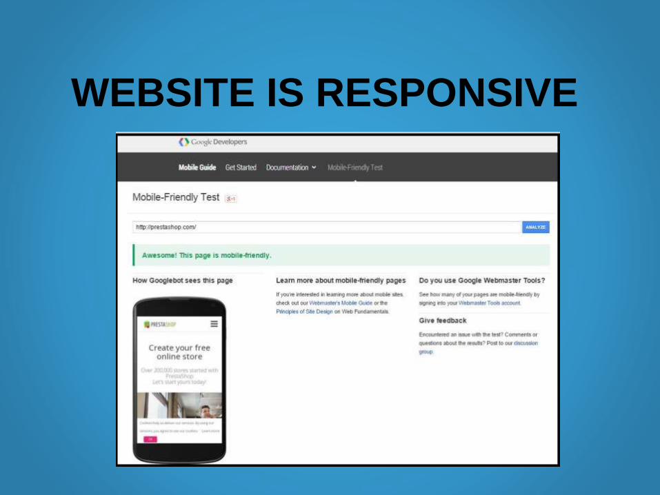
WEBSITE IS RESPONSIVE

WEBSITE IS NON-RESPONSIVE
It will give you the reason of non-
responsivness like this;

HOW TO MAKE YOUR SITE
MOBILE FRIENDLY?
As mentioned in last slides, Google explains
that why your website is non-reponsive?
You can make it reponsive by considering
same issues.
I have given some best tips to make your
store responsive.

CHANGE YOUR
THEME
If your current
theme is not mobile
friendly, the easiest
solution is to use
some responive
theme on your site.
USE PLUGIN
Use plugin like WP
Touch to make your
site mobile friendly.
However, such
plugins does not
work with all
themes.
MEDIA QUEURIES
Use CSS media
queries on your site
style sheet that tells
the search engine
the settings to
display the website
correctly in mobile.
TIPS TO MAKE YOUR SITE
MOBILE FRIENDLY?

OUT SOURCING TO MAKE YOUR
STORE MOBILE FRIENDLY?
If these tips don’t helped you or your site
involves complex coding then it is better
to hire expert designers for this task
You can contact with Go Gulf Team to get
support on this issue.

For Watching PresentationFor any query contact us at
http://www.go-gulf.ae/
Saeed Tower 1, Office 2406, Sheikh Zahid Road, Dubai


