52
Section A: Delivery
4 DeliveryRobert Pattinson
This chapter covers several aspects of maternal health related to delivery as well as indicators of obstetric, intrapartum and postnatal care and includes the following indicators:
✦ Delivery in facility under 18 years rate
✦ Institutional maternal mortality ratio
✦ Inpatient early neonatal death rate
✦ Mother postnatal visit within 6 days rate
4.1 Delivery in facility under 18 years rateThe delivery in facility under 18 years rate indicator measures the proportion of all deliveries among women younger than 18 years in public health facilities in South Africa. The numerator is the number of deliveries among women under 18 in public health facilities, while the denominator includes all deliveries in public health facilities over the same time period. The indicator is expressed as a percentage. Because this indicator monitors the proportion of deliveries in facility by young women under 18 years, it can be used as a proxy for the adolescent birth rate.
The South Africa Demographic and Health Survey (SADHS)a findings from 1998 to 2003 indicate that most young women become sexually active by the age of 18 years and that 14.8% of women are likely to fall pregnant by the age of 18 years. Most women start using a contraceptive method at the age of 20 years, and more than half of all women who give birth will have their first child before their 21st birthday.
Despite the existence of the Choice on Termination of Pregnancy Act (92 of 1996),b which gives women the right to safe choices and access to safe legal abortion in South Africa, these services remain unequally available and/or accessible, especially in the rural areas of South Africa.
National overview
The national delivery in facility under 18 years rate shows a downward trend, from 7.7% in 2012/13 to 6.8% in 2016/17, with a slight fluctuation in 2013/14 (Table 1).
Table 1: National delivery in facility under 18 years rate trends, 2012/13–2016/17
2012/13 2013/14 2014/15 2015/16 2016/17National delivery in facility under 18 years rate (%) 7.7 7.8 7.4 7.1 6.8
Source: DHIS.
Provincial overview
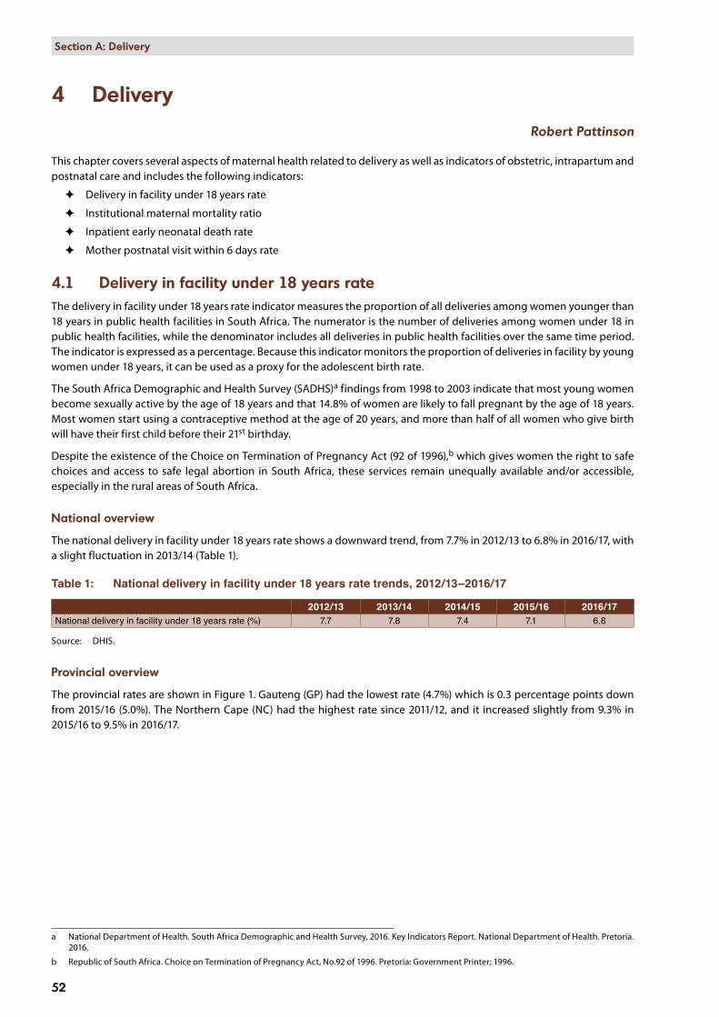
The provincial rates are shown in Figure 1. Gauteng (GP) had the lowest rate (4.7%) which is 0.3 percentage points down from 2015/16 (5.0%). The Northern Cape (NC) had the highest rate since 2011/12, and it increased slightly from 9.3% in 2015/16 to 9.5% in 2016/17.
a National Department of Health. South Africa Demographic and Health Survey, 2016. Key Indicators Report. National Department of Health. Pretoria. 2016.
b Republic of South Africa. Choice on Termination of Pregnancy Act, No.92 of 1996. Pretoria: Government Printer; 1996.
Delivery in facility under 18 years rate by province, 2016/17
Percentage [Source: DHIS]
NC
EC
KZN
MP
NW
LP
FS
WC
GP
5 10
8.6
5.7
5.9
8.5
7.7
6.3
6.5
4.7
9.5
SA: 6.8
ProvincesECFSGPKZNLPMPNCNWWC
53
Section A: Delivery
Figure 1: Delivery in facility under 18 years rate by province, 2016/17
District overview
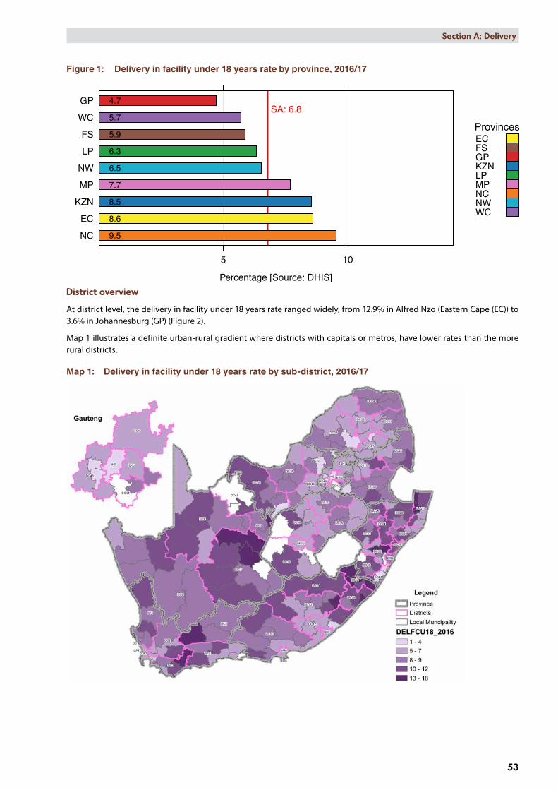
At district level, the delivery in facility under 18 years rate ranged widely, from 12.9% in Alfred Nzo (Eastern Cape (EC)) to 3.6% in Johannesburg (GP) (Figure 2).
Map 1 illustrates a definite urban-rural gradient where districts with capitals or metros, have lower rates than the more rural districts.
Map 1: Delivery in facility under 18 years rate by sub-district, 2016/17

Delivery in facility under 18 years rate by district, 2016/17
Percentage [Source: DHIS]
A Nzo: DC44JT Gaetsewe: DC45
uMkhanyakude: DC27Harry Gwala: DC43
Pixley ka Seme: DC7Joe Gqabi: DC14OR Tambo: DC15uMzinyathi: DC24
Zululand: DC26ZF Mgcawu: DC8
RS Mompati: DC39Ugu: DC21
uThukela: DC23C Hani: DC13
Amathole: DC12West Coast: DC1
iLembe: DC29uMgungundlovu: DC22
Ehlanzeni: DC32G Sibande: DC30
Frances Baard: DC9Amajuba: DC25
King Cetshwayo: DC28S Baartman: DC10
Central Karoo: DC5Namakwa: DC6Overberg: DC3Vhembe: DC34Xhariep: DC16
eThekwini: ETHNM Molema: DC38
Mopani: DC33Eden: DC4
T Mofutsanyana: DC19Cape Winelands: DC2Lejweleputswa: DC18
Waterberg: DC36Ekurhuleni: EKU
Fezile Dabi: DC20Nkangala: DC31
Sekhukhune: DC47Bojanala: DC37
N Mandela Bay: NMACapricorn: DC35
Dr K Kaunda: DC40Buffalo City: BUF
West Rand: DC48Sedibeng: DC42Cape Town: CPTMangaung: MAN
Tshwane: TSHJohannesburg: JHB
5 10
5.0
5.0
8.7
8.1
8.7 8.8
10.410.0
7.2
6.5
6.6 6.6
6.1
9.5
8.5
8.8
9.9
8.1
9.8
10.7
8.1
8.7
7.8
8.2
5.9
8.4
6.8
7.3
5.3
6.5
5.6
7.0
9.7
6.7
5.1
5.0
10.4
12.911.5
5.8
5.0
8.0 7.9
10.4
9.8
8.2
6.2
7.0
3.6
4.6
5.6
4.3 SA: 6.8
ProvincesECFSGPKZNLPMPNCNWWC
54
Section A: Delivery
Figure 2: Delivery in facility under 18 years rate by district, 2016/17

Deliv in fac <18
FY 2010 FY 2011 FY 2012 FY 2013 FY 2014 FY 2015 FY 2016 FY 2017Financial year
Per
cent
age
5
6
7
8
9
10
11
10.2
7.57.6
5.9
9.4
7.6
6.7
5.3
8.5
9.5
Indicator value by SEQ (weighted average of data by district quintile)SEQ
SEQ 1 (most deprived)
SEQ 2 (deprived)
SEQ 3
SEQ 4 (well off)
SEQ 5 (least deprived)
55
Section A: Delivery
Figure 3 shows a steady decrease in delivery in facility under 18 years rate for all socio-economic quintiles (SEQs) in 2016/17, with rates ranging from 9.4% to 5.3%.
Figure 3: Trends in average district values by socio-economic quintile for delivery in facility under 18 years rate, 2009/10–2016/17
Key findings ✦ Three aspects stand out in this data:
• There has been a marked reduction in delivery in facility under 18 years rate in South Africa since 2013/14.
• The rural provinces (Northern Cape, Eastern Cape and KwaZulu-Natal) and rural districts (Alfred Nzo (EC), JT Gaetsewe (NC), uMkhanyakude (KZN) and Pixley Ka Seme (NC)) have the highest delivery in facility under 18 years rates.
• The districts in the lowest SEQs have the highest teenage pregnancy rates.
✦ The difference in the delivery in facility under 18 years rate between the metros, cities and rural areas clearly indicates the inequity of services and the need for focused interventions on rural populations and access to sexual and reproductive services for adolescents.
✦ Preventing teenage pregnancies is a more complex issue requiring other departments like the Department of Basic Education to help provide social solutions.
Recommendations ✦ Districts with the highest teenage pregnancy rates should be targeted for evidence-based interventions.
✦ Linking the school’s health programme to preventing teenage pregnancies would be a feasible option through intensive contraceptive use, together with educational interventions in high prevalence areas.
4.2 Institutional maternal mortality ratio The World Health Organization (WHO) defines maternal mortality as the “death of a woman while pregnant or within 42 days of termination of pregnancy, irrespective of the duration and site of the pregnancy, from any cause related to or aggravated by the pregnancy or its management, but not from accidental or incidental causes”.c
The National Indicator Data Setd of the National Department of Health defines a maternal death as a death occurring during pregnancy, childbirth and the puerperium of a woman while pregnant or within 42 days of termination of pregnancy, irrespective of the duration and site of pregnancy and irrespective of the cause of death (obstetric and non-obstetric). The maternal mortality ratio (MMR) is a measure of maternal mortality and is defined as the number of maternal deaths per 100 000 live births. The numerator is the number of maternal deaths, while the denominator includes the number of live births and is expressed per 100 000. This is a proxy for the population-based maternal mortality ratio, aimed at monitoring
c World Health Organization. Health statistics and information systems: Maternal mortality ratio (per 100 000 live births). Available from: http://www.who.int/healthinfo/statistics/indmaternalmortality/en/ [Accessed 16 July 2016].
d 2013 National Indicator Data Set definition.

Maternal mortality in facility ratio by province, 2016/17
per 100 000 live births [Source: DHIS]
FS
NW
EC
LP
MP
GP
KZN
NC
WC
50 100 150 200 250
135.0
59.9
152.8
106.7
129.6
130.2
138.9
119.2
95.3SA: 116.9
Target: 115 ProvincesECFSGPKZNLPMPNCNWWC
56
Section A: Delivery
trends in health facilities between official surveys. It focuses on obstetric causes (around 30% of all maternal mortality) and provides an indication of health system results in terms of prevention of unplanned pregnancies, antenatal care, delivery and postnatal services.
The MMR can be calculated from two sources in South Africa, namely the District Health Information Software (DHIS) (institutional MMR (iMMR)) and the National Committee on Confidential Enquiries into Maternal Deaths (NCCEMD). This section mainly focuses on the iMMR calculated from the DHIS data.
National overview
South Africa has shown a decreasing trend in the iMMR over the past five years (Table 2). The national iMMR in 2016/17 was slightly above the target of 115 per 100 000 live births with 116.9 per 100 000 live births.
Table 2: National institutional maternal mortality ratio (DHIS) trends, 2012/13–2016/17
2012/13 2013/14 2014/15 2015/16 2016/17National institutional maternal mortality ratio (per 100 000 live births) 132.9 133.3 132.5 119.1 116.9
Source: DHIS.
Provincial overview
In 2016/17, only three provinces, Western Cape, Northern Cape and KwaZulu-Natal, met the national target (115 per 100 000 live births) or below with Western Cape having the lowest iMMR at 59.9 per 100 000 live births (Figure 4). Free State (FS) had the highest iMMR with 152.8 per 100 000 live births. Western Cape and Northern Cape have consistently performed below the target while Eastern Cape, Limpopo (LP), Free State and North West (NW) have not met the target for 2015/16 or 2016/17.
Figure 4: Institutional maternal mortality ratio by province, 2016/17
District overview
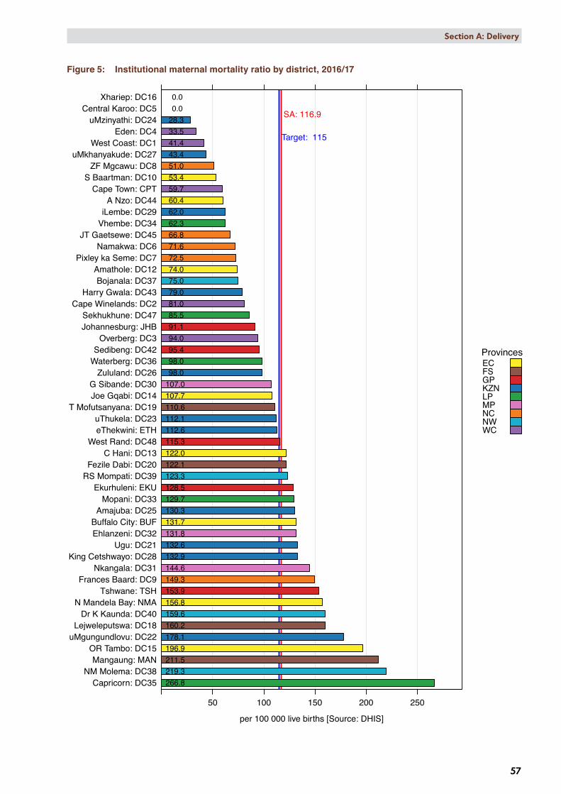
At a district level, the iMMR ranged widely, from 266.8 per 100 000 live births in Capricorn (LP) to zero per 100 000 live births in Xhariep (FS) and Central Karoo (WC) (Figure 5). Thirty districts met the target or had an iMMR less than 115 per 100 000 live births for 2016/17. Three districts had an iMMR of more than 200 per 100 000 live births in 2016/17, namely Mangaung (FS) (211.5 per 100 000 live births), NM Molema (NW) (219.3 per 100 000 live births) and Capricorn (LP) (266.8 per 100 000 live births).
Maternal mortality in facility ratio by district, 2016/17
per 100 000 live births [Source: DHIS]
Capricorn: DC35NM Molema: DC38
Mangaung: MANOR Tambo: DC15
uMgungundlovu: DC22Lejweleputswa: DC18
Dr K Kaunda: DC40N Mandela Bay: NMA
Tshwane: TSHFrances Baard: DC9
Nkangala: DC31King Cetshwayo: DC28
Ugu: DC21Ehlanzeni: DC32Buffalo City: BUF
Amajuba: DC25Mopani: DC33
Ekurhuleni: EKURS Mompati: DC39Fezile Dabi: DC20
C Hani: DC13West Rand: DC48
eThekwini: ETHuThukela: DC23
T Mofutsanyana: DC19Joe Gqabi: DC14G Sibande: DC30
Zululand: DC26Waterberg: DC36Sedibeng: DC42
Overberg: DC3Johannesburg: JHBSekhukhune: DC47
Cape Winelands: DC2Harry Gwala: DC43
Bojanala: DC37Amathole: DC12
Pixley ka Seme: DC7Namakwa: DC6
JT Gaetsewe: DC45Vhembe: DC34iLembe: DC29
A Nzo: DC44Cape Town: CPT
S Baartman: DC10ZF Mgcawu: DC8
uMkhanyakude: DC27West Coast: DC1
Eden: DC4uMzinyathi: DC24
Central Karoo: DC5Xhariep: DC16
50 100 150 200 250
131.7
59.7
41.4
53.4
74.0
122.0
107.7
196.9
0.0
160.2
110.6
81.0
122.1
132.6
178.1
112.1
28.3
130.3
98.0
43.4
132.9
62.0
94.0
107.0
144.6
131.8
129.7
62.3
266.8
98.0
75.0
219.3
123.3
33.5
159.6
95.4
79.0
60.4
66.8
85.5
115.3
0.0
71.6 72.5
51.0
149.3
128.5
112.6
91.1
211.5
156.8153.9
SA: 116.9
Target: 115
ProvincesECFSGPKZNLPMPNCNWWC
57
Section A: Delivery
Figure 5: Institutional maternal mortality ratio by district, 2016/17

Maternal Mort ratio
FY 2010 FY 2011 FY 2012 FY 2013 FY 2014 FY 2015 FY 2016 FY 2017Financial year
per 1
00 0
00 li
ve b
irths
100
150
200
59.1
140.9
97.9
113.7
127.0
88.7
131.9
103.7
102.9
Indicator value by SEQ (weighted average of data by district quintile)SEQ
SEQ 1 (most deprived)
SEQ 2 (deprived)
SEQ 3
SEQ 4 (well off)
SEQ 5 (least deprived)
58
Section A: Delivery
Map 2 displays the iMMR by sub-district. Some of the blank sub-districts have no hospitals and some with hospitals have no maternal deaths reported in 2016/17.
Map 2: Institutional maternal mortality ratio by sub-district, 2016/17
Figure 6 illustrates how the iMMR for SEQs 1–3 is steadily decreasing and that the gap between SEQs narrowed in 2016/17. Slight increases were noted for 2016/17 in SEQs 4 and 5 (well off and least deprived). Socio-economic quintiles iMMR ranged from 102.9 per 100 000 live births to 140.9 per 100 000 live births.
Figure 6: Trends in average district values by socio-economic quintile for institutional maternal mortality ratio, 2009/10–2016/17

59
Section A: Delivery
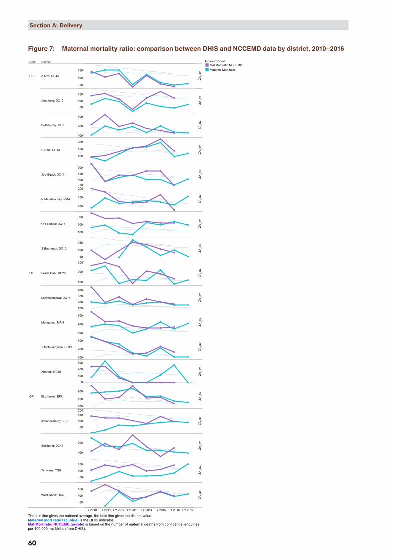
Table 3 and Figure 7 show the comparison between the iMMR (DHIS) and the NCCEMD MMR. The iMMR is for the 2016/17 financial year and the NCCEMD MMR is for the 2016 calendar year. There is a notable correlation between the maternal deaths reported to the NCCEMD and those reported in the DHIS.
Table 3: Maternal deaths and maternal mortality ratio: comparison between DHIS and NCCEMD data by province, 2016e
Live birth in facility (DHIS)
(Number)
Maternal deaths NCCEMD (Number)
Maternal deaths (DHIS) (Number)
NCCEMD iMMR (per 100 000)
DHIS iMMR(per 100 000)
Western Cape 91 438 74 67 80.93 73.27Northern Cape 20 091 22 17 109.50 84.62Gauteng 202 253 242 227 119.65 112.24KwaZulu-Natal 176 621 216 195 122.30 110.41Eastern Cape 102 008 144 138 141.17 135.28Mpumalanga 71 375 104 95 145.71 133.10North West 55 268 83 74 150.18 133.89Limpopo 117 154 191 146 163.03 124.62Free State 40 544 69 66 170.19 162.79SA 876 752 1 145 1 025 130.60 116.91
Source: DHIS.
e DHIS data per 2016/17 financial year, NCCEMD by 2016 calendar year.
Prov District
FY 2010 FY 2011 FY 2012 FY 2013 FY 2014 FY 2015 FY 2016 FY 2017
EC A Nzo: DC44
Amathole: DC12
Buffalo City: BUF
C Hani: DC13
Joe Gqabi: DC14
N Mandela Bay: NMA
OR Tambo: DC15
S Baartman: DC10
FS Fezile Dabi: DC20
Lejweleputswa: DC18
Mangaung: MAN
T Mofutsanyana: DC19
Xhariep: DC16
GP Ekurhuleni: EKU
Johannesburg: JHB
Sedibeng: DC42
Tshwane: TSH
West Rand: DC48
50
100
150
50
100
150
100
200
300
100
150
200
50
100
150
200
100
150
200
100
200
300
50
100
150
100
200
300
100
200
300
400
100
200
300
100
200
300
0
100
200
300
100
150
200
50
100
150200
100
200
50
100
150
50
100
150
150
ZA_a
vZA
_av
ZA_a
vZA
_av
ZA_a
vZA
_av
ZA_a
vZA
_av
ZA_a
vZA
_av
ZA_a
vZA
_av
ZA_a
vZA
_av
ZA_a
vZA
_av
ZA_a
vZA
_av
Maternal mortality ratio in facility comparing DHIS and National Confidential Enquiries estimates, by districtIndicatorShort
Mat Mort ratio NCCEMDMaternal Mort ratio
The thin line gives the national average, the bold line gives the district value.Maternal Mort ratio fac (blue) is the DHIS indicator.Mat Mort ratio NCCEMD (purple) is based on the number of maternal deaths from confidential enquiriesper 100 000 live births (from DHIS).
60
Section A: Delivery
Figure 7: Maternal mortality ratio: comparison between DHIS and NCCEMD data by district, 2010–2016

Prov District
FY 2010 FY 2011 FY 2012 FY 2013 FY 2014 FY 2015 FY 2016 FY 2017
GP West Rand: DC48
KZN Amajuba: DC25
eThekwini: ETH
Harry Gwala: DC43
iLembe: DC29
King Cetshwayo: DC28
Ugu: DC21
uMgungundlovu: DC22
uMkhanyakude: DC27
uMzinyathi: DC24
uThukela: DC23
Zululand: DC26
LP Capricorn: DC35
Mopani: DC33
Sekhukhune: DC47
Vhembe: DC34
Waterberg: DC36
MP Ehlanzeni: DC32
G Sibande: DC30
150
50
100
150
100
200
300
0
100
200
100
200
300
100
200
300
400
100
200
300
100
200
300
50
100
150
50
100
150
100
150
200
250
50
100
150
200
0
200
400
50
100
150200
100
150
050
100
150
100
150
200
100
150
100
200
300
200
ZA_a
vZA
_av
ZA_a
vZA
_av
ZA_a
vZA
_av
ZA_a
vZA
_av
ZA_a
vZA
_av
ZA_a
vZA
_av
ZA_a
vZA
_av
ZA_a
vZA
_av
ZA_a
vZA
_av
Maternal mortality ratio in facility comparing DHIS and National Confidential Enquiries estimates, by districtIndicatorShort
Mat Mort ratio NCCEMDMaternal Mort ratio
The thin line gives the national average, the bold line gives the district value.Maternal Mort ratio fac (blue) is the DHIS indicator.Mat Mort ratio NCCEMD (purple) is based on the number of maternal deaths from confidential enquiriesper 100 000 live births (from DHIS).
61
Section A: Delivery

Prov District
FY 2010 FY 2011 FY 2012 FY 2013 FY 2014 FY 2015 FY 2016 FY 2017
MPG Sibande: DC30
Nkangala: DC31
NC Frances Baard: DC9
JT Gaetsewe: DC45
Namakwa: DC6
Pixley ka Seme: DC7
ZF Mgcawu: DC8
NW Bojanala: DC37
Dr K Kaunda: DC40
NM Molema: DC38
RS Mompati: DC39
WC Cape Town: CPT
Cape Winelands: DC2
Central Karoo: DC5
Eden: DC4
Overberg: DC3
West Coast: DC1
300
100
150
200
100
200
300
400
100
200
300
400
0
100
200
100
200
0200
400
600
800
100
200
100
200
300
100
200
300
100
150
200
050
100
150
0
100
200
0
200
400
050
100
150
0
100
200
0
100
200
ZA_a
vZA
_av
ZA_a
vZA
_av
ZA_a
vZA
_av
ZA_a
vZA
_av
ZA_a
vZA
_av
ZA_a
vZA
_av
ZA_a
vZA
_av
ZA_a
vZA
_av
Maternal mortality ratio in facility comparing DHIS and National Confidential Enquiries estimates, by districtIndicatorShort
Mat Mort ratio NCCEMDMaternal Mort ratio
The thin line gives the national average, the bold line gives the district value.Maternal Mort ratio fac (blue) is the DHIS indicator.Mat Mort ratio NCCEMD (purple) is based on the number of maternal deaths from confidential enquiriesper 100 000 live births (from DHIS).
62
Section A: Delivery

63
Section A: Delivery
Key findings ✦ There is fair correlation between the maternal deaths reported to the NCCEMD and those reported in the DHIS.
However, in some districts there are huge discrepancies between iMMR reported by DHIS and NCCEMD for several years, e.g. Amathole (EC), Nelson Mandela (EC), Fezile Dabi (FS), Tshwane (GP), Sekhukhune (LP), Nkangala (Mpumalanga (MP)) and Eden (WC) districts. This needs to be corrected.
✦ Only three provinces, Western Cape, Northern Cape and KwaZulu-Natal, reached the national iMMR target of 115 per 100 000 live births.
✦ The rural provinces have a higher iMMR and again interventions related to reducing the rate needs to be prioritised in these provinces. Western Cape and Gauteng are urban provinces with a lower iMMR.
✦ The deprived population (SEQ2) has a higher iMMR than the other quintiles and the most deprived (SEQ1) population the lowest iMMR. This is an anomaly and hard to explain other than as poor data quality, or that district hospitals refer complicated cases to regional, central or tertiary hospitals.
✦ The districts with the highest iMMR are those with provincial central, tertiary or large regional hospitals, e.g. Frances Baard (NC), Capricorn (LP), OR Tambo and Buffalo City (both EC). These hospitals also had high early neonatal death rates. These hospitals receive referrals from their own and other districts. It would be ideal to be able to do the analysis with respect to catchment areas as opposed to districts. Assessing a whole catchment area will give one a better idea of the quality of care within the country.
✦ There is no correlation between rural district and iMMR or urban districts and iMMR.
Recommendations ✦ Districts and provinces with big discrepancies between the DHIS maternal deaths and NCCEMD maternal deaths
must review their processes and ensure more accurate reporting. Reasons for these discrepancies warrant further investigation.
✦ Even though there has been a consistent decrease in the iMMR, focused interventions are required for those districts not meeting the national target.
✦ The institutionalisation of maternal death reporting at facility level and ensuring that all deaths are recorded and reported within 24 hour after the death.
✦ Providing the iMMR per catchment area instead of the district would help in assessing high risk areas in the country. These areas could then be targeted.
✦ The large district and provincial tertiary hospitals lie in the districts with the highest iMMR and these hospitals should be assessed as to their resources and capacity to manage the number of ill pregnant women they treat.
4.3 Inpatient early neonatal death rateThe inpatient early neonatal death rate (ENDR) or inpatient death 0–7 days measures the number of deaths among live-born babies that occur within seven days of birth and is expressed per 1 000 live births. The numerator is the number of deaths in facility 0–7 days, while the denominator includes the number of live births in facility. It monitors trends in early neonatal deaths in health facilities and indications of health system results in terms of antenatal- and early neonatal care and delivery.
The inpatient ENDR provides an indication of the quality of antenatal, intrapartum and postnatal care and is a key indicator to address in order for South Africa to end preventable deaths among neonates and children under 5 years.
National overview
In 2016/17 the national inpatient ENDR was 9.9 per 1 000 live births, a decrease from 10.5 per 1 000 live births in 2015/16, and is the first time the inpatient early neonatal death rate has been under 10 per 1 000 live births in the past 5 years (Table 4).
Table 4: National inpatient early neonatal death rate, 2012/13–2016/17
2012/13 2013/14 2014/15 2015/16 2016/17National inpatient early neonatal death rate (per 1 000 live births) 10.2 10.1 10.1 10.5 9.9
Source: DHIS.
Inpatient early neonatal death rate by province, 2016/17
per 1 000 live births [Source: DHIS]
NC
FS
EC
LP
GP
NW
KZN
MP
WC
5 10 15
10.8
7.1
11.4
9.7
9.5
10.6
10.0
10.0
13.4
SA: 9.9
Target: 10 ProvincesECFSGPKZNLPMPNCNWWC
64
Section A: Delivery
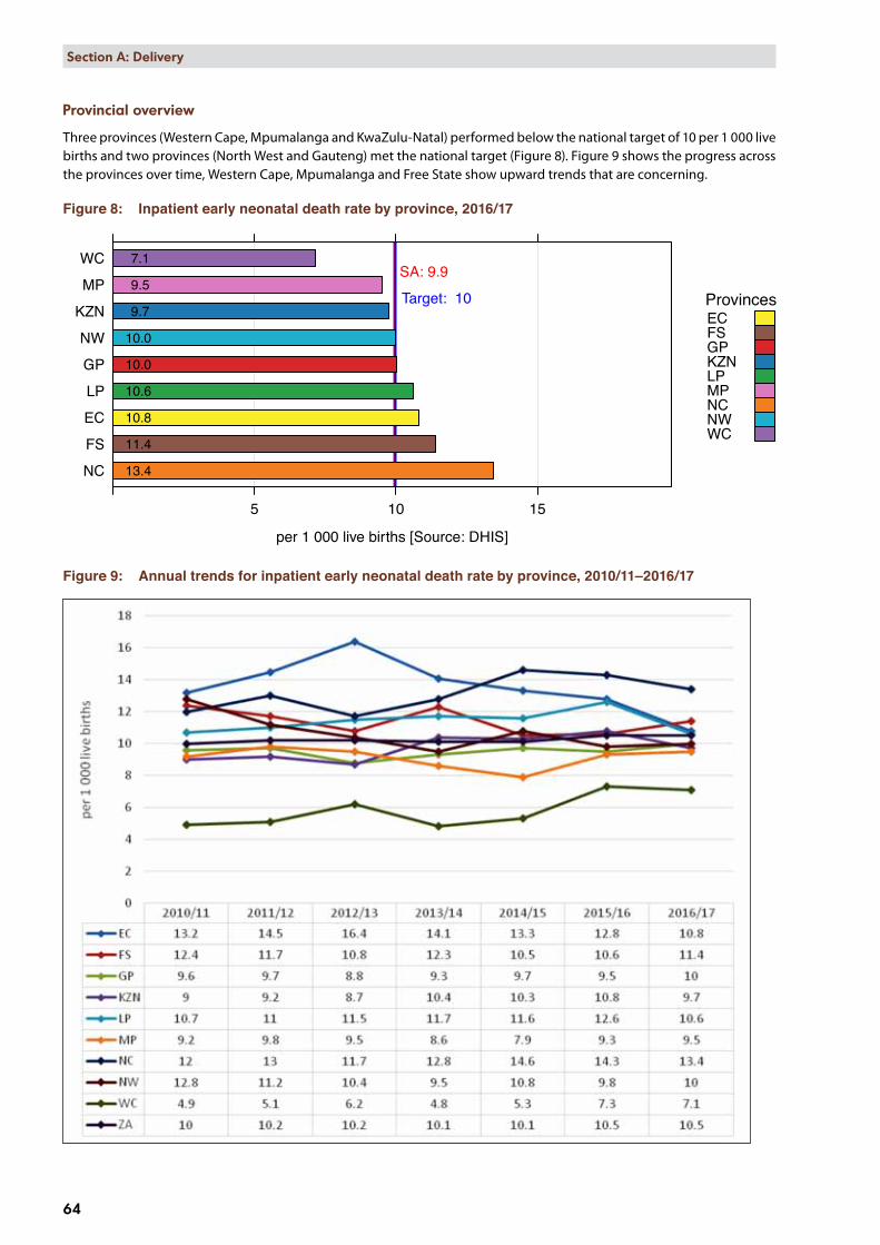
Provincial overview
Three provinces (Western Cape, Mpumalanga and KwaZulu-Natal) performed below the national target of 10 per 1 000 live births and two provinces (North West and Gauteng) met the national target (Figure 8). Figure 9 shows the progress across the provinces over time, Western Cape, Mpumalanga and Free State show upward trends that are concerning.
Figure 8: Inpatient early neonatal death rate by province, 2016/17
Figure 9: Annual trends for inpatient early neonatal death rate by province, 2010/11–2016/17

65
Section A: Delivery
District overview
At district level, the inpatient early neonatal death rate ranged widely, from 17.9 per 1 000 live births in Capricorn (LP) to 5.2 per 1 000 live births in Xhariep (FS). It is encouraging that more than half of all the districts (30 out of 52) achieved the national target (Figure 10 and Map 3). Xhariep (FS) remained the district with the lowest inpatient ENDR even though it increased from 2.7 per 1 000 live births in 2015/16 to 5.2 in 2016/17. Capricorn (LP) remained the district with the highest rate, however, the rate did decrease from 22.0 per 1 000 live births in 2015/16 to 17.9 in 2016/17.
Map 3: Inpatient early neonatal death rate by sub-district, 2016/17

Inpatient early neonatal death rate by district, 2016/17
per 1 000 live births [Source: DHIS]
Capricorn: DC35JT Gaetsewe: DC45
Lejweleputswa: DC18OR Tambo: DC15
Namakwa: DC6Frances Baard: DC9Harry Gwala: DC43
iLembe: DC29Amajuba: DC25
G Sibande: DC30Fezile Dabi: DC20
RS Mompati: DC39Buffalo City: BUFEkurhuleni: EKU
Pixley ka Seme: DC7NM Molema: DC38Central Karoo: DC5
C Hani: DC13S Baartman: DC10
N Mandela Bay: NMATshwane: TSH
eThekwini: ETHMangaung: MAN
West Rand: DC48uMzinyathi: DC24
Ugu: DC21Dr K Kaunda: DC40
Zululand: DC26Waterberg: DC36
Johannesburg: JHBKing Cetshwayo: DC28
ZF Mgcawu: DC8Mopani: DC33
T Mofutsanyana: DC19Bojanala: DC37
Ehlanzeni: DC32Nkangala: DC31
uMgungundlovu: DC22uThukela: DC23
Sekhukhune: DC47Vhembe: DC34
Cape Town: CPTSedibeng: DC42
A Nzo: DC44Eden: DC4
uMkhanyakude: DC27West Coast: DC1
Overberg: DC3Joe Gqabi: DC14
Cape Winelands: DC2Amathole: DC12
Xhariep: DC16
5 10 15
11.0
7.5
6.6
10.3
5.7
10.7
6.5
15.1
5.2
16.8
9.4
5.9
11.3
9.9
8.5 8.1
9.9
12.1
9.7
6.7
9.5
12.3
6.6
11.9
8.7 8.9
9.4
7.6
17.9
9.7
9.0
10.8
11.2
7.0
9.8
7.3
12.5
7.1
17.4
8.1
9.9
10.7
15.0
10.9
9.4
13.8
11.0
10.1
9.6
10.0
10.210.2
SA: 9.9
Target: 10
ProvincesECFSGPKZNLPMPNCNWWC
66
Section A: Delivery
Figure 10: Inpatient early neonatal death rate by district, 2016/17

IP early neo death rate
FY 2010 FY 2011 FY 2012 FY 2013 FY 2014 FY 2015 FY 2016 FY 2017Financial year
per 1
000
live
birt
hs
8
9
10
11
12
10.7
8.0
11.2
10.0
9.49.2
9.6
11.1
9.9
11.0
Indicator value by SEQ (weighted average of data by district quintile)SEQ
SEQ 1 (most deprived)
SEQ 2 (deprived)
SEQ 3
SEQ 4 (well off)
SEQ 5 (least deprived)
67
Section A: Delivery
Huge fluctuations for inpatient ENDR are evident in SEQ’s since 2009/10; however, 2016/17 is the first year where the gap between the SEQs is closer (Figure 11).
Figure 11: Trends in average district values by socio-economic quintile for inpatient early neonatal death rate, 2009/10–2016/17
Key findings ✦ There is no clear pattern of early neonatal deaths in this data. Some districts without large referral hospitals have
high inpatient ENDRs, namely Harry Gwala (KZN), Amajuba (KZN), and JT Gaetsewe (NC), and these are interspersed with districts that have large district and provincial central hospitals: Lejweleputswa(FS), Capricorn (LP), OR Tambo (EC) and Francis Baard (NC).
✦ Capricorn (LP) had the highest inpatient ENDR as well as the highest iMMR in 2016/17. Some other districts also had high inpatient ENDRs and iMMRs, namely Buffalo City, Nelson Mandela Bay and OR Tambo in Eastern Cape; Lejweleputswa and Mangaung in Free State; Tshwane in Gauteng; King Cetshwayo in KwaZulu-Natal and Frances Baard in the Northern Cape.
✦ Xhariep (FS) remained the district with the lowest inpatient ENDR even though it increased from 2.7 per 1 000 live births in 2015/16 to 5.2 in 2016/17. One reason might be that all complicated deliveries and neonatal cases are referred to other districts.
✦ It appears, as expected, that the poorer communities (SEQ 1 and 2) have higher inpatient early neonatal death rates.
✦ Some very rural communities, e.g. Joe Gqabi (EC) and uMkhanyakude (KZN) have relatively low inpatient ENDRs. An explanation needs to be sought for this as there may be valuable lessons for the rest of the country. One reason might be that babies die outside the facilities and that the deaths are not recorded at facilities.
Recommendations ✦ The District Clinical Specialist teams should check the data from their districts to see if it correlates with the DHIS
data.
✦ The early neonatal care of uMkhanyakude should be examined to explain their low early neonatal death rates.
✦ It would be ideal if the stillbirth rate can be included again in the analysis as this would enable an assessment of the quality of antenatal care. If this could be linked with the number of visits, it would be even more valuable.

Mother postnatal visit within 6 days rate by province, 2016/17
Percentage [Source: DHIS]
NC
EC
WC
MP
KZN
LP
FS
NW
GP
50 100 150 200
59.7
60.0
71.2
66.8
60.2
70.9
74.4
85.9
58.9
SA: 70.3
Target: 75
ProvincesECFSGPKZNLPMPNCNWWC
68
Section A: Delivery
4.4 Mother postnatal visit within 6 days ratePostnatal care takes place in the period directly after the delivery of the baby. The mother postnatal visit within 6 days rate provides insights into the access and utilisation of postnatal care. The purpose of the postnatal visit is to manage the normal psychological and physical changes that occur within those first few days after delivery, and to assist, counsel, and provide screening, care and treatment for any problems that threaten the health and wellbeing of the mother and baby.
The mother postnatal visit within 6 days rate measures the mothers who received postnatal care within 6 days after delivery as a proportion of deliveries in health facilities. The indicator is expressed as a percentage. The numerator is the number of mother postnatal visits within 6 days after delivery, and the denominator is the total number of deliveries in facility. The mother postnatal visit within 6 days rate indicator monitors access to and utilisation of postnatal care.
National overview
In 2016/17 the national average for mother postnatal visit within 6 days rate was 70.3% which is below the national target of 75% (Table 5). The national rate improved from 68.5% in 2015/16 to 70.3% in 2016/17.
Table 5: National mother postnatal visit within 6 days rate, 2012/13–2016/17
2012/13 2013/14 2014/15 2015/16 2016/17National mother postnatal visit within 6 days rate (%) 65.2 73.0 74.3 68.5 70.3
Source: DHIS.
Provincial overview
Only Gauteng (85.9%) met the national target for mother postnatal visit within 6 days rate in 2016/17 (Figure 12). Northern Cape had the lowest rate at 58.9%, probably due to the large distances women have to travel to clinics in this province.
Figure 12: Mother postnatal visit within 6 days rate by province, 2016/17
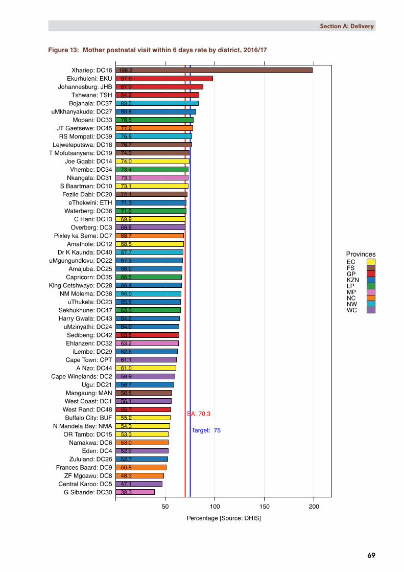
District overview
At district level, the mother postnatal visit within 6 days rate ranged widely, from 39.3% in Gert Sibande (MP) to 198.2% in Xhariep (FS) (Figure 13). Only 10 of 52 districts (19.2%) met the national target of 75%. Six districts showed a decrease of more than 10 percentage points between 2015/16 and 2016/17, namely Gert Sibande (MP) (10.4), Sedibeng (GP) (11.0), uThukela (KZN) (11.4), iLembe (KZN) (11.7), uMzinyathi (KZN) (12.4) and Cape Town (WC) (15.2). Central Karoo (WC) had the highest percentage point increase among the districts of 21.1 in the same period.
Mother postnatal visit within 6 days rate by district, 2016/17
Percentage [Source: DHIS]
G Sibande: DC30Central Karoo: DC5
ZF Mgcawu: DC8Frances Baard: DC9
Zululand: DC26Eden: DC4
Namakwa: DC6OR Tambo: DC15
N Mandela Bay: NMABuffalo City: BUF
West Rand: DC48West Coast: DC1Mangaung: MAN
Ugu: DC21Cape Winelands: DC2
A Nzo: DC44Cape Town: CPT
iLembe: DC29Ehlanzeni: DC32Sedibeng: DC42
uMzinyathi: DC24Harry Gwala: DC43Sekhukhune: DC47
uThukela: DC23NM Molema: DC38
King Cetshwayo: DC28Capricorn: DC35Amajuba: DC25
uMgungundlovu: DC22Dr K Kaunda: DC40
Amathole: DC12Pixley ka Seme: DC7
Overberg: DC3C Hani: DC13
Waterberg: DC36eThekwini: ETH
Fezile Dabi: DC20S Baartman: DC10
Nkangala: DC31Vhembe: DC34
Joe Gqabi: DC14T Mofutsanyana: DC19
Lejweleputswa: DC18RS Mompati: DC39
JT Gaetsewe: DC45Mopani: DC33
uMkhanyakude: DC27Bojanala: DC37Tshwane: TSH
Johannesburg: JHBEkurhuleni: EKU
Xhariep: DC16
50 100 150 200
55.2
61.1
56.1
73.1
68.5
69.9
74.0
53.3
198.2
76.7 74.3
59.9
72.1
58.7
67.3
65.6
64.0
66.9
52.7
80.8
66.4
62.5
69.8
39.3
73.3
63.2
78.5
73.4
66.5
71.0
83.5
66.0
76.8
52.9
67.7
63.8
64.2
61.0
77.6
65.3
55.7
47.1
53.0
68.7
48.3 50.8
97.6
71.3
87.9
56.5
54.3
84.2
SA: 70.3
Target: 75
ProvincesECFSGPKZNLPMPNCNWWC
69
Section A: Delivery
Figure 13: Mother postnatal visit within 6 days rate by district, 2016/17

Postnatal mother <6d
FY 2010 FY 2011 FY 2012 FY 2013 FY 2014 FY 2015 FY 2016 FY 2017Financial year
Per
cent
age
0
20
40
60
80
11.7
5.20.1
66.5
69.076.6
63.1
Indicator value by SEQ (weighted average of data by district quintile)SEQ
SEQ 1 (most deprived)
SEQ 2 (deprived)
SEQ 3
SEQ 4 (well off)
SEQ 5 (least deprived)
70
Section A: Delivery
Map 4 shows the geographical distribution of mother postnatal visit within 6 days rate by district and sub-district.
Map 4: Mother postnatal visit within 6 days rate by sub-district, 2016/17
Figure 14 shows that the mother postnatal visit within 6 days rate was the highest in SEQ5 and lowest in SEQ1 and SEQ4.
Figure 14: Trends in average district values by socio-economic quintile for mother postnatal visit within 6 days rate, 2009/10–2016/17

71
Section A: Delivery
Key findings ✦ Data indicates an increasing trend of early postnatal visits which is encouraging.
✦ Some districts, e.g. Xhariep (FS), had a mother postnatal visit within 6 days rate of more than a 100%. The constant mobility and cross border referrals has been a common finding in most areas, especially for deliveries. This is probably the reason for Xhariep, due to the women mostly delivering in Mangaung and then doing their postnatal follow-up closer to their homes, thus the denominator is artificially low. Another reason might be poor data quality.
✦ Only 10 of the 52 districts (19.2%) reached the national target and these districts include the three metropolitan districts in Gauteng.
✦ The South Africa Demographic and Health Survey of 2016f indicates that 96% of women give birth in health facilities; however, data from the Burden of Disease unit of the South African Medical Research Council indicates that about 15–20% of maternal deaths occur outside of health facilities and these are mostly postpartum deaths. There is obviously a very real need to ensure all women are seen early postpartum to detect the women who are ill.
Recommendations ✦ Efforts must continue to increase the postnatal visits within 6 days after delivery.
✦ The data are recorded for women visiting the clinics and outpatient departments at hospitals according to the data element definition of the 2013 National Indicator Data Set (NIDS) that excluded postnatal women admitted in hospitals. However, the 2017 NIDS stipulates that as from April 2017, all postnatal women admitted in hospital should be examined and the data should also be recorded.
✦ The role of ward-based outreach teams (WBOTs) needs to be explored in this area. Ideally the number of women seen postnatally by WBOTs should be recorded and linked with the postnatal visits already recorded in the DHIS.
✦ Methods by which the delivery sites can communicate with WBOTs need to be developed.
✦ Hospitals should submit data for the data element ‘Mother postnatal visit within 6 days after delivery’ for women who are hospitalised within 6 days after the delivery.
✦ Linking the mother with the existing MomConnectg system needs to be strengthened to send reminders for postnatal visits.
f National Department of Health (NDoH), Statistics South Africa (Stats SA), South African Medical Research Council (SAMRC). South Africa Demographic and Health Survey, 2016: Key Indicators. Pretoria, South Africa, and Rockville, Maryland, USA: NDoH, Stats SA, SAMRC, and ICF. http://www.statssa.gov.za/publications/Report%2003-00-09/Report%2003-00-092016.pdf [Accessed 30 July 2017].
g MOMCONNECT. Available from: http://www.rmchsa.org/momconnect/ [Accessed 30 July 2017].


