double page spead progression
TRANSCRIPT

Progression of double page spread

To start the double page spread I used Photoshop and opened new page. I amended the setting of the page as it needed to be appropriate size for the article. I then added the mast head text as pull quote and then the main pull quote that was present on the front cover. I made the font colour the same colour as the main pull quote as it looks appropriate. I also added stroke to the text but made the colour into a brighter colour
I then added outer glow to the pull quote which makes the text to stand out slightly.
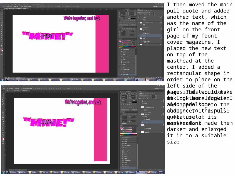
I then moved the main pull quote and added another text, which was the name of the girl on the front page of my front cover magazine. I placed the new text on top of the masthead at the center. I added a rectangular shape in order to place on the left side of the page. This would make it look more funkier and appealing to the audience, it is also a feature of its conventions.
I resized the texts, making them larger. I also made some changes to the pull quote as the masthead. I made them darker and enlarged it in to a suitable size.
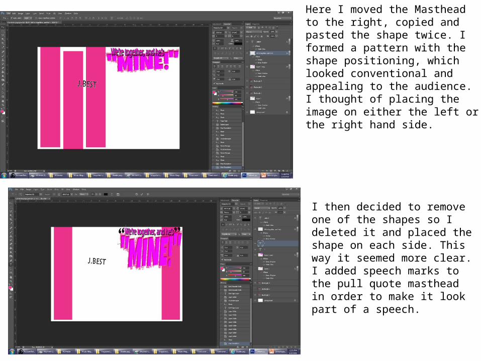
Here I moved the Masthead to the right, copied and pasted the shape twice. I formed a pattern with the shape positioning, which looked conventional and appealing to the audience. I thought of placing the image on either the left or the right hand side.
I then decided to remove one of the shapes so I deleted it and placed the shape on each side. This way it seemed more clear. I added speech marks to the pull quote masthead in order to make it look part of a speech.

I added a text as a subheading to the article. I went through different fonts on Photoshop and chose one, but I decided that it would have been better if I used the one from the internet. As result, I opened the website 1001.com and went through several fonts. I then chose one font. To use it I had to save it first, so I saved it and opened it on Photoshop and began to edit to remove the background. I then decided not to use this. This was because I thought it wouldn’t suit the page. I also moved the small text ‘J. BEST’ onto the main masthead text in order to make it clearer on who made the speech.
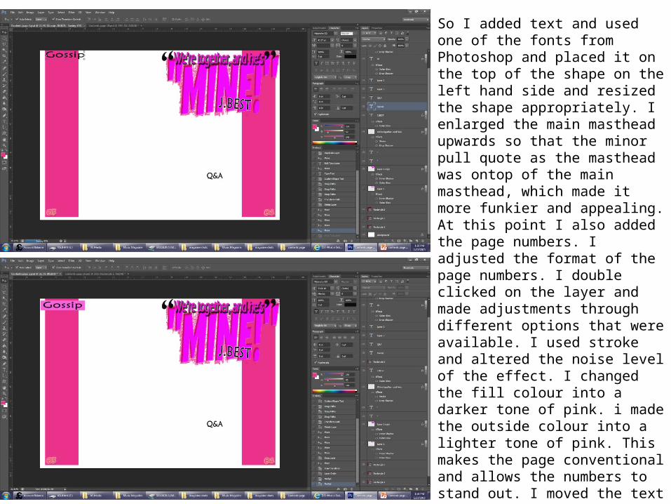
So I added text and used one of the fonts from Photoshop and placed it on the top of the shape on the left hand side and resized the shape appropriately. I enlarged the main masthead upwards so that the minor pull quote as the masthead was ontop of the main masthead, which made it more funkier and appealing. At this point I also added the page numbers. I adjusted the format of the page numbers. I double clicked on the layer and made adjustments through different options that were available. I used stroke and altered the noise level of the effect. I changed the fill colour into a darker tone of pink. i made the outside colour into a lighter tone of pink. This makes the page conventional and allows the numbers to stand out. I moved the text further in into the masthead in order to make it more close which made it look busy and funkier. I added a rectangular shape in order to place behind the text ‘Gossip’. This allows the page to be more conventional and appealing to the audience. I also made the pull quite more into the main masthead for the same reason as explained.

I added text in order to introduce the article. After adding the text I positioned it below the masthead and sized it appropriately. I changed the font into a funkier font. I
At this point I realised that the page numbers didn’t match the feature stories on the front cover of the magazine, so I had to changed the numbers. I changed them into 15 and 16.

I added text onto the left hand side as the overview of the article. As the beginning of the text I added a drop cap because it is conventional and makes the product more professional, which would persuade in purchase. I added a shape in order to add text in the shape as a pull quote. I added the text and used the warp mode in order to adjust the shape of the shape. I filled in the shape with a darker tone of the pink used and the shape on each side of the page. This would allow the shape to stand out differing from the rest. I then decided to fill the shape in with a lighter tone, which matches the page numbers. I also changed the form of the shape, which looks smoother.

I placed the shape in different positions in order to find the best match. I then adjusted the drop cap of the text.
This is the look so far of the double page spread.

Looking at the version now, I realised that I could improve on it, so I deleted the shapes. Instead I made the text separate and without the shape and located it below the masthead and centered the text.
I copied the text and removed the shape. I then inserted a graphic of a cartoon flower, enlarged it and then pasted the text onto it. I adjusted the text and the shape so that it was in a suitable size. I made the shape in line with the background shape, which makes it look neat and professional. I added the same graphic but made it smaller and placed it behind the page number. This allows the page to be more conventional and funky. I moved the text ‘J.BEST’ further out of the masthead, which I believe looks better. At the bottom of each page, just below the page number, I added the website for the magazine same font and style as the one on the contents page. This keeps the house style and promotion of the magazine. I had to order the layers in order to make every layer visible and in appropriate order.

This is what the page looks like so far.
On Word I first wrote the questions and then the answers of them each. After that I copied and pasted some of the questions at a time and made it in to the form of columns, which is conventional. I positioned the second column appropriately in order to avoid the clash of the graphic and the text.
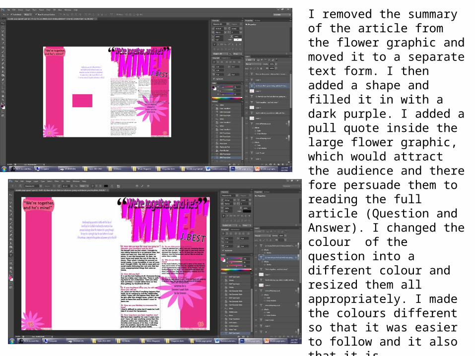
I removed the summary of the article from the flower graphic and moved it to a separate text form. I then added a shape and filled it in with a dark purple. I added a pull quote inside the large flower graphic, which would attract the audience and there fore persuade them to reading the full article (Question and Answer). I changed the colour of the question into a different colour and resized them all appropriately. I made the colours different so that it was easier to follow and it also that it is conventional. I made all of the text bold so that it was clear, it also looked better. I adjusted the shape using the warp mode and then filled it in with a light pink.

I then moved the summary text below the main masthead, changed the colour and suitably resized it. I adjusted the colour of the text using stroke changing the colour into a tone of the masthead. I made adjustments to the text inside the graphic using stroke. I changed the colour into a tone of the masthead and adjusted the level of the stroke as slight heavy, but made the noise level low in order to make it look smooth. I also made changed to the text inside the graphic on the top left side. I used the stroke effect, using the colour black, to outline the outside of the text in order for the text to stand out. This is the view so far.
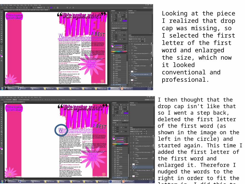
Looking at the piece I realized that drop cap was missing, so I selected the first letter of the first word and enlarged the size, which now it looked conventional and professional.
I then thought that the drop cap isn’t like that so I went a step back, deleted the first letter of the first word (as shown in the image on the left in the circle) and started again. This time I added the first letter of the first word and enlarged it. Therefore I nudged the words to the right in order to fit the letter in. I did this to the first two lines. Now it looked more conventional and professional.
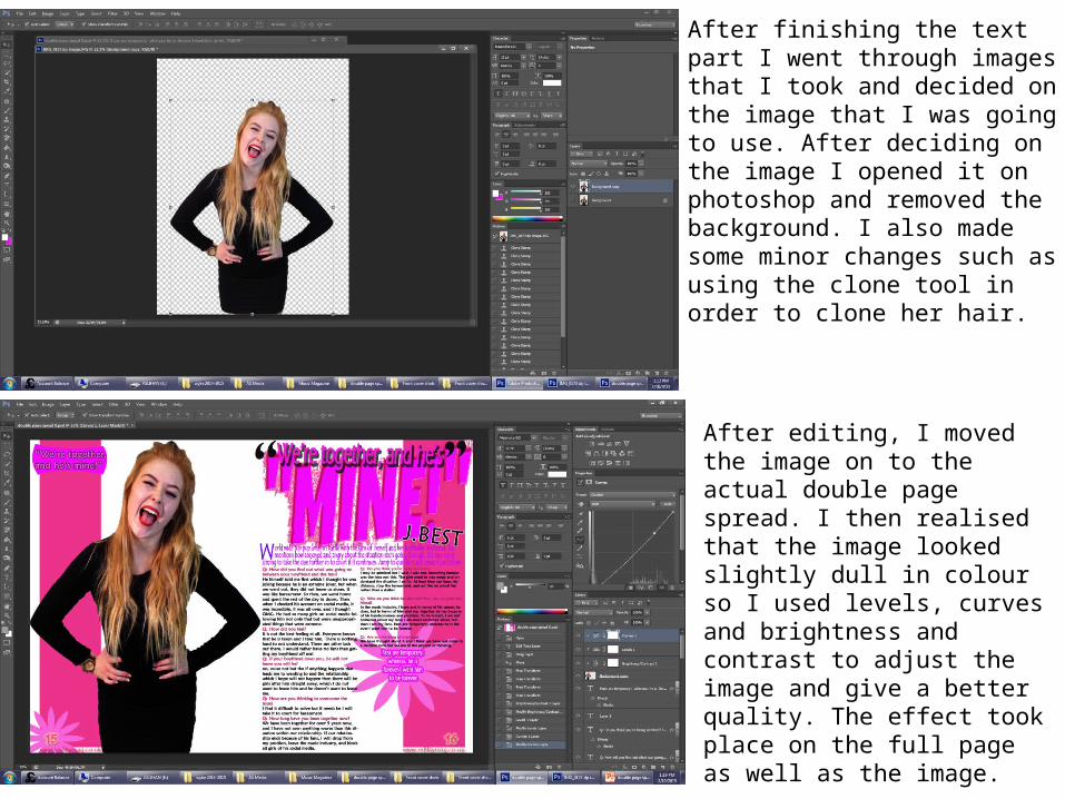
After finishing the text part I went through images that I took and decided on the image that I was going to use. After deciding on the image I opened it on photoshop and removed the background. I also made some minor changes such as using the clone tool in order to clone her hair.
After editing, I moved the image on to the actual double page spread. I then realised that the image looked slightly dull in colour so I used levels, curves and brightness and contrast to adjust the image and give a better quality. The effect took place on the full page as well as the image.

I made adjustments to the summary text. I added the stroke effect so that it stood out and was readable on both side. I added a graphic image of a flower to place behind the page number just like I did on the left hand side of the page. I made the graphic same size as the one on the left hand side. I also made the positioning the same. I added another text showing who the photograph was taken by as this is conventional and seen in other magazines. I placed the text ontop of the image and positioned it at the bottom, which I made the text white so that the text stood out and was readable. I used the Tempus Sans font, which made the text look conventional as it is slightly curvy and relates back to the signature on the front cover.
I then added a shape and a text inside in order to remind me for when I continued to work on it as I had to take a Photograph.I added another text as the caption of the photograph and made the font into the tone of her hair.

After I took images, I went though the images to decide on which one to use, I then decided on an image to use and then opened the image on Photoshop, made some changes and then moved the image to the double page spread. I added a circle shape, stretched the shape downwards in order to fit the image in the shape. Focusing on the image I took, according to the shape, I cropped bottom parts of the image using the eraser, in order to fit the image to the shape but not the top of the image. I used the warp mode to adjust the image to get the best fit of the image.
This is the view of what it looks like so far.

I filled the colour of the shape into a brighter colour like a tone of red. I then focused on the main image on the left. I added the stroke effect and changed the colour of the stroke into grey and then adjusted the levels of the stroke. I made the stroke heavier which reinforced the convention of pop as it is conventional and looks funky. I made the stroke transparent which makes it look 3d and eye catching allowing the image to stand out.
Here I added speech marks on to the text inside the graphic and filled the colour into white, which stands out.
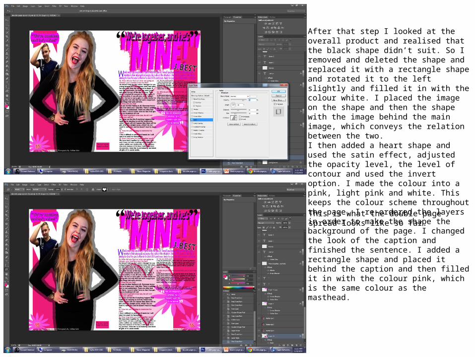
After that step I looked at the overall product and realised that the black shape didn’t suit. So I removed and deleted the shape and replaced it with a rectangle shape and rotated it to the left slightly and filled it in with the colour white. I placed the image on the shape and then the shape with the image behind the main image, which conveys the relation between the two. I then added a heart shape and used the satin effect, adjusted the opacity level, the level of contour and used the invert option. I made the colour into a pink, light pink and white. This keeps the colour scheme throughout the page. I re-ordered the layers in order to make the shape the background of the page. I changed the look of the caption and finished the sentence. I added a rectangle shape and placed it behind the caption and then filled it in with the colour pink, which is the same colour as the masthead.This is what the double page spread looks like so far.

Here I changed the caption text, in attempt to make the caption sound better. I added the stroke effect in order to make it stand out more.
I used the drop shadow effect for the shape in order to make it look 3D and look more attractive. I used the multiply blend mode. I adjusted the distance, spread and size levels.

I wanted to take another photograph of the model with a boy as the boyfriend, however, she didn’t want to so I had to consider using the images I previously took. I decided to use two of the images and put them together as one.I opened one of the images I took on photoshop and began to edit the image to remove the background. Depending on the areas I used the eraser tool.
I then opened another image of the main image and removed the background. I placed the second image in front of the first image, which makes the image look joint and one image.

This is the final look of the two images.
I then realized there were white patches to I removed them using a mixture of tools, eraser and clone stamp tool.
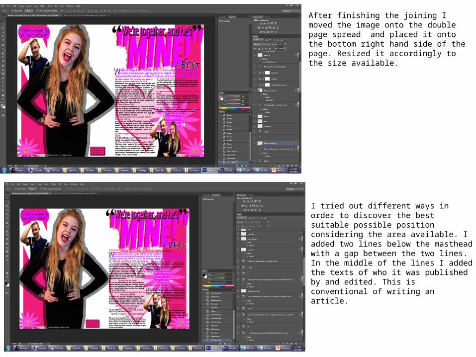
After finishing the joining I moved the image onto the double page spread and placed it onto the bottom right hand side of the page. Resized it accordingly to the size available.
I tried out different ways in order to discover the best suitable possible position considering the area available. I added two lines below the masthead with a gap between the two lines. In the middle of the lines I added the texts of who it was published by and edited. This is conventional of writing an article.
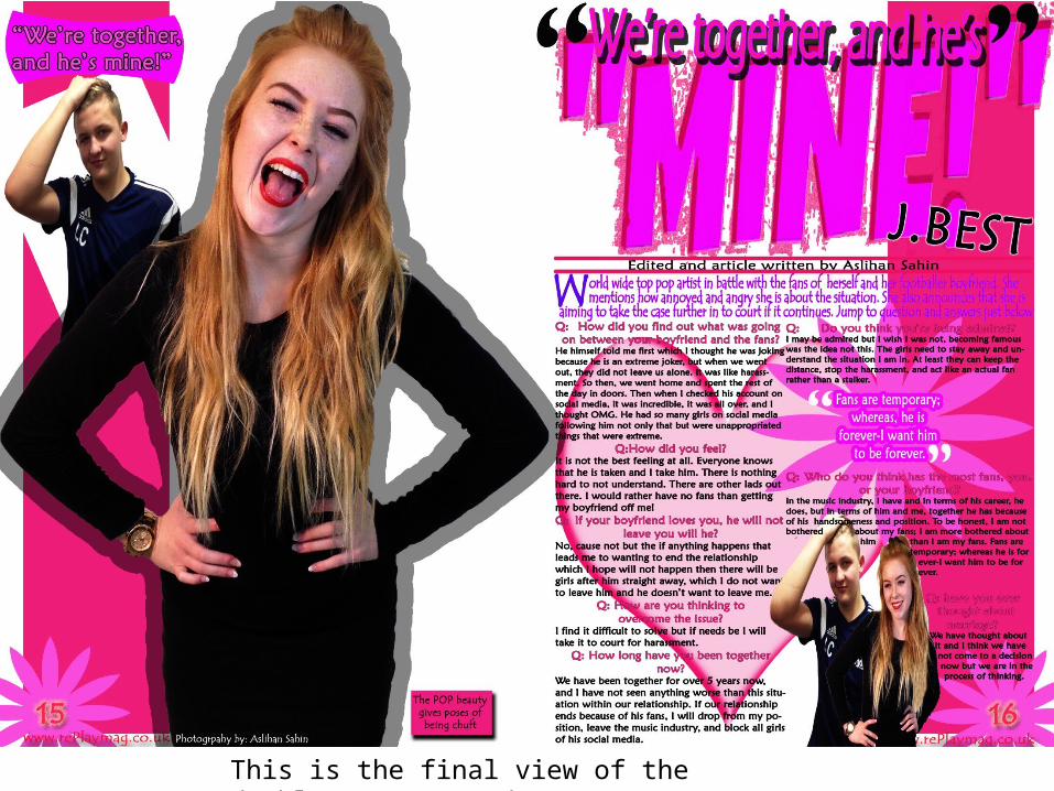
This is the final view of the double page spread
