doi: 10.1016/j.chb.2014.07.002 © 2014 elsevier ltd. · lehman, & graesser, 2011; Özyurt,...
TRANSCRIPT

This document is published in:
José A. Ruipérez-Valiente, Pedro J. Muñoz-Merino, Derick
Leony, Carlos Delgado Kloos,” ALAS-KA: A Learning Analytics
Extension for better understanding the Learning Process in the
Khan Academy Platform”, Computers in Human Behavior
(2014)
DOI: 10.1016/j.chb.2014.07.002
© 2014 Elsevier Ltd.

ALAS-KA: A LEARNING ANALYTICS
EXTENSION FOR BETTER UNDERSTANDING
THE LEARNING PROCESS IN THE KHAN
ACADEMY PLATFORM
José A. Ruipérez-Valientea,b,*, Pedro J. Muñoz-Merinoa, Derick Leonya, Carlos Delgado Kloosa
a Universidad Carlos III de Madrid, Avenida Universidad 30, 28911 Leganés (Madrid) Spain
b IMDEA Networks Institute, Av. del Mar Mediterráneo 22, 28918 Leganés (Madrid) Spain
* Corresponding author: José A. Ruipérez-Valiente (phone: (+34) 91 624 5949, email:
ABSTRACT
The Khan Academy platform enables powerful on-line courses in which students can
watch videos, solve exercises, or earn badges. This platform provides an advanced
learning analytics module with useful visualizations. Nevertheless, it can be improved. In
this paper, we describe ALAS-KA, which provides an extension of the learning analytics
support for the Khan Academy platform. We herein present an overview of the
architecture of ALAS-KA. In addition, we report the different types of visualizations and
information provided by ALAS-KA, which have not been available previously in the Khan
Academy platform. ALAS-KA includes new visualizations for the entire class and also for
individual students. Individual visualizations can be used to check on the learning styles of
students based on all the indicators available. ALAS-KA visualizations help teachers and
students to make decisions in the learning process. The paper presents some guidelines
and examples to help teachers make these decisions based on data from undergraduate
courses, where ALAS-KA was installed. These courses (physics, chemistry, and
mathematics) for freshmen were developed at Universidad Carlos III de Madrid (UC3M)
and were taken by more than 300 students.
Keywords
Learning analytics, architectures, decision making, visualizations, data processing

1. INTRODUCTION Education is being boosted by new tendencies to improve the learning process, and
learning analytics is one of the most promising tools. Although there is a debate about the
definition of learning analytics, we consider the learning analytics term in a broad sense as
introduced in the call for papers of the 1st LAK conference1: “Learning analytics is the
measurement, collection, analysis and reporting of data about learners and their contexts,
for purposes of understanding and optimizing learning and the environments in which it
occurs.”
There are two main approaches for making decisions based on learning analytics
techniques. On the one hand, work on visual analytics (Duval, 2010; Leony, Pardo, de la
Fuente, Sanchez, & Delgado, C., 2012; Mazza & Dimitrova, 2004; Schmitz et al., 2009) aims
at providing students with visualizations for self-reflection and at providing teachers with
visual information so that they can interpret and make decisions taking into account the
educational context. Therefore, teachers and students make final decisions with the help
of the visual information. On the other hand, other works (Chen & Persen, 2009; D’Mello,
Lehman, & Graesser, 2011; Özyurt, Özyurt, & Baki, 2013; Ya Tang & McCalla, 2005) aim to
implement automatic actuators, such as recommenders or adaptive systems, which take
into account different variables related to the learning process to carry out their actions.
These automatic actuators do not require teacher or student intervention but are usually
restricted to specific indicators (while visual analytics usually cover a wider range of
possibilities); however, they might make more errors in their decisions than live people.
The use of MOOCs (Massive Online Open Courses) is emerging as a new paradigm. In this
context, the use of learning analytics becomes more necessary because it requires
instructors to analyze and to interpret students’ learning processes on a large scale
(thousands of students in a course). Tools that provide insights about this learning process
are required because a teacher cannot take care of so many students in detail in an
efficient way without technological help.
The Khan Academy2 platform is one of the pioneer systems for running MOOCs. The Khan
Academy system provides an advanced learning analytics support (considering the
previously introduced broad definition of learning analytics). Some of the included
features are related to the skill progress, the exercise report, or the student activity report.
Even though the Khan Academy system offers this analytical support through several
visualizations, some interesting information is not included in its module. Therefore, an
extension is required to achieve the goal of including this additional information.
In this paper, we present our implemented ALAS-KA module (Add-on of the Learning
Analytics support of the Khan Academy) as a contribution to the visual analytics area, and
specifically make the following contributions:
We provide an overview of the implemented architecture of ALAS-KA for
extending the Khan Academy learning analytics support (Section 4). This
architecture enables teachers to process the huge amount of educational low level
1 https://tekri.athabascau.ca/analytics/
2 http://www.khanacademy.org

data (in the form of events) and to obtain higher level learning information that
can be presented in the form of visualizations and recommendations.
We describe new types of visualizations that were not previously present in the
Khan Academy platform with new types of information (Section 5). On the one
hand, these types of visualizations are novel because other visual analytics works
have usually focused on direct indicators (such as number of accesses, number of
posts, correct number of exercises, etc.) but these visualizations show information
about complex processes (e.g. taking into account pedagogical aspects such as for
unthoughtful users, hint abusers, and affective information). On the other hand,
the new visualizations imply an advancement with respect to the previously
supported Khan Academy functionality.
We give an analysis about how ALAS-KA visualizations can be used for making
decisions about the learning process (Section 6), illustrating with different
examples with real student data from pre-graduate courses at UC3M with more
than 300 students. The ALAS-KA visualizations can give teachers a general view of
different useful indicators of their classes so that they can make proper
corrections, enable students’ self-reflection, or use a user model’s automatic
definition based on learning styles and emotions.
2. RELATED WORK
2.1. LEARNING ANALYTICS Learning analytics can be seen as a particular case of the Big Data phenomenon in the e-
learning scenario (Duval & Verbert, 2012), it aims to combine historical and current user
data to provide useful information in each moment (Elias, 2011). Following the visual
analytics paradigm, several systems incorporate visualization tools, including: CAMERA
(Schmitz et al., 2009), which enables social network visualizations; GLASS (Leony et al.,
2012), which shows the most used events by students; CourseVis (Mazza & Dimitrova,
2004), which is integrated in the on-line WebCT platform; or other works applied in
Moodle, such as Moodog (Zhang & Almeroth, 2010), which tries to make an analysis of
some interactions in a course through visualizations, or the application of visual analytics
techniques to logs using tag clouds (García-Peñalvo, Conde, & Bravo, 2011). The work in
(Duval, 2010) shows several learning dashboards and recommender examples.
Furthermore, they do a comparison between educational and non-educational user
tracking environments (Duval, 2010).
There are also many recommender educational systems. These tools are focused on
providing feedback related to some elements of the learning process (i.e. what video
should be seen next or what forum post could be useful). In this direction, there are tools
that assist the learning process with forum posts that might be helpful for students, or
messages which might benefit current students based on former learners’ knowledge
(Chen & Persen, 2009). There are also several other recommendation tools that help
people by offering resources and papers that could be of interest to them (e.g. Recker,
Walker, & Lawless, 2003; Ya Tang & McCalla, 2005).

Although the Khan Academy platform already provides powerful learning analytics
visualizations (e.g. for knowing the students’ progress in different skills or the students’
last activity in the different resources), there is room for improvement. One example of the
new analysis of learning processes provided by ALAS-KA is the analysis and visualizations
of affective states. This issue has been approached from several perspectives, ranging from
the use of physical sensors (Arroyo et al., 2009) to the probabilistic analysis based on the
student actions (Baker, D’Mello, & Rodrigo, 2010; Conati & Maclaren, 2009). Intelligent
tutors are among the tools with the most use of emotional information. For instance,
AutoTutor uses natural language processing to detect the affective state of the learner and
respond accordingly (D’Mello, Lehman, & Graesser, 2011). Other categories of tools that
have taken advantage of affective information are educational games such as Prime Climb
(Conati, & Maclaren, 2009) and immersive environments, with Crystal Island as an
example (Robison, McQuiggan, & Lester, 2009). In our case, a MOOC framework (within
Khan Academy) is used for the calculation and visualization of affective states.
The work presented in this article is also related to the concept of learning styles. The
ALAS-KA module gives (among other things) individual visualizations with personal
learner values for different user features, which can define a learner model as a
combination of different indicator values. Felder and Silverman (1988) initially elaborated
in detail upon the concept of learning styles. Learning styles are one of the individual traits
considered to be part of the user model in adaptive educational systems (Brusilovsky &
Millán, 2007; Graf, Liu, & Chen, 2009); this can be also observed in more recent
developments of adaptive educational environments (Özyurt et al., 2013). Researchers
have recently studied the analysis of the relation of learning styles to cognitive load during
an activity to learn programming (Abdul-Rahman & du Boulay, 2014).
2.2. LEARNING ANALYTICS SUPPORT IN THE KHAN ACADEMY PLATFORM The Khan Academy platform has a powerful learning analytics module. Khan Academy was
one of the pioneer platforms to implement a great learning analytics support. The system
allows people to access a great amount of educational data, including most of the low level
events and users’ interactions during their learning paths. In this way, all the required
data is available for processing.
The learning analytics module has individual visualizations so that students can access
their own information. There are also some global class visualizations that can only be
accessed by teachers. One example of individual visualizations allows users to access their
activities organized by time. With this feature, they are able to see what resources they
have been using each day or for different intervals of time. Another type of individual
visualization allows students to know their time distribution for the different skills or
videos (shown as a percentage). Moreover, users can access the option “Skill Progress” to
check their progress status in the different skills.
Figure 1 shows one example of global visualization with two screenshots. One screenshot
contains visualizations of each student, and another, visualizations of the entire class. The
screenshot on the left side of Figure 1, which is called “Progress Report,” has as rows the
different students and as columns the different exercises in the course. For each pair of
user/exercise, the color of the matrix indicates if the student started the task, obtained
proficiency, or struggled. This is helpful to know for an overall class progress. The
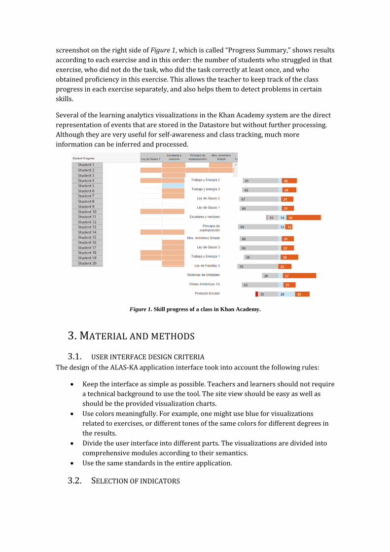
screenshot on the right side of Figure 1, which is called “Progress Summary,” shows results
according to each exercise and in this order: the number of students who struggled in that
exercise, who did not do the task, who did the task correctly at least once, and who
obtained proficiency in this exercise. This allows the teacher to keep track of the class
progress in each exercise separately, and also helps them to detect problems in certain
skills.
Several of the learning analytics visualizations in the Khan Academy system are the direct
representation of events that are stored in the Datastore but without further processing.
Although they are very useful for self-awareness and class tracking, much more
information can be inferred and processed.
Figure 1. Skill progress of a class in Khan Academy.
3. MATERIAL AND METHODS
3.1. USER INTERFACE DESIGN CRITERIA The design of the ALAS-KA application interface took into account the following rules:
Keep the interface as simple as possible. Teachers and learners should not require
a technical background to use the tool. The site view should be easy as well as
should be the provided visualization charts.
Use colors meaningfully. For example, one might use blue for visualizations
related to exercises, or different tones of the same colors for different degrees in
the results.
Divide the user interface into different parts. The visualizations are divided into
comprehensive modules according to their semantics.
Use the same standards in the entire application.
3.2. SELECTION OF INDICATORS

There have been a lot of proposals of indicators to analyze the learning process. Dyckhoff,
Lukarov, and Muslim (2013) provided a collection of these indicators obtained from
different works that were presented in the literature. Our selection of indicators was
obtained with an in-depth analysis of the literature using some existing indicators but
adapted to our context and also designing new ones. Some of the indicators used in our
work have been presented in different works such as the number of resources accessed,
the time spent in each resource or the students’ gender. Others indicators such as hint
abuse and hint avoidance have been addressed previously (Aleven, McLaren, & Roll,
2004), however the specific algorithms to infer these parameters are adapted to Khan
Academy context and are very different. Finally some of the indicators here exposed have
not been previously addressed as far as we know, for example forgetful or unreflective
user. Anyhow, all the indicators have been newly developed and implemented by the
authors of this work.
Details about our proposal of indicators grouped in 5 categories can be seen in our
previous work (Muñoz-Merino, Ruipérez-Valiente, & Delgado, 2013). In addition, we
added an additional category about emotions, which has been proposed in several other
learning systems but has been adapted to the Khan Academy context. Details of the
calculation methods of many of these indicators from low level data were explained in our
previous work (Muñoz-Merino et al., 2013) and also for the emotion indicators (Leony,
Muñoz-Merino, & Ruipérez-Valiente, 2014).
3.3. DESCRIPTION OF THE EXPERIENCE The idea of the experience where ALAS-KA has been applied is the use of Khan Academy as
a tool for applying the “flipping the classroom” methodology. The contents of the courses,
which are videos and exercises, cover the requirements of freshmen students who are
working on degrees in different science fields. The students can interact with each other
within the Khan Academy system, classes that were previously face-to-face, which take
place in September each year.
This methodology has been applied to different courses. The first experience was in a
physics pre-graduate course in August 2012. Due to the success of this experience, it was
applied to physics, chemistry, and mathematics courses in August 2013. The number of
exercises and videos are different for each course, but most of the lessons include one
video that has one or more associated exercises.
3.3.1. PARTICIPANTS The students who took these courses were undergraduate students enrolled in a science
degree. The age range of the majority of students was from 17 to 19 years old. The number
of students was different for each course. There were 81 students in the 2012 physics
class (n=59 males, 22 females), 167 students in the 2013 physics class (n=121 males, 46
females), 73 students in the 2013 chemistry class (n=55 males, 18 females) and 243
students in the mathematics class in 2013 (n=153 males, 90 females). Thus, we had a total
of 564 student data samples from the different courses. It is important to note that some of
these students took more than one of the courses in 2013, depending on their Bachelor’s
degree requirements. Consequently, the number of unique students who participated in
this experience was 372.

The instructors of the different courses were experienced teachers in each field. However
only in the 2013 physics course did the instructors have prior experience in developing
video content and know what exercises were available in the Khan Academy platform.
Consequently preparing an online course was an additional handicap for the teachers who
did not have experience. Finally, in order to set up the Khan Academy platform and other
technical aspects, different employees from UC3M were required.
3.3.2. DATA COLLECTION When students interact in their learning process with the Khan Academy platform, a lot of
data is generated and stored in the Google App Engine Datastore. The data generated
belongs to the four different courses that were explained in the previous section. There
are a wide variety of student actions that were captured by the Khan Academy system. For
example, each time a student attempted to answer an exercise or watch a video, whenever
a student earned a badge, timestamps, and many other data types, these actions were
captured. We used transformations to turn this raw data into useful information that can
be used to improve the learning process.
4. OVERVIEW OF THE ARCHITECTURE OF ALAS-KA ALAS-KA has been designed as a plug-in for the Khan Academy platform. Figure 2
represents the implemented architecture with its related elements. The Google App
Engine (GAE) Datastore provides storage for the Khan Academy platform data. Most of the
events of the user interactions during their learning paths are stored in the Datastore as a
“Model Class”, which is the superclass for data model definitions. Since we have designed
our add-on to run in the same GAE server as the Khan Academy, because of this
Datastore’s initial simplicity, we use it as well for data persistence. We can make a
distinction between Khan Academy data models which are the data definitions existing in
the default platform and ALAS-KA data models which have been added into the system to
support the implementation of ALAS-KA.

The data processing module of ALAS-KA access Khan Academy data models to extract the
student information which is required to make the processing of the indicators, while the
ALAS-KA data models are used to store and retrieve the results of the processing. The data
processing module is in charge of making the proper computation to transform the
different low level data from the Khan Academy data models into higher level information
that is stored as ALAS-KA data models.
The Google Charts API3 was selected for the visualizations because of its simplicity and the
variety of its charts. This API only needs to load the JavaScript libraries to be ready for use.
API is widely spread and tested. Another important matter is that charts are rendered
using HTML5/SVG. Therefore, this technology provides cross-browser and cross-platform
compatibility (e.g. with tablets or smartphones). Google Charts only renders the graphics
on the client’s side and does not make any processing in the server’s side. In our case, the
data that was needed to build the visualizations are requested through the ALAS-KA data
models in the Datastore. Hence, this required data could also be received from an external
source such as a web service.
Since the Khan Academy and ALAS-KA data models are different, and modifications in the
Khan Academy platform were not made, there are no further problems in installing the
ALAS-KA add-on. We are working with a fixed version of Khan Academy, so the Khan
Academy data models do not change. Nonetheless, the development can be made totally
independent of the Khan Academy system because ALAS-KA only needs Khan Academy
data models to work. In this way, an ETL (Extract, Transform, and Load) process can be
configured to extract the data needed from the Khan Academy Datastore, transform it in
order to be usable, and finally load it into ALAS-KA Datastore. Using this configuration, the
Khan Academy platform and ALAS-KA could be running in different servers without any
problems. Furthermore, the “Transform” step could be adaptable as a middleware layer in
case there are changes in the Khan Academy data models.
Figure 3 shows the data processing design. Cron jobs are scheduled jobs to be executed
several times per day to calculate the different indicators used in the visualizations, as it is
not feasible to do it in real time because the processing is too consuming and users would
not receive the answer until after more than 30 seconds in some cases. Each “Task” entity
(a processing unit of the indicators for one student) is added into its “Queue” entity. They
are executed in the same order in which they were added. The App Engine system handles
the “Queue” system executing “Task” entities in the background whenever possible. Thus,
this feature helps the server not to overload. Each “Task” entity gets the required
information from the Khan Academy data models and makes the custom processing of the
proposed measures. Once it is finished, the results are stored in the ALAS-KA data models.
This method allows the system to retrieve the information quickly when users are
watching visualizations.
3 https://developers.google.com/chart/?hl=en
Figure 2. Interaction diagram of the system architecture.
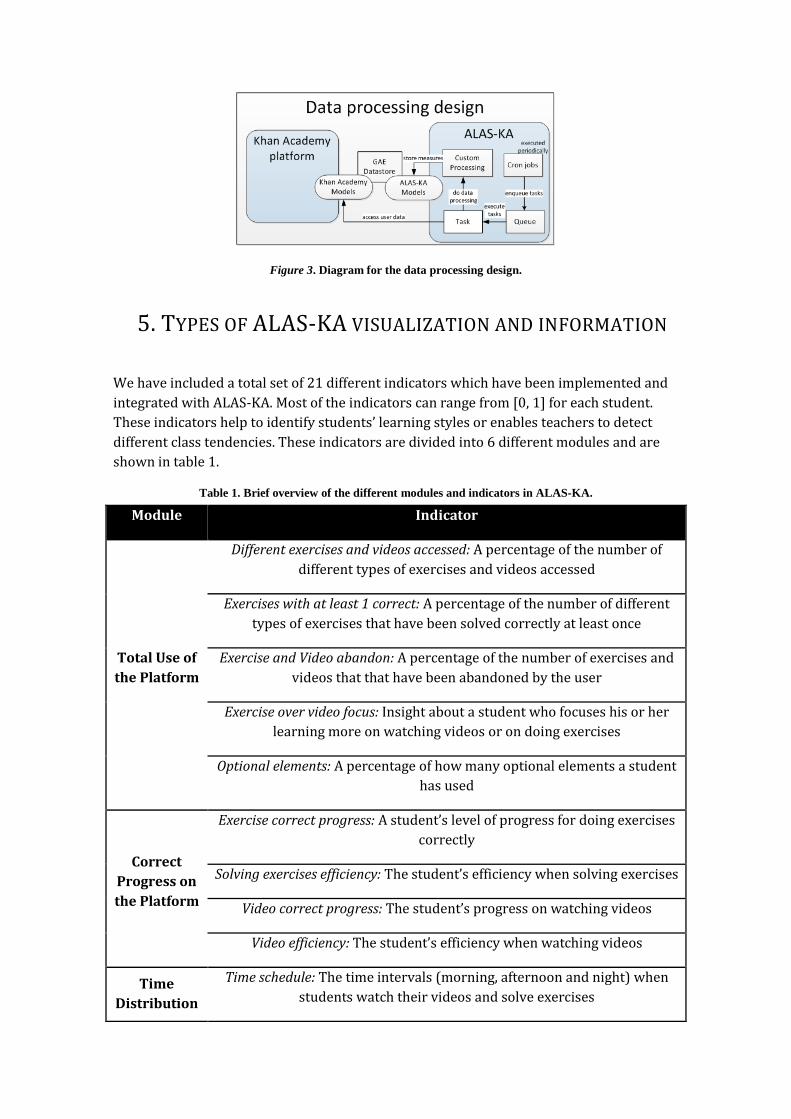
Figure 3. Diagram for the data processing design.
5. TYPES OF ALAS-KA VISUALIZATION AND INFORMATION
We have included a total set of 21 different indicators which have been implemented and
integrated with ALAS-KA. Most of the indicators can range from [0, 1] for each student.
These indicators help to identify students’ learning styles or enables teachers to detect
different class tendencies. These indicators are divided into 6 different modules and are
shown in table 1.
Table 1. Brief overview of the different modules and indicators in ALAS-KA.
Module Indicator
Total Use of
the Platform
Different exercises and videos accessed: A percentage of the number of
different types of exercises and videos accessed
Exercises with at least 1 correct: A percentage of the number of different
types of exercises that have been solved correctly at least once
Exercise and Video abandon: A percentage of the number of exercises and
videos that that have been abandoned by the user
Exercise over video focus: Insight about a student who focuses his or her
learning more on watching videos or on doing exercises
Optional elements: A percentage of how many optional elements a student
has used
Correct
Progress on
the Platform
Exercise correct progress: A student’s level of progress for doing exercises
correctly
Solving exercises efficiency: The student’s efficiency when solving exercises
Video correct progress: The student’s progress on watching videos
Video efficiency: The student’s efficiency when watching videos
Time
Distribution
Time schedule: The time intervals (morning, afternoon and night) when
students watch their videos and solve exercises

of the Use of
the Platform
Exercise efficiency by schedule: The efficiency solving exercises in each
time interval from the Time schedule indicator
Constancy: The student constancy by calculating the sample mean and
variance of the time spent on the platform by the student each day
Gamification
Habits
Gamification motivation: measurement of the student’s interest in earning
badges
Badge points percentage: The percentage of points that have been earned
from winning badges
Exercise
Solving
Habits
Recommendation listener: An indication of the student’s following the
recommended path specified by the course instructors
Forgetful in exercises: Analysis of students’ memory of having already
solved a parametric exercise correctly, including their failure to solve it
later
Hint avoidance: Hint avoiders are those who cannot solve an exercise
correctly but yet do not ask for hints.
Hint abuse: Hint abusers are those who ask for too many hints without
reflecting on previous hints or on the exercise statement.
Video avoidance: Video avoiders are those who cannot solve an exercise
correctly and yet do not watch the related video.
Unreflective user: Unreflective students are those who submit answers too
fast without reflecting.
Affective
State
Level of emotions: The emotions analyzed in this indicator set are
happiness, frustration, confusion, and boredom.
The visual analytics provided by ALAS-KA try to implement the same types of graphs for
each of the presented indicators where possible. This decision facilitates a correct
understanding, so once the user comprehends one type of graphic, the others can be
interpreted similarly. Nevertheless, because of the nature of some visualizations, some
graphics make sense only for a certain type of indicators (e.g. the evolution of feelings
during time makes sense, but the evolution of hint abuse is not so interesting since we are
usually interested in the cumulative hint abuse profile until the current time). In addition,
the units in the different charts in most cases are expressed in percentages from 0 to 100,
where possible. The use of the same units allows for an easy interpretation in most cases.
For each one of the indicators in table 1, there are individual and class graphics which
have been implemented and are integrated with ALAS-KA. We have included in section 6
some examples of individual and class visualizations that have been directly retrieved
from ALAS-KA (6.1.4, 6.2.1, 6.2.2 and 6.2.3). In addition there are some visualizations
(6.1.1, 6.1.2, 6.1.3 and 6.2.4) exposed in section 6 which use the data provided by ALAS-KA
but have not been integrated with ALAS-KA yet, but we plan to do it. We have introduced
these visualizations in order to illustrate ideas of how to use the data that ALAS-KA
provides.
Class visualizations are meant to be a guide of the overall status of a class or for a set of
students. The main chart type for class visualizations used in ALAS-KA has been pie charts.
All of the previously presented indicators have a corresponding pie char. Although we are
aware that pie charts are regarded as a controversial decision, they accomplish their goal,
which is to provide an overview of the class that can be easily interpreted. The number of
options in pie visualizations is always less than five. This is a good premise to use pie
charts, which are seen as unsuitable for a large number of options due to slice
differentiation. Pie charts are also regarded as worse than bar charts for comparison;
however, in this work, we are not trying to compare the number of students in each
category, but to present an overview by showing the percentage of students in each
category. Some authors have defended the use of pie charts for this purpose (Spence &
Lewandowsky, 1991).
ALAS-KA also enables in-depth visualizations for each student. The graphics that are
mainly used in ALAS-KA for individual visualization are bar charts. For each one of the
presented indicators, there is one bar chart. Moreover, each type of indicator has a
comparative bar, which is the mean of the class for that indicator. The mean is calculated
taking into account all students who have logged in at least once to the Khan Academy
course. The class mean comparison enables comparisons among each student with the
rest of the class.
6. RESULTS AND DISCUSSION This section is devoted to explaining how the ALAS-KA module can be used for
understanding the learning process and making decisions in the Khan Academy platform
using visualizations. The next two sub-sections offer some visualization examples from the
real experience presented in sub-section 3.3. We divide the following discussion into two
parts. First, we discuss the class results, where teachers can access visualizations of
several students and the entire class in order to offer possible interpretations. The second
part focuses on analyzing individual student examples where different students can be
compared and analyzed in ALAS-KA.
6.1. CLASS VISUALIZATIONS Class visualizations show how students have different tendencies in their learning and
also the overall status of an entire class. These examples use data from ALAS-KA and
combine not only information of one indicator but of several of them (6.1.1, 6.1.2, and
6.1.3). The example in 6.1.4 involves only one indicator.
6.1.1. PERSISTENCE The first example gives insight into the students’ persistence on watching videos. Figure 4
presents a visualization that shows the students’ video abandon rate. In the X-axis, the
different users are represented. In the Y-axis, the number of videos for each user is
provided. A green circle represents the number of videos that have been accessed by a

user. A blue circle represents the number of these videos that have been finished by that
user. These two points can be compared to deduce a “video abandoner” profile. Larger
lines represent users that started lots of videos but did not end many of them while
shorter lines represent users who are more persistent in finishing videos. An extreme case
is, for example, user number 30, who started to watch all videos but did not end any of
them. On the contrary, we can find users with only one green point, which means that the
student ended all the videos that he started. Examples of this type of users are numbered 2
to 6 in Figure 4. With these types of figures, teachers can have a global overview of their
students’ persistence.
Figure 4. Persistence indicator in videos. Started videos (green) and finished videos (blue)
As an example of an easy condition to configure the recommender module for non-
persistent users, a rule might be to check the ratio between the number of videos started
and the number finished. If this ratio is lower than a chosen threshold (e.g. 0.4), the system
will send a warning to advise the student to focus more on the resources before
attempting new ones.
An important issue is that the same visualization information can have different
interpretations. For example, in the case of a student who starts a lot of videos but does
not end most of them, this might be because the student is struggling or because the
student already knows the concepts explained in the videos. The final interpretation and
recommendation should depend on other variables such as if the student already knows
how to solve the related exercises. In some cases, it is not possible to determine the exact
causes of some information visualizations. ALAS-KA provides the graphs to help teachers
and students, but the stakeholders should make the decisions depending on the context
and the specific learner.
6.1.2. OVERVIEW OF AFFECTIVE STATES This example is based on the inference of the students’ affective states from the activity
patterns generated in the platform. For instance, using algorithms that we have developed

and implemented (Leony et al., 2014) we can infer the levels of happiness, boredom,
confusion and frustration for each student in the classroom. Afterwards, these
measurements can be aggregated in order to show an overview of each state for the whole
classroom. Figure 5 provides an illustration of this example.
Figure 5. Visualization of the affective states for the class group.
In the example, affective states that correlate positively with learning gains are colored
green, while red-colored states have been shown to correlate negatively with learning
gains (Baker et al., 2010).
6.1.3. RESOURCE FOCUS Figure 6 presents the information of learners’ time distribution for videos and exercises.
Blue bars represent the time devoted by users to solving exercises. The green bars
represent the time devoted by users to watching videos. An example of different behaviors
can be observed in users 16 and 17. The first one has spent much more time watching
videos while the second has focused the learning on resolving exercises.
Regarding recommendations, communications might be sent to teachers advising them
about students who are focused on videos or exercises. In this way, a teacher can make an
analysis and act properly depending on the specific educational context. As an example,
students who devote greater time to solving exercises might be more active learners in
some situations.
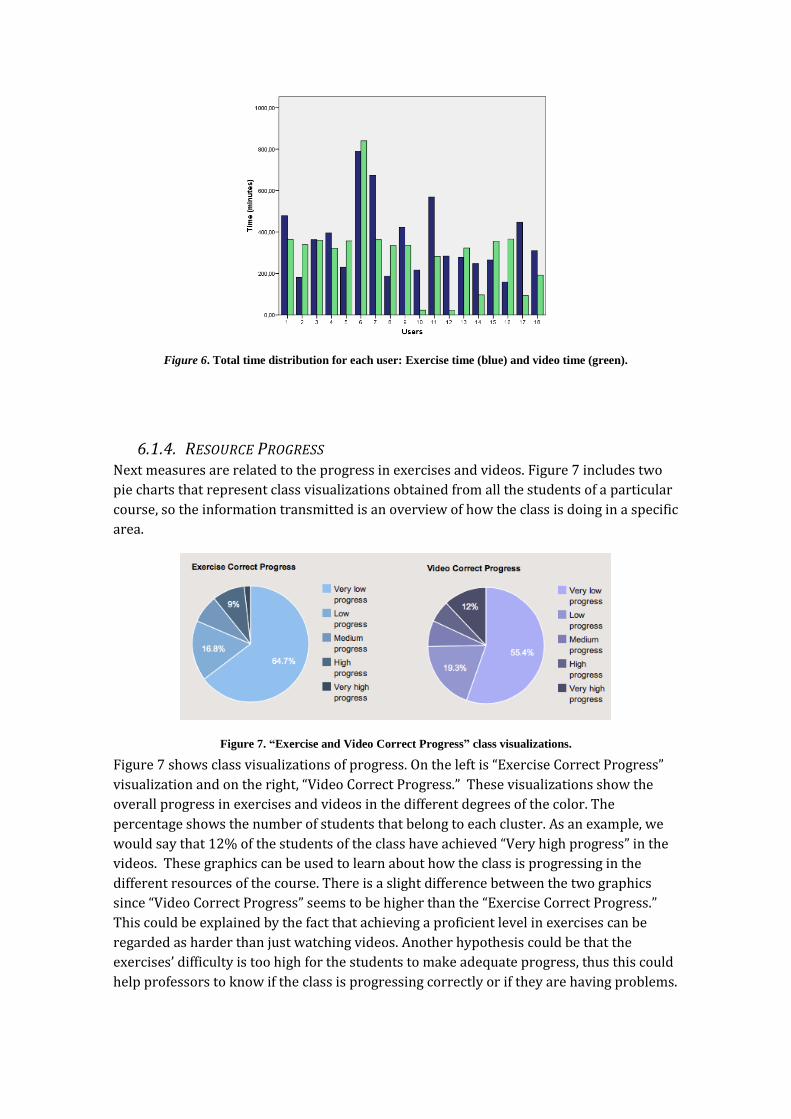
Figure 6. Total time distribution for each user: Exercise time (blue) and video time (green).
6.1.4. RESOURCE PROGRESS Next measures are related to the progress in exercises and videos. Figure 7 includes two
pie charts that represent class visualizations obtained from all the students of a particular
course, so the information transmitted is an overview of how the class is doing in a specific
area.
Figure 7. “Exercise and Video Correct Progress” class visualizations.
Figure 7 shows class visualizations of progress. On the left is “Exercise Correct Progress”
visualization and on the right, “Video Correct Progress.” These visualizations show the
overall progress in exercises and videos in the different degrees of the color. The
percentage shows the number of students that belong to each cluster. As an example, we
would say that 12% of the students of the class have achieved “Very high progress” in the
videos. These graphics can be used to learn about how the class is progressing in the
different resources of the course. There is a slight difference between the two graphics
since “Video Correct Progress” seems to be higher than the “Exercise Correct Progress.”
This could be explained by the fact that achieving a proficient level in exercises can be
regarded as harder than just watching videos. Another hypothesis could be that the
exercises’ difficulty is too high for the students to make adequate progress, thus this could
help professors to know if the class is progressing correctly or if they are having problems.

6.2. INDIVIDUAL VISUALIZATIONS These graphics show for each type of indicator the value of the user and the class mean
value. Visualizations 6.2.1, 6.2.2 and 6.2.3 show in the darker color the user bar and in the
lighter color the class mean bar. There are also other types of individual visualizations
such as for emotions (6.2.4). However this type of graph has been not integrated in ALAS-
KA yet.
6.2.1. TOTAL USE OF THE PLATFORM Here, we present some examples that were retrieved directly from the ALAS-KA
application. Figure 8 shows a visualization example of one user, as retrieved from ALAS-
KA. First, the user has accessed nearly 100% of the exercises and videos available in the
course. This indicates that the user is far above the mean value of the class (which is
around 38%), and that she or he is probably showing a “resource explorer” profile.
Secondly we can check the abandon ratios. The video abandon indicator shows a 0%
abandon ratio in videos, so all the videos that the user started (which is the 100% of the
videos) have been finished. However the exercise abandon indicator shows that around
60% of the exercises the student started have been abandoned. These results show that
although the user has completely seen all the videos available in the course, he or she is
struggling in the exercises.
Figure 8. “Total Use of the Platform” user example.
We can propose reasonable causes for these results but not assure a certain cause. For
example, the user might not be paying enough attention to the videos and then, she or he
cannot resolve the exercises properly later. Maybe the user has a visual learner tendency,
and he or she prefers just to watch videos instead of solving many exercises. Possible
recommendations to such a student would be to pay more attention to the videos or put a
higher effort into solving exercises. There are many possible interpretations, but before
conveying suggestions, the teachers should also take into account other indicators and
variables. It might even require that the student provide feedback for the teacher to know
what is going on.
6.2.2. CORRECT PROGRESS IN THE PLATFORM

Figure 9 shows the results of all of the indicators in the “Correct Progress in the Platform”
module for students A and B.
Figure 9. Comparison example between students of “Correct Progress in the Platform”.
We can see that both students have similar “exercise” and “video correct progress”
indicators, which means that both of them have made the same progress. In addition, this
progress is considerably higher than the mean value of the class, thus they both have done
a great effort. However, if we check “solving exercises” and “video efficiency,” we notice
that student A has a much higher efficiency rate than has student B. The interpretation is
that although student A and B have the same progress, student A has been much more
efficient than has student B. This information would enable the teacher to look further into
student B, in case he or she is having problems with the course contents. The teacher could
also check other indicators provided in ALAS-KA or make an intervention by contacting
the student.
6.2.3. EXERCISE SOLVING HABITS Figure 10 shows an example related to the “Exercise Solving Habits” module.
Figure 10. “Exercise Solving Habits” user example.

We can see that the “hint” and “video avoidance” indicators are low and that they are also
below the class mean value. A teacher might interpret this to mean that the user is not a
hint or video avoider, and, therefore, this student probably uses the different resources
available (videos and hints) in order to solve the attempted exercises properly. However
we can also see that “unreflective user” and “hint abuser” indicators are very high and
above the class mean. These two last indicators are probably related to the student’s
capacity to reflect. A possible interpretation is that the student probably is not reflecting
about how to solve exercises, nor on the hints received. We could recommend the student
make more in-depth thinking about the errors and the hints.
Other recommendations might be provided based, for example, on the hint abuse
indicators. If a student is detected to be a hint abuser, a teacher might recommend that the
student change his or her behavior (Aleven et al., 2004).
6.2.4. VARIATIONS IN AFFECTIVE STATE The last case consists of a chart that displays the variations in a student’s affective states.
Figure 11 serves as an example, showing the changes of two affective states: frustration in
blue, and boredom in red. This is an example of graph that is not present for all the
indicators but only for the emotions.
Figure 11. Line chart of the affective states of a learner, with annotations of relevant events.
The example shows the variations for both affective states for a period of six days. In cases
where another event has been captured, its description is added to the chart with a label.
The example includes two labels, one describing the introduction of a new concept and
another indicating the view of an introductory video. This contextual information can be
used to detect situations that modified the student’s affective state.
7. CONCLUSIONS
In this paper, we presented ALAS-KA, a visual analytics module to extend the learning
analytics support for the Khan Academy platform. We presented the architecture of ALAS-
KA as well as the different types of visualizations allowed and the type of information

presented. We have also presented ways for teachers and students to make use of these
visualizations to make decisions about the learning process. This is illustrated with some
example data from real courses at UC3M.
All the information included in ALAS-KA can be used by instructors for different purposes
and for students’ self-reflection. This information enables instructors to make decisions
supported by data related to many aspects that were not by default in the Khan Academy
platform (efficiency, behavioral, motivation, etc.). One important piece of advice for
teachers would be that they look into all of the information available as a whole before
jumping into conclusions because many of the visualized information are closely related.
In addition, some of these indicators have been addressed already as bad or good for
learning from previous research, so instructors can support their decisions from other
research works’ conclusions. It is also possible to analyze class tendencies that can be
useful to make a better course design or to make changes depending on how the class is
progressing. Furthermore, in a more personal context, professors can learn a lot about
how to motivate students or the best ways to work with each student. Finally, all the
information could be used to cluster students in different groups, for example to group
similar students in practice hours.
Nevertheless, it is important to point out that all these ideas should be analyzed separately
in each context and that a generalization is difficult. The final learning decisions should be
made by the instructors, who should also take into account many other variables of the
specific educational context. We are also preparing an evaluation survey with students
and professors to receive feedback and improve the tool and indicators. For future work,
we aim at extending ALAS-KA in order to make specific automatic recommendations based
on other different context variables and on experience from experiments where learning
gains should be measured.
In order to reuse some of the visualizations, the semantics of each platform should be
taken into account. For example, hint abuser graphics would not make sense in a platform
that does not support hints. Another interesting line of future work is to compare the use
of e-learning platforms between “digital natives” and “forced digital immigrants” because
interesting differences might arise.
REFERENCES Abdul-Rahman, S.-S., & du Boulay, B. (2014). Learning programming via worked-examples:
Relation of learning styles to cognitive load. Computers in Human Behavior, 30, 286–298.
doi:10.1016/j.chb.2013.09.007
Aleven, V., McLaren, B. M., Roll, O., & Koedinger, K. (2004) Toward tutoring help seeking:
Applying cognitive modeling to meta-cognitive skills. Intelligent Tutoring Systems. Lecture
Notes in Computer Science. Volume 3220, 227-239.
Arroyo, I., Cooper, D. G., Burleson, W., Woolf, B. P., Muldner, K., & Christopherson, R. M.
(2009). Emotion sensors go to school. Proceedings of the 2009 conference on Artificial
Intelligence in Education. 17–24. The Netherlands, Amsterdam: IOS Press. Retrieved from
http://dl.acm.org/citation.cfm?id=1659458

Baker, R. S. J. d., D’Mello, S. K., Rodrigo, M. M. T., & Graesser, A. C. (2010). Better to be
frustrated than bored: The incidence, persistence, and impact of learners’ cognitive–
affective states during interactions with three different computer-based learning
environments. International Journal of Human-Computer Studies, 68(4), 223–241.
doi:10.1016/j.ijhcs.2009.12.003
Brusilovsky, P., & Millán, E. (2007). User models for adaptive hypermedia and adaptive
educational systems. The Adaptive Web, 3–53. Heidelberg, Berlin: Springer-Verlag.
Retrieved from http://dl.acm.org/citation.cfm?id=1768199
Chen, W., & Persen, R. (2009). A recommender system for collaborative knowledge.
Proceedings of the 2009 conference on Artificial Intelligence in Education, 309-316. The
Netherlands, Amsterdam: IOS Press. Retrieved from
http://dl.acm.org/citation.cfm?id=1659499
Conati, C., & MacLaren, H. (2009). Empirically Building and Evaluating a Probabilistic
Model of User Affect. User Modeling and User-Adapted Interaction, 19(3), 267–303.
Retrieved from http://dx.doi.org/10.1007/s11257-009-9062-8
D’Mello, S. K., Lehman, B., & Graesser, A. C. (2011). A Motivationally Supportive Affect-
Sensitive AutoTutor. New Perspectives on Affect and Learning Technologies, 3, 113–126.
New York, NY: Springer. doi:10.1007/978-1-4419-9625-1
Duval, E. (2010). Attention Please! Learning Analytics for Visualization and
Recommendation. Proceedings of LAK11: 1st International Conference on Learning
Analytics and Knowledge 2011. New York, NY: ACM. Retrieved from
http://dl.acm.org/citation.cfm?id=1659499
Duval, E. and Verbert, K. (2012). Learning Analytics. eleed. Issue 8(1). Retrieved from
http://eleed.campussource.de/archive/8/3336
Elias, T. (2011). Learning Analytics: Definitions, Processes and Potential. Retrieved from
http://learninganalytics.net/LearningAnalyticsDefinitionsProcessesPotential.pdf
Felder, R., & Silverman, L. (1988). Learning and teaching styles in engineering education.
Engineering Education, 78(7), 674–681.
García-Peñalvo, F. J., Conde, M. Á., Bravo, S., Gómez, D. A., & Therón, R. (2011). Visual
Analysis of a Moodle-based Object Oriented Programming Course. International Journal of
Computers Applications. Proceedings on Design and Evaluation of Digital Content for
Education (DEDCE), 8-14. Retrieved from
http://www.ijcaonline.com/dedce/number1/dece002.pdf
Graf, S., Liu, T.-C., Chen, N.-S., & Yang, S. J. H. (2009). Learning styles and cognitive traits –
Their relationship and its benefits in web-based educational systems. Computers in Human
Behavior, 25(6), 1280–1289. doi:10.1016/j.chb.2009.06.005
Leony, D. Muñoz-Merino, P. J. Ruipérez-Valiente, J. A. Arellano, D. & Delgado, C (2014).
Rule-based detection of emotions in the Khan Academy platform. International Workshop
on Massive Open Online Courses. Antigua Guatemala, Guatemala.
Leony, D., Pardo, A., de la Fuente, L., Sanchez, D., & Delgado, C. (2012). GLASS: A Learning
Analytics Visualization Tool. LAK '12 Proceedings of the 2nd International Conference on
Learning Analytics and Knowledge, 162-163. New York, NY: ACM
doi:10.1145/2330601.2330642
Mazza, R., & Dimitrova, V. (2004). Visualising Student Tracking Data to Support Instructors
in Web-Based Distance Education. Proceedings of the 13th international World Wide Web
conference on Alternate track papers & posters, 154-161. New York, NY: ACM.
doi:10.1145/1013367.1013393
Muñoz-Merino, P. J. Ruipérez, J. A. & Delgado, C. (2013). Inferring higher level learning
information from low level data for the Khan Academy platform. Proceeding LAK '13
Proceedings of the Third International Conference on Learning Analytics and Knowledge,
112-116. New York, NY: ACM. doi:10.1145/2460296.2460318
Özyurt, Ö., Özyurt, H., Baki, A., & Güven, B. (2013). Integration into mathematics
classrooms of an adaptive and intelligent individualized e-learning environment:
Implementation and evaluation of UZWEBMAT. Computers in Human Behavior, 29(3), 726–
738. doi:10.1016/j.chb.2012.11.013
Recker, M. M. Walker, A., & Lawless, K. (2003). What do you recommend? Implementation
and analyses of collaborative information filtering of web resources for education.
Instructional Science 31: 299–316. doi:10.1023/A:1024686010318
Robison, J. L., McQuiggan, S. W., & Lester, J. C. (2009). Modeling Task-Based vs. affect-based
feedback behavior in pedagogical agents: An inductive approach. In Proceedings of the 14h
International Conference on Artificial Intelligence in Education, 25–32. Amsterdam, The
Netherlands: IOS Press. Retrieved from http://dl.acm.org/citation.cfm?id=1659459
Spence, I., & Lewandowsky, S. (1991). Displaying proportions and percentages. Applied
Cognitive Psychology, 5(1), 61–77. doi:10.1002/acp.2350050106
Schmitz, H., Schefel, M., Friedrich, M., Jahn, M., Niemann, K., & Wolpers, M., (2009). CAMera
for PLE. Learning in the Synergy of Multiple Disciplines. Proceedings of the 4th European
Conference on Technology Enhanced Learning: Learning in the Synergy of Multiple
Disciplines, 507-520. Berlin, Heidelberg: Springer-Verlag. doi:10.1007/978-3-642-04636-
0_47
Dyckhoff, A.L., Lukarov, V., Muslim, A., Chatti, M.A., Schroeder, U. (2013) Supporting Action
Research with Learning Analytics. Proceedings of the Third International Conference on
Learning Analytics and Knowledge, 220-229. New York, NY: ACM.
doi:10.1145/2460296.2460340
Ya Tang, T., & McCalla, G. (2005). Smart Recommendation for an Evolving E-Learning
System: Architecture and Experiment. International Journal on E-Learning, 4(1), 105-129.
Retrieved from http://editlib.org/p/5822
Zhang, H., Almeroth, K. (2010). Moodog: Tracking Students’ Online Learning Activities.
Journal of Interactive Learning Research, 21(3), 407-429. Retrieved from
http://editlib.org/p/32307/