use of visualization in digital financial reporting
TRANSCRIPT
University of Kentucky University of Kentucky
UKnowledge UKnowledge
Theses and Dissertations--Business Administration Business Administration
2012
USE OF VISUALIZATION IN DIGITAL FINANCIAL REPORTING: THE USE OF VISUALIZATION IN DIGITAL FINANCIAL REPORTING: THE
EFFECT OF SPARKLINE EFFECT OF SPARKLINE
Priyanka Meharia University of Kentucky, [email protected]
Right click to open a feedback form in a new tab to let us know how this document benefits you. Right click to open a feedback form in a new tab to let us know how this document benefits you.
Recommended Citation Recommended Citation Meharia, Priyanka, "USE OF VISUALIZATION IN DIGITAL FINANCIAL REPORTING: THE EFFECT OF SPARKLINE" (2012). Theses and Dissertations--Business Administration. 1. https://uknowledge.uky.edu/busadmin_etds/1
This Doctoral Dissertation is brought to you for free and open access by the Business Administration at UKnowledge. It has been accepted for inclusion in Theses and Dissertations--Business Administration by an authorized administrator of UKnowledge. For more information, please contact [email protected].

STUDENT AGREEMENT: STUDENT AGREEMENT:
I represent that my thesis or dissertation and abstract are my original work. Proper attribution
has been given to all outside sources. I understand that I am solely responsible for obtaining
any needed copyright permissions. I have obtained and attached hereto needed written
permission statements(s) from the owner(s) of each third-party copyrighted matter to be
included in my work, allowing electronic distribution (if such use is not permitted by the fair use
doctrine).
I hereby grant to The University of Kentucky and its agents the non-exclusive license to archive
and make accessible my work in whole or in part in all forms of media, now or hereafter known.
I agree that the document mentioned above may be made available immediately for worldwide
access unless a preapproved embargo applies.
I retain all other ownership rights to the copyright of my work. I also retain the right to use in
future works (such as articles or books) all or part of my work. I understand that I am free to
register the copyright to my work.
REVIEW, APPROVAL AND ACCEPTANCE REVIEW, APPROVAL AND ACCEPTANCE
The document mentioned above has been reviewed and accepted by the student’s advisor, on
behalf of the advisory committee, and by the Director of Graduate Studies (DGS), on behalf of
the program; we verify that this is the final, approved version of the student’s dissertation
including all changes required by the advisory committee. The undersigned agree to abide by
the statements above.
Priyanka Meharia, Student
Dr. Radhika Santhanam, Major Professor
Dr. Steven J. Skinner, Director of Graduate Studies

USE OF VISUALIZATION IN DIGITAL FINANCIAL REPORTING: THE EFFECT OF SPARKLINE
____________________________
DISSERTATION
____________________________
A dissertation submitted in partial fulfillment of the requirements for the degree of Doctor of Philosophy in the
College of Business and Economics at the University of Kentucky
By Priyanka Meharia
Lexington, Kentucky
Director: Dr. Radhika Santhanam, Gatton Endowed Research Professor of Management
Lexington, Kentucky
2012
Copyright © Priyanka Meharia 2012
2
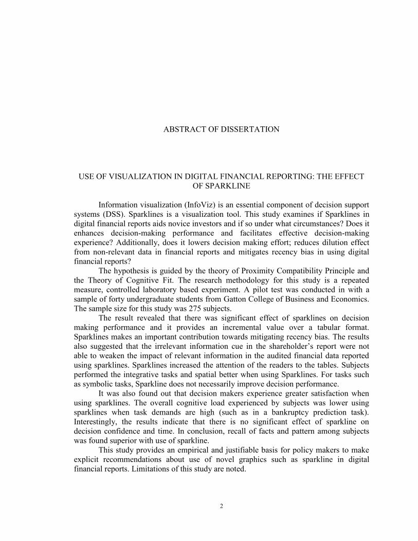
ABSTRACT OF DISSERTATION
USE OF VISUALIZATION IN DIGITAL FINANCIAL REPORTING: THE EFFECT OF SPARKLINE
Information visualization (InfoViz) is an essential component of decision support systems (DSS). Sparklines is a visualization tool. This study examines if Sparklines in digital financial reports aids novice investors and if so under what circumstances? Does it enhances decision-making performance and facilitates effective decision-making experience? Additionally, does it lowers decision making effort; reduces dilution effect from non-relevant data in financial reports and mitigates recency bias in using digital financial reports?
The hypothesis is guided by the theory of Proximity Compatibility Principle and the Theory of Cognitive Fit. The research methodology for this study is a repeated measure, controlled laboratory based experiment. A pilot test was conducted in with a sample of forty undergraduate students from Gatton College of Business and Economics. The sample size for this study was 275 subjects.
The result revealed that there was significant effect of sparklines on decision making performance and it provides an incremental value over a tabular format. Sparklines makes an important contribution towards mitigating recency bias. The results also suggested that the irrelevant information cue in the shareholder’s report were not able to weaken the impact of relevant information in the audited financial data reported using sparklines. Sparklines increased the attention of the readers to the tables. Subjects performed the integrative tasks and spatial better when using Sparklines. For tasks such as symbolic tasks, Sparkline does not necessarily improve decision performance.
It was also found out that decision makers experience greater satisfaction when using sparklines. The overall cognitive load experienced by subjects was lower using sparklines when task demands are high (such as in a bankruptcy prediction task). Interestingly, the results indicate that there is no significant effect of sparkline on decision confidence and time. In conclusion, recall of facts and pattern among subjects was found superior with use of sparkline.
This study provides an empirical and justifiable basis for policy makers to make explicit recommendations about use of novel graphics such as sparkline in digital financial reports. Limitations of this study are noted.

KEYWORDS: Decision support system, Visualization, Decision making, Business
Intelligence, Presentation format, digital reporting.
Priyanka Meharia Student’s Signature July 3rd 2012 Date

USE OF VISUALIZATION IN DIGITAL FINANCIAL REPORTING: THE EFFECT OF SPARKLINE
By
Priyanka Meharia
Radhika Santhanam, PhD Chair of Dissertation
Steven J. Skinner,PhD
Director of Graduate Studies
3rd July 2012 Date

iii
ACKNOWLEDGEMENTS
It is my great pleasure to thank the many people who have made this
dissertation possible. It is difficult to overstate my gratitude to my Ph.D. advisor,
Dr. Radhika Santhanam. Her enthusiasm, inspiration, and critiques helped me to
grow up as I followed the academic path. Throughout my dissertation writing
period, she provided encouragement, sound advice, support, and lots of good ideas.
She provided me with solid guidance in my research over the whole development
phase. With her great efforts to explain things clearly and simply, Dr. Santhanam
helped to make the whole process fun for me. I am thankful to her as she helped me
to overcome many difficulties in my life and research.
I am indebted to my many colleagues for providing a stimulating
environment in which to learn and grow. I am grateful to Dr. Melody Carswell, Dr.
Krishnamurty Muralidhar and Dr. David Hulse who provided a lot of helpful
comments and assistance in time. I am thankful to Dr. Clyde Holsapple for his kind
encouragement and support.
I wish to thank my entire family for providing a loving environment for me.
My sisters and my son were particularly supportive. Most importantly, I wish to
thank my mother, Veena Meharia and my late father Satish Meharia. They raised
me, supported me, taught me, and loved me. Lastly, I would like to give great
acknowledgement, appreciation, and thanks to my husband, Dr. Biswajit Panja,
who emotionally supported my need to become a researcher. I will never forget his
efforts on behalf of my education and career.
Priyanka Meharia
iv
TABLE OF CONTENTS
Acknowledgements......................................................................................... iii List of Figures.................................................................................................... viii List of Tables .................................................................................................. ix
Contents
1 CHAPTER ONE: VISUALIZATION AS A DECISION AID........................1
1.1 DECISION SUPPORT SYSTEMS .................................................................................1 1.2 BUSINESS INTELLIGENCE FOR MAKING DECISIONS .................................................2 1.3 VISUALIZATION IN DECISION SUPPORT ..................................................................4 1.4 INTERACTIVE DATA FORMAT AND USE OF VISUALIZATION .....................................5 1.5 ROLE OF VISUALIZATION IN DECISION MAKING ....................................................7
1.5.1 Visualization as a memory aid ..........................................................................7 1.5.2 Visualization as representation aid ...................................................................7 1.5.3 Visualization as supporting parallel processing in the brain ...........................7 1.5.4 Visualization as support for creative thinking and insight ................................8 1.5.5 Visualization as support for Pattern Recognition .............................................8 1.5.6 Visualization as support for Persuasion ...........................................................9
2 Chapter Two: Survey of visualization tools and techniques…………………10
2.1 DYNAMIC GRAPH .................................................................................................10 2.2 DENSE GRAPHICS .................................................................................................13 2.3 INTERACTIVE GRAPH ............................................................................................16
3 Chapter Three: Presentation format and decision making: a review of
literature………………………………………………………… …………………..18
3.1 KEY FINDINGS FROM THE LITERATURE.................................................................19 3.1.1 Effect of Presentation Format on Decision Performance ...............................19
3.1.2 Effect of presentation format of tagged data and web syndication on decision performance……….. ...................................................................................................20
3.1.3 Effect of presentation format and individual differences on decision performance…………. ................................................................................................21
3.1.4 Effect of presentation format and task/environment complexity on decision performance…………. ................................................................................................22
3.1.5 Effect of presentation format with task interruption on decision performance 22
3.1.6 Effect of presentation format on memory and decision performance .............23 3.1.7 Effect of presentation format on compensatory choices under uncertainty ....24
3.1.8 Effect of presentation format and task type (spatial vs. symbolic) on decision performance………… .................................................................................................24 3.1.9 Effect of presentation format, time constraint, color and individual differences on decision performance ............................................................................................24

v
3.1.10 Effect of alternative forms of information presentation on evaluating corporate performance ...............................................................................................25 3.1.11 Effect of maps vs. table on decision performance ...........................................26 3.1.12 Effect of novel presentation format and task type on decision performance ..26
3.1.13 Effect of presentation format, Cathode Ray Tube (CRT) versus hard copy terminal and heuristic versus analytical decision makers on decision performance. 28 3.1.14 Effect of decision guidance/decision aid on tasks ...........................................29 3.1.15 Effect of graph and decision strategies on decision performance ..................30 3.1.16 Effect of decision-making incentives on decision performance ......................31
3.1.17 Impact of desired accuracy on preferences for different presentation formats 31
3.1.18 Effect of video vs. text on decision performance .............................................32 4 Chapter Four: Review of theory frameworks used in visualization
research………………………………………………………………………………..36
4.1 DISTRIBUTED COGNITION THEORY (ZHANG AND NORMAN 1994; HOLLAN, HUTCHINS ET AL. 2000; ZHANG AND PATEL 2006) .........................................................36 4.2 THEORY OF GRAPH COMPREHENSION (PINKER 1990)...........................................36 4.3 INTEGRATIVE MODEL OF GRAPH COMPREHENSION (CARPENTER AND SHAH 1998)
38 4.4 THEORY OF DUAL CODING (PAIVIO 1986; PAIVIO 1991; SADOSKI AND PAIVIO
2001) 38 4.5 THEORY OF PROPOSITIONAL REPRESENTATION (PYLYSHYN 1973) ......................39 4.6 COGNITIVE LOAD THEORY (VAN MERRIENBOER AND SWELLER 2005) ...............39 4.7 STEVENS’ POWER LAW FOR ESTIMATING MAGNITUDES .......................................40 4.8 COMPUTATIONAL MODEL OF GRAPHICAL PERCEPTION (LOHSE 1993; LOHSE 1997)
41 4.9 WEBER'S LAW OF JUST NOTICEABLE DIFFERENCES (WEBER, ROSS ET AL. 1996) 41
5 Chapter Five: Research Framework……………………………………… 43
5.1 IMPORTANCE OF REPORTING FORMAT ..................................................................43 5.2 SPARKLINES .........................................................................................................46 5.3 THEORY AND HYPOTHESIS ...................................................................................49
5.3.1 Theory of proximity compatibility ...................................................................49 5.3.2 Theory of Cognitive Fit ...................................................................................49
5.4 DEVELOPMENT OF HYPOTHESES ..........................................................................50 5.4.1 Decision Experience: Decision Confidence and Satisfaction .........................50 5.4.2 Decision effort: Cognitive load and Attention ................................................51 5.4.3 Dilution effect 53 5.4.4 Recency Bias 54 5.4.5 Decision Performance: Accuracy and Time ...................................................55
5.5 RESEARCH DESIGN ...............................................................................................59 5.6 EXPERIMENTAL PROCEDURES ..............................................................................59
5.6.1 Development of stock reports ..........................................................................60 5.7 MEASURES ...........................................................................................................62
vi
5.7.1 Independent Variables .....................................................................................62 5.7.2 Dependent Variables .......................................................................................62
5.8 CONTROL VARIABLES ...........................................................................................65 5.9 PILOT STUDY PROCEDURE ...................................................................................65
6 Chapter 6: Main Study……………………………………………………. 67
6.1 PARTICIPANTS ......................................................................................................67 6.2 VALIDITY CHECKS ................................................................................................70
6.2.1 Counterbalancing ............................................................................................70 6.2.2 Manipulation check .........................................................................................70
6.3 RESULTS ..............................................................................................................72 6.3.1 Data analysis 72
6.4 LIMITATIONS ........................................................................................................83 6.5 FUTURE RESEARCH DIRECTIONS ..........................................................................85 6.6 CONTRIBUTIONS OF THE STUDY ...........................................................................86
6.6.1 Implications for research ................................................................................86 6.6.2 Implications for practice .................................................................................88
Appendices Appendix A: Scanned copy of the Consent Form……………………………………… 90 Appendix B: Experiment………………………………………………………......... 95
Appendix C: Pretask questionnaire (Demographics and background) …………………96 Appendix D: Introduction to Sparkline …………………………………………………98 Appendix E: Using tables ……………………………………………………………….99 Appendix F: Case Scenario for the first condition…………………………………… 100
Appendix G:Shareholders Report and key financial ratiosof High Tech Systems Corporation Inc.………………………………………………………………………101
Appendix I: Case Scenario for second condition ………………………………………104 Appendix J: Shareholder's Report for the treatment condition ………………………...105 Appendix K: Measurement Scales……………………………………………………. 107
References……………………………………………………………………..……….112
Vita……...……………………………………………………………………..……..120
vii
LIST OF FIGURES FIGURE 2-1: SCREENSHOT OF MOTION CHART IN ACTION. .............................. 12 FIGURE 2-2: SCREENSHOT OF TREE MAP HIGHLIGHTING STOCK MARKET
HAD FALLEN ON THAT DAY, WITH A FEW EXCEPTIONS ........................... 14 FIGURE 2-3: TREE MAP SHOWING THE BOMBAY STOCK EXCHANGE
PERFORMANCE ...................................................................................................... 15 FIGURE 2-4 INTERACTIVE FINANCIAL CHART ..................................................... 17 FIGURE 4-1: THEORY OF GRAPH COMPREHENSION (PINKER 1990) ................. 37 FIGURE 4-2: DIFFERENT PHYSICAL FEATURES OF A GRAPH AND ACCURACY
OF JUDGMENTS ..................................................................................................... 40 FIGURE 4-3: STEVENS’ POWER LAW FOR ESTIMATING MAGNITUDES IN
AREA MAP ............................................................................................................... 41 FIGURE 5-1: RESEARCH MODEL: FACTORS INFLUENCING THE IMPACT OF
VISUALIZATION ON DECISION MAKING PERFORMANCE .......................... 46 FIGURE 5-2: : SNAPSHOT OF A MOBILE APPLICATION DEVELOPED FOR
EXECUTIVE DASHBOARD USING SPARKLINE ............................................... 47 FIGURE 5-3: SPARKLINE TRACKS 250 DAYS OF PRICE OF FOREIGN
EXCHANGE ............................................................................................................. 48 FIGURE 5-4: COLUMN FINANCIAL PAGE WITH SPARKLINE IN NEWSPAPER 48 FIGURE 5-5 THEORY OF COGNITIVE FIT ................................................................. 50 FIGURE 6-1: : GRAPHS THAT CAN BE REPRESENTED IN WORD SIZE FORMAT
................................................................................................................................... 86

viii
LIST OF TABLES
TABLE 3-1: RESEARCH BASED GUIDELINES FOR DESIGN AND USE OF VISUALIZATION TOOLS ...................................................................................... 34
TABLE 5-1 SUMMARY OF HYPOTHESIS .................................................................. 58 TABLE 5-2: ALTMAN Z SCORE CALCULATION ..................................................... 61 TABLE 5-3: NASA TASK LOAD INDEX ..................................................................... 64 TABLE 6-1: CFA OF THE PERCEPTUAL CONSTRUCTS ......................................... 73 TABLE 6-2:SUMMARY OF HYPOTHESIS TESTING FOR STUDENT SAMPLE ... 74 TABLE 6-3: SUMMARY OF HYPOTHESIS TESTING FOR SAMPLE OF
EXPERIENCED INVESTORS ................................................................................. 75 TABLE 6-4: SUMMARY OF HYPOTHESIS TESTING FOR ALL PARTICIPANTS IN
THE STUDY. ............................................................................................................ 76 TABLE 6-5: SUMMARY OF RESULTS ........................................................................ 77 TABLE 6-6: CORRELATIONS BETWEEN THE DEPENDENT VARIABLES .......... 77
1
1 Chapter One: Visualization as a Decision Aid
1.1 Decision Support Systems
Information technology (IT) plays a key role in creating knowledge (2000) and
supporting management in decision making activities (Keen and Morton ; Morton 1971;
Bonczek, Holsapple et al. 1981; Holsapple and Whinston 1996; Todd and Benbasat
2000). Decision support systems are Management Information Systems that aids a
decision maker in the decision making process. DSS include “business intelligence
systems, some workflow systems, groupware, conferencing software, management expert
systems and model-based analytics”(Holsapple 2003). In an article that classifies DSS
architecture and types; Holsapple writes that
“DSS relaxes cognitive, temporal, spatial and/or economic limits on the decision maker.
The support furnished by the system allows a decision episode to unfold
• in more productive ways (e.g., faster, less expensively, with less effort),
• with greater agility (e.g., alertness to the unexpected, higher ability to respond),
• innovatively (e.g., with greater insight, creativity, novelty, surprise),
• reputably (e.g., with higher accuracy, ethics, quality, trust), and/or
• with higher satisfaction by decisional stakeholders (e.g., decision participants,
decision sponsors, decision consumers, decision implementers)”
As per Simon’s intelligence-design-choice model; DSS should support all phases of the
management decision-making process; specifically the intelligence phase that refers to
the “process of searching the environment for conditions calling for decisions” (Simon
1960). In the digital era, decision makers have access to large amount of digital data
2
which can be used by DSS to support decision making. DSS aids the decision maker in
making sense from the large amount of digital data. In a decision making setting, the
decision maker progresses from six states of descriptive knowledge: data, information,
structured information, insight, judgment and finally the decision (Wali Van Lohuizen
1986). IT such as DSS can support the decision maker to progress through the different
states of knowledge and make more informed decisions.
1.2 Business Intelligence for making decisions
Business intelligence (BI) refers to inferences and knowledge discovered by analyzing
data acquired from different sources. A data warehouse is a repository of digital data
from which business intelligence can be derived. BI refers to “technologies, applications
and practices for the collection, integration, analysis and presentation of business
information” (AICPA 2010). BI systems can help decision makers in an organization to
derive knowledge from the data to make wiser and more informed business decisions.
In today’s economic climate, companies want quantifiable success measures. BI can help
in extraction, analysis, and reporting of historical data or data related to comparable
companies in order to provide valuable performance measure. As per the PAIR model,
organizations that use BI systems can potentially increase business competitiveness
through improved productivity, agility, innovation, and/or reputation (Holsapple and
Singh 2001). To increase competiveness the businesses need to be more agile and
innovative. They need to predict rather than react to changes in the conditions in which
they operate. The BI system supports the retrospective and predictive analytics on data
(detailed sales, production, and financial and other business data) from different sources.
3
Independent researchers have predicted high future demand for BI systems. Gartner's
research reports that in spite of global recession businesses are interested in investing in
business intelligence (BI) platforms that are expanding their capabilities towards
advanced data visualization, scorecards and interactive dashboards. It predicts BI
market’s compound annual growth rate (CAGR) through 2012 to be 7.0% for stand-alone
BI platforms (Hostmann 2009) . Gartner predicts “Through 2015, organizations
integrating high-value, diverse, new information types and sources into a coherent
information management infrastructure will outperform their industry peers financially
by more than 20%.”
As competition in the knowledge economy gets more fierce, organizations are constantly
trying to get new insights from different sources of knowledge to gain competitive
advantage.
As per the Knowledge Management theory, an organization has two classes of
knowledge resources: content and schematic knowledge resources (Holsapple and Singh
2001). As per Holsapple et al (2001), a) Content knowledge resources are of two types:
knowledge conveyed in/by artifacts and Participants’ knowledge and b) schematic
knowledge resources are of four types: culture, infrastructure, strategy, and purpose.
Artifacts are usable representation(s) of knowledge on which digital processors like the
BI tools can be applied. The digital artifacts can be stored in database and be in the form
of records, files, images, video, reports, documents, books and so on. Participants’
knowledge is knowledge possessed by a participant in the decision making process. The
knowledge to make more informed decisions can be discovered from internal participants
within the organization and external participants like people in the professional and social
4
network, experts in the field (consultants). Knowledge can be acquired from databases,
search engines, from remote sensing objects and from other environment knowledge
resources. On Participants knowledge and schematic knowledge resources, BI tools can
be applied if the knowledge is represented in a usable form.
1.3 Visualization in Decision Support
Information visualization (InfoViz) is an essential component of decision support systems
(DSS) that supports Business Intelligence. Visualization is the use of “computer-
supported, interactive, visual representations of abstract data to amplify cognition”(Card,
Mackinlay et al. 1999). Visualization tools are computer applications that produce
graphical representations that aid decision making. Visualization tools make it possible to
model the digital data on the basis of queries to create digital reports that can aid decision
making. Information visualization (InfoViz) has been gaining prominence recently
because it supports visual exploration of data resources by the use of computer graphics.
InfoViz is commonly used in reports and performance evaluation dashboards.
Business Intelligence Dashboard is a “reporting mechanism that aggregates and displays
metrics and key performance indicators (KPIs), enabling them to be examined at a glance
before further exploration by the additional BI tools”(Chandler 2007 ). InfoViz is
available in dashboards as they employ dense, interactive, color coded visual
presentations to provide at-a-glance information that provides situation awareness.
InfoViz is also available in simple spreadsheets to complex computer-based systems like
enterprise resource management (ERP); knowledge management (KM) systems; and
expert systems (ES). Sample vendors of companies selling visualization software include
Advizor Solutions; QlikTech; and Tableau. There are several BI Platform Vendors with
5
interactive data visualization functionality and the list of such vendors include Board
International, IBM Cognos, MicroStrategy, SAP BusinessObjects, SAS and Tibco
Spotfire.
Chief economist of Google Inc. predicts that need for data visualization will be growing
rapidly in the next few years. He writes.
“the ability to take data—to be able to understand it, to process it, to extract value from
it, to visualize it, to communicate it—that’s going to be a hugely important skill in the
next decade.... because now we really do have essentially free and ubiquitous data. So the
complimentary scarce factor is the ability to understand that data and extract value from
it… Managers need to be able to access and understand the data themselves” (Sundberg
1998)).
1.4 Interactive data format and use of visualization
eXtensible Business Reporting Language (XBRL) is an XML-based, open technology
standard for the digital exchange of financial and business information in a computer-
readable format. The computer readable format facilitates use of software to visualize
data in XBRL documents and prepare custom reports to support decision making. The
current 'paper centric' nature of reporting business information includes only few data
points. XBRL deployment increases the number of data points and the variety of
information that can be incorporated into management decision-making processes (Willis
2003). The financial-database available from companies like Compustat provide less
than 400 data points but a typical annual report may include in excess of 3,500 unique
information concepts through XBRL tags (Willis 2006). Data submitted as XBRL will
facilitate the development of interactive data viewers which allow investors to find,
6
download, view and compare financial information across companies (SEC 2008; SEC
2009). Further, audit firms are considering using interactive data visualization to
streamline analytical procedures (Bay 2006; Gunn 2007). Several companies currently
incorporate interactive data visualization features on their investor relations web sites,
such as hyperlinked tables of contents, dynamic graphic images, and search engines
(Kelton and Yang 2008).
Starting with fiscal periods ending on or after June 15, 2011, the U.S Security Exchange
Commission rules require all public companies to submit their financial statements in the
eXtensible Business Reporting Language (XBRL); interactive data format, that is
intended to improve its usefulness to investors (SEC 2009). The Commission has also
issued rules that will require interactive data reporting by mutual funds and ratings
organizations. XBRL is a global reporting language for financial supply chain
management and business and financial reporting (Willis 2006). The XBRL reporting
format apply to public companies and foreign private issuers that prepare their financial
statements using U.S. generally accepted accounting principles (U.S. GAAP) or using
International Financial Reporting Standards (IFRS) as issued by the International
Accounting Standards Board (IASB). XBRL is widely used in China, Japan and Europe.
In this format used globally, financial statement information is being downloaded directly
into spreadsheets that will allow visualization of such data in any particular management
analysis. BI tools can also be applied to create, exchange, slice and dice numbers,
create analytical ratios and perform cross-company comparison of business reporting
information (XBRL 2010).
7
1.5 Role of Visualization in Decision Making
Review of the literature on computer graphics as decision aid reports that the format in
which data is presented to decision makers is critical to provide information for making
decision (DeSanctis 1984; Sharda, Barr et al. 1988; Benbasat and Nault 1990). Effective
visualization tools are of great importance in supporting decision making because when
visualization tools are inadequate, decision making performance is impaired.
Visualization tools amplifies cognition, perceptual information processing and facilitates
knowledge generation in the some of the following ways.
1.5.1 Visualization as a memory aid
As per the Central capacity theory humans have limited working memory (Miller 1956).
Human beings also have limited visual working memory which allows human beings to
store simple images and visual objects in their brain (Haber 1969). Visualization of data
may improve the storage and accessibility of the information in the visual working
memory to support decision maker. It may reduce demands on working memory.
1.5.2 Visualization as representation aid
Visualization can help in representing data in a format that is easier to read and interpret.
For e.g., both pairs of following numbers represent the same quantities but Arabic
numbers are easier to read than roman numbers. 16 times 103 vs. XVI times CIII.
1.5.3 Visualization as supporting parallel processing in the brain
As per Dual Coding Theory, left side of the brain processes language in a sequential
order, whereas the right side of the brain is more visual and processes information
synchronously (Paivio 1986; Paivio 1991; Sadoski and Paivio 2001). Visualization
8
supports parallel processing of the visual object and the textual to aid decision making.
Visualization can aids recall of information for making decisions.
1.5.4 Visualization as support for creative thinking and insight
Decision making includes problem solving (Todd and Benbasat 2000). According to
Gestalt’s theory of problem solving, creative solutions to complex problems need
“insight”. Many complex business decision making also need “insight” and insight is a
sudden discovery of a solution to a problem which results in a subjectively catastrophic
experience (Weisberg 1992). Visualization tools can summarize and represent large
amount of data in a small screen space. This may help the decision maker to make sense
of the data and in this sudden discovery of a solution to a problem. For decision making;
Information acquisition task is data driven whereas the information evaluation task
requires parallel use of data and mental schema (Jarvenpaa 1989). Mental schema
influences what we pay attention to and what we ignore. Characteristics that are
consistent with our schema gets more attention and those that are inconsistent with our
schema gets filtered out (Nash 2006). The knowledge generated from effective
visualization of large volume of data can help the decision maker to build their mental
schema; to support information evaluation task and to solve complex problems creatively.
For solving semi structured or ill structured problem, visualization tools has the potential
to influence the ease of reaching an accurate solution.
1.5.5 Visualization as support for Pattern Recognition
Human brain is a powerful pattern-finding engine. Effective graph make patterns,
temporal trends, correlations, clusters, gaps, and outliers visible in seconds (Tufte 1990).
Effective data graphics can amplify cognition and complement the pattern finding ability
9
of human brain. Perceptual cues in graph can help identify the pattern, Visualization aids
in perceptual information processing to identify exceptions, trends, patterns, relationship
in the data (clusters, associations, causality etc.), detect outliers and to summarize data
perceptually (Carpenter and Shah 1998).
1.5.6 Visualization as support for Persuasion
Vivid and interactive graph can be persuasive and inspiring (Morrison and Vogel
1998).People trust visual cues (similar to seeing is believing) and patterns. Hence, it is
more persuasive in communicating ideas and for completing collaborative work.
10
2 Chapter Two: Survey of visualization tools and techniques
There are a host of visualization tools and techniques emerging that are commonly used
today in the Business Intelligence to make sense of large volumes of data such as XBRL
financial data from the Securities and Exchange Commission, FDIC call reports and other
world financial, stock market and business data. Some of the popular and newer
visualization tools available are discussed below.
2.1 Dynamic Graph
There is a general belief that dynamic graphics should be more effective than
comparable static graphics and is more enjoyable because of aesthetics, ability to attract
attention or maintain motivation (Tversky, Morrison et al. 2002). For example
information can be presented dynamically in the format of Motion Charts which is
explained below. Over the last two decades several studies have investigated the effect of
dynamic graphics on comprehension, learning, memory, communication and inference
but the results have not reached a consensus. The review by Tversky et al. (2002) argued
that the difficulty to reach a conclusion can be attributed to the methodological and
theoretical problems with the research and that the animated and static graphics lacked
equivalence between in content or procedures. Where animation presented more
information or involved interactivity. Moreover, Tversky et al.(2002) agreed that
conveying real-time changes and reorientations in time and space seemed to be the most
promising uses of animation due to people’s natural cognitive correspondences based on
the congruence principle. Other studies have found evidence to say animations facilitates
in faster retrieval and recall of information than static images (Rieber and Boyce 1990;
Morrison and Vogel 1998). In a prior study, when practice was given to subjects ,
11
animated graphics were found superior to static graphics and to no graphics (Rieber
1990). Compared to static graph (SG), Dynamic Graph (DG) facilitates in faster retrieval
and recall of information (Rieber and Boyce 1990; Morrison and Vogel 1998),
information comprehension required for decision making (Morrison & Vogel, 1998).
Dynamic graph enhances information comprehension (Morrison and Vogel 1998) but
verbal narration or text in conjunction with animation improves information
comprehension (Mayer and Anderson 1991). In another study it was found that in a
problem solving task, subjects who were presented with information in the form of a)
Text in conjunction with animation and caption performed better than subjects who were
presented with information in the form of both b) text plus animation and c) captions
plus animation. Animation was found to significantly improve the performance of the
problem-solving task that involved the highest level of cognitive effort (Large, Beheshti
et al. 1996). Animation enhances comprehension but this is determined by a variety of
factors, including the level of complexity of the information and the kind of information
being conveyed and differences in time lag between testing and viewing can have an
effect on information comprehension (Large, Beheshti et al. 1994). Speed at which
animations were portrayed effects comprehension of the display (Lightner 2001). Once
such example of dynamic graph used in Management Information systems is Motion
graph. Motion chart is a dynamic chart to explore several indicators over time. It
provides multi-dimensional analysis of all the metrics. Once the Motion Chart loads,
there is an array of bubbles. Each bubble represents a different metric. We can select four
different dimensions to plot data: X-axis, Y-axis, Color, and Size. There are several
research questions that need to be addressed with motion charts: for example, is Color
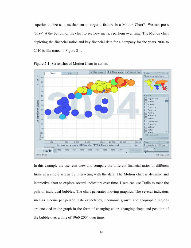
12
superior to size as a mechanism to target a feature in a Motion Chart? We can press
"Play" at the bottom of the chart to see how metrics perform over time. The Motion chart
depicting the financial ratios and key financial data for a company for the years 2004 to
2010 is illustrated in Figure 2-1.
Figure 2-1: Screenshot of Motion Chart in action.
In this example the user can view and compare the different financial ratios of different
firms at a single screen by interacting with the data. The Motion chart is dynamic and
interactive chart to explore several indicators over time. Users can use Trails to trace the
path of individual bubbles. The chart generates moving graphics. The several indicators
such as Income per person, Life expectancy, Economic growth and geographic regions
are encoded in the graph in the form of changing color, changing shape and position of
the bubble over a time of 1960-2004 over time.
13
2.2 Dense Graphics
Dense graph can plot millions of records in small screen space. In today’s world of
pervasive and mobile computing, there is a growing demand for Mobile Business
Analytics. The display area available in such smart phone and mobile PC is small. For
small screen space, graph excellence for high volume of data can be achieved with
creating dense graphics. Dense graphs for Business Analytics will continue to grow in
demand. Dense graph are graph that can maximize data density of graphics (Tufte 1990).
Dense graph would mean graph than can accommodate large set of data points in a small
screen space. Data density has been defined with the following formulae.
Data density of graphic = Number of entries in data matrix
Area of data graphic
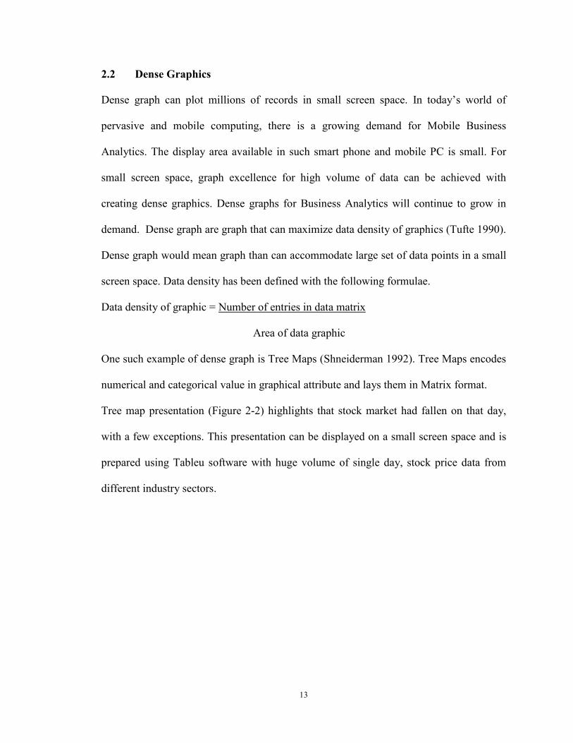
One such example of dense graph is Tree Maps (Shneiderman 1992). Tree Maps encodes
numerical and categorical value in graphical attribute and lays them in Matrix format.
Tree map presentation (Figure 2-2) highlights that stock market had fallen on that day,
with a few exceptions. This presentation can be displayed on a small screen space and is
prepared using Tableu software with huge volume of single day, stock price data from
different industry sectors.
14
Figure 2-2: Screenshot of Tree Map highlighting stock market had fallen on that day,
with a few exceptions
The combination of spatial presentations and color coding in Tree maps helps the user
gain an overview of the data. Using the traffic color light schema, red meant the stock
price for the particular groups of stocks in a particular industry had fallen for the day and
green meant the prices had increased for the day. The Tree map illustrates that stock
market had fallen on that day, with a few exceptions. The Tree map as shown in the
example above can help create situation awareness by presenting current status and alerts.
In the above example, the few exceptions are highlighted in green.
While tabular displays and spreadsheets can show 30-60 rows at a time on typical
displays, Tree maps can accommodate hundreds or thousands of items in a meaningfully
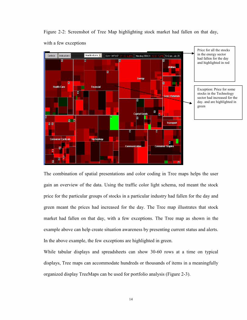
organized display TreeMaps can be used for portfolio analysis (Figure 2-3).
Exception: Price for some stocks in the Technology sector had increased for the day. and are highlighted in green
Price for all the stocks in the energy sector had fallen for the day and highlighted in red
15
Figure 2-3: Tree Map showing the Bombay Stock Exchange Performance
The guidelines proposed by Tufte (1997) are to arrange for decoding of data encoded in
the graph to take place at the perceptual level by making visual comparisons between
large datasets and make large datasets coherent. One particularly interesting way to create
dense graphics is through what Tufte calls micro/macro readings. These are graphics that
convey one layer of information on a micro (zoomed in) scale and another layer on a
macro (zoomed out) scale. In the Tree map above, by zooming on the green boxes users
can review the details of single or groups of stock. The viewer may glance from a
distance to observe an aggregate trend, and later peer in closely to examine individual
pieces of that trend. In the tree map the users can look at the exceptions highlighted in
green at the macro level and then zoom in on the individual stocks to get information
about the stocks at the micro level. The size of the blocks shows the market share
valuation of the particular segment, for example healthcare.

16
2.3 Interactive graph
Computer graph are often interactive and interactivity is known to facilitate performance
(Narayanan and Hegarty 1998). Interactive task can be overview, zoom, filter, details-on-
demand, relate, history, and extract (Shneiderman 1996) or dynamic projections,
interactive distortion, interactive linking and brushing (Keim 2002). Interaction types can
be transformable (decision makers can manipulate how the representation is rendered,
such as zooming, panning or resizing), or manipulable (decision makers may control
parameters during the process of image generation, i.e. filtering, visually encoding the
variables). Gonzalez and Kasper (1997) proposed a framework where four properties of
animation were identified: image abstraction (change of image from more realistic to
abstract representation), transition (movement of image: gradually or abruptly, or by
dissolving, fading, etc.), alteration (texturing, coloration, etc.), and interactivity
(manipulation, navigation). It was found in their study that decision quality was enhanced
by parallel navigation technique as compared to sequential navigation technique in
interacting with graph (Gonzalez and Kasper 1997). In a study by Tversky, Morrison, and
Betrancourt (2002), the results indicate that if learners are in control of the speed of
animation and can view and review, stop and start, zoom in and out, and change
orientation of parts and wholes of the animation at will, then learner performance is
enhanced. The results of the study suggests that if graph are both dynamic and
interactive then it can aid the decision maker better (Tversky, Morrison et al. 2002).
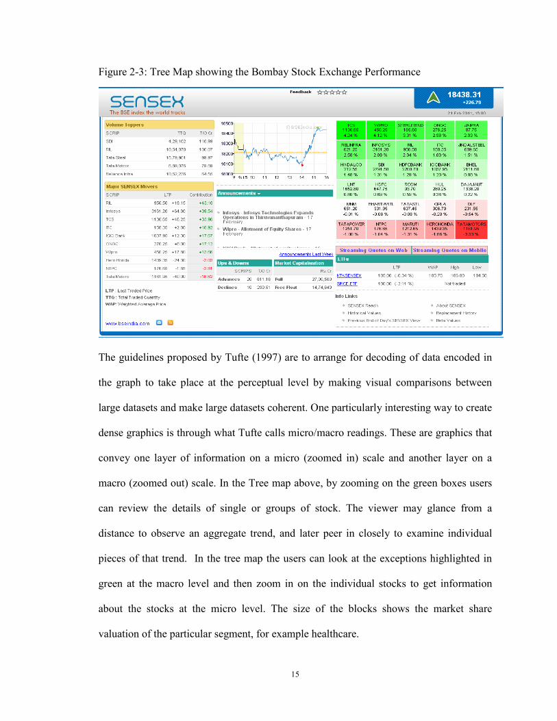
Example of such interactive graph is illustrated in Error! Reference source not found..
17
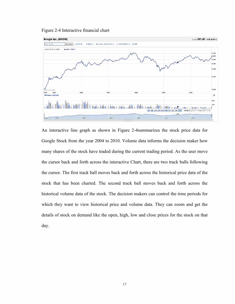
Figure 2-4 Interactive financial chart
An interactive line graph as shown in Figure 2-4summarizes the stock price data for
Google Stock from the year 2004 to 2010. Volume data informs the decision maker how
many shares of the stock have traded during the current trading period. As the user move
the cursor back and forth across the interactive Chart, there are two track balls following
the cursor. The first track ball moves back and forth across the historical price data of the
stock that has been charted. The second track ball moves back and forth across the
historical volume data of the stock. The decision makers can control the time periods for
which they want to view historical price and volume data. They can zoom and get the
details of stock on demand like the open, high, low and close prices for the stock on that
day.
18
3 Chapter Three: Presentation format and decision making: a review of
literature.
The objective of the study is to focus on the interface components of DSS. Several
seminal laboratory based experiments that examined, the influence of information
presentation format on quality, process and outcome of decision making was identified
from the leading journals in Information systems and Accounting. Our literature search
follows the recommended four-step process (Vom Brocke, Simons et al. 2009): First,
using the MIS Journal Ranking (AIS 2010), we select six of the most popular IS journals
and other Accounting journals (Webster and Watson 2002). The journals selected were
Information Systems Research , Journal of Information Systems, Management Science,
MIS Quarterly, Decision Support Systems, Communications of the ACM, Accounting
Organizations and Society, Accounting Review, Behavioral Research in Accounting,
Accounting, Behavior and Organizations Conference, Journal of Accounting and Public
Policy, Accounting Education, Journal of Management and Journal of Emerging
Technologies in Accounting. Second, we use EBSCO host, Google scholar, Science
Direct, and Wiley Inter Science to access the journals. Third, using the keywords "
Decision making” and the terms "presentation format, decision aid, decision making,
visualization" we got several papers. Fourth, doing a backward and forward search, we
end up with 50 relevant publications. The key findings from 50 such research papers are
synthesized below. Based on the key findings and existing theories on visual perception;
we develop initial research based design guidelines for new-generation Visualization
tools. We also develop a research framework to study the effect of interface
19
components of DSS such as new-generation Visualization tools and other factors on
decision outcome, as part of future research in directions in chapter six.
3.1 Key Findings from the literature
3.1.1 Effect of Presentation Format on Decision Performance
Several seminal studies have studied the effect of presentation format in organizing data,
mitigating biases, accuracy and time taken to make decisions.
Roscoe and Horwoth (2009) studied the effect charting techniques on investment
performance. The results suggested that charting techniques may help decision
techniques to organize data but may not help decision makers to an optimal or correct
situation. Hutchinson et al.(2010) studied the effect of graphs to mitigate biases in multi-
attribute budget allocation decisions. Results suggested that graph were not effective in
mitigating biases. Vivien A. Beattie and Michael John Jones (1993) compared the
effects of visual and numerical presentations of financial information as well as
demonstrated an effective alternative method of accounting education and training. The
experimental studies suggested that graphs were more effective than numerical
presentation. Schulz and Booth (2009) studied accuracy of subjects’ sales account
balance prediction as well as subjects’ confidence in their account balance prediction.
They inferred that when actual normative value was used to measure prediction accuracy,
subjects receiving graphs arrived at a more accurate prediction of the future sales balance
account than by those receiving tables. The time taken by subjects receiving graphs to
complete the tasks was shorter than those receiving tables.
20
3.1.2 Effect of presentation format of tagged data and web syndication on decision
performance
One source of knowledge to support decision making can be a document. If the document
is tagged with Meta data then the tagged data can help in improving decision
performance. Arnold et al. (2009)studied the effect of reports with information in XBRL
format using tagged data on judgment performance. It was found that investors using the
XBRL format spend less time viewing risk information than those using a standard text
display format. Investors with XBRL format assessed risk and predicted stock price for a
potential investment better than investors with standard text display format.
Hodge et al. (2004) studied the effect of tagged data and XBRL-enhanced search engine
on decision performance. They found out that decision makers who use XBRL enhanced
decision engine are more aware as they are likely to acquire footnote information and use
it in making investment decisions.
Web syndication technology helps the contents from one website to be available to other
people with a summary of the latest update. It could also mean to license website contents
so that other websites can use it. Cong et al. (2008) studied the effect of web syndication
technology on investment decisions. They found that individuals who use information
presented in the form of web feeds are more effective in making decisions than
individuals who do not use such technology. The results suggests that presenting
information as web feeds by acquiring current information frequently and integrating
information available from different sites can improve investment decision making
performance.
21
3.1.3 Effect of presentation format and individual differences on decision
performance
Carey and White (1991) studied the influence of Problem Representations (tables vs. line
charts), Graph-Reading Ability, and Forecasting Ability on decision performance for a
Time series prediction task. The results indicate that in terms of absolute errors, the better
decision performance with the graphical response was significant. The study also found
that there was no relationship between Graph-Reading Ability and Forecasting Ability
with either numeric or graphic response.
Vera-Munoz et al. (2001) found that experienced managers are better able to determine
relevant information than are less experienced managers when information is presented
inappropriately. Speier and Morris (2003) found that high spatial ability participants
using an interactive visual query interface had higher judgment accuracy than low spatial
ability decision makers.
Cardinaels (2008) found that more knowledgeable participants are more accurate when
using table and they spend more time in information search with tables. Less
knowledgeable participants are more accurate using graphs. Dilla et al.(2011) found that
nonprofessional investors relatively spend more time viewing graphs on a simulated
investor relations web site with text and graphical displays than professional investors.
Their results suggested that the nonprofessional investors found that graphical
information was easier to use.
22
3.1.4 Effect of presentation format and task/environment complexity on decision
performance
A study by Remus (1984) revealed that in the task of production scheduling , tabular
format is a better decision making aid in environments of low complexity as it reduces
the erratic component of a decision maker . In intermediate complexity environments, the
graphical format is a better decision making aid.
A study by Cheri Speier and Michael G. Morris (2003) compared the use of visual and
text-based interfaces on decision performance (subjective mental workload, decision
accuracy and decision time) for both low and high complexity task. The results of their
study concluded that when task complexity was low decision maker performed more
accurately using the text-based interface, and when task complexity was high, decision
makers using the visual interface performed better. When using the visual interface, the
decision makers’ subjective mental work-load was significantly lower, regardless of task
complexity. When task complexity was low decision maker took less time using the
visual interface but when task complexity was high decision maker took more time using
the visual interface.
In a study by Peng et al. (2007) it was found that presentation format; using drill-down
(OLAP) functionality with multi-dimensional hierarchical display of sales and
advertising expense; may only be effective in improving decision performance for less
complex tasks.
3.1.5 Effect of presentation format with task interruption on decision performance
A study by Speier et all (1997) concluded that when interruptions were experienced,
graphical displays improved decision-making performance for complex tasks.
23
Interruptions consisted of four simple information acquisition tasks, which occurred
during each of the four experimental tasks. Task types stated in the study were spatial,
symbolic, and both simple and complex. The results of the study indicated that
interruptions facilitated decision making when the decision maker concentrated he/she
concentrated on a simple task and inhibited performance when concentrating on a
complex task. Increased interruption frequency inhibited decision
performance. Decision-making efficiency decreased when the information content
between the primary task and interruption was highly dissimilar.
3.1.6 Effect of presentation format on memory and decision performance
Study by Schmell and Umanath (1994) measured immediate and delayed Recall in terms
of Directional recall(rank order), Pattern recall and Simple fact recall. The results of the
study indicated that for simple task, recall between the decision makers were indifferent
towards presentation format. Pattern recall by decision makers were better when they
used graphs. Graphs not only helped in integrating data but also provided underlying data
which was good for perceptual problem solving in the area of Integration of multi
attribute data for bankruptcy prediction. Volmer (1992) studied the influence of Problem
Representations (tables vs. line charts) , on decision performance for Financial ratios
analysis. The results indicated that the visual information made it possible to pass quicker
judgment on the financial position. They found that there was a positive correlation
between the final result and strength of the memory when visual information was given,
but there was none or little correlation in case of numerical information.
24
3.1.7 Effect of presentation format on compensatory choices under uncertainty
Compensatory choices are rational decisions that involve selecting the option with the
best value. It was observed by Dilla and Steinbart (2005) that under uncertainty, with the
simple information display style effect with tables, the subjects made fewer
compensatory choices, more maximin choices, and selected dominated alternatives.
Whereas with the simple information display style effect with graph the subjects made
more compensatory choices with midpoint-variability than with min-max graphs. .
Participants who received information in graphical format gave fewer dominated
alternatives as compared to participants who received information in tabular format.
3.1.8 Effect of presentation format and task type (spatial vs. symbolic) on decision
performance
Vessey and Galletta (1991) studied influence of problem representations (in form of
tables vs. line charts) and order of problem representation on decision performance for a
bookkeeping task. The results suggested that matching both the problem representation
and the task had a greater effect on performance than matching only problem
representation or task. The results showed the characteristics of the mental
representations decision makers formulated were more frequently based on the problem
representation than on the task. The result of the study suggested that the subjects’ chose
tables to respond to symbolic tasks than to spatial tasks.(Vessey 1991).
3.1.9 Effect of presentation format, time constraint, color and individual
differences on decision performance
Benbasat and Dexter (1985) studied the effect of graph, color and individual differences
(field dependence/Independence) on tasks where the individual has to isolate or
25
differentiate patterns from a complex field and disassembled parts from the whole. The
results indicated that in terms of decision quality (DQ), decision time and user perception
of IS attributes; color is better for graph than tabular display. Also they found that
decision quality was superior for field dependent individuals with color enhanced reports.
In a continuing study, Benbasat and Dexter (1986) examined the joint effect of time and
color and information presentation format (Tabular, graphical, combination) on decision
quality and time. They examined the influence for different task settings (Retrieval,
Communication of facts, Comparison of alternatives, Trend analysis, Recognition and
recall, Problem finding, Problem comprehension, Problem solving). The results of the
study suggested that under low time constraints (15 min), Tabular display resulted in
accurate decision making. Combined display was superior in terms of decision quality.
Under high time constraint (5 mins) condition, color led to improved decision making
3.1.10 Effect of alternative forms of information presentation on evaluating
corporate performance
Jan Bell (1984) investigated whether alternative forms of information presentation
affected the use of information in evaluating corporate performance. The investigation
concluded that for Research and Development oriented companies, a non-numeric
presentation form (such as letter or video presentation to shareholders) for president’s
comments was more salient than a numeric presentation form. For production companies
there was no significant difference between the two forms of presenting supplementary
information.
26
3.1.11 Effect of maps vs. table on decision performance
Dennis and Carte (Dennis and Carte 1998) studied the influence of map-based vs.
tabular display on decision performance of Location selection decisions for different
type of tasks (geographic containment vs. adjacency). According to the results of the
study , subjects using the map-based presentation tend to use perceptual processes,
irrespective of tasks. Decision makers using the map based presentations made fewer
correct decisions for geographic containment task and more correct decisions for the
geographic adjacency task. As per the results of the study, subjects using the map-based
presentations were faster in making decision for both tasks, with greater variances for
containment task.
3.1.12 Effect of novel presentation format and task type on decision performance
3.1.12.1 Effect of Virtual Reality Environment on decision performance
Nelson et al.(1999) found that participants using an immersive virtual reality (VR)
were more accurate at detecting clusters and radial sparseness than those using an
interactive two-dimensional visualization tool. Selection of data through a brushing
technique took longer time than immersive VR. The results suggested that VR
environment may be helpful to the decision maker when working with complex data sets.
3.1.12.2 Effect of 2D vs. 3D scatter plot and block model display, data type on
decision performance.
Lee, MacLachlan et al.(1986) studied the influence of information representations (2D vs.
3D scatter plot and Block model display) with Continuous data and discrete data on
decision performance. The results from their study indicated that 3D had a positive effect
on speed and time, unlike block model as it provided visualization of the data. In terms of
27
decision performance: for continuous data, 3D display was better whereas for non-
continuous data 3D, block model or tabular data was equally good. Arnold et al. (Arnold,
Bedard et al. 2009) studied the effect of reports with information in XBRL format using
tagged data on judgment performance. It was found that investors using the XBRL format
spend less time viewing risk information than those using a standard text display format
with more. Investors with XBRL format assessed risk and predicted stock price for a
potential investment better than investors with standard text display format.
3.1.12.3 Effect of 2D, 3D vs. Rotatable 3d display on decision performance
Dull and Tegarden (Dull and Tegarden 1999) studied the influence of information
representations (2D, 3D vs. rotatable 3D) on decision performance for wealth prediction.
The result of the study on standardized wealth accuracy implied that as the
dimensionality of the representation increased i.e. 2D to 3D to rotatable 3D, the accuracy
of decision also increased. In this study, the results implied that static visual
representations results in faster decision making than dynamic visual representations.
Also the combined time and accuracy results suggested that the static 3D (R2) visual
representations may be better than the static 2D (R1) or 3D rotatable (R3) visual
representations.
3.1.12.4 Effect of 2D, 3D display and data complexity on decision performance
Kumar and Benbasat (2004) study the influence of information representation (2D, 3D
graph) and Data complexity (data set with 8 or 25 data points ) on decision performance
for Task type (advanced and simple tasks that require extraction and comprehension).
The results indicated that 3D graph is superior than 2D for both advance and elementary
task with more than two variables.
28
Amer (1991) studied the influence of Problem Representations (bar graphs, polygon
displays vs. Chernoff faces) on decision performance for an Integrative task (bond ratings
determination) and Selective task (bank debt monitoring). The summarized statistics for
selective covenant debt task indicates that the rank order of display with respect to
decision accuracy rates is: numerical = bar > polygon > face. The rank order of the
displays with respect to subjects’ decision times is: numerical < polygon < bar < face.
The rank order of the displays with respect to perceptions of ease of use and decision
confidence is: numerical = bar > polygon > face.
Umanath and Vessey (1994) studied the influence of problem representations
(Schematics faces Vs. graph vs. table) and information load (nominal vs. increased load)
on decision performance for bankruptcy prediction; which involves integrating multi-
attribute data. They found out that graph helped not only in integrating data but also
provided an underlying data and were good for perceptual problem solving. They found
that Chernoff did not provide an underlying data for judgment. The results indicated that
the schematic faces would result in faster decision making than graphs but there was no
difference in time as compared with tables. Consistent with previous findings, accuracy at
nominal information load was lower for graph than at higher information load. Also, the
prediction time for tables would be significantly higher at increased information load.
3.1.13 Effect of presentation format, Cathode Ray Tube (CRT) versus hard copy
terminal and heuristic versus analytical decision makers on decision performance.
Lucas (1981) presented the results of an experiment designed to investigate the impact of
computer-based graphics on decision making. For conducting the experiment
performance on stimulated problems, self-reports of information usefulness, test of
29
problem understanding was used in conjunction with graphical output and tabular output.
Comparing Cathode Ray Tube (CRT) versus Hard Copy Terminal (HCT), the results
showed that the decision maker using hard copy reports had superior performance and
better test scores on inventory understanding. Evidence suggested that decision makers
using graphs developed a better understanding of the problem as compared to decision
makers using tables. For Graphical and Tabular Versus Tabular on the CRT, the group
receiving both graphics and tabular information reported greater usefulness for the
simulation output as compared to the group that received tabular alone. Analytical
decision makers using graphs had the highest test scores as compared to heuristic
decision makers .
Hodge (2001) compared investor judgments using static hard copy displays to those
using a hyperlinked online display. Participants who viewed online hyperlinked materials
were less accurate than those who viewed hard copy materials. Decision aid in the form
of an “Audited / Not Audited” label to online participants mitigated these effects.
3.1.14 Effect of decision guidance/decision aid on tasks
Montazemi, Wang et al. (1996) concluded that for complex task Informative Guidance
(IG) is better than suggestive guidance (SG) but in the case of less complex tasks,
suggestive guidance is better than informative guidance.
A study by Thomassin Singh (1998) regarding decision guidance (DG) on the efficiency
and effectiveness of Planned v/s Actual Strategy together with the inclusion of
unnecessary action and exclusion of necessary action concluded that decision
guidance (Strategy support and memory support) improves decision effectiveness and
efficiency. Vance Wilson & Zigurs (1999) also concluded that decision guidance was
30
welcomed by decision makers, if it did not limit their options while making decisions and
also did not effect their decision performance negatively.
Todd and Benbasat (1991; 1992; 1992) conducted experiments with the use verbal
protocol analysis to compare the extent of information used by aided and unaided
decision makers to support preferential choice problems. With the help of unique units of
information referenced, total units of information referenced and number of alternatives
analyzed in details they identified the problem size and decision aid required. According
to the result the number of unique units of information referenced was not different
between aided and unaided decision makers. The total number of information units
referenced did not differ between the aided and unaided group. There was no difference
in the number of alternatives examined in detail between the aided and unaided groups
for the experiments. There were no significant interactions between decision aid and
problem size for any of the information use measures.
3.1.15 Effect of graph and decision strategies on decision performance
Jarvenpaa (1989) studied the influence of Presentation format (Attribute bar chart,
alternative bar chart, a grouped bar chart) and decision strategies (linear strategy,
conjunctive strategy, majority of confirming, elimination by aspect) on decision
performance. The task was multi-attribute choice task where the users had to perform
information acquisition and information evaluation. They found that the presentation
format influences the selection of strategies for information acquisition and evaluation
based on cost benefit considerations. The study also found support for congruence notion:
i.e. match between task and display format; where congruence influences cognitive
processes and decision time but not decision quality. The study reported that the
31
acquisition of information was dependent on information presentation format and for
evaluation of information; the effect of graph was contingent on task demand.
3.1.16 Effect of decision-making incentives on decision performance
Todd and Benbasat (1999) developed an integrated model that explained the relationship
of DSS with decision strategy and decision performance from an effort-accuracy
perspective and incorporated the effects of decision-making incentives. The results
showed that as the level of support of for Additive Compensatory (AC) strategy increased
the proportion of independent evaluations and elimination operations decreased, and the
portions of compensatory statements and the total number of statements in the protocols
increased.
The study by Lauritzen and Nilsson (2001) provided a solution for decision problems
and strategies by local computation of single policy updates with limited information.
According to the results of pure strategies evaluated in the table, it showed that the
obtained LIMID strategies are indeed both local and global maximum.
3.1.17 Impact of desired accuracy on preferences for different presentation formats
The study by Tractinsky and Meyer (1999) aimed to assess people’s preferences for
different presentation formats as determined by their objectives and motivation. The main
purpose for their study was to evaluate the impact of choice of presentation format,
suitability of the presentation format to the situation as well as the format of the
presentation on response latency accuracy and decision quality. For the above purpose
three experiments were conducted and it was observed that while conducting the first two
experiments that there was no difference in the pattern of presentation preferences
between presentation for decision making by one and others. According to findings from
32
all the three experiments that were conducted, the presenters whose objective were to
impress others would have different presentation preferences than presenters whose
objectives was to present for optimal decision making. According to the last two
experiments it showed that there would be no effect of content desirability when the
presentation objective was optimal decision making. Another finding of the study was
that the presenters who tried to impress others would have different presentation
preferences, depending on the content desirability of their presentation.
3.1.18 Effect of video vs. text on decision performance
Elliot (2009) found that when the CEO’s firm was the only firm restating its financial
statements, participants viewing the restatement announcement online via video were
more confident in the firm’s future ability to meet analysts’ expectations and make larger
investments in the firm than were participants who view the restatement announcement
online via text. The effects of presentation format on decision were moderated by
participants' perceptions of the CEO's trustworthiness. A study by Lim and Benbasat et
al. (2000) studied the effect of information representation format (video vs. text-based)
on first impression bias for an appraisal task. The result from the study suggested that
subjects who used the multimedia system were able to reduce the influence of first
impression bias more than were those who used the text-based system. The subjects’
written justifications indicated that multimedia lowers the effect of first impression bias
by making information more vibrant and less ambiguous, thus making it difficult for the
decision maker to not pay attention to content or reinterpret in different ways.
A continuing study by Lim and Benbasat on presentation format (video vs. text based)
for Task type (analyzable vs. less analyzable) on Perceived equivocality and Perceived
33
Usefulness of information system (Lim and Benbasat 2000) The results of the study
indicated that for analyzable tasks, there would be no difference between the multimedia
and the text-based representation in terms of perceived equivocality. For less-analyzable
tasks, the multimedia representation, when compared to the text-based representation,
would lead to a lower level of perceived equivocality (ambiguity). Thus, consistent with
both the tasks, it suggested that only the video-based representation led to lower
perceived equivocality. The result on perceived usefulness states that the multimedia
representation would be perceived as more useful than the text-based representation.
Jiang and Benbasat (2007) studied the effects of information presentation format
(vividness and interactivity of product presentations) and its influence on customer
buying decisions. The results of the study indicated that design features of product
presentations influenced the consumers perceptions regarding efficacy of the
presentations, diagnosticity of websites, the compatibility between online shopping and
physical shopping experiences. Furthermore, Shopping enjoyment derived from a
particular online shopping experience jointly influenced consumers’ attitudes toward
shopping at a website; and both consumers’ attitudes toward products and their attitudes
toward shopping at a website contributed to their intentions to purchase the products
displayed on the website.
In another study by Jiang and Benbasat (2007)) examined the product presentation format
(static pictures, videos without narration, videos with narration, and virtual product
experience (VPE)) and its influence on decision performance in terms of consumers’
product understanding, actual product knowledge and perceived website diagnosticity.
The results of the study indicated that as compared to statics pictures, both videos and
34
VPE resulted in better perceived website diagnosticity. Under a moderate task complexity
condition, both VPE and videos lead to the same level of actual product knowledge.
Under a high task complexity condition, all four presentation formats lead to same actual
product knowledge. Consumers are more likely to revisit websites that are perceived
useful. It was found that Perceived website diagnosticity and not actual product
knowledge prompted the perceived usefulness of websites.
Wheeler and Arunachalam (2008) studied the effect of information presented using text
or video only and both text and video environment on judgment performance in familiar
(general knowledge) and unfamiliar (accounting) tasks,. Results suggested that the text
and video environment appeared to decrease task understanding. Thus, decision makers
were more willing to apply externally provided decision weights when using multimedia
for both task types.
Based on the findings of the literature analysis, we synthesize the following initial design
guidelines for new-generation Visualization tools in table below.
Table 3-1: Research Based Guidelines for Design and use of Visualization Tools
1. Visualization should match task type 2. Visualization tools should also match data type 3. The impact of visualization tool on decision performance is moderated by task
complexity/demand. 4. Visualization should aid perceptual process and analytical process 5. Visualization should make use of color to aid decision makers under time
constraints. 6. Visualization should match organization type 7. Visualization influences the selection of strategies for decision making 8. Visualization could make use of guidance to aid decision makers 9. Online reporting format is not always better than hard copy printed reporting
format. 10. Visualizations of XBRL tagged reports can help decision makers make more
informed decisions 11. Visualization should be appealing and engaging

35
The findings of this review have been used to set up an empirical study to how do
information visualization techniques such as Sparklines influence decision-making
performance.
36
4 Chapter Four: Review of theory frameworks used in visualization research
There are several theories that have been used in the several research articles that study
presentation format and its effect on decision support. Review of such theory can help in
developing research hypothesis for current and future research studies related to this
field. Several such theories are identified and reviewed in brief below.
4.1 Distributed cognition theory (Zhang and Norman 1994; Hollan, Hutchins et
al. 2000; Zhang and Patel 2006)
This theory proposes external representations aids memory but also provides affordance
and structure cognitive behavior. A cognitive process can be distributed among an actor
and the environment, external representations (artifacts),among many actors that are co-
located in a shared physical space or not co-located(Hutchins and Norman 1988;
Hutchins 1995; Hollan, Hutchins et al. 2000) Internal representations - are in the mind,
as propositions, productions, schemas, mental images, connection and networks, or other
forms. External representations - are in the world. External representations can change
the nature of the task by building the connection between internal and external
representation. External representations can provide information that can be perceived
directly
4.2 Theory of Graph comprehension (Pinker 1990)
This theory describes the processes that a graph viewer undertakes while interpreting a
graph. It emphasized that relevant prior knowledge is an important part of facilitating
graph comprehension. According to Pinker’s information processing paradigm, graph
comprehension involves an interaction between bottom-up and top-down processes.
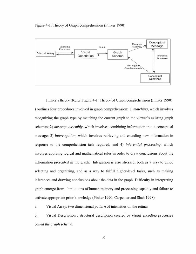
37
Figure 4-1: Theory of Graph comprehension (Pinker 1990)
Pinker’s theory (Refer Figure 4-1: Theory of Graph comprehension (Pinker 1990)
) outlines four procedures involved in graph comprehension: 1) matching, which involves
recognizing the graph type by matching the current graph to the viewer’s existing graph
schemas; 2) message assembly, which involves combining information into a conceptual
message; 3) interrogation, which involves retrieving and encoding new information in
response to the comprehension task required; and 4) inferential processing, which
involves applying logical and mathematical rules in order to draw conclusions about the
information presented in the graph. Integration is also stressed, both as a way to guide
selecting and organizing, and as a way to fulfill higher-level tasks, such as making
inferences and drawing conclusions about the data in the graph. Difficulty in interpreting
graph emerge from limitations of human memory and processing capacity and failure to
activate appropriate prior knowledge (Pinker 1990; Carpenter and Shah 1998).
a. Visual Array: two dimensional pattern of intensities on the retinas
b. Visual Description : structural description created by visual encoding processes
called the graph schema.
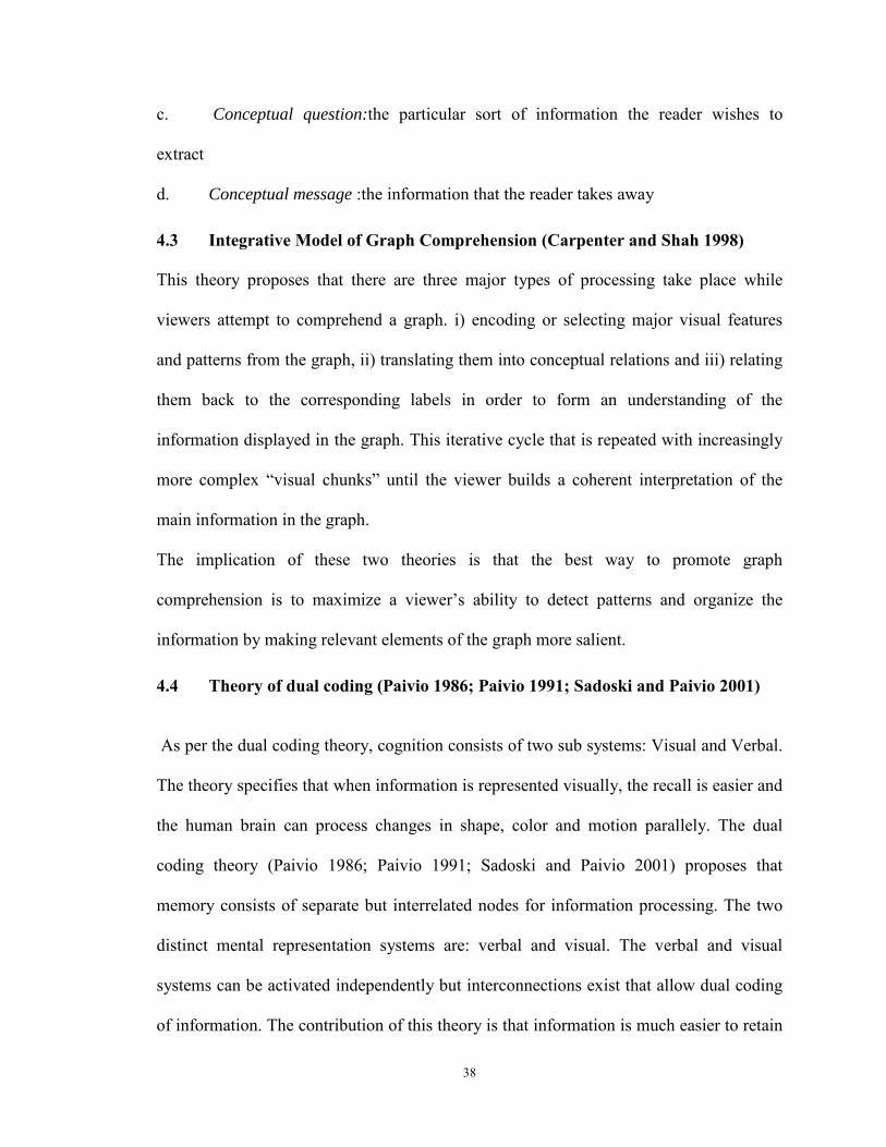
38
c. Conceptual question:the particular sort of information the reader wishes to
extract
d. Conceptual message :the information that the reader takes away
4.3 Integrative Model of Graph Comprehension (Carpenter and Shah 1998)
This theory proposes that there are three major types of processing take place while
viewers attempt to comprehend a graph. i) encoding or selecting major visual features
and patterns from the graph, ii) translating them into conceptual relations and iii) relating
them back to the corresponding labels in order to form an understanding of the
information displayed in the graph. This iterative cycle that is repeated with increasingly
more complex “visual chunks” until the viewer builds a coherent interpretation of the
main information in the graph.
The implication of these two theories is that the best way to promote graph
comprehension is to maximize a viewer’s ability to detect patterns and organize the
information by making relevant elements of the graph more salient.
4.4 Theory of dual coding (Paivio 1986; Paivio 1991; Sadoski and Paivio 2001)
As per the dual coding theory, cognition consists of two sub systems: Visual and Verbal.
The theory specifies that when information is represented visually, the recall is easier and
the human brain can process changes in shape, color and motion parallely. The dual
coding theory (Paivio 1986; Paivio 1991; Sadoski and Paivio 2001) proposes that
memory consists of separate but interrelated nodes for information processing. The two
distinct mental representation systems are: verbal and visual. The verbal and visual
systems can be activated independently but interconnections exist that allow dual coding
of information. The contribution of this theory is that information is much easier to retain
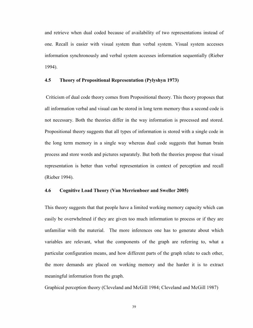
39
and retrieve when dual coded because of availability of two representations instead of
one. Recall is easier with visual system than verbal system. Visual system accesses
information synchronously and verbal system accesses information sequentially (Rieber
1994).
4.5 Theory of Propositional Representation (Pylyshyn 1973)
Criticism of dual code theory comes from Propositional theory. This theory proposes that
all information verbal and visual can be stored in long term memory thus a second code is
not necessary. Both the theories differ in the way information is processed and stored.
Propositional theory suggests that all types of information is stored with a single code in
the long term memory in a single way whereas dual code suggests that human brain
process and store words and pictures separately. But both the theories propose that visual
representation is better than verbal representation in context of perception and recall
(Rieber 1994).
4.6 Cognitive Load Theory (Van Merrienboer and Sweller 2005)
This theory suggests that that people have a limited working memory capacity which can
easily be overwhelmed if they are given too much information to process or if they are
unfamiliar with the material. The more inferences one has to generate about which
variables are relevant, what the components of the graph are referring to, what a
particular configuration means, and how different parts of the graph relate to each other,
the more demands are placed on working memory and the harder it is to extract
meaningful information from the graph.
Graphical perception theory (Cleveland and McGill 1984; Cleveland and McGill 1987)
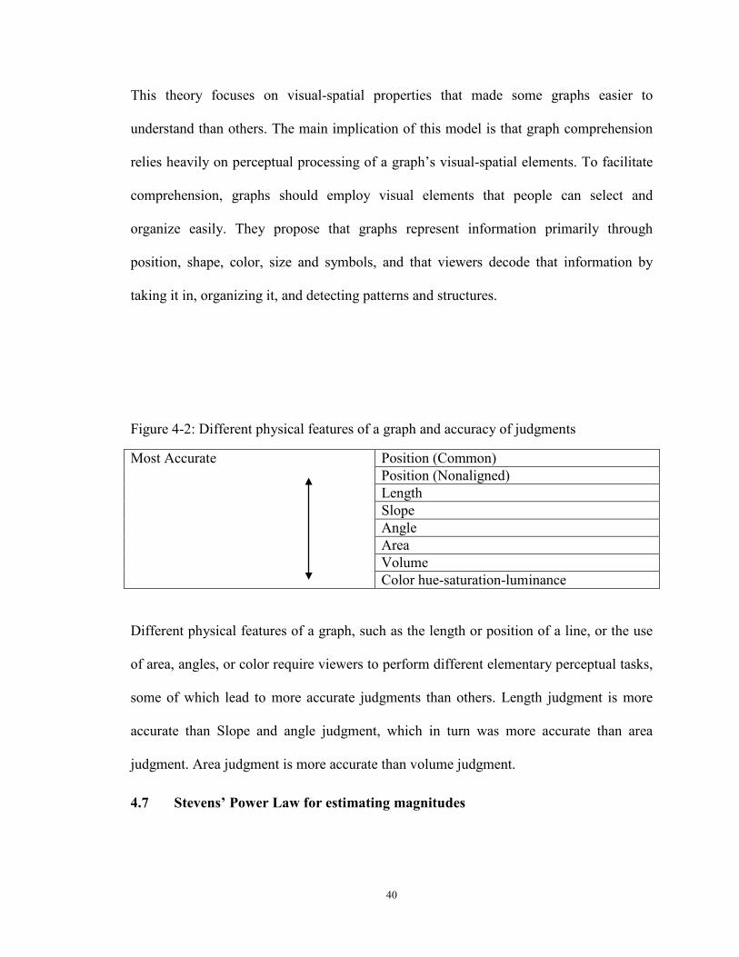
40
This theory focuses on visual-spatial properties that made some graphs easier to
understand than others. The main implication of this model is that graph comprehension
relies heavily on perceptual processing of a graph’s visual-spatial elements. To facilitate
comprehension, graphs should employ visual elements that people can select and
organize easily. They propose that graphs represent information primarily through
position, shape, color, size and symbols, and that viewers decode that information by
taking it in, organizing it, and detecting patterns and structures.
Figure 4-2: Different physical features of a graph and accuracy of judgments
Most Accurate
Position (Common) Position (Nonaligned) Length Slope Angle Area Volume Color hue-saturation-luminance
Different physical features of a graph, such as the length or position of a line, or the use
of area, angles, or color require viewers to perform different elementary perceptual tasks,
some of which lead to more accurate judgments than others. Length judgment is more
accurate than Slope and angle judgment, which in turn was more accurate than area
judgment. Area judgment is more accurate than volume judgment.
4.7 Stevens’ Power Law for estimating magnitudes
41
This theory states that when values are presented as area or volumes, perceptions of the
decision makers are affected by shape. Decicion makers as per this law, underestimate
large values relative to small ones and overestimate small values relative to large ones
Figure 4-3: Stevens’ Power Law for estimating magnitudes in area map
In the figure above (Figure 4-4), it appears that Florida is larger than Georgia, but in
reality, it is slightly smaller. Perceptually it was easier for users of this map to
overestimate the smaller one (Florida) and underestimate the larger one (Georgia).
4.8 Computational model of graphical perception (Lohse 1993; Lohse 1997)
This proposed that graph viewers first detect and encode visual primitives such as shape,
color, and length and then build a visual description from localized scanning and
rescanning of the graph. They then match this description to a graph schema in long-term
memory which contains rules and procedures about where and what to look for when
retrieving information.
4.9 Weber's Law of Just Noticeable Differences (Weber, Ross et al. 1996)
The 19th century experimental psychologist states that the Difference Threshold (or
"Just Noticeable Difference") is the minimum amount by which stimulus intensity must
be changed in order to produce a noticeable variation in sensory experience (Weber, Ross
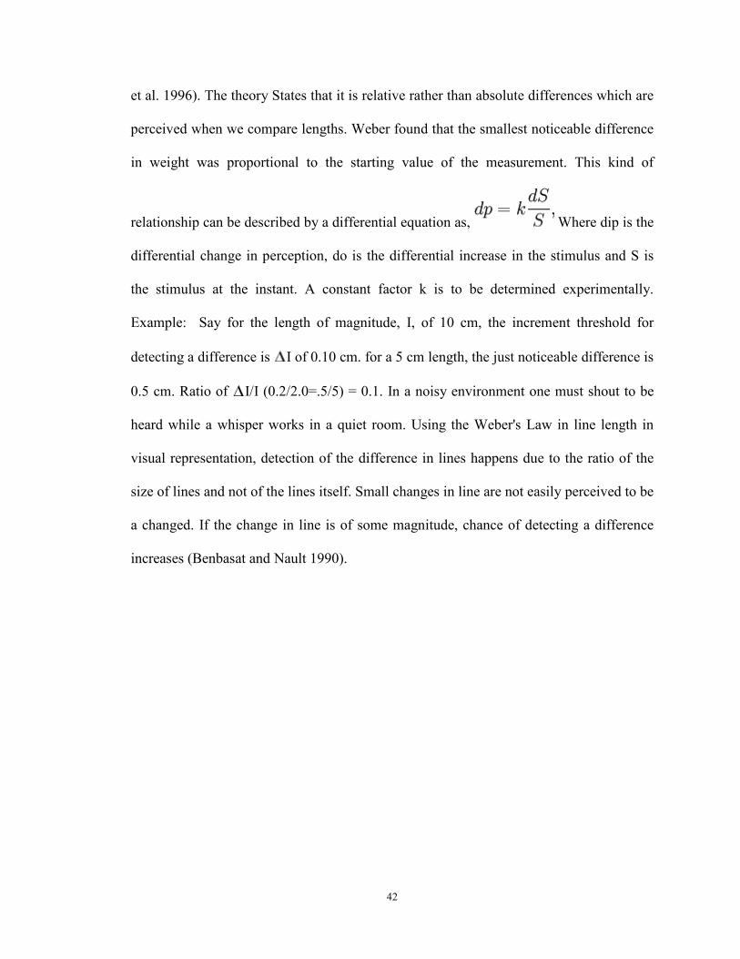
42
et al. 1996). The theory States that it is relative rather than absolute differences which are
perceived when we compare lengths. Weber found that the smallest noticeable difference
in weight was proportional to the starting value of the measurement. This kind of
relationship can be described by a differential equation as, Where dip is the
differential change in perception, do is the differential increase in the stimulus and S is
the stimulus at the instant. A constant factor k is to be determined experimentally.
Example: Say for the length of magnitude, I, of 10 cm, the increment threshold for
detecting a difference is I of 0.10 cm. for a 5 cm length, the just noticeable difference is
0.5 cm. Ratio of I/I (0.2/2.0=.5/5) = 0.1. In a noisy environment one must shout to be
heard while a whisper works in a quiet room. Using the Weber's Law in line length in
visual representation, detection of the difference in lines happens due to the ratio of the
size of lines and not of the lines itself. Small changes in line are not easily perceived to be
a changed. If the change in line is of some magnitude, chance of detecting a difference
increases (Benbasat and Nault 1990).
43
5 Chapter Five: Research Framework
5.1 Importance of reporting format
Format in which data are presented to decision makers is critical to provide information
for making decision (DeSanctis 1984; Sharda, Barr et al. 1988). Importance of study on
visualization tools and its effectiveness in disseminating financial information in the
accounting context; to aid decision making; stems from a) progression of annual reports
and other financial reports from the traditional hard copy to digital format (Dull and
Tegarden 1999) and b) increasing need of the decision makers in the knowledge
economy to have access to real time access to information and c) increasing use of
business intelligence software for reporting purposes. According to FASB Statement of
Financial Accounting Concepts No.1, financial statements should provide information
beneficial to investors, creditors, analysts and other users in supporting their decision
(FASB 1978).
It is also important to study the use of visualization tools in developing digitized financial
reports because it is worried that management may be interested in manipulating the
graphic presentation (Beattie and Jones 1993; Beattie and Jones 1997). There are several
propositions for the development of professional guidelines or standards for use of
graphical presentation of financial data (CICA 1993).
This study is a continuation of a rich area of research on reporting format of financial
information and its influence on decision performance in the area of accounting and
information system. Subjects enrolled in finance and accounting courses prepare or study
business reports to compare and/or evaluate performance of different companies.
Investors, Creditors, Auditors, Management team and other Stakeholders of the company
44
also study such business reports to make decisions. Traditionally business reports are
presented with tables, line graph, bar graph and text. Past research on alternative
reporting methods has focused on Graph (Bar, Line, 2D, 3D, Rotatable 3D, Animated,
Interactive), Tables, Schematic faces (Chernoff faces), Polygon diagram, Business
animator.
The traditional reporting format has some limitations. Traditional reporting format has
been used with low volume of data that are easily comprehensible in tables or graph. In
the digital environment, as information becomes ubiquitous, getting managers' attention
and helping them find and focus on the most relevant data becomes increasingly
difficult(Davenport and Beck 2001). The mobile knowledge workers need access to real-
time opportune and appropriate information to make decisions. Mobile knowledge
workers need access to high volume of data in small screen space like smart phones.
There have been several calls on research or the study of visualization tools. Research
examining information visualization largely focuses on the construction of visualization
techniques and has not focused on the evaluation of these techniques (Carey and White
1991) Empirical studies that assess the effectiveness of visualization techniques are
needed (Mirel 1998). Research is needed to study the behavioral factors associated with
how the visualization tools are used on an everyday basis (Dillon 2000). Visualization
tools may enable improvements in decisions, but if used ineffectively may also lead to
negative cognitions and outcomes such as overwhelm decision makers, leading to
information overload. Accounting literature has emphasized the need for studying the
role of presentation format in the efficiency and effectiveness of decision-makers’
decision quality in order to provide empirical evidence on the effect of presentation
45
format on decision quality (Debreceny and Gray 2001; Abdolmohammadi, Harris et al.
2002). To address this gap in the literature, the research questions guiding this research
related to digital financial reporting are as follows:
1. Does an information visualization technique such as Sparklines improve decision-
making performance?
2. Does an information visualization technique such as Sparklines improve decision-
making experience?
3. Does an information visualization technique such as Sparklines have an impact on
decision-making effort?
4. Does an information visualization technique such as Sparklines have an impact on
reducing dilution effect from non relevant data in financial reports?
5. Does an information visualization technique such as Sparklines have an impact on
reducing recency bias in using digital financial reports?
The research model developed and applied in this study is presented in Figure 5-1.The
figure illustrates that Sparklines with visual proximity of graph and text in digital
financial reports enhances decision making performance, decision making experience and
reduces decision making effort. In addition, Sparklines can reduce decision effort; reduce
dilution effect from non-diagnostic information and in mitigation of recency bias. These
assertions and the corresponding hypothesis are developed below.
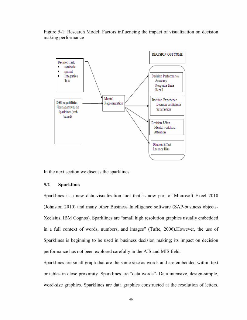
46
Figure 5-1: Research Model: Factors influencing the impact of visualization on decision making performance
In the next section we discuss the sparklines.
5.2 Sparklines
Sparklines is a new data visualization tool that is now part of Microsoft Excel 2010
(Johnston 2010) and many other Business Intelligence software (SAP-business objects-
Xcelsius, IBM Cognos). Sparklines are “small high resolution graphics usually embedded
in a full context of words, numbers, and images” (Tufte, 2006).However, the use of
Sparklines is beginning to be used in business decision making; its impact on decision
performance has not been explored carefully in the AIS and MIS field.
Sparklines are small graph that are the same size as words and are embedded within text
or tables in close proximity. Sparklines are “data words”- Data intensive, design-simple,
word-size graphics. Sparklines are data graphics constructed at the resolution of letters.
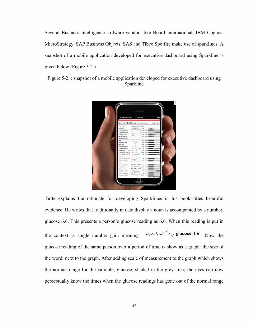
47
Several Business Intelligence software vendors like Board International, IBM Cognos,
MicroStrategy, SAP Business Objects, SAS and Tibco Spotfire make use of sparklines. A
snapshot of a mobile application developed for executive dashboard using Sparkline is
given below (Figure 5-2.)
Figure 5-2: : snapshot of a mobile application developed for executive dashboard using Sparkline
Tufte explains the rationale for developing Sparklines in his book titles beautiful
evidence. He writes that traditionally in data display a noun is accompanied by a number,
glucose 6.6. This presents a person’s glucose reading as 6.6. When this reading is put in
the context, a single number gain meaning .Now the
glucose reading of the same person over a period of time is show as a graph ;the size of
the word; next to the graph. After adding scale of measurement to the graph which shows
the normal range for the variable, glucose, shaded in the grey area; the eyes can now
perceptually know the times when the glucose readings has gone out of the normal range
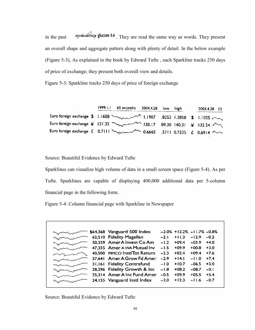
48
in the past . They are read the same way as words. They present
an overall shape and aggregate pattern along with plenty of detail. In the below example
(Figure 5-3), As explained in the book by Edward Tufte , each Sparkline tracks 250 days
of price of exchange; they present both overall view and details.
Figure 5-3: Sparkline tracks 250 days of price of foreign exchange
Source: Beautiful Evidence by Edward Tufte Sparklines can visualize high volume of data in a small screen space (Figure 5-4). As per
Tufte. Sparklines are capable of displaying 400,000 additional data per 5-column
financial page in the following form.
Figure 5-4: Column financial page with Sparkline in Newspaper
Source: Beautiful Evidence by Edward Tufte
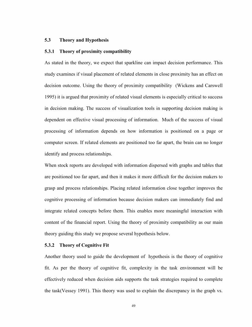
49
5.3 Theory and Hypothesis
5.3.1 Theory of proximity compatibility
As stated in the theory, we expect that sparkline can impact decision performance. This
study examines if visual placement of related elements in close proximity has an effect on
decision outcome. Using the theory of proximity compatibility (Wickens and Carswell
1995) it is argued that proximity of related visual elements is especially critical to success
in decision making. The success of visualization tools in supporting decision making is
dependent on effective visual processing of information. Much of the success of visual
processing of information depends on how information is positioned on a page or
computer screen. If related elements are positioned too far apart, the brain can no longer
identify and process relationships.
When stock reports are developed with information dispersed with graphs and tables that
are positioned too far apart, and then it makes it more difficult for the decision makers to
grasp and process relationships. Placing related information close together improves the
cognitive processing of information because decision makers can immediately find and
integrate related concepts before them. This enables more meaningful interaction with
content of the financial report. Using the theory of proximity compatibility as our main
theory guiding this study we propose several hypothesis below.
5.3.2 Theory of Cognitive Fit
Another theory used to guide the development of hypothesis is the theory of cognitive
fit. As per the theory of cognitive fit, complexity in the task environment will be
effectively reduced when decision aids supports the task strategies required to complete
the task(Vessey 1991). This theory was used to explain the discrepancy in the graph vs.
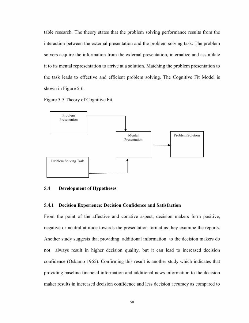
50
table research. The theory states that the problem solving performance results from the
interaction between the external presentation and the problem solving task. The problem
solvers acquire the information from the external presentation, internalize and assimilate
it to its mental representation to arrive at a solution. Matching the problem presentation to
the task leads to effective and efficient problem solving. The Cognitive Fit Model is
shown in Figure 5-6.
Figure 5-5 Theory of Cognitive Fit
5.4 Development of Hypotheses
5.4.1 Decision Experience: Decision Confidence and Satisfaction
From the point of the affective and conative aspect, decision makers form positive,
negative or neutral attitude towards the presentation format as they examine the reports.
Another study suggests that providing additional information to the decision makers do
not always result in higher decision quality, but it can lead to increased decision
confidence (Oskamp 1965). Confirming this result is another study which indicates that
providing baseline financial information and additional news information to the decision
maker results in increased decision confidence and less decision accuracy as compared to
Problem Presentation
Mental Presentation
Problem Solution
Problem Solving Task
51
providing just the baseline financial information (Davis, Lohse et al. 1994). There are
studies that demonstrate a significant difference in decision confidence due to
presentation format (Amer 1991; Anderson and Mueller 2005). Contradicting these
results there are some studies that find no significant difference in decision confidence
due to presentation format (DeSanctis and Jarvenpaa 1989; Lim, Benbasat et al. 2000;
Schulz and Booth 2009). The research hypothesis that we propose is
H1a Compared to traditional stock report, decision makers using stock report with
Sparklines will have greater decision confidence
H1b Compared to traditional stock report, decision makers using stock report with
Sparklines will have greater decision satisfaction
5.4.2 Decision effort: Cognitive load and Attention
Visualization must organize and explain information, relate views, provide knowledge
and engage decision makers. When the visualization is not clear, decision makers can
become confused and daunted. When using stock reports, the shareholder’s report and the
financial statements with key ratios are provided to the decision makers in the form of
hyperlinks. The decision makers are asked to link from page to page, information is
dispersed in the form of separate table and graph. This could make it difficult for decision
makers to connect the related pieces. In the Sparkline condition, decision makers are also
asked to link from page to page, but the graph and the table on the financial report is
placed in close proximity using Sparkline. Guided by the theory of Proximity
Compatibility Principle, we propose that the visual proximity of graph and table in the
form of sparkline could make the visual processing of the information easier in the form
of reduced cognitive workload.
52
H2a Compared to traditional stock report, decision makers using stock report with
Sparklines will experience reduced a cognitive workload.
Attention is the cognitive process of selectively concentrating on one aspect of the
environment while ignoring other things(Anderson 2004). Attention has also been
referred to as the allocation of processing resources. As per the capacity model of
attention The task attention can be of two types (a) off-task activities, (b) on-task
activities (Kahneman 1973). As per this theory, in a complex task, when task demands
are high, the decision maker will pay close attention to the on- task activities or be more
engaged leading to greater performance. Conversely, when task demands are lower the
decision maker may concentrate on off-task activities. Performance can be represented
by “joint function of the subject's relative attentional capacity (i.e., cognitive ability) and
the proportion of the subject's total capacity actually devoted to the task (motivation)”
(Larkin and Simon 1987). Tables show only current levels or recent changes. We
hypothesize that sparklines with table will improve the attention span of the tables. So
when task demand is high sparkline improves attention and when task demand is low
there is no difference between sparkline with table. In a bankruptcy prediction task, task
demands are high, so sparkline with table should improve on task attention and reduce off
task attention as compared to table and graph separately.
H2b Compared to traditional stock report, decision makers using stock report with
Sparklines will experience greater on task attention.
H2c Compared to traditional stock report, decision makers using stock report with
Sparklines will experience lower off task attention.
53
5.4.3 Dilution effect
Cognitive Load Theory (Van Merrienboer and Sweller 2005) suggests that that people
have a limited working memory capacity which can be overwhelmed if they are given too
much information to process. The limited working memory capacity affects how the
information is processed during decision making (Miller 1956; Baddeley 1992; Libby
Ken 1993). The limited working memory causes a burden on our working memory
known as cognitive load and this cognitive load is negatively associated with learning
(Sweller 1988). Decision makers not following normative patterns of behavior and
adopting processing strategies or heuristics, such as the representativeness heuristic, to
reduce cognitive effort are often the result of the limited cognitive capacity of the brain
(Einhorn and Hogarth 1981; Payne 1982). This use of heuristics in combination with
limited mental processing capacities of the brain leads to decision biases, such as dilution
effects (Kahneman and Tversky 1979; Nisbett, Zukier et al. 1981). The source of dilution
effect research is that the nondiagnostic information (irrelevant data) dilutes the impact of
the diagnostic information (relevant). Thus, dilution effect is the result of any irrelevant
information cue weakening the impact of relevant information. Several studies in the
accounting field suggests that investor decisions are influenced when financial
statements are presented to investors in combination with other types of information such
as a letter from a company’s president (Kaplan, Pourciau et al. 1990) and supplementary
news information (Davis, Lohse et al. 1994). Kaplan et al. (1990) suggest that
nondiagnostic or irrelevant information may be given to better manage the opinion of
existing and potential investors. A dilution effect occurs when predictions based on a
54
combination of relevant and irrelevant information are less extreme than predictions
based solely on relevant information (Nisbett et al. 1981).
When the potential investors are presented with stock reports containing audited financial
information (relevant information) and shareholder’s report (irrelevant information) then
using the theory of PCP, we can predict that the visual proximity of table and graph in
table prepared with sparklines should aid decision makers. The relevant information
required to make bankruptcy prediction are placed in close proximity when using
sparklines. With sparklines the decision makers should have lower demands placed on
working memory, making it easier to make inferences about which variables are relevant,
what the components of the visualization are referring to, what a particular configuration
means, and how different parts of the visualization relate to each other.
We hypothesize that the presence of bankruptcy prediction based on a combination of
relevant and irrelevant information are less extreme in sparkline condition as compared to
the non-sparkline condition.
H3 Compared to traditional stock report, decision makers using stock report with
Sparklines will experience lower dilution effect from irrelevant information contained in
the shareholder’s report.
5.4.4 Recency Bias
Recency bias is the persistent overweighting of recent events in making decisions. By
showing recent changes in relation to many past changes, sparklines provide a context for
nuanced analysis and one hopes for better decisions (Tufte 2006).
Tufte writes that “If the visual task is contrast, comparison and choice – as so often it is –
then the more relevant information within eye span, the better”(Tufte 1995). This study
55
proposes that visual proximity of graph and table in Sparklines may vastly improve the
data within the eye span and intensify routine capabilities of the human eye-brain visual
processing of information, seeing distinctions and making comparisons and hence
mitigate the effect of recency bias.
H4 Compared to traditional stock report, decision makers using stock report containing
Sparklines will experience lower recency bias.
5.4.5 Decision Performance: Accuracy and Time
Accuracy and response time is often used as an indicator of performance in decision
making tasks using different presentation formats (Benbasat and Dexter 1985; Benbasat
and Dexter 1986; Amer 1991; Volmer 1992; Umanath and Vessey 1994). Cognitive
effort refers to the total expenditure of cognitive resources required to complete a task
(Frownfelter-Lohrke 1998). Decision accuracy is probably the most commonly used
criterion for measuring decision making performance (Remus 1984; Benbasat and Dexter
1985; Benbasat and Dexter 1986; Lee, MacLachlan et al. 1986; Jarvenpaa 1989; Amer
1991; Carey and White 1991; Vessey and Galletta 1991; Volmer 1992; Umanath and
Vessey 1994; Montazemi, Wang et al. 1996; Dennis and Carte 1998; Dull and Tegarden
1999; Vance Wilson and Zigurs 1999; Chan 2001).
Using the theory of cognitive fit as explained earlier; we propose that if information
presentation format and decision subtask match, there will be greater level of cognitive
fit, resulting in better decision performance.
Symbolic task is decision making task which requires the decision maker to manipulate
discrete sets of symbols. According to the effects of the Spatial and Symbolic Problem
Solving elements, the result of a study suggested that the decision makers’ chose tables to
56
respond to symbolic tasks than to spatial tasks (Vessey and Galletta 1991). So for
symbolic tasks, Sparklines will increase mental load, distract attention and can negatively
effect decision performance.
H5a Compared to traditional stock report, decision makers using stock report with
Sparklines will have lower decision accuracy rate for symbolic tasks
To find relationships, trends or patterns graphs outperform the tables (Vessey 1991).
Spatial task is a decision making task that requires decision maker to establish
relationships among those discrete sets of symbols. Sparklines with table provide word
size line graph placed in close proximity to the table that can help provide trend over
time. So for Spatial task Sparklines provide a good Cognitive fit as information
presentation format (sparklines with table) matches the task type (finding relationships
among these discrete variables); which will result in improved decision performance.
H5b Compared to traditional stock report, decision makers using stock report with
Sparklines will have higher decision accuracy rate for spatial task.
Sparkline helps organize graph and table in close proximity. Sparkline also contain
word size graph which can be analyzed together with the discrete numbers available in
the table. This form of information presentation will induce the decision makers to
develop mental representations based on the task. Tasks can also be classified as
Integrative task or Selective task. Integrative task is a decision making task which require
the decision maker to integrate multi-attribute data.(Umanath and Vessey 1994;
Crossland, Wynne et al. 1995). In this type of task the large volume of data cannot be
processed cognitively (analytically) hence Sparkline can reduce the cognitive load of the
decision maker to arrive at the judgment. This type of task is called a holistic task.
57
(Vessey and Galletta 1991). Thus, for Integrative tasks, Sparklines provide a good
Cognitive fit as information presentation format (sparklines with table) matches the task
type (integrate multi-attribute data); which will result in improved decision
performance. Based on the theory of cognitive fit that we assert that effectiveness of
close display proximity of graph and text in the form of Sparkline is greatest for tasks
where data from different sources needs to be processed together such as in integrative
task.
H5c, Compared to traditional stock report, decision makers using stock report with
Sparklines will have higher decision accuracy rate for integrative task.
Decision-makers often rely on perceptual cues present in the data which consume less
time (Umanath and Vessey 1994). Cognitive effort refers to the “total expenditure of
cognitive resources required completing a task” (Frownfelter-Lohrke, 1998). Cognitive
effort is often measured by total decision or response time (Dull and Tegarden 1999).
Therefore we select response time as a measure of decision performance efficiency. Less
time means less cognitive effort required to do the task and more efficient decision
making. Guided by the theory of Proximity Compatibility Principle, which identifies that
placing related information close together improves the cognitive processing of
information because decision makers can immediately find and integrate related concepts
before them quickly; we hypothesize the following.
H5d Compared to traditional stock report, decision makers using stock report with
Sparklines will take less response time.
Recall
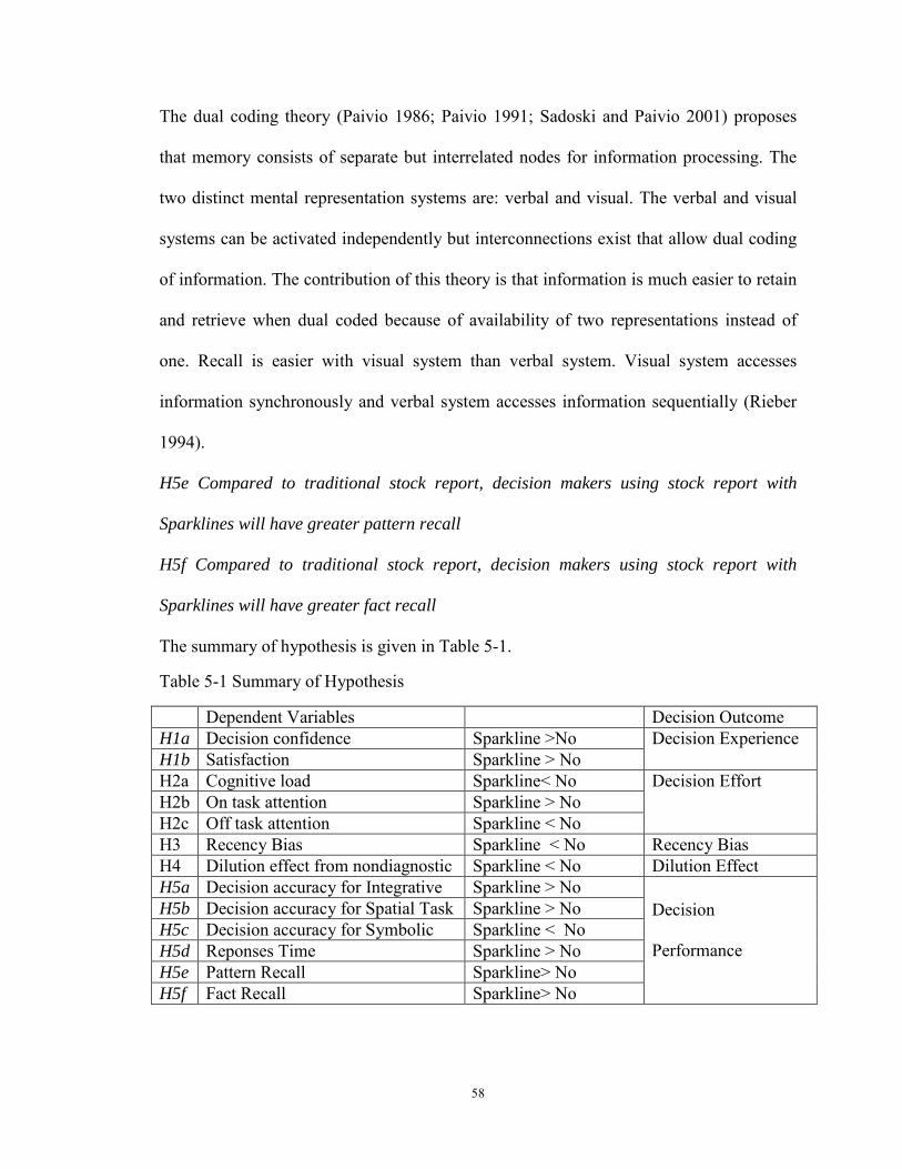
58
The dual coding theory (Paivio 1986; Paivio 1991; Sadoski and Paivio 2001) proposes
that memory consists of separate but interrelated nodes for information processing. The
two distinct mental representation systems are: verbal and visual. The verbal and visual
systems can be activated independently but interconnections exist that allow dual coding
of information. The contribution of this theory is that information is much easier to retain
and retrieve when dual coded because of availability of two representations instead of
one. Recall is easier with visual system than verbal system. Visual system accesses
information synchronously and verbal system accesses information sequentially (Rieber
1994).
H5e Compared to traditional stock report, decision makers using stock report with
Sparklines will have greater pattern recall
H5f Compared to traditional stock report, decision makers using stock report with
Sparklines will have greater fact recall
The summary of hypothesis is given in Table 5-1.
Table 5-1 Summary of Hypothesis
Dependent Variables Decision Outcome H1a Decision confidence Sparkline >No
Decision Experience H1b Satisfaction Sparkline > No
H2a Cognitive load Sparkline< No
Decision Effort H2b On task attention Sparkline > No
H2c Off task attention Sparkline < No
H3 Recency Bias Sparkline < No
Recency Bias H4 Dilution effect from nondiagnostic
Sparkline < No
Dilution Effect H5a Decision accuracy for Integrative
Sparkline > No
Decision
Performance
H5b Decision accuracy for Spatial Task Sparkline > No
H5c Decision accuracy for Symbolic
Sparkline < No
H5d Reponses Time Sparkline > No
H5e Pattern Recall Sparkline> No
H5f Fact Recall Sparkline> No
59
5.5 Research Design
The study employs a controlled laboratory experiment to empirically test the effects of
Sparkline on Decision performance for different task types. The experiment control for
the independent, moderating, dependent, and possibly confounding variables to achieve a
high degree of internal validity (Singleton, Straits, Straits, & McAllister, 1999). It is a
repeated measures design where the same measures were collected two times for each
subject but under two different reporting format conditions. Besides economizing on the
number of participants , the use of a within-subject design for the interface design
enabled control over individual differences like spatial ability (Large, Beheshti et al.
1996), cognitive style, knowledge of participants (2008), comprehension abilities, which
otherwise could have significantly influenced the dependent variables (DeSanctis 1984).
Within subject we have a) representation type- Sparkline vs. Graph representation and b)
task type: Spatial vs. Symbolic vs. Integrative Task.
5.6 Experimental Procedures
The digital financial report was launched on the web using Google site which is a web
application that can add to other Google applications such as documents, forms (to collect
data), spreadsheet (to store data) etc.
i. In the first screen signed consent was taken from the participants were taken to
participate in the project (Refer Appendix 8.1)
ii. Second screen providing instructions to participants to complete the experiment
iii. Pretask questionnaire related to demographics, participant knowledge and other
background information was collected (Refer appendix 8.3)
60
iv. A brief presentation on sparkline was provided to decision makers using power
point which included images of sparklines along with explanation. They then asked
question about the sparkline to evidence their familiarity with the new visualization tool
called sparklines. (Refer appendix 8.4). We provided the decision makers with case
scenario, and hyperlinks connected to shareholders report and 5 year overview with key
financial rations of two similar anonymous companies in two different presentation
formats. We maintained equivalence of information in both conditions, the decision
makers studied the reports individually, and then performed some tasks and answered
questionnaire (Refer appendix 8.6 and 8.7).
v. They finally completed the experiment by answering the post experiment
evaluation questionnaire (Refer appendix 8.8)
5.6.1 Development of stock reports
To simulate experiment close to real world experiences and to increase the
generalizability of the findings, we used a stock report of a random company from TD
Ameritrade, and developed prototype stock reports using Sparkline. We selected
Microsoft Excel 2010 to develop Sparkline as it is a commercial product commonly used
by accountants and analysts to develop financial reports. The experimental task of
bankruptcy prediction was developed based on prior research (Umanath and Vessey
1994; Zhao 2008). Two anonymous firms (which went bankrupt in the sixth year) were
selected from their data set. Altman Z-Score (Altman 1968) was calculated for the two
dataset of two companies that actually went bankrupt using the formula given in Table 5-
2. Based on the formula of z score of the two companies for which the stock reports were
prepared, were 1.6 and 1.9 respectively. This suggested that there is a high probability
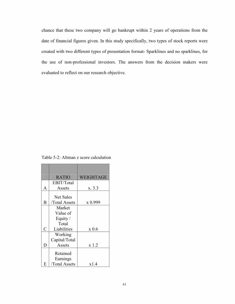
61
chance that these two company will go bankrupt within 2 years of operations from the
date of financial figures given. In this study specifically, two types of stock reports were
created with two different types of presentation format- Sparklines and no sparklines, for
the use of non-professional investors. The answers from the decision makers were
evaluated to reflect on our research objective.
Table 5-2: Altman z score calculation
RATIO WEIGHTAGE
A EBIT/Total
Assets x. 3.3
B Net Sales
/Total Assets x 0.999
C
Market Value of Equity /
Total Liabilities x 0.6
D
Working Capital/Total
Assets x 1.2
E
Retained Earnings
/Total Assets x1.4
62
5.7 Measures
5.7.1 Independent Variables
In this study we examine the effectiveness of two types of online financial report formats
that are applied widely in company websites: traditional financial report with graph,
table, text; and new report with table, text and Sparkline; and investigate the moderating
role of task type.
5.7.2 Dependent Variables
Major objective dependent variables that have been used to measure decision
performance has been decision accuracy, recall and response time.
For the first, labeled decision accuracy, Decision makers had to perform 3 spatial tasks, 4
symbolic tasks and 1 integrative task each, under both conditions and for each tasks there
was only 1 accurate answer. Accuracy was measured by the number of correct answers.
Response time was measured using the time log automatically recorded in the experiment
to complete the tasks and answer the questionnaire under each condition. The total
number of correct answers under each condition is then used to analyze the differences
between the means.
Degree of recall can be measured by % of correct answers (Watson and Driver 1983). In
the study recall has been measured by the number of correct answers for two questions
for recall of pattern/trend and one question of recall of specific fact each under both
conditions (Schmell and Umanath 1988). The total number of correct answers under each
condition is then used to analyses the difference between the means.
Given that an important goal of financial report on websites is to disseminate financial
information to investors and other stakeholder’s knowledge, it is important to assess the
63
effects of the two presentation formats on perceptual constructs that can potentially
influence usage of visualization. The perceptual measures used in the study are Decision
confidence and perceived satisfaction. Decision confidence is measured by five questions
regarding decision makers' decision confidence for the tasks under each condition
(DeSanctis 1984; Benbasat and Dexter 1986; Amer 1991).The average of the decision
confidence under each condition is then used to analyses the difference between the
means. Satisfaction has been measures using two questions under each condition.
Attention on (a) off-task activities and (b) on-task activities (Kahneman 1973) has been
measured using two questions under two conditions.
Effectively understanding the level of cognitive load or stress on working memory from
the use of Sparkline can help gauge the effectives of such visualization tool in reducing
the decision effort. The major dependent variables have been used to measure cognitive
cost is mental workload and attention. Subjective cognitive workload was measured using
the NASA Task Load Index (NASA-TLX)(Hart and Staveland 1988). This instrument
has been extensively used and validated in human factors research. In this research the
dimensions scores for each variable was added to generate the overall cognitive load on
the decision makers. The NASA Task load has been modified to suit the purpose of our
study and the variables used in this study is given in Table 5-3. The variables physical
effort and time constraints from the original NASA TLX were not suitable for this study
and were not used in the study.
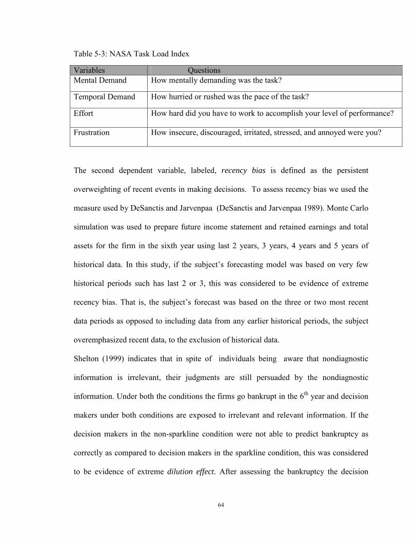
64
Table 5-3: NASA Task Load Index
Variables Questions Mental Demand How mentally demanding was the task?
Temporal Demand How hurried or rushed was the pace of the task?
Effort How hard did you have to work to accomplish your level of performance?
Frustration How insecure, discouraged, irritated, stressed, and annoyed were you?
The second dependent variable, labeled, recency bias is defined as the persistent
overweighting of recent events in making decisions. To assess recency bias we used the
measure used by DeSanctis and Jarvenpaa (DeSanctis and Jarvenpaa 1989). Monte Carlo
simulation was used to prepare future income statement and retained earnings and total
assets for the firm in the sixth year using last 2 years, 3 years, 4 years and 5 years of
historical data. In this study, if the subject’s forecasting model was based on very few
historical periods such has last 2 or 3, this was considered to be evidence of extreme
recency bias. That is, the subject’s forecast was based on the three or two most recent
data periods as opposed to including data from any earlier historical periods, the subject
overemphasized recent data, to the exclusion of historical data.
Shelton (1999) indicates that in spite of individuals being aware that nondiagnostic
information is irrelevant, their judgments are still persuaded by the nondiagnostic
information. Under both the conditions the firms go bankrupt in the 6th year and decision
makers under both conditions are exposed to irrelevant and relevant information. If the
decision makers in the non-sparkline condition were not able to predict bankruptcy as
correctly as compared to decision makers in the sparkline condition, this was considered
to be evidence of extreme dilution effect. After assessing the bankruptcy the decision
65
makers was asked how much of the $5,000 you would invest in this firm. If is the
decision makers are overly influenced by shareholder’s report to not to be able to predict
the bankruptcy accurately, then the decision makers would be more likely to invest in that
firm, evidencing the presence of strong dilution effect. On the other hand, if the decision
makers are relying heavily on the relevant information encoded in graphs and tables to
make decisions, then they are less likely to invest in the firm which will go bankrupt. To
assess dilution effect we have used the method used by Kelton (2006). Dilution effects
are measured by the differences between participants in the sparkline condition and
participants in non-sparkline condition for investing in the firm, using both relevant and
irrelevant data.
5.8 Control variables
Demographic factors may influence decision maker’s performance and therefore
collected information on the background of the participants. We controlled for individual
differences such as knowledge, graph preference, Gender, GPA, sex, age and others by
using a repeated measure design.
5.9 Pilot Study Procedure
Students were randomly assigned in to two groups. Group 1 had the presentation order as
Sparkline followed by non-sparkline condition. In Group 2 the presentation order was
reversed as non-sparkline condition followed by sparkline condition. There were in total
40 students in both treatment and the control group. There were 24 female and 16 male
for the pilot study. The results from our pilot study supported our hypotheses that
predicted the superior effects of Sparklines on decision outcome. This indicated that our
stock reports and tasks were all successful and could be incorporated into our proposed

66
larger study. Based on oral feedback from some of our experienced participants it was
observed that two of the questions required minor grammar corrections in the framing of
the questions which was incorporated in the main experiment. Feedback was received
from the participants.
67
6 Chapter 6: Main Study
The first step after collecting the data was data preparation. The codebook was prepared
to define how each questionnaire is coded for data entry. All the questions in the digital
questionnaire were required entry and hence there was no missing value. .
6.1 Participants
This study examines the use of visualization with users with lower level of financial
understanding and how the use of novel graphics affects their judgment and decision.
Dilla et al.(2007) find that nonprofessional investors spend relatively more time viewing
graphs on a simulated investor relations web site with text and graphical displays than
professional investors. Their results suggest that the nonprofessionals spend relatively
more time viewing the graphical display (Dilla, Janvrin et al. 2007). Hence to study the
effect of visualization, our decision makers are from a pool of non-professional investors
who have lower level of financial understanding. In Bransford, Brown, & Cocking,
R.(2000) , it is recommended that for novice learners related information be placed close
together so that the learners are led through the process of recognizing key information
and visualizing the connections between ideas internally. For the more expert learners,
who are already more able to see connections between the information, they suggests that
it is important to present sufficient amounts of data to encourage greater interest in the
topic and opportunities for deeper levels of learning. Undergraduate students having
limited or no prior experience in making investments in stock and had taken finance and
accounting courses investments participated in the study. These students have taken some
finance and accounting courses in general and have a low level of financial understanding
68
as compared to professional investors. To encourage participation, participants were
given course credit.
The demographic characteristics of the sample as shown in Table 4: 52 percent were
male, 91 percent were younger than age 25 and the distribution of majors was consistent
with the student population from which the sample was drawn. The majority 64 percent
had prior investing experience, although only 2 percent of these decision makers have
investment experience of more than 3 years. Thus, our sample reflects what one might
expect of a typical end-user population of novice investors as opposed to one made up of
professional investors.
A controlled experiment is sufficient for internal validity (Smith 1982). However, in
order to generalize and transfer the experimental results to other situations, (for external
validity); several studies test parallelism by direct comparisons of the outcomes of an
experimental setting between different samples recruited from a student and a
professional (field) pool (e.g., Smith et al. 1988; Drehmann et al. 2005). In these
situations, both the student and the field pool were confronted with the same
experimental context (e.g., laboratory setting or Internet experiment). In addition to the
student pool, members with advance degree or professional degree in accounting with
some experience in investing were recruited to test for parallelism. The latter group
included six women and twenty men, aged 22 to 51-years-old, with mean job experience
of years in investment (Refer Table 5-4).
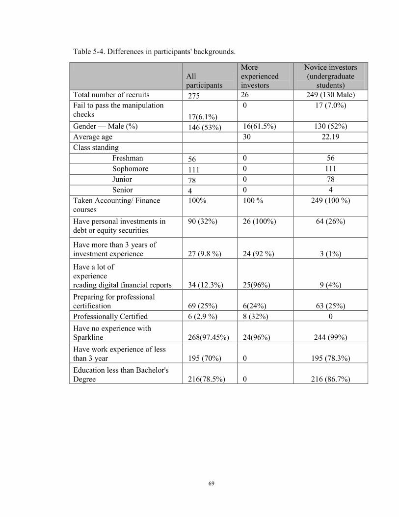
69
Table 5-4. Differences in participants' backgrounds.
All participants
More experienced investors
Novice investors (undergraduate
students) Total number of recruits 275 26 249 (130 Male) Fail to pass the manipulation checks 17(6.1%)
0 17 (7.0%)
Gender — Male (%) 146 (53%) 16(61.5%) 130 (52%) Average age 30 22.19 Class standing
Freshman 56 0 56 Sophomore 111 0 111 Junior 78 0 78 Senior 4 0 4
Taken Accounting/ Finance courses
100% 100 % 249 (100 %)
Have personal investments in debt or equity securities
90 (32%) 26 (100%) 64 (26%)
Have more than 3 years of investment experience 27 (9.8 %) 24 (92 %) 3 (1%)
Have a lot of experience reading digital financial reports 34 (12.3%) 25(96%) 9 (4%) Preparing for professional certification 69 (25%) 6(24%) 63 (25%) Professionally Certified 6 (2.9 %) 8 (32%) 0 Have no experience with Sparkline 268(97.45%) 24(96%) 244 (99%) Have work experience of less than 3 year 195 (70%) 0 195 (78.3%) Education less than Bachelor's Degree 216(78.5%) 0 216 (86.7%)
70
6.2 Validity checks
6.2.1 Counterbalancing
Half the participants started with the Sparkline Condition, and the other half started with
the Non-Sparkline condition. On average, completion of tasks within each condition took
15 minutes. The overall experiment took around 30-40 minutes to complete. Order of
testing was counterbalanced to prevent the learning effect and fatigue effect that might be
associated with the ordering of the presentation format.
6.2.2 Manipulation check
Participants' motivation is often low and they frequently don't pay attention to the very
things that are supposed to influence them. We used a questionnaire to test whether the
participants training on sparklines was effective. Approximately 93% answered correctly
indicating that they had undergone the training correctly. We asked questions as a
manipulation check to be sure that participants actually read and used the different
reports provided to them in the form of hyperlinks. For both the sparkline with table and
graph with table format, we asked information about the management letter was from
which executive on the company and management letter states which of the following?
Around 90-92.5% gave right answers. Therefore we can conclude that participants
actually read the different reports for making the decision. We also asked the following
questions to make sure that the participants actually read the relevant information in the
form of financial reports and the irrelevant information in the form of the letter from
management in making their decisions.
How important was the Management Letter to your judgment of Bankruptcy Prediction?
How important was the Financial Statement to your judgment of Bankruptcy Prediction?
71
For Bankruptcy Prediction, how much weight did you place on information from the
financial statements and for Bankruptcy Prediction, how much weight did you place on
information in the management letter?
Under the treatment and the control group the results indicated that decision makers
placed weight more on the financial report under the sparkline condition than the non-
sparkline condition. This indicated that the decision makers under the sparkline condition
paid attention to the relevant information in the financial reports more, which influenced
them to experience significant lower dilution effect from the control group ( t = 3.863, df
= 274, p<.01). A statistically significant effect for presentation format on other dependent
variable such as spatial accuracy was also observed (t = 2.832, DF = 275, p<.01). This
shows that the means for the answers to the above questions were significantly different
under the two treatment groups indicating that our treatments via different presentation
formats were successful. It suggests that decision makers paid enough attention to a
manipulation for it to influence them.
We also checked on the counterbalancing of the order in which the two presentation
type, Sparklines without sparklines, were given. Independent t-test confirmed that the
order of the presentation format is not significant as a main effect (t (275) =0.8970, p =
0.3706; 2.30 answers were accurate versus 2.42 answers out of the 3 questions). This
means that we were successful in counterbalancing any learning effect that might be
associated with the ordering of the tasks. Hence the participants did not experience
decreased performance on the dependent measure due to being tired or less enthusiastic
as the experiment continues. No significant differences were seen in results between the

72
two gender (t (247) =.0.303, p= 0.7631). Hence we can conclude that the random
assignment of participants to the assignments were successful.
6.3 Results
6.3.1 Data analysis
6.3.1.1 Factor loadings and Scale reliability
The five items of decision confidence, four items of cognitive workload, 2 items of
satisfaction and 2 items of on task and off task attention were pooled to conduct a factor
analysis. All five items of decision confidence has factor loadings of greater than .6
(Cronbach alpha .855). All four items of cognitive workload has factor loadings of
greater than .6 (Cronbach alpha .762). The two items of satisfaction and attention had
factor loadings of greater than .60. The results of the principal component analysis and
reliability analysis of the scales used in the study are reported in Table 6.1. It is seen that
the reliability of these measures as gauged by Cronbach alpha was above the satisfactory
threshold of .6 (Hatcher, 1994; Nunnally, 1978).
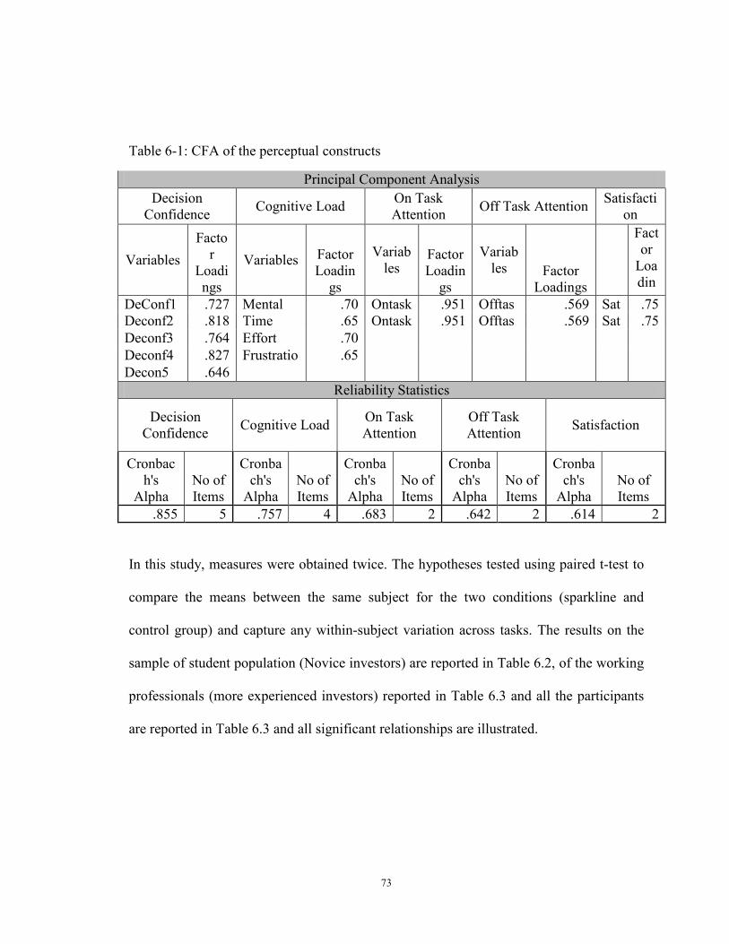
73
Table 6-1: CFA of the perceptual constructs
Principal Component Analysis Decision
Confidence Cognitive Load On Task Attention Off Task Attention Satisfacti
on
Variables Facto
r Loadings
Variables Factor Loadin
gs
Variables
Factor Loadin
gs
Variables Factor
Loadings
Factor
Loadin
DeConf1 .727 Mental .70 Ontask
.951 Offtas
.569 Sat
.75 Deconf2 .818 Time .65 Ontask
.951 Offtas
.569 Sat
.75
Deconf3 .764 Effort .70 Deconf4 .827 Frustratio
.65
Decon5 .646 Reliability Statistics
Decision Confidence Cognitive Load On Task
Attention Off Task Attention Satisfaction
Cronbach's
Alpha No of Items
Cronbach's
Alpha No of Items
Cronbach's
Alpha No of Items
Cronbach's
Alpha No of Items
Cronbach's
Alpha No of Items
.855 5 .757 4 .683 2 .642 2 .614 2
In this study, measures were obtained twice. The hypotheses tested using paired t-test to
compare the means between the same subject for the two conditions (sparkline and
control group) and capture any within-subject variation across tasks. The results on the
sample of student population (Novice investors) are reported in Table 6.2, of the working
professionals (more experienced investors) reported in Table 6.3 and all the participants
are reported in Table 6.3 and all significant relationships are illustrated.
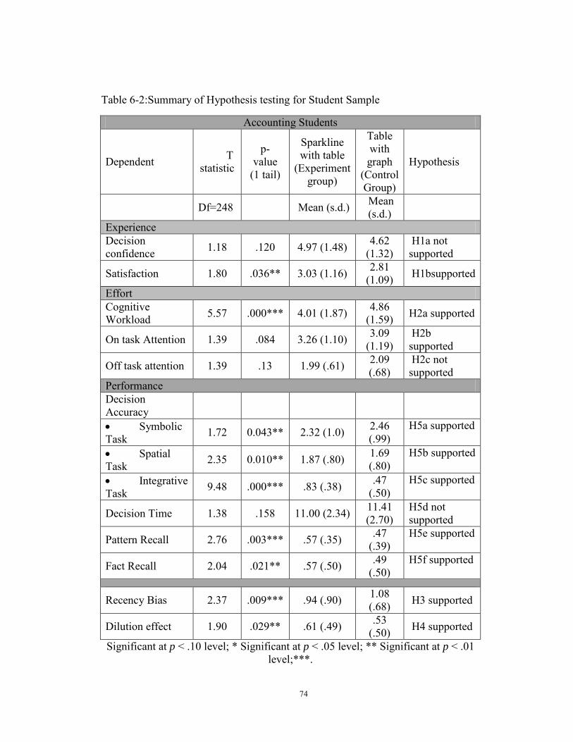
74
Table 6-2:Summary of Hypothesis testing for Student Sample
Accounting Students
Dependent T statistic
p- value
(1 tail)
Sparkline with table
(Experiment group)
Table with graph
(Control Group)
Hypothesis
Df=248 Mean (s.d.) Mean (s.d.)
Experience Decision confidence 1.18 .120 4.97 (1.48) 4.62
(1.32) H1a not supported
Satisfaction 1.80 .036** 3.03 (1.16) 2.81 (1.09) H1bsupported
Effort Cognitive Workload 5.57 .000*** 4.01 (1.87) 4.86
(1.59) H2a supported
On task Attention 1.39 .084 3.26 (1.10) 3.09 (1.19)
H2b supported
Off task attention 1.39 .13 1.99 (.61) 2.09 (.68)
H2c not supported
Performance Decision Accuracy
• Symbolic Task 1.72 0.043** 2.32 (1.0) 2.46
(.99) H5a supported
• Spatial Task 2.35 0.010** 1.87 (.80) 1.69
(.80) H5b supported
• Integrative Task 9.48 .000*** .83 (.38) .47
(.50) H5c supported
Decision Time 1.38 .158 11.00 (2.34) 11.41 (2.70)
H5d not supported
Pattern Recall 2.76 .003*** .57 (.35) .47 (.39)
H5e supported
Fact Recall 2.04 .021** .57 (.50) .49 (.50)
H5f supported
Recency Bias 2.37 .009*** .94 (.90) 1.08
(.68) H3 supported
Dilution effect 1.90 .029** .61 (.49) .53 (.50) H4 supported
Significant at p < .10 level; * Significant at p < .05 level; ** Significant at p < .01 level;***.
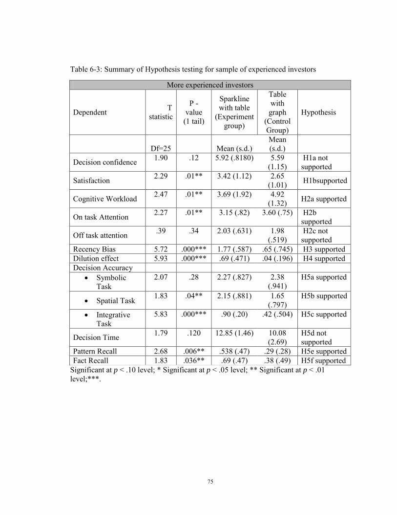
75
Table 6-3: Summary of Hypothesis testing for sample of experienced investors
More experienced investors
Dependent T statistic
P - value
(1 tail)
Sparkline with table
(Experiment group)
Table with graph
(Control Group)
Hypothesis
Df=25
Mean (s.d.) Mean (s.d.)
Decision confidence 1.90 .12 5.92 (.8180) 5.59 (1.15)
H1a not supported
Satisfaction 2.29 .01** 3.42 (1.12) 2.65 (1.01) H1bsupported
Cognitive Workload 2.47 .01** 3.69 (1.92) 4.92 (1.32) H2a supported
On task Attention 2.27 .01** 3.15 (.82) 3.60 (.75) H2b supported
Off task attention .39 .34 2.03 (.631) 1.98 (.519)
H2c not supported
Recency Bias 5.72 .000*** 1.77 (.587) .65 (.745) H3 supported Dilution effect 5.93 .000*** .69 (.471) .04 (.196) H4 supported Decision Accuracy
• Symbolic Task
2.07 .28 2.27 (.827) 2.38 (.941)
H5a supported
• Spatial Task 1.83 .04** 2.15 (.881) 1.65 (.797)
H5b supported
• Integrative Task
5.83 .000*** .90 (.20) .42 (.504) H5c supported
Decision Time 1.79 .120 12.85 (1.46) 10.08 (2.69)
H5d not supported
Pattern Recall 2.68 .006** .538 (.47) .29 (.28) H5e supported Fact Recall 1.83 .036** .69 (.47) .38 (.49) H5f supported
Significant at p < .10 level; * Significant at p < .05 level; ** Significant at p < .01 level;***.
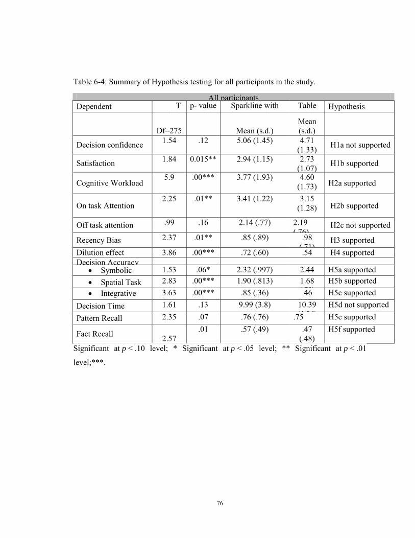
76
Table 6-4: Summary of Hypothesis testing for all participants in the study.
All participants Dependent T
i i p- value (1 il)
Sparkline with bl (E i
Table i h
Hypothesis
Df=275
Mean (s.d.)
Mean (s.d.)
Decision confidence 1.54 .12 5.06 (1.45) 4.71 (1.33) H1a not supported
Satisfaction 1.84 0.015** 2.94 (1.15) 2.73 (1.07) H1b supported
Cognitive Workload 5.9 .00*** 3.77 (1.93) 4.60
(1.73) H2a supported
On task Attention 2.25 .01** 3.41 (1.22) 3.15
(1.28) H2b supported
Off task attention .99 .16 2.14 (.77) 2.19 ( 76)
H2c not supported
Recency Bias 2.37 .01** .85 (.89) .98 ( 71)
H3 supported Dilution effect 3.86 .00*** .72 (.60) .54
H4 supported
Decision Accuracy • Symbolic
1.53 .06* 2.32 (.997) 2.44
H5a supported
• Spatial Task 2.83 .00*** 1.90 (.813) 1.68 ( 79)
H5b supported • Integrative
k 3.63 .00*** .85 (.36) .46
( 49) H5c supported
Decision Time 1.61 .13 9.99 (3.8) 10.39 (4 06)
H5d not supported
Pattern Recall 2.35 .07 .76 (.76) .75
H5e supported
Fact Recall 2.57 .01 .57 (.49) .47
(.48) H5f supported
Significant at p < .10 level; * Significant at p < .05 level; ** Significant at p < .01
level;***.
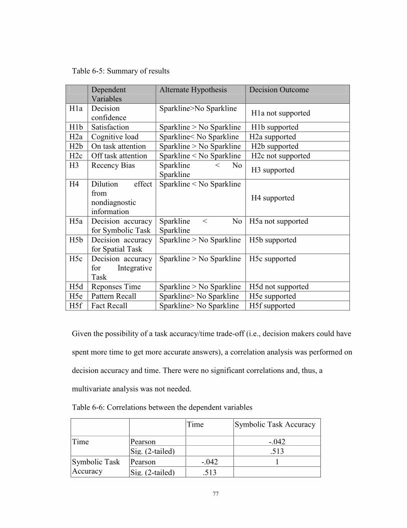
77
Table 6-5: Summary of results
Dependent Variables
Alternate Hypothesis Decision Outcome
H1a Decision confidence
Sparkline>No Sparkline H1a not supported
H1b Satisfaction Sparkline > No Sparkline H1b supported H2a Cognitive load Sparkline< No Sparkline H2a supported H2b On task attention Sparkline > No Sparkline H2b supported H2c Off task attention Sparkline < No Sparkline H2c not supported H3 Recency Bias Sparkline < No
Sparkline H3 supported
H4 Dilution effect from nondiagnostic information
Sparkline < No Sparkline
H4 supported
H5a Decision accuracy for Symbolic Task
Sparkline < No Sparkline
H5a not supported
H5b Decision accuracy for Spatial Task
Sparkline > No Sparkline H5b supported
H5c Decision accuracy for Integrative Task
Sparkline > No Sparkline H5c supported
H5d Reponses Time Sparkline > No Sparkline H5d not supported H5e Pattern Recall Sparkline> No Sparkline H5e supported H5f Fact Recall Sparkline> No Sparkline H5f supported
Given the possibility of a task accuracy/time trade-off (i.e., decision makers could have
spent more time to get more accurate answers), a correlation analysis was performed on
decision accuracy and time. There were no significant correlations and, thus, a
multivariate analysis was not needed.
Table 6-6: Correlations between the dependent variables
Time Symbolic Task Accuracy
Time Pearson
-.042 Sig. (2-tailed) .513
Symbolic Task Accuracy
Pearson
-.042 1 Sig. (2-tailed) .513
78
Decision Experience
Paired t-test was conducted to evaluate whether decision makers experienced enhanced
decision experience (confidence and satisfaction) when using advanced visualizations
such as sparklines in digital financial reporting. The results indicated no significant
difference in decision confidence between decision makers in both conditions (t = 1.54, p
= .12). Decision makers on an average experienced lower confidence (4.71 out of scale
of 1-7) using stock reports without sparkline as compared to reports with sparkline (5.06
out of 7). H1a which predicted that compared to traditional stock report, decision makers
using stock report with Sparklines will have experience greater decision confidence was
not supported. Perhaps the novelty of the Sparkline can be attributed to not obtaining
significant difference in the subject confidence when using reports. With continued
usage, novelty of Sparkline could wear out resulting in equal or higher confidence in
future. Paired t-test to on subject satisfaction indicated significant differences in results
between the two conditions (t = 1.838, p=.03). However, participants reported
significantly higher satisfaction with the use of Sparkline reports (mean =2.94) than the
non-Sparkline reports (mean =2.73). H1b which predicted that compared to traditional
stock report, decision makers using stock report with Sparklines will experience greater
decision satisfaction was supported.
Decision effort
Paired t-test was conducted to evaluate whether subject had to use less effort (cognitive
load, attention) when making decisions using visualizations such as sparklines in digital
financial reports. The results indicated significant difference in cognitive load between
79
the conditions, (t=5.90, p=.000). The decision makers also experienced significantly
lower cognitive load with the use of Sparkline reports (mean =3.78) than the non-
Sparkline reports (mean =4.60). H2a which predicts that as compared to traditional stock
report, decision makers using stock report with Sparklines will experience reduced
cognitive load is supported.
The results indicated significant difference between on task attention (t= 2.25, p= .01).
The off task attention between the two groups was not statistically significant. (t=.99,
p=.16). The results of the study suggest that on-task attention under Sparkline (mean=
3.41) was higher than under non-Sparkline condition (mean= 3.15). H2b which predicted
that decision makers using stock report with Sparklines will experience greater on task
attention is supported. Tables show only current levels or recent changes and the results
indicate that sparklines with table improved the attention span of the tables.
The off task attention under Sparkline (mean= 2.14) was lower than under non-Sparkline
condition (mean= 2.19). These differences were not significant t (275) =0.99, p=0.16).
Hence we fail to reject the null hypothesis in favor of the alternate and we are 95%
confident that the difference in the means could be attributed to chance alone. H2c which
predicted that decision makers using stock report with Sparklines will experience
differences in off task attention under the two conditions was not supported. In a
bankruptcy prediction task, task demands are high. Perhaps due to high task demands,
under both conditions the decision maker was not able to concentrate on off-task
activities leading to no difference in the results in these conditions.
80
Recency Bias
The results indicated significant difference in recency bias experienced between the
conditions (p=.01). Recency Bias in the Non-Sparkline treatment (mean = .98/1 or 98
percent) were more pronounced than those in the Sparkline treatment (mean = .85/1 or 85
percent). H4 which predicted that as compared to traditional stock report, decision
makers using stock report containing Sparklines will experience lower recency bias is
supported. The results suggest that Sparkline were useful in mitigating recency bias to a
certain extent as compared to traditional reports.
Dilution effect
Both the firms had strong potential to become bankrupt in the sixth year and a wise
investor must avoid investing in such a company. Investors experiencing dilution effect
will not be able to assess the financial status of the company accurately and not take an
extreme view of the situation. Such investors could be inclined towards investing in such
a firm. Paired t test was conducted to evaluate whether decision makers experienced
dilution effect using Sparkline or traditional report. The results indicated significant
difference under the two conditions (t=3.86, p=.00). Participants in the Sparkline
treatment reported that they were less likely to invest in the firm likely to go bankrupt
(mean = .72/1 or 77 percent than the non-Sparkline treatment (mean = .54/1 or 54
percent). The results suggest that the decision makers using stock reports (with tables,
separate line graphs and shareholder’s report) experienced dilution effect and hence were
not able to make investment decision wisely. Results indicates that, H#, which proposed
that, as compared to traditional stock report, decision makers using stock report with
81
Sparklines will experience lower dilution effect from irrelevant information contained in
the shareholder’s report were also supported.
Decision performance
In this study, paired t test was conducted to evaluate whether decision makers
experienced greater decision performance (accuracy, time, recall) using Sparkline or
traditional report. The results indicated significant difference in decision accuracy related
to symbolic task, (t= 1.53, p=.06). The predictions based on the theory of cognitive fit
were supported. Participants reported lower accuracy for the Symbolic task in the
Sparkline treatment (mean = 2.44/3 or 71.6 percent) than the non-Sparkline treatment
(mean = 2.32/3 or 85.66 percent). Thus, H5a, which predicts that as compared to
traditional stock report, decision makers using stock report with Sparklines will have
lower decision accuracy rate for symbolic tasks was supported.
An analysis on data suggests that decision makers experienced greater accuracy using
sparklines for spatial task (t=2.83, p=0.00). For Spatial task, the decision makers were
significantly more accurate in the Sparkline treatment (mean = 1.9/3 or 63 percent) than
the non-sparkline treatment (mean = 1.68/3 or 56 percent). Thus, H5b, which predicted
that as compared to traditional stock report, decision makers using stock report with
Sparklines will have higher decision accuracy rate for spatial task is supported.
The results indicated significant difference between decision accuracy between the two
groups (t=3.63, p=.00. Moreover, accuracy for the Integrative task (Bankruptcy
prediction) in the Sparkline treatment (mean = .85/1 or 85 percent) were also not
significantly higher than those in the Non-Sparkline treatment (mean = .46/1 or 46
percent) for Integrative task. Thus, H5c, which predicts Sparkline, will have more
82
significant effects than non-sparkline reports on investor’s decision accuracy for
integrative task are also supported. The predictions from Proximity Compatibility
Principle are also supported. The close proximity of related visual elements (the tables
and the graph in the form of sparklines) proved critical for success in decision making for
an integrative task. As the related elements were positioned close to each other and hence
the information was processed together by decision makers in the sparkline condition.
The difference between accuracy rate percentages under both treatment conditions were
more pronounced for integrative task (85 percent) than the spatial task (75 percent). As
per the findings of this study, Sparklines are hence best usable for integrative task and
spatial task. Sparklines are less useful for symbolic tasks.
Response Time
Participants reported lower response time to do the tasks in the Sparkline treatment (mean
=9.99 or 9 minutes 99 seconds) than the non-sparkline treatment (mean = 10.39 or 10
minutes 39 Secs). The differences between the conditions was statistically significant
(t=1.61, p=.13). H5d which predicts that as compared to traditional stock report, decision
makers using stock report with Sparklines will take lower decision time for all tasks was
not supported. In this study data was presented to the decision makers were for last five
years. If data of 10 or more years was presented, then maybe the decision makers would
have found sparklines to be an efficient tool in decision making by having a quick
response time.
Recall
The results from the paired t test provides sufficient evidence to reject the null
hypothesis, in favor of the alternative hypothesis that pattern recall is significantly higher
83
in the sparkline condition than the non Sparkline condition (t= 2.35 p=0.07). Decision
makers were able to recall slightly higher (.76/2 or 38% of the decision makers) in the
sparkline condition than the non sparkline condition (.75/2 or 37.5%). The results of the
study also provides sufficient evidence to reject the null hypothesis, in favor of the
alternative hypothesis that fact recall is significantly higher in the sparkline condition
than the non Sparkline condition (t=2.57, p=.01). Participants reported significantly
higher fact recall rate in the Sparkline treatment (mean =.57/1 or 57%) than the non-
sparkline treatment (mean = .47 or 47%). The hypothesis H5e that as compared to
traditional stock report, decision makers using stock report with Sparklines will have
greater pattern recall will be supported.
H5f , as compared to traditional stock report, decision makers using stock report with
Sparklines will have greater fact recall is also supported.
6.4 Limitations
This study as with other studies in general have some limitations. This study only
examines sparklines in the context of bankruptcy prediction task and other symbolic and
spatial task. The limitation of this study provides avenue for research to researchers
working in this area. This need more tasks to be tested. Due to the use of repeated
measure design and to avoid participant fatigue, we used 1 trial under each condition. In
future studies the trials of the tasks can be increased to increase the robustness of the
results. The volume of data used in preparing the financial reports is for the last five
years. Future studies can incorporate financial data of more than five years to study the
effect of sparkline with more complex data set. We have also controlled for individual
differences in this study by using a repeated measure design. Future studies can study the

84
interaction effect if any of individual differences and effect of visualizations tools on
decision outcome. Several future research directions as outlined from the review of the
literature and findings of this study are discussed in the next section.
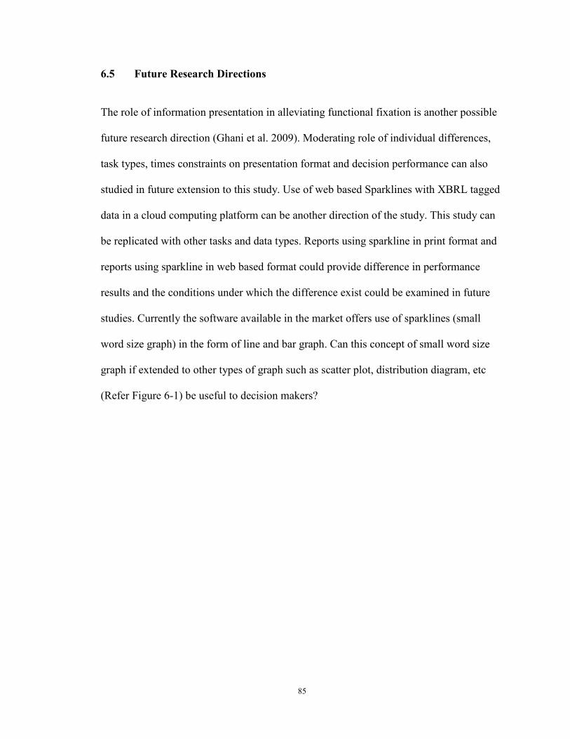
85
6.5 Future Research Directions
The role of information presentation in alleviating functional fixation is another possible
future research direction (Ghani et al. 2009). Moderating role of individual differences,
task types, times constraints on presentation format and decision performance can also
studied in future extension to this study. Use of web based Sparklines with XBRL tagged
data in a cloud computing platform can be another direction of the study. This study can
be replicated with other tasks and data types. Reports using sparkline in print format and
reports using sparkline in web based format could provide difference in performance
results and the conditions under which the difference exist could be examined in future
studies. Currently the software available in the market offers use of sparklines (small
word size graph) in the form of line and bar graph. Can this concept of small word size
graph if extended to other types of graph such as scatter plot, distribution diagram, etc
(Refer Figure 6-1) be useful to decision makers?
86
Figure 6-1: : Graphs that can be represented in word size format
6.6 Contributions of the study
6.6.1 Implications for research
The result from this empirical study revealed that there was significant effect of use of
sparklines in digital financial reports on decision outcome and provides an incremental
value over a tabular format in accounting data or in financial statements.
As per research on information processing visually, processing can be of two types,
graphical perception and graphical cognition. The results indicate that sparklines support
spatial tasks which require graphical perception more than symbolic tasks that require
graphical cognition.
Preattentive vision is an amount of information that a small glimpse can pick up. Graphs
that convey their information at this unconscious level allow us to extract information
87
without any conscious effort on our part using preattentive vision. In the context of
extracting information from the graph, we call this visual processing graphical
perception.
On the other hand, graphical cognition is visual processing that requires that we inspect
things that we are looking at and psychologists refer to as cognitive activity. In the
context of visual processing by inspect things such as to highest point; lowest point etc
extracting information from the graph, we call this visual processing, graphical
cognition. For tasks that require graphical cognition such as symbolic tasks, the study
supports out assertion that Sparkline does not necessarily improve decision performance.
In this study it was found out that when symbolic tasks were performed, multi-object
displays were associated with superior performance
The results from the main study provide an empirical and justifiable basis for policy
makers to make explicit recommendations about use of novel graphics such as sparkline
in digital financial reports. The results from this study provide contribution to theory of
cognitive Fit to match information presentation format to task and contribution to theory
of Proximity Compatibility Principle with use of visualization tools for digital financial
reporting.
Both the IS literature and Accounting literature has emphasized the need for studying the
role of presentation format in the efficiency and effectiveness of decision-makers’
decision quality in order to provide empirical evidence on the effect of presentation
format on decision quality. The need of such research has also been identified by other
academics in accounting (Abdolmohammadi, Harris et al. 2002)and (Debreceny and Gray
2001).The role of information presentation in alleviating functional fixation is another
88
possible future research direction (Ghani, Mara et al. 2009). This research is important to
provide empirical empirically supported guidance to researchers and practitioners for the
design and use of dense, interactive visualizations in business decision making with high
volume of data.
6.6.2 Implications for practice
These findings have important implications users of visualization tools such as sparklines
in digital financial reporting. This research provides empirical evidence to the users of
sparklines in favor of use of Sparkline in mitigating recency bias to a certain extent as
compared to traditional reports. Another result that could be very useful to the preparers
of digital financial reports is that the irrelevant information cue in the shareholder’s
report was not able to weaken the impact of relevant information in the audited financial
data reported when that data was presented with sparklines. The results indicate that
decision makers experience greater satisfaction when using sparklines. In a controlled
laboratory setting, Sparklines were able to successfully reduce the cognitive load on the
decision maker when task demands are high (such as in a bankruptcy prediction task).The
sparklines were able to increase the attention of the readers to the tables as the tables was
integrated with the sparklines in close proximity in the sparklines condition.
Decision makers also perform integrative tasks and spatial tasks better when using
Sparkline with table as opposed to multi-object displays of graphs and tables not placed
in visual proximity. Sparklines are hence best usable for integrative task and spatial task.
Sparklines are less useful for symbolic tasks.
End users of today’s BI tools fall across a broad range of functional areas. Reports from
such BI systems are generated on a fly by users rather than information systems
89
professionals. End users' need to work with large data sets and Sparklines help users see
the whole picture. Visual proximity of graph with text and tables is useful in context of
providing support for integrative and spatial tasks.
In conclusion, Sparkline is a useful reporting tool for supporting the recalls of facts and
patterns reported in digital financial reports.
This study provide empirical evidence of effect of Sparklines in providing user support
for information recall, mitigation of recency bias to a certain extent, reduce dilution effect
from non-diagnostic information, improve decision performance, reduce decision effort
and improve the decision making experience.

90
Appendices Appendix A: Scanned copy of the Consent Form

91

92

93
94
95
Appendix B: Experiment
First, let me start by thanking you for your participation. The experiment has five parts. Part 1: Background Questionnaire: In this part please answer some questions about your background. Part 2: Introduction to sparklines: Images of sparklines will be presented on next screen. Please take some time to familiarize with the new business data visualization format. Part 3: Evaluation of first company: In the following session you will be given financial report for first company in first format. You have to review the reports; make assessment of companies’ current earnings performance, judgments of future earnings potential and investment decisions. Part 4: Evaluation of second company: In the following session you will be given financial report for second company. You have to review the reports; make assessment of companies’ current earnings performance, judgments of future earnings potential and investment decisions. Part 5: Evaluate and report your preference for presentation format for reporting financial system. When you finish part five you have completed the experiment. There is no time limit, however do not spend too much time on any one question. Remember to answer the questions as accurately for yourself as possible. Once again! Thank you for participating! If you have further questions please raise your hand and an administrator will assist you. When you are ready to begin click the CONTINUE button below
96
Appendix C: Pretask questionnaire (Demographics and background)
Please answer each of the following questions and then click the submit button. Then click continue to go to the next sheet. * Required
What is your age? *
What is your gender *
What is your highest level of education *
How many accounting/Finance courses have you completed? *
How many years of accounting work experience do you have? * Do you currently own investments in debt or equity
securities? * How many years have you been investing in debt or equity securities? *
• 0 -3
• 3 - 5
• 5 -10
• 10 -15
• >15 How much experience do you have with the digital financial reports? *
1 2 3 4 5 No Experience A Lot of Experience
How much experience do you have using Sparklines? *
1 2 3 4 5 No Experience A Lot of Experience
Do you have professional certification? *
• CPA/CA
• CMA/ICWA
97
• CS
• Not Applicable
• Other: Are you preparing for professional certification exams? *
• CPA/CA
• CMA/ICWA
• CS
• Not applicable
• Other:
What is your major at University of Kentucky? * I am currently a *
• Freshman
• Sophomore
• Junior
• Senior
• Graduate
• Not applicable
98
Appendix D: Introduction to Sparkline
Power point presentation on Sparklines is provided to the decision makers in the form of six slides. Please view all the 6 slides and answer the question below. Manipulation check to see if the decision makers went over the slides
What is a Sparkline? *
• Word Size Graph
• Large size Graph
• Table
• Graph that sparkles
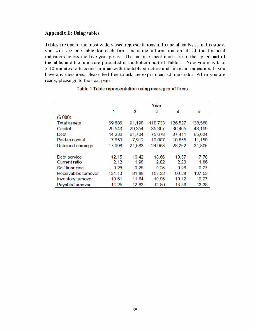
99
Appendix E: Using tables
Tables are one of the most widely used representations in financial analysis. In this study, you will see one table for each firm, including information on all of the financial indicators across the five-year period. The balance sheet items are in the upper part of the table, and the ratios are presented in the bottom part of Table 1. Now you may take 5-10 minutes to become familiar with the table structure and financial indicators. If you have any questions, please feel free to ask the experiment administrator. When you are ready, please go to the next page.

100
Appendix F: Case Scenario for the first condition
Assume you want to invest money in a stock and the stock report containing the shareholder's report, financial data organized in the form of table and graph for a company High Tech Systems Corporation is provided to you in the hyperlinks below. You will evaluate several sets of financial data. Each set contains real data, on the financial condition of a firm over five consecutive years. You need to make a prediction that the company will go bankrupt or not in the sixth year of operation based on the information presented. Before you do so you need to forecast the future retained earnings and total assets for the sixth year. You also have to perform some tasks, assess the financial status of the firm and make an investment decision.
When making the forecasts, consider only the financial reports you are given. Bringing other knowledge about the market, the economy or the industry will lower the quality of the forecasts. You can refer to the Shareholder's report, financial report (Table, Graph) of the firm at any point by clicking on them. They will open in separate window. Keep in mind that the firm is not randomly selected from the software industry. You have to use the side scroll bar to access all the questions. After you have answered the entire questions click the SUBMIT button. Then click CONTINUE. SELECT THE REPORT YOU WANT TO READ FROM THE LINKS BELOW.
Shareholders' Report 5-year overview with key financial ratios Table 5-year overview with key financial ratios Graph

101
Appendix G: Shareholders Report of High Tech Systems Corporation Inc.
High Tech Systems Corporation Inc.
MANAGEMENT LETTER
To our shareowners:
High Tech Systems Corporation Inc. enters the 2009 well positioned and confident.
• We are strategically well positioned • We are confident of our market and our product strategy • We have a large number of smart, relentless, customer-devoted people across all areas of the company. • We will be offering low prices, reliable delivery, and improve our in-stock position on even obscure and hard-to-find items. • Additionally, our Company has experienced significant changes during 2010 that have dramatically improved the foundation of our Company.
We plan to make improvements in customer experience so we can afford to offer customers ever-lower prices, and many others by:
• increasing selection, • speeding delivery, • reducing cost structure
Let there be no doubt about our dedication to success. High Tech Systems knows how to anticipate market trends, provide solutions that answer real needs, and deliver them with compelling timing and cost performance. I look forward to the future growth of our company.
We also know that we can still be much better, and we’re dedicated to improving further.
Thank you for your continued support.
John Smith
Founder and Chief Executive Officer
High Tech Systems Corporation Inc.
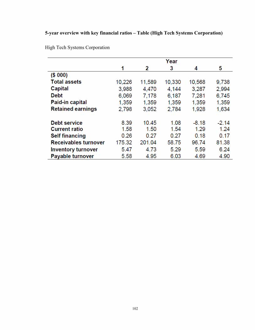
102
5-year overview with key financial ratios – Table (High Tech Systems Corporation)
High Tech Systems Corporation
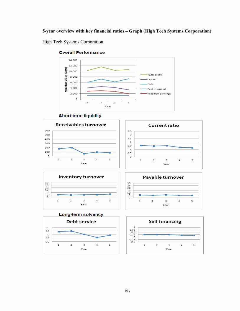
103
5-year overview with key financial ratios – Graph (High Tech Systems Corporation)
High Tech Systems Corporation
104
Appendix I: Case Scenario for second condition
Assume you want to invest money in a stock and the stock report containing the shareholder's report, financial data organized in the form of table and graph for a company Prime Tech Systems Corporation is provided to you in the hyperlinks below. You will evaluate several sets of financial data. Each set contains real data, on the financial condition of a firm over five consecutive years. You need to make a prediction that the company will go bankrupt or not in the sixth year of operation based on the information presented. Before you do so you need to forecast the future retained earnings and total assets for the sixth year. You also have to perform some tasks, assess the financial status of the firm and make an investment decision. When making the forecasts, consider only the financial reports you are given. Bringing other knowledge about the market, the economy or the industry will lower the quality of the forecasts. You can refer to the Shareholder's report, financial report (Table, Graph) of the firm at any point by clicking on them. They will open in separate window. Keep in mind that the firm is not randomly selected from the software industry. You have to use the side scroll bar to access all the questions. After you have answered the entire questions click the SUBMIT button. Then click CONTINUE. SELECT THE REPORT YOU WANT TO READ FROM THE LINKS BELOW • Shareholder's Report • 5-year overview with key financial ratios - Table with Sparkline

105
Appendix J: Shareholder's Report for the treatment condition
Prime Tech Systems Inc. MANAGEMENT LETTER To our shareowners: Prime Tech Systems Inc. enters the 2009 well positioned and confident. We are strategically well positioned We will add new product categories around the world in 2010 We will increase our pace of innovation, launching many new services and features. We will add more customers in 2011, including many large enterprise customers. Additionally, our Company has experienced significant changes during 2010 that have dramatically improved the foundation of our Company. We plan to make improvements in customer experience so we can afford to offer customers ever-lower prices, and many others by: • increasing selection, • speeding delivery, • reducing cost structure We also know that we can still be much better, and we’re dedicated to improving further. Let there be no doubt about our dedication to success. Prime Tech Systems knows how to anticipate market trends, provide solutions that answer real needs, and deliver them with compelling timing and cost performance. I look forward to the future growth of our company. Thank you for your continued support. Kerry Sullivan Founder and President Prime Tech Systems Inc.
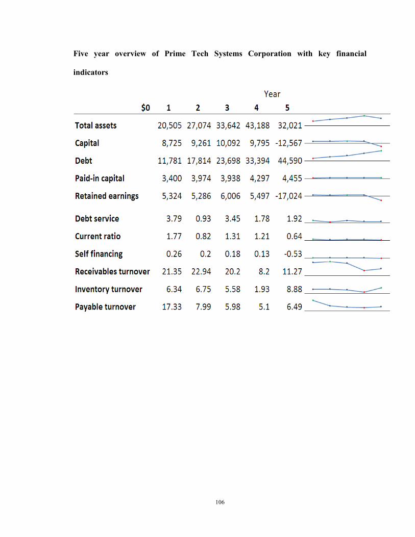
106
Five year overview of Prime Tech Systems Corporation with key financial
indicators
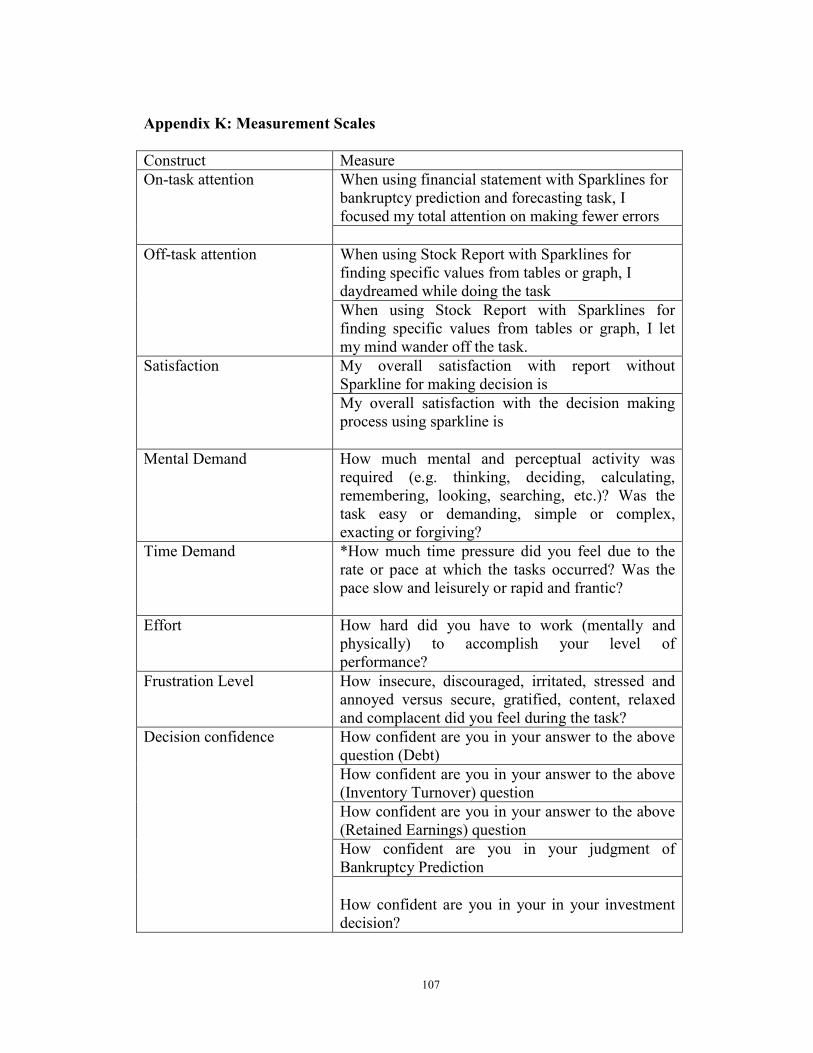
107
Appendix K: Measurement Scales
Construct Measure On-task attention When using financial statement with Sparklines for
bankruptcy prediction and forecasting task, I focused my total attention on making fewer errors
Off-task attention When using Stock Report with Sparklines for finding specific values from tables or graph, I daydreamed while doing the task When using Stock Report with Sparklines for finding specific values from tables or graph, I let my mind wander off the task.
Satisfaction My overall satisfaction with report without Sparkline for making decision is My overall satisfaction with the decision making process using sparkline is
Mental Demand How much mental and perceptual activity was required (e.g. thinking, deciding, calculating, remembering, looking, searching, etc.)? Was the task easy or demanding, simple or complex, exacting or forgiving?
Time Demand *How much time pressure did you feel due to the rate or pace at which the tasks occurred? Was the pace slow and leisurely or rapid and frantic?
Effort How hard did you have to work (mentally and physically) to accomplish your level of performance?
Frustration Level How insecure, discouraged, irritated, stressed and annoyed versus secure, gratified, content, relaxed and complacent did you feel during the task?
Decision confidence How confident are you in your answer to the above question (Debt) How confident are you in your answer to the above (Inventory Turnover) question How confident are you in your answer to the above (Retained Earnings) question How confident are you in your judgment of Bankruptcy Prediction How confident are you in your in your investment decision?
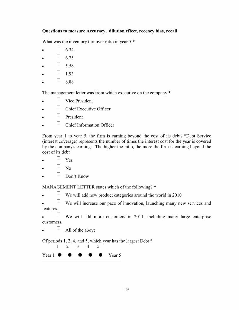
108
Questions to measure Accuracy, dilution effect, recency bias, recall
What was the inventory turnover ratio in year 5 *
• 6.34
• 6.75
• 5.58
• 1.93
• 8.88 The management letter was from which executive on the company *
• Vice President
• Chief Executive Officer
• President
• Chief Information Officer From year 1 to year 5, the firm is earning beyond the cost of its debt? *Debt Service (interest coverage) represents the number of times the interest cost for the year is covered by the company's earnings. The higher the ratio, the more the firm is earning beyond the cost of its debt
• Yes
• No
• Don’t Know MANAGEMENT LETTER states which of the following? *
• We will add new product categories around the world in 2010
• We will increase our pace of innovation, launching many new services and features.
• We will add more customers in 2011, including many large enterprise customers.
• All of the above Of periods 1, 2, 4, and 5, which year has the largest Debt *
1 2 3 4 5 Year 1 Year 5
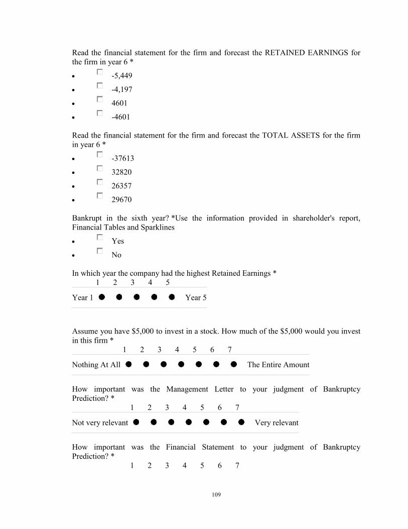
109
Read the financial statement for the firm and forecast the RETAINED EARNINGS for the firm in year 6 *
• -5,449
• -4,197
• 4601
• -4601 Read the financial statement for the firm and forecast the TOTAL ASSETS for the firm in year 6 *
• -37613
• 32820
• 26357
• 29670 Bankrupt in the sixth year? *Use the information provided in shareholder's report, Financial Tables and Sparklines
• Yes
• No In which year the company had the highest Retained Earnings *
1 2 3 4 5 Year 1 Year 5
Assume you have $5,000 to invest in a stock. How much of the $5,000 would you invest in this firm *
1 2 3 4 5 6 7 Nothing At All The Entire Amount
How important was the Management Letter to your judgment of Bankruptcy Prediction? *
1 2 3 4 5 6 7 Not very relevant Very relevant
How important was the Financial Statement to your judgment of Bankruptcy Prediction? *
1 2 3 4 5 6 7
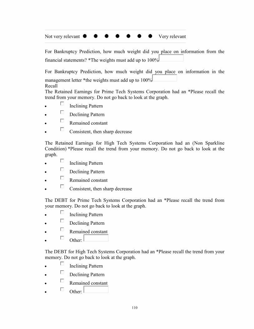
110
Not very relevant Very relevant
For Bankruptcy Prediction, how much weight did you place on information from the
financial statements? *The weights must add up to 100% For Bankruptcy Prediction, how much weight did you place on information in the
management letter *the weights must add up to 100% Recall The Retained Earnings for Prime Tech Systems Corporation had an *Please recall the trend from your memory. Do not go back to look at the graph.
• Inclining Pattern
• Declining Pattern
• Remained constant
• Consistent, then sharp decrease The Retained Earnings for High Tech Systems Corporation had an (Non Sparkline Condition) *Please recall the trend from your memory. Do not go back to look at the graph.
• Inclining Pattern
• Declining Pattern
• Remained constant
• Consistent, then sharp decrease The DEBT for Prime Tech Systems Corporation had an *Please recall the trend from your memory. Do not go back to look at the graph.
• Inclining Pattern
• Declining Pattern
• Remained constant
• Other: The DEBT for High Tech Systems Corporation had an *Please recall the trend from your memory. Do not go back to look at the graph.
• Inclining Pattern
• Declining Pattern
• Remained constant
• Other:
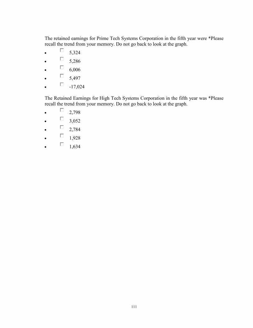
111
The retained earnings for Prime Tech Systems Corporation in the fifth year were *Please recall the trend from your memory. Do not go back to look at the graph.
• 5,324
• 5,286
• 6,006
• 5,497
• -17,024 The Retained Earnings for High Tech Systems Corporation in the fifth year was *Please recall the trend from your memory. Do not go back to look at the graph.
• 2,798
• 3,052
• 2,784
• 1,928
• 1,634
112
References
1. Abdolmohammadi, M., J. Harris, et al. (2002). "Government financial reporting on the Internet: The potential revolutionary effects of XBRL." Journal of Government Financial Management 51(2): 24-31.
2. AICPA. (2010). from http://www.aicpa.org/INTERESTAREAS/INFORMATIONTECHNOLOGY/RESOURCES/BUSINESSINTELLIGENCE/Pages/default.aspx.
3. AIS. (2010). from http://ais.affiniscape.com/displaycommon.cfm?an=1&subarticlenbr=432.
4. Altman, E. I. (1968). "Financial ratios, discriminant analysis and the prediction of corporate bankruptcy." The journal of finance 23(4): 589-609.
5. Amer, T. (1991). "An experimental investigation of multi-cue financial information display and decision making." Journal of Information Systems 5(2): 18-34.
6. Anderson, J. and J. Mueller (2005). "The Effects Of Experience And Data Presentation Format On An Auditing Judgment." Journal of Applied Business Research 21(1).
7. Anderson, J. R. (2004). Cognitive psychology and its implications, Worth Pub. 8. Arnold, V., J. C. Bedard, et al. (2009). "The impact of information tagging in the
MD&A on investor decision making: Implications for XBRL." 9. Arnold, V., J. C. Bedard, et al. (2009). "THE IMPACT OF TAGGING
QUALITATIVE FINANCIAL INFORMATION ON INVESTOR DECISION MAKING: IMPLICATIONS FOR XBRL."
10. Baddeley, A. (1992). "Working memory: The interface between memory and cognition." Journal of Cognitive Neuroscience 4(3): 281-288.
11. Bay, S. (2006). "Large scale detection of irregularities in accounting data." 12. Beattie, V. and M. Jones (1993). "Effect of graphical presentations on insights
into a company's financial position-an innovative educational approach to communicating financial information in financial reporting: a comment." Accounting Education 2(4): 303-309.
13. Beattie, V. and M. J. Jones (1997). "A Comparitive Study of the Use of Financial Graphs in the Corporate Annual Reports of Major US and UK Companies." Journal of International Financial Management & Accounting 8(1): 33-68.
14. Bell, J. (1984). "The effect of presentation form on the use of information in annual reports." Management Science: 169-185.
15. Benbasat, I. and A. Dexter (1985). "An experimental evaluation of graphical and color-enhanced information presentation." Management Science: 1348-1364.
16. Benbasat, I. and A. Dexter (1986). "An investigation of the effectiveness of color and graphical information presentation under varying time constraints." MIS Quarterly: 59-83.
17. Benbasat, I. and B. Nault (1990). "An evaluation of empirical research in managerial support systems." Decision Support Systems 6(3): 203-226.
18. Bonczek, R., C. Holsapple, et al. (1981). Foundations of decision support systems, Academic Press.
113
19. Bransford, J. (2000). How people learn: Brain, mind, experience, and school, National Academies Press.
20. Card, S., J. Mackinlay, et al. (1999). Readings in information visualization: using vision to think, Morgan Kaufmann.
21. Cardinaels, E. (2008). "The interplay between cost accounting knowledge and presentation formats in cost-based decision-making." Accounting, Organizations and Society 33(6): 582-602.
22. Carey, J. and E. White (1991). "The effects of graphical versus numerical response on the accuracy of graph-based forecasts." Journal of Management 17(1): 77.
23. Carpenter, P. and P. Shah (1998). "A model of the perceptual and conceptual processes in graph comprehension." Journal Of Experimental Psychology Applied 4: 75-100.
24. Chan, S. (2001). "The use of graphs as decision aids in relation to information overload and managerial decision quality." Journal of information science 27(6): 417.
25. Chandler, N. (2007 ) "Important Integration Considerations for Scorecards, Dashboards and Portals."
26. Cleveland, W. and R. McGill (1984). "Graphical perception: Theory, experimentation, and application to the development of graphical methods." Journal of the American Statistical Association: 531-554.
27. Cleveland, W. and R. McGill (1987). "Graphical perception: The visual decoding of quantitative information on graphical displays of data." Journal of the Royal Statistical Society. Series A (General): 192-229.
28. Cong, Y., H. Du, et al. (2008). "Does Web Syndication Technology Facilitate Investor Decision Making?" Journal of Emerging Technologies in Accounting 5: 143.
29. Crossland, M., B. Wynne, et al. (1995). "Spatial decision support systems: An overview of technology and a test of efficacy." Decision Support Systems 14(3): 219-235.
30. Davenport, T. H. and J. C. Beck (2001). The attention economy, Harvard Business School Press Boston Mass.
31. Davis, F., G. Lohse, et al. (1994). "Harmful effects of seemingly helpful information on forecasts of stock earnings." Journal of economic psychology 15(2): 253-267.
32. Debreceny, R. and G. Gray (2001). "The production and use of semantically rich accounting reports on the Internet: XML and XBRL." International Journal of Accounting Information Systems 2(1): 47-74.
33. Dennis, A. and T. Carte (1998). "Using geographical information systems for decision making: Extending cognitive fit theory to map-based presentations." Information Systems Research 9(2): 194.
34. DeSanctis, G. (1984). "Computer Graphics As Decision Aids: Directions For Research." Decision Sciences 15(4): 463-487.
35. DeSanctis, G. and S. Jarvenpaa (1989). "Graphical presentation of accounting data for financial forecasting: an experimental investigation." Accounting, Organizations and Society 14(5/6): 509-525.
114
36. Dilla, W. and P. Steinbart (2005). "Using Information Display Characteristics to Provide Decision Guidance in a Choice Task under Conditions of Strict Uncertainty." Journal of Information Systems 19(2): 29-55.
37. Dilla, W. N., D. J. Janvrin, et al. (2007). "The Impact of Graphical Displays of Non-GAAP Earnings Measures on Professional and Inexperienced Investors’ Earnings Judgments."
38. Dilla, W. N., D. J. Janvrin, et al. (2011). "The Impact of Non-GAAP Earnings and Interactive Data Displays on Earnings and Investment Judgments."
39. Dillon, A. (2000). "Spatial semantics: How users derive shape from information space." Journal of the American Society for Information Science 51(6): 521-528.
40. Dull, R. and D. Tegarden (1999). "A comparison of three visual representations of complex multidimensional accounting information." Journal of Information Systems 13(2): 117-131.
41. Elliott, W. B., F. D. Hodge, et al. (2009). "Using Online Video to Announce a Restatement: Influences on Investor Trust and Investment Decisions." Working paper presented at the 2009 Accounting, Behavior and Organizations Conference.
42. Frownfelter-Lohrke, C. (1998). "The effects of differing information presentations of general purpose financial statements on users’ decisions." Journal of Information Systems 12(2): 99-107.
43. Ghani, E., U. Mara, et al. (2009). "The Role of Presentation Format on Decision-makers’ Behaviour in Accounting." International Business Research 2(1): P183.
44. Gonzalez, C. and G. Kasper (1997). "Animation in User Interfaces Designed for Decision Support Systems: The Effects of Image Abstraction, Transition, and Interactivity on Decision Quality*." Decision Sciences 28(4): 793-823.
45. Gunn (2007). XBRL: Opportunities and Challenges in Enhancing Financial Reporting and Assurance Processes, AAA.
46. Haber, R. (1969). Information-processing approaches to visual perception, Holt, Rinehart and Winston.
47. Hart, S. G. and L. E. Staveland (1988). "Development of NASA-TLX (Task Load Index): Results of empirical and theoretical research." Human mental workload 1: 139–183.
48. Hodge, F. D. (2001). "Hyperlinking unaudited information to audited financial statements: Effects on investor judgments." Accounting Review 76(4): 675-691.
49. Hodge, F. D., J. J. Kennedy, et al. (2004). "Does search-facilitating technology improve the transparency of financial reporting?" Accounting Review 79(3): 687-703.
50. Hollan, J., E. Hutchins, et al. (2000). "Distributed cognition: toward a new foundation for human-computer interaction research." ACM Transactions on Computer-Human Interaction (TOCHI) 7(2): 174-196.
51. Holsapple, C. and M. Singh (2001). "The knowledge chain model: activities for competitiveness." Expert Systems with Applications 20(1): 77-98.
52. Holsapple, C. and A. Whinston (1996). Decision Support Systems: A Knowledge-based Approach. Minneapolis/St. Paul, MN: .
53. Holsapple, C. W. (2003). What are the characteristics of a Decision Support System? . DSS News, . Vol. 4.
115
54. Hostmann, B. (2009). "Trends That Business Intelligence Leaders Can not Afford to Ignore." from http://www.gartner.com/it/content/1436200/1436229/october_14_bi_trends_bhostman.pdf.
55. Hutchins, E. (1995). Cognition in the Wild, Bradford Books. 56. Hutchins, E. and D. Norman (1988). "Distributed cognition in aviation: a concept
paper for NASA (Contract No. NCC 2-591)." Department of Cognitive Science. University of California, San Diego.
57. Hutchinson, J. W., J. W. Alba, et al. (2010). "Heuristics and Biases in Data-Based Decision Making: Effects of Experience, Training, and Graphical Data Displays." Journal of Marketing Research 47(4): 627-642.
58. Jarvenpaa, S. (1989). "The effect of task and graphical format congruence on information processing strategies and decision-making performance." Management Science 35(3): 285-303.
59. Jarvenpaa, S. (1989). "The effect of task demands and graphical format on information processing strategies." Management Science: 285-303.
60. Jiang, Z. and I. Benbasat (2007). "The Effects of Presentation Formats and Task Complexity on Online Consumers' Product Understanding." MANAGEMENT INFORMATION SYSTEMS QUARTERLY 31(3): 475.
61. Jiang, Z. and I. Benbasat (2007). "Research Note Investigating the Influence of the Functional Mechanisms of Online Product Presentations." Information Systems Research 18(4): 454.
62. Johnston, R. (2010). "What s New for CPAs in Office 2010." Journal of Accountancy(February).
63. Kahneman, D. (1973). Attention and effort, Prentice-Hall Englewood Cliffs, NJ. 64. Kahneman, D. and A. Tversky (1979). "Prospect theory: An analysis of decision
under risk." Econometrica: Journal of the Econometric Society: 263-291. 65. Kaplan, S. E., S. Pourciau, et al. (1990). "An examination of the effect of the
president's letter and stock advisory service information on financial decisions." Behavioral Research in Accounting 2: 63-92.
66. Keen, P. and S. Morton "MS (1978)." Decision support systems: an organizational perspective.
67. Keim, D. (2002). "Information visualization and visual data mining." IEEE transactions on visualization and computer graphics 8(1): 1-8.
68. Kelton, A. S. (2006). "Internet financial reporting: The effects of hyperlinks and irrelevant information on investor judgments."
69. Kelton, A. S. and Y. Yang (2008). "The impact of corporate governance on Internet financial reporting." Journal of Accounting and Public Policy 27(1): 62-87.
70. Kumar, N. and I. Benbasat (2004). "The effect of anchoring and encoding on information representation: A comparison of 2D and 3D graphs." MIS Quarterly 28(2): 255-281.
71. Large, A., J. Beheshti, et al. (1996). "Effect of animation in enhancing descriptive and procedural texts in a multimedia learning environment." Journal of the American Society for Information Science 47(6).

116
72. Larkin, J. and H. Simon (1987). "Why a diagram is (sometimes) worth ten thousand words." Cognitive science 11(1): 65-100.
73. Lauritzen, S. and D. Nilsson (2001). "Representing and solving decision problems with limited information." Management Science: 1235-1251.
74. Lee, J., J. MacLachlan, et al. (1986). "The effects of 3D imagery on managerial data interpretation." MIS Quarterly: 257-269.
75. Libby Ken, T. (1993). "The review process as a control for differential recall of evidence in auditor judgments* 1." Accounting, Organizations and Society 18(6): 559-574.
76. Lim, K. and I. Benbasat (2000). "The effect of multimedia on perceived equivocality and perceived usefulness of information systems." MIS Quarterly: 449-471.
77. Lim, K., I. Benbasat, et al. (2000). "The role of multimedia in changing first impression bias." Information Systems Research 11(2): 115.
78. Lohse, G. (1993). "A cognitive model for understanding graphical perception." Human-Computer Interaction 8(4): 353-388.
79. Lohse, G. (1997). "Models of graphical perception." Handbook of Human-Computer Interaction: 107–135.
80. Lucas Jr, H. (1981). "An experimental investigation of the use of computer-based graphics in decision making." Management Science: 757-768.
81. Miller, G. (1956). "The magical number seven, plus or minus two: Some limits on our capacity for processing information." Psychological review 63(2): 81-97.
82. Mirel, B. (1998). "Visualizations for Data Exploration and Analysis: A Critical Review of Usability Research." Technical Communication: Journal of the Society for Technical Communication 45(4): 491-509.
83. Montazemi, A., F. Wang, et al. (1996). "On the effectiveness of decisional guidance." Decision Support Systems 18(2): 181-198.
84. Morrison, J. and D. Vogel (1998). "The impacts of presentation visuals on persuasion." Information & Management 33(3): 125-135.
85. Morton, S. (1971). " Management Decision Systems: Computer Based Support for Decisión Making." Division of Research, Harvard University, Carbridge, MA.
86. Narayanan, N. H. and M. Hegarty (1998). "On designing comprehensible interactive hypermedia manuals." International Journal of Human-Computers Studies 48(2): 267-301.
87. Nash, B. (2006). Essentials of psychology. 88. Nelson, L., D. Cook, et al. (1999). "Xgobi vs the c2: Results of an experiment
comparing data visualization in a 3-d immersive virtual reality environment with a 2-d workstation display." Computational Statistics 14(1): 39-52.
89. Nisbett, R., H. Zukier, et al. (1981). "The dilution effect: Nondiagnostic information weakens the implications of diagnostic information* 1." Cognitive Psychology 13(2): 248-277.
90. Oskamp, S. (1965). "Overconfidence in case-study judgments." Journal of consulting psychology 29(3): 261-265.
91. Paivio, A. (1986). Mental representations, Clarendon Press Oxford [Oxfordshire. 92. Paivio, A. (1991). "Dual coding theory: Retrospect and current status." Canadian
Journal of psychology 45(3): 255-287.
117
93. Peng, J., R. E. Viator, et al. (2007). "An Experimental Study of Multidimensional Hierarchical Accounting Data: Drill Down Paths Can Influence Economic Decisions." Journal of Information Systems 21: 69.
94. Pinker, S. (1990). "A theory of graph comprehension." Artificial intelligence and the future of testing: 73-126.
95. Pylyshyn, Z. (1973). "What the mind's eye tells the mind's brain: A critique of mental imagery." Psychological Bulletin 80(1): 1-24.
96. Remus, W. (1984). "An empirical investigation of the impact of graphical and tabular data presentations on decision making." Management Science: 533-542.
97. Rieber, L. (1994). Computers, graphics & learning, Brown & Benchmark Madison, Wis.
98. Roscoe, P. and C. Howorth (2009). "Identification through technical analysis: A study of charting and UK non-professional investors." Accounting, Organizations and Society 34(2): 206-221.
99. Sadoski, M. and A. Paivio (2001). Imagery and text: A dual coding theory of reading and writing, Lawrence Erlbaum Associates.
100. Schmell, R. and N. Umanath (1988). "An experimental evaluation of the impact of data display format on recall performance." Communications of the ACM 31(5): 562-570.
101. Schulz, A. and P. Booth (2009). "The Effects Of Presentation Format On The Effectiveness And Efficiency Of Auditors'analytical Review Judgments." Accounting & Finance 35(1): 107-131.
102. SEC (2008). "SEC approves interactive data for financialvreporting by public companies, mutual funds. ." Securities and Exchange Commission.
103. SEC (2009). 104. Sharda, R., S. Barr, et al. (1988). "Decision support system effectiveness:
a review and an empirical test." Management Science: 139-159. 105. Shelton, S. W. (1999). "The effect of experience on the use of irrelevant
evidence in auditor judgment." The Accounting Review 74(2): 217-224. 106. Shneiderman, B. (1992). "Tree visualization with tree-maps: 2-d space-
filling approach." ACM Transactions on graphics (TOG) 11(1): 92-99. 107. Shneiderman, B. (1996). The eyes have it: a task by data type taxonomy
for informationvisualizations. 108. Shneiderman, B. (2000). "Creating creativity: user interfaces for
supporting innovation." ACM Transactions on Computer-Human Interaction (TOCHI) 7(1): 114-138.
109. Simon, S. (1960). The new science of management decision, Citeseer. 110. Speier, C. and M. Morris (2003). "The influence of query interface design
on decision-making performance." MIS Quarterly: 397-423. 111. Speier, C., J. Valacich, et al. (1997). The effects of task interruption and
information presentation on individual decision making, Association for Information Systems Atlanta, GA, USA.
112. Sundberg, P. (1998). "Animation in CALL: Learning to think in the fourth dimension." Paper Presentation CALICO 98.
113. Sweller, J. (1988). "Cognitive load during problem solving: Effects on learning." Cognitive Science: A multidisciplinary journal 12(2): 257-285.
118
114. Thomassin Singh, D. (1998). "Incorporating cognitive aids into decision support systems: the case of the strategy execution process." Decision Support Systems 24(2): 145-163.
115. Todd, P. and I. Benbasat (1991). "An experimental investigation of the impact of computer based decision aids on decision making strategies." Information Systems Research 2(2): 87.
116. Todd, P. and I. Benbasat (1992). "An experimental investigation of the impact of computer-based DSS on processing effort." MIS Quarterly 16(3): 373-393.
117. Todd, P. and I. Benbasat (1992). "The use of information in decision making: an experimental investigation of the impact of computer-based decision aids." MIS Quarterly: 373-393.
118. Todd, P. and I. Benbasat (1999). "Evaluating the impact of DSS, cognitive effort, and incentives on strategy selection." Information Systems Research 10(4): 356.
119. Todd, P. and I. Benbasat (2000). "The impact of information technology on decision making: A cognitive perspective." Framing the domains of IT management—Projecting the future through the past.
120. Tractinsky, N. and J. Meyer (1999). "Chartjunk or goldgraph? Effects of presentation objectives and content desirability on information presentation." MIS Quarterly: 397-420.
121. Tufte, E. (1990). "The visual display of quantitative information. 1983." Envisioning information.
122. Tufte, E. (1995). Envisioning Information (5th printing, August 1995 ed.), Cheshire, Conn.: Graphics Press.
123. Tufte, E. (1997). Visual Explanations (Cheshire, CT, Graphics Press. 124. Tufte, E. (2006). Beautiful evidence, Graphics Press Cheshire, Conn. 125. Tversky, B., J. Morrison, et al. (2002). "Animation: can it facilitate?"
International Journal of Human Computer Studies 57(4): 247-262. 126. Umanath, N. and I. Vessey (1994). "Multiattribute Data Presentation and
Human Judgment: A Cognitive Fit Perspective*." Decision Sciences 25(5-6): 795-824.
127. Van Merrienboer, J. and J. Sweller (2005). "Cognitive load theory and complex learning: Recent developments and future directions." Educational Psychology Review 17(2): 147-177.
128. Vance Wilson, E. and I. Zigurs (1999). "Decisional guidance and end-user display choices." Accounting, Management and Information Technologies 9(1): 49-75.
129. Vera-Munoz, S. C., W. R. Kinney Jr, et al. (2001). "The effects of domain experience and task presentation format on accountants' information relevance assurance." Accounting Review 76(3): 405-429.
130. Vessey, I. (1991). "Cognitive Fit: A Theory-Based Analysis of the Graphs Versus Tables Literature*." Decision Sciences 22(2): 219-240.
131. Vessey, I. and D. Galletta (1991). "Cognitive fit: An empirical study of information acquisition." Information Systems Research 2(1): 63.
119
132. Volmer, F. (1992). "Effect of graphical presentations on insights into a company's financial position: an innovative educational approach to communicating financial information in financial reporting." Accounting Education 1(2): 151-170.
133. Vom Brocke, J., A. Simons, et al. (2009). Reconstructing the giant: on the importance of rigour in documenting the literature search process.
134. Wali Van Lohuizen, C. (1986). "Knowledge management and policymaking." Science Communication 8(1): 12.
135. Watson, C. and R. Driver (1983). "The influence of computer graphics on the recall of information." MIS Quarterly 7(1): 45-53.
136. Weber, E., H. Ross, et al. (1996). EH Weber on the tactile senses, Psychology Press.
137. Webster, J. and R. T. Watson (2002). "Analyzing the past to prepare for the future: Writing a literature review." MANAGEMENT INFORMATION SYSTEMS QUARTERLY 26(2): 3.
138. Weisberg, R. (1992). "Metacognition and insight during problem solving: Comment on Metcalfe." Journal of Experimental Psychology: Learning, Memory, and Cognition 18(2): 426-431.
139. Wheeler, P. R. and V. Arunachalam (2008). "The Effects of Decision Aid Design on the Information Search Strategies and Confirmation Bias of Tax Professionals." Behavioral Research in Accounting 20: 131.
140. Wickens, C. and C. Carswell (1995). "The Proximity Compatibility Principle: Its Psychological Foundation and Relevance to Display Design." Human Factors 37(3).
141. Willis, M. (2003). "Corporate Reporting Enters the Information AgE." XBRL International.
142. Willis, M. (2006). File Number 4-515 S. a. E. Commission. Washington, D.C. 20549-1090, PricewaterhouseCoopers
143. 20. 144. XBRL (2010). 145. Zhang, J. and D. Norman (1994). "Representations in distributed cognitive
tasks." Cognitive science 18(1): 87-122. 146. Zhang, J. and V. Patel (2006). "Distributed cognition, representation, and
affordance." Pragmatics &# 38; Cognition 14(2): 333-341. 147. Zhao, L. (2008). Dynamic representation of financial ratios: A design and
empirical test, Case Western Reserve University.

120
Vita
PRIYANKA MEHARIA
EDUCATION M.S. in Management Information Science and Technology Jan 2005 - July 2006. Missouri University of Science and Technology (formerly the University of Missouri-Rolla) The Department of Business and Information Technology GPA:3.8/4.0 Graduate Certificate in Enterprise Resource Planning (ERP) Jan 2005 - July 2006. Missouri University of Science and Technology (formerly the University of Missouri-Rolla). Certificate in Computer Programming August 2000. National Institute of Information Technologies (NIIT), Calcutta, India. B.S in Commerce/Accounting May 2000. Sri Shikshayatan College for Women University of Calcutta, India. First Division PROFESSIONAL CERTIFICATIONS Certified Public Accountant (CPA); not in public practice April 2007. Delaware Board of Accountancy, Delaware Certificate # CC0007452. MySAP Business Suite May 2006. SAP America, USA. Foundation and Intermediate level Chartered Accountancy Course August 2001. The Institute of Chartered Accountants of India, India TEACHING Eastern Michigan University Assistant Professor Aug 2011 – Present.
University of Kentucky Graduate Teaching Assistant Jan 2008– May 2011.

121
Missouri University of Science and Technology (formerly the University of Missouri-Rolla) Graduate Teaching Assistant August 2005 – May 2006. PUBLICATIONS Peer Reviewed Journal
• P Meharia; B Panja; J Hu, Towards a model for enhancing consumer trust in an online environment, International Journal of Research in Computer Application & Management, ISSN 2231-1009, volume no. 2 (2012), Issue no. 1
• P Meharia , Assurance on the Reliability of Mobile Payment System and its effects on its’ use: an empirical examination; accepted at Journal of Accounting and Management Information Systems
Peer Reviewed Conference • R Santhanam; S Sasidharan; P. Meharia; D Brass; V Sambamurthy Improving the
Success of Enterprise information System Implementation - Current Findings and Future Research, The Enterprise Information Systems International Conference on Research and Practical Issues of EIS (CONFENIS, 2009), Hungary.
• B Panja, B Schneider, P Meharia, Wirelessly sensing open parking spaces : accounting and management of parking facility, (2011). AMCIS 2011 Proceedings - All Submissions. Paper 270.
• B Panja, K Highley, P Meharia: Enterprise Mobile Security using Wireless Sensor Network, Annual Symposium on Information Assurance (Asia), June 7-8, 2011, Albany, NY
• B Panja, Dayton Paul, Priyanka Meharia, Alex Henke. Cloud computing Security using DOSBAD: Denial of Service Bandwidth Allowance. World Congress in Computer Science, Computer Engineering, and Applied Computing 2012. Las Vegas, NV.
• B Panja, Atul Prakash, Priyanka Meharia, and Brad Schneider. Security in Sensor Network Based SCADA System for Adaptive Traffic Signal Operation. International Conference on Collaboration Technologies and Systems (CTS) 2012, Denver, CO.
INDUSTRY EXPERIENCE SAP Report Developer September 2006- July 2007. Kentucky Medical Services Foundation Inc, Lexington, Kentucky Student Intern August 2005 – July 2006. SAP University Competency Center, University of Missouri-Rolla Finance Manager/Director July 2000 – May 2003. Smart Land Estates Pvt Ltd (Real Estate Development Company), Calcutta, India

122
Accounting Clerk November 1998 – December 2000. Meharia Consultants Pvt Ltd (Chartered Accountancy Firm) Calcutta, India