the value of local agricultural information: evidence from
TRANSCRIPT
The Value of Local Agricultural Information:Evidence from Kenya∗
Raissa Fabregas, Michael Kremer, Jonathan Robinson, and Frank Schilbach†
This version: November 25th, 2019
Abstract
The suitability of agricultural inputs can be dependent on local agro-climatic con-ditions and soil characteristics. For example, the effectiveness of a particular type offertilizer might depend on the extent of soil acidity or carbon content, which canvary across areas. This makes information about optimal local agricultural practicespotentially valuable to farmers. However, it might be too costly for each farmer togenerate this type of information for their own farm. However, if soil characteris-tics are spatially correlated, local -rather than individual- agricultural informationmight be valuable and any piece of information could be shared by many. This pa-per provides an empirical estimation of smallholder Kenyan farmers’ valuation forfertilizer recommendations based on soil analyses and experimental test plots basedon nearby farms. We first show that recommended practices are heterogeneous butspatially correlated. Second, we report on four trials that estimated farmers’ willing-ness to pay (WTP) for local agricultural information. The mean WTP for local soiltest results is between $0.2 and $4.8, and for results from local experimental plots is$2.3. Under certain assumptions, the aggregate WTP for soil information in an areaexceeds the costs of generating and delivering such information.
∗We thank Daniel Pollmann and Josh Schwartzstein for helpful discussions and comments. We alsothank Brian Giera, Thomas Ginn, Hwee Boon Goh, Mahnaz Islam, Xavier Jaravel, Cara Myers, AlexanderNawar, Kim Siegal, and Jack Willis for their support with field activities in Kenya. Jasleen Kaur providedexcellent research assistance. The funding for this study was provided by: ATAI, 3ie, and Harvard’sWeatherhead Center for International Affairs. We thank them, without implicating them, for making thisstudy possible.†Fabregas: University of Texas at Austin, [email protected]; Kremer: Harvard University and
NBER, [email protected]; Robinson: University of California, Santa Cruz and NBER, email: [email protected]; Schilbach: Massachusetts Institute of Technology, [email protected].
1
1 Introduction
Local conditions such as soil types, nutrient deficiencies, altitude, micro-climates or mar-
ket prices affect the suitability and profitability of different agricultural inputs, types of
seeds or crop choices (Suri, 2011). Improved information about local agro-climatic con-
ditions could enable small-scale farmers to undertake more locally appropriate agricul-
tural decisions. For instance, localized information about the characteristics of their soils
could help them better calibrate input use.
Economic theory suggests that the provision of information may be subject to market
failures (Arrow, 1962; Romer, 1986). However, if the cost of generating information is
greater than its value to any one individual but less than the value to the community
as a whole, it will be socially efficient to generate that information (Samuelson, 1954).
Nevertheless, when information can be easily shared, it may be difficult for producers
of information to recover their costs and limited incentives will exist for its creation.
Lack of generation and dissemination of science-based local agricultural knowledge
is apparent in Western Kenya, the area of study. Soil tests to determine suitable fertilizer
types for a given area are rarely used, and most small-scale farmers have never exper-
imented with inputs using on-farm trials with appropriate comparison plots. While
the private benefits arising from such experimentation might be lower than the costs of
creating this information, the social benefits may be sufficiently large to outweigh the
costs of producing this knowledge if the information is spatially correlated and could
be shared among neighbors. Therefore, while soil tests and experimental plots might be
too expensive and impractical to be implemented on everyone’s farms, testing soils for
some farmers in the area and sharing these results with neighboring farmers could be
valuable.
In this paper, we provide empirical evidence of smallholder farmers’ valuation for
neighboring agricultural information. First, we characterize agricultural information
2
from soil tests and experimental plots. Second, we investigates farmers’ valuation for
local agricultural information through four different willingness to pay (WTP) trials.
The mean WTP for local soil test results is between $0.2 and $4.8, and for results from
local experimental plots is $2.3. Under certain assumptions, the aggregate WTP for soil
information in an area exceeds the costs of generating and delivering such information.
This work complements existing empirical evidence that estimates farmers’ willing-
ness to pay for agricultural information. Cole and Fernando (2016) elicit willingness to
pay for an Interactive Voice Response (IVR) system for cotton farmers in Gujarat, India.
They find that while the cost of the service was $7 per 9-months, farmers valued the
service at $2 for that same period. Interestingly, their impact estimates suggest that the
benefits of receiving the information were much higher than the costs. Similarly, Palloni
et al. (2018) find that farmers in Ghana have a high WTP for a phone-based informa-
tion service at low prices but that their WTP decreases rapidly as the price increases.
Complementary work has looked at the impacts of receiving agricultural information
on farmers’ WTP for those inputs or their decision to use them (Murphy et al., 2017;
Tjernstrom et al., 2019; Fabregas, 2019; Casaburi et al., 2014; Van Campenhout et al.,
2018).
The paper proceeds as follows. Section 2 discusses the context where this project
takes place. Section 3 presents the characteristics of the information. Details about
the WTP trials are found in section 4 and results are discussed in section 5. Section 6
concludes.
2 Context
This project took place in Western Kenya between 2012 and 2015. In this region, maize is
the primary staple crop and the main crop for all the farmers in this study. Few farmers
in this region have ever gotten their soil analyzed, and experimenting with new fertilizer
3
is rare. For instance, in a survey conducted in 2015 only 9% of farmers report having
had a soil test ever conducted in their farm.
Chemical fertilizers used in the area include diammonium phosphate (DAP), a source
of phosphorus and nitrogen which is applied at planting, calcium ammonium nitrate
(CAN), a nitrogen-based fertilizer, which is typically applied at top-dressing, and NPKs,
a nitrogen-phosphorous-potassium compound also applied during planting. While DAP
and CAN have been widely available in the study area, NPK has not.
Several authors have document limited use of productive agricultural inputs despite
high average returns. For instance, Duflo et al. (2008) and Duflo et al. (2011) find that
returns to top dressing fertilizer (CAN) are high on average, with annualized returns
between 52 and 85 percent. In addition, these authors find that many farmers switch
back and forth between using and not using fertilizer from season to season. There is
also evidence that returns to agricultural inputs vary across farmers. For example, Suri
(2011) documents heterogeneity in costs and benefits of hybrid seeds, and Marenya and
Barrett (2009) find that heterogeneity in returns to nitrogen fertilizer is associated with
variation in soil carbon content.
3 Agricultural Information
The potential value of local information depends crucially on the spatial correlation
of soil characteristics and test plot results. Information from a neighbor’s plot is only
helpful for a farmer if this information is somewhat predictive of his or her own soil
characteristics and, hence, indicative of own expected distribution of rates of return.
This section will, hence, consider several measures to determine whether the information
collected and distributed by the project is spatially correlated.
4

3.1 Soil Chemistry: Soil Tests
We conducted two rounds of soil analyses. In the first round we conducted soil tests
in 1,615 farms during Fall 2011. These soil tests were part of the endline survey of
a previous research project, where a sample of farmers in the area were offered the
opportunity to participate in a soil test lottery, with a 50% probability of winning a soil
test.1 A second round of soil tests took place in 2014. At that time, the research team
visited a random sample of 576 farmers, residing in one of 37 catchment areas.2 During
this round, to understand how precise the soil analyses were for a given farm plot, two
different soil samples were taken for each farm. In total, 1,152 soil tests were analyzed.
Soil samples were collected by a team of trained enumerators, following standard soil
sampling protocols.3 Soil samples were sent for testing at the National Agricultural Re-
search Laboratories (NARL), managed by the Kenya Agricultural and Livestock Research
Organization (KARLO). The analysis determined levels of pH, organic carbon content,
nitrogen, phosphorus, potassium, calcium, magnesium, manganese, iron, copper, zinc,
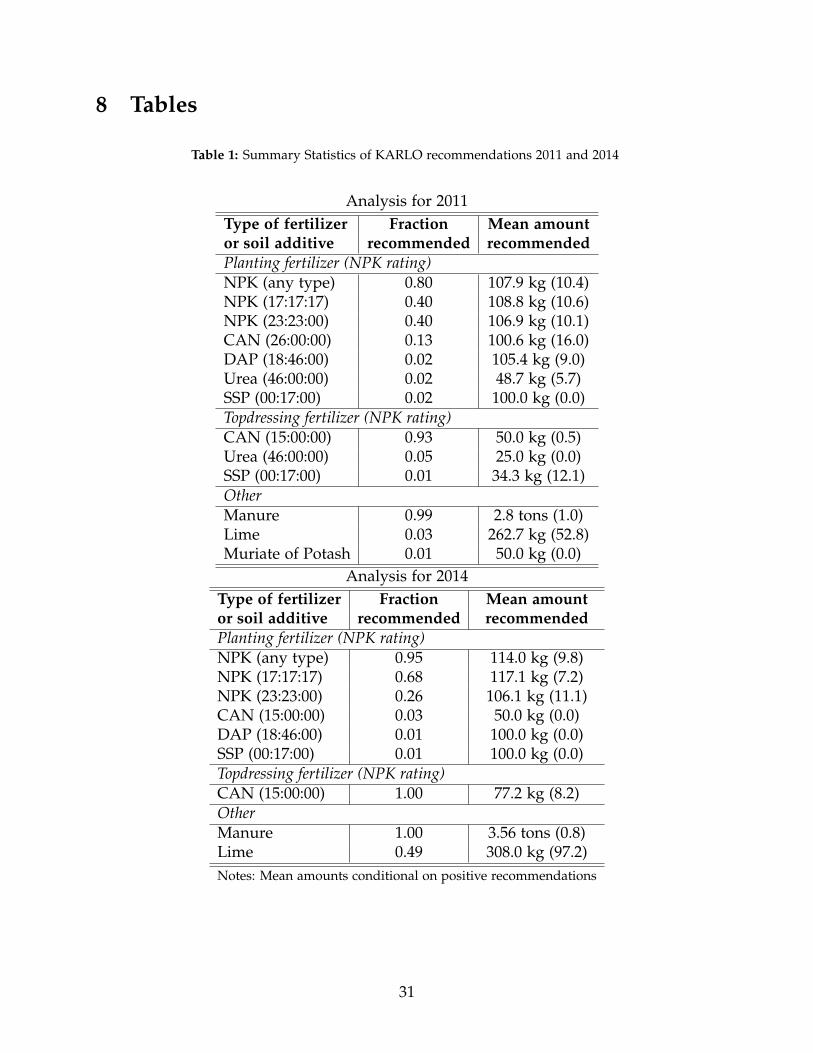
and sodium. Based on these soil characteristics, KALRO generated recommendations
for types and quantities of locally available fertilizers (CAN, DAP, and NPK) as well as
agricultural lime and manure. Summary statistics of the recommendations produced by
NARL are shown in Table 1.
Figure 1 shows the distribution of selected soil characteristics across the entire 80 km
by 60 km study area for the first round and second round of soil tests. The red lines show
the adequate nutrient levels according to NARL. These graphs show high heterogeneity
in soil characteristics. In addition, much of the distribution for key nutrients such as
1See Duflo et al. (2013) for additional details on this sample. In that project farmers were recruitedthrough school meetings. The original sample consisted of over 20,000 farmers in the region, from which5,000 were randomly sampled to complete an in-person household survey. From that group, a randomlyselected two thirds of farmers were offered the opportunity to participate in a soil test lottery.
2We define a catchment area as the area around a primary school. Villages are not well-defined in thisregion, but primary schools are well-known landmarks that people use as a geographical reference
3Soil samples are taken in a zig-zag pattern from at least 20 parts of the land and then combined togenerate a final soil sample, that is less likely to be vulnerable to within plot noise
5
nitrogen and phosphorus lies to the left of the adequate level, suggesting soil nutrient
deficiencies.
Figure 2 maps the spatial distribution of soil pH, nitrogen, carbon and phosphorus
by tercile. Figure 3 maps recommendations for the type of NPK (or neither) as produced
by NARL. Visual inspection of maps of suggest that the values of these variables are
spatially correlated. These visual impressions are confirmed by additional measures of
spatial correlation. First, columns 1 and 2 of Table 2 show that the measured intra-cluster
correlation (ICC) using farmers (with several plots) as clusters is between 0.23 (Zinc) and
0.74 (Copper) in 2011.4 In 2014, the range is between 0.04 (Copper) and 0.79 (Nitrogen).
Columns 3 and 4 of this table show that the measured ICC of soil characteristics using
the original primary school as cluster variable. Primary schools are local landmarks, and
we consistently use them to denote an area. In 2011, the ICC is between 0.06 (Zinc) and
0.47 (Copper) and in 2014 it was between 0.01 (iron) and 0.55 (Calcium).5
Second, neighbors’ results are predictive of soil characteristics and recommendations.
Including neighbors’ characteristics reduces the mean square error (MSE) of the predic-
tion compared to using overall means of the corresponding variables using data from
all soil tests in the sample. Column 3 of Table 2 shows that using the mean of the soil
characteristics of farmers that live in the same school area can reduces the MSE of pre-
diction compared to using the overall mean for most characteristics.6 For instance, using
school (area) means reduces the MSE of prediction for soil pH by between 12 and 28%,
for carbon (15-20%), Copper (10-39%), and nitrogen (10-16%). However, for Iron and
Zinc the MSE of the prediction in fact increases.
Finally, Figure 4 shows the predictiveness of the information for different distances
4Note that this is not a measure of the test-retest correlation since for most farmers with more thanone soil test, one test was taken from the fertilized parts of their land and the other one from unfertilizedparts. The measured ICC increases (to between 0.45 (Zinc) and 0.79 (Copper) when the variables are (log-)transformed to alleviate the influence of outliers.
5The ICC is calculated using one observation per farmer. For farmers with several soil tests we calcu-lated the mean of these tests.
6The own result is, of course, excluded when calculating school means.
6

(which also implies varying the number of observations) using the data for 2011. Moving
further away greatly increases the number of observations (the number of observations
are shown next to the black dots) but it makes prediction worse. The variables are
normalized such that by construction the MSE converges to 1 when using the entire
sample.
3.2 Rates of Return to Fertilizer: Experimental Plots
In addition to the soil tests, we invited farmers to set up experimental test plots in their
land, so as to produce information on the rates of returns to different types of fertilizers.
In 2014, we randomly sampled 432 individuals in 10 market centers to participate in
demonstration plot trials. Approximately, 7% of this sample declined. Test plots were
set with a total of 378 individuals. Test plots for different types of fertilizers were set up
in each respondent’s farm. All test plots were set up within the same farmland and each
test plot was further divided in two subplots; whether a subplot would be treatment or
control was randomized into receiving NPK, CAN or DAP.
Participants were asked to use their normal fertilizer application method on the first
plot and to apply half a teaspoon of fertilizer on the treated plots. Farmers were in-
structed to farm as they usually would, and members of the research team supervised
the application of fertilizers. Finally, at the end of the season field officers returned to
harvest with respondents and weigh their maize for each subplot. The rate of return was
calculated using data on inputs, prices and harvest weights.
Based on these calculations we prepared information sheets with recommendations
based on profitability. Information was provided on rates of return for 3 types of fertil-
izers, yield with and without fertilizer, amounts of fertilizer provided, and local maize
and fertilizer prices.
7
4 Study Design
We conducted four trials to elicit farmers’ willingness to pay for the agricultural infor-
mation from neighboring soil analysis and experimental test plots. Trials one and two
were smaller in scale and were conducted as part of the activities of a separate research
project. Trials 3 and 4 incorporated many of the lessons learned during the first two
trials. We describe each trial in turn.
Trial I. The first WTP trial took place in February and March 2012. A sample of 1,319
farmers who were part of the original research sample, and therefore lived in the same
areas, but had not gotten their own soil tested, were offered the soil test results from
their neighbors. Farmers were visited at their homes and their WTP for soil test infor-
mation was elicited through a RLIS (Random Lottery Incentive System) where they were
given a series of choices between monetary payments (ranging from Ksh 20 to Ksh 200,
increasing in steps of Ksh 20) and receiving the neighboring farmers’ soil test results.
We define willingness to pay (WTP) as the highest amount, at which the respondent
preferred information over money. For example, if a respondent preferred to receive the
information over Ksh 140 (and all lower amounts), but preferred Ksh 160 (and all higher
amounts) over receiving the information, her WTP is Ksh 140). Appendix A1 shows an
example of this method. To ensure incentive compatibility, we randomly selected one
of these choices, and then implemented the option that the farmer had selected for this
choice.7
Trial II. The second WTP trial took place in June and July 2012. For this trial, a new sam-
ple of individuals whom had been visited in Fall 2011 as part of the previous research
project was selected.8 This trial took place during school meetings, to which farmers
7Additionally, the research team return the soil test results to the 370 farmers who had their own landtested.
8Just like in the first trial, approximately one third of these individuals had gotten their soil tested, andanother third of individuals had been explicitly informed about these tests. We worked with farmers whohad not received the information
8

where previously invited. WTP elicitation was done in private with farmers. However,
since this trial was in a public place, in principle, it would have been possible for farm-
ers to share the information they had acquired with others as they walked out of the
meeting.
Farmers were randomly divided into two categories: a first group was given Ksh
100 and later on were offered the soil test results of one randomly selected farmer from
the area at a price of Ksh 100. A second group was given Ksh 100 and had a choice of
purchasing the soil test results of another farmer at a Ksh 50 price.
Trial III. In June 2013, we conducted a farmer census and randomly sampled farmers
from areas in which we had previously set up experimental plots.9A total of 866 farmers
were surveyed in 34 different areas.10
Enumerators collected information on demographics, farming experiences and in-
put use, and beliefs about the effectiveness of different types of chemical fertilizers. At
the end of the survey the enumerator conducted the WTP experiments. Enumerators
carefully explained how the experimental plots were set up in other farmers’ land. For
instance, they informed subjects that farmers themselves managed these plots and that
they applied the amounts of fertilizer they had deemed appropriate. They were also told
that there were subplots that received fertilizer and subplots that did not and comparing
them could help assess the effects of fertilizers on yield increases, but that the differ-
ence in yields were not enough to assess profitability of fertilizer use. Instead needed
9Since villages are not well defined in this area, farmers were drawn through a random walk methodin which a starting point is first selected and households from that point onwards are randomly selectedthrough a set of rules (e.g. every fifth or sixth household). We completed a short questionnaire at eachhousehold, in which we collected GPS information for the farm, information on household structure andwho the person responsible for farming was. From July to September 2013, 899 farmers were visited attheir homes to invite them to complete WTP elicitation surveys for information on experimental plots.
10Primary schools are a good landmark in this setting, since they are ubiquitous and most people knowwhat their closest primary school to their home is. In the sample, over 90% of farmers live within 2 km oftheir closest school. In total, we worked in the surrounding area of 34 landmarks. Therefore in order toconvey where the experimental plots were located and in order to keep a given area fixed we calculatedthe distance of the experimental plot to each local landmark. We then explained within what radius of thelandmark were the experimental plots located. Enumerators were aided by a diagram which would showthe landmark, the different radius and the test plots. Distances were also explained in walking time.
9
to account for the costs of inputs and the price at which one could sell the maize.11
Enumerators had drawings of experimental plots which helped explain this message.
The enumerator would then offer an information sheet to the respondent which con-
tained information on rates of returns for different types of chemical fertilizer for nearby
plots. Each sheet contained a table with information on the increase in yields from DAP,
CAN and NPK, the amount of fertilizer used, differences in costs from using and not
using fertilizers and a calculation for the rates of return for each type of fertilizer. The
information sheet also explained how rates of returns were calculated and what did they
mean. Before eliciting WTP for the local sheet the enumerator would show a template
piece of paper to respondents (that contained the table but not the actual information), to
reduce information asymmetries and ensure that respondent was clear on exactly what
type of information they could receive. In addition, a sample of farmers were random-
ized into a module that elicited WTP for soil test results. Figures A3 and A2 in the
appendix depict examples of information sheets for test plots and soil tests respectively.
Each farmer completed several WTP elicitation modules in which different versions
of information sheets were offered to them. The order of the modules was randomized
and WTP was elicited through RLIS in which farmers were offered a series of choices
between different monetary amounts and the information. For each agricultural infor-
mation product, the respondent was presented with both choices and she could choose
between information or money, where the money offers initially ranged from 20 to 500
Kenyan Shillings (approximately between 0.2 and 5 US dollars).12 Farmers were ran-
domly assigned to the following modules:
Distance from Test Plots. A fixed number of 3 test plots at varying distances from the
closest landmark (0-5 km, 0-10 km, 10-20 km).
11The protocols also clarified that yields can be affected by other factors and that information from theseexperimental plots were only one source of information they should consider but that it could be noisy.
12Initially, for the first couple of days the maximum amount was 200 Ksh. However, we increased thisceiling since many farmers were choosing Ksh 200 over the information.The offers were for 20, 50, 100,150, 200, 300, 400 and 500 Ksh.
10
Number of Test Plots. The average of a varying number of test plots within a fixed distance
to the closest landmark (1, 2 or 3).
Information on Soil Tests. A randomly selected group of farmers was also offered result
from a soil tests within 10 km of the landmark.
Placebo. To measure a lower bound of willingness to pay we elicited WTP for a sheet
with low information content (the sheet contained a single number, the total yields in kg
from a plot at least 20 km of closest school).
To ensure that farmers had an incentive to truthfully reveal their willingness to pay, par-
ticipants were informed that one of their choices would be randomly chosen at the end
of the visit to be implemented. The implementation of the module and question within
the module depended on a series of numbers revealed on a phone scratch card that the
respondents would scratch at the end of the survey. 13 On average, we collected WTP
data for five different information sheets for each farmer.
The experimental design in trial III attempted to address potential concerns regarding
the results found in trials I and II. In particular, we actively addressed the concern that
individuals might have had wrong expectations regarding the information they were
offered (i.e. they may have expected more detailed or different information), by clearly
explained to farmers the information they were offered to purchase before choices were
made. Second, to address the concern that individuals were not taking the choices
seriously, were instructed ennumerators to put the money on the table at the beginning
of the WTP survey. In order to address any potential anchoring, whether the range of
prices increased or decreased was randomly assigned to respondents, with half of them
facing increasing prices and half decreasing prices.14
13In order to ensure that respondents understood these protocols, before any WTP for information waselicited, respondents played a practice round of this game, where we offered them another product (abox of matches) and one of their choices was implemented. At that point, respondents were given theopportunity to clarify questions.
14All choices were read to respondent, regardless of whether they had preferred money at a higherprice.
11
Trial IV. In 2015, we conducted a final round of WTP elicitation with a new sample of
farmers drawn from areas were soil tests had been conducted in 2014. We elicited WTP
from two groups of farmers. First, from a random sample of 207 farmers that lived
around the landmarks closest to where the soil samples were taken. Second, from a
sample of 185 farmers that were listed as the networks of people who had agreed to
have a soil test in their land.15
Farmers were visited at home, where they would first complete a suervey and then
they would be offered the information products. Enumerators explained that the infor-
mation sheets contained information on input recommendations made by NARL based
of local wet chemistry soil analyses. Farmers were shown a template of what the infor-
mation sheet looked like (Appendix A2), which contained the chemical measurements of
soil characteristics, and recommendations on types and quantities of agricultural inputs
(fertilizer and soil additives) that were most appropriate given the soil deficiencies in the
area. All farmers completed several WTP modules in which they were presented with
different variations of the information. Farmers were randomized into the following
modules:
Distance from Soil tests.A fixed number of soil tests at varying distances from the closest
landmark (0-5 km, 0-10 km, 10-20 km).
Number of Soil Tests. The average of a varying number of soil tests within a fixed distance
to the closest landmark (1, 2 or 3).
Placebo. To measure a lower bound of willingness to pay we elicited WTP for a sheet
with low information content (the sheet contained a single number, the total yields in kg
from a plot at least 20 km of closest school).
During this trial farmers were randomly assigned to either one of two different elicitation
methods. The first method was the variant of RLIS, previousl described. Choices were
15When soil samples were taken, a baseline survey was completed with those faramers. This surveycontained questions on their demographic profiles, their farming experience and input use. In addition,during the baseline we collected information on the identity of 3 farmers who they regularly spoke to.
12
offered in descending or ascending order (randomly assigned) and ranged from 0 Ksh
to 800 Ksh.16 The second method was to elicit WTP using a Becker-DeGroot-Marshack
(BDM) elicitation method in which farmers were asked to use their own money to ac-
quire the information (Becker et al., 1964).17 In this scenario, respondents were told that
they would be first asked to state their WTP for the information before a random price p
was drawn.18 If their stated WTP was greater than p, the respondent committed to pur-
chase the good at price p. However, if their stated WTP was less than p, the respondent
was not allowed to purchase the information sheet. Under this system, farmers were
incentivized to reveal their true WTP.19
5 Results
5.1 Main Results
Table 3 presents the overview of the different trials and the mean WTP for a standard
(soil or test plot) information sheet. For soil tests, the average WTP in trial I was Ksh 156
($1.8), in trial II Ksh 27 ($0.3) and in trial III 217 ($2.6). In trial IV mean WTP was Ksh
489 ($4.9) when elicited through RLIS and Ksh 20 ($0.2) when elicited through BDM. For
the test plot information, the average WTP in Trial III was 190 Ksh ($2.3). Figure 9 shows
an inverse demand function comparing BDM and RLIS results. The point estimates are
statistically significantly different from each other.
16The prices offered were 20, 50, 100, 150, 200, 300, 400, 500, 600, 700 and 800 Ksh.17Other studies have successfully implemented this method in developing-country contexts (Berry et al.,
2015).18This price was also between 0 and 800 Ksh19One issue with this approach is that many farmers would state that they would want to purchase
the information but since they were liquidity constrained, they would need time to gather the money toacquire it. During piloting, it became clear that it was difficult to distinguish between those who neededadditional time to arrange for money for the information vs. those who might have thought this was apolite way to refuse the purchase. Therefore, we elicited WTP with the amount of money that farmershad in hand when the survey was conducted. Liquidity was confirmed by asking the farmers to show theenumerator the amount of money they were willing to pay before their final bid . This also helped ensurethat farmers were in fact committing to pay that amount.
13
Figure 6 shows WTP in trial III as a function of distance and number of test plots.
The figure shows that farmers have a higher WTP for information that is more precise.
WTP is higher the closer the information is to their farms and for a higher number of test
plot results. For trial IV, Figure 7 and 8 show WTP as a function of distance and number
of soil tests using the RLIS and BDM methods respectively. Farmers have a higher WTP
for soil test results that are closer to their land (the sample size is smaller than in trial
III, so the point estimates are noisier). However, there is no clear pattern for the number
of soil test results.
5.2 Addressing Threats to the Interpretation of WTP
The results above show some variation depending on the method with which WTP
was elicited and the trial. For instance, in trial IV, where respondents where randomly
assigned to either BDM or RLIS we see that mean WTP is $0.2 vs. $4.8. In addition, the
distribution of WTP tends to be bimodal (see for instance 5 for trial III).
There are a few reasons as to why the result could be different across BDM and RLIS
trials. First, one possibility is that WTP elicited through RLIS was too high relative to
true valuation due to social desirability bias. Second, BDM elicitation was done during
a surprise visit to farmers, and because of the logistical constraints WTP was elicited
with cash they had on hand. If farmers are credit constrained, this might underestimate
their true valuation for the information. Therefore, the BDM estimates could be a lower
bound.
To better understand a potential overestimation of WTP using RLIS , during trials
III and IV the research team elicited WTP for a placebo information sheet. The placebo
information was likely of very little value to the farmer, since it only contained informa-
tion on the yields (in kg) of a plot 20 km away. Between, 20% and 30% of farmers were
willing to pay for this information. We can use WTP for placebo information in two
14
ways (assuming that the placebo information is valueless). First, we could exclude the
farmers with a positive WTP from the analysis. Under this scenario, average WTP falls
from $2.6 to $2.02 in trial III and from $4.68 to $2.70 in trial IV. A second approach is to
substract the WTP for the placebo information. Using this approach the average WTP
changes from $2.6 to $1.44 in trial II and from $4.68 to $2.73 in trial IV.
Finally, we also ask whether WTP might be higher than real valuation because farm-
ers’ themselves thought they could sell or share this information with others. To address
this question, we compare WTP of farmers who were in the social network of those who
had previously received information and those who were not part of that network. Fig-
ure 10 shows the results. We do not find evidence to suggest that WTP of the peers of
those who had information was lower than that from a random sample of farmers in the
area. If anything the point estimates are slightly higher (but statistically insignificant).
Overall, we did not find any evidence of resale of information among farmers.
5.3 Aggregate WTP vs. Cost
An key policy question is whether the aggregate WTP in an area is higher than the costs
of generating and distributing this information for that area. We conduct back of the
envelope calculations to provide some evidence on this question. We consider two sce-
narios. First, the generation and delivery of this information with the same technologies
used during the trials to generate the information but where dissemination is imple-
mented at scale rather than through farmers’ home visits (and without additional costs
related to research activities). Second, delivery and dissemination of this information,
under lowest costs for technologies (e.g. mobile phone for delivery, and cheaper costs
for soil test analysis).
Figure 11 suggests that under current technologies, aggregate WTP for experimental
plots is unlikely to cover the costs of implementing and managing them, though this
15
might be done at scale, assuming lower costs for delivery of information (done through
cheaper labor and reaching additional farmers at a lower marginal cost, either through
larger meetings or through cellphones).
The results are most promising for soil tests. We estimate that the overall costs of
conducting one soil test was $21 which includes the soil analysis, but also local wages for
labor and transporting soil samples. Since returning this information at farmers’ homes
would be extremely costly, we consider other approaches such as through meetings or
through other mass difussion events. We estimate that this can be done for as low as
$0.34 per person (excluding other fixed costs). Figure 12 represents the cost of collecting
and disseminating the information from soil tests under different number of farmers
served (costs mainly depend on number of tests per catchment area and on number of
farmers info is disseminated to). The green line represents a scenario on minimum costs.
For instance, one could more cheaply deliver this information through cellphones and
there might be other testing technologies (e.g. spectroscopy ($1.6), piloting mobile kits
($3), India’s large-scale testing program ($3)). We estimate that at scale soil information
could be generated and delivered at less than $0.15 per farmer (for 150 farmers per test),
which is less than the $0.2 WTP per farmer in the conservative BDM scenario.
6 Conclusion
Creating individualized agricultural information is costly. This paper contributes to our
understanding of whether local information could be shared by many, and whether
farmers’ would value that information. First, we show that soil information is spatially
correlated but noisy. Second, we present average WTP estimates for this information
from four different trials. We show that the estimates are sensitive to the way in which
they are collected. However, under conservative assumptions, we still find that aggregate
WTP for soil information could be higher than its generation and dissemination at scale.
16
References
Arrow, K. (1962). The economic implications of learning by doing. Review of Economic
Studies 29, 155–173.
Becker, G., M. DeGroot, and J. Marschak (1964). Measuring utility by a single-response
sequential method. Behavioral Science 9, 226–232.
Berry, J., G. Fischer, and R. P. Guiteras (2015). Eliciting and utilizing willingness to pay:
Evidence from field trials in northern ghana. Working paper.
Casaburi, L., M. Kremer, S. Mullainathan, and R. Ramrattan (2014). Harnessing ict to
increase agricultural production: Evidence from kenya. Technical report, Technical
report.
Cole, S. A. and A. Fernando (2016). ‘mobile’izing agricultural advice: Technology adop-
tion, diffusion and sustainability. Harvard Business School Finance Working Paper (13-
047).
Duflo, E., M. Kremer, and J. Robinson (2008). How high are the returns to fertilizer use?
American Economic Review Papers and Proceedings 98, 482–488.
Duflo, E., M. Kremer, and J. Robinson (2011). Nudging farmers to use fertilizer: Theory
and experimental evidence from kenya. American Economic Review 101, 2350–2390.
Duflo, E., M. Kremer, J. Robinson, and F. Schilbach (2013). [title]. mimeo.
Fabregas, Raissa; Kremer, M. L. M. O. R. Z. G. (2019). Sms-extension and farmer behav-
ior: Lessons from six rcts in east africa. Working Paper.
Marenya, P. and C. Barrett (2009). State-conditional fertilizer yield response on western
kenyan farms. American Journal of Agricultural Economics 91, 991–1006.
17
Murphy, D. M., D. Roobroeck, D. R. Lee, and J. Thies (2017). Underground knowledge:
Estimating the impacts of soil information transfers through experimental auctions.
Palloni, G., J. Aker, D. Gilligan, M. Hidrobo, and N. Ledlie (2018). Paying for digital in-
formation: Assessing farmers willingness to pay for a digital agriculture and nutrition
service in ghana.
Romer, P. (1986). Increasing returns and long-run growth. Journal of Political Economy 94,
1000–1037.
Samuelson, P. (1954). The pure theory of public expenditure. Review of Economics and
Statistics 36, 387–389.
Suri, T. (2011). Selection and comparative advantage in technology adoption. Economet-
rica 79, 159–209.
Tjernstrom, E., T. Lybbert, R. Frattarola Hernandez, and J. Correa (2019). Learning by
(virtually) doing: Experimentation and belief updating in smallholder agriculture.
university of wisconsin. Technical report, mimeo.
Van Campenhout, B., D. J. Spielman, and E. Lecoutere (2018). Information and com-
munication technologies (icts) to provide agricultural advice to smallholder farmers:
Experimental evidence from uganda. 1778.
18
7 Figures
19
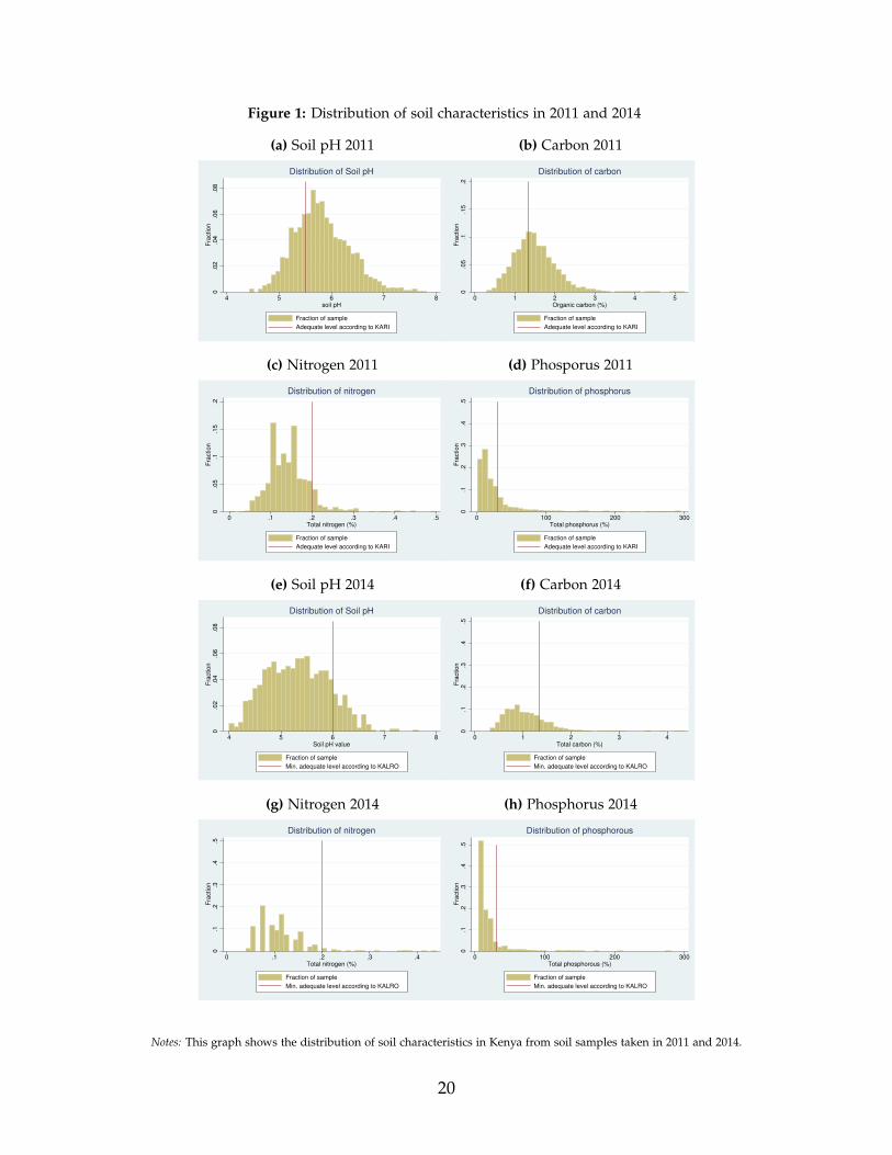
Figure 1: Distribution of soil characteristics in 2011 and 2014
(a) Soil pH 2011
0.0
2.0
4.0
6.0
8F
raction
4 5 6 7 8soil pH
Fraction of sample
Adequate level according to KARI
Distribution of Soil pH
(b) Carbon 2011
0.0
5.1
.15
.2F
raction
0 1 2 3 4 5Organic carbon (%)
Fraction of sample
Adequate level according to KARI
Distribution of carbon
(c) Nitrogen 2011
0.0
5.1
.15
.2F
raction
0 .1 .2 .3 .4 .5Total nitrogen (%)
Fraction of sample
Adequate level according to KARI
Distribution of nitrogen
(d) Phosporus 2011
0.1
.2.3
.4.5
Fra
ction
0 100 200 300Total phosphorus (%)
Fraction of sample
Adequate level according to KARI
Distribution of phosphorus
(e) Soil pH 2014
0.0
2.0
4.0
6.0
8F
raction
4 5 6 7 8Soil pH value
Fraction of sample
Min. adequate level according to KALRO
Distribution of Soil pH
(f) Carbon 2014
0.1
.2.3
.4.5
Fra
ction
0 1 2 3 4Total carbon (%)
Fraction of sample
Min. adequate level according to KALRO
Distribution of carbon
(g) Nitrogen 2014
0.1
.2.3
.4.5
Fra
ction
0 .1 .2 .3 .4Total nitrogen (%)
Fraction of sample
Min. adequate level according to KALRO
Distribution of nitrogen
(h) Phosphorus 2014
0.1
.2.3
.4.5
Fra
ction
0 100 200 300Total phosphorous (%)
Fraction of sample
Min. adequate level according to KALRO
Distribution of phosphorous
Notes: This graph shows the distribution of soil characteristics in Kenya from soil samples taken in 2011 and 2014.
20

Figure 2: Maps of Spatial Characteristics 2011 (above) and 2014 (below)
0.2
.4.6
.8
34 34.2 34.4 34.6
Spatial distribution of pH
0.2
.4.6
.8
34 34.2 34.4 34.6
Spatial distribution of Nitrogen0
.2.4
.6.8
34 34.2 34.4 34.6
Spatial distribution of Carbon
0.2
.4.6
.8
34 34.2 34.4 34.6
Spatial distribution of Phosphorus
First tercile Second tercile Third tercile Busia
.35
.4.4
5.5
.55
.6
34.1 34.2 34.3 34.4 34.5
Spatial distribution of pH
.35
.4.4
5.5
.55
.6
34.1 34.2 34.3 34.4 34.5
Spatial distribution of Nitrogen
.35
.4.4
5.5
.55
.6
34.1 34.2 34.3 34.4 34.5
Spatial distribution of Carbon
.35
.4.4
5.5
.55
.6
34.1 34.2 34.3 34.4 34.5
Spatial distribution of Phosphorus
First tercile Second tercile Third tercile Busia
Notes: This graph shows maps of soil samples taken in Western Kenya in 2011 and 2014. The black dots marks the location of Busiatown, where the research team was based. The plots show x-axis longitude and y-axis latitude. The study area is of around 80 kmby 60 km.
21
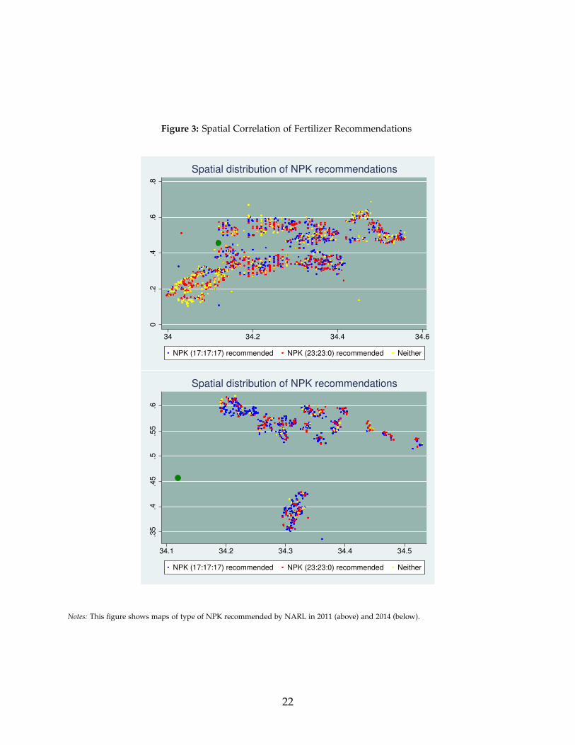
Figure 3: Spatial Correlation of Fertilizer Recommendations
0.2
.4.6
.8
34 34.2 34.4 34.6
NPK (17:17:17) recommended NPK (23:23:0) recommended Neither
Spatial distribution of NPK recommendations
.35
.4.4
5.5
.55
.6
34.1 34.2 34.3 34.4 34.5
NPK (17:17:17) recommended NPK (23:23:0) recommended Neither
Spatial distribution of NPK recommendations
Notes: This figure shows maps of type of NPK recommended by NARL in 2011 (above) and 2014 (below).
22
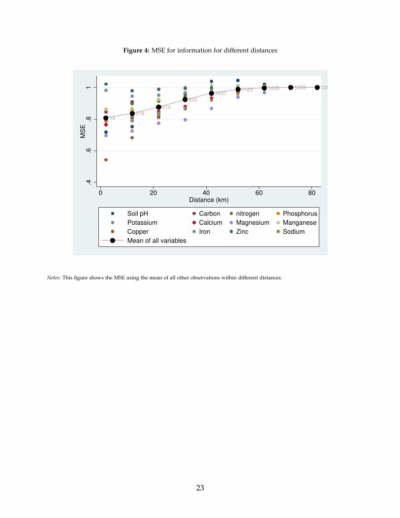
Figure 4: MSE for information for different distances
14218
514
832
10371163 1228 1259 1260
.4.6
.81
MS
E
0 20 40 60 80Distance (km)
Soil pH Carbon nitrogen Phosphorus
Potassium Calcium Magnesium Manganese
Copper Iron Zinc Sodium
Mean of all variables
Notes: This figure shows the MSE using the mean of all other observations within different distances.
23

Figure 5: Bimodal Distribution of WTP
0.2
.4.6
Fra
ctio
n
0 100 200 300 400 500WTP for info based on 1 soil test within 10 km (Ksh)
Note: Sample restricted to individuals with maximum amount of Ksh 500
Notes: This figure shows WTP for soil test result for trial III.
24
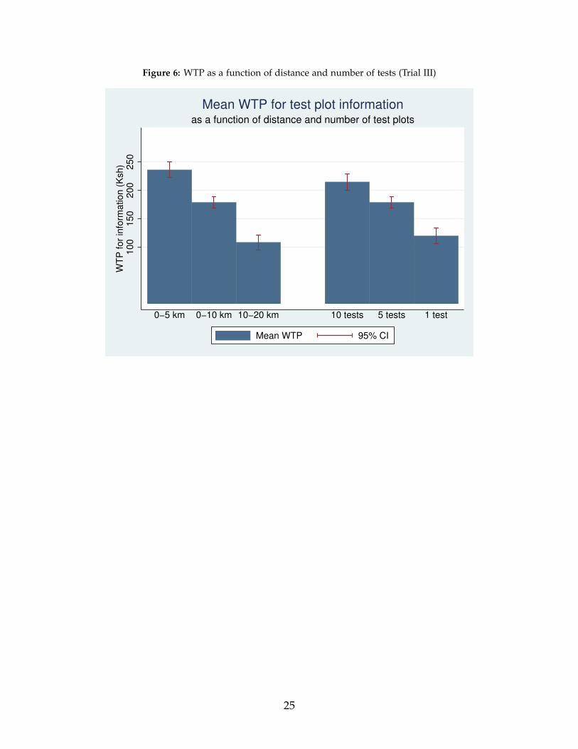
Figure 6: WTP as a function of distance and number of tests (Trial III)
10
01
50
20
02
50
WT
P f
or
info
rma
tio
n (
Ksh
)
0−5 km 0−10 km 10−20 km 10 tests 5 tests 1 test
Mean WTP 95% CI
as a function of distance and number of test plots
Mean WTP for test plot information
25

Figure 7: WTP (RLIS) as a function of distance and number of tests (Trial IV)
200
300
400
500
600
WT
P for
info
rmation (
Ksh)
1 test 2 tests 3 tests 0−5 km 0−10 km 10−20 kmModule RLIS
Mean WTP 95% CI
as a function of distance and number of results
Mean WTP (RLIS) for soil test information
Figure 8: WTP (BDM) as a function of distance and number of tests (Trial IV)
10
15
20
25
30
35
WT
P for
info
rmation (
Ksh)
1 test 2 tests 3 tests 0−5 km 0−10 km 10−20 kmModule BDM
Mean WTP 95% CI
as a function of distance and number of results
Mean WTP (BDM) for soil test information
26
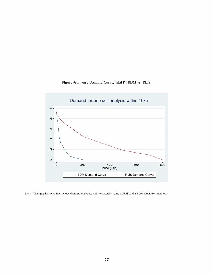
Figure 9: Inverse Demand Curve, Trial IV, BDM vs. RLIS
0.2
.4.6
.81
0 200 400 600 800Price (Ksh)
BDM Demand Curve RLIS Demand Curve
Demand for one soil analysis within 10km
Notes: This graph shows the inverse demand curve for soil test results using a RLIS and a BDM elicitation method.
27
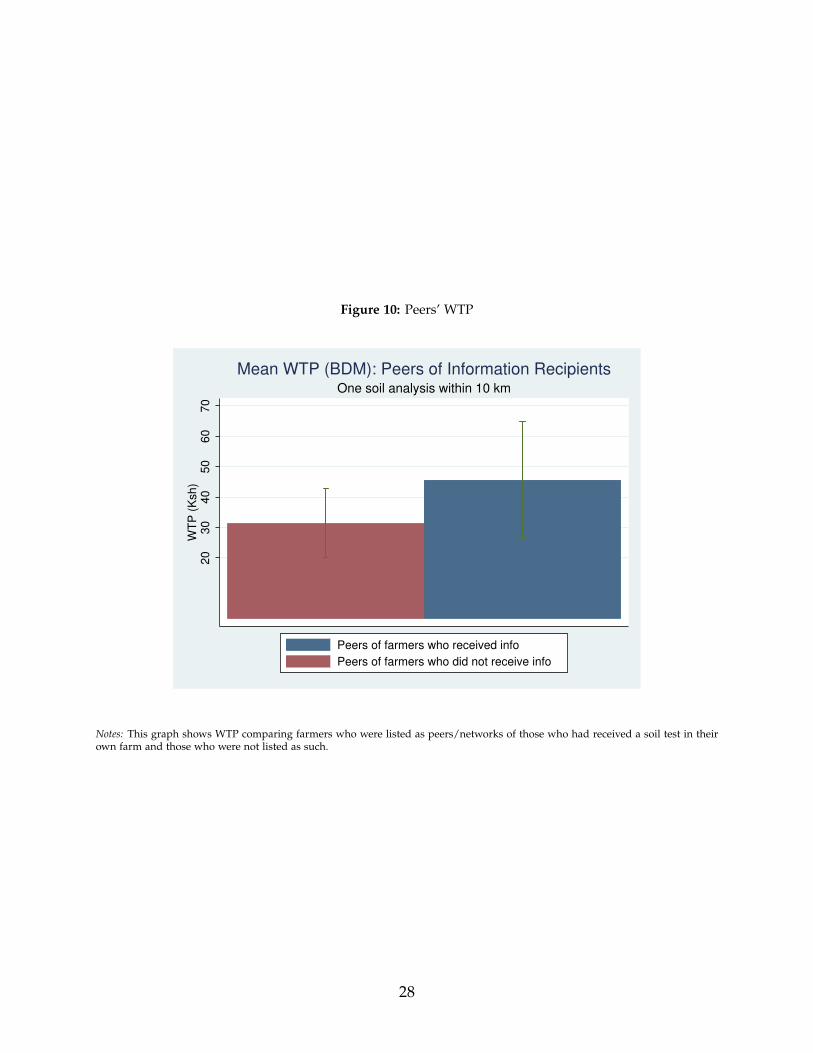
Figure 10: Peers’ WTP
20
30
40
50
60
70
WT
P (
Ksh
)
Peers of farmers who received info
Peers of farmers who did not receive info
One soil analysis within 10 km
Mean WTP (BDM): Peers of Information Recipients
Notes: This graph shows WTP comparing farmers who were listed as peers/networks of those who had received a soil test in theirown farm and those who were not listed as such.
28
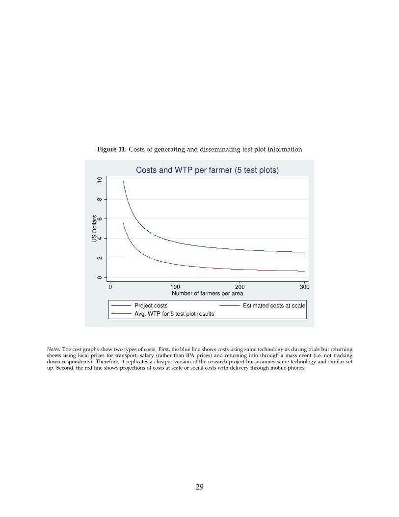
Figure 11: Costs of generating and disseminating test plot information
02
46
810
US
Dolla
rs
0 100 200 300Number of farmers per area
Project costs Estimated costs at scale
Avg. WTP for 5 test plot results
Costs and WTP per farmer (5 test plots)
Notes: The cost graphs show two types of costs. First, the blue line shows costs using same technology as during trials but returningsheets using local prices for transport, salary (rather than IPA prices) and returning info through a mass event (i.e. not trackingdown respondents). Therefore, it replicates a cheaper version of the research project but assumes same technology and similar setup. Second, the red line shows projections of costs at scale or social costs with delivery through mobile phones.
29
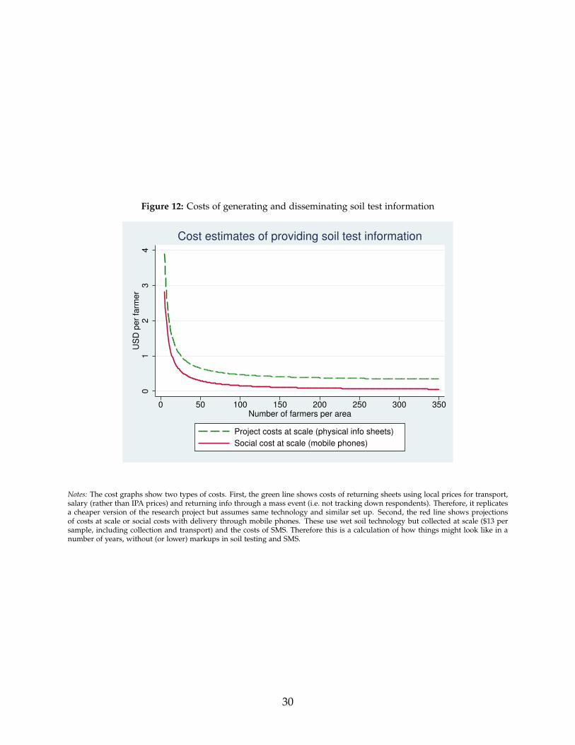
Figure 12: Costs of generating and disseminating soil test information
01
23
4U
SD
pe
r fa
rme
r
0 50 100 150 200 250 300 350Number of farmers per area
Project costs at scale (physical info sheets)
Social cost at scale (mobile phones)
Cost estimates of providing soil test information
Notes: The cost graphs show two types of costs. First, the green line shows costs of returning sheets using local prices for transport,salary (rather than IPA prices) and returning info through a mass event (i.e. not tracking down respondents). Therefore, it replicatesa cheaper version of the research project but assumes same technology and similar set up. Second, the red line shows projectionsof costs at scale or social costs with delivery through mobile phones. These use wet soil technology but collected at scale ($13 persample, including collection and transport) and the costs of SMS. Therefore this is a calculation of how things might look like in anumber of years, without (or lower) markups in soil testing and SMS.
30
8 Tables
Table 1: Summary Statistics of KARLO recommendations 2011 and 2014
Analysis for 2011Type of fertilizer Fraction Mean amountor soil additive recommended recommendedPlanting fertilizer (NPK rating)NPK (any type) 0.80 107.9 kg (10.4)NPK (17:17:17) 0.40 108.8 kg (10.6)NPK (23:23:00) 0.40 106.9 kg (10.1)CAN (26:00:00) 0.13 100.6 kg (16.0)DAP (18:46:00) 0.02 105.4 kg (9.0)Urea (46:00:00) 0.02 48.7 kg (5.7)SSP (00:17:00) 0.02 100.0 kg (0.0)Topdressing fertilizer (NPK rating)CAN (15:00:00) 0.93 50.0 kg (0.5)Urea (46:00:00) 0.05 25.0 kg (0.0)SSP (00:17:00) 0.01 34.3 kg (12.1)OtherManure 0.99 2.8 tons (1.0)Lime 0.03 262.7 kg (52.8)Muriate of Potash 0.01 50.0 kg (0.0)
Analysis for 2014Type of fertilizer Fraction Mean amountor soil additive recommended recommendedPlanting fertilizer (NPK rating)NPK (any type) 0.95 114.0 kg (9.8)NPK (17:17:17) 0.68 117.1 kg (7.2)NPK (23:23:00) 0.26 106.1 kg (11.1)CAN (15:00:00) 0.03 50.0 kg (0.0)DAP (18:46:00) 0.01 100.0 kg (0.0)SSP (00:17:00) 0.01 100.0 kg (0.0)Topdressing fertilizer (NPK rating)CAN (15:00:00) 1.00 77.2 kg (8.2)OtherManure 1.00 3.56 tons (0.8)Lime 0.49 308.0 kg (97.2)Notes: Mean amounts conditional on positive recommendations
31
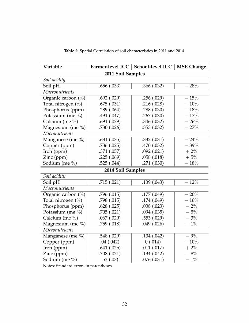
Table 2: Spatial Correlation of soil characteristics in 2011 and 2014
Variable Farmer-level ICC School-level ICC MSE Change2011 Soil Samples
Soil aciditySoil pH .656 (.033) .366 (.032) − 28%MacronutrientsOrganic carbon (%) .692 (.029) .256 (.029) − 15%Total nitrogen (%) .675 (.031) .216 (.028) − 10%Phosphorus (ppm) .289 (.064) .288 (.030) − 18%Potassium (me %) .491 (.047) .267 (.030) − 17%Calcium (me %) .691 (.029) .346 (.032) − 26%Magnesium (me %) .730 (.026) .353 (.032) − 27%MicronutrientsManganese (me %) .631 (.035) .332 (.031) − 24%Copper (ppm) .736 (.025) .470 (.032) − 39%Iron (ppm) .371 (.057) .092 (.021) + 2%Zinc (ppm) .225 (.069) .058 (.018) + 5%Sodium (me %) .525 (.044) .271 (.030) − 18%
2014 Soil SamplesSoil aciditySoil pH .715 (.021) .139 (.043) − 12%MacronutrientsOrganic carbon (%) .796 (.015) .177 (.049) − 20%Total nitrogen (%) .798 (.015) .174 (.049) − 16%Phosphorus (ppm) .628 (.025) .038 (.023) − 2%Potassium (me %) .705 (.021) .094 (.035) − 5%Calcium (me %) .067 (.029) .553 (.029) − 3%Magnesium (me %) .759 (.018) .049 (.026) − 1%MicronutrientsManganese (me %) .548 (.029) .134 (.042) − 9%Copper (ppm) .04 (.042) 0 (.014) − 10%Iron (ppm) .641 (.025) .011 (.017) + 2%Zinc (ppm) .708 (.021) .134 (.042) − 8%Sodium (me %) .53 (.03) .076 (.031) − 1%Notes: Standard errors in parentheses.
32
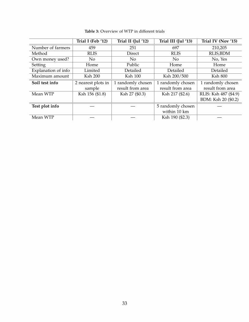
Table 3: Overview of WTP in different trials
Trial I (Feb ’12) Trial II (Jul ’12) Trial III (Jul ’13) Trial IV (Nov ’15)Number of farmers 459 251 697 210,205Method RLIS Direct RLIS RLIS,BDMOwn money used? No No No No, YesSetting Home Public Home HomeExplanation of info Limited Detailed Detailed DetailedMaximum amount Ksh 200 Ksh 100 Ksh 200/500 Ksh 800Soil test info 2 nearest plots in 1 randomly chosen 1 randomly chosen 1 randomly chosen
sample result from area result from area result from areaMean WTP Ksh 156 ($1.8) Ksh 27 ($0.3) Ksh 217 ($2.6) RLIS: Ksh 487 ($4.9)
BDM: Ksh 20 ($0.2)Test plot info — — 5 randomly chosen —
within 10 kmMean WTP — — Ksh 190 ($2.3) —
33
Appendix
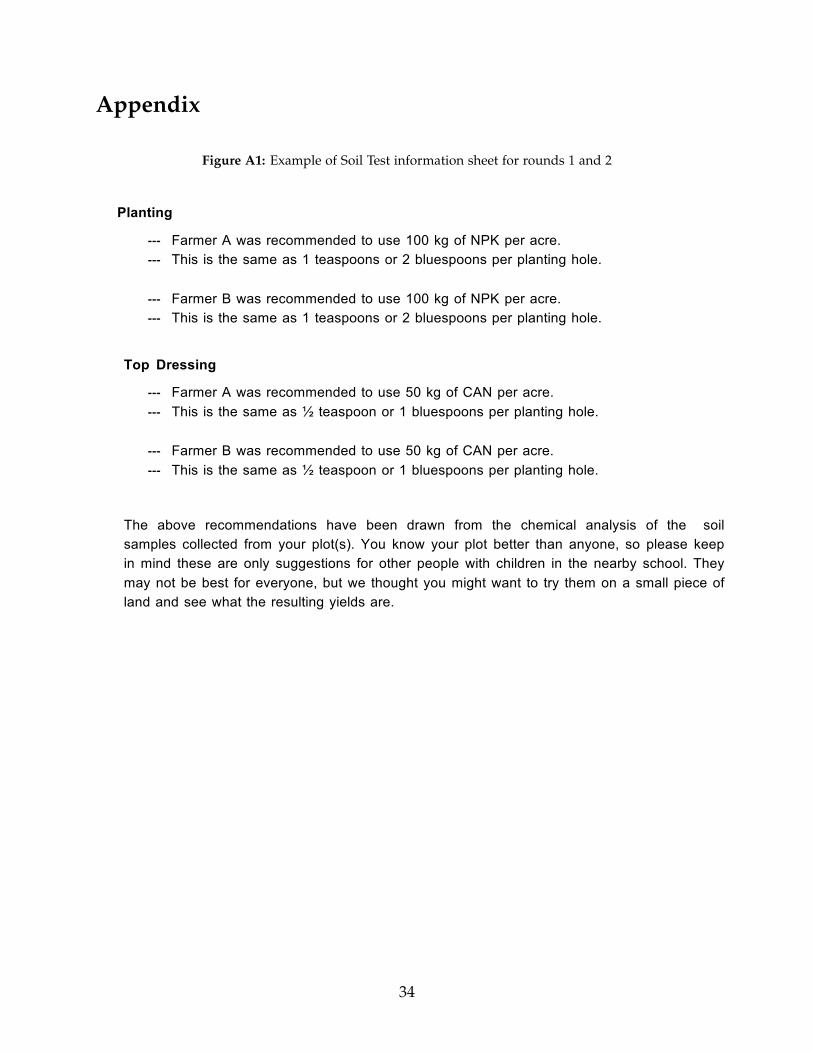
Figure A1: Example of Soil Test information sheet for rounds 1 and 2
Planting
-‐-‐-‐ Farmer A was recommended to use 100 kg of NPK per acre. -‐-‐-‐ This is the same as 1 teaspoons or 2 bluespoons per planting hole.
-‐-‐-‐ Farmer B was recommended to use 100 kg of NPK per acre. -‐-‐-‐ This is the same as 1 teaspoons or 2 bluespoons per planting hole.
Top Dressing
-‐-‐-‐ Farmer A was recommended to use 50 kg of CAN per acre. -‐-‐-‐ This is the same as ½ teaspoon or 1 bluespoons per planting hole.
-‐-‐-‐ Farmer B was recommended to use 50 kg of CAN per acre. -‐-‐-‐ This is the same as ½ teaspoon or 1 bluespoons per planting hole.
The above recommendations have been drawn from the chemical analysis of the soil samples collected from your plot(s). You know your plot better than anyone, so please keep in mind these are only suggestions for other people with children in the nearby school. They may not be best for everyone, but we thought you might want to try them on a small piece of land and see what the resulting yields are.
34
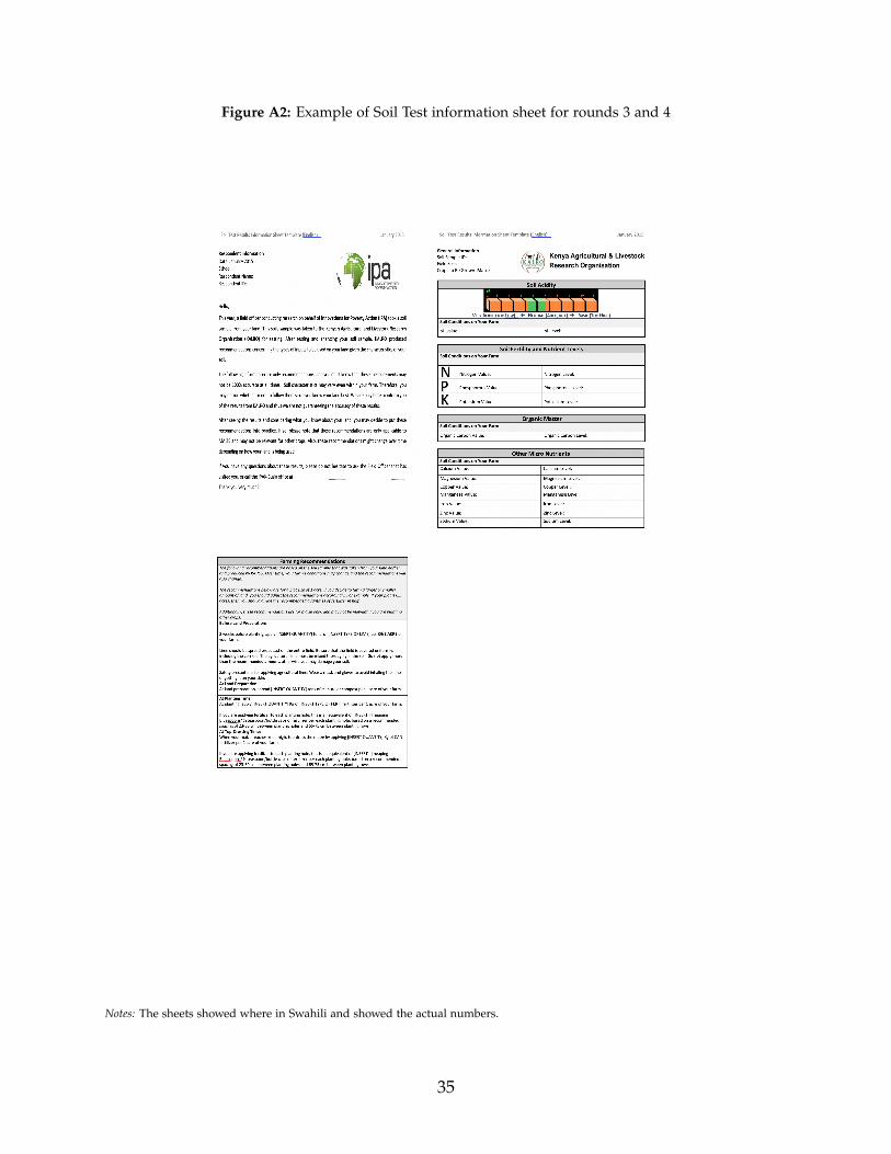
Figure A2: Example of Soil Test information sheet for rounds 3 and 4
Notes: The sheets showed where in Swahili and showed the actual numbers.
35
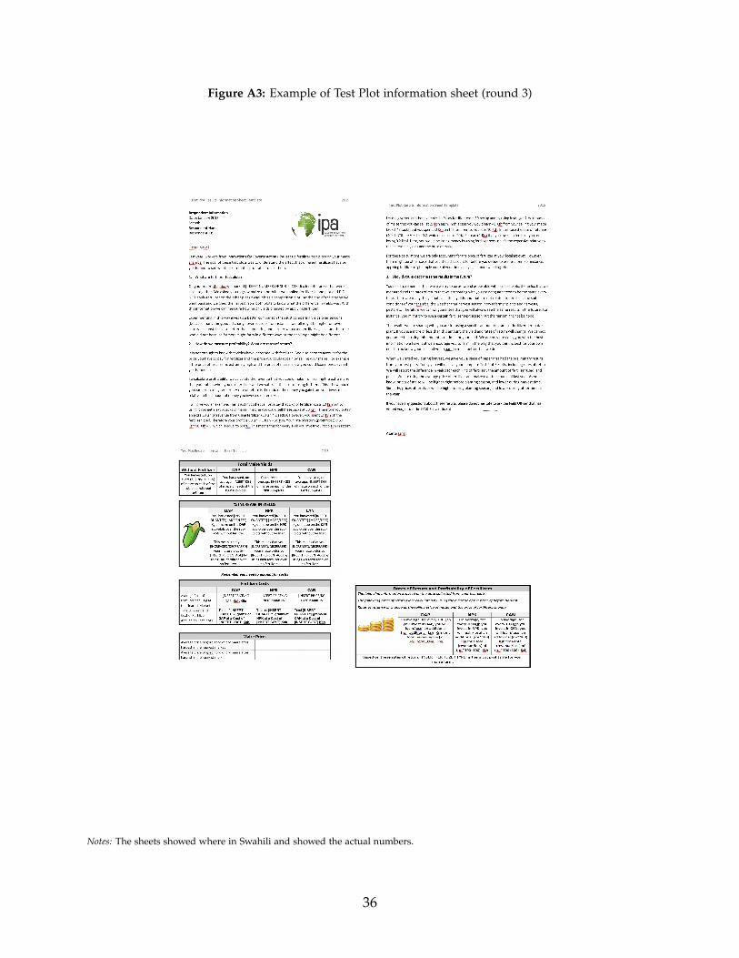
Figure A3: Example of Test Plot information sheet (round 3)
Notes: The sheets showed where in Swahili and showed the actual numbers.
36
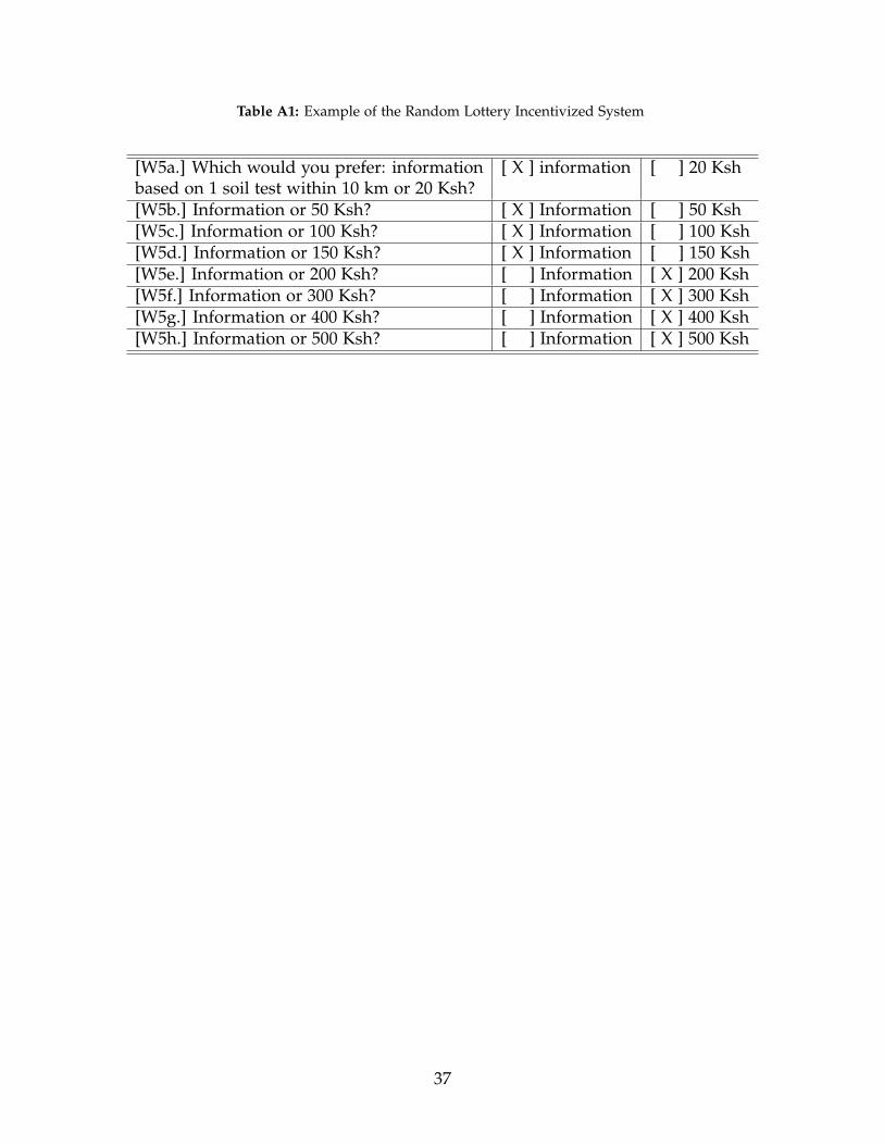
Table A1: Example of the Random Lottery Incentivized System
[W5a.] Which would you prefer: information [ X ] information [ ] 20 Kshbased on 1 soil test within 10 km or 20 Ksh?[W5b.] Information or 50 Ksh? [ X ] Information [ ] 50 Ksh[W5c.] Information or 100 Ksh? [ X ] Information [ ] 100 Ksh[W5d.] Information or 150 Ksh? [ X ] Information [ ] 150 Ksh[W5e.] Information or 200 Ksh? [ ] Information [ X ] 200 Ksh[W5f.] Information or 300 Ksh? [ ] Information [ X ] 300 Ksh[W5g.] Information or 400 Ksh? [ ] Information [ X ] 400 Ksh[W5h.] Information or 500 Ksh? [ ] Information [ X ] 500 Ksh
37