test upload
TRANSCRIPT

Stacked-to-Grouped Bars
DefinisiGrafik ini memiliki bentuk batang (bar), baik dalam bentuk “grouped” ataupun “stuck” yang dapat dipindahkan secara otomatis. Sehingga, nantinya dengan mudah user dapat mengganti atau memilih grafik mana yang sesuai dengan kebutuhan.
Umumnya, grafik dalam bentuk batang digunakan untuk menunjukkan,1. Perbandingan2. Perkembangan nilai dari waktu ke waktu
Bentuk Grafik
Sumber: http://bl.ocks.org/mbostock/3943967
Jenis Data Yang DigunakanData yang digunakan terbagi menjadi dua, yaitu data perbandingan dan data perkembangan. Utamanya, untuk data perbandingan diperlukan objek yang dibandingkan. Sedangkan untuk data perkembangan, utamanya dibutuhkan periode waktu.

Contoh Data
Data Perbandingan Luas Lahan Warga RT 05 Desa Sukamaju
Nomor Rumah
Luas Bangunan
(m2)
Luas Ruang Terbuka Hijau
(m2)
Luas Lahan Yang Tidak Dimanfaatkan
(m2)
Luas Lahan Seluruhnya
(m2)
3 32 28 6 664 64 8 7 796 72 12 8 929 32 18 5 55
10 60 20 8 8811 80 20 9 10913 72 28 10 11014 60 12 7 7915 64 14 8 8616 52 8 6 6617 38 12 4 54
3 4 6 9 10 11 13 14 15 16 170
20406080
100120
Perbandingan Luas LahanWarga RT 05 Desa Sukamaju
Luas Bangunan (m2) Luas Ruang Terbuka Hijau (m2)Luas Lahan Yang Tidak Dimanfaatkan (m2)
Nomor Rumah

3 4 6 9 10 11 13 14 15 16 170
102030405060708090
Perbandingan Luas LahanWarga RT 05 Desa Sukamaju
Luas Bangunan (m2) Luas Ruang Terbuka Hijau (m2)Luas Lahan Yang Tidak Dimanfaatkan (m2)
Nomor Rumah

Judul Grafik
Definisi
Bentuk GrafikSumber:Jenis Data Yang Digunakan
Contoh Data

Hexagonal Binning
DefinisiThis example shows how to use the d3.hexbin plugin for hexagonal binning. 2,000 random points with a normal distribution are binned into hexagons; color encodes the number of points that fall into each bin.Bentuk Grafik
Sumber: http://bl.ocks.org/mbostock/4248145
Jenis Data Yang Digunakan
Contoh Data
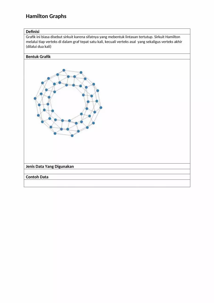
Hamilton Graphs
DefinisiGrafik ini biasa disebut sirkuit karena sifatnya yang mebentuk lintasan tertutup. Sirkuit Hamilton melalui tiap verteks di dalam graf tepat satu kali, kecuali verteks asal yang sekaligus verteks akhir (dilalui dua kali)
Bentuk Grafik
Jenis Data Yang Digunakan
Contoh Data

Scatterplot Matrix
DefinisiThe scatterplot matrix visualizations pairwise correlations for multi-dimensional data; each cell in the matrix is a scatterplot. This example uses Anderson's data of iris flowers on the Gaspé Peninsula. Scatterplot matrix design invented by J. A. Hartigan; see also R and GGobi. Data on Iris flowers collected by Edgar Anderson and published by Ronald Fisher.Bentuk Grafik
Sumber: http://bl.ocks.org/mbostock/3213173
Jenis Data Yang Digunakan
Contoh Data

Nominating Comparison
Definisi
Bentuk Grafik
Sumber: http://www.nytimes.com/interactive/2012/09/06/us/politics/convention-word-counts.html?_r=0#!
Jenis Data Yang Digunakan
Contoh Data

Budget Proposal
Definisi
Bentuk Grafik
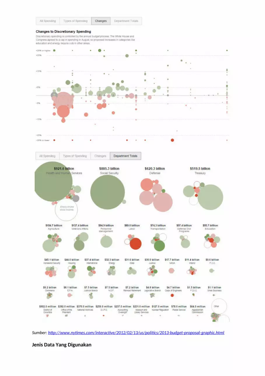
Sumber: http://www.nytimes.com/interactive/2012/02/13/us/politics/2013-budget-proposal-graphic.html
Jenis Data Yang Digunakan

Contoh Data

Bilevel Partition (Click on any arc to zoom in. Click in the center to zoom out)
DefinisiA sunburst is similar to a treemap, except it uses a radial layout. The root node of the tree is at the center, with leaves on the circumference. The area (or angle, depending on implementation) of each arc corresponds to its value.
Bentuk Grafik
Sumber: http://bl.ocks.org/mbostock/5944371
Jenis Data Yang Digunakan
Contoh Data

Voronoi Tessellation
DefinisiThe Voronoi tessellation shows the closest point on the plane for a given set of points. This example updates the Voronoi diagram in response to mouse interaction! Colors by Cynthia Brewer; algorithm by Steven Fortune; implementation based on work by Nicolas Garcia Belmonte; interaction inspired by Raymond Hill.
Bentuk Grafik
Sumber: http://bl.ocks.org/mbostock/4060366
Jenis Data Yang Digunakan
Contoh Data

Twists and Turns
Definisi
Bentuk Grafik

Sumber: http://www.nytimes.com/interactive/2013/10/09/us/yellen-fed-chart.html
Jenis Data Yang Digunakan
Contoh Data
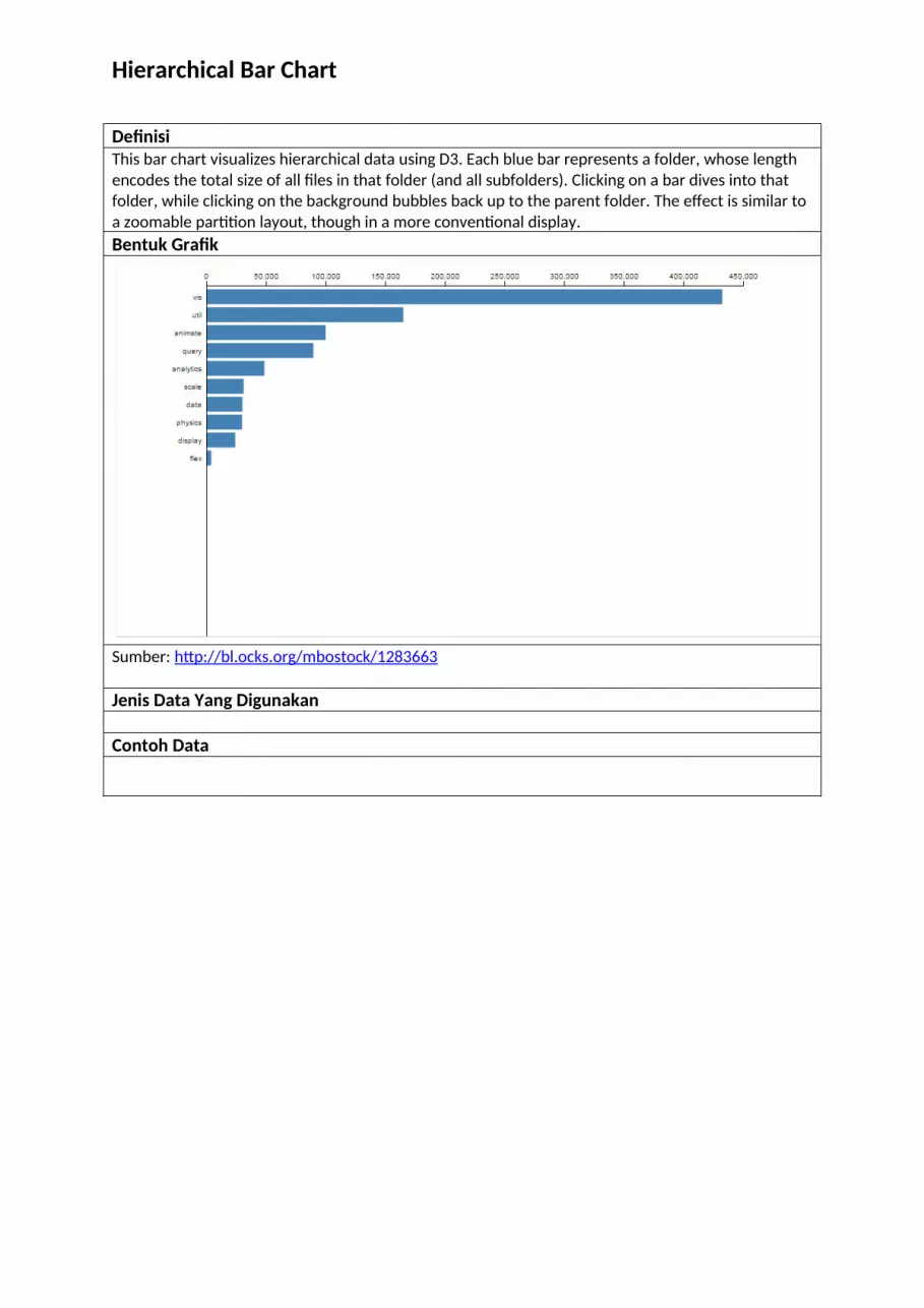
Hierarchical Bar Chart
DefinisiThis bar chart visualizes hierarchical data using D3. Each blue bar represents a folder, whose length encodes the total size of all files in that folder (and all subfolders). Clicking on a bar dives into that folder, while clicking on the background bubbles back up to the parent folder. The effect is similar to a zoomable partition layout, though in a more conventional display.Bentuk Grafik
Sumber: http://bl.ocks.org/mbostock/1283663
Jenis Data Yang Digunakan
Contoh Data

Les Misérables Co-occurrence
DefinisiA network can be represented by an adjacency matrix, where each cell ij represents an edge from vertex i to vertex j. Here, vertices represent characters in a book, while edges represent co-occurrence in a chapter.
Given this two-dimensional representation of a graph, a natural visualization is to show the matrix! However, the effectiveness of a matrix diagram is heavily dependent on the order of rows and columns: if related nodes are placed closed to each other, it is easier to identify clusters and bridges.
This example lets you try different orderings via the drop-down menu. This type of diagram can be extended with manual reordering of rows and columns, and expanding or collapsing of clusters, to allow deeper exploration. Jacques Bertin (or more specifically, his fleet of assistants) did this by hand with paper strips.
While path-following is harder in a matrix view than in a node-link diagram, matrices have other advantages. As networks get large and highly connected, node-link diagrams often devolve into giant hairballs of line crossings. Line crossings are impossible with matrix views. Matrix cells can also be encoded to show additional data; here color depicts clusters computed by a community-detection algorithm.
Want more? See this analysis of shuffling algorithms using matrix diagrams.Bentuk Grafik
By name

By Frequency

By Cluster

Sumber: https://bost.ocks.org/mike/miserables/
Jenis Data Yang Digunakan
Contoh Data

Judul Grafik
Definisi
Bentuk Grafik
Sumber: http://www.theguardian.com/world/interactive/2013/feb/12/state-of-the-union-reading-levelJenis Data Yang Digunakan
Contoh Data

Chord Diagram
DefinisiA chord diagram in D3.js, showing dependencies between classes in a software class hierarchy. Dependencies are grouped according to the source and target packages. Although this diagram does not show class-level detail visible with hierarchical edge bundling, it better reveals the total number of imports between and within packages. Note, for example, the circular dependency between vis.data and vis.events. Colors by ColorBrewer.Bentuk Grafik
Sumber: http://bl.ocks.org/mbostock/1046712
Jenis Data Yang Digunakan
Contoh Data

Zoomable Icicle
DefinisiClick anywhere to zoom in, or click on the top bar to zoom outBentuk Grafik

Sumber: http://bl.ocks.org/mbostock/1005873Jenis Data Yang Digunakan
Contoh Data

A Swing Of Beauty
DefinisiHow Harper is pitched
The way pitchers throw to Harper indicates his swing isn’t typical. Conventional wisdom is to avoid throwing low — particularly low fastballs — to lefties, because their sweeping swings can pull the ball into right field. But Harper’s choppy swing lets him hit everywhere, so pitchers don’t avoid the outside corner.Bentuk Grafik
Sumber: http://www.washingtonpost.com/wp-srv/special/sports/bryce-harper-swing-of-beauty/
Jenis Data Yang Digunakan
Contoh Data

Donut Transitions
DefinisiThis example demonstrates a complex chained transition for updating values in a donut chart, as considered by Robertson & Heer in Animated Transitions in Statistical Data Graphics. While fascinating to watch, users found the complicated transitions difficult to follow. For a simpler approach, see the Pie Chart Update series of examples.Bentuk Grafik
Sumber:
http://bl.ocks.org/mbostock/4341417http://vis.berkeley.edu/papers/animated_transitions/
Jenis Data Yang Digunakan
Contoh Data

Pie Chart Update, II
Definisi
Bentuk Grafik
Sumber: http://bl.ocks.org/mbostock/1346410Jenis Data Yang Digunakan
Contoh Data

Donut Chart
DefinisiThis donut chart is constructed from a CSV file storing the populations of various age groupsBentuk Grafik
Sumber: http://bl.ocks.org/mbostock/3887193Jenis Data Yang Digunakan
Contoh Data

The at Risk List
Definisi
Bentuk Grafik
Sumber: http://www.theguardian.com/environment/interactive/2013/may/14/alaska-villages-frontline-global-warmingJenis Data Yang Digunakan
Contoh Data

Judul Grafik
Definisi
Bentuk GrafikSumber:Jenis Data Yang Digunakan
Contoh Data

Judul Grafik
Definisi
Bentuk GrafikSumber:Jenis Data Yang Digunakan
Contoh Data

Judul Grafik
Definisi
Bentuk GrafikSumber:Jenis Data Yang Digunakan
Contoh Data

Judul Grafik
Definisi
Bentuk GrafikSumber:Jenis Data Yang Digunakan
Contoh Data

Judul Grafik
Definisi
Bentuk GrafikSumber:Jenis Data Yang Digunakan
Contoh Data