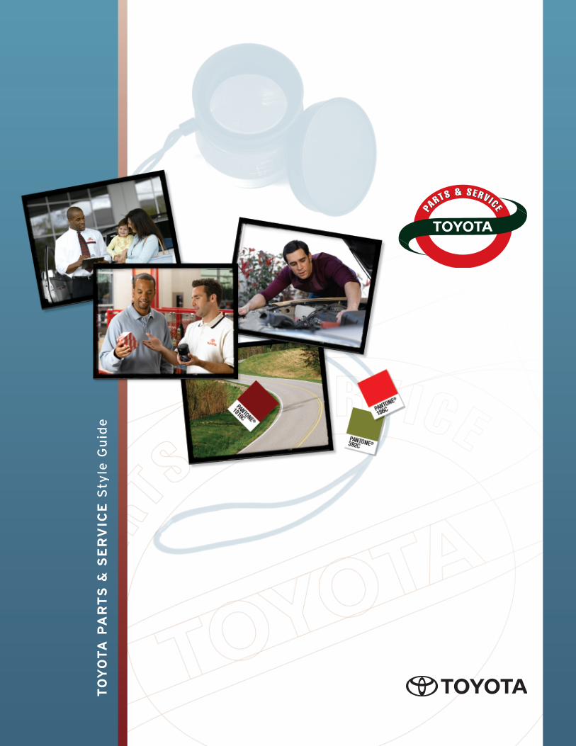
t o y o t a p ar t s & ser vice s tyle guide
TRANSCRIPT
TO
YO
TA
PA
RT
S &
SE
RV
ICE
Sty
le G
uid
e
“”
A consistent brand
communication strategy will
attain recognition and create
loyalty among our customers.
The Toyota Parts & Service style
guide serves as an umbrella to a
new unified look and feel for all
Toyota Parts & Service department
printed and online communication
pieces. Within this style guide you
will find information about fonts,
color palettes, and printing
processes, and usage guidelines for
the new Toyota Parts & Service
logo. The logo, together with
consistent fonts and colors, will
create a familiar look among all of
our communication pieces and
establish an immediate connection
to the Toyota brand.
A consistent brand communication
strategy will attain recognition and
create loyalty among our customers.
Our new look reinforces Toyota’s
Moving Forward campaign, which
will result in communicating a
stronger, more consistent image to
our Toyota Parts & Service customers.
The following pages provide
usage guidelines for Toyota
Parts & Service promotional
and communication materials.
Consistency is the key to
developing a powerful brand
image; therefore every
communication is significant
enough to fall within these
guidelines.
If you have questions regarding
the Toyota Parts & Service style
guide, or have questionable
situations not addressed in the
information presented here,
please contact:
Heidi Shurtz
of Toyota Parts & Service
at 310-468-7635
TOYOTA PARTS & SERVICE | Introduction to the Style Guide
iToyota Parts & Service Style Guide | v1.0
LOGO TREATMENTS
Introduction to the New Toyota Parts & Service Logo . . . . . . . . . . . . . . . .1
Configurations . . . . . . . . . . . . . . . . . . . . . . . . . . . . . . . . . . . . . . . . . . . . . . . . .2
Using the Toyota Parts & Service Logo
with the Toyota and Moving Forward Logo
Proportioning and Positioning . . . . . . . . . . . . . . . . . . . . . . . . . . . . . . . . . .3–4
Size and Format for Print and Interactive
White Space Zone
Reversed Logos and Other Exclusions
Color application . . . . . . . . . . . . . . . . . . . . . . . . . . . . . . . . . . . . . . . . . . . . . . .5
Appropriate Logo Colors
Two-Color Treatment
Grayscale Treatments
Improper Use of Logo . . . . . . . . . . . . . . . . . . . . . . . . . . . . . . . . . . . . . . . . .6–7
PROMOTIONAL MATERIAL COLOR PALETTE
Primary and Accent Color Palettes . . . . . . . . . . . . . . . . . . . . . . . . . . . . .8–10
Primary and Accent Colors
Color Palette Options
Sample Color Palettes
Tone Scale for Background Intensity . . . . . . . . . . . . . . . . . . . . . . . . . . . . . .11
“30/70” Rule
FONTS
Introduction to Fonts . . . . . . . . . . . . . . . . . . . . . . . . . . . . . . . . . . . . . . . . . .12
Headlines and Subheads . . . . . . . . . . . . . . . . . . . . . . . . . . . . . . . . . . . . . . .12
Font Licensing/Downloading Fonts
Body Copy . . . . . . . . . . . . . . . . . . . . . . . . . . . . . . . . . . . . . . . . . . . . . . . . . . .13
Legal Copy/Footnotes . . . . . . . . . . . . . . . . . . . . . . . . . . . . . . . . . . . . . . . . .13
POWER POINT PRESENTATION
Image Quality . . . . . . . . . . . . . . . . . . . . . . . . . . . . . . . . . . . . . . . . . . . . . . . .14
Contrast . . . . . . . . . . . . . . . . . . . . . . . . . . . . . . . . . . . . . . . . . . . . . . . . . . . . .14
Clutter . . . . . . . . . . . . . . . . . . . . . . . . . . . . . . . . . . . . . . . . . . . . . . . . . . . . . . .14
GLOSSARY . . . . . . . . . . . . . . . . . . . . . . . . . . . . . . . . . . . . . . . . . . . . . . . . . . . .15–16
TOYOTA PARTS & SERVICE | Table of Contents
Toyota Parts & Service Style Guide | v1.0 ii
The new Toyota Parts & Service
logo is our signature. It reflects
Toyota’s dedication to deliver the
best possible customer service
achievable and complements
the renowned craftsmanship of
the Toyota vehicle. This brand
signature is the one visual
that must accompany every
communication piece delivered
from our department.
The Toyota Parts & Service
logo is designed to complement
the Toyota brand, as well as
reinforce Toyota’s Moving Forward
campaign. It is contained and
balanced, and in its entirety
suggests stability, dependability
and quality.
Breaking the elements of the
logo down, the oval shape is
reminiscent of the Toyota brand
mark. A ribbon gracefully
interacts with the oval and
contains the Toyota logo. The
ribbon is the symbol of quality,
dependability and an award-
winning company. In addition, it
may be interpreted as a road,
which represents forward thinking
and progression.
LOGO TREATMENTS | Introduction to the New Toyota Parts & Service Logo
1Toyota Parts & Service Style Guide | v1.0
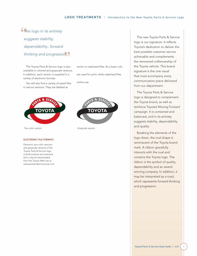
The Toyota Parts & Service logo is also
available in colored and grayscale versions.
In addition, each version is supplied in a
variety of electronic formats.
You will also find a variety of saved files
in various versions. They are labeled as
vector or rasterized files. As a basic rule,
vector-based files [Illustrator (ai, eps, pdf)]
are used for print, while rasterized files
[PhotoShop (jpg, pct, psd, tif)] are for
online use.
Two-color version
“”
The logo in its entirety
suggests stability,
dependability...forward
thinking and progression.
Grayscale version
ELECTRONIC FILE FORMATS
Electronic two-color versionsand grayscale versions of theToyota Parts & Service logo, in both positive and reversedform, may be downloaded from the Toyota Web site atwww.partsandservicecoop.com.
Keeping logo configurations
consistent will help maximize the
brand impact.
LOGO TREATMENTS | Configurations
2 Toyota Parts & Service Style Guide | v1.0
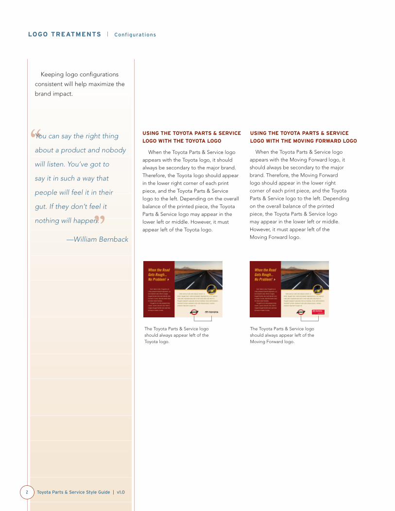
USING THE TOYOTA PARTS & SERVICE
LOGO WITH THE TOYOTA LOGO
When the Toyota Parts & Service logo
appears with the Toyota logo, it should
always be secondary to the major brand.
Therefore, the Toyota logo should appear
in the lower right corner of each print
piece, and the Toyota Parts & Service
logo to the left. Depending on the overall
balance of the printed piece, the Toyota
Parts & Service logo may appear in the
lower left or middle. However, it must
appear left of the Toyota logo.
When the Toyota Parts & Service logo
appears with the Moving Forward logo, it
should always be secondary to the major
brand. Therefore, the Moving Forward
logo should appear in the lower right
corner of each print piece, and the Toyota
Parts & Service logo to the left. Depending
on the overall balance of the printed
piece, the Toyota Parts & Service logo
may appear in the lower left or middle.
However, it must appear left of the
Moving Forward logo.
“
”
You can say the right thing
about a product and nobody
will listen. You’ve got to
say it in such a way that
people will feel it in their
gut. If they don’t feel it
nothing will happen.
—William Bernback
The Toyota Parts & Service logoshould always appear left of theToyota logo.
The Toyota Parts & Service logoshould always appear left of theMoving Forward logo.
USING THE TOYOTA PARTS & SERVICE
LOGO WITH THE MOVING FORWARD LOGO
To maintain design integrity,
reproduce the Toyota Parts &
Service logo in the appropriate
size for the application. Follow
the minimum size requirements.
LOGO TREATMENTS | Proportioning and Positioning
3Toyota Parts & Service Style Guide | v1.0
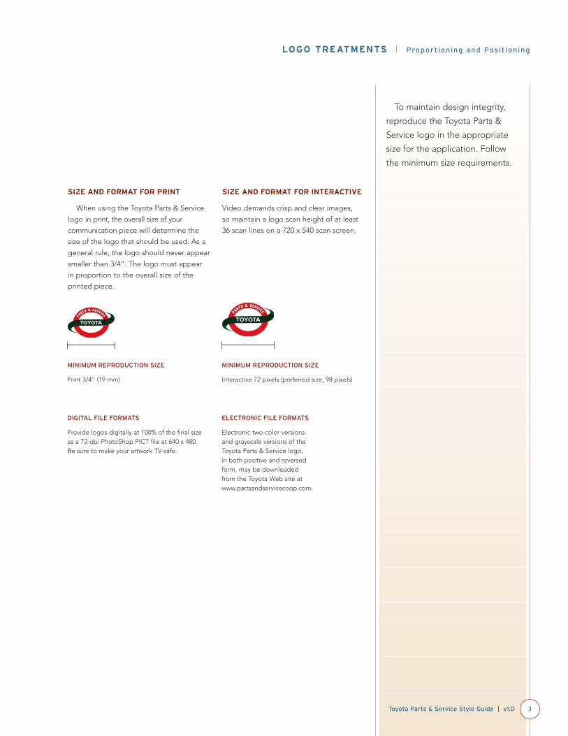
SIZE AND FORMAT FOR PRINT
When using the Toyota Parts & Service
logo in print, the overall size of your
communication piece will determine the
size of the logo that should be used. As a
general rule, the logo should never appear
smaller than 3/4”. The logo must appear
in proportion to the overall size of the
printed piece.
SIZE AND FORMAT FOR INTERACTIVE
Video demands crisp and clear images,
so maintain a logo scan height of at least
36 scan lines on a 720 x 540 scan screen.
MINIMUM REPRODUCTION SIZE
Print 3/4” (19 mm)
MINIMUM REPRODUCTION SIZE
Interactive 72 pixels (preferred size, 98 pixels)
DIGITAL FILE FORMATS
Provide logos digitally at 100% of the final sizeas a 72-dpi PhotoShop PICT file at 640 x 480. Be sure to make your artwork TV-safe.
ELECTRONIC FILE FORMATS
Electronic two-color versionsand grayscale versions of theToyota Parts & Service logo, in both positive and reversedform, may be downloaded from the Toyota Web site atwww.partsandservicecoop.com.

When using the Toyota Parts &
Service logo, always remember
the white space. This white space
forms a “neutral zone” within
which no other graphic elements,
such as typography, images or
borders, may appear or intrude.
Do not modify the logo by
distorting its shape.
LOGO TREATMENTS | Proportioning and Positioning
4 Toyota Parts & Service Style Guide | v1.0
WHITE SPACE ZONE
The white space around the logo must
equal the X height of the Toyota logotype.
REVERSED LOGOS
AND OTHER EXCLUSIONS
It is not recommended for the logo
to appear in reversed or negative form.
Do not allow the Toyota Parts & Service
logo to bleed off the page.
Cyan dotted lines represent theminimum amount of whitespace allowed. “X” isdetermined by the height of theletter “T” in Toyota.
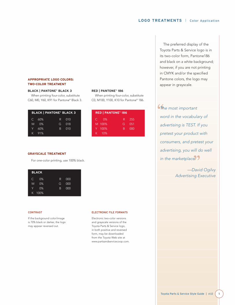
The preferred display of the
Toyota Parts & Service logo is in
its two-color form, Pantone186
and black on a white background;
however, if you are not printing
in CMYK and/or the specified
Pantone colors, the logo may
appear in grayscale.
LOGO TREATMENTS | Color Application
5Toyota Parts & Service Style Guide | v1.0
APPROPRIATE LOGO COLORS:
TWO-COLOR TREATMENT
BLACK | PANTONE® BLACK 3
When printing four-color, substitute
C60, M0, Y60, K91 for Pantone® Black 3.
RED | PANTONE® 186
When printing four-color, substitute
C0, M100, Y100, K10 for Pantone® 186.
BLACK | PANTONE® BLACK 3
C 60% R 010
M 0% G 018
Y 60% B 010
K 91%
RED | PANTONE® 186
C 0% R 255
M 100% G 051
Y 100% B 000
K 10%
CONTRAST
If the background color/image is 70% black or darker, the logomay appear reversed out.
GRAYSCALE TREATMENT
For one-color printing, use 100% black.
BLACK
C 0% R 000
M 0% G 000
Y 0% B 000
K 100%
ELECTRONIC FILE FORMATS
Electronic two-color versionsand grayscale versions of theToyota Parts & Service logo, in both positive and reversedform, may be downloaded from the Toyota Web site atwww.partsandservicecoop.com.
“
”
The most important
word in the vocabulary of
advertising is TEST. If you
pretest your product with
consumers, and pretest your
advertising, you will do well
in the marketplace.
—David OgilvyAdvertising Executive
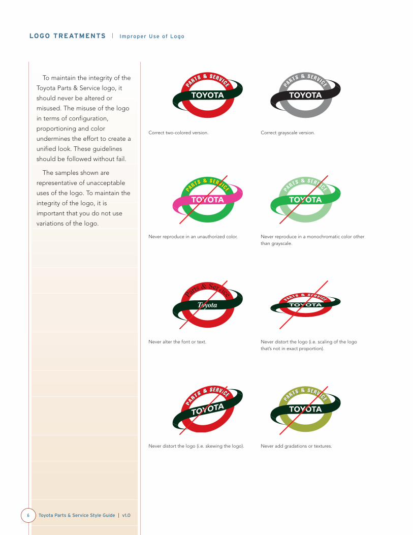
To maintain the integrity of the
Toyota Parts & Service logo, it
should never be altered or
misused. The misuse of the logo
in terms of configuration,
proportioning and color
undermines the effort to create a
unified look. These guidelines
should be followed without fail.
The samples shown are
representative of unacceptable
uses of the logo. To maintain the
integrity of the logo, it is
important that you do not use
variations of the logo.
LOGO TREATMENTS | Improper Use of Logo
6 Toyota Parts & Service Style Guide | v1.0
Correct two-colored version. Correct grayscale version.
Never reproduce in an unauthorized color. Never reproduce in a monochromatic color otherthan grayscale.
Never alter the font or text. Never distort the logo (i.e. scaling of the logothat’s not in exact proportion).
Never distort the logo (i.e. skewing the logo). Never add gradations or textures.
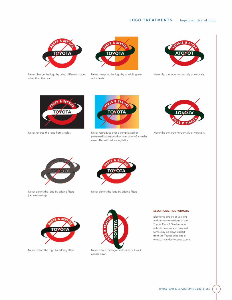
LOGO TREATMENTS | Improper Use of Logo
7Toyota Parts & Service Style Guide | v1.0
Never change the logo by using different shapesother than the oval.
Never overprint the logo by straddling two color fields.
Never reverse the logo from a color. Never reproduce over a complicated orpatterned background or over color of a similarvalue. This will reduce legibility.
Never distort the logo by adding filters (i.e. embossing)
Never distort the logo by adding filters
Never distort the logo by adding filters Never rotate the logo on it’s side or turn itupside down.
Never flip the logo horizontally or vertically.
Never flip the logo horizontally or vertically.
ELECTRONIC FILE FORMATS
Electronic two-color versionsand grayscale versions of theToyota Parts & Service logo, in both positive and reversedform, may be downloaded from the Toyota Web site atwww.partsandservicecoop.com.
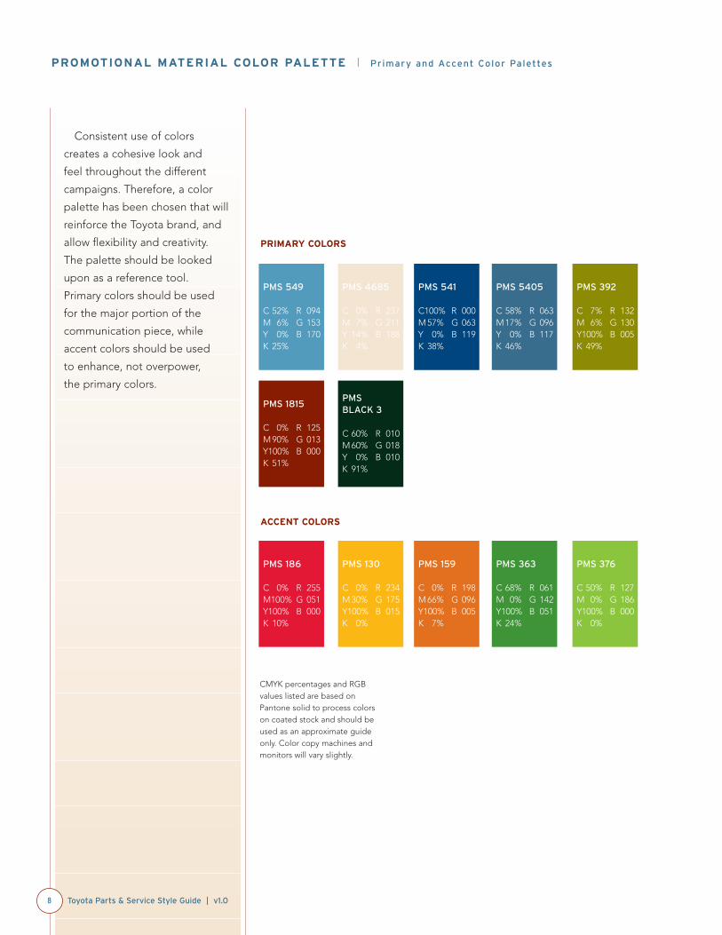
Consistent use of colors
creates a cohesive look and
feel throughout the different
campaigns. Therefore, a color
palette has been chosen that will
reinforce the Toyota brand, and
allow flexibility and creativity.
The palette should be looked
upon as a reference tool.
Primary colors should be used
for the major portion of the
communication piece, while
accent colors should be used
to enhance, not overpower,
the primary colors.
PROMOTIONAL MATERIAL COLOR PALETTE | Primary and Accent Color Palettes
8 Toyota Parts & Service Style Guide | v1.0
PMS 549
C 52% R 094M 6% G 153Y 0% B 170K 25%
PMS 4685
C 0% R 237M 7% G 211Y 14% B 188K 4%
PMS 541
C100% R 000M 57% G 063Y 0% B 119K 38%
PMS 5405
C 58% R 063M 17% G 096Y 0% B 117K 46%
PMS 392
C 7% R 132M 6% G 130Y100% B 005K 49%
PMS 1815
C 0% R 125M 90% G 013Y100% B 000K 51%
PMS BLACK 3
C 60% R 010M 60% G 018Y 0% B 010K 91%
PMS 541
CMYK
PMS 5405
CMYK
PMS 392
CMYK
PMS 186
C 0% R 255M100% G 051Y100% B 000K 10%
PMS 130
C 0% R 234M 30% G 175Y100% B 015K 0%
PMS 159
C 0% R 198M 66% G 096Y100% B 005K 7%
PMS 363
C 68% R 061M 0% G 142Y100% B 051K 24%
PMS 376
C 50% R 127M 0% G 186Y100% B 000K 0%
PRIMARY COLORS
ACCENT COLORS
CMYK percentages and RGBvalues listed are based onPantone solid to process colorson coated stock and should beused as an approximate guideonly. Color copy machines andmonitors will vary slightly.
To further your creativity,
there are two unique palettes to
choose from. For a brighter and
more energetic feel, use color
selections from palette option
“one,” which incorporates
Pantone 376 and Pantone 363,
and eliminates Pantone 392.
For a more sophisticated and
rich feel, use color selections
from the second palette, which
incorporates Pantone 392, and
eliminates Pantone 376 and
Pantone 363.
PROMOTIONAL MATERIAL COLOR PALETTE | Primary and Accent Color Palettes
9Toyota Parts & Service Style Guide | v1.0
PMS 186 PMS 549 PMS 130 PMS 4685 PMS 376
COLOR PALETTE OPTION #1
PMS 541 PMS 5405 PMS 159 PMS 1815 PMS 363
PMS BLACK 3
PMS 186 PMS 549 PMS 130 PMS 4685 PMS 392
COLOR PALETTE OPTION #2
PMS 541 PMS 5405 PMS 159 PMS 1815
PMS BLACK 3
NOTE
The colors on this page are notprinted in Pantone colors, buthave been simulated in CMYK.Please refer to the PantoneMatching System Color Book forprecise Pantone colors.
The amount of colors to use is
directly proportional to the size
of a project. However, always
remember that more doesn’t
equate to better. Avoid using
too many colors in any
communication piece. Keep
it simple and use accent colors
sparingly and tastefully.
PROMOTIONAL MATERIAL COLOR PALETTE | Primary and Accent Color Palettes
10 Toyota Parts & Service Style Guide | v1.0
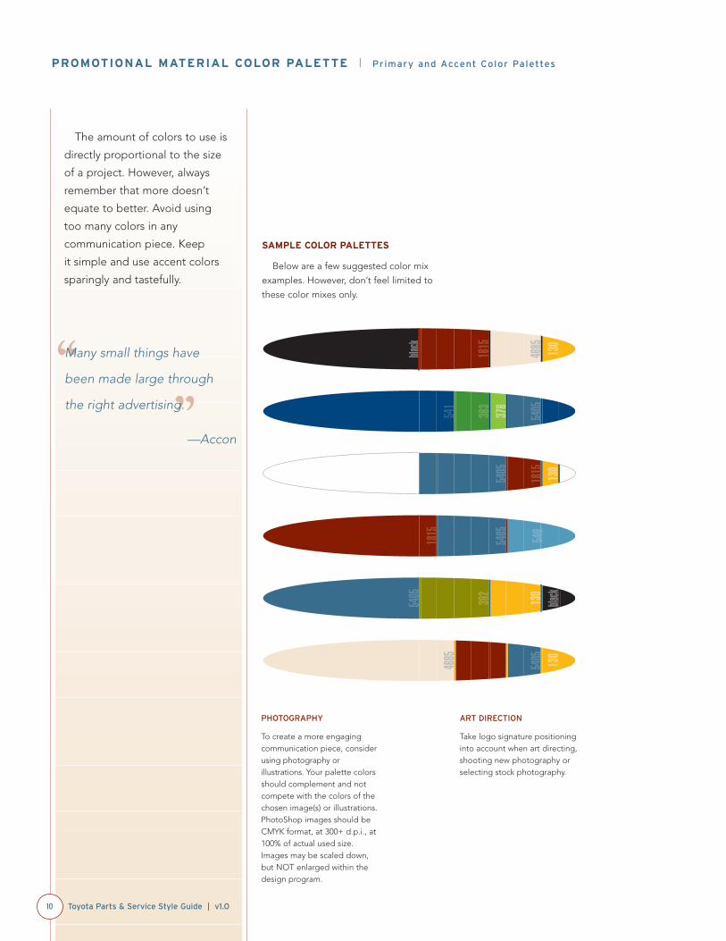
SAMPLE COLOR PALETTES
Below are a few suggested color mix
examples. However, don’t feel limited to
these color mixes only.
1815
5405 549
5405
black392
130
541
376
363
5405
black
1815
4685 130
4685
1815
5405 130
1815
5405 130
PHOTOGRAPHY
To create a more engagingcommunication piece, considerusing photography orillustrations. Your palette colorsshould complement and notcompete with the colors of thechosen image(s) or illustrations.PhotoShop images should beCMYK format, at 300+ d.p.i., at100% of actual used size.Images may be scaled down,but NOT enlarged within thedesign program.
ART DIRECTION
Take logo signature positioninginto account when art directing,shooting new photography orselecting stock photography.
“”
Many small things have
been made large through
the right advertising.
—Accon
Careful use of tints can
help provide visual clarity and
legibility. Use tints sparingly to
highlight levels of information.
When overprinting or reversing
text, logo, and/or graphics from
the recommended color palette,
the “30/70” rule should apply.
QUICK REFERENCE
Grayscale
A range of accurately known shades
of gray printed out for use in
calibrating those shades on a display
or printer.
Tints
A shade of a single color or
combined colors.
PROMOTIONAL MATERIAL COLOR PALETTE | Tone Scale for Background Intensity
11Toyota Parts & Service Style Guide | v1.0
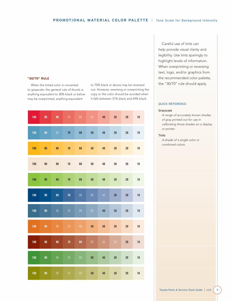
“30/70” RULE
When the tinted color is converted
to grayscale, the general rule of thumb is
anything equivalent to 30% black or below
may be overprinted; anything equivalent
to 70% black or above may be reversed
out. However, reversing or overprinting the
copy or the color should be avoided when
it falls between 31% black and 69% black.
100 90 80 70 60 50 40 30 20 10
100 90 80 70 60 50 40 30 20 10
100 90 80 70 60 50 40 30 20 10
100 90 80 70 60 50 40 30 20 10
100 90 80 70 60 50 40 30 20 10
100 90 80 70 60 50 40 30 20 10
100 90 80 70 60 50 40 30 20 10
100 90 80 70 60 50 40 30 20 10
100 90 80 70 60 50 40 30 20 10
100 90 80 70 60 50 40 30 20 10
100 90 80 70 60 50 40 30 20 10

The header and body copy
typefaces have been selected
from the array of current Toyota-
designated fonts along with their
compatibility with the Toyota
Parts & Service logo. All have
been chosen for their clean
lines, outstanding legibility and
compatibility with one another.
Use the selected fonts for all of
your communications, including
all promotional materials,
stationery and Internet ads.
Using approved fonts will convey
a consistent unified look and feel
among all communication pieces.
FONTS | Headlines and Subheads
12 Toyota Parts & Service Style Guide | v1.0
Interstate RegularABCDEF | abcdef | 1234567890The quick brown fox jumped over the lazy dog.
Interstate BoldABCDEF | abcdef | 1234567890The quick brown fox jumped over the lazy dog.
Interstate Regular CondensedABCDEF | abcdef | 1234567890The quick brown fox jumped over the lazy dog.
Trade Gothic Bold Condensed ObliqueABCDEF | abcdef | 1234567890The quick brown fox jumped over the lazy dog.
HEADLINES AND SUBHEADS
Headlines should be set in either the
Interstate or Trade Gothic family suite,
preferably in all caps or initial caps. Avoid
tracking type less than 0. As a general rule,
use color rather than weight to create
order in information. For type, always use
solid color, never tints.
Subheads should be set in the same
typeface as your header at a size ratio of
approximately 3:2. Avoid tracking type less
than 0. For type, always use solid color,
never tints.
FONT LICENSING/
DOWNLOADING FONTS
The selected Toyota Parts &Service fonts should currently bepart of your existing font library.However, all typefaces can bepurchased in electronic formatfrom Adobe Systems, Inc. Calltoll-free at 800-833-6687.
FONTS | Body Copy and Legal Copy/Footnotes
13Toyota Parts & Service Style Guide | v1.0
Helvetica Neue LightABCDEF | abcdef | 1234567890The quick brown fox jumped over the lazy dog.
Helvetica Neue Light ObliqueABCDEF | abcdef | 1234567890The quick brown fox jumped over the lazy dog.
Helvetica Neue RomanABCDEF | abcdef | 1234567890The quick brown fox jumped over the lazy dog.
Avenir LightABCDEF | abcdef | 1234567890The quick brown fox jumped over the lazy dog.
Avenir Light ObliqueABCDEF | abcdef | 1234567890The quick brown fox jumped over the lazy dog.
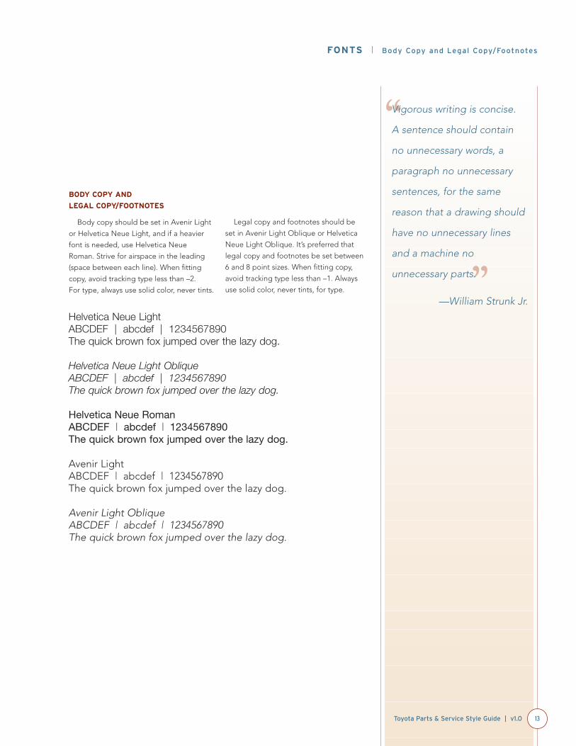
BODY COPY AND
LEGAL COPY/FOOTNOTES
Body copy should be set in Avenir Light
or Helvetica Neue Light, and if a heavier
font is needed, use Helvetica Neue
Roman. Strive for airspace in the leading
(space between each line). When fitting
copy, avoid tracking type less than –2.
For type, always use solid color, never tints.
Legal copy and footnotes should be
set in Avenir Light Oblique or Helvetica
Neue Light Oblique. It’s preferred that
legal copy and footnotes be set between
6 and 8 point sizes. When fitting copy,
avoid tracking type less than –1. Always
use solid color, never tints, for type.
“
”
Vigorous writing is concise.
A sentence should contain
no unnecessary words, a
paragraph no unnecessary
sentences, for the same
reason that a drawing should
have no unnecessary lines
and a machine no
unnecessary parts.
—William Strunk Jr.
PowerPoint presentations
provide the audience with
key points and simple visual
aids. Therefore, keep pages
uncluttered and easy to read.
Keep copy short and minimize
the use of complex builds
and animations.
POWER POINT PRESENTATION
14 Toyota Parts & Service Style Guide | v1.0
IMAGE QUALITY
Avoid complicated images and
illustrations, and make sure they are large
enough to be viewed clearly on-screen.
When importing Photoshop images
into PowerPoint, images should be RGB
format, at 100 d.p.i., at 100% of actual
used size. Images may be scaled down,
but NOT be enlarged within PowerPoint.
CONTRAST
Ensure that images don’t blend into
the background or contain dark images
in a box outlined in a color lighter than
the background.
CLUTTER
Avoid using too many words, colors
and images on a page. Less is better
than more.
GLOSSARY | Common Print Terms
15Toyota Parts & Service Style Guide | v1.0
B
BINDERY
The finishing department of a print
shop or firm specializing in finishing
printed products.
BLEED
Printing that goes to the edge of the
sheet after trimming.
BLUELINE
A blue photographic proof used to
check position of all image elements.
BRIGHTNESS
The brilliance or reflectance of paper.
BUTT
Joining images without overlapping.
C
CALIPER
Paper thickness in thousandths
of an inch.
COATED PAPER
Clay coated printing paper with a
smooth finish.
COLLATE
A finishing term for gathering paper in a
precise order.
COLOR CORRECTION
Methods of improving color separations.
CONTRAST
The tonal change in color from light
to dark.
CROMALIN
Trade name for DuPont color proofs.
CROP
To cut off parts of a picture or image.
CROP MARKS
Printed lines showing where to trim a
printed sheet.
CROSSOVER
Printing across the gutter or from
one page to the facing page of
a publication.
CYAN
One of four standard process
colors—the blue color.
D
DENSITOMETER
A quality control devise to measure the
density of printing ink.
DENSITY
The degree of color or darkness of an
image or photograph.
DIE CUTTING
Cutting images in or out of paper.
DOT
An element of halftones. Using a loupe
you will see that printed pictures are
made of many dots.
DOT GAIN OR SPREAD
A term used to explain the difference in
size between the dot on film and paper.
DOTS PER INCH (D.P.I.)
A resolution unit indicating the number
of dots printed per inch
DRAW-DOWN
A sample of ink and paper used to
evaluate ink colors.
DROP-OUT
Portions of artwork that do not print.
DUOTONE
A halftone picture made up of two
printed colors.
E
EMBOSS
Pressing an image into paper so that it
will create a raised relief.
F
FLOOD
To cover a printed page with ink,
varnish or plastic coating.
FOUR-COLOR PROCESS
The process of combining four basic
colors (cyan, magenta, yellow, black) to
create a printed color picture or colors
composed from the basic four colors.
G
GLOSS
A shiny look reflecting light.
GRAYSCALE
A range of accurately known shades of
gray printed out for use in calibrating
those shades on a display
or printer.
H
HAIRLINE
A very thin line or gap about the width
of a hair or 1/100 inch.
HALFTONE
Converting a continuous tone to dots
for printing.
HICKEY
Recurring unplanned spots that appear
in the printed image from dust, lint or
dried ink.
K
KNOCK OUT
To mask out an image.
L
LINES PER INCH (L.P.I.)
The number of rows of dots per inch
in a halftone.
M
MAGENTA
Process red, one of the basic colors
in process color.
MATCHPRINT
Trade name for 3M integral color proof.
MATTE FINISH
Dull paper or ink finish.
MOIRE
Occurs when screen angles are wrong,
causing odd patterns in photographs.
O
OPACITY
The amount of show-through on a
printed sheet. A higher opacity equates
to less show-through.
P
PICA
Unit of measure in typesetting.
One pica = 1/6 inch.
PMS
The abbreviated name of the Pantone
Color Matching System.
POINT
For paper, a unit of thickness equaling
1/1,000 inch. For typesetting, a unit of
height equaling 1/72 inch.
PROCESS BLUE
The blue or cyan color in
process printing.
PROCESS COLOR
Cyan (blue), magenta (process red),
yellow (process yellow), black (process
black).
S
SADDLE STITCH
Binding a booklet or magazine with
staples in the seam where it folds.
SCORE
A crease put on paper to help
it fold better.
SCREEN ANGLES
Frequently a desktop publisher’s
nightmare. The angles at which halftone,
duotones, tritones and color separation
printing films are placed to make them
look right.
SELF-COVER
Using the same paper as the text
for the cover.
SIDE STITCH
Binding by stapling along one side
of a sheet.
SIGNATURE
A sheet of printed pages that,
when folded, become a part of a
book or publication.
SPECIFICATIONS
A precise description of a print order.
SPINE
The binding edge of a book or
publication.
SPOT VARNISH
Varnish used to highlight a specific part
of the printed sheet.
T
TINTS
A shade of a single color or combined
colors.
TRIM MARKS
Similar to crop or register marks. These
marks show where to trim the printed
sheet.
TRIM SIZE
The final size of one printed image after
the last trim is made.
U
UV COATING
Liquid laminate bonded and cured with
ultraviolet light. Environmentally friendly.
V
VARNISH
A clear liquid applied to printed
surfaces for looks and protection.
(UV coating looks better.)
W
WIRE O
A bindery trade name for mechanical
binding using double loops of wire
through a hole.
WIRE O BINDING
A method of wire binding books along
the binding edge that will allow the
book to lay flat using double loops.
(See Wire O.)
Toyota Parts & Service Style Guide | v1.016
GLOSSARY | Common Print Terms

© Toyota Motor Sales, U.S.A., Inc., May 2005