lesson 2: displaying a data distribution - engageny
TRANSCRIPT

NYS COMMON CORE MATHEMATICS CURRICULUM 6•6 Lesson 2
Lesson 2: Displaying a Data Distribution
20
This work is derived from Eureka Math ™ and licensed by Great Minds. ©2015 Great Minds. eureka-math.org This file derived from G6-M6-TE-1.3.0-10.2015
This work is licensed under a Creative Commons Attribution-NonCommercial-ShareAlike 3.0 Unported License.
Lesson 2: Displaying a Data Distribution
Student Outcomes
Given a dot plot, students begin describing the distribution of the points on the dot plot in terms of center and
variability.
Classwork
Example 1 (9 minutes): Heart Rate
This example uses the scenario of students’ resting heart rates. While discussing the scenario with students, consider
demonstrating how a pulse is taken, and (if time permits) have students find their resting heart rates and use that data
to make a dot plot. Take a few minutes to go over Example 1, and make sure that students understand what the given
numbers represent.
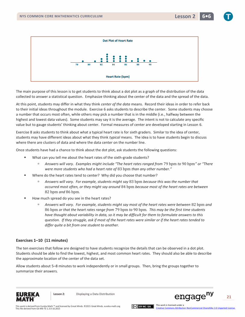
Example 1: Heart Rate
Mia, a sixth grader at Roosevelt Middle School, was thinking about joining the middle school track team. She read that
Olympic athletes have lower resting heart rates than most people. She wondered about her own heart rate and how it
would compare to other students. Mia was interested in investigating the statistical question: What are the heart rates
of students in my sixth-grade class?
Heart rates are expressed as beats per minute (or bpm). Mia knew her resting heart rate was 𝟖𝟎 beats per minute. She
asked her teacher if she could collect the heart rates of the other students in her class. With the teacher’s help, the other
sixth graders in her class found their heart rates and reported them to Mia. The following numbers are the resting heart
rates (in beats per minute) for the 𝟐𝟐 other students in Mia’s class.
𝟖𝟗 𝟖𝟕 𝟖𝟓 𝟖𝟒 𝟗𝟎 𝟕𝟗 𝟖𝟑 𝟖𝟓 𝟖𝟔 𝟖𝟖 𝟖𝟒 𝟖𝟏 𝟖𝟖 𝟖𝟓 𝟖𝟑 𝟖𝟑 𝟖𝟔 𝟖𝟐 𝟖𝟑 𝟖𝟔 𝟖𝟐 𝟖𝟒
Use the given data values to construct a dot plot. Mia’s data point is not included. While making the dot plot, have
students follow the steps to make their own dot plots of the data. Emphasize that it is important to think about where
to start numbering (need to include the smallest value in the data set) and where to stop numbering (need to include the
largest value in the data set) when setting up the number line for the dot plot. Mia’s data point is not included.
To learn about the heart rates, a good place to start is to make a graph of the data. There are several different
graphs that could be used, including the three types of graphs that you learn in this module: dot plots,
histograms, and box plots. This lesson covers dot plots.
Mia noticed that there were many different heart rates. She decided to make a dot plot to show the different
heart rates. Help Mia construct a dot plot of her classmates’ heart rates by drawing a number line. Start
numbering at 78, and continue to 92.
Place a dot above the corresponding number on the number line for each heart rate. If there is already a dot
above a number, add another above it. Continue until there is one dot for each heart rate.
MP.1
NYS COMMON CORE MATHEMATICS CURRICULUM 6•6 Lesson 2
Lesson 2: Displaying a Data Distribution
21
This work is derived from Eureka Math ™ and licensed by Great Minds. ©2015 Great Minds. eureka-math.org This file derived from G6-M6-TE-1.3.0-10.2015
This work is licensed under a Creative Commons Attribution-NonCommercial-ShareAlike 3.0 Unported License.
The main purpose of this lesson is to get students to think about a dot plot as a graph of the distribution of the data
collected to answer a statistical question. Emphasize thinking about the center of the data and the spread of the data.
At this point, students may differ in what they think center of the data means. Record their ideas in order to refer back
to their initial ideas throughout the module. Exercise 6 asks students to describe the center. Some students may choose
a number that occurs most often, while others may pick a number that is in the middle (i.e., halfway between the
highest and lowest data values). Some students may say it is the average. The intent is not to calculate any specific
value but to gauge students’ thinking about center. Formal measures of center are developed starting in Lesson 6.
Exercise 8 asks students to think about what a typical heart rate is for sixth graders. Similar to the idea of center,
students may have different ideas about what they think typical means. The idea is to have students begin to discuss
where there are clusters of data and where the data center on the number line.
Once students have had a chance to think about the dot plot, ask students the following questions:
What can you tell me about the heart rates of the sixth-grade students?
Answers will vary. Examples might include “The heart rates ranged from 79 bpm to 90 bpm” or “There
were more students who had a heart rate of 83 bpm than any other number.”
Where do the heart rates tend to center? Why did you choose that number?
Answers will vary. For example, students might say 83 bpm because this was the number that
occurred most often, or they might say around 84 bpm because most of the heart rates are between
82 bpm and 86 bpm.
How much spread do you see in the heart rates?
Answers will vary. For example, students might say most of the heart rates were between 82 bpm and
86 bpm or that the heart rates range from 79 bpm to 90 bpm. This may be the first time students
have thought about variability in data, so it may be difficult for them to formulate answers to this
question. If they struggle, ask if most of the heart rates were similar or if the heart rates tended to
differ quite a bit from one student to another.
Exercises 1–10 (11 minutes)
The ten exercises that follow are designed to have students recognize the details that can be observed in a dot plot.
Students should be able to find the lowest, highest, and most common heart rates. They should also be able to describe
the approximate location of the center of the data set.
Allow students about 5–8 minutes to work independently or in small groups. Then, bring the groups together to
summarize their answers.
NYS COMMON CORE MATHEMATICS CURRICULUM 6•6 Lesson 2
Lesson 2: Displaying a Data Distribution
22
This work is derived from Eureka Math ™ and licensed by Great Minds. ©2015 Great Minds. eureka-math.org This file derived from G6-M6-TE-1.3.0-10.2015
This work is licensed under a Creative Commons Attribution-NonCommercial-ShareAlike 3.0 Unported License.
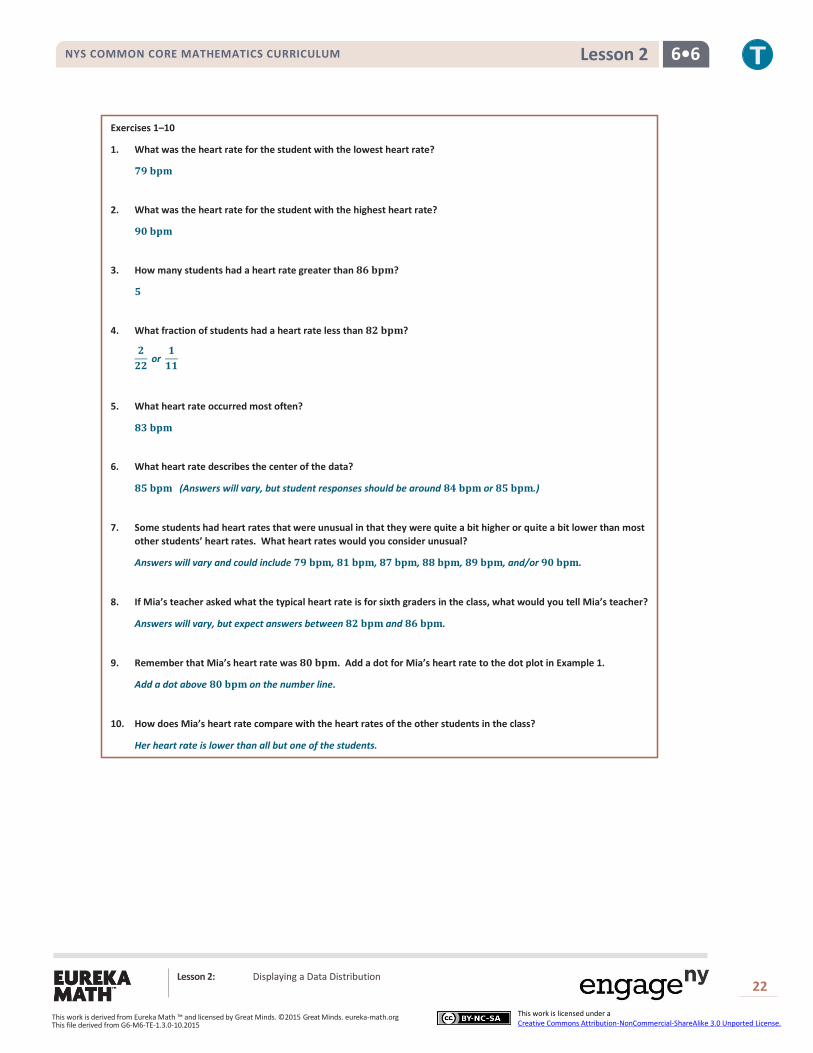
Exercises 1–10
1. What was the heart rate for the student with the lowest heart rate?
𝟕𝟗 𝐛𝐩𝐦
2. What was the heart rate for the student with the highest heart rate?
𝟗𝟎 𝐛𝐩𝐦
3. How many students had a heart rate greater than 𝟖𝟔 𝐛𝐩𝐦?
𝟓
4. What fraction of students had a heart rate less than 𝟖𝟐 𝐛𝐩𝐦?
𝟐
𝟐𝟐 or
𝟏
𝟏𝟏
5. What heart rate occurred most often?
𝟖𝟑 𝐛𝐩𝐦
6. What heart rate describes the center of the data?
𝟖𝟓 𝐛𝐩𝐦 (Answers will vary, but student responses should be around 𝟖𝟒 𝐛𝐩𝐦 or 𝟖𝟓 𝐛𝐩𝐦.)
7. Some students had heart rates that were unusual in that they were quite a bit higher or quite a bit lower than most
other students’ heart rates. What heart rates would you consider unusual?
Answers will vary and could include 𝟕𝟗 𝐛𝐩𝐦, 𝟖𝟏 𝐛𝐩𝐦, 𝟖𝟕 𝐛𝐩𝐦, 𝟖𝟖 𝐛𝐩𝐦, 𝟖𝟗 𝐛𝐩𝐦, and/or 𝟗𝟎 𝐛𝐩𝐦.
8. If Mia’s teacher asked what the typical heart rate is for sixth graders in the class, what would you tell Mia’s teacher?
Answers will vary, but expect answers between 𝟖𝟐 𝐛𝐩𝐦 and 𝟖𝟔 𝐛𝐩𝐦.
9. Remember that Mia’s heart rate was 𝟖𝟎 𝐛𝐩𝐦. Add a dot for Mia’s heart rate to the dot plot in Example 1.
Add a dot above 𝟖𝟎 𝐛𝐩𝐦 on the number line.
10. How does Mia’s heart rate compare with the heart rates of the other students in the class?
Her heart rate is lower than all but one of the students.
NYS COMMON CORE MATHEMATICS CURRICULUM 6•6 Lesson 2
Lesson 2: Displaying a Data Distribution
23
This work is derived from Eureka Math ™ and licensed by Great Minds. ©2015 Great Minds. eureka-math.org This file derived from G6-M6-TE-1.3.0-10.2015
This work is licensed under a Creative Commons Attribution-NonCommercial-ShareAlike 3.0 Unported License.
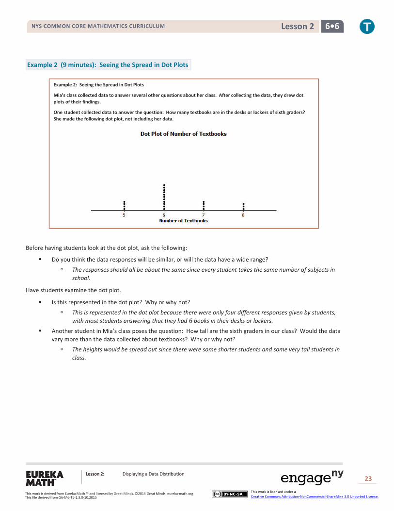
Example 2 (9 minutes): Seeing the Spread in Dot Plots
Example 2: Seeing the Spread in Dot Plots
Mia’s class collected data to answer several other questions about her class. After collecting the data, they drew dot
plots of their findings.
One student collected data to answer the question: How many textbooks are in the desks or lockers of sixth graders?
She made the following dot plot, not including her data.
Before having students look at the dot plot, ask the following:
Do you think the data responses will be similar, or will the data have a wide range?
The responses should all be about the same since every student takes the same number of subjects in
school.
Have students examine the dot plot.
Is this represented in the dot plot? Why or why not?
This is represented in the dot plot because there were only four different responses given by students,
with most students answering that they had 6 books in their desks or lockers.
Another student in Mia’s class poses the question: How tall are the sixth graders in our class? Would the data
vary more than the data collected about textbooks? Why or why not?
The heights would be spread out since there were some shorter students and some very tall students in
class.
NYS COMMON CORE MATHEMATICS CURRICULUM 6•6 Lesson 2
Lesson 2: Displaying a Data Distribution
24
This work is derived from Eureka Math ™ and licensed by Great Minds. ©2015 Great Minds. eureka-math.org This file derived from G6-M6-TE-1.3.0-10.2015
This work is licensed under a Creative Commons Attribution-NonCommercial-ShareAlike 3.0 Unported License.
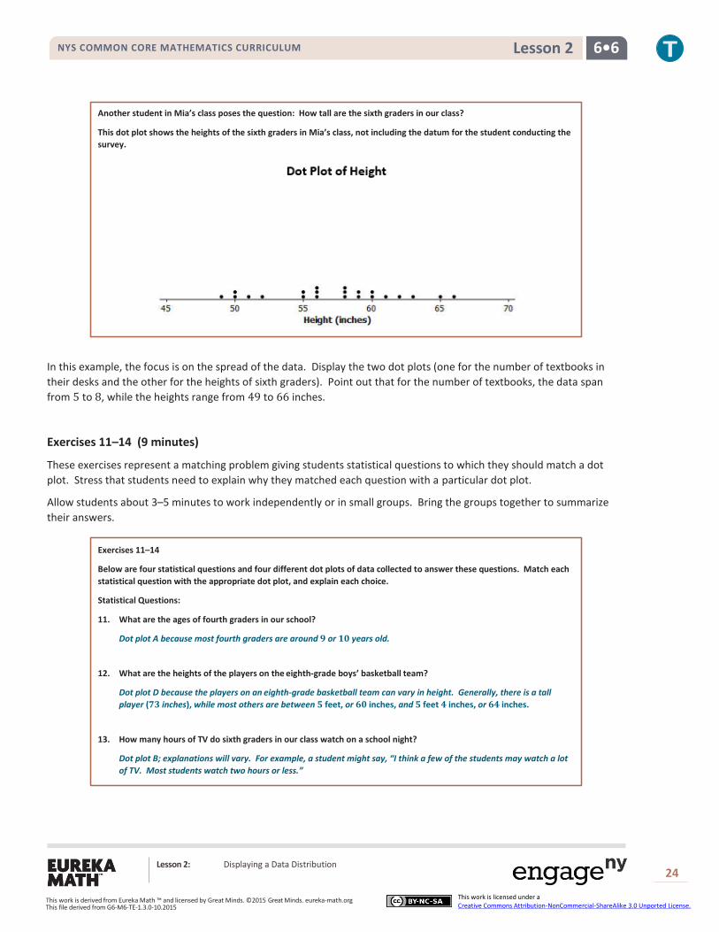
Another student in Mia’s class poses the question: How tall are the sixth graders in our class?
This dot plot shows the heights of the sixth graders in Mia’s class, not including the datum for the student conducting the
survey.
In this example, the focus is on the spread of the data. Display the two dot plots (one for the number of textbooks in
their desks and the other for the heights of sixth graders). Point out that for the number of textbooks, the data span
from 5 to 8, while the heights range from 49 to 66 inches.
Exercises 11–14 (9 minutes)
These exercises represent a matching problem giving students statistical questions to which they should match a dot
plot. Stress that students need to explain why they matched each question with a particular dot plot.
Allow students about 3–5 minutes to work independently or in small groups. Bring the groups together to summarize
their answers.
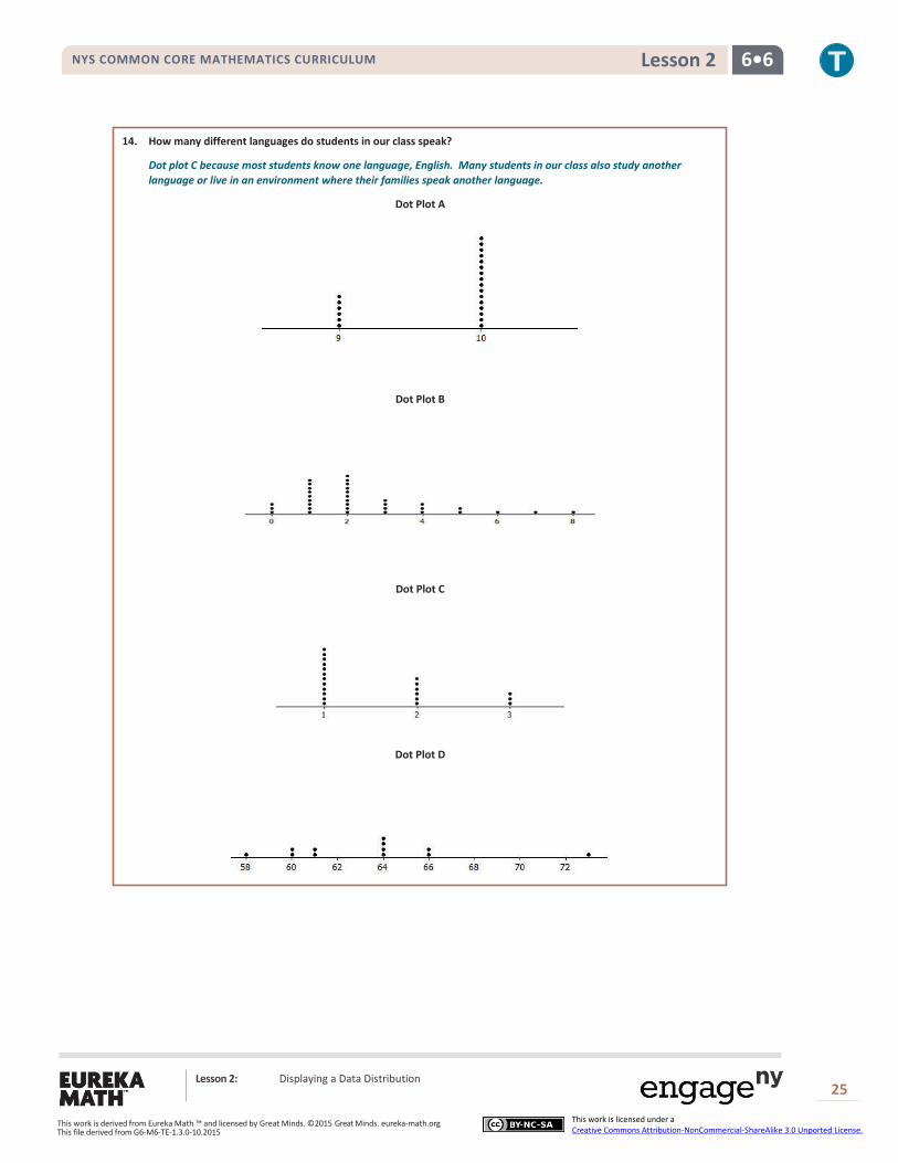
Exercises 11–14
Below are four statistical questions and four different dot plots of data collected to answer these questions. Match each
statistical question with the appropriate dot plot, and explain each choice.
Statistical Questions:
11. What are the ages of fourth graders in our school?
Dot plot A because most fourth graders are around 𝟗 or 𝟏𝟎 years old.
12. What are the heights of the players on the eighth-grade boys’ basketball team?
Dot plot D because the players on an eighth-grade basketball team can vary in height. Generally, there is a tall
player (𝟕𝟑 inches), while most others are between 𝟓 feet, or 𝟔𝟎 inches, and 𝟓 feet 𝟒 inches, or 𝟔𝟒 inches.
13. How many hours of TV do sixth graders in our class watch on a school night?
Dot plot B; explanations will vary. For example, a student might say, “I think a few of the students may watch a lot
of TV. Most students watch two hours or less.”
NYS COMMON CORE MATHEMATICS CURRICULUM 6•6 Lesson 2
Lesson 2: Displaying a Data Distribution
25
This work is derived from Eureka Math ™ and licensed by Great Minds. ©2015 Great Minds. eureka-math.org This file derived from G6-M6-TE-1.3.0-10.2015
This work is licensed under a Creative Commons Attribution-NonCommercial-ShareAlike 3.0 Unported License.
14. How many different languages do students in our class speak?
Dot plot C because most students know one language, English. Many students in our class also study another
language or live in an environment where their families speak another language.
Dot Plot A
Dot Plot B
Dot Plot C
Dot Plot D

NYS COMMON CORE MATHEMATICS CURRICULUM 6•6 Lesson 2
Lesson 2: Displaying a Data Distribution
26
This work is derived from Eureka Math ™ and licensed by Great Minds. ©2015 Great Minds. eureka-math.org This file derived from G6-M6-TE-1.3.0-10.2015
This work is licensed under a Creative Commons Attribution-NonCommercial-ShareAlike 3.0 Unported License.
Closing (2 minutes)
If a number occurs twice in a data set, how do you represent the second one on a dot plot?
Place a second dot on top of the first dot at the same value.
When examining a dot plot, what information can one gather?
We can find the smallest and largest values, gather information about the spread of the data, and see
where the center of the data is located.
Exit Ticket (5 minutes)

NYS COMMON CORE MATHEMATICS CURRICULUM 6•6 Lesson 2
Lesson 2: Displaying a Data Distribution
27
This work is derived from Eureka Math ™ and licensed by Great Minds. ©2015 Great Minds. eureka-math.org This file derived from G6-M6-TE-1.3.0-10.2015
This work is licensed under a Creative Commons Attribution-NonCommercial-ShareAlike 3.0 Unported License.
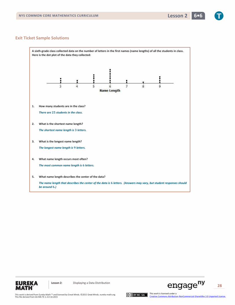
Name __________________________________________________ Date____________________
Lesson 2: Displaying a Data Distribution
Exit Ticket
A sixth-grade class collected data on the number of letters in the first names (name lengths) of all the students in class.
Here is the dot plot of the data they collected:
1. How many students are in the class?
2. What is the shortest name length?
3. What is the longest name length?
4. What name length occurs most often?
5. What name length describes the center of the data?
NYS COMMON CORE MATHEMATICS CURRICULUM 6•6 Lesson 2
Lesson 2: Displaying a Data Distribution
28
This work is derived from Eureka Math ™ and licensed by Great Minds. ©2015 Great Minds. eureka-math.org This file derived from G6-M6-TE-1.3.0-10.2015
This work is licensed under a Creative Commons Attribution-NonCommercial-ShareAlike 3.0 Unported License.
Exit Ticket Sample Solutions
A sixth-grade class collected data on the number of letters in the first names (name lengths) of all the students in class.
Here is the dot plot of the data they collected:
1. How many students are in the class?
There are 𝟐𝟓 students in the class.
2. What is the shortest name length?
The shortest name length is 𝟑 letters.
3. What is the longest name length?
The longest name length is 𝟗 letters.
4. What name length occurs most often?
The most common name length is 𝟔 letters.
5. What name length describes the center of the data?
The name length that describes the center of the data is 𝟔 letters. (Answers may vary, but student responses should
be around 𝟔.)

NYS COMMON CORE MATHEMATICS CURRICULUM 6•6 Lesson 2
Lesson 2: Displaying a Data Distribution
29
This work is derived from Eureka Math ™ and licensed by Great Minds. ©2015 Great Minds. eureka-math.org This file derived from G6-M6-TE-1.3.0-10.2015
This work is licensed under a Creative Commons Attribution-NonCommercial-ShareAlike 3.0 Unported License.
Dot Plot of Vertical Jump
Problem Set Sample Solutions
1. The dot plot below shows the vertical jump height (in inches) of some NBA players. A vertical jump height is how
high a player can jump from a standstill.
a. What statistical question do you think could be answered using these data?
What are the vertical jump heights of NBA players?
b. What was the highest vertical jump by a player?
𝟒𝟑 inches
c. What was the lowest vertical jump by a player?
𝟑𝟐 inches
d. What is the most common vertical jump height (the height that occurred most often)?
𝟑𝟖 inches
e. How many players jumped the most common vertical jump height?
𝟏𝟎
f. How many players jumped higher than 𝟒𝟎 inches?
𝟑
g. Another NBA player jumped 𝟑𝟑 inches. Add a dot for this player on the dot plot. How does this player
compare with the other players?
Add another dot above 𝟑𝟑. This player jumped the same as two other players and jumped higher than only
one player.
NYS COMMON CORE MATHEMATICS CURRICULUM 6•6 Lesson 2
Lesson 2: Displaying a Data Distribution
30
This work is derived from Eureka Math ™ and licensed by Great Minds. ©2015 Great Minds. eureka-math.org This file derived from G6-M6-TE-1.3.0-10.2015
This work is licensed under a Creative Commons Attribution-NonCommercial-ShareAlike 3.0 Unported License.
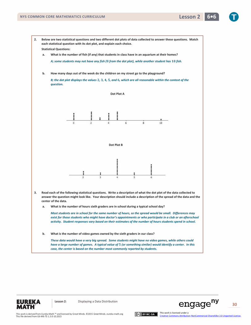
2. Below are two statistical questions and two different dot plots of data collected to answer these questions. Match
each statistical question with its dot plot, and explain each choice.
Statistical Questions:
a. What is the number of fish (if any) that students in class have in an aquarium at their homes?
A; some students may not have any fish (𝟎 from the dot plot), while another student has 𝟏𝟎 fish.
b. How many days out of the week do the children on my street go to the playground?
B; the dot plot displays the values 𝟐, 𝟑, 𝟒, 𝟓, and 𝟔, which are all reasonable within the context of the
question.
3. Read each of the following statistical questions. Write a description of what the dot plot of the data collected to
answer the question might look like. Your description should include a description of the spread of the data and the
center of the data.
a. What is the number of hours sixth graders are in school during a typical school day?
Most students are in school for the same number of hours, so the spread would be small. Differences may
exist for those students who might have doctor’s appointments or who participate in a club or an afterschool
activity. Student responses vary based on their estimates of the number of hours students spend in school.
b. What is the number of video games owned by the sixth graders in our class?
These data would have a very big spread. Some students might have no video games, while others could
have a large number of games. A typical value of 𝟓 (or something similar) would identify a center. In this
case, the center is based on the number most commonly reported by students.
Dot Plot B
Dot Plot A