ielts writing task 1
TRANSCRIPT
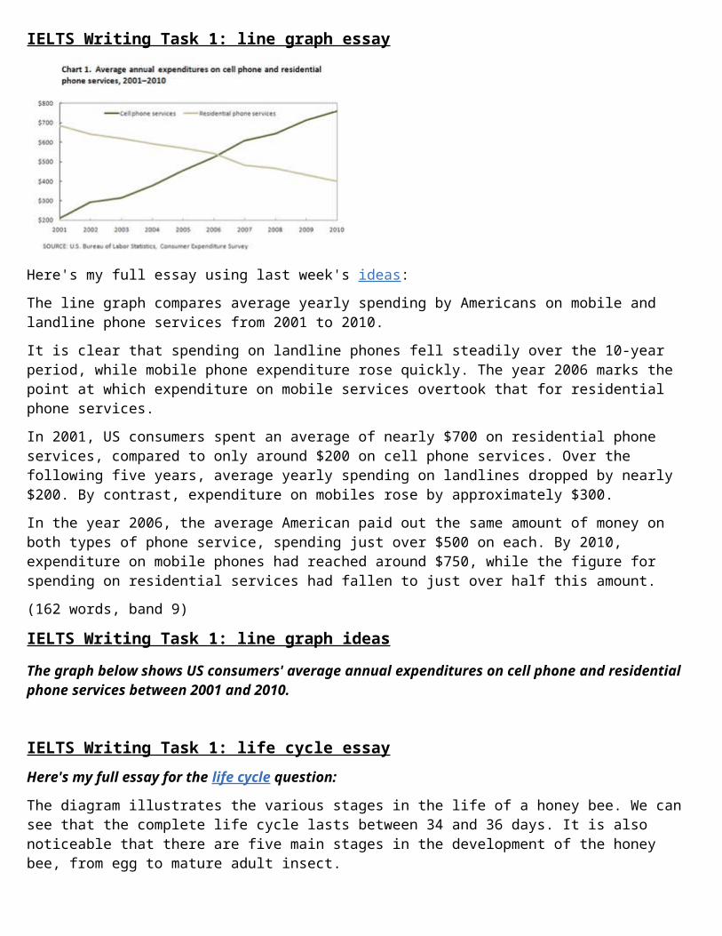
IELTS Writing Task 1: line graph essay
Here's my full essay using last week's ideas:The line graph compares average yearly spending by Americans on mobile and landline phone services from 2001 to 2010.It is clear that spending on landline phones fell steadily over the 10-year period, while mobile phone expenditure rose quickly. The year 2006 marks the point at which expenditure on mobile services overtook that for residential phone services.In 2001, US consumers spent an average of nearly $700 on residential phone services, compared to only around $200 on cell phone services. Over the following five years, average yearly spending on landlines dropped by nearly $200. By contrast, expenditure on mobiles rose by approximately $300.In the year 2006, the average American paid out the same amount of money on both types of phone service, spending just over $500 on each. By 2010, expenditure on mobile phones had reached around $750, while the figure for spending on residential services had fallen to just over half this amount.(162 words, band 9)
IELTS Writing Task 1: line graph ideasThe graph below shows US consumers' average annual expenditures on cell phone and residential phone services between 2001 and 2010.
IELTS Writing Task 1: life cycle essayHere's my full essay for the life cycle question:
The diagram illustrates the various stages in the life of a honey bee. We can see that the complete life cycle lasts between 34 and 36 days. It is also noticeable that there are five main stages in the development of the honey bee, from egg to mature adult insect.
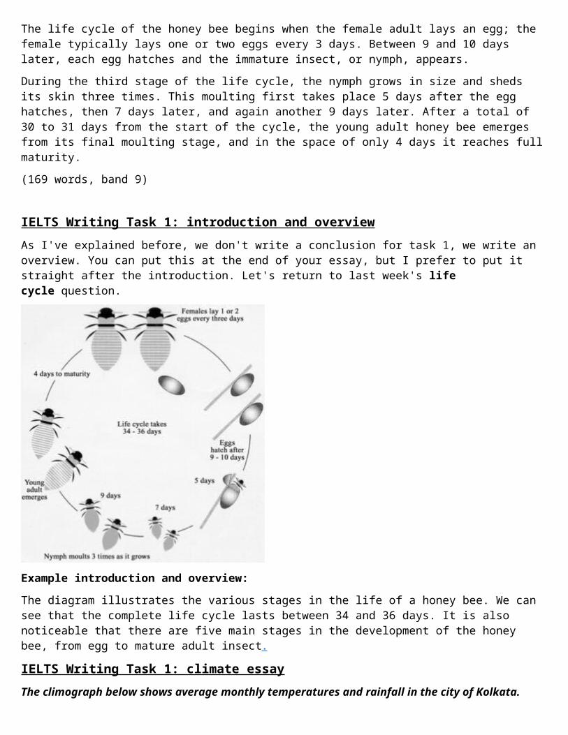
The life cycle of the honey bee begins when the female adult lays an egg; the female typically lays one or two eggs every 3 days. Between 9 and 10 days later, each egg hatches and the immature insect, or nymph, appears.During the third stage of the life cycle, the nymph grows in size and sheds its skin three times. This moulting first takes place 5 days after the egg hatches, then 7 days later, and again another 9 days later. After a total of 30 to 31 days from the start of the cycle, the young adult honey bee emerges from its final moulting stage, and in the space of only 4 days it reaches fullmaturity.(169 words, band 9)
IELTS Writing Task 1: introduction and overviewAs I've explained before, we don't write a conclusion for task 1, we write an overview. You can put this at the end of your essay, but I prefer to put it straight after the introduction. Let's return to last week's life cycle question.
Example introduction and overview:The diagram illustrates the various stages in the life of a honey bee. We can see that the complete life cycle lasts between 34 and 36 days. It is also noticeable that there are five main stages in the development of the honey bee, from egg to mature adult insect.
IELTS Writing Task 1: climate essayThe climograph below shows average monthly temperatures and rainfall in the city of Kolkata.
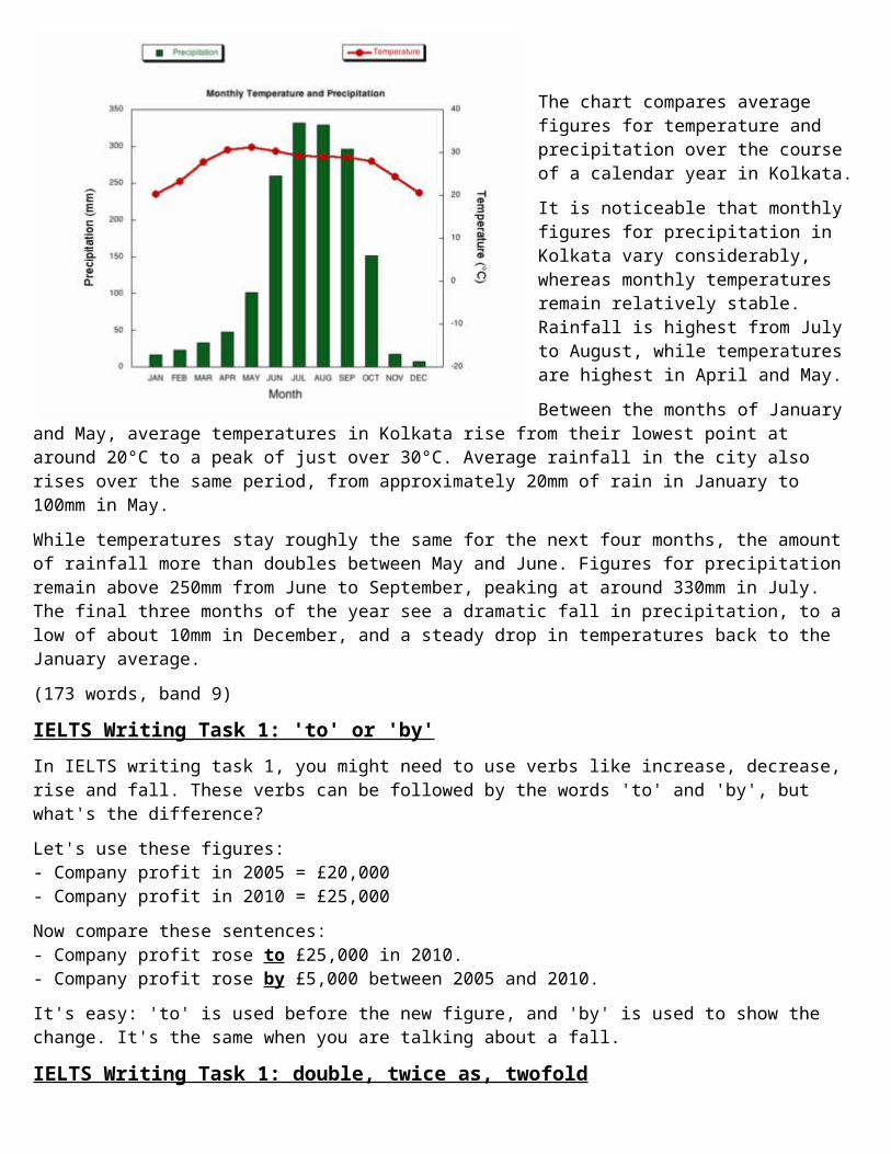
The chart compares average figures for temperature and precipitation over the course of a calendar year in Kolkata.It is noticeable that monthly figures for precipitation in Kolkata vary considerably, whereas monthly temperatures remain relatively stable. Rainfall is highest from July to August, while temperatures are highest in April and May.Between the months of January
and May, average temperatures in Kolkata rise from their lowest point at around 20°C to a peak of just over 30°C. Average rainfall in the city also rises over the same period, from approximately 20mm of rain in January to 100mm in May.While temperatures stay roughly the same for the next four months, the amount of rainfall more than doubles between May and June. Figures for precipitation remain above 250mm from June to September, peaking at around 330mm in July. The final three months of the year see a dramatic fall in precipitation, to a low of about 10mm in December, and a steady drop in temperatures back to the January average.(173 words, band 9)
IELTS Writing Task 1: 'to' or 'by'In IELTS writing task 1, you might need to use verbs like increase, decrease, rise and fall. These verbs can be followed by the words 'to' and 'by', but what's the difference?Let's use these figures:- Company profit in 2005 = £20,000- Company profit in 2010 = £25,000Now compare these sentences:- Company profit rose to £25,000 in 2010.- Company profit rose by £5,000 between 2005 and 2010.It's easy: 'to' is used before the new figure, and 'by' is used to show the change. It's the same when you are talking about a fall.
IELTS Writing Task 1: double, twice as, twofold
A few students have asked me about how to use 'double', 'twice as', 'three times', 'twofold', 'threefold' etc. Compare how each word/phrase is used in the following examples:1. 'double' (verb)The number of unemployed people doubled between 2005 and 2009.2. 'twice as...as/compared to', 'three times as...as/compared to'There were twice as many unemployed people in 2009 as in 2005.Twice as many people were unemployed in 2009 compared to 2005.3. 'twofold', 'threefold' (adjective or adverb)There was a twofold increase in the number of unemployed people between 2005 and 2009. (adjective with the noun 'increase')The number of unemployed people increased twofold between 2005 and 2009. (adverb with the verb 'increase')Try using these forms in your own sentences. Make sure you follow the patterns.
IELTS Writing Task 1: nouns and verbsWhen describing changes I prefer to avoid words like soar, rocket and plummetbecause they are too "sensationalist" - they exaggerate too much, and are more journalistic than academic in style.Instead, we can demonstrate good control of grammar by using words likeincrease, rise and fall as both nouns and verbs:- London saw a significant increase in the cost of homes. (noun)- The cost of homes in London increased significantly. (verb)- There was a rise in house prices between 1990 and 1995. (noun)- House prices rose between 1990 and 1995. (verb)- There was a 7% fall in the average house price in Tokyo. (noun)- The average Tokyo house price fell by 7%. (verb)
IELTS Writing Task 1: paraphrasingThe easiest way to start your Task 1 essay is by paraphrasing the question. Paraphrasing means writing something in a different way (using your own words).Here are some simple changes you can make:
graph = line graph chart = bar chart diagram = figure shows = illustrates (or 'compares' if the graph is comparing)
proportion = percentage information = data the number of = the figure for the proportion of = the figure for people in the USA = Americans from 1999 to 2009 = between 1999 and 2009 from 1999 to 2009 = over a period of 10 years how to produce = the process of producing in three countries = in the UK, France and Spain (i.e. name the
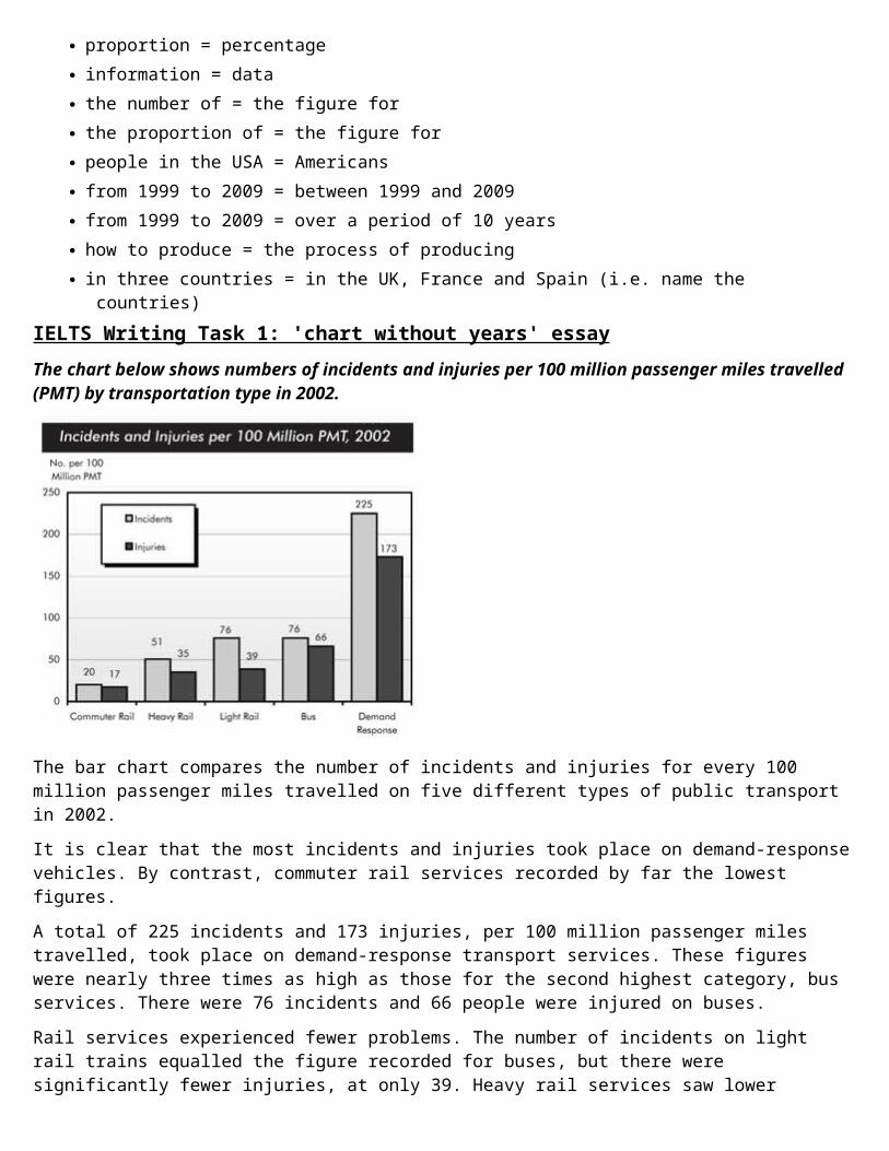
countries)IELTS Writing Task 1: 'chart without years' essayThe chart below shows numbers of incidents and injuries per 100 million passenger miles travelled (PMT) by transportation type in 2002.
The bar chart compares the number of incidents and injuries for every 100 million passenger miles travelled on five different types of public transport in 2002.It is clear that the most incidents and injuries took place on demand-responsevehicles. By contrast, commuter rail services recorded by far the lowest figures.A total of 225 incidents and 173 injuries, per 100 million passenger miles travelled, took place on demand-response transport services. These figures were nearly three times as high as those for the second highest category, bus services. There were 76 incidents and 66 people were injured on buses.Rail services experienced fewer problems. The number of incidents on light rail trains equalled the figure recorded for buses, but there were significantly fewer injuries, at only 39. Heavy rail services saw lower
numbers of such events than light rail services, but commuter rail passengers were even less likely to experience problems. In fact, only 20 incidents and 17 injuries occurred on commuter trains.(165 words, band 9)(Charts taken from US Department of Transportation website)
IELTS Writing Task 1: full essayHere's my full essay for last week's line graph question:
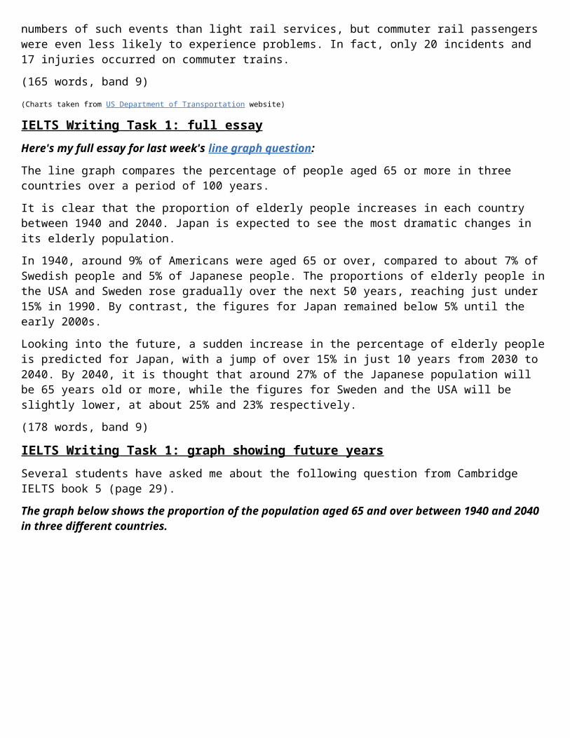
The line graph compares the percentage of people aged 65 or more in three countries over a period of 100 years.It is clear that the proportion of elderly people increases in each country between 1940 and 2040. Japan is expected to see the most dramatic changes in its elderly population.In 1940, around 9% of Americans were aged 65 or over, compared to about 7% of Swedish people and 5% of Japanese people. The proportions of elderly people inthe USA and Sweden rose gradually over the next 50 years, reaching just under 15% in 1990. By contrast, the figures for Japan remained below 5% until the early 2000s.Looking into the future, a sudden increase in the percentage of elderly peopleis predicted for Japan, with a jump of over 15% in just 10 years from 2030 to 2040. By 2040, it is thought that around 27% of the Japanese population will be 65 years old or more, while the figures for Sweden and the USA will be slightly lower, at about 25% and 23% respectively.(178 words, band 9)
IELTS Writing Task 1: graph showing future yearsSeveral students have asked me about the following question from Cambridge IELTS book 5 (page 29).The graph below shows the proportion of the population aged 65 and over between 1940 and 2040 in three different countries.
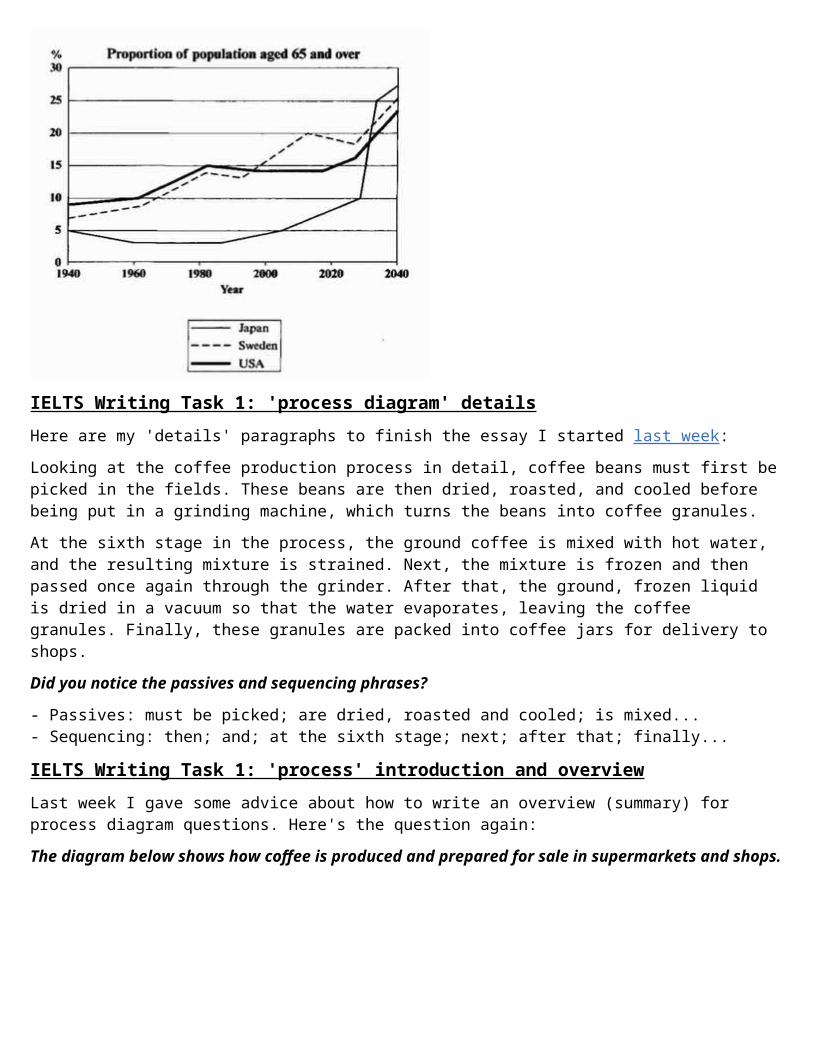
IELTS Writing Task 1: 'process diagram' detailsHere are my 'details' paragraphs to finish the essay I started last week:Looking at the coffee production process in detail, coffee beans must first bepicked in the fields. These beans are then dried, roasted, and cooled before being put in a grinding machine, which turns the beans into coffee granules.At the sixth stage in the process, the ground coffee is mixed with hot water, and the resulting mixture is strained. Next, the mixture is frozen and then passed once again through the grinder. After that, the ground, frozen liquid is dried in a vacuum so that the water evaporates, leaving the coffee granules. Finally, these granules are packed into coffee jars for delivery to shops.Did you notice the passives and sequencing phrases?
- Passives: must be picked; are dried, roasted and cooled; is mixed...- Sequencing: then; and; at the sixth stage; next; after that; finally...
IELTS Writing Task 1: 'process' introduction and overviewLast week I gave some advice about how to write an overview (summary) for process diagram questions. Here's the question again:The diagram below shows how coffee is produced and prepared for sale in supermarkets and shops.
(Click on picture to make it bigger. Source: 'Meanings into Words Upper-Intermediate')
Here's my introduction and overview:
The picture illustrates the process of coffee manufacture and preparation for sale on the market.It is clear that there are 11 stages in the production of coffee. The process begins with the picking of coffee beans, and ends at the packing stage.
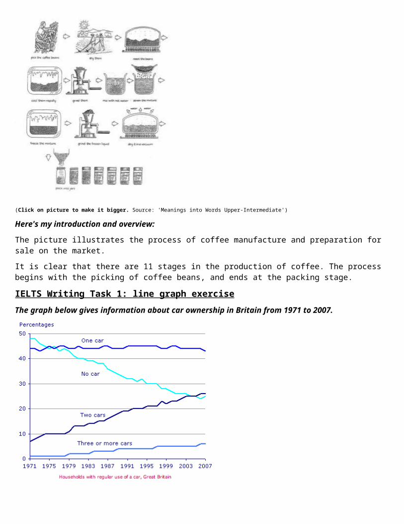
IELTS Writing Task 1: line graph exerciseThe graph below gives information about car ownership in Britain from 1971 to 2007.
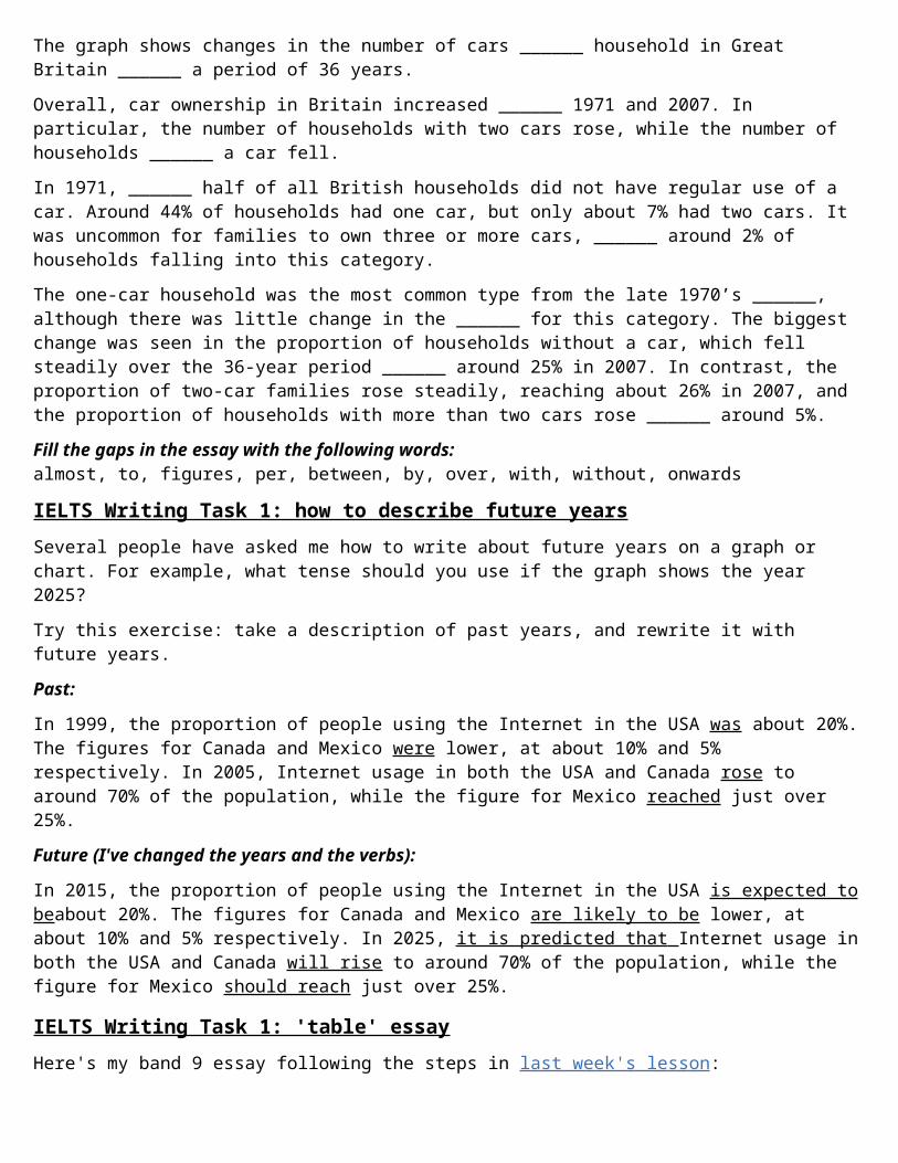
The graph shows changes in the number of cars ______ household in Great Britain ______ a period of 36 years.Overall, car ownership in Britain increased ______ 1971 and 2007. In particular, the number of households with two cars rose, while the number of households ______ a car fell.In 1971, ______ half of all British households did not have regular use of a car. Around 44% of households had one car, but only about 7% had two cars. It was uncommon for families to own three or more cars, ______ around 2% of households falling into this category.The one-car household was the most common type from the late 1970’s ______, although there was little change in the ______ for this category. The biggest change was seen in the proportion of households without a car, which fell steadily over the 36-year period ______ around 25% in 2007. In contrast, the proportion of two-car families rose steadily, reaching about 26% in 2007, and the proportion of households with more than two cars rose ______ around 5%.Fill the gaps in the essay with the following words:almost, to, figures, per, between, by, over, with, without, onwards
IELTS Writing Task 1: how to describe future yearsSeveral people have asked me how to write about future years on a graph or chart. For example, what tense should you use if the graph shows the year 2025?Try this exercise: take a description of past years, and rewrite it with future years.Past:
In 1999, the proportion of people using the Internet in the USA was about 20%.The figures for Canada and Mexico were lower, at about 10% and 5% respectively. In 2005, Internet usage in both the USA and Canada rose to around 70% of the population, while the figure for Mexico reached just over 25%.Future (I've changed the years and the verbs):
In 2015, the proportion of people using the Internet in the USA is expected tobeabout 20%. The figures for Canada and Mexico are likely to be lower, at about 10% and 5% respectively. In 2025, it is predicted that Internet usage inboth the USA and Canada will rise to around 70% of the population, while the figure for Mexico should reach just over 25%.
IELTS Writing Task 1: 'table' essayHere's my band 9 essay following the steps in last week's lesson:
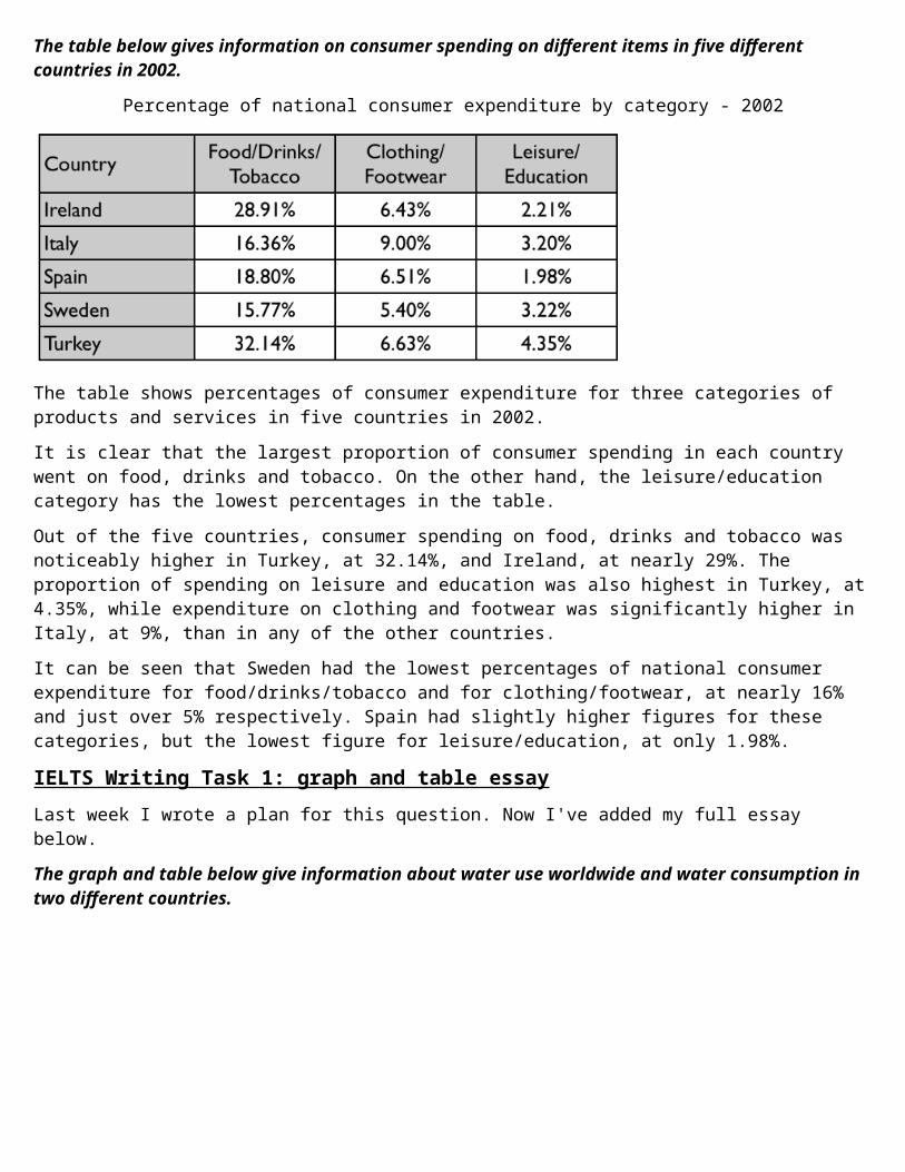
The table below gives information on consumer spending on different items in five different countries in 2002.
Percentage of national consumer expenditure by category - 2002
The table shows percentages of consumer expenditure for three categories of products and services in five countries in 2002.It is clear that the largest proportion of consumer spending in each country went on food, drinks and tobacco. On the other hand, the leisure/education category has the lowest percentages in the table.Out of the five countries, consumer spending on food, drinks and tobacco was noticeably higher in Turkey, at 32.14%, and Ireland, at nearly 29%. The proportion of spending on leisure and education was also highest in Turkey, at4.35%, while expenditure on clothing and footwear was significantly higher in Italy, at 9%, than in any of the other countries.It can be seen that Sweden had the lowest percentages of national consumer expenditure for food/drinks/tobacco and for clothing/footwear, at nearly 16% and just over 5% respectively. Spain had slightly higher figures for these categories, but the lowest figure for leisure/education, at only 1.98%.
IELTS Writing Task 1: graph and table essayLast week I wrote a plan for this question. Now I've added my full essay below.The graph and table below give information about water use worldwide and water consumption in two different countries.
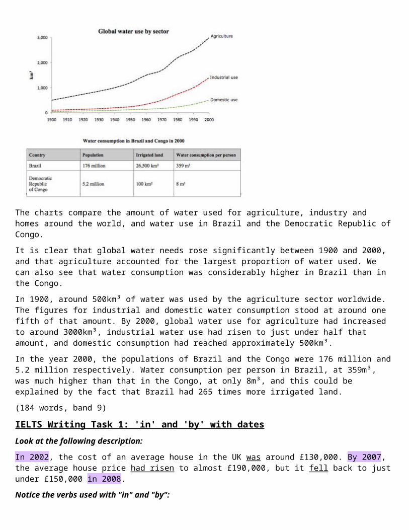
The charts compare the amount of water used for agriculture, industry and homes around the world, and water use in Brazil and the Democratic Republic ofCongo.It is clear that global water needs rose significantly between 1900 and 2000, and that agriculture accounted for the largest proportion of water used. We can also see that water consumption was considerably higher in Brazil than in the Congo.In 1900, around 500km³ of water was used by the agriculture sector worldwide. The figures for industrial and domestic water consumption stood at around one fifth of that amount. By 2000, global water use for agriculture had increased to around 3000km³, industrial water use had risen to just under half that amount, and domestic consumption had reached approximately 500km³.In the year 2000, the populations of Brazil and the Congo were 176 million and5.2 million respectively. Water consumption per person in Brazil, at 359m³, was much higher than that in the Congo, at only 8m³, and this could be explained by the fact that Brazil had 265 times more irrigated land.(184 words, band 9)
IELTS Writing Task 1: 'in' and 'by' with datesLook at the following description:
In 2002, the cost of an average house in the UK was around £130,000. By 2007, the average house price had risen to almost £190,000, but it fell back to justunder £150,000 in 2008.Notice the verbs used with "in" and "by":
I used "in" with the past simple (was, fell). I used "by" with the past perfect (had risen) to give the idea that the
increase had happened in the years leading up to 2007. To avoid worrying about "by + past perfect" you could write: "Between
2002 and 2007, the average house price rose to..."
IELTS Writing Task 1: pie chart essayHere's my full essay for the pie charts in last week's lesson. I've made the last two paragraphs into a gap-fill exercise to focus your attention on some good ways to describe numbers.Fill the gaps with these words:constitutes, drops, amount, fifth, higher, make, one, relative, figure, up
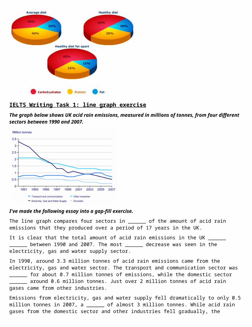
The pie charts compare the proportion of carbohydrates, protein and fat in three different diets, namely an average diet, a healthy diet, and a healthy diet for sport.It is noticeable that sportspeople require a diet comprising a significantly higher proportion of carbohydrates than an average diet or a healthy diet. Theaverage diet contains the lowest percentage of carbohydrates but the highest proportion of protein.Carbohydrates ______ ______ 60% of the healthy diet for sport. This is 10% ______ than the proportion of carbohydrates in a normal healthy diet, and 20% more than the proportion in an average diet. On the other hand, people who eatan average diet consume a greater ______ ______ of protein (40%) than those who eat a healthy diet (30%) and sportspeople (25%).The third compound shown in the charts is fat. Fat ______ exactly ______ ______ of both the average diet and the healthy diet, but the ______ ______ toonly 15% for the healthy sports diet.
IELTS Writing Task 1: introduction and summaryLast week I said that you need to do 3 things to write a task 1 essay: introduce, summarise, and describe details. Today I'll look at the introduction and summaryfor the pie charts below.
IELTS Writing Task 1: line graph exerciseThe graph below shows UK acid rain emissions, measured in millions of tonnes, from four different sectors between 1990 and 2007.
I've made the following essay into a gap-fill exercise.
The line graph compares four sectors in ______ of the amount of acid rain emissions that they produced over a period of 17 years in the UK.It is clear that the total amount of acid rain emissions in the UK ______ ______ between 1990 and 2007. The most ______ decrease was seen in the electricity, gas and water supply sector.In 1990, around 3.3 million tonnes of acid rain emissions came from the electricity, gas and water sector. The transport and communication sector was ______ for about 0.7 million tonnes of emissions, while the domestic sector ______ around 0.6 million tonnes. Just over 2 million tonnes of acid rain gases came from other industries.Emissions from electricity, gas and water supply fell dramatically to only 0.5million tonnes in 2007, a ______ of almost 3 million tonnes. While acid rain gases from the domestic sector and other industries fell gradually, the
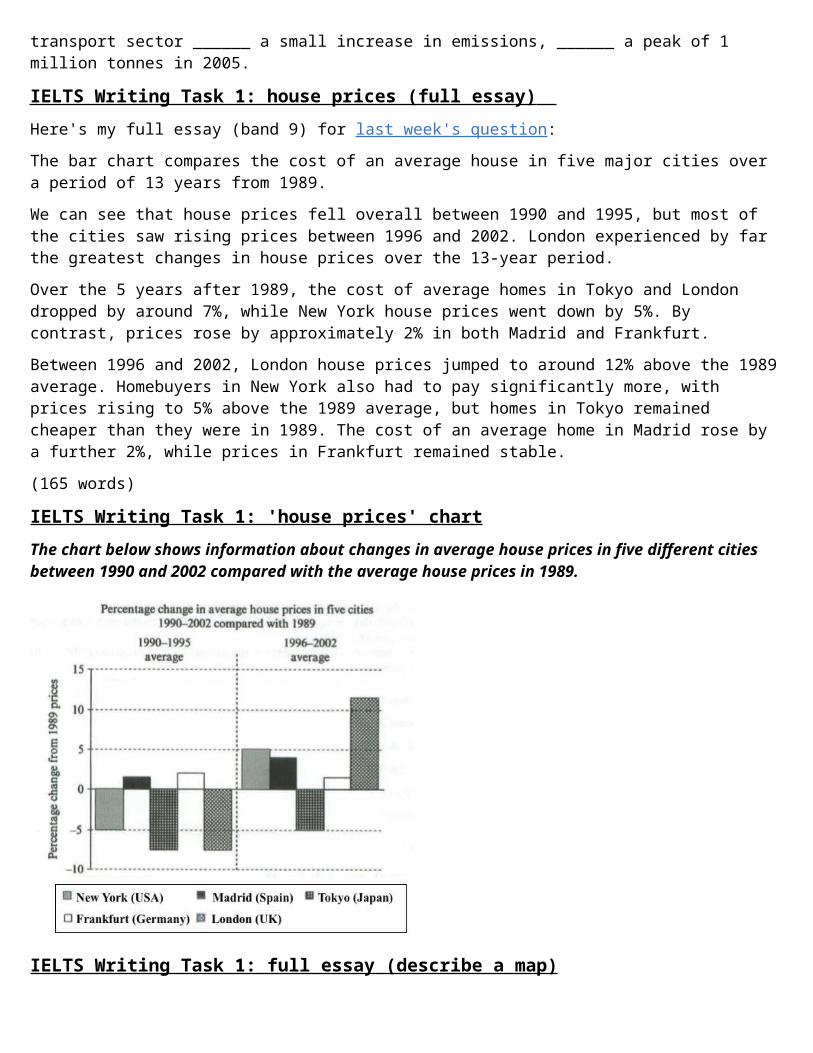
transport sector ______ a small increase in emissions, ______ a peak of 1 million tonnes in 2005.
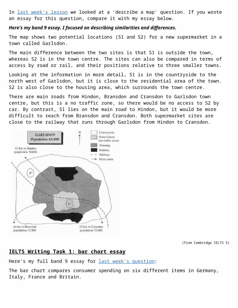
IELTS Writing Task 1: house prices (full essay) Here's my full essay (band 9) for last week's question:The bar chart compares the cost of an average house in five major cities over a period of 13 years from 1989.We can see that house prices fell overall between 1990 and 1995, but most of the cities saw rising prices between 1996 and 2002. London experienced by far the greatest changes in house prices over the 13-year period.Over the 5 years after 1989, the cost of average homes in Tokyo and London dropped by around 7%, while New York house prices went down by 5%. By contrast, prices rose by approximately 2% in both Madrid and Frankfurt.Between 1996 and 2002, London house prices jumped to around 12% above the 1989average. Homebuyers in New York also had to pay significantly more, with prices rising to 5% above the 1989 average, but homes in Tokyo remained cheaper than they were in 1989. The cost of an average home in Madrid rose by a further 2%, while prices in Frankfurt remained stable.(165 words)
IELTS Writing Task 1: 'house prices' chartThe chart below shows information about changes in average house prices in five different cities between 1990 and 2002 compared with the average house prices in 1989.
IELTS Writing Task 1: full essay (describe a map)
In last week's lesson we looked at a 'describe a map' question. If you wrote an essay for this question, compare it with my essay below.Here's my band 9 essay. I focused on describing similarities and differences.
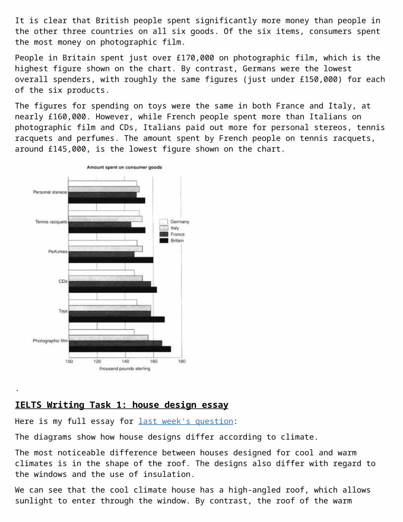
The map shows two potential locations (S1 and S2) for a new supermarket in a town called Garlsdon.The main difference between the two sites is that S1 is outside the town, whereas S2 is in the town centre. The sites can also be compared in terms of access by road or rail, and their positions relative to three smaller towns.Looking at the information in more detail, S1 is in the countryside to the north west of Garlsdon, but it is close to the residential area of the town. S2 is also close to the housing area, which surrounds the town centre.There are main roads from Hindon, Bransdon and Cransdon to Garlsdon town centre, but this is a no traffic zone, so there would be no access to S2 by car. By contrast, S1 lies on the main road to Hindon, but it would be more difficult to reach from Bransdon and Cransdon. Both supermarket sites are close to the railway that runs through Garlsdon from Hindon to Cransdon.
(From Cambridge IELTS 5)
IELTS Writing Task 1: bar chart essayHere's my full band 9 essay for last week's question:The bar chart compares consumer spending on six different items in Germany, Italy, France and Britain.
It is clear that British people spent significantly more money than people in the other three countries on all six goods. Of the six items, consumers spent the most money on photographic film.People in Britain spent just over £170,000 on photographic film, which is the highest figure shown on the chart. By contrast, Germans were the lowest overall spenders, with roughly the same figures (just under £150,000) for eachof the six products.The figures for spending on toys were the same in both France and Italy, at nearly £160,000. However, while French people spent more than Italians on photographic film and CDs, Italians paid out more for personal stereos, tennisracquets and perfumes. The amount spent by French people on tennis racquets, around £145,000, is the lowest figure shown on the chart.
.
IELTS Writing Task 1: house design essayHere is my full essay for last week's question:The diagrams show how house designs differ according to climate.The most noticeable difference between houses designed for cool and warm climates is in the shape of the roof. The designs also differ with regard to the windows and the use of insulation.We can see that the cool climate house has a high-angled roof, which allows sunlight to enter through the window. By contrast, the roof of the warm
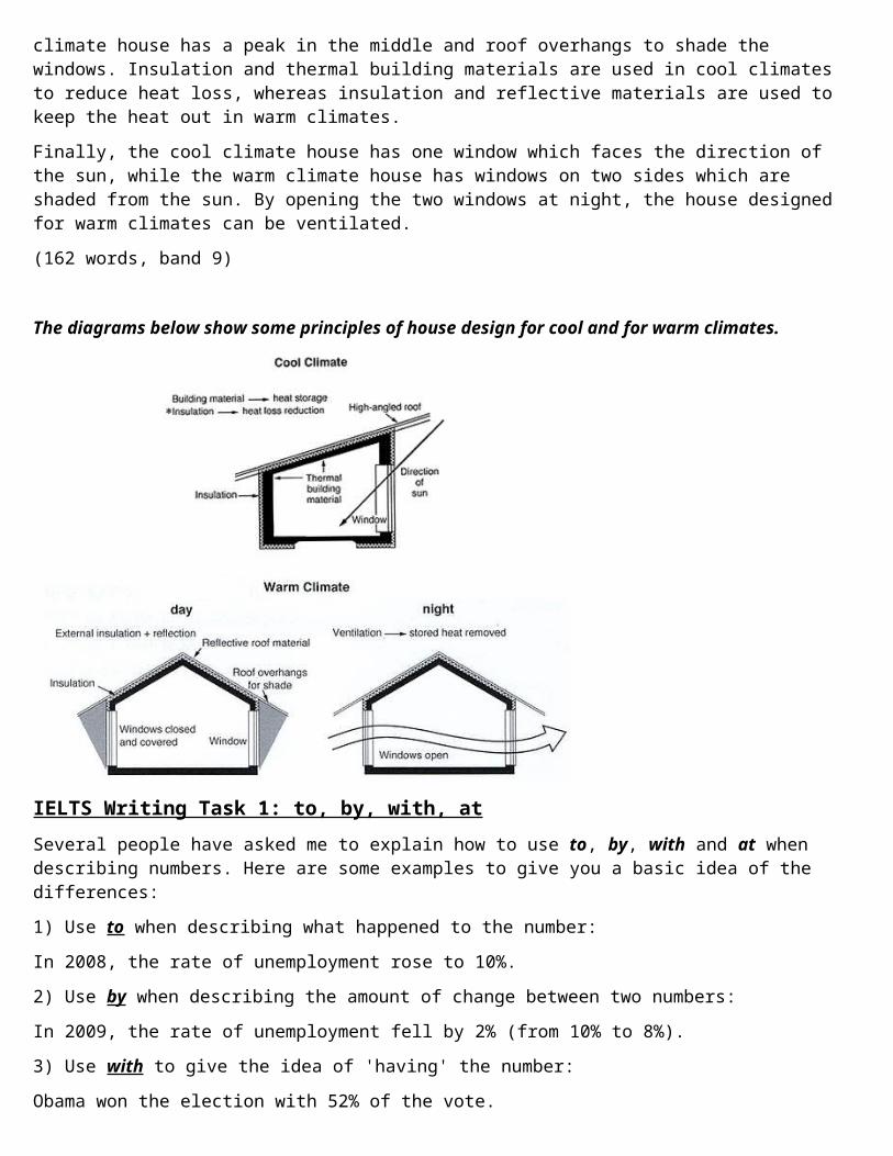
climate house has a peak in the middle and roof overhangs to shade the windows. Insulation and thermal building materials are used in cool climates to reduce heat loss, whereas insulation and reflective materials are used to keep the heat out in warm climates.Finally, the cool climate house has one window which faces the direction of the sun, while the warm climate house has windows on two sides which are shaded from the sun. By opening the two windows at night, the house designed for warm climates can be ventilated.(162 words, band 9)
The diagrams below show some principles of house design for cool and for warm climates.
IELTS Writing Task 1: to, by, with, atSeveral people have asked me to explain how to use to, by, with and at when describing numbers. Here are some examples to give you a basic idea of the differences:1) Use to when describing what happened to the number:In 2008, the rate of unemployment rose to 10%.2) Use by when describing the amount of change between two numbers:In 2009, the rate of unemployment fell by 2% (from 10% to 8%).3) Use with to give the idea of 'having' the number:Obama won the election with 52% of the vote.
4) Use at to add the number on the end of a sentence:Unemployment reached its highest level in 2008, at 10%.
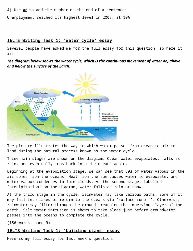
IELTS Writing Task 1: 'water cycle' essaySeveral people have asked me for the full essay for this question, so here it is!The diagram below shows the water cycle, which is the continuous movement of water on, above and below the surface of the Earth.
The picture illustrates the way in which water passes from ocean to air to land during the natural process known as the water cycle.Three main stages are shown on the diagram. Ocean water evaporates, falls as rain, and eventually runs back into the oceans again.Beginning at the evaporation stage, we can see that 80% of water vapour in theair comes from the oceans. Heat from the sun causes water to evaporate, and water vapour condenses to form clouds. At the second stage, labelled ‘precipitation’ on the diagram, water falls as rain or snow.At the third stage in the cycle, rainwater may take various paths. Some of it may fall into lakes or return to the oceans via ‘surface runoff’. Otherwise, rainwater may filter through the ground, reaching the impervious layer of the earth. Salt water intrusion is shown to take place just before groundwater passes into the oceans to complete the cycle.(156 words, band 9)
IELTS Writing Task 1: 'building plans' essayHere is my full essay for last week's question.
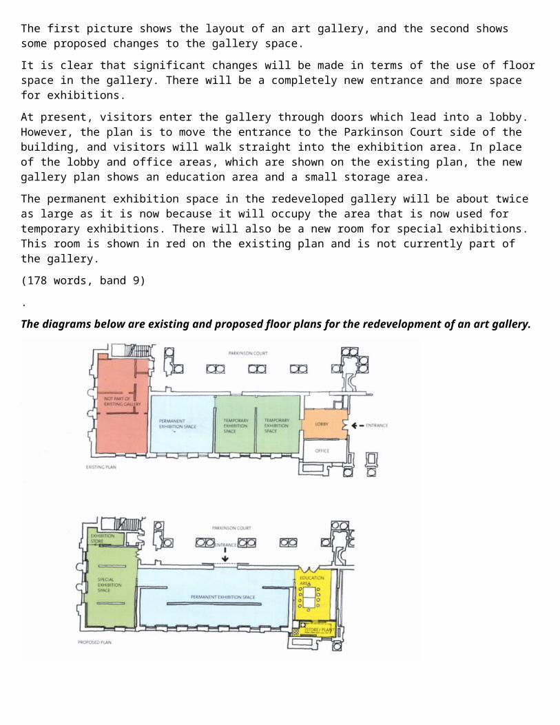
The first picture shows the layout of an art gallery, and the second shows some proposed changes to the gallery space.It is clear that significant changes will be made in terms of the use of floorspace in the gallery. There will be a completely new entrance and more space for exhibitions.At present, visitors enter the gallery through doors which lead into a lobby. However, the plan is to move the entrance to the Parkinson Court side of the building, and visitors will walk straight into the exhibition area. In place of the lobby and office areas, which are shown on the existing plan, the new gallery plan shows an education area and a small storage area.The permanent exhibition space in the redeveloped gallery will be about twice as large as it is now because it will occupy the area that is now used for temporary exhibitions. There will also be a new room for special exhibitions. This room is shown in red on the existing plan and is not currently part of the gallery.(178 words, band 9).The diagrams below are existing and proposed floor plans for the redevelopment of an art gallery.
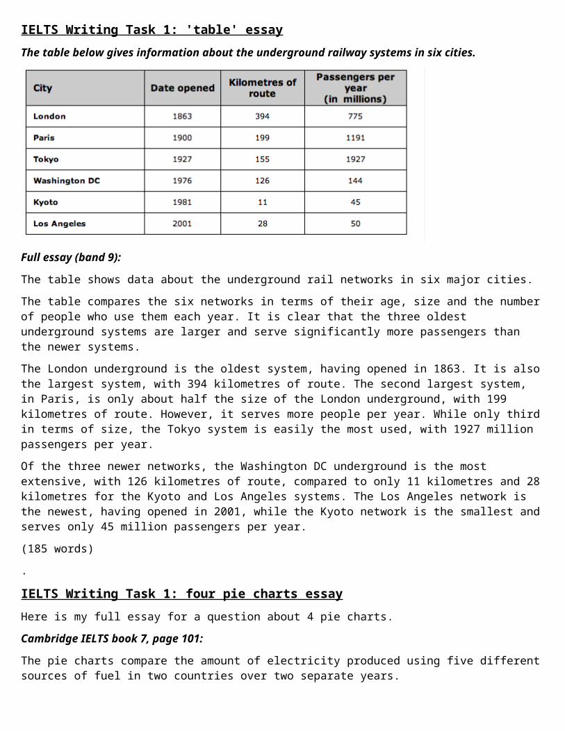
IELTS Writing Task 1: 'table' essayThe table below gives information about the underground railway systems in six cities.
Full essay (band 9):
The table shows data about the underground rail networks in six major cities.The table compares the six networks in terms of their age, size and the numberof people who use them each year. It is clear that the three oldest underground systems are larger and serve significantly more passengers than the newer systems.The London underground is the oldest system, having opened in 1863. It is alsothe largest system, with 394 kilometres of route. The second largest system, in Paris, is only about half the size of the London underground, with 199 kilometres of route. However, it serves more people per year. While only thirdin terms of size, the Tokyo system is easily the most used, with 1927 million passengers per year.Of the three newer networks, the Washington DC underground is the most extensive, with 126 kilometres of route, compared to only 11 kilometres and 28kilometres for the Kyoto and Los Angeles systems. The Los Angeles network is the newest, having opened in 2001, while the Kyoto network is the smallest andserves only 45 million passengers per year.(185 words).
IELTS Writing Task 1: four pie charts essayHere is my full essay for a question about 4 pie charts.Cambridge IELTS book 7, page 101:
The pie charts compare the amount of electricity produced using five differentsources of fuel in two countries over two separate years.
Total electricity production increased dramatically from 1980 to 2000 in both Australia and France. While the totals for both countries were similar, there were big differences in the fuel sources used.Coal was used to produce 50 of the total 100 units of electricity in Australiain 1980, rising to 130 out of 170 units in 2000. By contrast, nuclear power became the most important fuel source in France in 2000, producing almost 75% of the country’s electricity.Australia depended on hydro power for just under 25% of its electricity in both years, but the amount of electricity produced using this type of power fell from 5 to only 2 units in France. Oil, on the other hand, remained a relatively important fuel source in France, but its use declined in Australia.Both countries relied on natural gas for electricity production significantly more in 1980 than in 2000.(170 words)
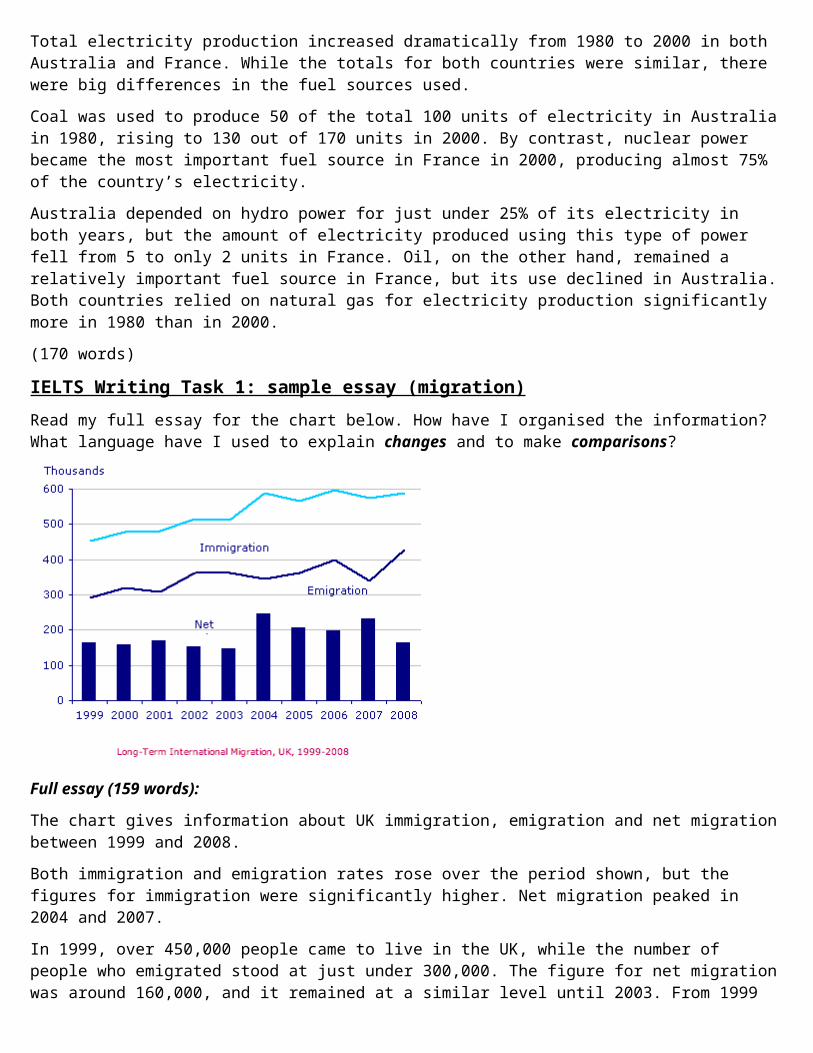
IELTS Writing Task 1: sample essay (migration)Read my full essay for the chart below. How have I organised the information? What language have I used to explain changes and to make comparisons?
Full essay (159 words):
The chart gives information about UK immigration, emigration and net migrationbetween 1999 and 2008.Both immigration and emigration rates rose over the period shown, but the figures for immigration were significantly higher. Net migration peaked in 2004 and 2007.In 1999, over 450,000 people came to live in the UK, while the number of people who emigrated stood at just under 300,000. The figure for net migrationwas around 160,000, and it remained at a similar level until 2003. From 1999

to 2004, the immigration rate rose by nearly 150,000 people, but there was a much smaller rise in emigration. Net migration peaked at almost 250,000 peoplein 2004.After 2004, the rate of immigration remained high, but the number of people emigrating fluctuated. Emigration fell suddenly in 2007, before peaking at about 420,000 people in 2008. As a result, the net migration figure rose to around 240,000 in 2007, but fell back to around 160,000 in 2008.
IELTS Writing Task 1: bar charts essayHere is my full essay for last week's bar chart question. Study the essay carefully to see which details I selected for each paragraph. Notice that I describe the two science bar charts in the same paragraph.The three bar charts show average years of schooling, numbers of scientists and technicians, and research and development spending in developing and developed countries. Figures are given for 1980 and 1990.It is clear from the charts that the figures for developed countries are much higher than those for developing nations. Also, the charts show an overall increase in participation in education and science from 1980 to 1990.People in developing nations attended school for an average of around 3 years,with only a slight increase in years of schooling from 1980 to 1990. On the other hand, the figure for industrialised countries rose from nearly 9 years of schooling in 1980 to nearly 11 years in 1990.From 1980 to 1990, the number of scientists and technicians in industrialised countries almost doubled to about 70 per 1000 people. Spending on research anddevelopment also saw rapid growth in these countries, reaching $350 billion in1990. By contrast, the number of science workers in developing countries remained below 20 per 1000 people, and research spending fell from about $50 billion to only $25 billion.(187 words)
IELTS Writing Task 1: process diagram essayLast week I suggested an essay structure for the following question:The diagram below shows how the Australian Bureau of Meteorology collects up-to-the-minute information on the weather in order to produce reliable forecasts.
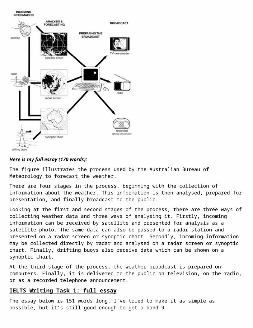
Here is my full essay (170 words):
The figure illustrates the process used by the Australian Bureau of Meteorology to forecast the weather.There are four stages in the process, beginning with the collection of information about the weather. This information is then analysed, prepared forpresentation, and finally broadcast to the public.Looking at the first and second stages of the process, there are three ways ofcollecting weather data and three ways of analysing it. Firstly, incoming information can be received by satellite and presented for analysis as a satellite photo. The same data can also be passed to a radar station and presented on a radar screen or synoptic chart. Secondly, incoming information may be collected directly by radar and analysed on a radar screen or synoptic chart. Finally, drifting buoys also receive data which can be shown on a synoptic chart.At the third stage of the process, the weather broadcast is prepared on computers. Finally, it is delivered to the public on television, on the radio,or as a recorded telephone announcement.
IELTS Writing Task 1: full essayThe essay below is 151 words long. I've tried to make it as simple as possible, but it's still good enough to get a band 9.
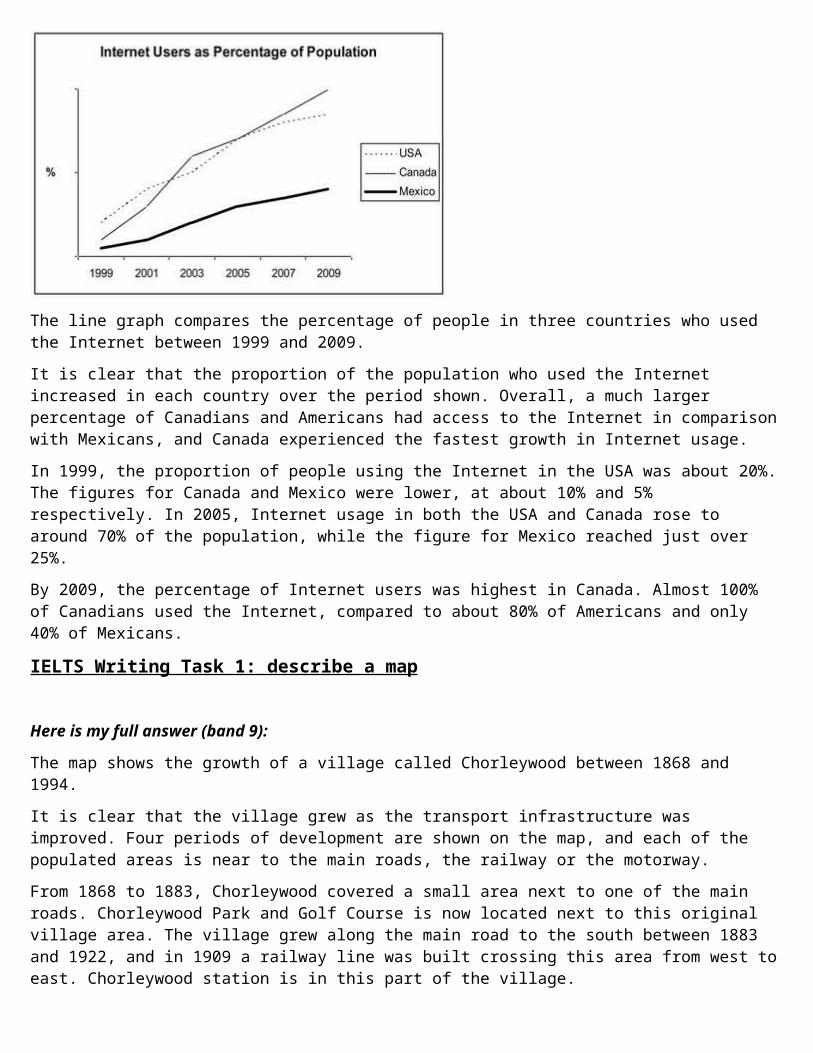
The line graph compares the percentage of people in three countries who used the Internet between 1999 and 2009.It is clear that the proportion of the population who used the Internet increased in each country over the period shown. Overall, a much larger percentage of Canadians and Americans had access to the Internet in comparisonwith Mexicans, and Canada experienced the fastest growth in Internet usage.In 1999, the proportion of people using the Internet in the USA was about 20%.The figures for Canada and Mexico were lower, at about 10% and 5% respectively. In 2005, Internet usage in both the USA and Canada rose to around 70% of the population, while the figure for Mexico reached just over 25%.By 2009, the percentage of Internet users was highest in Canada. Almost 100% of Canadians used the Internet, compared to about 80% of Americans and only 40% of Mexicans.
IELTS Writing Task 1: describe a map
Here is my full answer (band 9):
The map shows the growth of a village called Chorleywood between 1868 and 1994.It is clear that the village grew as the transport infrastructure was improved. Four periods of development are shown on the map, and each of the populated areas is near to the main roads, the railway or the motorway.From 1868 to 1883, Chorleywood covered a small area next to one of the main roads. Chorleywood Park and Golf Course is now located next to this original village area. The village grew along the main road to the south between 1883 and 1922, and in 1909 a railway line was built crossing this area from west toeast. Chorleywood station is in this part of the village.
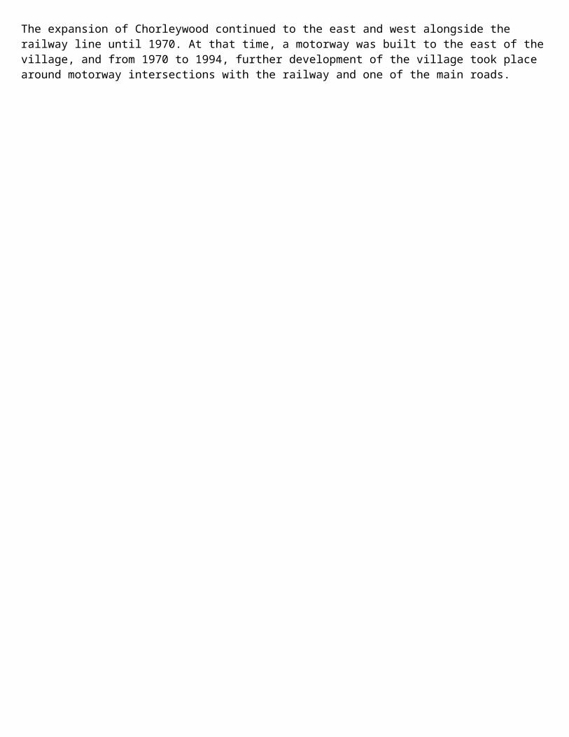
The expansion of Chorleywood continued to the east and west alongside the railway line until 1970. At that time, a motorway was built to the east of thevillage, and from 1970 to 1994, further development of the village took place around motorway intersections with the railway and one of the main roads.